Timeless Tradition Meets Modern Minimalism: DOT Design’s Exhibition Hall for BORCCI
DOT Design's exhibition hall for BORCCI Kitchen Cabinets at the 2022 China International Building Decoration Fair (Shanghai) offers an immersive journey through art, culture, and sustainability. The space, inspired by the elegance of traditional Chinese gardens, aims to provide an experience of 'changing scenery with every step,' engaging visitors in a seamless blend of artistry, leisure, and amusement within a refined, contemporary framework.
DOT Design's exhibition hall for BORCCI Kitchen Cabinets at the 2022 China International Building Decoration Fair (Shanghai) offers an immersive journey through art, culture, and sustainability. The space, inspired by the elegance of traditional Chinese gardens, aims to provide an experience of 'changing scenery with every step,' engaging visitors in a seamless blend of artistry, leisure, and amusement within a refined, contemporary framework.
The hall, with its distinct oriental classical charm on the outside, sets the stage for a truly unique experience inside. The interior, in contrast, exudes minimalist sophistication. It employs a restrained colour palette with white walls, floors, and furnishings, creating a serene backdrop that accentuates the brand's product colours. This simplicity is a deliberate choice, echoing the beauty of ancient aesthetics while providing a contemporary space for contemplation.
The design's central concept is a harmonious blend of tradition and modernity. Drawing inspiration from the enduring beauty of China's water towns, DOT Design reimagines these iconic landscapes through simplified architectural forms. The hall becomes a 'four-dimensional space of art,' where traditional elements such as raised ridges, whitewashed walls, bamboo groves, and stone formations are seamlessly integrated, fostering a harmonious dialogue between the past and present.
"This project is a profound exploration of Chinese cultural heritage. The design embodies the Suzhou Garden philosophy of "changing scenery with every step," creating a series of interconnected yet distinct spaces that invite visitors to discover something new at every turn. This spatial narrative honours tradition and aligns with modern environmental concerns by adhering to low-carbon and recycling principles."


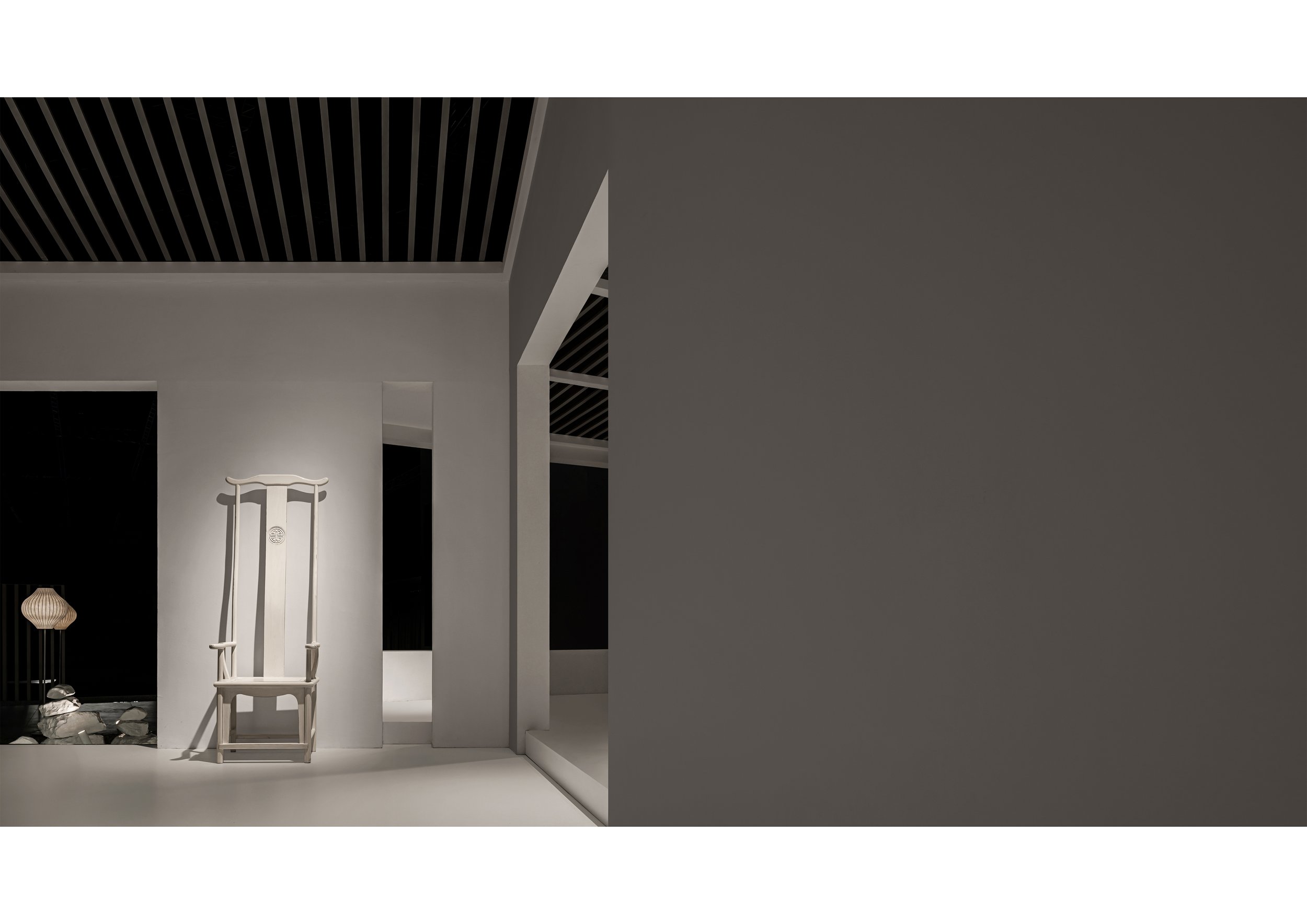

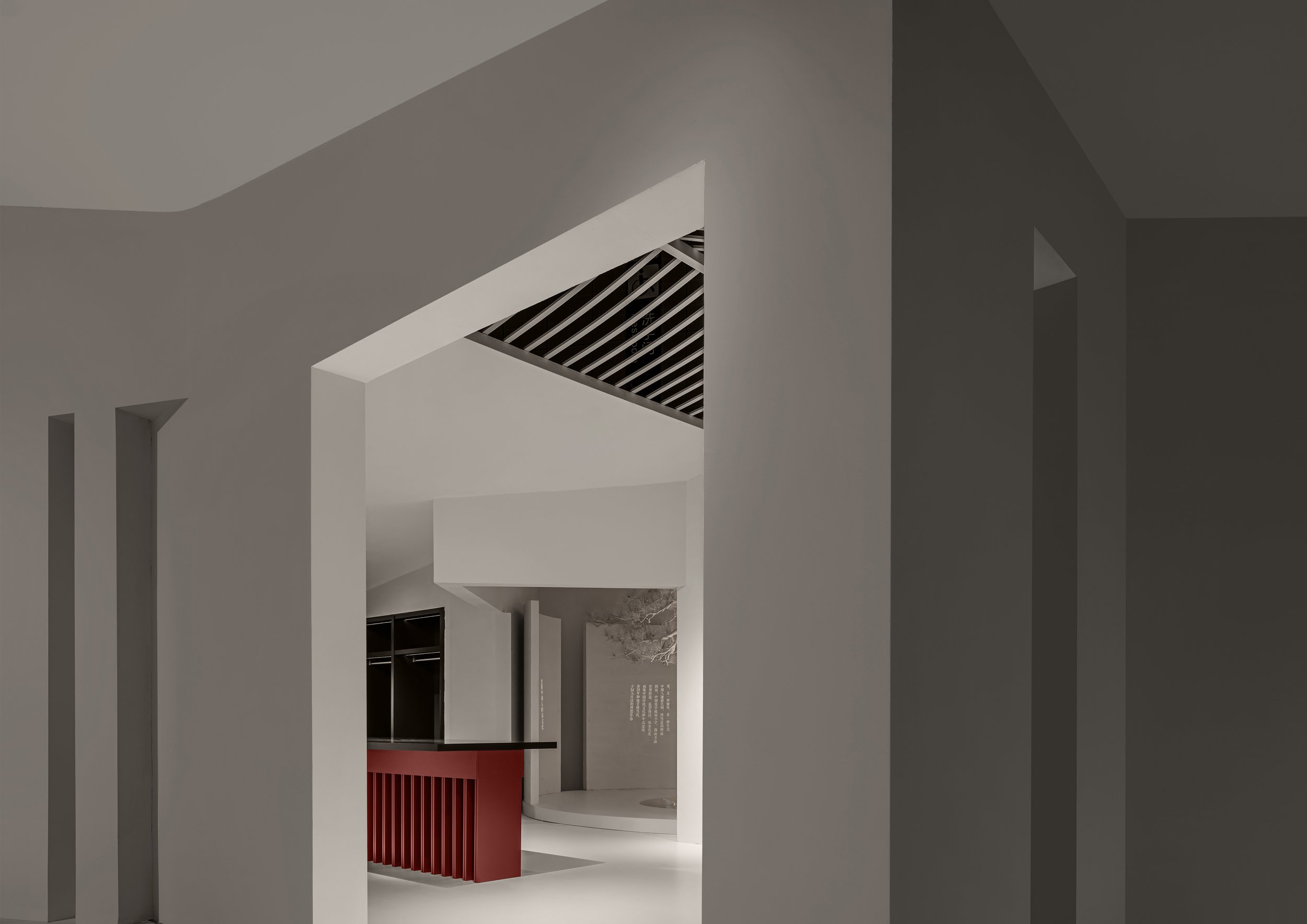

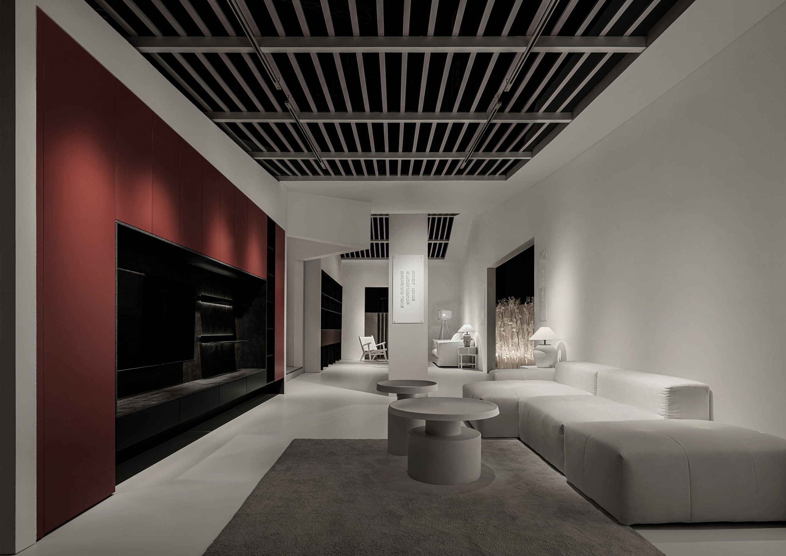
The exhibition hall is meticulously designed with sustainability at its core. It comprises six modular sections: living room, kitchen, dining room, bedroom, dressing room, and e-sports room. Each section is crafted for easy disassembly and reusability in future exhibitions, reassuring visitors of our commitment to reducing the environmental footprint. This approach not only showcases a forward-thinking design but also strikes a balance between form, function, and responsibility.
To further emphasize its commitment to eco-consciousness, the hall's minimalist interior and exterior decor use environmentally friendly coatings. This design choice subtly connects the products to the overall spatial composition, embodying the brand's ethos of simplicity and balance. The exhibition's theme, "Art Gallery of Wu Wei," meaning non-interference, is brought to life through its tranquil, nature-infused spaces, inviting visitors to embrace a calm, harmonious lifestyle.
By blending traditional Chinese elements with modern design innovation, DOT Design has not only created a space that reflects cultural reverence but also presents a bold vision of the future. This innovative approach is a true testament to the power of thoughtful, sustainable design, inspiring all who experience it.
*This project is one of the shortlisted project in the Sky Design Awards 2024 - Interior Design: Institution Division
Yue Pan
Designer Profile
Yue Pan
Registered Senior Interior Designer, Registered Senior Engineer
Education:
Master's degree in spatial planning and design at Polytechnic University of Milan, Italy
Master's degree in Art, Design and Design at the Brera Academy of Fine Arts in Milan, Italy
Current:
DOT Founder/Design Director of DESIGN
Experience:
"Champion's New Home" by Wu Minxia's specially invited designer
"Su Shen's New Home" Invited Designer by Su Bingtian's Home
Specially invited designer for Beijing TV's "Warm New Home" program
Specially invited designer by Tencent Video for the "Craftsman Becomes a New Home" program
DOT DESIGN is a high-end professional interior space planning and design performance firm established in 2007, founded by renowned domestic senior interior designer Rudy Pan. Advocate for integrated spatial design services in professional services, providing integrated design solutions from early visual communication, architectural optimization, interior design, landscape design, lighting design, display art, product design, and structural optimization to ensure the final aesthetic presentation of the project.
Cultural Heritage Reimagined: The Contemporary Craft of Nice Rice Shanghai
The store's design draws inspiration from traditional Chinese architecture, precisely the concept of the siheyuan, a classic Chinese courtyard house. SAY Architects skillfully translated this architectural heritage into a modern context by transforming the store into a "Rice Barn Shelter" that welcomes customers beneath its iconic eaves. The eaves, often called the "fifth elevation" in Chinese architecture, create an inviting sanctuary that offers a balance of openness and intimacy. The double-sloped roofs mirror traditional structures, yet their contemporary interpretation makes them relevant to today's retail landscape.
In the lively center of Huaihai Road in Shanghai, where Eastern and Western cultures meet, the Nice Rice Shanghai Flagship Store stands as a testament to cultural preservation and modern design. Crafted by the pioneering team at SAY Architects, this flagship store fuses tradition and contemporary aesthetics, offering an experience that transcends mere shopping.
A Sanctuary Rooted in Tradition
The store's design draws inspiration from traditional Chinese architecture, precisely the concept of the siheyuan, a classic Chinese courtyard house. SAY Architects skillfully translated this architectural heritage into a modern context by transforming the store into a "Rice Barn Shelter" that welcomes customers beneath its iconic eaves. The eaves, often called the "fifth elevation" in Chinese architecture, create an inviting sanctuary that offers a balance of openness and intimacy. The double-sloped roofs mirror traditional structures, yet their contemporary interpretation makes them relevant to today's retail landscape.
The choice of interior design is more than just cosmetic. It reflects the purpose of an Oriental Rice Warehouse, historically used for storing Rice. This symbolizes sustenance, inclusivity, and generosity. SAY Architects expanded on this concept by creating a "Rice Barn Shelter," a welcoming and inclusive space beneath the eaves that represents the harmonious coexistence of diverse cultural elements. This design respects the past and contributes to the sustainable cultural expression that SAY aims to incorporate alongside the sustainable use of materials.
Modern Retail: Blending Fashion, Tradition, and Culture
Nice Rice is more than just a retail brand; it represents a lifestyle concept that combines fashion, culture, and gastronomy. The flagship store in Shanghai showcases a "fashion + coffee" dual-business model, targeting younger demographics who seek a comprehensive retail experience. The simple and versatile clothing reflects the brand's philosophy of "harmony in diversity," subtly echoing Eastern cultural values.
The store's original architecture includes a wide horizontal beam that visually separates the space. This element was further emphasized by incorporating the traditional roof style of a siheyuan into the design. The roofline appears extended through cohesive colours and a minimalist yet innovative design, creating a captivating visual effect. Inside, intricate decorations have been removed to allow for more freedom of movement. Lacquer art installations punctuate the minimalist space, giving it a timeless quality.


An Inclusive Design for Urban Explorers
The dual-purpose design of Nice Rice includes a coffee shop and fashion retail, creating a modern and open public space. The store's recessed entrance and spacious outdoor area invite people passing by to interact with the space, making it a communal hub. The seamless flow between the inside and outside encourages visitors to pause, stay, and fully experience the cultural environment. The open and accessible entrance defines the store's identity and aligns with SAY Architects' vision for cultural sustainability through spatial design.
The overarching layout is designed to foster interaction. SAY Architects aimed to extend the functionality of the traditional courtyard beyond its historical limitations, highlighting how adaptable traditional elements can seamlessly integrate with modern fashion sensibilities. This architectural philosophy resonates deeply with the young urban consumer, blending cultural recognition with the ease of modernity.
Tradition Reborn for a New Generation
Through the extension and reinterpretation of traditional design elements, SAY Architects breathes new life into cultural heritage at the Nice Rice Shanghai Flagship Store. It serves not only as a retail space but also as a cultural touchstone, where the spirit of design is rejuvenated in a fresh and relevant manner. The balance of traditional charm and fashion-forward sensibility fosters emotional connections with Shanghai's youth, whose cultural recognition and engagement are keys to Nice Rice's success.
By promoting a harmonious blend of Eastern culture in a modern urban environment, Nice Rice creates a rich narrative for both the present and the future—a story that carries the weight of tradition yet speaks the language of contemporary design.


For more information, please visit: www.sayarchitects.cn
*This project is one of the shortlisted project in the Sky Design Awards 2024 - Interior Design: Retail Design Division
Kris Lin International Design Crafts a Riverside Cultural Landmark in Ningbo
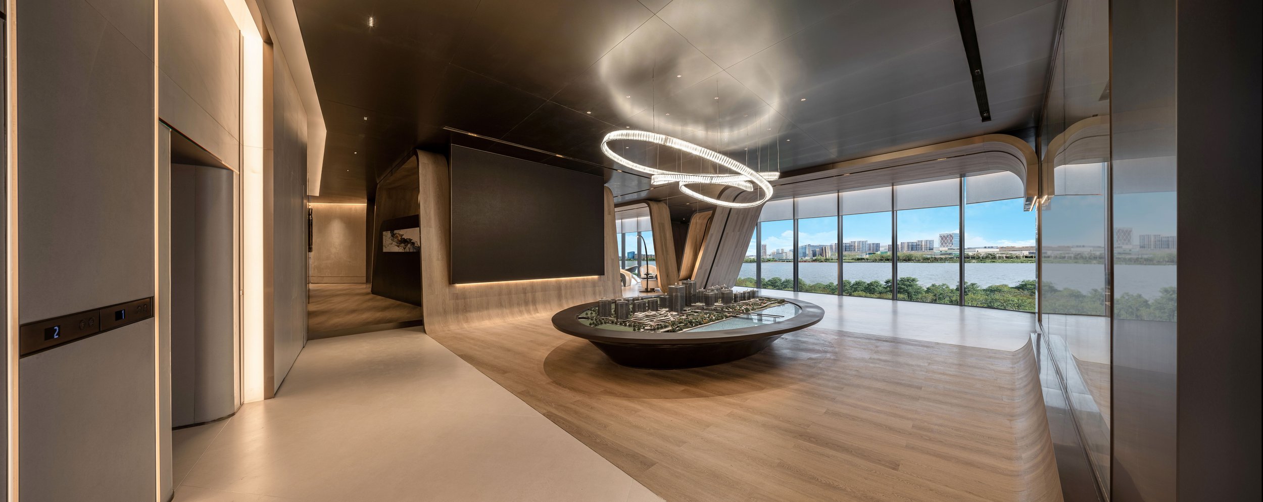
Located in the bustling core of Ningbo, this ambitious project by Kris Lin International Design aims to redefine the city's riverside landscape. Situated within the WenChuang Port, the space is intended to serve as a world-class cultural and creative hub, blending the vibrancy of Ningbo's modern ethos with its historical essence. The first floor is a dynamic display area for the city's burgeoning trendy culture scene. In contrast, the second floor is dedicated to art exhibitions and a riverside café, providing a seamless fusion of cultural presentation and leisurely relaxation.
Located in the bustling core of Ningbo, this ambitious project by Kris Lin International Design aims to redefine the city's riverside landscape. Situated within the WenChuang Port, the space is intended to serve as a world-class cultural and creative hub, blending the vibrancy of Ningbo's modern ethos with its historical essence. The first floor is a dynamic display area for the city's burgeoning trendy culture scene. In contrast, the second floor is dedicated to art exhibitions and a riverside café, providing a seamless fusion of cultural presentation and leisurely relaxation.
Originality and Creativity
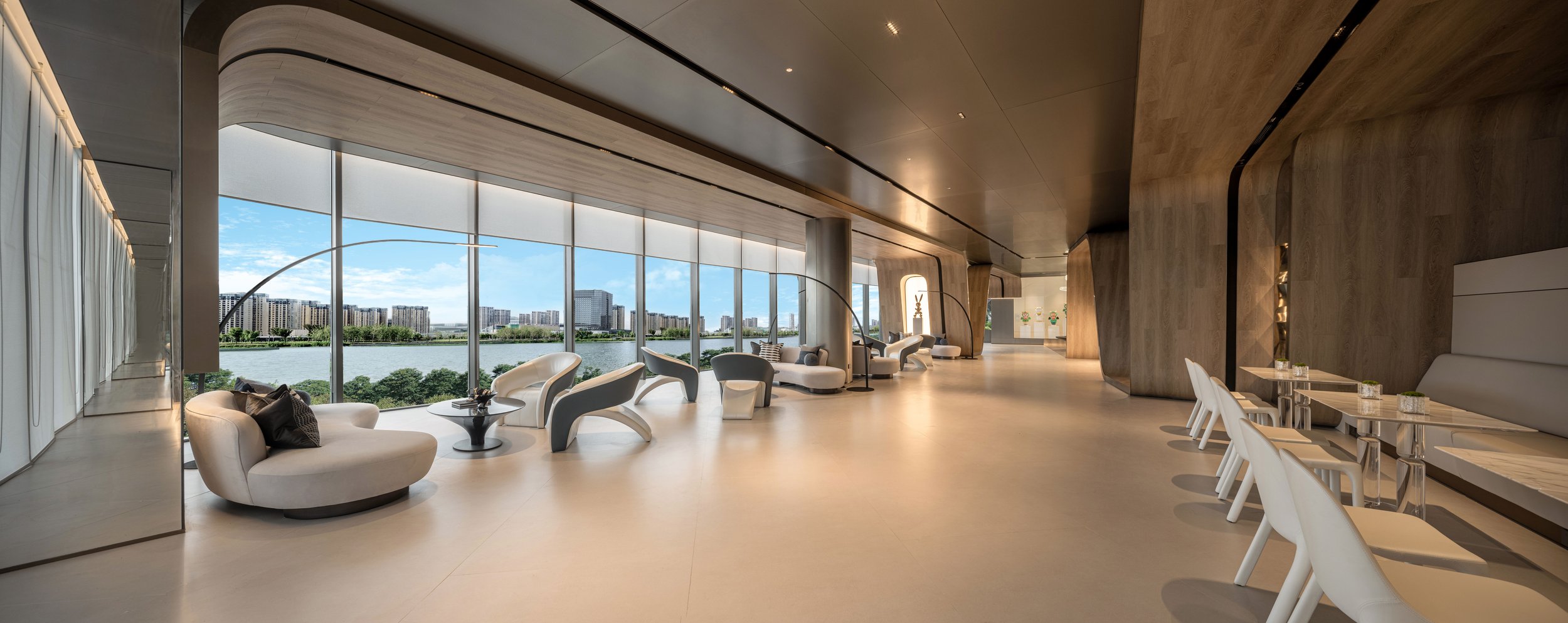
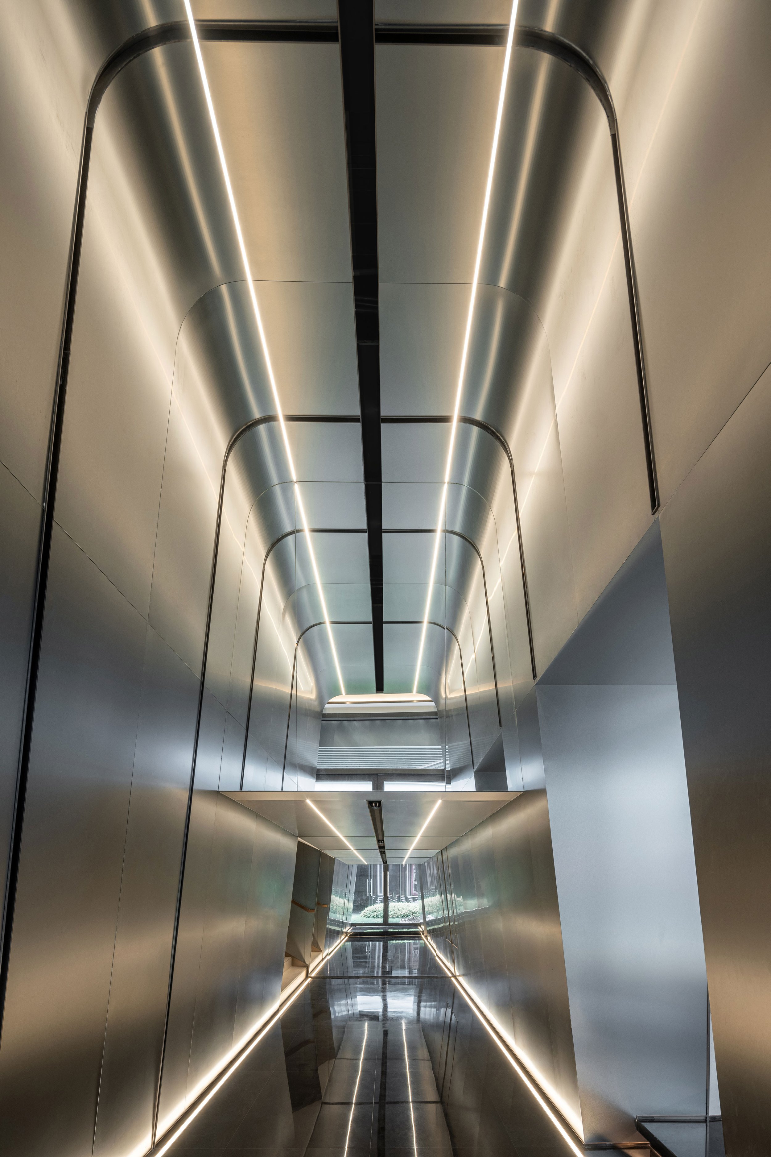
The building's design is inspired by the Yong River, with fluid lines and sculptural forms shaping the space. The dynamic exterior lines capture movement and inject vitality into the building's silhouette. This organic design blurs the boundary between the built environment and nature, creating a social hub where relaxation meets creative energy.
Exterior Vision
The project's exterior design seamlessly combines natural elements with modern aesthetics. The building's sweeping curves and fluid lines evoke the river's gentle flow, ensuring that the structure blends in with its surrounding environment. The interior continues this artistic theme, featuring pop culture artifacts such as BE@RBRICK bears and KAWS figures. These playful additions transform the space into a cultural playground, catching the eye and sparking conversation while offering a unique mix of art and architecture that reflects contemporary urban culture.




Constructibility
"Designed with flexibility and functionality in mind, the project is prepared for the changing needs of city life. It includes adaptable spaces that easily switch between exhibition areas and leisure zones. Using modular and prefabricated components ensures precision and efficiency, improving build quality while controlling costs. This modular approach is a practical response to the fast-paced demands of modern construction, all while preserving design integrity."
Commercial Value
By incorporating globally recognized pop culture icons such as BE@RBRICK and KAWS, the venue goes beyond traditional cultural spaces and creates an immersive environment that attracts tourists and locals. This clever integration of trendy culture into the architectural design enhances the project's appeal, providing a unique cultural experience that combines art, leisure, and commerce. It is expected to attract many visitors and strengthen Ningbo's reputation as a forward-thinking, culturally rich destination.
Sustainability
"Sustainability is at the core of this project's values. The development is designed to serve as a flexible cultural center while minimizing its environmental impact. The project demonstrates its dedication to sustainable urban development through eco-friendly materials and energy-efficient technologies. Additionally, it promotes cultural involvement and environmental awareness, fostering economic sustainability for the community and maintaining a harmonious relationship between the built environment and nature."
In every way, this project by Kris Lin International Design is a testament to how architecture can shape cultural identity. It provides a space where art, community, and nature blend seamlessl
For more information, please visit: www.klid.com.cn
*This project is one of the shortlisted project in the Sky Design Awards 2024 - Interior Design: “Others” Division
Designer Profile
Kris Lin
Kris Lin, a graduate of the Department of Architecture at Feng Chia University in Taiwan, also earned a Master's degree in Construction Management from CNAM in France. In 2001, he founded Shanghai Daguan Architectural Design Co., Ltd., becoming one of the few design institutions in China capable of integrating "architecture," "interior," "landscape," and "soft decoration design and engineering" into a unified service.
With 23 years of deep cultivation in the design field, he adheres to the design philosophy of "The achiever innovates, observing with principle" and has always insisted on personally leading the creative planning and design of high-end real estate projects. He has achieved numerous accolades in international professional design competitions, and as of December 2023, Shanghai Daguan Architectural Design Co., Ltd. has accumulated a total of 1,515 global awards.
Liangcai Wu Eyeglasses Flagship Store: A Seamless Fusion of Heritage and Modernity
For over 300 years, Liangcai Wu Eyeglasses has been a beacon of exceptional optical craftsmanship in China. With a deep-rooted tradition, the brand has not just survived, but thrived, adapting to changing consumer preferences over the centuries. Now, as Generation Z shapes the market with a preference for experiential, offline shopping, Liangcai Wu Eyeglasses is not just embracing the future, but shaping it. The brand's newly redesigned flagship store on Nanjing Road, a masterpiece by the renowned Dayuan Design, is a testament to this resilience, blending Liangcai Wu's cultural heritage with a fresh, youthful aesthetic.
For over 300 years, Liangcai Wu Eyeglasses has been a beacon of exceptional optical craftsmanship in China. With a deep-rooted tradition, the brand has not just survived, but thrived, adapting to changing consumer preferences over the centuries. Now, as Generation Z shapes the market with a preference for experiential, offline shopping, Liangcai Wu Eyeglasses is not just embracing the future, but shaping it. The brand's newly redesigned flagship store on Nanjing Road, a masterpiece by the renowned Dayuan Design, is a testament to this resilience, blending Liangcai Wu's cultural heritage with a fresh, youthful aesthetic.
The store's concept centers around transformation, both in terms of materials and brand. Dayuan Design is inspired by the founding family's jade business, precisely the intricate craftsmanship in turning raw stone into beautiful, polished jade. This refinement process is reflected in the store's layout, where visitors can experience the craft firsthand as they move through the space.
An Immersive Retail Journey Rooted in Craftsmanship
Dayuan Design's store design is based on the concept of "craftsmanship," meticulously creating spaces that evoke the artistry behind jade carving. Upon entering, visitors are greeted by a quarry-like environment with towering stone mountains and deep, cavernous spaces reflecting nature's creation's raw beauty. This design choice represents the early stages of jade crafting—rough, unpolished stone slowly revealing its inner beauty through skilled artisans' hands. The textured, uneven surfaces of the walls echo the passage of time, suggesting the sedimentation of history and the indelible marks left by master craftsmen over generations.
The design carries this story forward by contrasting rugged and refined elements. Dayuan Design excels in blending the natural and the architectural, combining the wild with the elegant. Despite its small size, the retail area achieves this balance by mixing modern, clean lines with raw textures, creating a serene yet dynamic atmosphere. The designers effectively communicate a sense of continuity, where history is preserved and made relevant through contemporary reinterpretation.
The Time Corridor: A Bridge Between Past and Present
As visitors walk through the first floor, they will come across a fascinating display of jade grinding tools, paying tribute to the centuries-old tradition of craftsmanship. Accompanied by the gentle sound of stone grinding, this installation is a symbolic entrance to the second floor, appropriately named the 'Time Corridor.' The 'Time Corridor' is a carefully designed space that takes visitors on a journey through Liangcai Wu's history, with areas designed to evoke the gradual refinement of jade. The second floor's design introduces polished, time-worn jade surfaces that seamlessly blend with modern materials, creating a space that connects Liangcai Wu's rich history with the forward-looking ambitions of today.
The Time Corridor leads to a sleek, simple space where traditional jade craftsmanship transforms into a modern representation of the brand's history. Dayuan Design intelligently uses materials like stone, metal, and jade to symbolize Liangcai Wu's journey through time and encourage visitors to interact with the brand's heritage in a tangible way.


Cultural Storytelling Through Design
The flagship store features the 'Mountain Quarry' art installation, a symbolic representation of the enduring history of Liangcai Wu Eyeglasses. Designed by Dayuan Design, the installation showcases a mechanical, metallic aesthetic that gives it a futuristic look. This bold visual statement connects the brand's past to its future, emphasizing that Liangcai Wu is rooted in tradition and evolving to meet modern sensibilities.
The retail space draws inspiration from traditional Chinese medicine cabinets, blending heritage with contemporary design. The result is a display system that is both stylish and practical, reflecting the precision of the eyewear while paying tribute to centuries-old display techniques.
"Dayuan Design's vision goes beyond a typical retail space. The flagship store is a versatile area that blurs the line between business and culture. The store showcases eyewear and features exhibition spaces, a coffee shop, and an exclusive VIP fitting room. These thoughtful additions turn the store into a cultural center where customers can do more than just shop; they are encouraged to socialize, linger, and delve into the brand's history. This multifaceted approach enhances the customer experience, fostering stronger connections with visitors and building brand loyalty."
Sustainable Design for a Dynamic Future
Sustainability is at the core of Dayuan Design's approach. They use modular, movable installations to ensure that the space can adapt over time, reducing the need for extensive renovations and allowing for a flexible response to changing functional needs over the next three to five years. This not only minimizes environmental impact but also enhances the economic viability of the project. It provides a forward-thinking model for retail design that aligns with contemporary concerns about sustainability.
In their flagship store on Nanjing Road, Dayuan Design has created an immersive, multifunctional space that pays homage to Liangcai Wu Eyeglasses' rich heritage while preparing it for the future. By skillfully blending modern and traditional elements, the design narrates the story of craftsmanship in a way that resonates with today's consumers while maintaining the brand's timeless essence. Through this seamless fusion of old and new, Liangcai Wu Eyeglasses is entering a new chapter that promises to uphold its legacy with grace and innovation.
For more information, please visit: www.dayuan.net
*This project is one of the shortlisted project in the Sky Design Awards 2024 - Interior Design: Retail Design Division
Feather Dancing: A Dreamlike Fusion of Art, Space, and Emotion
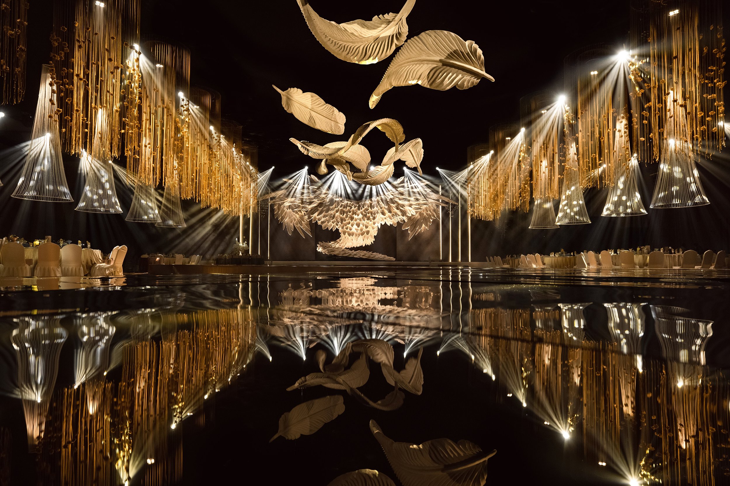
Introducing "Feather Dancing," a unique creation by Destiny Wedding Planner that goes beyond the traditional wedding venue. This innovative design features a 30-meter-wide runway and suspended art installations, transforming the space into a dreamlike experience. The ceiling acts as an infinite canvas, enhancing the grandeur of the venue and sparking curiosity with its unique features. The installation creates a feeling of weightlessness, drawing the eye upward and filling the environment with a magnificent serenity. The design of 'Feather Dancing' is not just visually striking; it's emotionally evocative. It seamlessly blends functionality with aesthetics through interlocking volumes and suspended platforms.
Introducing "Feather Dancing," a unique creation by Destiny Wedding Planner that goes beyond the traditional wedding venue. This innovative design features a 30-meter-wide runway and suspended art installations, transforming the space into a dreamlike experience. The ceiling acts as an infinite canvas, enhancing the grandeur of the venue and sparking curiosity with its unique features. The installation creates a feeling of weightlessness, drawing the eye upward and filling the environment with a magnificent serenity.
The design of 'Feather Dancing' is not just visually striking; it's emotionally evocative. It seamlessly blends functionality with aesthetics through interlocking volumes and suspended platforms. These structural elements not only enhance the spatial rhythm but also provide multiple functional layers. The thoughtful use of colours introduces a unique emotional resonance, striking a perfect balance between the formal and the casual. This creates a nuanced atmosphere where warmth and intimacy intertwine, ensuring a comfortable and reassuring experience.
The water ripple motifs in the corridor create a sense of motion and fluidity, giving it a rhythmic and almost musical quality. The overlapping patterns and subtle reflections of light turn the corridor into a poetic passage, adding quiet elegance and minimalist beauty to the space. Angelic wings delicately spread across the ceiling blend seamlessly with light and shadow, infusing the design with vitality that seems to pulse with life. The contrast of textures, soft to the touch yet visually striking, creates an atmospheric environment reminiscent of moonlight gently bathing the surroundings in a serene glow.
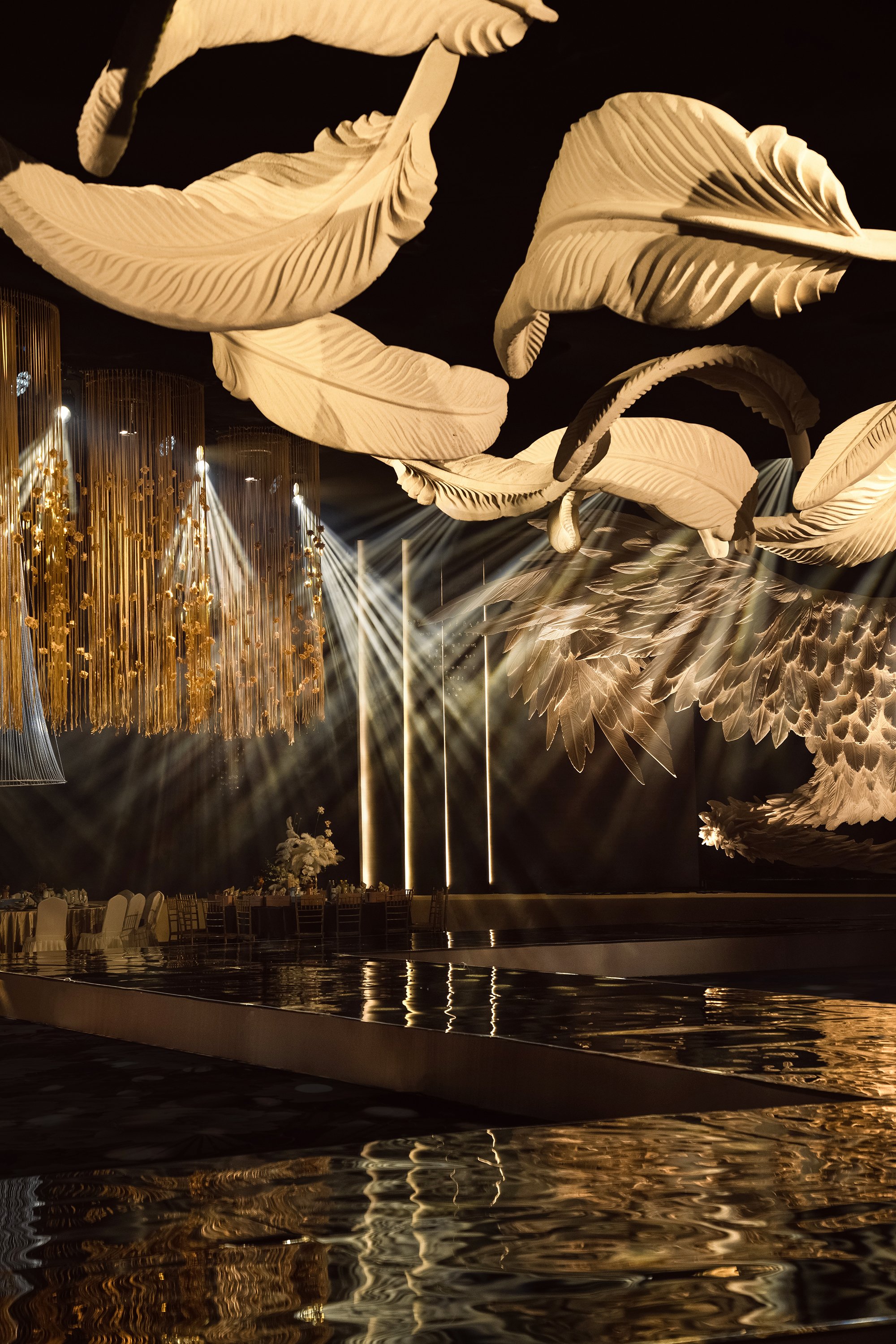

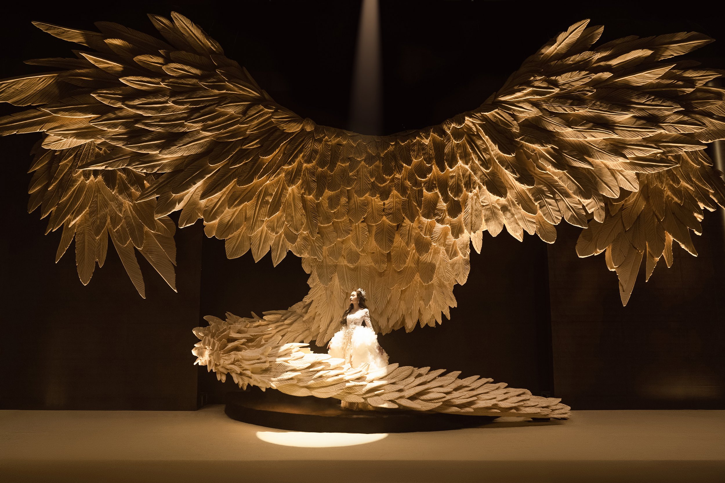
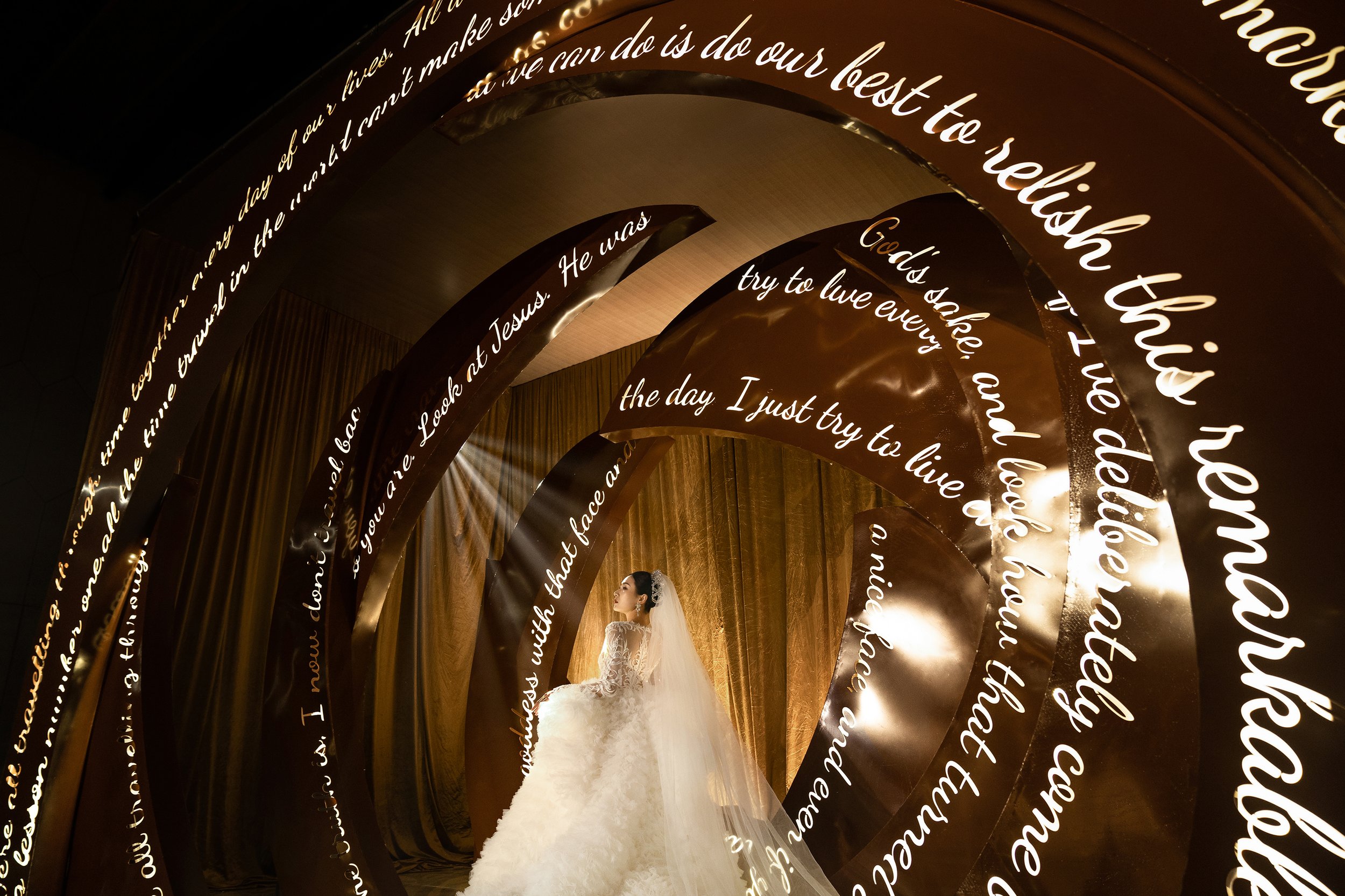
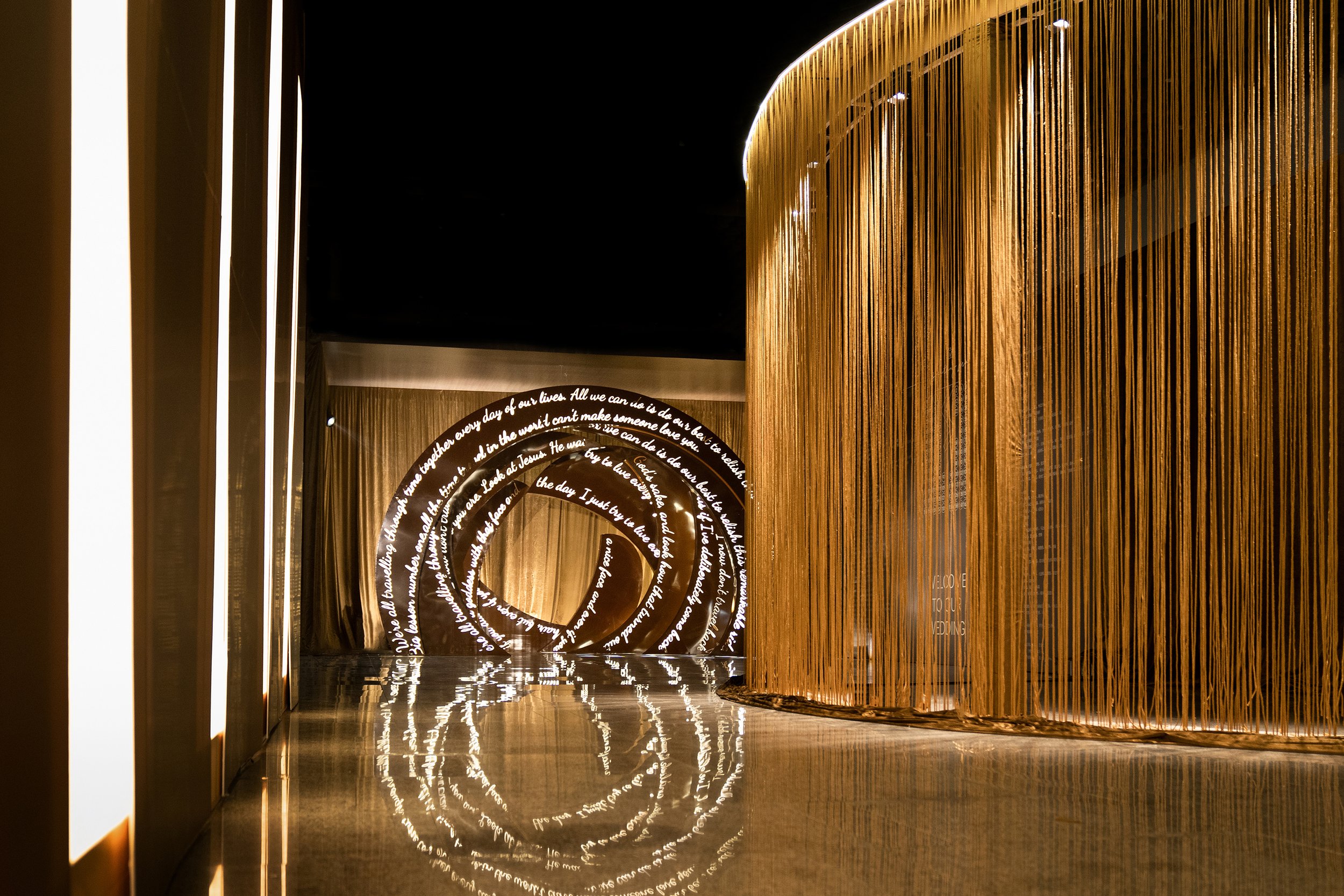
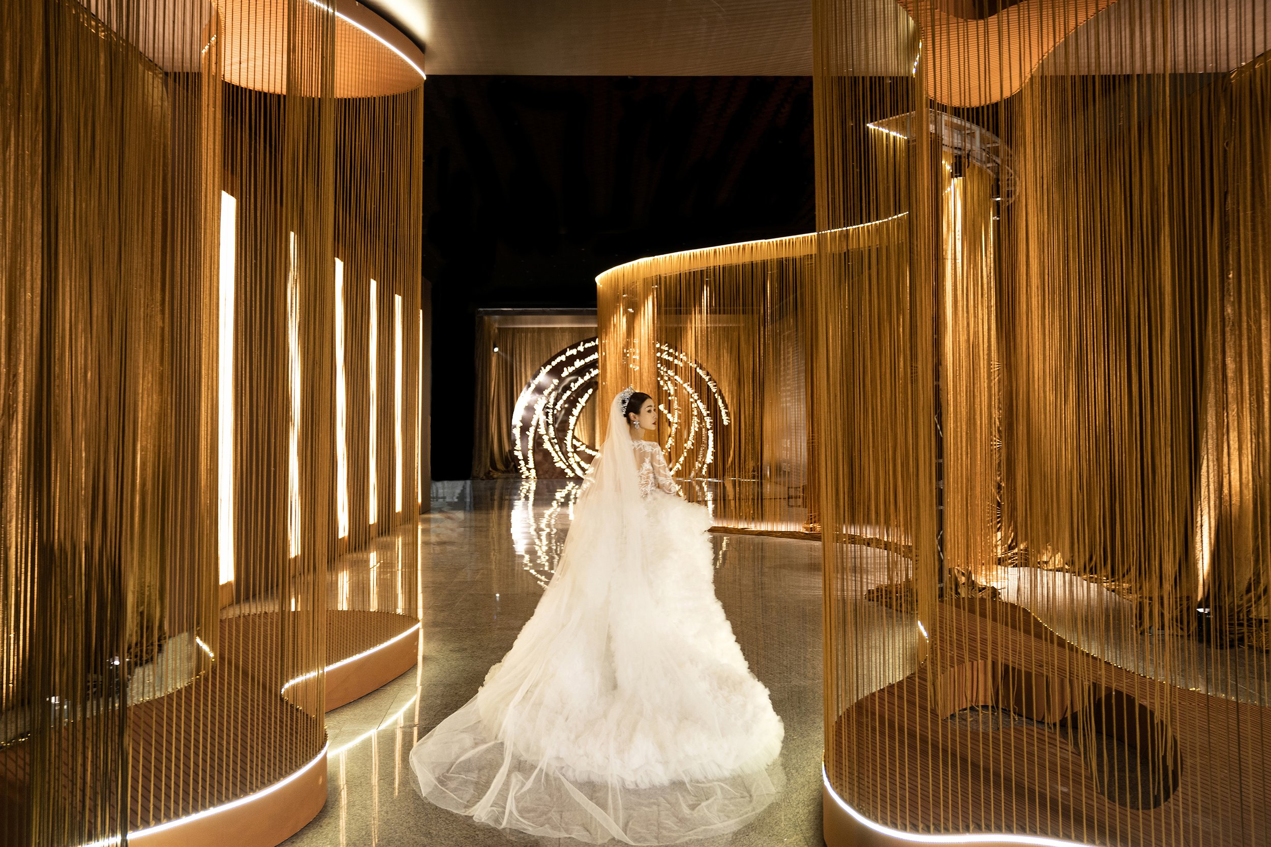
The dynamic interaction of form and function further enhances the spatial experience. The venue is more than just a wedding space; it's an environment that adapts to its occupants, regulating the ambiance like a carefully crafted symphony. The seamless blending of nature and artifice invites guests to linger, with soft, warm light falling like delicate brushstrokes across the scene, painting a picture of serenity and intimacy. In this harmonious space, the details of daily life take on new significance, infused with meaning and purpose. This balance between form and function is not just reassuring; it's confidence-inspiring.
The essence of Feather Dancing transcends mere visual appeal; it is deeply rooted in ecological principles and redefines the traditional concept of a wedding space. By addressing the limitations of conventional layouts, the design allows freedom, love, and joy to flow freely. The result is a modern and spiritually rich celebration of life, love, and art, where culture and emotion are intricately intertwined. Here, art stimulates the soul, and human connection energy is honored, creating an atmosphere where time seems to stand still, embracing the present moment. This transformative impact of the design is not just inspiring; it's intriguing.
In this reimagined space, life and design merge as a vibrant expression of shared existence, where love, art, and modernity unite in a sole, breathtaking instance. Feather Dancing is a testament to design's transformative impact – creating a haven where memories are made, emotions are deeply experienced, and the beauty of life is illuminated.
For more information, please visit: https://weibo.com/1216500490/M6Vxyl933
*This project is one of the shortlisted project in the Sky Design Awards 2024 - Interior Design: “Others”a Division
LI City Library: A Reimagined Urban Cultural Hub in Tianmu Lake Resort
Liyang City's LI City Library, located in the Tianmu Lake Resort, showcases the transformative power of thoughtful design. Originally designed as an office building, the structure underwent a significant transformation, driven by the local government's vision to integrate dynamic social functions into the urban landscape. Today, the library not only provides a 24-hour accessible space for citizens and tourists to engage with literature but also functions as a shared cultural hub that enriches the community. The renovation, skillfully carried out by Greater Dog Architects, redefines the building's purpose, striking a perfect balance between modern functionality and cultural significance, and preserving its architectural integrity in a way that resonates with the community.
Liyang City's LI City Library, located in the Tianmu Lake Resort, showcases the transformative power of thoughtful design. Originally designed as an office building, the structure underwent a significant transformation, driven by the local government's vision to integrate dynamic social functions into the urban landscape. Today, the library not only provides a 24-hour accessible space for citizens and tourists to engage with literature but also functions as a shared cultural hub that enriches the community. The renovation, skillfully carried out by Greater Dog Architects, redefines the building's purpose, striking a perfect balance between modern functionality and cultural significance, and preserving its architectural integrity in a way that resonates with the community.
Architectural Reuse: Embracing and Evolving the Existing Framework
The building, which has three above-ground floors and one underground level, features a durable frame structure effectively repurposed to meet modern needs. More excellent Dog Architects utilized a strategy focused on reusing the building while redefining its spatial design. This approach not only preserved the building's historical significance but also reduced the project's environmental impact by minimizing the need for new construction materials. Removing the exterior walls and exposing the original beams and columns established a conversation between the old and the new. The addition of setback circular structural beams along the main facade transforms the building's exterior and reshapes the interior floor slabs, creating a seamless combination of preservation and innovation. This approach extends to the semi-outdoor entrance, set back from the main structure, where a deliberately extended circular traffic flow provides a peaceful buffer from the busy street outside.
Sustainability: Infusing the Building with Natural Light and Texture
The renovation focuses on bringing in natural light to open up the previously enclosed spaces. The frameless inner curved glass complements the strong frame structure, gracefully accentuating the building's architectural lines. The use of gray wooden tiles, meticulously re-dyed and pressed from recycled wood, gives the library a natural, tactile quality that harmonizes with its surroundings. A spiral staircase within a cylindrical space connects the main areas on each floor, optimizing the light flow and creating multiple links between the interior and the external environment.


Renewal: Enhancing Functionality for a New Era
The renovation of the LI City Library was not just about improving its appearance, but also about ensuring its readiness for a new era. The HVAC system from the early 1990s was upgraded to meet modern standards, and changes were made to the fire escape routes, lighting systems, and seismic capacity. The building's structure was reinforced to ensure its readiness for its new purpose. As a result, the renovated LI City Library, designed by Greater Dog Architects, is a modern and visually appealing structure that fits well with its urban surroundings and the natural beauty of the Tianmu Lake area. It now serves as a vibrant public space, meeting the community's needs for cultural engagement while preserving its historical significance. The renovation has given the library a fresh, dynamic identity that will ensure its relevance and vitality for years.
Project Information
Client: Jiangsu Tianmu Lake Holding Group Co., Ltd. Architecture and Interior Design: Greater Dog Architects Collaborator: Shanghai Urban Architectural Design Co., Ltd. Principal Architects: Jin XIN, Zhihong HU
Design Team: Manyan He, Keith Guo, Longlin Gong, Huge Shen, Alex Wu, Ella Tang, Vincent Wang
Structural Design: Shanghai Yijing Architectural Design Co., Ltd. Project Photography: Metaviz Studio
Project Address: No.375, Yingbin Avenue, Tianmu Lake Town, Liyang City, Jiangsu Prov- ince
Building Area: 2387 m2
Year Began: 2021
Completion: June, 2023
For more information, please visit: www.greater-dog.com
*This project is one of the shortlisted project in the Sky Design Awards 2024 -Architecture Division


