Earthboat V1: The Nomadic Timber Retreat Reviving Japan’s Forgotten Leisure Landscapes
In the foothills of rural Japan, PAN- PROJECTS quietly redefines the architecture of impermanence. Their latest prototype, Earthboat V1, is a mobile timber retreat built entirely from Cross-Laminated Timber — designed not to claim land, but to touch it lightly and move on. Equal parts shelter and statement, the 20.5m² cabin revives forgotten leisure sites with Scandinavian clarity and Japanese restraint. Featuring a sauna, modular interiors, and zero foundations, the Earthboat is less about escape than encounter — a new, slower ritual of living with nature.
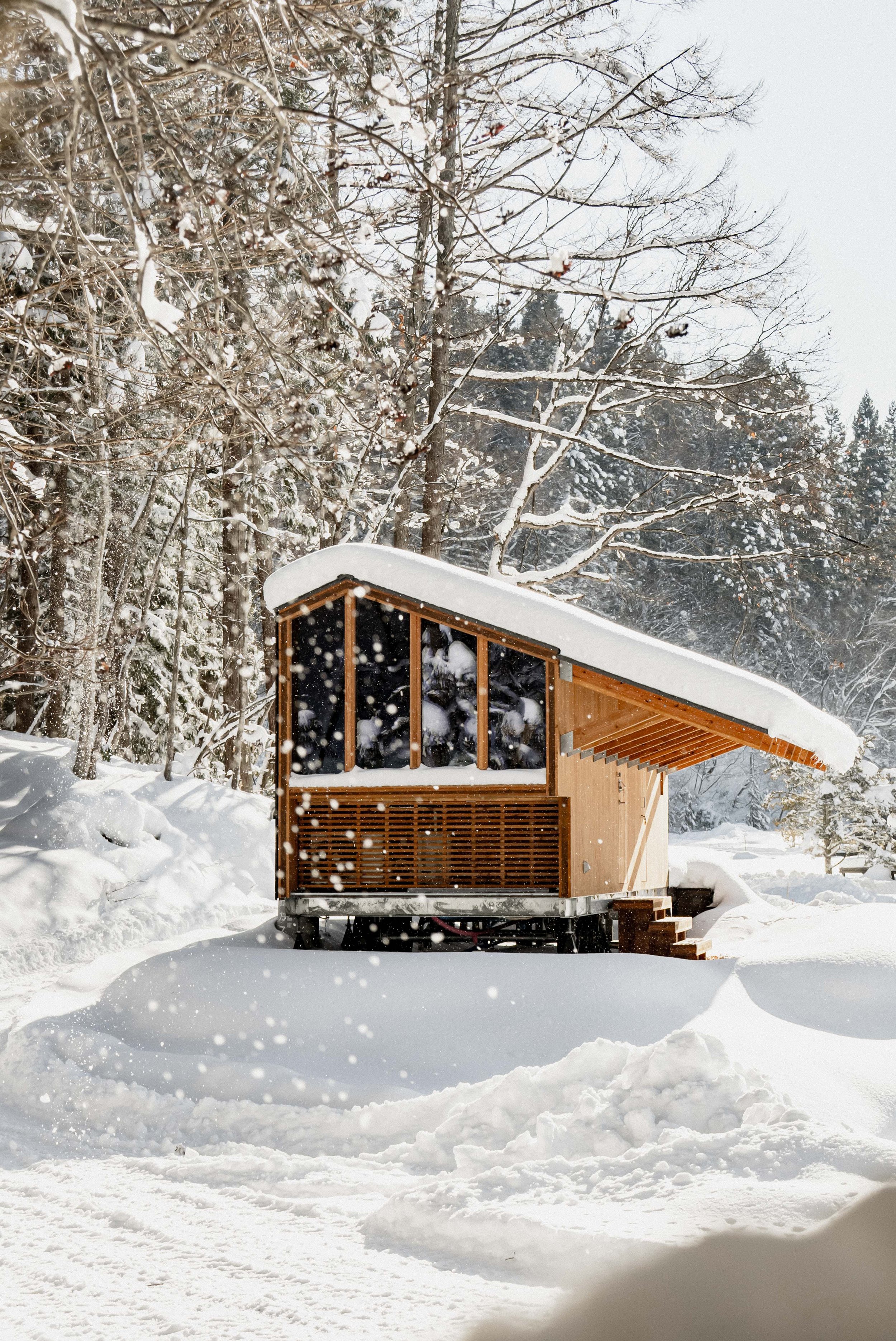
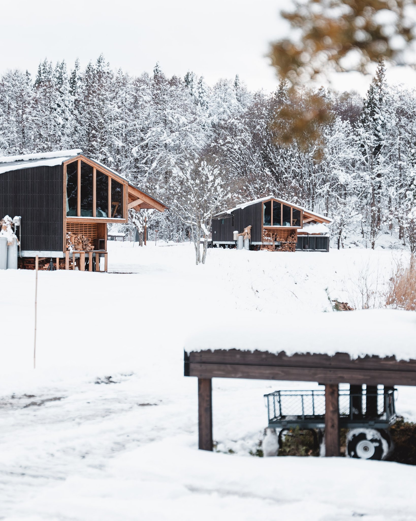
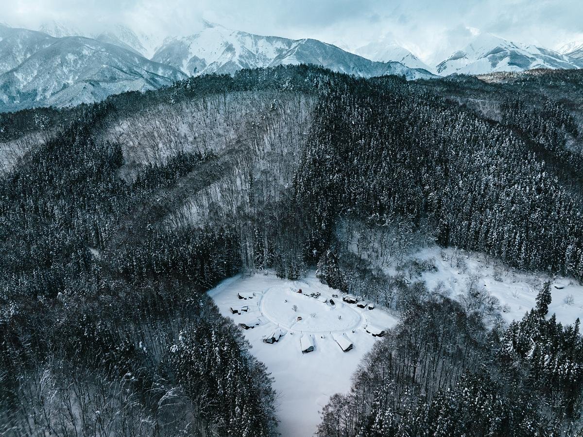
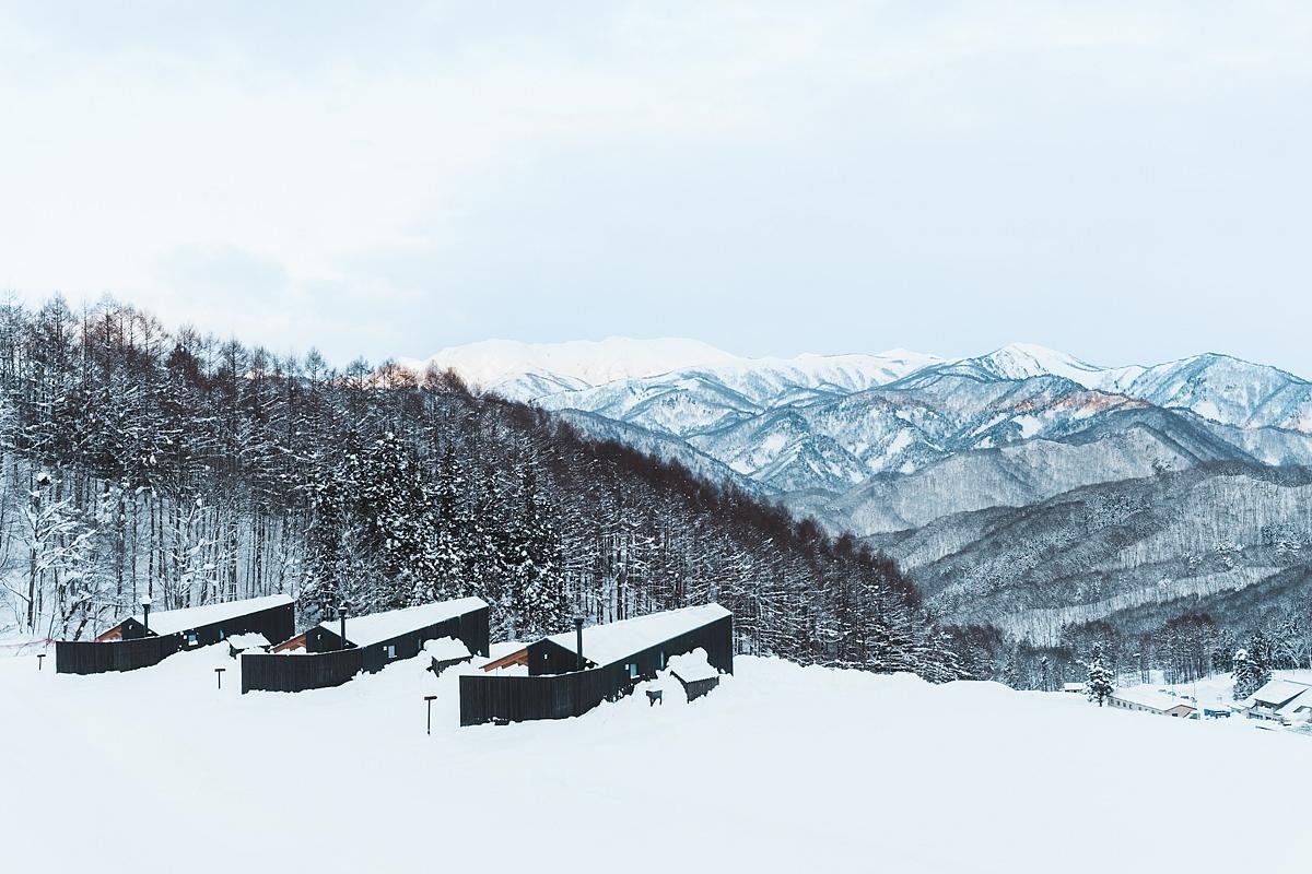
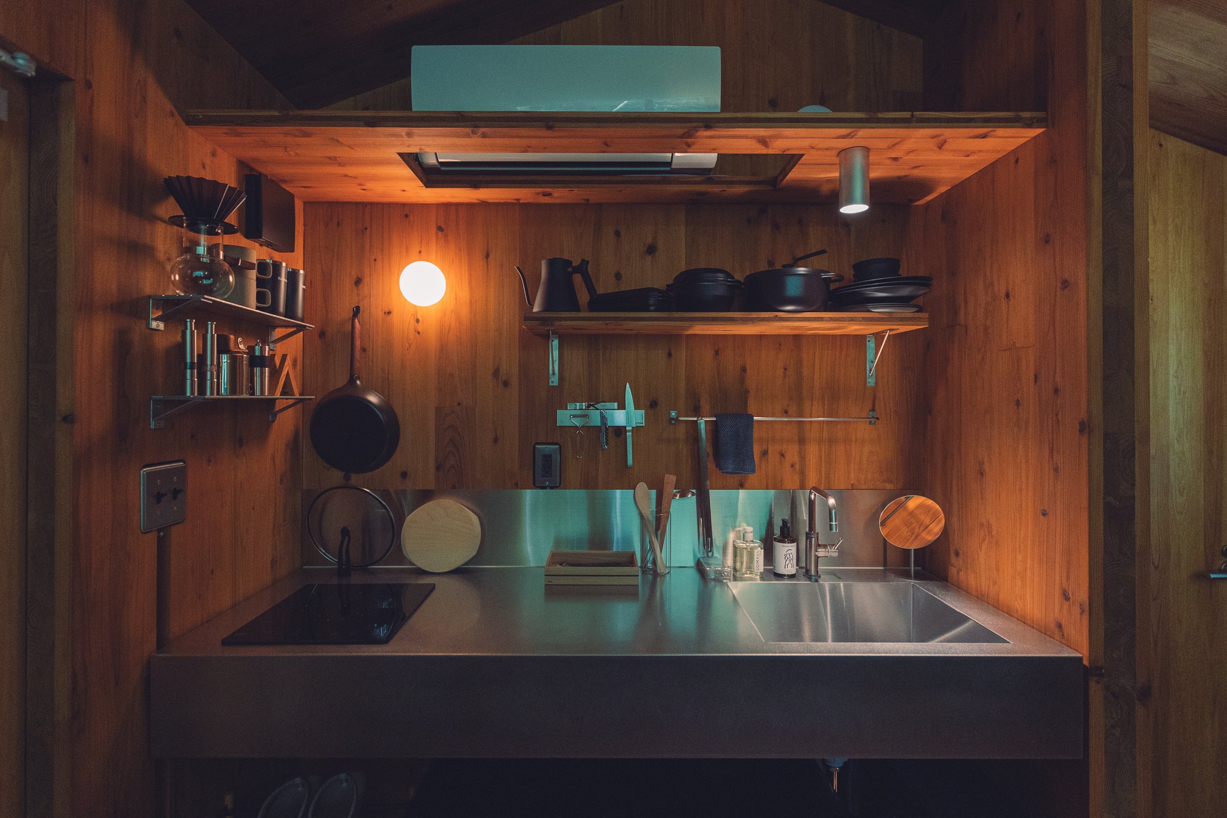

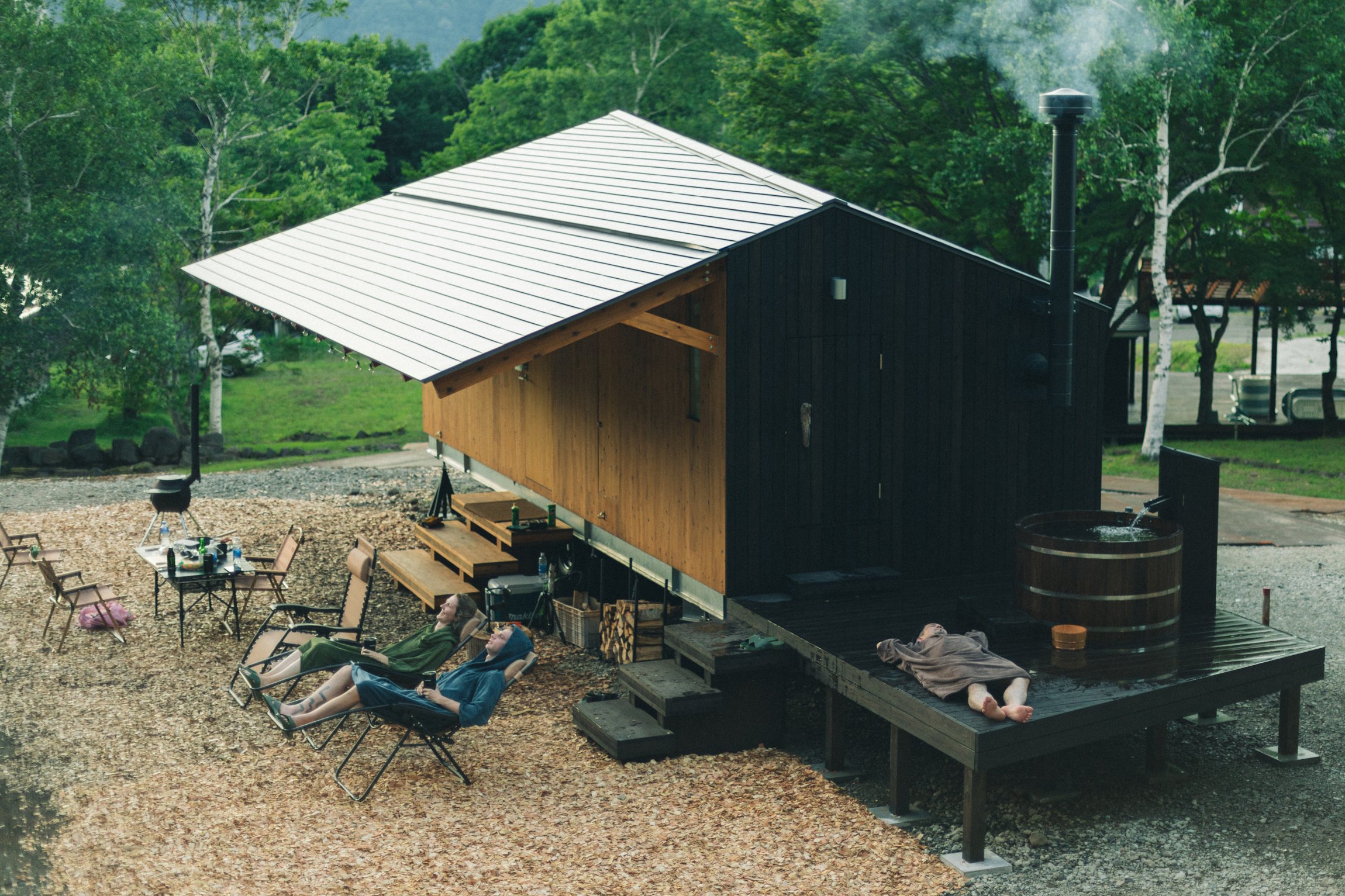
In a serene corner of rural Japan, a remarkable transformation is unfolding—one that reimagines our relationship with space, nature, and the forgotten realms of post-bubble leisure culture. PAN-PROJECTS, a design studio based in London and Tokyo, celebrated for its elegantly restrained interventions and architectural diplomacy, is at the forefront of this movement. Their latest endeavour, Earthboat V1, is a powerful prototype: a compact, mobile cabin crafted entirely from Cross-Laminated Timber (CLT), designed to “float” gracefully above the land it embraces.
The Earthboat transcends nostalgia for countryside glamping; it embodies a thoughtful act of architectural reclamation. Once, Japan’s economic boom filled the countryside with leisure attractions like golf resorts, ski fields, and fishing ponds. Today, many of these sites lie dormant, echoes of a hopeful past. Earthboat V1 gently interacts with these spaces with its humble 20.5 square meter footprint. It eschews traditional foundations, resting lightly on the terrain, preserving the landscape while inviting a refreshing temporary habitation.
At first glance, the cabin's silhouette is strikingly modernist—a beautifully balanced architectural haiku in timber. A refined yet functional layout features a sauna, modular storage, and panoramic views that dissolve the boundaries between the indoor and outdoor worlds. The prefabricated design enhances assembly and ensures the unit can be relocated, minimizing environmental impact and adapting to evolving needs or seasonal contexts.
The concept remains dynamic, with around sixty Earthboat units now distributed across seven sites in Japan. This architecture moves—responsive to the land, memories, and utility. Each deployment signifies an act of regeneration—a fleeting reanimation of neglected spaces, sidestepping conventional development's permanence (and often abandonment).
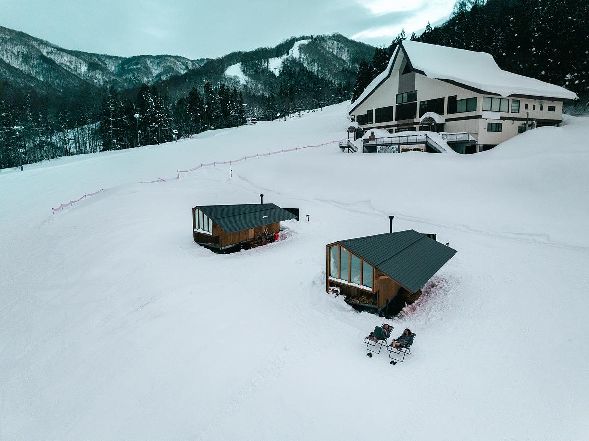
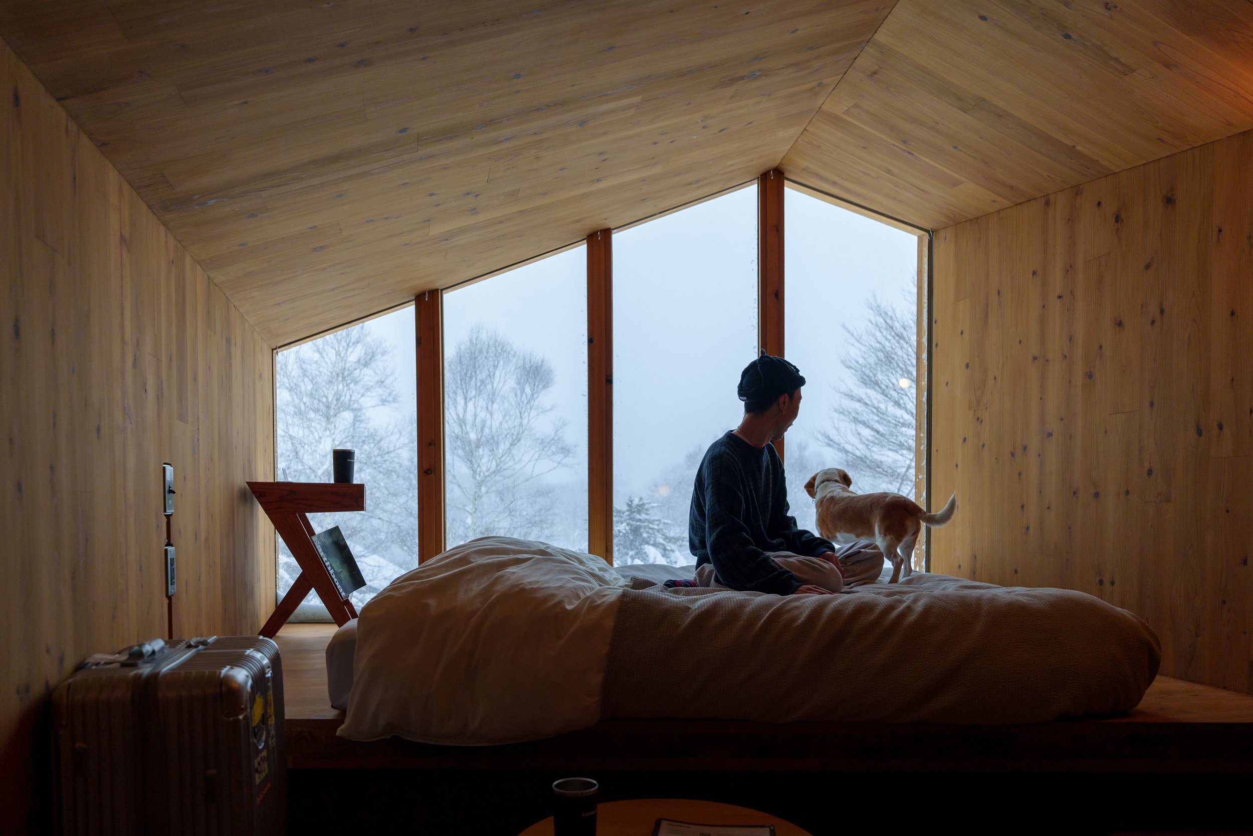
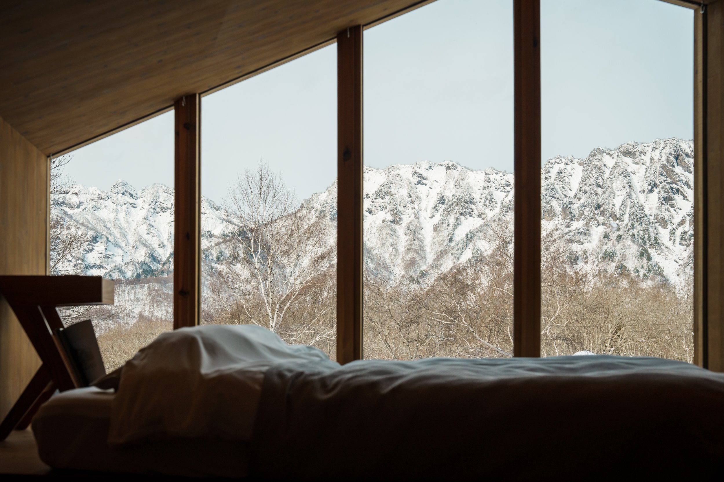
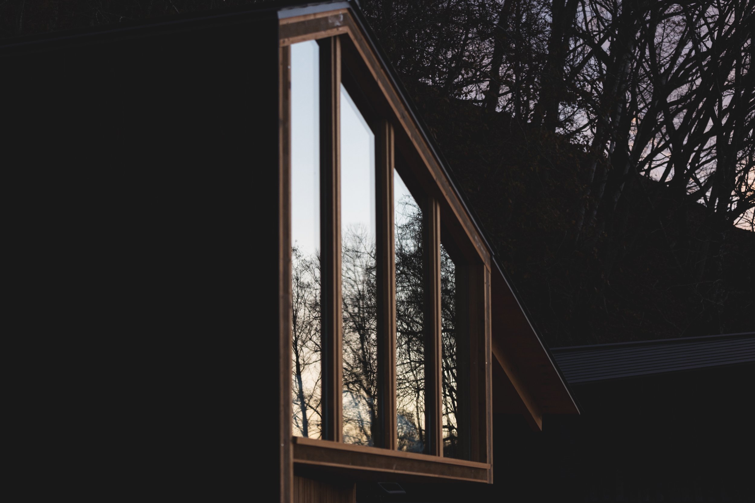
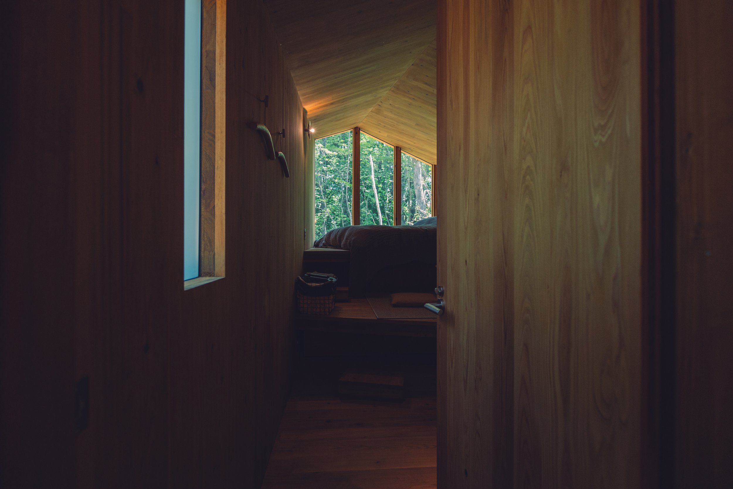
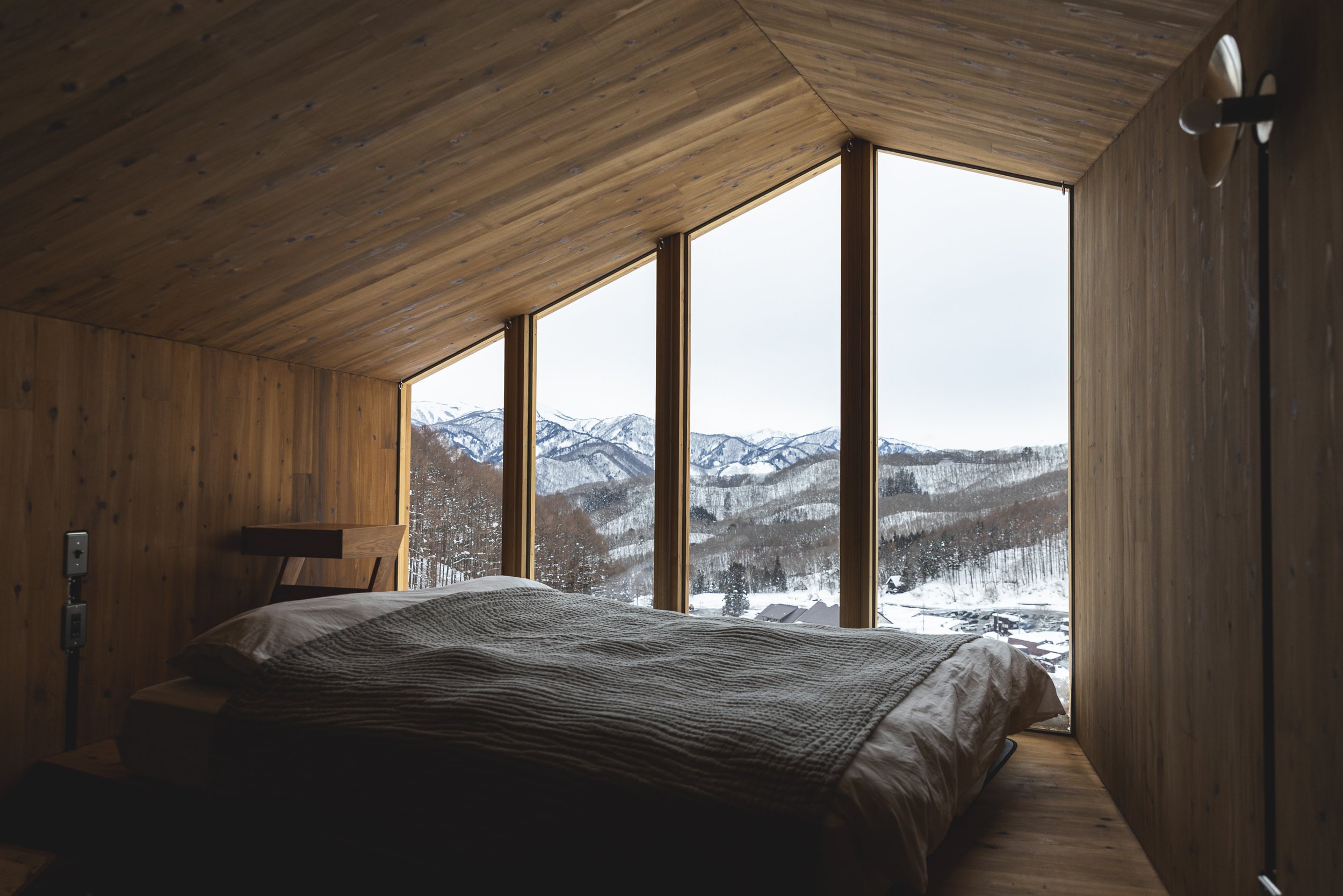

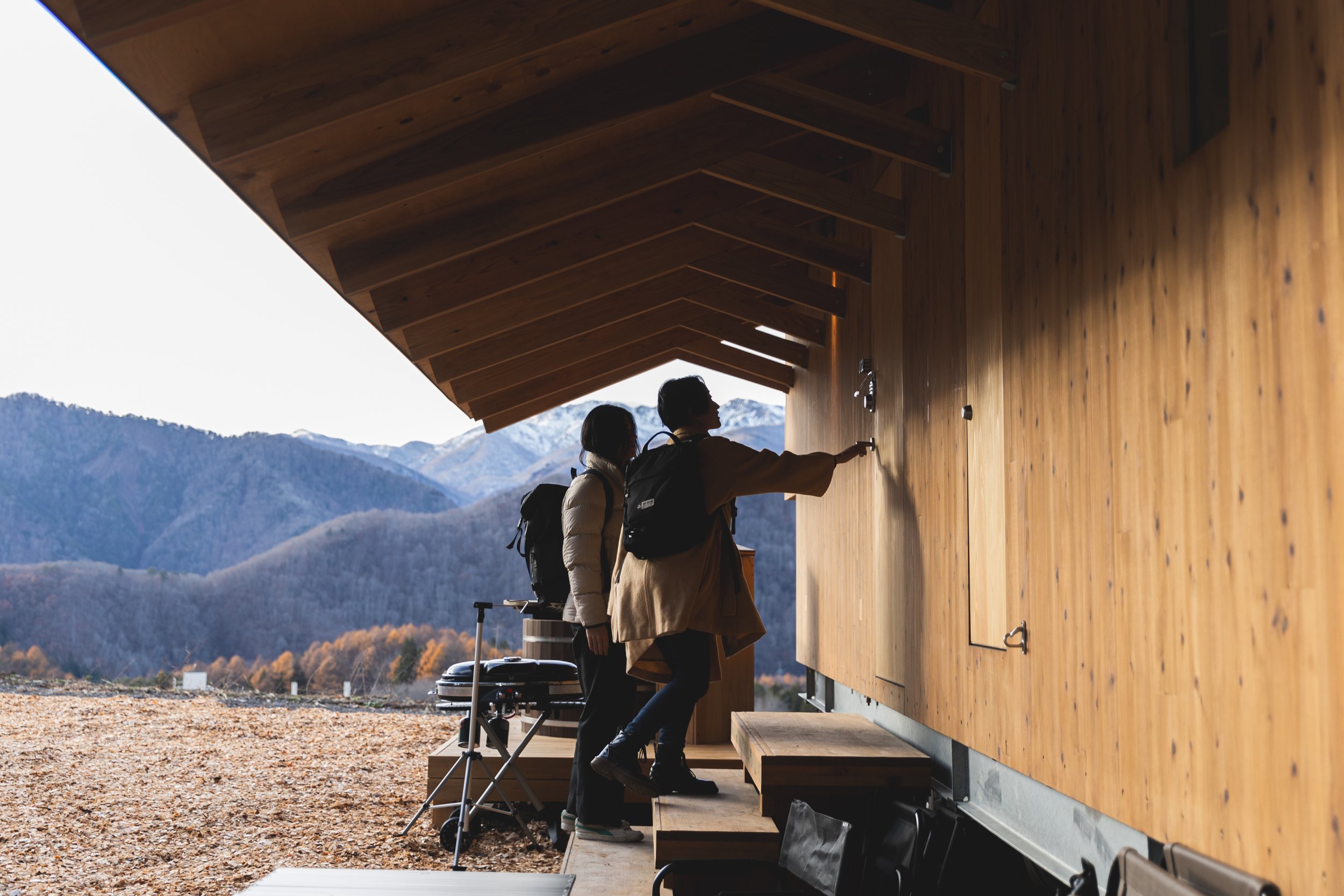
The true innovation lies in its material intelligence. In a culture where CLT tends to be reserved for larger structures, Earthboat V1 recalibrates this scale, marrying high-performance, sustainable timber technology with a human-centred, emotionally resonant format—a quiet revolution in Japanese architecture.
As both a retreat and a powerful idea, Earthboat V1 exemplifies the pinnacle of hospitality architecture: providing shelter and offering a new lens through which to experience a place. It invites us to explore how to inhabit the in-between—not as owners or consumers but as thoughtful stewards of space and time.
ABOUT PAN_PROJECTS
PAN- PROJECTS is a London-based architectural design studio co-founded in 2017 by Japanese architects Yuriko Yagi and Kazumasa Takada. The studio engages in architecture, interior, installation, product, and exhibition design through multidisciplinary collaborations.
Founding Partners:
Yuriko Yagi, M.Arch, Arkitekt MAA: Yagi earned her Bachelor and Master of Architecture Design degrees from Kyoto Institute of Technology in 2014 and 2017, respectively.
Kazumasa Takada, M.Arch, ARB/RIBA: Takada completed his Bachelor of Architecture at Waseda University in 2015 and obtained a Master of Arts in Architecture from The Royal Danish Academy of Fine Arts in 2017.
Left: Yuriko Yagi
Co-founder, PAN- PROJECTS | Arkitekt MAA
Right: Kazumasa Takada
Co-founder, PAN- PROJECTS | Architect ARB/RIBA
PAN- PROJECTS has been recognized in the architectural community, including being longlisted for the Emerging Architecture Studio of the Year and Large Retail Interior Design categories at the 2021 Dezeen Awards.
Website: https://pan-projects.com
Studio Cinema: Redefining Cinematic Design in Macau
Studio City Phase 2 in Macau offers more than just a cinematic experience; it introduces a new design language where technology, materials, and spatial storytelling come together. Designed by OFT Interior under the creative direction of CM Jao and Ken Cheung, this ambitious project also includes contributions from Japanese lighting designer Koichi Tanaka and Lightlinks International. It masterfully merges form, function, and innovation. Each element of the space engages the senses, creating an environment that blurs the boundaries between architecture and performance.


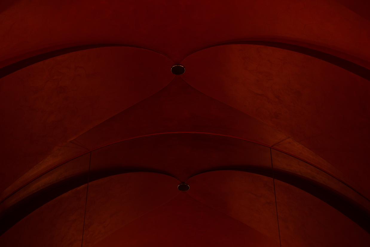


Studio City Phase 2 in Macau offers more than just a cinematic experience; it introduces a new design language where technology, materials, and spatial storytelling come together. Designed by OFT Interior under the creative direction of CM Jao and Ken Cheung, this ambitious project also includes contributions from Japanese lighting designer Koichi Tanaka and Lightlinks International. It masterfully merges form, function, and innovation. Each element of the spaceengages the senses, creating an environment that blurs the boundaries between architecture and performance.
A Dramatic Entrance: Setting the Stage
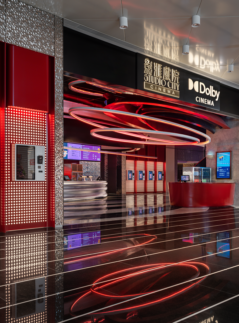
The journey begins in the entrance lobby, which resembles a visual symphony of textures and materials. The glass curtain wall features a white gradient film sticker that softens the exterior light while still allowing for visibility. Behind this, the lighting interacts with the gradient glass to create a theatrical ambiance. Stainless steel curves define the ticket counter and the metallic-painted feature counters, complemented by a ripple stainless steel wall and fluted wall tiles for added texture. Above, a metallic-painted curved ceiling integrates concealed lighting troughs, while the stone flooring provides a sense of permanence that anchors the space. Motion graphic LED screens introduce kinetic energy, instantly immersing visitors in the cinematic experience.
Architectural Lighting and Spatial Drama
The design creatively utilizes light and shadow to evoke a theatrical stage, fostering audience engagement. Milky acrylic panels with concealed lighting highlight important areas, while reflective surfaces amplify the interaction between light and materials. This combination creates a dynamic and vibrant environment, setting the stage for an immersive experience.


IMAX and Auditorium Features: Precision and Atmosphere
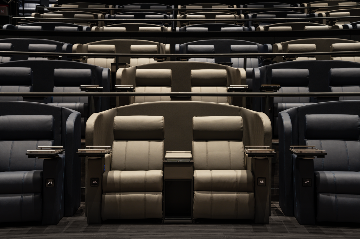
Inside the IMAX theater, the space is defined by blue fabric wall features and a black acoustic ceiling with LED lighting. Concealed LED lighting enhances the visual drama, while black wood vinyl stair walls and handrails provide a striking contrast. Grey-toned carpets soften the atmosphere, ensuring both acoustic excellence and comfort.
Each house in the cinema is designed for a unique experience:
- House 2 (Reclining):** Features purple and mud-yellow fabric walls combined with concealed LED lighting and a black acoustic ceiling. The warm, muted tones create a balance of luxury and coziness.
- 4DX House:** Showcases red and navy fabric walls that contrast with concealed LED lighting. The addition of black wood vinyl stair walls and grey-tone carpets maintains consistency in the overall aesthetic while ensuring functional comfort.
Typical Houses:** Have grey and blue fabric walls paired with concealed LED lighting, creating a subdued yet sophisticated ambiance. The black acoustic ceiling and wood vinyl wall coverings emphasize the architectural precision.
The Director’s Club: Exclusive Luxury
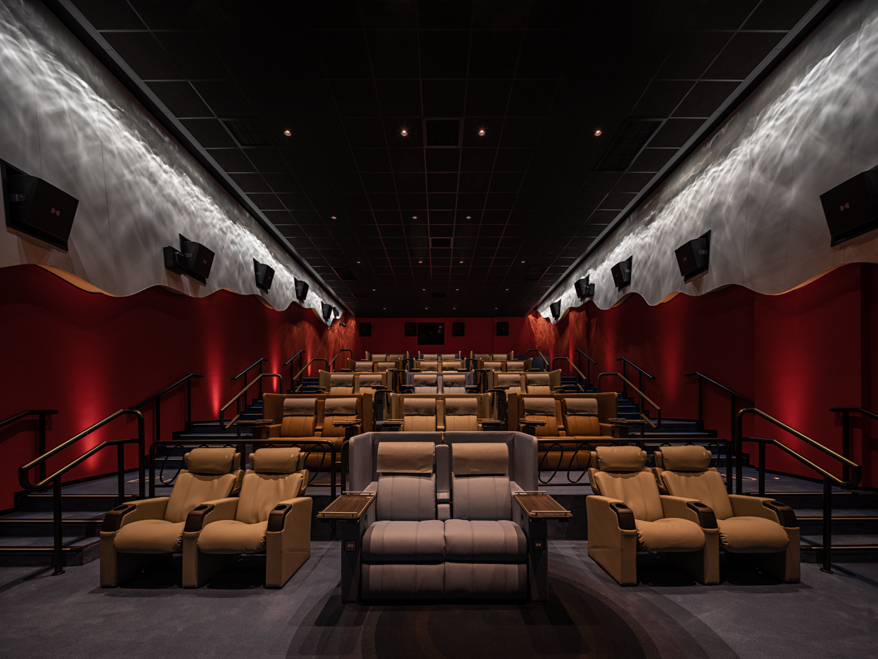
The Director’s Club, which includes Houses 5 and 6, elevates the cinematic experience to a whole new level. House 5 showcases iridescent fabric curved walls with a water wave lighting effect, blending shades of blue and green fabric with highlights of orange and red. Concealed LED lighting enhances the curvature of the walls, creating a fluid, organic feel. In House 6, the green fabric curved walls continue the water wave motif, complemented by beige and grey fabric accents. Both houses feature recessed floor lighting and advanced acoustic treatments, ensuring an exclusive and intimate atmosphere.


Dynamic Corridors and Lounge Spaces
The corridors connecting the theaters are designed as transitional spaces that enhance the cinematic experience. Cove lighting follows the architectural curves, while reflective materials enhance the visual rhythm. The Director’s Club Lounge offers a sophisticated yet welcoming atmosphere, featuring high tables and integrated 55-inch TV lightboxes, providing an ideal space for socializing before or after a film.
The Cinematic Future
Studio City Cinema is more than just a venue for watching films; it is a space where every material, light, and texture contributes to its narrative. Each element, from the rippling stainless-steel walls to the iridescent fabric panels, invites exploration and engagement. By combining cutting-edge technology with innovative design, OFT Interior has created an environment that redefines cinematic architecture, providing audiences with an experience that goes far beyond the screen. Studio City Cinema is not merely a building; it is a performance in its own right—a landmark of design excellence in Macau.
For more information, please visit: https://www.oftinteriors.com
Biu Lam - The portrait of time.
BL redefines traditional eyewear design, transforming glasses into unique pieces of art that capture the essence of our time. By fusing graphic artistry with the vibrant contrasts of Pop Art, our designs transcend mere materials and forms, celebrating creativity through a precise spray-painting technique that surpasses traditional silk-screen printing. Each element is meticulously crafted with sustainability in mind: our eyewear cases are crafted from recycled Dupont materials, and our aluminum time capsule packaging pays homage to the pioneering spirit of space exploration. These design choices embody a philosophy of preserving wisdom and beauty in a digital world, offering a unique and timeless memento of life's fleeting moments.
BL redefines traditional eyewear design, transforming glasses into unique pieces of art that capture the essence of our time. By fusing graphic artistry with the vibrant contrasts of Pop Art, our designs transcend mere materials and forms, celebrating creativity through a precise spray-painting technique that surpasses traditional silk-screen printing. Each element is meticulously crafted with sustainability in mind: our eyewear cases are crafted from recycled Dupont materials, and our aluminum time capsule packaging pays homage to the pioneering spirit of space exploration. These design choices embody a philosophy of preserving wisdom and beauty in a digital world, offering a unique and timeless memento of life's fleeting moments.
Design Philosophy: Crafting Future Antiques
At BL, we believe that great design is a form of self-expression. Our eyewear is not just a functional accessory but a way for wearers to showcase their individuality and personal style. Each piece seamlessly blends functionality with aesthetic brilliance, inviting wearers to embrace their uniqueness while reflecting on their journeys. Over time, our designs develop unique patinas of history, evolving with their owners to become intimate works of art. With BL, your eyewear transcends being just an accessory; it becomes an expression of your life story.
Inspired by the bold spirit of Pop Art, **BiuLam | The Portrait of Time: Fig (ii) 1940 1009** captures fleeting moments in a timeless, tactile masterpiece. This unique creation combines advanced spray-painting techniques with meticulous craftsmanship, resulting in vibrant contrasts that surpass traditional silk-screen printing.
Drawing inspiration from James Rosenquist's iconic **F-111** (1964), the design process exemplifies a perfect fusion of artistry and precision. A flat illustration is spray-painted onto a stainless steel sheet, then sandwiched between two acetate sheets and secured within a carefully crafted mould. Once encased in an acid fibre cover and solidified, the stainless steel sheet undergoes precise CNC cutting to achieve its final shape.
The result is more than just a product—it is a sculptural narrative in which design, materials, and technique combine to preserve the transient beauty of the present in an enduring, wearable piece of art.
Aesthetics: Where Art Meets Structure
BL's eyewear combines classic designs with modern innovation, resulting in timeless elegance. Each pair features stainless steel plates adorned with intricate, spray-painted patterns of light and shadow integrated into clear acetate frames. This design achieves a harmonious balance between structure and artistry.
Moreover, BL's commitment to aesthetic excellence extends to our packaging. Our space-age designs, crafted from recycled materials, evoke a sense of cosmic allure while promoting sustainability. The brushed aluminum time capsule packaging protects each pair, with sleek lines and tactile details that reflect the wearer's unique and sophisticated journey.
Functionality: A Window to Self-Discovery
BL sunglasses go beyond mere fashion; they are companions for the modern age, combining functionality with a deep emotional connection. We create pieces that resonate strongly with wearers by merging classic design principles with futuristic technology. The timeless elegance of our designs reflects enduring values, while space-age elements inspire exploration and curiosity. Our time capsule concept adds emotional depth to our creations, reminding wearers to cherish life's fleeting moments. More than just a product, BL sunglasses serve as an evolving companion that enriches the story of your unique identity.
Differentiation: Wearable Art, Emotional Connection
BL glasses are not just eyewear; they are unique wearable works of art that tell individual visual stories. Inspired by Pop Art, the vibrant designs are brought to life using precise spray-painting techniques, adding character and fostering a deeper emotional connection between the product and the wearer. Incorporating space-age influences and eco-friendly materials, along with evocative metal time capsule packaging, BL glasses establish a distinct identity. More than just visually striking, each pair carries memories and emotions, transforming eyewear into a deeply personal artifact that evolves with its owner.
Sustainability: Designing for a Circular Future
Sustainability is at the heart of BL's ethos. BL Eyewear goes beyond fashion by committing to environmental sustainability. BiuLam | The Portrait of Time incorporates eco-friendly principles into every aspect of its design, featuring recycled DuPont eyewear cases and aluminum time capsule packaging. Through careful selection of sustainable materials and optimized production processes, BL has reduced its environmental impact while extending the lifespan of its products, creating pieces that stand the test of time.
The aluminum time capsule packaging is inspired by the iconic aesthetics of the "Space Age," evoking a sense of innovation and exploration. Meanwhile, the eyewear cases, made from DuPont's Tyvek®—100% polyethylene and produced in Japan—are lightweight, durable, and recyclable. This innovative approach demonstrates that style and sustainability can coexist harmoniously, providing consumers with visually appealing and ethically responsible choices. BL Eyewear is a testament to the idea that design can celebrate artistry and the environment.
Living Art: How KT102’s Shadow Windows Redefine Interior Spaces
The KT102 residence, a transformative creation by In Him's Interior Design, redefines the interplay of architectural forms, natural elements, and interior flow. The innovative 'shadow window' concept, a central feature of the project, orchestrates a remarkable synergy between light and space. These shadow windows, with their intentional fluidity, draw natural light into the home and visually frame the outdoor environment, enriching the home's interior narrative. This architectural feature transcends mere lighting; it establishes a rhythmic cadence throughout the residence.
The KT102 residence, a transformative creation by In Him's Interior Design, redefines the interplay of architectural forms, natural elements, and interior flow. The innovative 'shadow window' concept, a central feature of the project, orchestrates a remarkable synergy between light and space. These shadow windows, with their intentional fluidity, draw natural light into the home and visually frame the outdoor environment, enriching the home's interior narrative. This architectural feature transcends mere lighting; it establishes a rhythmic cadence throughout the residence. As sunlight filters through, it crafts an ever-changing display on the walls, effectively turning the home into a canvas where nature itself becomes the artist.
From a design perspective, shadow windows are a dynamic architectural feature that not only invites the outside in but also shapes the resident's experience of time and the changing seasons. As sunlight moves across the sky, it sculpts and transforms the interior spaces, creating evolving shadow patterns that vary in density and texture. This makes each room unique depending on the hour and season. This interplay between architecture and nature is an excellent example of how interior spaces can go beyond mere functionality to become vibrant living environments.
The project's layout emphasizes spatial coherence by dividing areas into distinct functional zones while maintaining an interconnected sense of transparency. This approach to interior planning fosters a feeling of openness and continuity without compromising the purpose of each area. Using frames, shadow windows, and architectural volumes creates a continuous sightline, enhancing the spatial flow and ensuring a cohesive atmosphere across different zones. These thoughtfully designed divisions encourage a journey through the home that feels both private and shared, intimate yet grand.
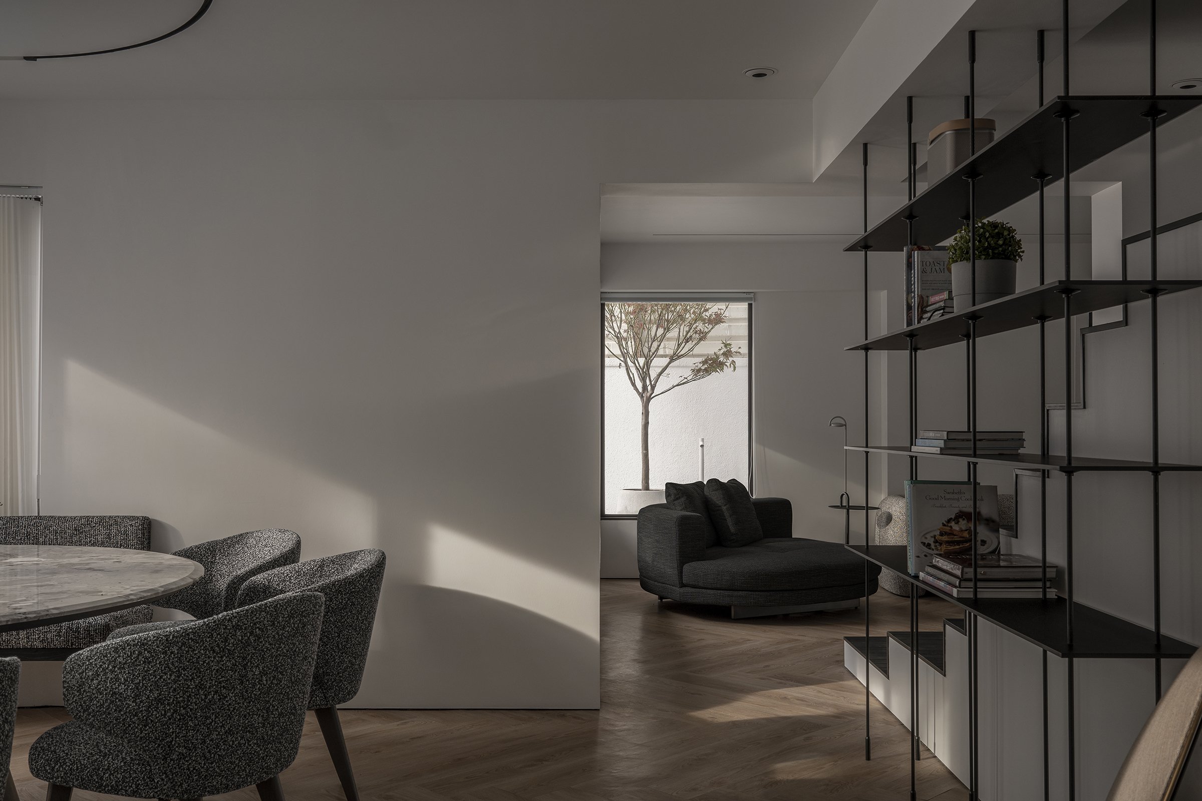
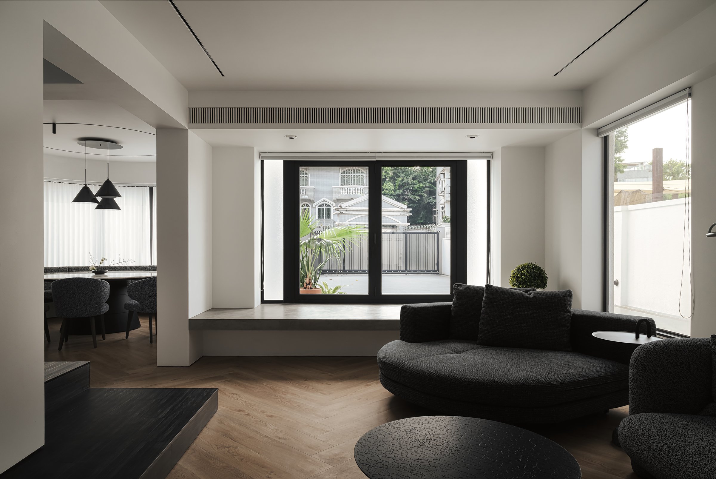

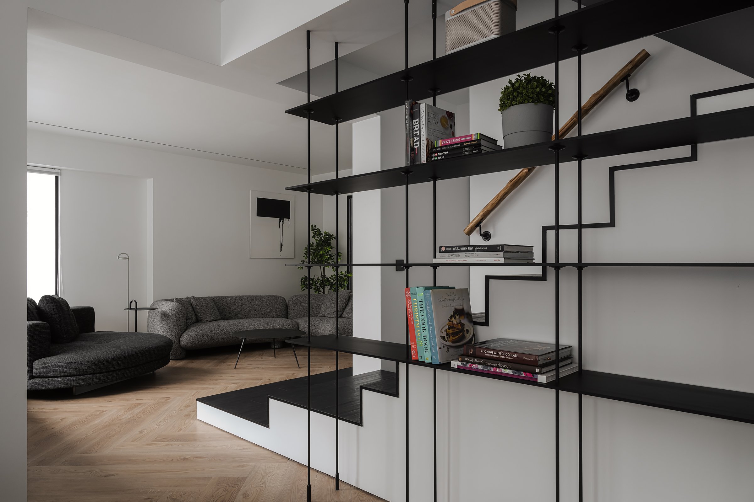

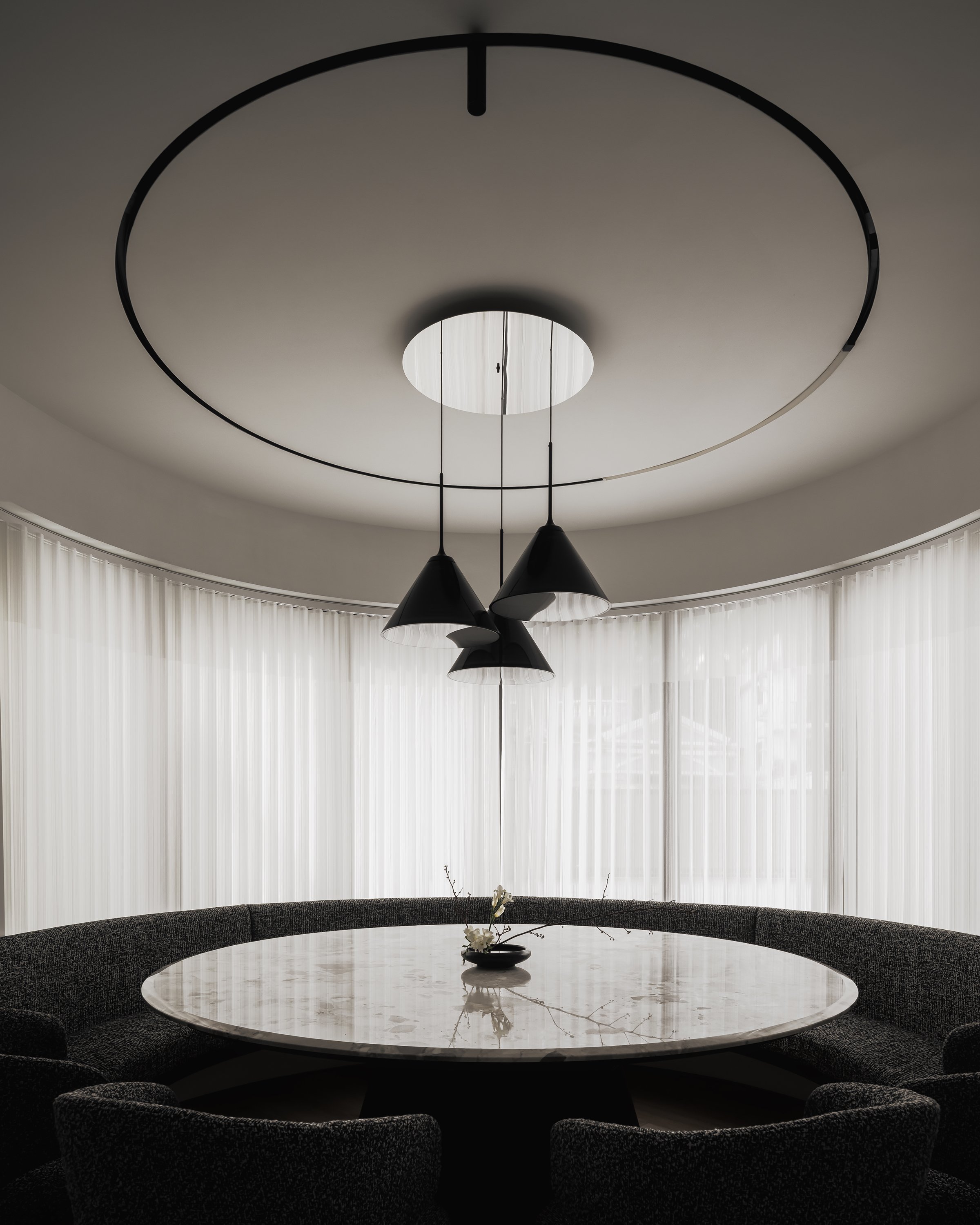
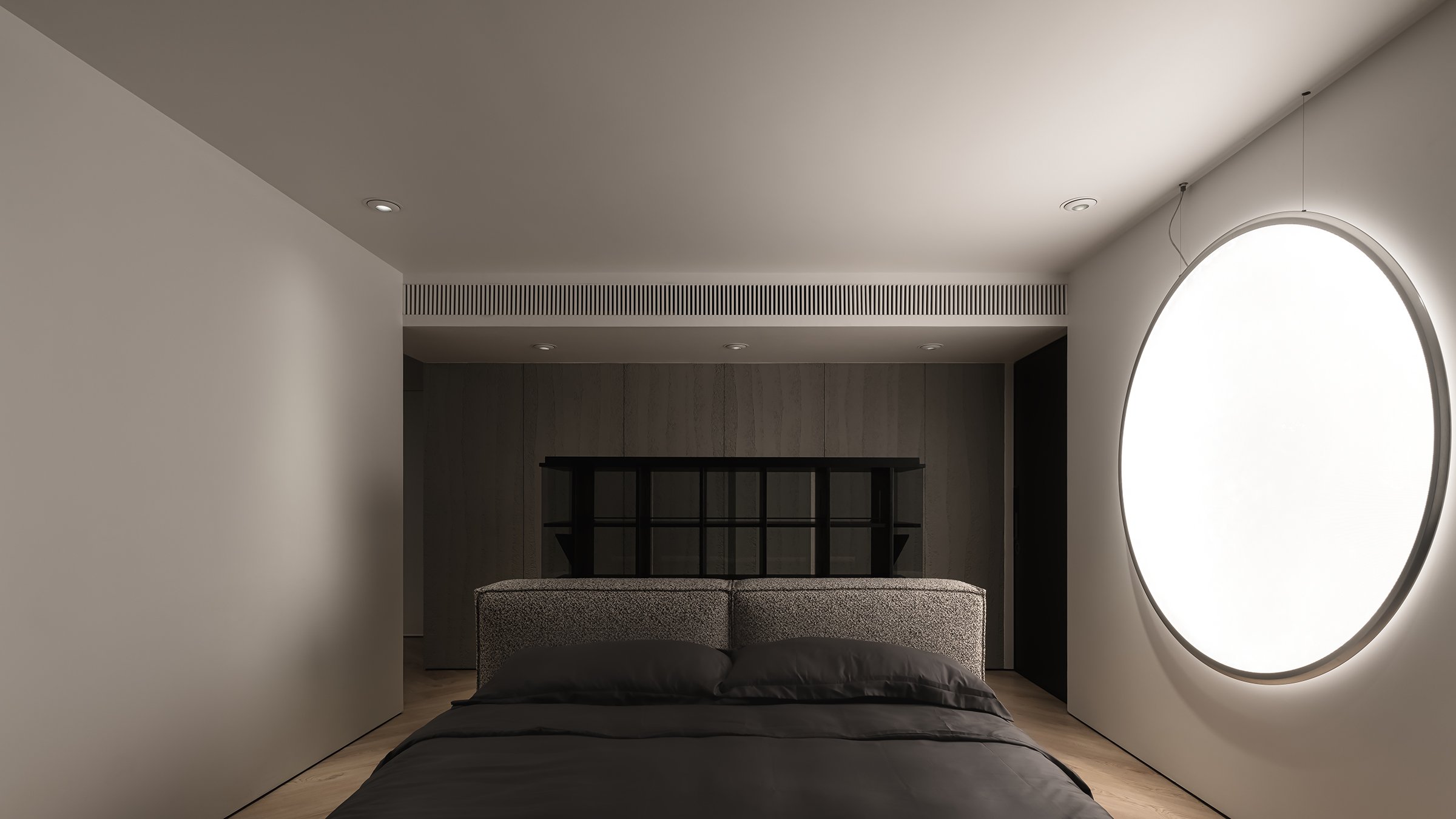
The shadow windows serve as a backdrop for a captivating display of light and shadow, creating a modern interpretation of shadow puppetry. This adds a subtle sense of drama to the space. These design elements harmonize with the surrounding landscape, where the movement of foliage and changing light contributes an ephemeral quality to the interiors. This echoes the Japanese aesthetic of wabi-sabi, which values transience and imperfection. Overall, this design fosters a sense of calm and balance and transforms the residence into a dynamic visual experience that encourages daily exploration.
The design of KT102 is an exemplary demonstration of how interior architecture can utilize natural phenomena to enhance living spaces. It inspires those who aim to create engaging and tranquil environments. This approach reminds us that thoughtful design can be both functional and poetic, encouraging us to look beyond walls and windows to discover the artistic potential in every ray of light and shadow cast.
For more information, please visit:
*This project is one of the shortlisted project in the Sky Design Awards 2024 - Interior Design - Residential
Heritage Reimagined: Shinbashi Tamakiya’s New Era of Tsukudani Tradition
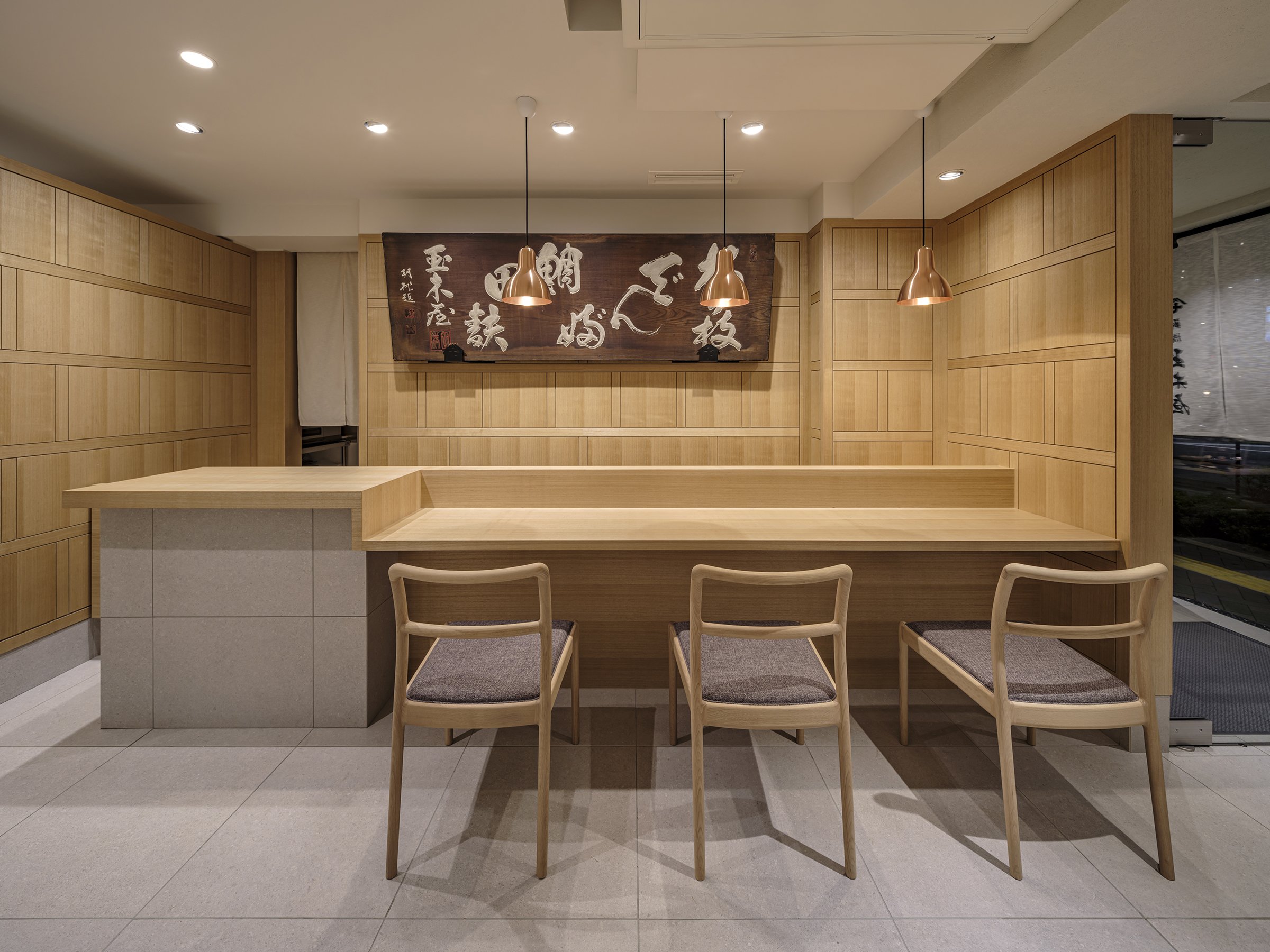
The redesign of Shinbashi Tamakiya's main store by Aioi Design explores the deep cultural significance of tsukudani while incorporating a modern design approach. This update positions the historic brand to appeal to a contemporary and discerning audience. The space features a minimalist yet dignified aesthetic, showcasing modern functionality and a profound respect for heritage. These elements reflect the brand's commitment to preserving traditional Japanese food culture.
The redesign of Shinbashi Tamakiya's main store by Aioi Design explores the deep cultural significance of tsukudani while incorporating a modern design approach. This update positions the historic brand to appeal to a contemporary and discerning audience. The space features a minimalist yet dignified aesthetic, showcasing modern functionality and a profound respect for heritage. These elements reflect the brand's commitment to preserving traditional Japanese food culture.
Design Perspective
Aioi's innovative approach to the redesign of Shinbashi Tamakiya's main store is a departure from traditional tsukudani shop layouts. Instead of the typical dominant counters and brief customer interactions, the design embraces openness. It features strategically placed flat display fixtures that encourage a more dynamic, three-dimensional space exploration. This unique layout allows customers to linger and engage more deeply with Tamakiya's artisanal tsukudani offerings, creating a comfortable and contemplative environment. The store design uses understated materials and a neutral colour palette, invoking a sense of calm and reflecting the simplicity of Japanese aesthetics. This ensures that the store feels serene and uncluttered while drawing attention to the meticulously arranged products.
A notable addition is a dining space within the retail environment, which is an uncommon feature for a Tsukudani specialty store. This area allows customers to sample dishes that highlight tsukudani as a central ingredient, providing a unique opportunity to experience this traditional food's versatility and rich flavors. This "living display" of Japanese culinary heritage transforms the store into a multisensory journey, bridging Tamakiya's historical past with the evolving tastes of today's clientele.




Business and Cultural Value
For a brand like Shinbashi Tamakiya, this redesign reinforces its role as a custodian of cultural tradition. Highlighting tsukudani, a preserved food, is a significant choice—it embodies Japan's values of sustainability, resourcefulness, and reverence for nature. The design aims to introduce this craft to a new generation, serving as a business strategy and a cultural statement. It allows the brand to attract a broader demographic, including younger consumers and international visitors unfamiliar with tsukudani. This emphasis on business and cultural value will leave the audience feeling confident about the brand's future and its commitment to cultural preservation.
By incorporating educational elements and an experiential tasting room, Tamakiya positions tsukudani as an ingredient that bridges traditional and modern culinary worlds. This approach not only fosters cultural value but also stimulates business growth. The blend of functionality and brand impression is crafted to create a memorable, immersive experience that reflects Aioi's vision of transmitting Japanese food culture to future generations. These educational elements will leave customers feeling informed and enlightened about the cultural significance of tsukudani.
As Tamakiya steps into a new era, the store's design embodies both respect for its rich past and a steadfast commitment to a sustainable, culturally enriched future. The result is a space that is as timeless as it is forward-thinking—a reflection of Japanese heritage reimagined for a world that values authenticity, tradition, and innovation equally.
For more information, please visit: https://aioi-design.jp/
*This project is one of the shortlisted project in the Sky Design Awards 2024 - Interior Design - Retail Design Division
Designer Profile
A New Era of Smart Travel: Holiday Inn Express Opens in Midosuji, Osaka
In a significant development for Japan's hospitality sector, IHG has opened its first Holiday Inn Express in the vibrant heart of Midosuji, Osaka. This new property, with its unique blend of functionality and comfort, marks an essential change in the travel landscape. It embodies the brand's philosophy of 'simple, smart travel' and is designed to cater to the needs of today's discerning travellers. With its strategic location, modern amenities, and thoughtful design, the hotel promises a unique and memorable stay experience.
In a significant development for Japan's hospitality sector, IHG has opened its first Holiday Inn Express in the vibrant heart of Midosuji, Osaka. This new property, with its unique blend of functionality and comfort, marks an essential change in the travel landscape. It embodies the brand's philosophy of 'simple, smart travel' and is designed to cater to the needs of today's discerning travellers. With its strategic location, modern amenities, and thoughtful design, the hotel promises a unique and memorable stay experience.
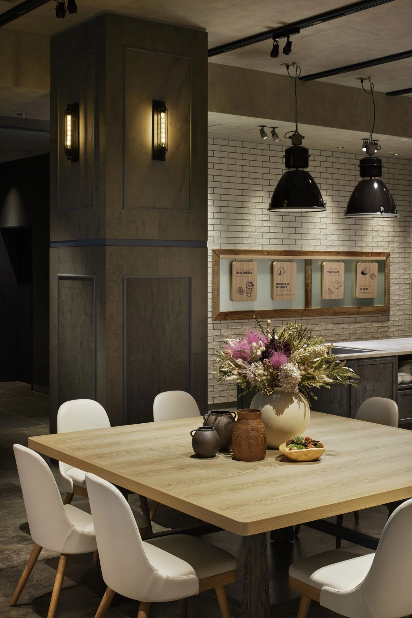
The hotel's design theme, aptly named "Smart & Comfy," is a unique blend of modern travel essence, prioritizing practicality and relaxation. Situated along the prestigious Midosuji Avenue, the hotel's stunning backdrop inspires its interior design, reflecting the grandeur and vibrancy of the area. The careful incorporation of the brand's signature blue colour—symbolizing comfort and trust—adorns the lobby and public spaces, creating an inviting atmosphere that feels familiar and distinctive.
As guests enter the lobby, they are welcomed by a striking reception area filled with deep blue tones, creating a memorable first impression. This bold use of colour highlights the hotel's branding and fosters a sense of warmth and hospitality, encouraging travellers to relax after their journey. At this reception, Osaka's true essence begins to unfold.
The esteemed MITSUI Designtec expertly designed the hotel's interior, combining aesthetic appeal and functionality. A standout feature is the beautifully crafted map installation, which highlights Osaka's most beloved tourist attractions. Positioned for maximum visibility from the reception counter, this interactive art piece serves a dual purpose: a visual delight and a conversation starter. This thoughtful design element fosters interactions between guests and hotel staff, enriching the guest experience by encouraging discussions about the myriad adventures awaiting in the vibrant city of Osaka.


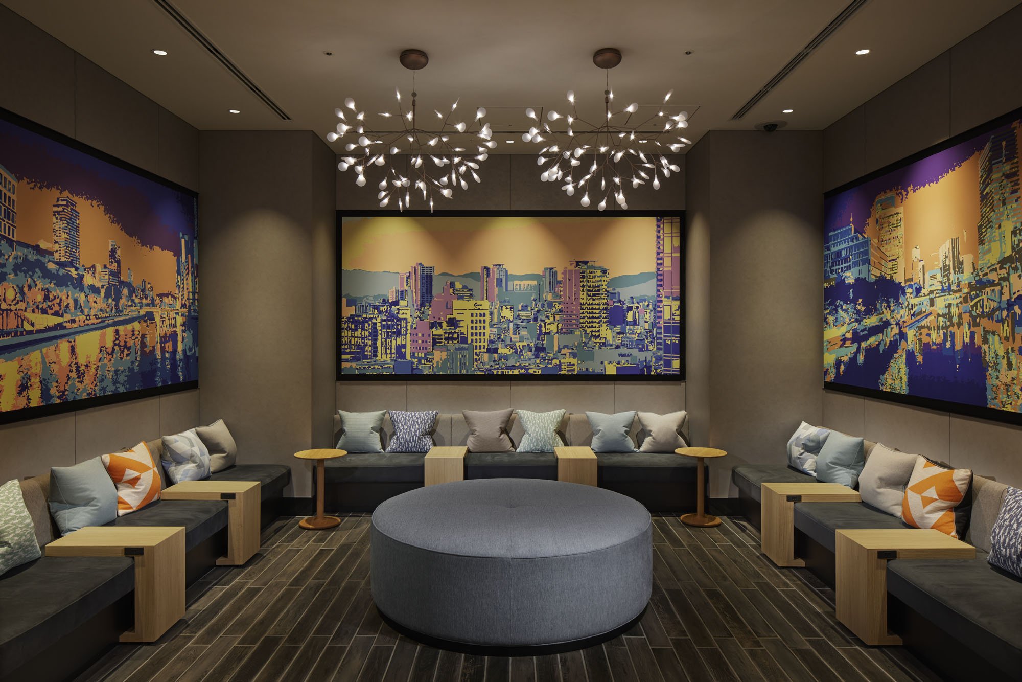
In addition to the map, the hotel features graphic wall art that showcases evocative scenes from the local neighbourhood. This artwork offers guests a visual narrative of their surroundings and a deeper connection to the city's culture. These impressive depictions, including representations of the Osaka dialect, enhance the sense of place, allowing visitors to connect with the city and its culture. Such meticulous attention to the local experience reflects the hotel staff's commitment to ensuring guests leave with cherished memories, creating a bond beyond a typical stay.
The hotel's unwavering commitment to creating a comforting and memorable atmosphere is evident in every aspect of the guest experience. From the well-appointed rooms designed for relaxation to communal spaces that encourage socialization, the Holiday Inn Express in Midosuji is more than just a place to rest; it is a thoughtfully curated environment that celebrates the essence of Osaka while catering to the needs of modern travellers.
As Japan's first Holiday Inn Express, this property sets a new standard for intelligent, comfortable, and culturally attuned hospitality. It reinforces IHG's dedication to blending international standards with local flavours and serves as a testament to Japan's evolving nature of travel. In a city renowned for its rich heritage and vibrant atmosphere, the Holiday Inn Express in Midosuji stands out as a modern hospitality beacon, inviting guests to explore, engage, and create lasting memories in the heart of one of Japan's most dynamic cities.
For more information, please visit: https://www.mitsui-designtec.co.jp/
*This project is one of the shortlisted project in the Sky Design Awards 2024 - Interior Design - Hotel & Resorts Division
Designer Profile


