Living Art: How KT102’s Shadow Windows Redefine Interior Spaces
The KT102 residence, a transformative creation by In Him's Interior Design, redefines the interplay of architectural forms, natural elements, and interior flow. The innovative 'shadow window' concept, a central feature of the project, orchestrates a remarkable synergy between light and space. These shadow windows, with their intentional fluidity, draw natural light into the home and visually frame the outdoor environment, enriching the home's interior narrative. This architectural feature transcends mere lighting; it establishes a rhythmic cadence throughout the residence.
The KT102 residence, a transformative creation by In Him's Interior Design, redefines the interplay of architectural forms, natural elements, and interior flow. The innovative 'shadow window' concept, a central feature of the project, orchestrates a remarkable synergy between light and space. These shadow windows, with their intentional fluidity, draw natural light into the home and visually frame the outdoor environment, enriching the home's interior narrative. This architectural feature transcends mere lighting; it establishes a rhythmic cadence throughout the residence. As sunlight filters through, it crafts an ever-changing display on the walls, effectively turning the home into a canvas where nature itself becomes the artist.
From a design perspective, shadow windows are a dynamic architectural feature that not only invites the outside in but also shapes the resident's experience of time and the changing seasons. As sunlight moves across the sky, it sculpts and transforms the interior spaces, creating evolving shadow patterns that vary in density and texture. This makes each room unique depending on the hour and season. This interplay between architecture and nature is an excellent example of how interior spaces can go beyond mere functionality to become vibrant living environments.
The project's layout emphasizes spatial coherence by dividing areas into distinct functional zones while maintaining an interconnected sense of transparency. This approach to interior planning fosters a feeling of openness and continuity without compromising the purpose of each area. Using frames, shadow windows, and architectural volumes creates a continuous sightline, enhancing the spatial flow and ensuring a cohesive atmosphere across different zones. These thoughtfully designed divisions encourage a journey through the home that feels both private and shared, intimate yet grand.
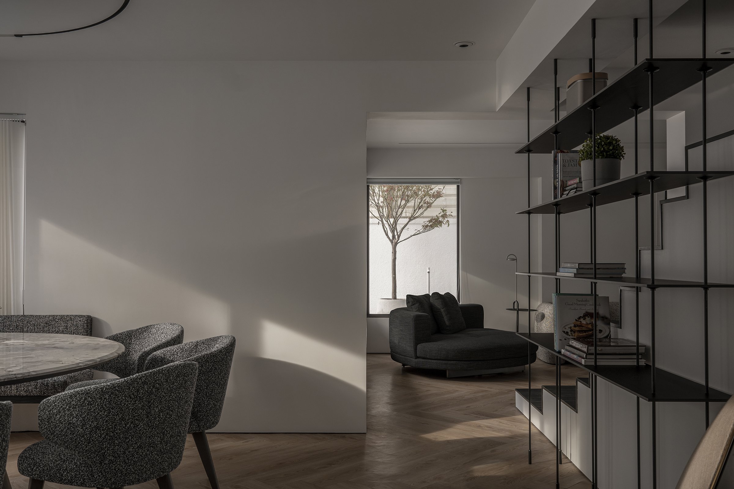
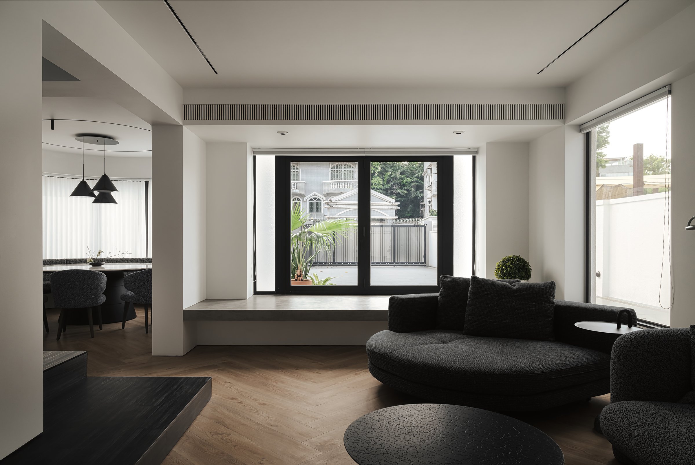

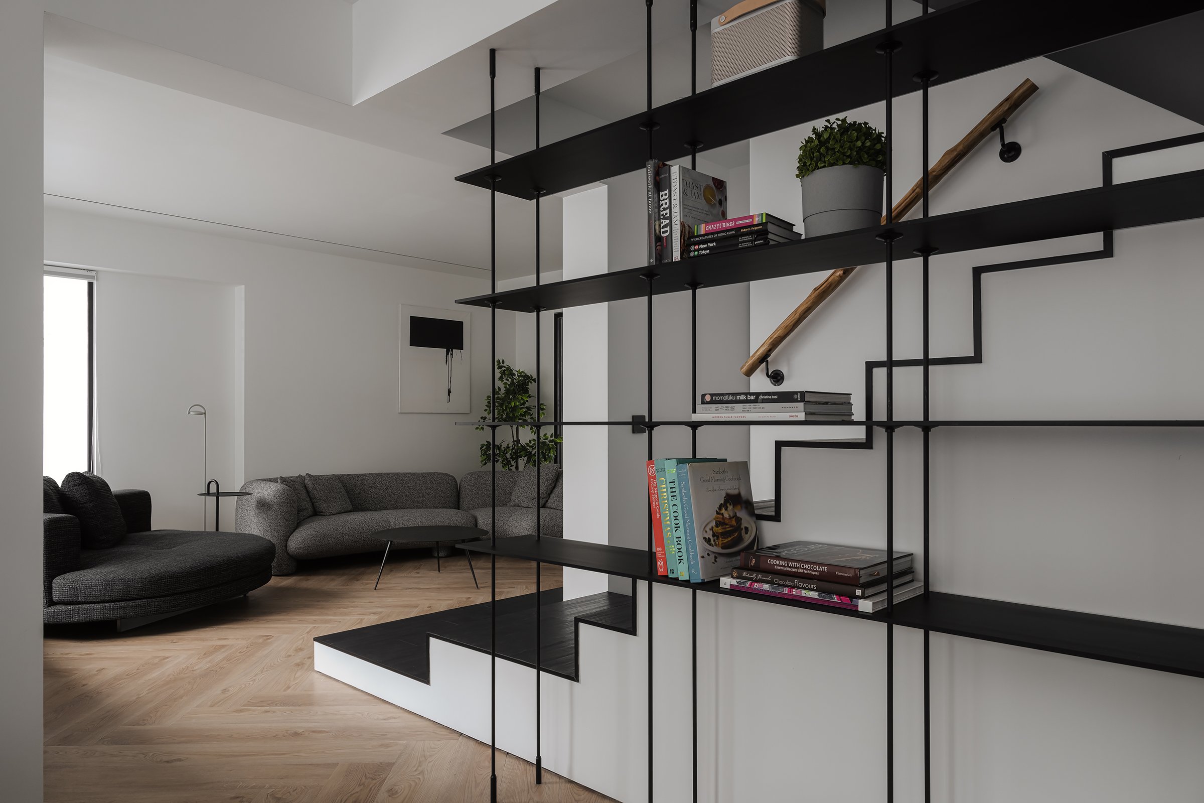

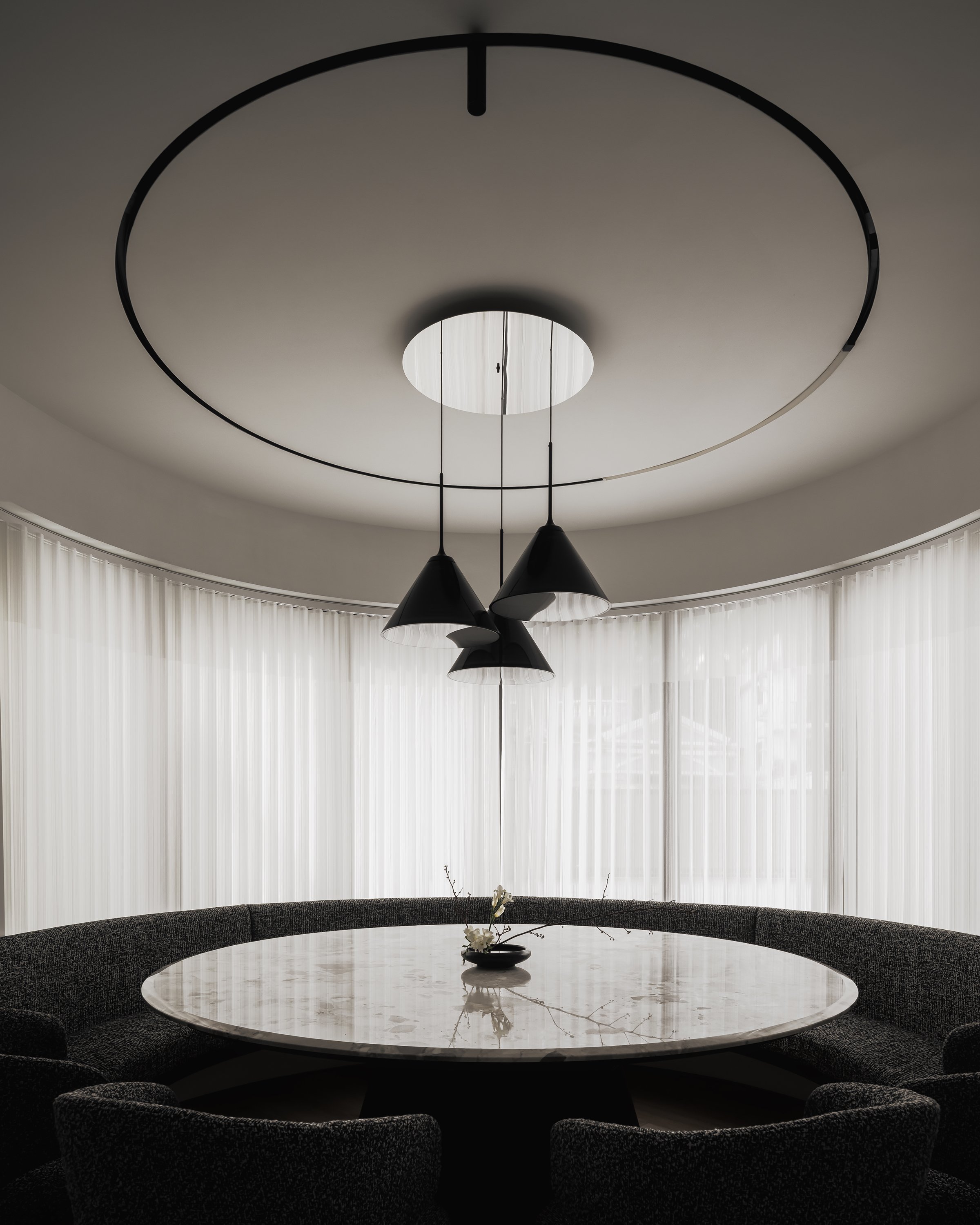
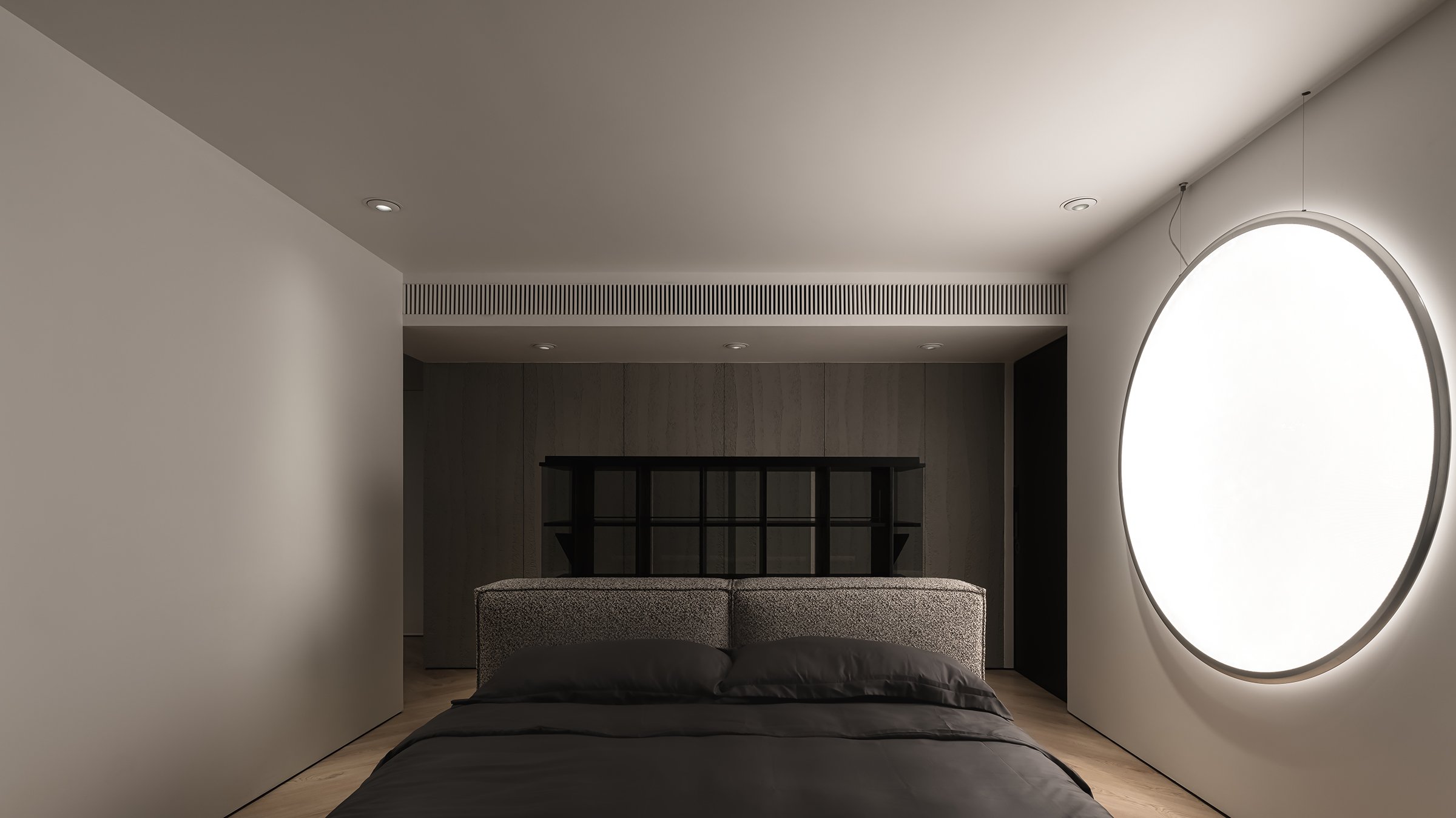
The shadow windows serve as a backdrop for a captivating display of light and shadow, creating a modern interpretation of shadow puppetry. This adds a subtle sense of drama to the space. These design elements harmonize with the surrounding landscape, where the movement of foliage and changing light contributes an ephemeral quality to the interiors. This echoes the Japanese aesthetic of wabi-sabi, which values transience and imperfection. Overall, this design fosters a sense of calm and balance and transforms the residence into a dynamic visual experience that encourages daily exploration.
The design of KT102 is an exemplary demonstration of how interior architecture can utilize natural phenomena to enhance living spaces. It inspires those who aim to create engaging and tranquil environments. This approach reminds us that thoughtful design can be both functional and poetic, encouraging us to look beyond walls and windows to discover the artistic potential in every ray of light and shadow cast.
For more information, please visit:
*This project is one of the shortlisted project in the Sky Design Awards 2024 - Interior Design - Residential
Sustainable Innovation: See How Group's Nature-Driven Workspace Design for Ricoh HK
In an era where innovation and well-being come together, See How Group from Hong Kong has redesigned Ricoh HK's future. They achieved this by combining cutting-edge technology with nature-inspired elements to create a forward-thinking and nurturing coworking environment. This design philosophy's core is integrating advanced intelligent systems and biophilic design to foster productivity, collaboration, and a strong commitment to environmental consciousness. The design follows the principles of Natural Minimalism, which prioritize simplicity, functionality, and a strong connection to the natural world.
In an era where innovation and well-being come together, See How Group from Hong Kong has redesigned Ricoh HK's future. They achieved this by combining cutting-edge technology with nature-inspired elements to create a forward-thinking and nurturing coworking environment. This design philosophy's core is integrating advanced intelligent systems and biophilic design to foster productivity, collaboration, and a strong commitment to environmental consciousness.
The design follows the principles of Natural Minimalism, which prioritize simplicity, functionality, and a strong connection to the natural world. This design philosophy creates a peaceful and uncluttered environment that encourages concentration and a sense of calm, fostering a productive and focused work environment. The use of natural materials like wood, stone, and indoor greenery brings the workspace to life, reflecting a harmonious blend of human creativity and nature's calming influence through their textures and colours.
The project emphasizes biophilic design principles, incorporating living green walls and strategically placed indoor plants to create a natural and serene office environment. These elements not only enhance the visual appeal but also have a significant positive impact on the health and well-being of the people in the space, showing our commitment to your comfort and productivity. This aligns with research indicating a strong connection between exposure to nature and improved cognitive function.
To drive innovation, See How Group has integrated smart technology into every aspect of the workspace. Advanced audiovisual systems and integrated digital solutions allow for seamless collaboration, boosting coworking efficiency and keeping users connected across physical and virtual platforms. The office is equipped with ergonomic furniture, carefully chosen to meet the needs of modern workers and offering flexibility in both posture and function. Dynamic workstations enable users to easily transition between individual focus and collaborative creativity, ensuring a seamless and efficient work experience.
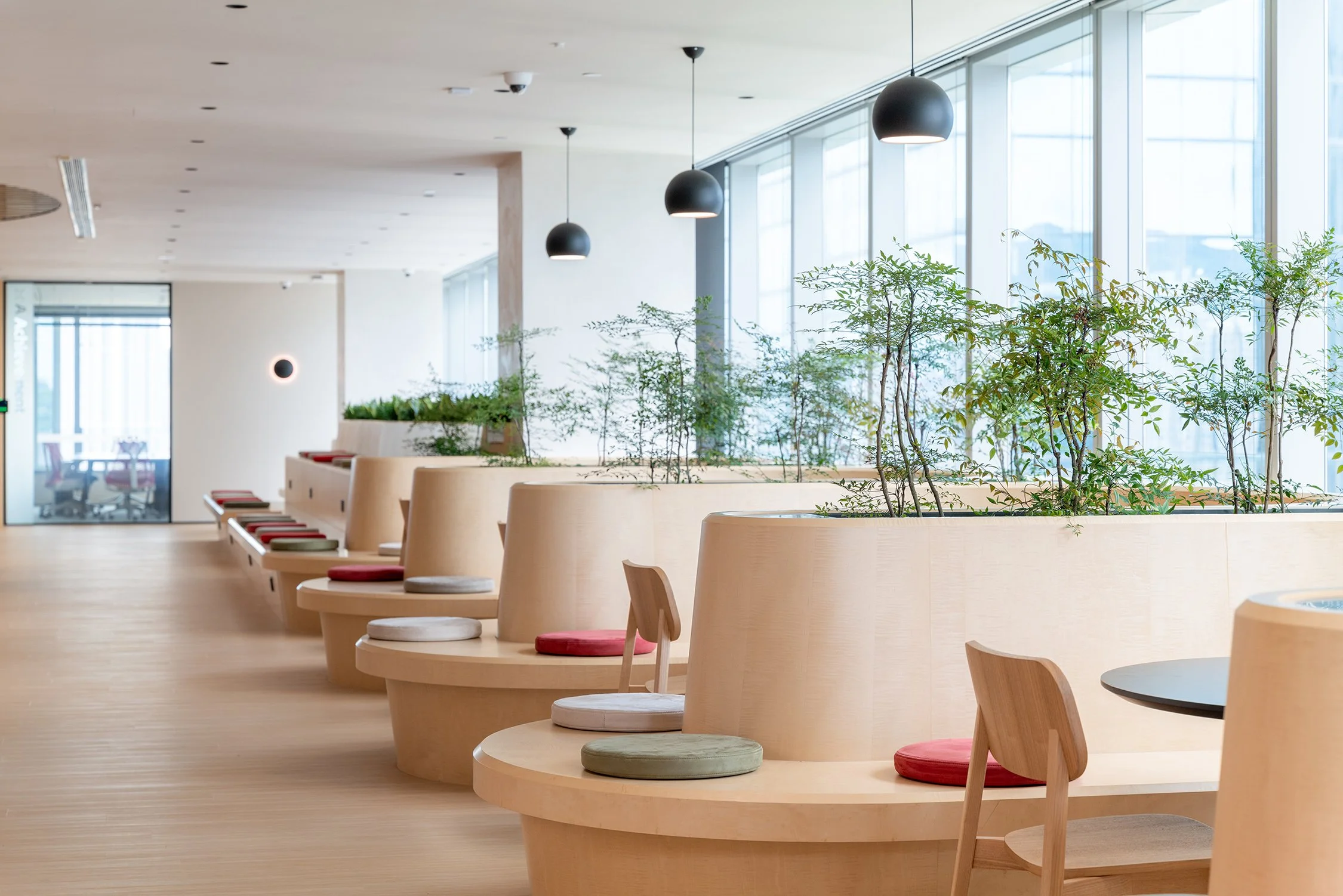
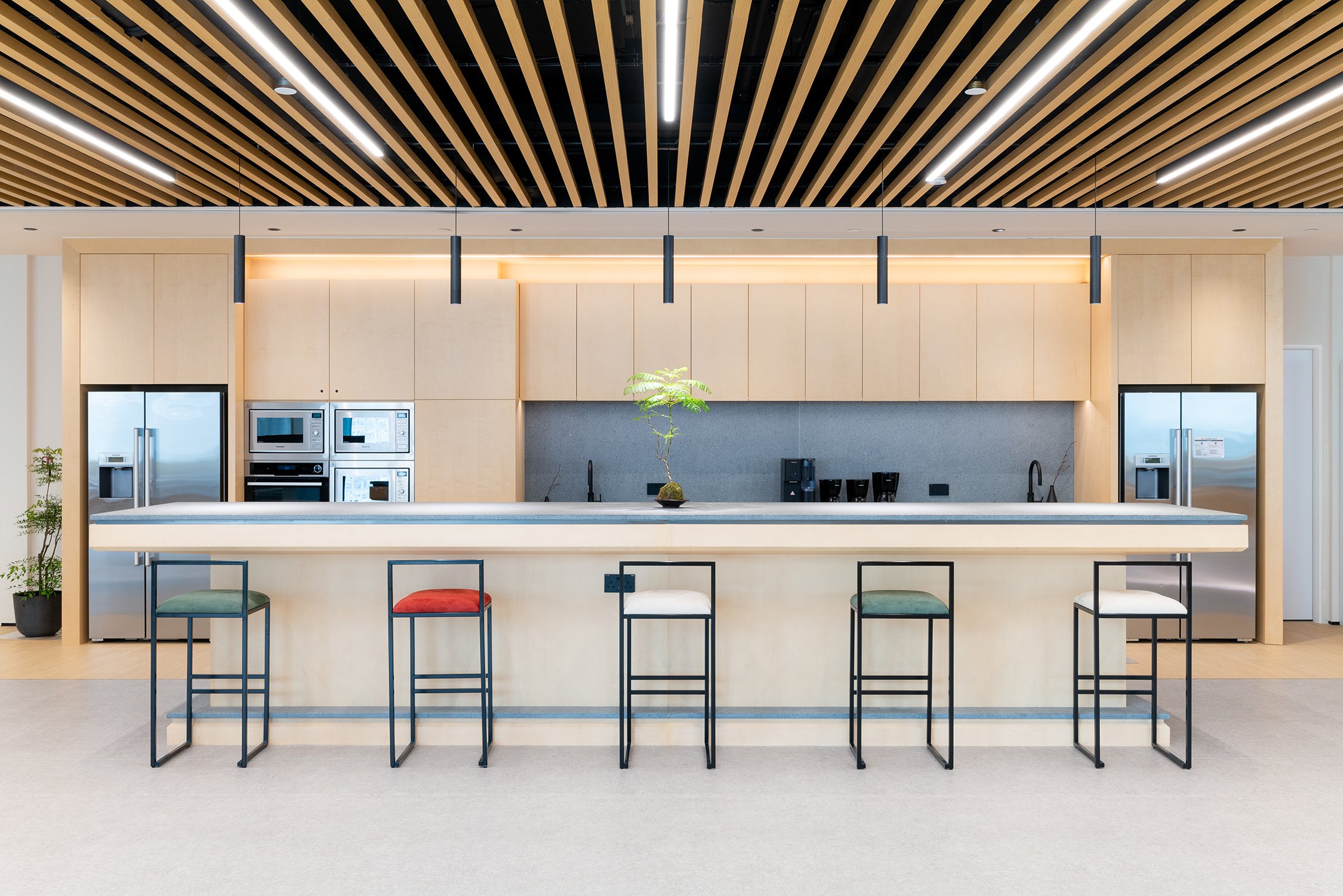
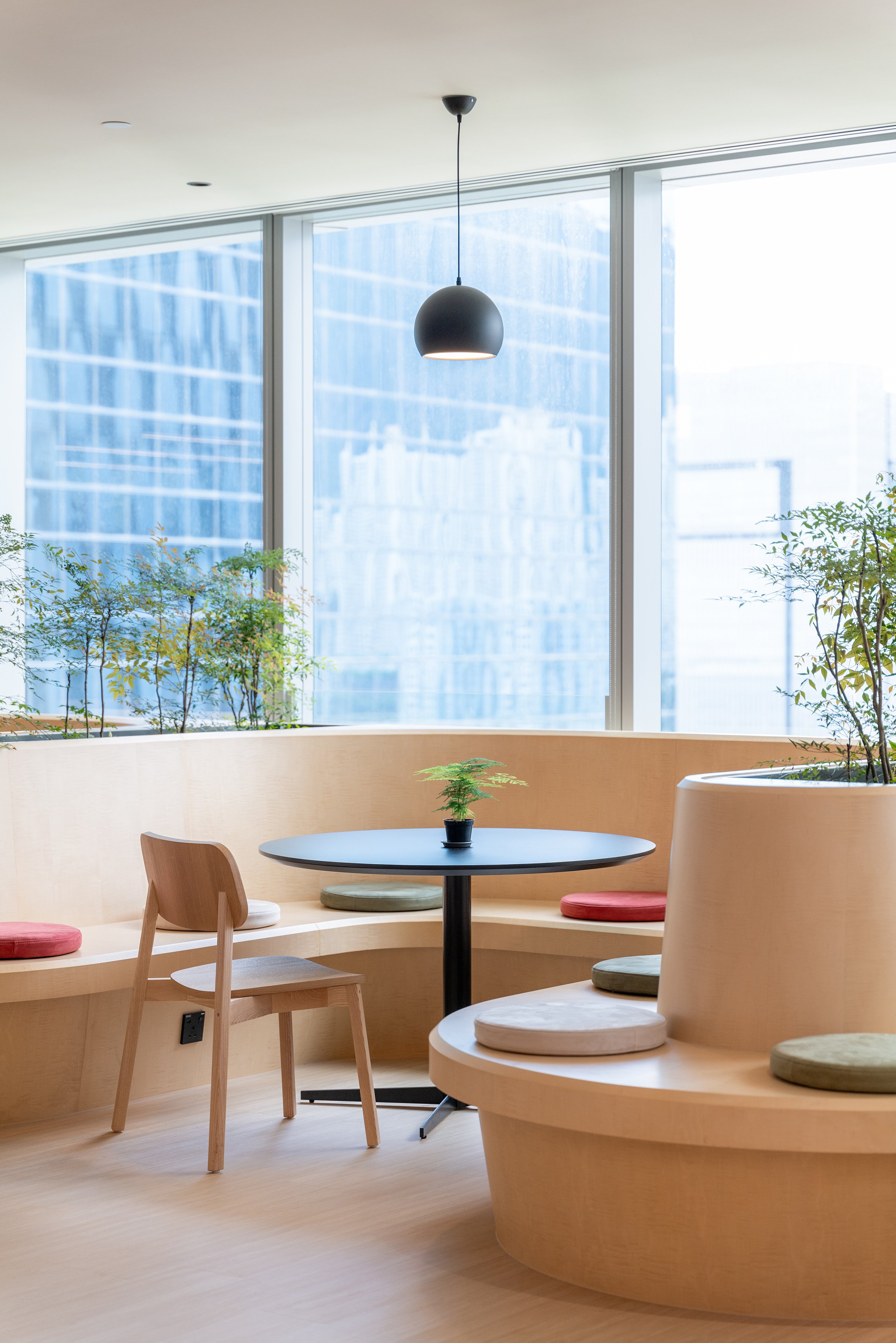
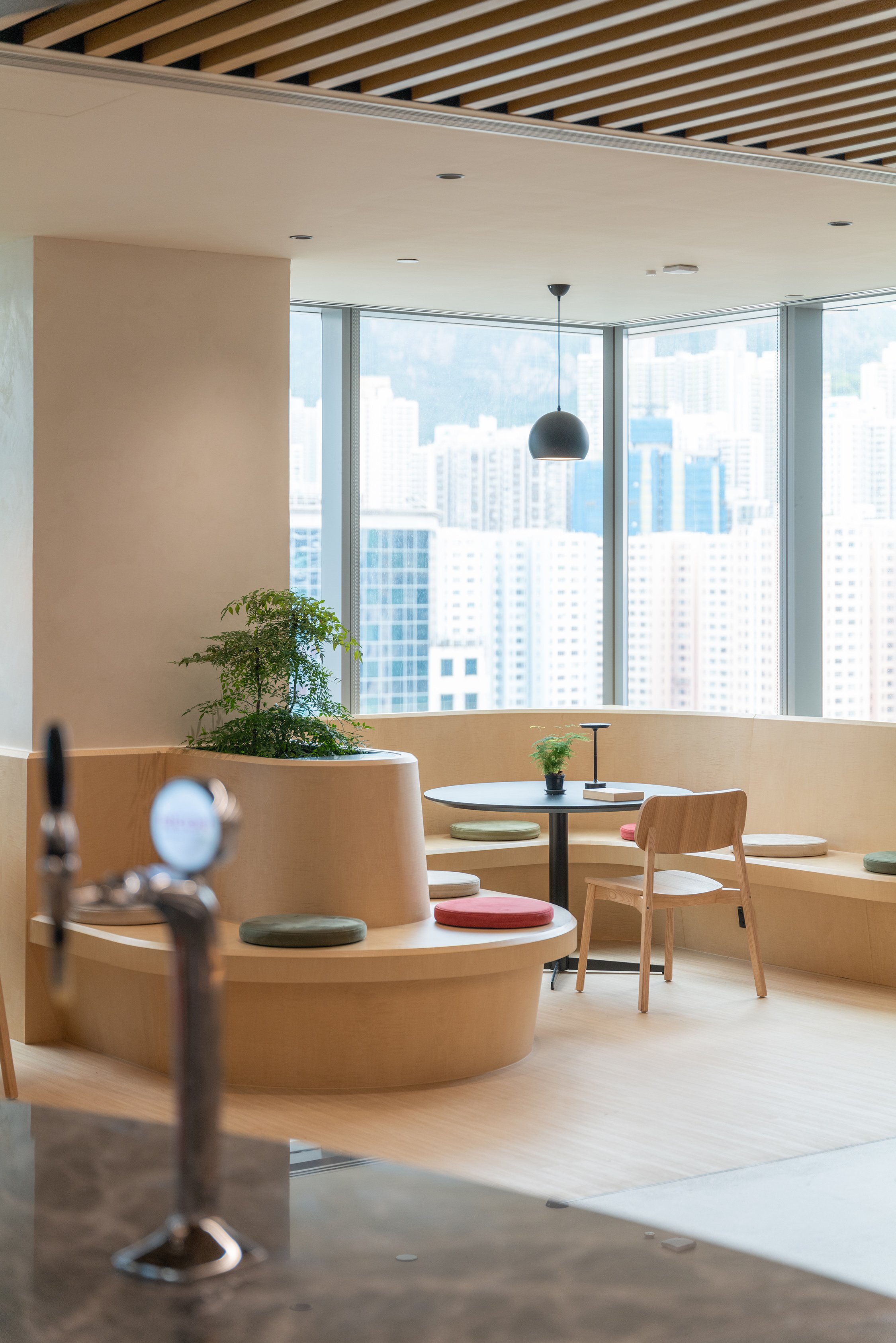
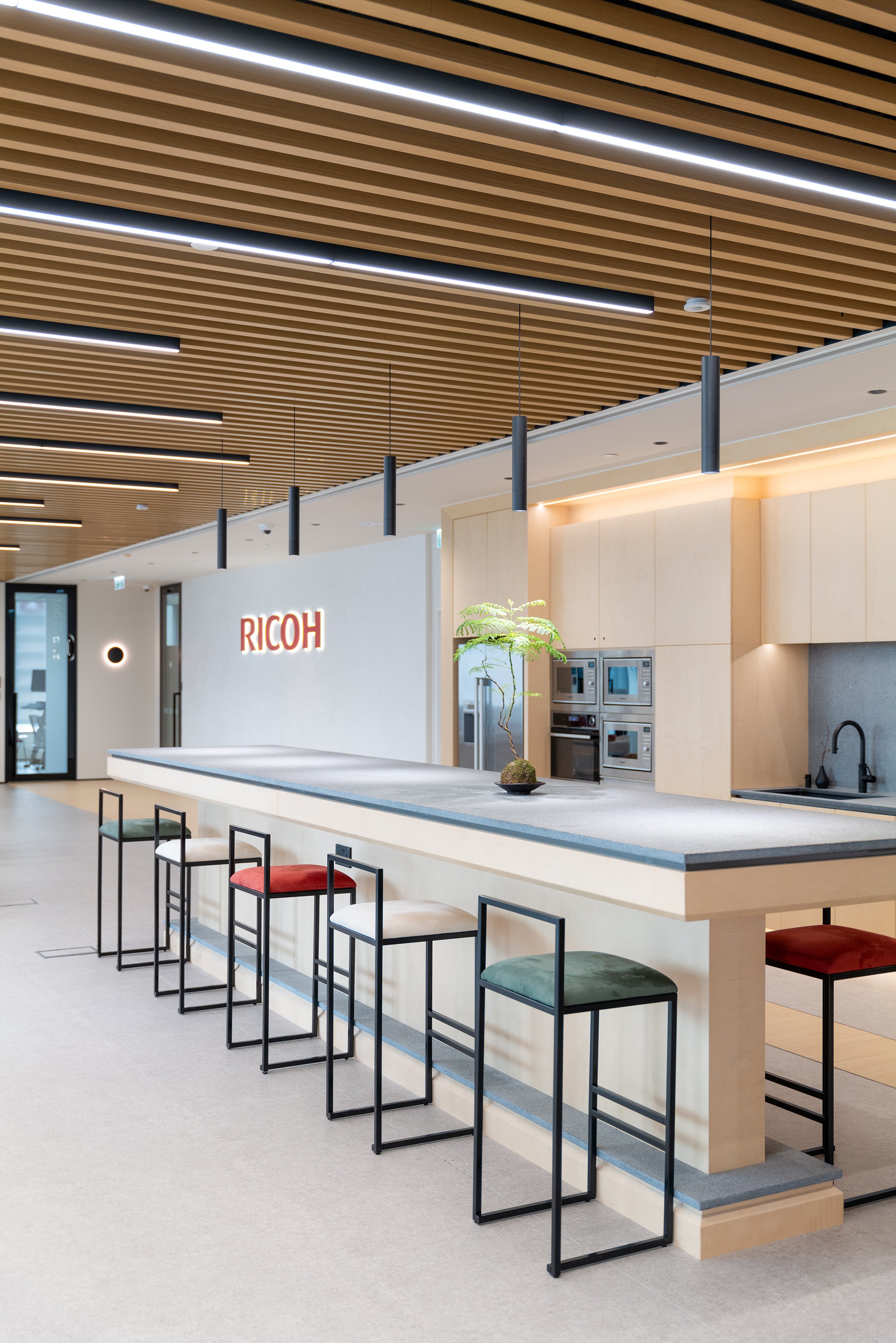
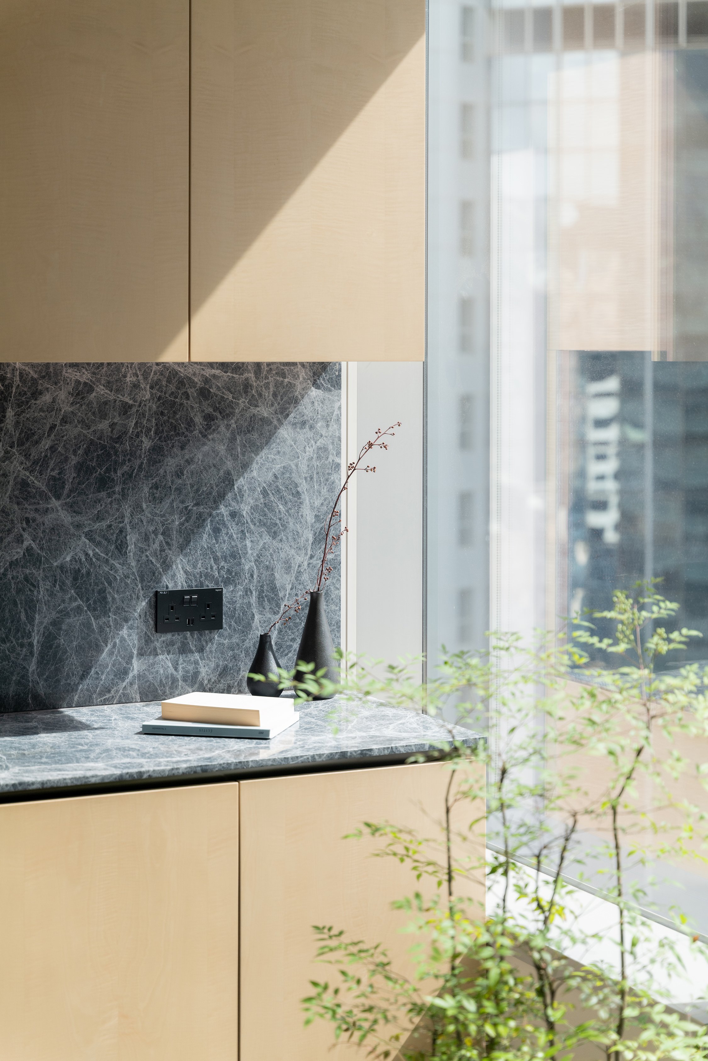
Natural Light and Openness: Large windows fill the workspace with ample natural light, casting a warm glow across the clean, minimalist interiors. The open design and panoramic views of surrounding greenery ensure a constant connection to nature, even indoors. These deliberate design choices create an uplifting atmosphere where creativity can flourish, and stress is kept at bay. Communal areas are strategically positioned to encourage interaction and the organic sharing of ideas, fostering a vibrant, collaborative community.
Sustainability at the Core
Sustainability is a crucial focus of See How Group's design for Ricoh HK. The design incorporates energy-efficient lighting systems, low-emission materials, and a comprehensive recycling program. These features are not just add-ons but are essential to the design, demonstrating a dedication to creating a workspace that honours the planet while enhancing the human experience.
A Harmonious Future
The Ricoh HK coworking space represents the future of workplace design, integrating technology and nature to create an innovative and nurturing environment. The space goes beyond just supporting productivity and collaboration—it actively enhances the well-being of its occupants while also prioritizing sustainability. See How the Group's vision for Ricoh HK is more than just about looks; it's a blueprint for the future of work, celebrating functionality, sustainability, and human connection equally.
For more information, please visit: https://www.seehowgroup.com
*This project is one of the shortlisted project in the Sky Design Awards 2024 - Interior design - Commercial & Office Division
Sushi Kamosu: A Harmonious Ode to Tradition and Innovation in Interior Design
Nestled discreetly within a sleek commercial building in Hong Kong's bustling Central district, Sushi Kamosu offers more than just a dining experience; it provides a serene escape where traditional Japanese aesthetics are seamlessly intertwined with contemporary design. Crafted by the visionary team at Him's Interior Design, this Edomae sushi restaurant presents a refined space that speaks to the heart of Japanese cultural heritage while embracing modernity with a touch of elegance that only 'in Him's" Interior Design can deliver.
Nestled discreetly within a sleek commercial building in Hong Kong's bustling Central district, Sushi Kamosu offers more than just a dining experience; it provides a serene escape where traditional Japanese aesthetics are seamlessly intertwined with contemporary design. Crafted by the visionary team at “in Him's” Interior Design, this Edomae sushi restaurant presents a refined space that speaks to the heart of Japanese cultural heritage while embracing modernity with a touch of elegance.
As guests step into Sushi Kamosu, they are immediately greeted by an ambiance that evokes the tranquillity of a traditional Japanese home. The interior design, a masterpiece "in Him's" Interior Design, emphasizes simplicity and serenity. The gentle glide of shoji screens, made from delicate washi paper, diffuses soft, natural light across the space, creating an ethereal glow that instantly transports guests from the vibrant streets of Central to a peaceful sanctuary.
The design palette has been meticulously chosen, with natural wood tones and muted earth colours dominating the space. These elements establish a deep connection to nature, a core principle in Japanese design. The tactile qualities of the materials—smooth, polished wood juxtaposed with the subtle textures of stone—encourage guests to engage with the environment through their senses, thus enhancing the overall dining experience. The use of natural materials and the emphasis on tactile qualities not only create a serene and inviting atmosphere but also contribute to the appreciation of the culinary artistry of Edomae sushi.
The design of Sushi Kamosu revolves around the sushi counter, a unique feature that serves as the focal point reflecting the restaurant's philosophy. Carved from a single hinoki wood slab, the counter embodies purity and precision, mirroring the craftsmanship of sushi-making. Its unique design and the use of hinoki wood, known for its antibacterial properties and pleasant aroma, make it a standout feature. "in Him's" Interior Design's minimalist approach ensures that the counter serves as the heart of the space, providing a stage for the culinary artistry of Edomae sushi to shine. The surrounding space is deliberately kept uncluttered to emphasize simplicity, quality, and elegance.
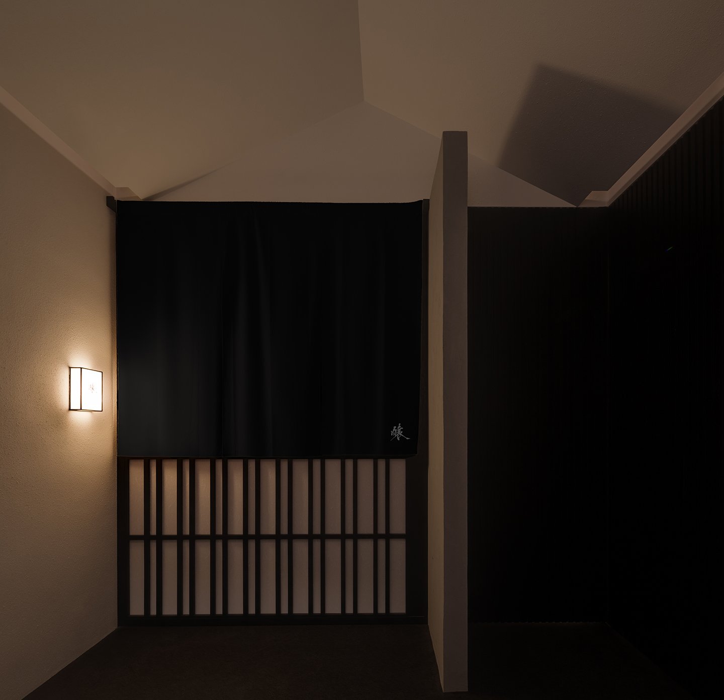

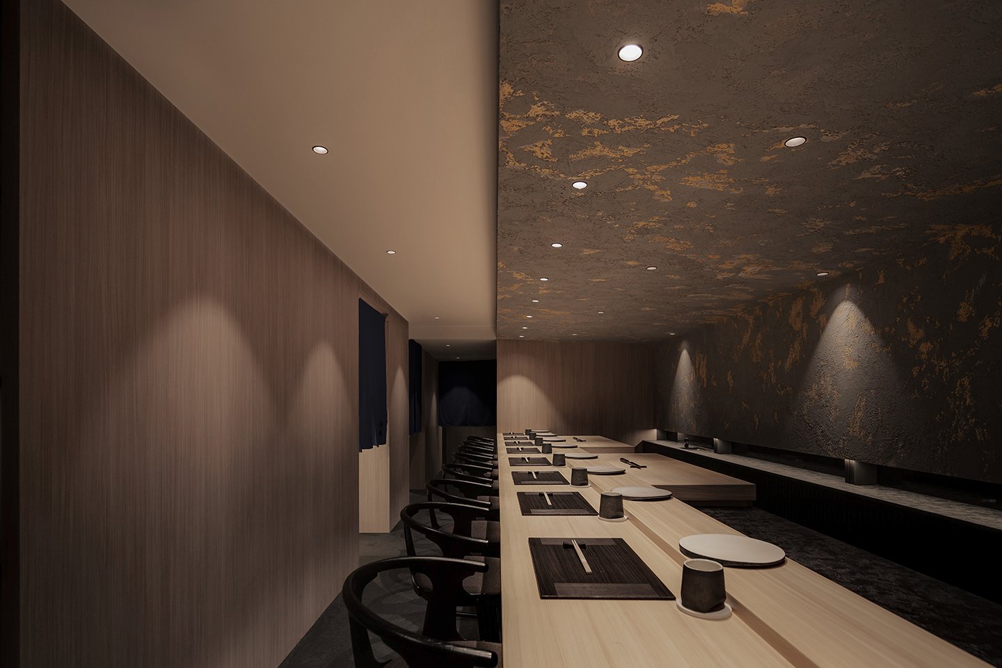
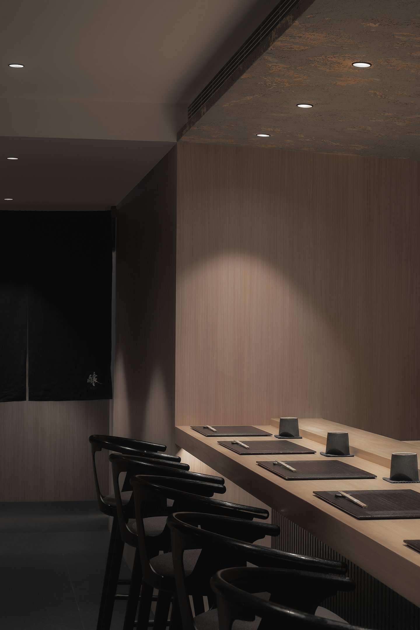
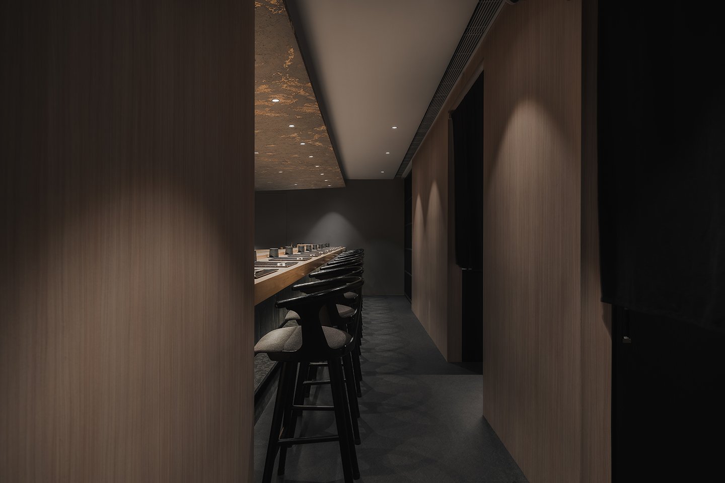
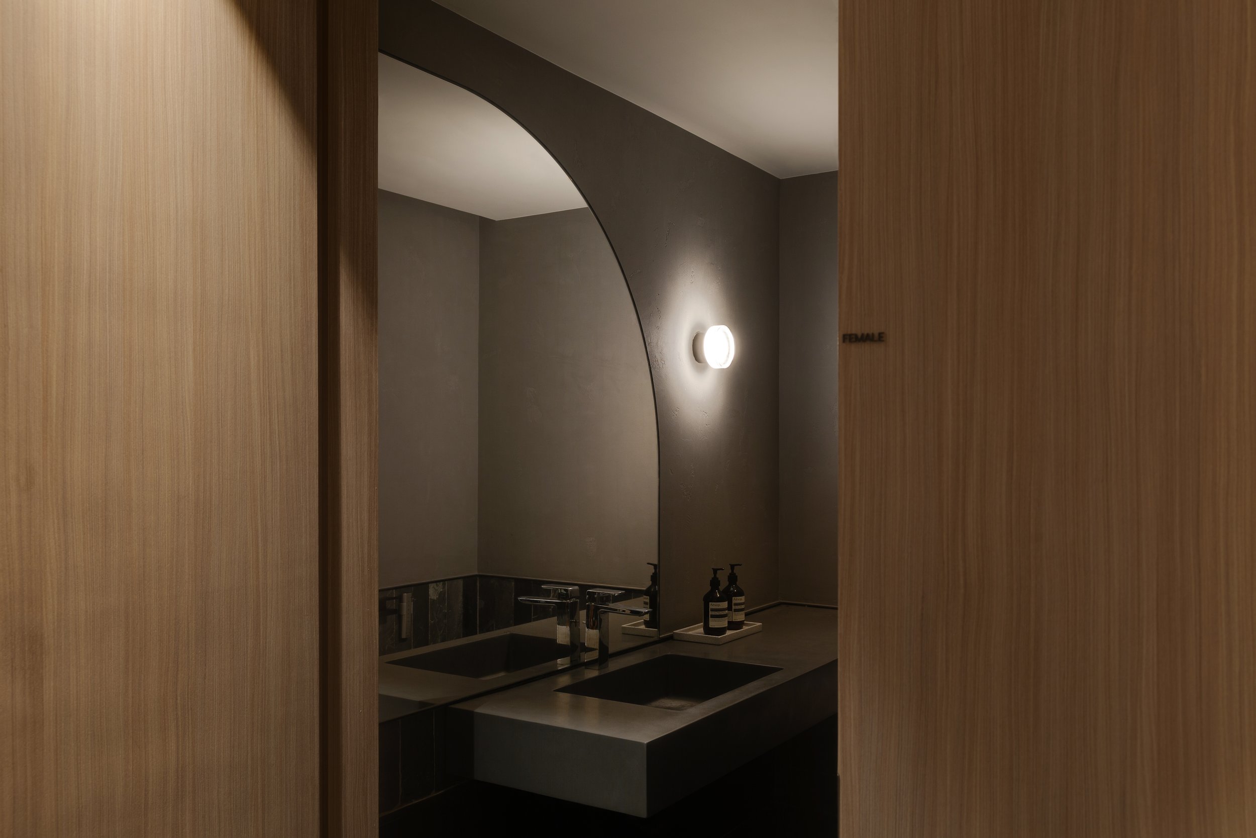

The interior of Sushi Kamosu is a sophisticated blend of tradition and innovation. It reinterprets the enduring principles of Japanese design through a modern lens, creating a harmonious balance of timeless and contemporary elements. Clean lines, open spaces, and the thoughtful use of natural materials all contribute to this unique blend, inviting guests to explore and appreciate the fusion of past and present.
In an era of rapid urbanization, where cultural identity can easily be lost, Sushi Kamosu is a testament to how tradition and innovation coexist beautifully within interior design. The work of "in Him's" Interior Design demonstrates that a space rooted in history and fully engaged with the present can be created by honouring the essence of traditional Japanese aesthetics while embracing modern design elements. Here, every design decision—from the play of light and shadow to the selection of materials—contributes to an atmosphere of quiet luxury, making Sushi Kamosu a true embodiment of the harmonious blend of past and present in the heart of Hong Kong.
For more information, please visit: https://www.inhims.com
*This project is one of the shortlisted project in the Sky Design Awards 2024 - Interior Design - Retail & Club Division


