Heritage Reimagined: Shinbashi Tamakiya’s New Era of Tsukudani Tradition
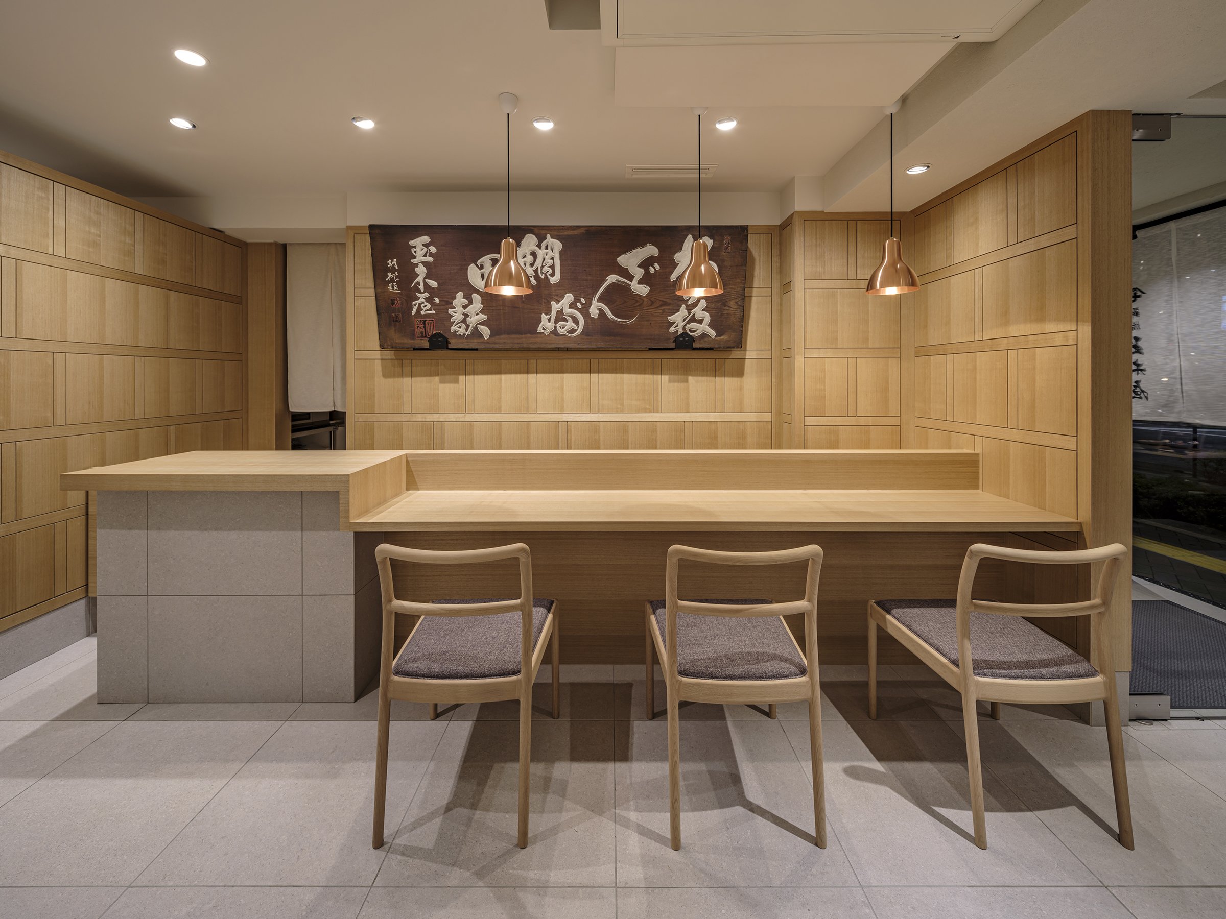
The redesign of Shinbashi Tamakiya's main store by Aioi Design explores the deep cultural significance of tsukudani while incorporating a modern design approach. This update positions the historic brand to appeal to a contemporary and discerning audience. The space features a minimalist yet dignified aesthetic, showcasing modern functionality and a profound respect for heritage. These elements reflect the brand's commitment to preserving traditional Japanese food culture.
The redesign of Shinbashi Tamakiya's main store by Aioi Design explores the deep cultural significance of tsukudani while incorporating a modern design approach. This update positions the historic brand to appeal to a contemporary and discerning audience. The space features a minimalist yet dignified aesthetic, showcasing modern functionality and a profound respect for heritage. These elements reflect the brand's commitment to preserving traditional Japanese food culture.
Design Perspective
Aioi's innovative approach to the redesign of Shinbashi Tamakiya's main store is a departure from traditional tsukudani shop layouts. Instead of the typical dominant counters and brief customer interactions, the design embraces openness. It features strategically placed flat display fixtures that encourage a more dynamic, three-dimensional space exploration. This unique layout allows customers to linger and engage more deeply with Tamakiya's artisanal tsukudani offerings, creating a comfortable and contemplative environment. The store design uses understated materials and a neutral colour palette, invoking a sense of calm and reflecting the simplicity of Japanese aesthetics. This ensures that the store feels serene and uncluttered while drawing attention to the meticulously arranged products.
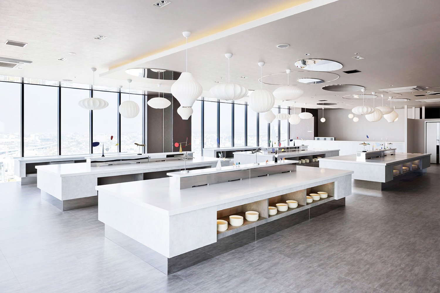
A notable addition is a dining space within the retail environment, which is an uncommon feature for a Tsukudani specialty store. This area allows customers to sample dishes that highlight tsukudani as a central ingredient, providing a unique opportunity to experience this traditional food's versatility and rich flavors. This "living display" of Japanese culinary heritage transforms the store into a multisensory journey, bridging Tamakiya's historical past with the evolving tastes of today's clientele.




Business and Cultural Value
For a brand like Shinbashi Tamakiya, this redesign reinforces its role as a custodian of cultural tradition. Highlighting tsukudani, a preserved food, is a significant choice—it embodies Japan's values of sustainability, resourcefulness, and reverence for nature. The design aims to introduce this craft to a new generation, serving as a business strategy and a cultural statement. It allows the brand to attract a broader demographic, including younger consumers and international visitors unfamiliar with tsukudani. This emphasis on business and cultural value will leave the audience feeling confident about the brand's future and its commitment to cultural preservation.
By incorporating educational elements and an experiential tasting room, Tamakiya positions tsukudani as an ingredient that bridges traditional and modern culinary worlds. This approach not only fosters cultural value but also stimulates business growth. The blend of functionality and brand impression is crafted to create a memorable, immersive experience that reflects Aioi's vision of transmitting Japanese food culture to future generations. These educational elements will leave customers feeling informed and enlightened about the cultural significance of tsukudani.
As Tamakiya steps into a new era, the store's design embodies both respect for its rich past and a steadfast commitment to a sustainable, culturally enriched future. The result is a space that is as timeless as it is forward-thinking—a reflection of Japanese heritage reimagined for a world that values authenticity, tradition, and innovation equally.
For more information, please visit: https://aioi-design.jp/
*This project is one of the shortlisted project in the Sky Design Awards 2024 - Interior Design - Retail Design Division
Designer Profile
A New Era of Smart Travel: Holiday Inn Express Opens in Midosuji, Osaka
In a significant development for Japan's hospitality sector, IHG has opened its first Holiday Inn Express in the vibrant heart of Midosuji, Osaka. This new property, with its unique blend of functionality and comfort, marks an essential change in the travel landscape. It embodies the brand's philosophy of 'simple, smart travel' and is designed to cater to the needs of today's discerning travellers. With its strategic location, modern amenities, and thoughtful design, the hotel promises a unique and memorable stay experience.
In a significant development for Japan's hospitality sector, IHG has opened its first Holiday Inn Express in the vibrant heart of Midosuji, Osaka. This new property, with its unique blend of functionality and comfort, marks an essential change in the travel landscape. It embodies the brand's philosophy of 'simple, smart travel' and is designed to cater to the needs of today's discerning travellers. With its strategic location, modern amenities, and thoughtful design, the hotel promises a unique and memorable stay experience.
The hotel's design theme, aptly named "Smart & Comfy," is a unique blend of modern travel essence, prioritizing practicality and relaxation. Situated along the prestigious Midosuji Avenue, the hotel's stunning backdrop inspires its interior design, reflecting the grandeur and vibrancy of the area. The careful incorporation of the brand's signature blue colour—symbolizing comfort and trust—adorns the lobby and public spaces, creating an inviting atmosphere that feels familiar and distinctive.
As guests enter the lobby, they are welcomed by a striking reception area filled with deep blue tones, creating a memorable first impression. This bold use of colour highlights the hotel's branding and fosters a sense of warmth and hospitality, encouraging travellers to relax after their journey. At this reception, Osaka's true essence begins to unfold.
The esteemed MITSUI Designtec expertly designed the hotel's interior, combining aesthetic appeal and functionality. A standout feature is the beautifully crafted map installation, which highlights Osaka's most beloved tourist attractions. Positioned for maximum visibility from the reception counter, this interactive art piece serves a dual purpose: a visual delight and a conversation starter. This thoughtful design element fosters interactions between guests and hotel staff, enriching the guest experience by encouraging discussions about the myriad adventures awaiting in the vibrant city of Osaka.


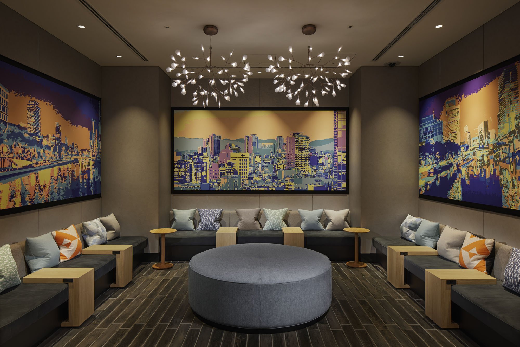
In addition to the map, the hotel features graphic wall art that showcases evocative scenes from the local neighbourhood. This artwork offers guests a visual narrative of their surroundings and a deeper connection to the city's culture. These impressive depictions, including representations of the Osaka dialect, enhance the sense of place, allowing visitors to connect with the city and its culture. Such meticulous attention to the local experience reflects the hotel staff's commitment to ensuring guests leave with cherished memories, creating a bond beyond a typical stay.
The hotel's unwavering commitment to creating a comforting and memorable atmosphere is evident in every aspect of the guest experience. From the well-appointed rooms designed for relaxation to communal spaces that encourage socialization, the Holiday Inn Express in Midosuji is more than just a place to rest; it is a thoughtfully curated environment that celebrates the essence of Osaka while catering to the needs of modern travellers.
As Japan's first Holiday Inn Express, this property sets a new standard for intelligent, comfortable, and culturally attuned hospitality. It reinforces IHG's dedication to blending international standards with local flavours and serves as a testament to Japan's evolving nature of travel. In a city renowned for its rich heritage and vibrant atmosphere, the Holiday Inn Express in Midosuji stands out as a modern hospitality beacon, inviting guests to explore, engage, and create lasting memories in the heart of one of Japan's most dynamic cities.
For more information, please visit: https://www.mitsui-designtec.co.jp/
*This project is one of the shortlisted project in the Sky Design Awards 2024 - Interior Design - Hotel & Resorts Division
Designer Profile
manu coffee Reimagined: A 20-Year Legacy of Culture and Connection
n the lively Haruyoshi district of Fukuoka, manu coffee has been a central part of the area's evolving subculture for the past two decades. This unassuming yet iconic café has been more than just a coffee place; it has served as a gathering spot for young professionals and a hub where Fukuoka's nightlife culture and creative communities come together. Situated at the unique intersection of the city's three central districts—Tenjin, Hakata, and Nakasu—Haruyoshi has developed into a unique enclave where nightlife, dining, and urban subcultures blend seamlessly. Within this dynamic setting, Manu Coffee has thrived for 20 years, creating its own story and building a dedicated following, a testament to our city's unique and vibrant culture.
In the lively Haruyoshi district of Fukuoka, Manu coffee has been a central part of the area's evolving subculture for the past two decades. This unassuming yet iconic café has been more than just a coffee place; it has served as a gathering spot for young professionals and a hub where Fukuoka's nightlife culture and creative communities come together. Situated at the unique intersection of the city's three central districts—Tenjin, Hakata, and Nakasu—Haruyoshi has developed into a unique enclave where nightlife, dining, and urban subcultures blend seamlessly. Within this dynamic setting, Manu Coffee has thrived for 20 years, creating its own story and building a dedicated following, a testament to our city's unique and vibrant culture.
After 20 years, Takasu Gaku Design and Associates have renovated Manu Coffee to honour its history and encourage new interactions. The new design features a sizeable operable steel sash on the shopfront, creating a transparent space that invites people to look inside and blurs the boundary between the street and the interior. This design aims to bring the energy of the street inside while maintaining the café's role as a cultural hub.
The renovation beautifully combines old and new elements. The counters and bench seating were made using traditional plastering techniques, while the floor has been patched with different materials, preserving its history while giving it a fresh look. These layered textures create a warm and authentic atmosphere, making the space feel familiar yet rejuvenated.
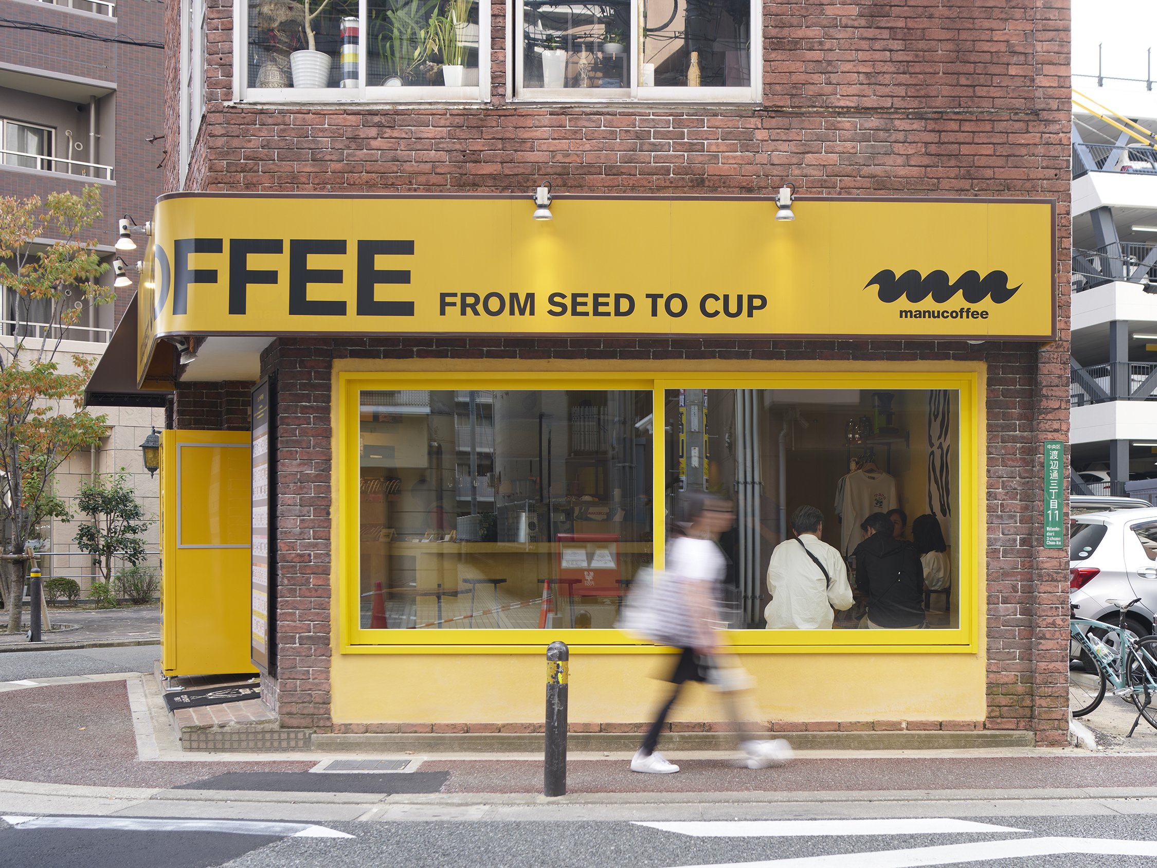
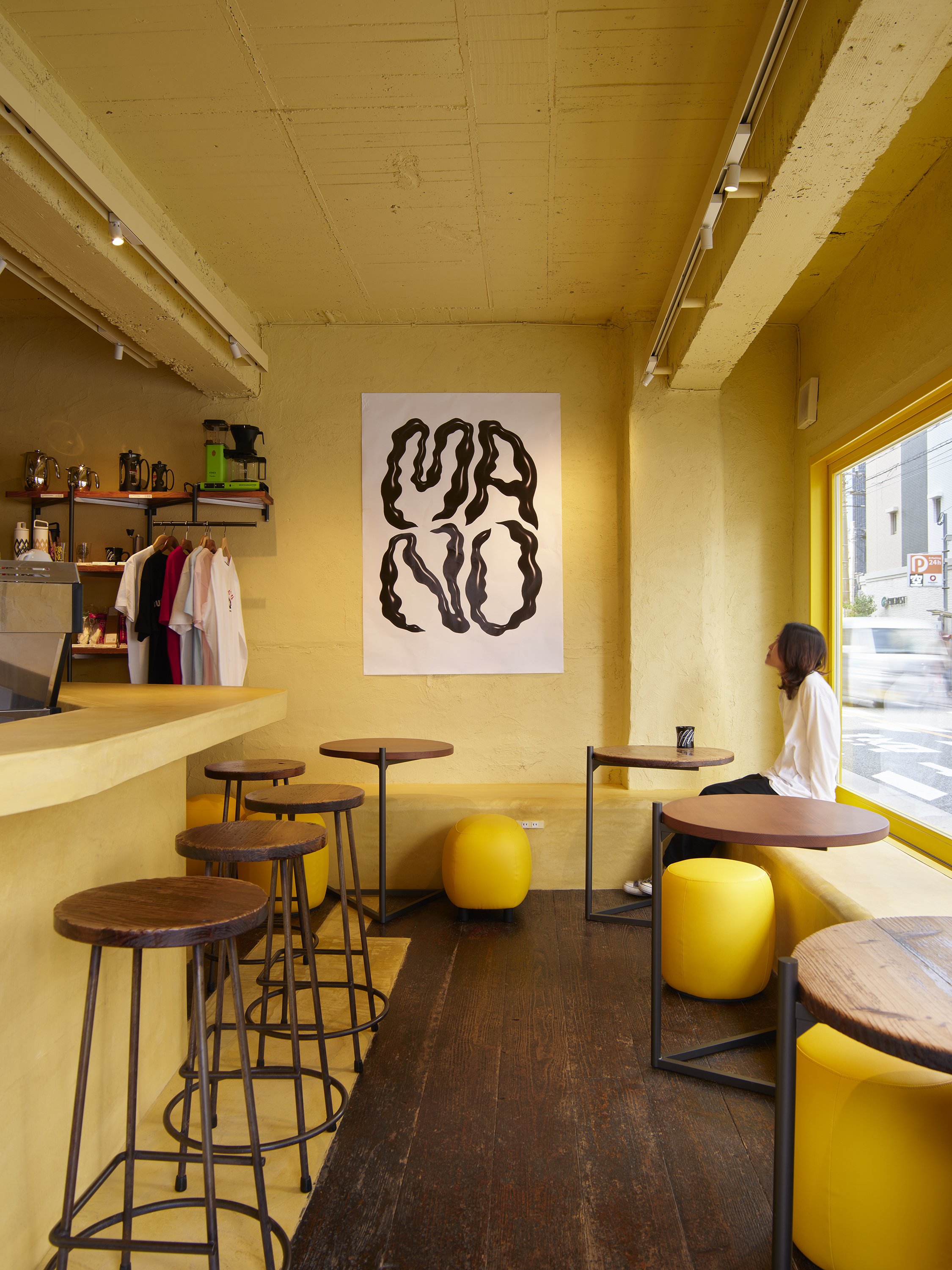


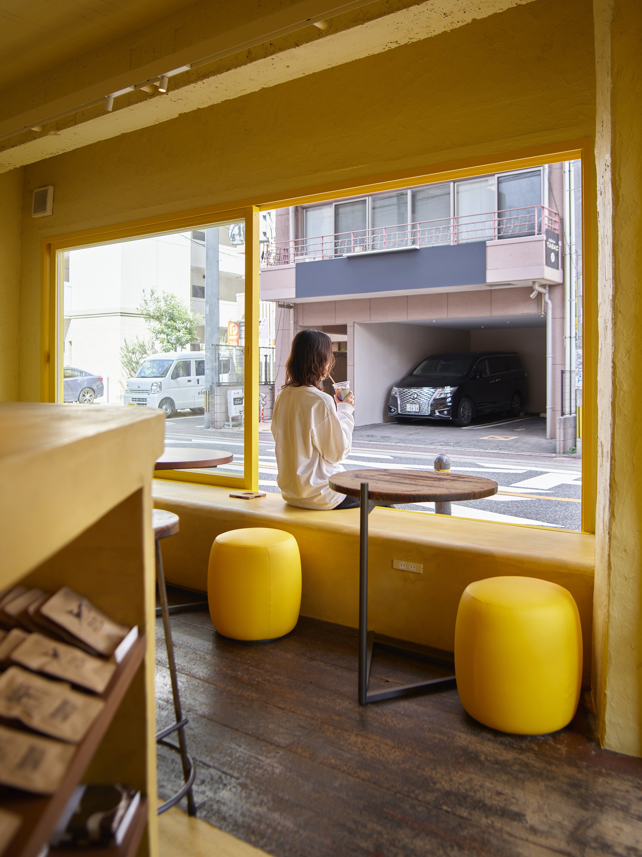
The soft lighting creates a warm and inviting atmosphere, piquing the curiosity of those passing by. The goal is to create a space that feels deeply connected to its surroundings, fostering a sense of continuity, security, and connection between the café's long-standing presence and the ever-evolving city. This renovation is not just about updating a space; it's about strengthening the bond between the café, the street, and the community it serves.
The aim is for this newly designed entrance to serve as both a physical and symbolic gateway, promoting the exchange of ideas and culture, and continuing to shape Haruyoshi's identity. As the café embarks on a new chapter, it will undoubtedly continue its dedicated mission of nurturing Fukuoka's subcultures, serving as a place where the old meets the new, and where the past informs the future, fostering a sense of continuity and anticipation for what's to come.
For more information, please visit: https://gaku-design.com
*This project is one of the shortlisted project in the Sky Design Awards 2024 - Interior Design - Restaurant, Bar & Clubs Division
Designer Profile
Elevating Airport Hospitality: OMO Kansai Airport’s Playful Design Celebrates the Art of Travel
OMO Kansai Airport by Hoshino Resorts, designed by MITSUI Designtec Co., Ltd., offers a unique airport hotel experience. It is the first OMO-branded hotel within an airport, and it involved renovating an existing hotel directly connected to Kansai International Airport, Japan's most significant air gateway to the west. The hotel's location, just steps away from the airport's terminal, ensures a stress-free and convenient stay, providing you with a sense of reassurance and ease. The design combines functionality with a playful urban aesthetic, inviting guests to view their journey as more than just transit but as an integral part of their travel adventure.
OMO Kansai Airport by Hoshino Resorts, designed by MITSUI Designtec Co., Ltd., offers a unique airport hotel experience. It is the first OMO-branded hotel within an airport, and it involved renovating an existing hotel directly connected to Kansai International Airport, Japan's most significant air gateway to the west. The hotel's location, just steps away from the airport's terminal, ensures a stress-free and convenient stay, providing you with a sense of reassurance and ease. The design combines functionality with a playful urban aesthetic, inviting guests to view their journey as more than just transit but as an integral part of their travel adventure.
The hotel's architectural concept is centred around adding "fun" to the guest experience, making it an extension of their journey and a destination. MITSUI Designtec approached the renovation with a focus on balancing practicality and aesthetic innovation. The hotel's design subtly incorporates elements of aviation and the excitement of travel. Notable features include an intricately crafted airplane object as the focal point in the lobby and lighting fixtures that resemble the dynamic form of an airplane turbine. These elements bring a sense of motion and energy to the space, capturing the spirit of flight. They are not just decorative but are intended to immerse guests in the travel experience, visually connecting them to the airport environment while maintaining an elegant, contemporary interior.
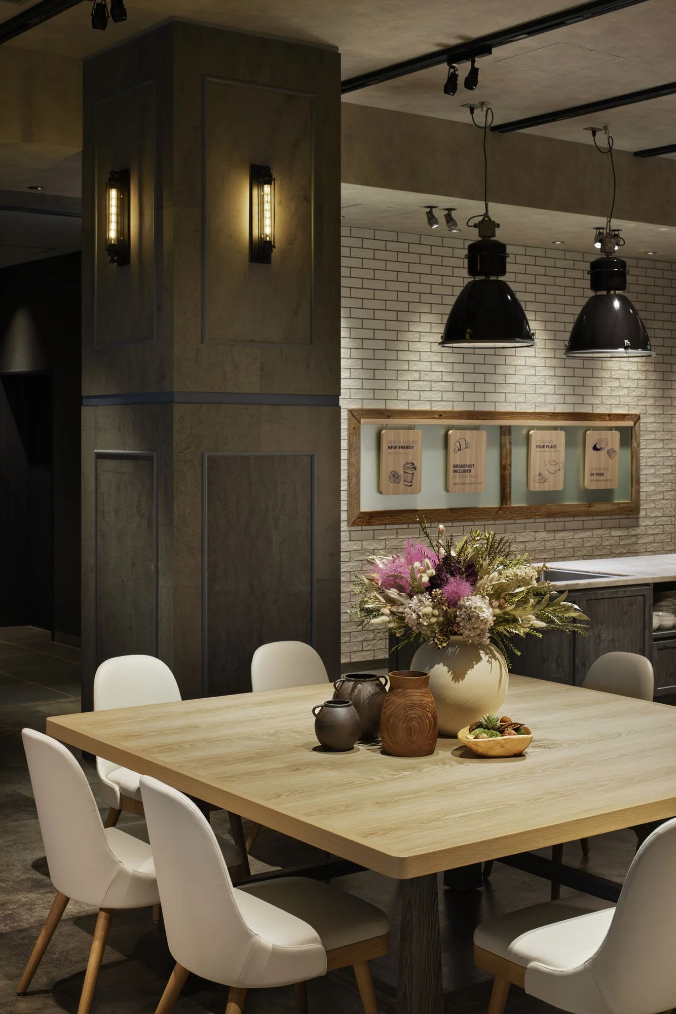
The hotel's design takes into account the needs of modern travellers. The spacious, streamlined interiors offer a peaceful retreat from the bustling airport atmosphere, ensuring that you can relax and recharge during your stay. The intentionally neutral colour palette, complemented by warm accents and natural materials, creates a welcoming and functional environment. This calm yet engaging atmosphere provides guests with a space to relax, whether they are staying for a brief stopover or a more extended layover, despite the transient nature of airports.
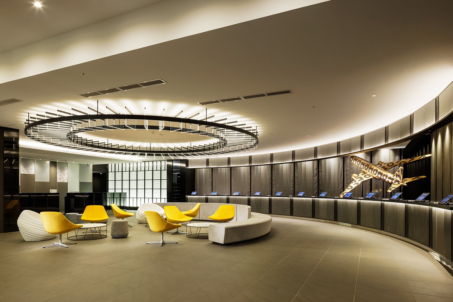
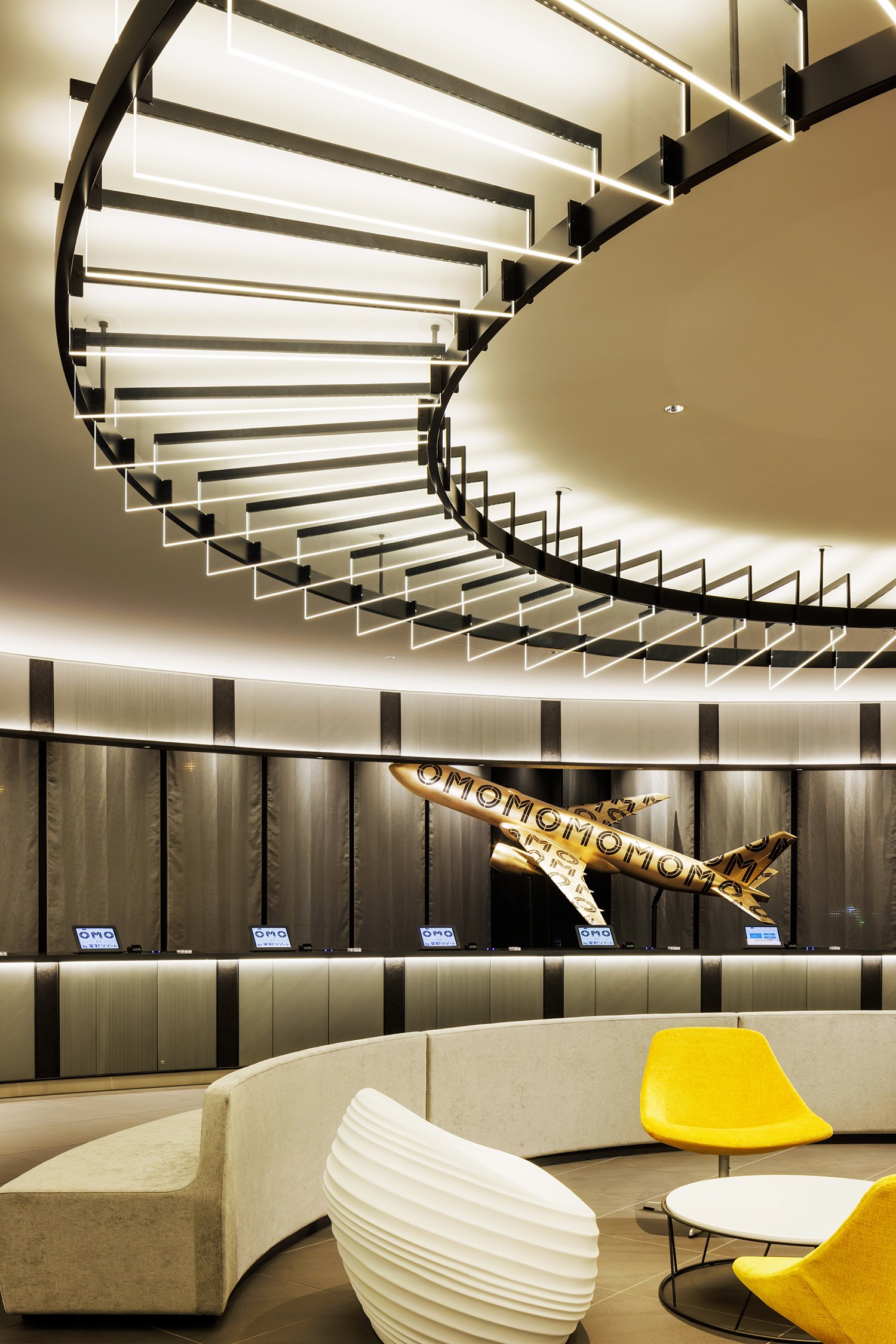
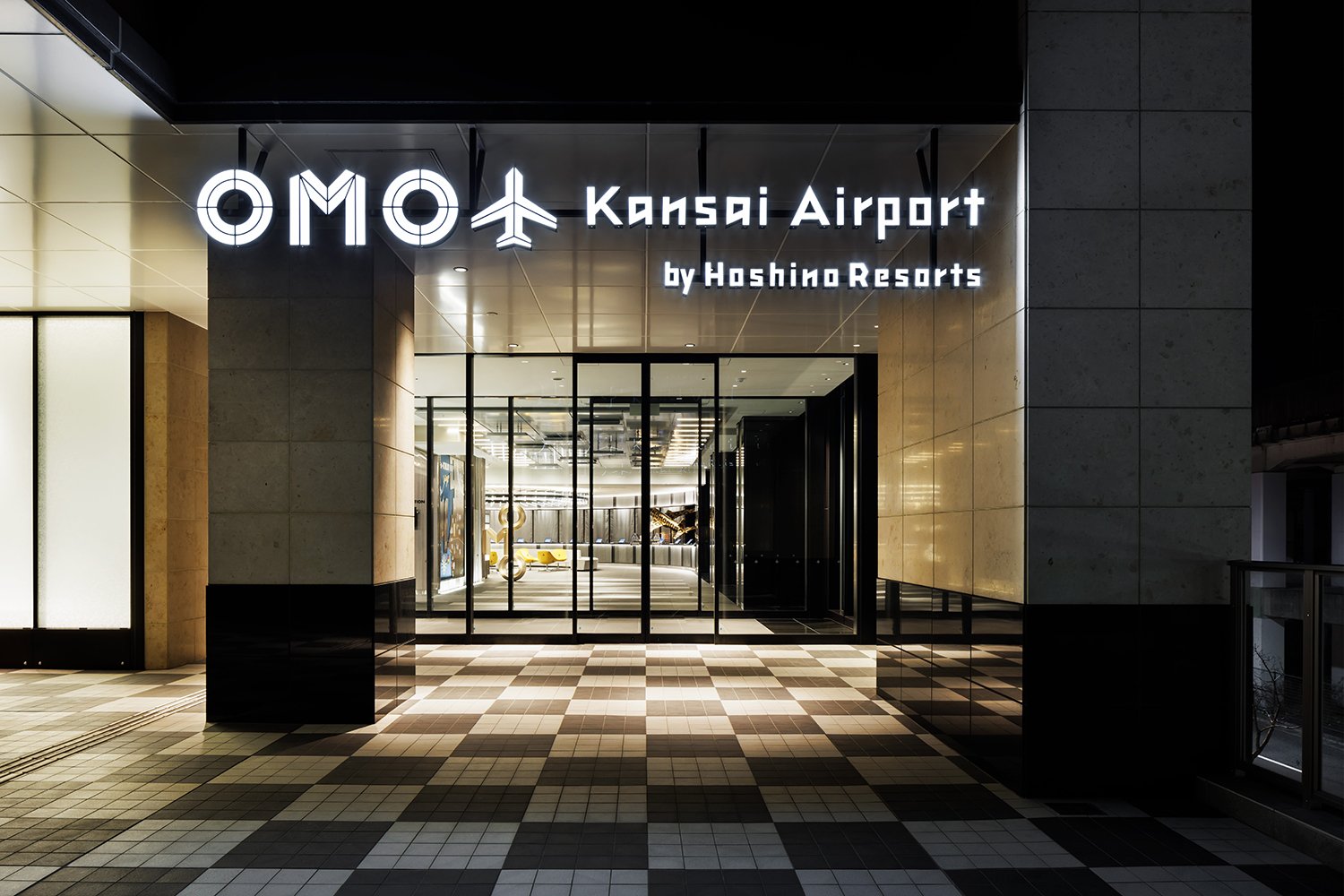


The OMO Kansai Airport emphasizes convenience and ease of movement. The hotel is located just steps away from the airport's terminal and offers unique services such as the 'Airporter' luggage delivery, which allows guests to streamline their travel experience from check-in to check-out. This service is a testament to our commitment to making your stay as stress-free as possible. The overall design facilitates a smooth and efficient stay, with a playful edge that reflects OMO's exciting mission to turn ordinary city experiences into memorable adventures. This promise of adventure is sure to pique the interest of any traveller.
At OMO Kansai Airport, modern travel seamlessly combines functional and whimsical design. MITSUI Designtec's approach creates a space where guests can transition between worlds - whether it's between different time zones, flights, or destinations - while enjoying carefully curated design that enhances the joy of movement, travel, and discovery. This is not just a hotel; it's the perfect bridge between the excitement of journeying and the comfort of arriving.
For more information, please visit: https://www.mitsui-designtec.co.jp/
*This project is one of the shortlisted project in the Sky Design Awards 2024 - Interior Design - Hotel & Resorts Division
Revolutionizing Healthcare Design: The Laminaesculapian’s Striking Fusion of Form and Function
The Laminaesculapian, designed by KTX archived, is the new building for Himeji Daiichi Hospital. It replaces the old structure from the 1960s, which no longer meets earthquake resistance standards. The new facility aims to move away from hospitals' traditional monolithic look while still being highly functional for healthcare.
The Laminaesculapian, designed by KTX archived, is the new building for Himeji Daiichi Hospital. It replaces the old structure from the 1960s, which no longer meets earthquake resistance standards. The new facility aims to move away from hospitals' traditional monolithic look while still being highly functional for healthcare.
The hospital is located along Japan's busy national road No. 2, presenting a striking visual of the urban landscape. Its north facade, the largest side, features a sleek design with irregularly shaped window openings that introduce a playful rhythm. This is contrasted by the sharp angles forming an 'open book' effect on the eastern side, which marks the main entrance. The 'open book' effect refers to the design's resemblance to an open book, with the sharp angles creating a sense of movement and inviting visitors into the hospital. This architectural choice softens the building's imposing presence, a thoughtful consideration that balances its size and function with aesthetic appeal, a feature that the audience will surely appreciate.
The hospital is designed to efficiently accommodate the flow of patients and staff. The ground floor features a spacious reception area that is well-lit with natural light, thanks to large windows that connect it to the outdoors. This layout continues on the subsequent floors, with dedicated areas for emergency care, medical imaging, dialysis, and surgical procedures. Inpatient rooms come in four-bed and single-bed configurations, and each floor is colour-coded to aid wayfinding and provide a distinct identity. The upper floors house rehabilitation spaces, offices, and facilities for both staff and patients. The top-level culminates in a versatile multi-purpose space, which can be used for [specific uses], demonstrating the hospital's adaptability and commitment to providing a comprehensive healthcare experience.
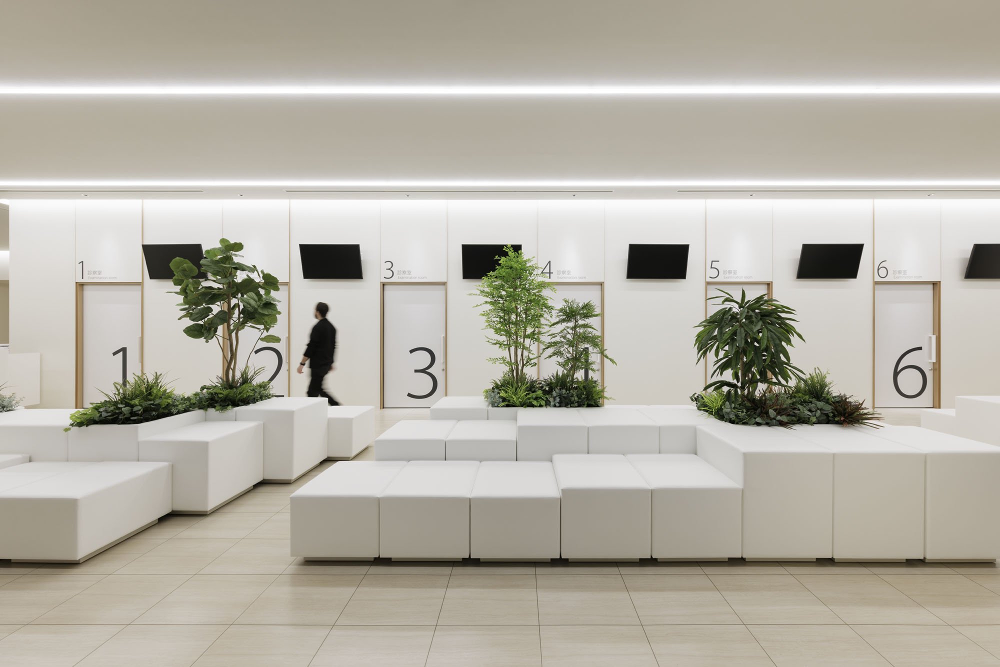
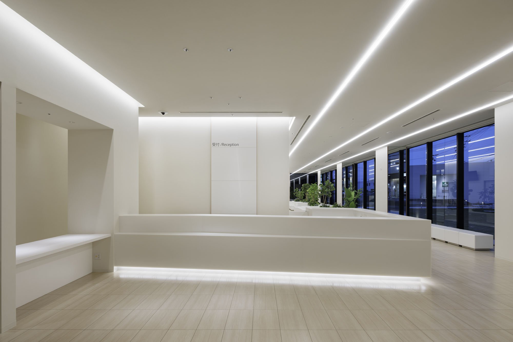
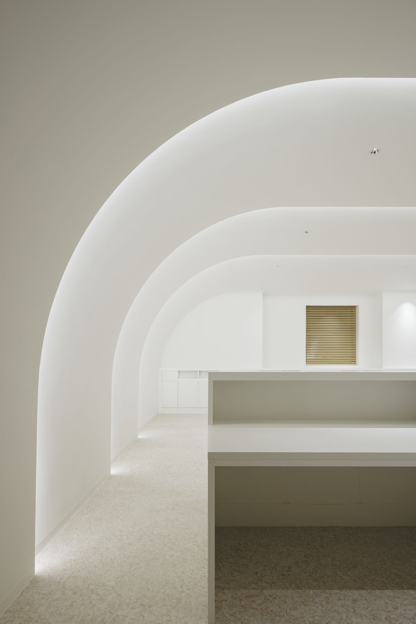

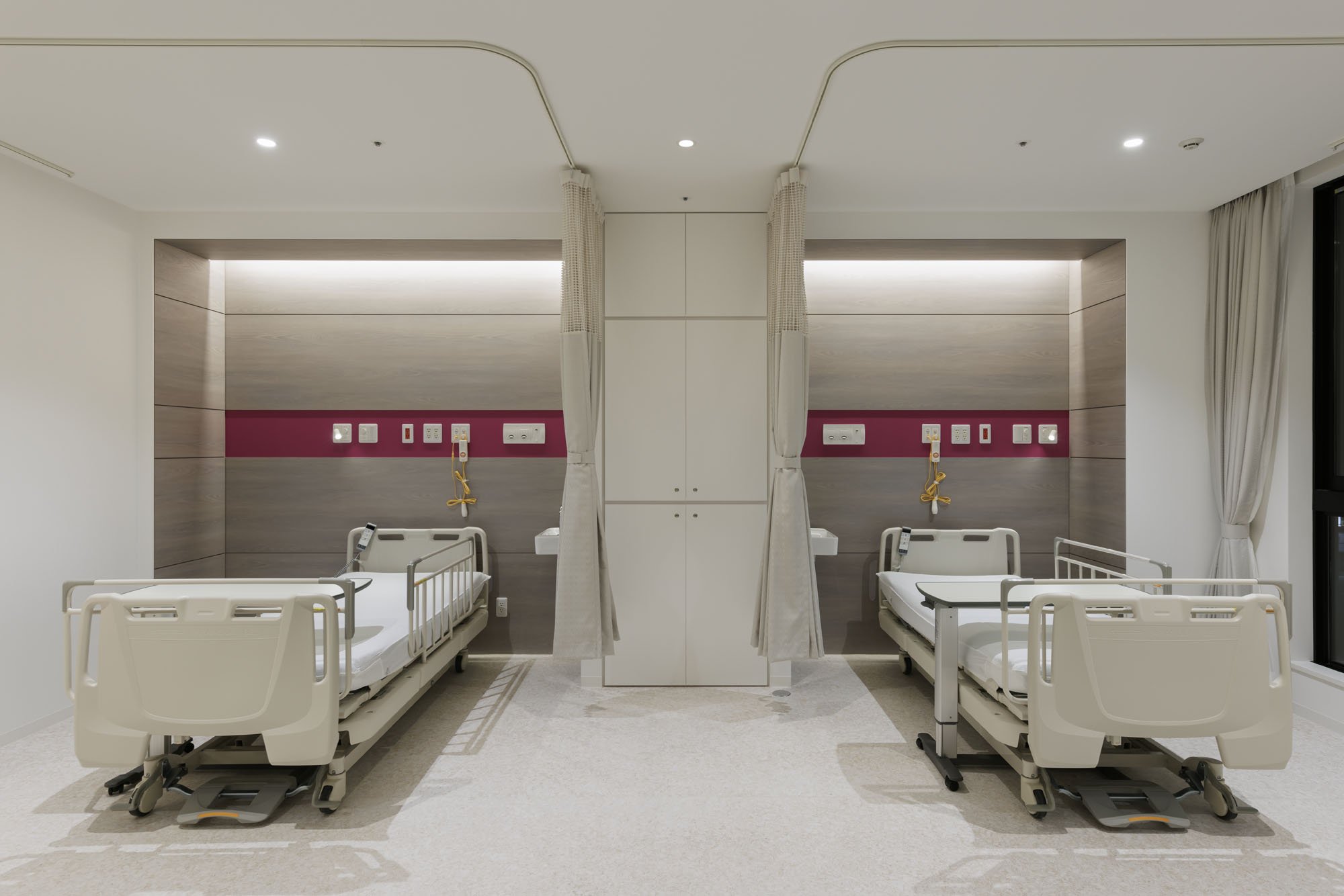
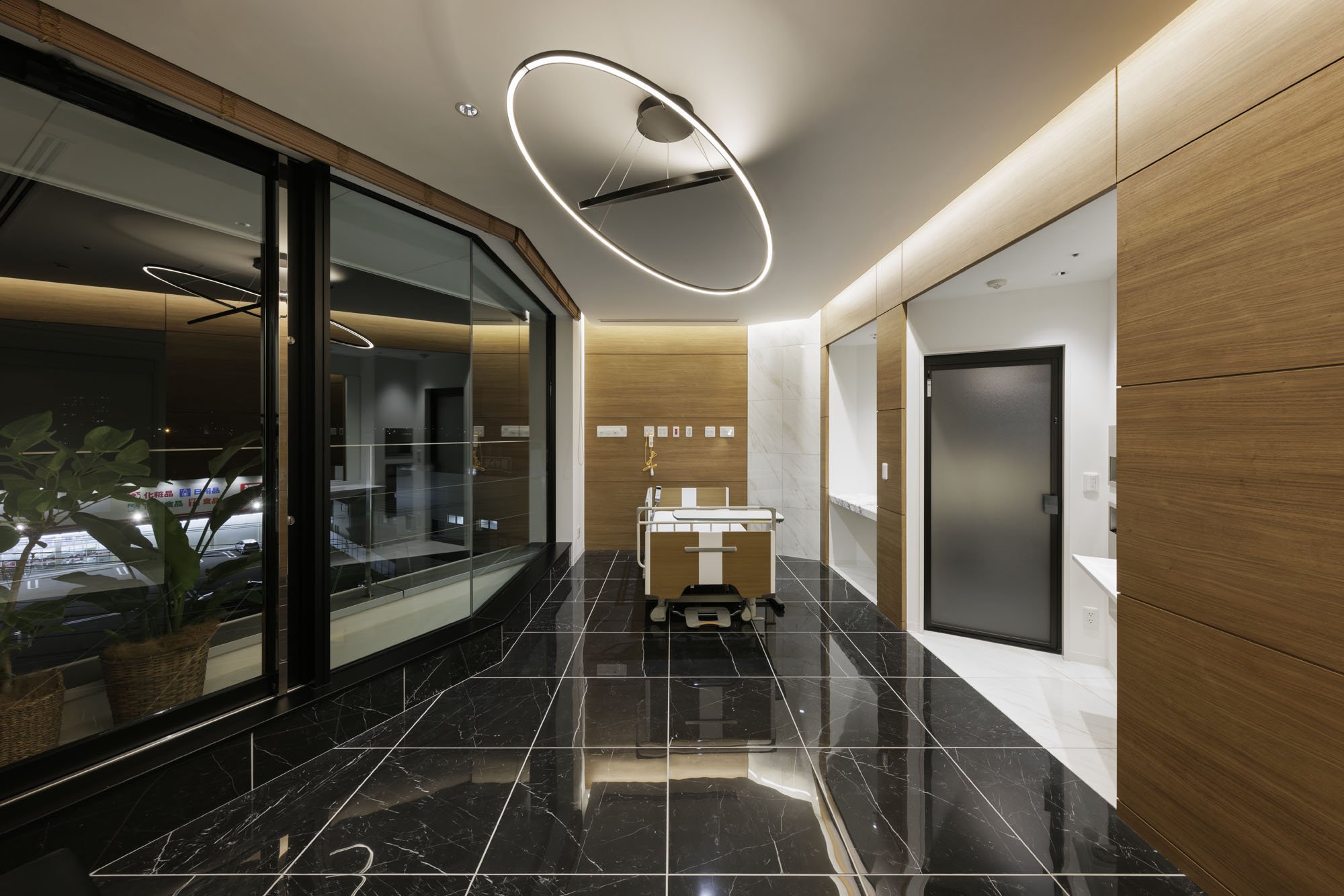
The Laminaesculapian is more than just a building. It's a testament to a patient-centric approach in healthcare architecture. KTX archiLAB has integrated modern healthcare needs with a patient-centric environment, blending form and function to redefine the typical hospital experience. The dynamic design elements challenge the conventional boxy hospital structure, creating a space that is not only welcoming and efficient but also reassuring. The hospital is designed with the best interests of the patients in mind, instilling confidence in the audience about the hospital's design.
"The Laminaesculapian marries form and function to redefine what a hospital can be. It blends the rigidity of healthcare with a sensitivity to human experience, light, and movement, setting a new standard for how healthcare facilities can engage aesthetically and functionally with their surroundings."
For more information, please visit: http://ktx.space/
KTX archiLAB
*This project is one of the shortlisted project in the Sky Design Awards 2024 - Architecture DivisionDesigner Profile
KTX archiLAB is an architectural and interior design office based in Japan. Specialized in commercial and medical design, its portfolio includes a wide range of projects: Hospitality, retail, showrooms, offices, hospitals, clinics, and more. KTX archiLAB has received more than a hundred and sixty local and international awards for its projects conducted both in Japan and abroad.
Crafting Soulful Luxury: Jean-Michel Gathy Redefines Hospitality Design with Janu Tokyo
In March 2024, Gathy revealed his latest masterpiece, Janu Tokyo, the highly anticipated flagship hotel for Aman's new sister brand. Janu, which means "soul" in Sanskrit, aims to blend mindful luxury and vibrant social energy. This concept is perfectly captured in the design of the Tokyo property, which combines European flair with understated Japanese elegance. Traditional Sakan wall plastering complements French-inspired interiors, resulting in a dynamic, timeless atmosphere that embodies both the ethos of the Janu brand and Gathy's signature design approach, where contemporary luxury meets cultural heritage.
Jean-Michel Gathy, the visionary behind some of the world’s most iconic luxury hotel interiors, continues to redefine the boundaries of opulence and design. As principal designer at DENNISTON, the architecture firm he founded in 1983, Gathy has established a reputation for crafting spaces that are as meticulously detailed as they are awe-inspiring. His portfolio reads like a who’s who of luxury hospitality, with celebrated projects for global heavyweights such as Mandarin Oriental, One&Only, and most recently, the flagship Aman New York.
In March 2024, Gathy unveiled his latest masterpiece, Janu Tokyo, the much-anticipated flagship hotel for Aman’s new sister brand. Janu, which translates to “soul” in Sanskrit, aims to strike a balance between mindful luxury and a vibrant social energy—a concept that Gathy has effortlessly encapsulated in the Tokyo property. The design merges European flair with understated Japanese elegance, with traditional Sakan wall plastering complementing French-inspired interiors. The result is a dynamic, timeless atmosphere that reflects both the ethos of the Janu brand and Gathy’s signature design approach, where contemporary luxury meets cultural heritage.
The crown jewel of Janu Tokyo is undoubtedly the Janu Suite. Spanning an impressive 284 square meters (3,057 square feet), this suite offers panoramic views of Tokyo Tower and the lush Azabudai Hills Garden Plaza from its two expansive balconies. Inside, the space is thoughtfully laid out with residential-scale living areas, a private study and library, and a spa-like bathroom complete with a double vanity, rain shower, and soaking tub. Every detail, from the seamless flow of space to the artfully curated furnishings, speaks to Gathy’s unmatched ability to combine comfort with grandeur.


Born in Belgium in 1955, Gathy’s early fascination with architecture was sparked during family trips across Europe, where he developed a keen eye for the nuances of different cultures and landscapes. By 1981, he had relocated to Asia, where his passion for innovative, luxury design found its perfect canvas. Over the past four decades, DENNISTON has become synonymous with cutting-edge hospitality design, and Gathy himself has emerged as a trailblazer in the industry.
Gathy’s impact has not gone unnoticed. His work has been widely published, and he is frequently invited to speak at international conferences. His numerous accolades include his induction into the prestigious "Platinum Circle of Hospitality Design" in 2006, an honor reserved for those who have significantly shaped the world of hotel design. In 2019, Gathy was awarded the title of "Officer of the Order of the Crown" by His Majesty Philippe, King of Belgium, recognizing his outstanding contributions to the field. More recently, in 2022, he received the Outstanding Contribution Award from AHEAD (Awards for Hospitality Experience and Design), further cementing his legacy as a pioneer in luxury design.
With Janu Tokyo, Gathy not only introduces a fresh design language to Japan’s hospitality scene but also reinforces his enduring commitment to innovation and excellence. The property exemplifies his ability to blend cultural influences with modern luxury, creating environments that are as soulful as they are sophisticated. As Janu continues to expand globally, Gathy’s design for the Tokyo flagship sets the tone for a new era of dynamic, design-forward luxury hotels.


