Bird Water Tower: FLIP Studio's Bold Revival of Industrial Heritage and Art at Shanghai's M50 Creative Park
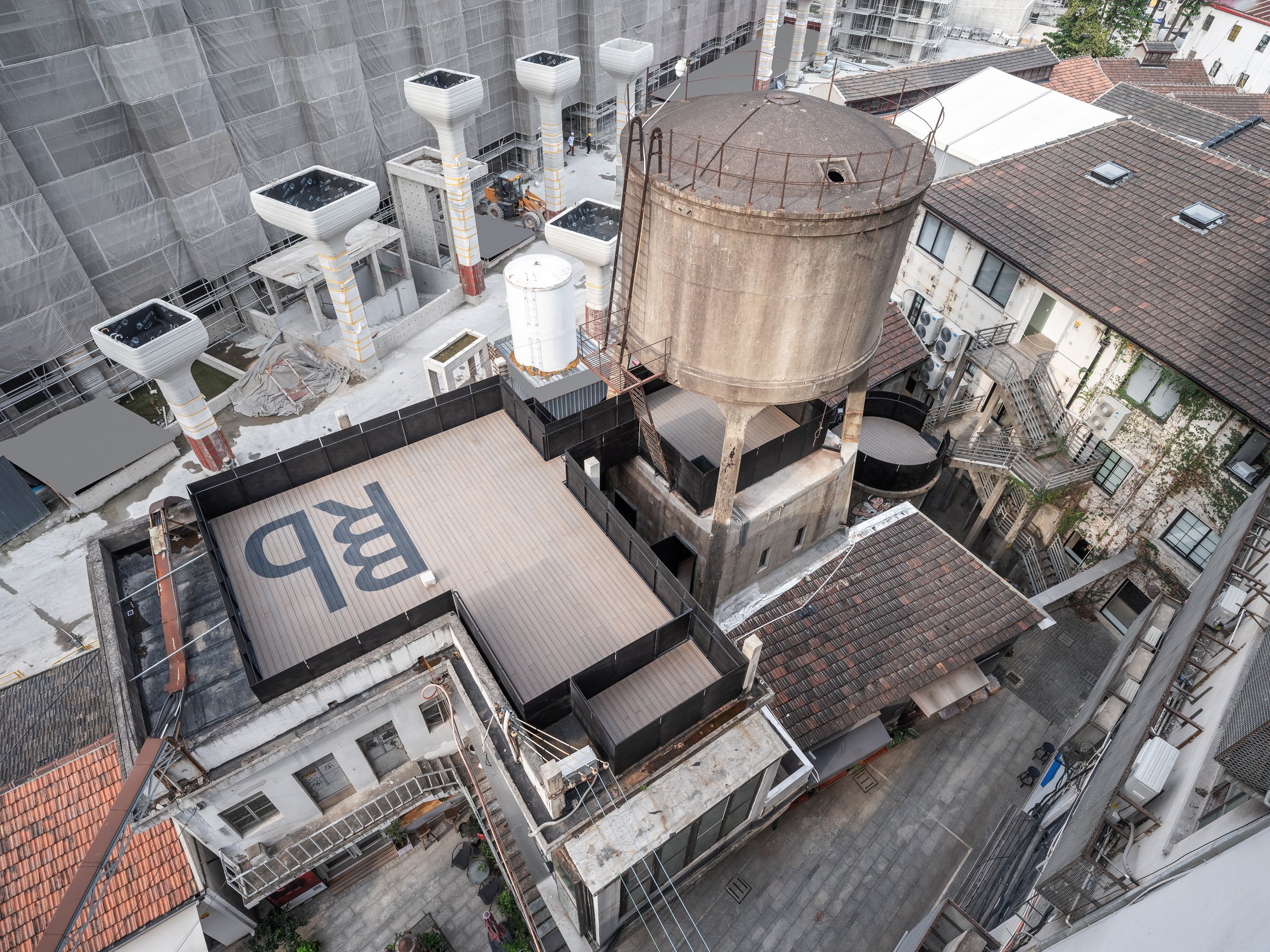
Located in the northwest corner of Shanghai's M50 Creative Park, a hub for contemporary art and design, the Bird Water Tower is a captivating blend of the old and the new. Standing next to Heatherwick Studio's famous 1000 Trees, this historic water tower has existed for over fifty years. Previously owned by the well-known artist and curator Bing Su, the tower was unused for many years until FLIP Studio converted it into a vibrant venue for modern art and social gatherings.
Located in the northwest corner of Shanghai's M50 Creative Park, a hub for contemporary art and design, the Bird Water Tower is a captivating blend of the old and the new. Standing next to Heatherwick Studio's famous 1000 Trees, this historic water tower has existed for over fifty years. Previously owned by the well-known artist and curator Bing Su, the tower was unused for many years until FLIP Studio converted it into a vibrant venue for modern art and social gatherings.
"The renovation of the Bird Water Tower offers an exploration of temporal layers. Visitors can physically and metaphorically navigate through Shanghai's industrial past while being immersed in modern artistic expression. FLIP Studio's design approach embraces the structure's worn and weathered character while introducing a new architectural language that engages with the old."
Outdoor Experience: A Gateway Between Eras
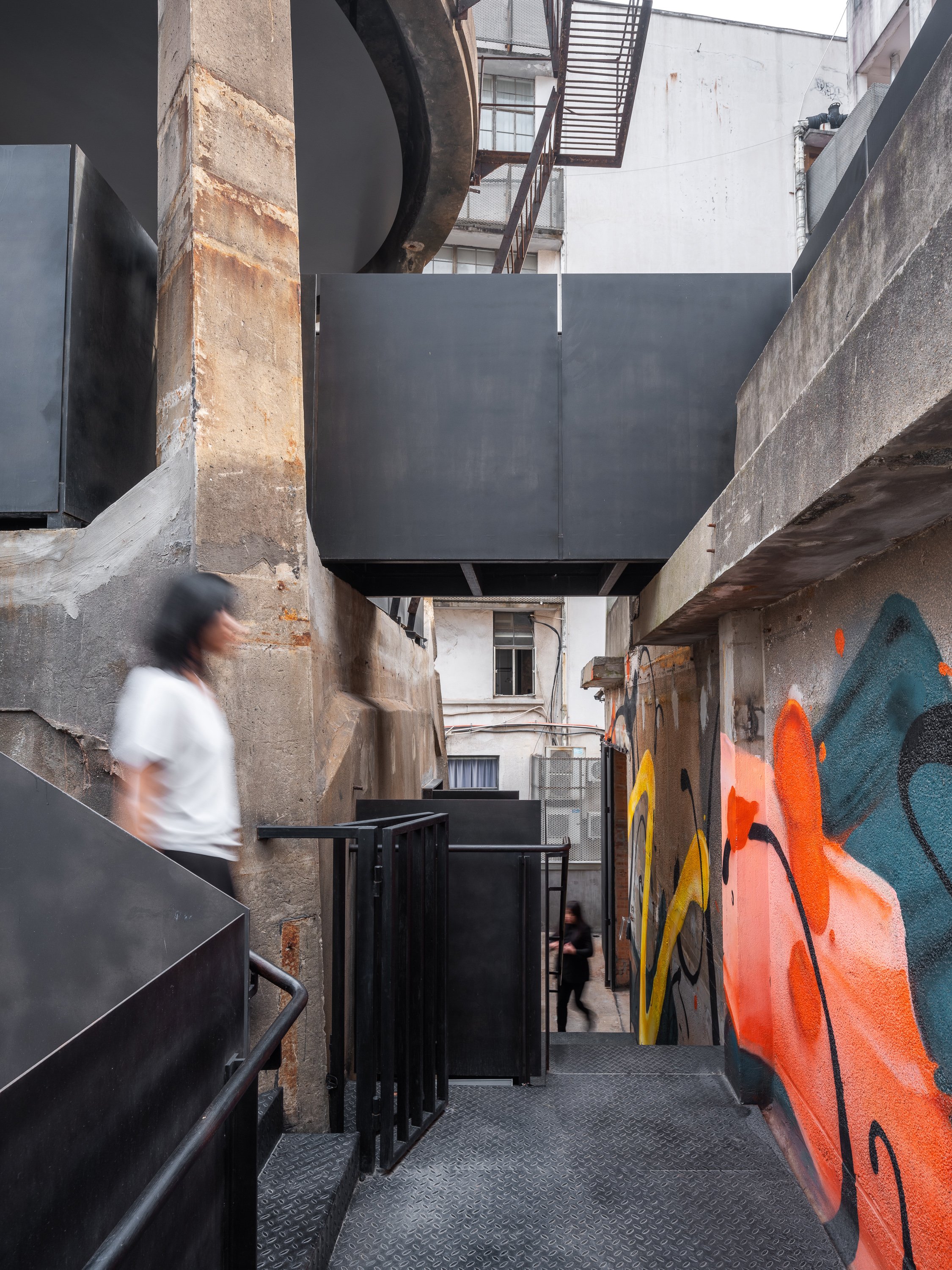
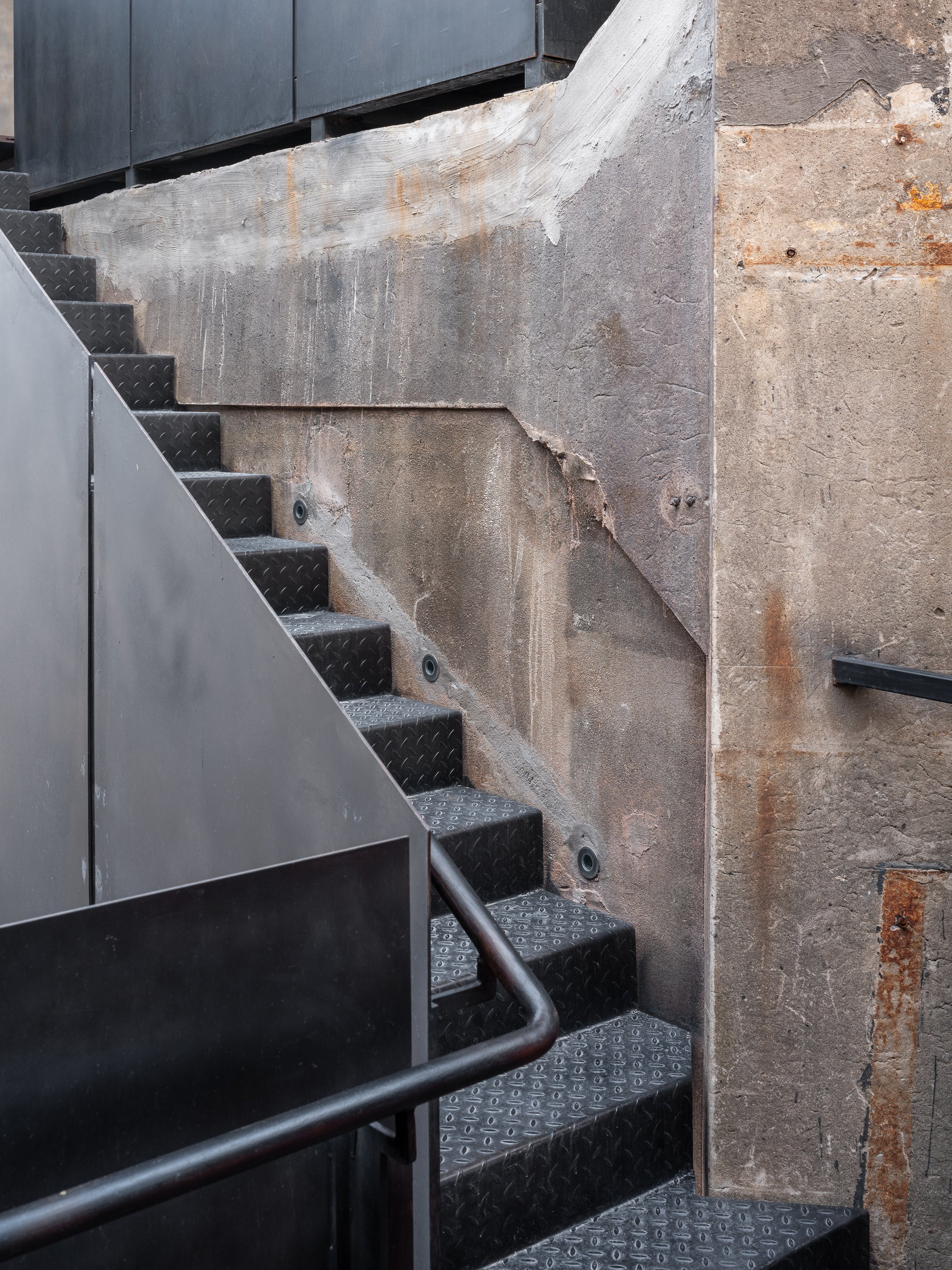
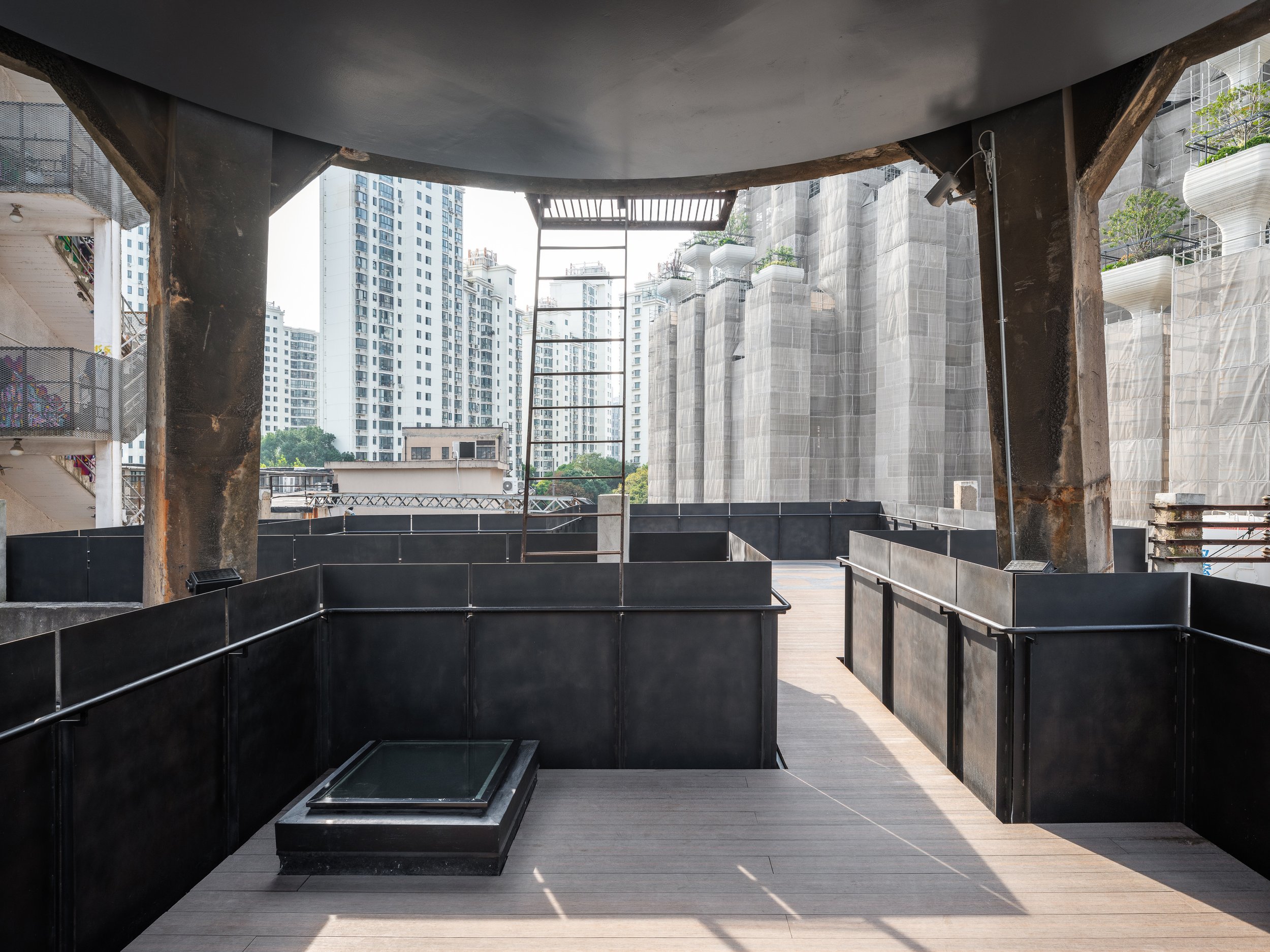
The journey starts in the outdoor area, where FLIP Studio has skillfully incorporated a network of platforms, bridges, and stairways to create an architectural promenade leading to the tower. These new pathways are marked by black-rusted steel handrails and balustrades, clearly distinguishing between old and new while maintaining a respectful enclosure. These changes serve as connectors and indicate the visitor's transition into a redefined space where history meets innovation.
Dual Interiors: Raw Elegance Meets Refined Modernity
The interior of the Bird Water Tower has been divided into two distinct spaces: one square and the other rectangular, each offering a unique spatial experience. A narrow outdoor terrace acts as a slender seam, joining the two spaces while providing a brief breath of fresh air between the roughness of the past and the precision of contemporary design.
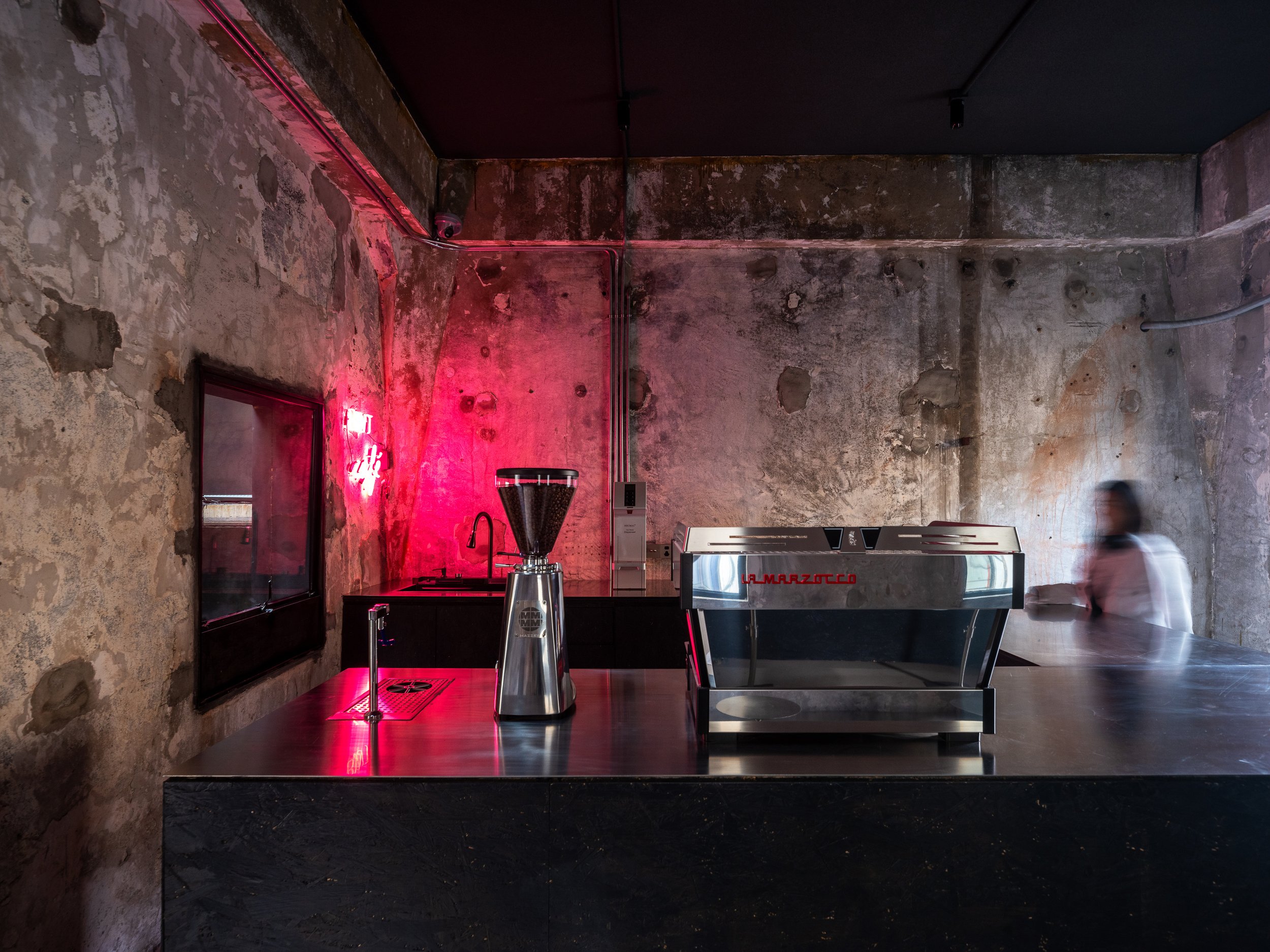
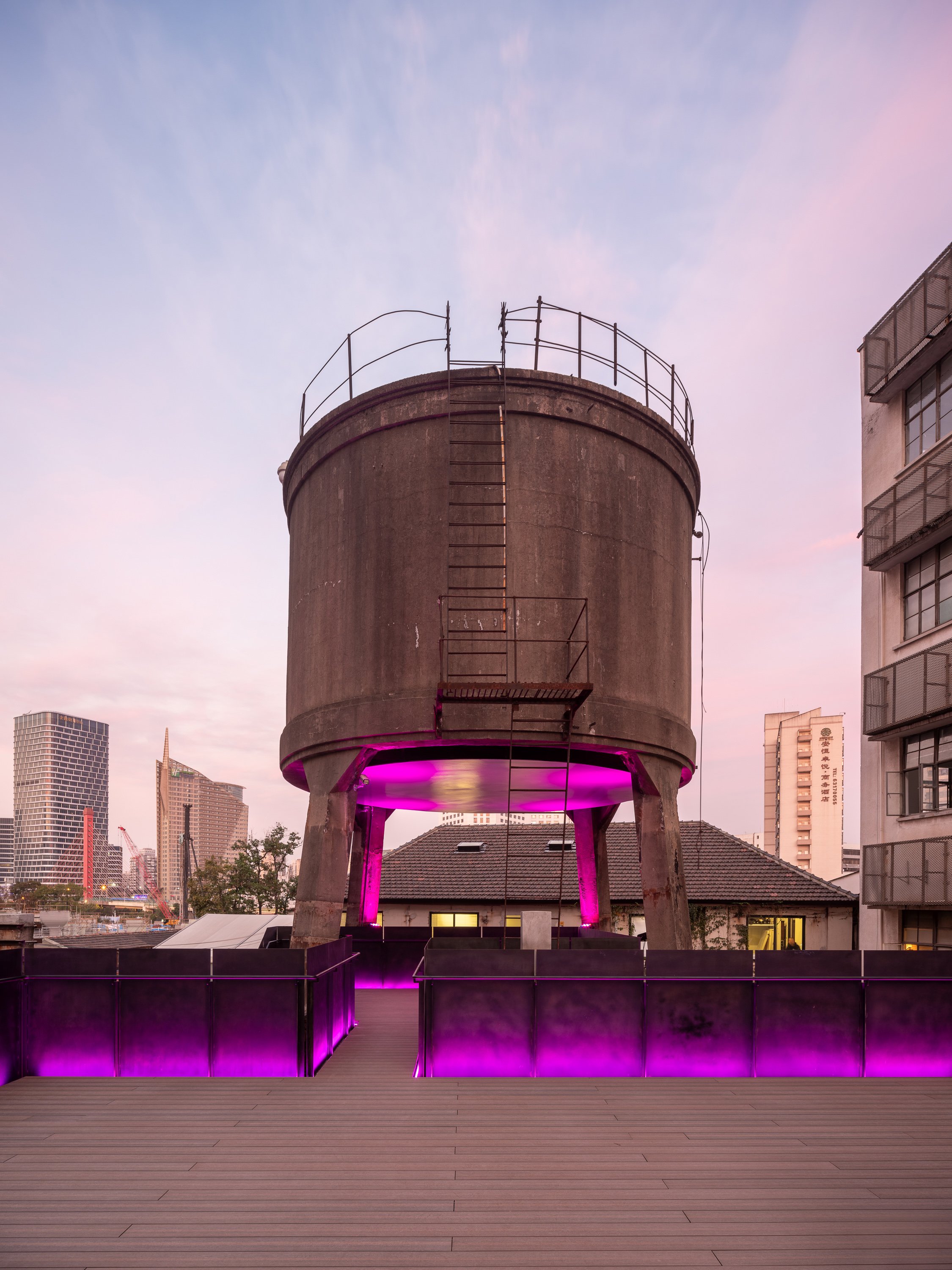
FLIP Studio chose to reveal the structure's raw, industrial character in the square hall. Exposed dark gray cement walls bear the scars of time, with traces of demolished interior partitions intentionally left visible. A boldly inserted black-painted OSB coffee bar creates a monolithic "black box" that contrasts sharply with the gritty backdrop. The pink neon lighting adds a surreal, almost cinematic atmosphere, blurring the lines between the industrial heritage and the contemporary art world.
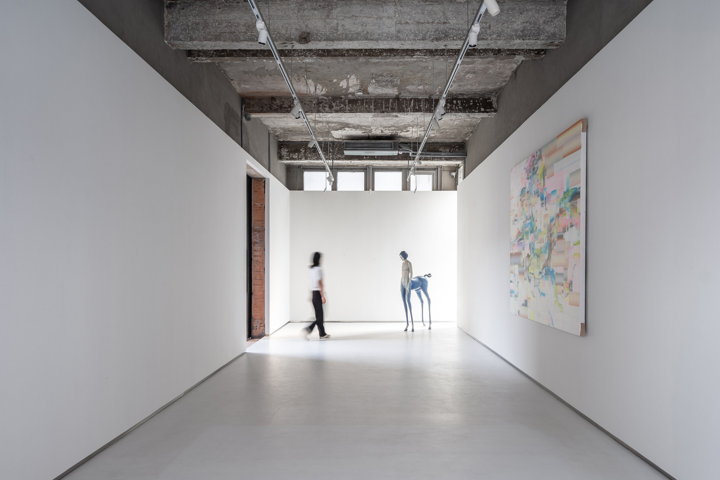
The rectangular hall contrasts with subtler gestures. A white box has been carefully placed in this space, covering two-thirds of the height and leaving the original ceiling exposed. The contrast between new and old is more noticeable in this room, especially where the white box meets the existing brick walls, terrazzo cladding, and exposed structural elements. These layers are revealed like an "architectural anatomy," a concept that aims to showcase the building's structural elements and materials, reminiscent of Gordon Matta-Clark's work, where cut walls and raw materials evoke a dialogue between past and present.
Art and Space: A Curatorial Journey
Art plays a crucial role in guiding visitors through the tower. Strategic placement of installations, graffiti, paintings, and video art punctuate the spatial experience. Key pieces act as navigational markers along the circulation path. An example of this is the untouched wall along the newly inserted staircase, where a live graffiti performance brought the raw energy of street art into the space during the pre-opening phase.
A polished metal plate suspended at the tower's base adds another dimension to the curation. This surface is a canvas for projected digital art, creating a fluid, ever-changing dialogue between physical architecture and ephemeral media.
A Beacon of Light and Art
The Bird Water Tower becomes a glowing beacon in the quiet M50 Creative Park at night. It is adorned with vibrant neon lights and dynamic projections, making it a lighthouse from another dimension. The interplay of light, shadow, and art creates an inviting space where time feels suspended, and the boundaries between past and future dissolve.
The revival of the Bird Water Tower is a testament to Shanghai's industrial heritage and an experiment in the intersection of architecture, art, and urban regeneration. FLIP Studio's sensitive yet inventive intervention has transformed this once-abandoned space into a landmark of creative expression that encourages exploration, contemplation, and conversation.
Project Name:M50 Bird Water Tower
Project Location:Shanghai, China
Lead Designer: Kailun Sun
Area:230㎡
Design Team:Zixuan Chen
Photo:Fangfang Tian
Completion:2023.08
For more information, please visit: www.flip-studio.com
*This project is one of the shortlisted project in the Sky Design Awards 2024 - Architecture Division
Kamakura Country Club: A Reimagined Icon of Modern Elegance and Timeless Tradition
The recent renovation of the Kamakura Country Club, a project that successfully balances preserving historical significance and embracing modern aesthetics, is a unique architectural feat. Led by the innovative firm CONTEMPORARY MARKET, this transformation marks the club's 55th anniversary. It has evolved from a mere golfing destination to a complete lifestyle retreat, offering a blend of history, culture, and luxury that is unparalleled. This evolution is a testament to the club's adaptability and its commitment to providing a unique experience for its members.
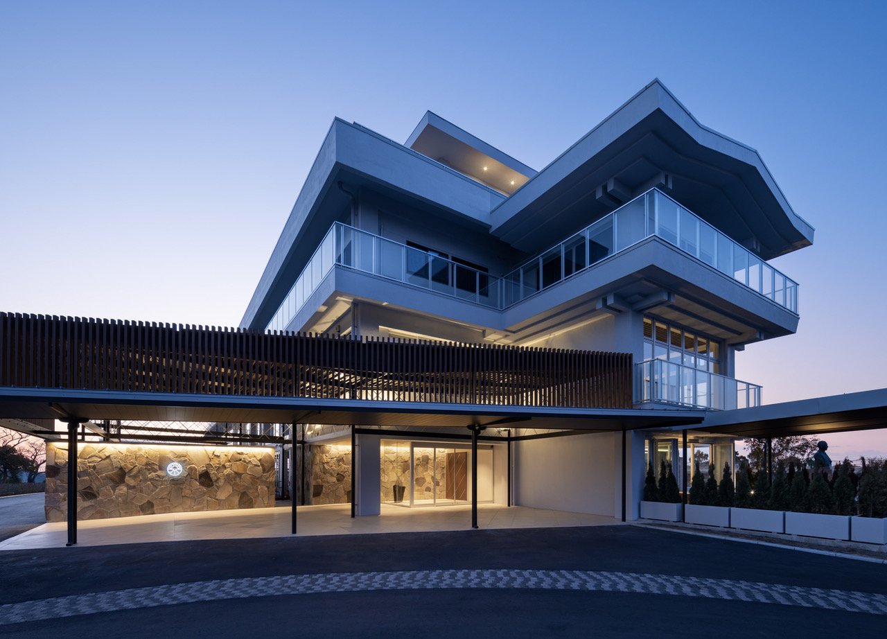
The redesign is based on a concept that reflects the aspirations of the club's founder - a "castle tower" representing strength and ambition. This vision is evident in the meticulous use of stone, traditionally associated with resilience and endurance.
The recent renovation of the Kamakura Country Club, a project that successfully balances preserving historical significance and embracing modern aesthetics, is a unique architectural feat. Led by the innovative firm CONTEMPORARY MARKET, this transformation marks the club's 55th anniversary. It has evolved from a mere golfing destination to a complete lifestyle retreat, offering an unparalleled blend of history, culture, and luxury. This evolution is a testament to the club's adaptability and, more importantly, its unwavering commitment to providing its members a unique and special experience.
The redesign is based on a concept that reflects the aspirations of the club's founder - a "castle tower" representing strength and ambition. This vision is evident in the meticulous use of stone, traditionally associated with resilience and endurance. The stone wall, a recurring motif throughout the renovation, is a visual and symbolic link between the past and present. It forms the core of the design, creating a seamless connection between the indoor spaces and the natural surroundings. This continuity honours the club's rich history and firmly grounds it in the present, laying the foundation for its future. The meticulous design elements, from the stone walls to the indoor spaces, are a testament to the club's dedication to preserving its heritage while embracing modernity.
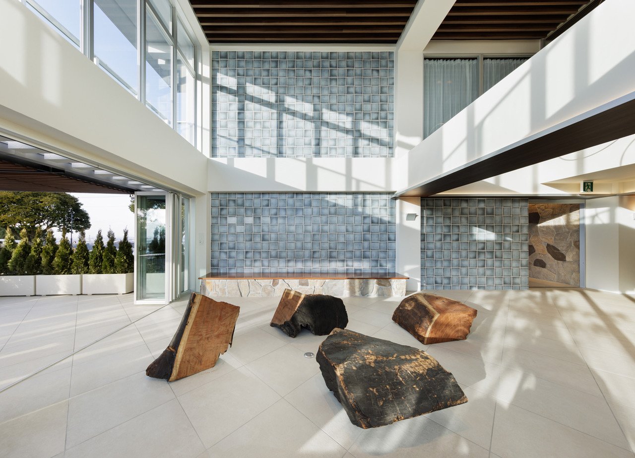
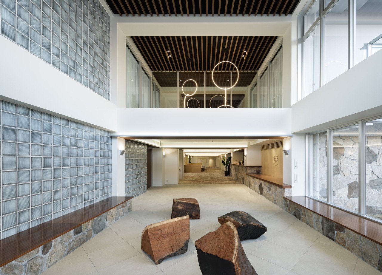
Entering the new club lounge, one is immediately struck by its grandeur. The stone walls, meticulously crafted to mimic the rough-hewn blocks of a castle's fortifications, imbue the area with a sense of permanence and gravitas. Yet, the design is far from archaic.
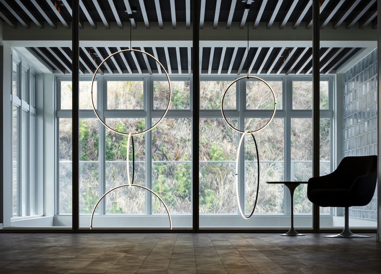
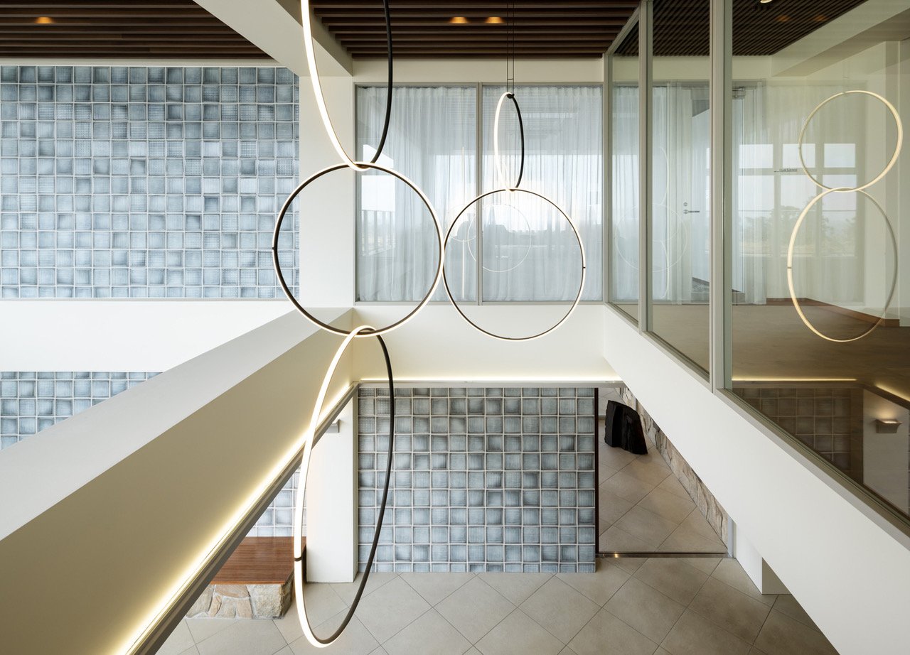
The CONTEMPORARY MARKET incorporates minimalist and futuristic elements, like the impressive chandelier in the atrium, to contrast with its historical references. This striking difference is most apparent in the encounter between ancient and modern elements: a large zelkova tree stump, a relic of nature and a symbol of enduring history, is placed in conversation with the contemporary lighting above. The process of incorporating the tree stump into the design was meticulous, involving careful consideration of its placement and the lighting that would best complement its natural beauty. This combination of materials and shapes creates a story that is visually compelling and deeply meaningful, highlighting a dialogue between the past and the future in the vast, open space of the lounge.
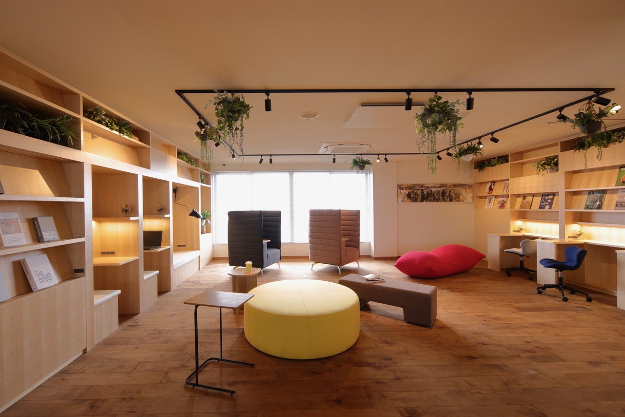
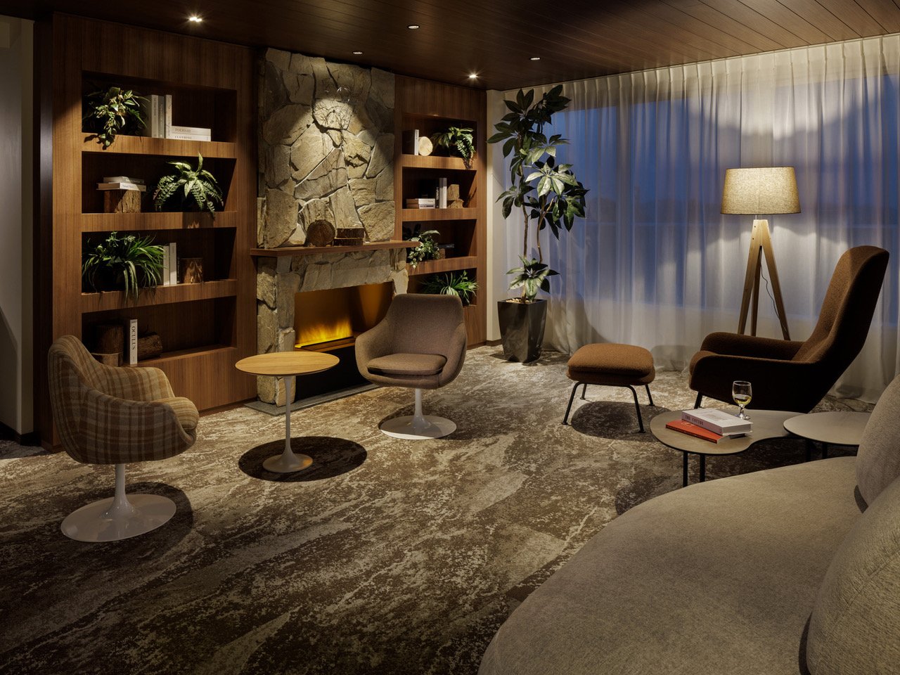
The renovation goes beyond just looks; it also meets the changing needs of the club's members. As more people look for a work-life balance, the design includes a study room for remote work and quiet reading. With its simple elegance and thoughtful details, this room offers a peaceful space where work and leisure seamlessly blend into a comfortable and productive experience. Additionally, a state-of-the-art fitness room has been added to the club, enhancing its appeal and providing a space for physical rejuvenation alongside the mental relaxation offered elsewhere.
The meticulous renovation of the Kamakura Country Club, a project by CONTEMPORARY MARKET, is a testament to the site's heritage and patrons' preferences. It honours the past and embraces modern design, perfectly balancing historical significance and modern aesthetics. The stone walls, symbolic objects, and minimalist interventions are not just decorative; they are essential elements of a design language that connects different periods, blending the timeless with the contemporary.
The renovation of the Kamakura Country Club was completed in January 2023, marking a new chapter in the club's history. The renovation is a testament to the enduring power of thoughtful design, where tradition and modernity are woven together to create a space that is as relevant today as it was when the club was conceived. The Kamakura Country Club is not just a place to play golf but a sanctuary where history and modernity coexist perfectly harmoniously for those who appreciate the art of design.
For more information, please visit: https://plow.tokyo/hijung-kasuya/
Designer Profile
Hijung Kasuya
Born in Tokyo. Graduated from Musashino Art College, Department of Life Design.
After working as a coordinator for an Italian furniture brand, became an interior stylist.
In 1985, she established her own private design firm, Contemporary Market.
Currently active in interior design, coordination, product design, and other genres.


