Revolutionizing Healthcare Design: The Laminaesculapian’s Striking Fusion of Form and Function
The Laminaesculapian, designed by KTX archived, is the new building for Himeji Daiichi Hospital. It replaces the old structure from the 1960s, which no longer meets earthquake resistance standards. The new facility aims to move away from hospitals' traditional monolithic look while still being highly functional for healthcare.
The Laminaesculapian, designed by KTX archived, is the new building for Himeji Daiichi Hospital. It replaces the old structure from the 1960s, which no longer meets earthquake resistance standards. The new facility aims to move away from hospitals' traditional monolithic look while still being highly functional for healthcare.
The hospital is located along Japan's busy national road No. 2, presenting a striking visual of the urban landscape. Its north facade, the largest side, features a sleek design with irregularly shaped window openings that introduce a playful rhythm. This is contrasted by the sharp angles forming an 'open book' effect on the eastern side, which marks the main entrance. The 'open book' effect refers to the design's resemblance to an open book, with the sharp angles creating a sense of movement and inviting visitors into the hospital. This architectural choice softens the building's imposing presence, a thoughtful consideration that balances its size and function with aesthetic appeal, a feature that the audience will surely appreciate.
The hospital is designed to efficiently accommodate the flow of patients and staff. The ground floor features a spacious reception area that is well-lit with natural light, thanks to large windows that connect it to the outdoors. This layout continues on the subsequent floors, with dedicated areas for emergency care, medical imaging, dialysis, and surgical procedures. Inpatient rooms come in four-bed and single-bed configurations, and each floor is colour-coded to aid wayfinding and provide a distinct identity. The upper floors house rehabilitation spaces, offices, and facilities for both staff and patients. The top-level culminates in a versatile multi-purpose space, which can be used for [specific uses], demonstrating the hospital's adaptability and commitment to providing a comprehensive healthcare experience.
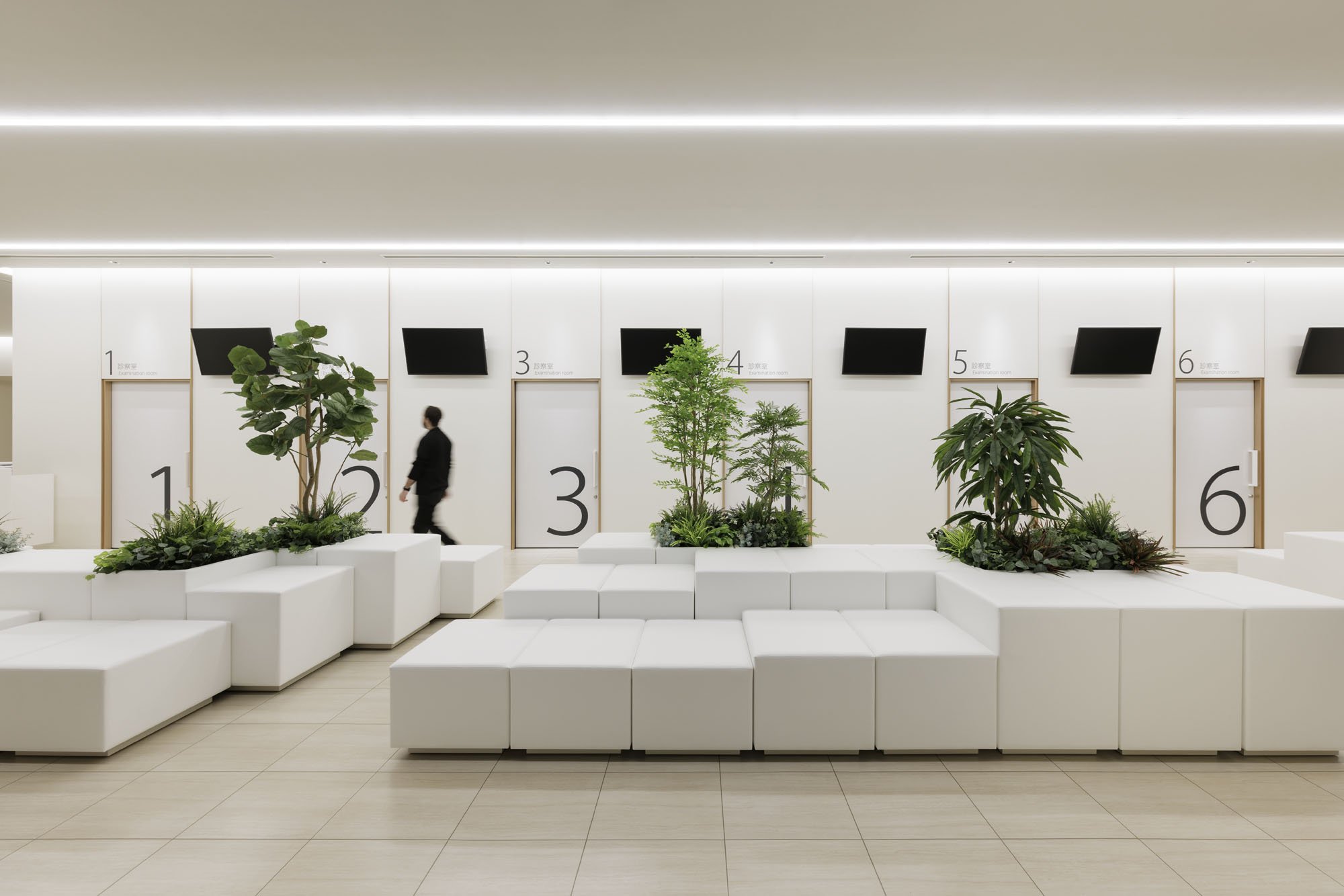
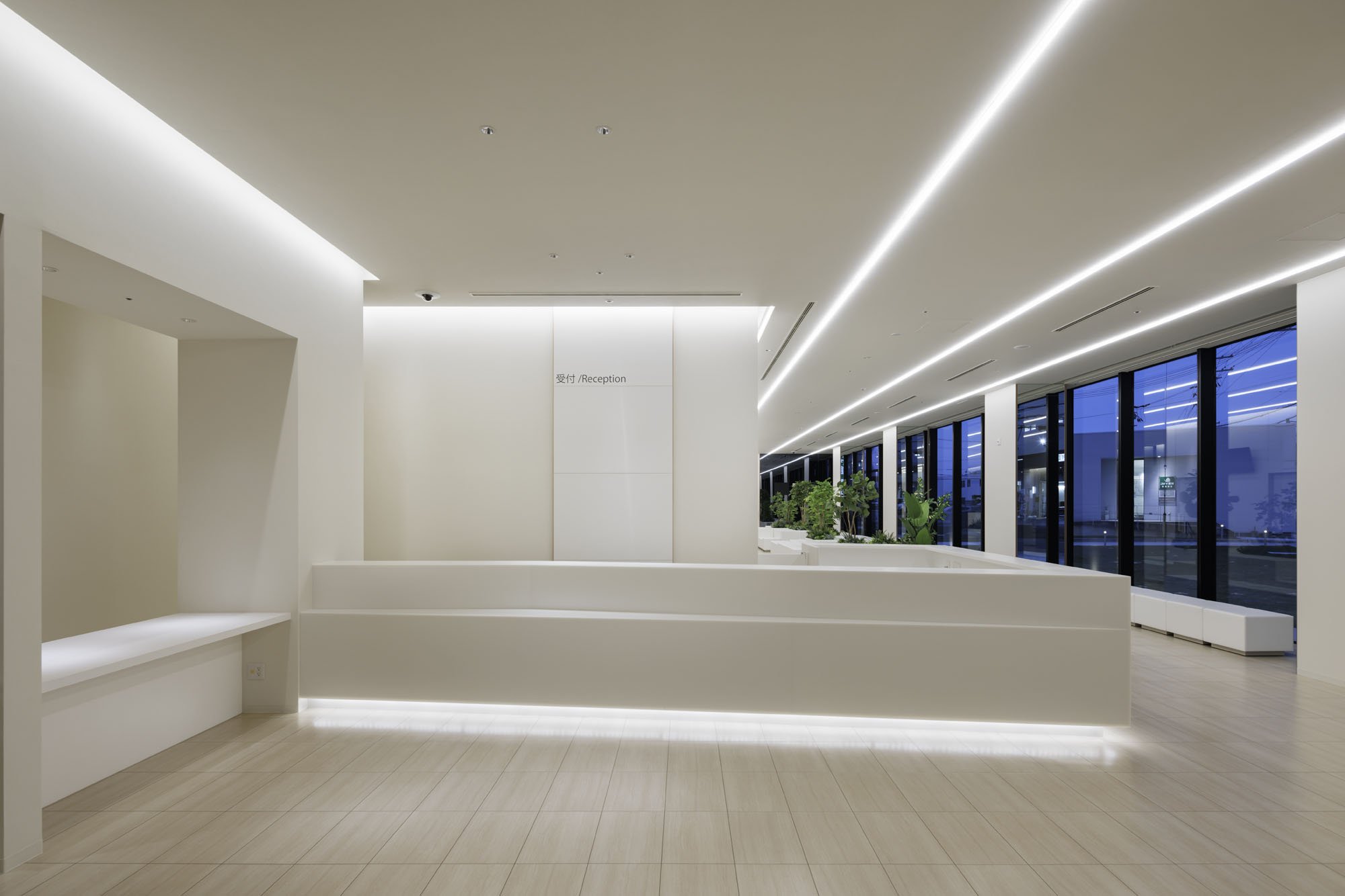
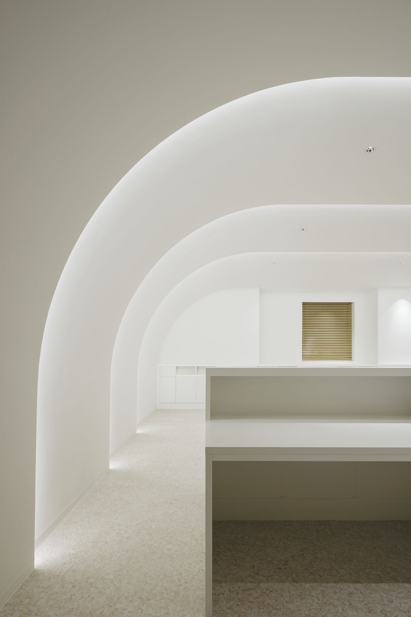

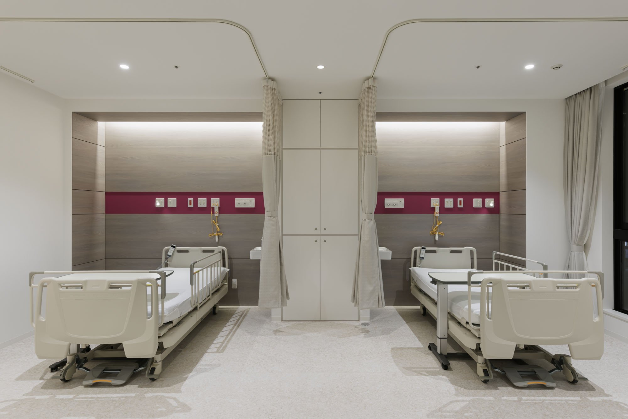
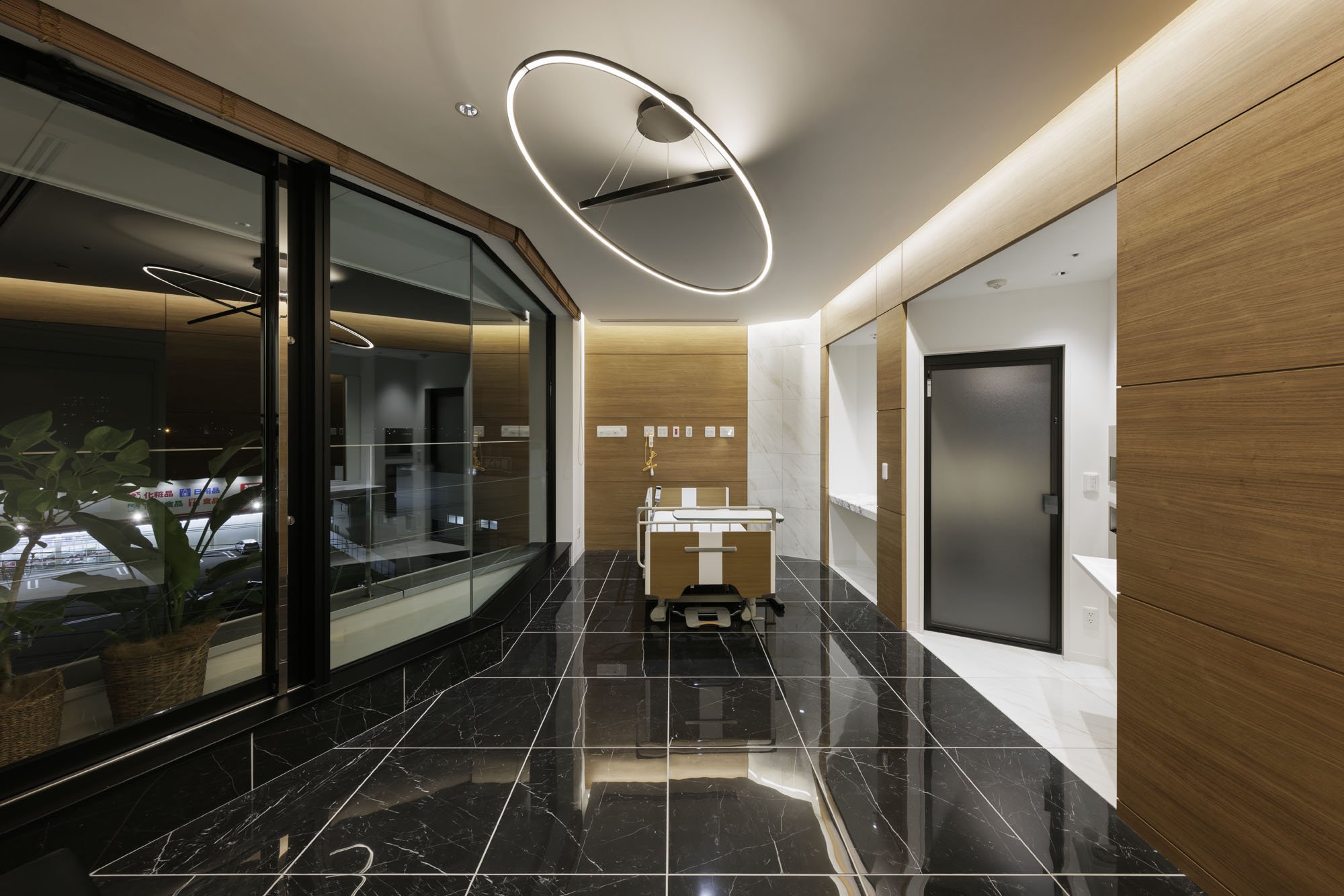
The Laminaesculapian is more than just a building. It's a testament to a patient-centric approach in healthcare architecture. KTX archiLAB has integrated modern healthcare needs with a patient-centric environment, blending form and function to redefine the typical hospital experience. The dynamic design elements challenge the conventional boxy hospital structure, creating a space that is not only welcoming and efficient but also reassuring. The hospital is designed with the best interests of the patients in mind, instilling confidence in the audience about the hospital's design.
"The Laminaesculapian marries form and function to redefine what a hospital can be. It blends the rigidity of healthcare with a sensitivity to human experience, light, and movement, setting a new standard for how healthcare facilities can engage aesthetically and functionally with their surroundings."
For more information, please visit: http://ktx.space/
KTX archiLAB
*This project is one of the shortlisted project in the Sky Design Awards 2024 - Architecture DivisionDesigner Profile
KTX archiLAB is an architectural and interior design office based in Japan. Specialized in commercial and medical design, its portfolio includes a wide range of projects: Hospitality, retail, showrooms, offices, hospitals, clinics, and more. KTX archiLAB has received more than a hundred and sixty local and international awards for its projects conducted both in Japan and abroad.
Bird Water Tower: FLIP Studio's Bold Revival of Industrial Heritage and Art at Shanghai's M50 Creative Park
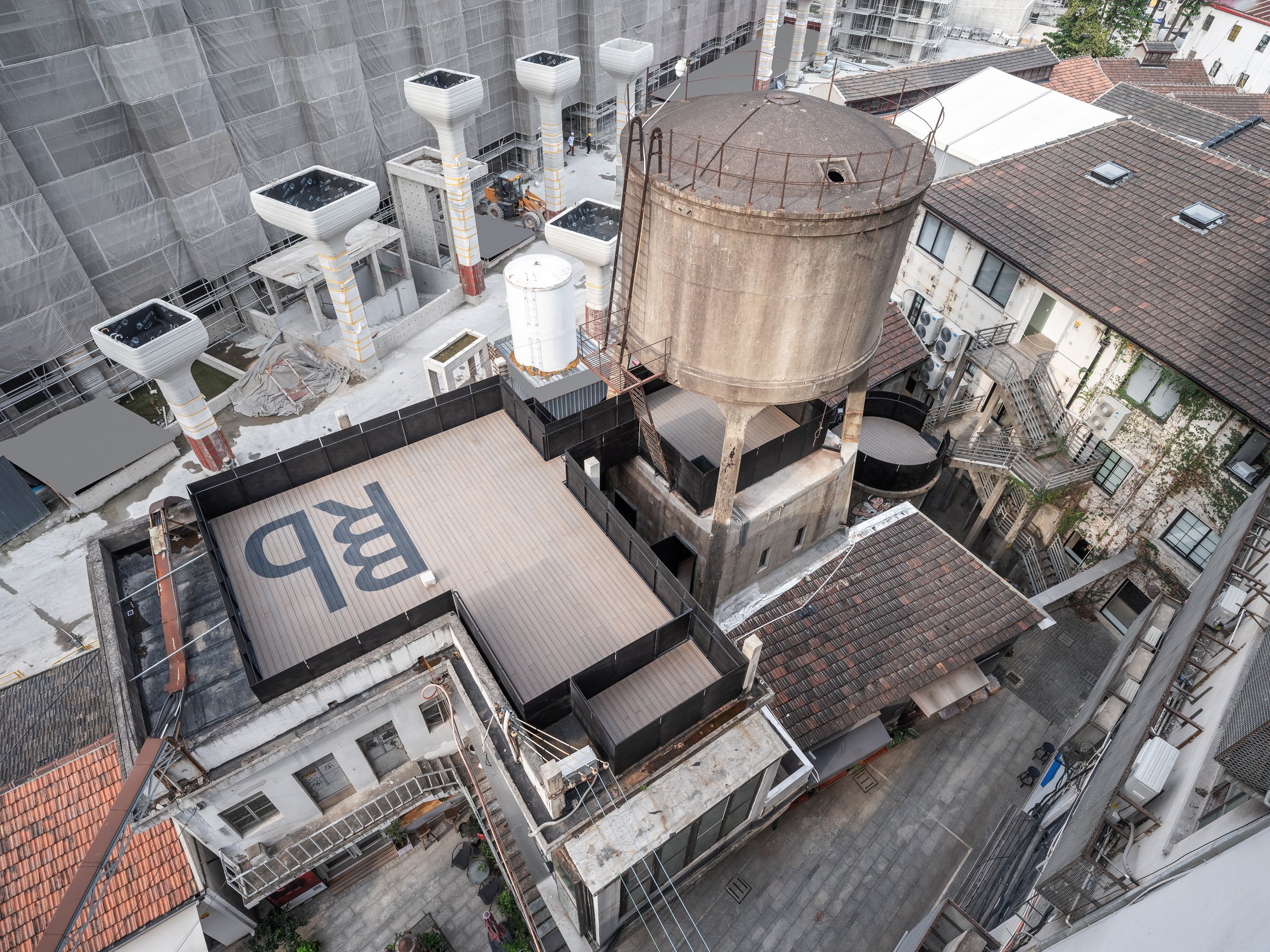
Located in the northwest corner of Shanghai's M50 Creative Park, a hub for contemporary art and design, the Bird Water Tower is a captivating blend of the old and the new. Standing next to Heatherwick Studio's famous 1000 Trees, this historic water tower has existed for over fifty years. Previously owned by the well-known artist and curator Bing Su, the tower was unused for many years until FLIP Studio converted it into a vibrant venue for modern art and social gatherings.
Located in the northwest corner of Shanghai's M50 Creative Park, a hub for contemporary art and design, the Bird Water Tower is a captivating blend of the old and the new. Standing next to Heatherwick Studio's famous 1000 Trees, this historic water tower has existed for over fifty years. Previously owned by the well-known artist and curator Bing Su, the tower was unused for many years until FLIP Studio converted it into a vibrant venue for modern art and social gatherings.
"The renovation of the Bird Water Tower offers an exploration of temporal layers. Visitors can physically and metaphorically navigate through Shanghai's industrial past while being immersed in modern artistic expression. FLIP Studio's design approach embraces the structure's worn and weathered character while introducing a new architectural language that engages with the old."
Outdoor Experience: A Gateway Between Eras
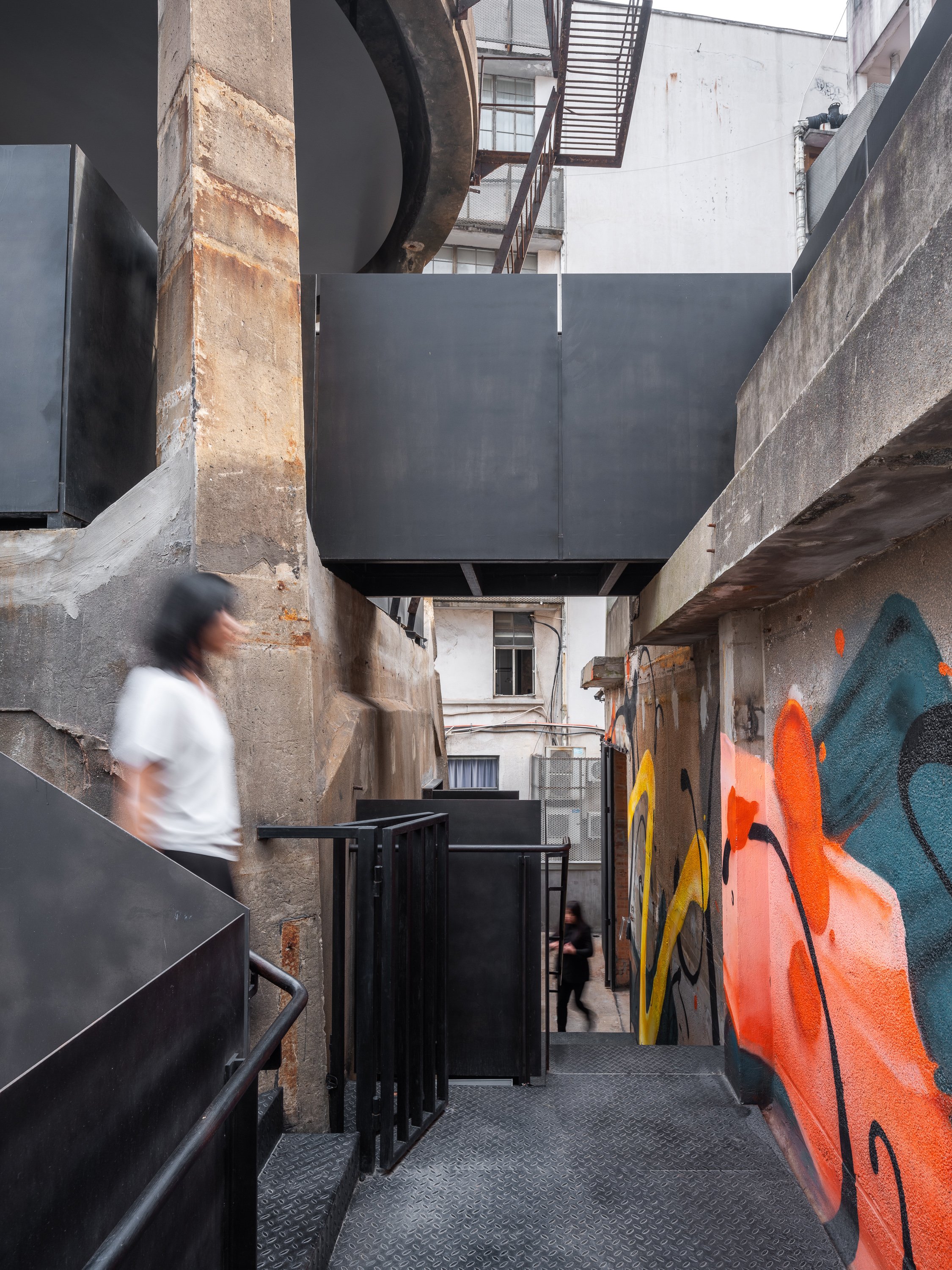
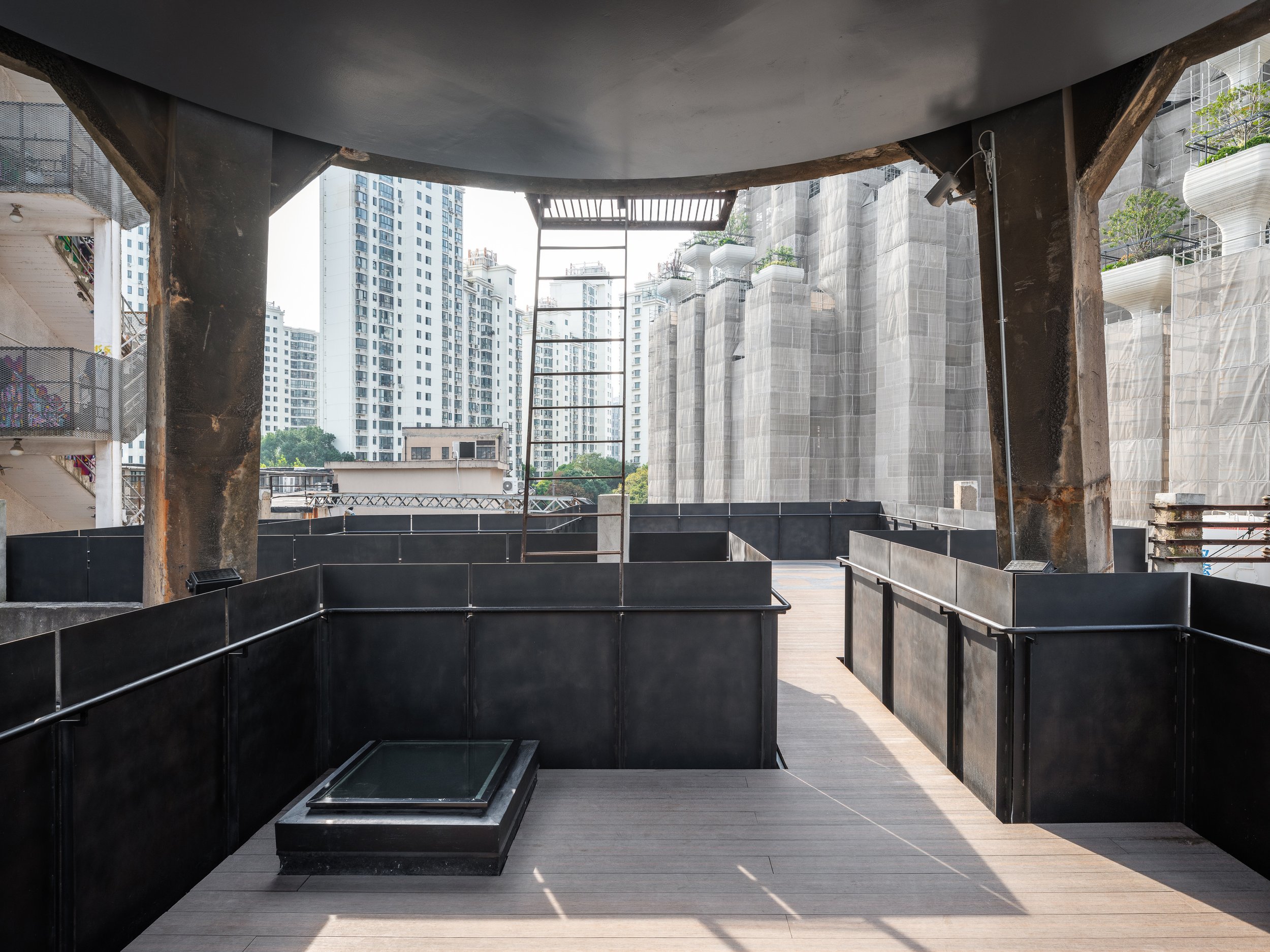
The journey starts in the outdoor area, where FLIP Studio has skillfully incorporated a network of platforms, bridges, and stairways to create an architectural promenade leading to the tower. These new pathways are marked by black-rusted steel handrails and balustrades, clearly distinguishing between old and new while maintaining a respectful enclosure. These changes serve as connectors and indicate the visitor's transition into a redefined space where history meets innovation.
Dual Interiors: Raw Elegance Meets Refined Modernity
The interior of the Bird Water Tower has been divided into two distinct spaces: one square and the other rectangular, each offering a unique spatial experience. A narrow outdoor terrace acts as a slender seam, joining the two spaces while providing a brief breath of fresh air between the roughness of the past and the precision of contemporary design.
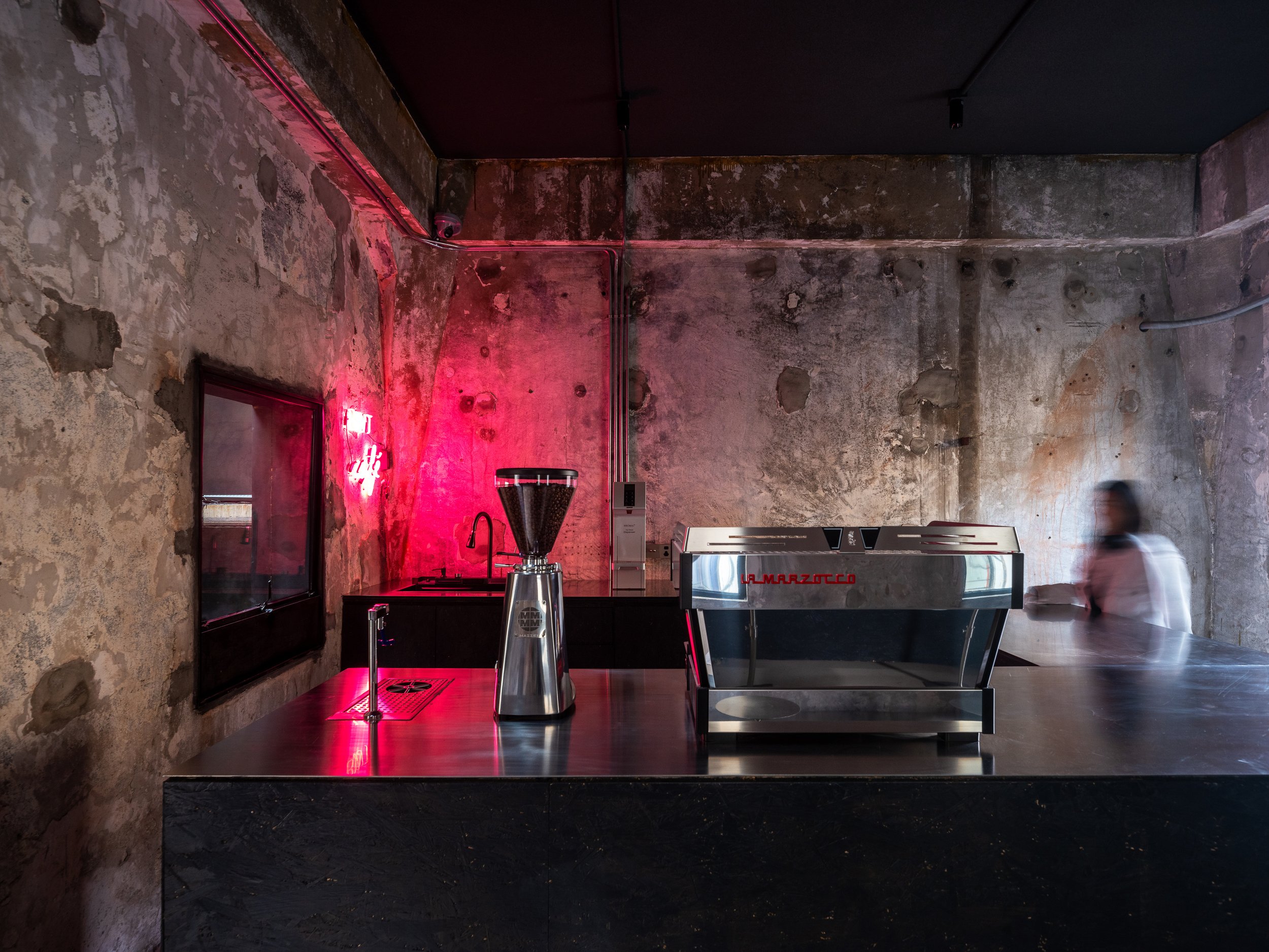
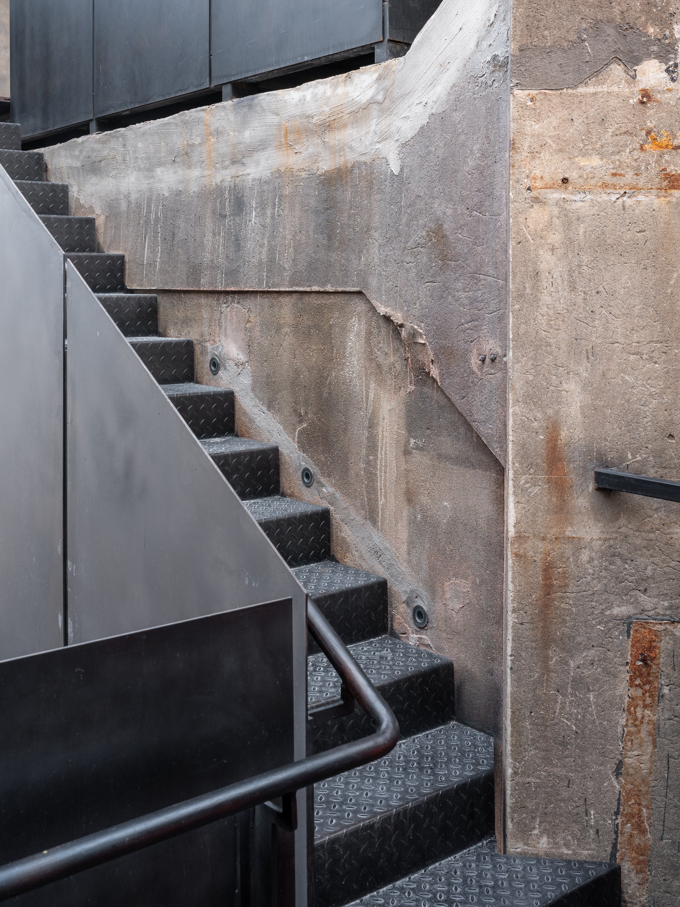
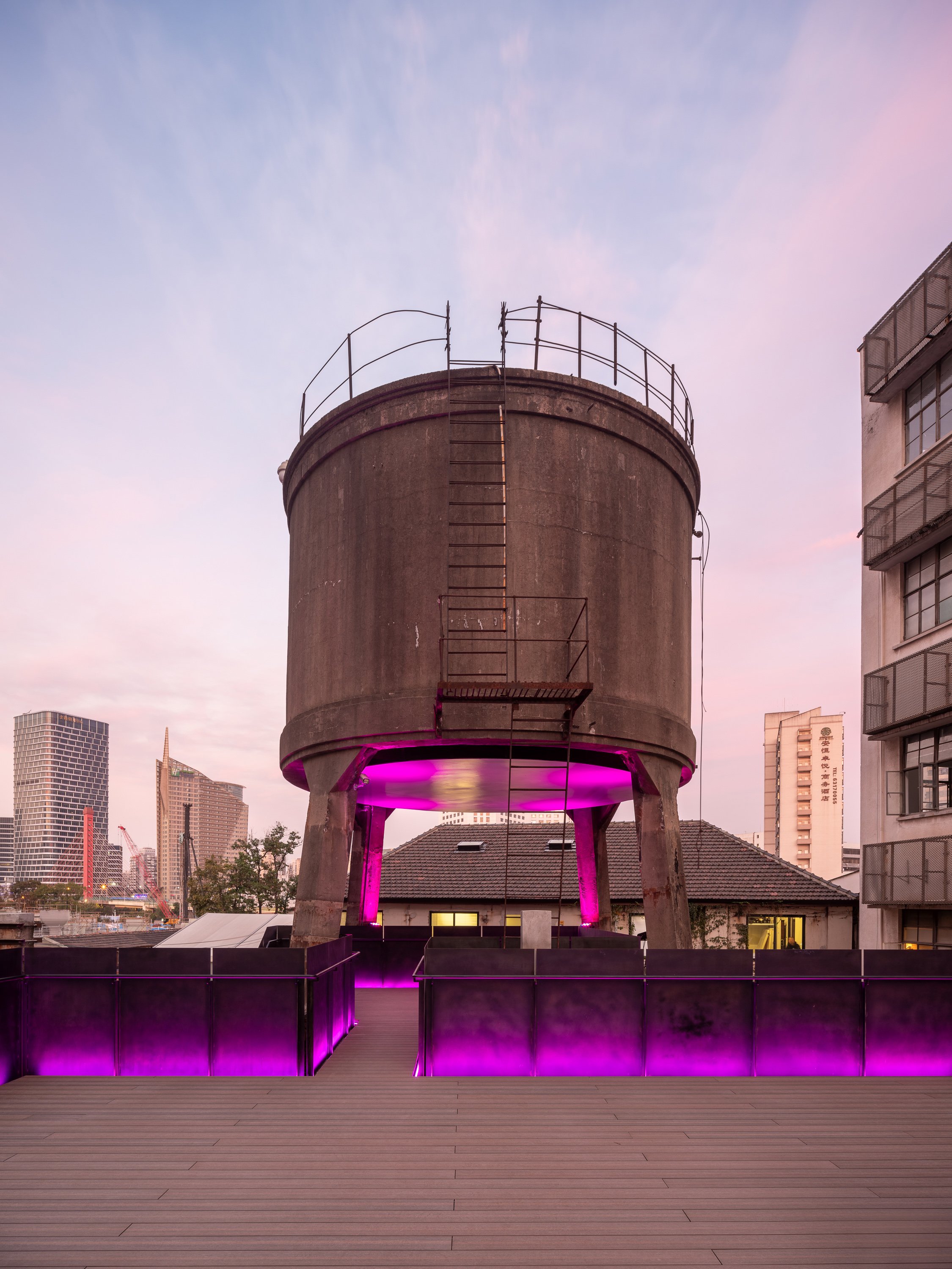
FLIP Studio chose to reveal the structure's raw, industrial character in the square hall. Exposed dark gray cement walls bear the scars of time, with traces of demolished interior partitions intentionally left visible. A boldly inserted black-painted OSB coffee bar creates a monolithic "black box" that contrasts sharply with the gritty backdrop. The pink neon lighting adds a surreal, almost cinematic atmosphere, blurring the lines between the industrial heritage and the contemporary art world.
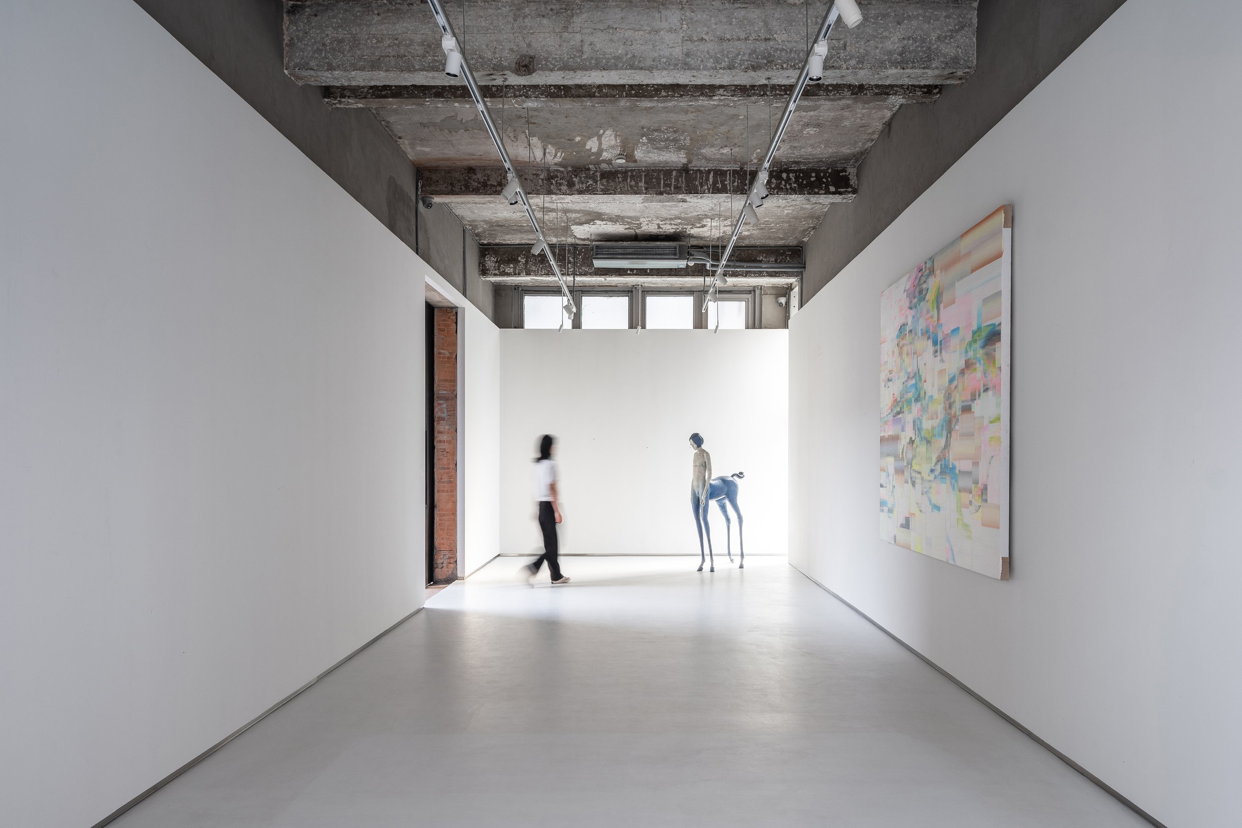
The rectangular hall contrasts with subtler gestures. A white box has been carefully placed in this space, covering two-thirds of the height and leaving the original ceiling exposed. The contrast between new and old is more noticeable in this room, especially where the white box meets the existing brick walls, terrazzo cladding, and exposed structural elements. These layers are revealed like an "architectural anatomy," a concept that aims to showcase the building's structural elements and materials, reminiscent of Gordon Matta-Clark's work, where cut walls and raw materials evoke a dialogue between past and present.
Art and Space: A Curatorial Journey
Art plays a crucial role in guiding visitors through the tower. Strategic placement of installations, graffiti, paintings, and video art punctuate the spatial experience. Key pieces act as navigational markers along the circulation path. An example of this is the untouched wall along the newly inserted staircase, where a live graffiti performance brought the raw energy of street art into the space during the pre-opening phase.
A polished metal plate suspended at the tower's base adds another dimension to the curation. This surface is a canvas for projected digital art, creating a fluid, ever-changing dialogue between physical architecture and ephemeral media.
A Beacon of Light and Art
The Bird Water Tower becomes a glowing beacon in the quiet M50 Creative Park at night. It is adorned with vibrant neon lights and dynamic projections, making it a lighthouse from another dimension. The interplay of light, shadow, and art creates an inviting space where time feels suspended, and the boundaries between past and future dissolve.
The revival of the Bird Water Tower is a testament to Shanghai's industrial heritage and an experiment in the intersection of architecture, art, and urban regeneration. FLIP Studio's sensitive yet inventive intervention has transformed this once-abandoned space into a landmark of creative expression that encourages exploration, contemplation, and conversation.
Project Name:M50 Bird Water Tower
Project Location:Shanghai, China
Lead Designer: Kailun Sun
Area:230㎡
Design Team:Zixuan Chen
Photo:Fangfang Tian
Completion:2023.08
For more information, please visit: www.flip-studio.com
*This project is one of the shortlisted project in the Sky Design Awards 2024 - Architecture Division
Villa P: Where Modern Minimalism Meets Natural Harmony
Located in the serene and lush forest of Toyota, Japan, Villa P is a stunning architectural creation by KIRYU ATELIER&T Architects Co., Ltd. Lead architect Seiji Takahashi's design philosophy is deeply rooted in the Japanese aesthetic of wabi-sabi, which celebrates the beauty of imperfection and impermanence. His design beautifully combines tradition and modernity, seamlessly integrating nature with structure, heritage with innovation, and light with shadow.
Located in the serene and lush forest of Toyota, Aichi, Japan, Villa P is a stunning architectural creation by KIRYU ATELIER&T Architects Co., Ltd. Lead architect Seiji Takahashi's design philosophy is deeply rooted in the Japanese aesthetic of wabi-sabi, which celebrates the beauty of imperfection and impermanence. His design beautifully combines tradition and modernity, seamlessly integrating nature with structure, heritage with innovation, and light with shadow.
Villa P is characterized by its seamless integration with the surrounding environment. The architect has thoughtfully incorporated natural elements from the site, such as large river rocks, emphasizing a deep respect for nature. Situated near a tranquil river, the villa harmoniously blends with its surroundings, reflecting Japanese architectural traditions prioritizing context and environment. The juxtaposition of modern., sturdy concrete forms with softer, organic materials ensures the building feels contemporary and deeply connected to the land. This interplay between the natural world and the built environment is a fundamental aspect of KIRYU ATELIER's design philosophy, promoting harmony between the physical structure and the external landscape.
The interior of the villa reflects the same design principles as the exterior. The large concrete walls, painted transparent black, create a space that celebrates natural light. Light becomes a defining feature, with shadows from the architecture and surrounding foliage constantly shaping the interior environment. The concrete's texture is warm and minimalistic, capturing an elegant simplicity that allows light and shadow to define each room. This level of precision is typical of Seiji Takahashi's work—where form and light engage in a continuous dialogue, inspiring reflection and creativity.
Villa P is more than just a home; it is a sanctuary for creativity. The adaptable design, featuring multifunctional spaces such as an atelier, gallery, and a theater that can transform into a party room when needed, reflects the modern need for fluidity and openness in living spaces. It offers both solitude and connection, depending on the desired atmosphere, and is a place where one can find peace and inspiration.
The design of Villa P enhances the feeling of peace and resilience. The thick concrete walls provide excellent insulation, keeping the interior comfortable year-round without relying on complex climate control systems. Despite its imposing appearance, the concrete offers a sense of security, acting as a protective barrier that connects the residents with nature while shielding them from the outside world.


Villa P is a study in contrasts, both in its aesthetic and its philosophy. The angular, minimal architecture stands in stark contrast to the natural curves and organic shapes of the surrounding landscape. This deliberate contrast, a central theme in Japanese architecture, is enhanced through thoughtful design decisions by Takahashi. The villa's open yet protected spaces blur the lines between interior and exterior, inviting the outside in and challenging traditional notions of space and form.
Ultimately, Villa P is an architectural achievement and an experiential one. The villa represents the best contemporary Japanese design, standing out with its unique blend of tradition and modernity, its seamless integration of nature with structure, and its emphasis on light and shadow. Seiji Takahashi's architectural language speaks to an elegance born of contrasts and balance, creating a residence that resonates deeply with those who inhabit and experience it.
For more information, please visit; https://t-arch.main.jp/
*This project is one of the shortlisted project in the Sky Design Awards 2024 - Architecture : Residential and Urban Design
Urban Landscape: A Street Corner Blooming with Scientific Dreams
The park is inspired by high-tech innovation and focuses on the theme of "Quantum Science." It simplifies complex concepts such as atomic nuclei, electrons, and the solar system into visually engaging design elements. The design utilizes circles to symbolize balance, simplicity, and security, creating a spatial narrative throughout the park. In the middle of the park lies a central shared area representing the "Atomic Nucleus." Interactive and leisure zones, symbolizing "Electrons," are located at each end of this area. Visitors' movements link these zones, generating an energy field that mirrors the dynamic interactions of particles. Naturally drawn to the familiar circular shapes, children feel a sense of wonder and curiosity as they explore the space.
The High-Tech Quantum Pocket Park.
There is a revitalized space in the High-Tech Zone between Nankai Jingyang Elementary School and Chunmiao Kindergarten that combines innovation, nature, and community. Situated on the busy Higher Education Mega Center East Road, this previously unremarkable street corner, which spans approximately 800m², has become a lively hub of scientific exploration and community engagement. The area used to be filled with boring tree planters and uninteresting landscaping, making it hard for people to move around and not very inviting. Despite being in a great location, it was ignored and unused.
The new design has transformed the space into an exciting public area that meets the community's needs. The park now serves as a peaceful place for parents to wait for their kids, a convenient walkway for pedestrians, and an interactive playground for children to play and learn.
A High-Tech Haven: Quantum Science Meets Play
The park is inspired by high-tech innovation and focuses on the theme of "Quantum Science." It simplifies complex concepts such as atomic nuclei, electrons, and the solar system into visually engaging design elements. The design utilizes circles to symbolize balance, simplicity, and security, creating a spatial narrative throughout the park.
In the middle of the park lies a central shared area representing the "Atomic Nucleus." Interactive and leisure zones, symbolizing "Electrons," are located at each end of this area. Visitors' movements link these zones, generating an energy field that mirrors the dynamic interactions of particles. Naturally drawn to the familiar circular shapes, children feel a sense of wonder and curiosity as they explore the space.
Beneath the ground are educational illustrations of the planets, connecting the small world of quantum science with the grandeur of the solar system. By incorporating scientific learning into the park's playful environment, science becomes approachable and fun, encouraging children to develop a love for discovery. The installation aims to intertwine scientific education with recreational activities, making learning about space an enjoyable experience for young visitors.
The park's layout is centred around a circular trajectory, drawing visitors toward the space's core. This simple yet powerful design gives rise to a three-tiered structure—outer, middle, and inner zones—each fulfilling a different purpose. The outer zone offers public seating, the middle zone offers a lush plant community, and the inner zone offers interactive play spaces.
The circular seating varies in height to accommodate people of all ages, allowing for a relaxed, pressure-free resting posture. Surrounding the seating, clusters of plant communities bring the space to life, their canopies offering shade and a softer transition between built and natural environments. These layered zones create a dynamic spatial experience, inviting exploration and connection with nature.


Sustainable Design: A Tribute to Chongqing's Spirit
The park's ecological design includes the Huang Jue Tree (Ficus virens), symbolizing Chongqing's resilience and vitality. Carefully chosen local plants surround this focal point, fostering a sense of connection to the city's landscape. Wildflower paths and herbaceous plants enhance the natural ambiance, creating an environment that changes seasons and encourages residents to interact with their surroundings.
This verdant oasis beautifies the urban environment and reinforces the importance of sustainability. With their year-round presence, the choice of plants ensures that the space remains vibrant and inviting throughout the year.
A Visual and Emotional Transformation
The park's visual appeal plays a significant role in attracting and engaging visitors. A series of circular patterns on the ground create a dynamic and lively aesthetic, bringing energy and movement to the previously static site. Inspired by the deep blue tones of the High-Tech Zone's logo, the park's colour palette strikes a balance between natural greens and striking blues—reminiscent of Klein Blue—symbolizing intelligence, hope, and the boundless potential of technology.
The playful yet thoughtful use of colour draws in passersby and sparks curiosity and joy among children. Through engaging design, the park becomes a space where scientific knowledge meets the imagination, allowing young minds to dream amidst an ideal blue backdrop.
A Corner Transformed: A Hub for Community and Innovation
What was once a nondescript street corner has been revitalized into a thriving community space. Neighbours gather here to relax, children's laughter fills the air, and the park's vibrant energy draws in the surrounding residents. The Quantum Pocket Park enhances the aesthetic and functional value of its immediate surroundings and symbolizes the High-Tech Zone's dedication to science, innovation, and public engagement.
In this transformed city corner, the pocket park integrates science and everyday life, fostering a deeper connection between the citizens and their environment. It is a beacon of the community's aspirations for a better, more innovative future—where dreams take root and bloom.
Project: High-Tech Quantum Pocket Park
Project Location: Nankai Jingyang Elementary School, High-Tech Zone, Chongqing
Design Firm: 10Design
Presentation Date: July 2023
For more information, please visit: https://mp.weixin.qq.com/s/Paya2mzILVzEM_DVNjKXpA
Katajanokan Laituri, new wooden landmark building in Helsinki, houses a hotel aiming to be the most sustainable one in Finland
Increasing wood construction is one way to build a more sustainable future and achieve Helsinki's target of becoming carbon-neutral by 2030. Designed by Anttinen Oiva Architects, Katajanokan Laituri is an impressive new solid wood building on Helsinki's shoreline that complements the city's signature skyline right next to the Market Square. The building houses the head office of Finnish forest industry company Stora Enso and the new design hotel Solo Sokos Hotel Pier 4, which aims to be the most sustainable hotel in Finland. With the upcoming Museum of Architecture and Design, the area is developing into an exciting new hub of art and design beside the sea.
Solo Sokos Hotel Pier 4 Exterior | Photographer: Kalle Kouhia/ Anttinen Oiva arkkitehdit Oy
Increasing wood construction is one way to build a more sustainable future and achieve Helsinki's target of becoming carbon-neutral by 2030. Designed by Anttinen Oiva Architects, Katajanokan Laituri is an impressive new solid wood building on Helsinki's shoreline that complements the city's signature skyline right next to the Market Square. The building houses the head office of Finnish forest industry company Stora Enso and the new design hotel Solo Sokos Hotel Pier 4, which aims to be the most sustainable hotel in Finland. With the upcoming Museum of Architecture and Design, the area is developing into an exciting new hub of art and design beside the sea.
Developing the city's building stock plays a key role in achieving the sustainability goals. It is important for Helsinki to create a lively urban environment and to make the city's 131-kilometre shoreline even more accessible to locals and visitors. "The aim of transforming the Katajanokka shoreline area is to create a lively urban space. With this project, we will be able to open the shoreline to the people of Helsinki. A building made of wood, that is durable and has as low a carbon footprint as possible meets the city’s goals,” says Deputy Mayor Anni Sinnemäki.
Helsinki’s new Architecture and Design Museum will further increase the appeal of the area. The first phase of the design competition closed on 29 August 2024.
Katajanokan Laituri lobby | Photographer: Kalle Kouhia/ Anttinen Oiva arkkitehdit Oy
A new architectural landmark in Helsinki’s historical centre
Katajanokan Laituri is a modern Finnish wooden building whose timeless architecture is the work of the award-winning Anttinen Oiva Architects. The building is owned by Varma Mutual Pension Insurance Company and it houses the head office of the forest industry company Stora Enso, which also supplied the solid wood load-bearing elements of the building. The four-storey building is made from Finnish and Swedish timber and combines pioneering architectural methods with traditional and sustainable materials.
Wooden structures have been left visible in the interior as much as possible, and nature is also strongly present: in addition to solar panels, the building features a multi-species green roof, and a small birch tree forest is growing in hotel’s atrium. The building functions as a carbon storage and is made to last for the next 100 years. Flood protection also makes the building future proof, as it can withstand a water level rise of more than 3 metres.
Stora Enso’s former head office designed by legendary Finnish architect Alvar Aalto is located right next to the new building. The district is otherwise known for its Art Nouveau architecture from the beginning of the 20th century. A short walk away is Helsinki's historic centre designed by Carl Ludvig Engel.
Finland's most environmentally sustainable hotel
The new Solo Sokos Hotel Pier 4 aims to be the most sustainable hotel in Finland in terms of everything from the building itself to the hotel’s functions and services. A LEED Platinum environmental certificate will be applied for the whole building aiming for carbon neutrality and using energy solely from renewable sources. The hotel will also apply for Green Key and Sustainable Travel Finland certificates.
The hotel has 164 rooms, 43 of which afford unobstructed views to the sea. The hotel also has conference facilities, a seaside café and a rooftop terrace with views over the Market Square and South Harbour. The hotel restaurant Harbore is led by Sauli Kemppainen, a Finnish chef with passion for simplicity and pure taste. He has previously been awarded a Michelin star. Each dish at Harbore consists of only two main ingredients prepared in various ways, such as reindeer and onion, with Finnish and Nordic produce accounting for up to 85 percent of all ingredients used.
Transitional Architecture: How Jindesign Co., Ltd. Reimagines Urban Boundaries with YSK Employment Office
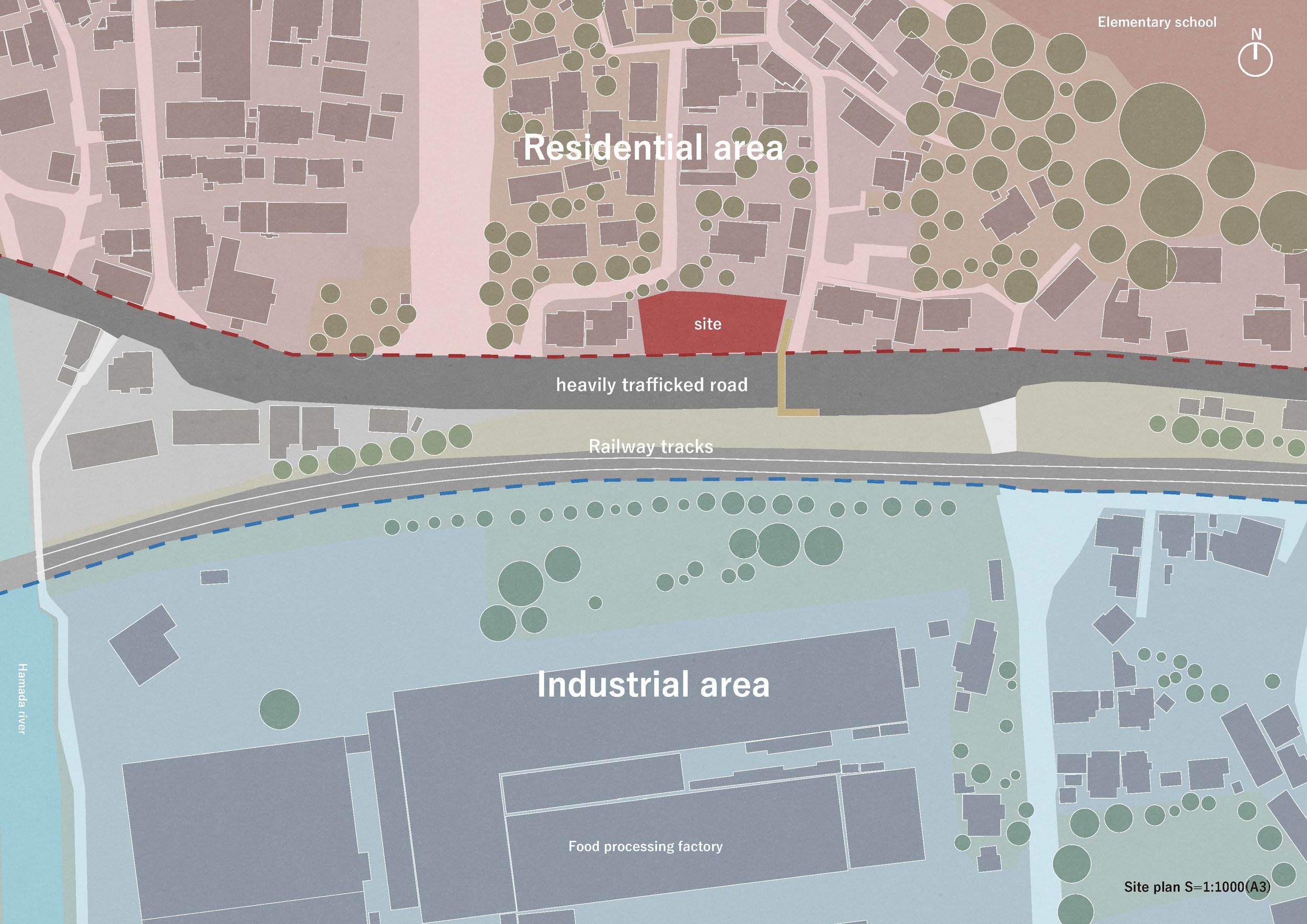
In the realm of urban planning, Jindesign Co., Ltd. stands out with its unique approach to zoning. While zoning is a practical framework for city development, the real architectural challenge often lies in navigating the borders between vastly different zones. Jindesign Co., Ltd. tackles these transitions with sensitivity, crafting structures that bridge the gaps between spaces rather than heightening their disparities. Their design for the YSK Employment Office is a prime example of this philosophy in action. It showcases how architecture can mediate and create a fluid, livable urban experience that responds to its context while serving a higher social purpose.
In the realm of urban planning, Jindesign Co., Ltd. stands out with its unique approach to zoning. While zoning is a practical framework for city development, the real architectural challenge often lies in navigating the borders between vastly different zones. Jindesign Co., Ltd. tackles these transitions with sensitivity, crafting structures that bridge the gaps between spaces rather than heightening their disparities. Their design for the YSK Employment Office is a prime example of this philosophy in action. It showcases how architecture can mediate and create a fluid, livable urban experience that responds to its context while serving a higher social purpose.
The YSK Employment Office in an industrial zone serves as more than just a functional employment center. It functions as a refuge and support system for local residents going through job transitions, fostering a strong sense of community and belonging. The building is not merely a corporate facility; it symbolizes the community, designed to provide more than just a service—a space for people to rely on during crucial moments in their lives.
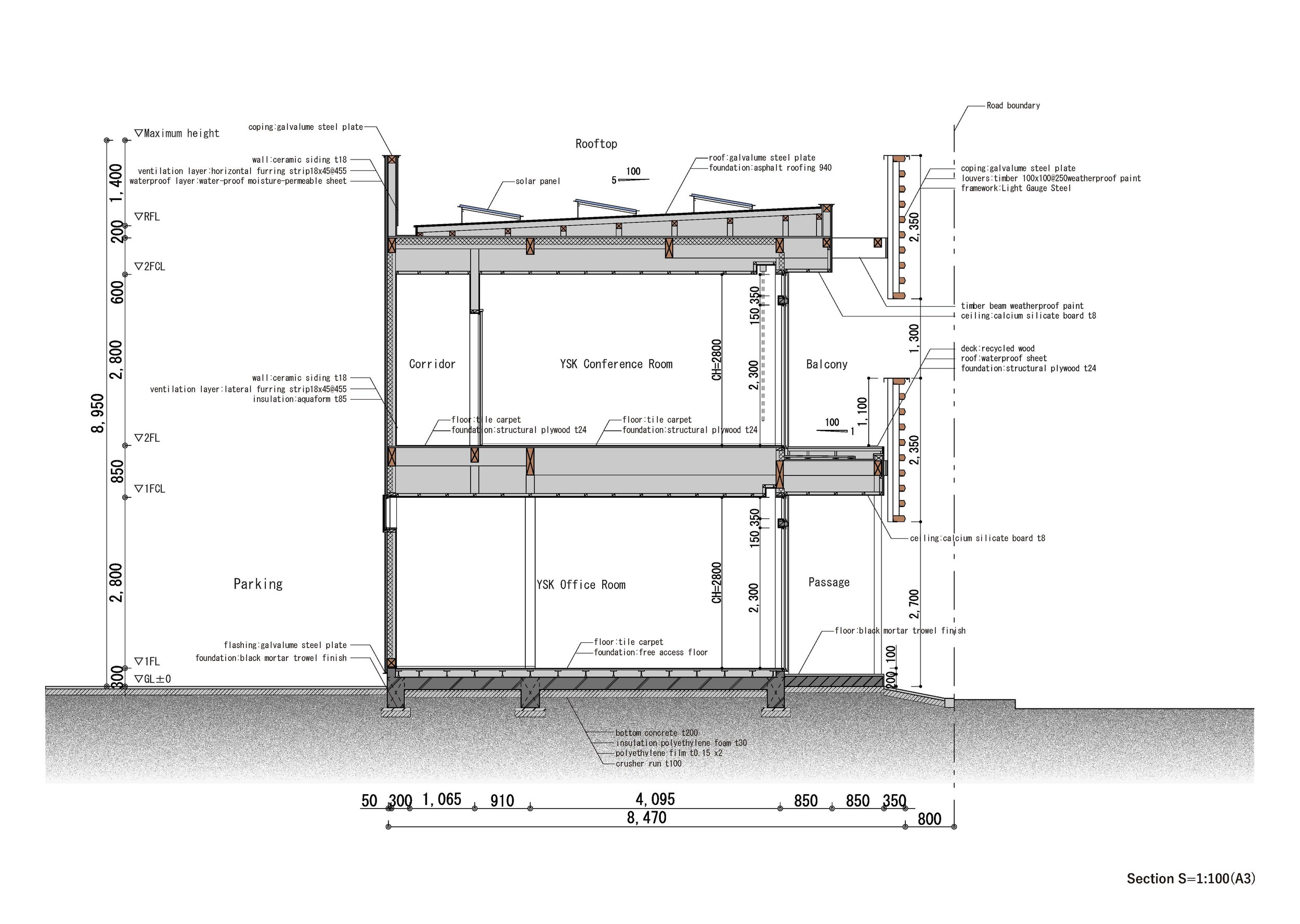
The building has a purposeful design that merges functionality with subtle gestures of hospitality. Its defining feature is the 1.7-meter-wide wraparound balcony, which softens the long rectangular volume stretching east to west. This balcony is a transitional zone, blurring the line between the interior office environment and the busy street outside. It enhances the usability of the space by providing a shaded, ventilated exterior for workers and creates an inviting threshold for pedestrians passing by, offering shelter and integrating the building into the life of the street.
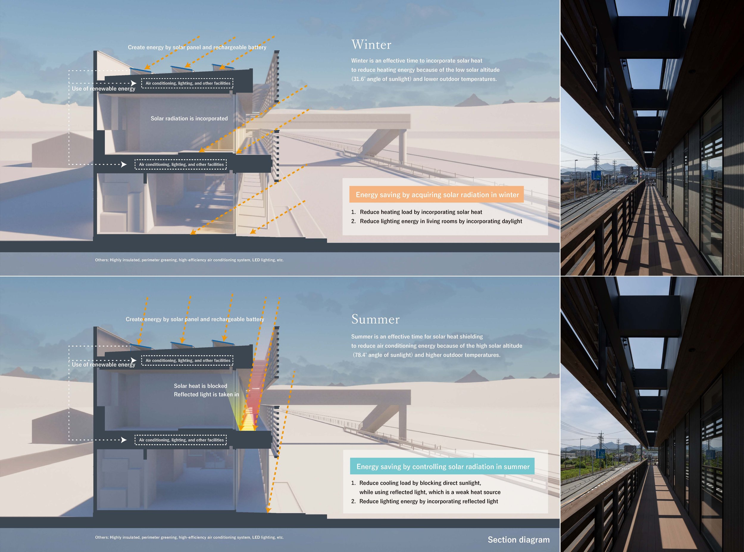
The YSK office features a striking architectural design with horizontal wooden louvres that encase the building in an elegant and rhythmic pattern. Inspired by traditional Japanese noren, these louvres serve several purposes: they give the building a unique visual identity, help control the amount of sunlight and heat entering the building, and contribute to energy efficiency. Their design is carefully planned to account for changes in the sun's position throughout the year, allowing them to let in warming sunlight during the winter while shielding the building from the intense summer sun, which helps keep the interior cool and reduces the need for artificial cooling. This sustainable and energy-efficient design is a testament to Jindesign Co., Ltd.'s commitment to environmental responsibility.
The louvres improve energy efficiency and contribute to the building's continuous horizontal facade. This design is a visual guide for people travelling at high speeds on nearby roads or railways. The constant line creates a lasting impression, making the office a recognizable landmark and providing subtle urban wayfinding.
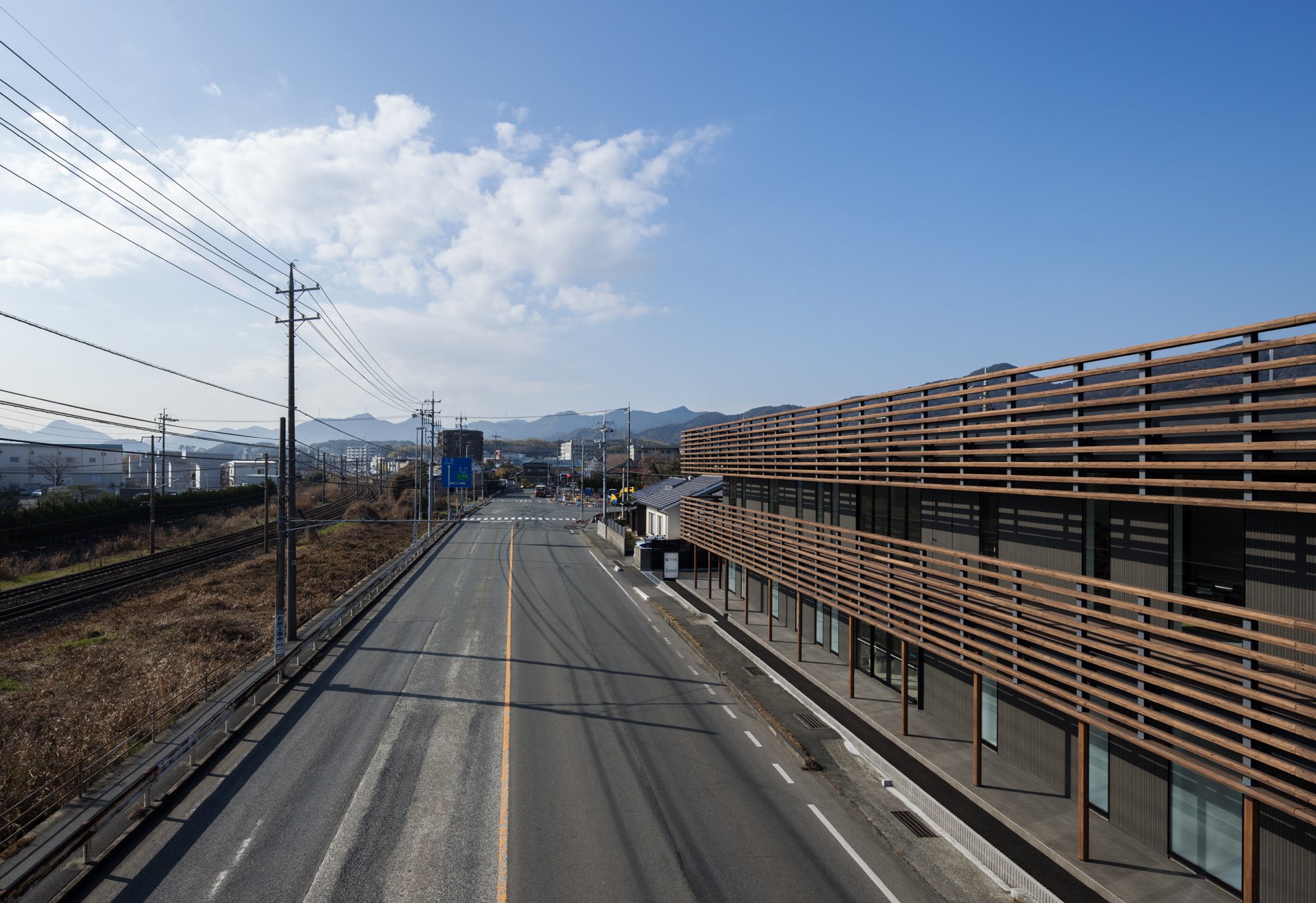


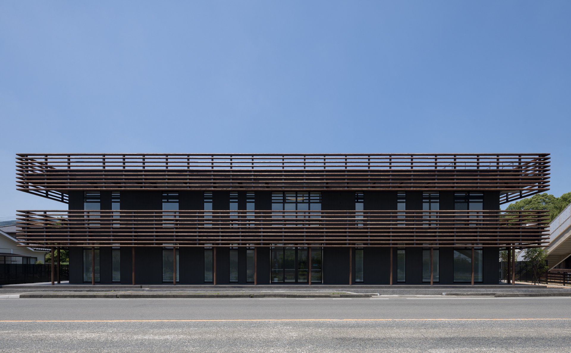

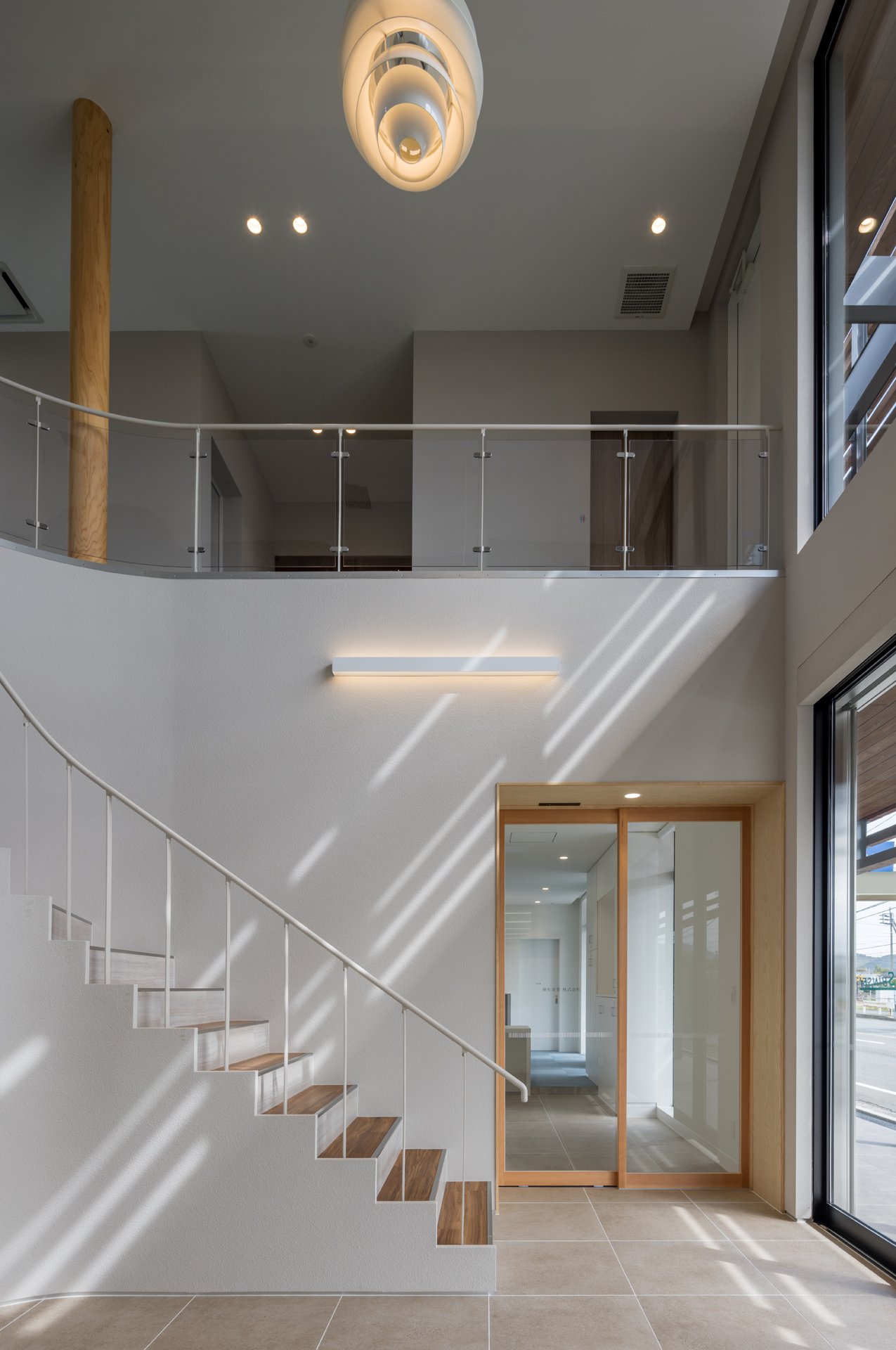
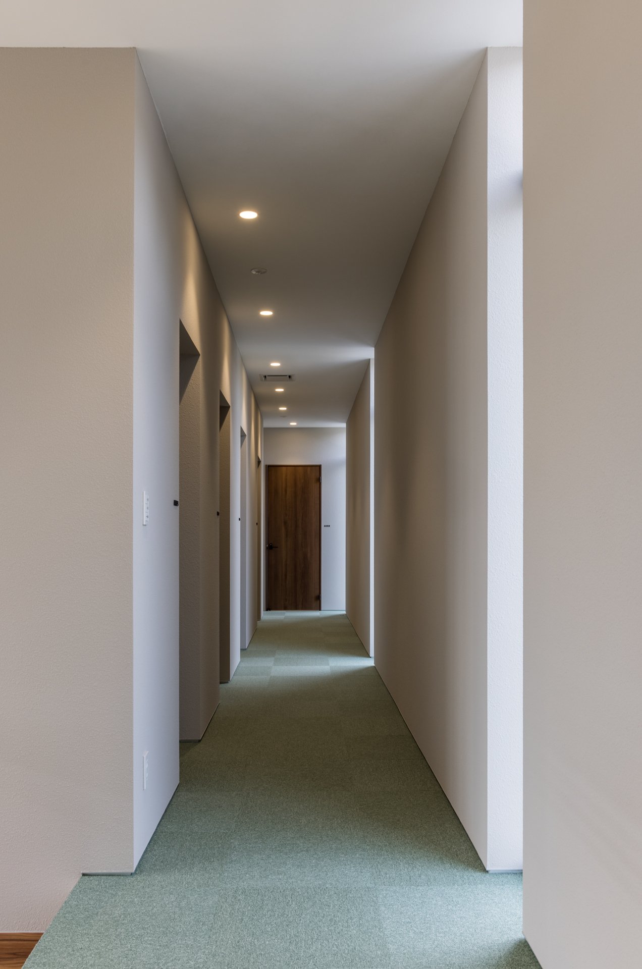
Materiality is a critical factor in anchoring the design in its local context. Jindesign Co., Ltd. has carefully used locally sourced materials to connect the building with its surroundings. The louvres and other structural elements are crafted from local wood, reflecting sustainability and skilled workmanship. The exterior walls are covered in fire-retardant ceramic panels, selected for both practical and aesthetic reasons, as they resonate with the region's traditional architecture. The colour scheme, mainly earthy reddish-browns, is inspired by conventional kawara roof tiles and charred cedar cladding, establishing a cohesive link between the modern office and the area's traditional homes.
Moreover, the architectural style of the building is a graceful blend of ancient techniques and modern sensibilities. The incorporation of Japanese woodworking methods, evident in the precision of the louvres and balcony construction, showcases a reverence for traditional craftsmanship. Additionally, the building's energy-efficient strategies and carefully considering seasonal variations demonstrate a progressive, sustainable approach. This harmonious combination of old and new defines the unique character of the YSK Employment Office—a structure firmly connected to its surroundings while being attuned to the requirements of a modern workforce.
The YSK Employment Office is more than just an architectural solution for an industrial employment center. It reflects Jindesign Co., Ltd.'s commitment to creating functional, beautiful, and environmentally connected spaces. This architecture incorporates quiet yet profound gestures, where the building's form, materials, and design philosophy combine to offer something more significant than the sum of its parts. In doing so, Jindesign Co., Ltd. has created a workplace and a meaningful public space that bridges zoning divides, enhances its urban surroundings, and enriches the lives of those who encounter it.
For more information, please visit: https://www.jindesign.co.jp/
Designer Profile
Toyotaka Aoki
Toyotaka Aoki
Graduated from Kyushu University in 2009, received a master’s degree from Kyushu University in 2011. In 2016, Aoki established his firm, Jindesign Co., Ltd., which is composed of architects, lighting designers and graphic designers. He has worked on a variety of projects in Japan and China, including commercial facilities, housing complexes and medical facilities as well as public structures. Since 2012, the nonprofit organization, the Fukuoka Architecture Foundation, has been a stage of another activity as an architect, which is to introduce and share values of local architecture with a general citizen.


