manu coffee Reimagined: A 20-Year Legacy of Culture and Connection
n the lively Haruyoshi district of Fukuoka, manu coffee has been a central part of the area's evolving subculture for the past two decades. This unassuming yet iconic café has been more than just a coffee place; it has served as a gathering spot for young professionals and a hub where Fukuoka's nightlife culture and creative communities come together. Situated at the unique intersection of the city's three central districts—Tenjin, Hakata, and Nakasu—Haruyoshi has developed into a unique enclave where nightlife, dining, and urban subcultures blend seamlessly. Within this dynamic setting, Manu Coffee has thrived for 20 years, creating its own story and building a dedicated following, a testament to our city's unique and vibrant culture.
In the lively Haruyoshi district of Fukuoka, Manu coffee has been a central part of the area's evolving subculture for the past two decades. This unassuming yet iconic café has been more than just a coffee place; it has served as a gathering spot for young professionals and a hub where Fukuoka's nightlife culture and creative communities come together. Situated at the unique intersection of the city's three central districts—Tenjin, Hakata, and Nakasu—Haruyoshi has developed into a unique enclave where nightlife, dining, and urban subcultures blend seamlessly. Within this dynamic setting, Manu Coffee has thrived for 20 years, creating its own story and building a dedicated following, a testament to our city's unique and vibrant culture.
After 20 years, Takasu Gaku Design and Associates have renovated Manu Coffee to honour its history and encourage new interactions. The new design features a sizeable operable steel sash on the shopfront, creating a transparent space that invites people to look inside and blurs the boundary between the street and the interior. This design aims to bring the energy of the street inside while maintaining the café's role as a cultural hub.
The renovation beautifully combines old and new elements. The counters and bench seating were made using traditional plastering techniques, while the floor has been patched with different materials, preserving its history while giving it a fresh look. These layered textures create a warm and authentic atmosphere, making the space feel familiar yet rejuvenated.
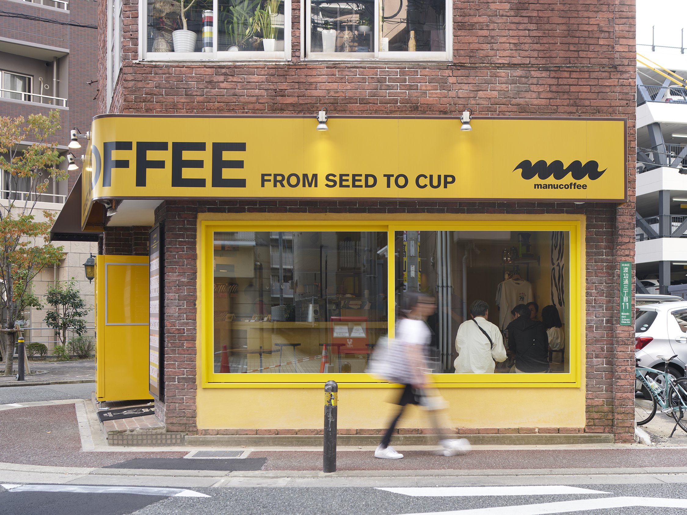
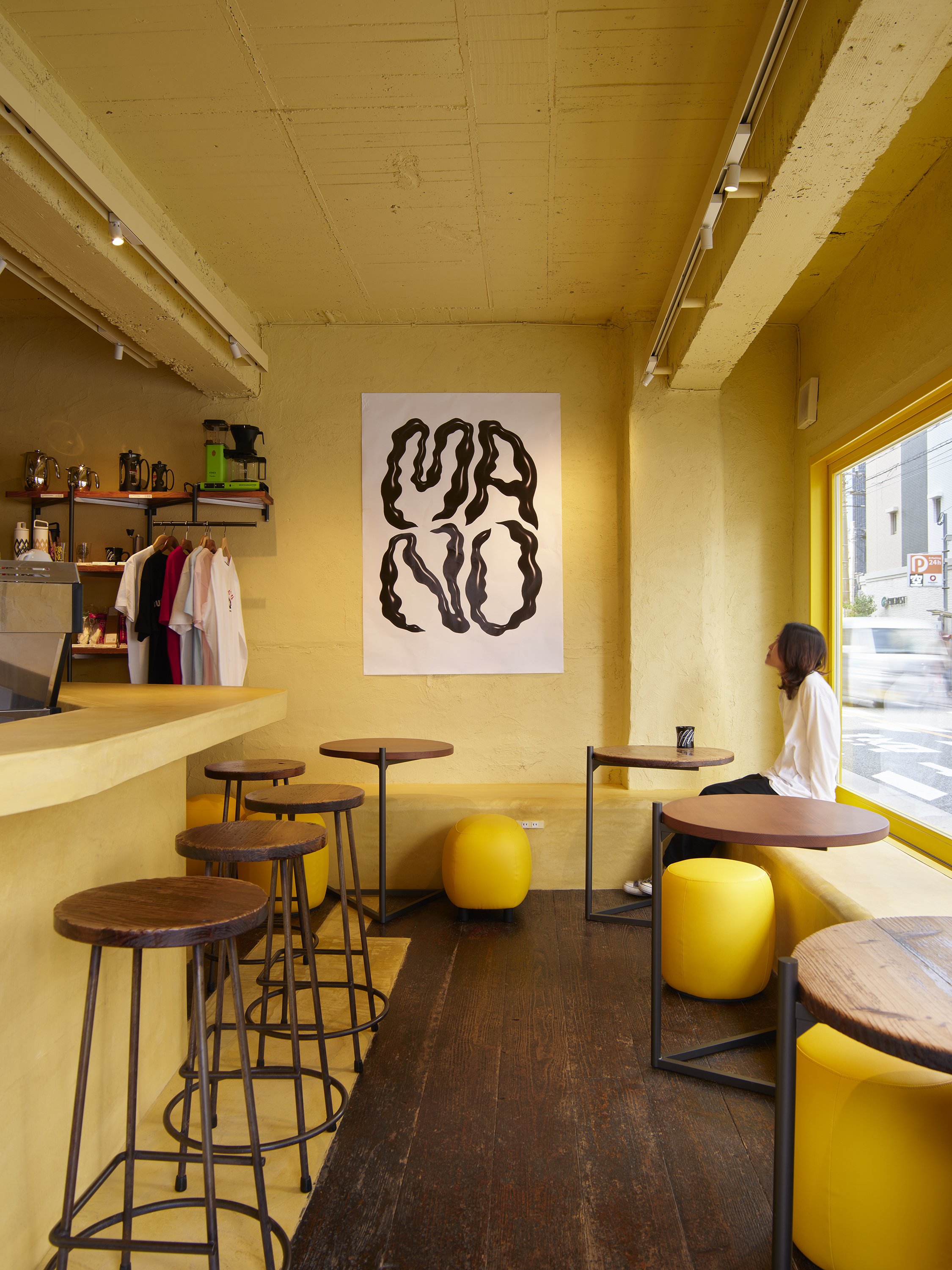


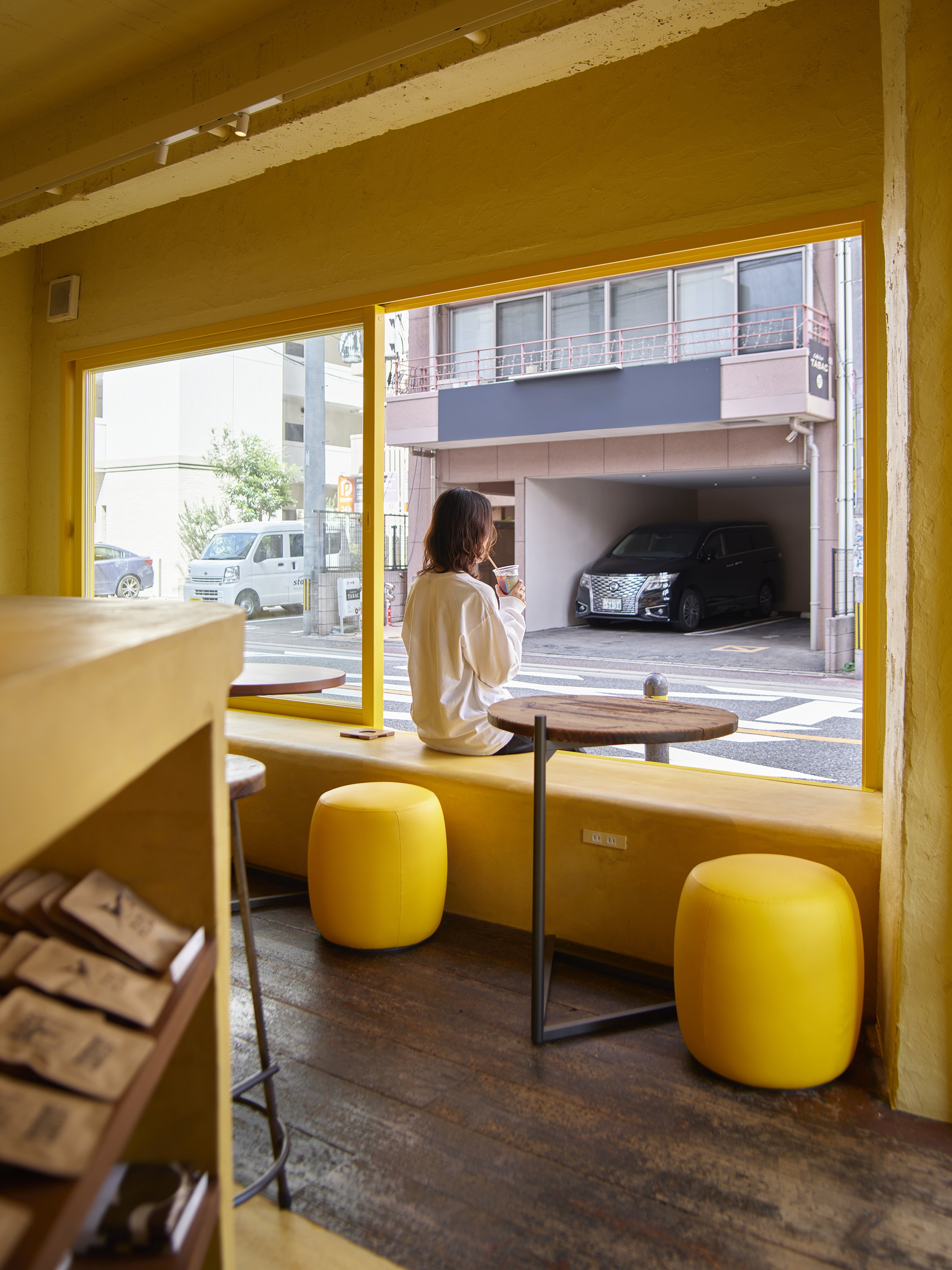
The soft lighting creates a warm and inviting atmosphere, piquing the curiosity of those passing by. The goal is to create a space that feels deeply connected to its surroundings, fostering a sense of continuity, security, and connection between the café's long-standing presence and the ever-evolving city. This renovation is not just about updating a space; it's about strengthening the bond between the café, the street, and the community it serves.
The aim is for this newly designed entrance to serve as both a physical and symbolic gateway, promoting the exchange of ideas and culture, and continuing to shape Haruyoshi's identity. As the café embarks on a new chapter, it will undoubtedly continue its dedicated mission of nurturing Fukuoka's subcultures, serving as a place where the old meets the new, and where the past informs the future, fostering a sense of continuity and anticipation for what's to come.
For more information, please visit: https://gaku-design.com
*This project is one of the shortlisted project in the Sky Design Awards 2024 - Interior Design - Restaurant, Bar & Clubs Division
Designer Profile
Bird Water Tower: FLIP Studio's Bold Revival of Industrial Heritage and Art at Shanghai's M50 Creative Park
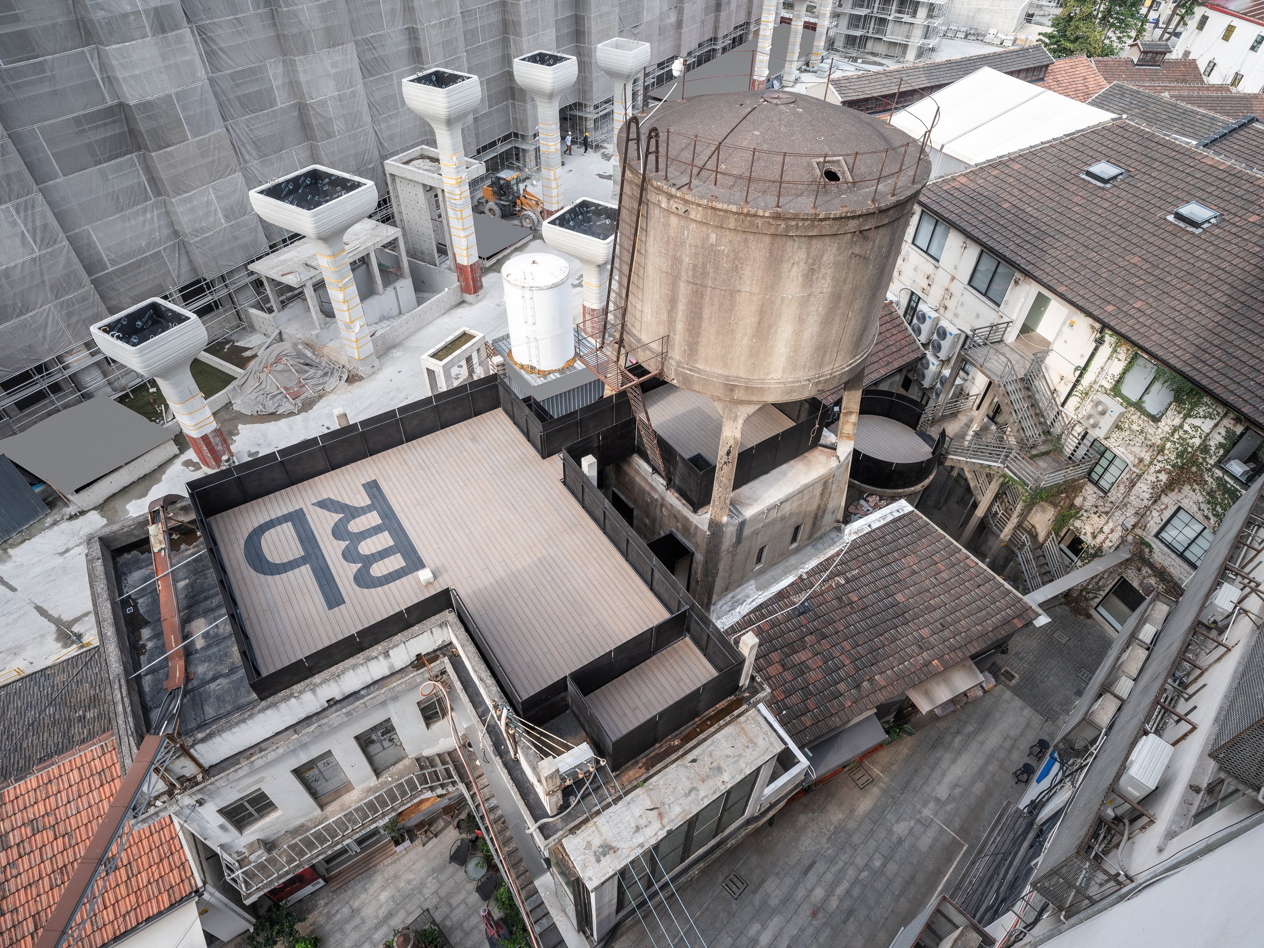
Located in the northwest corner of Shanghai's M50 Creative Park, a hub for contemporary art and design, the Bird Water Tower is a captivating blend of the old and the new. Standing next to Heatherwick Studio's famous 1000 Trees, this historic water tower has existed for over fifty years. Previously owned by the well-known artist and curator Bing Su, the tower was unused for many years until FLIP Studio converted it into a vibrant venue for modern art and social gatherings.
Located in the northwest corner of Shanghai's M50 Creative Park, a hub for contemporary art and design, the Bird Water Tower is a captivating blend of the old and the new. Standing next to Heatherwick Studio's famous 1000 Trees, this historic water tower has existed for over fifty years. Previously owned by the well-known artist and curator Bing Su, the tower was unused for many years until FLIP Studio converted it into a vibrant venue for modern art and social gatherings.
"The renovation of the Bird Water Tower offers an exploration of temporal layers. Visitors can physically and metaphorically navigate through Shanghai's industrial past while being immersed in modern artistic expression. FLIP Studio's design approach embraces the structure's worn and weathered character while introducing a new architectural language that engages with the old."
Outdoor Experience: A Gateway Between Eras
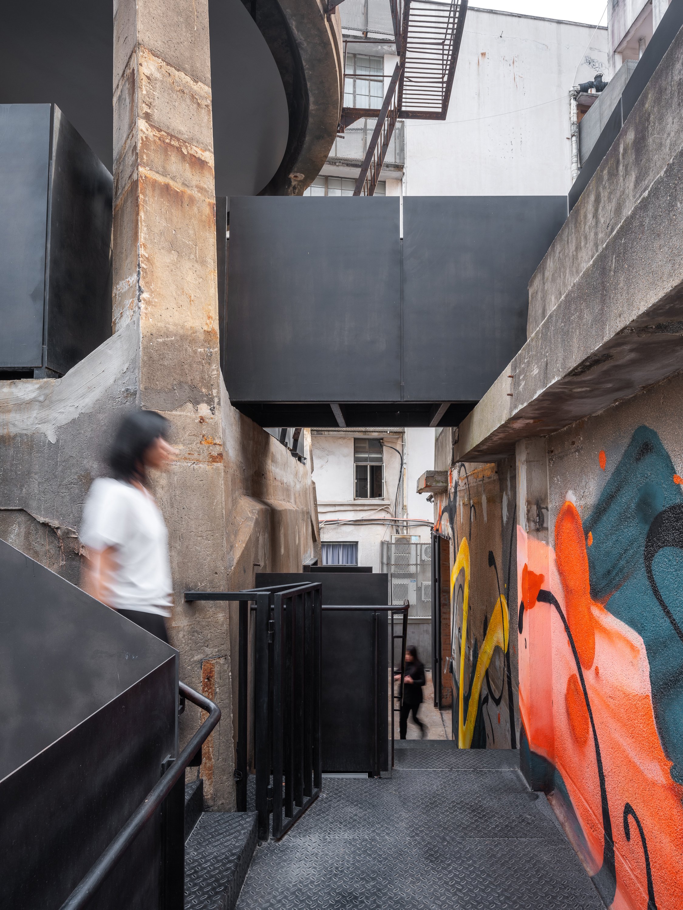
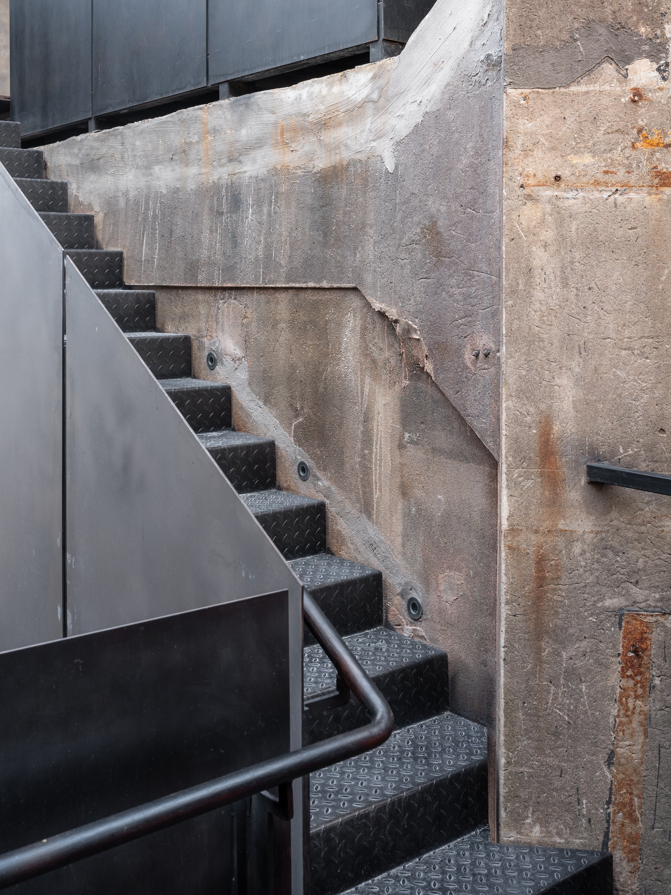
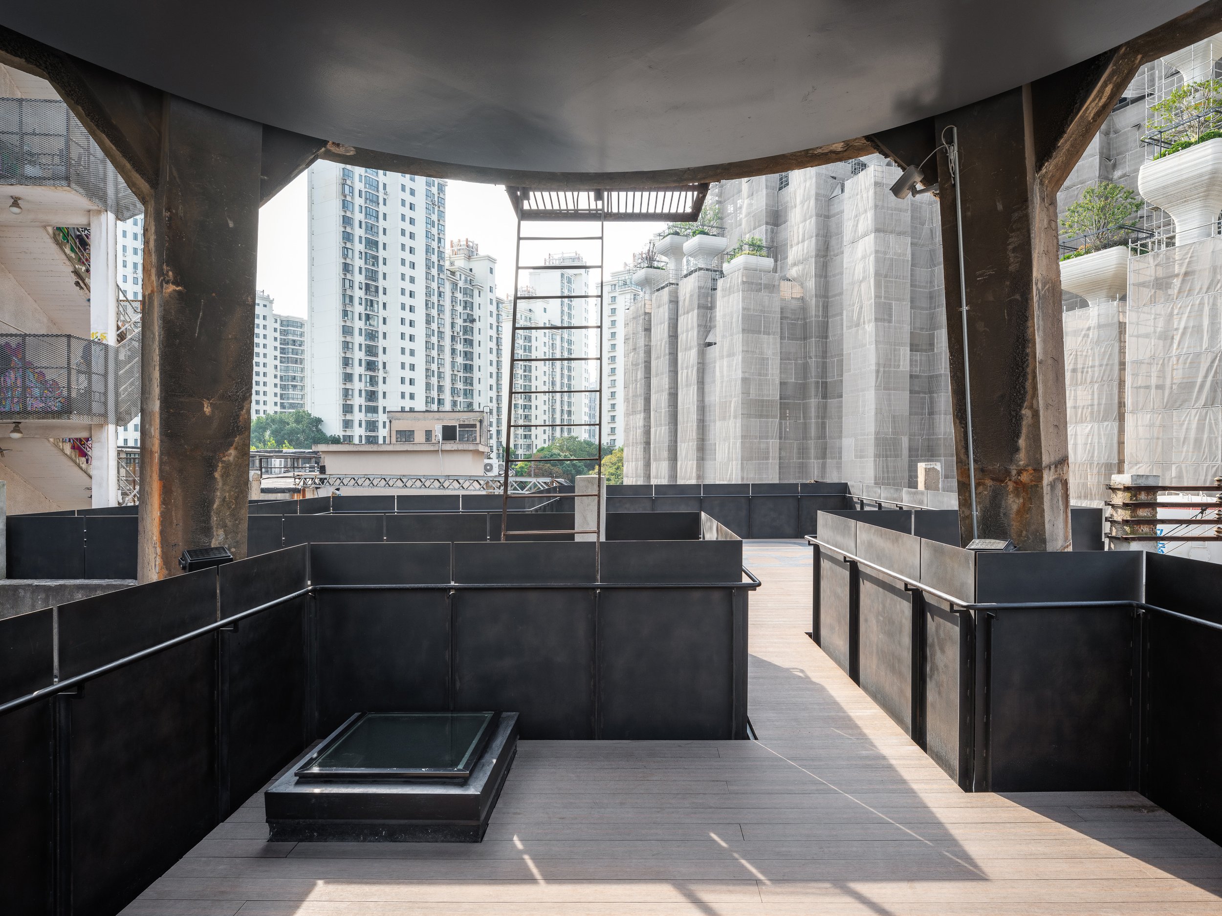
The journey starts in the outdoor area, where FLIP Studio has skillfully incorporated a network of platforms, bridges, and stairways to create an architectural promenade leading to the tower. These new pathways are marked by black-rusted steel handrails and balustrades, clearly distinguishing between old and new while maintaining a respectful enclosure. These changes serve as connectors and indicate the visitor's transition into a redefined space where history meets innovation.
Dual Interiors: Raw Elegance Meets Refined Modernity
The interior of the Bird Water Tower has been divided into two distinct spaces: one square and the other rectangular, each offering a unique spatial experience. A narrow outdoor terrace acts as a slender seam, joining the two spaces while providing a brief breath of fresh air between the roughness of the past and the precision of contemporary design.
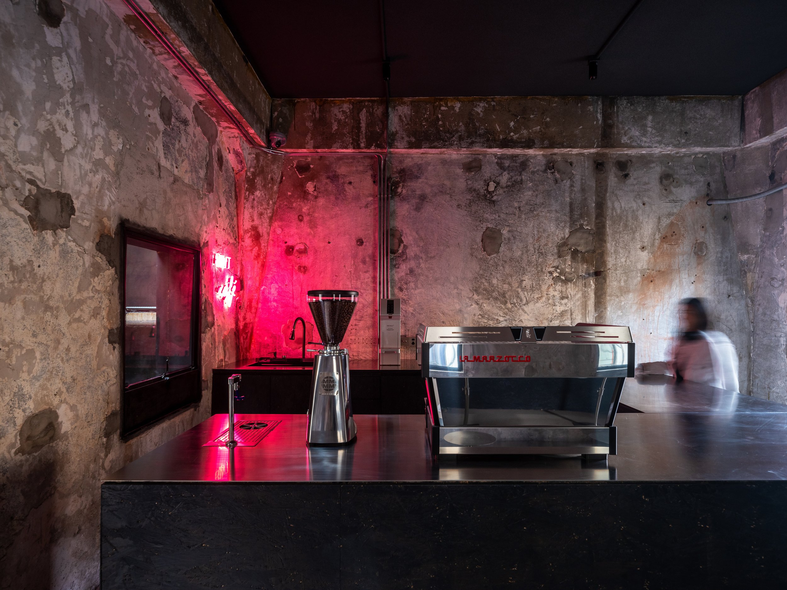
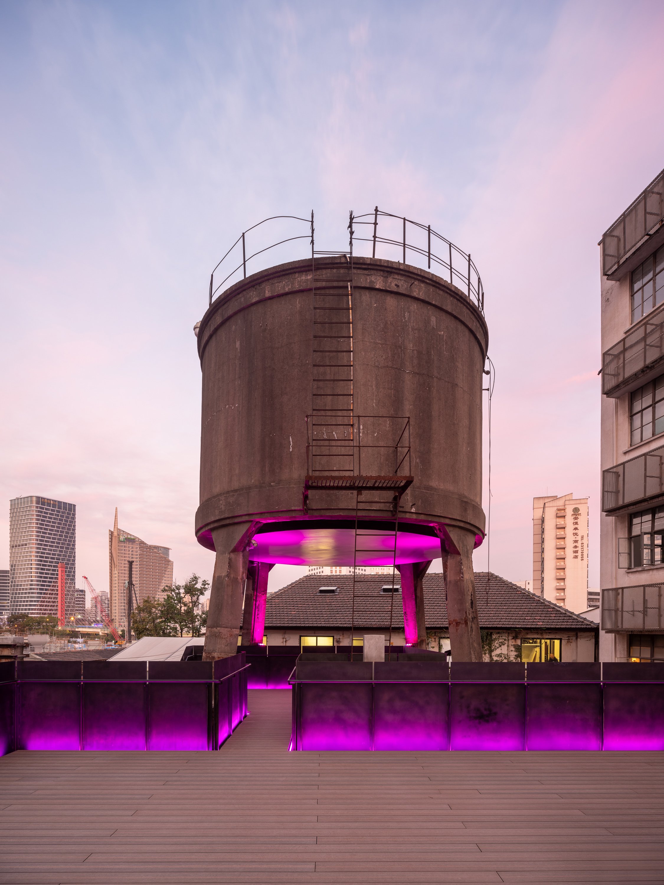
FLIP Studio chose to reveal the structure's raw, industrial character in the square hall. Exposed dark gray cement walls bear the scars of time, with traces of demolished interior partitions intentionally left visible. A boldly inserted black-painted OSB coffee bar creates a monolithic "black box" that contrasts sharply with the gritty backdrop. The pink neon lighting adds a surreal, almost cinematic atmosphere, blurring the lines between the industrial heritage and the contemporary art world.
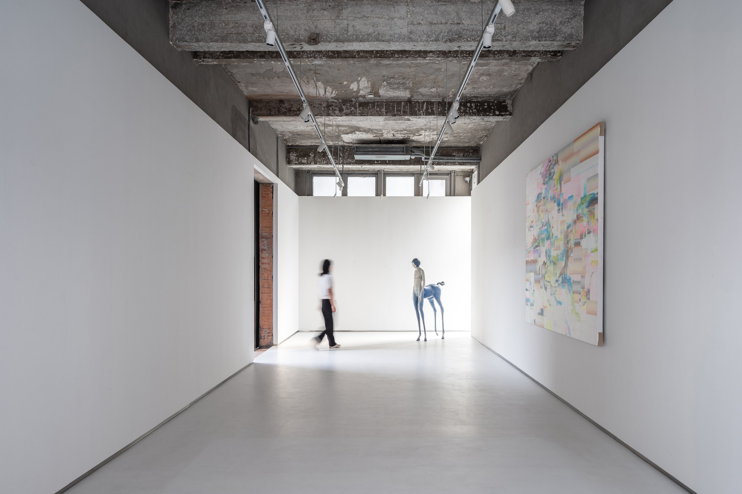
The rectangular hall contrasts with subtler gestures. A white box has been carefully placed in this space, covering two-thirds of the height and leaving the original ceiling exposed. The contrast between new and old is more noticeable in this room, especially where the white box meets the existing brick walls, terrazzo cladding, and exposed structural elements. These layers are revealed like an "architectural anatomy," a concept that aims to showcase the building's structural elements and materials, reminiscent of Gordon Matta-Clark's work, where cut walls and raw materials evoke a dialogue between past and present.
Art and Space: A Curatorial Journey
Art plays a crucial role in guiding visitors through the tower. Strategic placement of installations, graffiti, paintings, and video art punctuate the spatial experience. Key pieces act as navigational markers along the circulation path. An example of this is the untouched wall along the newly inserted staircase, where a live graffiti performance brought the raw energy of street art into the space during the pre-opening phase.
A polished metal plate suspended at the tower's base adds another dimension to the curation. This surface is a canvas for projected digital art, creating a fluid, ever-changing dialogue between physical architecture and ephemeral media.
A Beacon of Light and Art
The Bird Water Tower becomes a glowing beacon in the quiet M50 Creative Park at night. It is adorned with vibrant neon lights and dynamic projections, making it a lighthouse from another dimension. The interplay of light, shadow, and art creates an inviting space where time feels suspended, and the boundaries between past and future dissolve.
The revival of the Bird Water Tower is a testament to Shanghai's industrial heritage and an experiment in the intersection of architecture, art, and urban regeneration. FLIP Studio's sensitive yet inventive intervention has transformed this once-abandoned space into a landmark of creative expression that encourages exploration, contemplation, and conversation.
Project Name:M50 Bird Water Tower
Project Location:Shanghai, China
Lead Designer: Kailun Sun
Area:230㎡
Design Team:Zixuan Chen
Photo:Fangfang Tian
Completion:2023.08
For more information, please visit: www.flip-studio.com
*This project is one of the shortlisted project in the Sky Design Awards 2024 - Architecture Division
Futuristic Minimalism Meets Manila: % Arabica's Bold Arrival at Mitsukoshi BGC
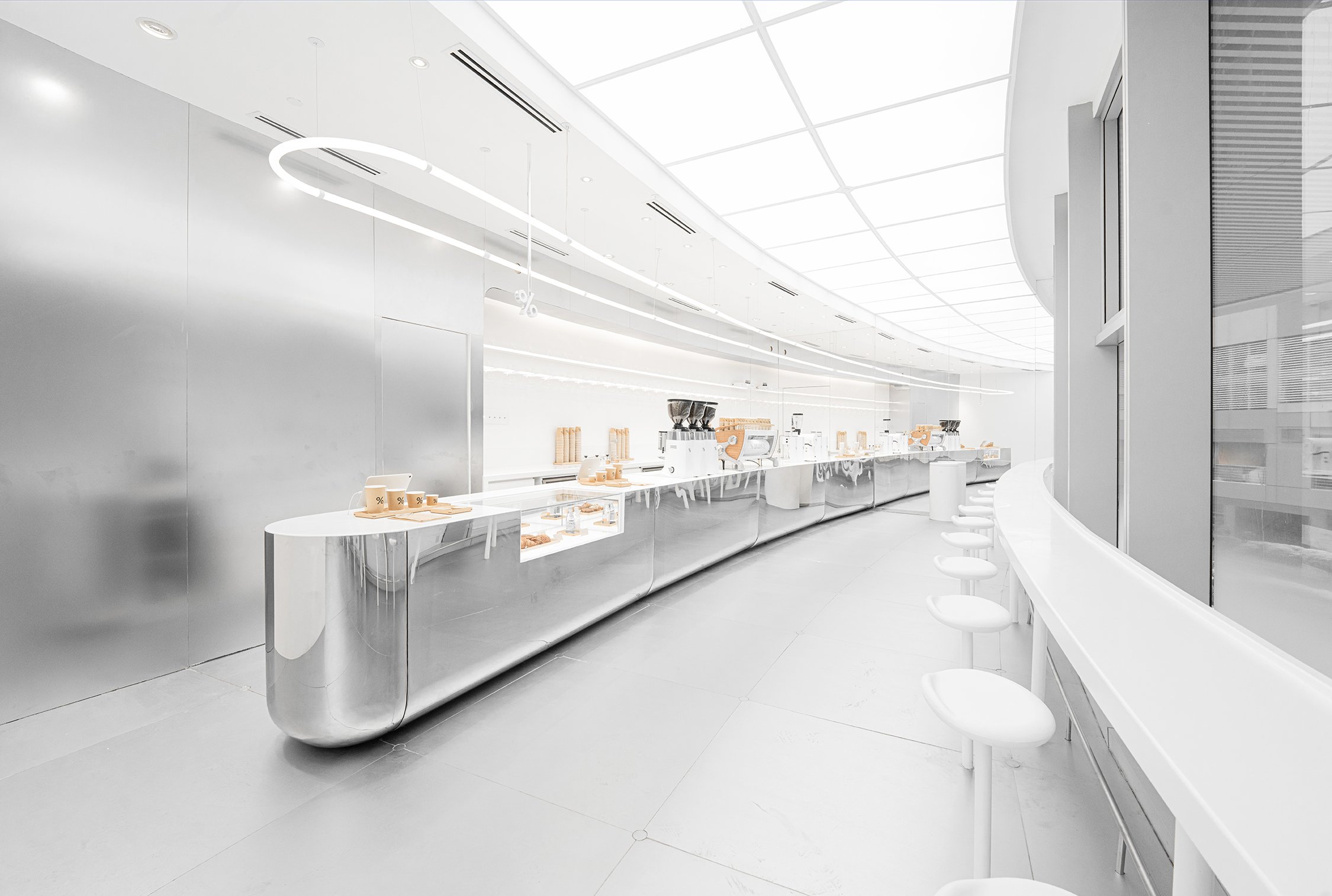
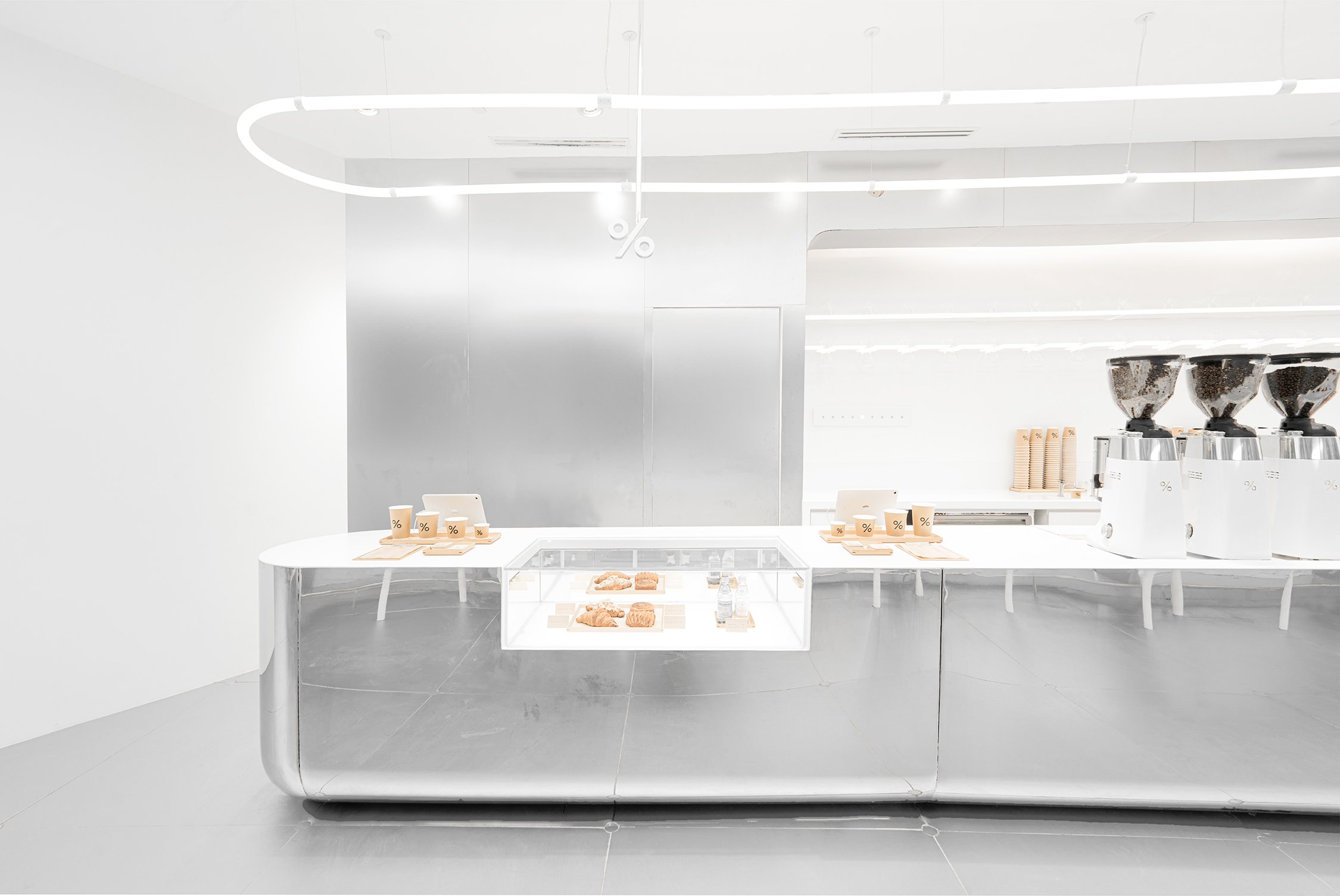
Arabica's debut in Manila at Mitsukoshi BGC showcases the brand's global expansion, blending its minimalist Japanese roots with the vibrancy of an evolving city. Designed by NOMURA Co., Ltd., No. 10, the café integrates the architectural elements of the space with Manila's cultural context and rapid development. Using a long, curved counter that follows the natural curves of the site creates a seamless sense of movement. Stainless steel panels on the walls and floor introduce a futuristic ambiance, resembling a spaceship and inviting patrons into a space that mirrors Manila's vision as a city of the future.
Arabica's debut in Manila at Mitsukoshi BGC showcases the brand's global expansion, blending its minimalist Japanese roots with the vibrancy of an evolving city. Designed by NOMURA Co., Ltd., the café integrates the architectural elements of the space with Manila's cultural context and rapid development. Using a long, curved counter that follows the natural curves of the site creates a seamless sense of movement. Stainless steel panels on the walls and floor introduce a futuristic ambiance, resembling a spaceship and inviting patrons into a space that mirrors Manila's vision as a city of the future.
The café's design perfectly captures % Arabica's commitment to simplicity and sophistication, deeply rooted in Kyoto's design traditions. The stainless steel surfaces provide gentle, muted reflections that don't overpower but enhance the clean, minimalist aesthetic. The design embodies % Arabica's dedication to craftsmanship in both coffee and architecture. This idea of transparency is highlighted through the café's open-plan layout, allowing customers to observe the coffee roasting process, a crucial part of % Arabica's pursuit of excellence.
As Manila emerges as one of Southeast Asia's most vibrant urban centers, % Arabica's location in Mitsukoshi BGC is more than just another café—it delves into design possibilities within a city undergoing economic and cultural transformation. Embracing futuristic elements such as a spaceship-like ambiance, reflective surfaces, and fluid design lines, the café recognizes Manila's future as a hub of creativity and development. Simultaneously, these design choices mirror the brand's established global identity, grounded in attention to detail, craftsmanship, and an admiration for the simple beauty of well-curated spaces.
% Arabica is more than just a physical space. It's known for sourcing and roasting some of the finest beans in the world. The café integrates its commitment to quality coffee with the same passion that defines its architectural approach. Visitors to % Arabica Mitsukoshi BGC can expect a refined coffee experience with a selection of freshly roasted single-origin beans. The coffee is served through precise brewing techniques that reflect the careful balance between tradition and innovation.
The café's return to the Philippines signifies a renewed interest in premium coffee. % Arabica's comeback to Manila at Mitsukoshi BGC is well-timed, indicating a resurgence of the brand in the country and the city's growing passion for artisanal coffee culture. Its location at Mitsukoshi, Japan's first luxury mall in the country, solidifies the partnership between Japanese design and Manila's cosmopolitan style. This blend of traditional craftsmanship and modern design sets % Arabica apart as a brand that turns everyday experiences into moments of luxury.
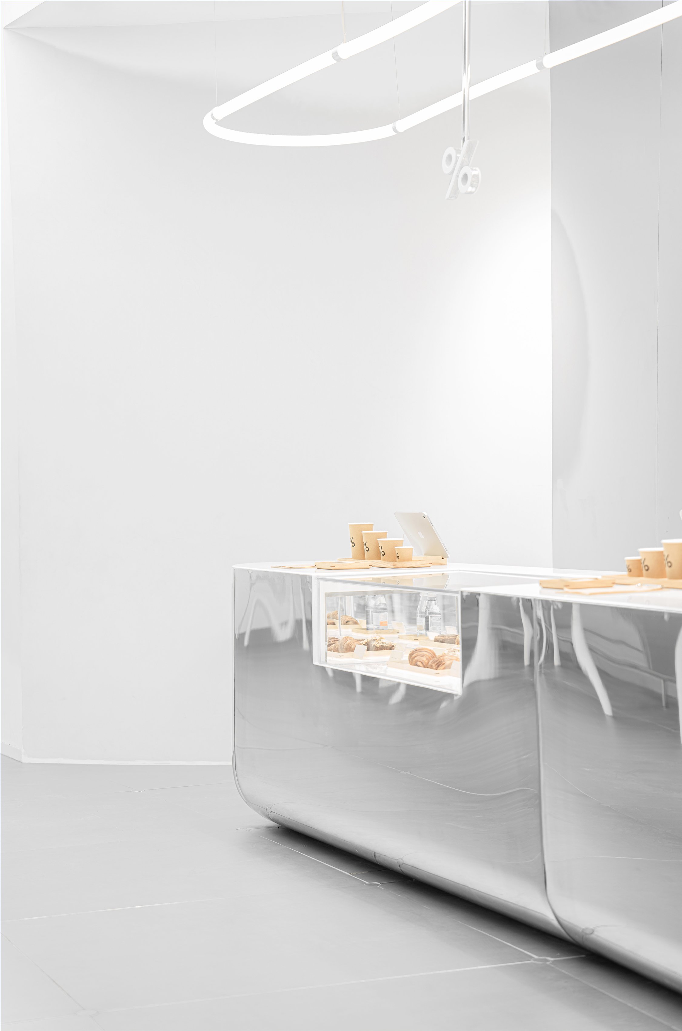
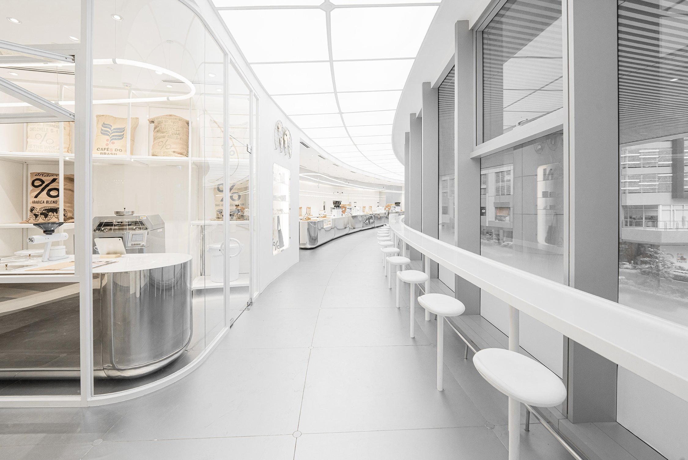
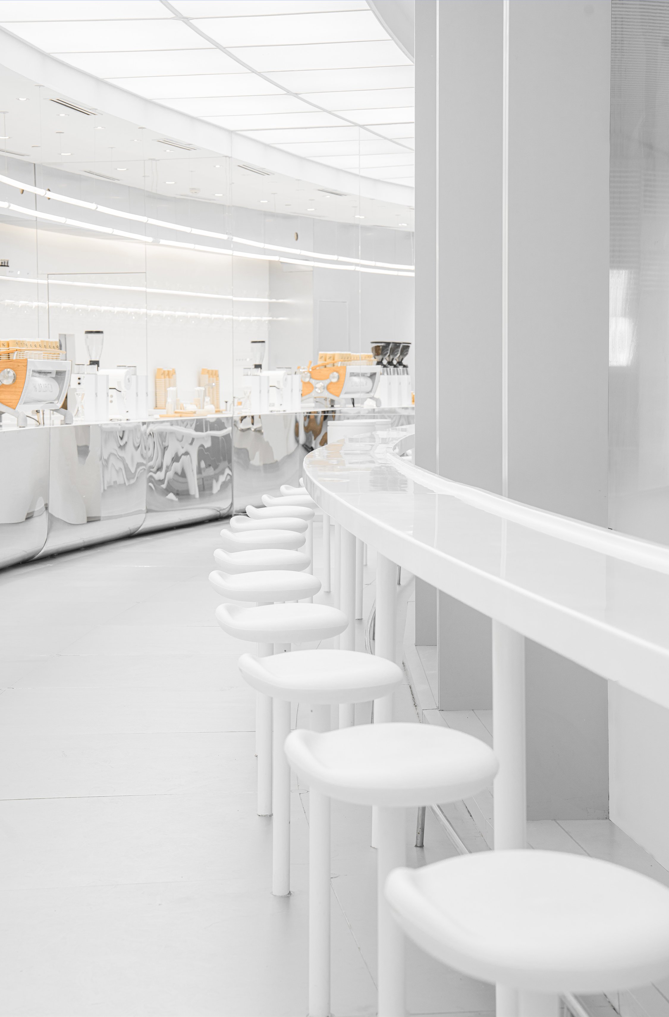
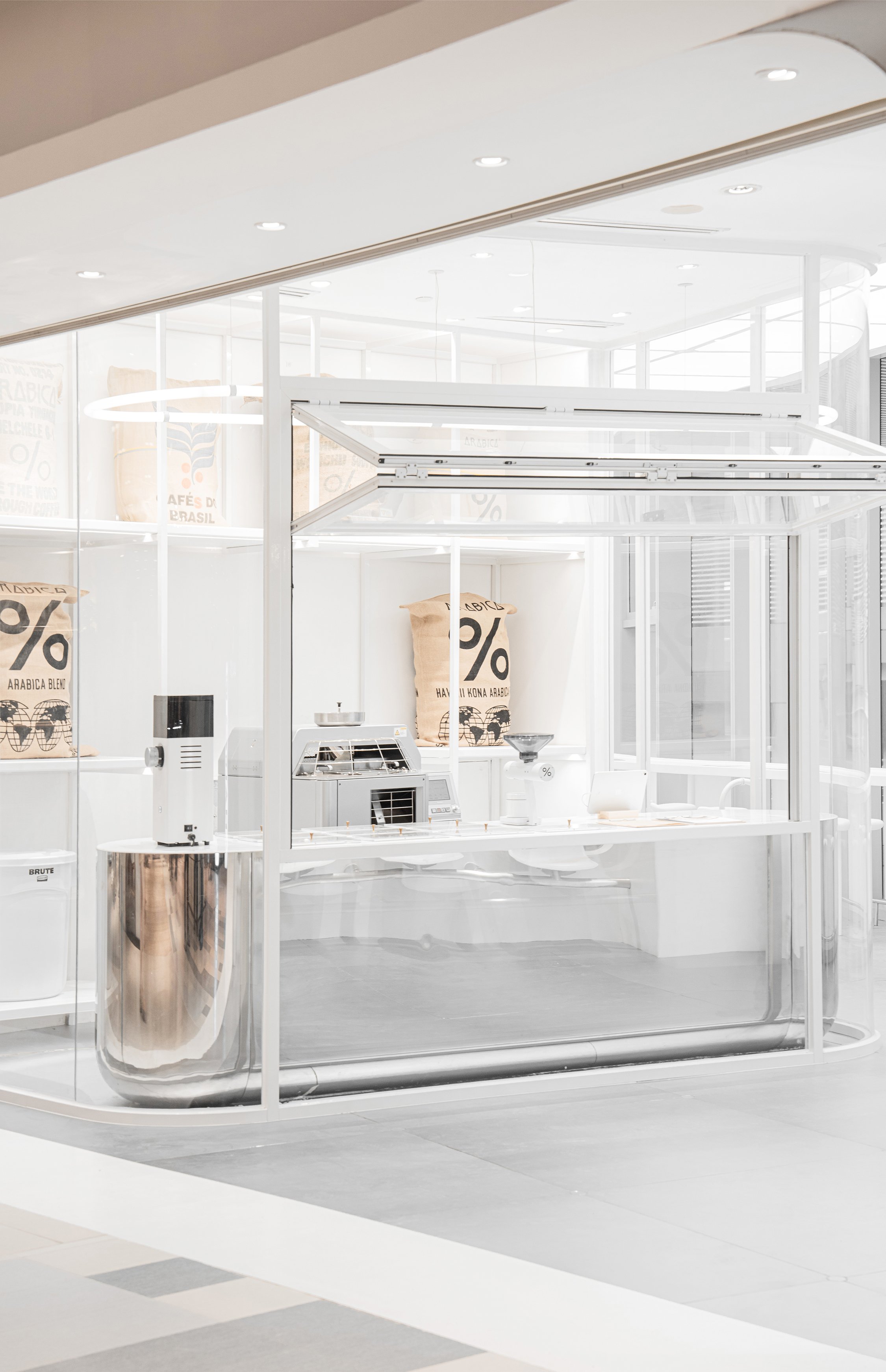
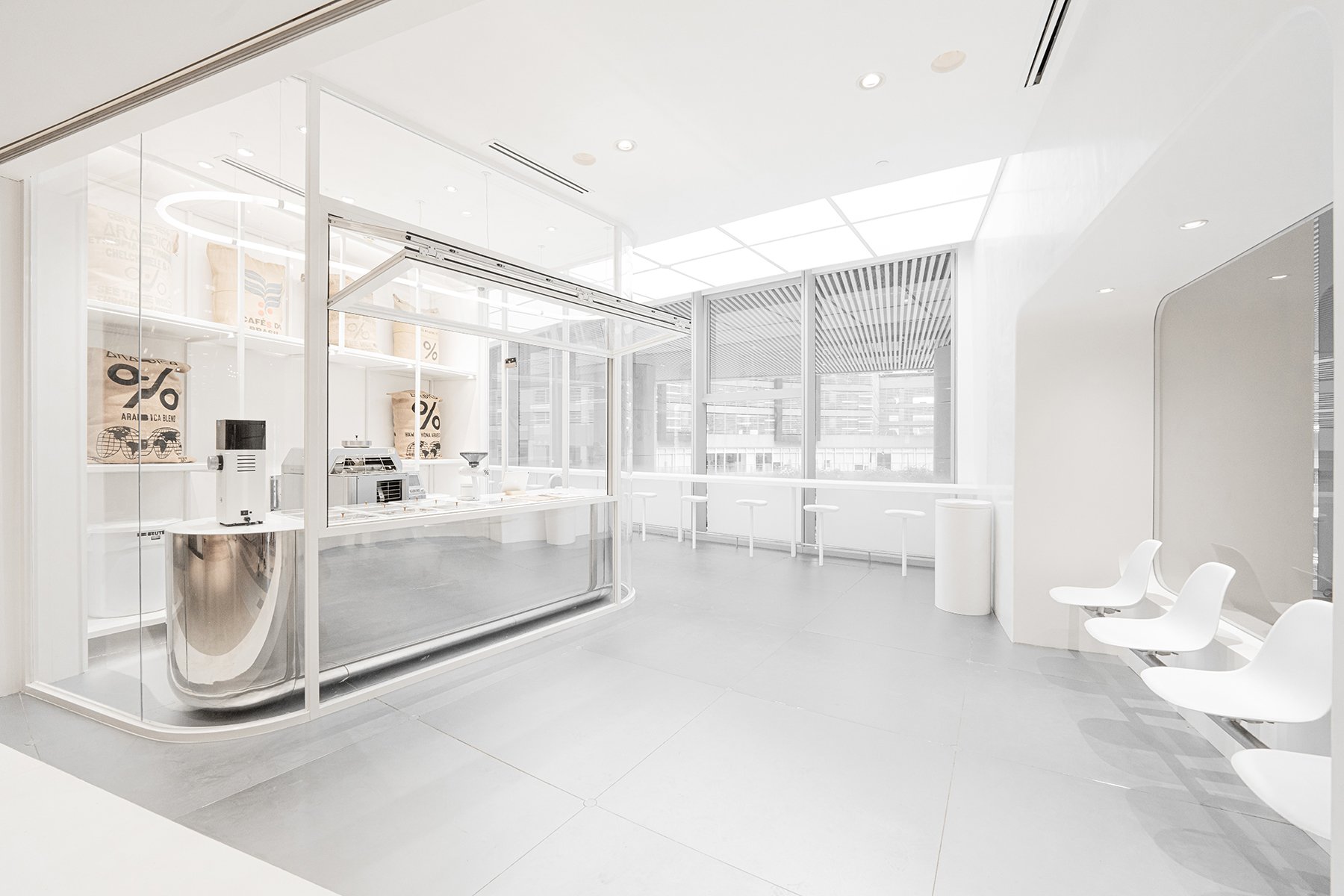
The decision to make Mitsukoshi BGC the café's new home perfectly aligns with % Arabica's aesthetic and design ethos. The mall represents the ongoing connection between Japanese culture and the Philippines, providing a unique platform for % Arabica to showcase its design philosophy and artisanal coffee to Manila's discerning clientele. The café's minimalist approach reflects the Japanese "ma" principle, which emphasizes the space between things. This approach aims for a carefully curated balance of elements that allows the essence of the coffee and the environment to shine through rather than viewing simplicity as emptiness.
Ultimately, % Arabica Mitsukoshi BGC is more than just a coffee shop. It is a space where design, culture, and coffee converge, offering a glimpse into the future of Manila while paying homage to the craftsmanship that defines the city and the brand. The interplay between modernity and tradition, stainless steel and natural curves, minimalist architecture, and artisanal coffee forms the heart of this iconic location, making % Arabica not just a café but a cultural landmark in the making.
For more information, please visit: https://www.no-10.jp/
*This project is one of the shortlisted project in the Sky Design Awards 2024 - Interior Design: Restaurants Division


