Living Art: How KT102’s Shadow Windows Redefine Interior Spaces
The KT102 residence, a transformative creation by In Him's Interior Design, redefines the interplay of architectural forms, natural elements, and interior flow. The innovative 'shadow window' concept, a central feature of the project, orchestrates a remarkable synergy between light and space. These shadow windows, with their intentional fluidity, draw natural light into the home and visually frame the outdoor environment, enriching the home's interior narrative. This architectural feature transcends mere lighting; it establishes a rhythmic cadence throughout the residence.
The KT102 residence, a transformative creation by In Him's Interior Design, redefines the interplay of architectural forms, natural elements, and interior flow. The innovative 'shadow window' concept, a central feature of the project, orchestrates a remarkable synergy between light and space. These shadow windows, with their intentional fluidity, draw natural light into the home and visually frame the outdoor environment, enriching the home's interior narrative. This architectural feature transcends mere lighting; it establishes a rhythmic cadence throughout the residence. As sunlight filters through, it crafts an ever-changing display on the walls, effectively turning the home into a canvas where nature itself becomes the artist.
From a design perspective, shadow windows are a dynamic architectural feature that not only invites the outside in but also shapes the resident's experience of time and the changing seasons. As sunlight moves across the sky, it sculpts and transforms the interior spaces, creating evolving shadow patterns that vary in density and texture. This makes each room unique depending on the hour and season. This interplay between architecture and nature is an excellent example of how interior spaces can go beyond mere functionality to become vibrant living environments.
The project's layout emphasizes spatial coherence by dividing areas into distinct functional zones while maintaining an interconnected sense of transparency. This approach to interior planning fosters a feeling of openness and continuity without compromising the purpose of each area. Using frames, shadow windows, and architectural volumes creates a continuous sightline, enhancing the spatial flow and ensuring a cohesive atmosphere across different zones. These thoughtfully designed divisions encourage a journey through the home that feels both private and shared, intimate yet grand.
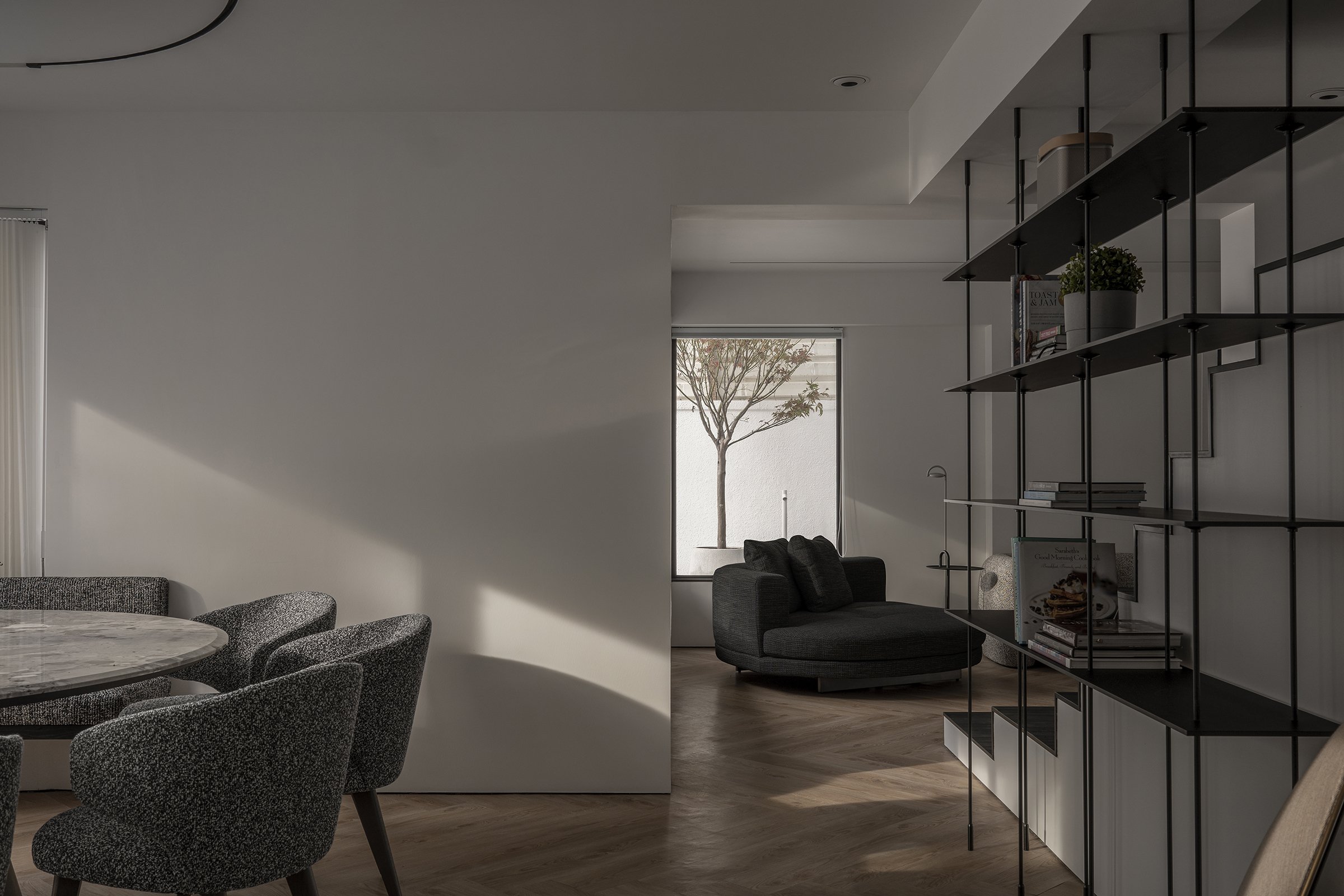
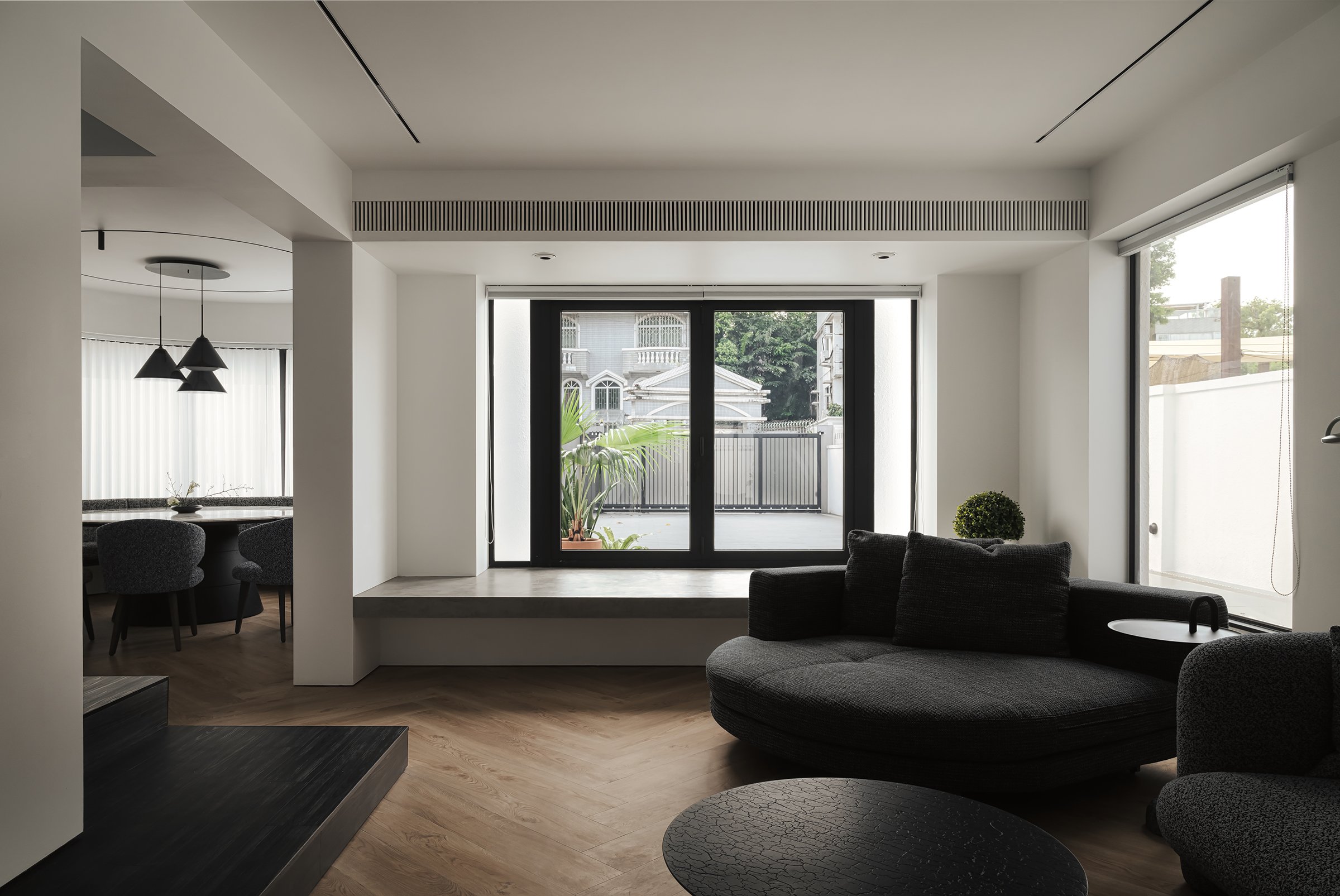

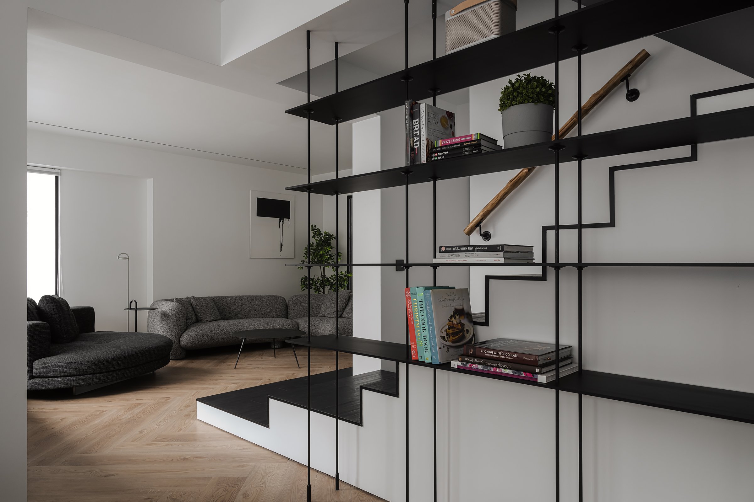

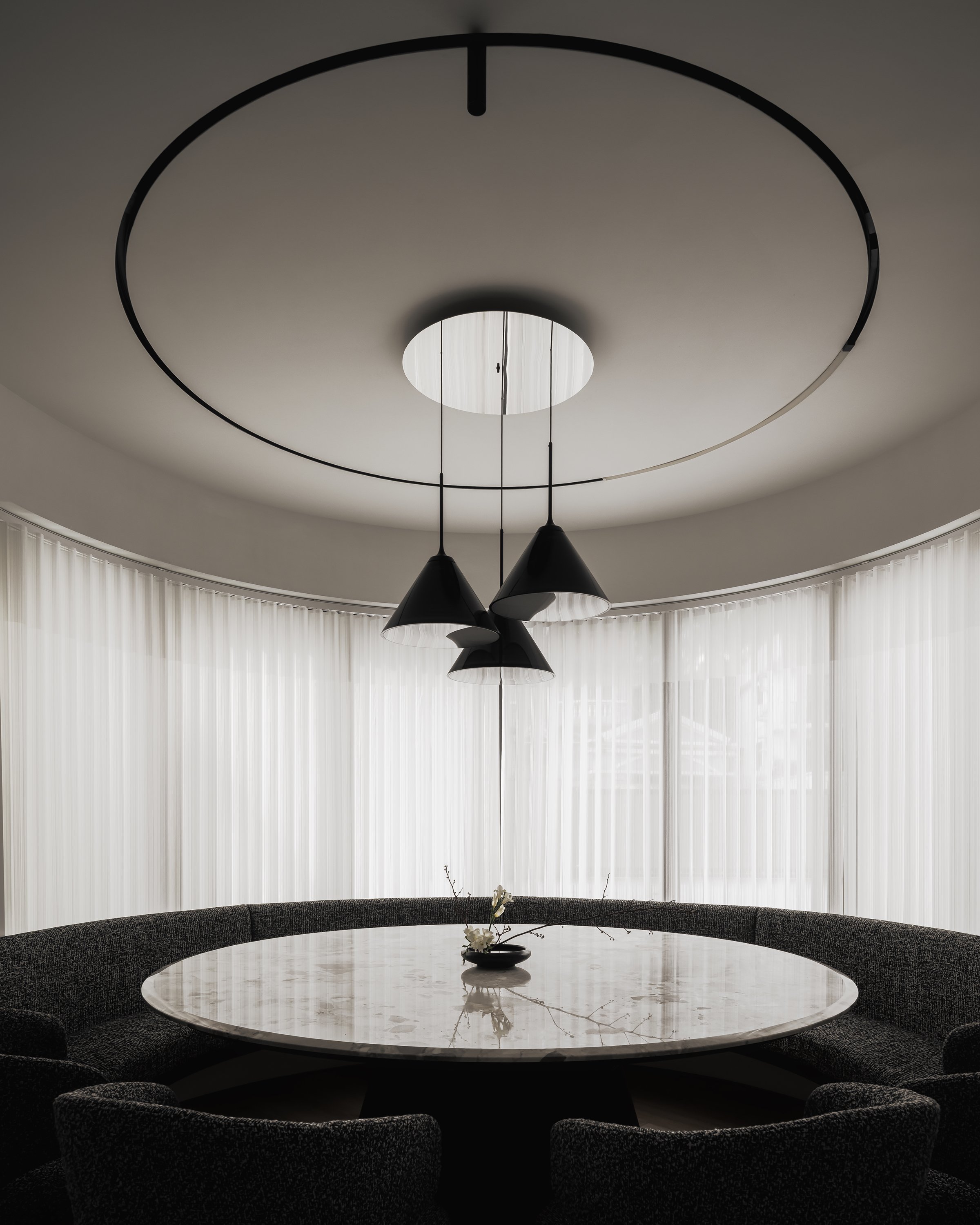
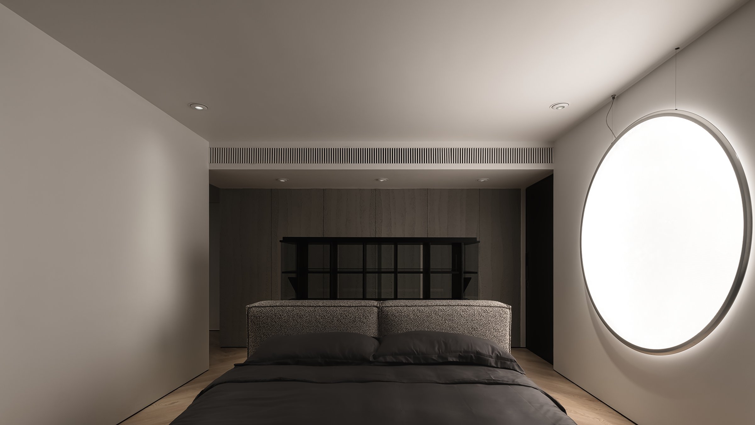
The shadow windows serve as a backdrop for a captivating display of light and shadow, creating a modern interpretation of shadow puppetry. This adds a subtle sense of drama to the space. These design elements harmonize with the surrounding landscape, where the movement of foliage and changing light contributes an ephemeral quality to the interiors. This echoes the Japanese aesthetic of wabi-sabi, which values transience and imperfection. Overall, this design fosters a sense of calm and balance and transforms the residence into a dynamic visual experience that encourages daily exploration.
The design of KT102 is an exemplary demonstration of how interior architecture can utilize natural phenomena to enhance living spaces. It inspires those who aim to create engaging and tranquil environments. This approach reminds us that thoughtful design can be both functional and poetic, encouraging us to look beyond walls and windows to discover the artistic potential in every ray of light and shadow cast.
For more information, please visit:
*This project is one of the shortlisted project in the Sky Design Awards 2024 - Interior Design - Residential
Timeless Tradition Meets Modern Minimalism: DOT Design’s Exhibition Hall for BORCCI
DOT Design's exhibition hall for BORCCI Kitchen Cabinets at the 2022 China International Building Decoration Fair (Shanghai) offers an immersive journey through art, culture, and sustainability. The space, inspired by the elegance of traditional Chinese gardens, aims to provide an experience of 'changing scenery with every step,' engaging visitors in a seamless blend of artistry, leisure, and amusement within a refined, contemporary framework.
DOT Design's exhibition hall for BORCCI Kitchen Cabinets at the 2022 China International Building Decoration Fair (Shanghai) offers an immersive journey through art, culture, and sustainability. The space, inspired by the elegance of traditional Chinese gardens, aims to provide an experience of 'changing scenery with every step,' engaging visitors in a seamless blend of artistry, leisure, and amusement within a refined, contemporary framework.
The hall, with its distinct oriental classical charm on the outside, sets the stage for a truly unique experience inside. The interior, in contrast, exudes minimalist sophistication. It employs a restrained colour palette with white walls, floors, and furnishings, creating a serene backdrop that accentuates the brand's product colours. This simplicity is a deliberate choice, echoing the beauty of ancient aesthetics while providing a contemporary space for contemplation.
The design's central concept is a harmonious blend of tradition and modernity. Drawing inspiration from the enduring beauty of China's water towns, DOT Design reimagines these iconic landscapes through simplified architectural forms. The hall becomes a 'four-dimensional space of art,' where traditional elements such as raised ridges, whitewashed walls, bamboo groves, and stone formations are seamlessly integrated, fostering a harmonious dialogue between the past and present.
"This project is a profound exploration of Chinese cultural heritage. The design embodies the Suzhou Garden philosophy of "changing scenery with every step," creating a series of interconnected yet distinct spaces that invite visitors to discover something new at every turn. This spatial narrative honours tradition and aligns with modern environmental concerns by adhering to low-carbon and recycling principles."


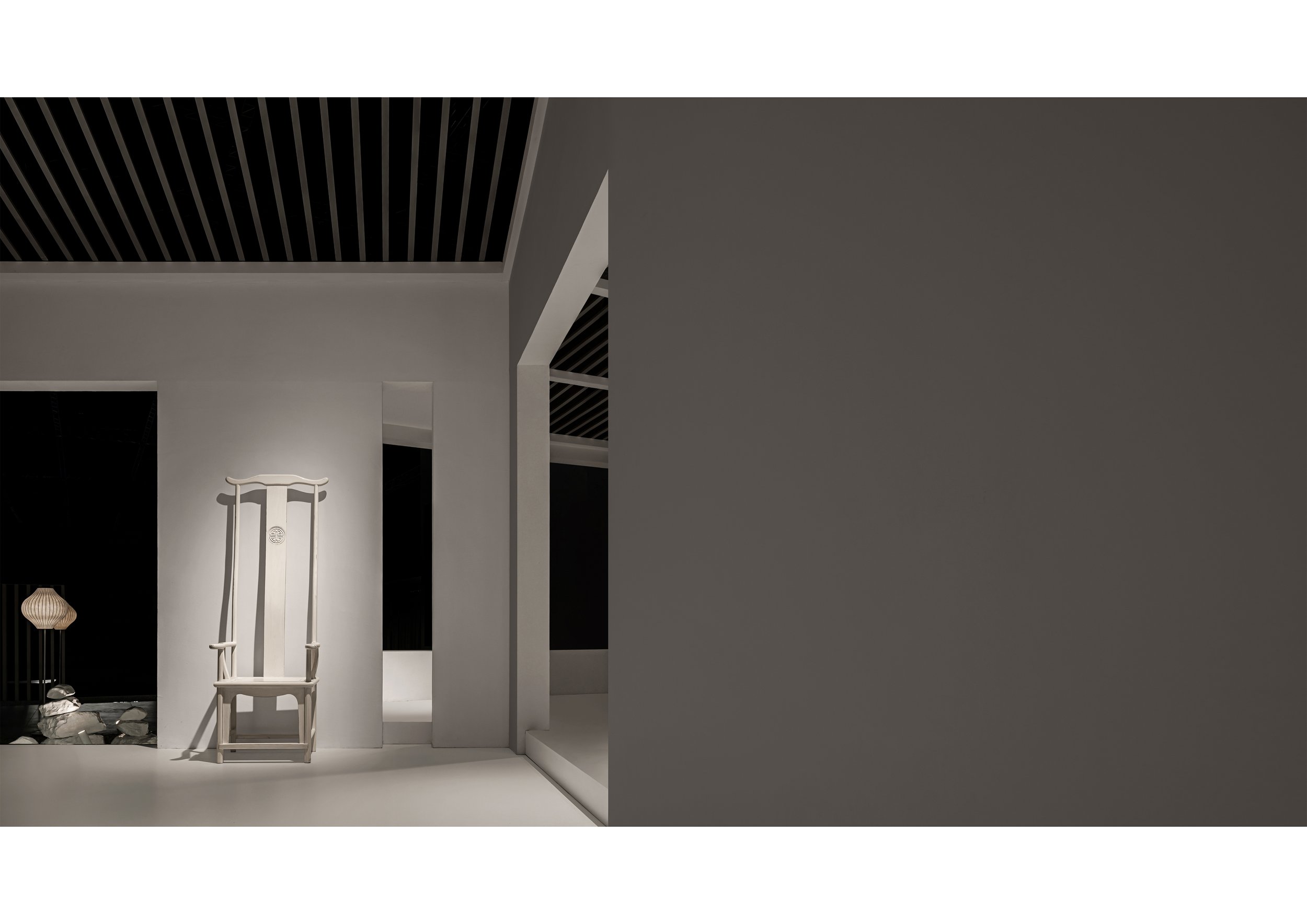

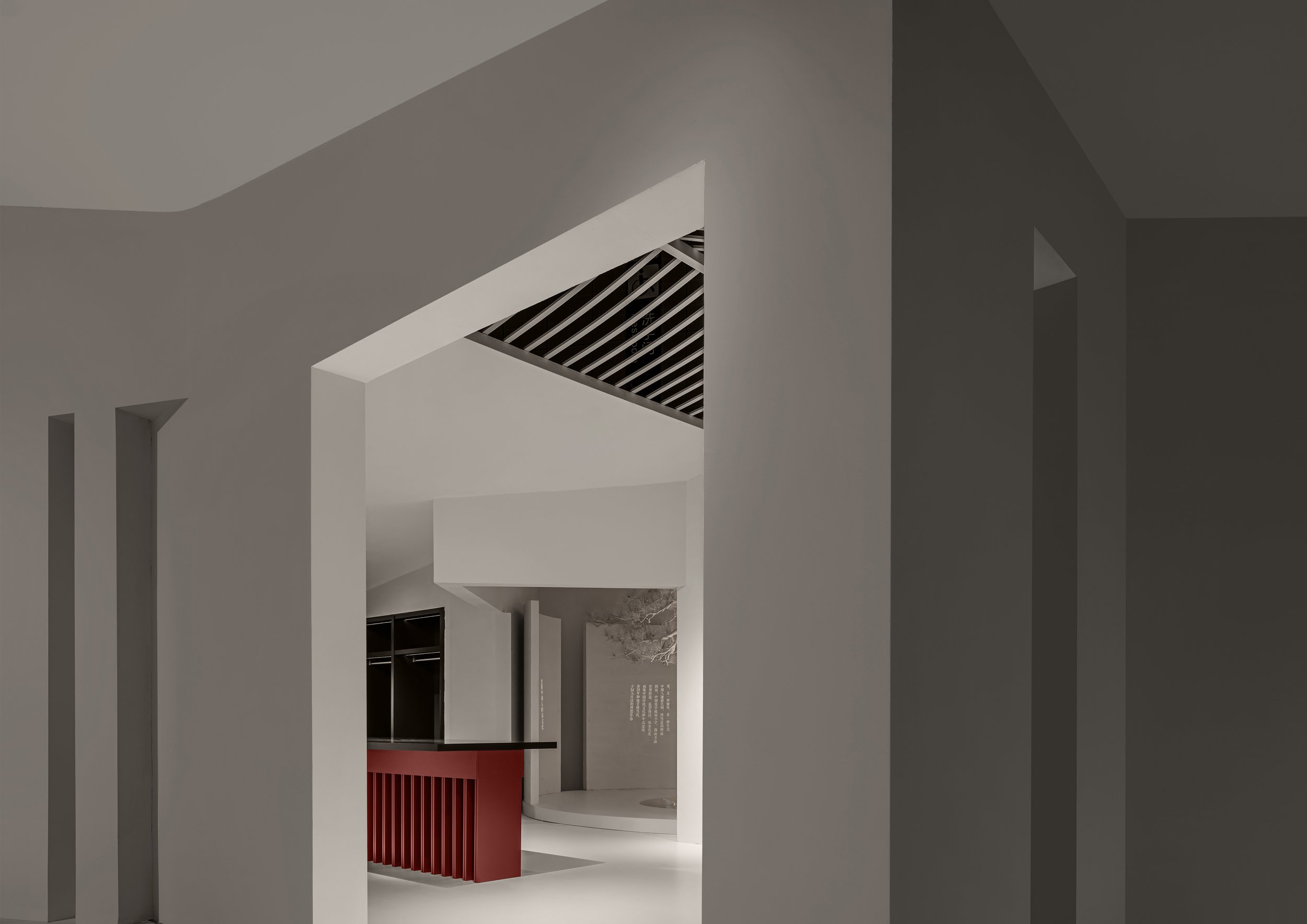

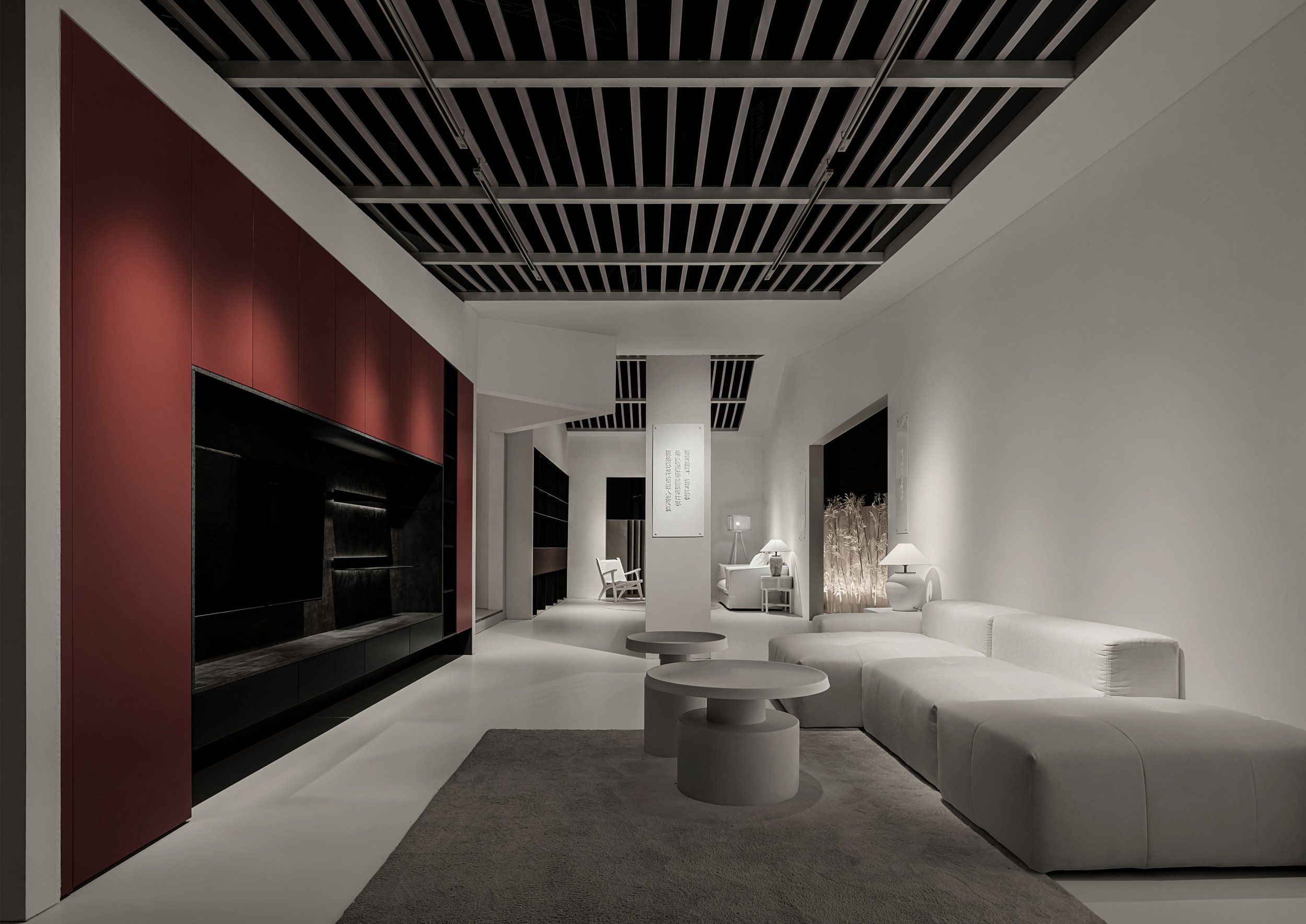
The exhibition hall is meticulously designed with sustainability at its core. It comprises six modular sections: living room, kitchen, dining room, bedroom, dressing room, and e-sports room. Each section is crafted for easy disassembly and reusability in future exhibitions, reassuring visitors of our commitment to reducing the environmental footprint. This approach not only showcases a forward-thinking design but also strikes a balance between form, function, and responsibility.
To further emphasize its commitment to eco-consciousness, the hall's minimalist interior and exterior decor use environmentally friendly coatings. This design choice subtly connects the products to the overall spatial composition, embodying the brand's ethos of simplicity and balance. The exhibition's theme, "Art Gallery of Wu Wei," meaning non-interference, is brought to life through its tranquil, nature-infused spaces, inviting visitors to embrace a calm, harmonious lifestyle.
By blending traditional Chinese elements with modern design innovation, DOT Design has not only created a space that reflects cultural reverence but also presents a bold vision of the future. This innovative approach is a true testament to the power of thoughtful, sustainable design, inspiring all who experience it.
*This project is one of the shortlisted project in the Sky Design Awards 2024 - Interior Design: Institution Division
Yue Pan
Designer Profile
Yue Pan
Registered Senior Interior Designer, Registered Senior Engineer
Education:
Master's degree in spatial planning and design at Polytechnic University of Milan, Italy
Master's degree in Art, Design and Design at the Brera Academy of Fine Arts in Milan, Italy
Current:
DOT Founder/Design Director of DESIGN
Experience:
"Champion's New Home" by Wu Minxia's specially invited designer
"Su Shen's New Home" Invited Designer by Su Bingtian's Home
Specially invited designer for Beijing TV's "Warm New Home" program
Specially invited designer by Tencent Video for the "Craftsman Becomes a New Home" program
DOT DESIGN is a high-end professional interior space planning and design performance firm established in 2007, founded by renowned domestic senior interior designer Rudy Pan. Advocate for integrated spatial design services in professional services, providing integrated design solutions from early visual communication, architectural optimization, interior design, landscape design, lighting design, display art, product design, and structural optimization to ensure the final aesthetic presentation of the project.
Crafting Soulful Luxury: Jean-Michel Gathy Redefines Hospitality Design with Janu Tokyo
In March 2024, Gathy revealed his latest masterpiece, Janu Tokyo, the highly anticipated flagship hotel for Aman's new sister brand. Janu, which means "soul" in Sanskrit, aims to blend mindful luxury and vibrant social energy. This concept is perfectly captured in the design of the Tokyo property, which combines European flair with understated Japanese elegance. Traditional Sakan wall plastering complements French-inspired interiors, resulting in a dynamic, timeless atmosphere that embodies both the ethos of the Janu brand and Gathy's signature design approach, where contemporary luxury meets cultural heritage.
Jean-Michel Gathy, the visionary behind some of the world’s most iconic luxury hotel interiors, continues to redefine the boundaries of opulence and design. As principal designer at DENNISTON, the architecture firm he founded in 1983, Gathy has established a reputation for crafting spaces that are as meticulously detailed as they are awe-inspiring. His portfolio reads like a who’s who of luxury hospitality, with celebrated projects for global heavyweights such as Mandarin Oriental, One&Only, and most recently, the flagship Aman New York.
In March 2024, Gathy unveiled his latest masterpiece, Janu Tokyo, the much-anticipated flagship hotel for Aman’s new sister brand. Janu, which translates to “soul” in Sanskrit, aims to strike a balance between mindful luxury and a vibrant social energy—a concept that Gathy has effortlessly encapsulated in the Tokyo property. The design merges European flair with understated Japanese elegance, with traditional Sakan wall plastering complementing French-inspired interiors. The result is a dynamic, timeless atmosphere that reflects both the ethos of the Janu brand and Gathy’s signature design approach, where contemporary luxury meets cultural heritage.
The crown jewel of Janu Tokyo is undoubtedly the Janu Suite. Spanning an impressive 284 square meters (3,057 square feet), this suite offers panoramic views of Tokyo Tower and the lush Azabudai Hills Garden Plaza from its two expansive balconies. Inside, the space is thoughtfully laid out with residential-scale living areas, a private study and library, and a spa-like bathroom complete with a double vanity, rain shower, and soaking tub. Every detail, from the seamless flow of space to the artfully curated furnishings, speaks to Gathy’s unmatched ability to combine comfort with grandeur.


Born in Belgium in 1955, Gathy’s early fascination with architecture was sparked during family trips across Europe, where he developed a keen eye for the nuances of different cultures and landscapes. By 1981, he had relocated to Asia, where his passion for innovative, luxury design found its perfect canvas. Over the past four decades, DENNISTON has become synonymous with cutting-edge hospitality design, and Gathy himself has emerged as a trailblazer in the industry.
Gathy’s impact has not gone unnoticed. His work has been widely published, and he is frequently invited to speak at international conferences. His numerous accolades include his induction into the prestigious "Platinum Circle of Hospitality Design" in 2006, an honor reserved for those who have significantly shaped the world of hotel design. In 2019, Gathy was awarded the title of "Officer of the Order of the Crown" by His Majesty Philippe, King of Belgium, recognizing his outstanding contributions to the field. More recently, in 2022, he received the Outstanding Contribution Award from AHEAD (Awards for Hospitality Experience and Design), further cementing his legacy as a pioneer in luxury design.
With Janu Tokyo, Gathy not only introduces a fresh design language to Japan’s hospitality scene but also reinforces his enduring commitment to innovation and excellence. The property exemplifies his ability to blend cultural influences with modern luxury, creating environments that are as soulful as they are sophisticated. As Janu continues to expand globally, Gathy’s design for the Tokyo flagship sets the tone for a new era of dynamic, design-forward luxury hotels.
Bird Water Tower: FLIP Studio's Bold Revival of Industrial Heritage and Art at Shanghai's M50 Creative Park
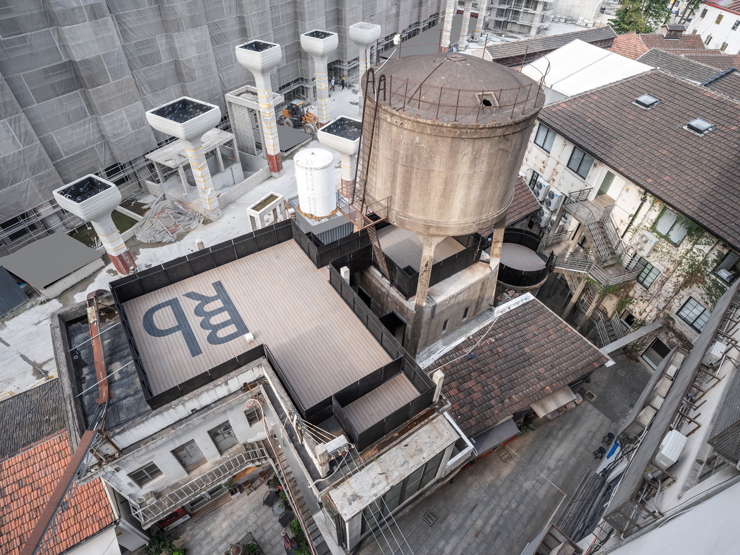
Located in the northwest corner of Shanghai's M50 Creative Park, a hub for contemporary art and design, the Bird Water Tower is a captivating blend of the old and the new. Standing next to Heatherwick Studio's famous 1000 Trees, this historic water tower has existed for over fifty years. Previously owned by the well-known artist and curator Bing Su, the tower was unused for many years until FLIP Studio converted it into a vibrant venue for modern art and social gatherings.
Located in the northwest corner of Shanghai's M50 Creative Park, a hub for contemporary art and design, the Bird Water Tower is a captivating blend of the old and the new. Standing next to Heatherwick Studio's famous 1000 Trees, this historic water tower has existed for over fifty years. Previously owned by the well-known artist and curator Bing Su, the tower was unused for many years until FLIP Studio converted it into a vibrant venue for modern art and social gatherings.
"The renovation of the Bird Water Tower offers an exploration of temporal layers. Visitors can physically and metaphorically navigate through Shanghai's industrial past while being immersed in modern artistic expression. FLIP Studio's design approach embraces the structure's worn and weathered character while introducing a new architectural language that engages with the old."
Outdoor Experience: A Gateway Between Eras
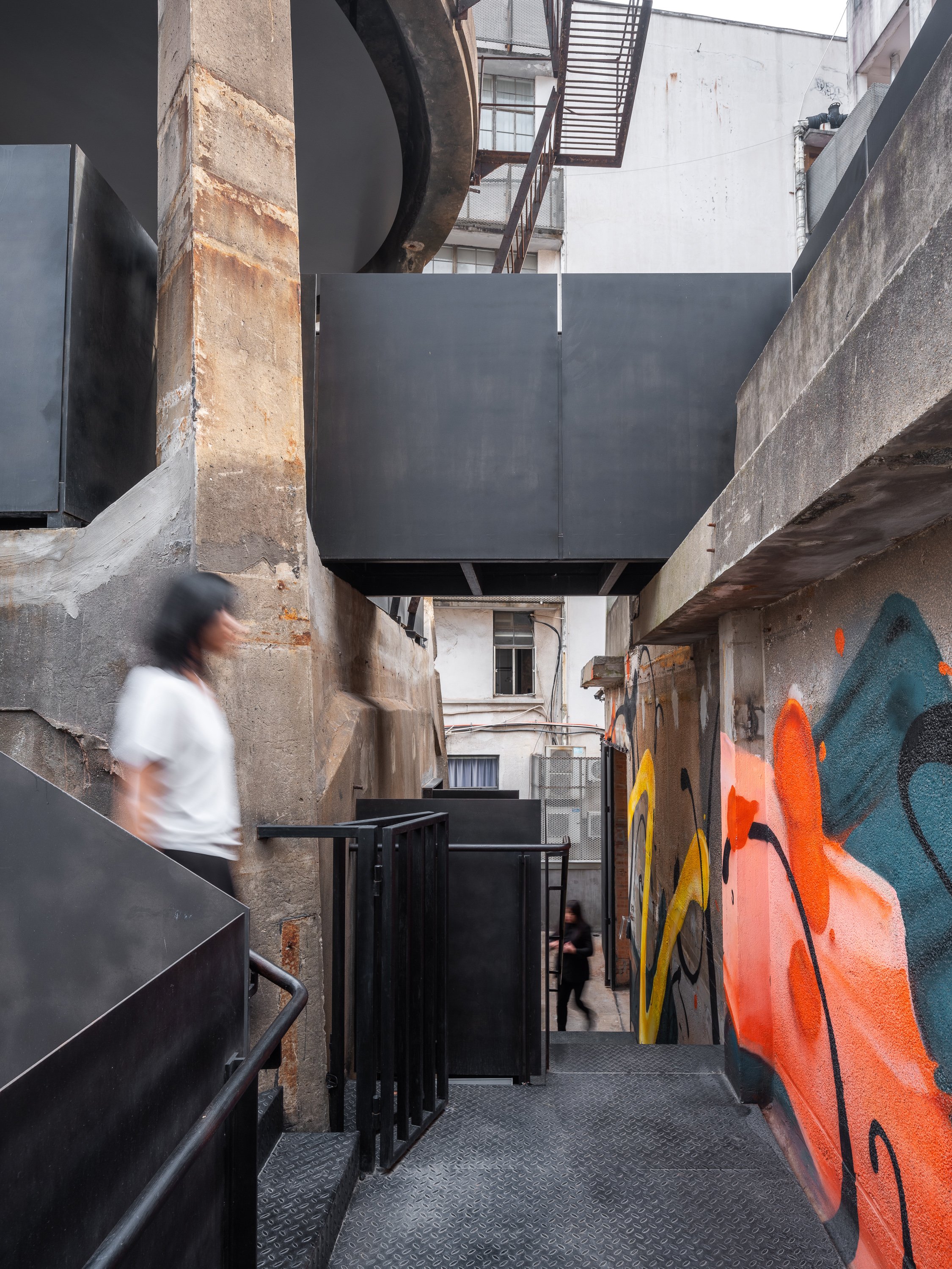
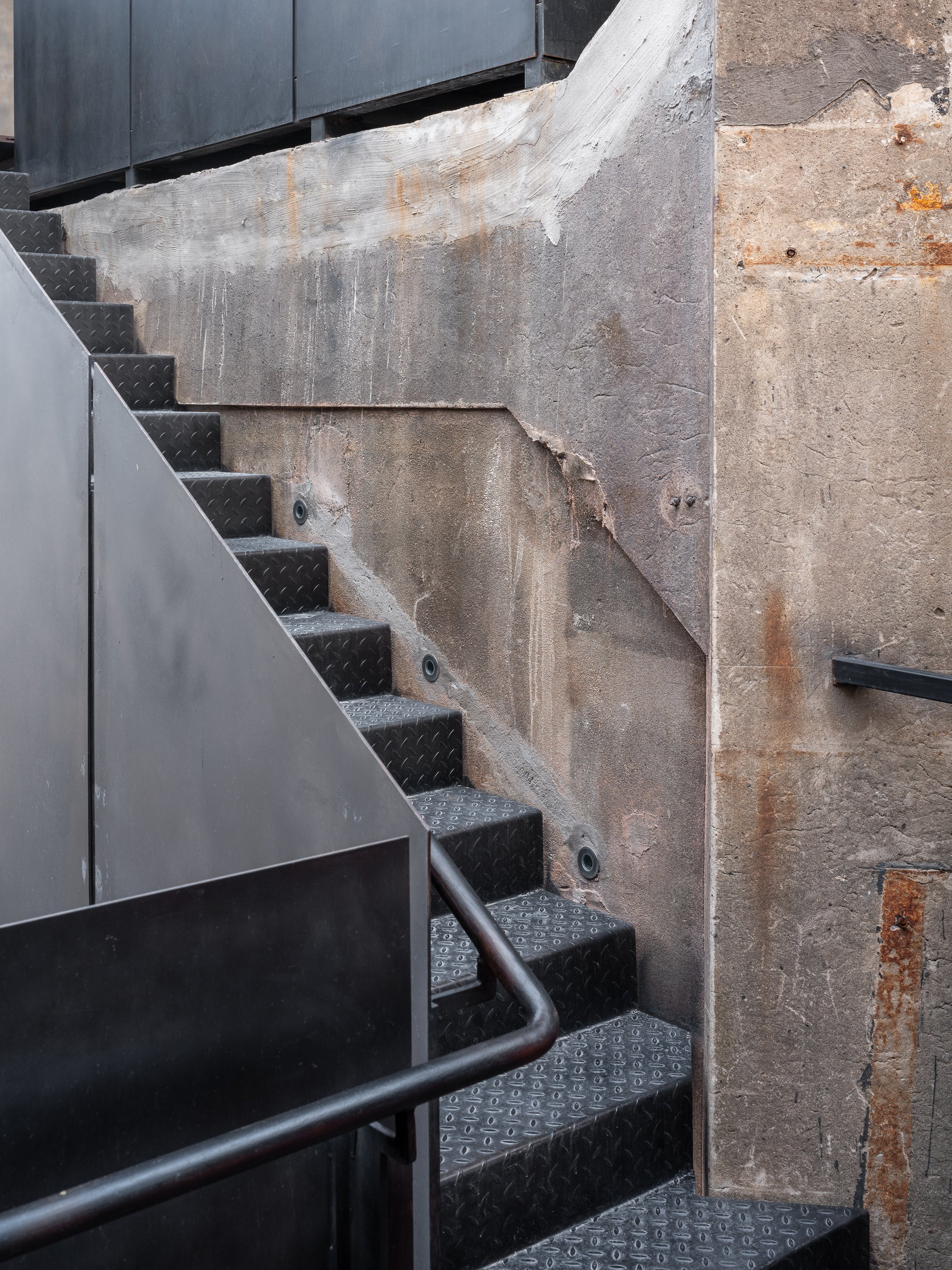
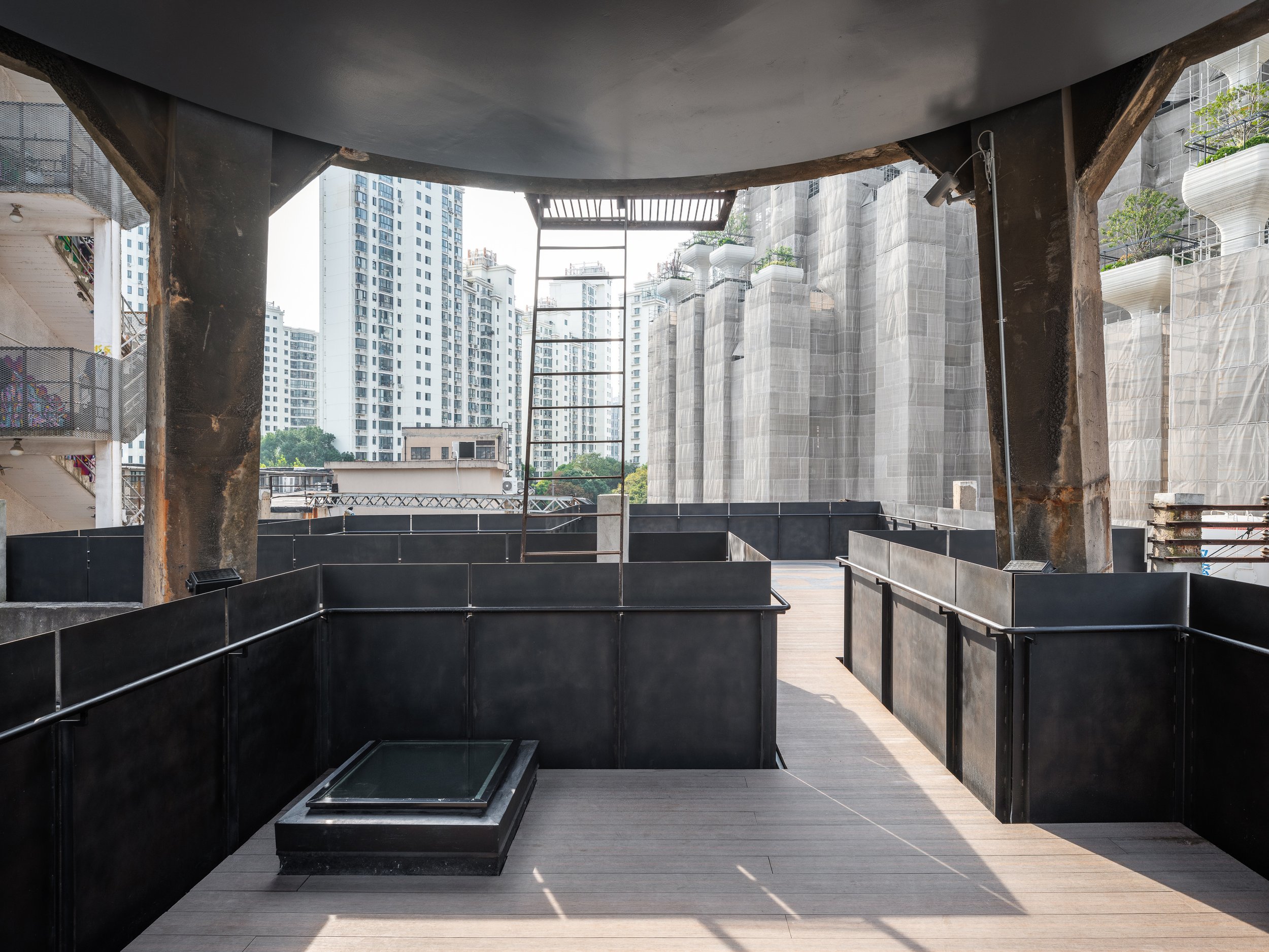
The journey starts in the outdoor area, where FLIP Studio has skillfully incorporated a network of platforms, bridges, and stairways to create an architectural promenade leading to the tower. These new pathways are marked by black-rusted steel handrails and balustrades, clearly distinguishing between old and new while maintaining a respectful enclosure. These changes serve as connectors and indicate the visitor's transition into a redefined space where history meets innovation.
Dual Interiors: Raw Elegance Meets Refined Modernity
The interior of the Bird Water Tower has been divided into two distinct spaces: one square and the other rectangular, each offering a unique spatial experience. A narrow outdoor terrace acts as a slender seam, joining the two spaces while providing a brief breath of fresh air between the roughness of the past and the precision of contemporary design.
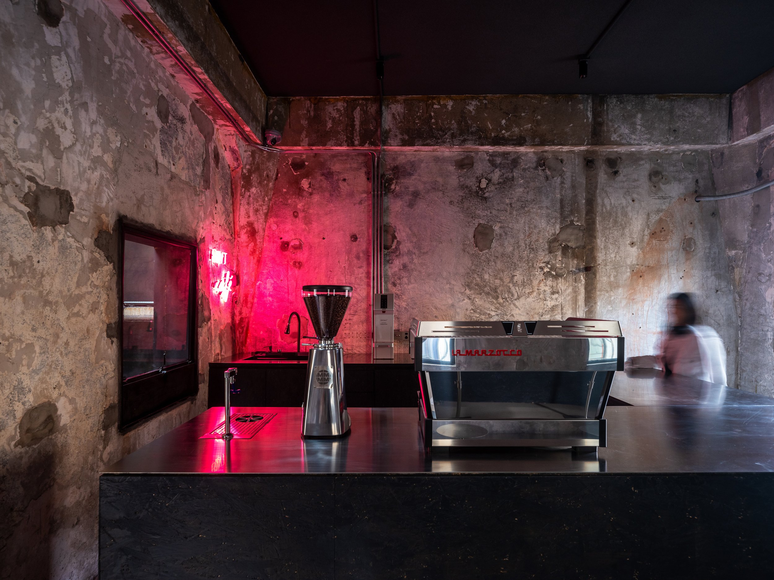
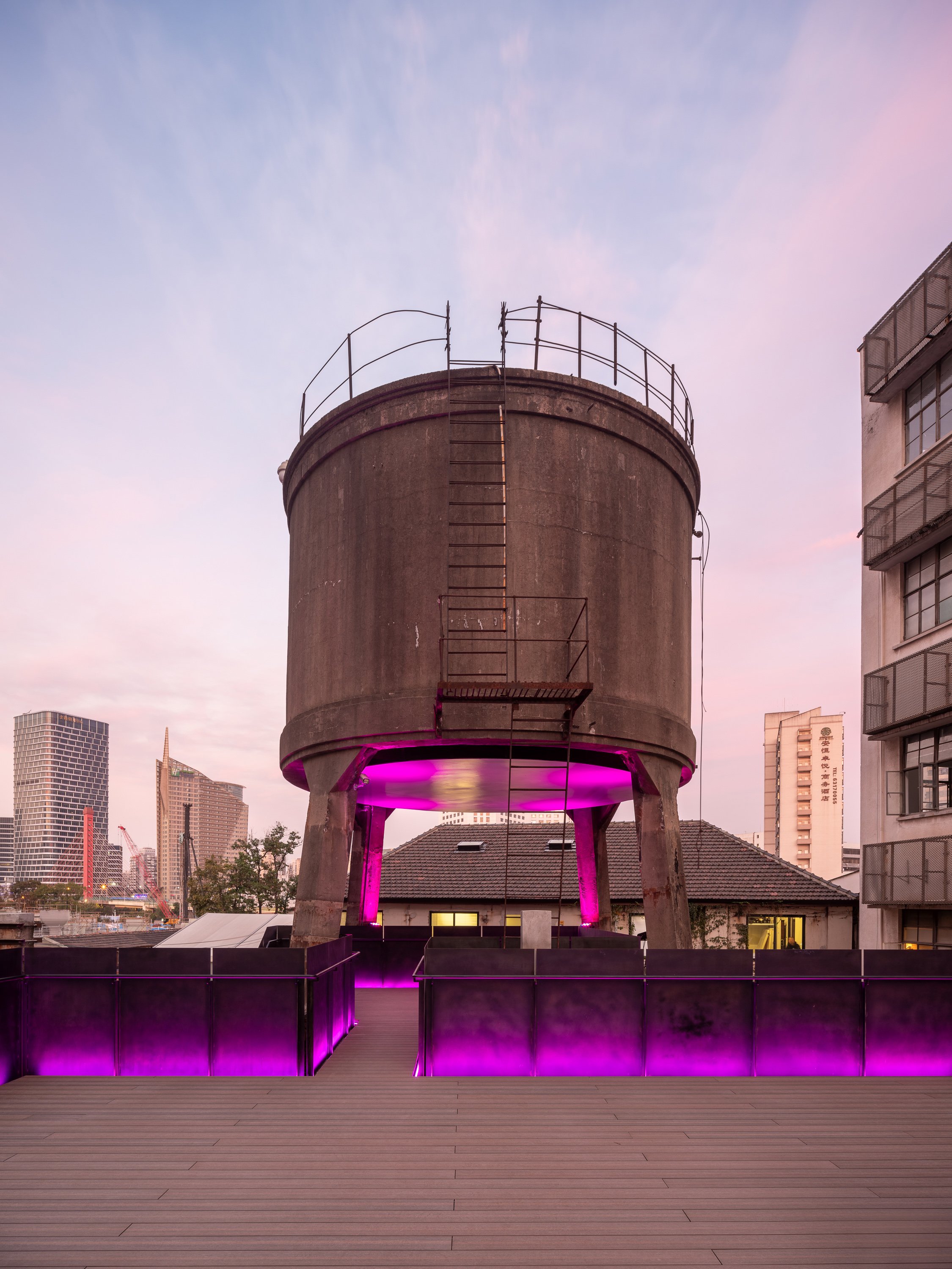
FLIP Studio chose to reveal the structure's raw, industrial character in the square hall. Exposed dark gray cement walls bear the scars of time, with traces of demolished interior partitions intentionally left visible. A boldly inserted black-painted OSB coffee bar creates a monolithic "black box" that contrasts sharply with the gritty backdrop. The pink neon lighting adds a surreal, almost cinematic atmosphere, blurring the lines between the industrial heritage and the contemporary art world.
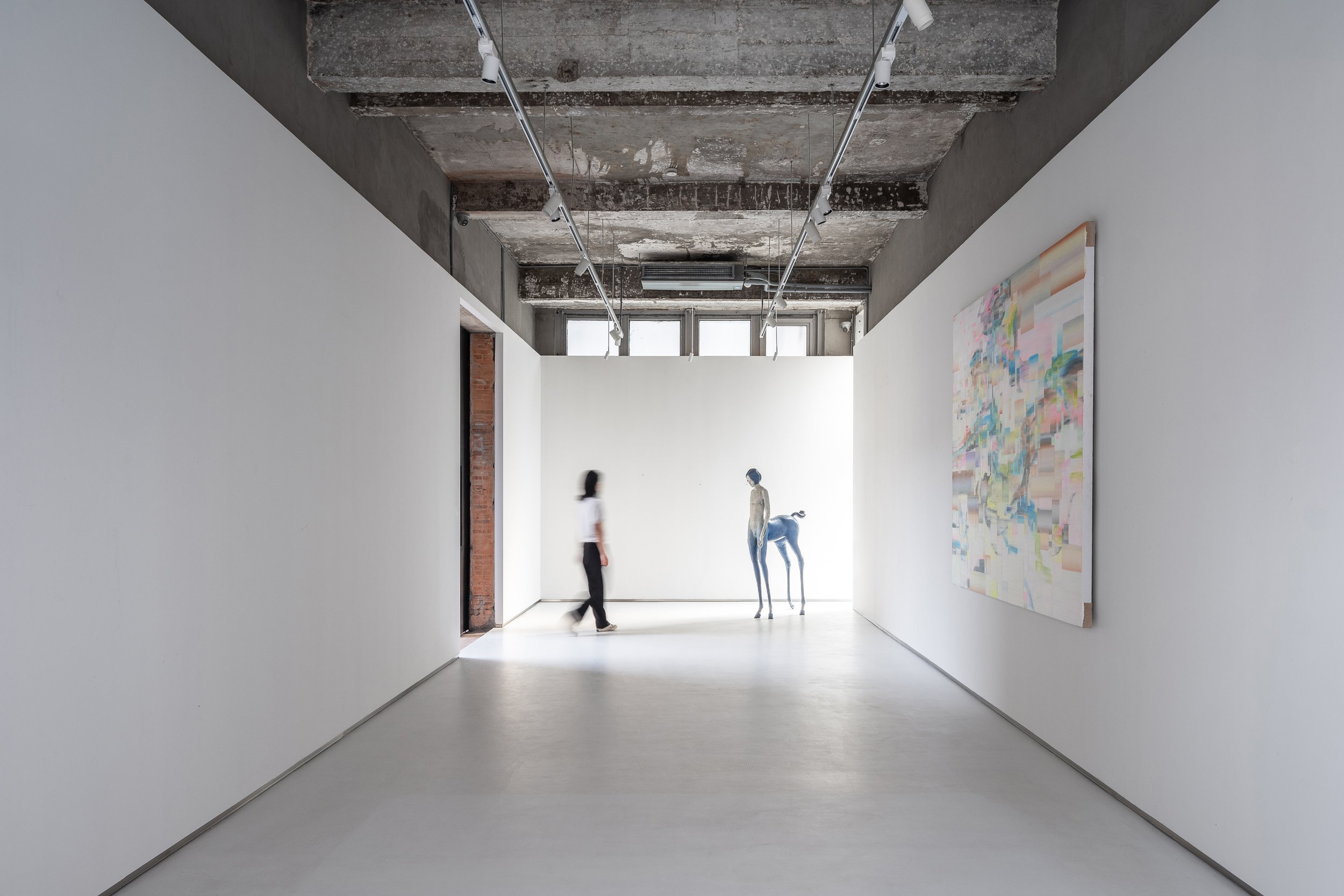
The rectangular hall contrasts with subtler gestures. A white box has been carefully placed in this space, covering two-thirds of the height and leaving the original ceiling exposed. The contrast between new and old is more noticeable in this room, especially where the white box meets the existing brick walls, terrazzo cladding, and exposed structural elements. These layers are revealed like an "architectural anatomy," a concept that aims to showcase the building's structural elements and materials, reminiscent of Gordon Matta-Clark's work, where cut walls and raw materials evoke a dialogue between past and present.
Art and Space: A Curatorial Journey
Art plays a crucial role in guiding visitors through the tower. Strategic placement of installations, graffiti, paintings, and video art punctuate the spatial experience. Key pieces act as navigational markers along the circulation path. An example of this is the untouched wall along the newly inserted staircase, where a live graffiti performance brought the raw energy of street art into the space during the pre-opening phase.
A polished metal plate suspended at the tower's base adds another dimension to the curation. This surface is a canvas for projected digital art, creating a fluid, ever-changing dialogue between physical architecture and ephemeral media.
A Beacon of Light and Art
The Bird Water Tower becomes a glowing beacon in the quiet M50 Creative Park at night. It is adorned with vibrant neon lights and dynamic projections, making it a lighthouse from another dimension. The interplay of light, shadow, and art creates an inviting space where time feels suspended, and the boundaries between past and future dissolve.
The revival of the Bird Water Tower is a testament to Shanghai's industrial heritage and an experiment in the intersection of architecture, art, and urban regeneration. FLIP Studio's sensitive yet inventive intervention has transformed this once-abandoned space into a landmark of creative expression that encourages exploration, contemplation, and conversation.
Project Name:M50 Bird Water Tower
Project Location:Shanghai, China
Lead Designer: Kailun Sun
Area:230㎡
Design Team:Zixuan Chen
Photo:Fangfang Tian
Completion:2023.08
For more information, please visit: www.flip-studio.com
*This project is one of the shortlisted project in the Sky Design Awards 2024 - Architecture Division
Guided by Light: Destiny Wedding Office's Sculptural Journey of Hope and Attraction
Destiny Wedding Office is notable for its contemporary Chinese design, which skillfully incorporates light and gravity as aesthetic and symbolic elements. The project, led by GODOT DESIGN, redefines spatial storytelling focusing on attraction, connection, and emotional resonance. It represents a forward-thinking interpretation of architecture that goes beyond mere function, embodying the essence of modern Chinese design by blending abstract concepts with tangible forms to create environments that inspire and enhance experiences.
Destiny Wedding Office is notable for its contemporary Chinese design, which skillfully incorporates light and gravity as aesthetic and symbolic elements. The project, led by GODOT DESIGN, redefines spatial storytelling focusing on attraction, connection, and emotional resonance. It represents a forward-thinking interpretation of architecture that goes beyond mere function, embodying the essence of modern Chinese design by blending abstract concepts with tangible forms to create environments that inspire and enhance experiences.
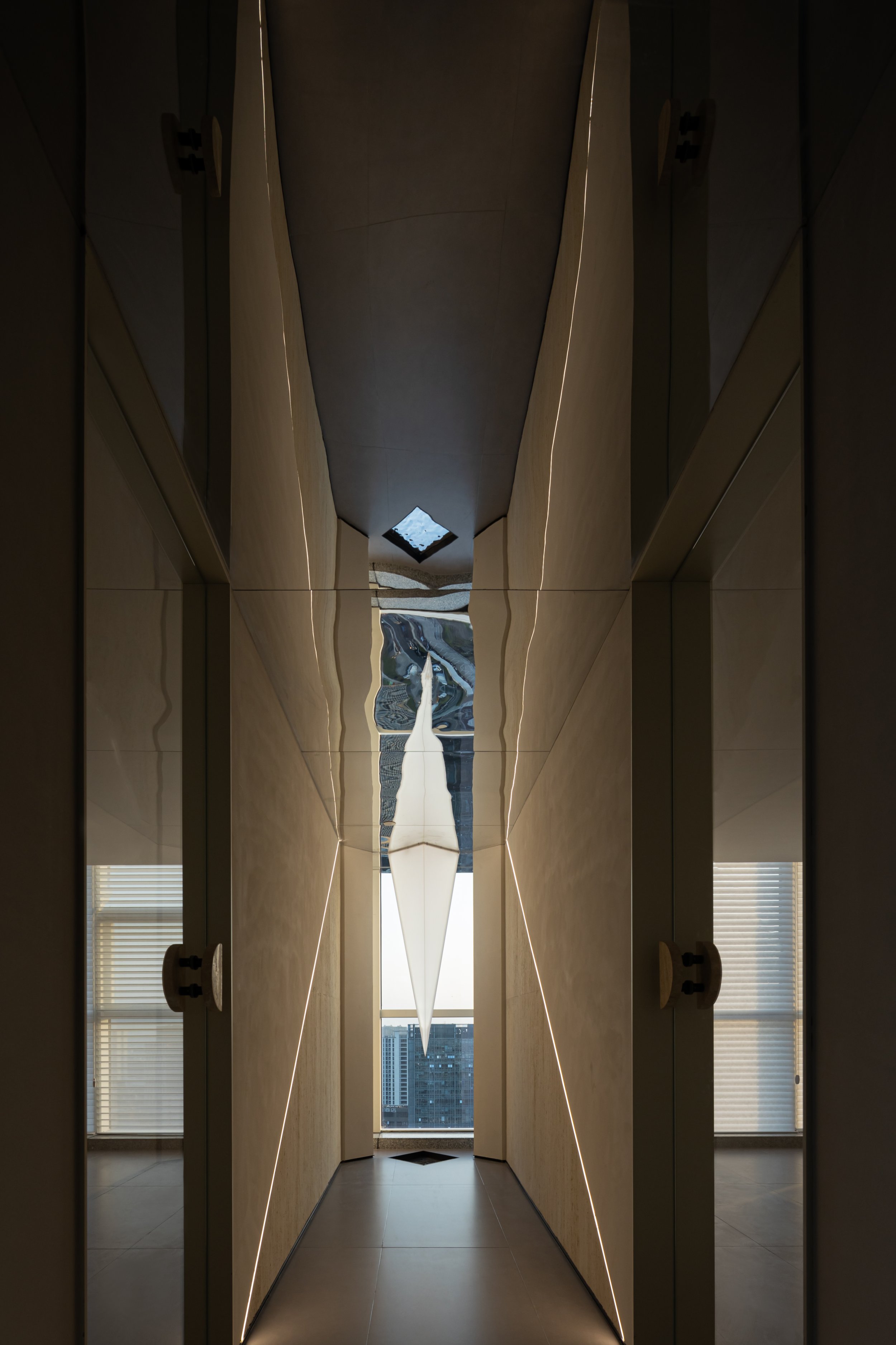
As you step into the space, the converging walls guide your gaze to a skylight, creating a serene canyon-like impression. This narrow 'strip of skylight' not only enhances the space's height but also introduces a soft, textured surface that feels both natural and intentional. As visitors transition from the outdoor public area, the ambiance shifts to a more tranquil, meditative state, fostering a sense of calm and relaxation. A strip of light embedded in the floor acts as the space's centrepiece, maintaining a harmonious visual balance and guiding visitors through this journey of light.
The reception hall's design ingeniously harnesses the concept of gravity as a force that unites, mirroring how the Destiny Wedding brand draws couples for their significant life events. The ceiling appears to be pulled downward, evoking a sense of dynamic energy and attraction. Below it, a reception desk with a texture reminiscent of travertine is strategically positioned, allowing the gravitational force above to be the room's focal point. A half-height light wall behind the desk completes the spatial energy, serving as a backdrop that accentuates the attraction.


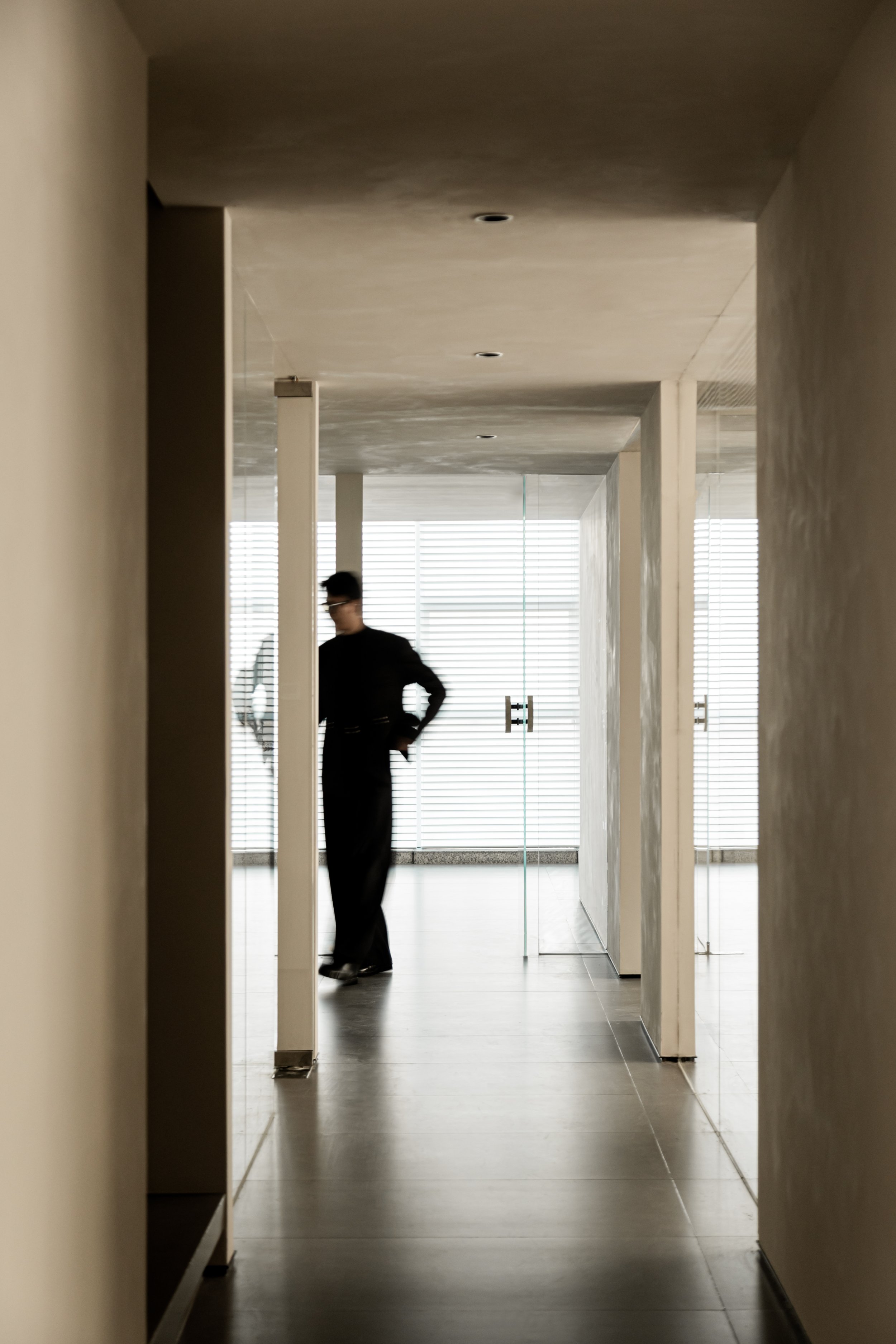
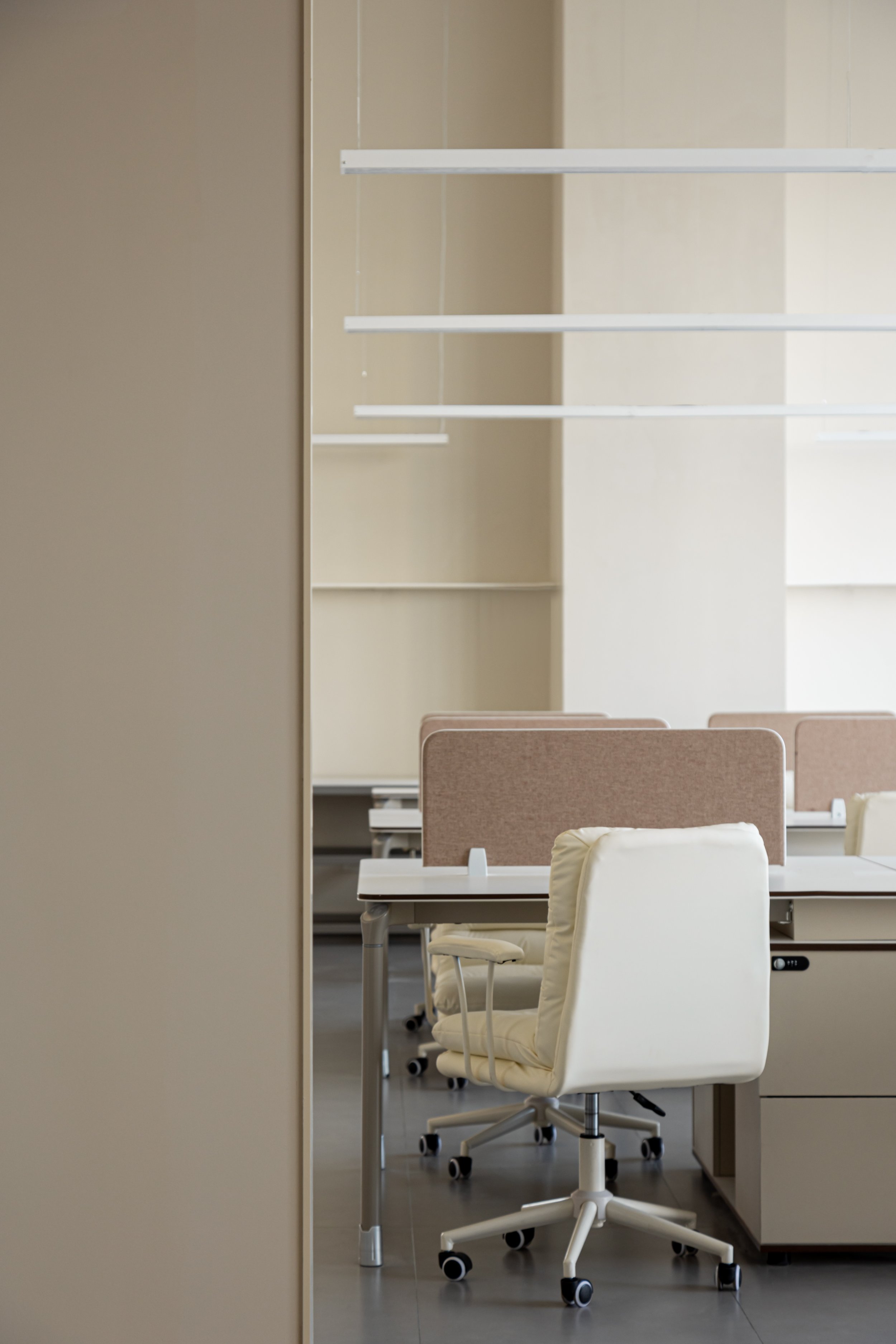
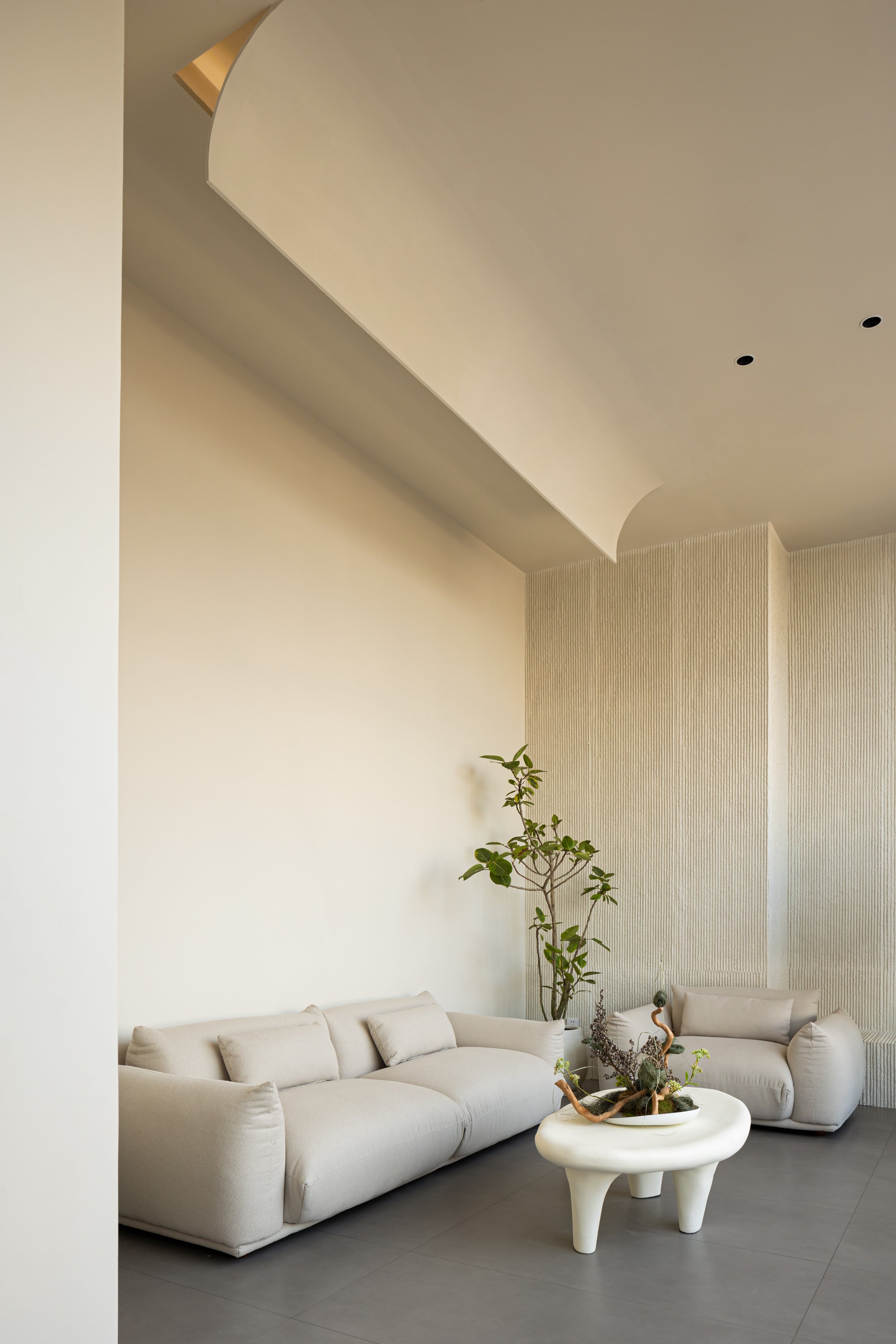

The office's layout is defined by an arched, trumpet-shaped wall that creates a smooth flow. A glass partition adds light and transparency, blurring the line between virtuality and reality. The office cleverly uses upper and lower tiers to maximize space. To address variations in floor height, a cylindrical element runs through the corridor, creating a "channel within a channel" while maintaining a seamless exterior facade. An opening at the top allows for vertical interaction between the floors, enhancing the sense of openness.
The design features a suspended acrylic triangular cone mirrored on the ceiling, serving as the focal point of the passage. By day, it reflects the cityscape, while it transforms into a glowing starburst at night. Illuminated by soft lighting, it symbolizes the essence of thea Destiny Wedding brand—a guiding light of hope and connection for couples embarking on the most romantic journey. Through this space, light defines form and embodies the promise of a shared future.
*This project is one of the shortlisted project in the Sky Design Awards 2024 - Interior Design: Office & Commercial Division


