Guided by Light: Destiny Wedding Office's Sculptural Journey of Hope and Attraction
Destiny Wedding Office is notable for its contemporary Chinese design, which skillfully incorporates light and gravity as aesthetic and symbolic elements. The project, led by GODOT DESIGN, redefines spatial storytelling focusing on attraction, connection, and emotional resonance. It represents a forward-thinking interpretation of architecture that goes beyond mere function, embodying the essence of modern Chinese design by blending abstract concepts with tangible forms to create environments that inspire and enhance experiences.
Destiny Wedding Office is notable for its contemporary Chinese design, which skillfully incorporates light and gravity as aesthetic and symbolic elements. The project, led by GODOT DESIGN, redefines spatial storytelling focusing on attraction, connection, and emotional resonance. It represents a forward-thinking interpretation of architecture that goes beyond mere function, embodying the essence of modern Chinese design by blending abstract concepts with tangible forms to create environments that inspire and enhance experiences.
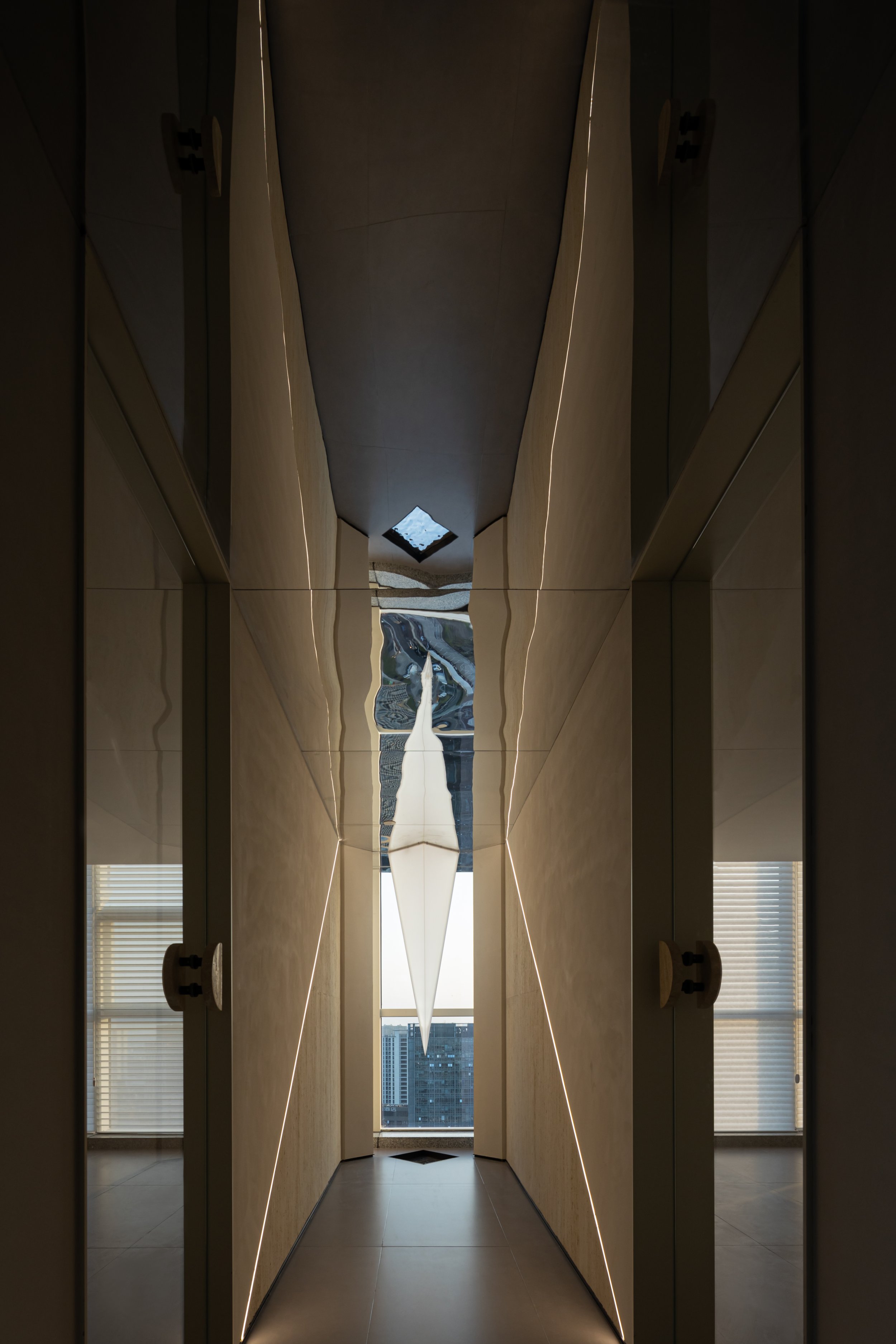
As you step into the space, the converging walls guide your gaze to a skylight, creating a serene canyon-like impression. This narrow 'strip of skylight' not only enhances the space's height but also introduces a soft, textured surface that feels both natural and intentional. As visitors transition from the outdoor public area, the ambiance shifts to a more tranquil, meditative state, fostering a sense of calm and relaxation. A strip of light embedded in the floor acts as the space's centrepiece, maintaining a harmonious visual balance and guiding visitors through this journey of light.
The reception hall's design ingeniously harnesses the concept of gravity as a force that unites, mirroring how the Destiny Wedding brand draws couples for their significant life events. The ceiling appears to be pulled downward, evoking a sense of dynamic energy and attraction. Below it, a reception desk with a texture reminiscent of travertine is strategically positioned, allowing the gravitational force above to be the room's focal point. A half-height light wall behind the desk completes the spatial energy, serving as a backdrop that accentuates the attraction.


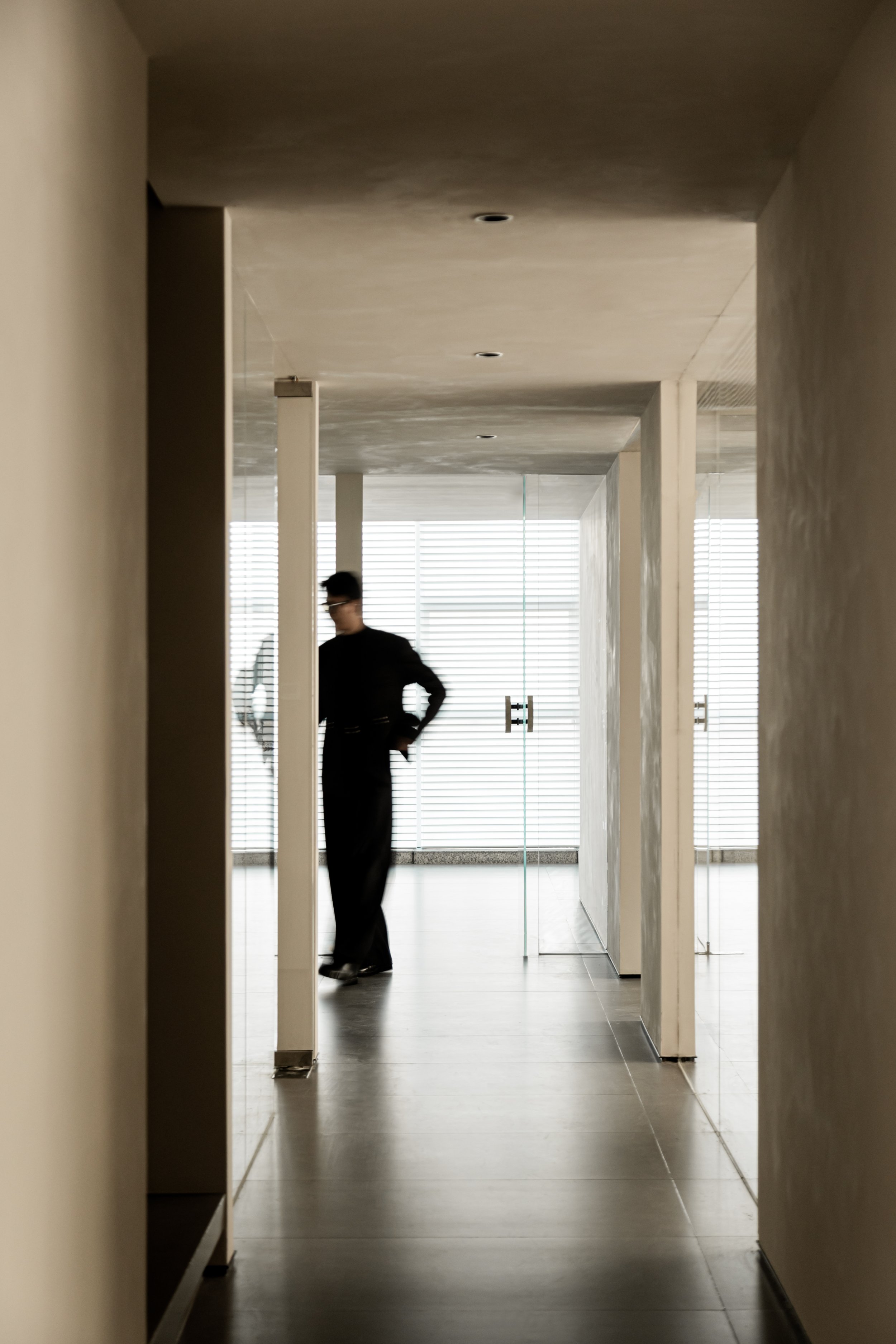
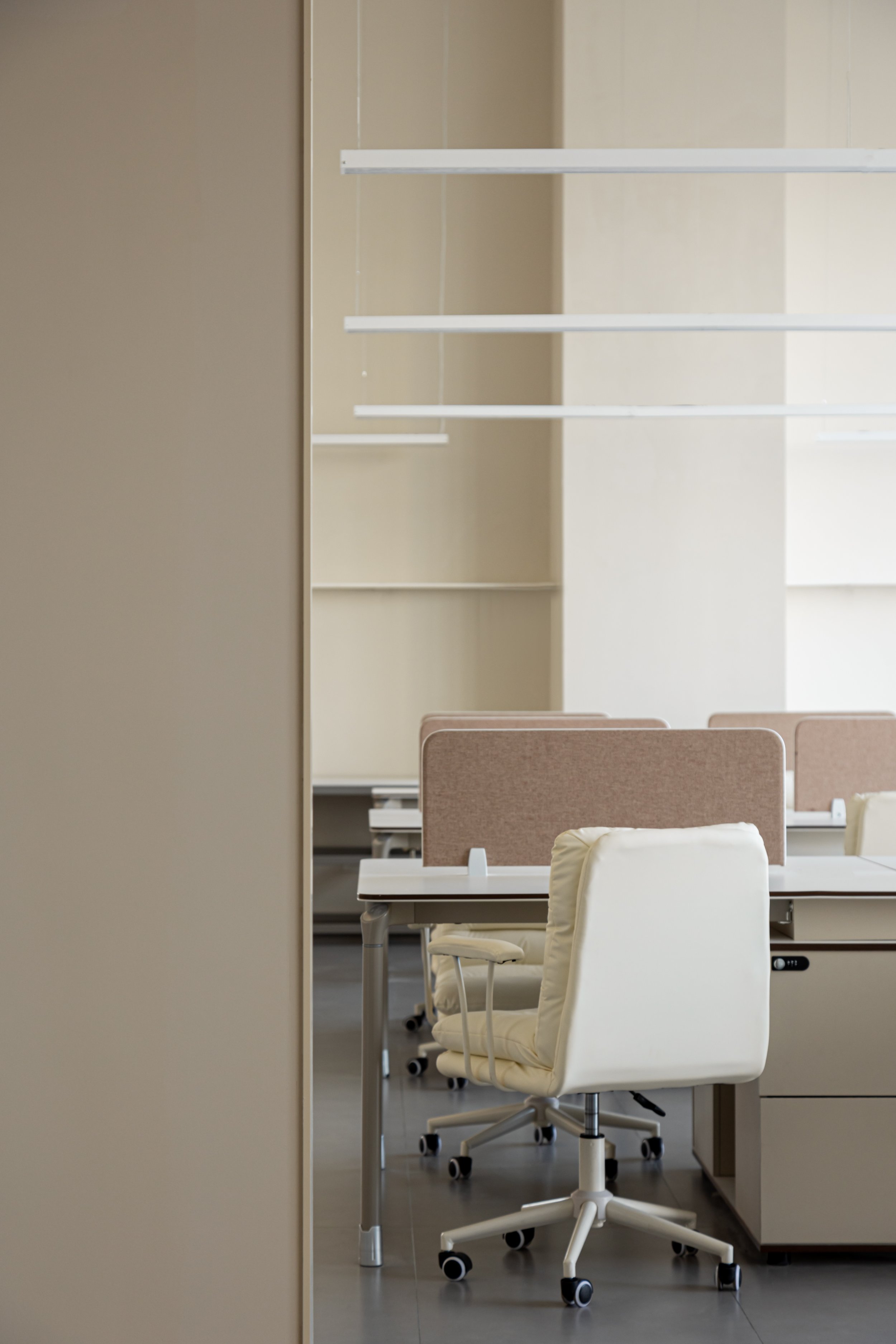
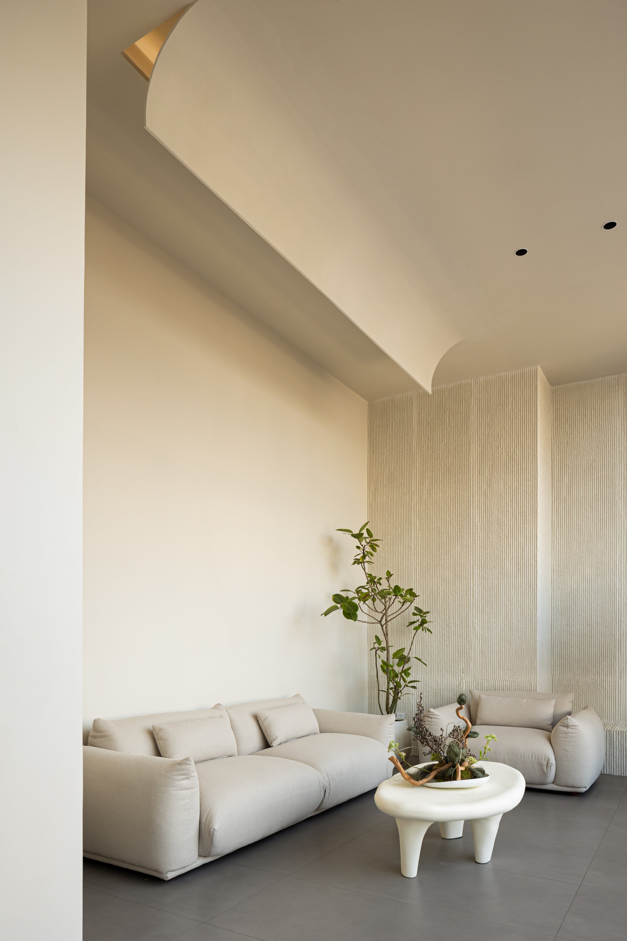

The office's layout is defined by an arched, trumpet-shaped wall that creates a smooth flow. A glass partition adds light and transparency, blurring the line between virtuality and reality. The office cleverly uses upper and lower tiers to maximize space. To address variations in floor height, a cylindrical element runs through the corridor, creating a "channel within a channel" while maintaining a seamless exterior facade. An opening at the top allows for vertical interaction between the floors, enhancing the sense of openness.
The design features a suspended acrylic triangular cone mirrored on the ceiling, serving as the focal point of the passage. By day, it reflects the cityscape, while it transforms into a glowing starburst at night. Illuminated by soft lighting, it symbolizes the essence of thea Destiny Wedding brand—a guiding light of hope and connection for couples embarking on the most romantic journey. Through this space, light defines form and embodies the promise of a shared future.
*This project is one of the shortlisted project in the Sky Design Awards 2024 - Interior Design: Office & Commercial Division
History Meets Innovation: Dayi Design’s Vision for Preserving the Past in a Modern Era
The "History is the Future" project by Dayi Design is located at 777 Huashan Road in Jiangyin City, Jiangsu Province. It is an exceptional example of integrating cultural preservation with modern innovation. Completed in May 2022 for Jinlu Tobacco and Wine, this 450-square-meter space reimagines the former site of Liu Yong University, revitalizing a historical setting while boldly embracing the future.
The "History is the Future" project by Dayi Design is located at 777 Huashan Road in Jiangyin City, Jiangsu Province. It is an exceptional example of integrating cultural preservation with modern innovation. Completed in May 2022 for Jinlu Tobacco and Wine, this 450-square-meter space reimagines the former site of Liu Yong University, revitalizing a historical setting while boldly embracing the future.
The design of the 'History is the Future' project by Dayi Design is a testament to our innovative use of materials. The design team have carefully selected a mix of materials, including glass steel grating, stainless steel, acrylic, and glass, to embody our philosophy of blending the past and future. The original wooden doors, preserved from the original structure and encased in acrylic panels, symbolize this fusion. The contrast between the modern acrylic and the warmth of the wood creates a visually compelling story that pays homage to tradition while embracing innovation. The salvaged doors, now a transparent screen, bring a sense of historical depth to the space, while the acrylic adds a futuristic, otherworldly touch.
The project includes modern technological elements like laser lights and digital projections. Rather than following the typical cyberpunk theme of destruction, Dayi Design uses these elements to create a sense of optimism and vitality. This is especially important in a post-pandemic world, where spaces should inspire hope and reflect better expectations for the future.
Natural light is also vital to the design. Strategically placed skylights fill the space with sunlight, highlighting the delicate balance between modernity and nature. The interaction of light, materials, and technology creates a harmonious, fluid environment where the past and future coexist.
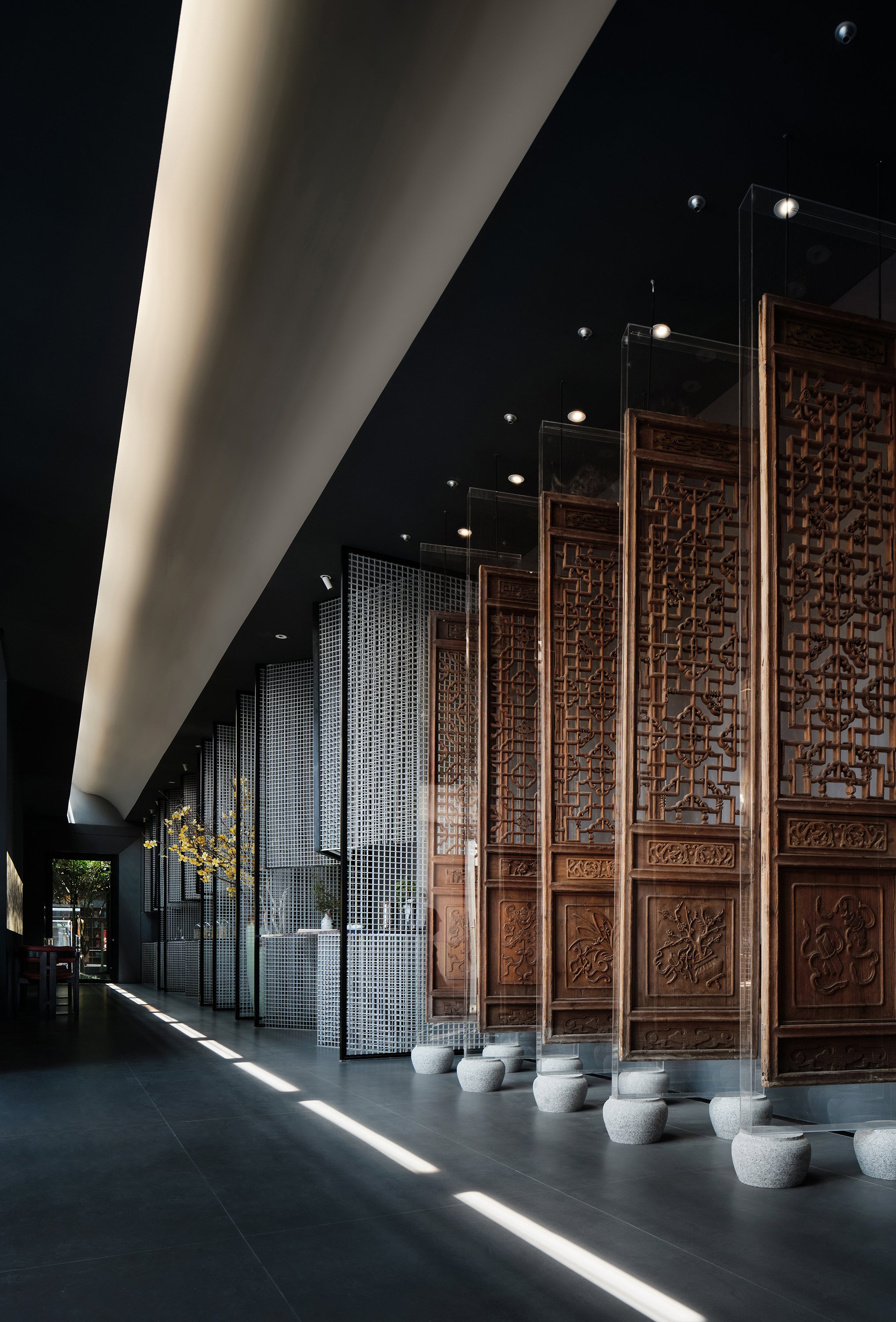

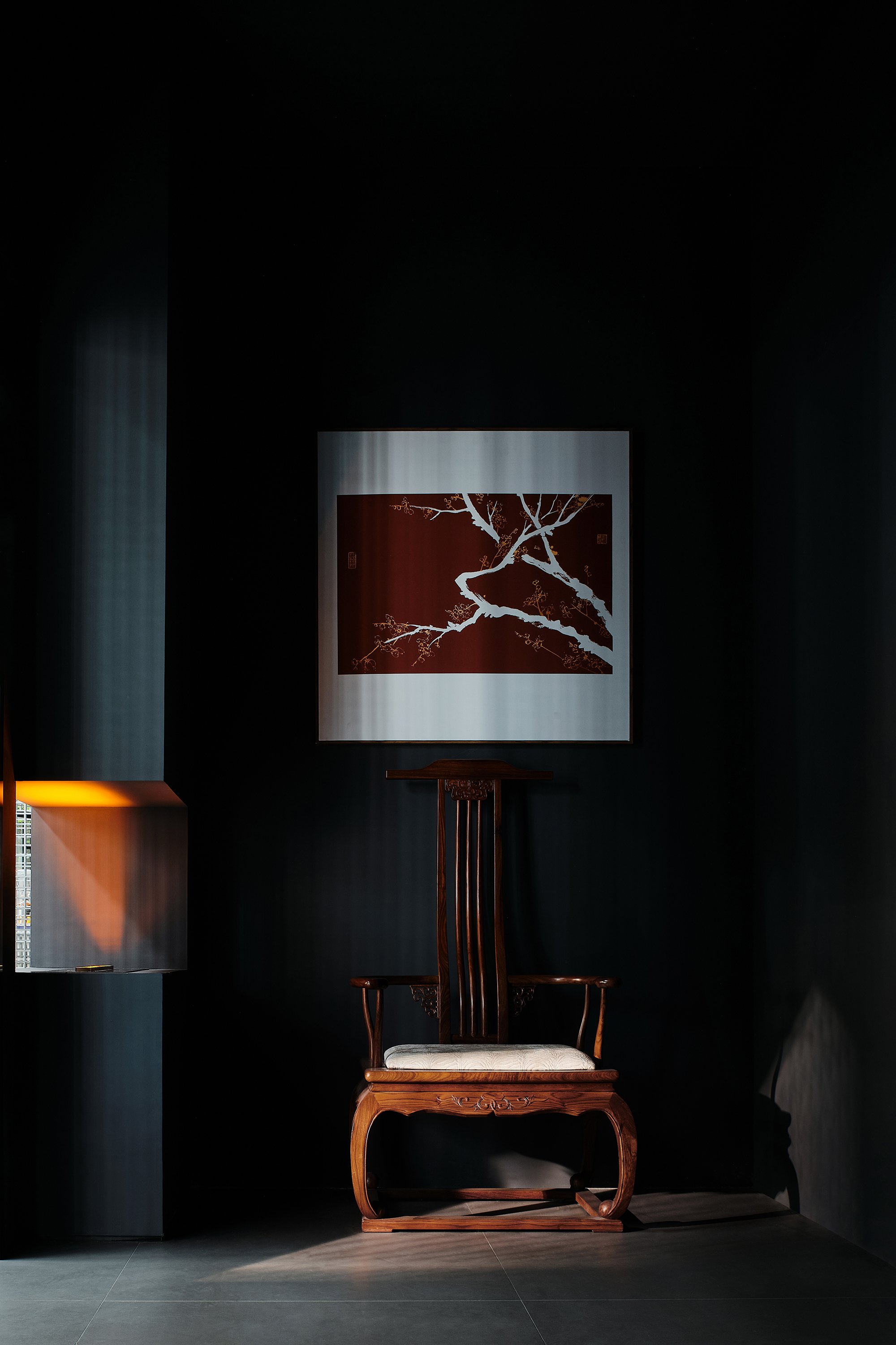


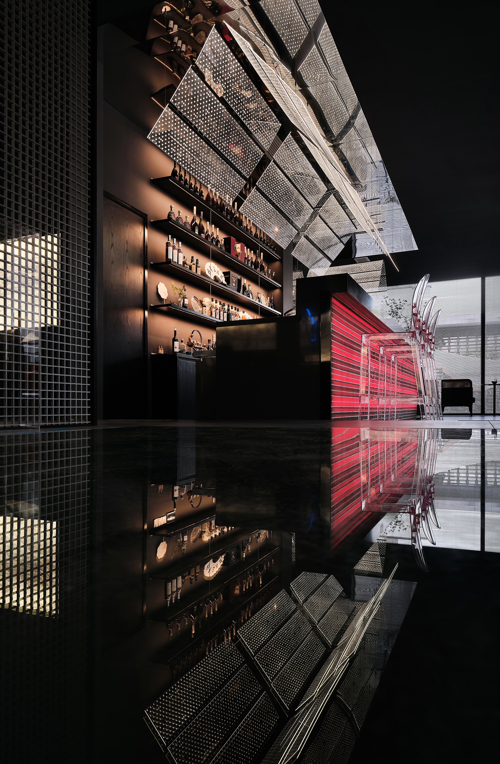
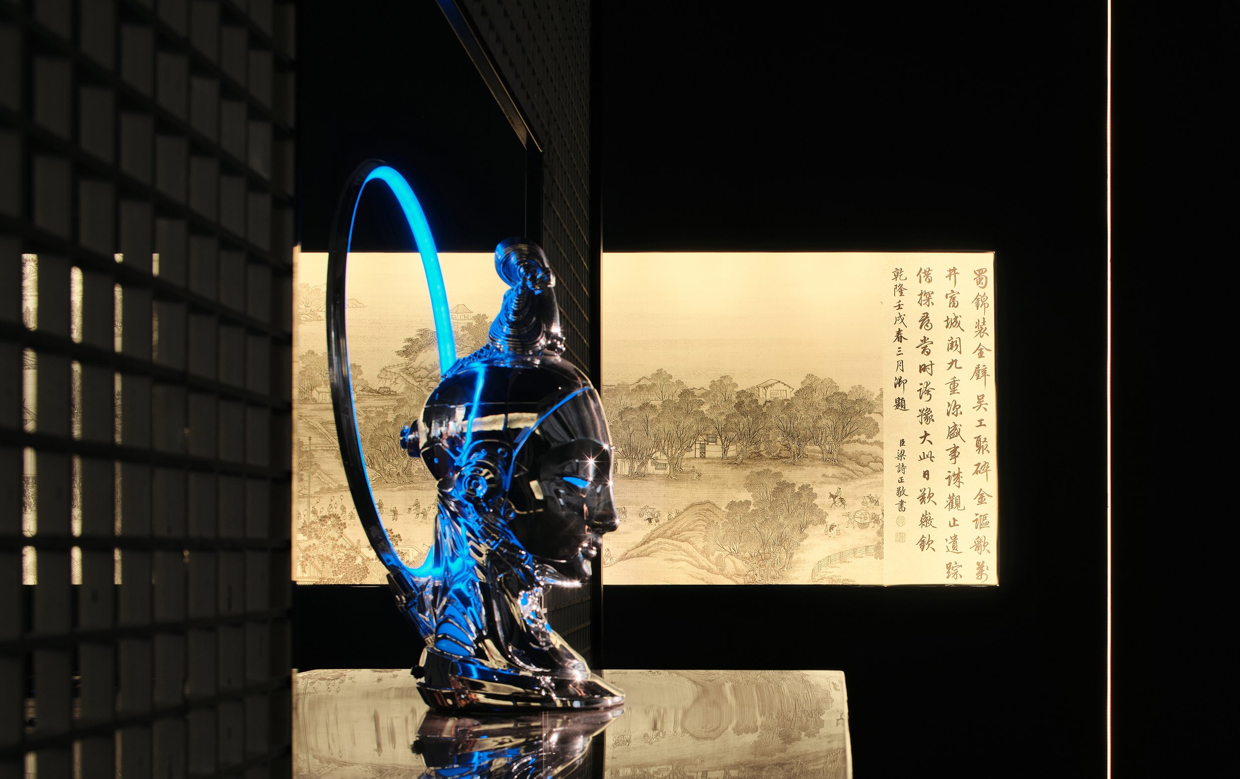
Dayi Design's thoughtful reuse of materials in the 'History is the Future' project demonstrates a sustainable approach to architectural practice. By salvaging the original doors, the design not only preserves the site's memory but also aligns with environmentally conscious principles, ensuring that the space remains adaptable for the future. The combination of materials such as acrylic, stainless steel, and glass further enhances the adaptability and longevity of the design, providing reassurance about its long-term sustainability.
By creatively reinterpreting traditional Chinese architectural forms using modern materials and incorporating futuristic lighting elements, "History is the Future" boldly describes the merging of heritage and progress. It demonstrates Dayi Design's ability to create spaces that honour the past while anticipating the future's changing needs.
Commissioned for Jinlu Tobacco and Wine, 'History is the Future' embodies a forward-thinking approach to time and design. Cultural heritage and modern aesthetics intersect to create a unique, functional, and evocative space. This project showcases how architecture can transcend time constraints, crafting spaces that resonate with historical significance and contemporary relevance, inspiring all who experience it with its timeless design.
Chief Designer: Zhou Yi, Chang Jingliang
Project Name: History is the future
Location: 777 Huashan Road, Jiangyin City, Jiangsu Province
Design Company: Dayi Design
Chief Designer: Zhou Yi, Chang Jingliang
Assistant Designer: Chen Shiyi, Guo Zihao, Meng Linghui
Area: 450㎡
Completion time: May 2022
Main Materials: Glass steel grating, stainless steel, acrylic, glass
Client Name: Jinlu Tobacco and Wine
Photographer: ingallery- the jungle
*This project is one of the shortlisted project in the Sky Design Awards 2024 - Interior Design: Commercial and Office Division
RIVAL Office: A Runway for Creativity designed by KAMITOPEN Co., Ltd.
The TRIVAL office, designed by Kamitopen, transforms the traditional workspace into a dynamic environment where creativity, functionality, and aesthetic minimalism come together. The central feature of the design is the "Runway," which redefines how office spaces can facilitate interaction and workflow. In media production, TRIVAL's employees constantly engage with models and clients, conducting interviews and coordinating projects that require a seamless blend of creativity and efficiency.
The TRIVAL office, designed by Kamitopen, transforms the traditional workspace into a dynamic environment where creativity, functionality, and aesthetic minimalism come together. TRIVAL is a company that specializes in producing visual content, from advertising and web media to digital signage. They needed an office space that reflected their fast-paced, media-driven culture. Masahiro Yoshida, the visionary behind Kamitopen, aimed to design a space that mirrored the daily rhythms of TRIVAL's work environment while fostering a sense of energy and movement.
The central feature of the design is the "Runway," which redefines how office spaces can facilitate interaction and workflow. In media production, TRIVAL's employees constantly engage with models and clients, conducting interviews and coordinating projects that require a seamless blend of creativity and efficiency. This is where the runway concept comes into play - a literal and symbolic path that connects the entire office, linking the front entrance directly to the director's office in the back.
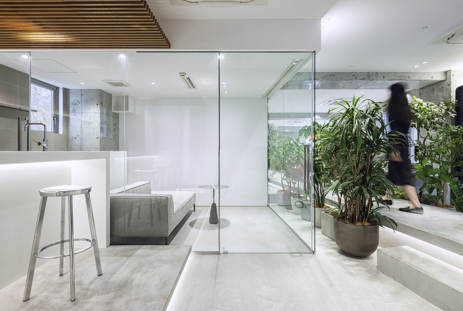
The runway is not just a passage; it serves as the heartbeat of the office. Located in the center of the space, it directs the flow of activity and sets the stage for the open, fluid nature of the office's daily operations. Flanked on either side by essential rooms such as meeting spaces, workstations, and creative areas, the runway is both a guiding framework and an architectural statement. It directs movement while visually anchoring the environment, making it functional and aspirational.
"Balancing Space and Privacy
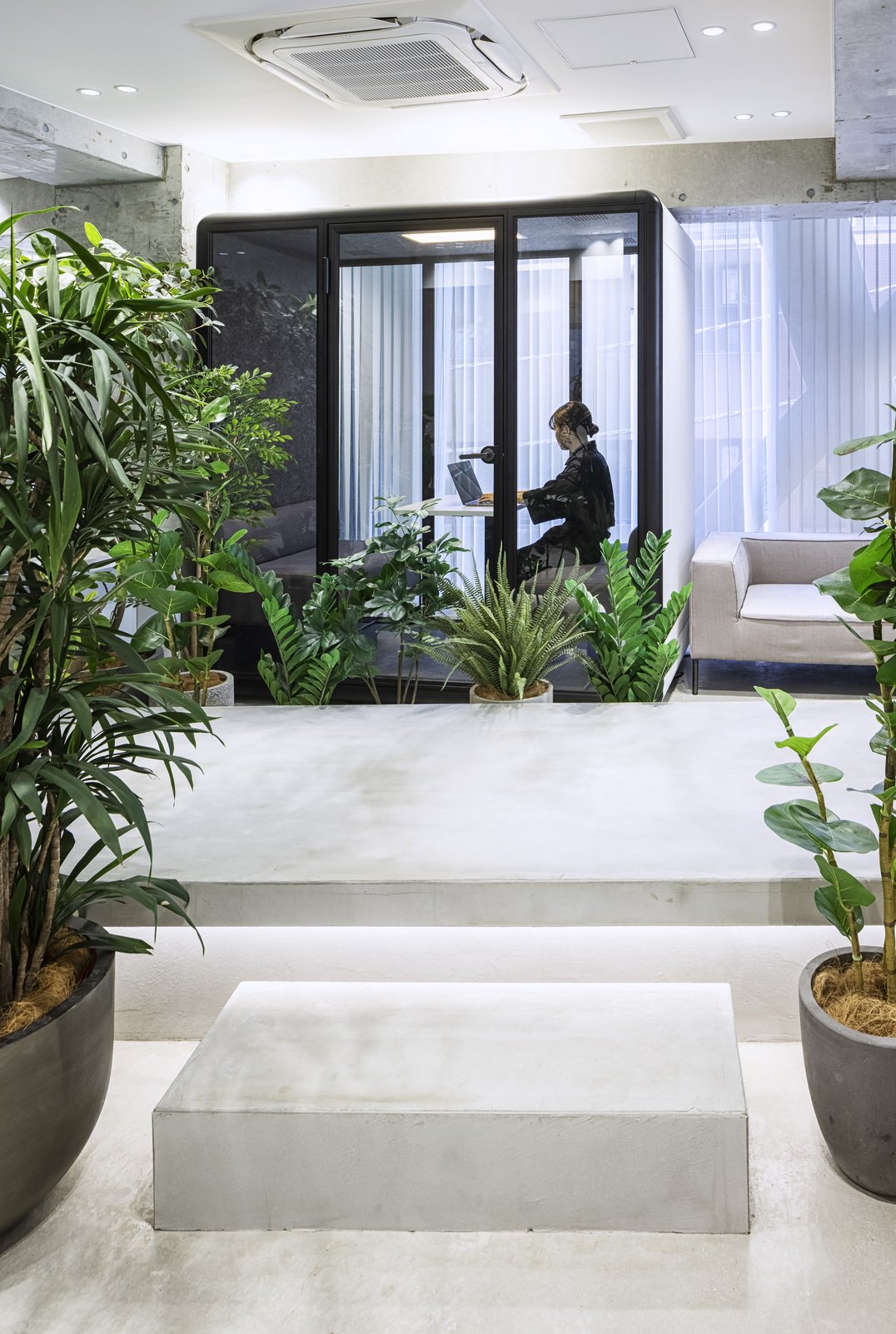
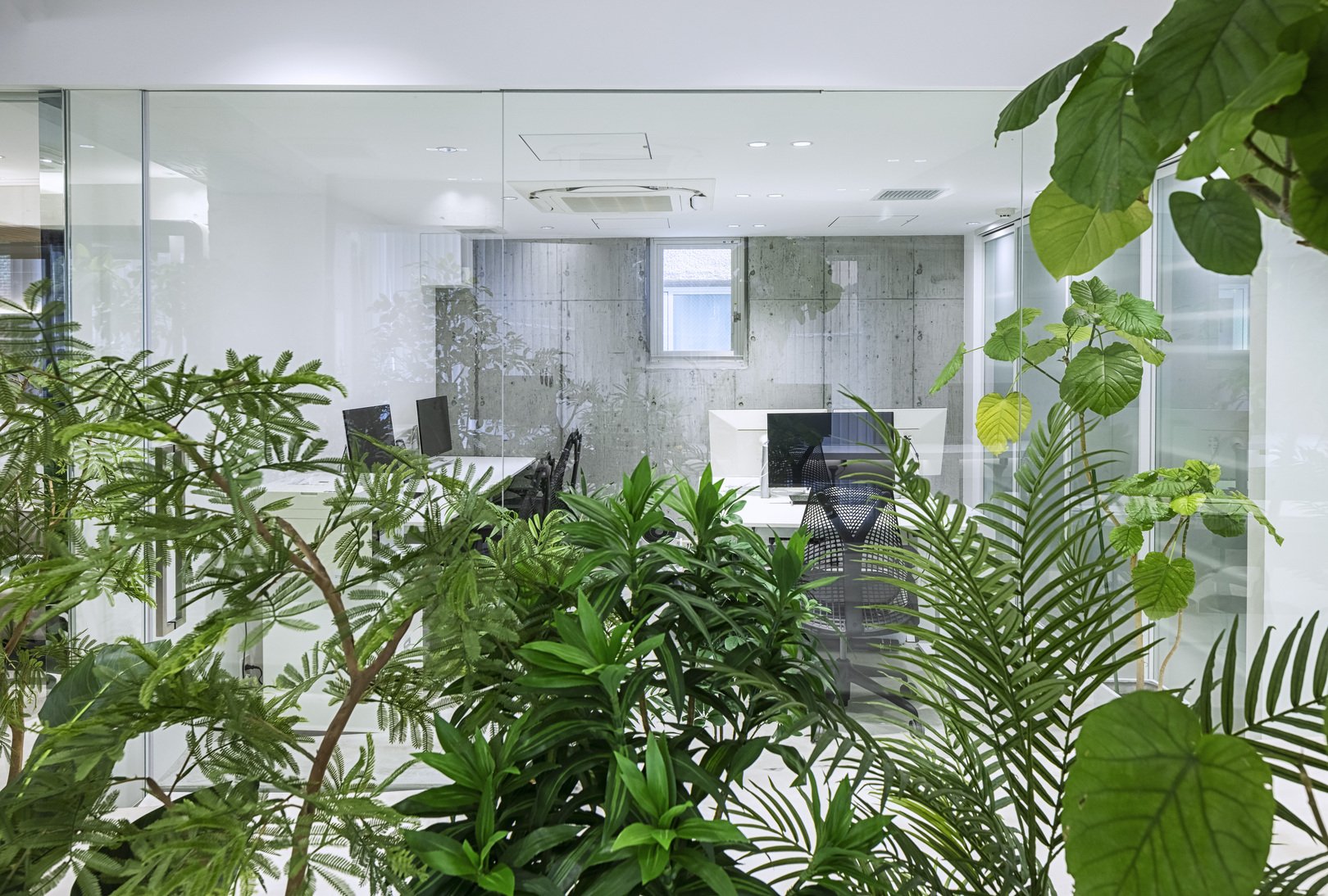
Kamitopen incorporated natural elements into the design to create an open yet private atmosphere. Rows of strategically placed plants line the walkway, acting as organic barriers that subtly control the distance between those walking and those seated at their desks. This design choice achieves a delicate balance by promoting interaction while maintaining personal focus. The plants act as visual and physical buffers, creating zones that encourage productivity without isolating employees from each other, ensuring a thoughtful balance between openness and privacy.
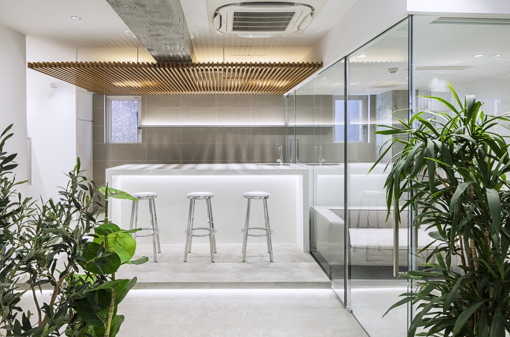
The intentional minimalism of the material palette reinforces the sense of openness. Kamitopen chose a sleek, streamlined approach, using materials sparingly to ensure the focus remained on the spatial layout and the runway itself. By minimizing material usage, the design stays true to its core purpose: to create a sense of volume and lightness while emphasizing efficiency. This choice aligns with Kamitopen's broader design philosophy, which often focuses on spatial storytelling-a concept where the design of a space tells a story about its purpose and the people who use it-and a thoughtful approach to translating client needs into architectural forms.



The Emotional and Practical Impact
The TRIVAL office is not only visually appealing but also designed to prioritize the well-being and comfort of its employees. The layout, highlighted by the runway, encourages natural movement, making the environment feel more dynamic and less static. This design allows employees to move seamlessly from one area to another, promoting a sense of ease and comfort throughout the workday. The runway symbolizes the company's creative journey, inspiring employees to feel like they are stepping onto a stage, with each day offering new opportunities for engagement, collaboration, and innovation. The practical impact of the design ensures that the TRIVAL office is not just a workplace, but a space that employees eagerly anticipate being in.
Kamitopen's design aims to transform the office into a space that employees eagerly anticipate being in rather than just a workplace. The design promotes interaction without enforcing strict structure by prioritizing flow and flexibility. This approach effectively aligns with the fast-paced, media-centric world in which TRIVAL operates-a world where quick decision-making, constant communication, and adaptability are key. The design of the TRIVAL office reflects these aspects, creating an environment that supports the company's work culture.
A Workplace Reinvented
The TRIVAL project showcases Kamitopen's talent for combining functionality with a minimalist design, creating a spacious and cozy workspace. The runway serves as more than just a walkway; it symbolizes the connection of the company's operations, embodying the energy and movement that define TRIVAL's work. Through reimagining the use of space and incorporating innovative design elements, Kamitopen has designed an office that prioritizes fostering creativity and enhancing comfort and practicality.
The TRIVAL office represents a new paradigm in workplace design, where space, movement, and minimalism come together to create an environment that is functional and inspirational. Kamitopen has uniquely designed the space to reflect the essence of TRIVAL's creative work, enhancing the daily experiences of those who work there.
For more information, please visit: http://kamitopen.com/en/
*This project is one of the shortlisted project in the Sky Design Awards 2024 - Interior Design: Commercial and Office Division
Transitional Architecture: How Jindesign Co., Ltd. Reimagines Urban Boundaries with YSK Employment Office
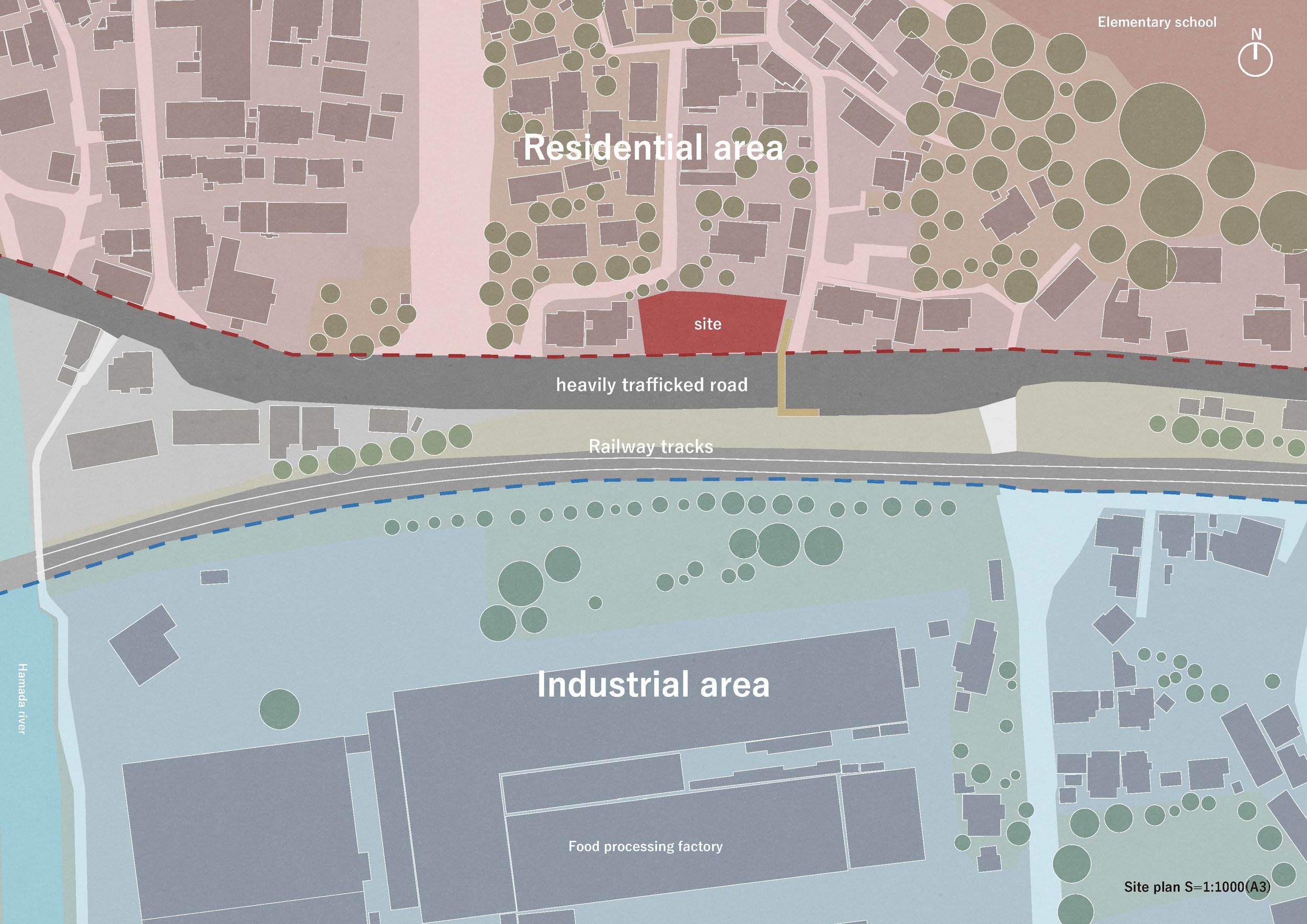
In the realm of urban planning, Jindesign Co., Ltd. stands out with its unique approach to zoning. While zoning is a practical framework for city development, the real architectural challenge often lies in navigating the borders between vastly different zones. Jindesign Co., Ltd. tackles these transitions with sensitivity, crafting structures that bridge the gaps between spaces rather than heightening their disparities. Their design for the YSK Employment Office is a prime example of this philosophy in action. It showcases how architecture can mediate and create a fluid, livable urban experience that responds to its context while serving a higher social purpose.
In the realm of urban planning, Jindesign Co., Ltd. stands out with its unique approach to zoning. While zoning is a practical framework for city development, the real architectural challenge often lies in navigating the borders between vastly different zones. Jindesign Co., Ltd. tackles these transitions with sensitivity, crafting structures that bridge the gaps between spaces rather than heightening their disparities. Their design for the YSK Employment Office is a prime example of this philosophy in action. It showcases how architecture can mediate and create a fluid, livable urban experience that responds to its context while serving a higher social purpose.
The YSK Employment Office in an industrial zone serves as more than just a functional employment center. It functions as a refuge and support system for local residents going through job transitions, fostering a strong sense of community and belonging. The building is not merely a corporate facility; it symbolizes the community, designed to provide more than just a service—a space for people to rely on during crucial moments in their lives.
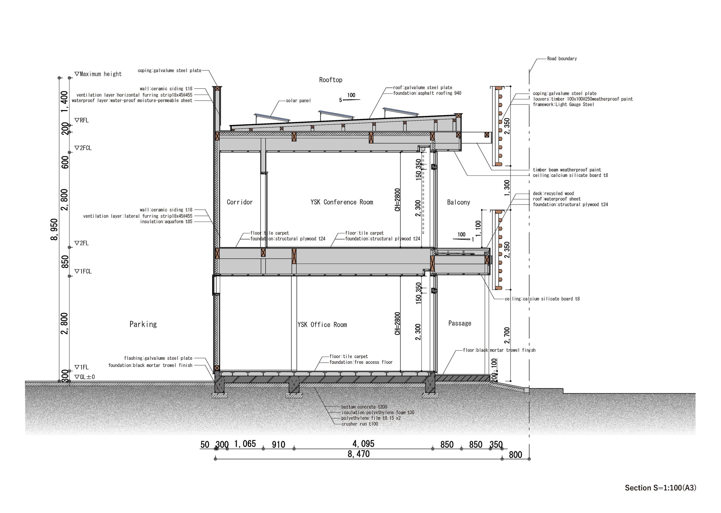
The building has a purposeful design that merges functionality with subtle gestures of hospitality. Its defining feature is the 1.7-meter-wide wraparound balcony, which softens the long rectangular volume stretching east to west. This balcony is a transitional zone, blurring the line between the interior office environment and the busy street outside. It enhances the usability of the space by providing a shaded, ventilated exterior for workers and creates an inviting threshold for pedestrians passing by, offering shelter and integrating the building into the life of the street.
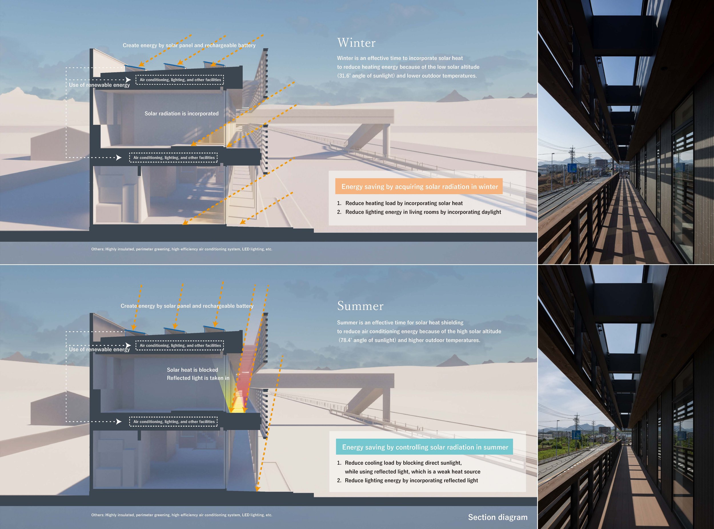
The YSK office features a striking architectural design with horizontal wooden louvres that encase the building in an elegant and rhythmic pattern. Inspired by traditional Japanese noren, these louvres serve several purposes: they give the building a unique visual identity, help control the amount of sunlight and heat entering the building, and contribute to energy efficiency. Their design is carefully planned to account for changes in the sun's position throughout the year, allowing them to let in warming sunlight during the winter while shielding the building from the intense summer sun, which helps keep the interior cool and reduces the need for artificial cooling. This sustainable and energy-efficient design is a testament to Jindesign Co., Ltd.'s commitment to environmental responsibility.
The louvres improve energy efficiency and contribute to the building's continuous horizontal facade. This design is a visual guide for people travelling at high speeds on nearby roads or railways. The constant line creates a lasting impression, making the office a recognizable landmark and providing subtle urban wayfinding.
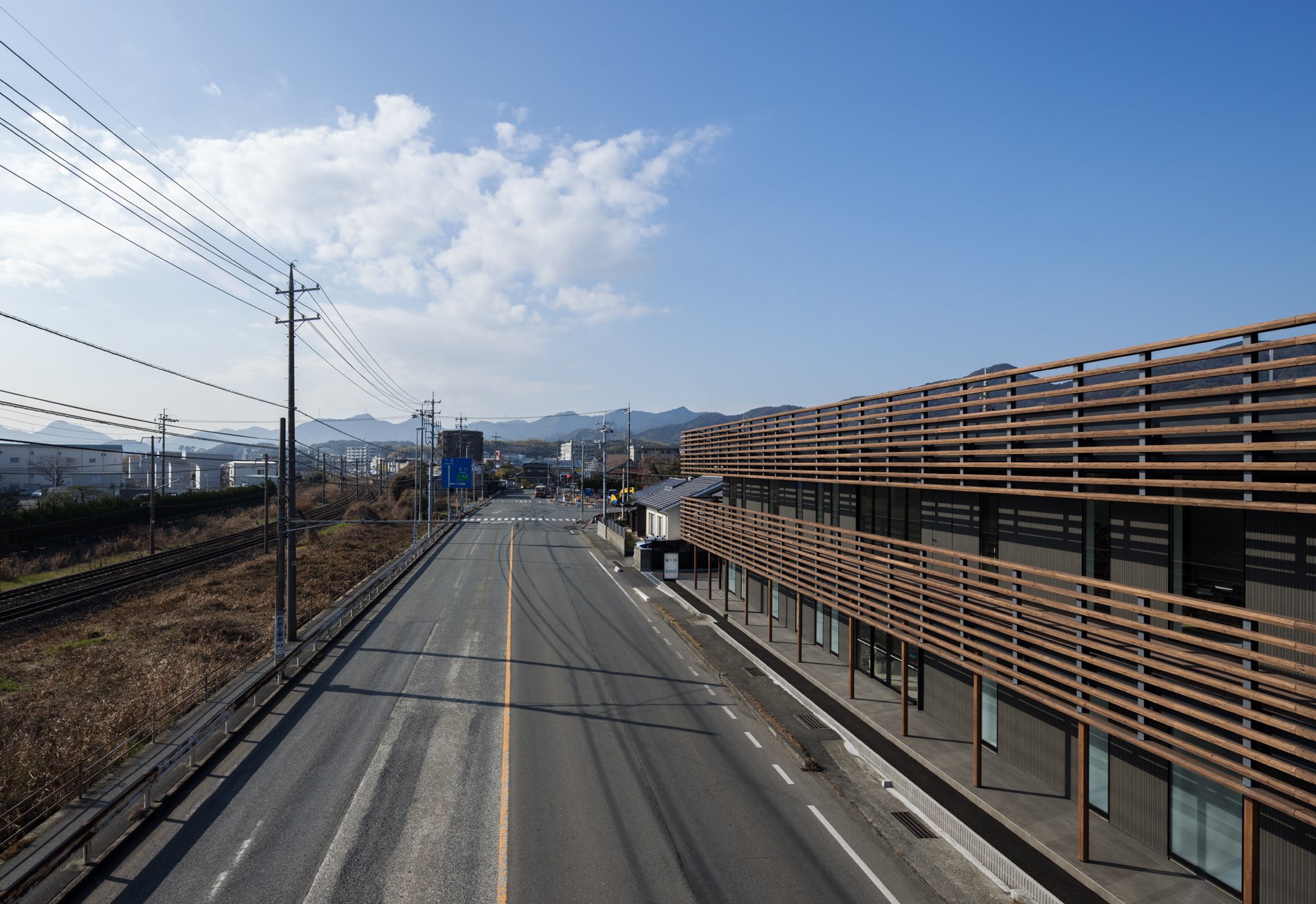


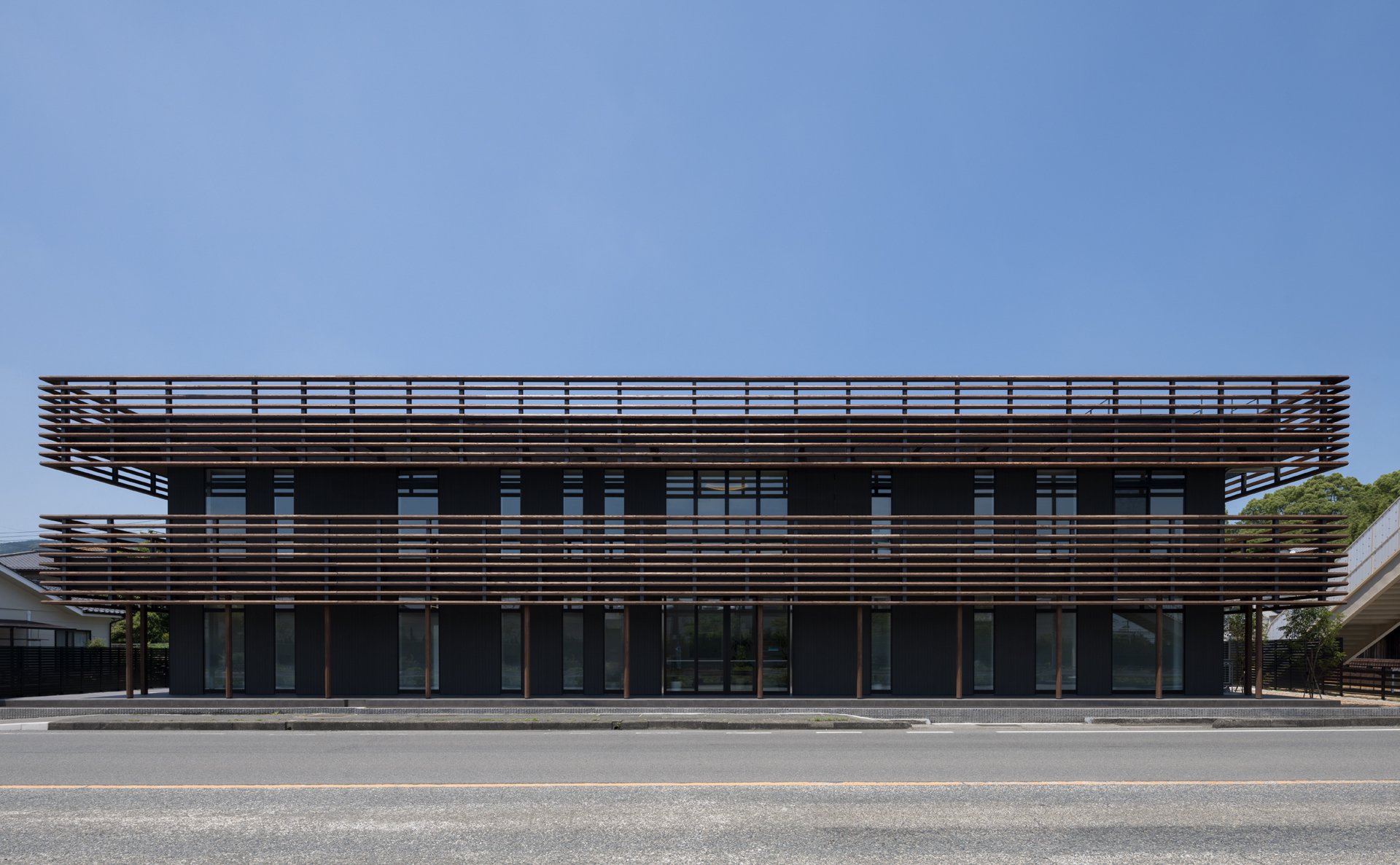

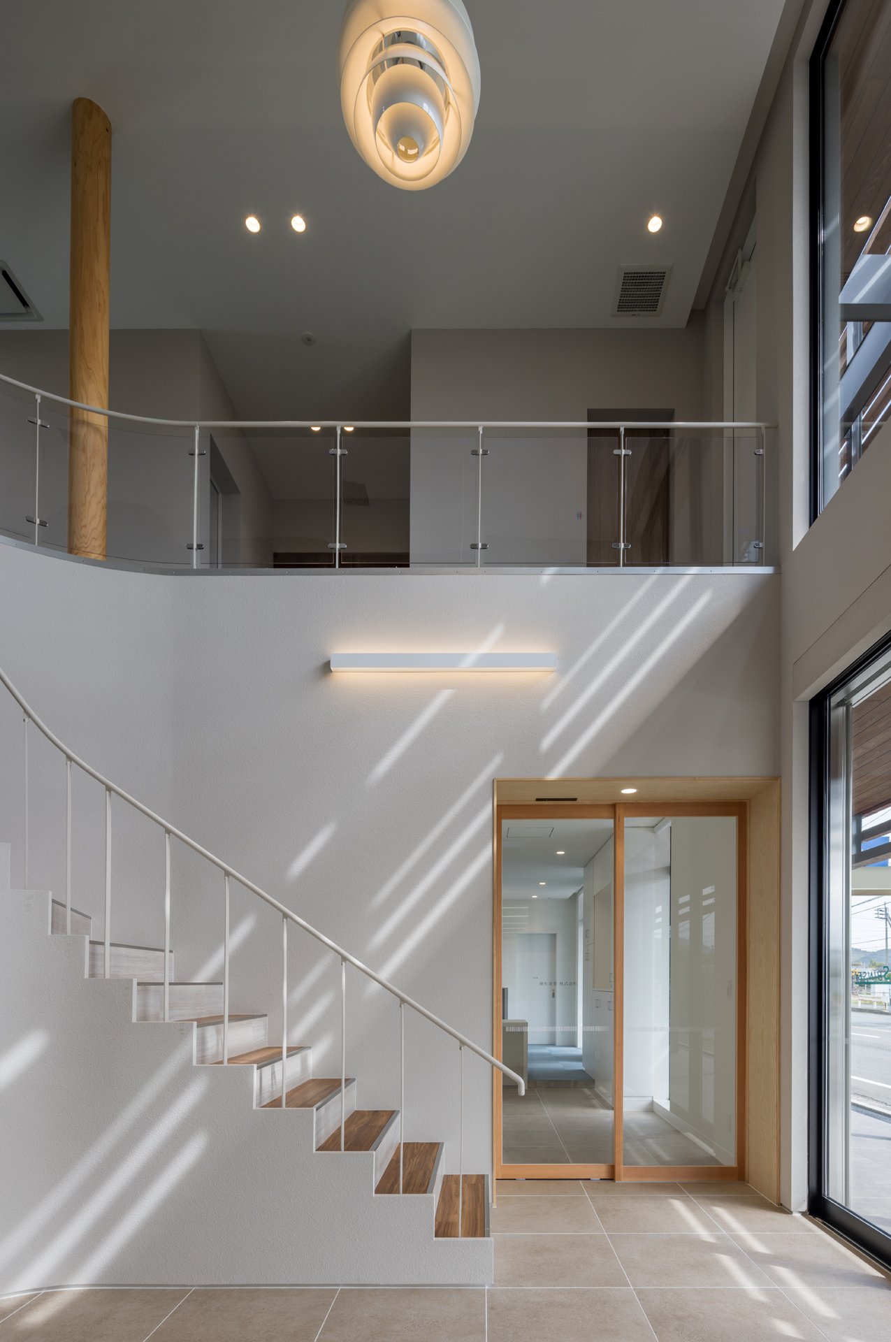
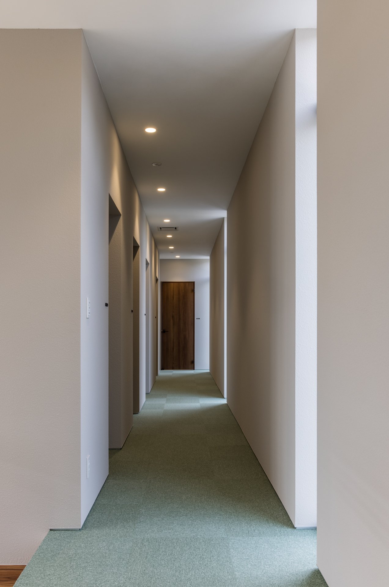
Materiality is a critical factor in anchoring the design in its local context. Jindesign Co., Ltd. has carefully used locally sourced materials to connect the building with its surroundings. The louvres and other structural elements are crafted from local wood, reflecting sustainability and skilled workmanship. The exterior walls are covered in fire-retardant ceramic panels, selected for both practical and aesthetic reasons, as they resonate with the region's traditional architecture. The colour scheme, mainly earthy reddish-browns, is inspired by conventional kawara roof tiles and charred cedar cladding, establishing a cohesive link between the modern office and the area's traditional homes.
Moreover, the architectural style of the building is a graceful blend of ancient techniques and modern sensibilities. The incorporation of Japanese woodworking methods, evident in the precision of the louvres and balcony construction, showcases a reverence for traditional craftsmanship. Additionally, the building's energy-efficient strategies and carefully considering seasonal variations demonstrate a progressive, sustainable approach. This harmonious combination of old and new defines the unique character of the YSK Employment Office—a structure firmly connected to its surroundings while being attuned to the requirements of a modern workforce.
The YSK Employment Office is more than just an architectural solution for an industrial employment center. It reflects Jindesign Co., Ltd.'s commitment to creating functional, beautiful, and environmentally connected spaces. This architecture incorporates quiet yet profound gestures, where the building's form, materials, and design philosophy combine to offer something more significant than the sum of its parts. In doing so, Jindesign Co., Ltd. has created a workplace and a meaningful public space that bridges zoning divides, enhances its urban surroundings, and enriches the lives of those who encounter it.
For more information, please visit: https://www.jindesign.co.jp/
Designer Profile
Toyotaka Aoki
Toyotaka Aoki
Graduated from Kyushu University in 2009, received a master’s degree from Kyushu University in 2011. In 2016, Aoki established his firm, Jindesign Co., Ltd., which is composed of architects, lighting designers and graphic designers. He has worked on a variety of projects in Japan and China, including commercial facilities, housing complexes and medical facilities as well as public structures. Since 2012, the nonprofit organization, the Fukuoka Architecture Foundation, has been a stage of another activity as an architect, which is to introduce and share values of local architecture with a general citizen.
Sustainable Innovation: See How Group's Nature-Driven Workspace Design for Ricoh HK
In an era where innovation and well-being come together, See How Group from Hong Kong has redesigned Ricoh HK's future. They achieved this by combining cutting-edge technology with nature-inspired elements to create a forward-thinking and nurturing coworking environment. This design philosophy's core is integrating advanced intelligent systems and biophilic design to foster productivity, collaboration, and a strong commitment to environmental consciousness. The design follows the principles of Natural Minimalism, which prioritize simplicity, functionality, and a strong connection to the natural world.
In an era where innovation and well-being come together, See How Group from Hong Kong has redesigned Ricoh HK's future. They achieved this by combining cutting-edge technology with nature-inspired elements to create a forward-thinking and nurturing coworking environment. This design philosophy's core is integrating advanced intelligent systems and biophilic design to foster productivity, collaboration, and a strong commitment to environmental consciousness.
The design follows the principles of Natural Minimalism, which prioritize simplicity, functionality, and a strong connection to the natural world. This design philosophy creates a peaceful and uncluttered environment that encourages concentration and a sense of calm, fostering a productive and focused work environment. The use of natural materials like wood, stone, and indoor greenery brings the workspace to life, reflecting a harmonious blend of human creativity and nature's calming influence through their textures and colours.
The project emphasizes biophilic design principles, incorporating living green walls and strategically placed indoor plants to create a natural and serene office environment. These elements not only enhance the visual appeal but also have a significant positive impact on the health and well-being of the people in the space, showing our commitment to your comfort and productivity. This aligns with research indicating a strong connection between exposure to nature and improved cognitive function.
To drive innovation, See How Group has integrated smart technology into every aspect of the workspace. Advanced audiovisual systems and integrated digital solutions allow for seamless collaboration, boosting coworking efficiency and keeping users connected across physical and virtual platforms. The office is equipped with ergonomic furniture, carefully chosen to meet the needs of modern workers and offering flexibility in both posture and function. Dynamic workstations enable users to easily transition between individual focus and collaborative creativity, ensuring a seamless and efficient work experience.
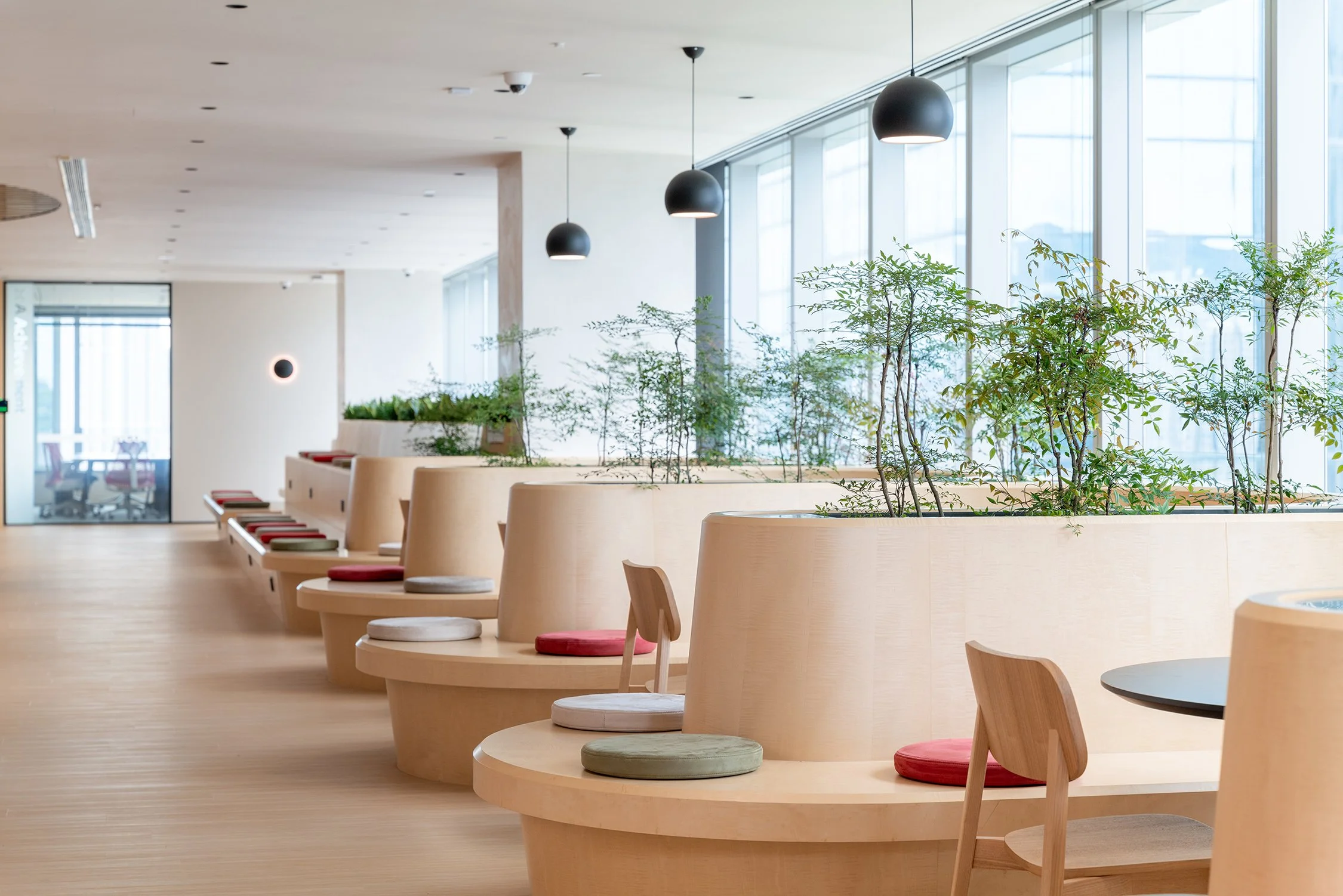
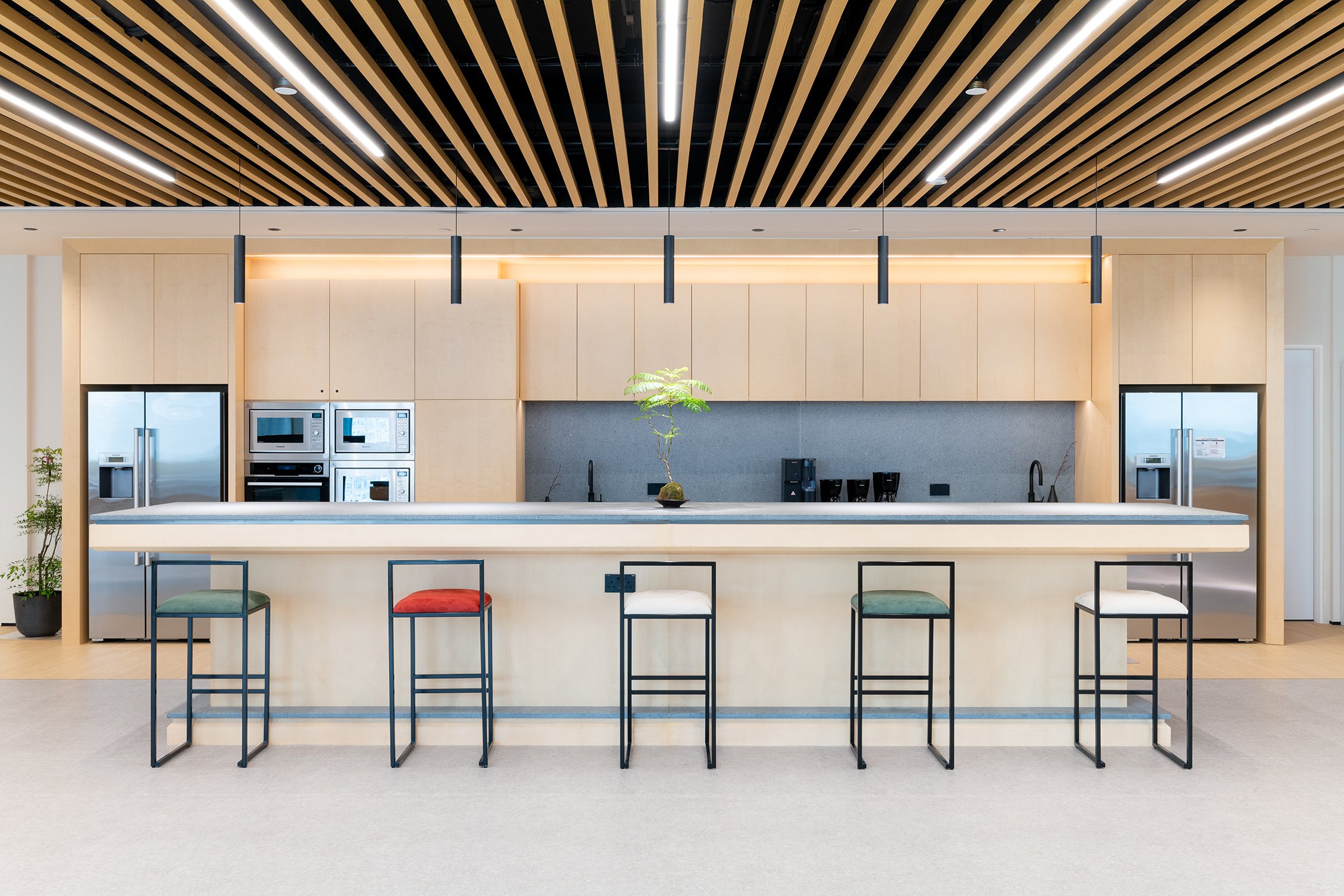
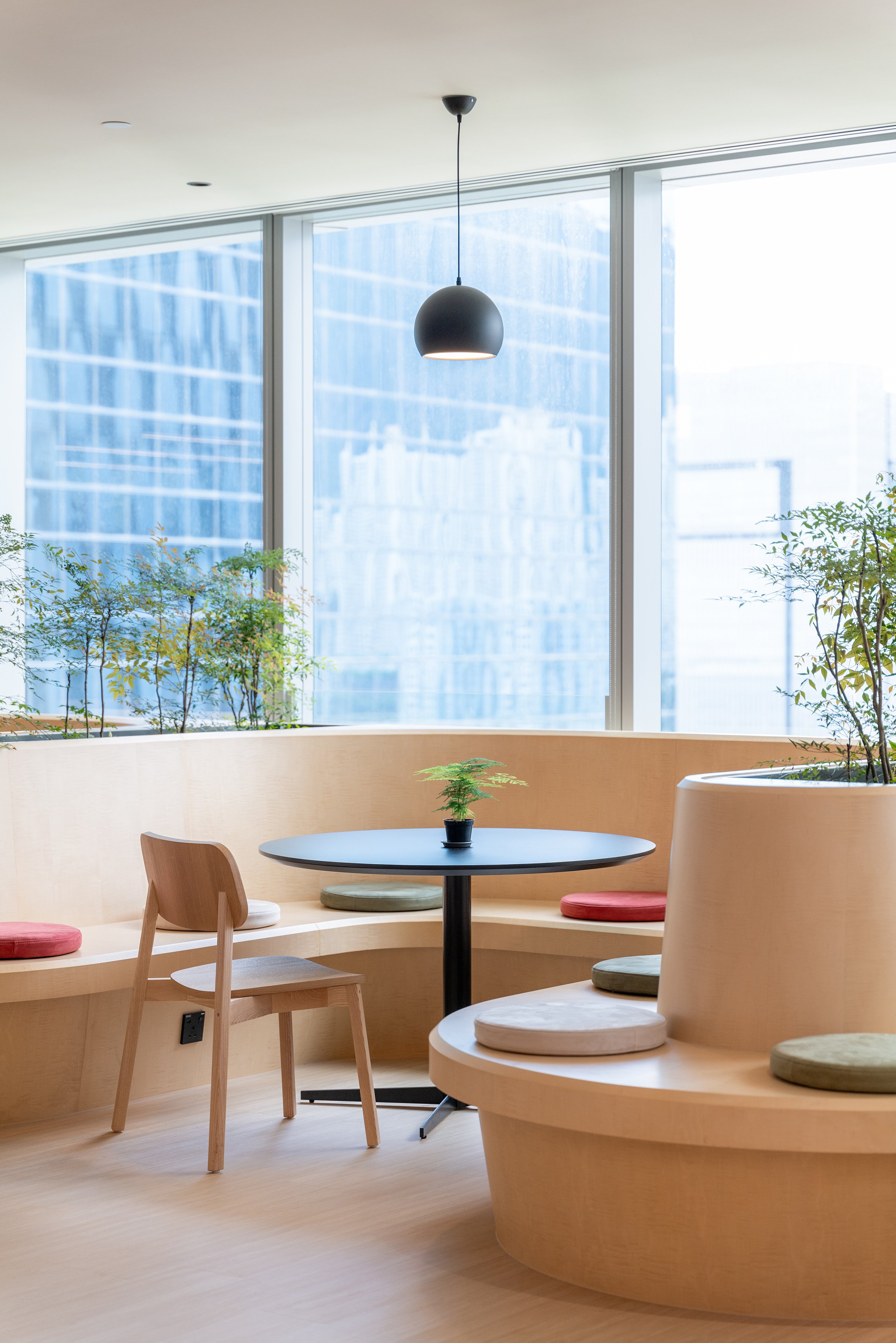
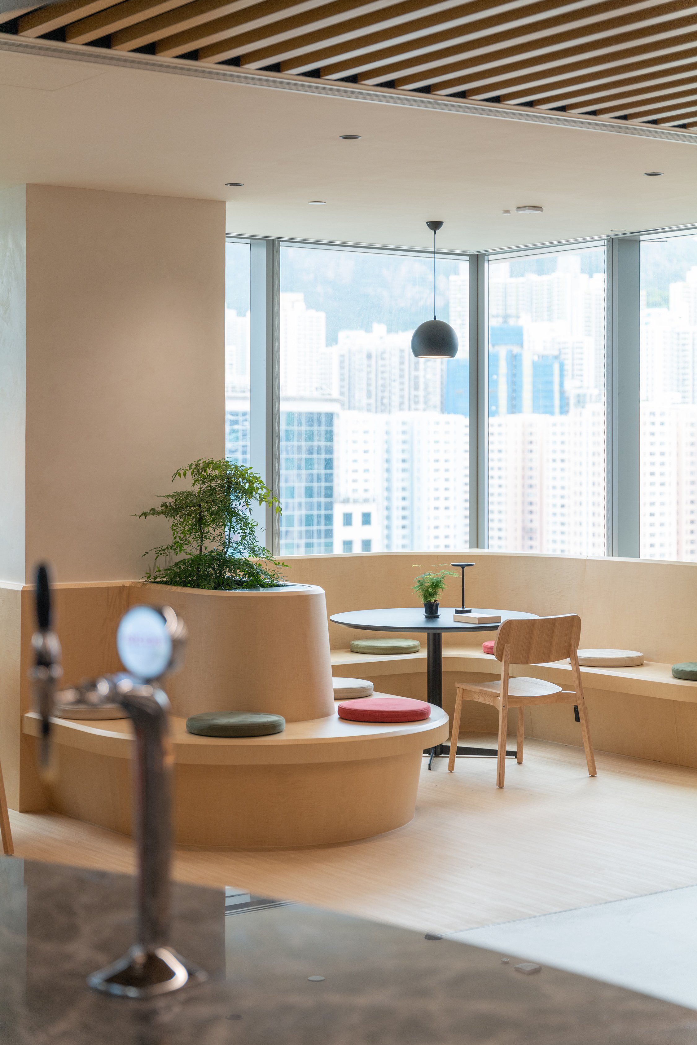
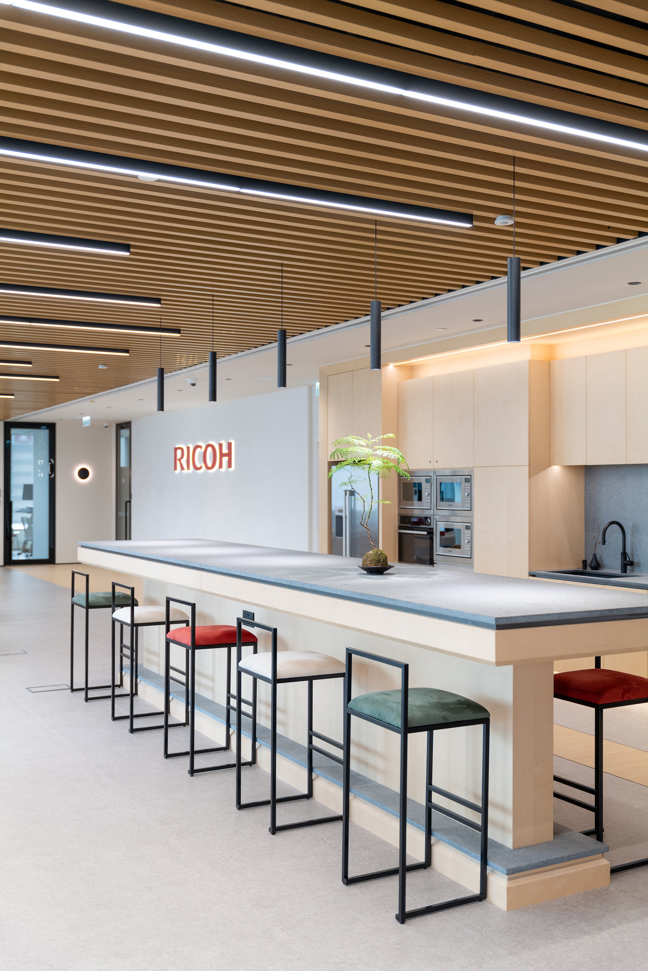
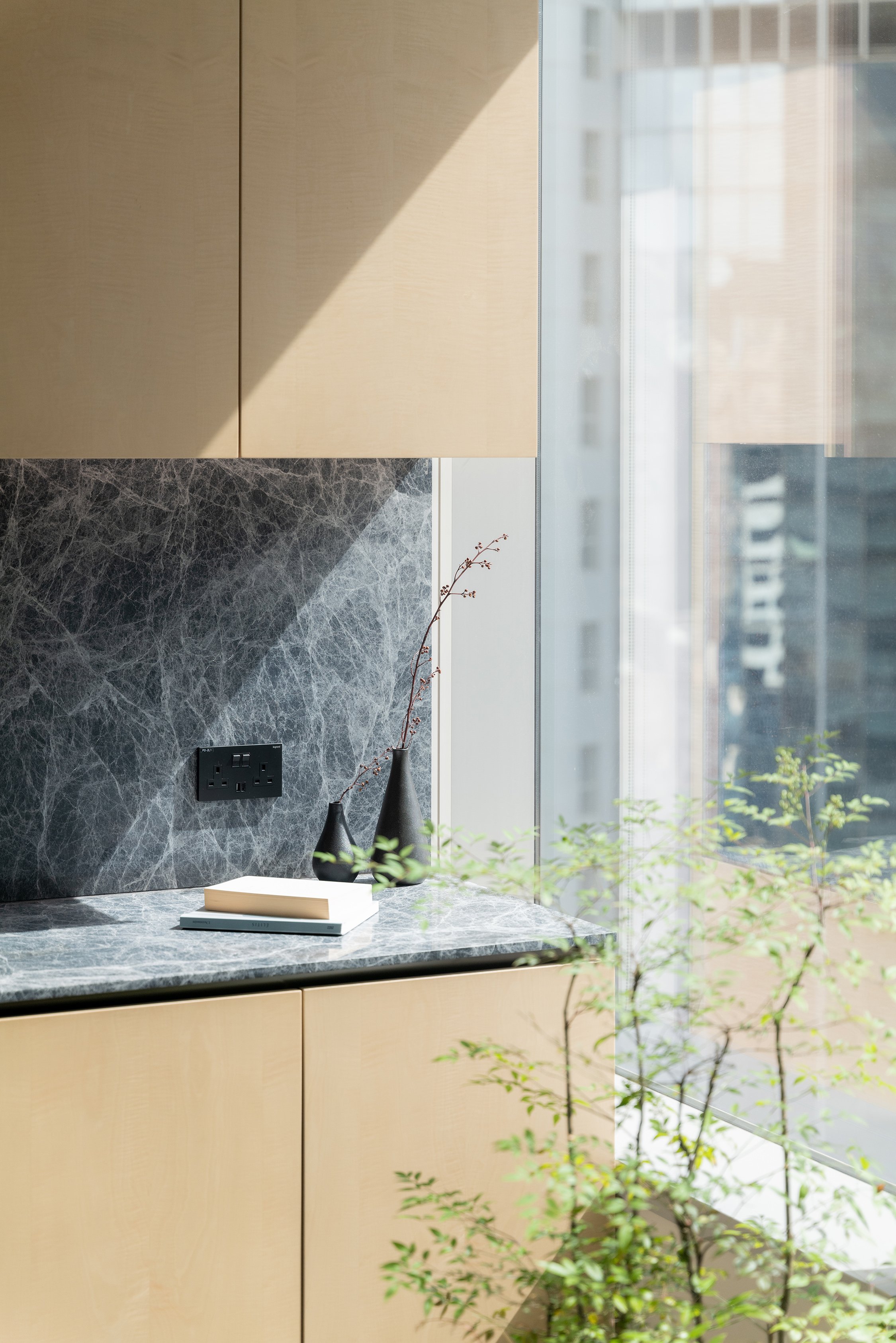
Natural Light and Openness: Large windows fill the workspace with ample natural light, casting a warm glow across the clean, minimalist interiors. The open design and panoramic views of surrounding greenery ensure a constant connection to nature, even indoors. These deliberate design choices create an uplifting atmosphere where creativity can flourish, and stress is kept at bay. Communal areas are strategically positioned to encourage interaction and the organic sharing of ideas, fostering a vibrant, collaborative community.
Sustainability at the Core
Sustainability is a crucial focus of See How Group's design for Ricoh HK. The design incorporates energy-efficient lighting systems, low-emission materials, and a comprehensive recycling program. These features are not just add-ons but are essential to the design, demonstrating a dedication to creating a workspace that honours the planet while enhancing the human experience.
A Harmonious Future
The Ricoh HK coworking space represents the future of workplace design, integrating technology and nature to create an innovative and nurturing environment. The space goes beyond just supporting productivity and collaboration—it actively enhances the well-being of its occupants while also prioritizing sustainability. See How the Group's vision for Ricoh HK is more than just about looks; it's a blueprint for the future of work, celebrating functionality, sustainability, and human connection equally.
For more information, please visit: https://www.seehowgroup.com
*This project is one of the shortlisted project in the Sky Design Awards 2024 - Interior design - Commercial & Office Division
AMADA GLOBAL INNOVATION CENTER: A Fusion of Heritage, Innovation, and Sustainable Design
The AMADA GLOBAL INNOVATION CENTER, designed by Yuzo Kosaka of NOMURA Co., Ltd., is a bold testament to AMADA's unwavering dedication to innovation and craftsmanship. As a global leader in metal processing technology and equipment, AMADA has purposefully crafted a space to showcase its products, embodying the company's resolute spirit of "building bonds with customers and manufacturing that contributes to society." This center is not simply a facility but a resounding declaration of AMADA's legacy and unwavering vision for the future.
The AMADA GLOBAL INNOVATION CENTER, designed by Yuzo Kosaka of NOMURA Co., Ltd., is a bold testament to AMADA's unwavering dedication to innovation and craftsmanship. As a global leader in metal processing technology and equipment, AMADA has purposefully crafted a space to showcase its products, embodying the company's resolute spirit of "building bonds with customers and manufacturing that contributes to society." This center is not simply a facility but a resounding declaration of AMADA's legacy and unwavering vision for the future.
The AMADA GLOBAL INNOVATION CENTER is more than just an exhibition hall. It's a place where the essence of metalworking comes to life, offering visitors a unique and exciting experience. Here, they can tangibly experience the 'spirit of manufacturing' and understand the profound impact of metal processing technology on the world. Every design aspect, from the architecture to the interior, fixtures, and signage, has been meticulously crafted to integrate metal processing technology as a core design element. This approach has resulted in a center that offers a truly unique experience, where technology and design converge in a seamless narrative.
The center is not only about displaying products; it's about conveying a more profound message — the value of metal processing technology in shaping our world. By incorporating these technologies into the building, the AMADA GLOBAL INNOVATION CENTER becomes an immersive environment where visitors can explore the endless possibilities of the future. This innovative approach reflects AMADA's commitment to pushing the boundaries of what is possible while staying true to the principles guiding the company for generations.
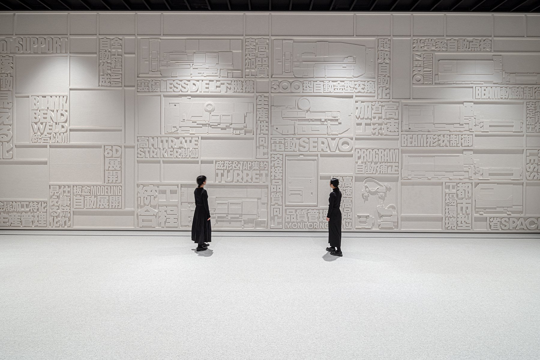
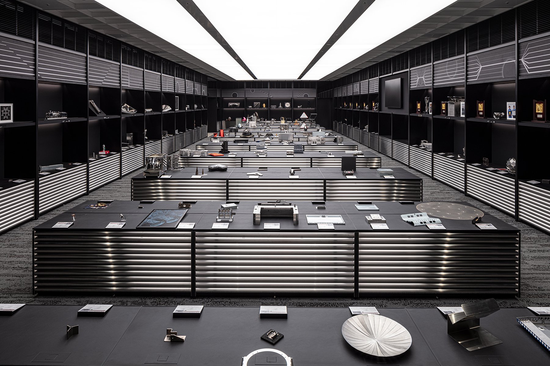
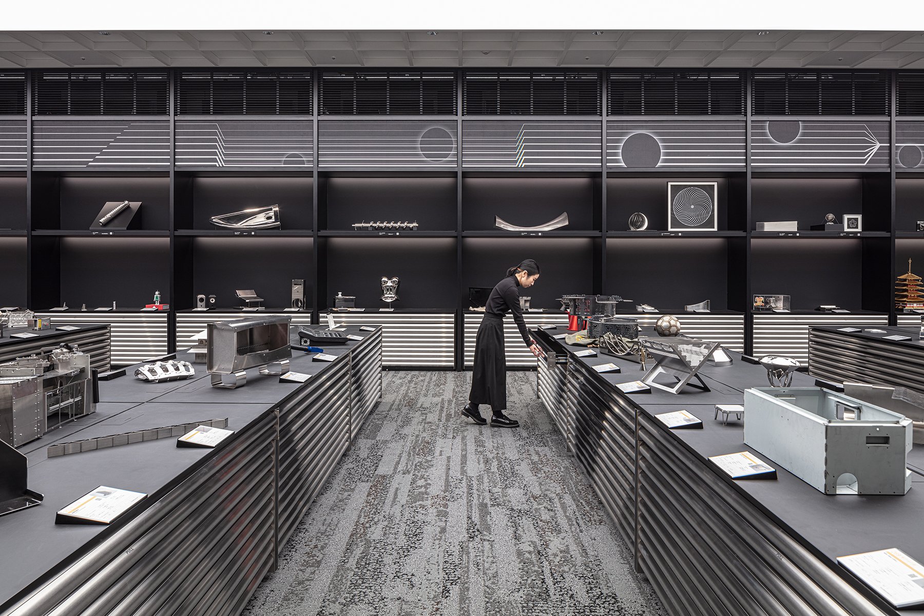

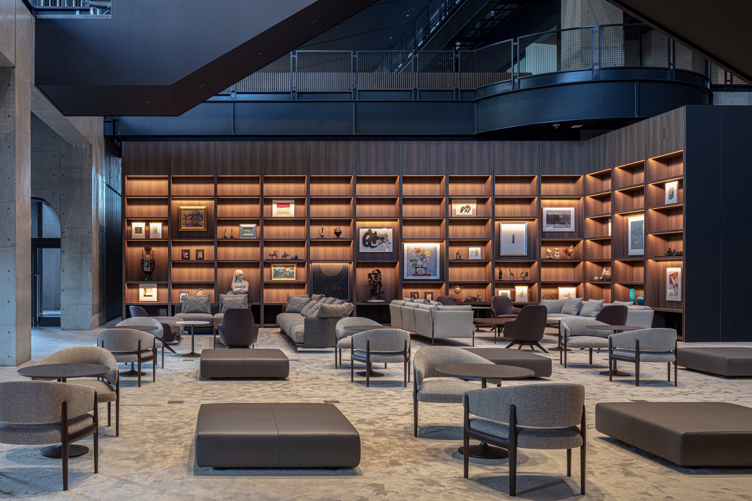
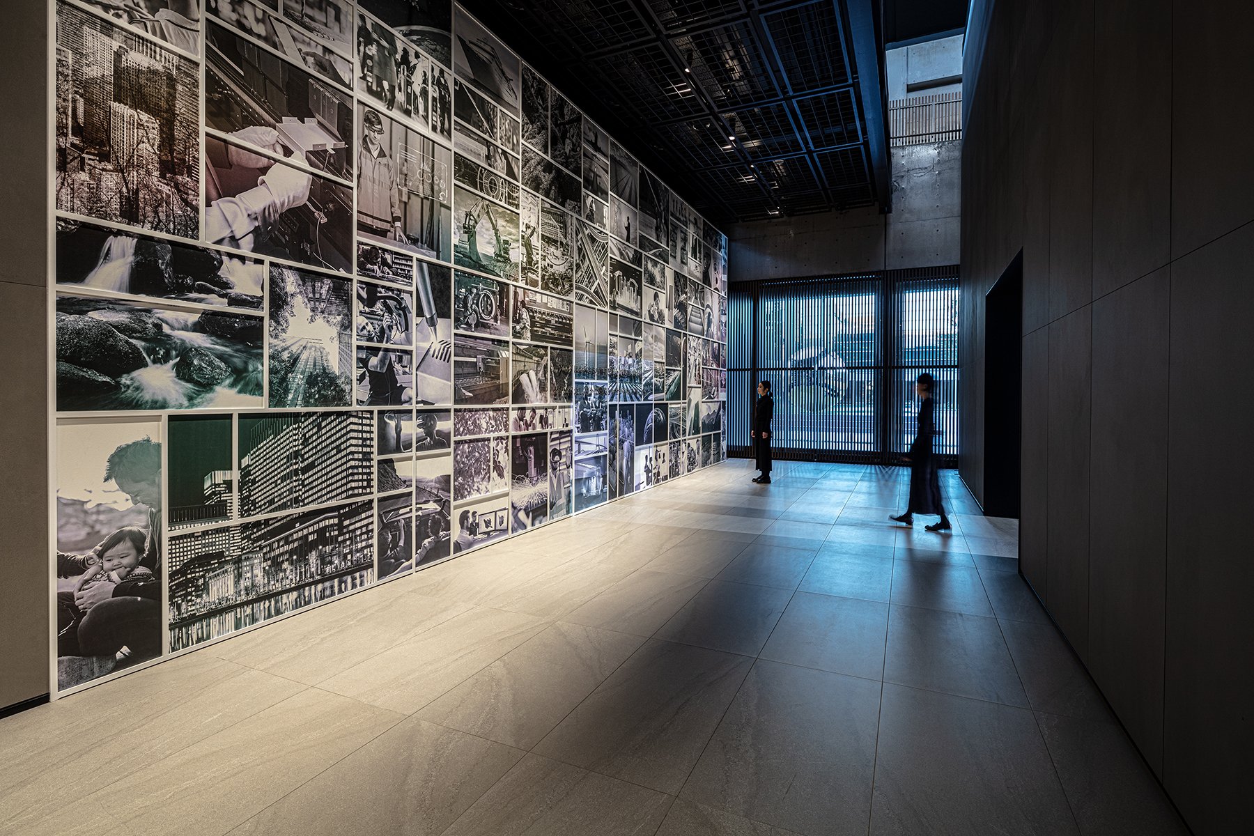
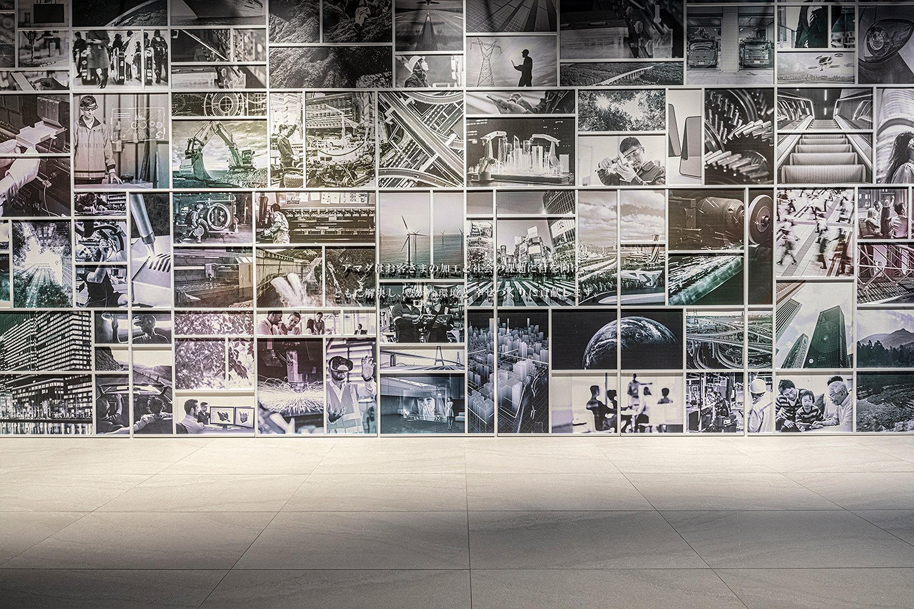
The center's design strongly emphasizes sustainability and environmental stewardship. In today's era of environmental conservation, AMADA has taken significant strides to ensure that its innovation center is state-of-the-art and eco-friendly. Through a collaborative effort between architecture, interior design, and exhibition direction teams, the facility has been transformed into a model of environmental sustainability. The center introduces energy-saving products and cutting-edge software that monitor the environmental impact of the entire factory, setting a new standard for eco-friendly industrial design. This commitment to sustainability reassures visitors and industry professionals of AMADA's dedication to a greener future.
The facility's construction and interior design showcase the latest environmentally conscious building practices and advancements. Compared to the previous structure and similar conventional facilities, the center has achieved a 50% reduction in CO2 emissions, demonstrating AMADA's commitment to reducing its environmental footprint. Visitors to the center will have the opportunity to experience these eco-friendly innovations firsthand, as the facility serves as a real-world example of AMADA's dedication to sustainable manufacturing.
AMADA's environmental initiatives extend beyond energy efficiency. The facility utilizes an AI recognition system to optimize lighting and air conditioning, integrates solar power generation, and incorporates a balanced use of recycled materials. These efforts are geared towards meeting regulatory requirements, leading the industry in sustainable practices, and providing solutions to operational and environmental challenges.
The AMADA GLOBAL INNOVATION CENTER is a shining example of what the future of manufacturing should be. It's a place where tradition meets innovation, where the legacy of AMADA's past is honoured while boldly stepping into the future. For visitors, this center offers a rare opportunity to witness, experience, and understand the transformative power of metal processing technology in a space that is as forward-thinking as the innovations it houses. Here, the future of manufacturing is not just imagined—it is realized, inspiring hope and excitement for what is to come.
Designer Profile
For more information, please visit: https://www.nomurakougei.co.jp/
*This project is one of the shortlisted project in the Sky Design Awards 2024 - Interior Design -Commercial & Office Division


