Heritage Reimagined: Shinbashi Tamakiya’s New Era of Tsukudani Tradition
The redesign of Shinbashi Tamakiya's main store by Aioi Design explores the deep cultural significance of tsukudani while incorporating a modern design approach. This update positions the historic brand to appeal to a contemporary and discerning audience. The space features a minimalist yet dignified aesthetic, showcasing modern functionality and a profound respect for heritage. These elements reflect the brand's commitment to preserving traditional Japanese food culture.
The redesign of Shinbashi Tamakiya's main store by Aioi Design explores the deep cultural significance of tsukudani while incorporating a modern design approach. This update positions the historic brand to appeal to a contemporary and discerning audience. The space features a minimalist yet dignified aesthetic, showcasing modern functionality and a profound respect for heritage. These elements reflect the brand's commitment to preserving traditional Japanese food culture.
Design Perspective
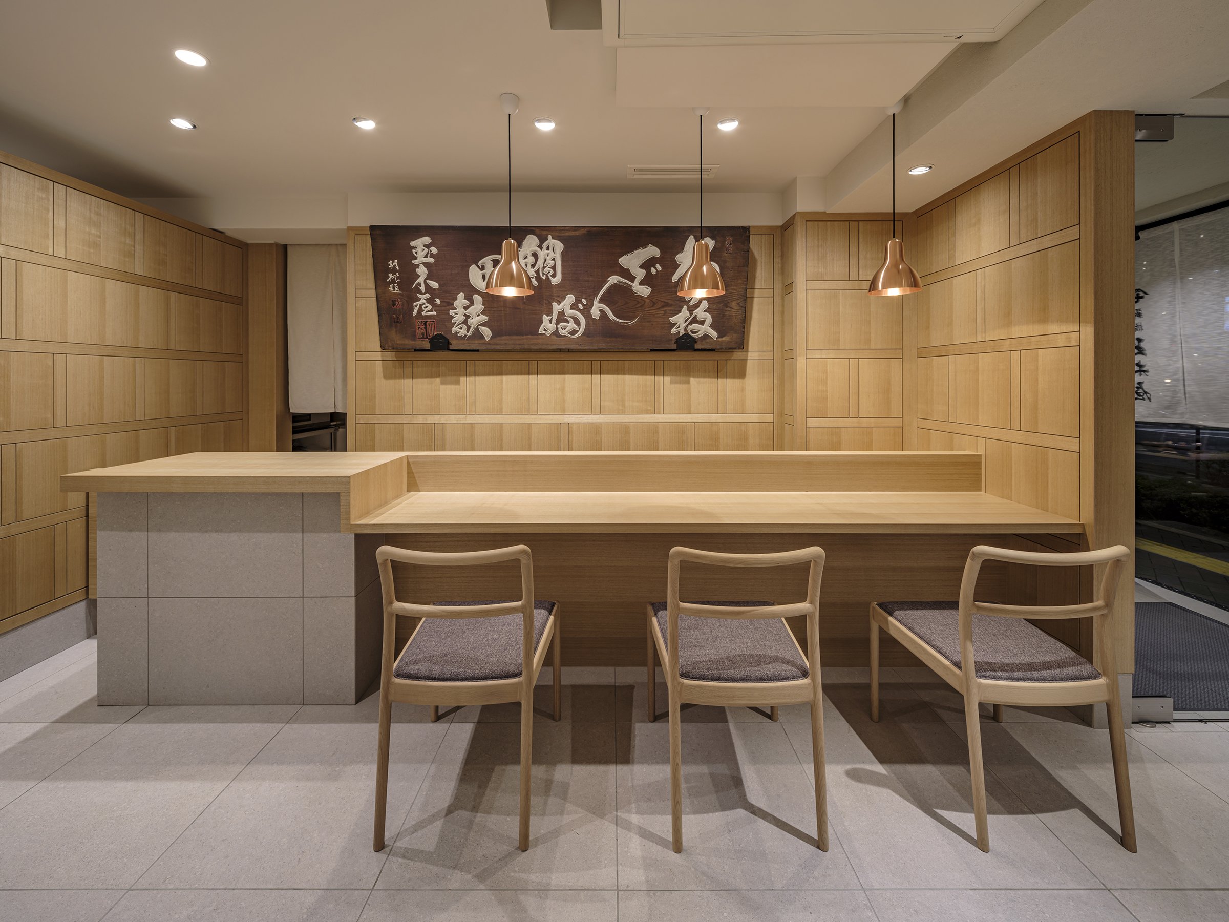
Aioi's innovative approach to the redesign of Shinbashi Tamakiya's main store is a departure from traditional tsukudani shop layouts. Instead of the typical dominant counters and brief customer interactions, the design embraces openness. It features strategically placed flat display fixtures that encourage a more dynamic, three-dimensional space exploration. This unique layout allows customers to linger and engage more deeply with Tamakiya's artisanal tsukudani offerings, creating a comfortable and contemplative environment. The store design uses understated materials and a neutral colour palette, invoking a sense of calm and reflecting the simplicity of Japanese aesthetics. This ensures that the store feels serene and uncluttered while drawing attention to the meticulously arranged products.
A notable addition is a dining space within the retail environment, which is an uncommon feature for a Tsukudani specialty store. This area allows customers to sample dishes that highlight tsukudani as a central ingredient, providing a unique opportunity to experience this traditional food's versatility and rich flavors. This "living display" of Japanese culinary heritage transforms the store into a multisensory journey, bridging Tamakiya's historical past with the evolving tastes of today's clientele.




Business and Cultural Value
For a brand like Shinbashi Tamakiya, this redesign reinforces its role as a custodian of cultural tradition. Highlighting tsukudani, a preserved food, is a significant choice—it embodies Japan's values of sustainability, resourcefulness, and reverence for nature. The design aims to introduce this craft to a new generation, serving as a business strategy and a cultural statement. It allows the brand to attract a broader demographic, including younger consumers and international visitors unfamiliar with tsukudani. This emphasis on business and cultural value will leave the audience feeling confident about the brand's future and its commitment to cultural preservation.
By incorporating educational elements and an experiential tasting room, Tamakiya positions tsukudani as an ingredient that bridges traditional and modern culinary worlds. This approach not only fosters cultural value but also stimulates business growth. The blend of functionality and brand impression is crafted to create a memorable, immersive experience that reflects Aioi's vision of transmitting Japanese food culture to future generations. These educational elements will leave customers feeling informed and enlightened about the cultural significance of tsukudani.
As Tamakiya steps into a new era, the store's design embodies both respect for its rich past and a steadfast commitment to a sustainable, culturally enriched future. The result is a space that is as timeless as it is forward-thinking—a reflection of Japanese heritage reimagined for a world that values authenticity, tradition, and innovation equally.
For more information, please visit: https://aioi-design.jp/
*This project is one of the shortlisted project in the Sky Design Awards 2024 - Interior Design - Retail Design Division
Designer Profile
Ultimate Vision: The Shangri-La Eyeglasses Boutique
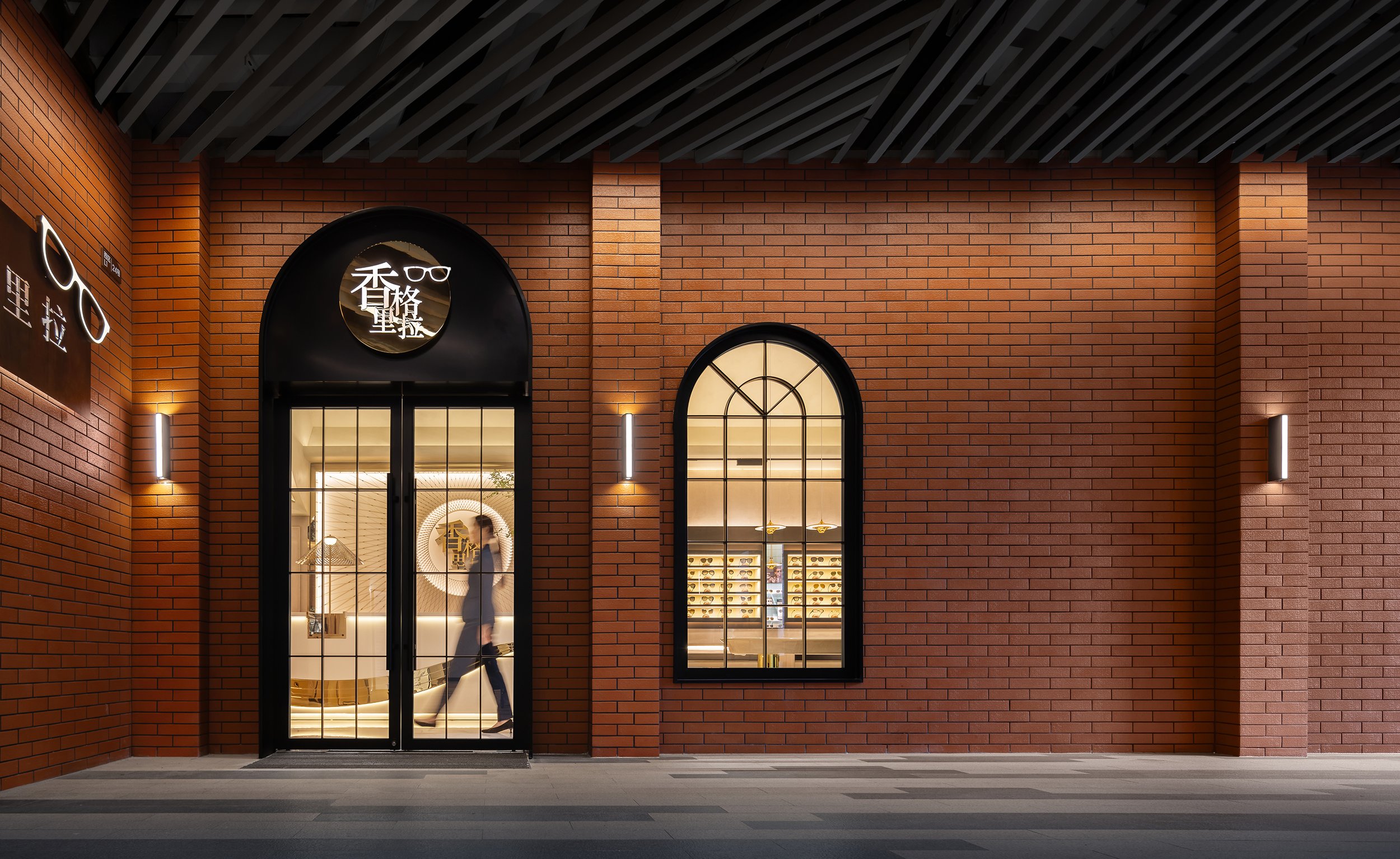
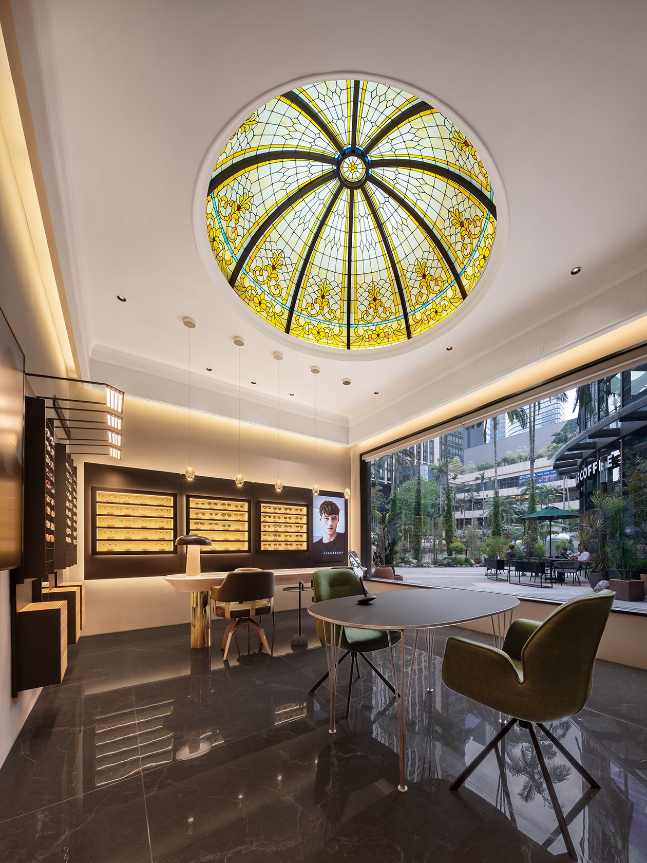
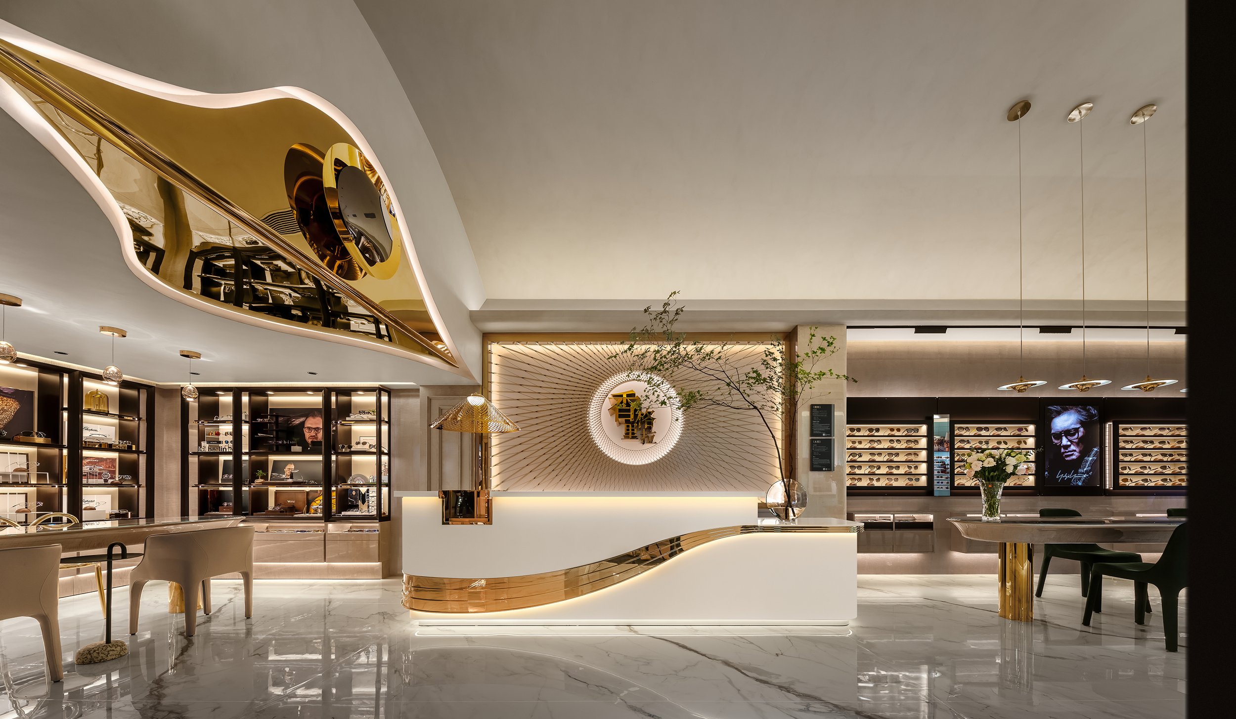
In a time when luxury retail experiences constantly evolve, Shangri-La Eyeglasses in Sihaicheng is setting a new benchmark. It combines high-end eyewear with a meticulously designed environment, providing an immersive experience. Crafted by Chengyi (Guangzhou) Decoration Engineering Co., Ltd., this boutique design in elevating the retail experience. It invites customers into a realm of sophistication where service and product merge to create something truly unforgettable.
In a time when luxury retail experiences constantly evolve, Shangri-La Eyeglasses in Sihaicheng is setting a new benchmark. It combines high-end eyewear with a meticulously designed environment, providing an immersive experience. Crafted by Chengyi (Guangzhou) Decoration Engineering Co., Ltd., this boutique design in elevating the retail experience. It invites customers into a realm of sophistication where service and product merge to create something truly unforgettable.
Inspired by the concept of Shangri-La—a fabled paradise brought to life in James Hilton's 1933 novel Lost Horizon—the design aims to capture a utopia's ethereal beauty and tranquillity while firmly planting itself in the modern world. The boutique's design concept revolves around escapism and luxury, offering visitors a retreat from the ordinary. It's a place where they can indulge in premium eyewear and an elevated sensory journey. The store is not merely a place to shop but a space where customers can pause and immerse themselves in an atmosphere that mirrors the myth of Shangri-La itself—an oasis of calm, refinement, and exclusivity.
Design Aesthetic: Fusing Tradition and Modernity
The boutique's design philosophy balances traditional opulence and contemporary minimalism. Inspired by the timeless allure of Shangri-La, the design incorporates natural materials like stone, wood, and glass, reflecting the mythical paradise's harmonious relationship with nature. These materials are combined with modern, sleek lines and cutting-edge lighting systems to create an environment that is both inviting and avant-garde.
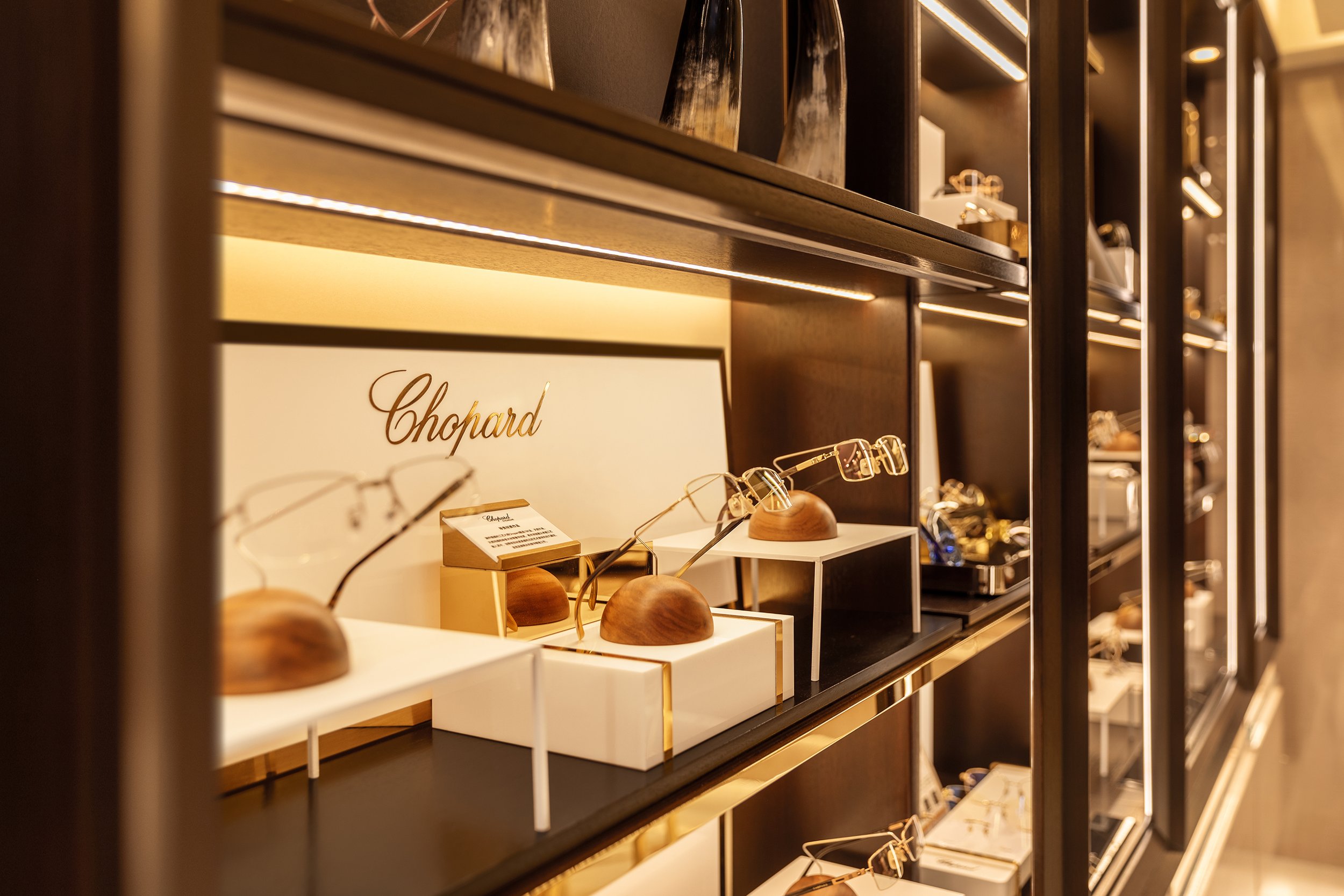
The store is intentionally spacious, with clear sightlines to guide visitors through a journey of discovery. A central pathway, flanked by custom wooden displays and softly illuminated with ambient lighting, leads customers to the world's most luxurious eyewear brands. Each display is designed with a minimalist approach, allowing the products to be showcased as pieces of art rather than just consumer goods. Reflective surfaces, like polished stone and glass, enhance the feeling of space and light, creating a serene and almost otherworldly atmosphere.
Atmosphere: A Multi-Sensory Experience
The atmosphere of Shangri-La Eyeglasses is carefully designed to create a sense of serenity, luxury, and exclusivity. When customers step inside, they are greeted with a calm environment, ambient music, and a subtle scent of sandalwood, all chosen to evoke warmth and tranquillity. Every element enhances the customer's emotional and psychological experience, making it more than just a place to buy eyewear.
Lighting is crucial in shaping the atmosphere. The boutique uses natural light during the day and a well-programmed lighting system that adjusts based on the time of day and customer flow. Warm, golden hues encourage a relaxed shopping experience during peak hours, while cooler, sharper tones in the evening create a sophisticated ambiance. The lighting is also strategically placed to highlight the craftsmanship of the products on display, enhancing the luxurious feel of the materials and finishes.


A Curated Selection of World-Class Brands
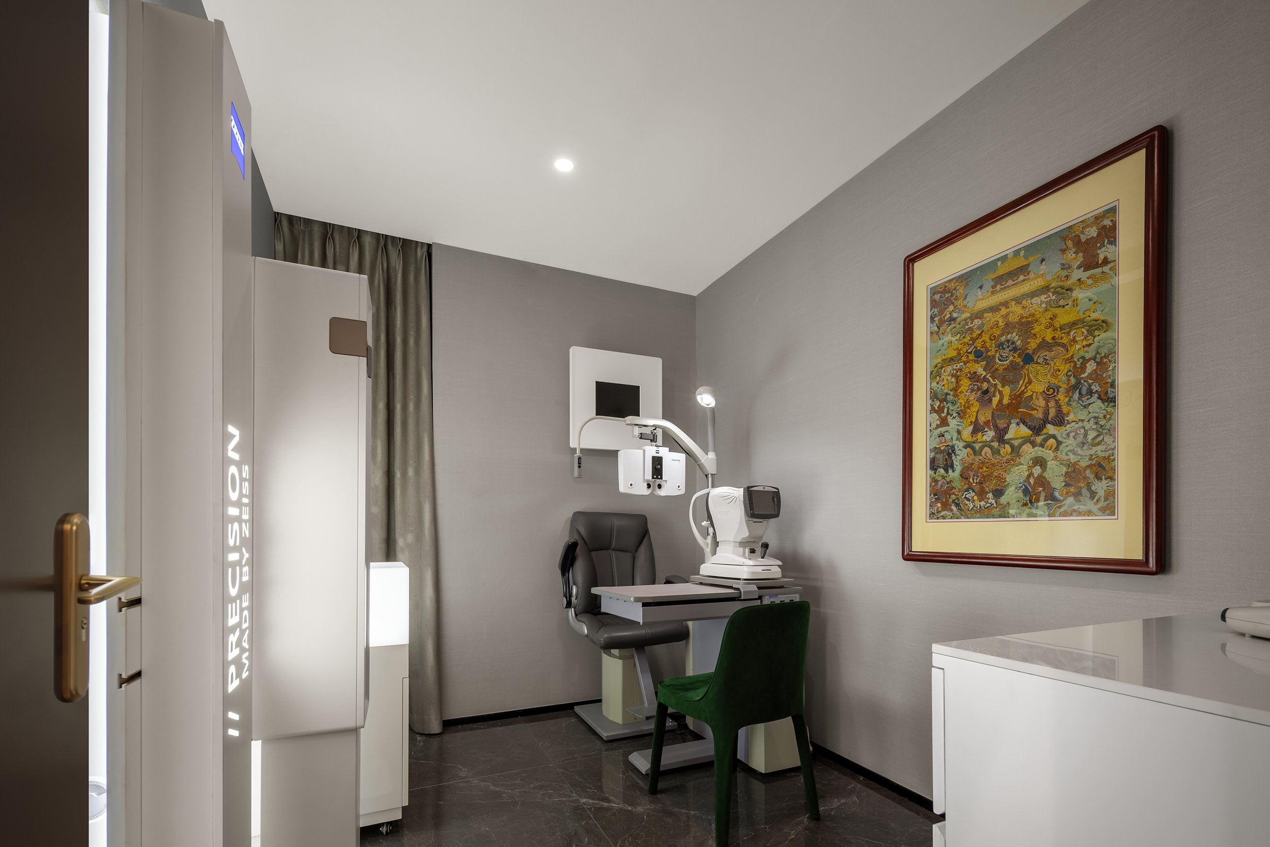
Shangri-La Eyeglasses is known for its carefully curated selection of the world's most sought-after eyewear brands. The boutique offers an exclusive range of frames from iconic names such as Cartier, Chanel, and Tom Ford, alongside limited-edition collections from avant-garde designers. These cater to the discerning tastes of luxury consumers. Each brand has been carefully chosen for its aesthetic value and craftsmanship, ensuring that every frame embodies the pinnacle of design and functionality.
The boutique offers a variety of custom eyewear options, allowing customers to personalize their frames to match their unique style. This level of customization adds an extra layer of exclusivity, as customers can own a piece that is uniquely theirs, reflecting their personal identity and taste.
The combination of exceptional architecture, thoughtful interior design, and unparalleled service distinguishes Shangri-La Eyeglasses as a leader in Asia's high-end eyewear market. Like Hilton's 'Lost Horizon 'Lost, which mesmerized readers with its portrayal of an earthly paradise, this boutique captivates visitors through its seamless integration of beauty, luxury, and experience—truly encapsulating the essence of Shangri-La.
*This project is one of the shortlisted project in the Sky Design Awards 2024 - Interior Design: Retail Design Division
Nomura’s Dynamic Vision: PAPABUBBLE Machida Merges Candy Craft with Immersive Design
PAPABUBBLE is a well-known candy brand from Barcelona known for its handmade candies and visually stunning presentations. Their signature candy, Kintaro-ame, is cylindrical candy with intricate patterns that are identical in every slice, showcasing the brand's dedication to precision and artistry. This commitment to craftsmanship and creativity is reflected in the design of PAPABUBBLE's Machida store, which was created by Kohei Fujinaka and his team at Nomura Co., Ltd.
PAPABUBBLE is a well-known candy brand from Barcelona known for its handmade candies and visually stunning presentations. Their signature candy, Kintaro-ame, is cylindrical candy with intricate patterns that are identical in every slice, showcasing the brand's dedication to precision and artistry. This commitment to craftsmanship and creativity is reflected in the design of PAPABUBBLE's Machida store, which was created by Kohei Fujinaka and his team at Nomura Co., Ltd.
An Experiential Design for the Senses
The PAPABUBBLE Machida store's design transforms a small, unconventional retail space into an immersive and dynamic experience. Despite being tucked beside an escalator in a busy shopping area, the design overcomes limitations in visibility and flow. Instead of seeing these as constraints, Nomura's design turns the store into a kinetic visual experience that attracts passersby and profoundly connects with the brand's DNA.
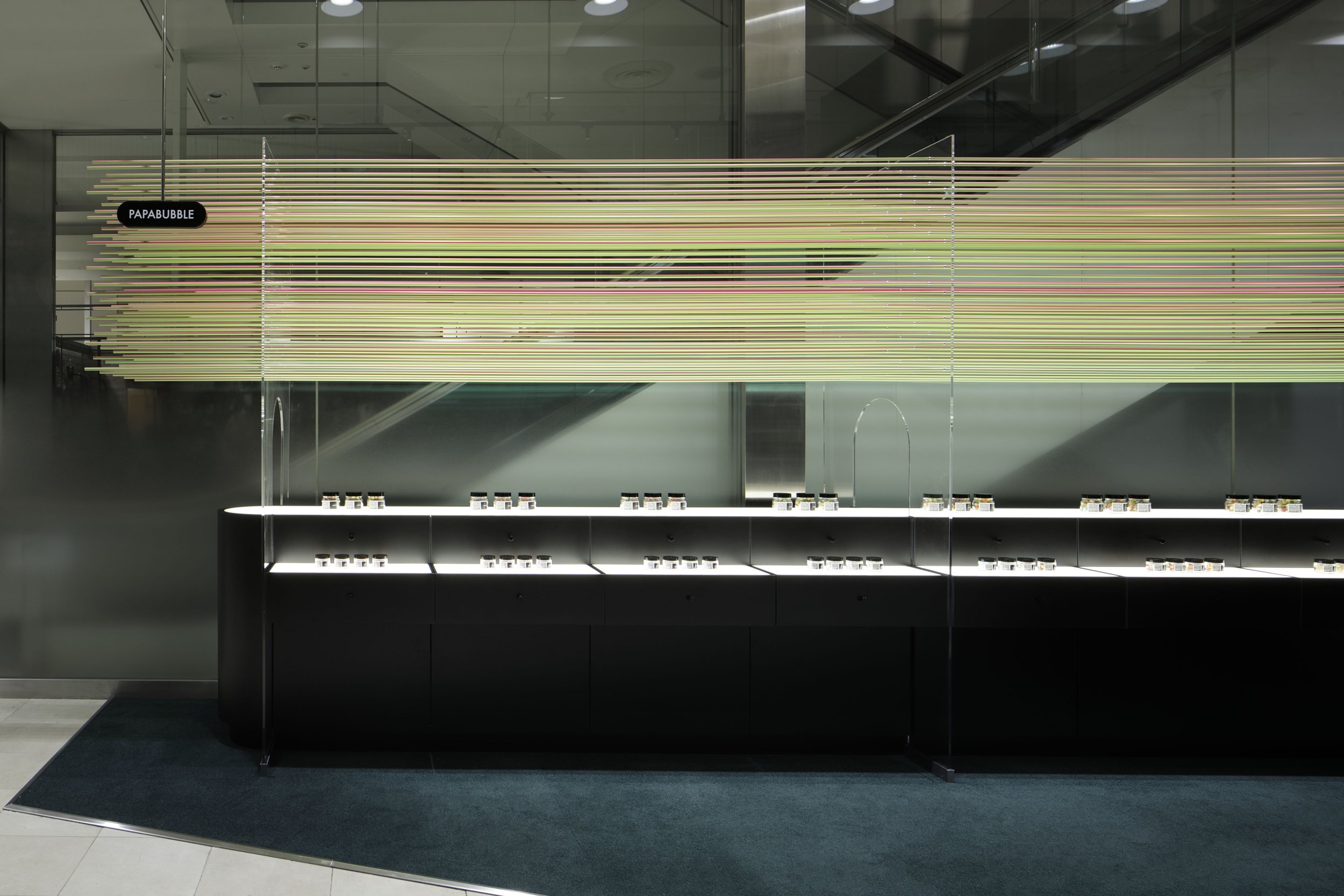
The design concept revolves around 90 aluminum rods, each with the same diameter as PAPABUBBLE's long cylindrical candy before it is sliced into individual pieces. These rods are not just decorative but the centrepiece of an ever-changing visual installation. Gradient-coated to shift in colour depending on the viewing angle, the rods echo the vibrant hues of the brand's kaleidoscopic sweets, creating a visual spectacle that mimics the candy's playful and intricate designs. As visitors move past or ascend the nearby escalator, they are greeted with this constantly evolving display that seemingly transforms with every step. This dynamic interaction turns a previously underwhelming space into a vibrant focal point.
The Power of Perception and Movement
The brilliance of Nomura's design lies in its ability to manipulate perception through simple, analog techniques. The colour-shifting aluminum rods interact with shoppers' natural movements, using the escalator's vertical flow as part of the store's visual narrative. This seamless integration of design and human motion transforms the store into an interactive experience that blurs the lines between retail and art installation. The fluid movement of colours not only reflects the essence of PAPABUBBLE's candy-making process (which involves transforming essential ingredients into delightful works of edible art) but also entices onlookers to engage with the store on an emotional level.
The gradual shifts in hue mirror the meticulous crafting of Kintaro-ame, a process that similarly unveils its intricate patterns with every slice. By allowing the store's exterior to change dynamically as people approach, the design invites curiosity and wonder, drawing visitors into the space like the magic of watching a master confectioner create candy.


A Narrative of Craftsmanship and Creativity
Nomura's design for PAPABUBBLE Machida is not just about looks; it is a visual story that reflects the brand's craftsmanship, creativity, and playful essence. The use of aluminum rods directly embodies PAPABUBBLE's philosophy - precision, artistry, and a sense of delight that appeals to both the senses and the imagination. This playful yet highly crafted approach perfectly aligns with the brand's identity, where making candy is as important and enjoyable as the final product.
The layout also cleverly addresses the challenge of visibility in a narrow space. Using the escalator's vertical axis, the design catches the attention of passersby who might otherwise miss the store. The visual trickery of changing colours creates a sense of wonder and ensures that the store stands out in a crowded retail environment. The design's minimalist yet dynamic execution allows the store to tell PAPABUBBLE's story - one of artful confectionery - without overwhelming the senses.
A Triumph in Spatial Innovation
The Machida store has achieved several prestigious accolades, including a Bronze Award at the 2023 Japan Space Design Awards and recognition at the 2024 iF Design Awards. These honours underscore how Nomura's design effectively combines functionality with artistic expression. In a retail environment where digital and flashy displays are increasingly prevalent, the PAPABUBBLE Machida store exemplifies how analog techniques and thoughtful design can create an equally engaging experience while striking a balance between simplicity and complexity, craftsmanship and spectacle.
Kohei Fujinaka's vision brings the brand's whimsical candy-making process into the realm of spatial design, creating an environment that is both practical and poetic. By emphasizing the connection between movement, perception, and craftsmanship, the store becomes a living, breathing reflection of PAPABUBBLE itself—dynamic, colourful, and endlessly captivating.
Design as a Reflection of Brand Identity
The PAPABUBBLE Machida store showcases how thoughtful, creative design can transcend physical space to embody a brand's core values. Nomura's innovative use of colour, form, and movement creates a sensory experience that mirrors the artistry and precision of the candy-making process. It transforms a small, challenging space into a dynamic work of art that captures attention, invites interaction, and narrates the story of PAPABUBBLE in a way that is as memorable as its candies. This project demonstrates how design can not only solve spatial challenges but also elevate a brand, turning a visit to the store into a journey through the playful, artistic world of PAPABUBBLE.
For more information, please visit: https://www.nomurakougei.co.jp/
*This project is one of the shortlisted project in the Sky Design Awards 2024 - Interior Design: Retail Design Division
Cultural Heritage Reimagined: The Contemporary Craft of Nice Rice Shanghai
The store's design draws inspiration from traditional Chinese architecture, precisely the concept of the siheyuan, a classic Chinese courtyard house. SAY Architects skillfully translated this architectural heritage into a modern context by transforming the store into a "Rice Barn Shelter" that welcomes customers beneath its iconic eaves. The eaves, often called the "fifth elevation" in Chinese architecture, create an inviting sanctuary that offers a balance of openness and intimacy. The double-sloped roofs mirror traditional structures, yet their contemporary interpretation makes them relevant to today's retail landscape.
In the lively center of Huaihai Road in Shanghai, where Eastern and Western cultures meet, the Nice Rice Shanghai Flagship Store stands as a testament to cultural preservation and modern design. Crafted by the pioneering team at SAY Architects, this flagship store fuses tradition and contemporary aesthetics, offering an experience that transcends mere shopping.
A Sanctuary Rooted in Tradition
The store's design draws inspiration from traditional Chinese architecture, precisely the concept of the siheyuan, a classic Chinese courtyard house. SAY Architects skillfully translated this architectural heritage into a modern context by transforming the store into a "Rice Barn Shelter" that welcomes customers beneath its iconic eaves. The eaves, often called the "fifth elevation" in Chinese architecture, create an inviting sanctuary that offers a balance of openness and intimacy. The double-sloped roofs mirror traditional structures, yet their contemporary interpretation makes them relevant to today's retail landscape.
The choice of interior design is more than just cosmetic. It reflects the purpose of an Oriental Rice Warehouse, historically used for storing Rice. This symbolizes sustenance, inclusivity, and generosity. SAY Architects expanded on this concept by creating a "Rice Barn Shelter," a welcoming and inclusive space beneath the eaves that represents the harmonious coexistence of diverse cultural elements. This design respects the past and contributes to the sustainable cultural expression that SAY aims to incorporate alongside the sustainable use of materials.
Modern Retail: Blending Fashion, Tradition, and Culture
Nice Rice is more than just a retail brand; it represents a lifestyle concept that combines fashion, culture, and gastronomy. The flagship store in Shanghai showcases a "fashion + coffee" dual-business model, targeting younger demographics who seek a comprehensive retail experience. The simple and versatile clothing reflects the brand's philosophy of "harmony in diversity," subtly echoing Eastern cultural values.
The store's original architecture includes a wide horizontal beam that visually separates the space. This element was further emphasized by incorporating the traditional roof style of a siheyuan into the design. The roofline appears extended through cohesive colours and a minimalist yet innovative design, creating a captivating visual effect. Inside, intricate decorations have been removed to allow for more freedom of movement. Lacquer art installations punctuate the minimalist space, giving it a timeless quality.


An Inclusive Design for Urban Explorers
The dual-purpose design of Nice Rice includes a coffee shop and fashion retail, creating a modern and open public space. The store's recessed entrance and spacious outdoor area invite people passing by to interact with the space, making it a communal hub. The seamless flow between the inside and outside encourages visitors to pause, stay, and fully experience the cultural environment. The open and accessible entrance defines the store's identity and aligns with SAY Architects' vision for cultural sustainability through spatial design.
The overarching layout is designed to foster interaction. SAY Architects aimed to extend the functionality of the traditional courtyard beyond its historical limitations, highlighting how adaptable traditional elements can seamlessly integrate with modern fashion sensibilities. This architectural philosophy resonates deeply with the young urban consumer, blending cultural recognition with the ease of modernity.
Tradition Reborn for a New Generation
Through the extension and reinterpretation of traditional design elements, SAY Architects breathes new life into cultural heritage at the Nice Rice Shanghai Flagship Store. It serves not only as a retail space but also as a cultural touchstone, where the spirit of design is rejuvenated in a fresh and relevant manner. The balance of traditional charm and fashion-forward sensibility fosters emotional connections with Shanghai's youth, whose cultural recognition and engagement are keys to Nice Rice's success.
By promoting a harmonious blend of Eastern culture in a modern urban environment, Nice Rice creates a rich narrative for both the present and the future—a story that carries the weight of tradition yet speaks the language of contemporary design.


For more information, please visit: www.sayarchitects.cn
*This project is one of the shortlisted project in the Sky Design Awards 2024 - Interior Design: Retail Design Division
Liangcai Wu Eyeglasses Flagship Store: A Seamless Fusion of Heritage and Modernity
For over 300 years, Liangcai Wu Eyeglasses has been a beacon of exceptional optical craftsmanship in China. With a deep-rooted tradition, the brand has not just survived, but thrived, adapting to changing consumer preferences over the centuries. Now, as Generation Z shapes the market with a preference for experiential, offline shopping, Liangcai Wu Eyeglasses is not just embracing the future, but shaping it. The brand's newly redesigned flagship store on Nanjing Road, a masterpiece by the renowned Dayuan Design, is a testament to this resilience, blending Liangcai Wu's cultural heritage with a fresh, youthful aesthetic.
For over 300 years, Liangcai Wu Eyeglasses has been a beacon of exceptional optical craftsmanship in China. With a deep-rooted tradition, the brand has not just survived, but thrived, adapting to changing consumer preferences over the centuries. Now, as Generation Z shapes the market with a preference for experiential, offline shopping, Liangcai Wu Eyeglasses is not just embracing the future, but shaping it. The brand's newly redesigned flagship store on Nanjing Road, a masterpiece by the renowned Dayuan Design, is a testament to this resilience, blending Liangcai Wu's cultural heritage with a fresh, youthful aesthetic.
The store's concept centers around transformation, both in terms of materials and brand. Dayuan Design is inspired by the founding family's jade business, precisely the intricate craftsmanship in turning raw stone into beautiful, polished jade. This refinement process is reflected in the store's layout, where visitors can experience the craft firsthand as they move through the space.
An Immersive Retail Journey Rooted in Craftsmanship
Dayuan Design's store design is based on the concept of "craftsmanship," meticulously creating spaces that evoke the artistry behind jade carving. Upon entering, visitors are greeted by a quarry-like environment with towering stone mountains and deep, cavernous spaces reflecting nature's creation's raw beauty. This design choice represents the early stages of jade crafting—rough, unpolished stone slowly revealing its inner beauty through skilled artisans' hands. The textured, uneven surfaces of the walls echo the passage of time, suggesting the sedimentation of history and the indelible marks left by master craftsmen over generations.
The design carries this story forward by contrasting rugged and refined elements. Dayuan Design excels in blending the natural and the architectural, combining the wild with the elegant. Despite its small size, the retail area achieves this balance by mixing modern, clean lines with raw textures, creating a serene yet dynamic atmosphere. The designers effectively communicate a sense of continuity, where history is preserved and made relevant through contemporary reinterpretation.
The Time Corridor: A Bridge Between Past and Present
As visitors walk through the first floor, they will come across a fascinating display of jade grinding tools, paying tribute to the centuries-old tradition of craftsmanship. Accompanied by the gentle sound of stone grinding, this installation is a symbolic entrance to the second floor, appropriately named the 'Time Corridor.' The 'Time Corridor' is a carefully designed space that takes visitors on a journey through Liangcai Wu's history, with areas designed to evoke the gradual refinement of jade. The second floor's design introduces polished, time-worn jade surfaces that seamlessly blend with modern materials, creating a space that connects Liangcai Wu's rich history with the forward-looking ambitions of today.
The Time Corridor leads to a sleek, simple space where traditional jade craftsmanship transforms into a modern representation of the brand's history. Dayuan Design intelligently uses materials like stone, metal, and jade to symbolize Liangcai Wu's journey through time and encourage visitors to interact with the brand's heritage in a tangible way.


Cultural Storytelling Through Design
The flagship store features the 'Mountain Quarry' art installation, a symbolic representation of the enduring history of Liangcai Wu Eyeglasses. Designed by Dayuan Design, the installation showcases a mechanical, metallic aesthetic that gives it a futuristic look. This bold visual statement connects the brand's past to its future, emphasizing that Liangcai Wu is rooted in tradition and evolving to meet modern sensibilities.
The retail space draws inspiration from traditional Chinese medicine cabinets, blending heritage with contemporary design. The result is a display system that is both stylish and practical, reflecting the precision of the eyewear while paying tribute to centuries-old display techniques.
"Dayuan Design's vision goes beyond a typical retail space. The flagship store is a versatile area that blurs the line between business and culture. The store showcases eyewear and features exhibition spaces, a coffee shop, and an exclusive VIP fitting room. These thoughtful additions turn the store into a cultural center where customers can do more than just shop; they are encouraged to socialize, linger, and delve into the brand's history. This multifaceted approach enhances the customer experience, fostering stronger connections with visitors and building brand loyalty."
Sustainable Design for a Dynamic Future
Sustainability is at the core of Dayuan Design's approach. They use modular, movable installations to ensure that the space can adapt over time, reducing the need for extensive renovations and allowing for a flexible response to changing functional needs over the next three to five years. This not only minimizes environmental impact but also enhances the economic viability of the project. It provides a forward-thinking model for retail design that aligns with contemporary concerns about sustainability.
In their flagship store on Nanjing Road, Dayuan Design has created an immersive, multifunctional space that pays homage to Liangcai Wu Eyeglasses' rich heritage while preparing it for the future. By skillfully blending modern and traditional elements, the design narrates the story of craftsmanship in a way that resonates with today's consumers while maintaining the brand's timeless essence. Through this seamless fusion of old and new, Liangcai Wu Eyeglasses is entering a new chapter that promises to uphold its legacy with grace and innovation.
For more information, please visit: www.dayuan.net
*This project is one of the shortlisted project in the Sky Design Awards 2024 - Interior Design: Retail Design Division
The BONAVENTURA Ginza Store: Where Minimalism Meets Luxury in Tokyo's Design Epicenter
Located in the bustling Ginza district of Tokyo, the BONAVENTURA Ginza Store represents a fusion of sophisticated design and unmatched luxury. Created by the esteemed Japanese firm Old-Kan, this flagship store redefines the traditional retail experience by offering a space that exudes the exclusivity of an art gallery rather than a typical store. The store's design concept revolves around a "Sculptural Museum" theme, where every detail is carefully selected to embody BONAVENTURA's dedication to quality and timeless elegance
Located in the bustling Ginza district of Tokyo, the BONAVENTURA Ginza Store represents a fusion of sophisticated design and unmatched luxury. Created by the esteemed Japanese firm Old-Kan, this flagship store redefines the traditional retail experience by offering a space that exudes the exclusivity of an art gallery rather than a typical store.
The store's design concept revolves around a "Sculptural Museum" theme, where every detail is carefully selected to embody BONAVENTURA's dedication to quality and timeless elegance. The interior is adorned in a serene greige tone, a neutral colour palette that provides an ideal backdrop for showcasing the brand's luxurious leather goods. This minimalist approach draws attention to the products, accentuating their craftsmanship and materials.
A striking feature of the store is its functional spiral staircase and design statement, with handrails wrapped in BONAVENTURA leather. This tactile detail invites customers to physically engage with the brand, creating a sensory connection beyond the visual, intriguing and engaging the senses.
The store's lighting is carefully orchestrated to enhance the overall atmosphere. Soft, ambient lighting highlights the textures of the materials and adds warmth to the space, creating an inviting and intimate environment. This thoughtful use of light transforms the store into a serene haven, a peaceful escape from the hustle and bustle of the outside world, where customers can explore freely and feel at ease.


In an era dominated by online shopping, the BONAVENTURA Ginza Store is a prime example of the enduring value of physical retail spaces. It offers a hands-on, immersive experience deeply connected to the brand's identity. It's not just a store; it's a sanctuary for enthusiasts of exceptional craftsmanship, where every detail has been carefully considered, and every element works in harmony to create a space as luxurious as the products it holds.
The BONAVENTURA Ginza Store represents the evolution of retail architecture into an art form. A harmonious blend of aesthetics, functionality, and brand representation creates an unforgettable experience for visitors. With its sophisticated design, seamless integration of brand elements, and focus on sensory engagement, the store stands as a testament to the power of physical retail spaces in captivating and inspiring consumers in the digital age.
For more information, please visit; https://old-kan.jp/
*This project is one of the shortlisted project in the Sky Design Awards 2024 - Interior Design -Retail Design Division
Designer Profile
Shohei Urata (Old Kan) - Interior designer.
Born in Sapporo, Hokkaido in 1987. After working at the interior design office in 2011-2014, studied under A.N.D. of NOMURA Co., Ltd. in 2014-2020. Established Old Kan in April 2020. He designs a wide range of genres, focusing on restaurants, retail stores, and bridal facilities.
Major awards include Japan , IF Design Awards 2023 “Winner” , Sky Design Awards 2022 “silver” , KUKAN DESIGN AWRAD 2022 “short list” , Sky Design Awards 2021 THE NEW BLACK IN INTERIOR DESIGN , Space Design Award 2020 Hospitality Category Gold Award, International Property award 2018, Andrew Martin Design Award 2015, 2017, APIDA 2016 (Hong Kong), Japan Space Design Award 2016, Display Industry Award 2016 Encouragement Award, etc.


