Touch Tea: A New Poetic Dialogue Between Tradition and Modernism
In today's urban landscape, the design of spaces reflects the cultural shift where the youth are increasingly drawn to fast-paced lifestyles and vibrant social environments. Touch Tea, designed by Touch Design, is a modern tea house that offers a refreshing response to this dynamic. Unlike traditional teahouses with elaborate and overly formal atmospheres, Touch Tea stands out with its unique blend of minimalism and an innovative approach to the ritual of tea drinking. It delicately balances honouring the tea tradition with embracing the vitality of modern life, creating a space that resonates with both the past and the future.
In today's urban landscape, the design of spaces reflects the cultural shift where the youth are increasingly drawn to fast-paced lifestyles and vibrant social environments. Touch Tea, designed by Touch Design, is a modern tea house that offers a refreshing response to this dynamic. Unlike traditional teahouses with elaborate and overly formal atmospheres, Touch Tea stands out with its unique blend of minimalism and an innovative approach to the ritual of tea drinking. It delicately balances honouring the tea tradition with embracing the vitality of modern life, creating a space that resonates with both the past and the future.
Touch Tea redefines the act of "savouring tea," creating a space where the experience becomes a dialogue between past and future, tranquillity and vibrancy. Its architectural design moves beyond form, creating a fluid interaction of purpose and aesthetics. The designers have reimagined how people engage with the space and the culture, infusing the experience of tea drinking with fresh meaning that resonates with a younger, more progressive audience.
The Touch Tea design philosophy is a poetic approach to life, emphasizing harmony over the trivialities of the city. The space is a harmonious environment with washable stones, stainless steel, and red brick, striking an elegant balance between simplicity and sophistication. It invites visitors to slow down and connect with the art of tea, reflecting a precise understanding of life's textures. It offers a sanctuary where rituals unfold naturally, enhanced by the surrounding ambiance, providing a calm and relaxing escape from the hustle and bustle of urban life.
Technology plays an understated but essential role in shaping the environment at Touch Tea. Intelligent curtains and lighting systems adapt to patrons' moods, adjusting the indoor lighting to match the shifting tone of the day. A 6-meter by 3-meter P2.0 full-color LED panel and BOSE surround sound system work together to create an immersive, sensory experience, soothing the mind and creating a serene atmosphere. These elements amplify the calming essence of the space, allowing guests to find respite from the noise of the outside world.

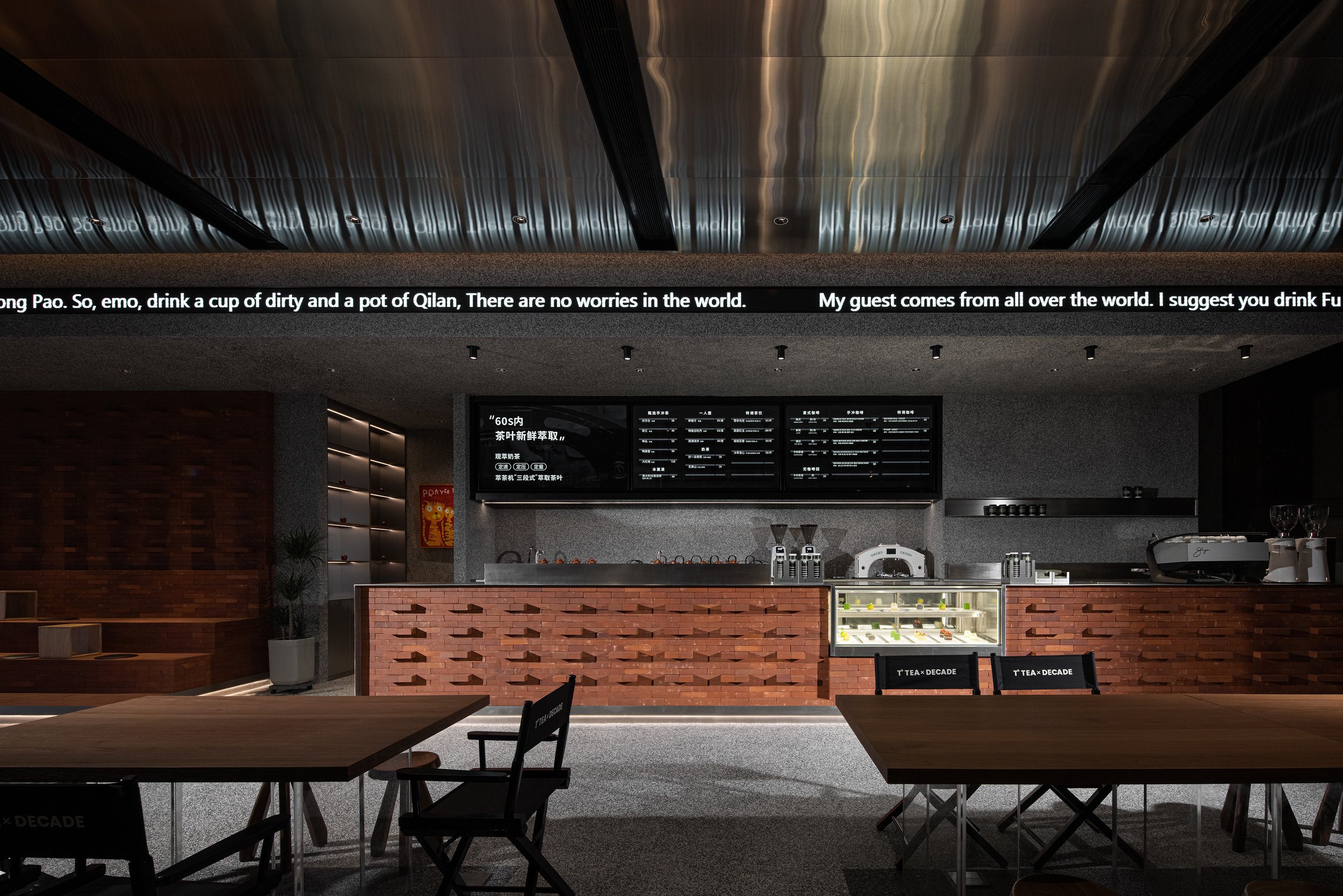
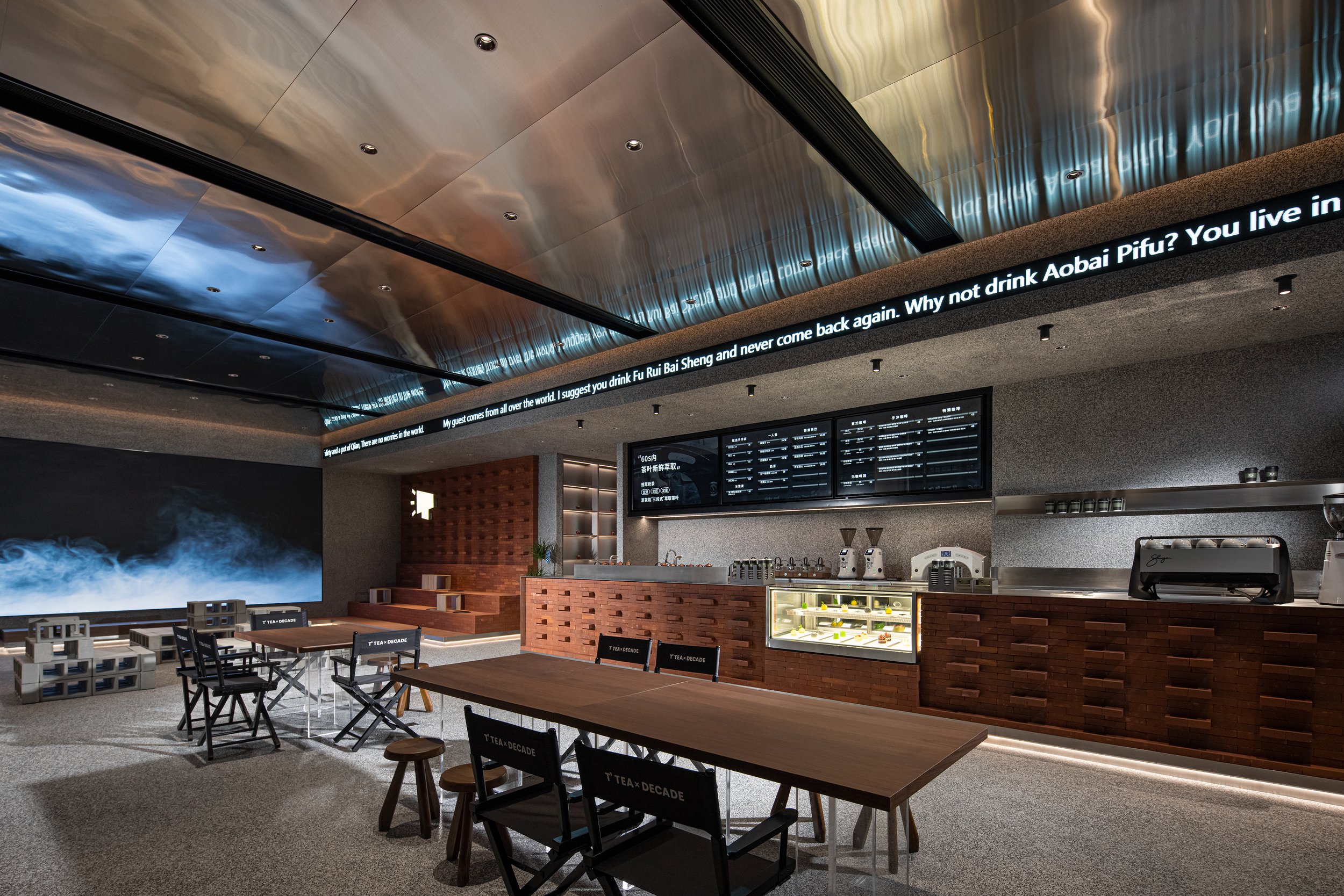


Touch Tea is more than just a teahouse; it's a vibrant social space that fosters simple connection and engagement. Its open, cubist-inspired layout breaks down barriers, creating a flexible space where people can meet, share, and engage in conversations. The design's contemporary yet thoughtful approach makes it an ideal setting for the evolving needs of the young generation—whether for socializing, contemplation or simply enjoying tea.
Touch Tea's identity is centred around the TOCOO Doku IP image, symbolizing youth and individuality. This emblem represents modern aesthetics and the brand's innovative spirit. The space itself is an artistic statement, blending avant-garde design with vitality and connecting art, architecture, and culture, but it also is a testament to the evolving relationship between architectural form and urban living. It brings together new materials, technologies, and design philosophies to reflect the needs of a generation that values tradition and forward-thinking innovation. Through its seamless fusion of architectural elements, Touch Tea creates a space that captures today's youth's anti-structure, anti-boredom, and anti-static mindset, offering a thoughtful escape amid the city's constant activity.
For more information, please visit: http://www.tj-touch.com
*This project is one of the shortlisted project in the Sky Design Awards 2024 - Interior Design: Restaurant & Clubs Division
Sushi Kamosu: A Harmonious Ode to Tradition and Innovation in Interior Design
Nestled discreetly within a sleek commercial building in Hong Kong's bustling Central district, Sushi Kamosu offers more than just a dining experience; it provides a serene escape where traditional Japanese aesthetics are seamlessly intertwined with contemporary design. Crafted by the visionary team at Him's Interior Design, this Edomae sushi restaurant presents a refined space that speaks to the heart of Japanese cultural heritage while embracing modernity with a touch of elegance that only 'in Him's" Interior Design can deliver.
Nestled discreetly within a sleek commercial building in Hong Kong's bustling Central district, Sushi Kamosu offers more than just a dining experience; it provides a serene escape where traditional Japanese aesthetics are seamlessly intertwined with contemporary design. Crafted by the visionary team at “in Him's” Interior Design, this Edomae sushi restaurant presents a refined space that speaks to the heart of Japanese cultural heritage while embracing modernity with a touch of elegance.
As guests step into Sushi Kamosu, they are immediately greeted by an ambiance that evokes the tranquillity of a traditional Japanese home. The interior design, a masterpiece "in Him's" Interior Design, emphasizes simplicity and serenity. The gentle glide of shoji screens, made from delicate washi paper, diffuses soft, natural light across the space, creating an ethereal glow that instantly transports guests from the vibrant streets of Central to a peaceful sanctuary.
The design palette has been meticulously chosen, with natural wood tones and muted earth colours dominating the space. These elements establish a deep connection to nature, a core principle in Japanese design. The tactile qualities of the materials—smooth, polished wood juxtaposed with the subtle textures of stone—encourage guests to engage with the environment through their senses, thus enhancing the overall dining experience. The use of natural materials and the emphasis on tactile qualities not only create a serene and inviting atmosphere but also contribute to the appreciation of the culinary artistry of Edomae sushi.
The design of Sushi Kamosu revolves around the sushi counter, a unique feature that serves as the focal point reflecting the restaurant's philosophy. Carved from a single hinoki wood slab, the counter embodies purity and precision, mirroring the craftsmanship of sushi-making. Its unique design and the use of hinoki wood, known for its antibacterial properties and pleasant aroma, make it a standout feature. "in Him's" Interior Design's minimalist approach ensures that the counter serves as the heart of the space, providing a stage for the culinary artistry of Edomae sushi to shine. The surrounding space is deliberately kept uncluttered to emphasize simplicity, quality, and elegance.
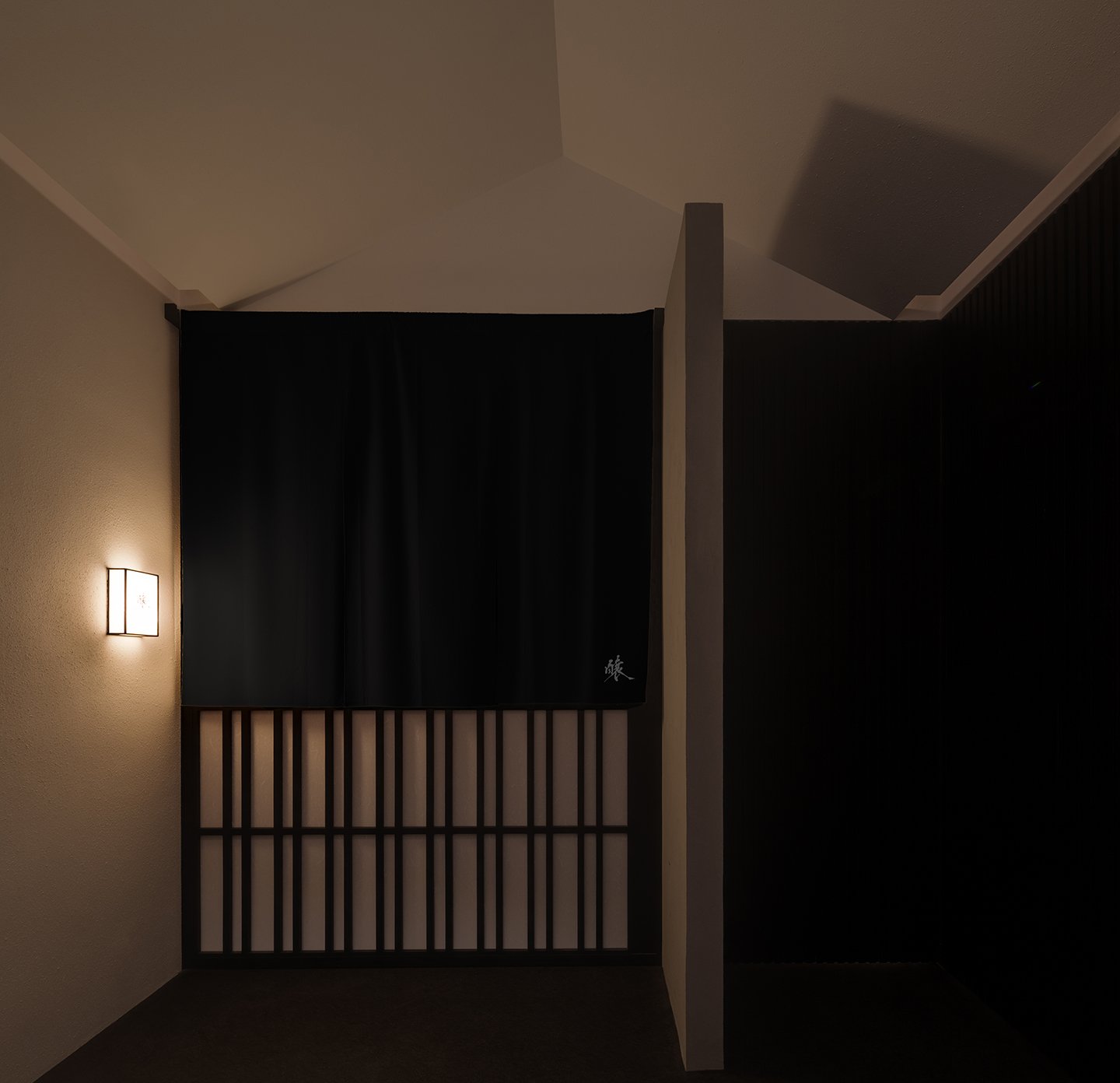

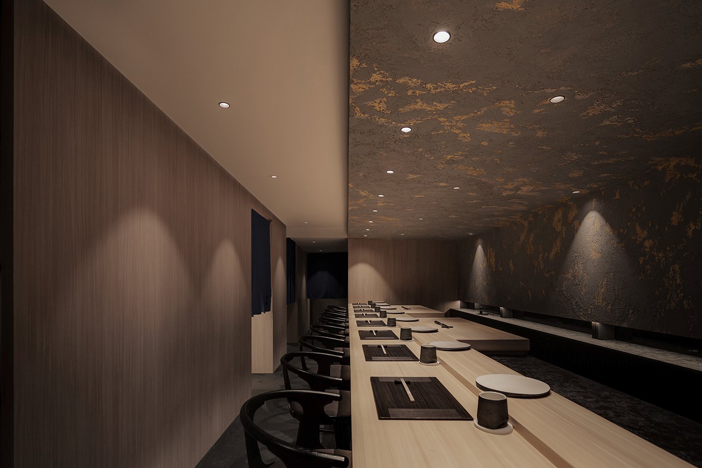
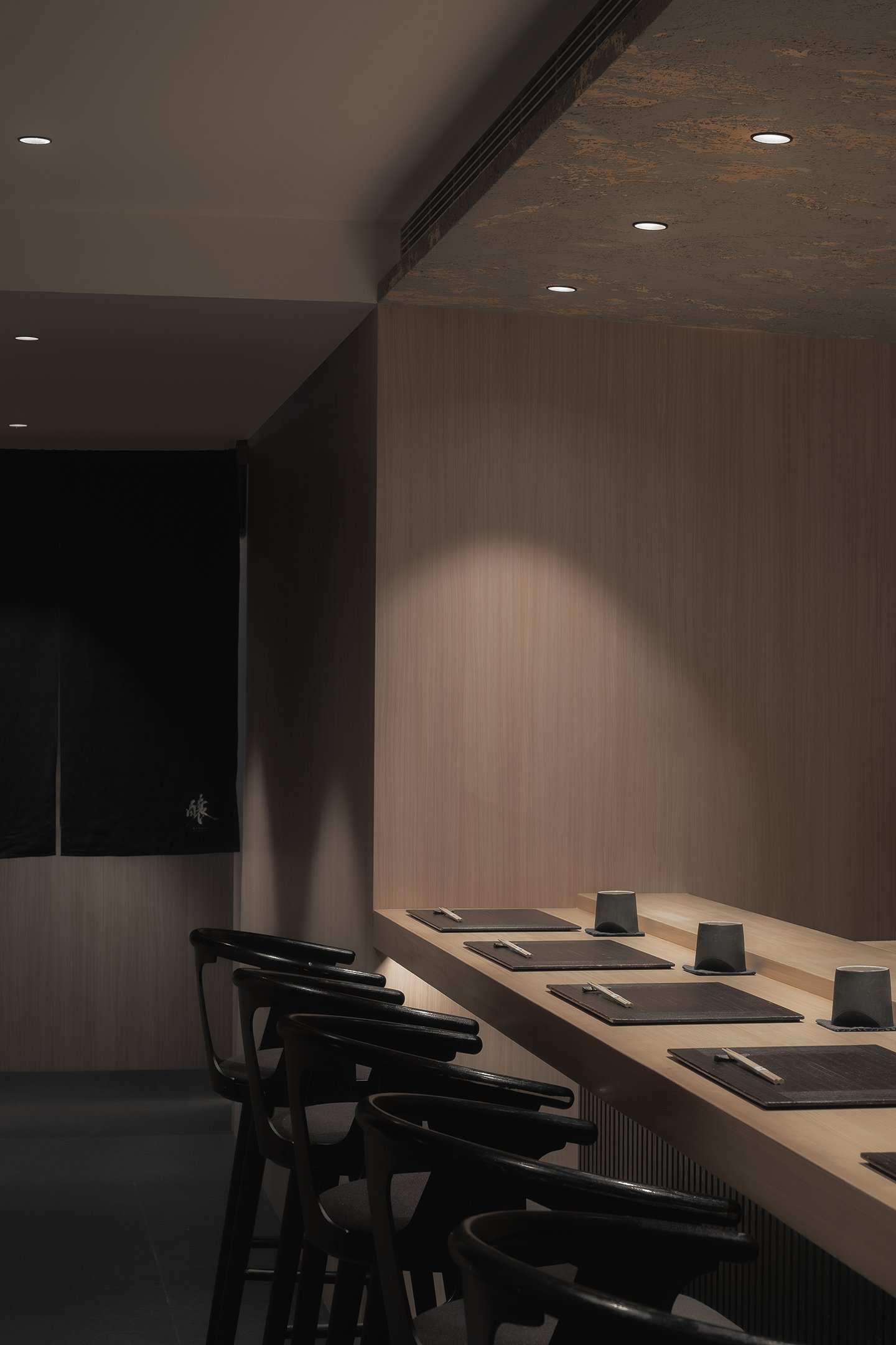
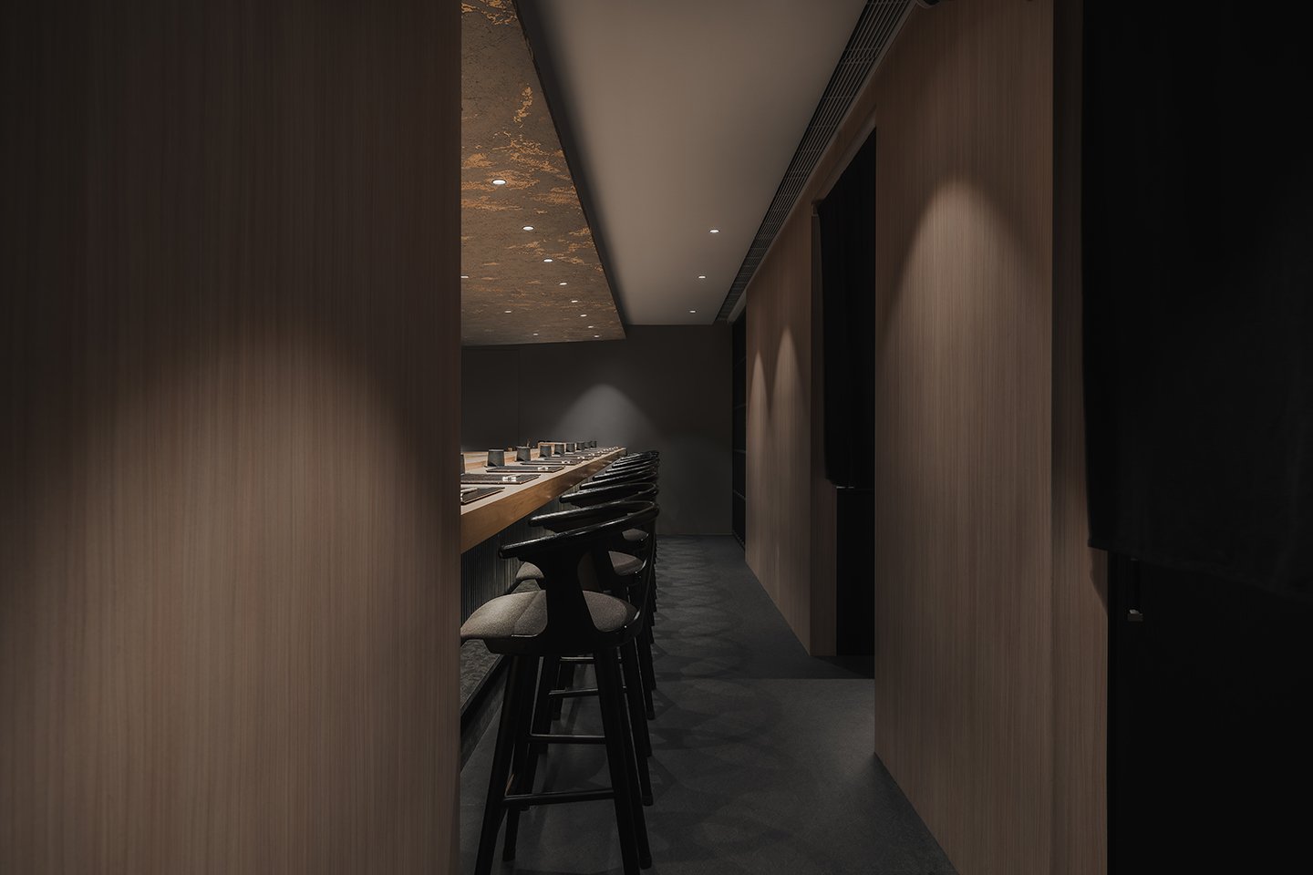
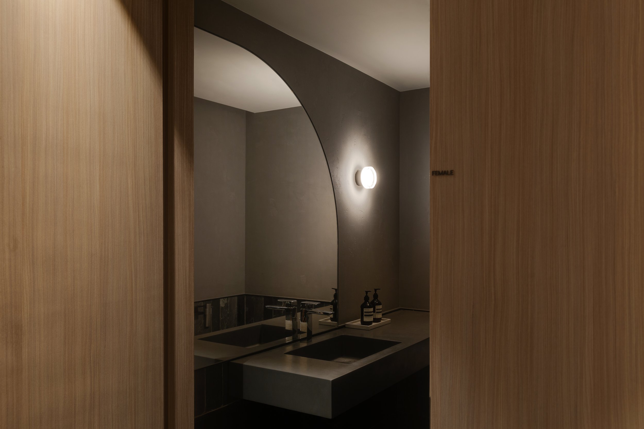

The interior of Sushi Kamosu is a sophisticated blend of tradition and innovation. It reinterprets the enduring principles of Japanese design through a modern lens, creating a harmonious balance of timeless and contemporary elements. Clean lines, open spaces, and the thoughtful use of natural materials all contribute to this unique blend, inviting guests to explore and appreciate the fusion of past and present.
In an era of rapid urbanization, where cultural identity can easily be lost, Sushi Kamosu is a testament to how tradition and innovation coexist beautifully within interior design. The work of "in Him's" Interior Design demonstrates that a space rooted in history and fully engaged with the present can be created by honouring the essence of traditional Japanese aesthetics while embracing modern design elements. Here, every design decision—from the play of light and shadow to the selection of materials—contributes to an atmosphere of quiet luxury, making Sushi Kamosu a true embodiment of the harmonious blend of past and present in the heart of Hong Kong.
For more information, please visit: https://www.inhims.com
*This project is one of the shortlisted project in the Sky Design Awards 2024 - Interior Design - Retail & Club Division
Curved Serenity: Jingle Design’s Immersive Art Installation Transforms Space into an Emotional Landscape
This imaginative project, created by Jingle Design, envisions space as a platform for design-focused academic discussions. It breaks away from traditional norms to establish a serene art installation that ignites contemplation and emotional connections. The design explores the profound link between awareness, personal emotions, and spatial dynamics. It seeks to build an environment that captivates the senses and nurtures the spirit.
This imaginative project, crafted by Jingle Design, reimagines space as a canvas for design-oriented academic discourse. It breaks free from conventional norms to birth a tranquil art installation that sparks contemplation and emotional resonance. The design delves into the profound connection between consciousness, personal emotions, and spatial dynamics. It aims to construct an environment that captivates the senses and nurtures the spirit.
The core concept behind this design is the use of curved forms as the visual centrepiece. These curves, presented in a light and airy colour scheme, infuse the space with a sense of purity and tranquillity. The soft elements in the design harmonize to strike a delicate balance, blending tension with flexibility. This interplay of opposites invites visitors to connect with the space on a deeper emotional level, where form and feeling intertwine.
The project aims to foster human interaction by creating a social gathering space within this serene art installation. The open layout encourages fluid movement and organic connections between people, while the spatial relationships within the design echo and reinforce each other. The original pillars at the front are gracefully enveloped, and the interior walls are finished with textured paint that invites touch, adding a tactile dimension to the visual experience. On the right side, curves enclose and define the space, allowing the internal atmosphere to extend outward and engage those who approach.
The furniture design plays a central role in enhancing the overall feel of the space. The chair's sow lines seamlessly blend into the surrounding area, and they are made from soft leather that contrasts the chair's sturdy structure. The chair's sturdy curves create a striking yet harmonious contrast to the strong materials used, fostering an open and inclusive environment where different curves come together to form a dynamic yet unified setting.
The installation's standout feature is its lighting design, which incorporates over 5,000 independent, transparent, luminous spheres, each with a diameter of 150mm. These spheres are meticulously connected in linear arrangements, forming an illuminated surface that changes with intelligent lighting. Serving as both an artistic installation and a functional light source for dining tables, this innovative lighting solution enhances the overall ambiance of the space. Mirrors strategically placed on the walls further extend the interior's sense of depth, intensifying the visual impact and drawing the eye into an expanded field of perception.


The lowered ceiling design creates an intimate atmosphere by reducing the perceived height from the floor. White tablecloths are accentuated by concealed light strips, becoming luminous elements that cast a gentle glow throughout the space. This thoughtful use of light transforms the environment into one that is transparent, serene, and ever-evolving as the light interacts with the various surfaces and textures within the space.
"The project by Jingle Design is a captivating exploration of how design can go beyond functionality, turning physical space into a vibrant work of art that resonates with the soul. The thoughtful integration of form, texture, light, and emotion creates an immersive experience that encourages reflection, connection, and a deeper understanding of the connection between space and the human experience."
Project Information
Project Name | MoLi
Project Address | Shenyang
Project Area | 400 sq. m
Completion Date | May 20, 2022
Design Firm | Jingle Design
Design Director | Zhou Bo, Cai Yuyang
Lead Designer | Ma Di
Design Team | Cao Na,Luo Yuntong,Xie Yilong,Liu Bo
Photography | TOPIA Vision
Main Materials | Texture paint, metal, wood finish, glass art lighting
For more information, please visit: http://www.jingledesign.com/
*This project is one of the shortlisted project in the Sky Design Awards 2024 - Interior Design -Restaurant and Club Division
A Vision for the Future - "Morinomachi Grace" in Okayama City designed by RENS, NOMURA Co.,Ltd
Designed by RENS, NOMURA Co.,Ltd from Japan. At the heart of this ambitious complex lies "Morinomachi Plaza," home to the "WONSETO FOODHALL." This vibrant culinary hub aims to invigorate regional development by celebrating local cuisine crafted from the unique ingredients native to Okayama and the Seto Inland Sea. Known for its mild climate and fertile soil, this area boasts a rich food culture that WONSETO FOODHALL proudly showcases. The food hall is a dining space and a cultural haven where visitors can immerse themselves in the region's gastronomic delights.
Located in the heart of Okayama City in Japan, "Morinomachi Grace" is a forward-thinking commercial facility that symbolizes innovation and community. It reflects the Seto Inland Sea region's rich heritage and natural beauty. It is poised to become a cornerstone of regional pride and a testament to sustainable urban development.
At the heart of this ambitious complex lies "Morinomachi Plaza," home to the "WONSETO FOODHALL." This vibrant culinary hub aims to invigorate regional development by celebrating local cuisine crafted from the unique ingredients native to Okayama and the Seto Inland Sea. Known for its mild climate and fertile soil, this area boasts a rich food culture that WONSETO FOODHALL proudly showcases. The food hall is a dining space and a cultural haven where visitors can immerse themselves in the region's gastronomic delights.
The design of this space, inspired by the Seto Inland Sea, is a unique and original creation. It seamlessly blends with the city's culture, offering a peaceful environment for the community to come together and enjoy the culinary delights of the Seto Inland Sea. This aims to promote a feeling of hope and connection through food, creating an intriguing and exciting experience for visitors.
The WONSETO FOODHALL is distinguished by its remarkable ceiling, designed to resemble the Seto Inland Sea's undulating waves, wind, and air currents. As natural light enters from the entrance, the expansive waves gradually transform into smaller ripples, leading visitors further into the space. This dynamic ceiling design represents the motion of waves and the passage of time and fosters a serene and unified atmosphere throughout the facility.
The architectural marvel includes a terraced "hill" that connects the first and second floors, resembling a natural topographical feature. This multipurpose space serves as bench seating and an event stage, providing a versatile area for relaxation and comfort. During events, it transforms into a lively stage and seating area, becoming a central hub for community activities celebrating Okayama's charms.


In a nod to local craftsmanship, "Okayama Denim," a specialty product from Ihara City, adorns the chairs and sofas. This choice highlights the region's textile industry and enhances the space with a distinctive regional touch, expanding the possibilities for local industries to thrive in new contexts.
The green zone, designed around a "diverse forest," contains approximately 1,000 trees and greenery, creating a landscape honouring Okayama's natural environment while incorporating new elements. The art lounge on the second floor, curated by Kohei Mawa, exhibits works by local artists and serves as a cultural hub. This space is envisioned to nurture Okayama's art and culture, encouraging new regional and artistic opportunities and linking them to the future.
"Morinomachi Grace" is more than a commercial facility; it represents a vision for the future. It embodies a harmonious blend of nature, culture, and community, creating a space where the past and future of Okayama coexist beautifully. This project is a proud testament to the city's commitment to sustainability, innovation, and cultural heritage, promising to be a cherished landmark for future generations.
"Morinomachi Grace" in Okayama City designed by RENS, NOMURA Co.,Ltd is one of the shortlisted projects from Sky Design Awards - Interior Design*
For more information, please visit:
Website: https://www.rens-design.jp/en/ or http://www.skydesignawards.com


