GOOD CYCLE BUILDING 001 Asanuma Corporation Nagoya Branch Office Renovation by Nori Architects and Asanuma Corporation
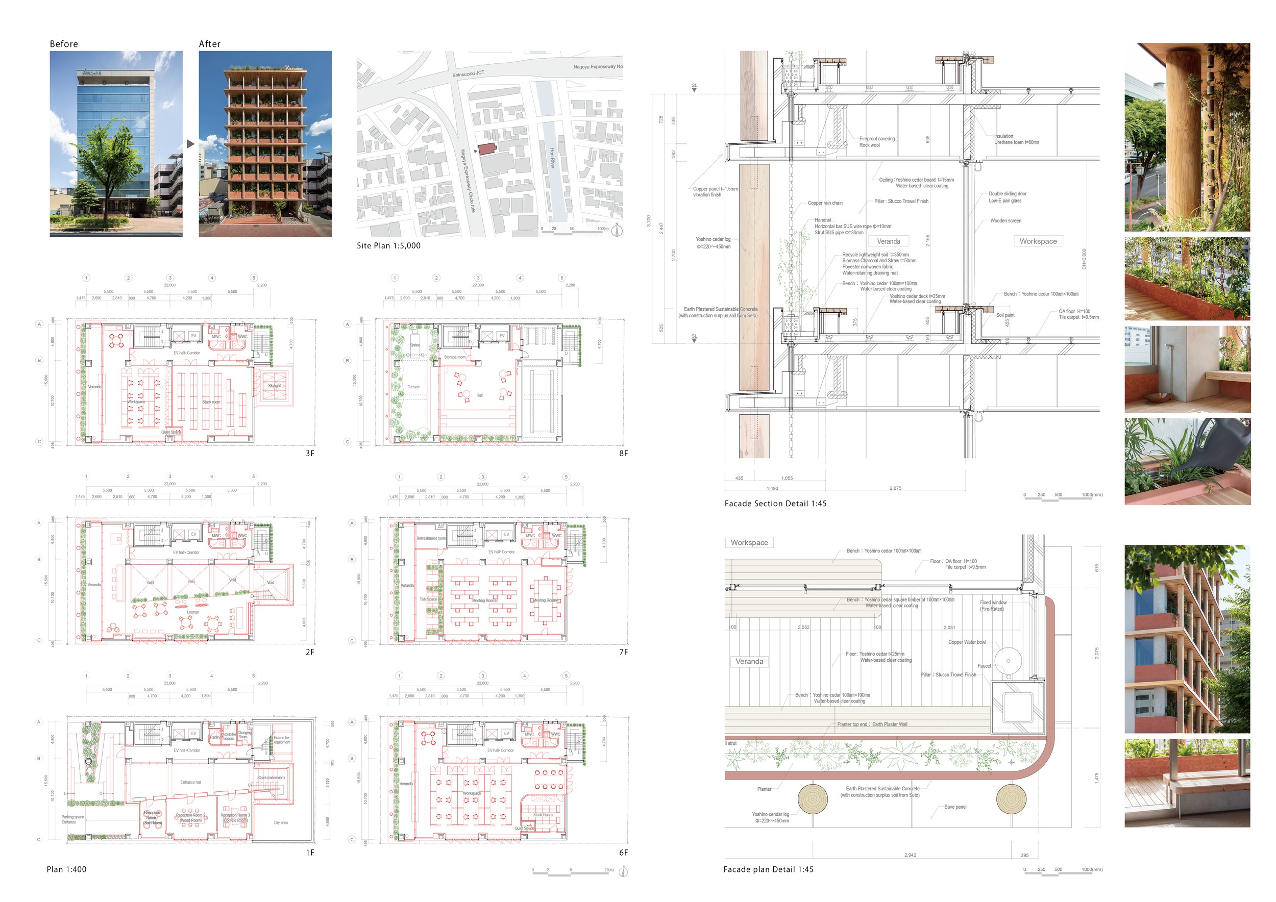
The Asanuma Corporation is promoting its first flagship project, the GOOD CYCLE BUILDING, a project to renovate a 30-year-old building into an environmentally friendly building. The existing building frame was utilized and modified to increase accessibility to natural light and wind, and new materials were added as much as possible using natural materials such as earth and wood, enabling the building users to participate in the construction and maintenance process.
The Asanuma Corporation is promoting its first flagship project, the GOOD CYCLE BUILDING, a project to renovate a 30-year-old building into an environmentally friendly building. The existing building frame was utilized and modified to increase accessibility to natural light and wind, and new materials were added as much as possible using natural materials such as earth and wood, enabling the building users to participate in the construction and maintenance process.
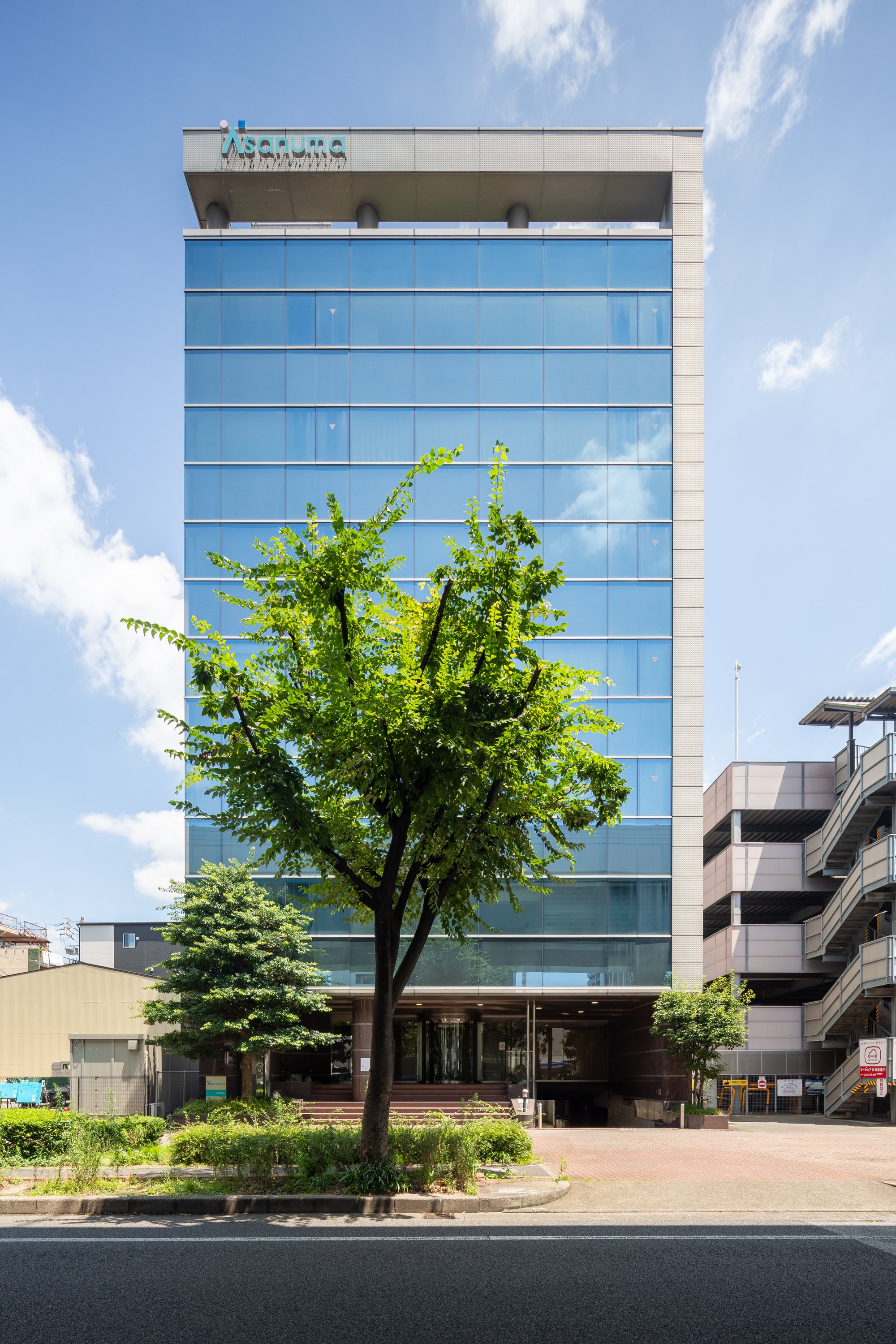
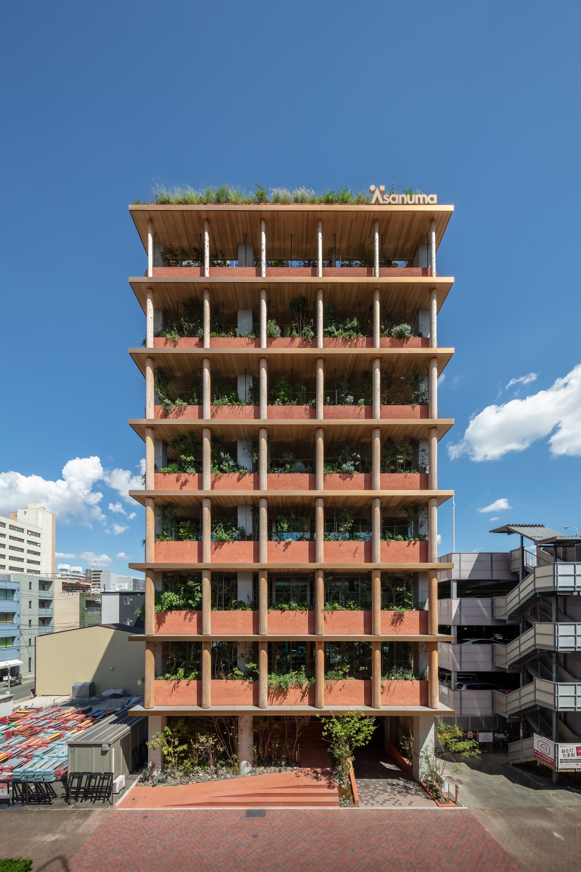
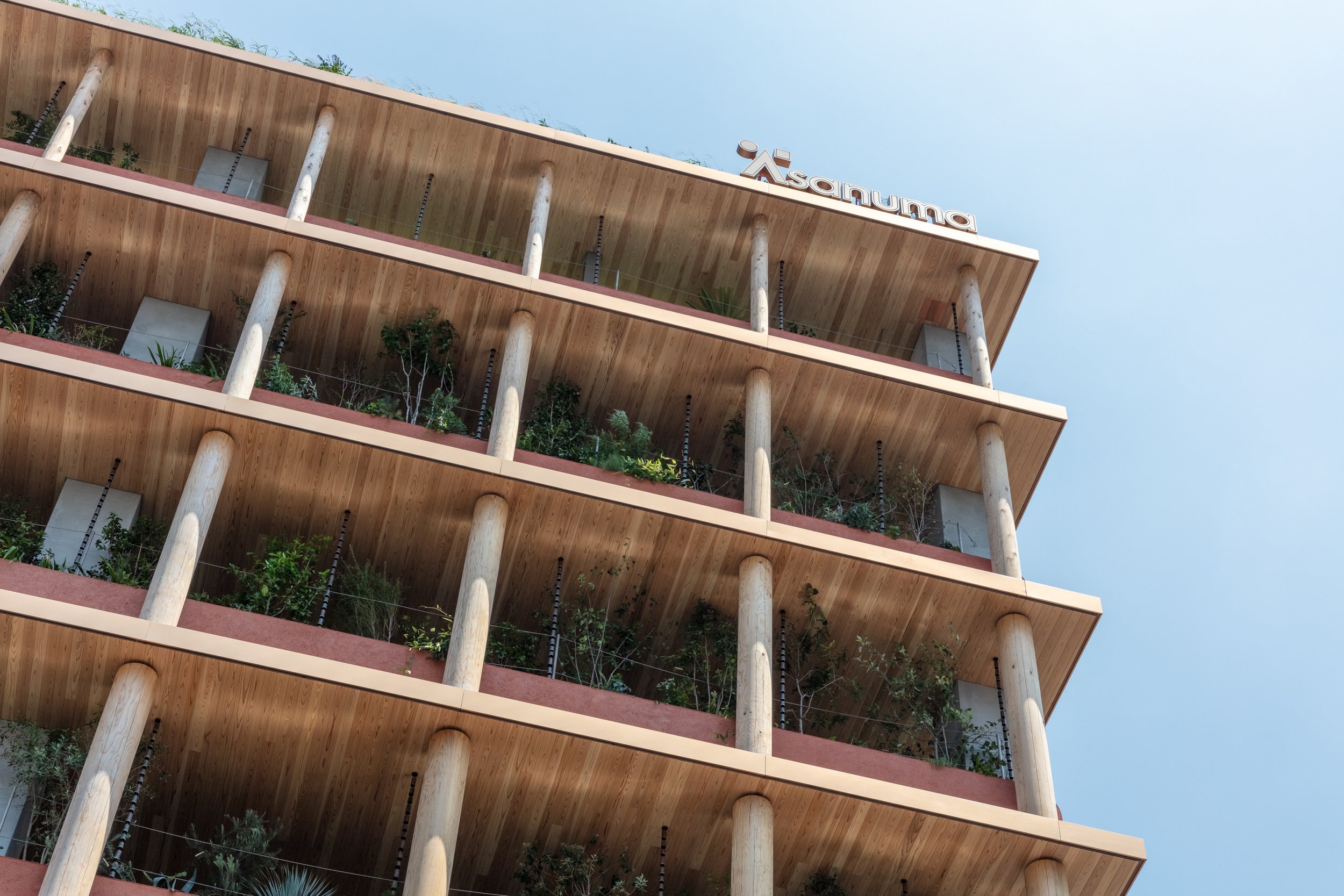
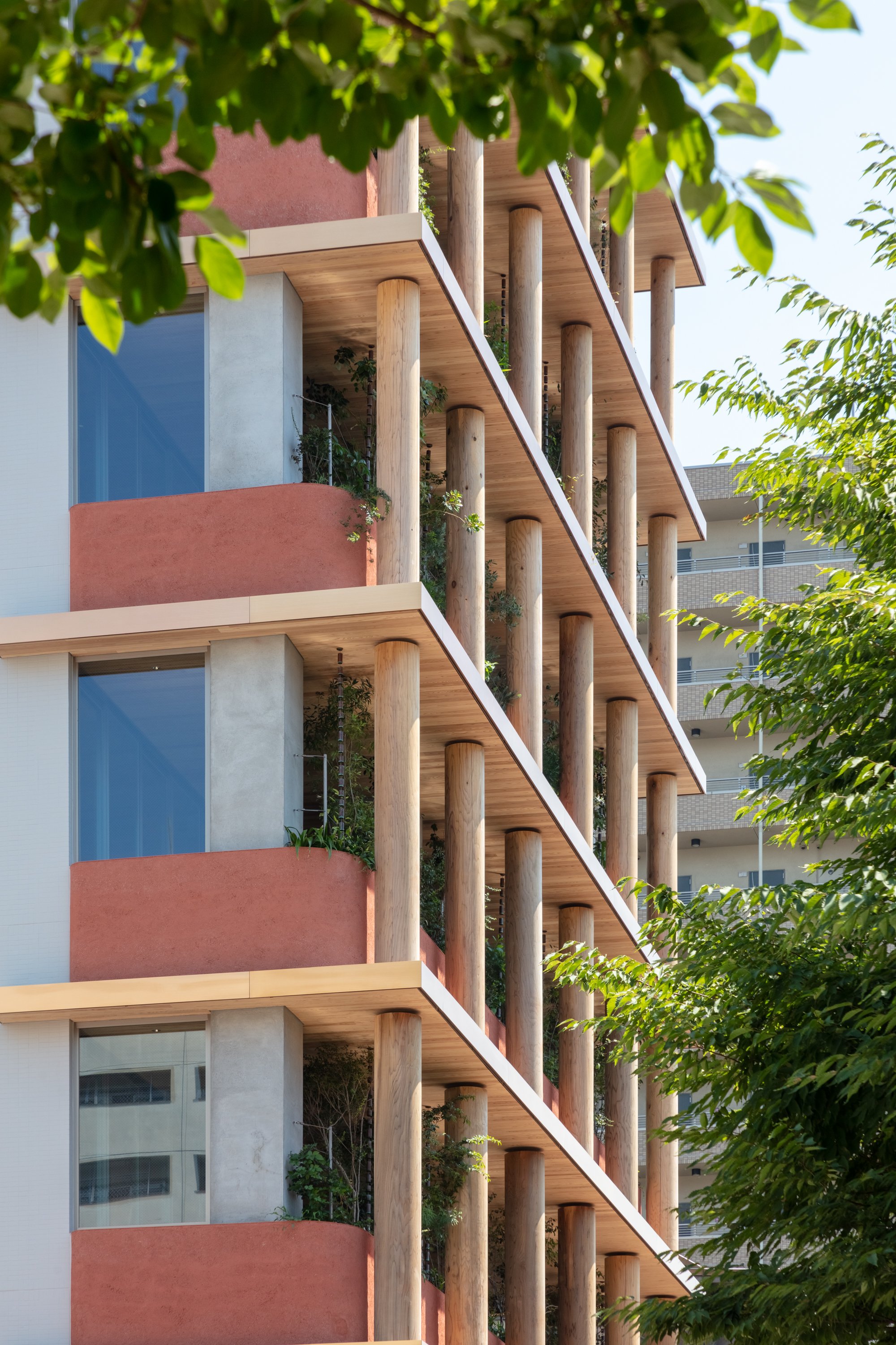
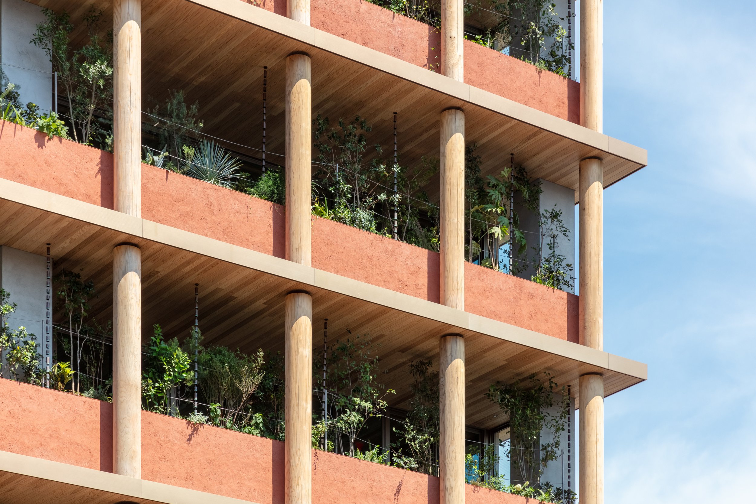
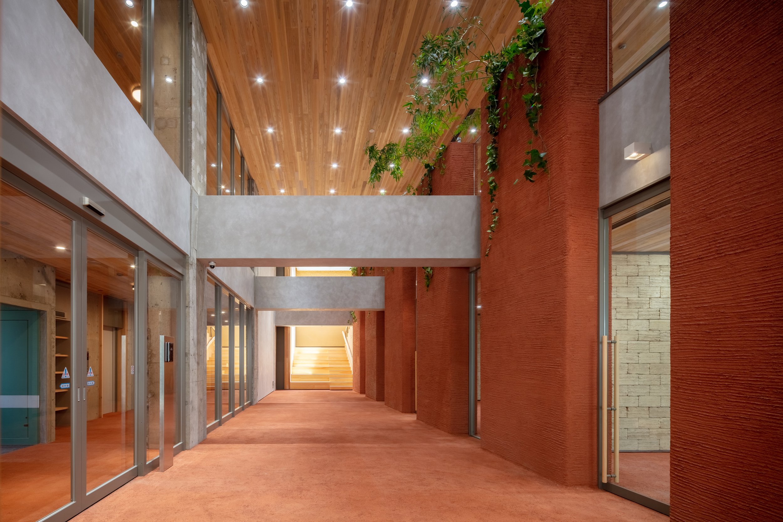
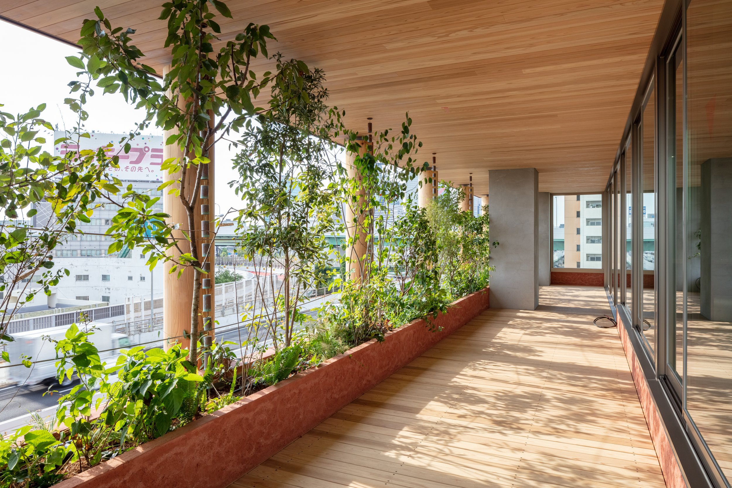
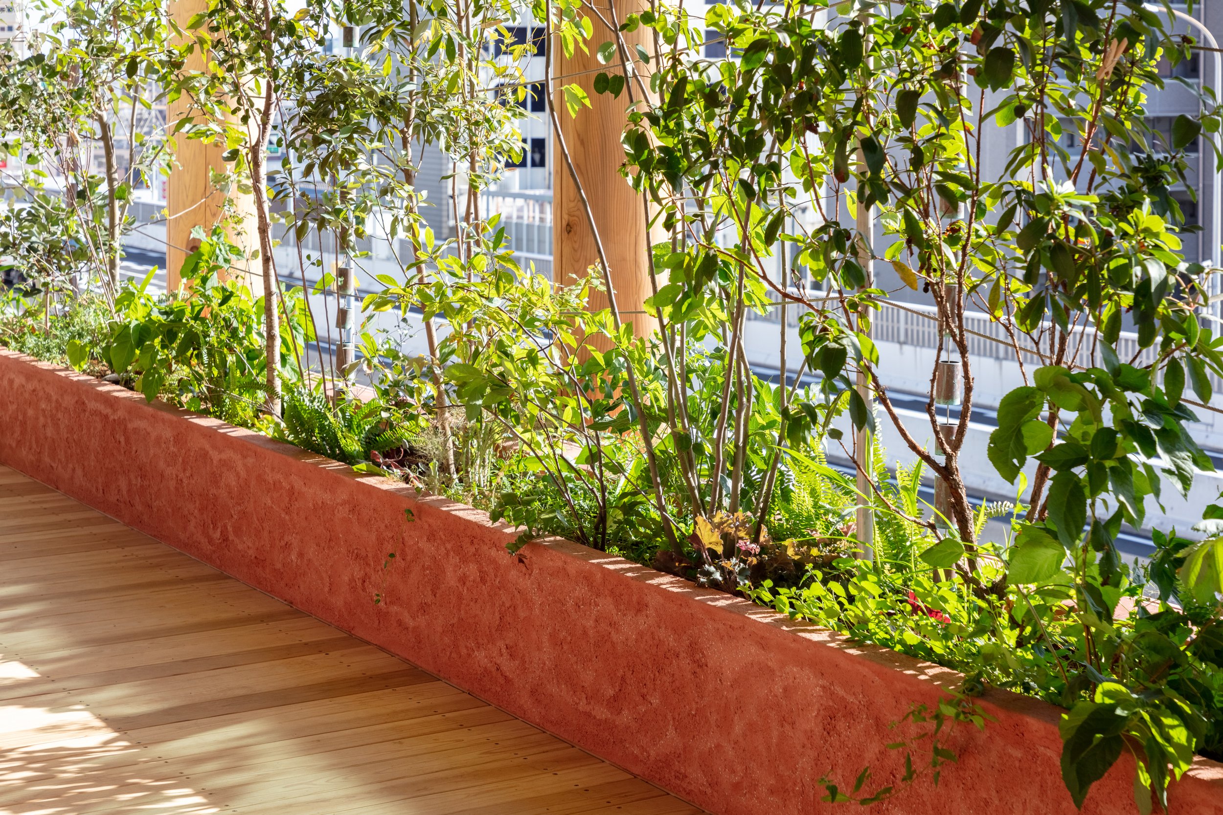
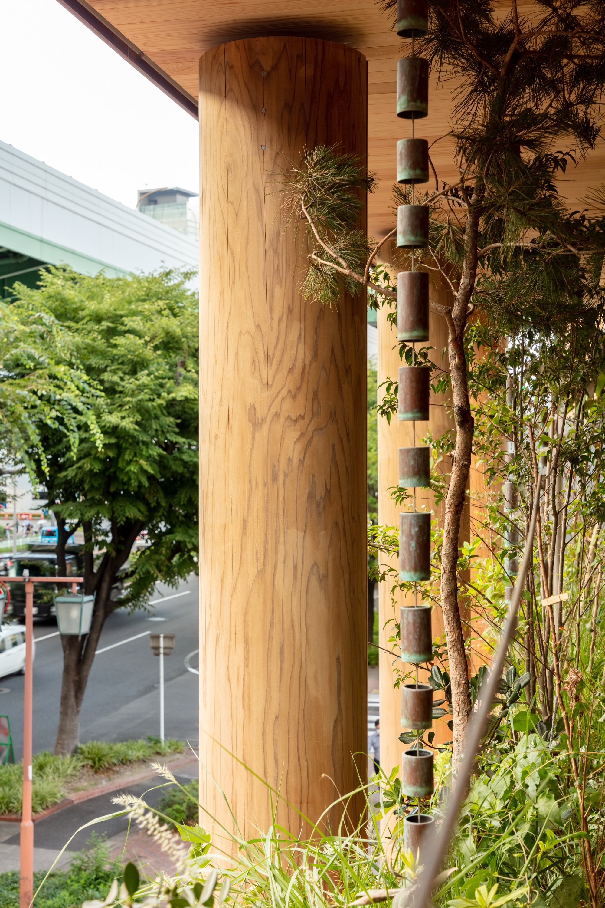
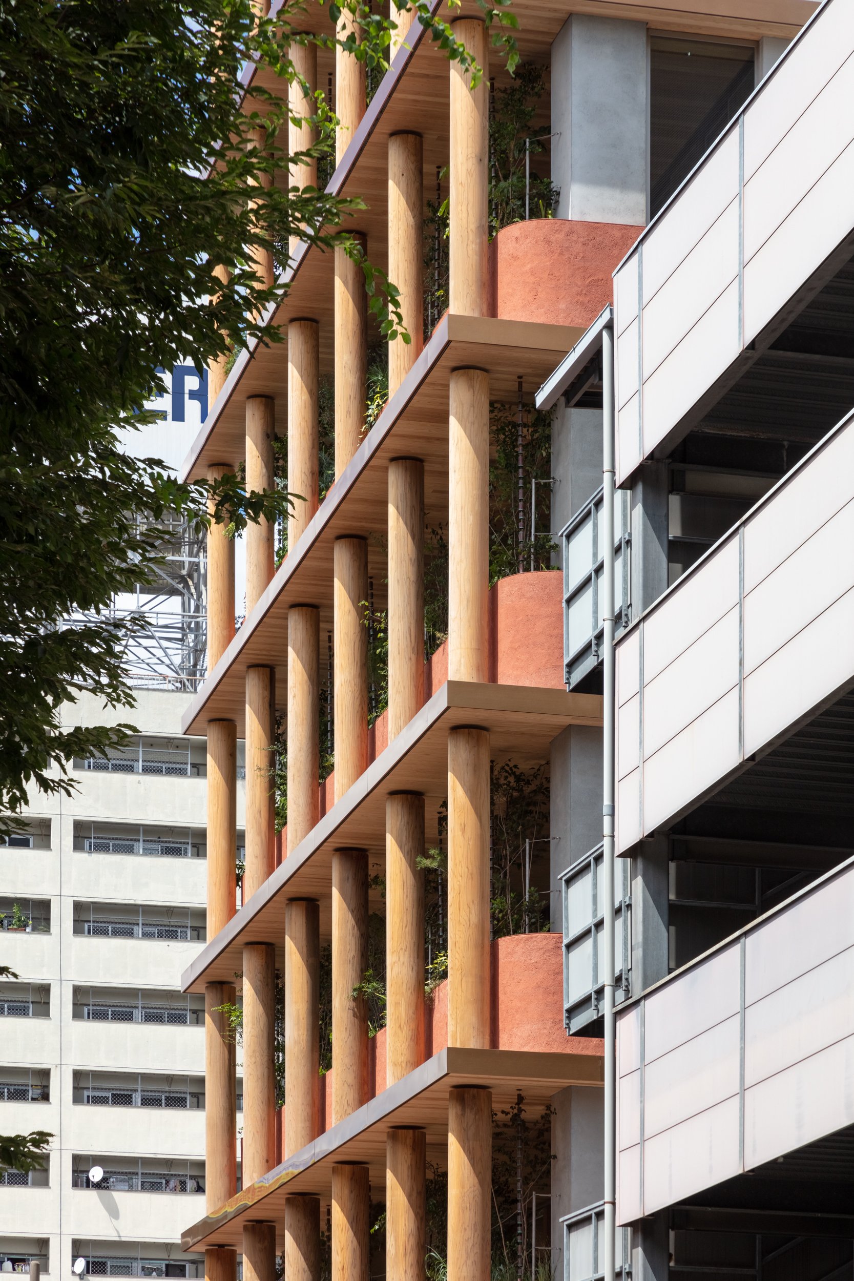
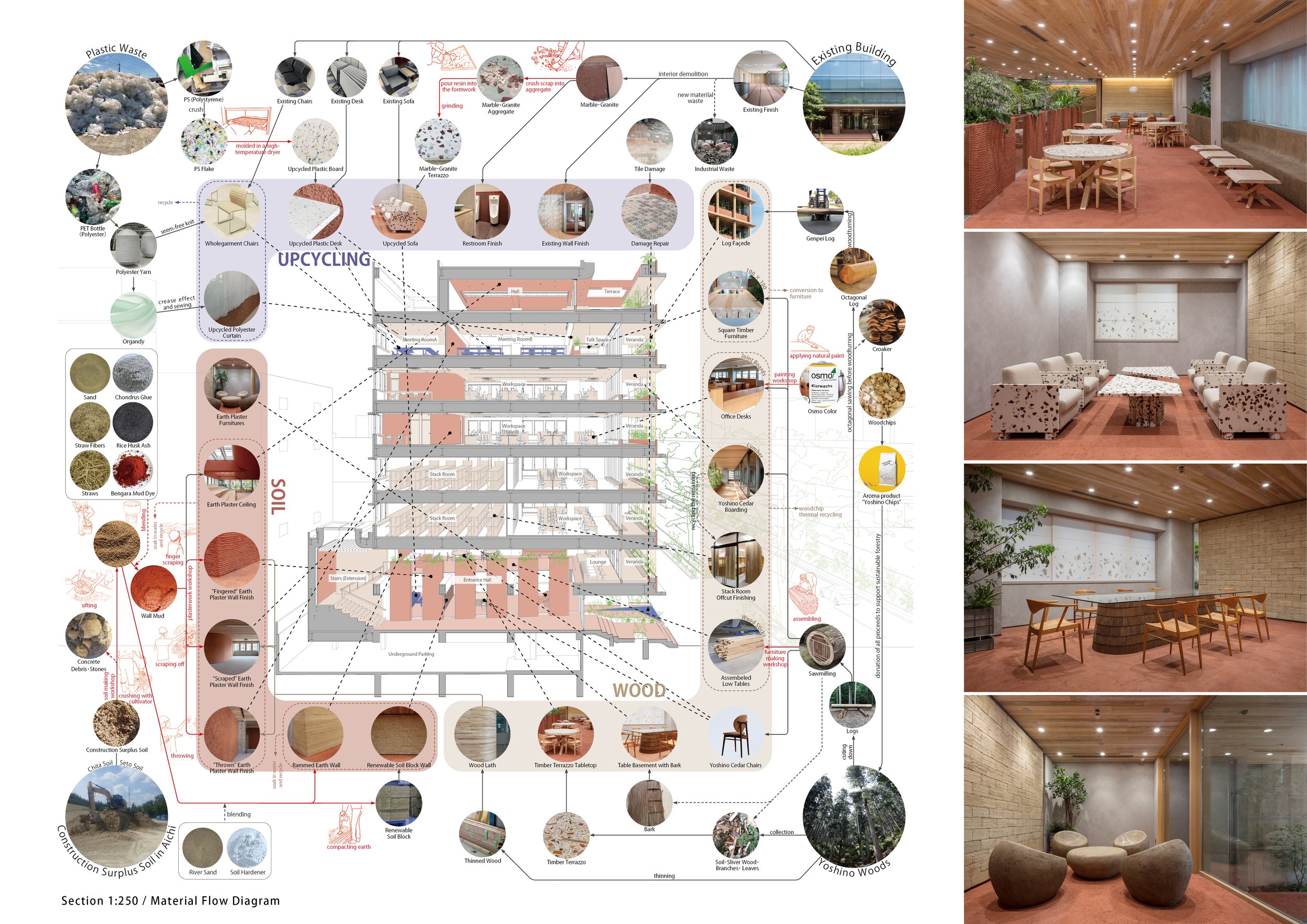
Inside and outside the building, soil materials were used for floors, walls, ceilings, and furniture. Raw materials were obtained from leftover soil in Aichi Prefecture. As long as amateurs participate in the finishing process, such as making marks with their fingers or throwing soil, the wall will be expressed "naturally" through human movement. Aside from the fact that earthen walls are not impure (petroleum-derived materials and cement are sometimes added to improve durability), they can also be applied for painting in the future and eventually returned to nature. In addition to the interior and exterior of the building as well as for furniture, fittings, and products, Japanese cedar from the Yoshino forest in Nara, which Asanuma Corporation manages sustainably, wharvested.ed. To minimize the amount of scrap wood generated, the front façade is built from Yoshino cedar logs with the largest diameter from a single tree. Existing stones and other materials used in existing buildings were repurposed as interior surfaces. Others were crushed into small pieces and hardened with plaster to be used as furniture surfaces. Urban waste was also used as a resource. A surface material made of waste plastic flakes that have been crushed and hardened by heating has been used to cover existing furniture, and a knitted fabric made of recycled polyester yarn has been used to wrap existing furniture.
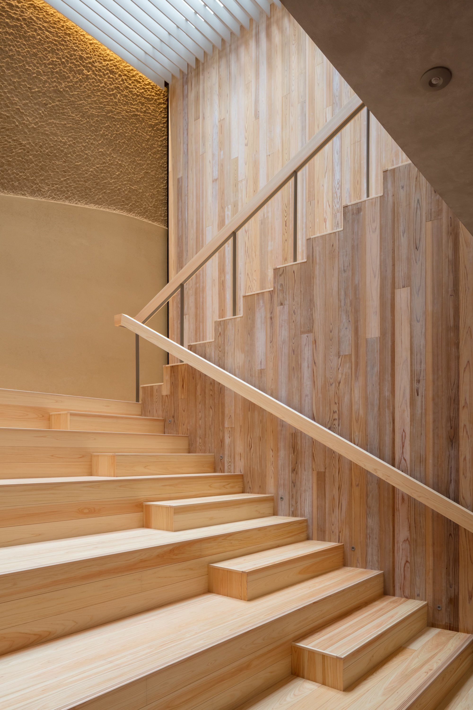
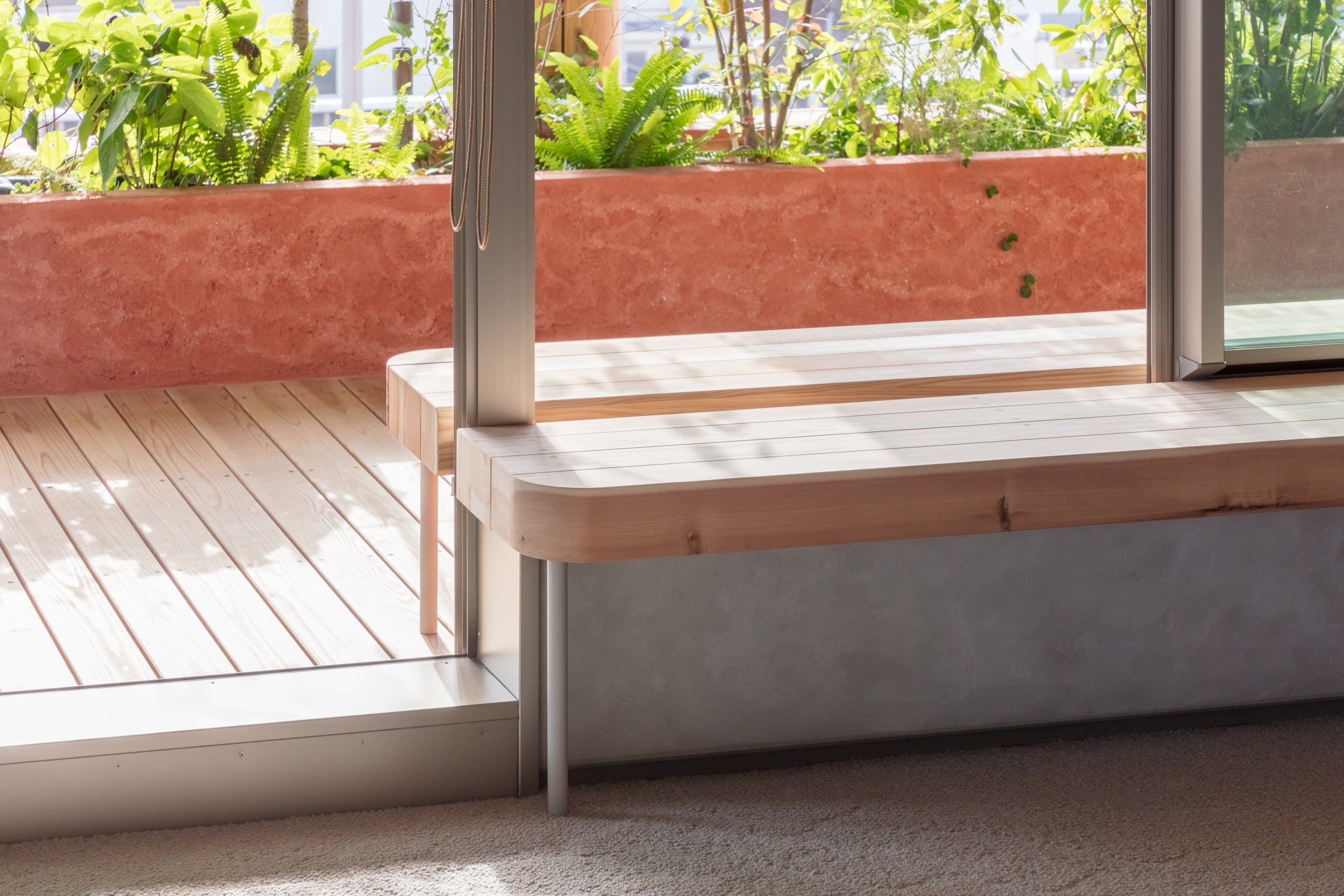
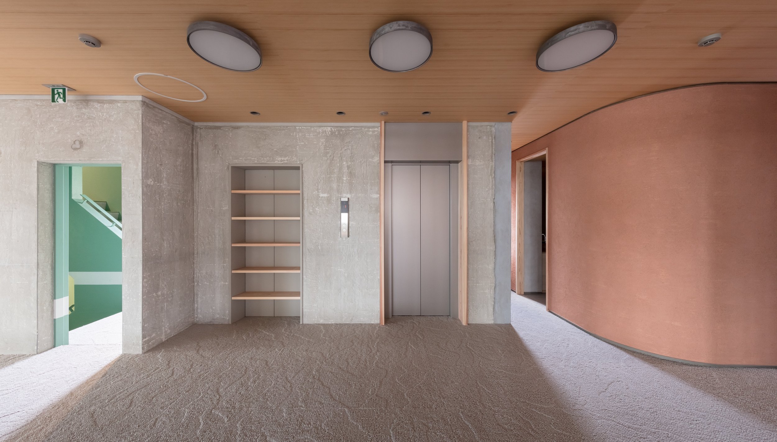
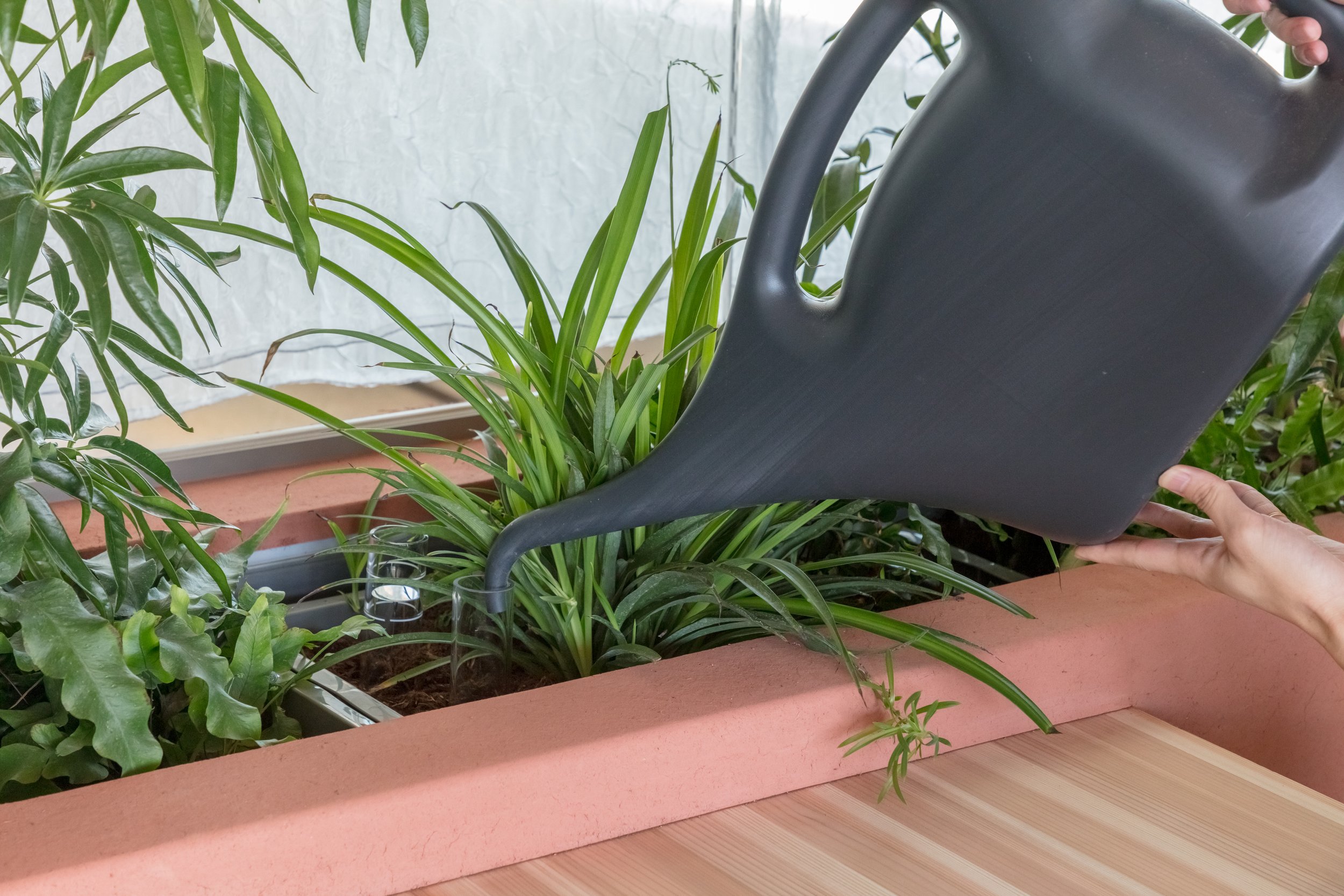
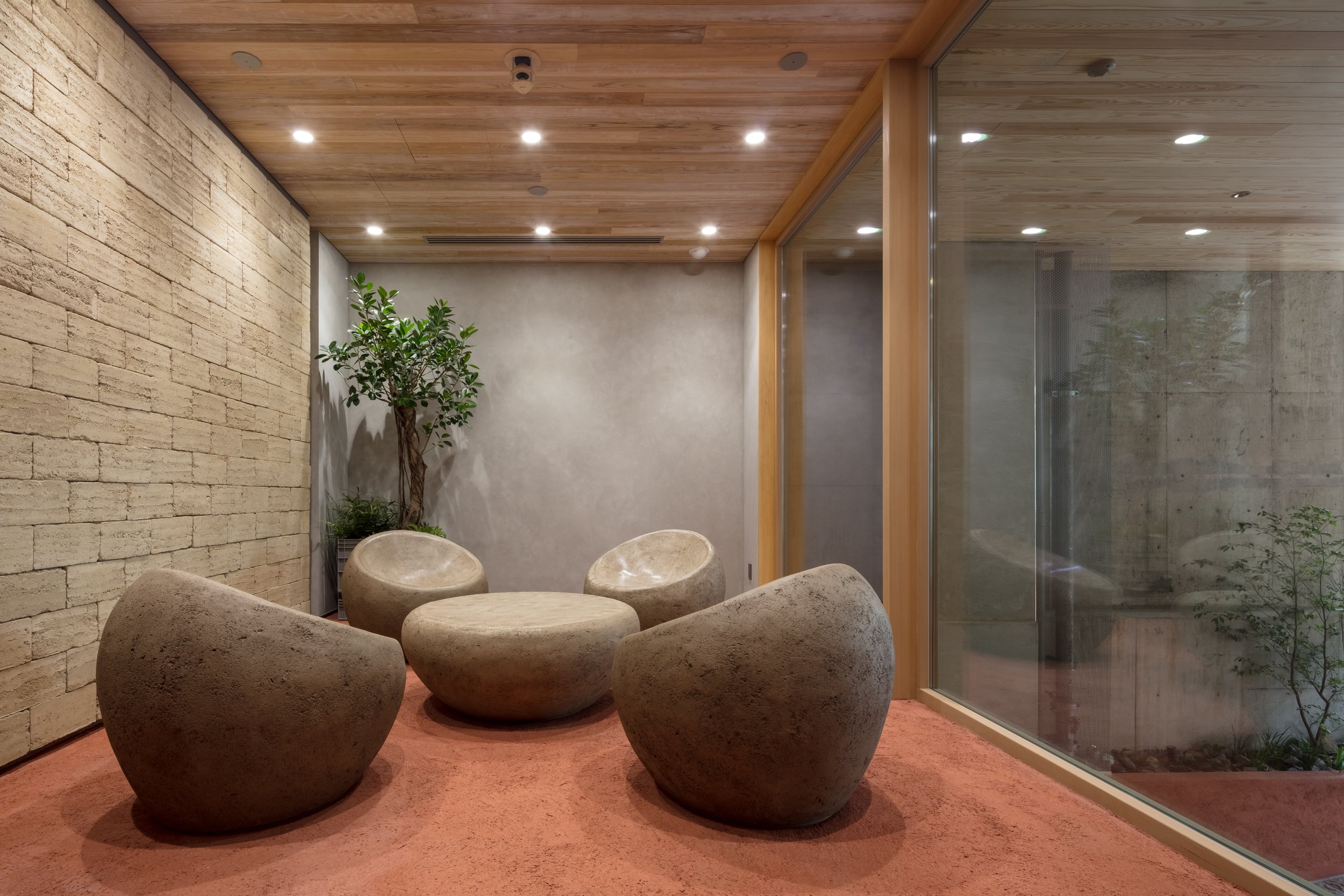
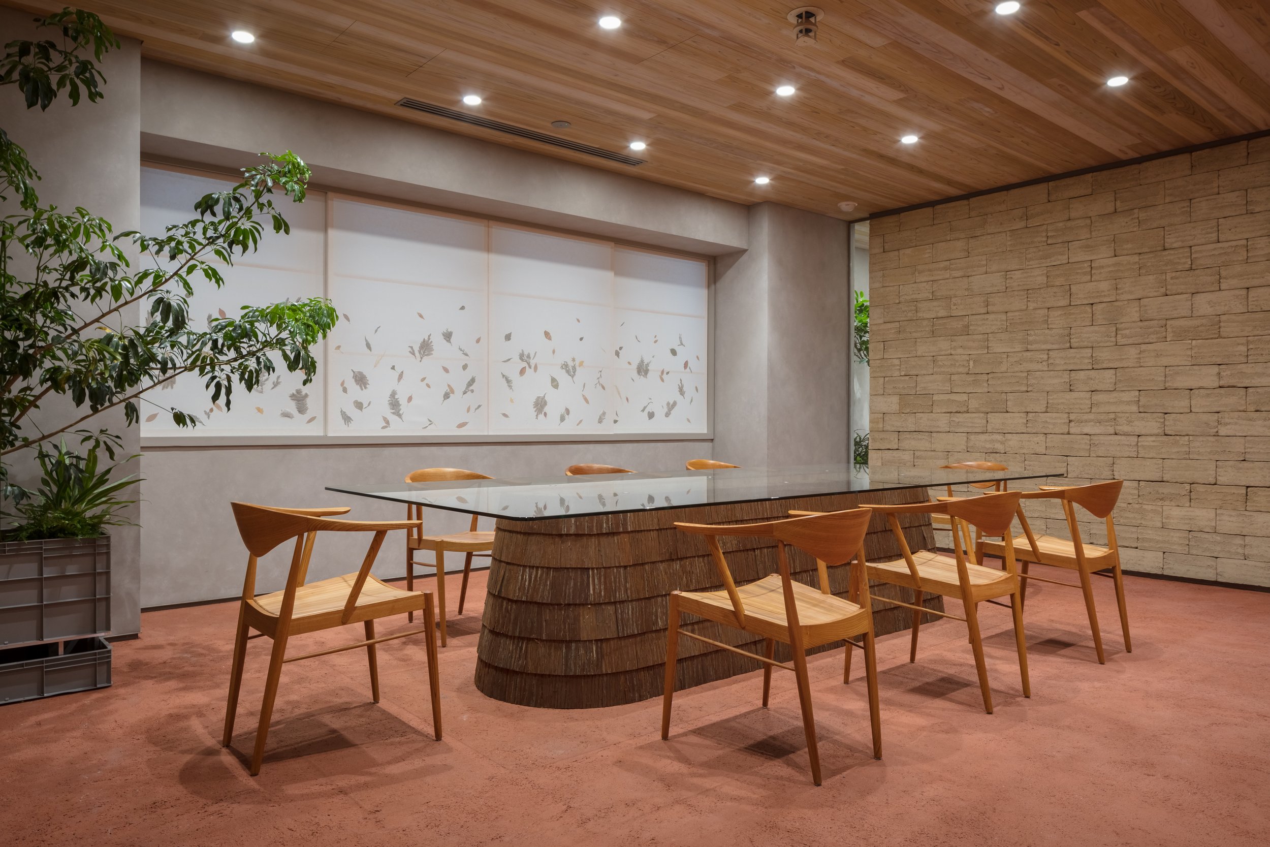
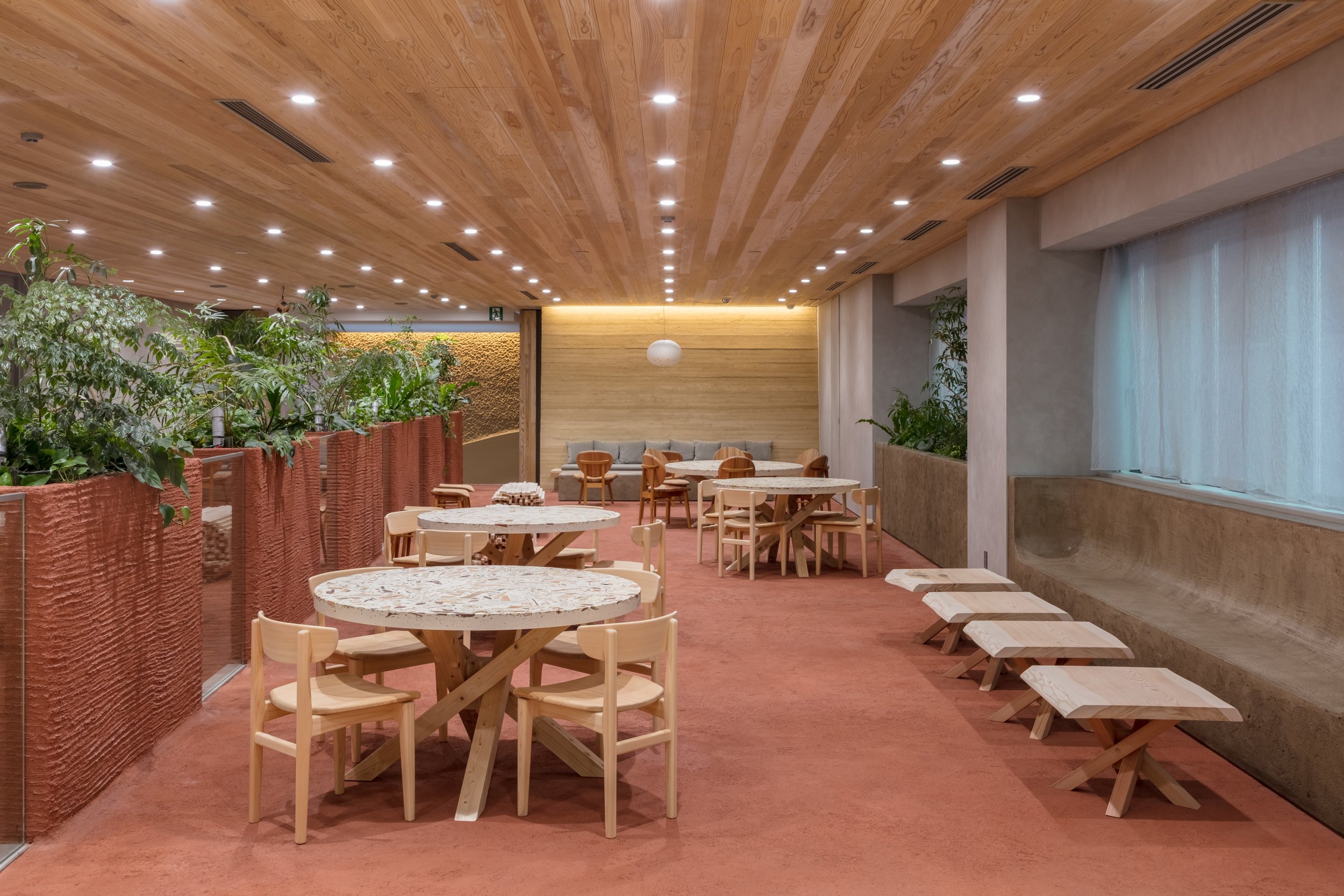
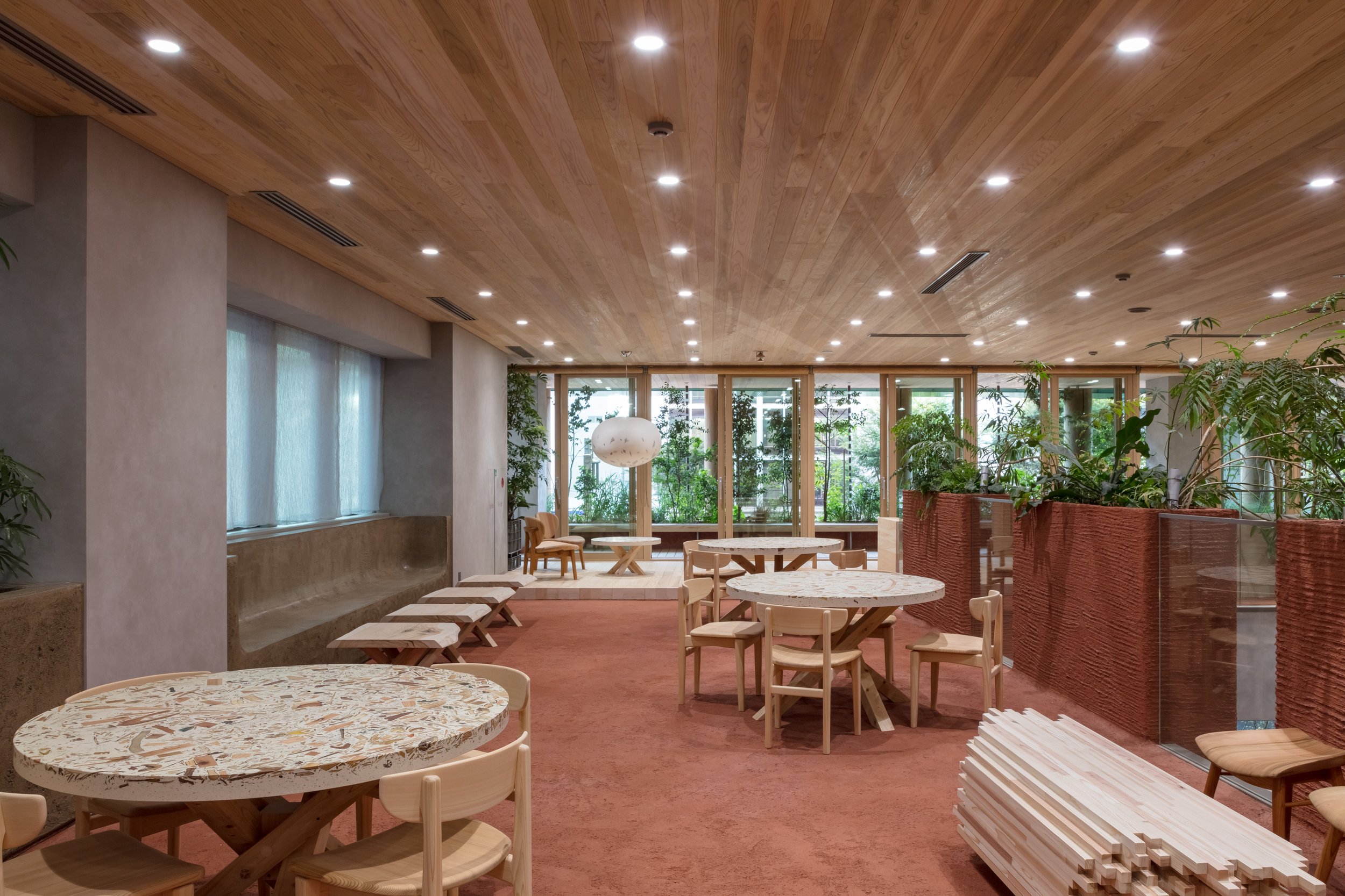
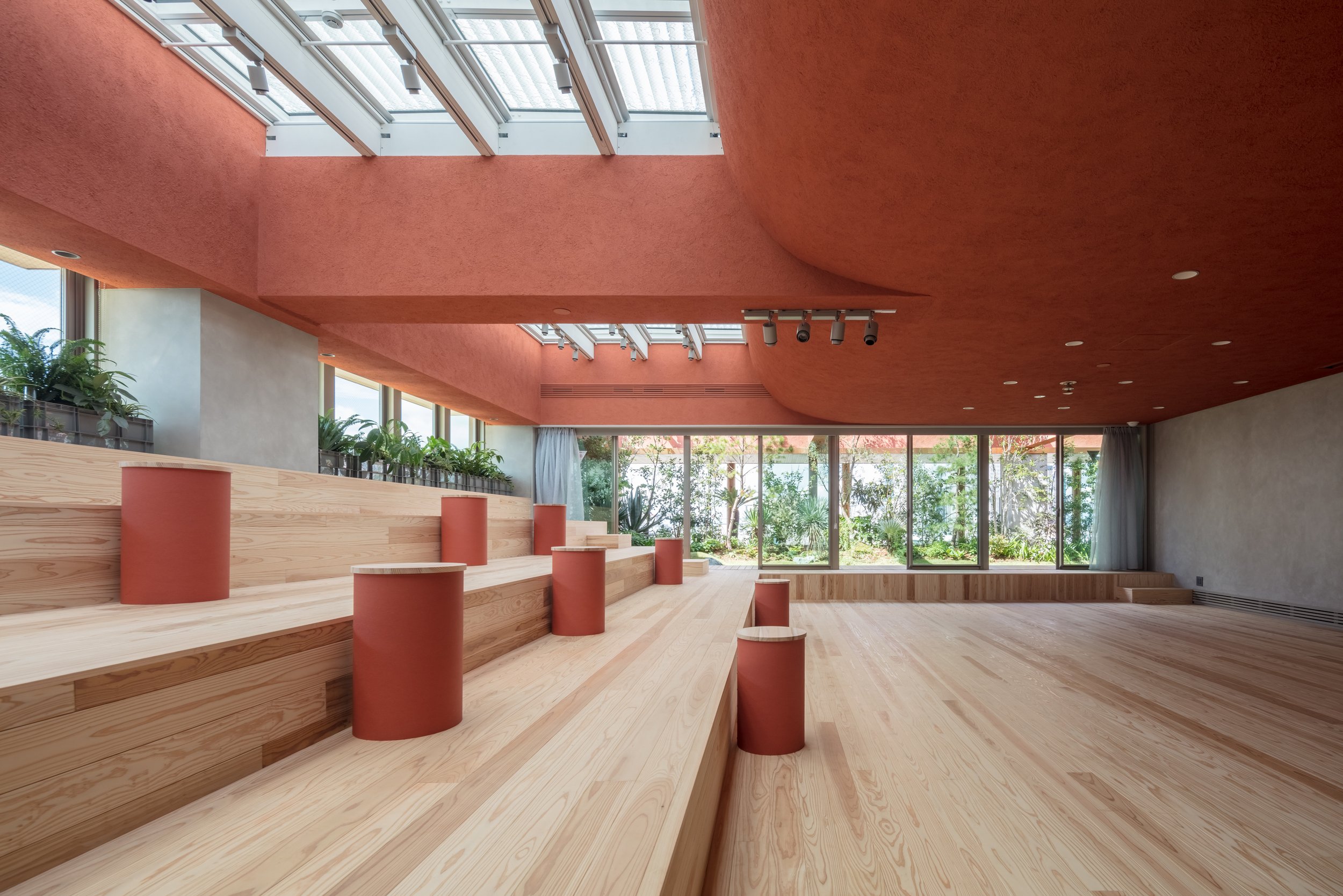
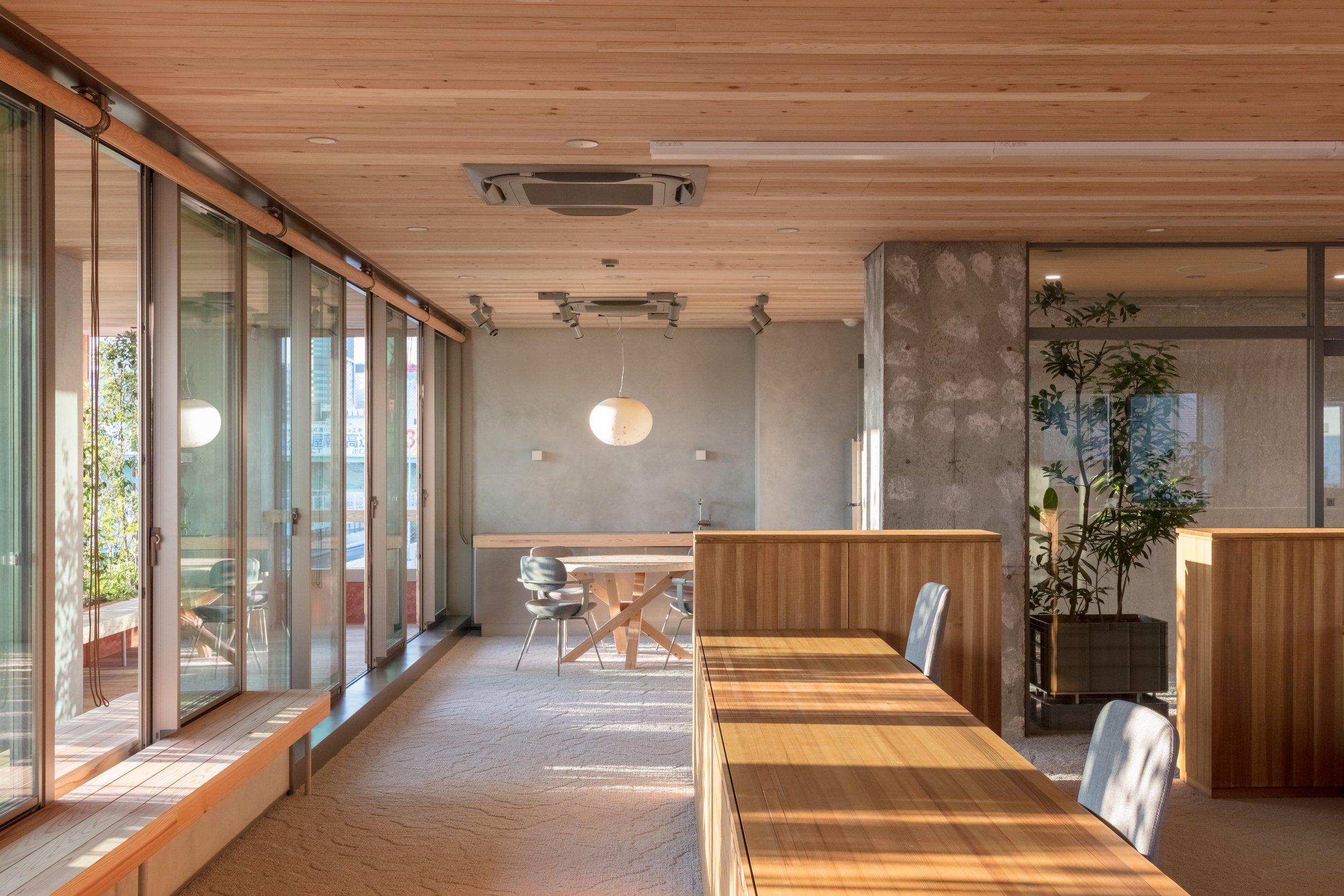
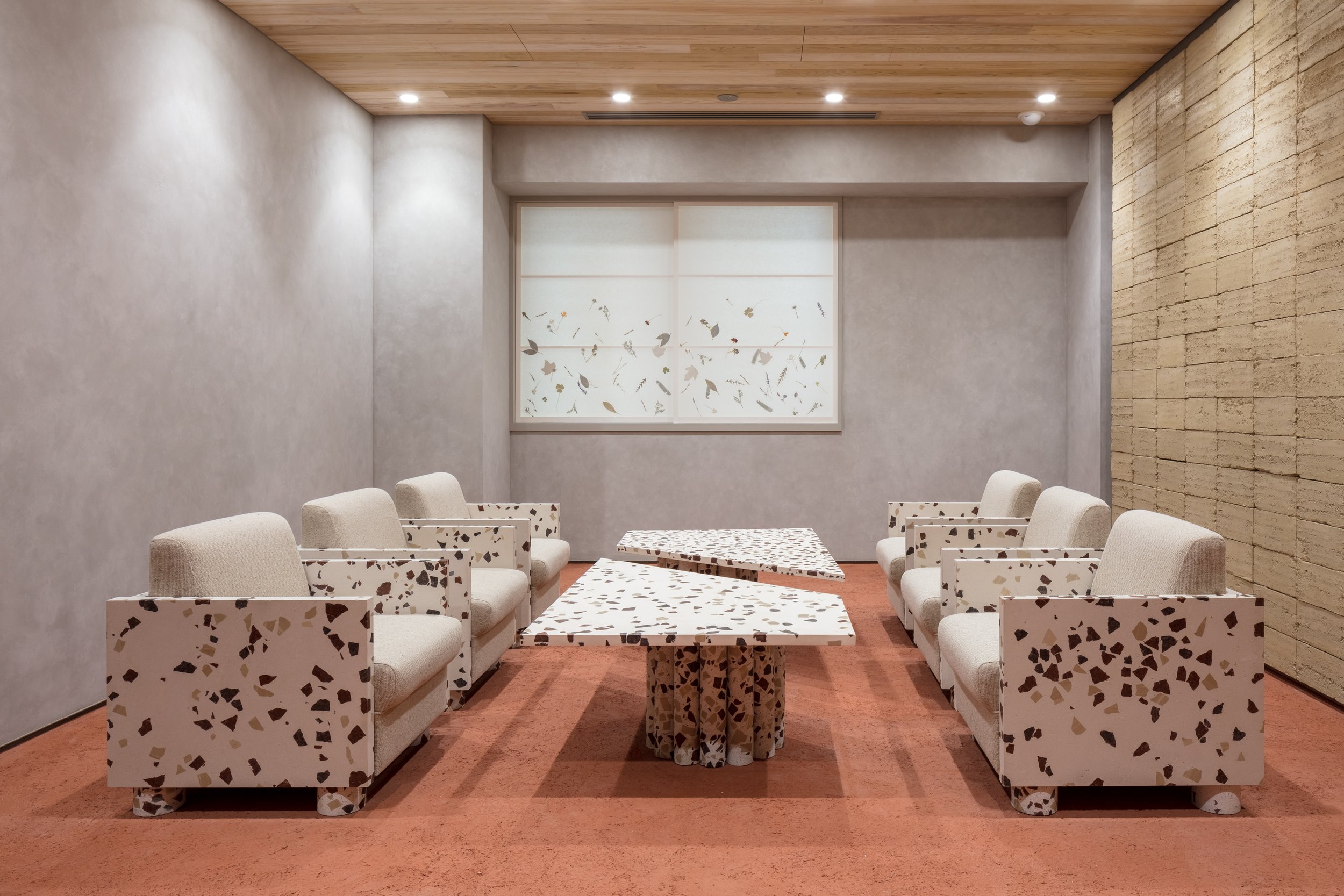
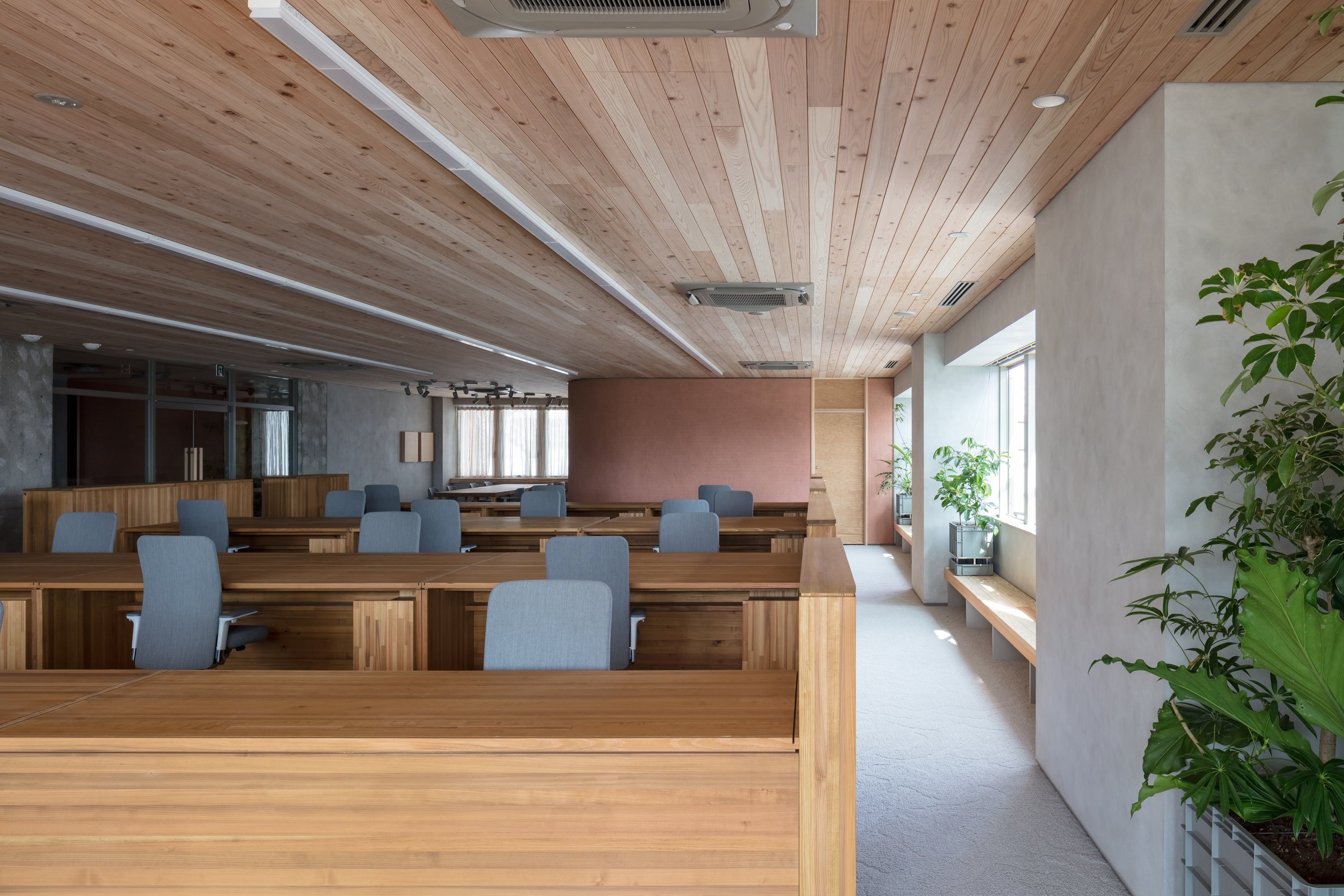
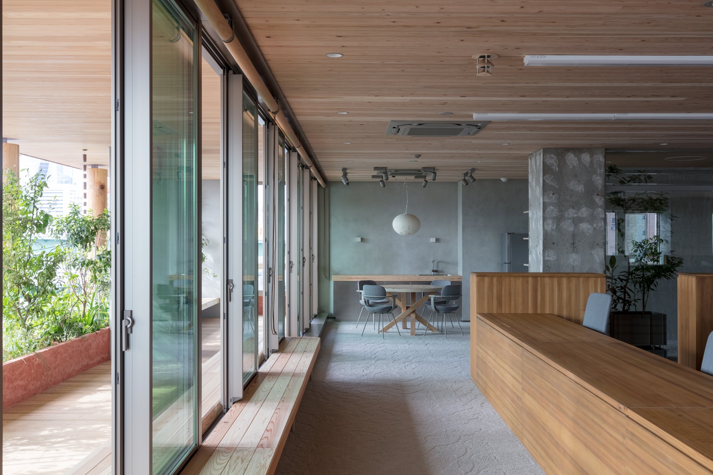
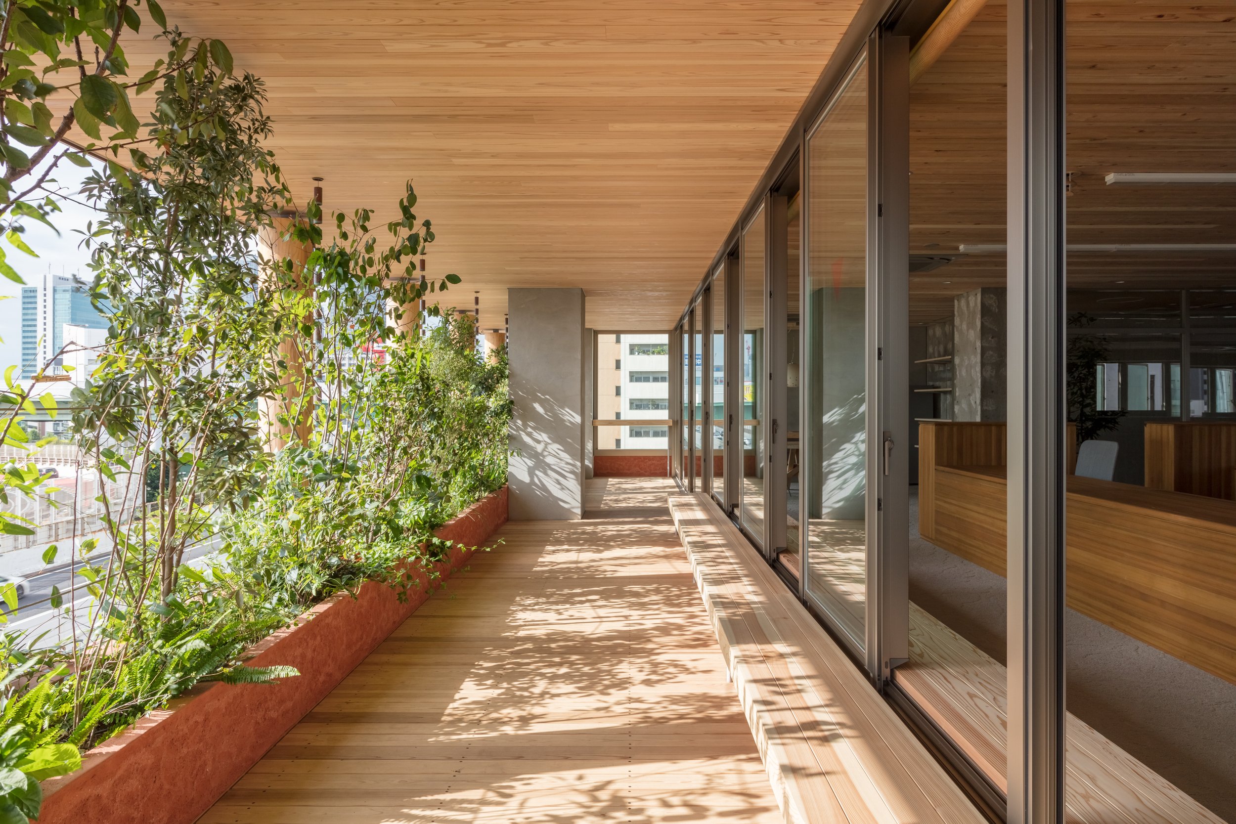
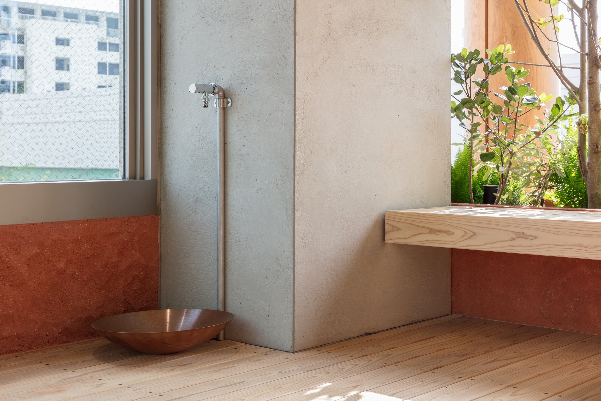
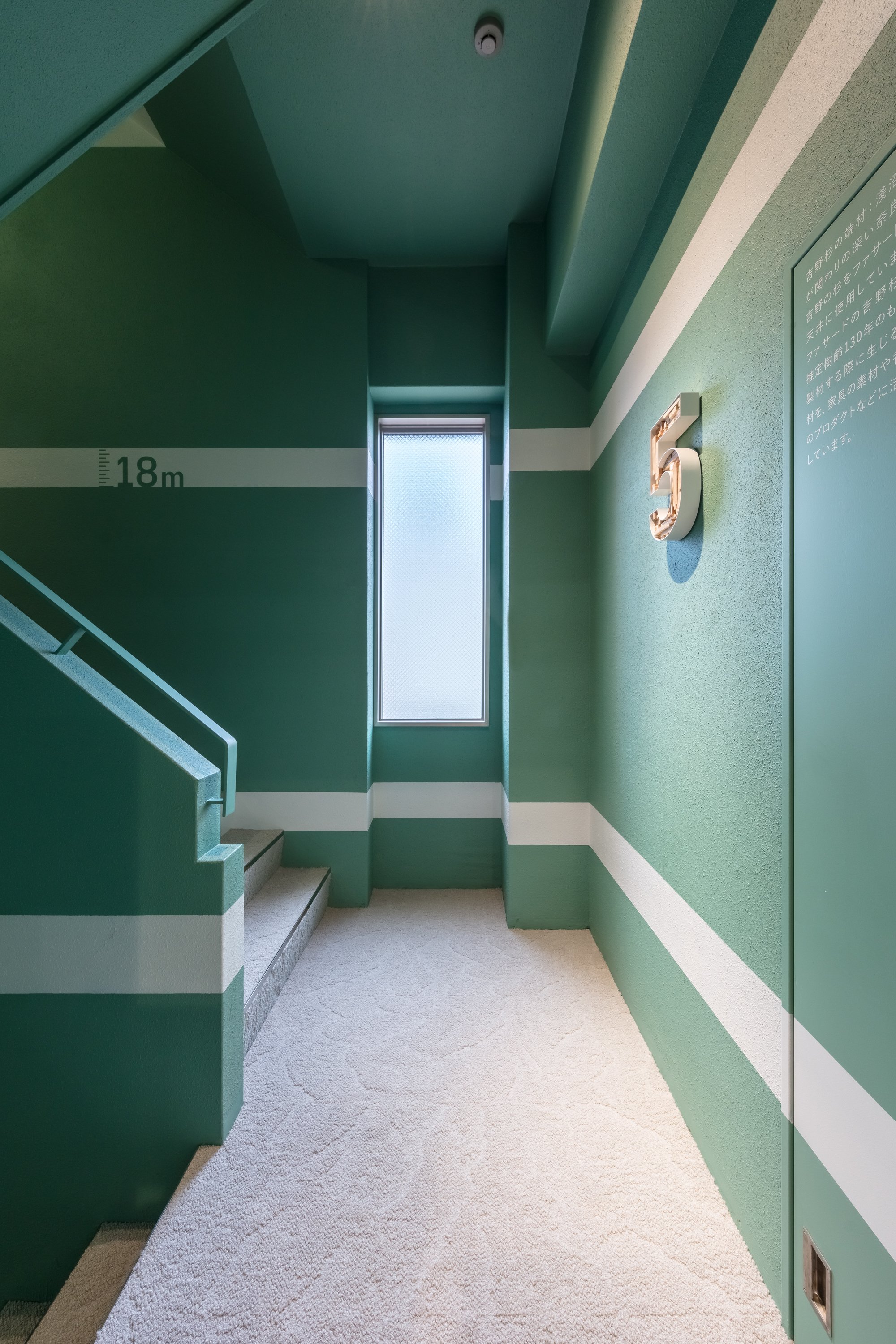
A building functions as a "material bank" and is a transit point in the flow of materials. To maximize the possibility of re-using materials, it is imperative to use natural materials in a way that allows them to be separated from artificial materials, in order to maximize their effectiveness, and eventually return them to the earth. It is necessary to process existing man-made materials so that new materials can be created, making the most of their characteristics. By creating a delightful environment connected to the changing nature of light, wind, soil, trees, and plants, this project attempts to reconstruct buildings as part of the new material flow in the city, and to reposition architecture in a cycle that is good for people and the earth.
Planning & Drawing
Designer Profile
Norihisa KAWASHIMA
Principal at Nori Architects, Senior Assistant Professor at Meiji University
Registered Architect, JAPAN, Dr. Eng.
Born in Kanagawa prefecture in 1982, Kawashima graduated from the University of Tokyo in 2005, earned his master’ s degree from the University of Tokyo Graduate School in 2007, after which he was hired by Nikken Sekkei. Kawashima became a visiting scholar at University of California, Berkeley and worked with Prof. Dana Buntrock and LOISOS + UBBELOHDE in 2012. In 2014, Kawashima became an assistant professor at the Department of Architecture of Tokyo Institute of Technology. In 2016, Kawashima earned a doctor’s degree from the University of Tokyo Graduate School. In 2017, Kawashima established Nori Architects. In 2020, Kawashima became a senior assistant professor at Meiji University. Now Kawashima is a principal of Nori Architects and a principal of Regional Design Laboratory at Meiji University.
Representative works:Sony City Osaki [2011] , Diagonal Boxes [2016] , Yuji Yoshida Gallery / House [2017] , Saw-tooth Roofs in Ichinomiya[2017], REVZO Toranomon [2020] ,and GOOD CYCLE BUILDING 001 Asanuma Corporation Nagoya Branch Office Renovation[2021].
Representative awards: The Prize of Architectural Institute of Japan [Architectural Design], 1st Prize in the 7th Sustainable Housing Award from IBEC, 1st Prize in JIA Sustainable Architecture Award 2020, Good Design Award 2021 Good Design Best 100, Sky Design Awards 2021 THE NEW BLACK BRONZE and many others.
Neri&Hu Exhibition - The Structural Field
Neri&Hu responds to the brand's invitation to rethink exhibition design within the context of international furniture fairs by exploring the possibilities of creating a Structural Field, as a way not necessarily to arrive at a harmonious synthesis, but perhaps to suspend these apparent contradictions during this temporary installation.
Neri&Hu responds to the brand's invitation to rethink exhibition design within the context of international furniture fairs by exploring the possibilities of creating a Structural Field, as a way not necessarily to arrive at a harmonious synthesis, but perhaps to suspend these apparent contradictions during this temporary installation.
There are two sets of dualities that are intersected by the choice of bamboo. Bamboo in Asia and other parts of the world is an abundant, fast-growing, renewable natural material. Despite the versatility of bamboo as a construction material, its lignified fibrous stalks, with their joints and organic profile, often retain signs of natural growth.
In the pavilion design, Neri&Hu sets over 1,000 vertical bamboo members on a regular grid to allude to a sense of the exterior. Through a small entry, visitors are invited to begin a journey through a series of framed views, and intermittent layering of bamboo and spaces beyond.
The relationship between objects and spectators is constantly shifting due to the varying density in the field. The exhibit does not use pedestals or special display mechanisms for the furniture pieces, so everyday scenes from everyday life are displayed - small sitting areas, living rooms, bedrooms, contemplation niches, etc. - are seamlessly integrated into the viewer's path.
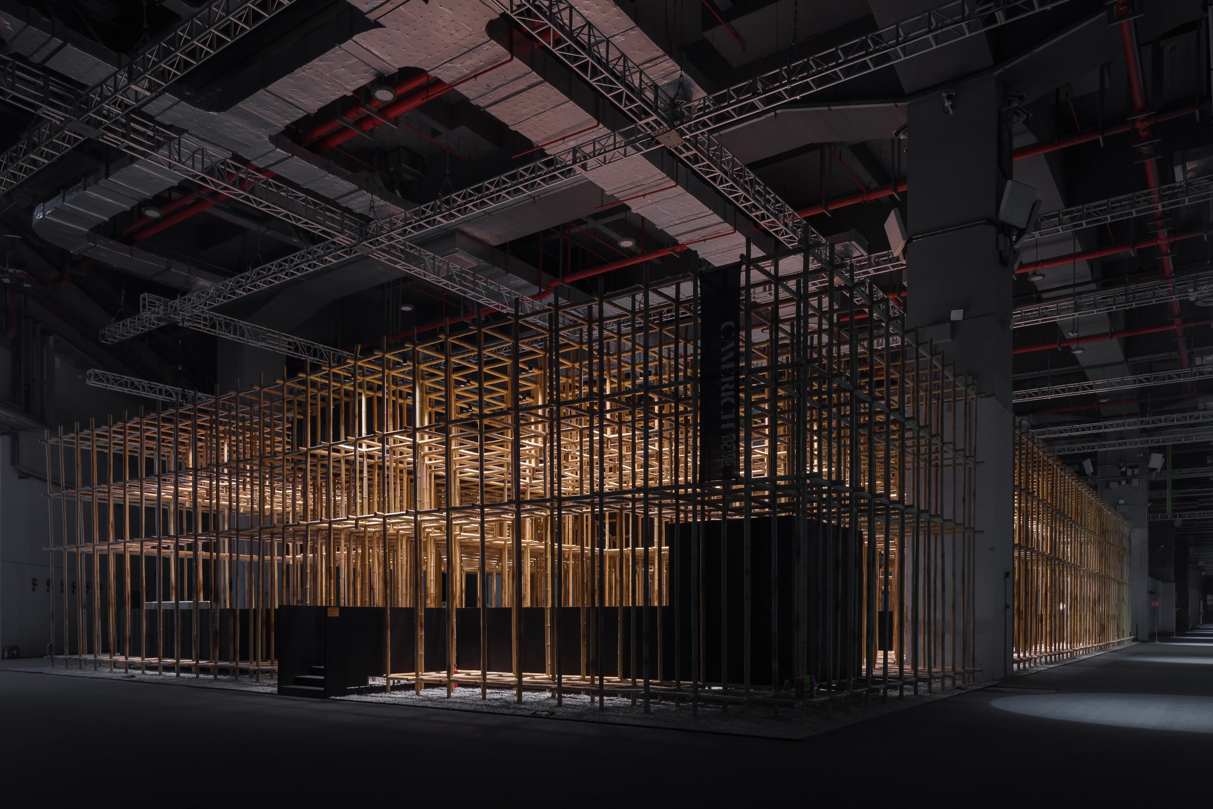
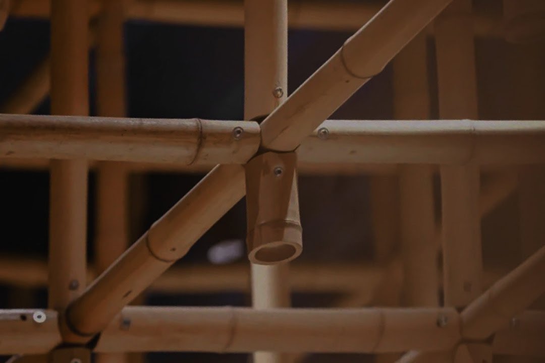
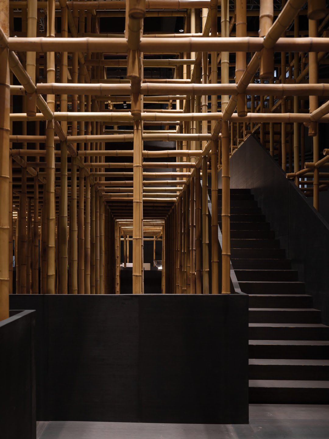
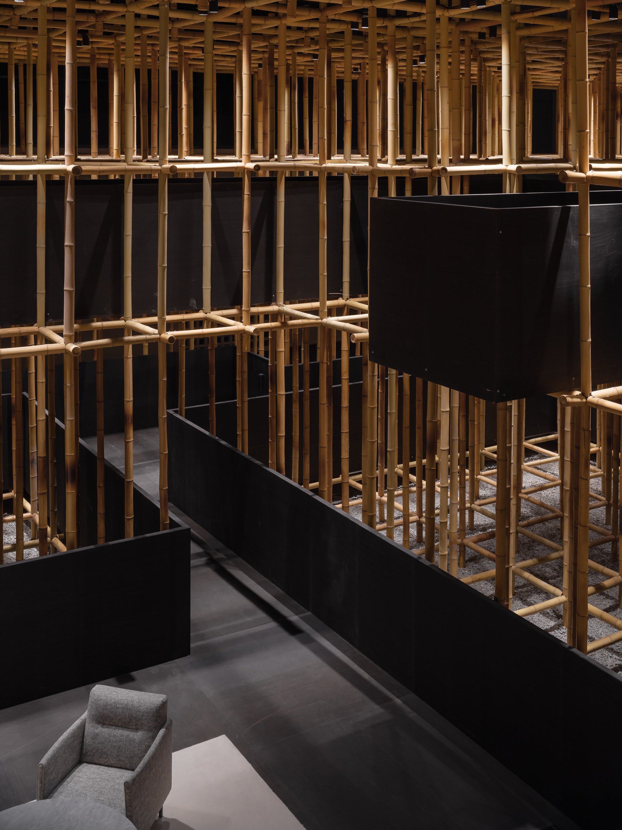
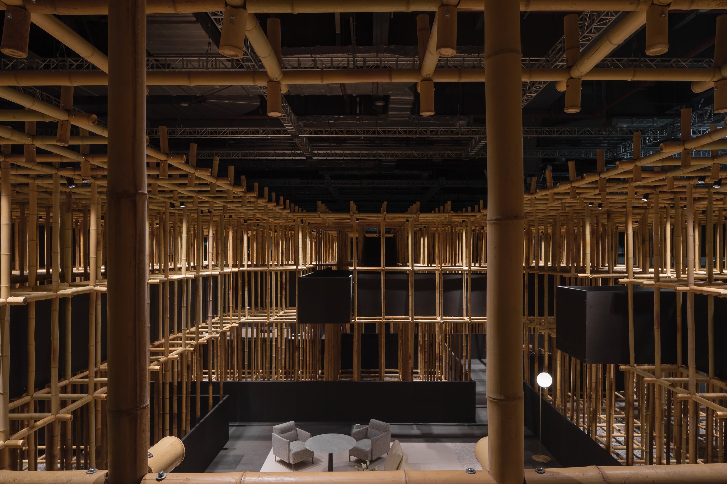
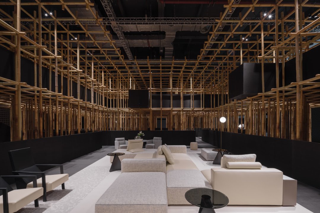
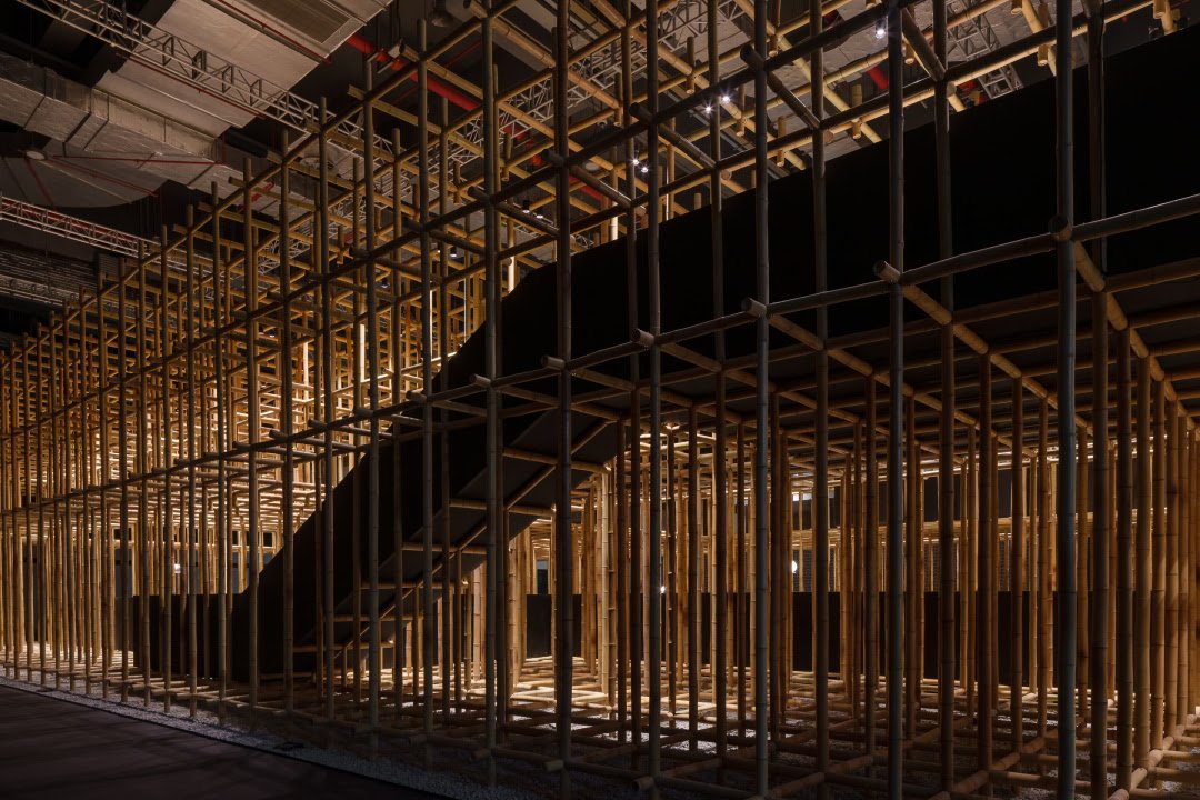
There are times when the narrow walkway gives the viewer a glimpse of the vignettes ahead, maintaining a distance between the spectator and the objects. As the field opens up in public areas, the spectator is fully immersed in the domestic setting, interacting with furniture in the presence of the field. By becoming "at home" with the objects, the spectator becomes a participant in the exhibition. By becoming both a spectator and a character on view, the visitor is immersed not only in the phenomenon of the field, but also in one's own projected spaces, a life stage.
The Structural Field | Camerich Exhibition Shanghai CIFF
Location: Shanghai
Year: 2022
Project Type: Installation & Exhibition Design
Gross area: 907.5m²
Partners-in-charge: Lyndon Neri, Rossana Hu
Senior Associate-in-charge: Chris Chen
Design team: Xiaotang Tang, Bingxin Yang, Peter Ye, Carol Zhu, July Huang, Luna Hong
Photo: Runzi Zhu (if not specifically stated)
Video: CAMERICH
Consultant:
Structure: Architectural Design and Research Institute of Tsinghua University Co., Ltd.
Lighting: Atelier Zhang Xin
Special Thanks:
Seamboo
www.neriandhu.com
Kamitopen Co. Ltd. has designed the finest architecture skills throughout history - the KAMA-ASA Shop
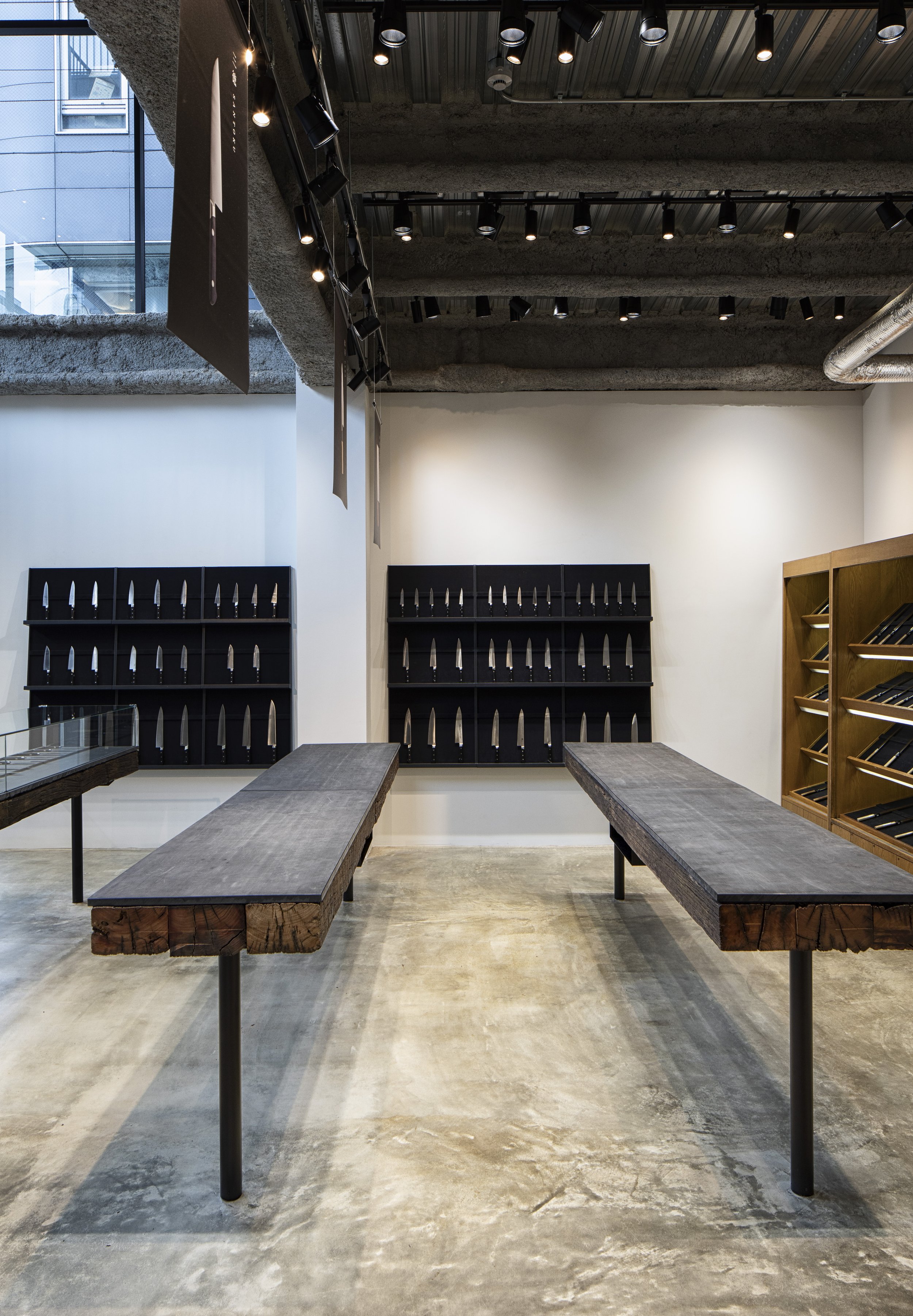
What should the shop do to stand out from its competitors and showcase its unique craftsmanship in Tokyo Japan? Kamitopen Co., Ltd Japan's head designer and architect, Mr. Masahiro Yoshida, has re-designed the shop and using a simple shape and the delicate touches of the craftsman.
The Kappabashi area of Tokyo, Japan is a well known area for chefs and for those who love to cook, it is often referred to as "Tokyo's Kitchen Town.". A day spent walking through Kappabashi, Tokyo's "kitchen town," could easily be spent. Kappabashi is about 800 meters long, with about 170 specialty stores lining an 800 meter stretch of a street called Kappabashi Dougu Street, between Asakusa and Ueno area.
"KAMA-ASA" in Asakusa Kappabashi was established in 1908 by Minosuke Kumazawa. It was initially known as Kumazawa Imono Ten, but was changed to its current name, Kama-ASA. Over a century ago, Kama-Asa began to cater to the needs of chefs. Daisuke Kumazawa, who is the fourth generation owner of the company, has inherited the business and its vision. He aims to provide customers with quality tools that are well-designed. What should the shop do to stand out from its competitors and showcase its unique craftsmanship? Using a simple shape and the delicate touches of the craftsman, Kamitopen Co., Ltd Japan's head designer and architect, Mr. Masahiro Yoshida, has re-designed the shop.
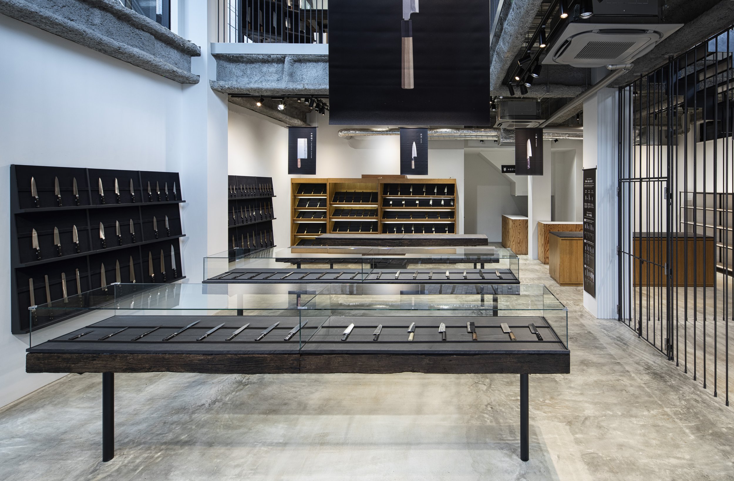

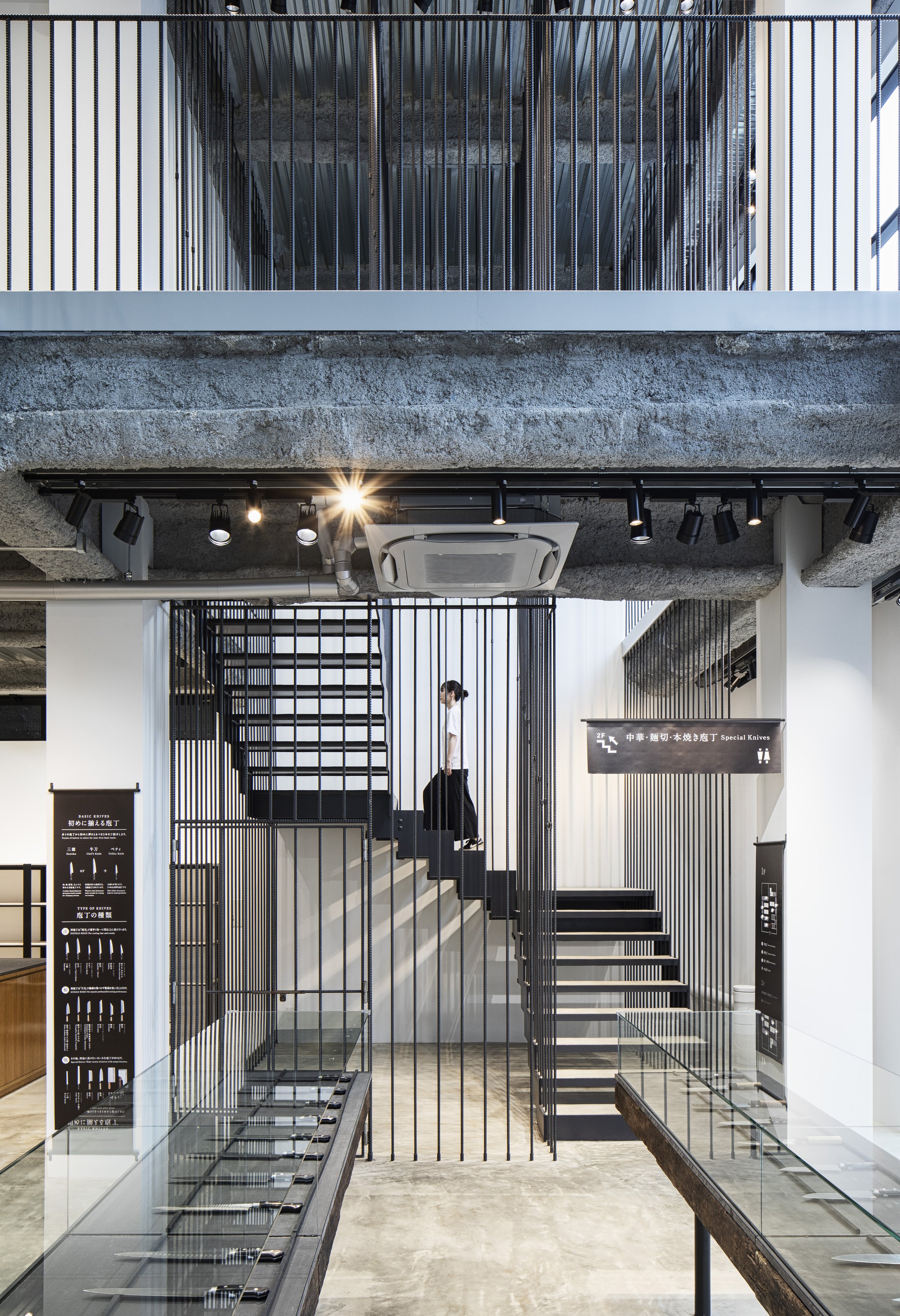
A steel rebar, which is also called ribs and joints, is a roll of steel in the form of a stick used to build homes, buildings, and other structures.
Mashairo Yoshida of the KAMA-ASA Shop understands that the philosophy of the company is based on the belief that the finest tools are made with the right intentions, thus offering the finest skills of craftsmen who make kitchen utensils to their customers.
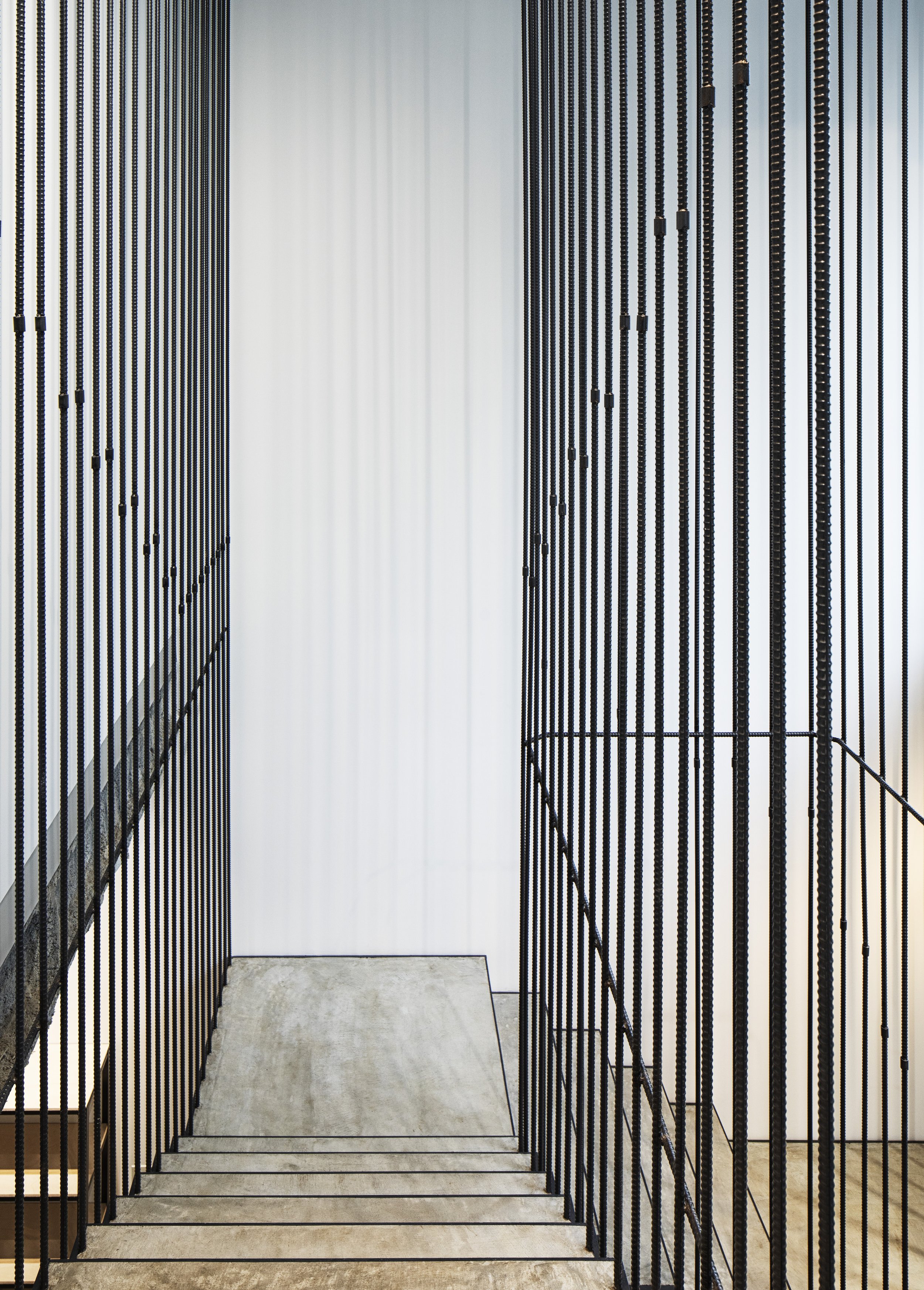
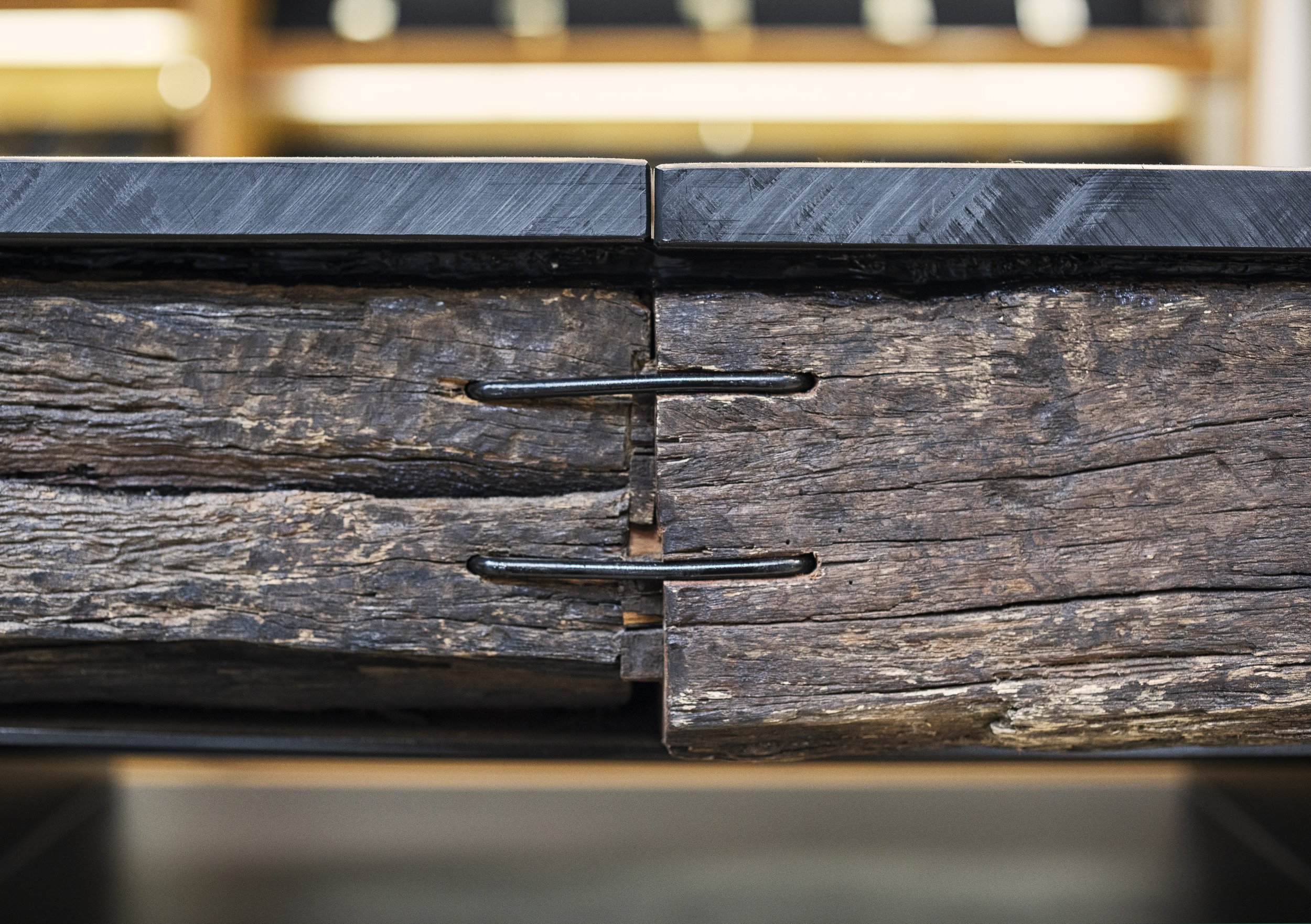
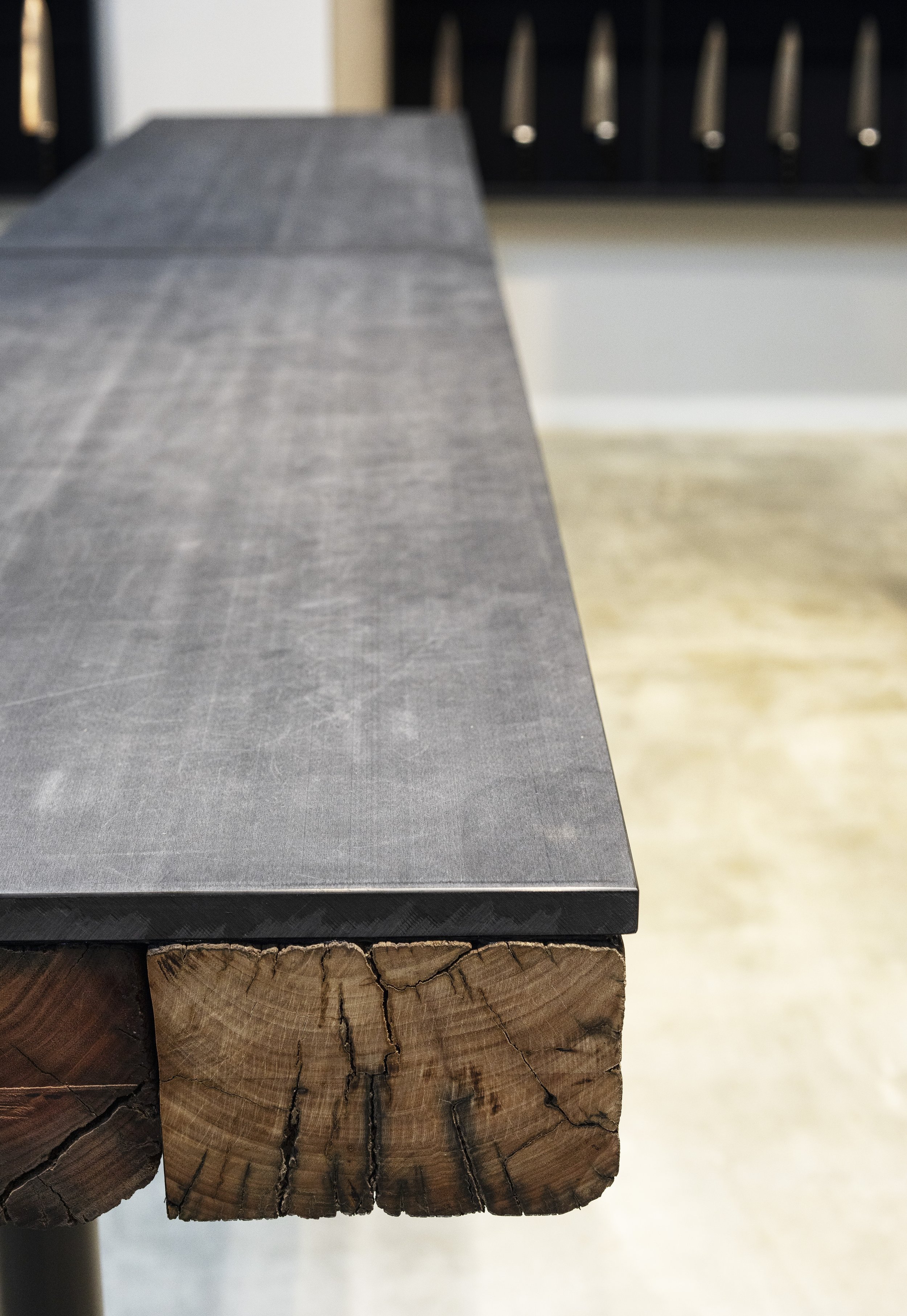
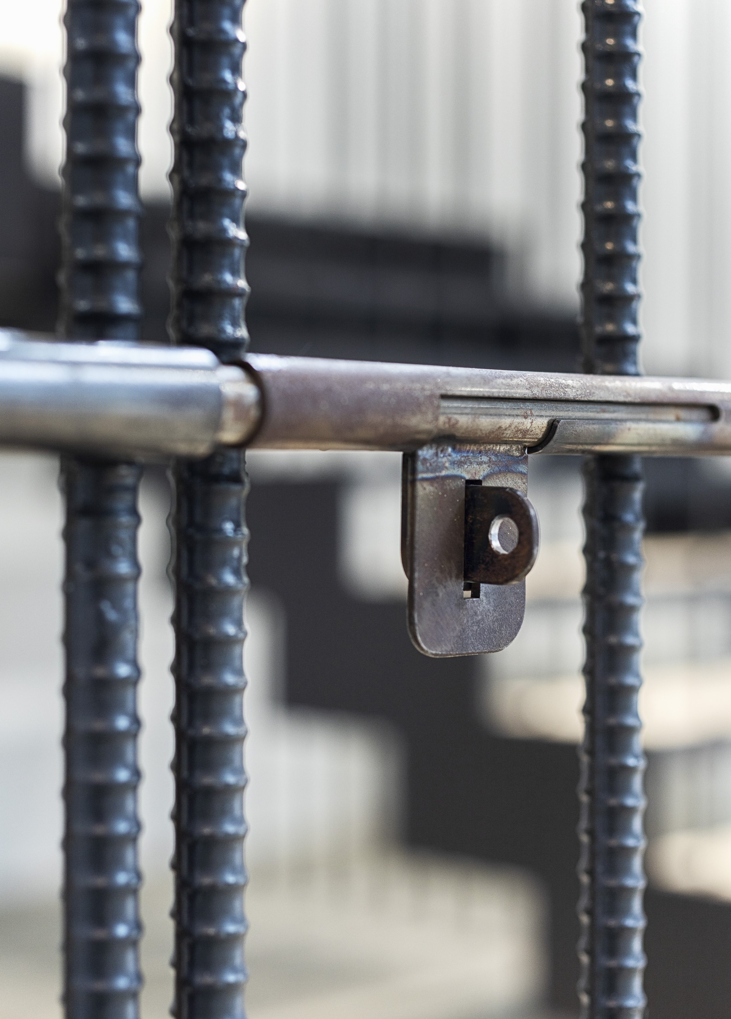
This is why in this store's space we felt it was appropriate to display an exhibition of the architecture skills that have been displayed by craftsmen throughout history. A particular design used rebar as the main design element, despite the fact that it is usually hidden in the walls since it is usually hidden in the ceiling. The use of rebar raised the level of sophistication in the shop dramatically.
The project won the silver award in the interior design division of Sky Design Awards www.skydesignawards.com in 2021.
Drawing/ Planning
Designer Profiles
Representative director / First Class Architect
1977 : Born in Osaka, Japan
2001 : Graduated from department of architecture,Kyoto Institute of Technology “Waro Kishi laboratory”
2001 : TAKARA SPACE DESIGN
2008 : Established KAMITOPEN architects
Imaise House - A high earthquake resistance residential in Japan
Japan is constantly affected by seismic and volcanic activity thanks to its location in the Circum-Pacific Mobile Belt. Despite covering just 0.25 percent of the earth's land area, Japan experiences 18.5% of the world's earthquakes. Geographically and physically, how the Japanese live and how they design safe living environments. For one of his clients, Tatsuya Kawamoto + Associates designed a high earthquake resistance residential building, which won the "New Black" Award in 2021.
Japan is constantly affected by seismic and volcanic activity thanks to its location in the Circum-Pacific Mobile Belt. Despite covering just 0.25 percent of the earth's land area, Japan experiences 18.5% of the world's earthquakes. Geographically and physically, how the Japanese live and how they design safe living environments. For one of his clients, Tatsuya Kawamoto + Associates designed a high earthquake resistance residential building, which won the "New Black" Award in 2021.
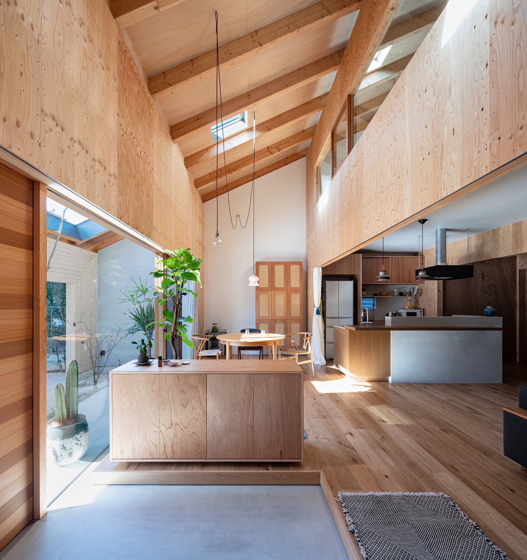
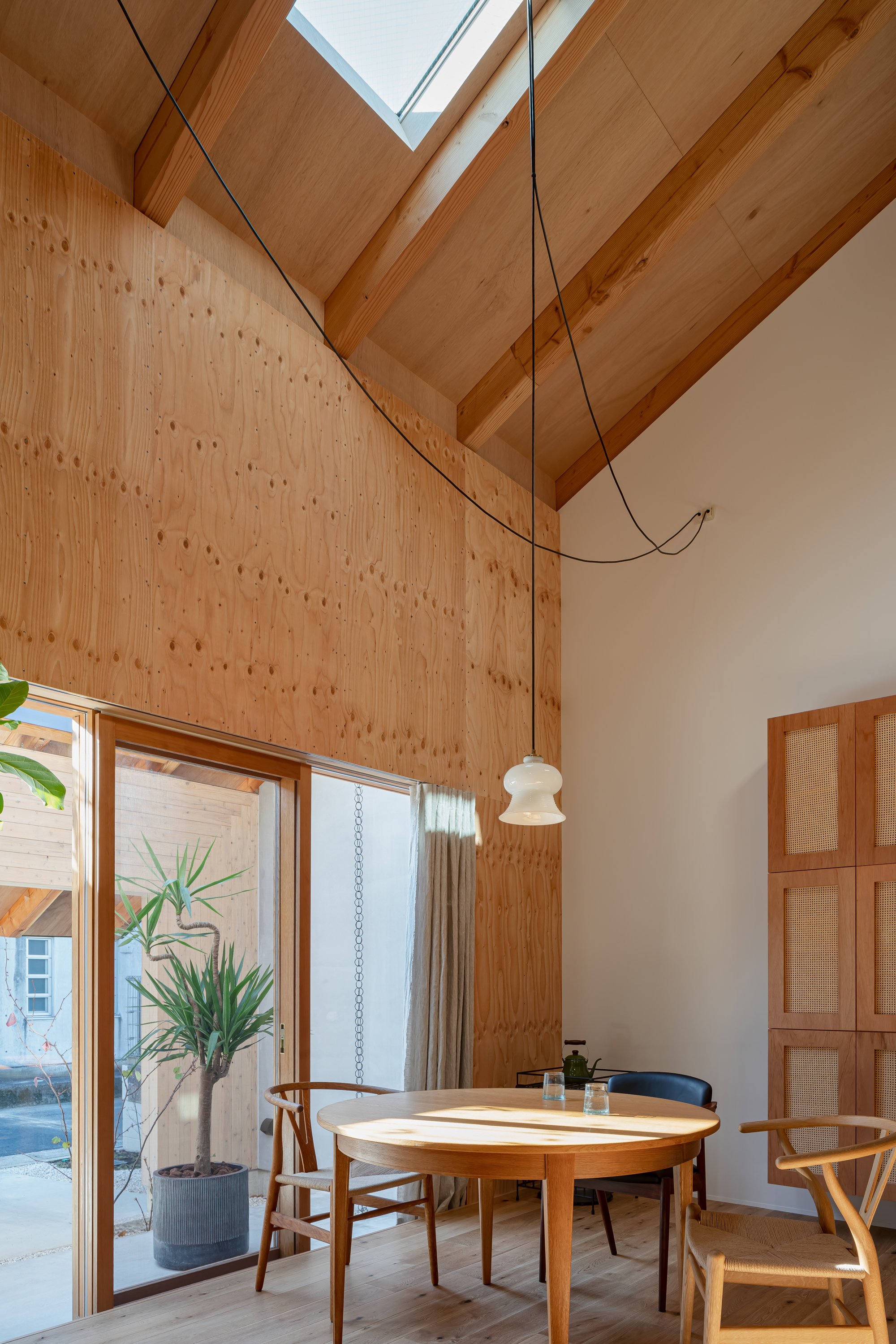
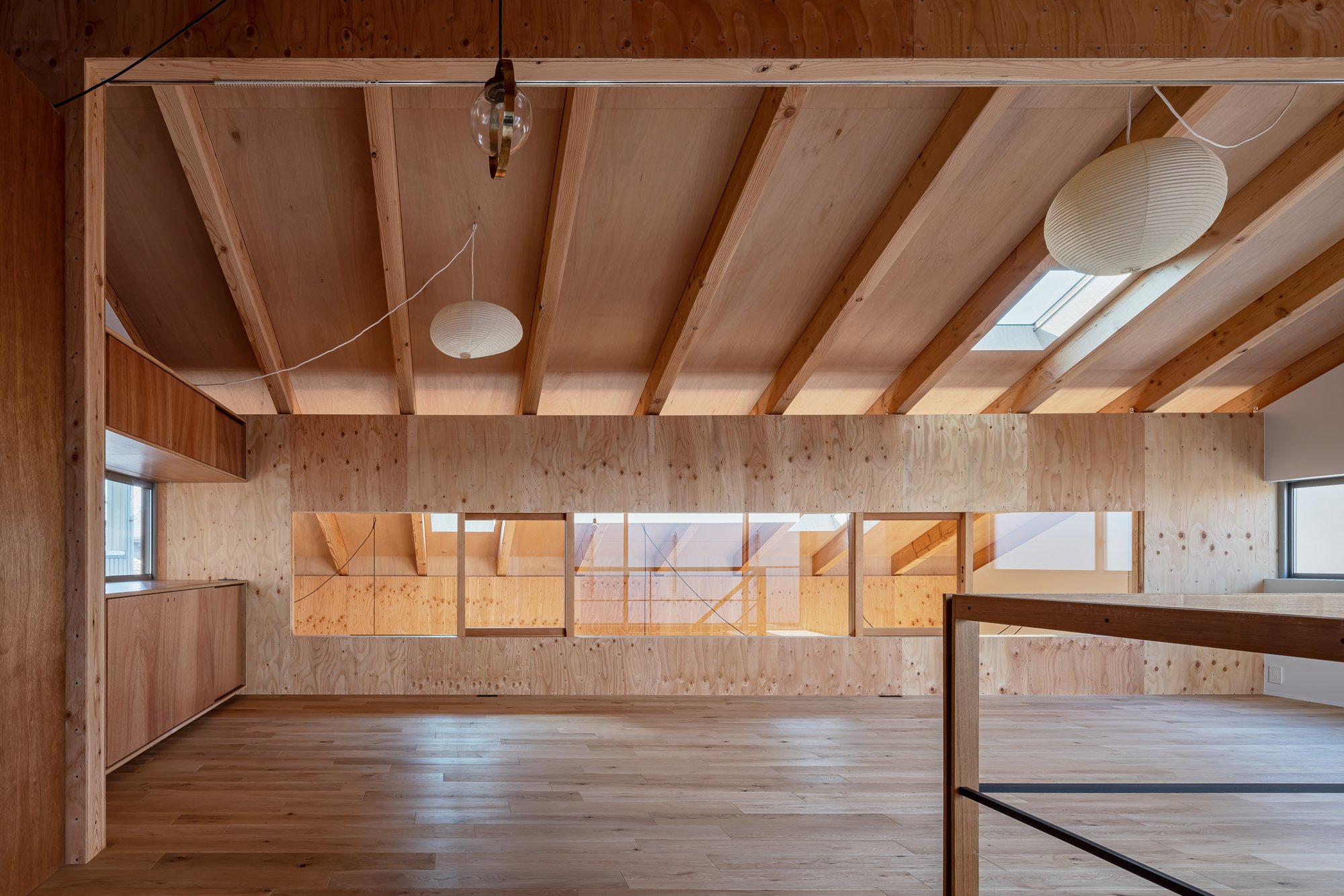
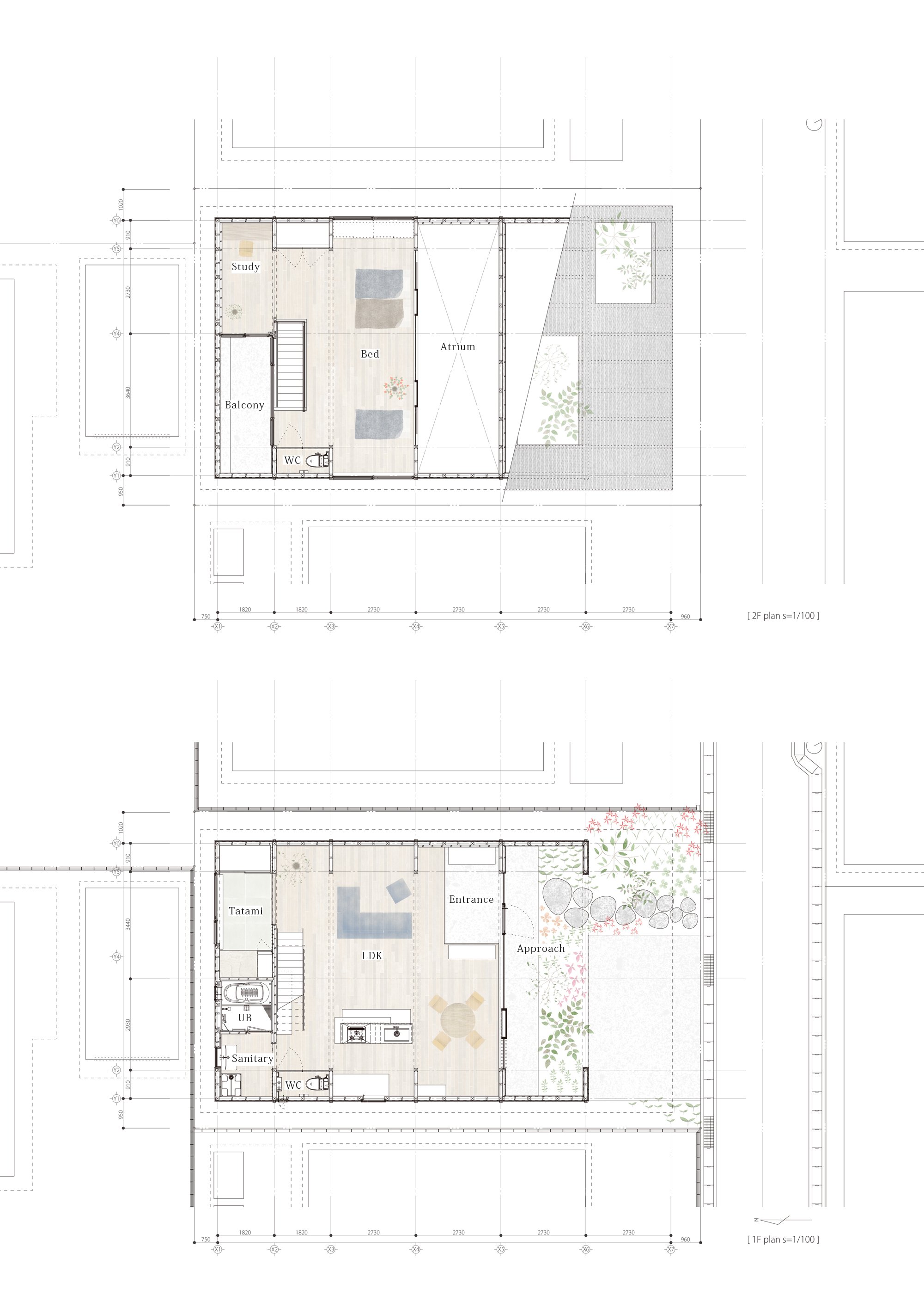
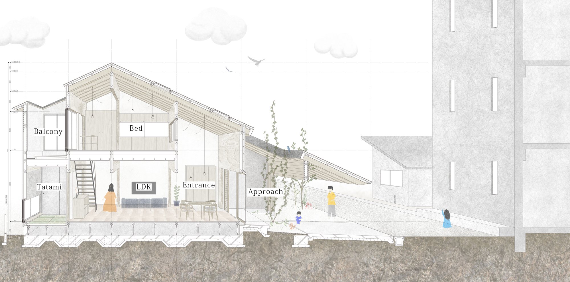
Generally, the main areas of a building need to be on the second floor since the structural walls needed on the first floor are reduced. The building should have "high earthquake resistance" as well as "open space."
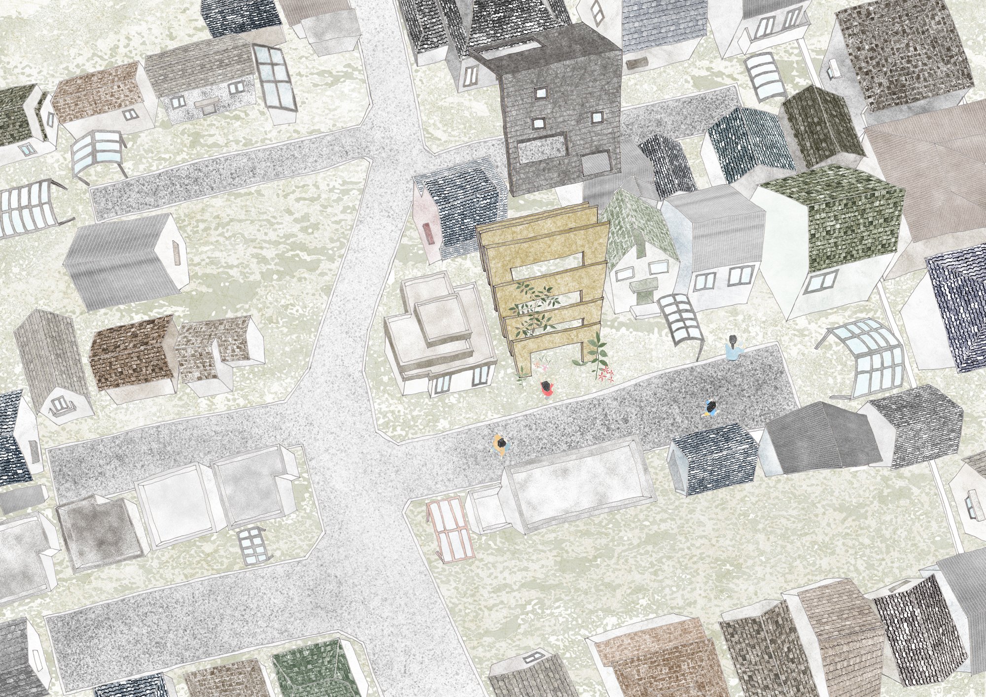
By taking into consideration the surrounding environment of a "private road," the front road is a private property, and planning a space in which the inside and the outside are seamless, the designer aims to achieve maximum spatial volume within the given constraints.
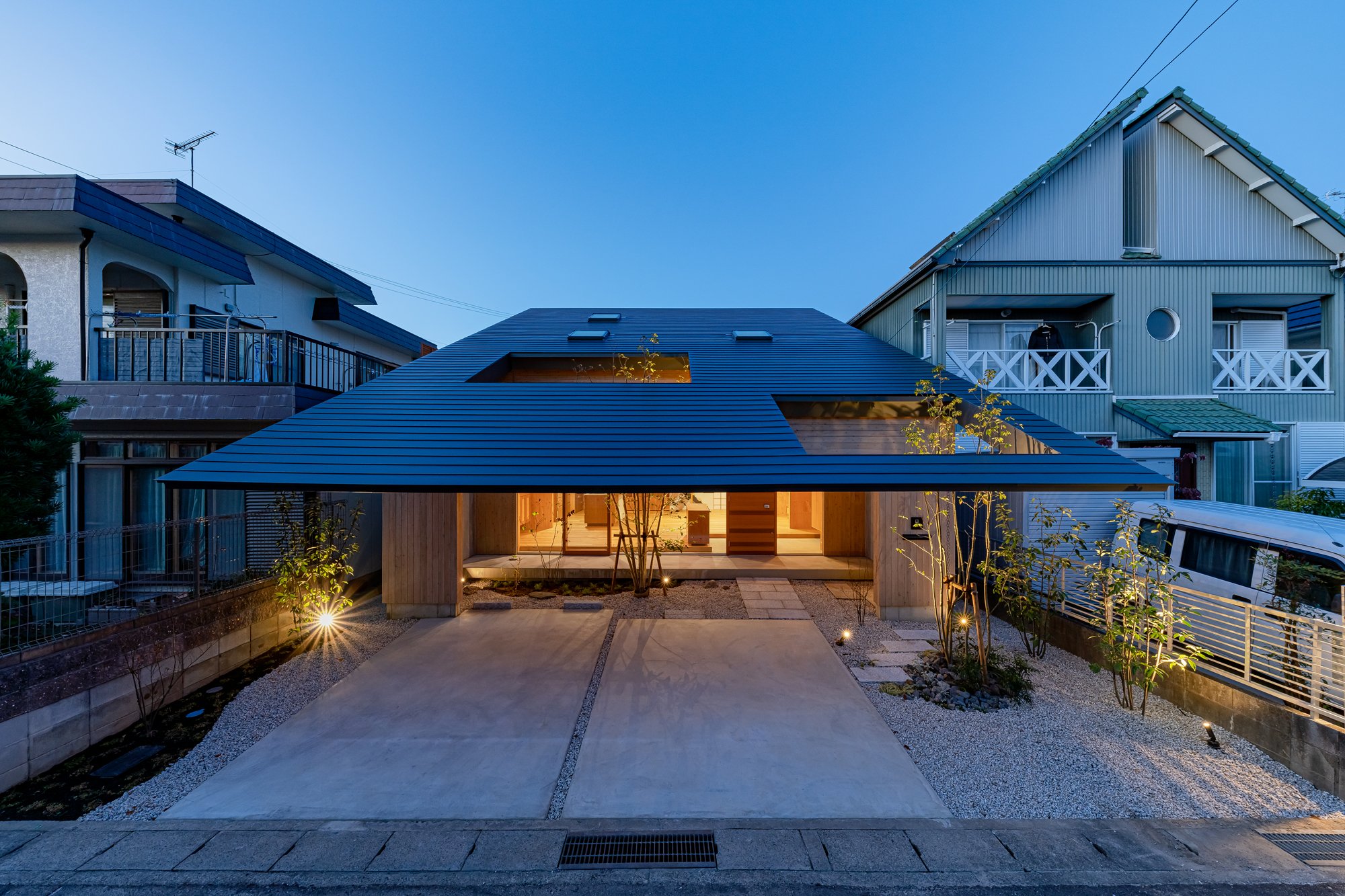
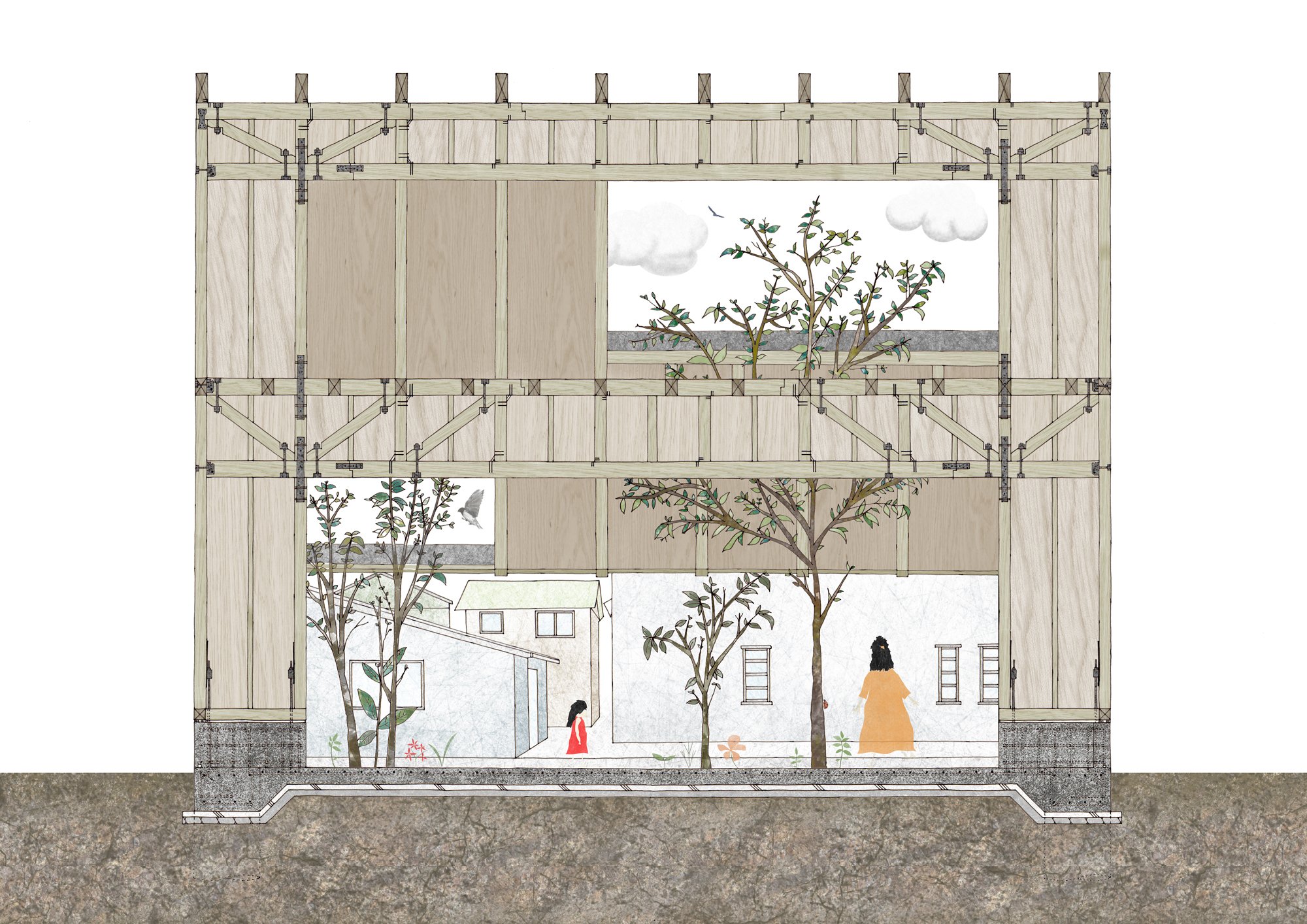
The building has a simple and clear configuration with only an 8.0m-wide "frame" that provides both earthquake resistance and a large opening.
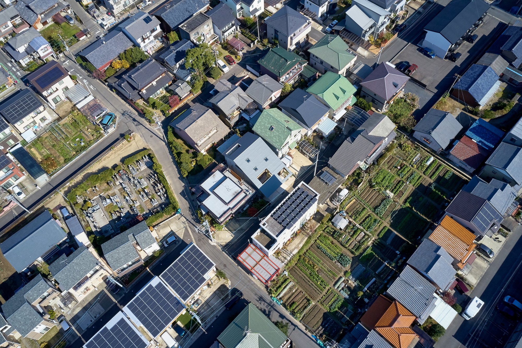
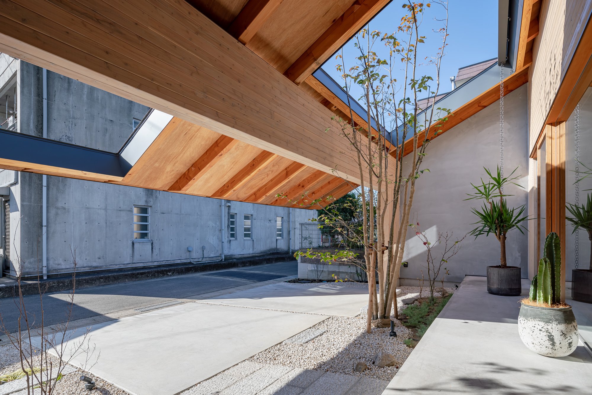
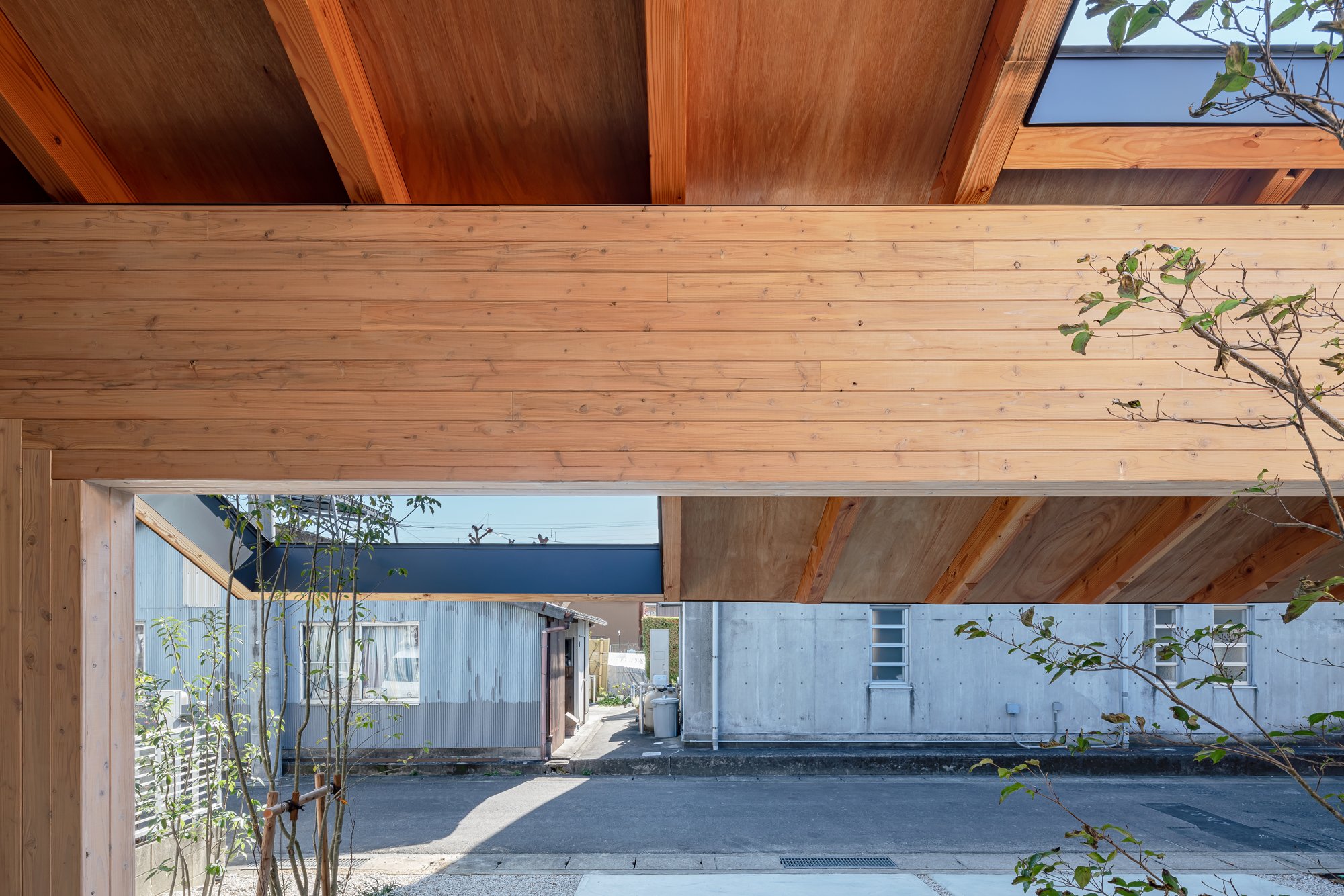
There was a unique community created around this "private road", which branched off the main road.
With the incorporation of local, unique characteristics that are different from each road into the living space, the designer thought it would be possible to contribute to regional development by establishing a favorable climate as a residential area for communities that could be made as a by-product of local industries.
A gate frame, in addition to its function as an earthquake-resistant element, also acts as a ruler that gives rhythm to the space by arranging at regular intervals and measuring the distance from the city, and by inserting rails into each frame, it can be private as desired.
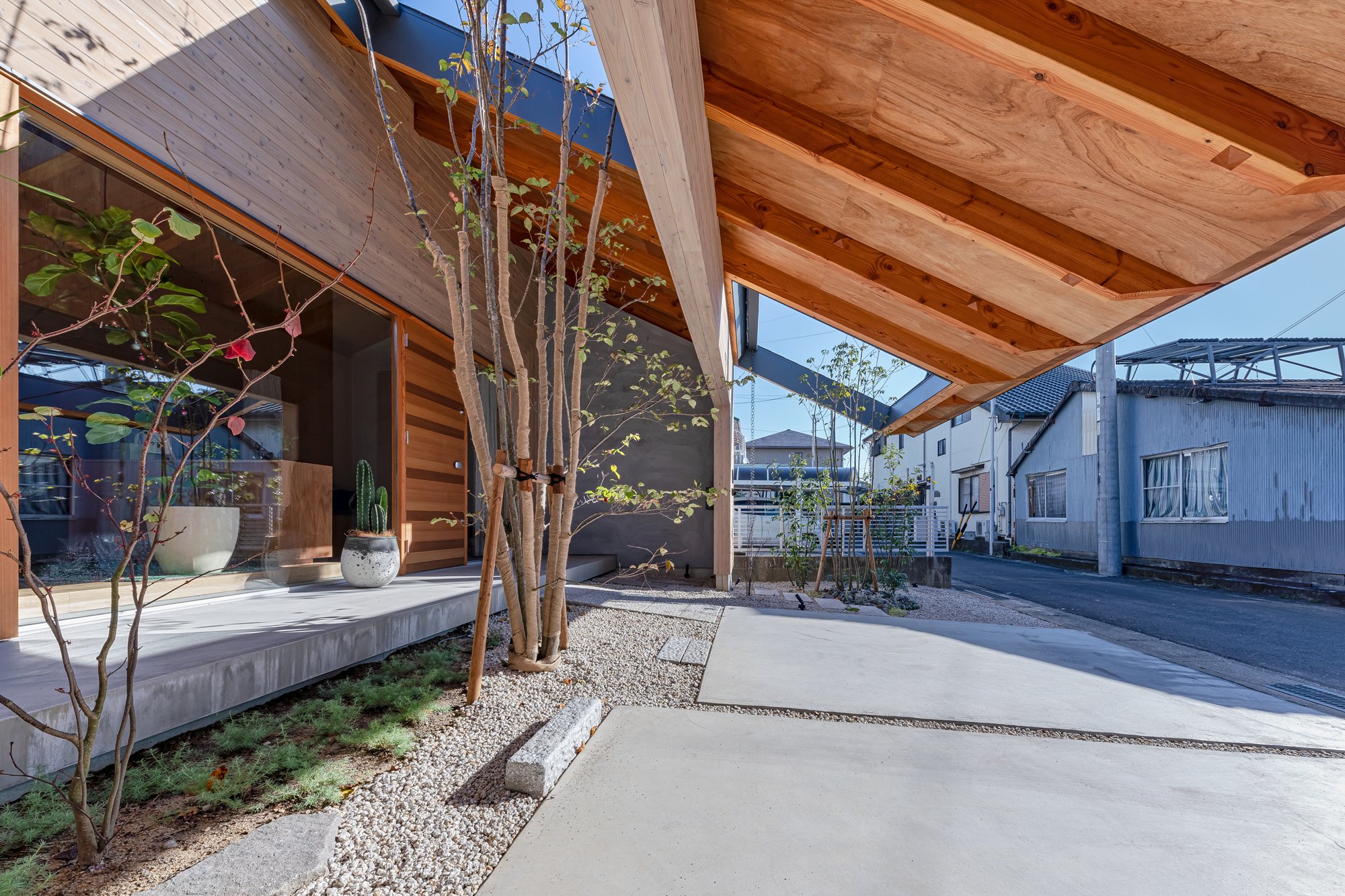
By extending the eaves across the front road side and creating a continuous external space, it is anticipated that the resident will gradually spread out under the roof while making the most of the small parcel.
Mr. Kawamoto said: "Due to the surrounding environment, which was moderately protected by chance, we were able to live in the nearby land and use the road as a living space."
Construction methods like this have taken root in this area. By mixing the resident's demand, the structure designed to solve the problem, and these, it is made.Imaise House
Architectural Overview
Location : Ichinomiya Aichi Japan
Completion : November 2020
Principal use : House
Structure : Timber structure
Site area : 168.38㎡
Building area : 99.12㎡

Designer Profile
Tatsuya Kawamoto
1990 Born in Aichi,Japan
2012 ~ worked at Takeshi Hosaka Architects
2013 ~ worked at Hiroyuki Shinozaki Architects
2018 ~ established Tatsuya Kawamoto + Associates
AWARDS
2011 2nd prize of Japan institute of architects tokai branch architectural design competition award 28th
2012 2nd prize of Graduation design review
2013 3rd prize of Japan institute of architects tokai branch architectural design competition award 30th
2015 Fine work of Nisshin kogyo architectural design competition 2015
2016 2nd prize of Circos international architecture competition 2016
2017 Honorable mentions of Shinkenchiku residential design 2017
2017 4th prize of CLT idea contest 2017 Awards
2011 2nd prize of Japan institute of architects tokai branch architectural design competition award 28th
2012 2nd prize of Graduation design review
2013 3rd prize of Japan institute of architects tokai branch architectural design competition award 30th
2015 Fine work of Nisshin kogyo architectural design competition 2015
2016 2nd prize of Circos international architecture competition
2017 Honorable mentions of Shinkenchiku residential design 2017
2017 4th prize of CLT idea contest 2017
For more information about Tatsuya Kawamoto + Associates, please visit:
*The New Black is a new award from www.skydesignawards.com designed to discover and recognise young architects and designers, or small projects such as pop-up, residential, or retail shops project sizes up to 50m2 (540 ft²).
*The New Black entrants must be either under 38 years of age OR the project submitted must be less than 50m2 (with no age limitation).


