Refining the Hyundai Customer Experience Center YOKOHAMA designed by TONERICO
The Hyundai Customer Experience Center YOKOHAMA stands as a testament to innovation and sustainability in the automotive industry. This visionary project, spearheaded by the renowned designers at TONERICO: INC., marks a pivotal step in Hyundai's commitment to delivering zero-emission vehicles (ZEV) in Japan.
The Hyundai Customer Experience Center YOKOHAMA stands as a testament to innovation and sustainability in the automotive industry. This visionary project, spearheaded by the renowned designers at TONERICO: INC., marks a pivotal step in Hyundai's commitment to delivering zero-emission vehicles (ZEV) in Japan.
The essence of this initiative lies in the careful combination of functionality and aesthetics. The project was born to transform an existing warehouse into a space that blends the industrial feel of a maintenance shop with the sleek image of electric and hydrogen vehicles (EV and FCEV). This well-thought-out approach represents Hyundai's commitment to environmental sustainability and establishes a tangible connection between the brand and its customers.
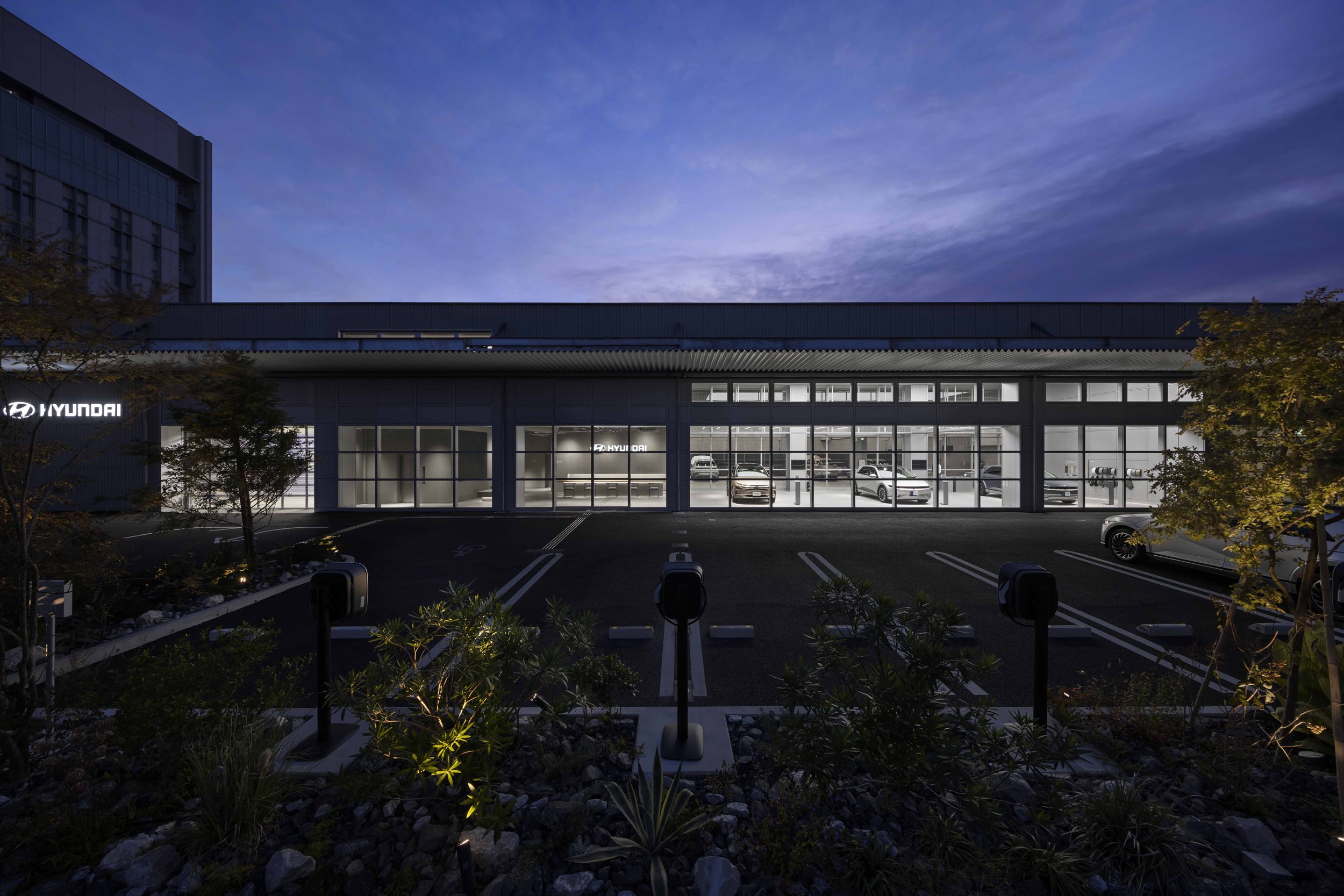
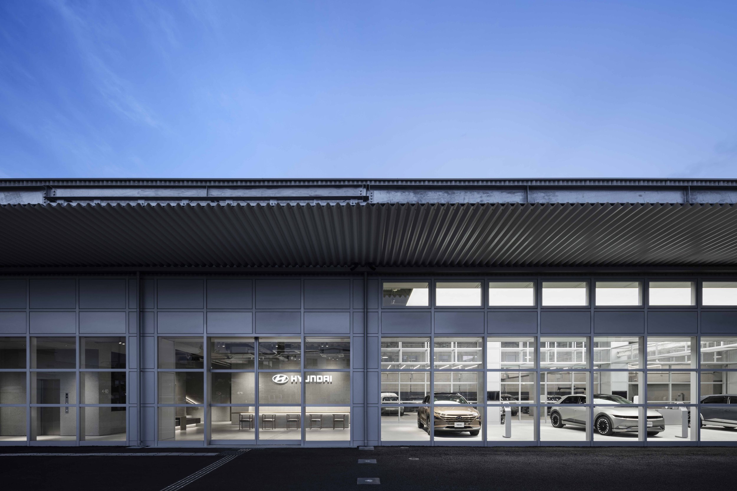
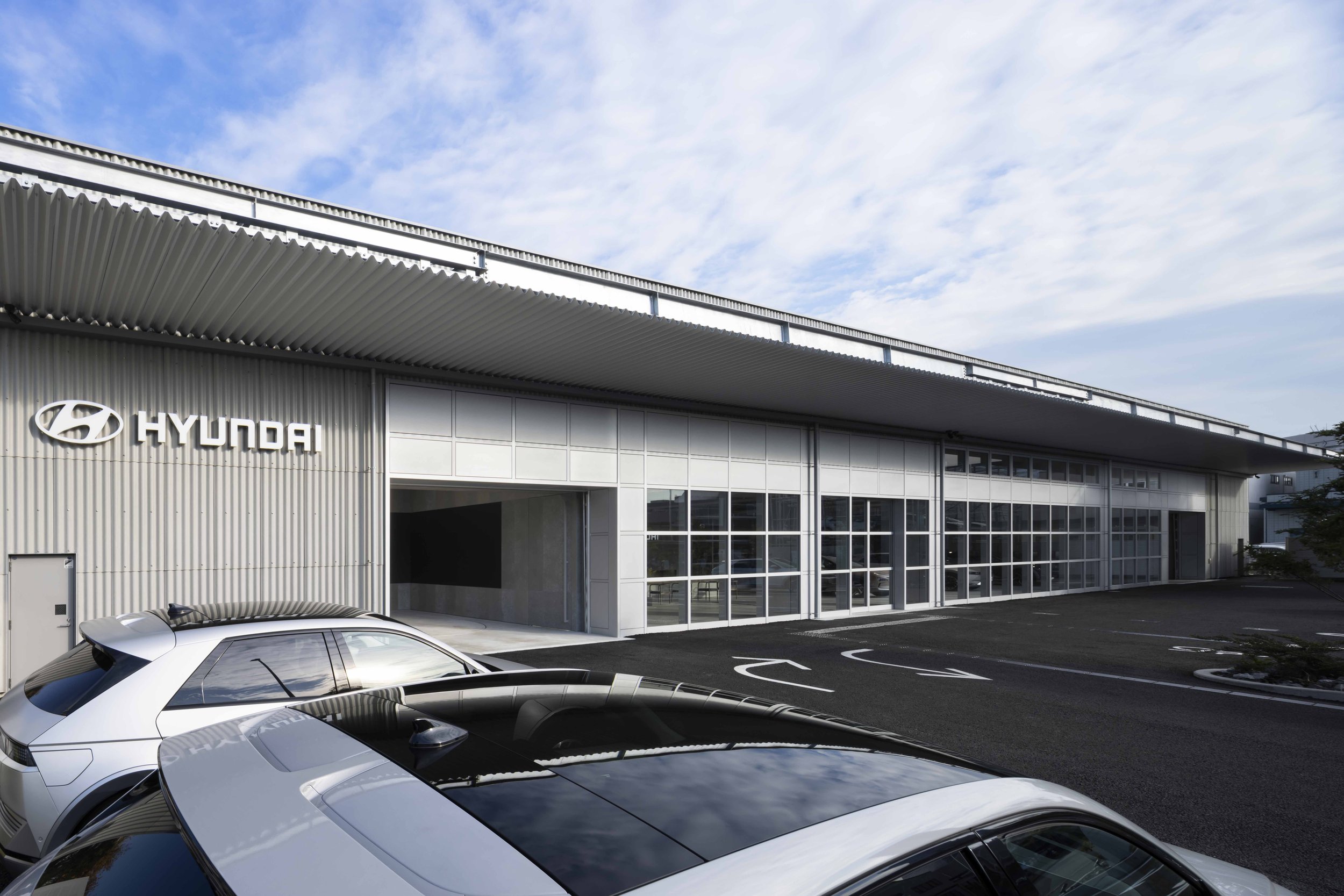
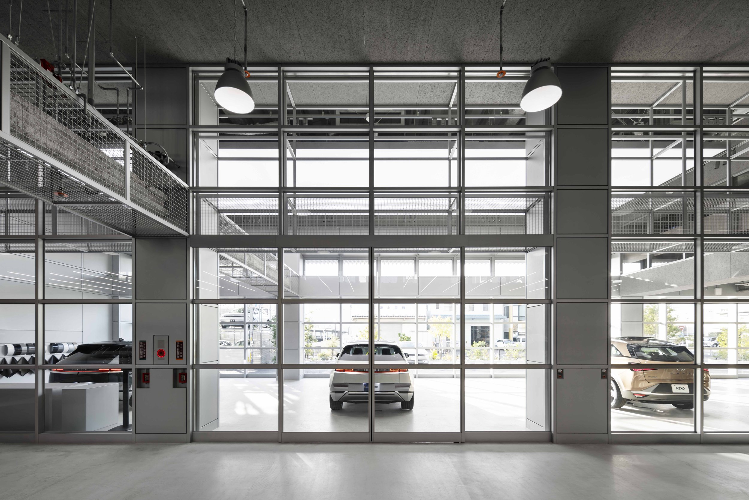
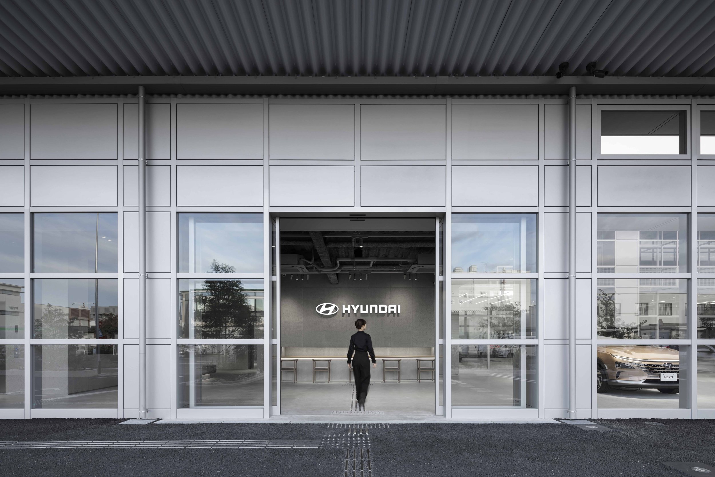
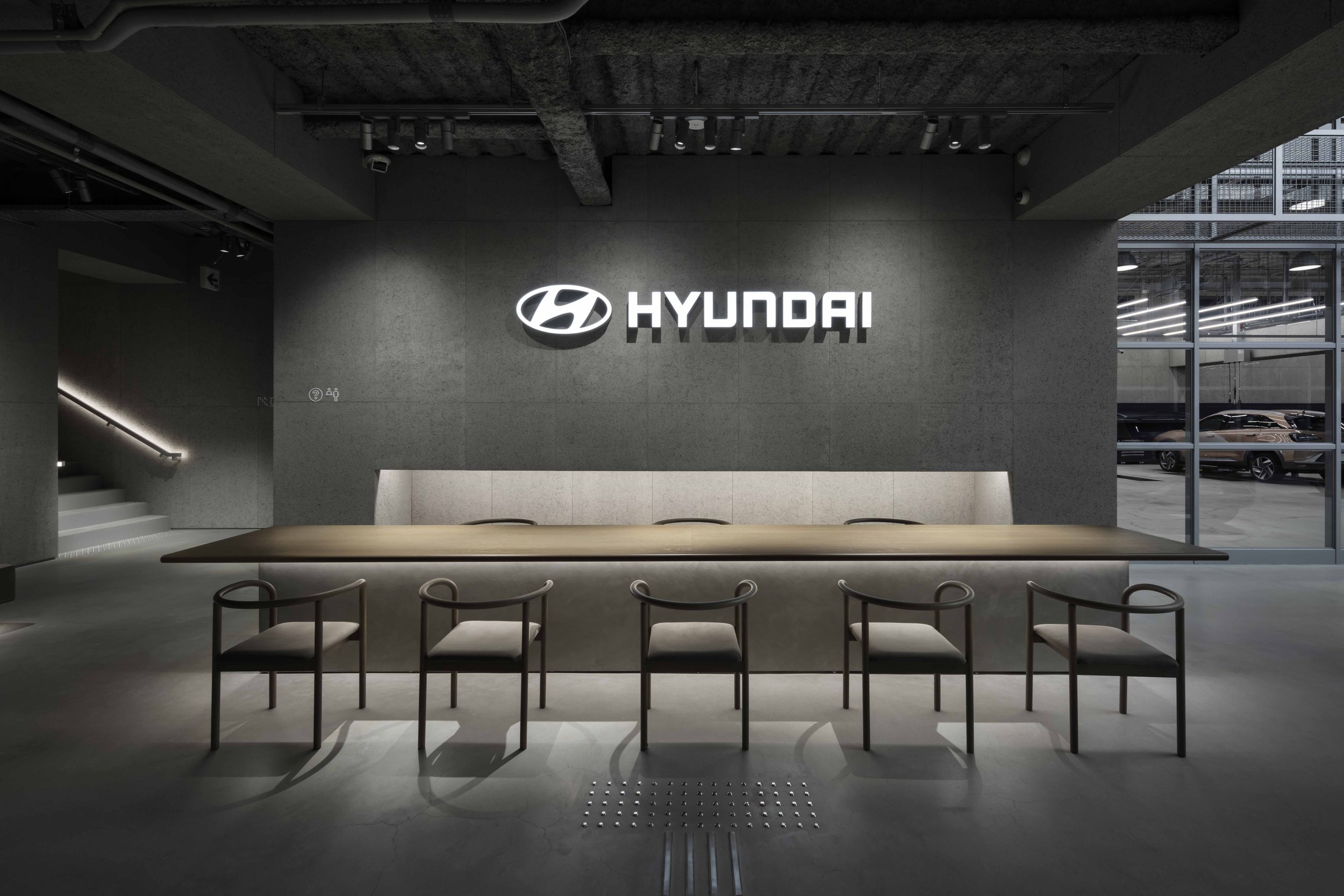
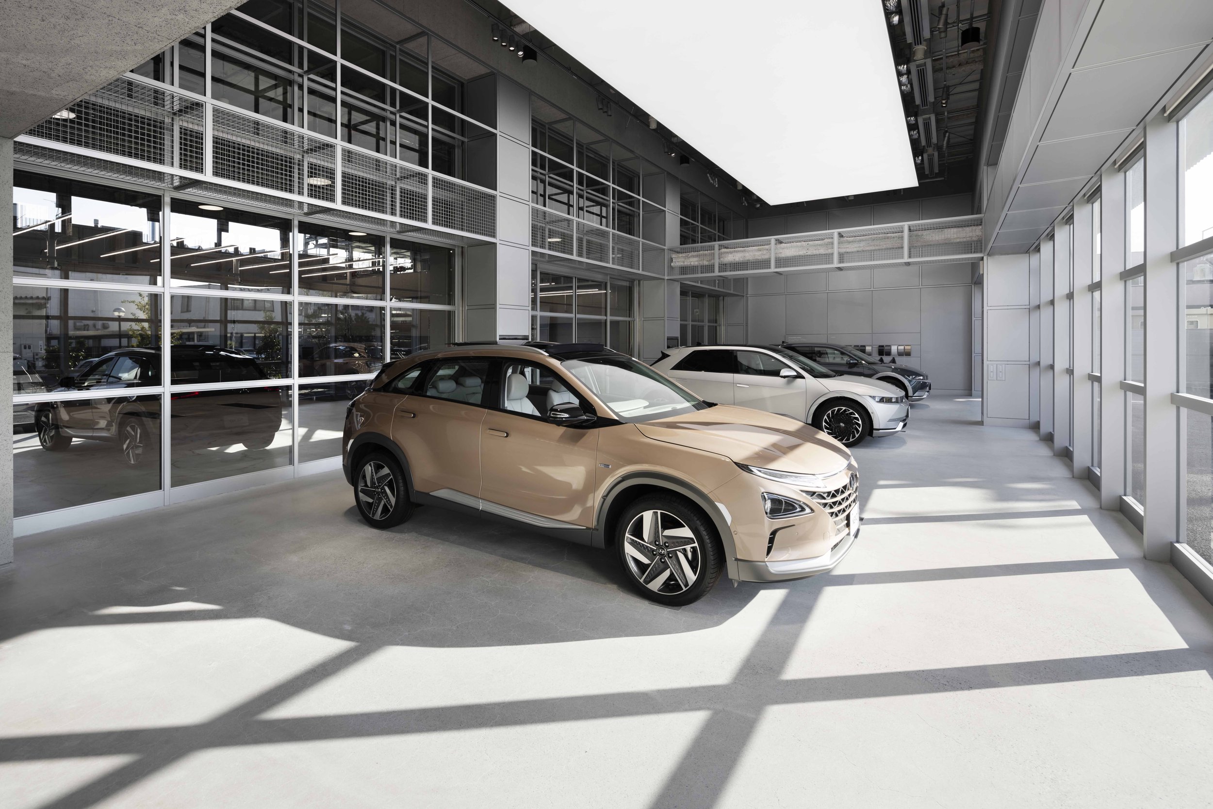
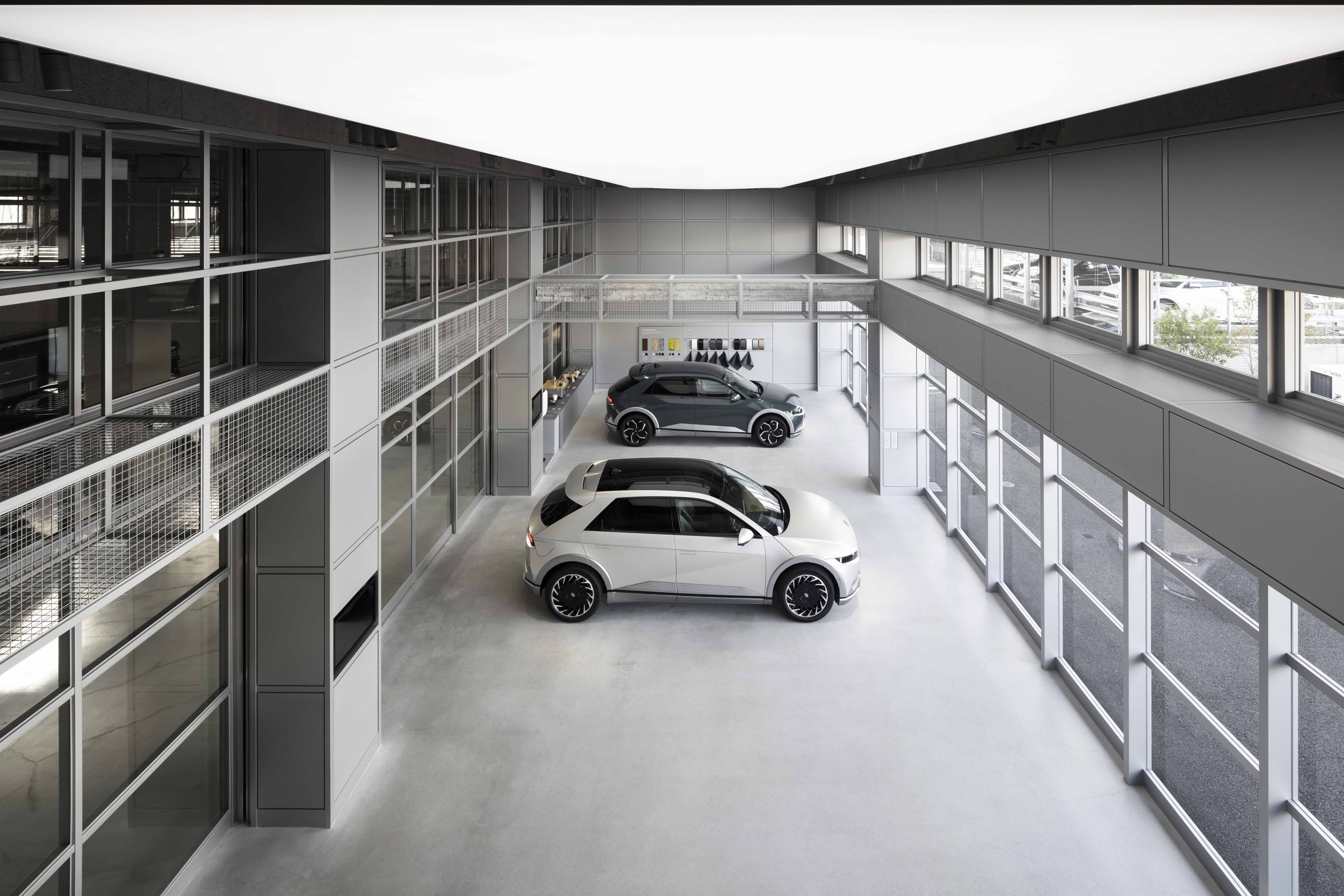
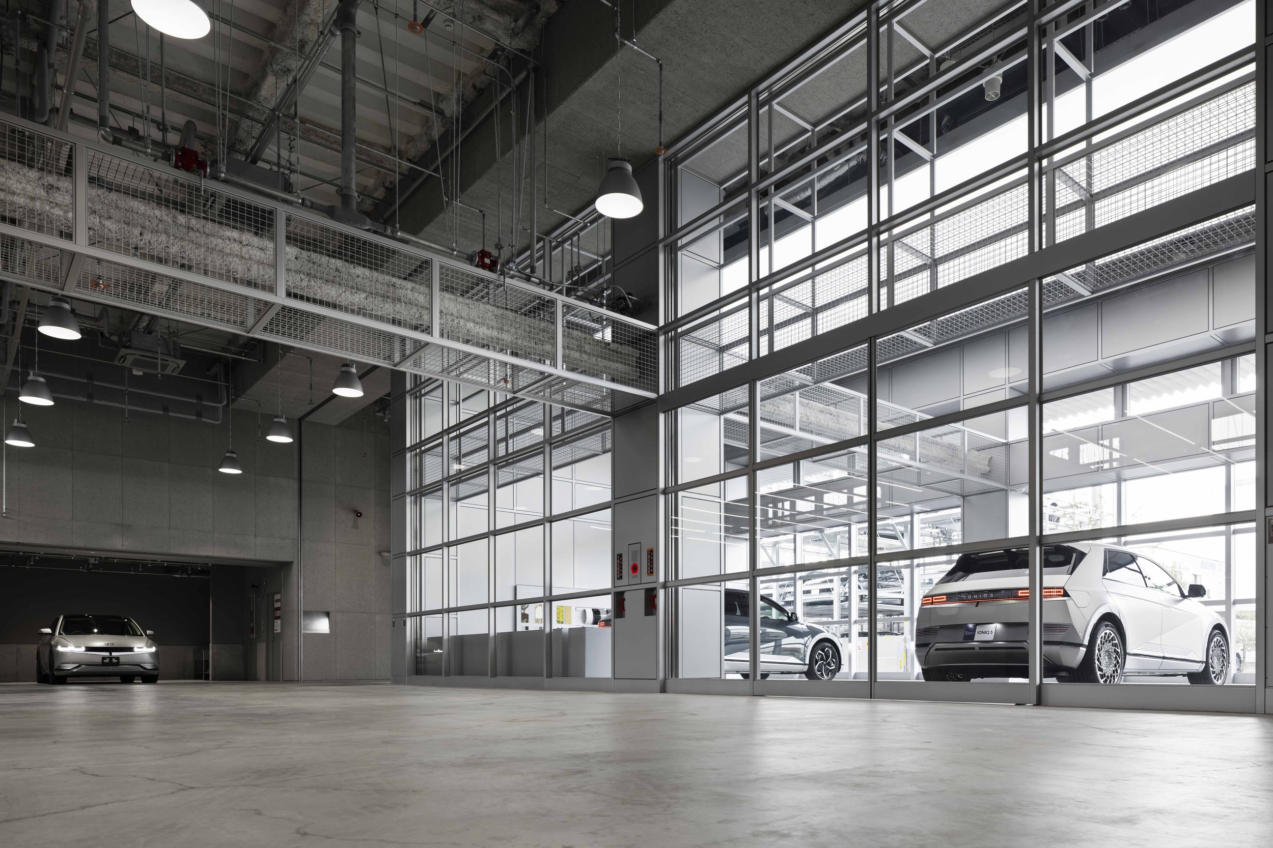
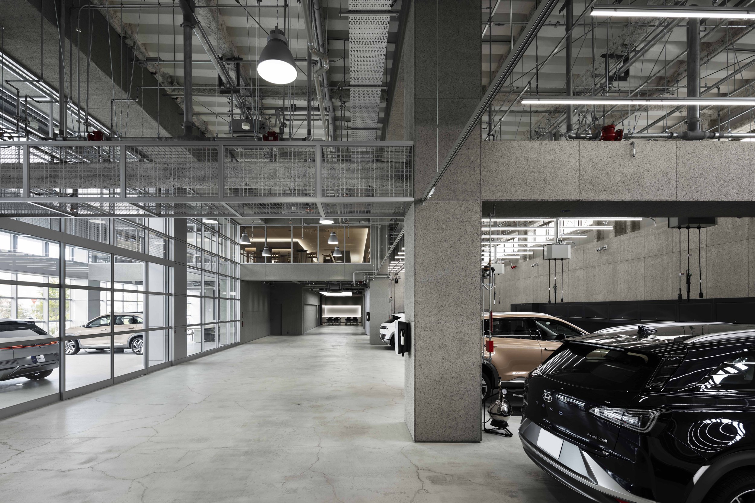
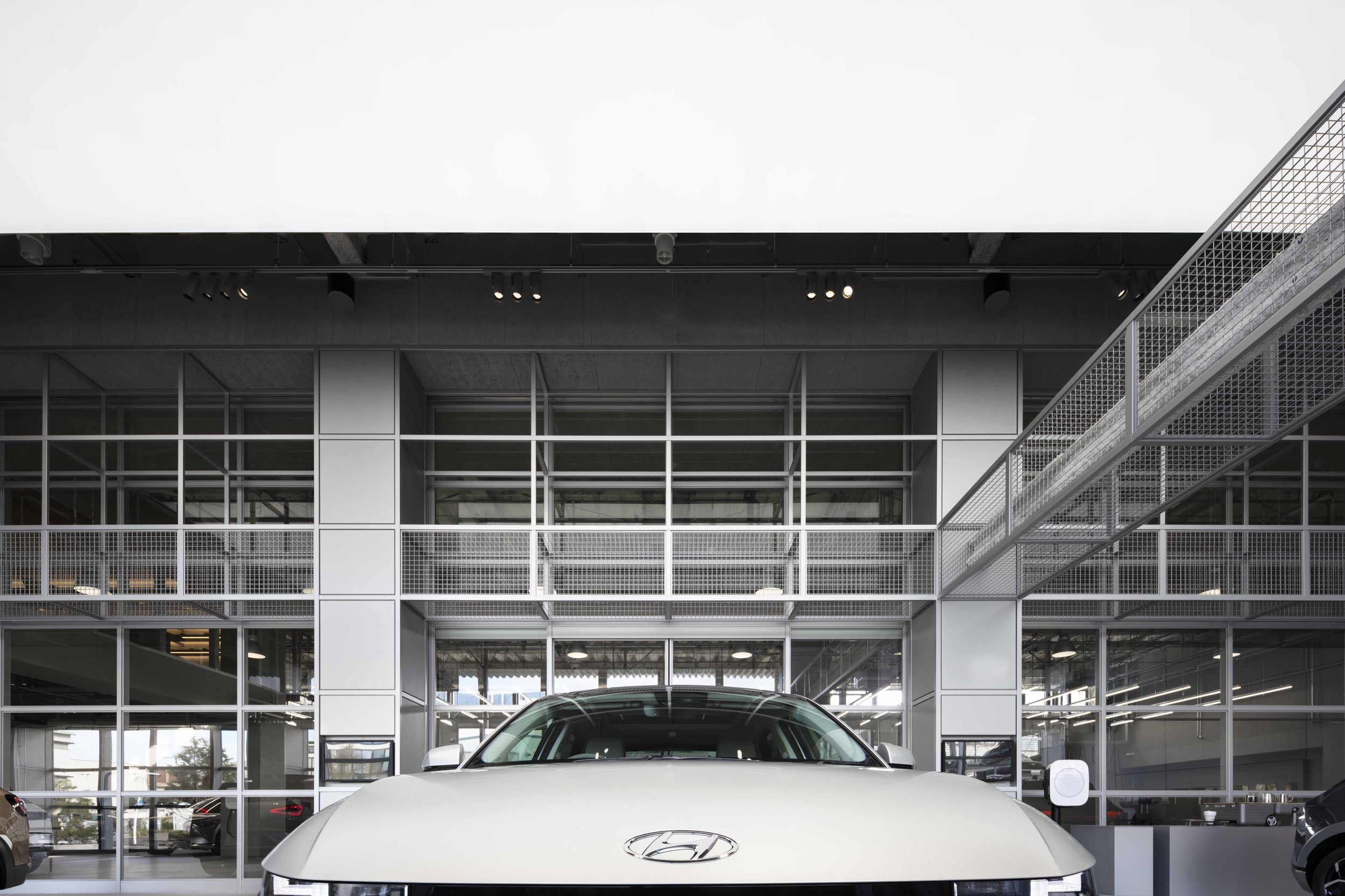
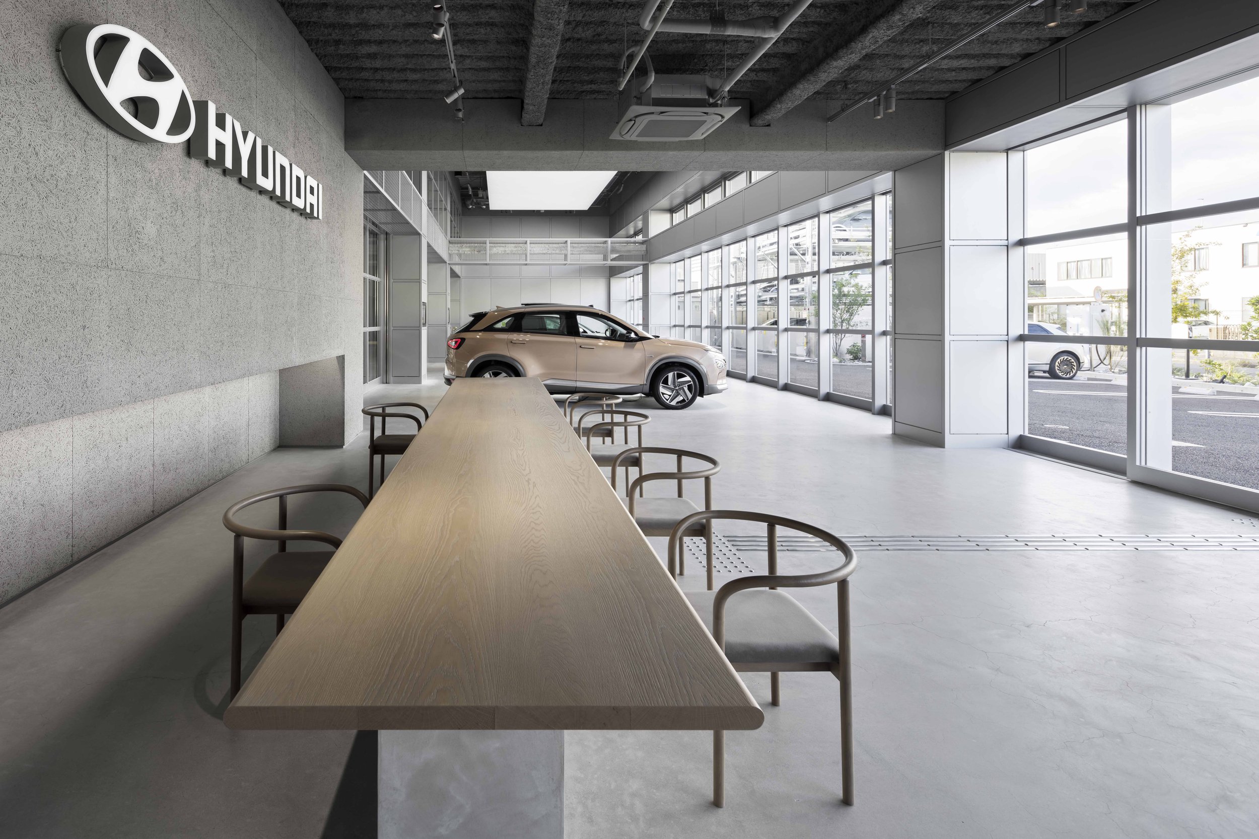
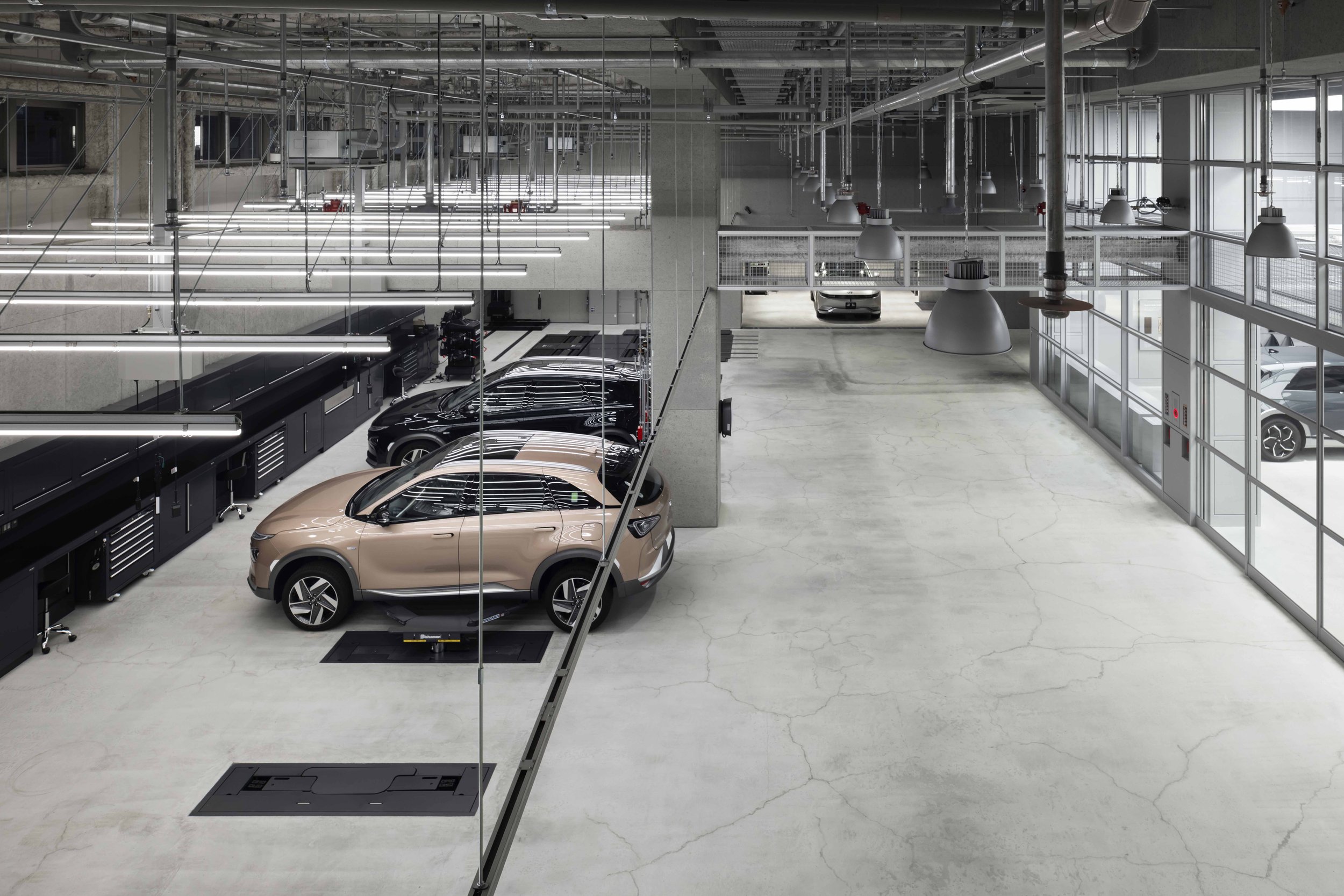
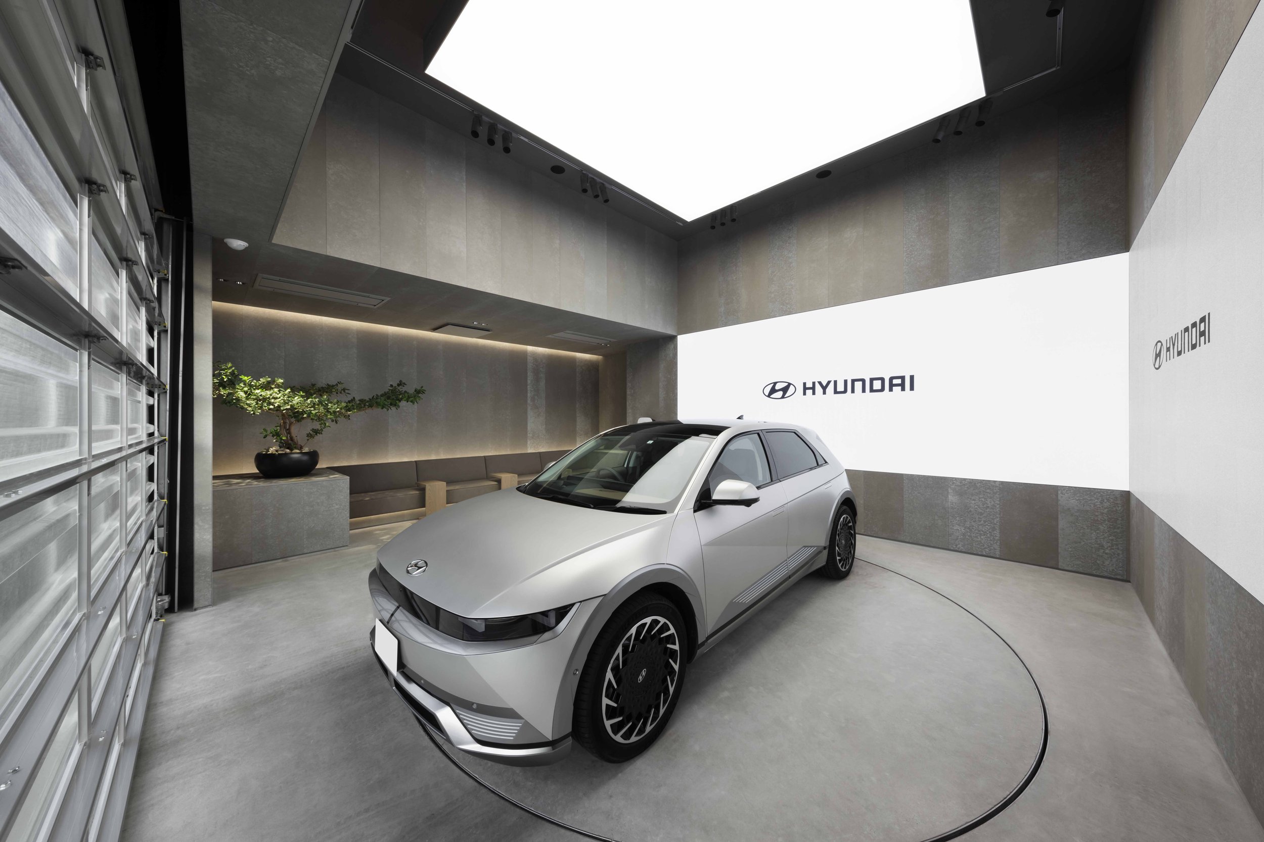
At the heart of the design philosophy is the customer. The integration of the showroom with the maintenance facility at the Hyundai Customer Experience Center YOKOHAMA is a testament to our commitment to transparency and trust-building. Customers are invited to witness firsthand the meticulous care and dedication that goes into servicing clean mobility solutions, fostering a sense of confidence and reliability.
A defining feature of the Hyundai Customer Experience Center YOKOHAMA is its emphasis on sustainability beyond just the vehicles it showcases. The choice of recyclable materials in the spatial design underscores Hyundai's dedication to creating lasting, environmentally conscious spaces. The result is a harmonious blend of functionality and eco-consciousness, encapsulating Hyundai's core values in a tangible, immersive experience.
The visionary minds behind this project, Hiroshi Yoneya, Ken Kimizuka, and Yumi Masuko of TONERICO: INC., have not just designed a space, but brought Hyundai's vision to life. Their expertise in architecture, interior design, and product design shines through in every aspect of the center, inspiring a commitment to excellence and innovation.
As Hyundai continues to lead the charge towards a cleaner, sustainable future, the Hyundai Customer Experience Center YOKOHAMA stands as a beacon of progress—a testament to the power of design in shaping a brighter tomorrow.
For more information, please visit: https://www.hyundai.com/jp/brand/cxc-yokohama
Designer Profile:
The PolyCuboid by KTX archiLAB, Silver winning architecture project from Sky Design Awards
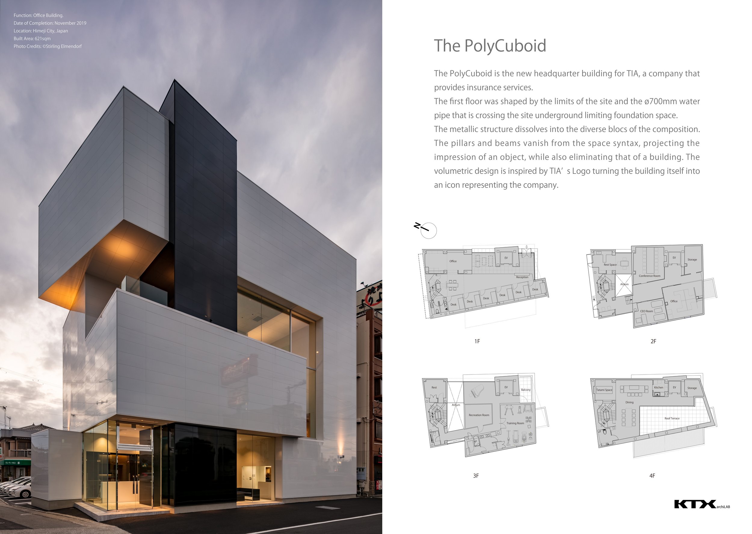
Designed by KTX archiLAB, the project of the PolyCuboid is located in Himeji City, Japan. The PolyCuboid is intended for the new headquarter building for TIA, which provides insurance services.
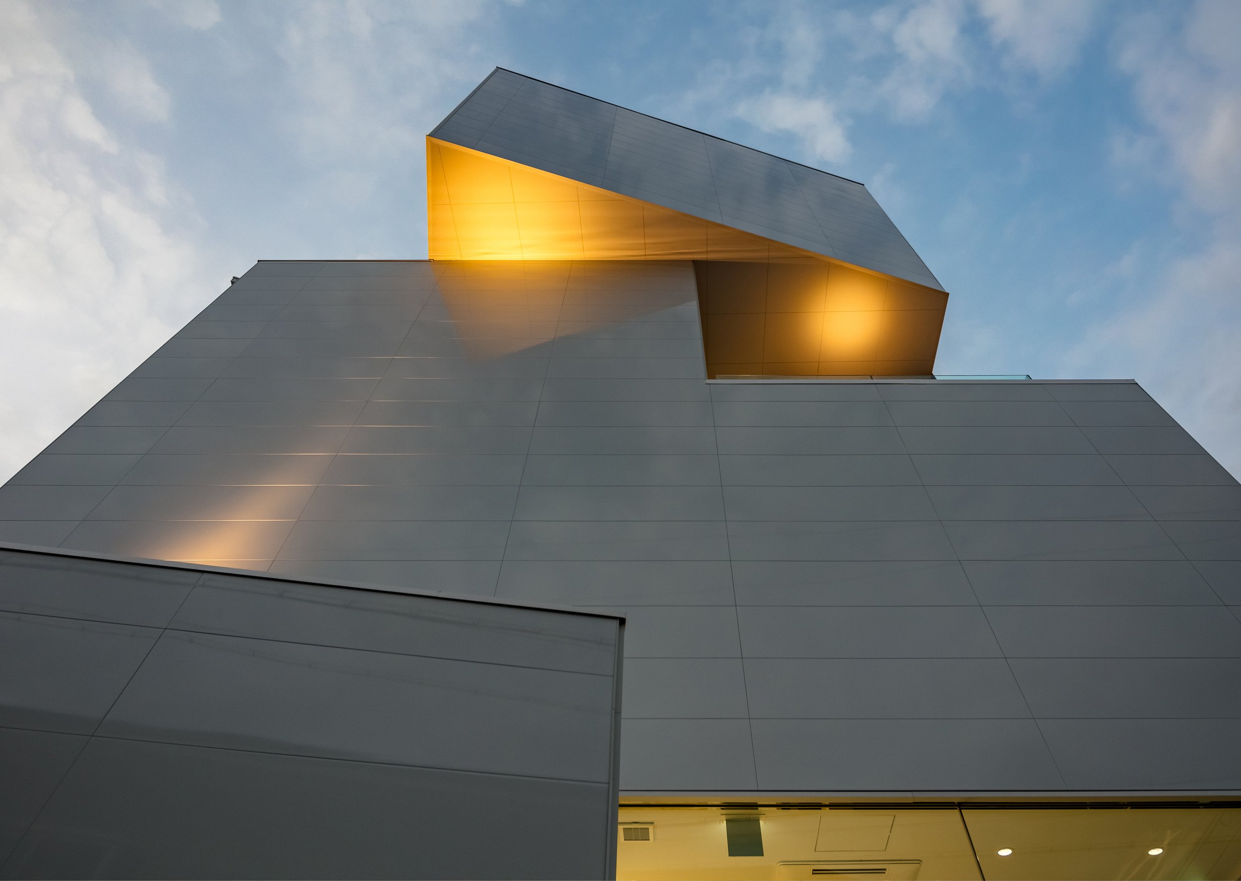
The metallic structure of the building dissolves into the diverse blocs of the composition. The pillars and beams vanish from the space syntax. Projecting the impression of an object while also eliminating that of a building. The volumetric design is inspired by TIA's Logo turning the building itself into an icon representing the company.
The silver medal in architecture from Sky Design Awards 2021.
The volumetric design is inspired by TIA’s logo turning into the building itself as an iconic building
Designed by KTX archiLAB, the project of the PolyCuboid is located in Himeji City, Japan. The PolyCuboid is intended for the new headquarter building for TIA, which provides insurance services.
The metallic structure of the building dissolves into the diverse blocs of the composition. The pillars and beams vanish from the space syntax. Projecting the impression of an object while also eliminating that of a building. The volumetric design is inspired by TIA's Logo turning the building itself into an icon representing the company.
The volumetric design is inspired by TIA's Logo turning the building itself into an icon representing the company.
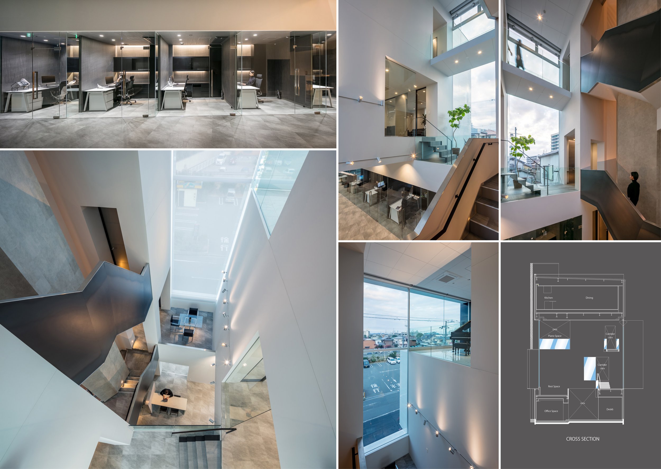
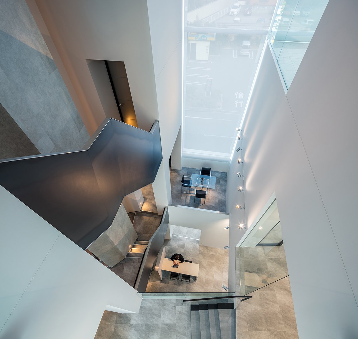
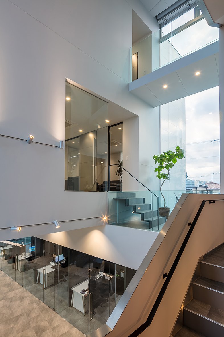
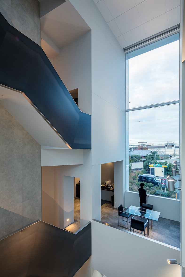
The volume comprises three primary cuboid shapes creating intersections, voids, and space units. The cuboids' superposition across each other also allows a richer space syntax, including interior and exterior terraces, an atrium, several seating spaces, and precise yet more prosperous functional distribution of spaces and connections. Bridges also connect the cuboids from inside, allowing a dynamic overview of the different areas.
The first floor was shaped by the site's limits and a ø700mm water pipe crossing the site underground, limiting foundation space to half the land area. As a result, the middle volume stretching from 2nd to 3rd floor extends in cantilevers on both sides, allowing the building to gain precious square meters.
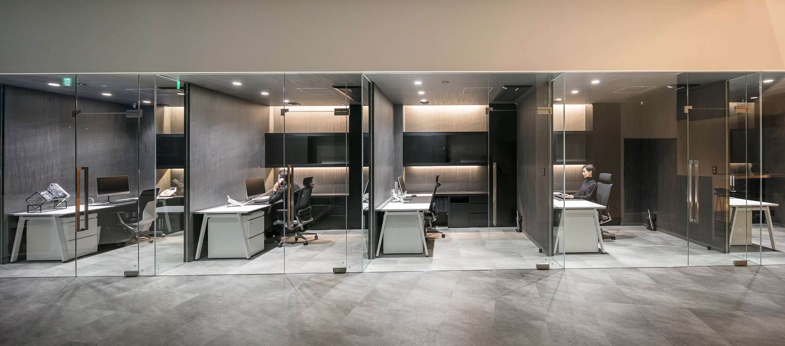
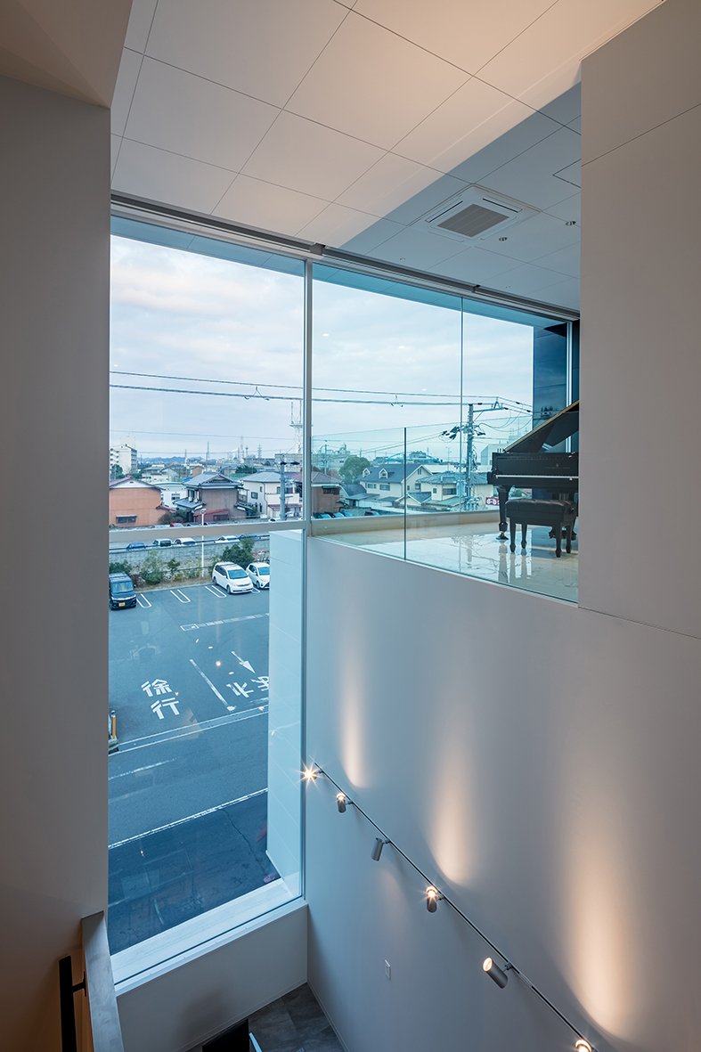
Functionally, a furnished reception and meeting space and 6 private desks and office space occupy the ground floor. The workspace continues to the next level with a conference room, CEO's room and second office space. This floor is separated into two areas by deferent floor levels, with the lower one dedicated to resting spaces, including a kitchen, a table terrace giving on the Atrium and a counter space. The third and fourth floors are devoted to recreation with various spaces such as a training room, dining space with a roof terrace and even a piano space on the Atrium. The staircase stretches from 1st to 4th level along the Atrium, although this last only reaches the third floor. However, the elevator block is the highest cuboid volume and was cladded in reflective black differently from the white cladding on all other volumes.
Identification: TIA Headquarters
Function: Office Building.
Total Area: 621sqm
Completed: 23 November 2019
Location: Himeji City, Japan.
Address: Shinzaike-1371-16 Aboshiku, Himeji city 671-1234 Japan.
Photo Credit: ©Stirling Elmendorf.
Photographer website: http://www.stirlingelmendorf.com/
KTX archiLAB: http://ktx.space/
"THE IMPORTANCE OF BEING AN ARCHITECT" TO PREMIERE AT MILAN DESIGN FILM FESTIVAL
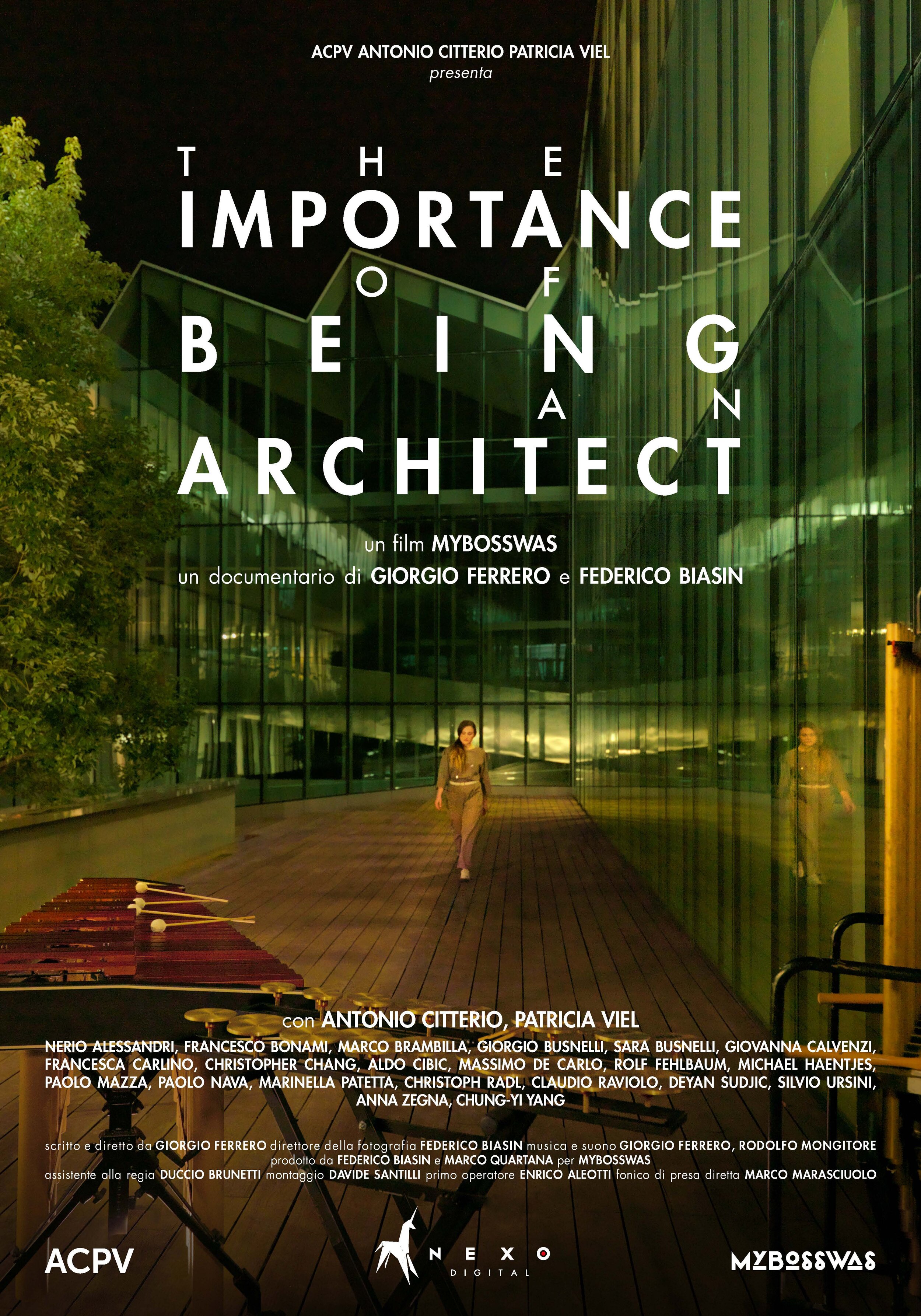
Italian architecture and interior design practice Antonio Citterio Patricia Viel (ACPV) presents the film ‘The Importance of Being an Architect’ (a MyBossWas production, by Giorgio Ferrero and Federico Biasin, 60’, Italy) . Conceived as a choral and musical documentary that investigates the responsibility of architects in building the society of tomorrow, the film will be screened for the first time at the Milan Design Film Festival, taking place between October 20 and 24, 2021.
Italian architecture and interior design practice Antonio Citterio Patricia Viel (ACPV) presents the film ‘The Importance of Being an Architect’ (a My Boss was production, by Giorgio Ferrero and Federico Biasin, 60’, Italy) . Conceived as a choral and musical documentary that investigates the responsibility of architects in building the society of tomorrow, the film will be screened for the first time at the Milan Design Film Festival, taking place between October 20 and 24,2021. Set in four acts, the film explores – through the gaze of architect Antonio Citterio, one of the most renowned Italian designers in the world, and architect Patricia Viel, the two co-founders of ACPV – a vision for the architecture of tomorrow, centered on an armistice between nature and the built environment.
Alternating dialogues with various personalities from the world of fashion, art and design, and exploring pieces of architecture designed by ACPV, the documentary offers a vision of the post-Covid world, in the midst of the climate crisis and urban redistribution, while guiding the viewer between elements of the design methodology, from data analysis and technological innovation, to travel as an inexhaustible engine of inspiration. “My life has always been a journey through places, ideas and experiences that represent a continuous source of inspiration: this film revisits these moments to map the outlines of my vision for the future,”says Antonio Citterio.“ In 2020, I turned 70, celebrated the 50th anniversary of my career, and the 20th anniversary of the practice founded together with Patricia Viel. This documentary has been an opportunity to take a step back and look at the most important moments of the past decades as an architect and designer.”Conceived as a virtual dialogue and musical journey, the film starts off with the first act that focuses on the compatibility between architecture and nature, with personalities such as Anna Zegna, Massimo De Carlo, Francesco Bonami and Rolf Fehlbaum, who seek a definition of the concept of architecture and the social responsibility that it carries in present-day society. In the second act, the former director of the Design Museum (London), Deyan Sudjic recounts Antonio Citterio’s professional path as a designer and architect, starting from the 1980s creative boom in Milan.
“With this film, we are proposing an interpretation of the role that architecture and architects will playin present-day society and beyond,” says Patricia Viel.“We do it through a series of dialogues with people from the world of art, fashion, culture and lifestyle, with whom we have built a shared history.Architecture is introduced as an undulating, non-intrusive element, echoed in the notes hit by the musicians that bring the four acts to life.”
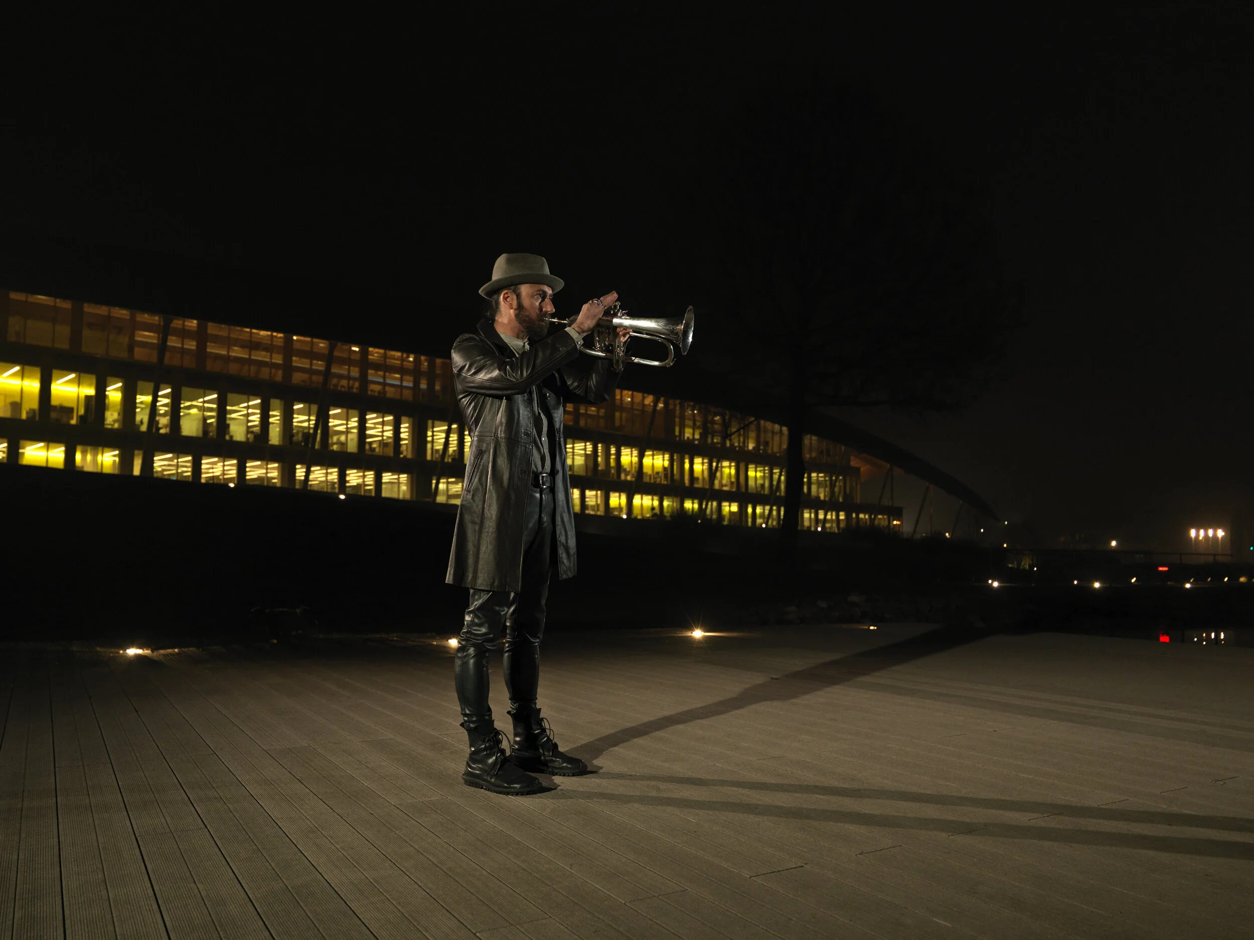
In the third act, ACPV opens up to the viewer, offering a glimpse of a holistic and multidisciplinary approach to the day-to-day complexities of designing buildings and spaces. The film closes with the memories of the great masters Antonio Citterio and Patricia Viel met during their life and work; and finishes with an understanding of how the responsibility of the architectural profession has evolved, as far as being expected to respond to social changes and the challenges of globalization. “With this film, we are proposing an interpretation of the role that architecture and architects will playin present-day society and beyond,” says Patricia Viel.“We do it through a series of dialogues with
The film will be screened during the Milan Design Film Festival (October 20-24, 2021) at Teatro FrancoParenti (Via Pier Lombardo, 14 – 20135, Milan), and it will be available for streaming during the Festivalat https://www.milanodesignfilmfestival.com/
The newly revitalised Avenue of Stars, Hong Kong
The first waterfront rejuvenation project in Hong Kong developed by New World Development (NWD)
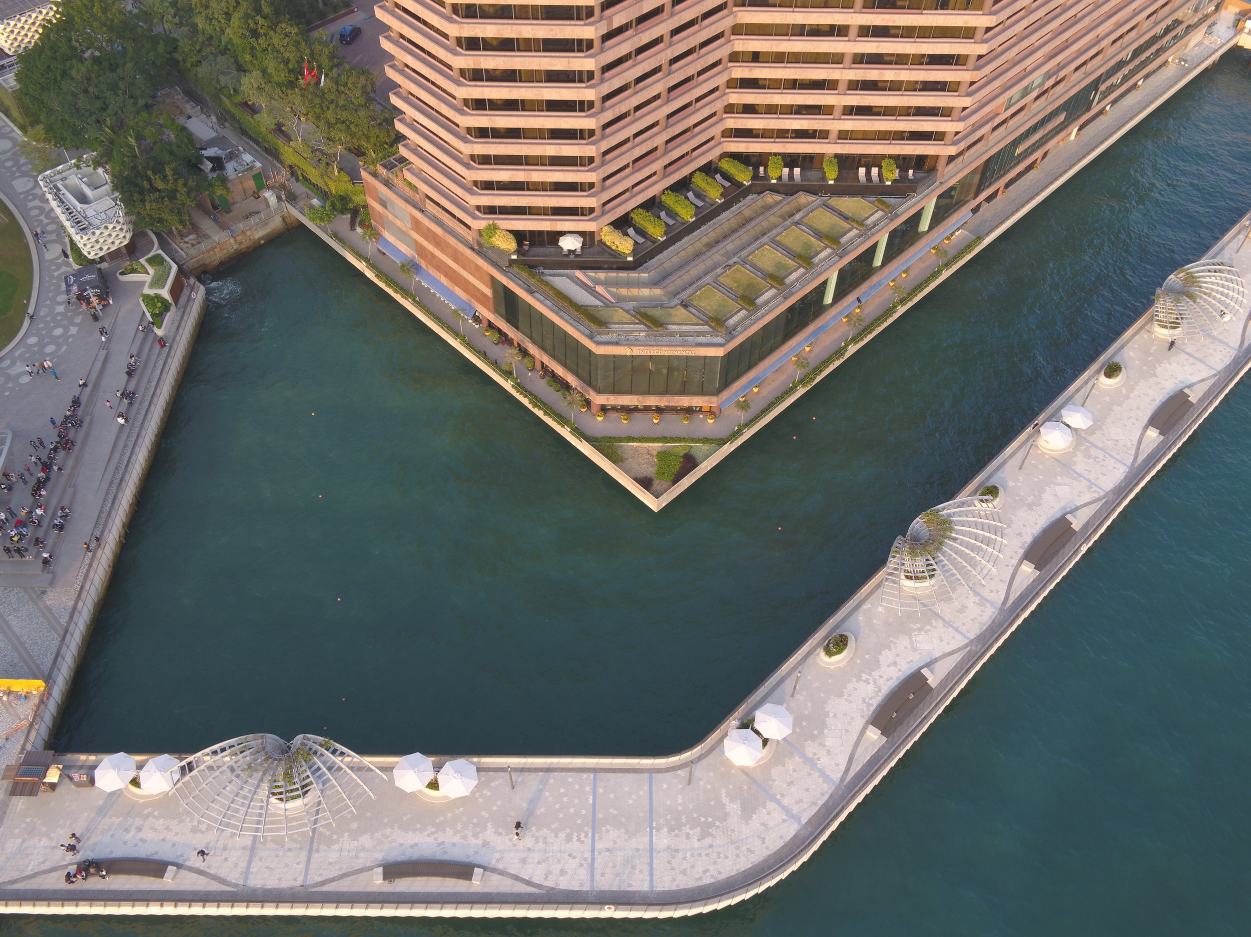
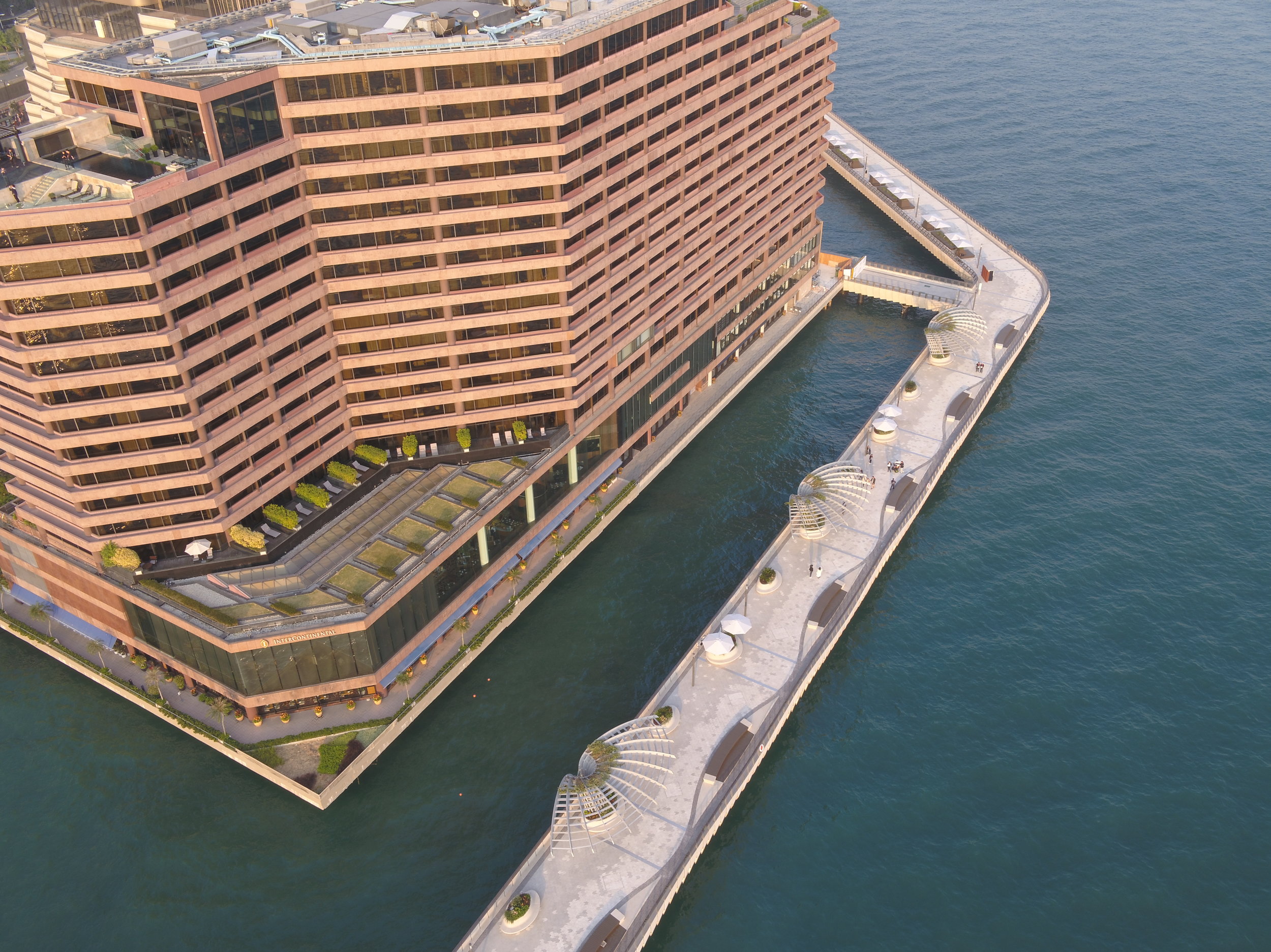
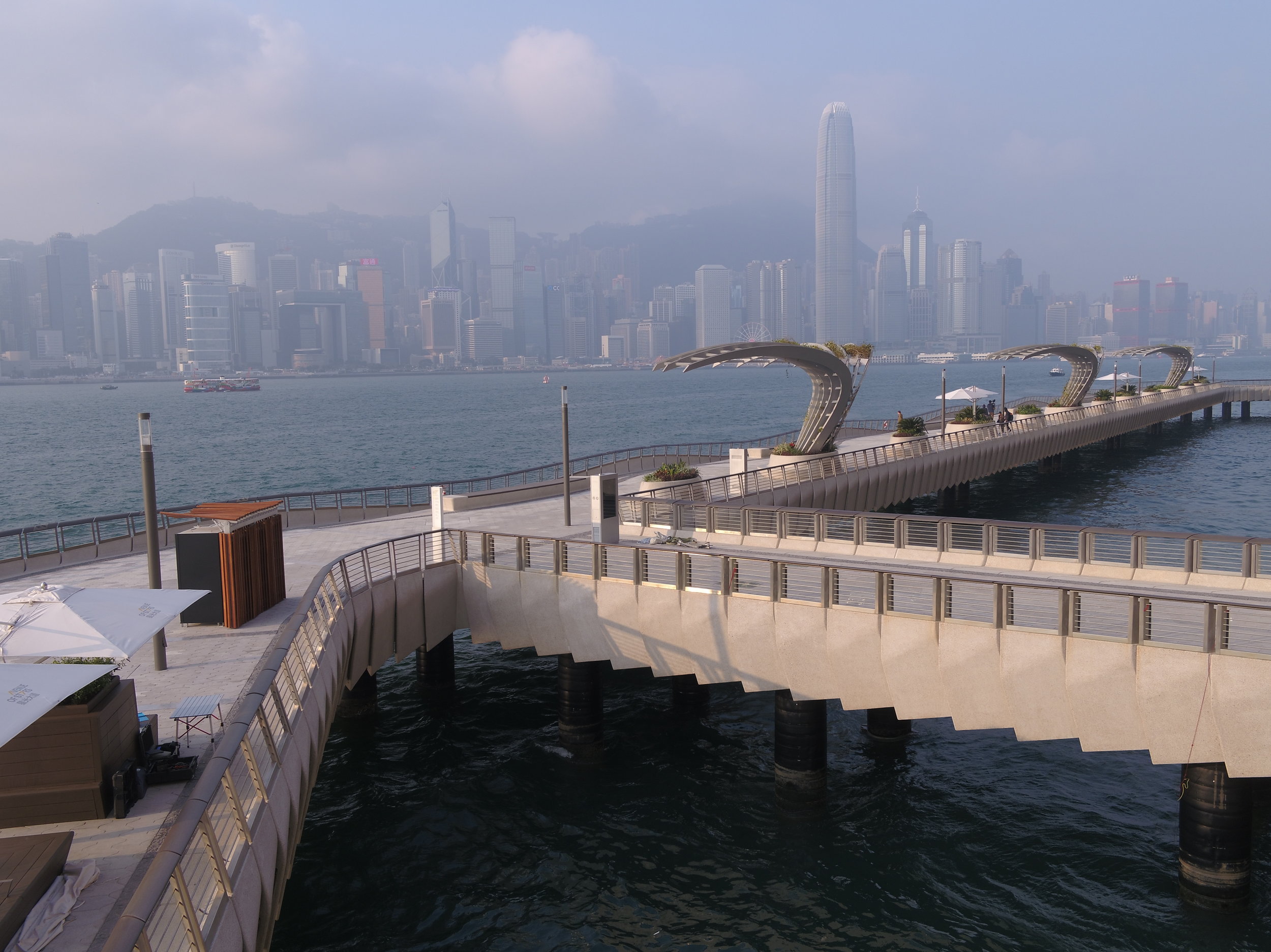

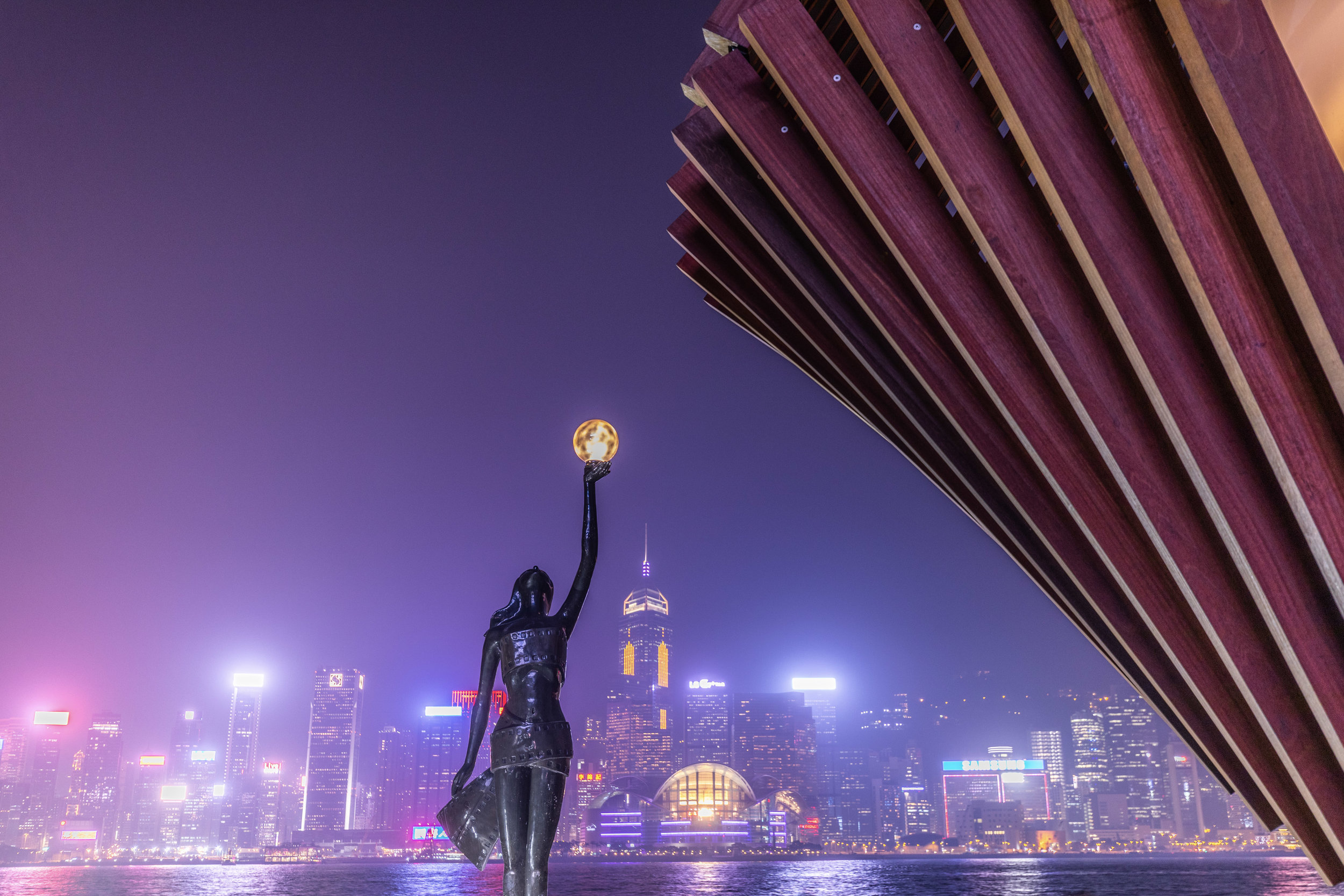
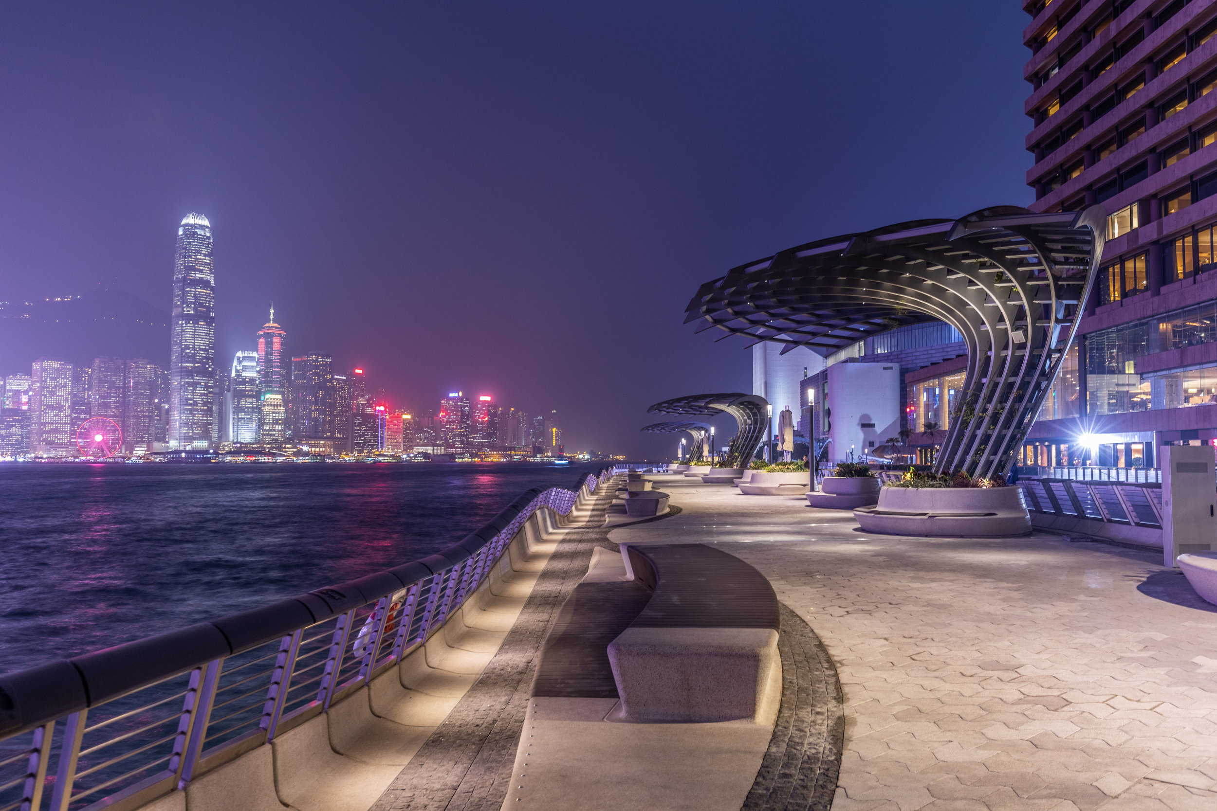
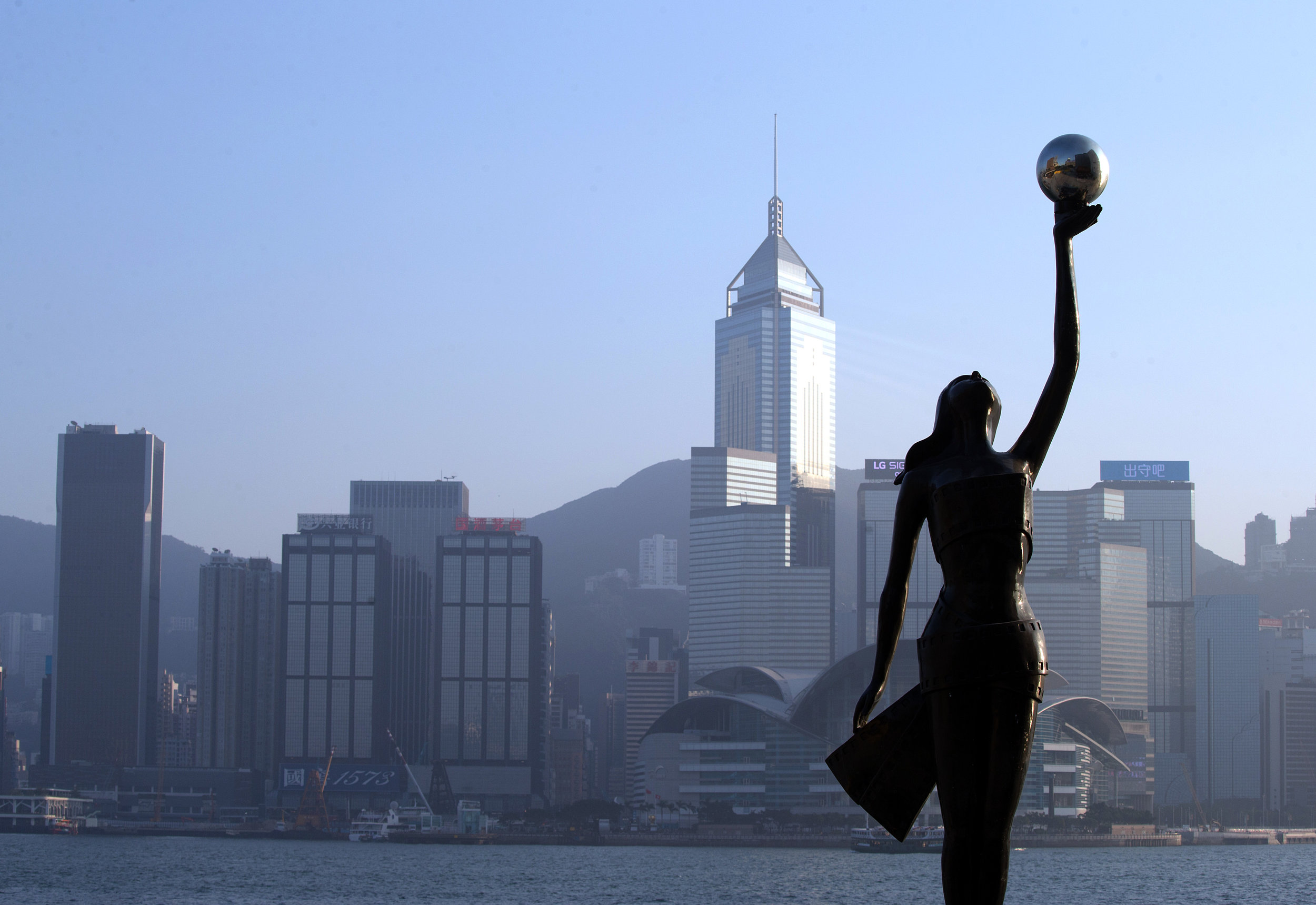
After a major overhaul and refurbishment, the Avenue of Stars (the Avenue), the first waterfront rejuvenation project in Hong Kong developed by New World Development (NWD) and designed by internationally acclaimed landscape architect James Corner Field Operations (JCFO), will be open to the public on 31 January 2019.
The Avenue is the result of close co-operation between Adrian Cheng, Executive Vice-chairman and General Manager of NWD, and James Corner, Founding Partner and CEO of JCFO. With JCFO who brought inspiration from their New York High Line Project, and the participation of international lighting architect Speirs & Major (S+M) and homegrown architect LAAB, they produced the masterplan to transform the Tsim Sha Tsui waterfront into a brand-new 21st century landmark of art, culture and sight-seeing.
The inspiration of the New York High Line in the design of the Avenue
The New York High Line is one of JCFO’s most notable urban revitalisation projects and it inspired their design for the Avenue. It features a stroll along a line, with episodic sequences, places, discoveries and surprises along the way. This scenographic journey, with coordinated views and vistas unfolding and being re-framed, is also apparent in the design of the Avenue. The main similarities between the High Line and the Avenue is that they are both elevated walks or promenades with amazing views and experiences. They are not parks or plazas or squares, but linear journeys.
Apart from the High Line, another major inspiration for the Avenue comes from the Harbourfront itself and the skyline of Hong Kong. The Avenue’s new rolling edge of the esplanade is designed to bring people closer to the water, and offer alternate views and experiences as they walk along the Avenue.
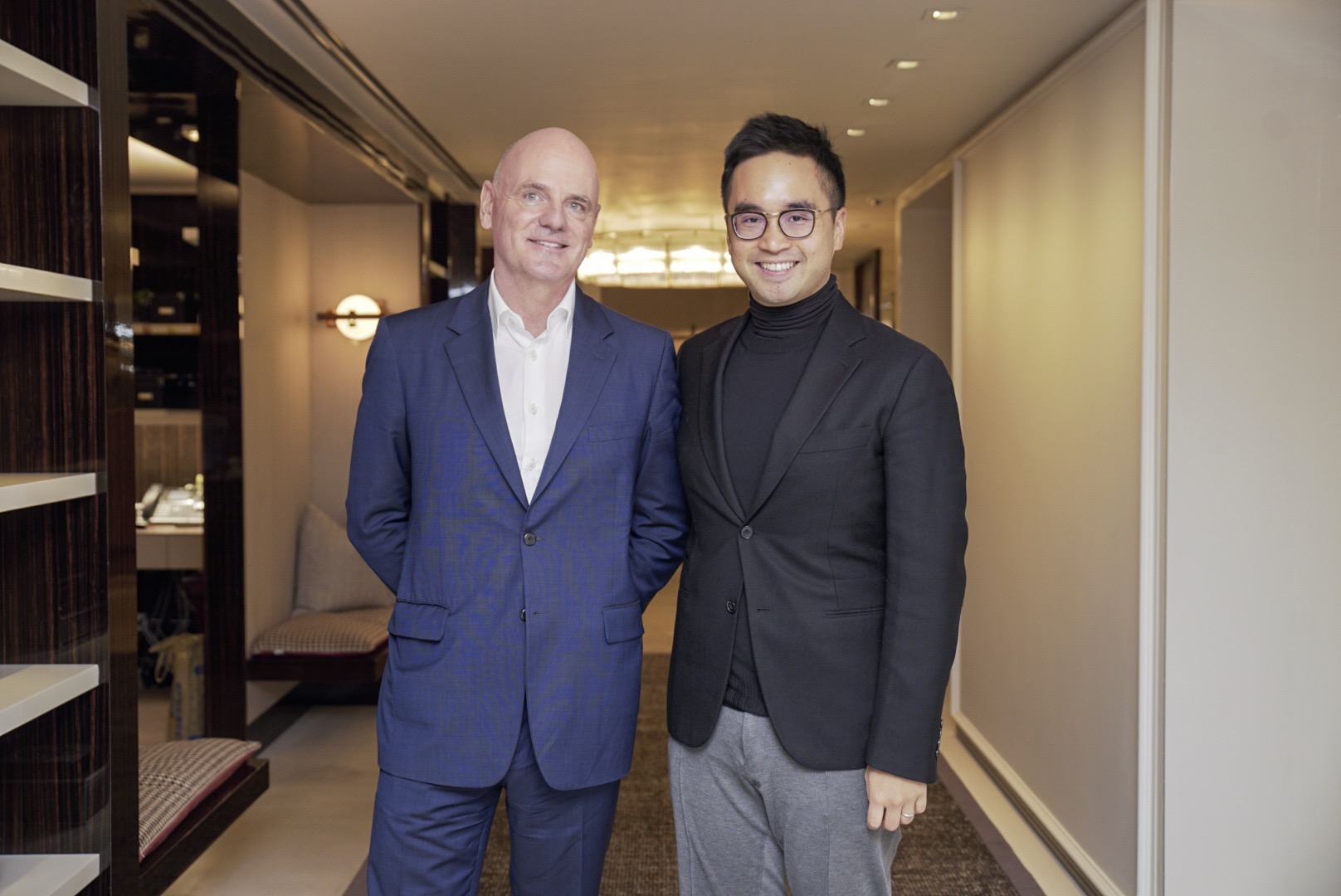
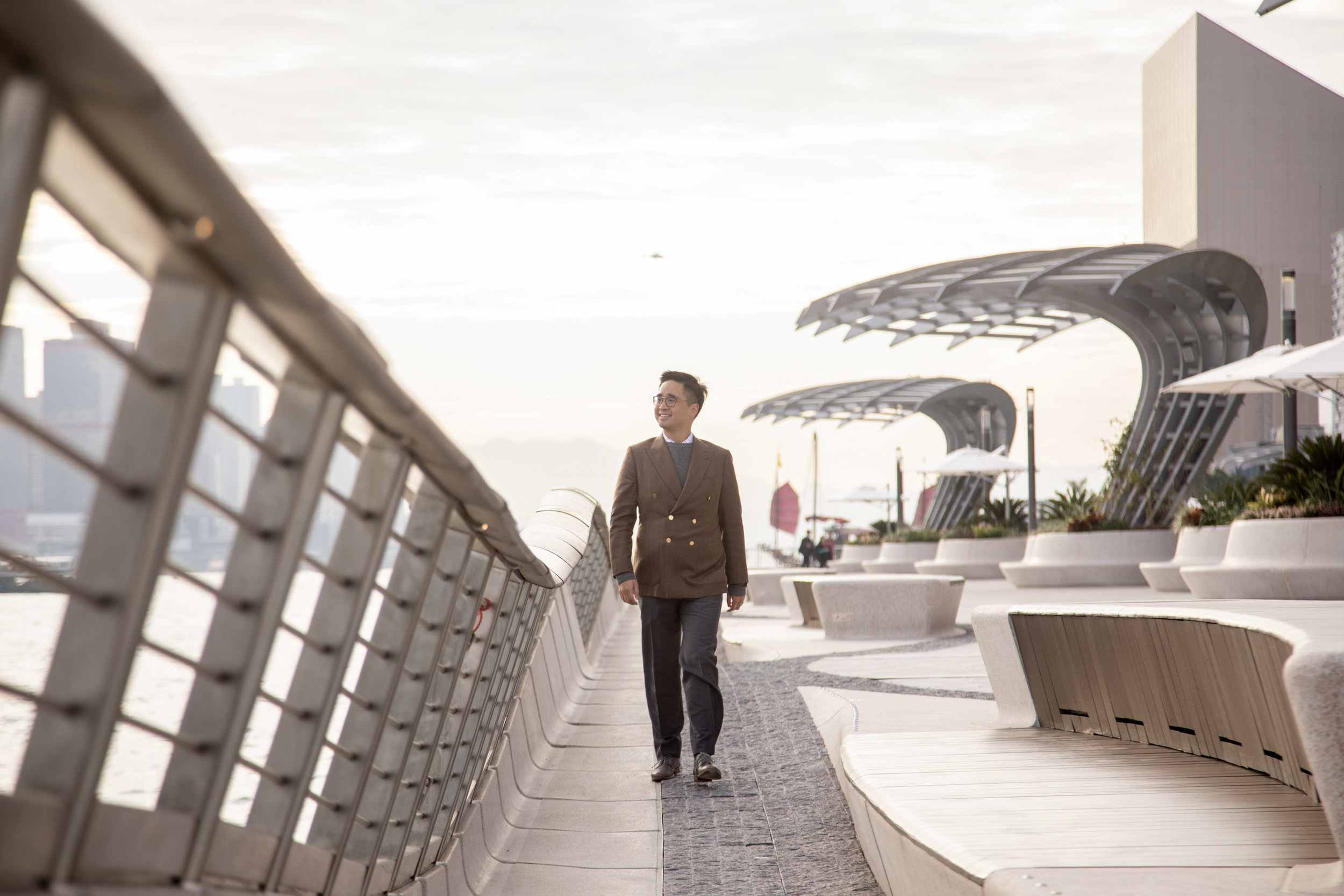
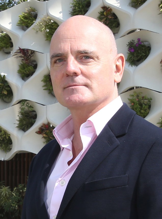
“James Corner expressed, “It was Adrian’s idea and priority to completely renovate and update the Tsim Tsa Tsui waterfront. I myself have enjoyed a very positive and creative relationship with Adrian. He brings a good deal of vision, aspiration, imagination and leadership to the table, enabling this new waterfront to be a special mix of dynamic public features with the arts, culture, varied social amenities and the Harbourfront itself, which was Adrian’s original vision – a global landmark.””
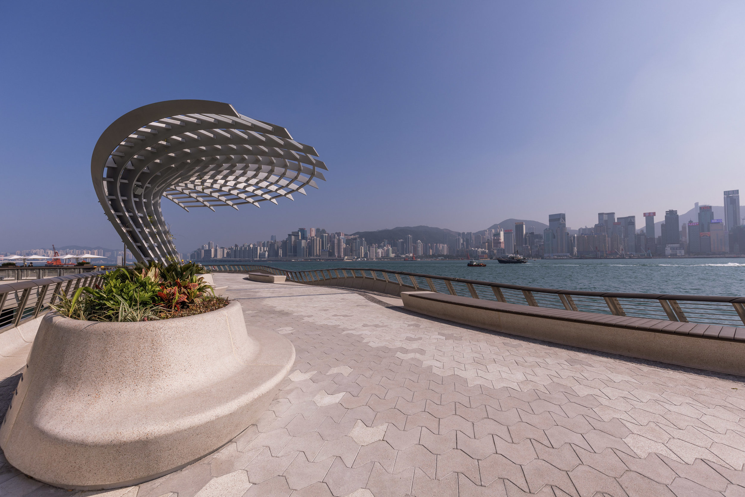
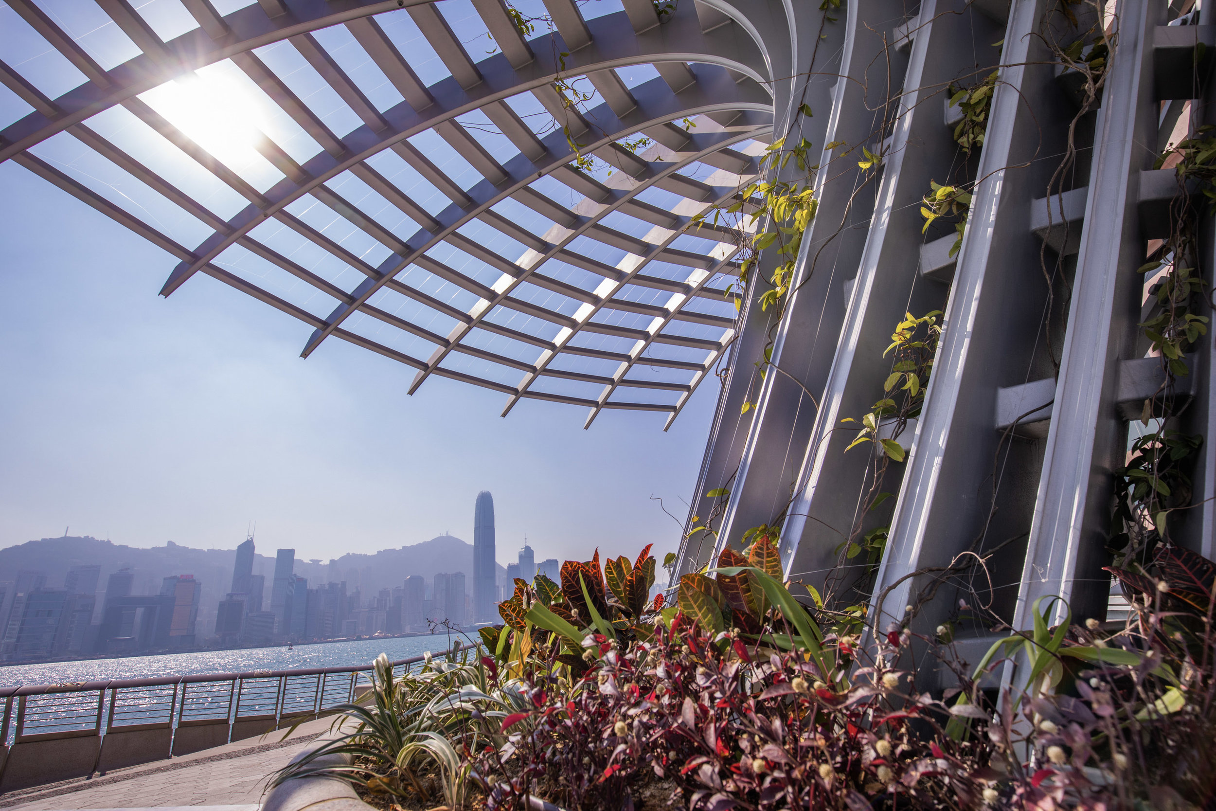
New amenities along the Avenue
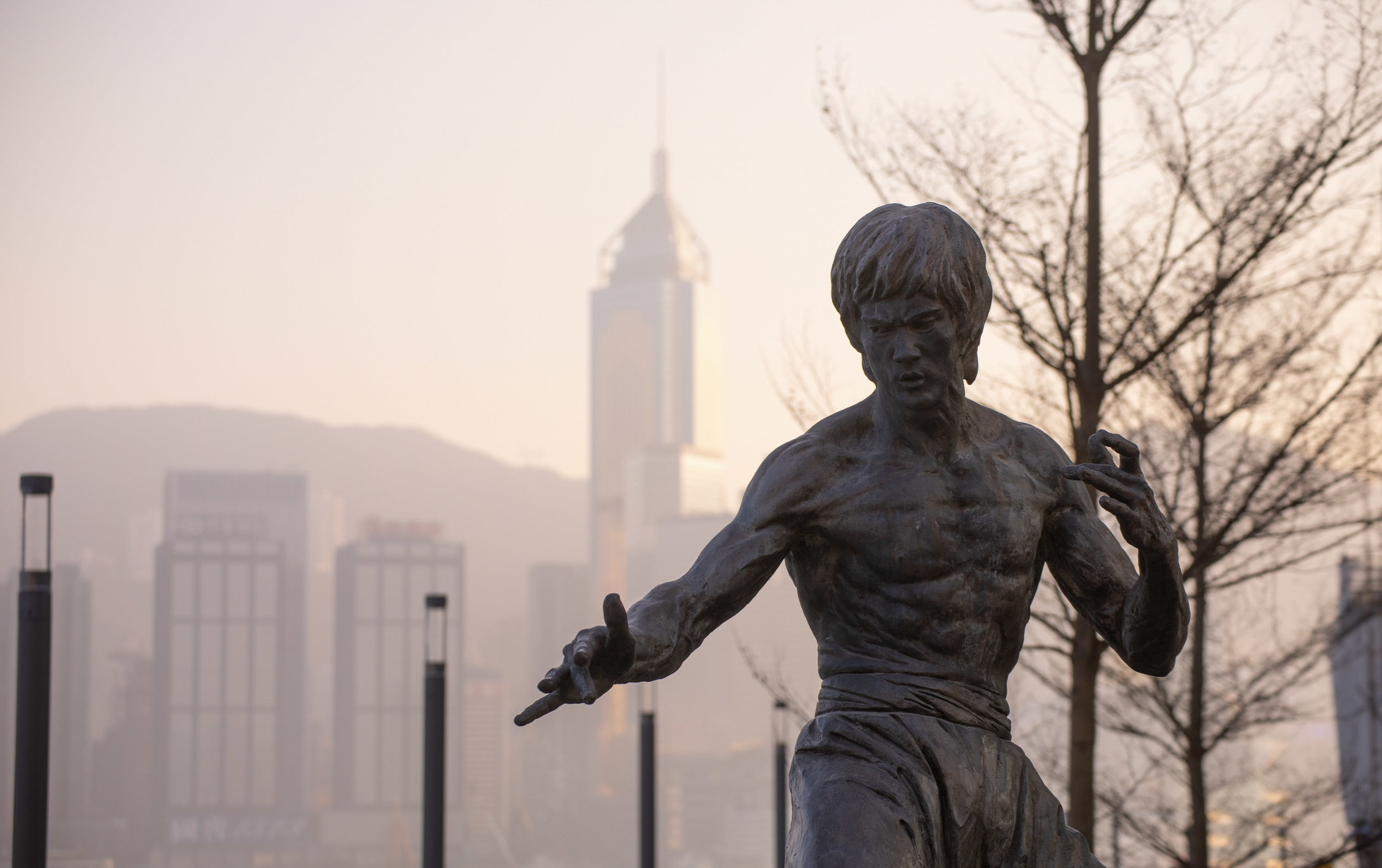
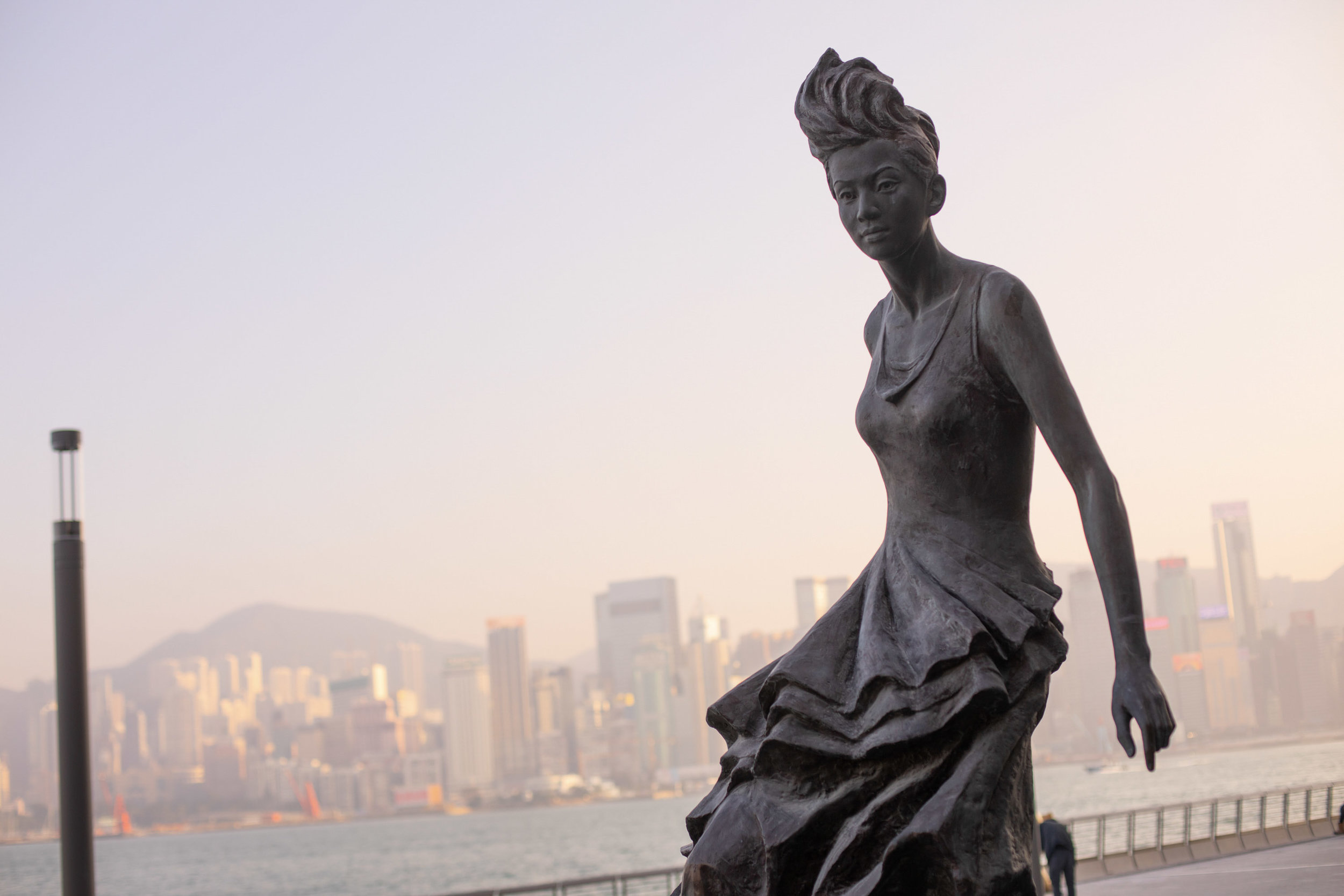
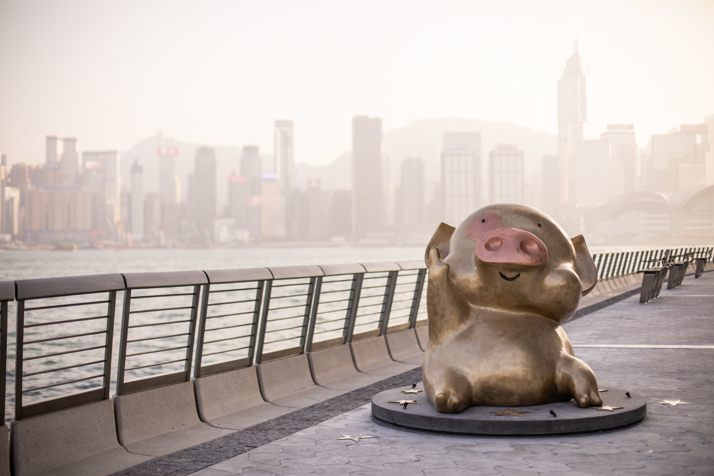
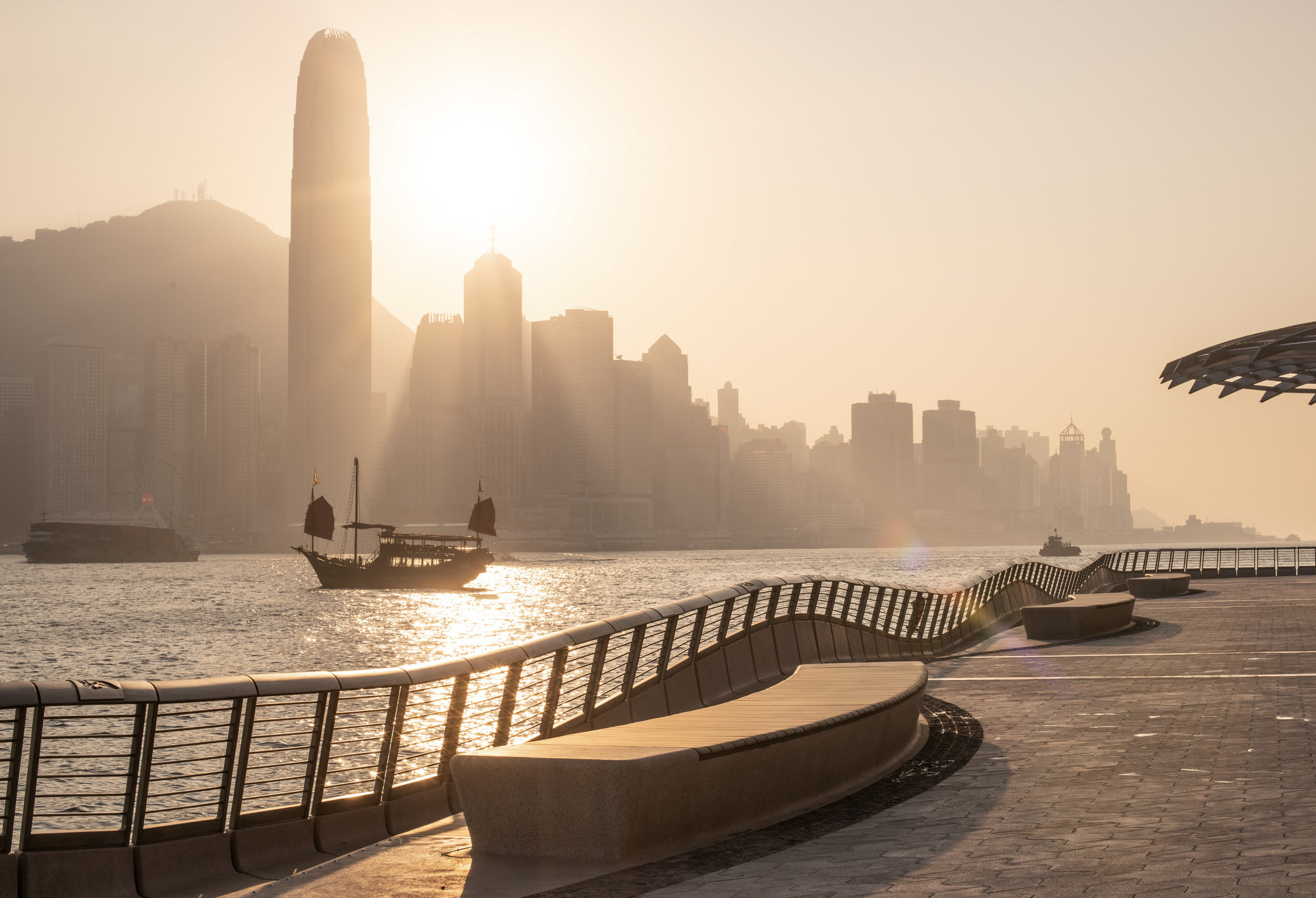
JCFO’s design maximises the potential of the Tsim Sha Tsui waterfront as a place where visitors can enjoy magnificent views of Victoria Harbour and the Hong Kong skyline, while respecting the heritage of the site and paying tribute to the Hong Kong film industry whose stars are featured along the walkway – hence the name Avenue of Stars. It also presents a holistic solution that responds sensitively to the needs of the community and overcomes the many challenges posed by the waterfront site including the increasingly extreme weather conditions the site is exposed to during the annual typhoon season.
Therefore, the new design from JCFO is more than a mere replacement - it offers a complete revamp in terms of social amenities, experience and diversity. It provides plenty of places, shades and seating for people to sit and enjoy the views, and people-watch, and allows themselves to become part of the scene.
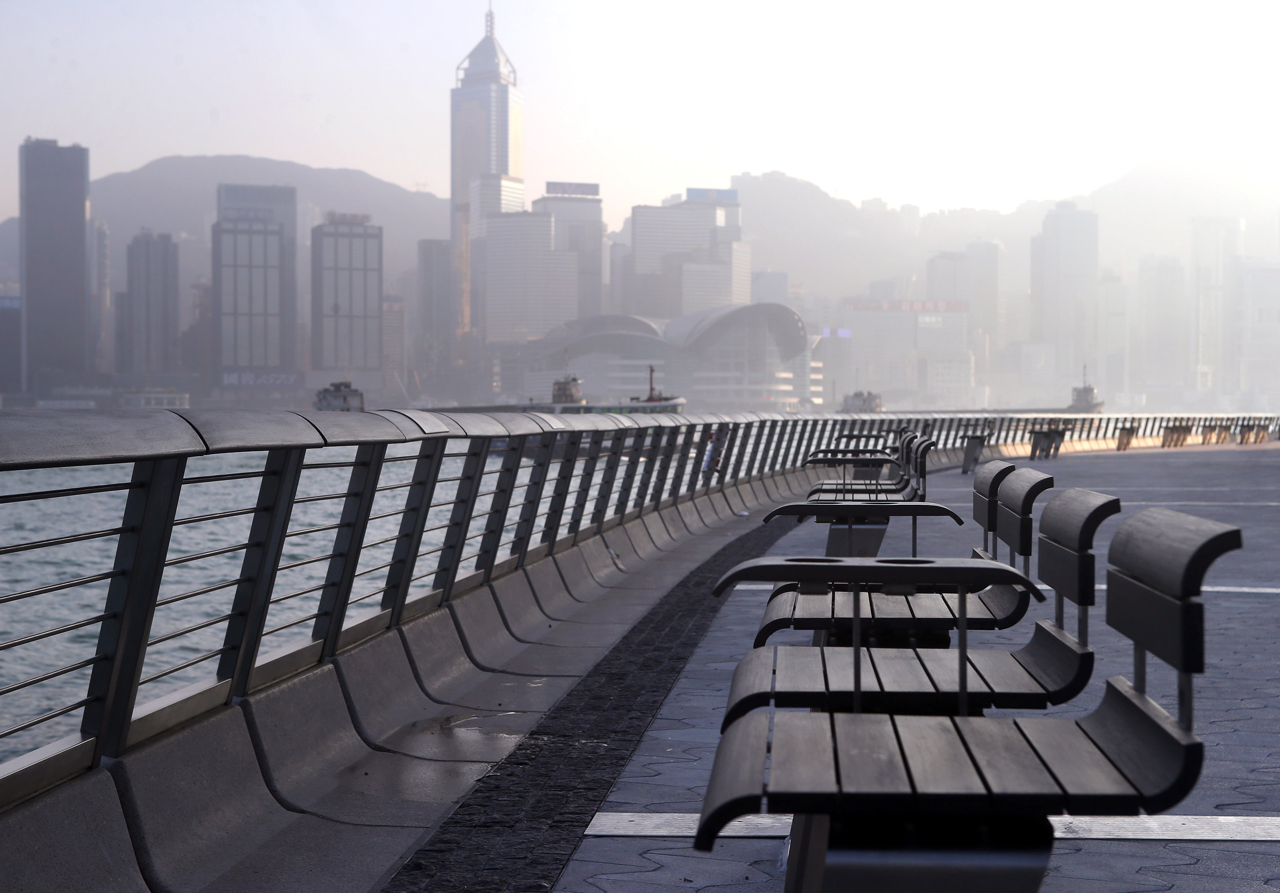
Notable Features:
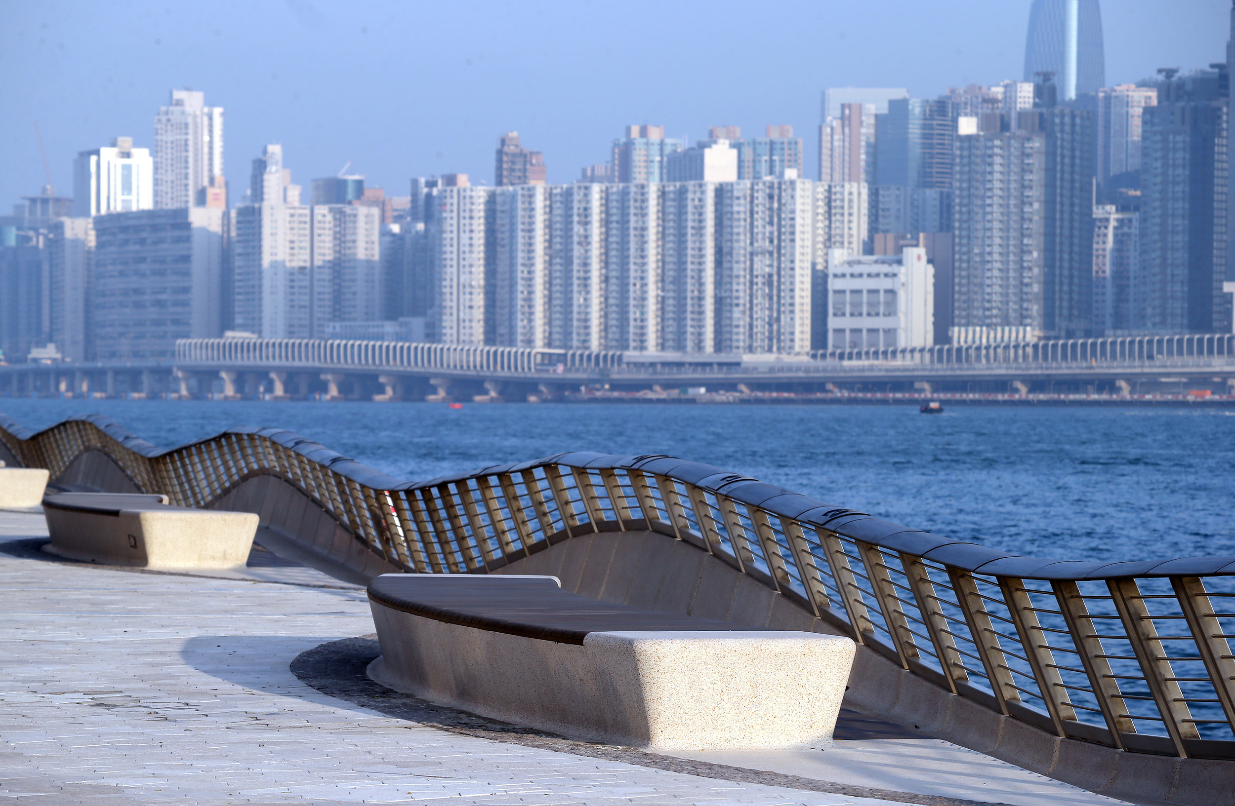
Visitors are brought closer to the waterfront with a range of sea-facing seats which make it one
of city’s best spots for viewing Victoria Harbour and firework displays.
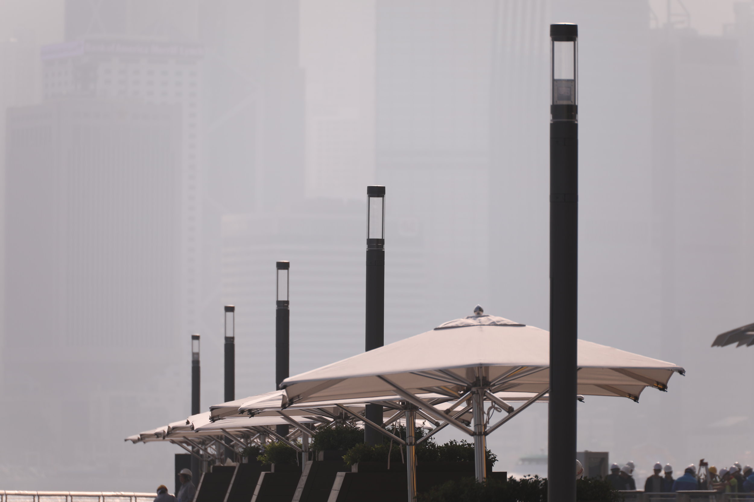
Four Trellises with vertical plants offer shade and reduce heat along the walkway.
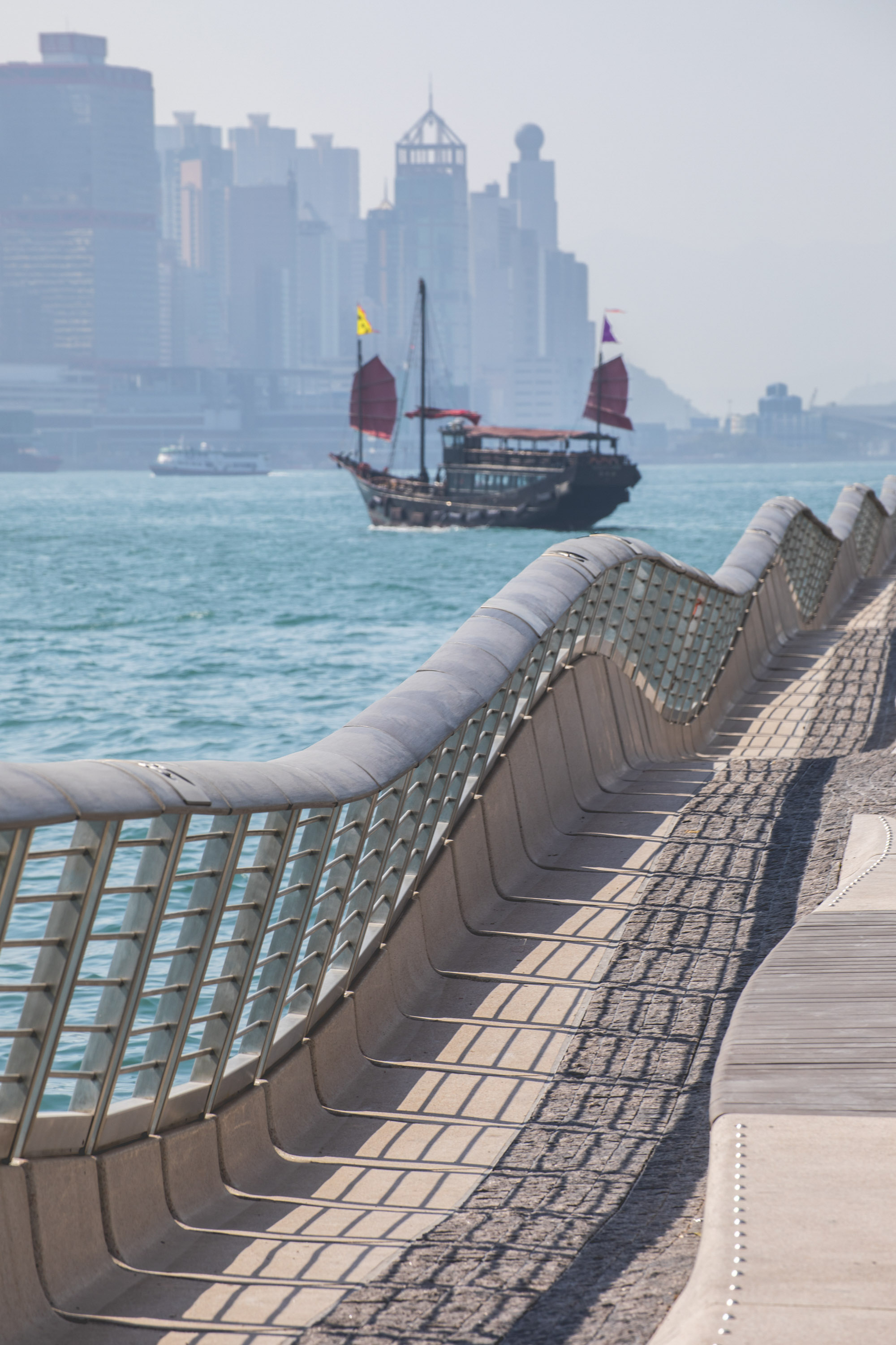
Wave-inspired rail cladding
The totally new rail cladding design, inspired by the movement of waves, provides a clean, contemporary yet soft waterfront edge. The strengthened waterfront cladding serves as a wave break to minimise wave damage on the shore and reduce storm effects. The seawall is clad in custom sculpted precast concrete that encourages underwater habitation and is also composed of interlocking panels to offer additional structural strength. The effects of potential typhoons are also countered with interlocking concrete pavers to withstand submerged conditions, while the trellises form windbreaks upon the shore.
New wave-shaped paving patterns throughout the Avenue unify and enhance the identity of the place. Light coloured paving facing the harbour reduces radiant heat.
The design offers respite for visitors with new amenities and a unique new dynamic edge that celebrates the harbour. The new design offers enhanced connections, improves circulation and sociability, expanded emergency vehicle access, more statues of film stars and other elements that complement the Avenue in fresh, enjoyable and interactive ways.
Lighting features from Speirs & Major (S+M)
The Avenue also features incredible lighting elements from award-winning international lighting architect Speirs & Major (S+M). S+M claimed warm lighting along the Avenue makes the attraction the perfect spot for enjoying Hong Kong’s skyline at night. In fact, one of the Avenue’s signature design features is the lighting system concealed inside the cladding which gently illuminates the water flowing beneath the pedestrian deck after dark. The unique, multifunctional LED lamp posts developed by S+M include lighting, WiFi and mobile signals, security cameras, speakers and power supplies all in one to provide comprehensive and sustainable amenities for all visitors.
Harbour Kiosk and mobile cart designs by LAAB
To help support homegrown creative enterprises, the Avenue features a number of kiosk and mobile carts selling local food and souvenirs, including the Mei Lok Store, Ho Cha, POSTalk, I SEE I SEE, Pop Pop Rangers and I-Dragon. Exclusive limited-edition Avenue products and Bruce Lee souvenirs will also be available for visitors.
Designed by homegrown design and architect firm LAAB exclusively for the Avenue, the Harbour Kiosk is a unique piece of robotic architecture that integrates a food kiosk and a mechanical room. The Kiosk reinterprets the architecture of local market stalls. Combining the food kiosk with an E&M machine room nearby maximises public functions and blends in by borrowing the architectural language of several surrounding pieces.
There are seven Mobile Carts near the Avenue. Just like the Harbour Kiosk, these Mobile Carts open during the day and close at night. Their overhead solar panels turn sunlight into electricity to support their activities. Mobile Carts have a wavy surface made of pleated metal sheets. One side of the metal sheet is painted in wood colours, while the other side maintains the mirror surface that reflects the colours of the harbour. If you walk from one end to the other, you can see the transforming colours of the wavy surface, just like a movie animation.
The sculptural design with new materials, lighting, shade trellises, plantings and furnishings were all sustainably sourced and built, and offer durable and resilient long-term qualities. Energy usage is minimized, maintenance requirements simplified, and operational issues designed to reduce waste and promote recycling. The design provides low-glare surfaces and ample shade, as well as diverse plantings that support various forms of life and bio-diversity. All of these sustainability elements have made the Avenue to become the first outdoor space in China to receive SITES Gold accreditation. SITES is an internationally recognized certification programme for sites with or without buildings such as national parks, school campus, and outdoor space like the Avenue of Stars.
The sculptural design with new materials, lighting, shade trellises, plantings and furnishings were all sustainably sourced and built, and offer durable and resilient long-term qualities. Energy usage is minimized, maintenance requirements simplified, and operational issues designed to reduce waste and promote recycling. The design provides low-glare surfaces and ample shade, as well as diverse plantings that support various forms of life and bio-diversity. All of these sustainability elements have made the Avenue to become the first outdoor space in China to receive SITES Gold accreditation. SITES is an internationally recognized certification programme for sites with or without buildings such as national parks, school campus, and outdoor space like the Avenue of Stars.
Global Millennials a World-Class Experiential Art, Culture and Retail Landmark - K11 MUSEA
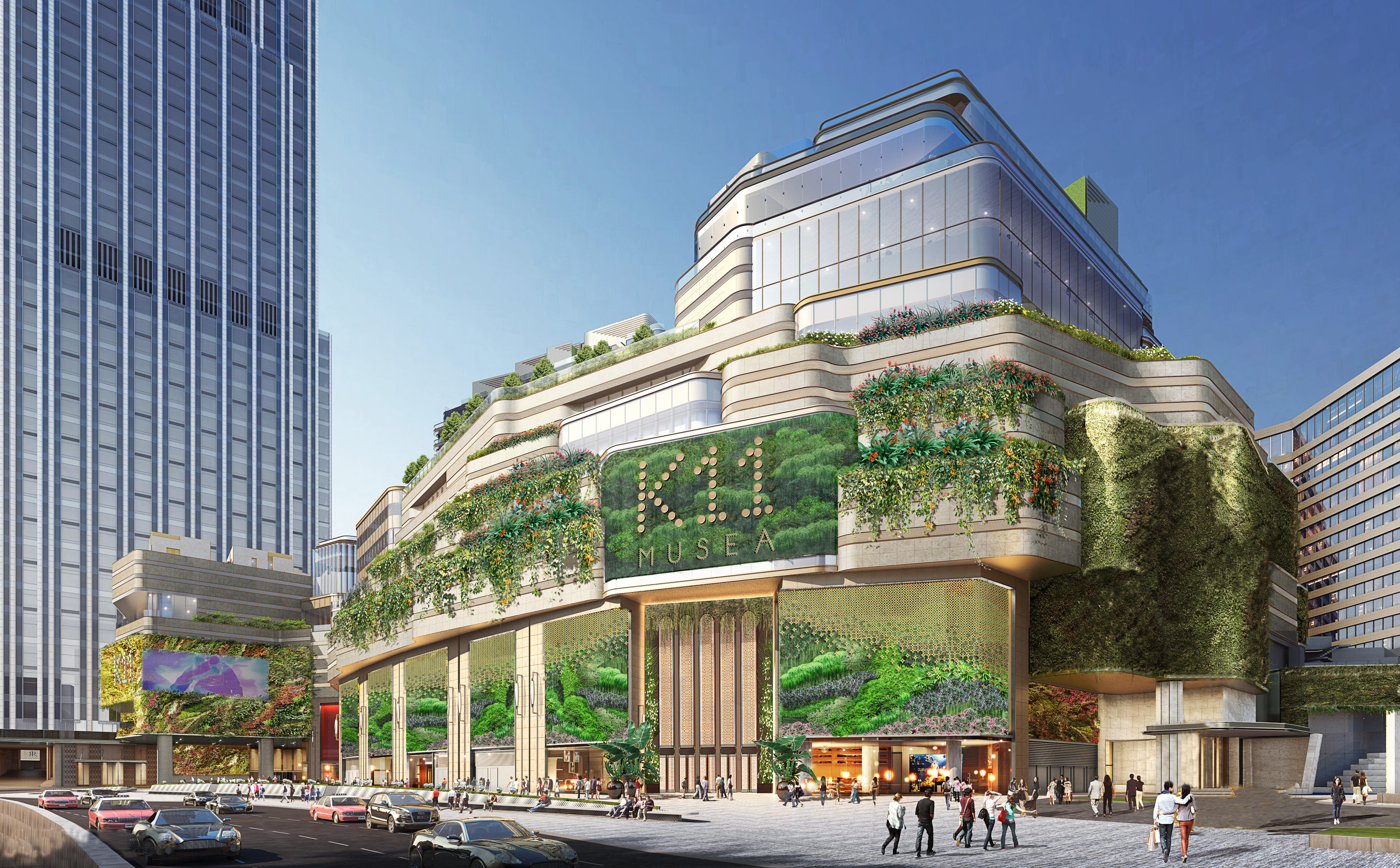
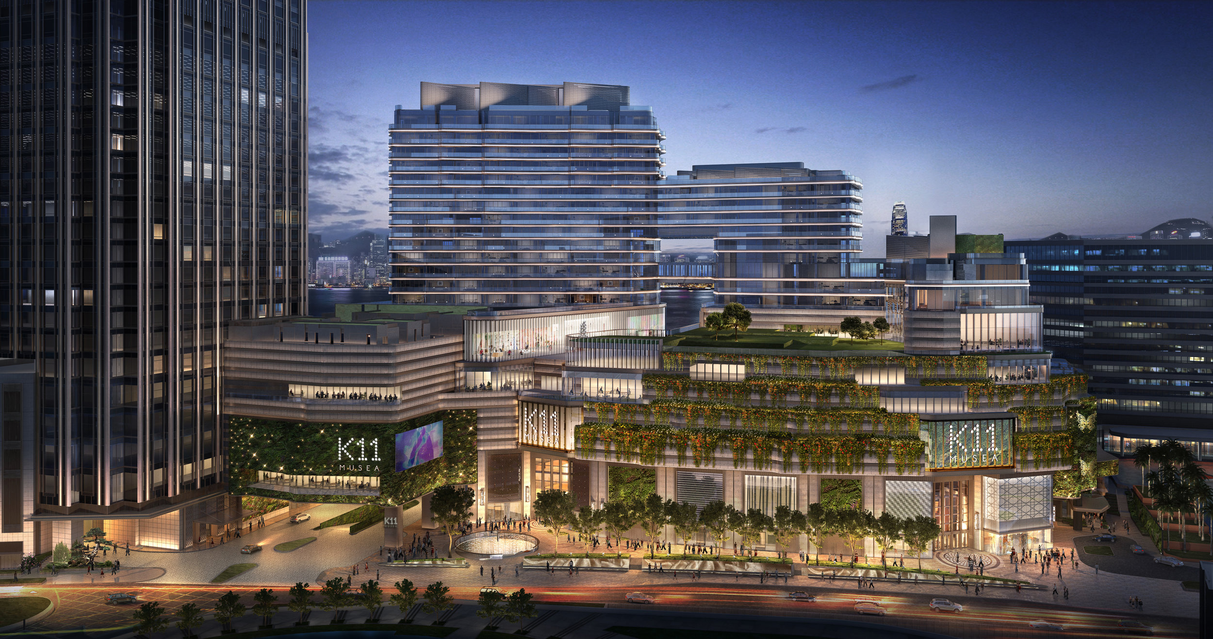
K11 MUSEA a name inspired by A Muse by the Sea for its revolutionary retail concepts – is the latest and most prestigious addition to K11’s burgeoning museum-retail portfolio and is located at the heart of Victoria Dockside, a broader project by New World Development that includes cultural, commercial, residential, hotel and family spaces, as well as art and design programmes. Victoria Dockside is a rejuvenation by New World Development of a once-celebrated district of Hong Kong, previously popular with tourists and locals alike. The project has been described by US media outlets as “Hong Kong’s Hudson Yards,” about the Manhattan mega-project, and as “Hong Kong’s most anticipated opening.”
Celebrating K11’s 10th anniversary, the Group announced the naming of its anchor project at Victoria Dockside as K11 MUSEA (pronounced: meu-see-ah), K11 MUSEA is inspired by the name of A Muse by the Sea and K11 MUSEA to be open in Q3 2019. Situated along the Tsim Sha Tsui Promenade, K11 MUSEA is the brand’s most ambitious museum retail landmark ever, as well as an aspirational global destination merging lifestyle, culture, and art.
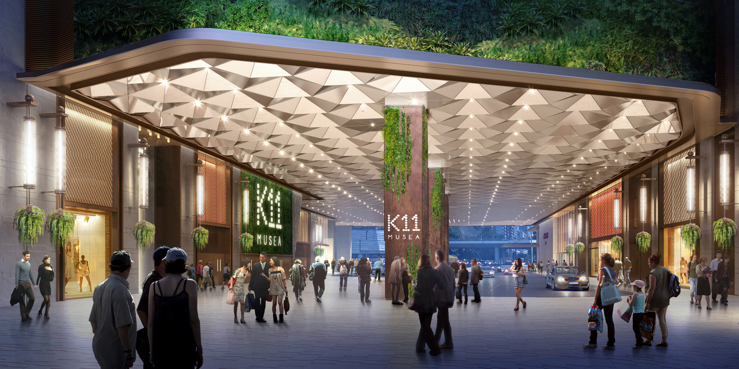
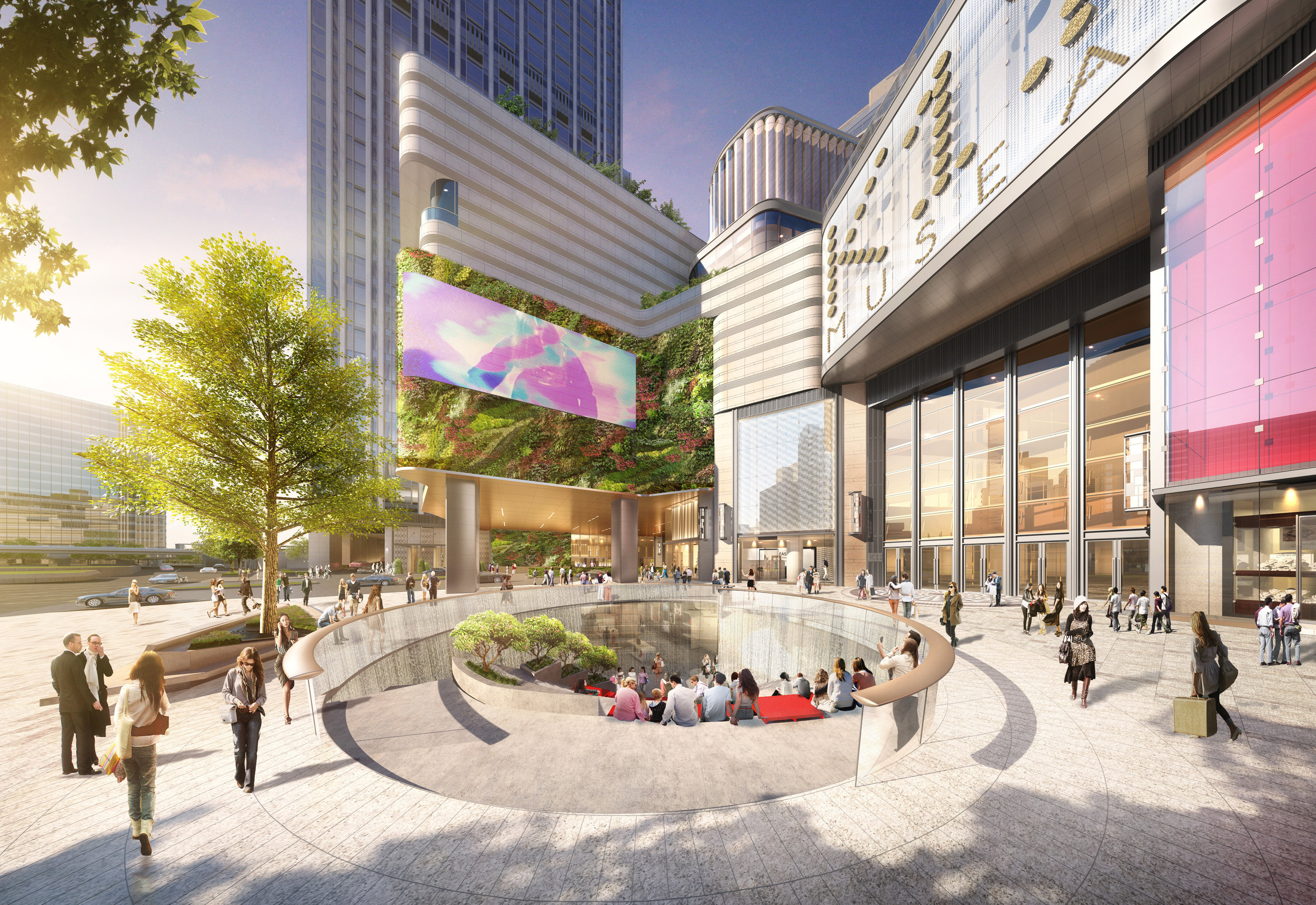
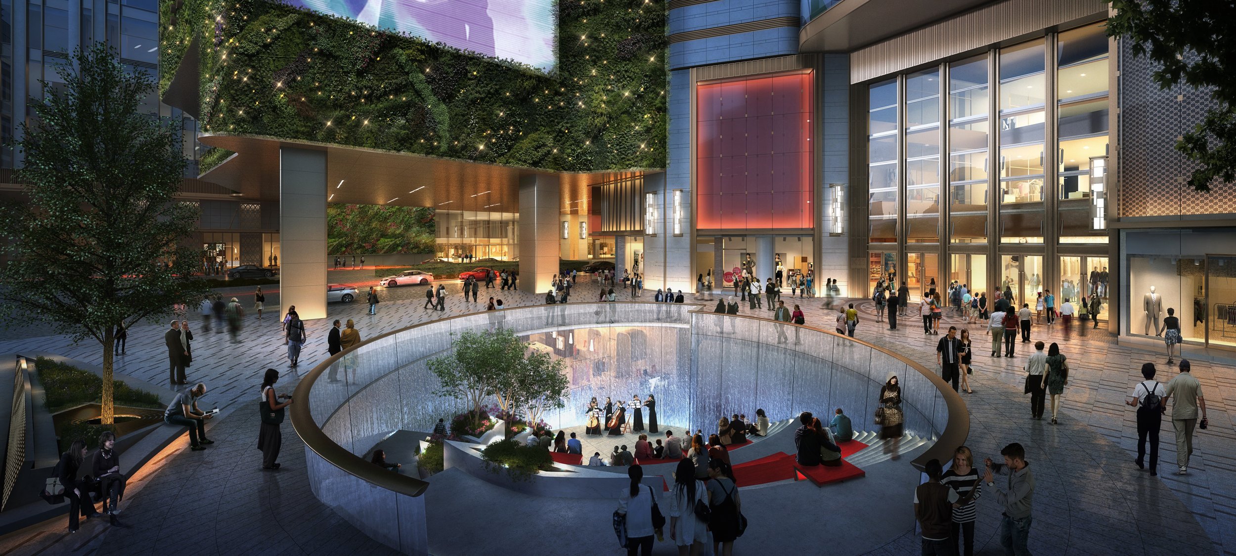
The 10-storey K11 MUSEA is K11’s latest flagship project, catering to the dynamic lifestyles of globetrotting millennials by bringing together world-class experiential retail, art, culture, entertainment, and dining under one magnificent roof.K11 MUSEA will house an extensive selection of international brands – many of which will be concept stores and flagships debuting in Hong Kong with a brand new image. K11 MUSEA takes inspiration from research that reveals Asian millennials as “Super Consumers,” prominent drivers of global consumption with spending power set to reach US$6 trillion by 2020 as they grow to account for 45% of Asia’s millennial population. K11 MUSEA will get together global millennials to discover their muse after its opening in Q3 2019 while positioning itself as an aspirational destination merging art, culture, and commerce in Hong Kong and Asia.
Hailed as the crown jewel of K11’s museum-retail concept, K11 MUSEA features many architectural highlights, including the 2,000-square-foot outdoor Sunken Plaza, modeled on amphitheaters and installed with programmed water patterns and a misting system for a cooling effect. Together with a large 25-foot-tall LED screen above, Sunken Plaza offers an intimate and immersive venue for cultural events ranging from outdoor movie screenings and live music to art and design related performances. As a new global destination to discover one’s muse and bask in the most exceptional art and cultural content, K11 MUSEA will display a world-class public art collection throughout its premises when it opens, highlighting the brand’s core values of Art, People, and Nature.
For more details on #K11MUSEA, its radical concepts and #DiscoverYourMuse stories and activities, please follow on Facebook and Instagram @K11MUSEA
Meteor Cinema
Meteor Cinema is designed by One Plus Partnership Limited. One Plus is an award-winning Hong Kong-based design firm established in 2004 by directors Ajax Law and Virginia Lung.
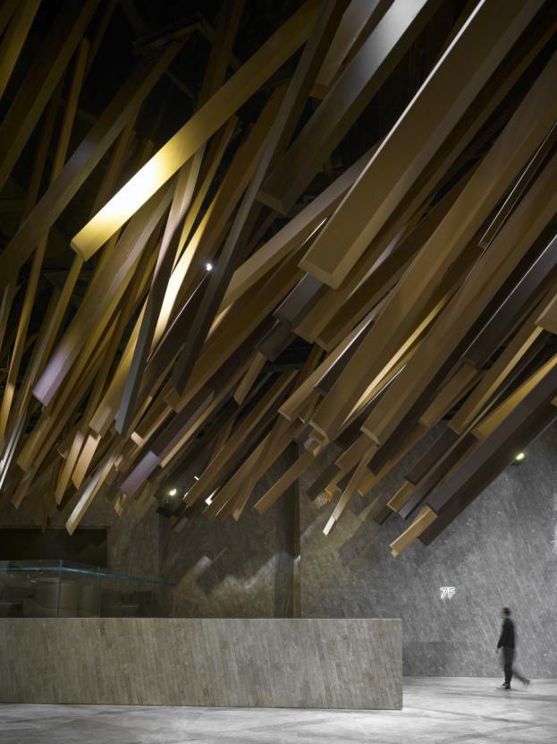
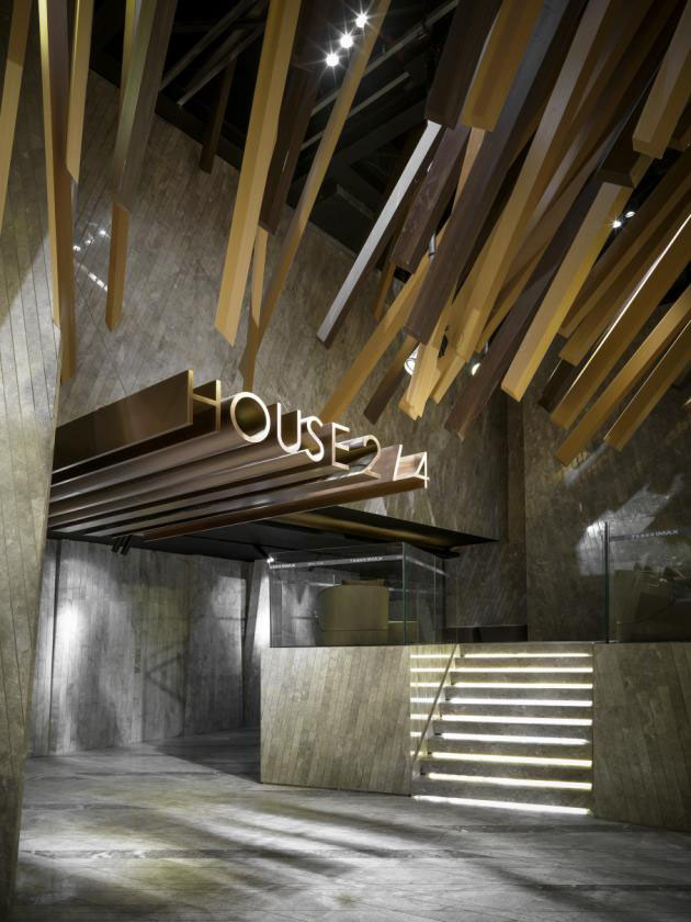
The project of Meteor Cinema is a 2-storey cinema located in a shopping mall in Guangzhou. Meteor is an astronomical observation where a bright trail of light appears in the night sky when a meteoroid enters the Earth’s atmosphere. This beautiful scene only appears in the sky for a very brief moment, and then vanishes without leaving any trace behind. Stunned when we walk into the lobby, a large-scale meteor shower in front of us. In the lobby, long rectangular-cuboid decorations extend from the ceiling, mimicking the motion of a meteor shower streaking through the sky.
One Plus described: To enhance the three-dimensional vibrant atmosphere, the rectangular cuboids point in two directions. The designers had to adjust both on the computer and on set to make sure every piece is displayed at the right angle for the best overall effect.
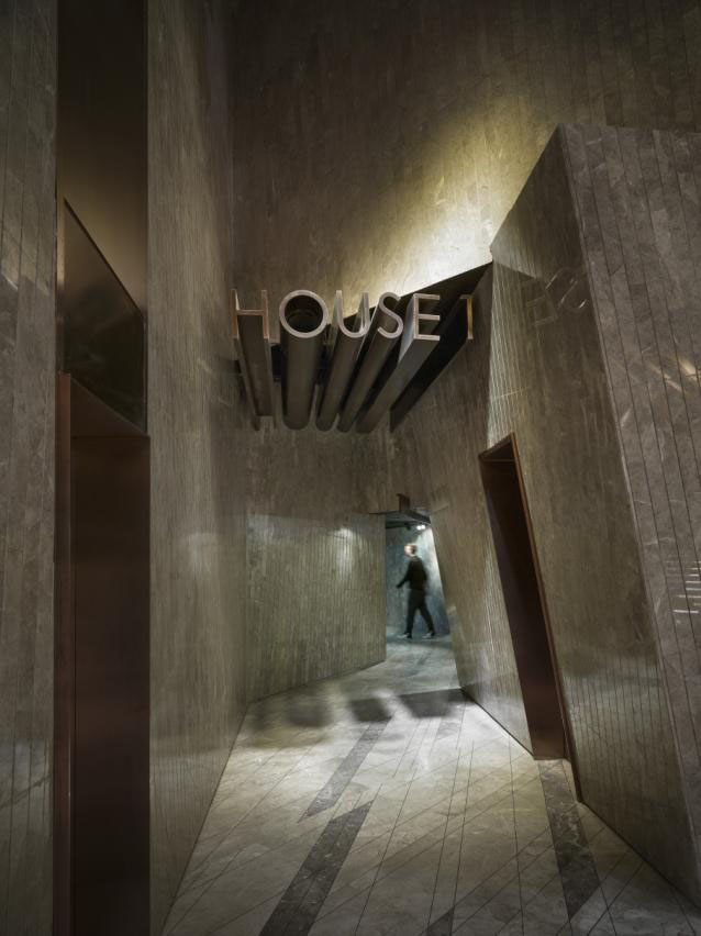
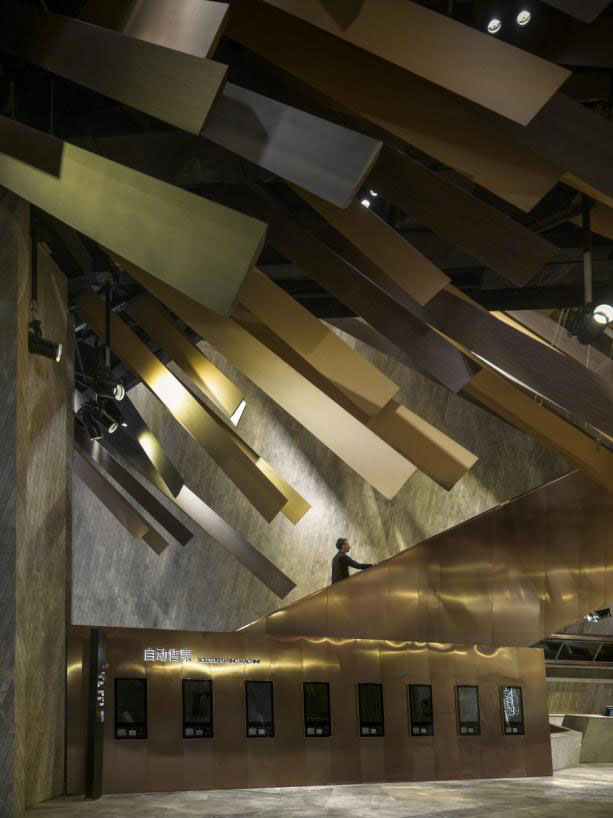
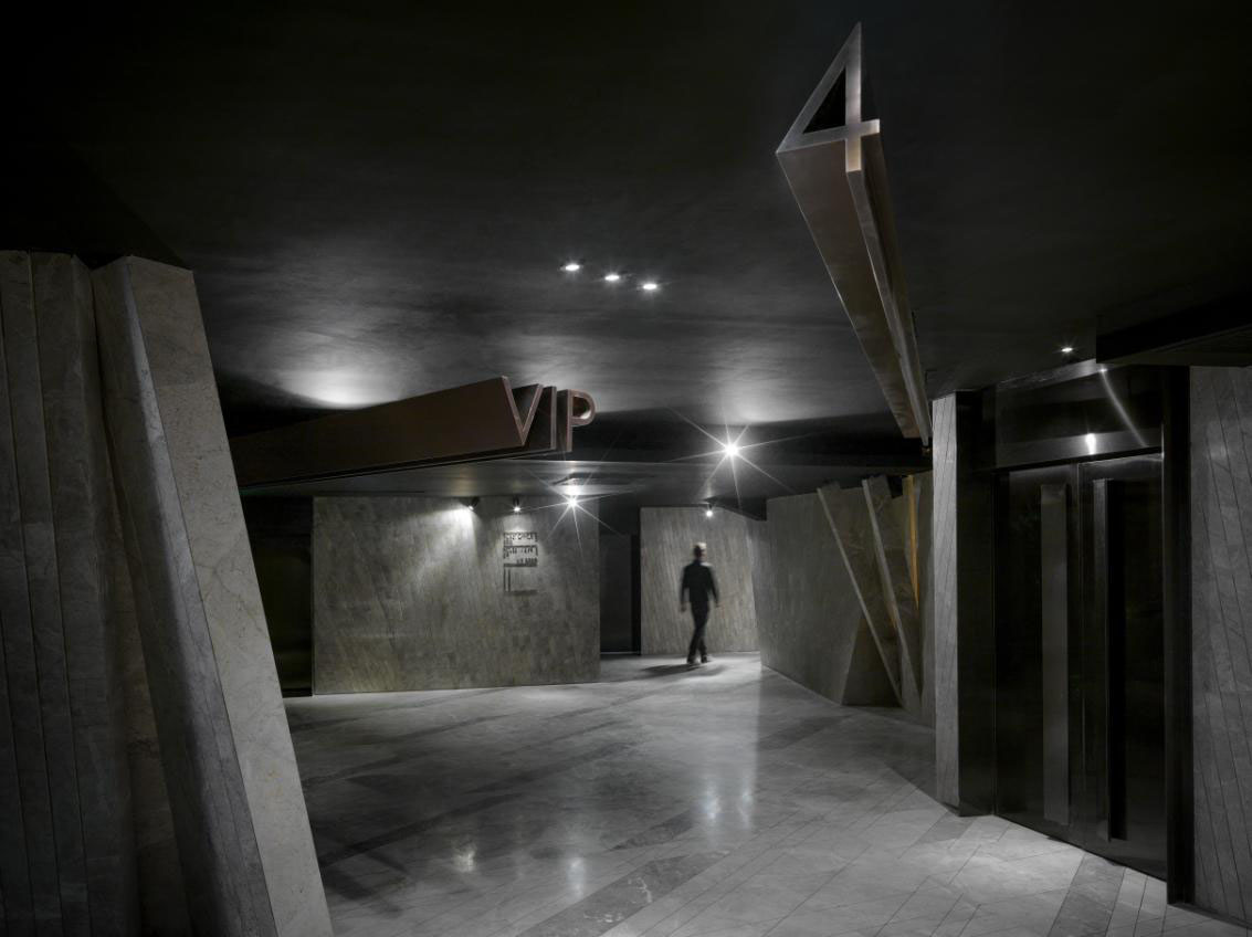
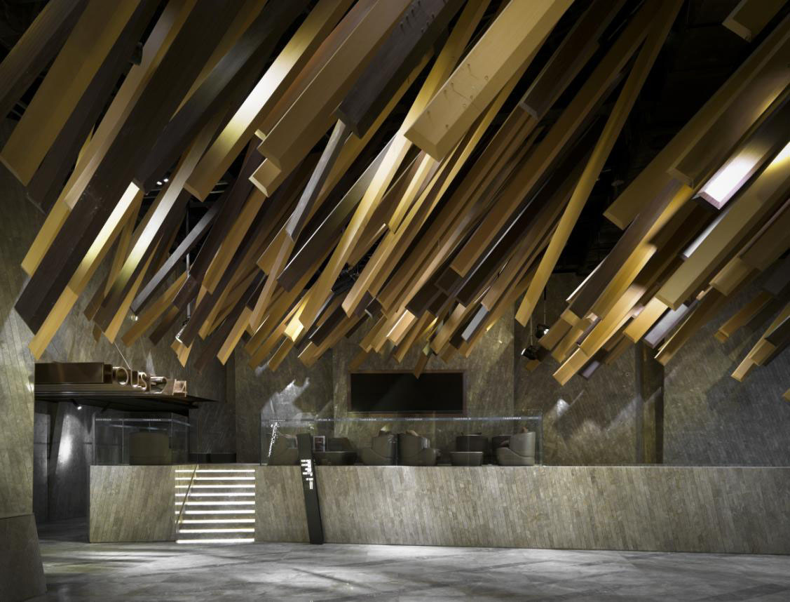
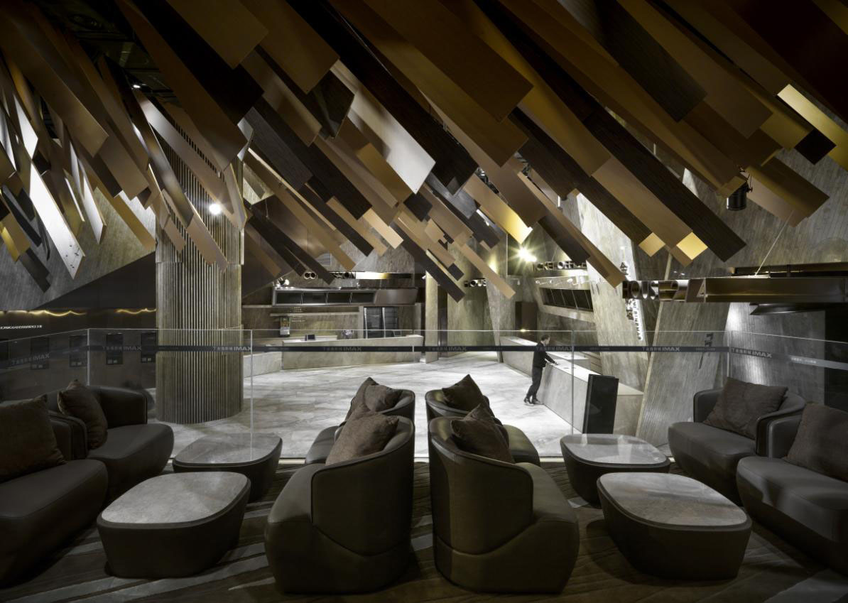
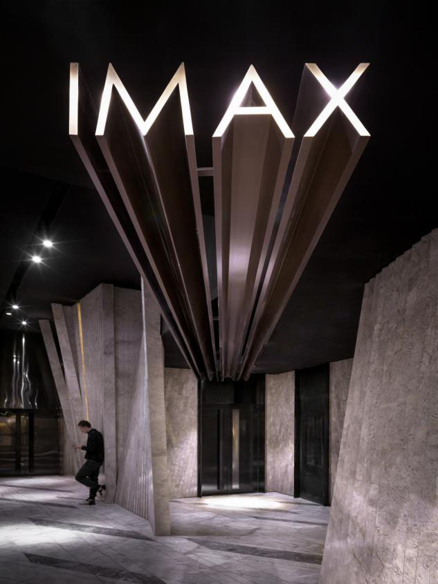
To adopt an earth color scheme for design. Instead of using wood, which would inflict fire regulations, used aluminum in creating the decorations. These aluminum plates are coated with wood patterns and two different shades of brown to create a wood-like effect. The edges of the cuboids are slightly slanted; the meteor looks as if they are falling very quickly on this sharper edge, creating a dramatic contrast between the fast movement of the meteor and the fact that it’s frozen and motionless in real life. Apart from the meteor shower in the ceiling, other features in the cinema, such as the signage and tiles on the wall, are also slightly slanted to match with the massive ceiling decoration.
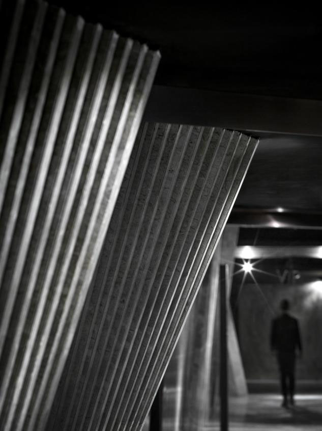
When going up on the second floor by the escalator, you can enjoy the best view of the whole meteor shower. It is an interesting experience to get closer and closer to the ceiling feature as if you are heading into the meteor shower. Walking through the corridor to reach the theater, you’ll find yourself walking in another form of meteor shower. The “meteor shower” transforms itself into flat rectangular shapes made out of stone, which look as if they are growing from the ground. The designers used this new object shape to illustrate another possible configuration of the meteor shower in a dynamic fashion.
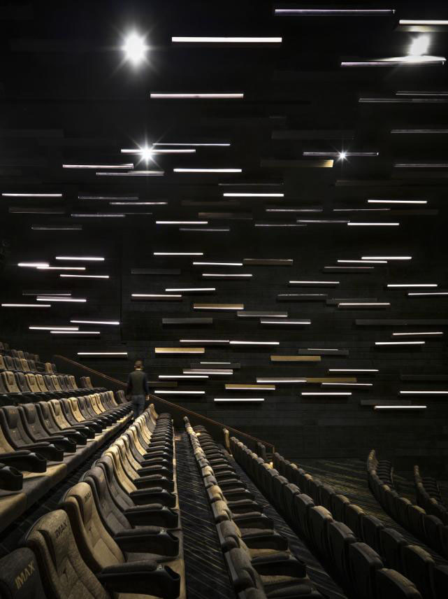
The concept of meteor shower continues through the auditorium. In each of the auditorium, the designers have created a different portrayal of meteor shower, enabling the audience to have a new experience when they watch the movie in different auditoriums.
Through the design of the Meteor Cinema, the designers have created a sanctuary for the audience to get away from reality; from the moment they step into the cinema, they are in a completely different space. The cinema acts as a prelude to their experience with the movie, to prepare the audience for immersing themselves entirely in the movie world.
OnePlus mentioned: Rectangular decorations are installed on the wall to imitate shooting stars radiating in the night sky. In another auditorium, instead of going in a diagonal direction, the trails of the meteor shower are horizontal. There is another auditorium where regular seats are replaced by beds, enabling the audience to lie down comfortably and enjoy the meteor shower before the movie starts.
For more information, please visit: www.onepluspartnership.com


