ZEGNA AND LEICA JOIN FORCES IN A COLLABORATION TO BE LAUNCHED GLOBALLY
Fashion meets Photography: the exclusive collaboration between Zegna and Leica Camera, the legendary German camera manufacturer, yields a capsule collection of high-end camera accessories, possibly the most refined to date.
Fashion meets Photography: the exclusive collaboration between Zegna and Leica Camera, the legendary German camera manufacturer, yields a capsule collection of high-end camera accessories, possibly the most refined to date.
Debuted in January 2020 on the runway of the Ermenegildo Zegna XXX Winter 2020 Fashion Show, this highly expected capsule collection finally comes to life.
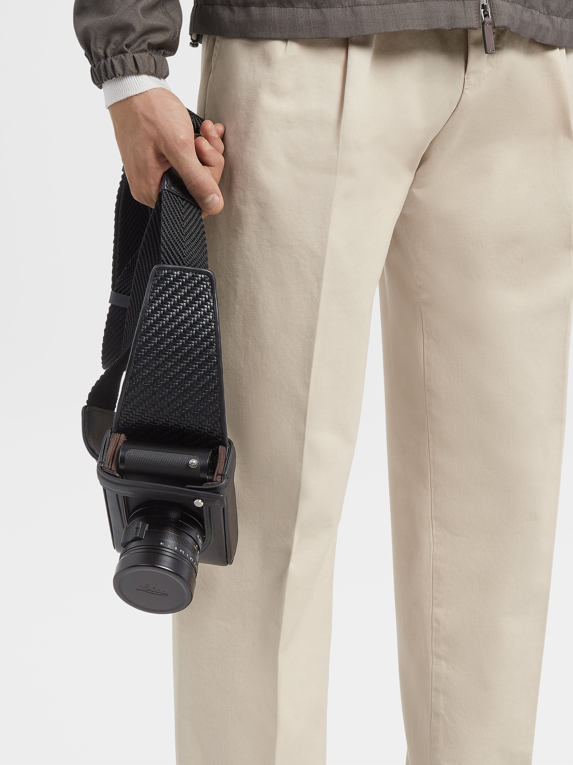
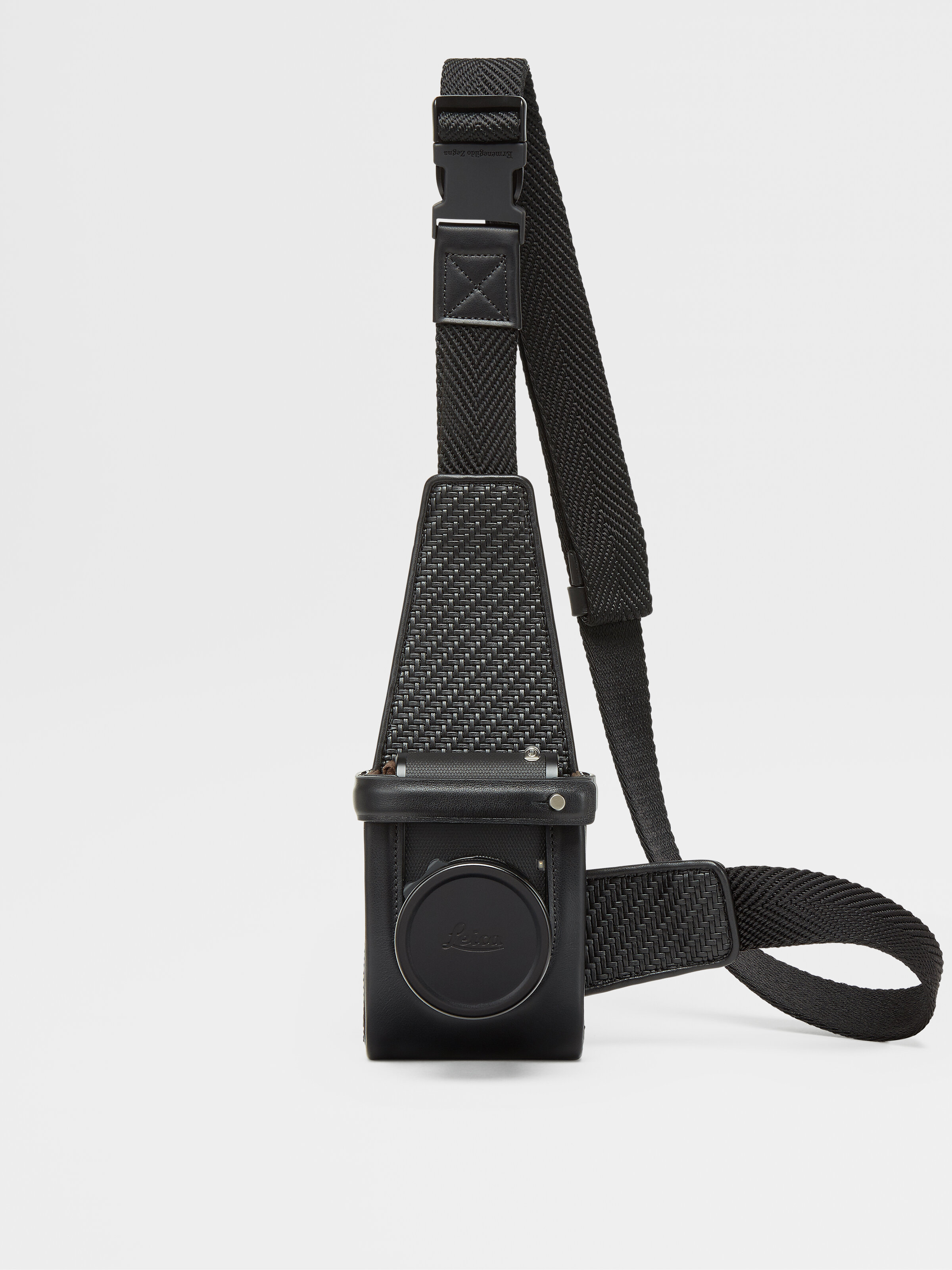
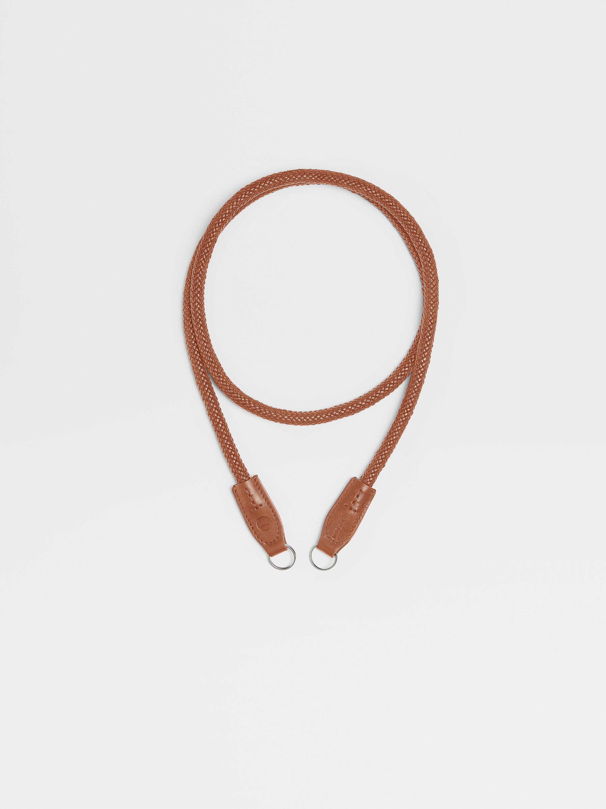

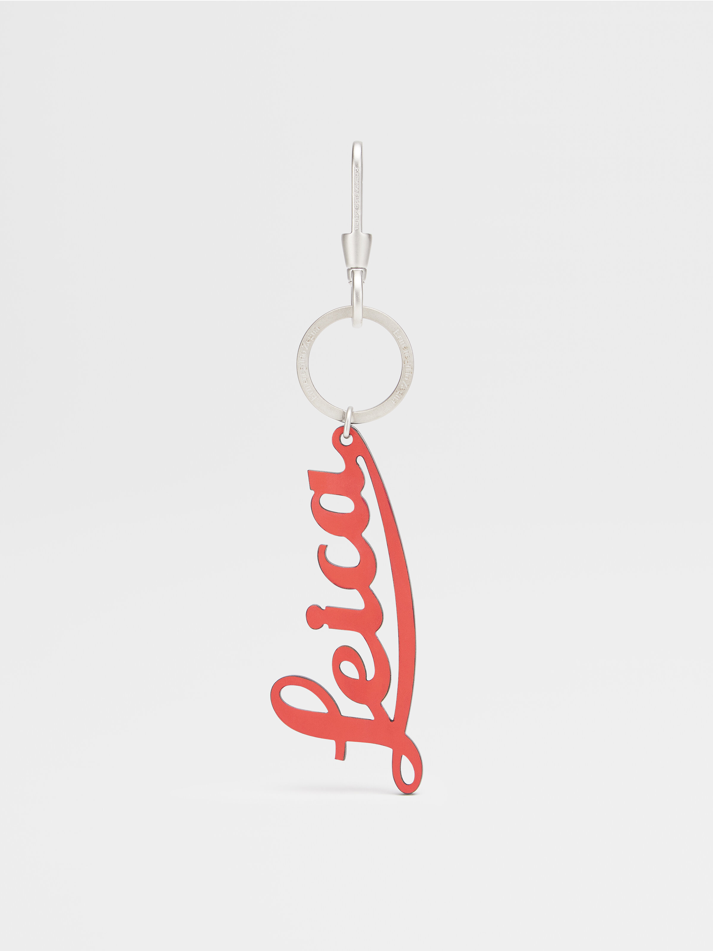
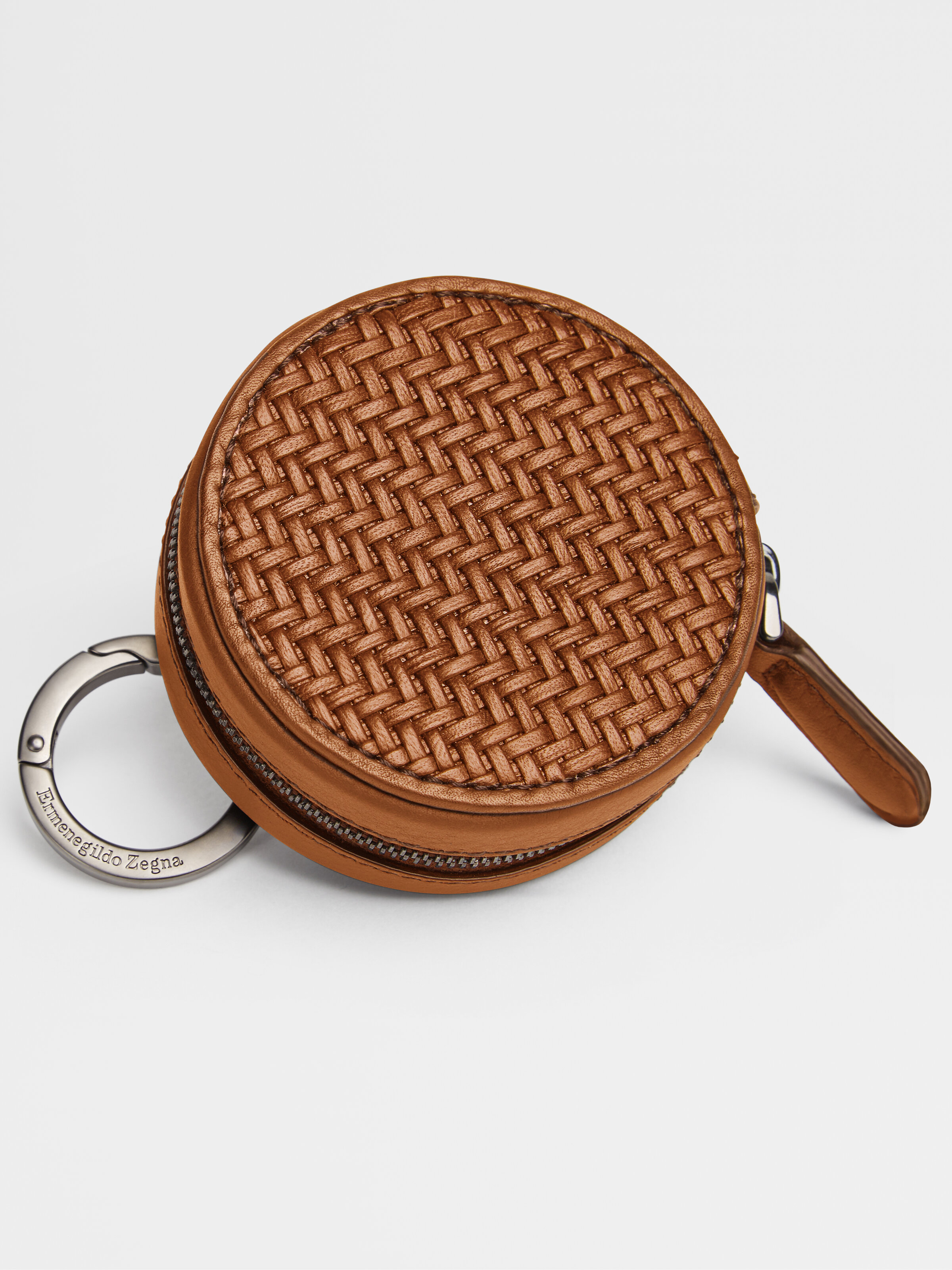
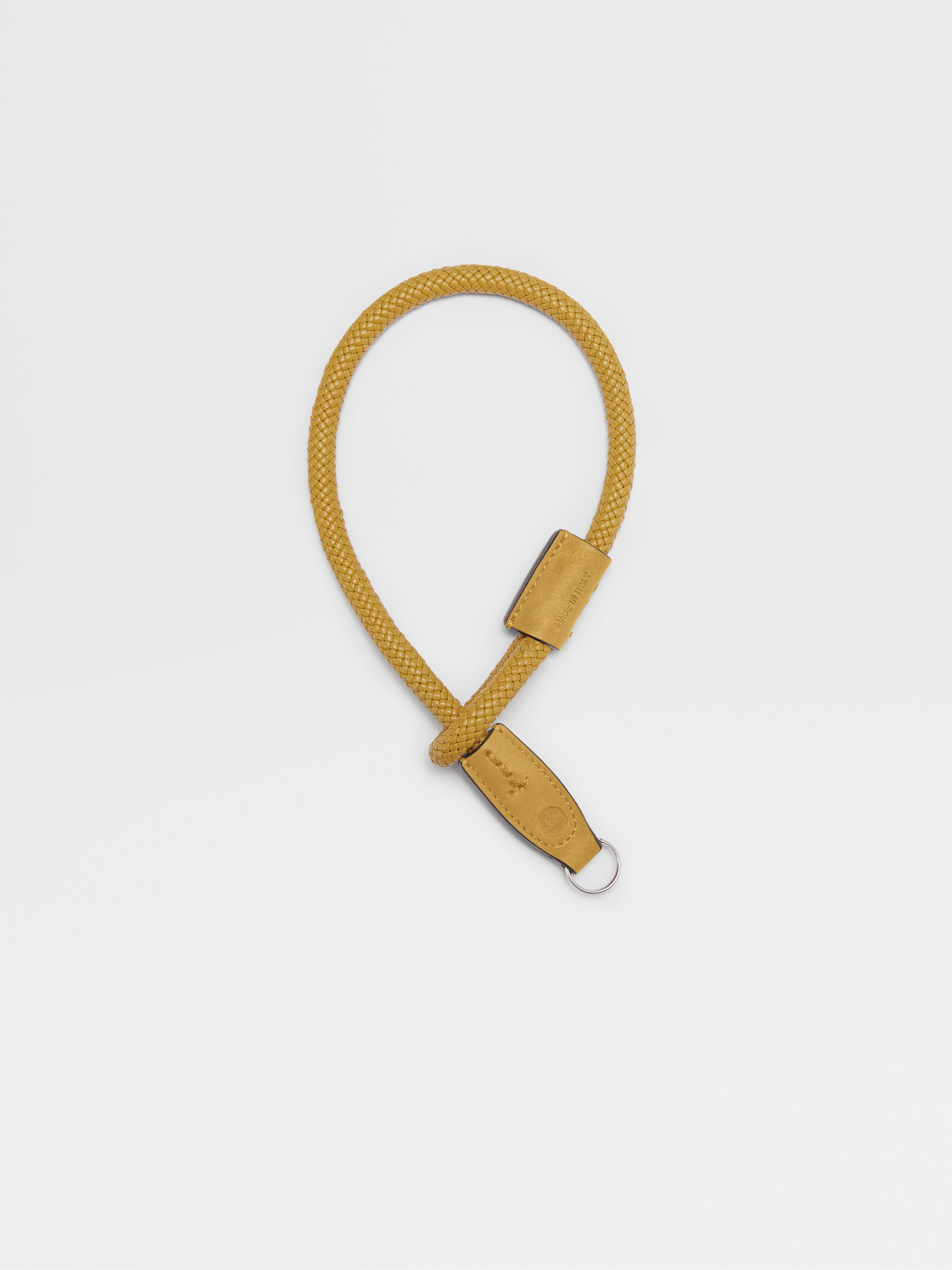
Designed for the modern photographer, in search of the most beautiful image but equally attentive to the subtle details of handmade craftsmanship, the collaboration strengthens the link between two expressions of art and creativity, reflecting a broader dialogue between the two brands.
Zegna Artistic Director Alessandro Sartori, a photography enthusiast and authentic Leica lover, has always been inspired by photography as a creative language that he often visually uses as a reference for his collections. His own passion led Zegna to a collaboration built upon the mutual expression of creativity and innovation, craftsmanship and technicality which further cements Zegna’s reputation as a global luxury lifestyle brand.
The collaboration collection consists in PELLETESSUTATM camera holsters for Leica Q2 and Leica M cameras; PELLETESSUTATM protectors for Leica Q2 and Leica M cameras; functional crossbody bags called Insta-Pack, inspired by photographers’ attitude that fit almost all Compact Leica cameras (Leica V-Lux excluded) and the Leica CL with the 18mm ‘pancake’ Leica lens; carrying and wrist straps; Leica keyrings and round wallets (both for coins or the Leica Q2 lens cap) that feature luxury details and precious touch of the PELLETESSUTATM collection, an iconic Zegna special woven nappa, result of an innovative Ermenegildo Zegna research aimed to recreate precious fabric using extremely thin strips of selected nappa leather in place of fabric yarns.“
“Zegna and Leica share the same values and very deep integrity and quality towards the excellence of their own products; my wish is to build up a long chapter together. The vision and the DNA of Leica have always been genuine, an obsessive quest for quality, extremely refined research, a very unique approach towards not only the world of camera and photography but mostly towards the craftsmanship and a distinctive syntax” says Alessandro Sartori, Zegna Artistic Director.
“What a wonderful addition: The creation of a Leica camera, moving images and a Zegna garment is unique and outstanding. Both brands share the same humanistic approach for values, design, sustainability, and quality” says Karin Rehn-Kaufmann, Leica Global Director Art and Leica Galleries.

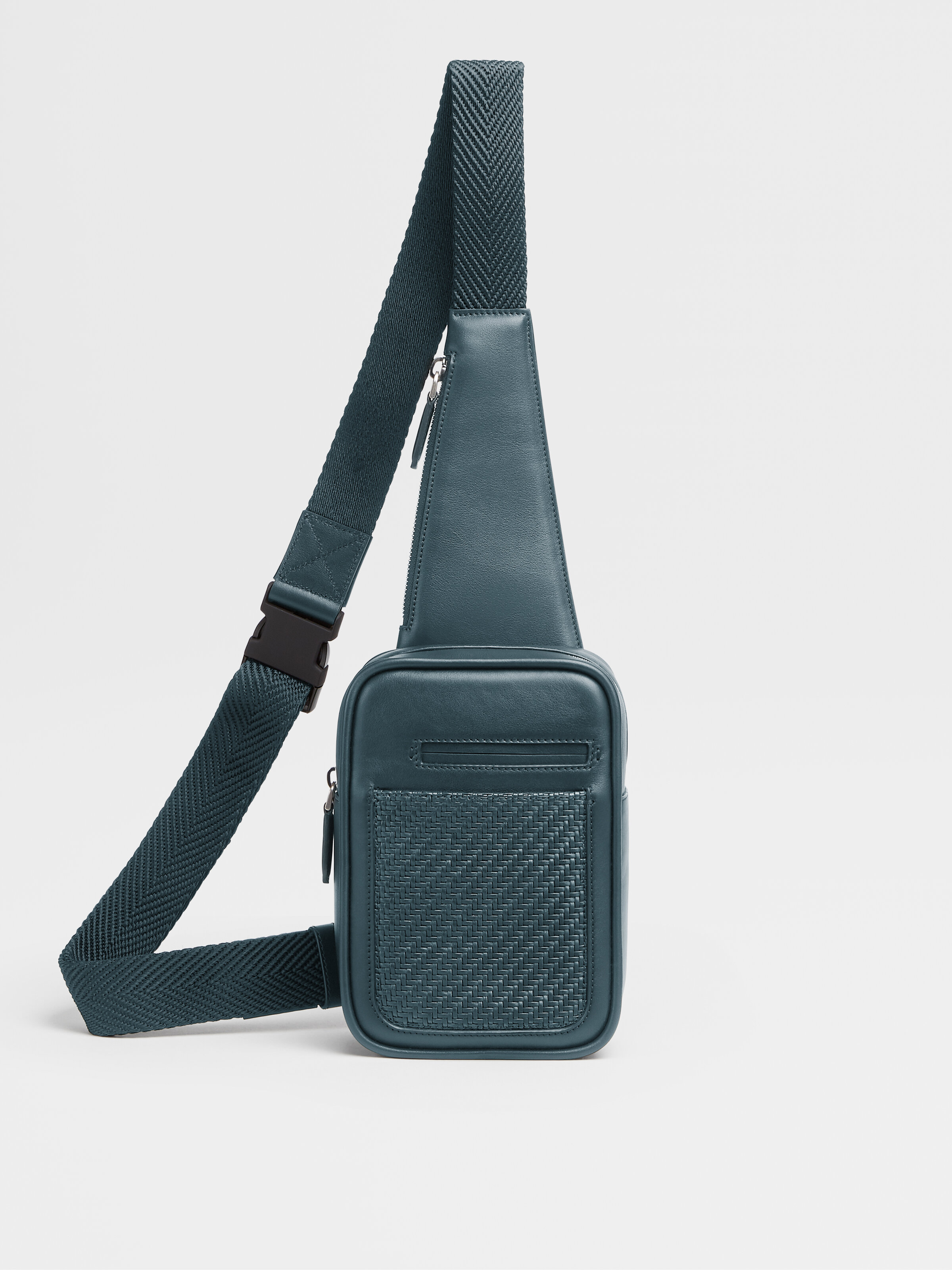


The Zegna and Leica collaboration collection are distributed globally in an exclusive selection of Zegna Flagship Stores (such as New York City, Paris, London, Milan, Dubai, Shanghai, Beijing, Ginza, Isetan) as well as in 60 select Leica stores worldwide.
The collection is also available on-line, on zegna.com and leica-camera.com.
Design Pier capture the preciousness of time and the fragility of a moment
Design Pier returns for Designart Tokyo 2020, compiling a selection of high-end design objects that capture the preciousness of time and the fragility of a moment and compels them to experience life to its fullest. The selection includes unique and precious pieces that challenge commercially made objects' homogeneity and brings a refreshing perspective, creating an emotional attachment between products and users.
Design Pier returns for Designart Tokyo 2020, compiling a selection of high-end design objects that capture the preciousness of time and the fragility of a moment and compels them to experience life to its fullest. The selection includes unique and precious pieces that challenge commercially made objects' homogeneity and brings a refreshing perspective, creating an emotional attachment between products and users.

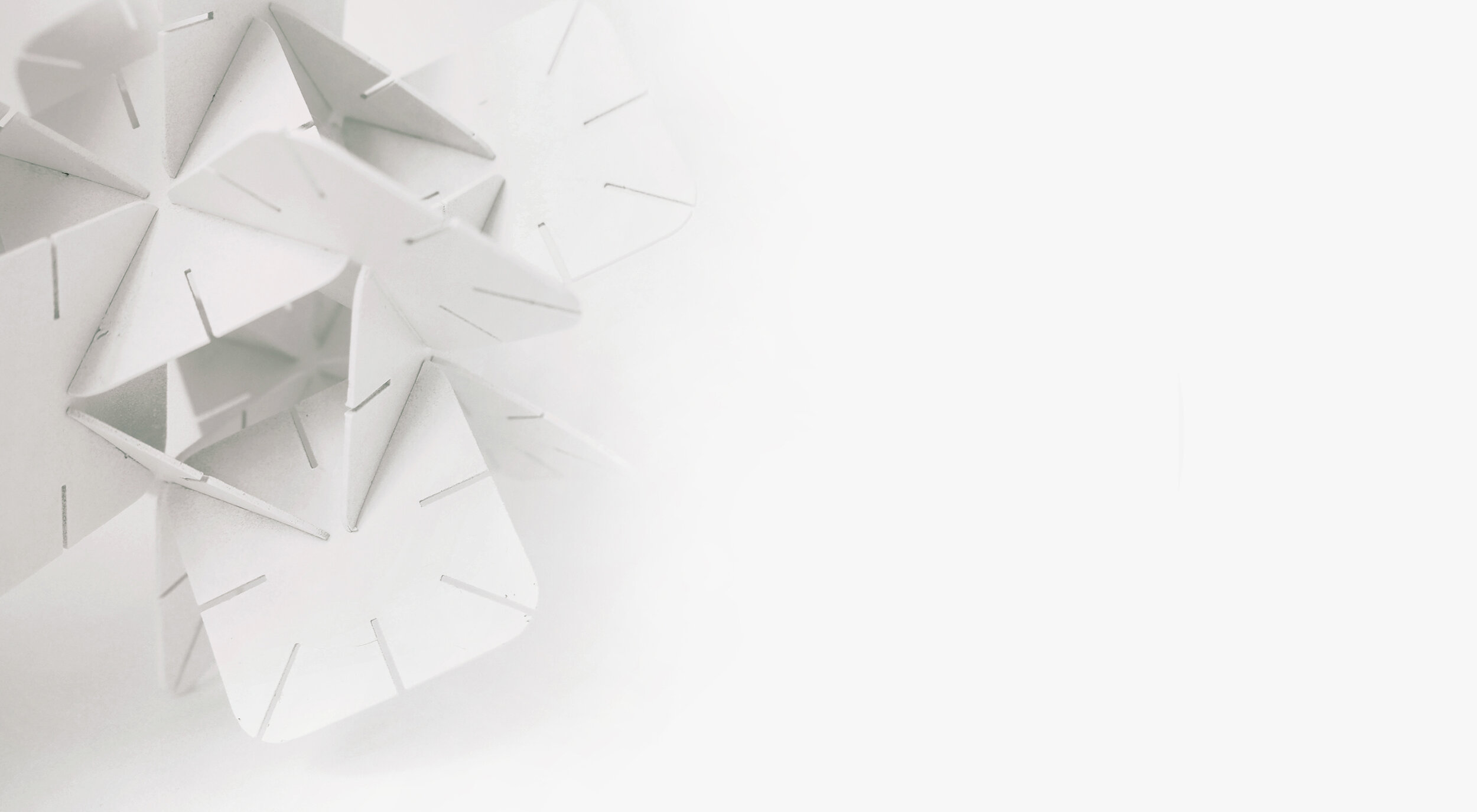
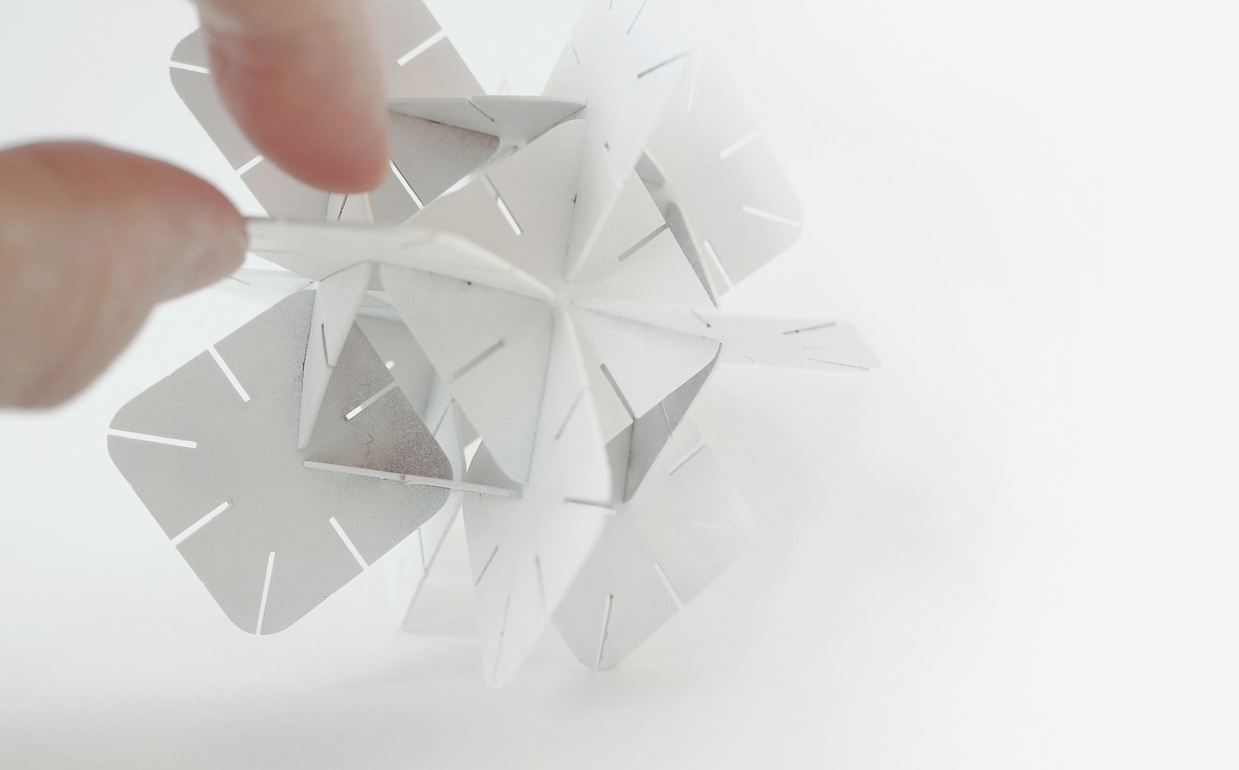
DAZINGFEELSGOOD (DFG) is a Singapore based design practice founded by Kiat Ng and Karen Chiam in 2015. Guided by design fundamentals, the practice reflects on rational and reduction approaches to explore, design, collaborate and create works that span across furniture, graphic and spatial design disciplines.
The practice has led DFG to produce works that are represented at international art and design platforms including Art Stage (Singapore), Maison&Objet (Paris), SaloneSatellite (Milan), and received recognition from A’ Design Award (Italy), Asia Design Prize (Korea) and Bolia Design Award (Denmark).
Objet is a series of modular planes in the expressions of geometric shapes connected in a methodical arrangement to create assemblages that function as lighting.
Title: Objet
Year: 2020
Dimensions: 500 x 500 x 500mm each (A series of 3 artworks)
Material: Acrylic with dichroic film
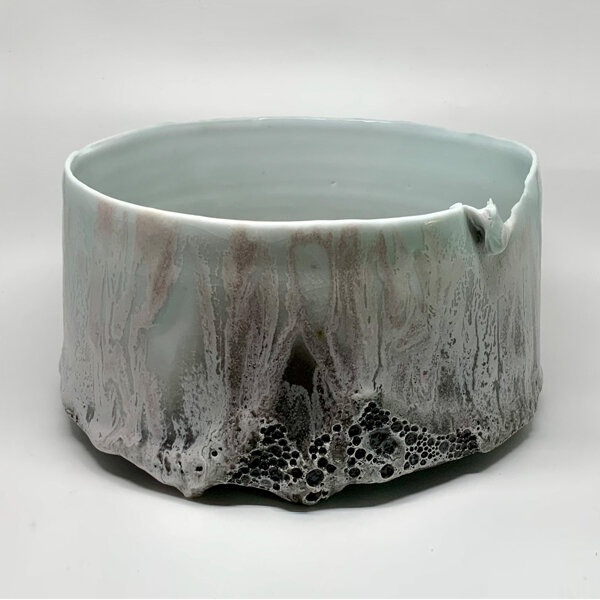
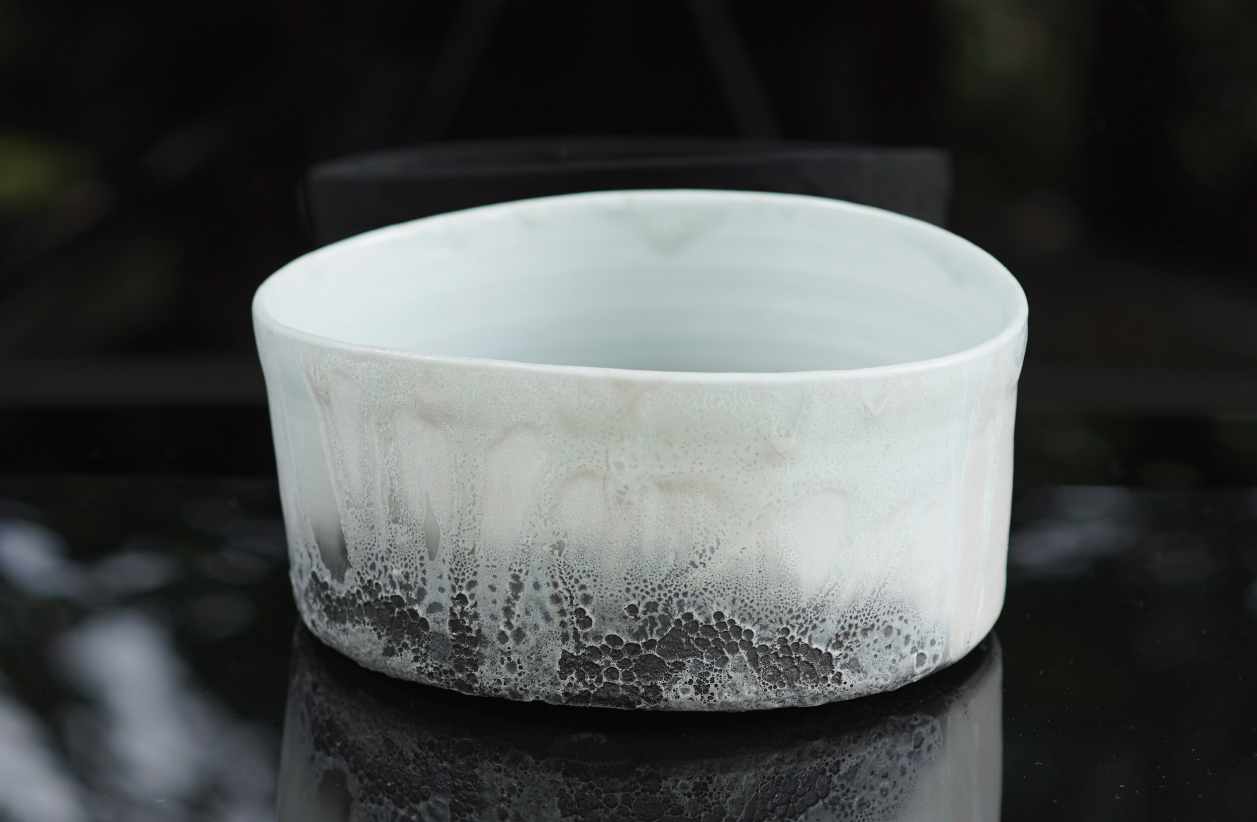
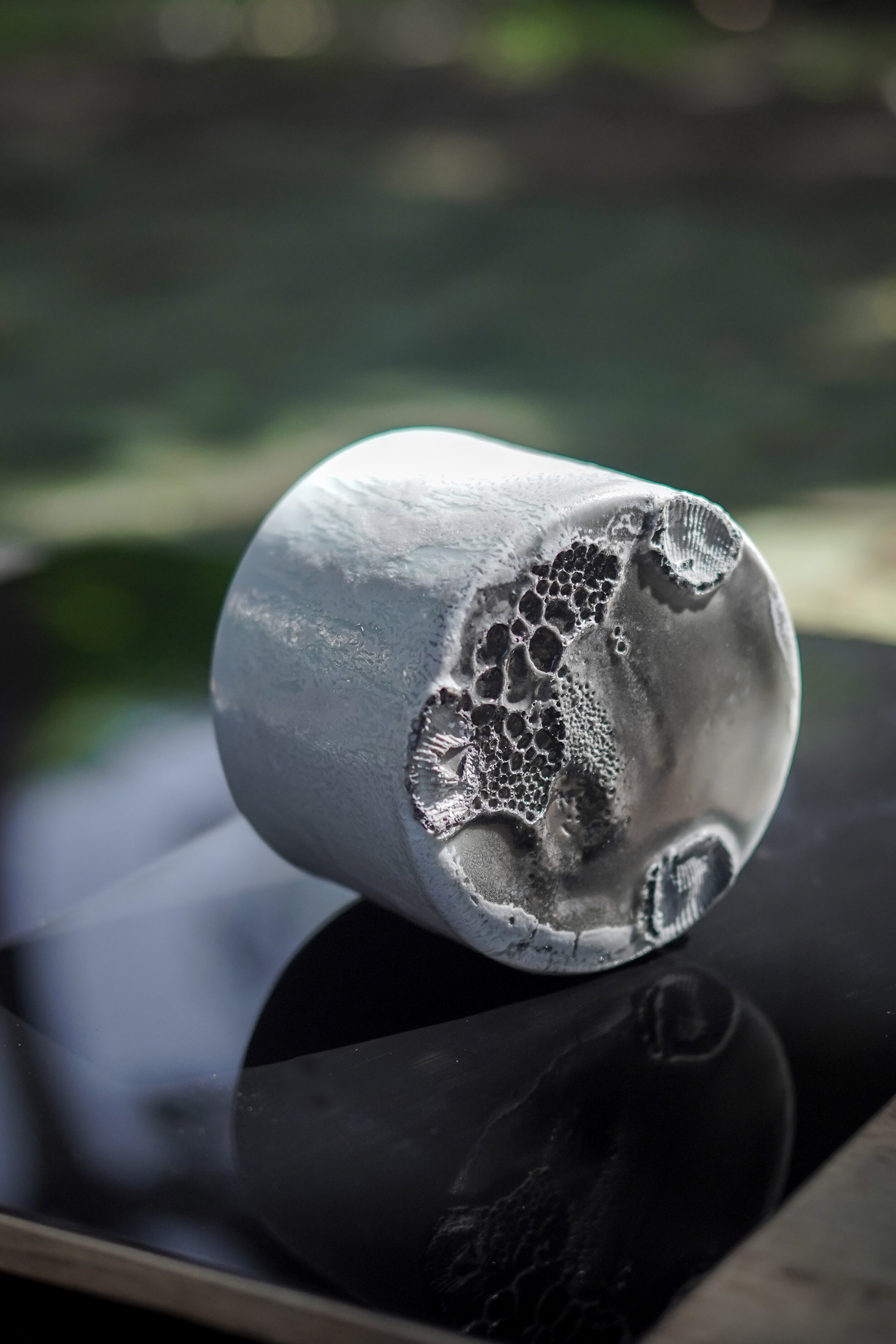
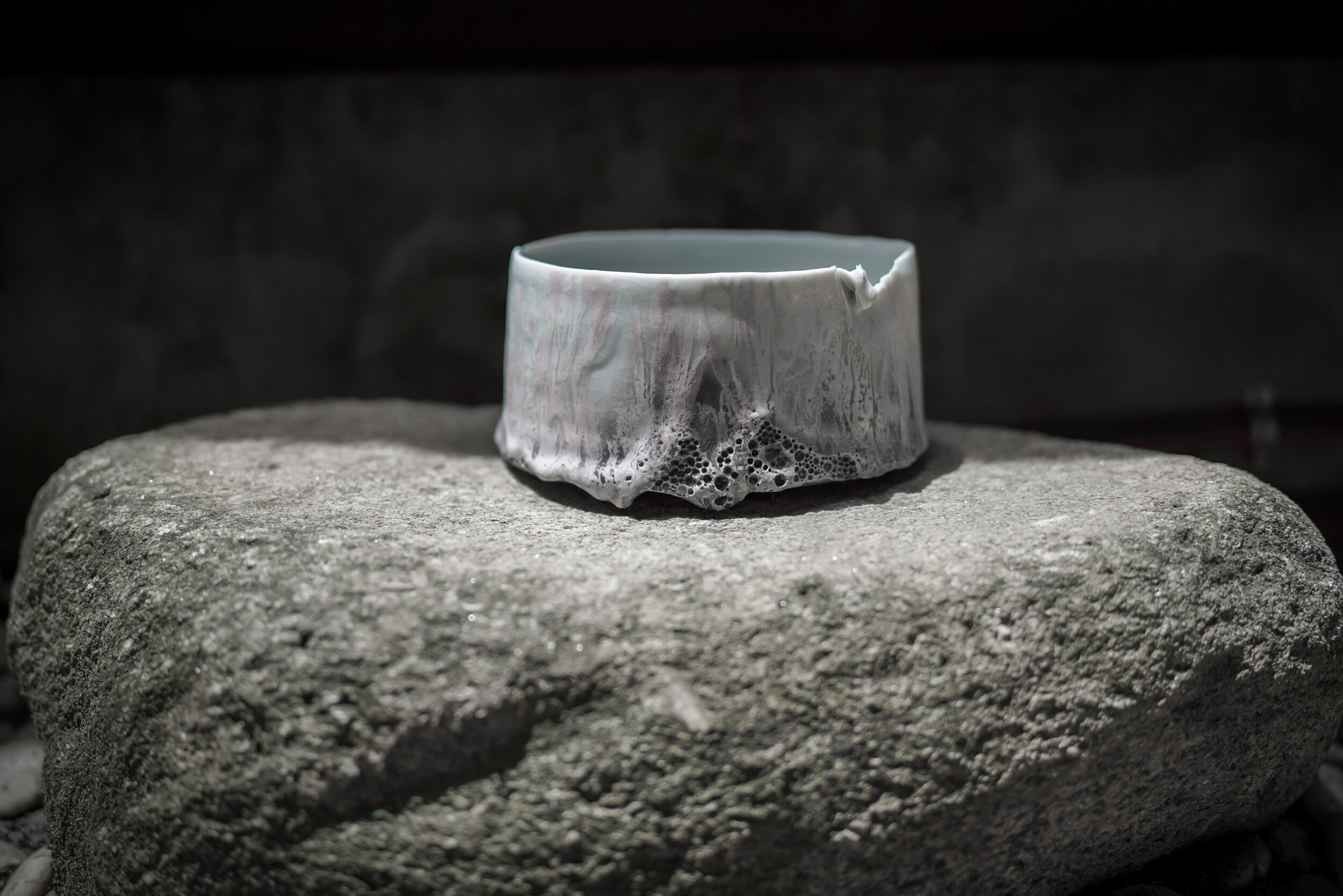
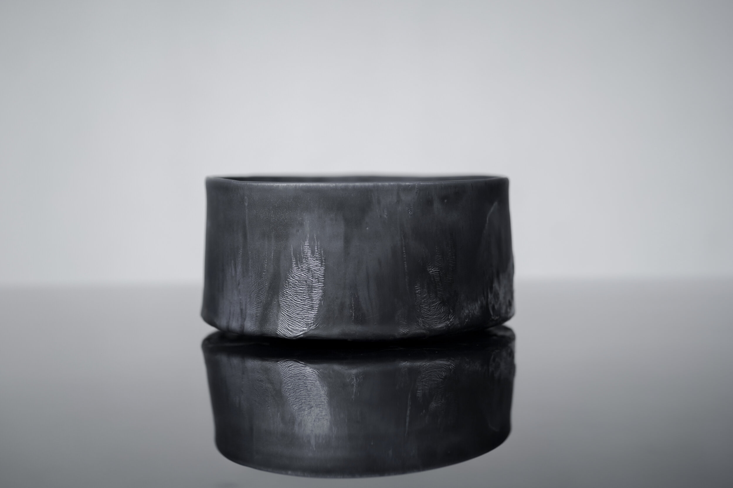
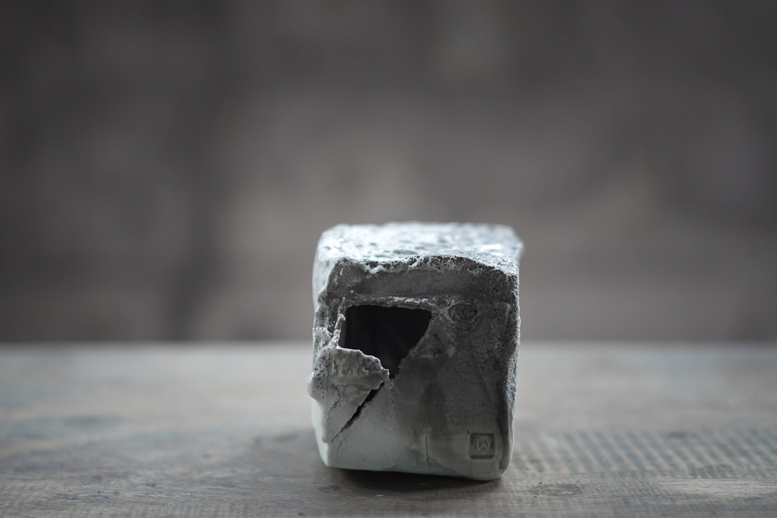
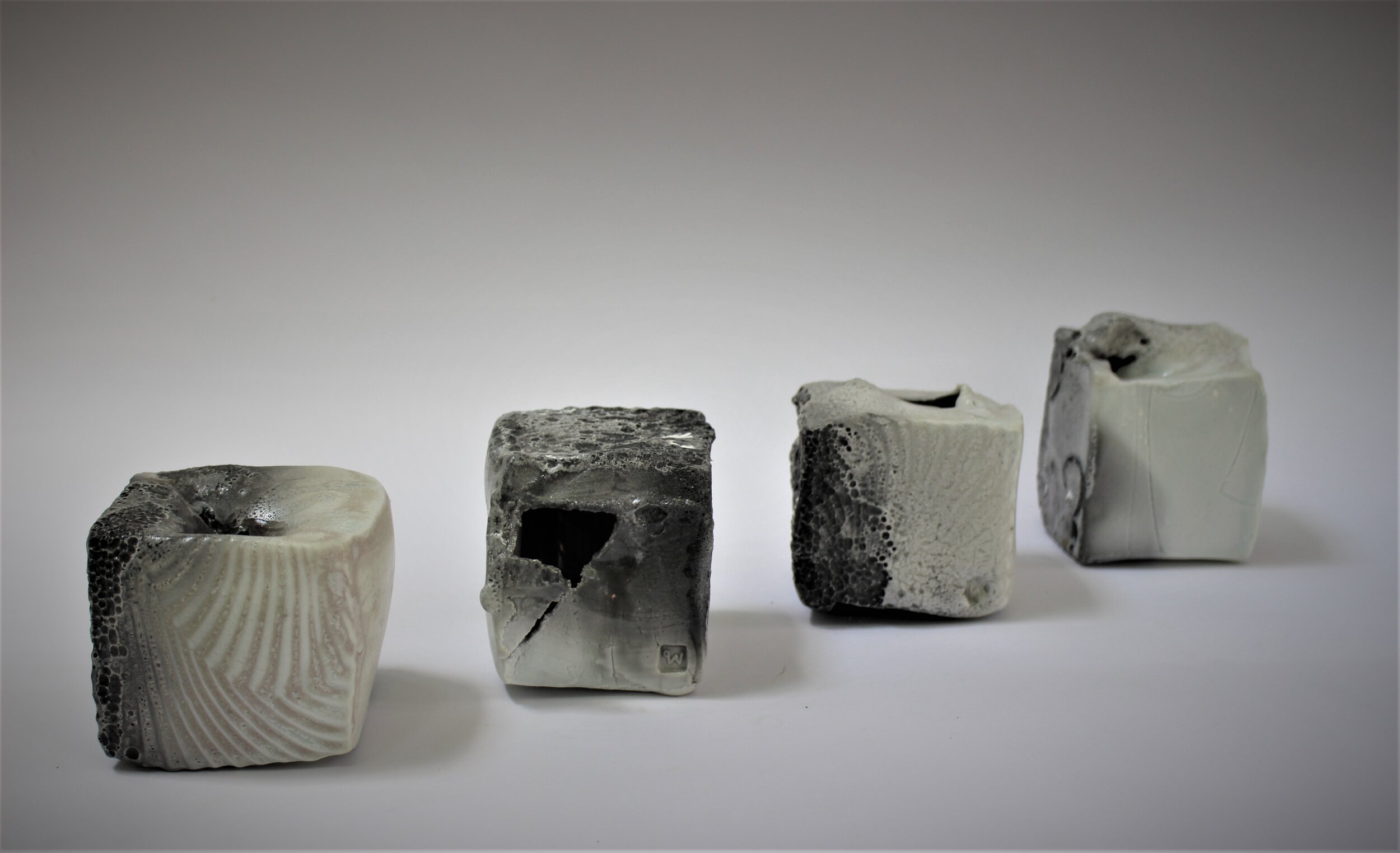
In my work I try to find a good balance between what is made and what is found. I want to submit to the nature of fired-clay, and keep certain evidence of my existence. That is my pride as a maker. I like boundaries and rules. Craftsmanship is very important to me.
I make vessels sometimes. Sometimes, I create an object with the intention of creating a vessel. When I take various kinds of minerals, clay, and different parts of Earth, arrange them in a specific way then heat them in my kiln and I feel like I am making a new type of rock in a very short time. The actual rock cycle in nature goes on for millions of years. In my lifetime I hope I can illustrate the process through my practice and bring it into the domestic settings and environments for people to experience.
Pim Sudhikam (1973/ Thailand): Pim holds a Bachelor of Industrial Design from Chulalongkorn University, Bangkok, and a Master of Fine Arts from HDK Gothenburg University, Sweden. Since 1998 Pim has been working with clay as her primary medium, investigating pottery as material, process and content. Her works include collections of objects, sculptures, and large-scale, site-specific installations. The works explore a balance between what happened and what being made while she tries to bring natural phenomena into the domestic context in the form of vessels. Pim has taken part in exhibitions, symposia, and residencies in Thailand and abroad. She has received “Awards of Excellence in Arts and Crafts” from the Ministry of Culture, “National Invention Award” from the National Research Council of Thailand, and an Honourable Mention from the 39th Ceramic Competition Gualdo Tadino, Italy. Pim is a board member of the Thai Ceramic Society and elected Council Member of The International Academy of Ceramics (IAC). Her studio is built among trees and gardens in the middle of Bangkok.
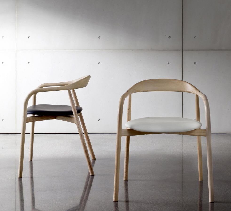
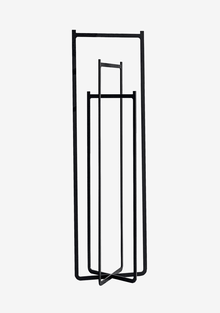
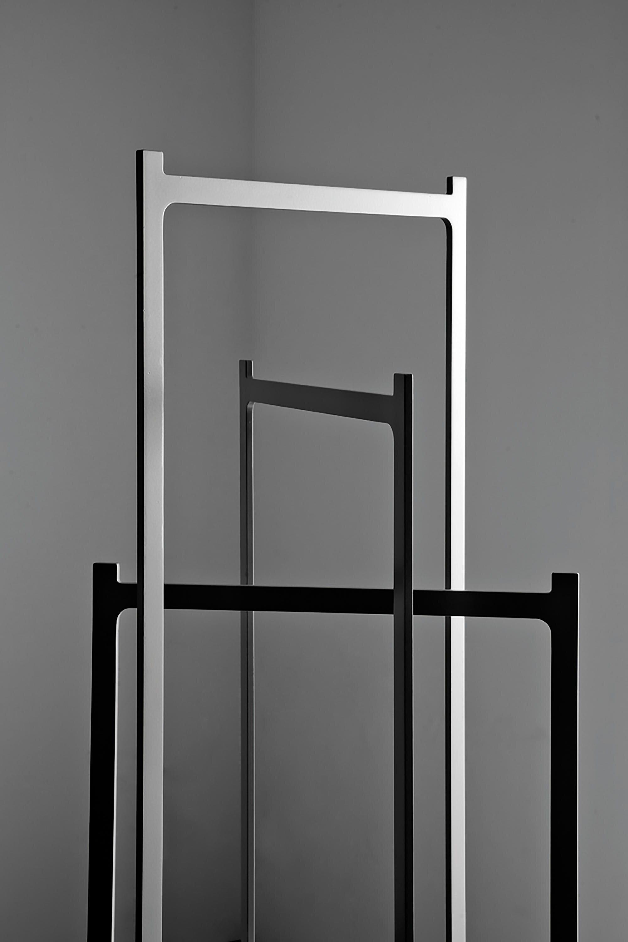
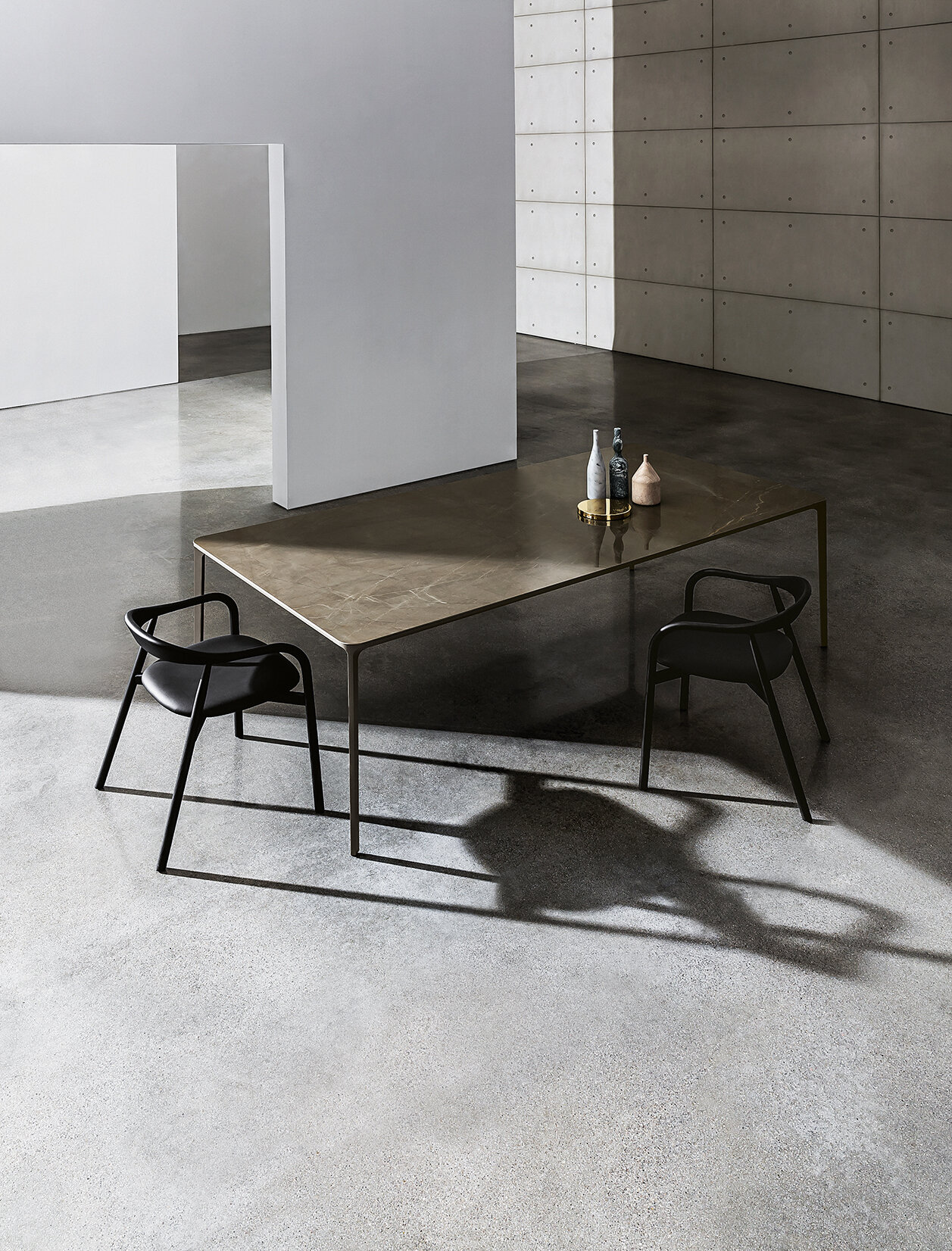
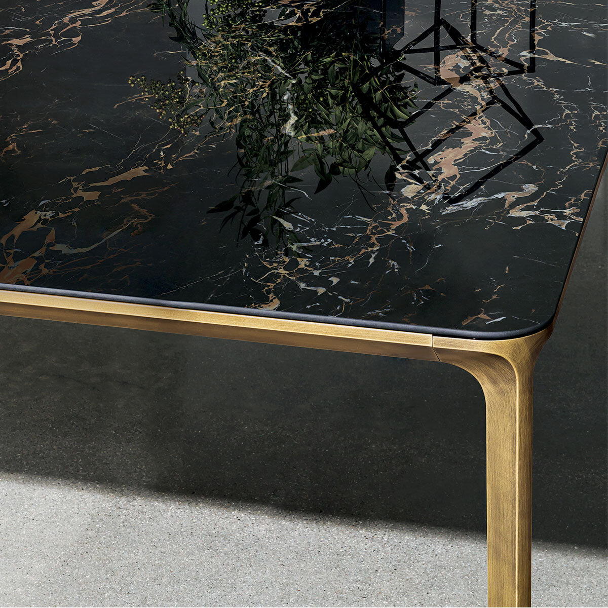
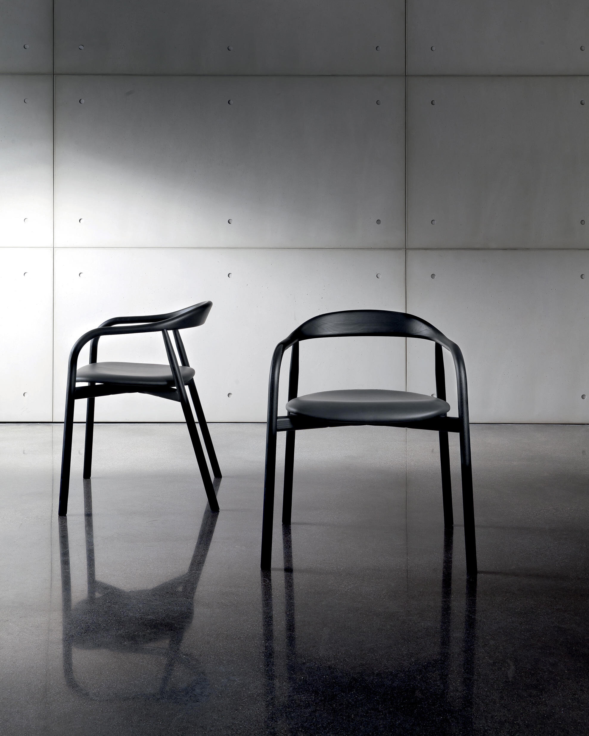
The Slim table, available in different sizes and heights, was designed by Matthias Demacker for Sovet. The designer sought the perfect balance between elegance and minimalism to create a model that can surprise the lines' lightness. Offering a selection of finishes that can fit any environment, Sovet's expertise in using materials added value to the model.
About Sovet: Sovet blends the Italian glass art tradition and the contemporary design inspiration to create furniture that speaks an original, elegant and versatile language. The company provides innovative material inspirations, combining elegance, sustainability and minimal design, focusing on the quality of the materials and the craftsmanship, the versatility of the project and the sustainability of the production process. Sovet is a new culture of living for home & contract spaces.
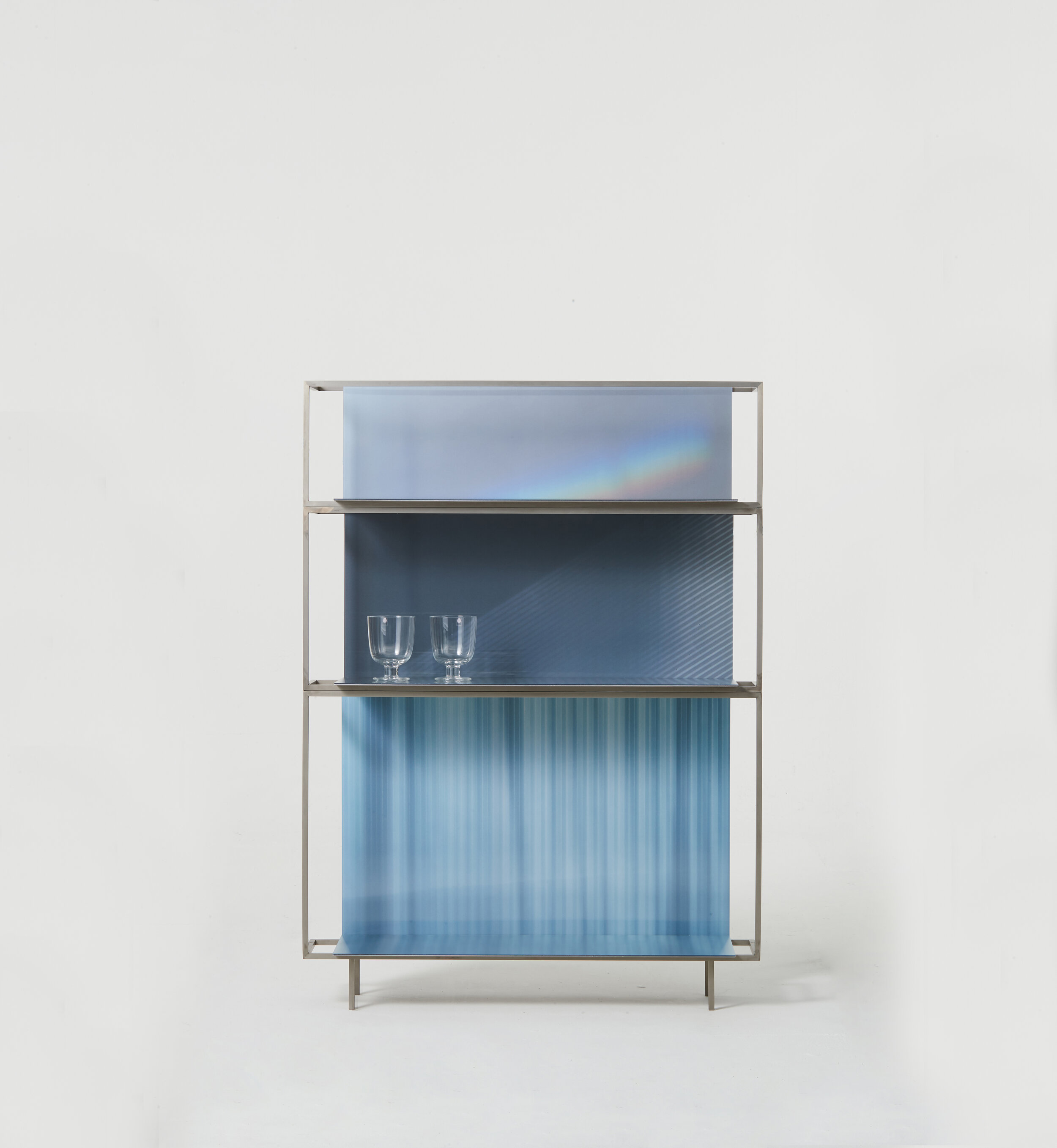
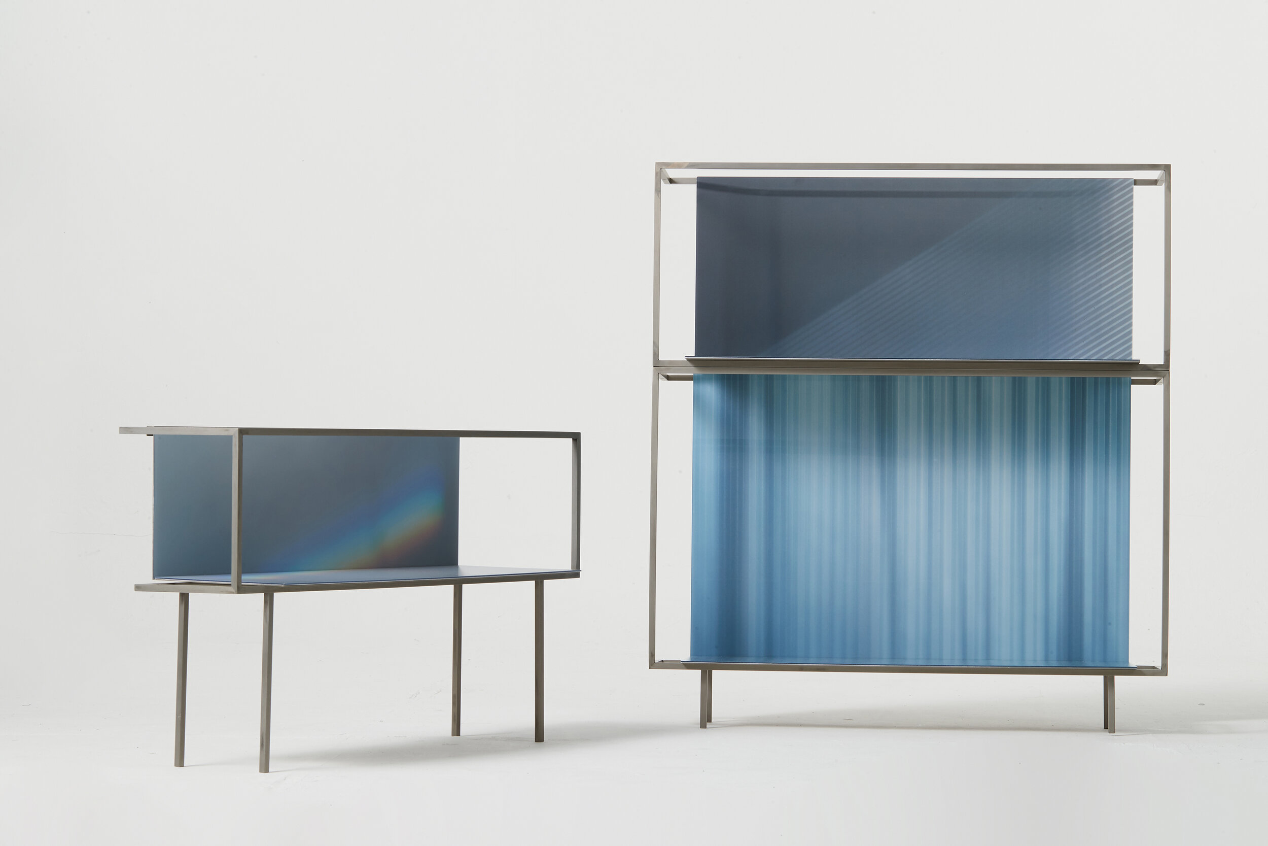
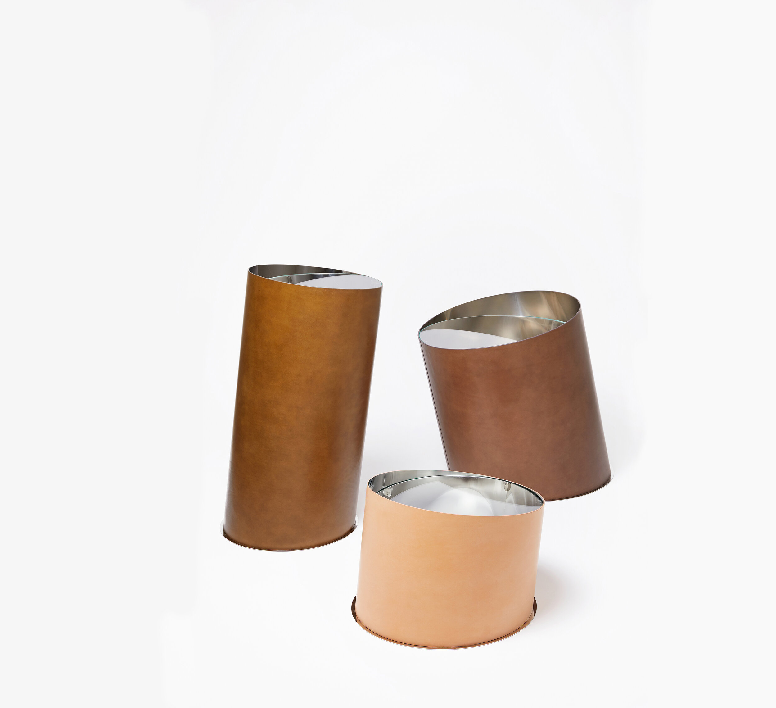
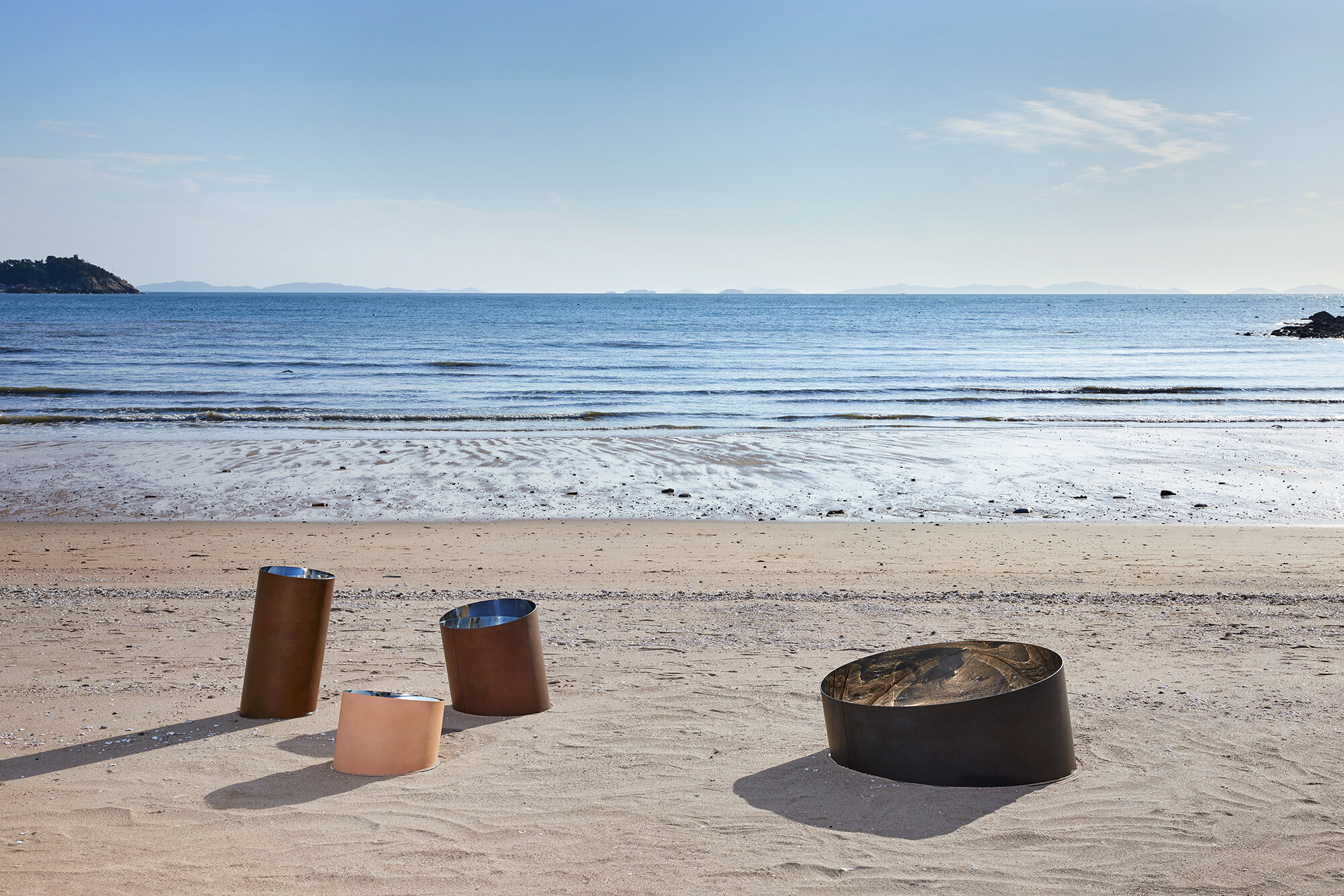
StudioEJ is a Seoul based design studio focusing on furniture and interior design.
“We try to make scenes of space that are created through unique relationships among objects and space.”
Printed Light 2020 is a shelf containing poetic moments drawn with natural light found in interior spaces. The light which is common in everyday life-light coming through the curtains in the morning, red light coming through the blind in the late afternoon and always nice rainbow (prism effect) on the wall-are applied to the spaces of different sizes to induce a warm light experience.
Happy Pixel intends more active and dramatic conversations with objects, which is interaction by applying a mirror to the lenticular as a pixel. If you apply a mirror to the naturalized pixelated image and reflect it on the mirror which is a part of the pixel, you will find a moment assimilated with the natural image.
With several years of working experience for architectural firms, she started her practice focusing on experimental and conceptual projects in a wide range of fields from small objects to space design. Her approach to design is to create a special and unique experience taking a fresh perspective on the mundane.
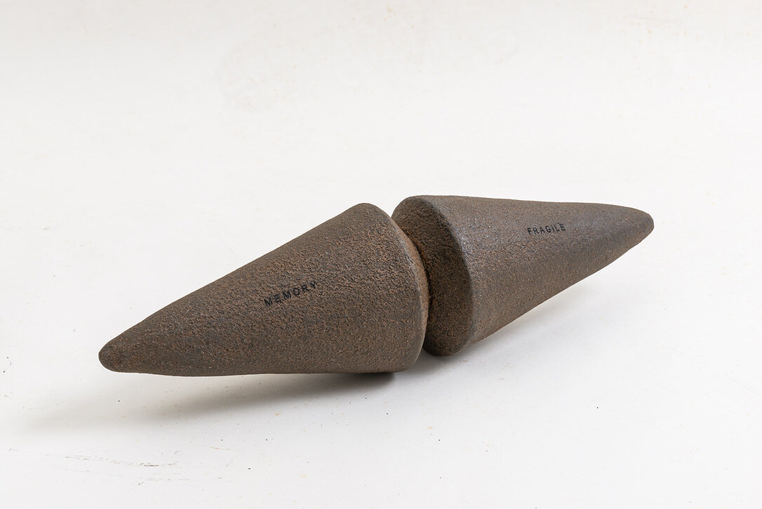
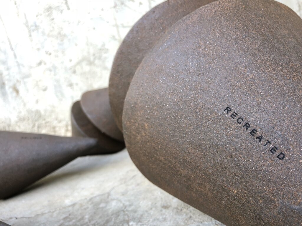

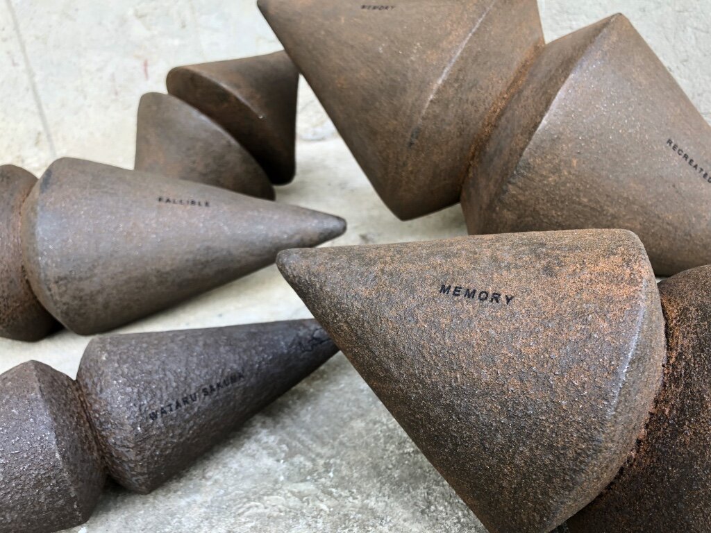
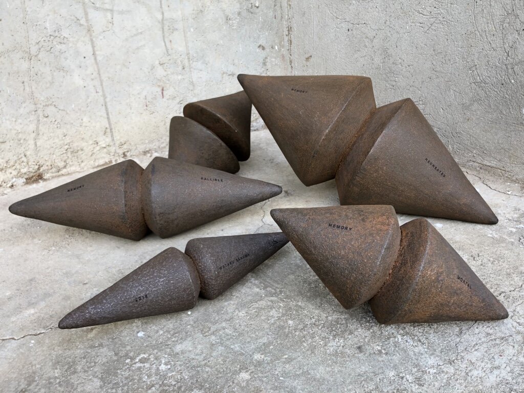
“Not what it seems to be”
Our memory is molded by daily social interaction with environment. We store the experience in our memory and we shape our own belief and faith.
We tend to judge and make decisions based on what we know. But more often things are “Not what it seems to be”.
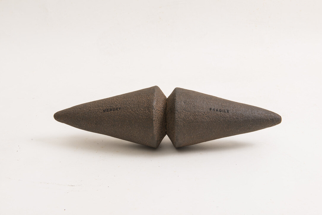
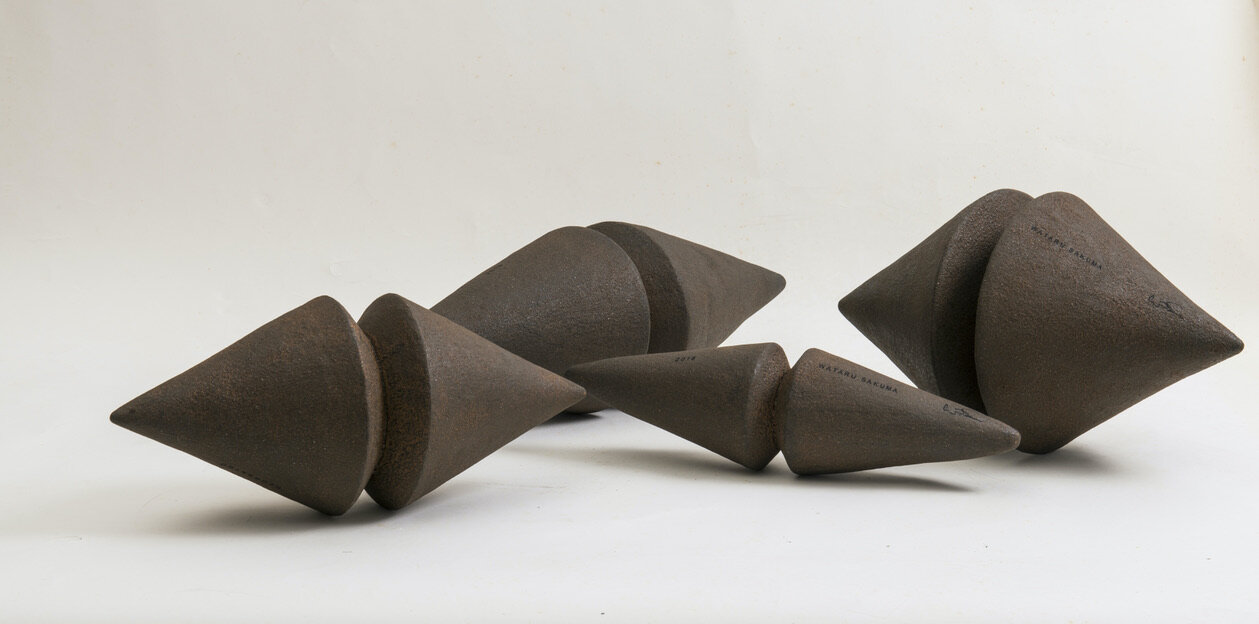
“Not what it seems to be”, the massive and masculine objects lead us to believe that they are made out of Heavy Black Iron, yet in contrary all the objects are made of light weight Recycled Carton. Once interacting with the objects, you would find out that they are not merely objects, but an instrumental pair of Maracas filled with natural seeds creating sound inside. Deceiving our expectations, they challenge our sense of perspective and question our own memory and faith while planting a New Memory through interacting with the pieces. Reminding us that Memory is Re-Created every day yet it is a Fragile, Mortal, and Fallible “Object” veiled by a thin layer of Rusting Faith.
THE DESIGNER
Wataru Sakuma is a Philippine-based Japanese designer with a strong background in fine arts. Famous for his creativity and ingenuity, Wataru uses even the most basic of materials, like paper, to create functional yet artistic pieces for urban living. His respect for nature and his ability to see something beautiful in discarded or overlooked materials gives his work conscience.
For more information, please visit: www.designpier.co or http://designart.jp/designarttokyo2020/en/exhibitor/design-pier/
Exhibition dates:Oct 27th – Nov 3rd, 2020
Hours:11:00 AM – 8:00 PM
Omotesando Hills Main Building B3F, Space O
Address:4-12-10 Jingumae, Shibuya-ku, Tokyo
About Omotesando Hills
Omotesando Hills is a unique cultural/commercial complex, emerging as the new face of Omotesando, which has transmitted various trends as the hub of Japanese fashion and culture.
The six-level atrium (three stories above ground and three underground stories) at the heart of the main building is complemented by the 700m “Spiral Slope” ramp (“the second Omotesando”) spiraling around the atrium space in an incline roughly equal to that of Omotesando. At the center of the atrium space is a grand stairway (from the first basement to the third basement), leading to a 548㎡ multi-purpose space, called “Space O”, in the third basement which serves as a base for imparting information.
The exterior wall holds a 250m long LED display called “Bright-Up Wall”, illuminating the nightscape of Omotesando.
These creative spaces are combined with “selective” stores mainly positioned along the Spiral Slope, “MEDIA SHIP.”, involved corporations, participating artists, and trend-conscious people who gather at Omotesando Hills combine together in order to evolve the complex into a new facility with unparalleled expressive ability. It is the venue for various events related to fashion and art and continues to generate the latest news.
Beijing Residence in Dongzhimen 8 designed by André Fu
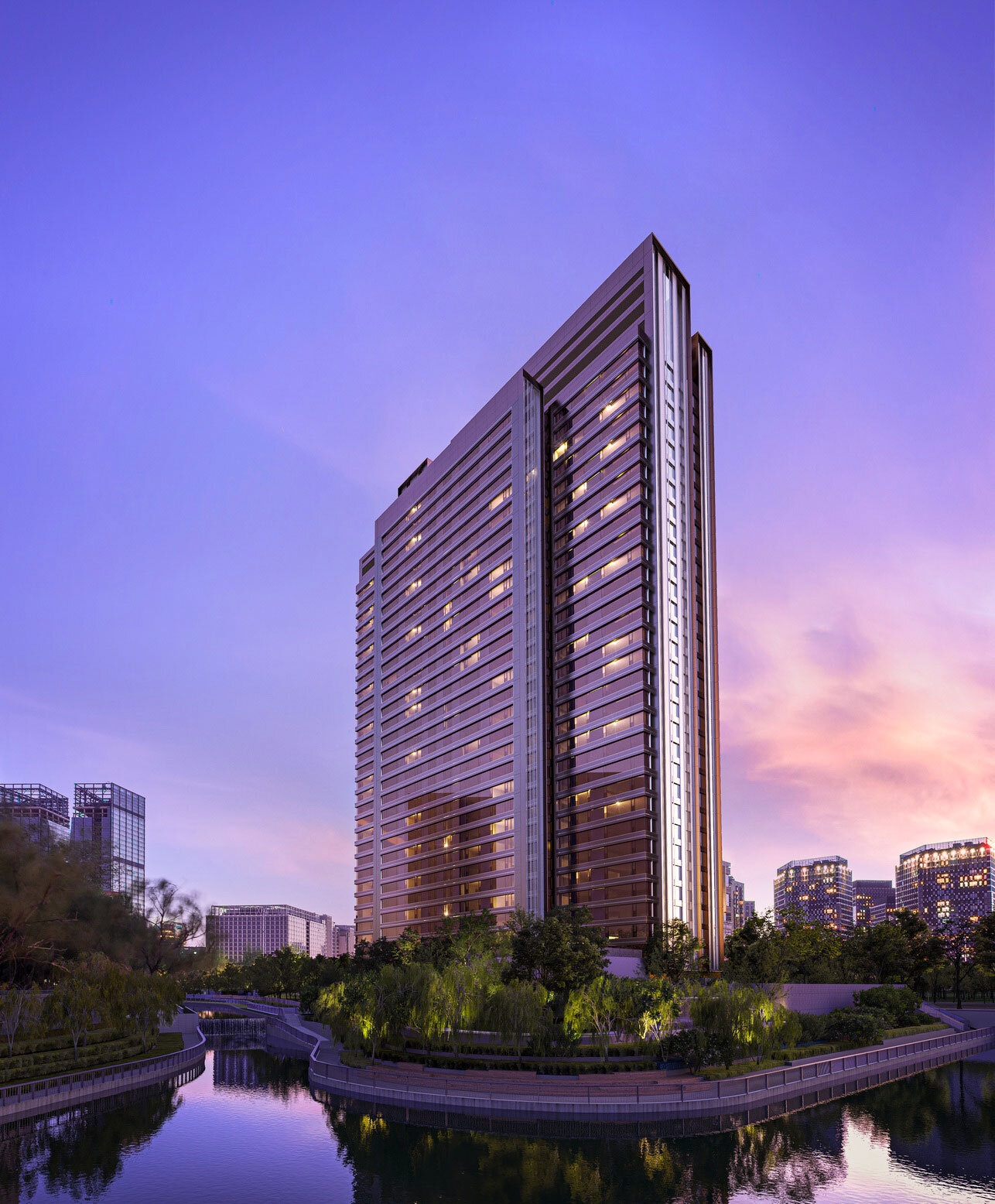
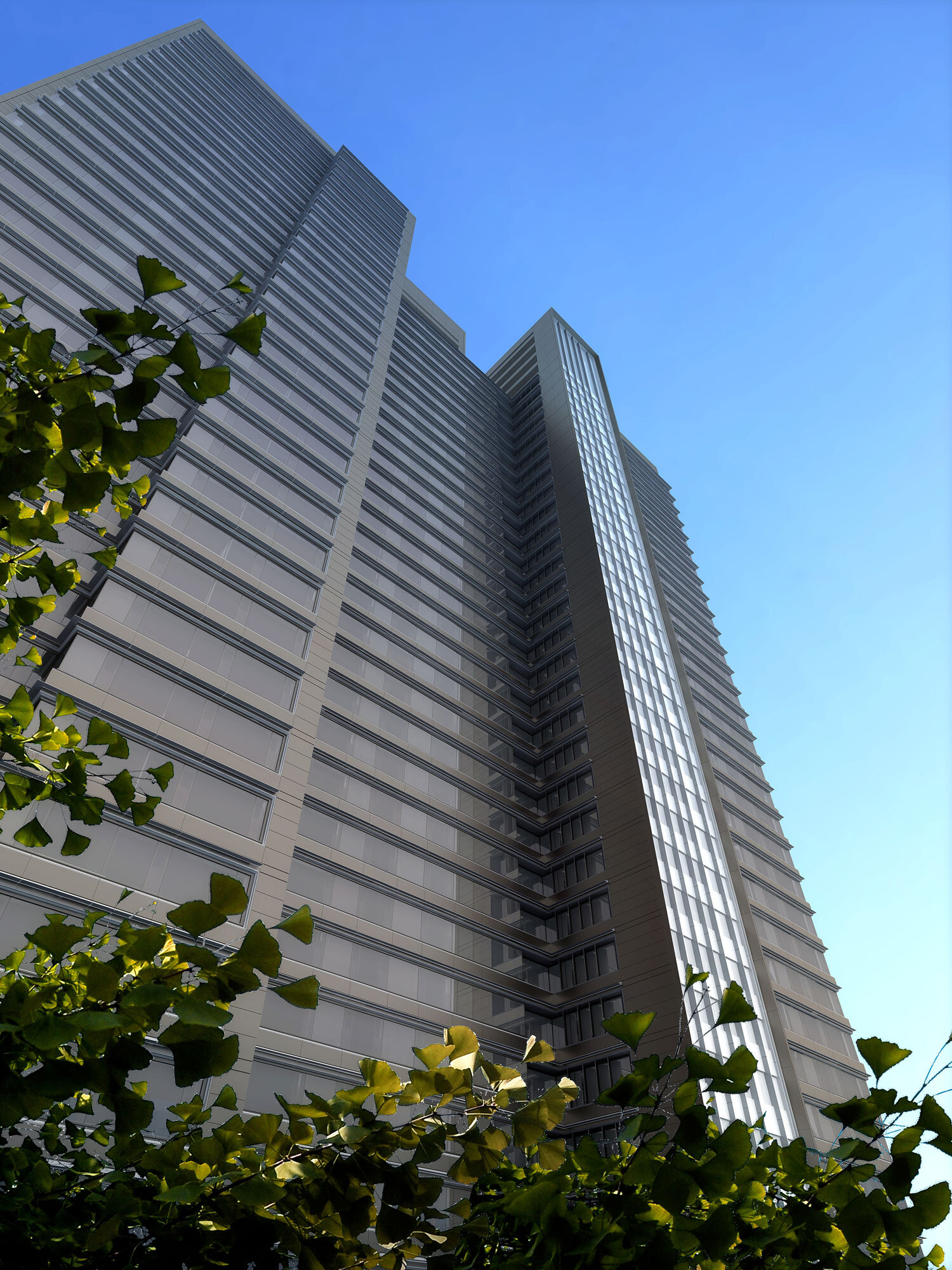
André Fu embarks upon his first foray into the ultra-luxe market of Mainland China, and his first station to alight upon is Dongzhimen 8 in Beijing.
André Fu embarks upon his first foray into the ultra-luxe market of Mainland China, and his first station to alight upon is Dongzhimen 8 in Beijing.
LED-ridden high-rises, neon signs, or a riot of sparkling colours, all the semblance of modernity are supposed to be entailed in the popular criteria used for assessing how developed a mega-city is. However, these iridescent delights could thin down a metropolis's genuine attractiveness, which boasts a duality of 'Modern vs. Historical,' and this city is Beijing.
Its historic heritages arguably weigh much more in attractiveness than modernity does. They could be either regal or folkloric - The Forbidden City, Hutong valleys, the residues of ramparts and fortifications dating back three millennia - if you would feel like seeking more approachableness from this city, then these locales will not be missed.

Crossing Cultures with Design indicates that André Fu has an inclination towards interlacing his designs with quality of locality. Investing the regional and cultural peculiarities with the design, for him, is a process of refinement, and redefinition as well. The city is alive, so designs.
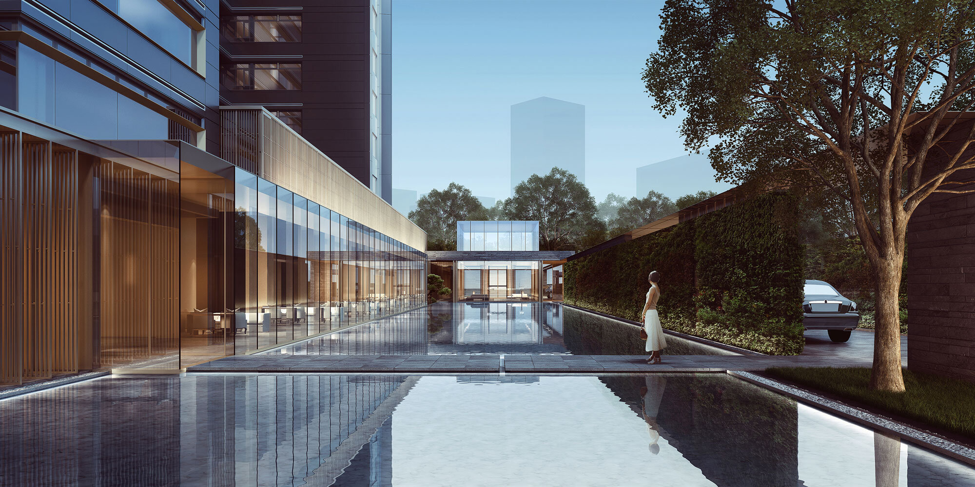
Dongzhimen 8 is wrapped in a history envelope. Dongzhimen was the East Gate of the Beijing city fortifications which was a transportation node since the Yuan Dynasty (1271–1368) and now is a prosperous commercial hub in Beijing. Because of its 800-year history and notably 8 being auspicious in Chinese numerology, 8 becomes an integral part of Dongzhimen 8. In particular, Liangma River (1368 – now), sending off an aroma of ancient history, encompasses it, serving as an aquatic vista for the residence. Dongzhimen 8 can undo the rigid dichotomy between urbanity and hermitage. It cannot be uprooted itself from the urbanity though, so one side is the hectic street, and it can be a Peach Blossom Shangri-la in a peninsula, the verdant and tree Moors in a suave manner, then the other side, you could imagine, it is an ecosystem friendly zone.
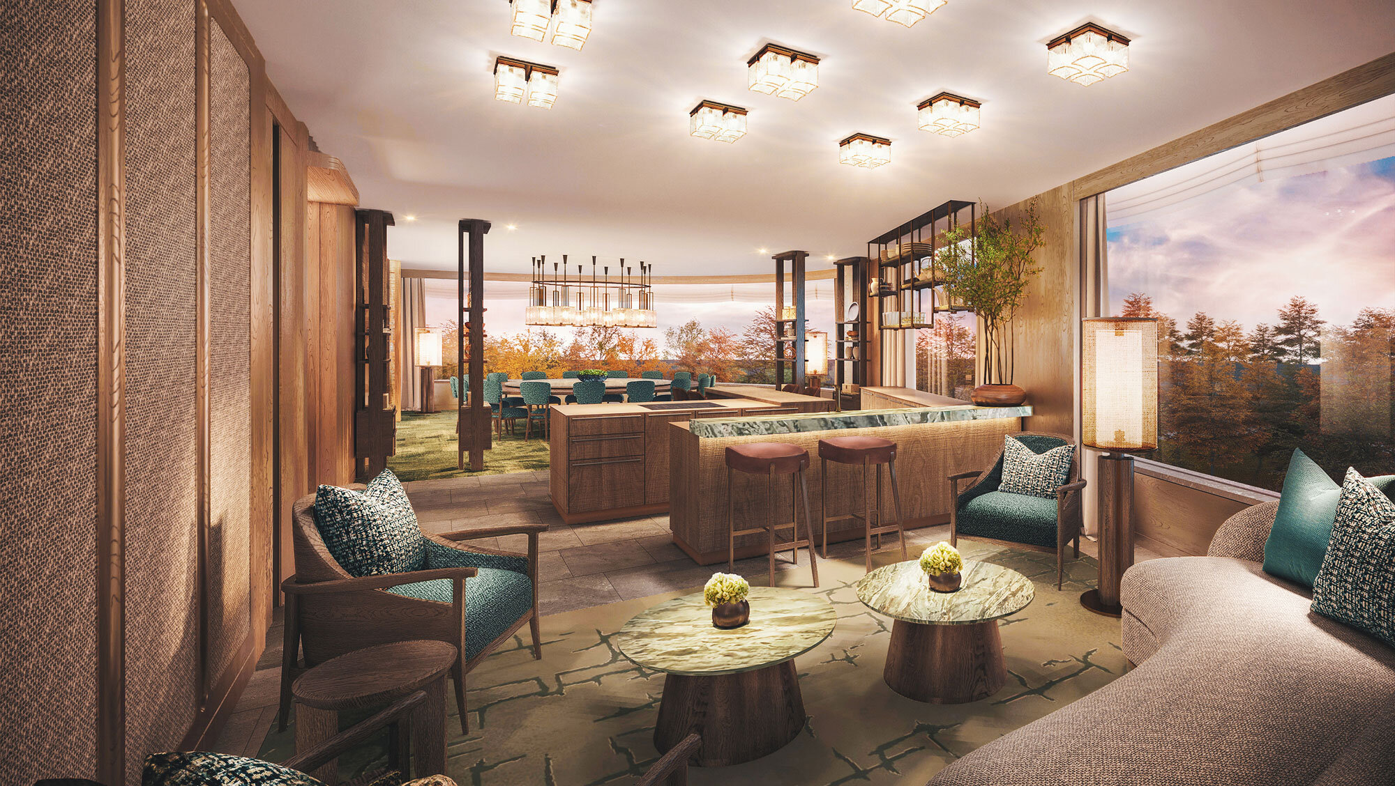
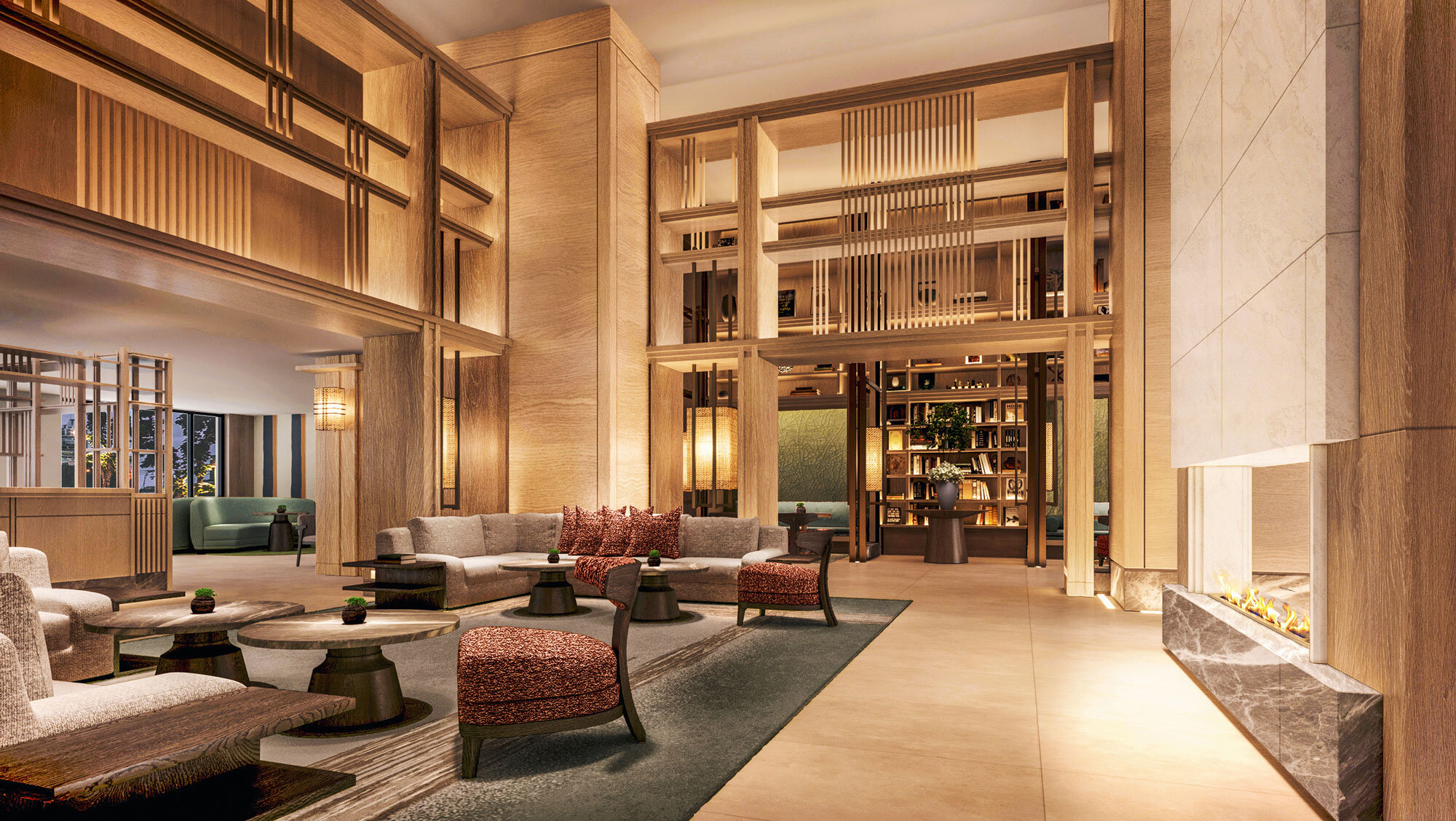
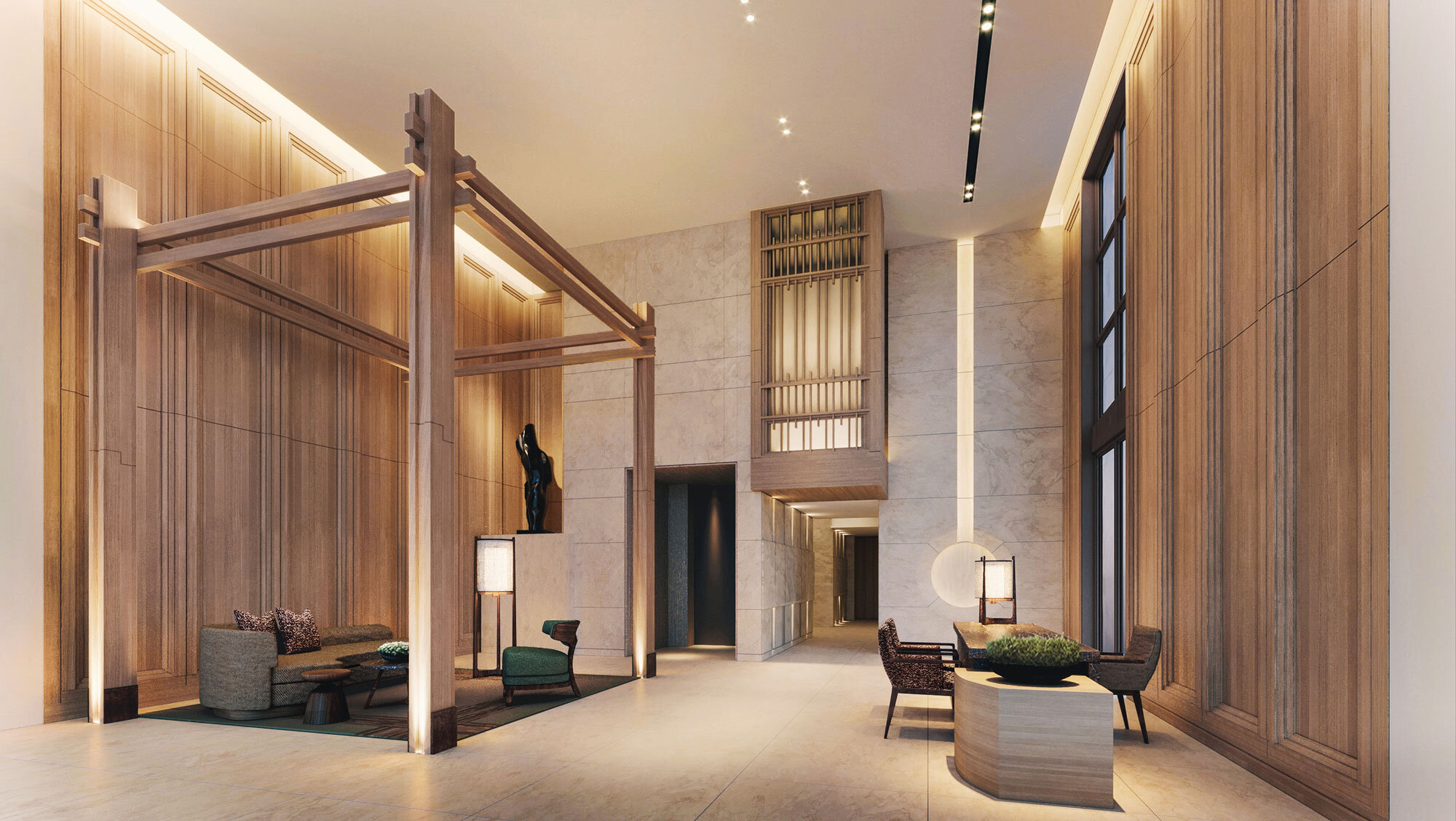
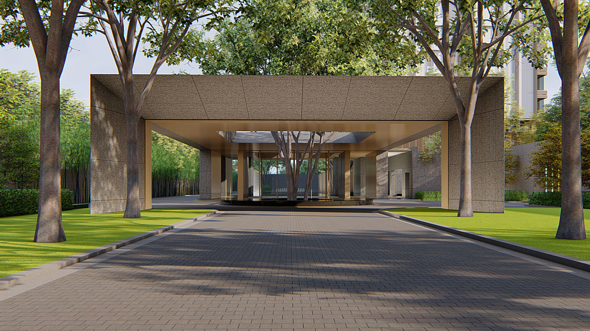
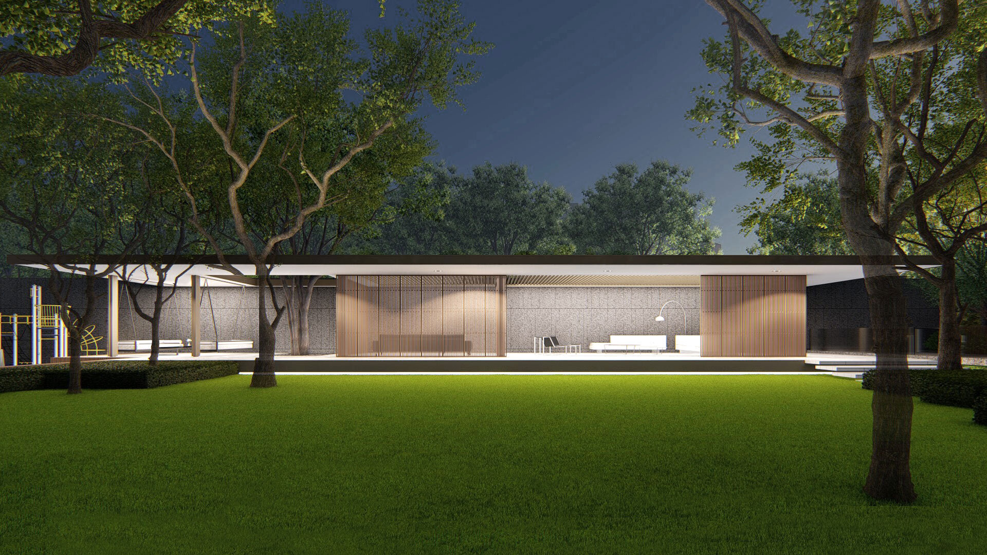
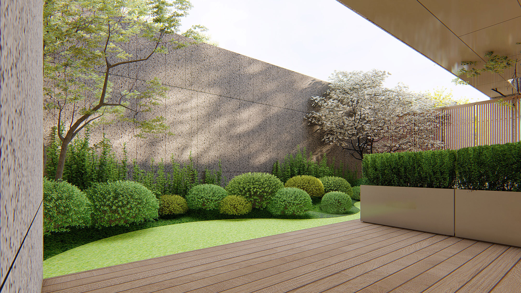
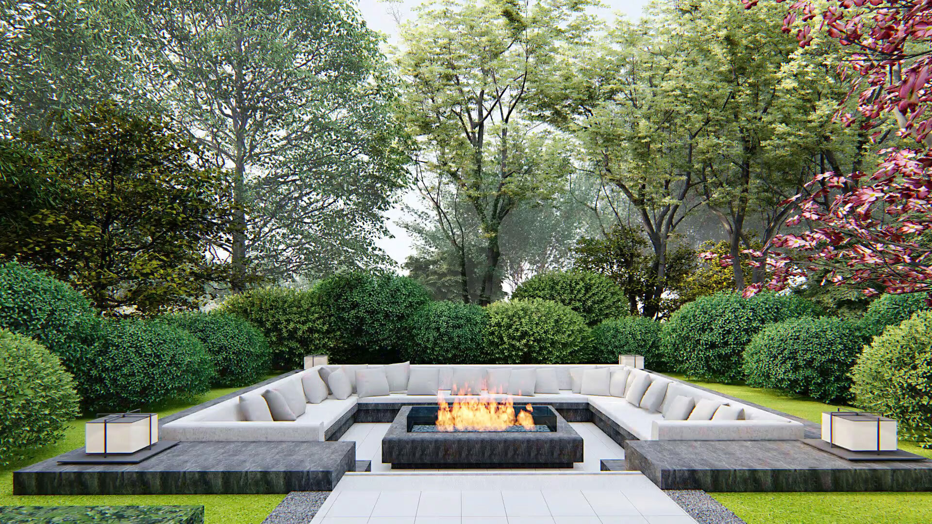
Suffice it to say that consumerism was outdated and uncalled-for enough to be decoupled from the modern definition of luxury. André believes that extravagant luxury needs to be pared down. Furthermore, at the thought of Beijing's stunning history, he wants luxury to set in motion resonance with the account. In partnership with the developers, they endeavour to create a space that makes an ‘elbow room’ to renew luxury and enliven the history.
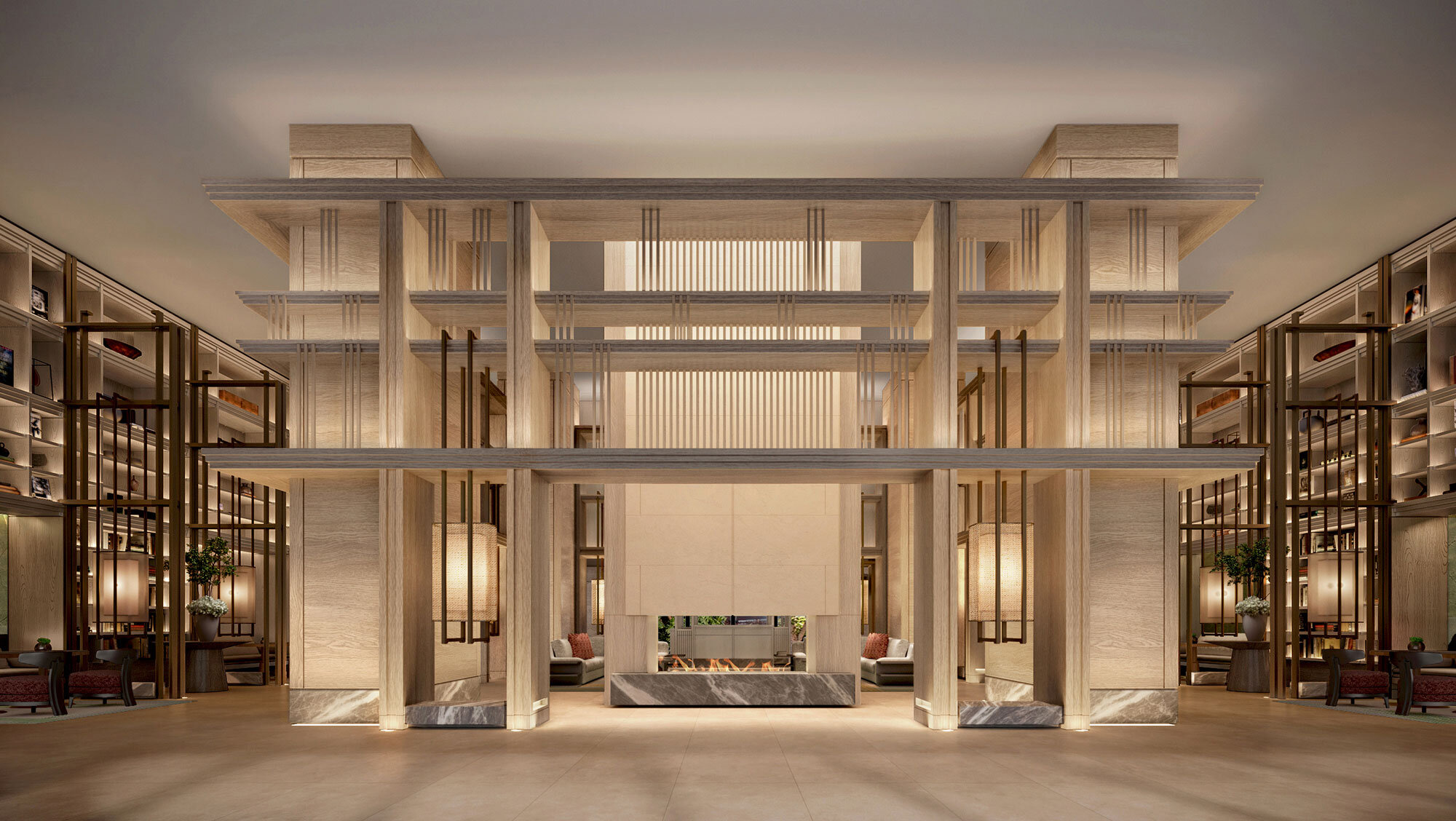
André includes mortise-and-tenon joints in the entire design. It is an oriental story to unfold. In stark comparison to brick-and-stone structures, wood texture is an enabler to lighten up the atmosphere redolent of the Chinese tradition. Colours are the key. By utilizing balanced shades and brightness, André made various palettes release a sense of elegance and reservedness. Design is, practically speaking, not something of montage. It is more like interwoven stuff wherein cultural expressions, through a particular symbol of colours, more often than not, are enacting a crucial role to fortify the texture.
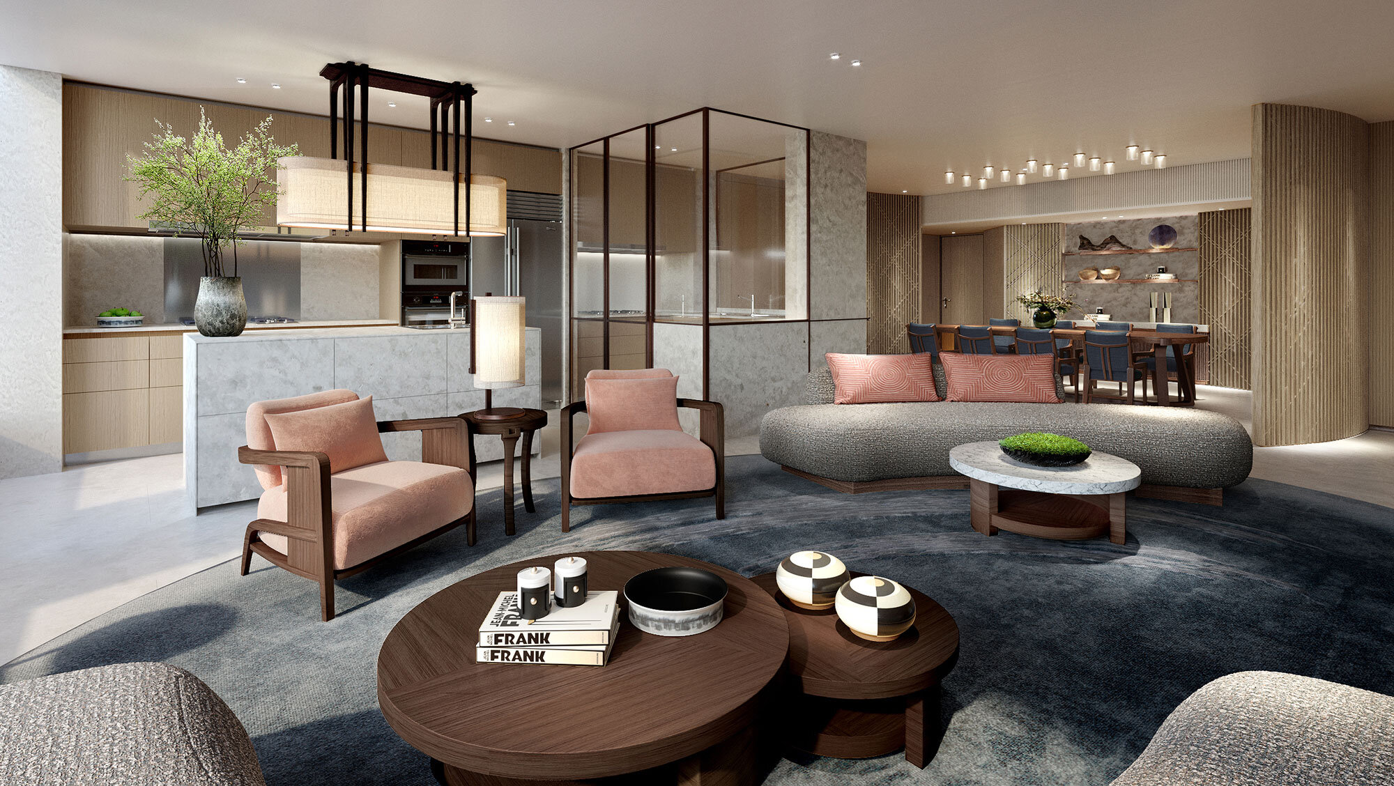
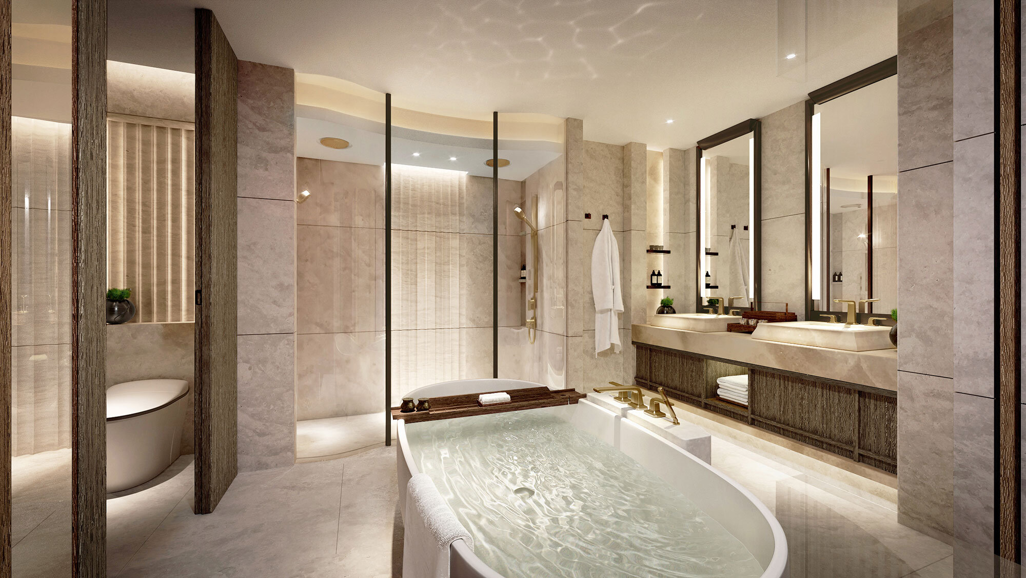
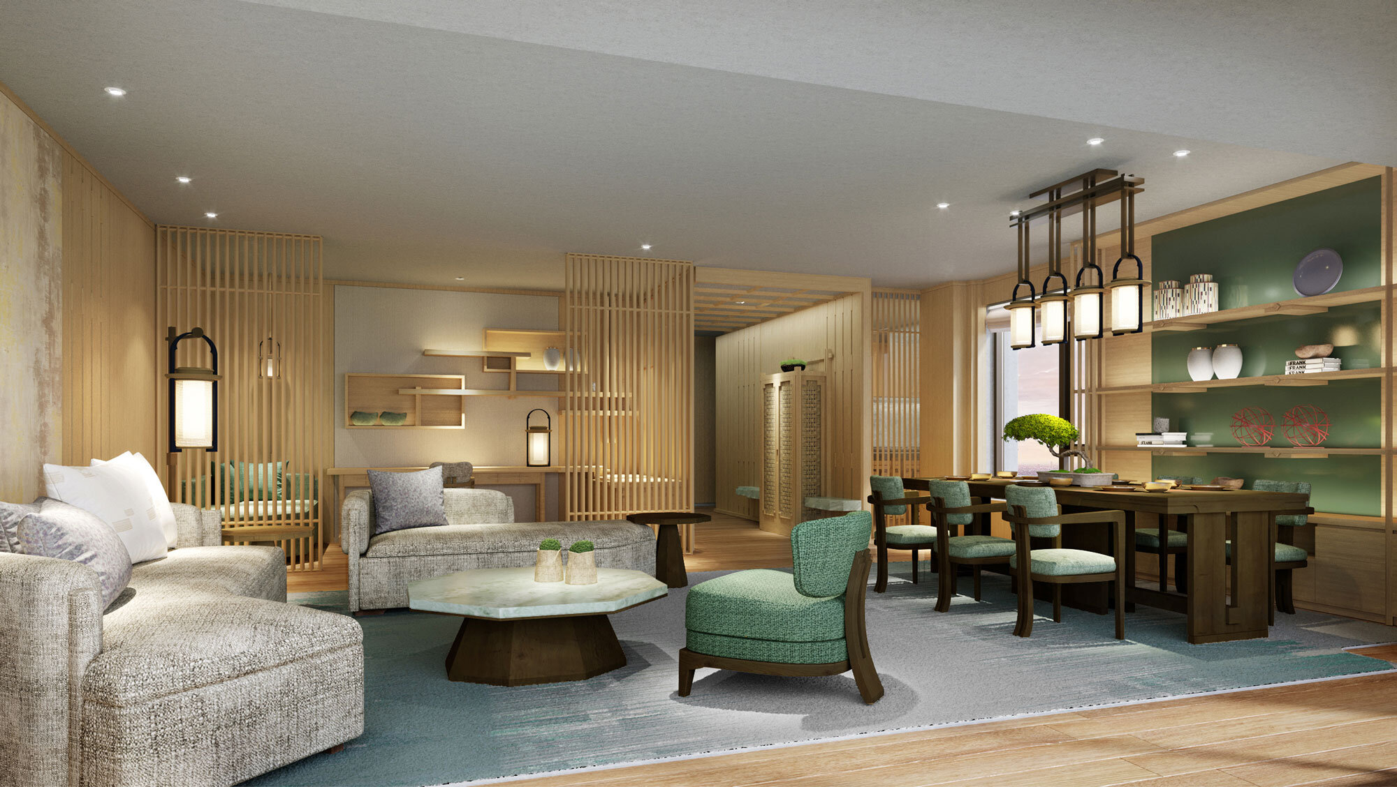
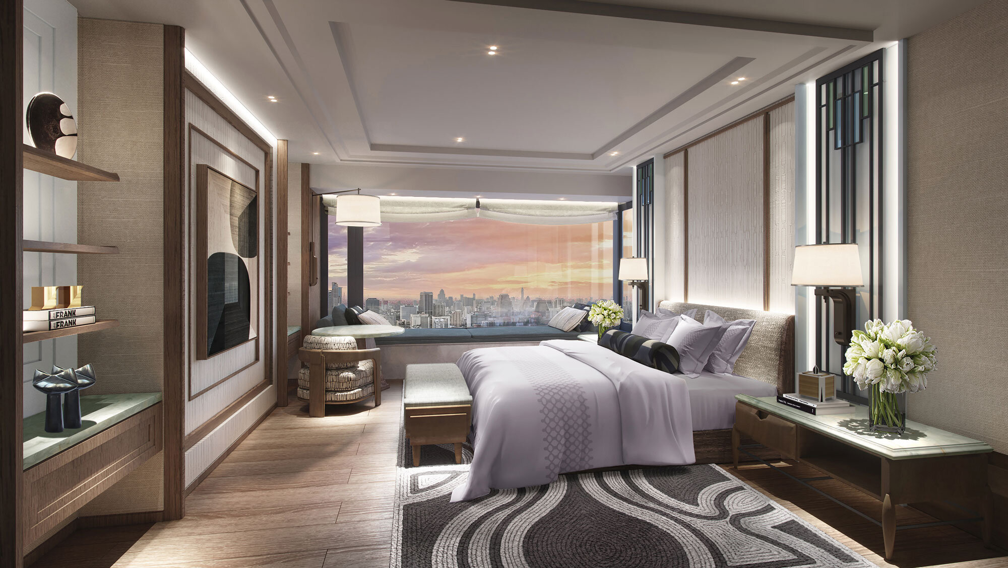
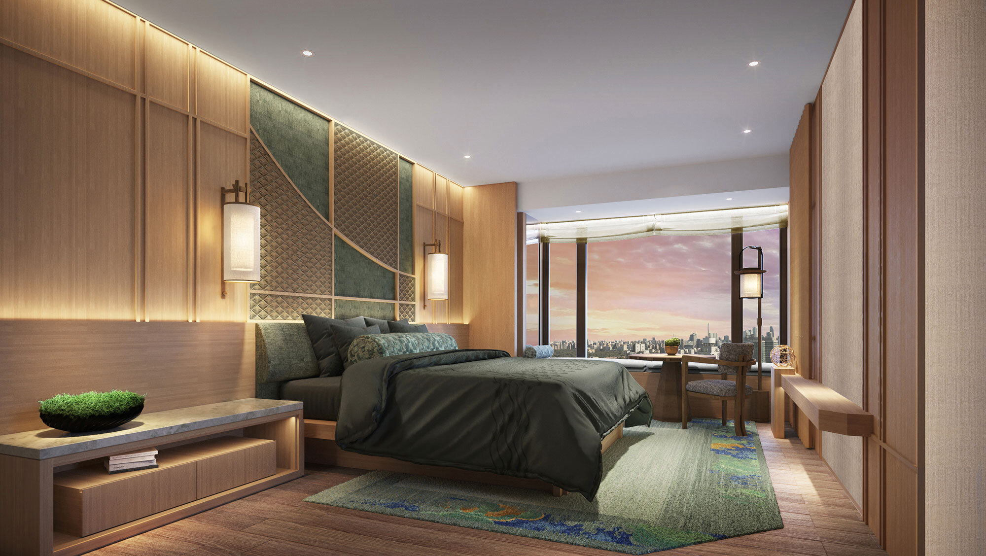
André does not implement an avant-garde design in Dongzhimen 8. He focuses much more on making coordination between elements. The residence is as genuinely individualistic as a person. Its personality basks in the reflected glory of the occupants and culture signs.
Born in Hong Kong and educated in England from the age of 14, André Fu holds a Bachelor of Arts at Cambridge University and a Masters in Architecture from the University of Cambridge. Fu credits his distinctive design style – a quietly thoughtful, carefully considered yet analytical approach marked by a highly refined aesthetic – to his peripatetic cultural upbringing.
He first redefined hospitality notions with his design of the world-renowned Upper House hotel in Hong Kong. His creations extend from a unique furniture collaboration with Louis Vuitton's Objets Nomades collection to contemporary art galleries in Hong Kong, Tokyo and Shanghai. With major hotels and restaurants around the world. Leading brands including Villa La Coste in Provence, The Berkeley London, Hong Kong's Upper House Hotel and St Regis, as well as Waldorf Astoria Bangkok.
Name: Dongzhimen 8
Exterior design: gad
Interior design: André Fu
Design team: DIA & AFSO
Landscape design: Zheng Shanfeng
Location: Dongzhimen, Beijing, China
Copyright: Life Group
Design year: 2020
Ditzel Lounge Chair Sheepskin Edition
Ditzel Lounge Chair is a modern take on the traditional, comfortable chair, offering a stylish seating solution for private residences to more public venues, such as hotel lobbies and executive suites, upscale lounges, reception areas and the like. Now available in white sheepskin with legs made of walnut wood.
Adding an extra layer of comfort to one of their classics, Fredericia now introduces the Ditzel Lounge Chair in a new version, fully upholstered with the softest sheepskin on beautiful legs made of walnut wood.
The Ditzel Lounge Chair is available in stores from October 2020.
Nanna Ditzel was truly an extraordinary woman. Incredibly talented, with a magnetic personality and a relentless drive. When Thomas Graversen took over as Creative Director at Fredericia in the late 1980’s, Ditzel joined him as Head of Design. Their close collaboration and openness to experimentation led to countless design awards and pieces celebrated all around the world to this day. Including what is arguably Ditzel’s most famous piece, the Trinidad Chair. She applied her brilliant creative mind to other disciplines, such as jewellery, tableware and cabinet making as well as textiles for famous design firms, such as Kvadrat. Boasting a career that began as part of the mid-century Danish Modern movement, she was a forward-thinking visionary whose work spanned more than 50 years.
Partnering with her husband Jørgen on the Ditzel Lounge Chair, they rejected conventional thinking and the assumption that a chair must be upright and rigid. Instead, by creating unconventional furniture that considered the various dimensions in a room, they believed that sitting in new ways would give people the freedom to think and live in new ways.
One of their most accomplished designs was the Ditzel Lounge Chair, designed in 1953. With the Ditzel Lounge Chair, each line and curve has been carefully considered to appear beautiful from all angles. Providing a perfect fit to the human form and as well as exceptional comfort, due to its generous width, back support, armrests and upholstery.
It also lends itself to customised versions and countless colours. Despite its broad, self-contained dimensions, the chair is rather light and takes up only little space. Known for her rebellious spirit and never-say-never attitude, Ditzel was unafraid to push the boundaries of what was considered possible. To challenge the status quo with sculptural, vibrant designs that drew inspiration from nature. Her rebellious spirit is also revealed in the varying ways you can position yourself in the Ditzel Lounge Chair. There are no rules; feel free to use it exactly as you see fit. Throw your leg over the side, lean sideways, straighten your back or cross your legs – do whatever you need to feel comfortable.
Ditzel Lounge Chair is a modern take on the traditional, comfortable chair, offering a stylish seating solution for private residences to more public venues, such as hotel lobbies and executive suites, upscale lounges, reception areas and the like. Now available in white sheepskin with legs made of walnut wood.
MATERIALS
Shell in high pressured PUR-foam enforced with a steel frame upholstered in sheepskin with solid wooden legs.
Beosound Balance, the new passion for music, design and craftsmanship
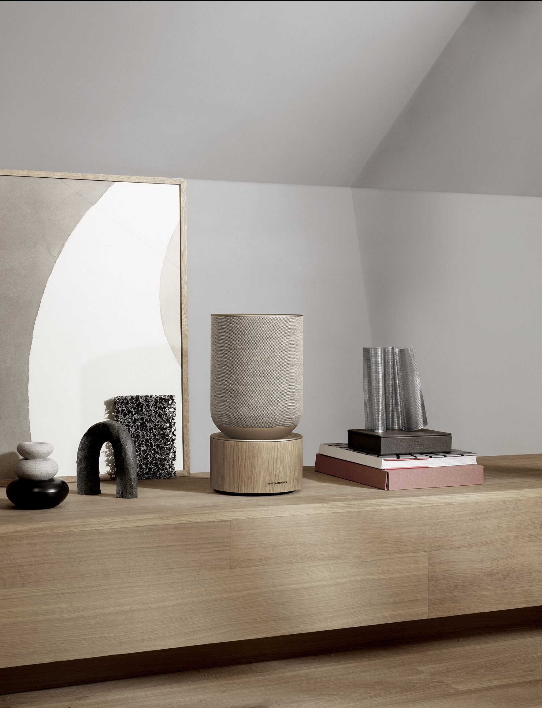
Beosound Balance is designed in collaboration with Benjamin Hubert from the British industrial design studio LAYER as an interior-first and shelf-friendly speaker that doesn’t compromise on the sound experience in large living spaces. Using materials that soften technology and blend in with quality furniture, Beosound Balance presents a solid oak wood base that visually grounds the speaker and a cylindrical shape clad in a seamlessly knitted textile that makes Beosound Balance inviting to touch and beautiful from any angle.
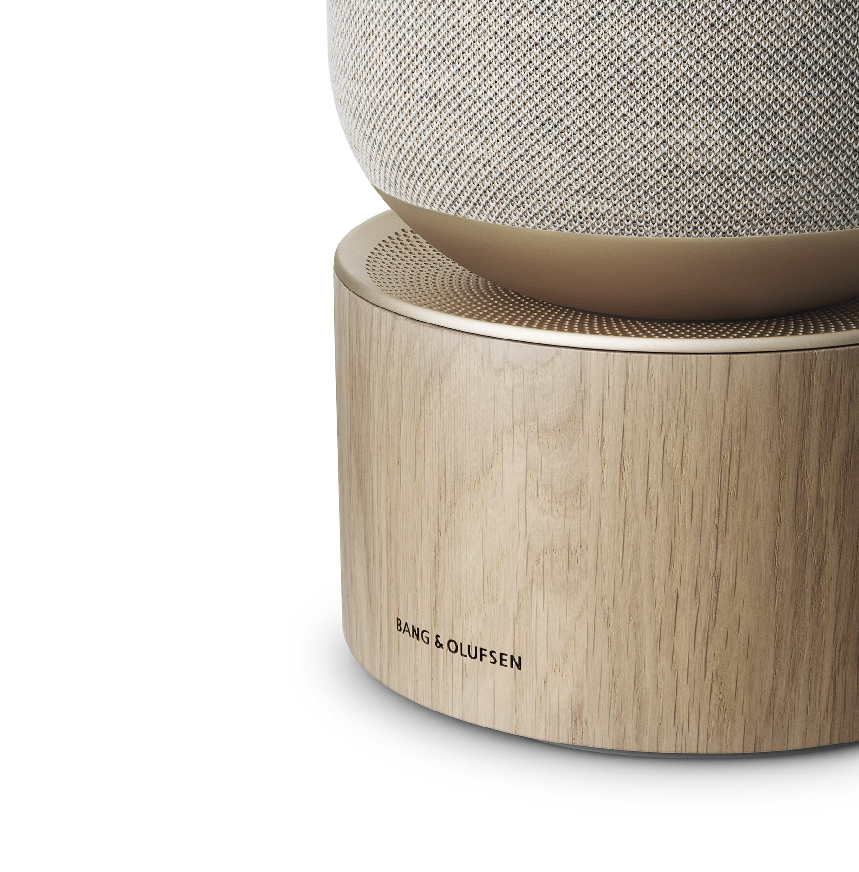
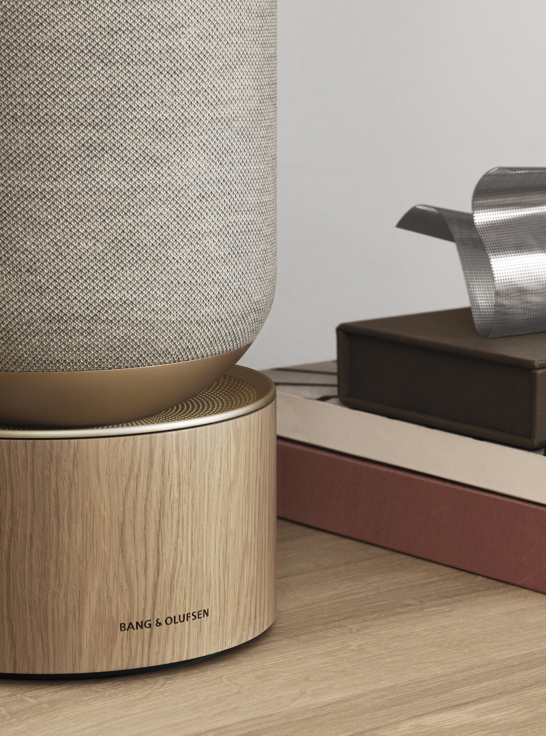
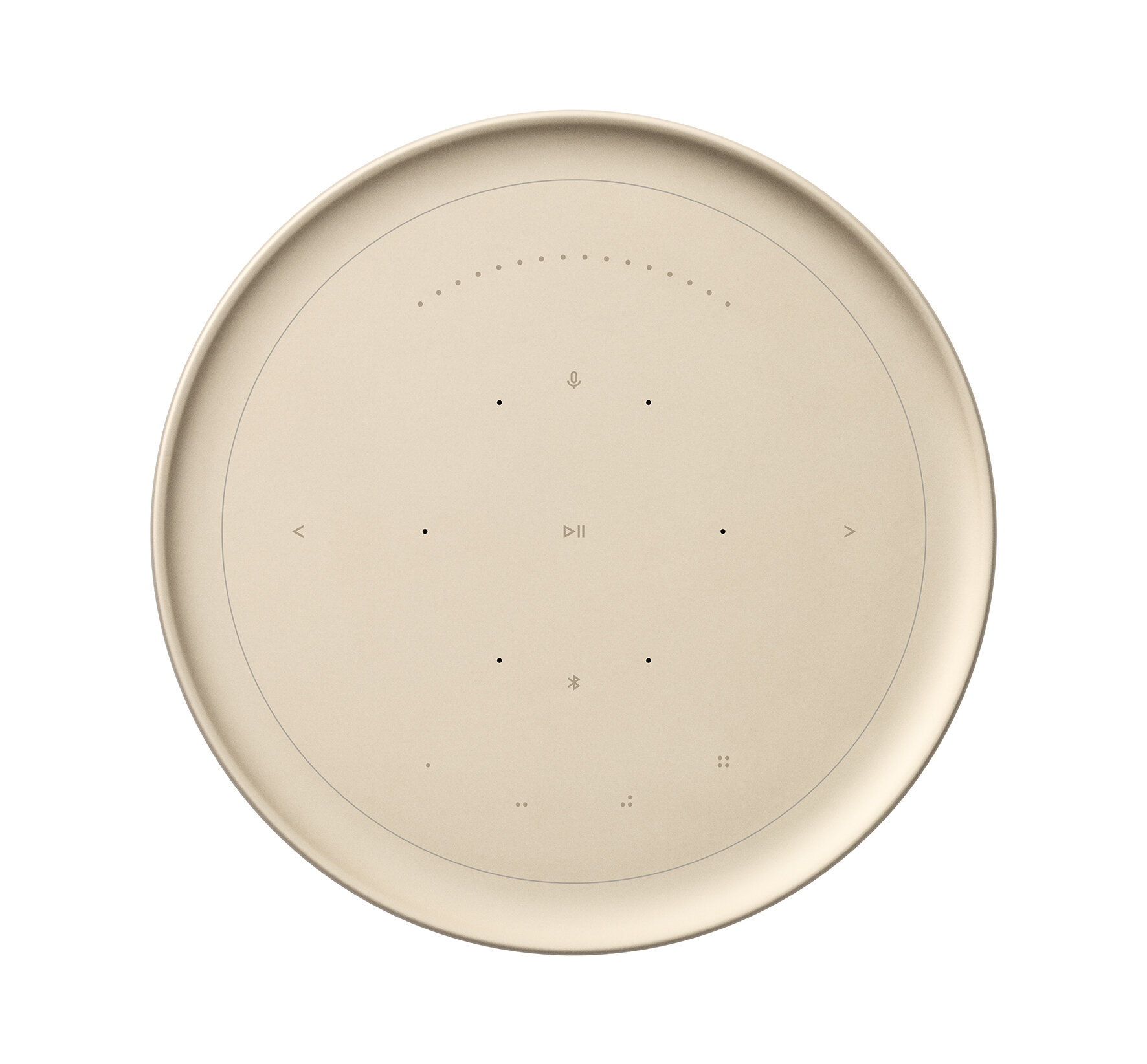
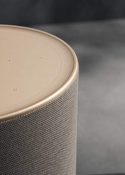
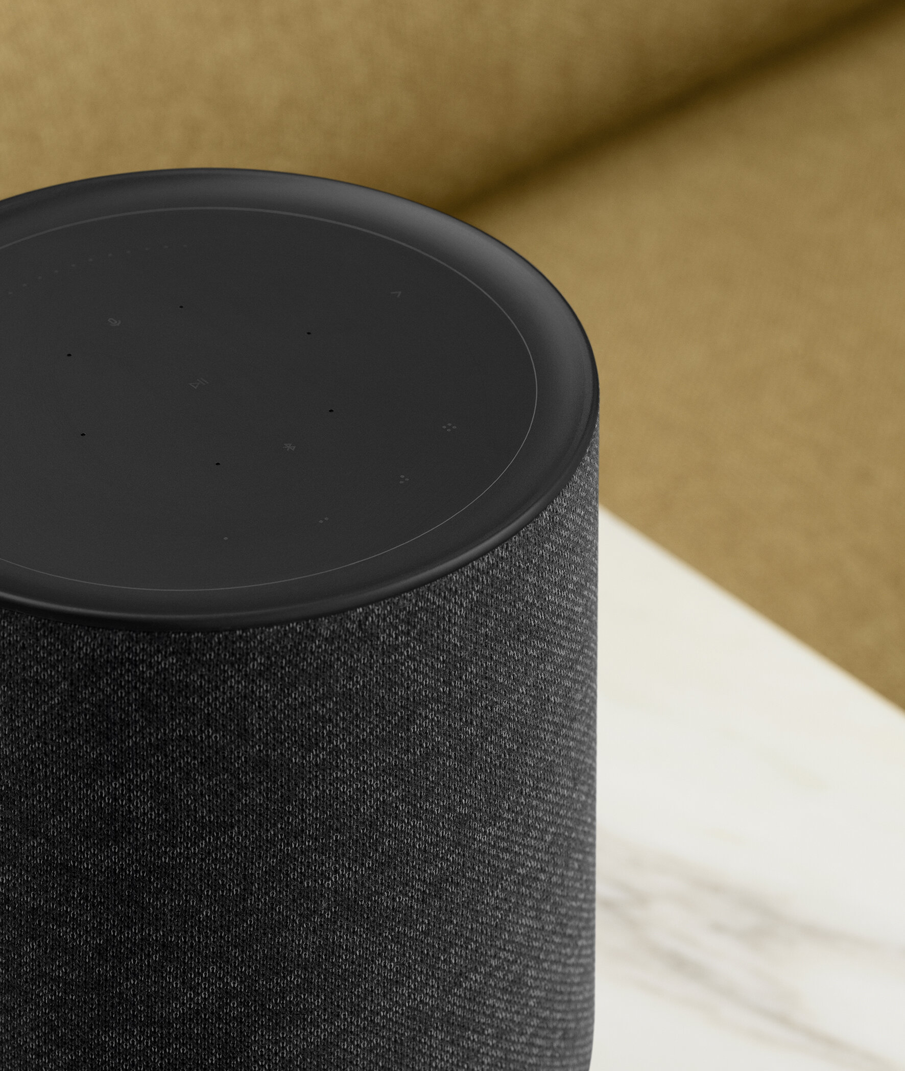
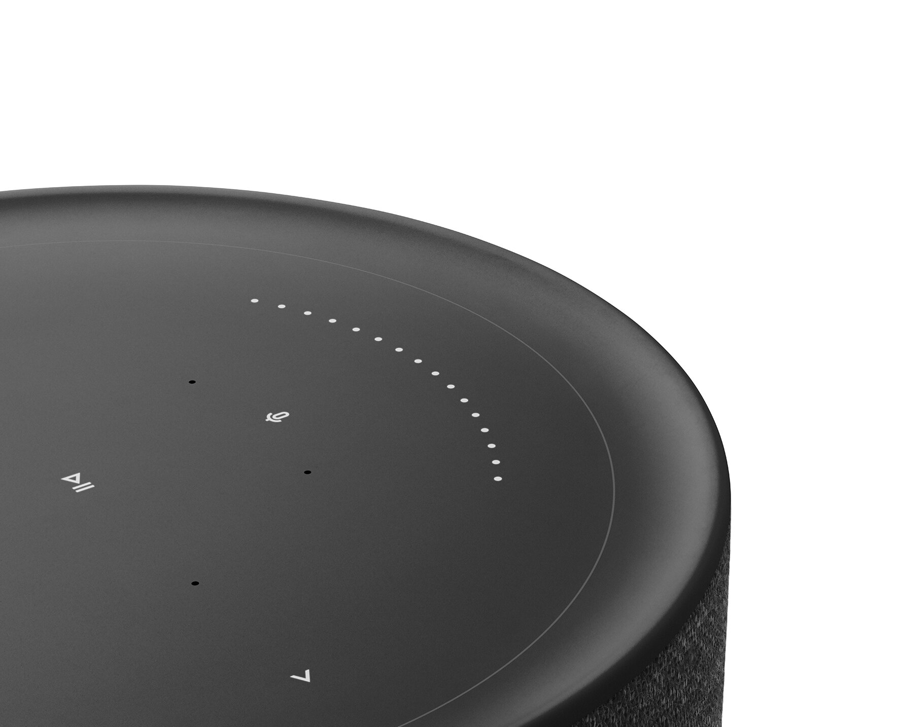
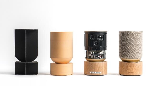
Created with a passion for music, design and craftsmanship, Beosound Balance is inspired by interior objects to redefine home audio in a way that only Bang & Olufsen can: a soft, rounded silhouette using interior-first materials such as solid oak wood and knitted textile, an innovative user interface that hides when not in use and seven carefully placed speaker drivers with beam-forming technology that lets the user choose between powerful and room-filling sound for everyday listening and sound directivity for precise and immersive music experiences.
Beosound Balance is designed in collaboration with Benjamin Hubert from the British industrial design studio LAYER as an interior-first and shelf-friendly speaker that doesn’t compromise on the sound experience in large living spaces. Using materials that soften technology and blend in with quality furniture, Beosound Balance presents a solid oak wood base that visually grounds the speaker and a cylindrical shape clad in a seamlessly knitted textile that makes Beosound Balance inviting to touch and beautiful from any angle.
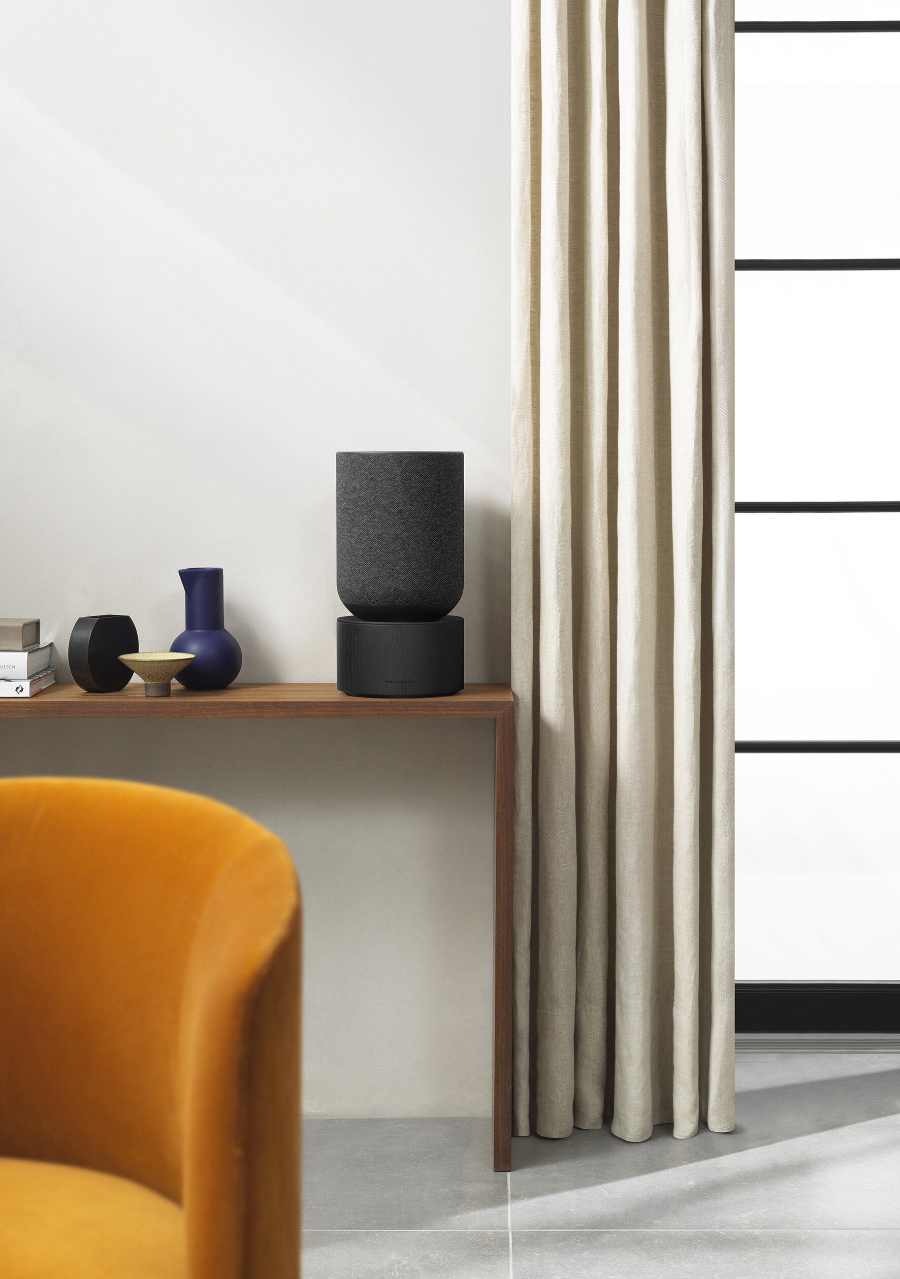
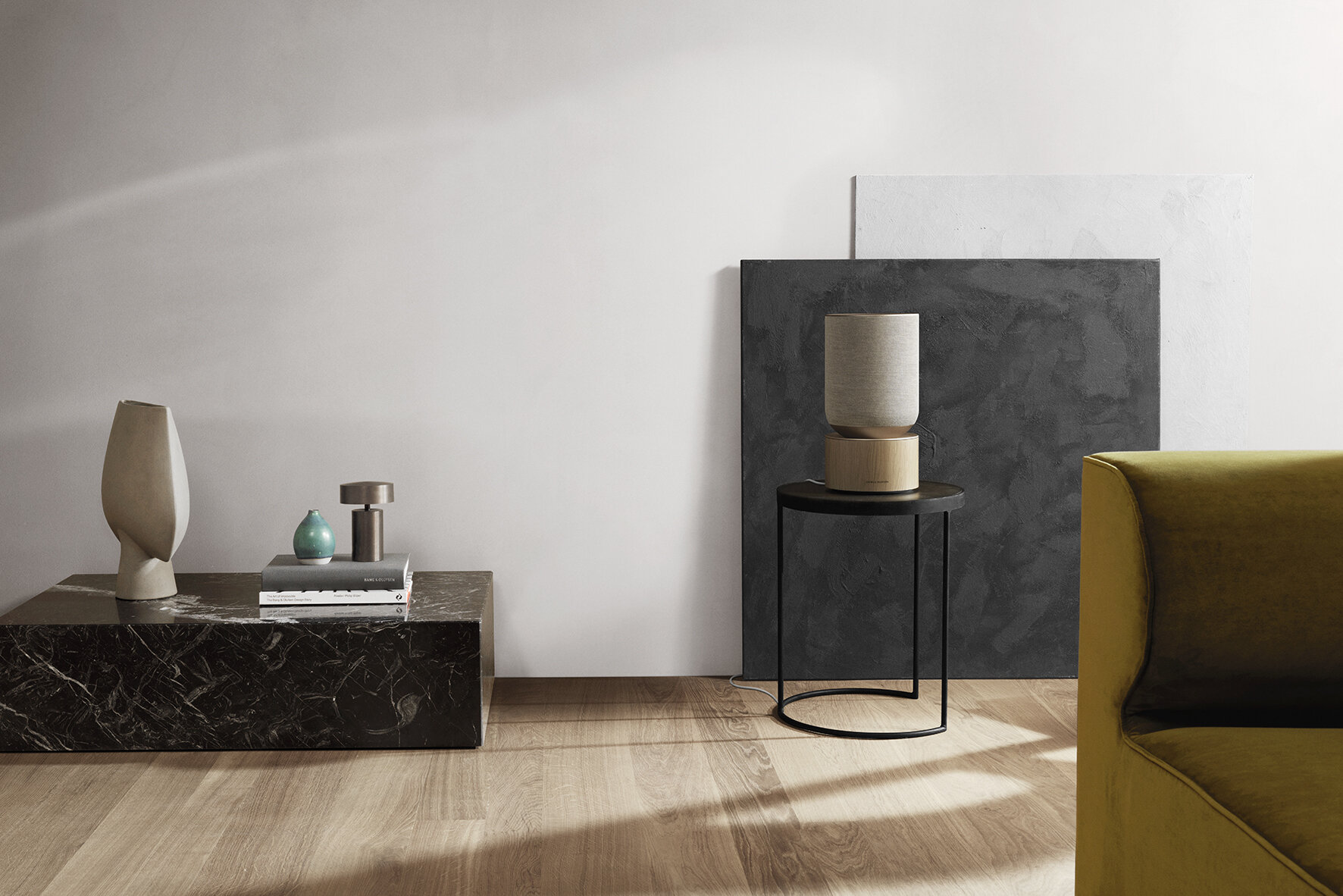
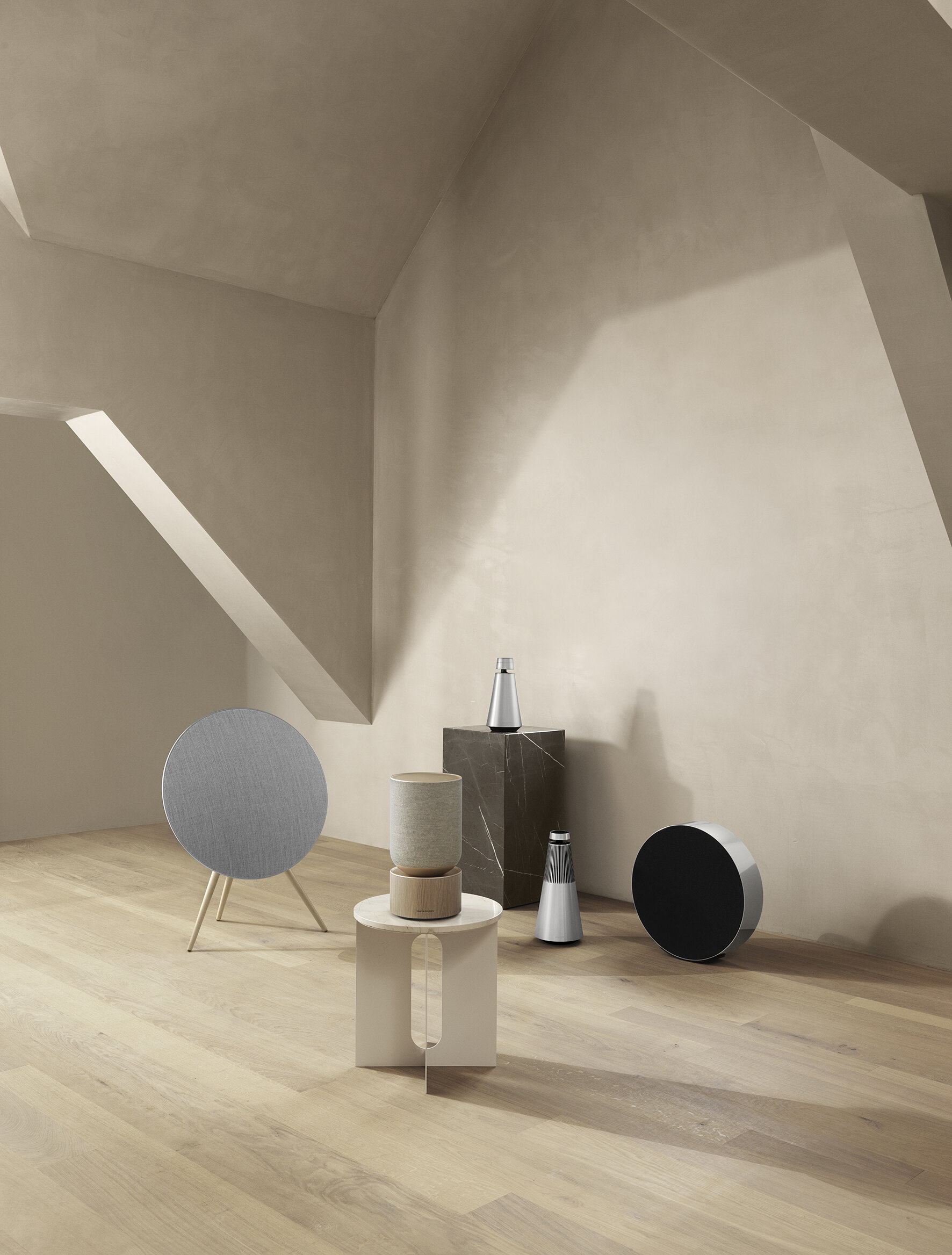
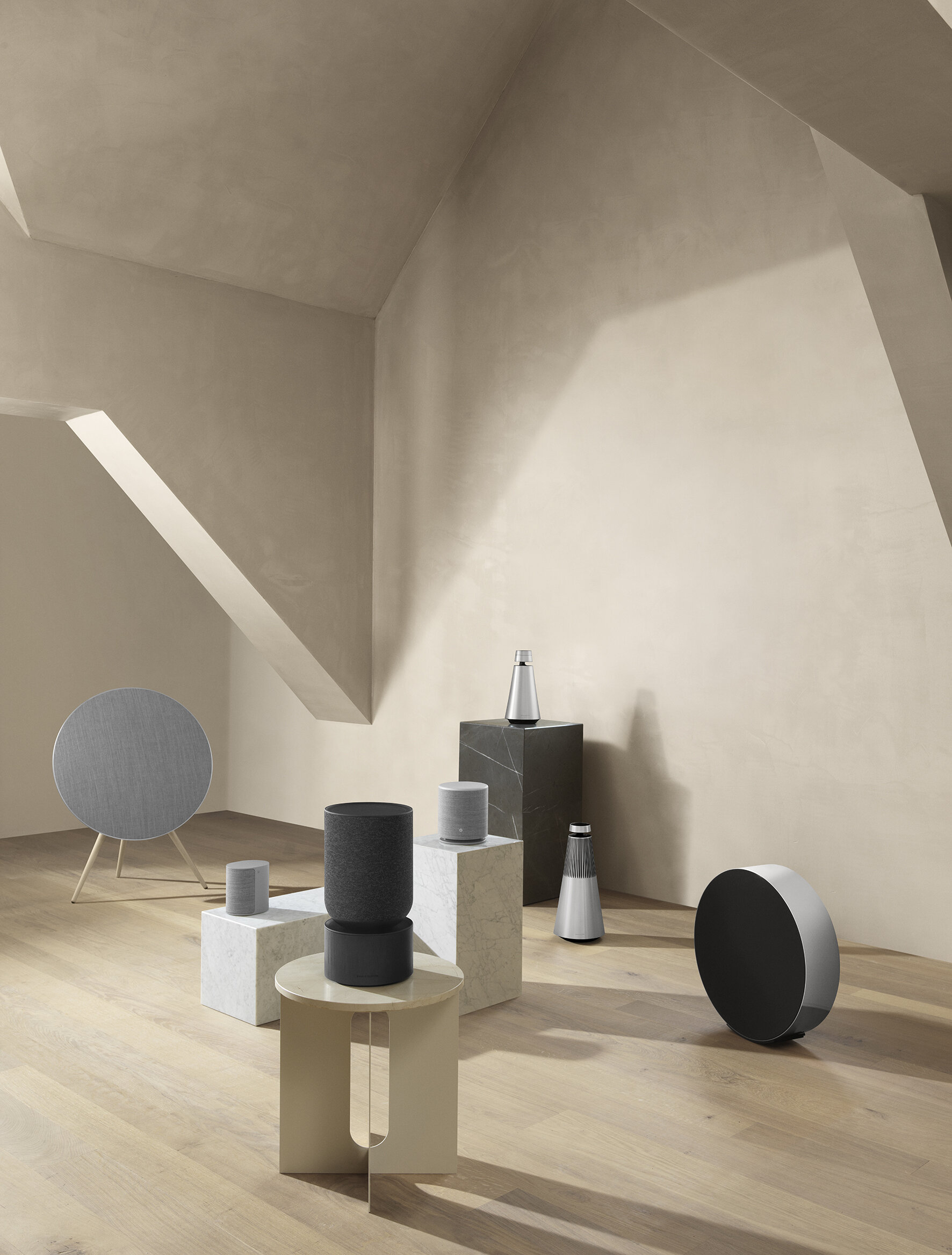
Blending in as an interior object, Beosound Balance has a hidden touch interface to control the speaker manually. When approaching the speaker, the interface lights up using light-through aluminum technology and invites the user to interact with the speaker. Swipe around the top plate to control volume or touch on the icons to change tracks, pause the music and select pre-saved favourite listening experience for easy access. When walking away from the speaker, the interface dim, sleaving nothing but the aluminum surface visible.
The concept for Beosound Balance was to make sure that beautiful aesthetics, innovation and powerful sound go hand in hand, explains Bang & Olufsen VP of Design Gavin Ivester: “The vision with Beosound Balance is to make the speaker feel like an extension of the atmosphere in the home - reflecting the place it is in and the person using it. The design is both sensorial and tactile, with a look and feel driven by high-quality interior craftsmanship and materials, as well as highly innovative. Listening modes allow tailored acoustics when needed, and carefree, stunning sound when wanted— putting listeners in control of a broad range of experiences that soothe, excite, and create joy”.
A speaker dedicated to purposeful technology
Beosound Balance comes with seven uniquely configured speaker drivers with two opposing woofers that generate a powerful bass sound that cancels out vibrations that could upset the neighbours. Beosound Balance also brings forward an innovative and flexible acoustic experience based on two sound modes – an Omni-directional mode ensuring a uniform sound experience around the speaker, and a sound mode delivering a precisely focused and unique ambient experience. Both technologies have trickled down from the flagship Bang & Olufsen Beolab speakers.
Product Overview
Beosound Balance is a wireless speaker with a dynamic acoustic performance designed to display friendly and inspired by interior objects and the use of soft, appealing and well-curated materials, colours and finishes. Placement up against the wall is ideal for optimal listening, whether from room-filling to focused sound experiences.
Special features:
Different sound modes in one.
From room-filling to focused sound.
Soft interior silhouette. Honest, natural materials.
Pricing and availability
Beosound Balance is available at Bang & Olufsen stores now.
Beosound Balance(Natural Oak and Black Oak): HK$17,900
For more information, please visit: https://www.bang-olufsen.com/en

![[FOR DIGITAL ONLY] FW20 Leica - 03 9x16.jpg](https://images.squarespace-cdn.com/content/v1/5260d046e4b0c0ba62540470/1607322652279-JAV9WNOVU431207KO4JK/%5BFOR+DIGITAL+ONLY%5D+FW20+Leica+-+03+9x16.jpg)


