Wa House - A Harmonious Blend of Nature and Design
Perched amidst the breathtaking natural landscapes of Wakayama, Gwenael Nicolas's modern fisherman's house stands as an iconic yet unassuming testament to architectural brilliance. Set within the enchanting backdrop of Nanki-Shirahama, a national park renowned for its stunning beauty, this architectural gem seamlessly fuses with its surroundings, creating a harmonious sanctuary that embraces the wild allure of the coast.
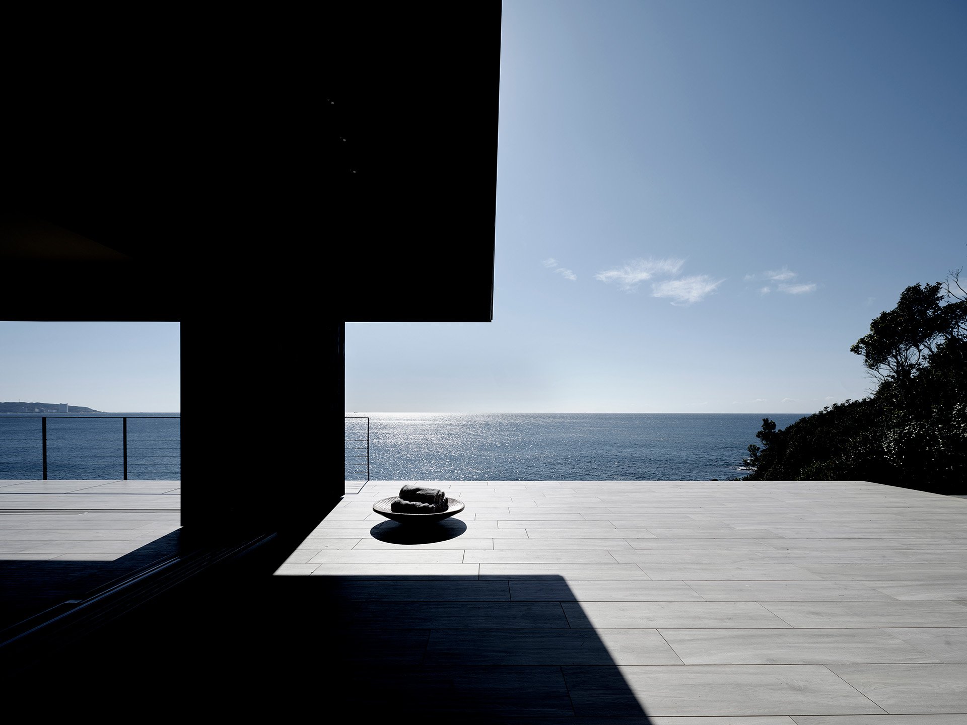
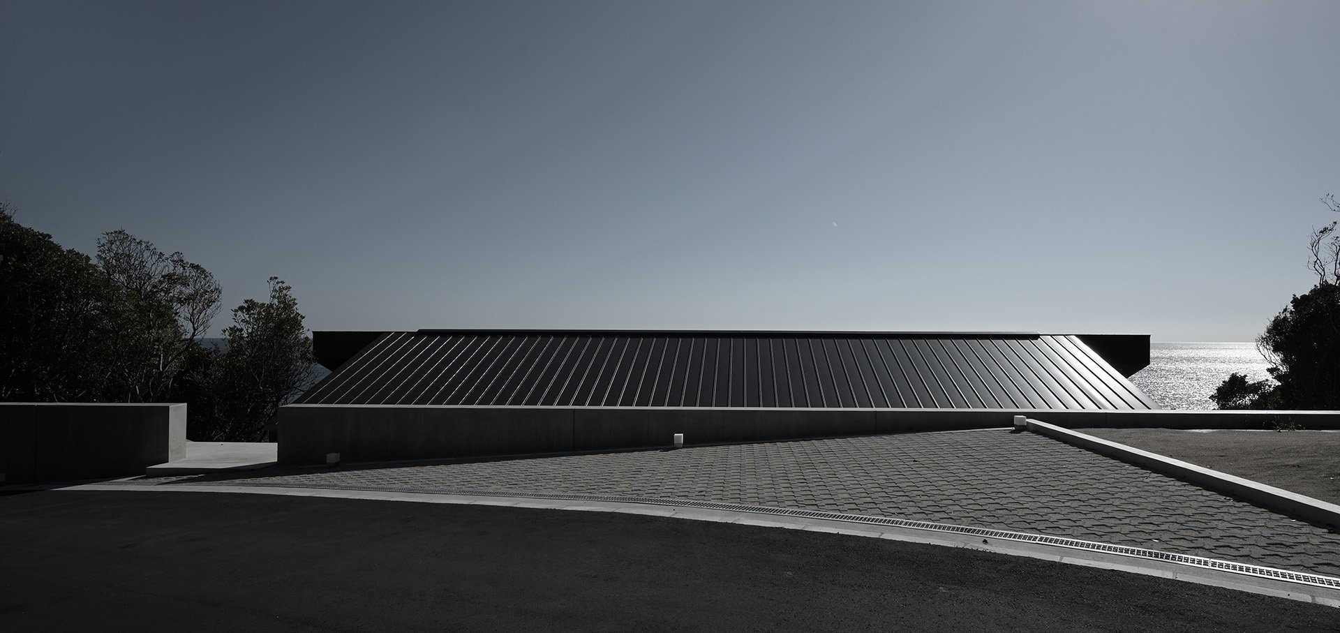
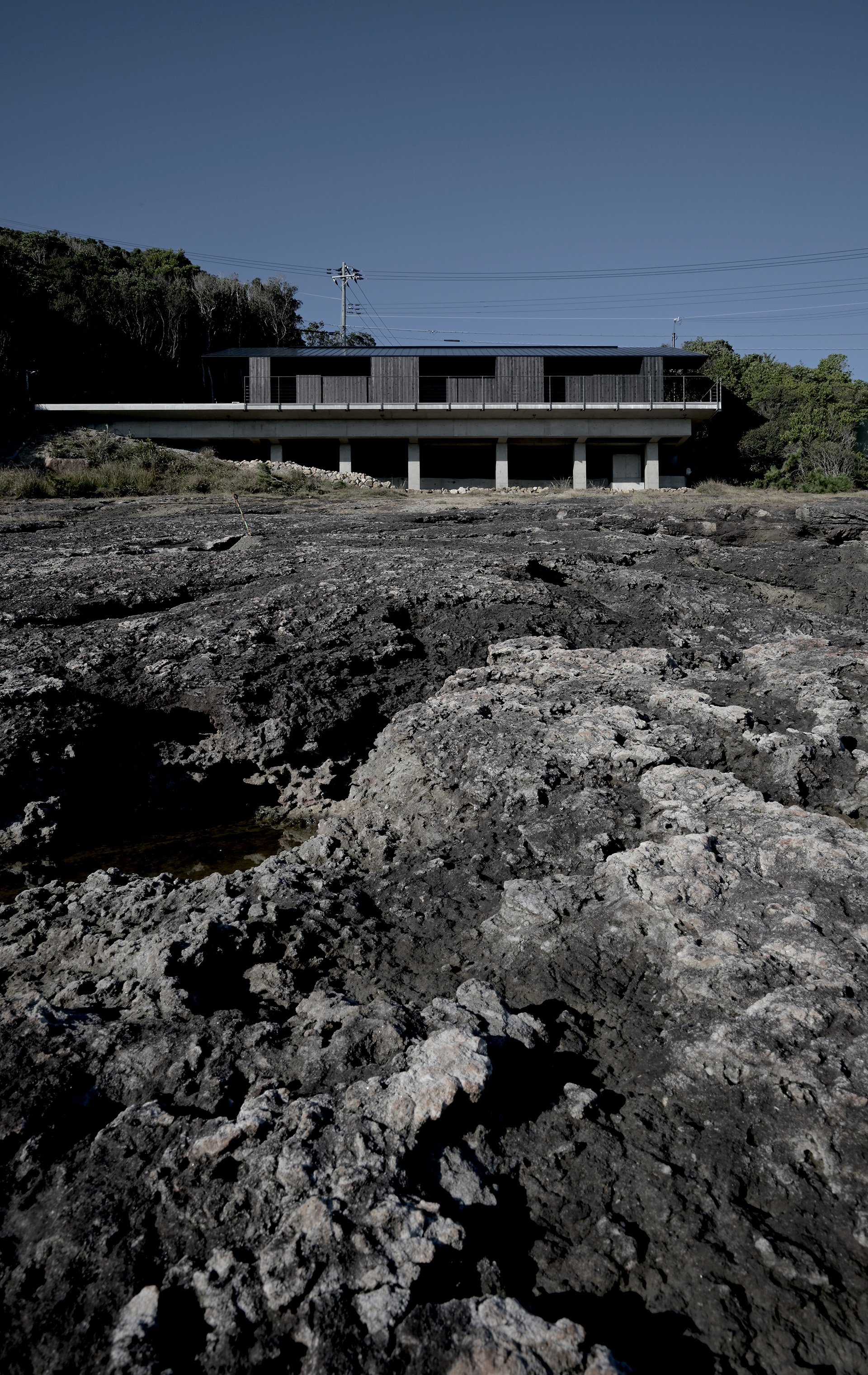
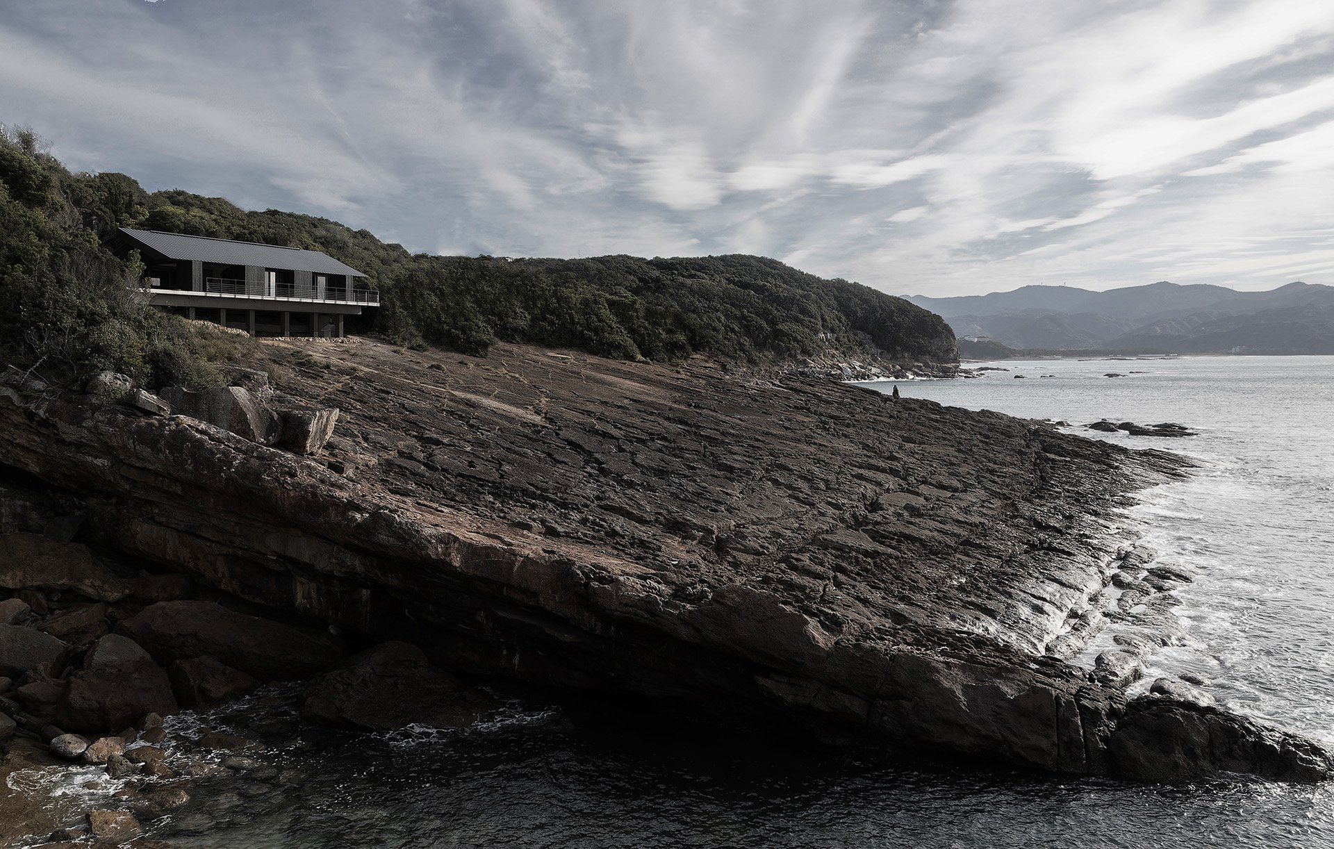
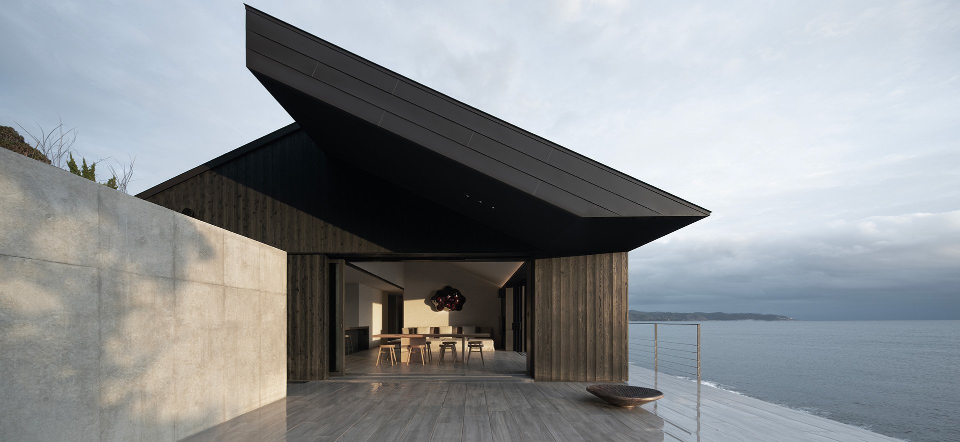
Perched amidst the breathtaking natural landscapes of Wakayama, Gwenael Nicolas's modern fisherman's house stands as an iconic yet unassuming testament to architectural brilliance. Set within the enchanting backdrop of Nanki-Shirahama, a national park renowned for its stunning beauty, this architectural gem seamlessly fuses with its surroundings, creating a harmonious sanctuary that embraces the wild allure of the coast.
Born on the Atlantic shores, Nicolas has drawn inspiration from his upbringing to create a house that boldly confronts nature while respecting its power. In collaboration with Haretoke Architects, every aspect of this carefully crafted dwelling has been thoughtfully considered to ensure a symbiotic relationship between the man-made structure and the untamed environment.
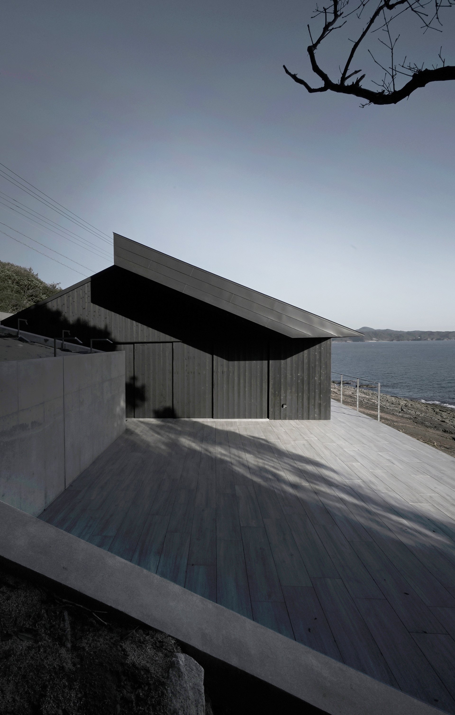
The design of this single-story abode is a delicate dance with nature. Its height is meticulously calculated to mirror the ocean's horizon, allowing the house to blend effortlessly into the coastal panorama. The distinctive wing-like roof, designed to withstand the fierce ocean winds, lends the structure its unique character. The wooden house delicately perches atop a concrete foundation, elevating it above the rocky terrain. In the face of storms, the waves gracefully flow beneath the concrete pillars, ensuring the house remains resilient. Its dark hues seamlessly merge with the natural surroundings and the reef's dark stone, harmonizing the built environment with the coastal ecosystem.
The extended roof serves a dual purpose, providing shade for the terraces while paying homage to the vernacular architecture of the region. Reimagined as a minimalist sculptural object, it embodies the essence of simplicity and functionality. Covered in Yakisugi, burnt cedar wood, the house takes on a rustic yet refined aesthetic, perfectly suited for its extreme location.
Undoubtedly, the house's crowning glory lies in its sweeping 180-degree ocean views. The expansive terrace seemingly floats above the sea, flawlessly merging with the living room to create a seamless transition from indoor to outdoor spaces. To emphasize this continuity, the same flooring material flows throughout the house, blurring the boundaries between nature and interior.
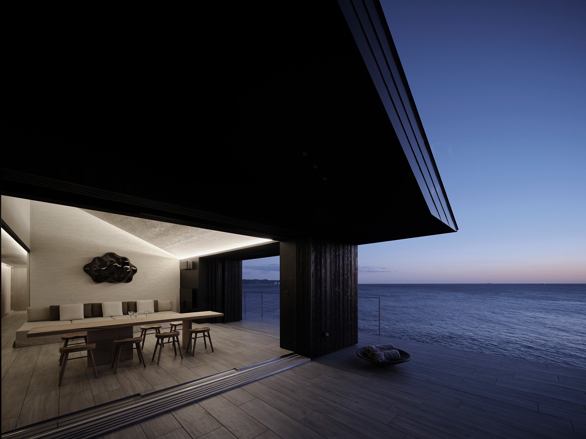
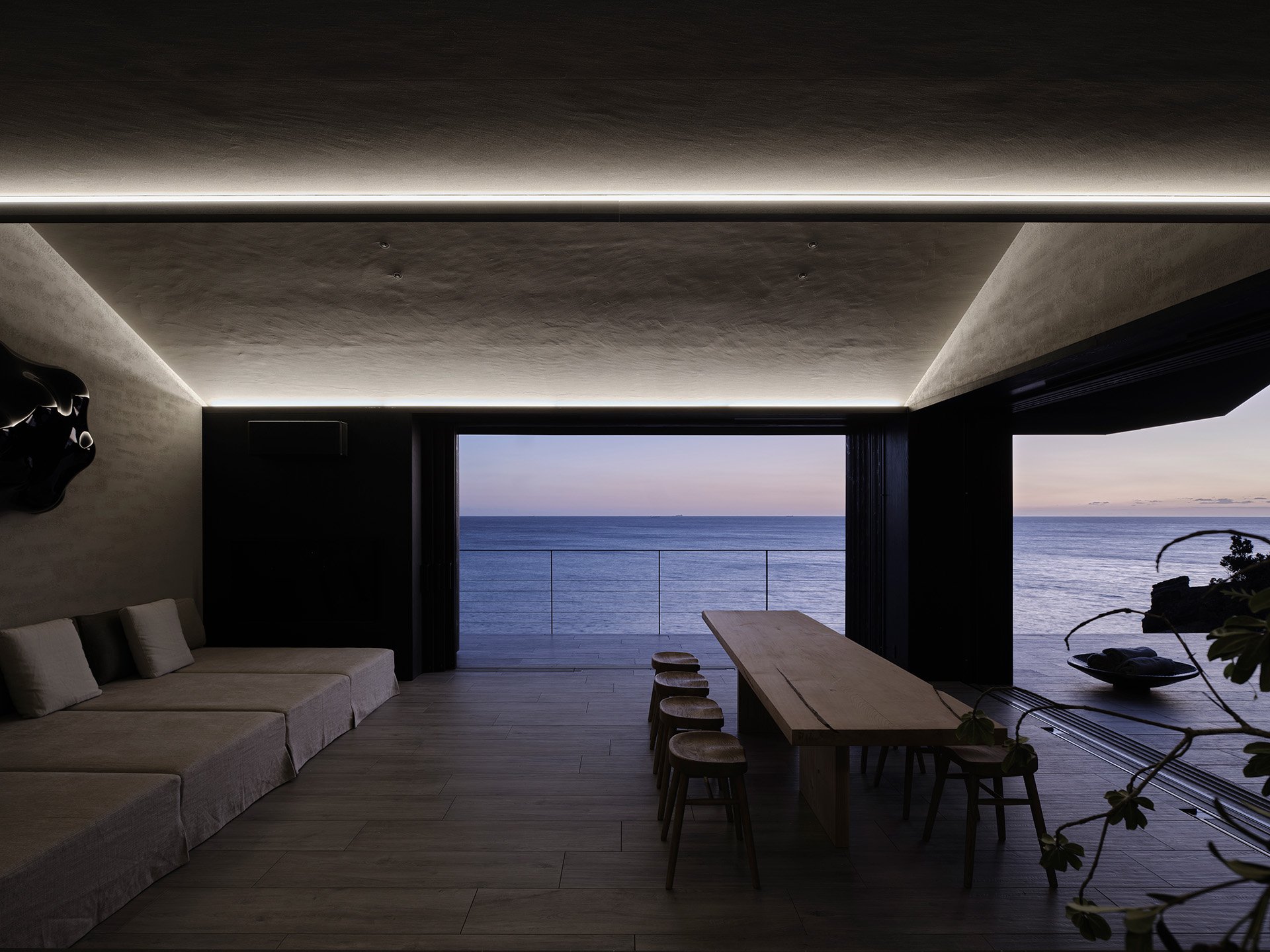
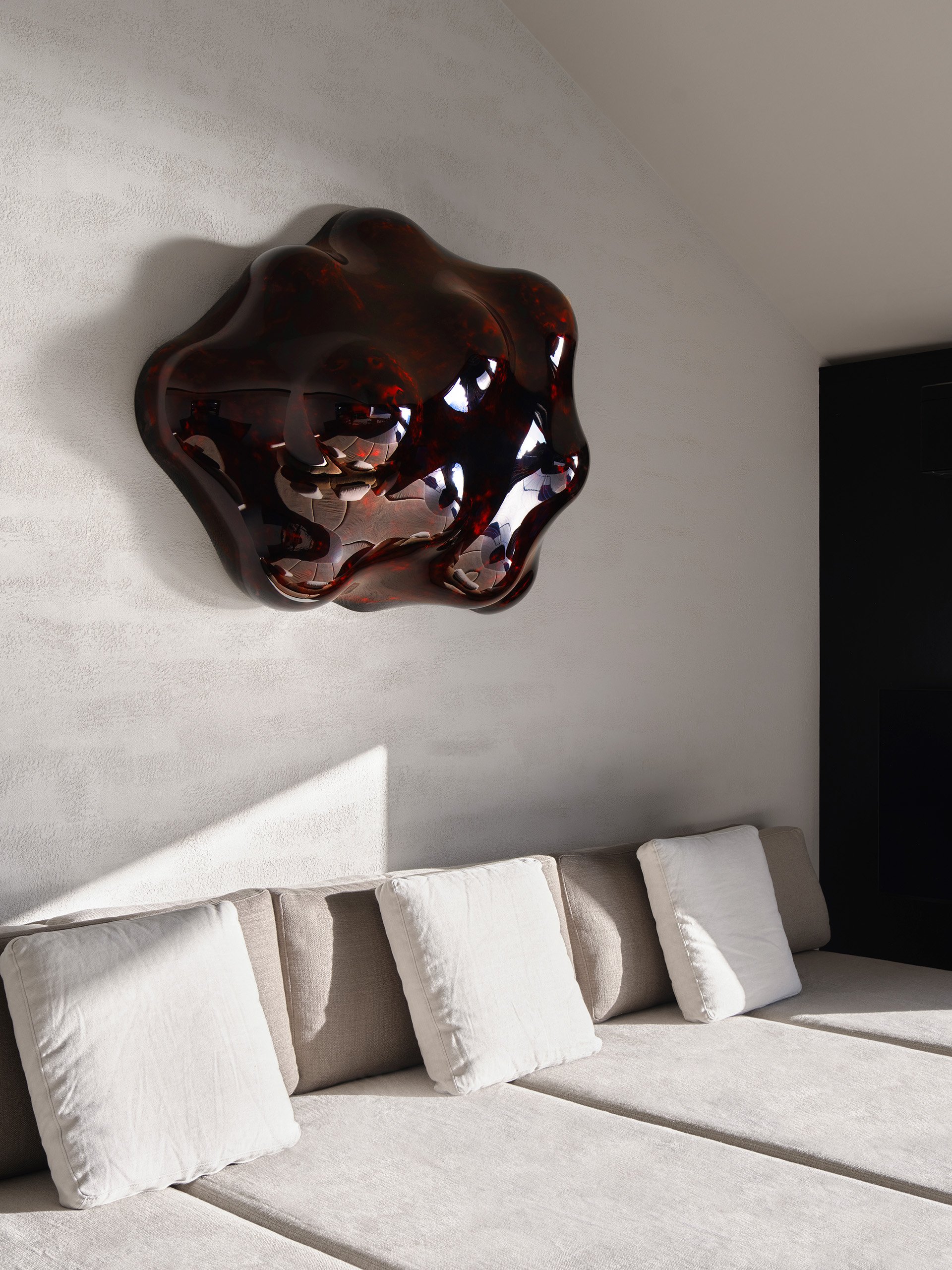
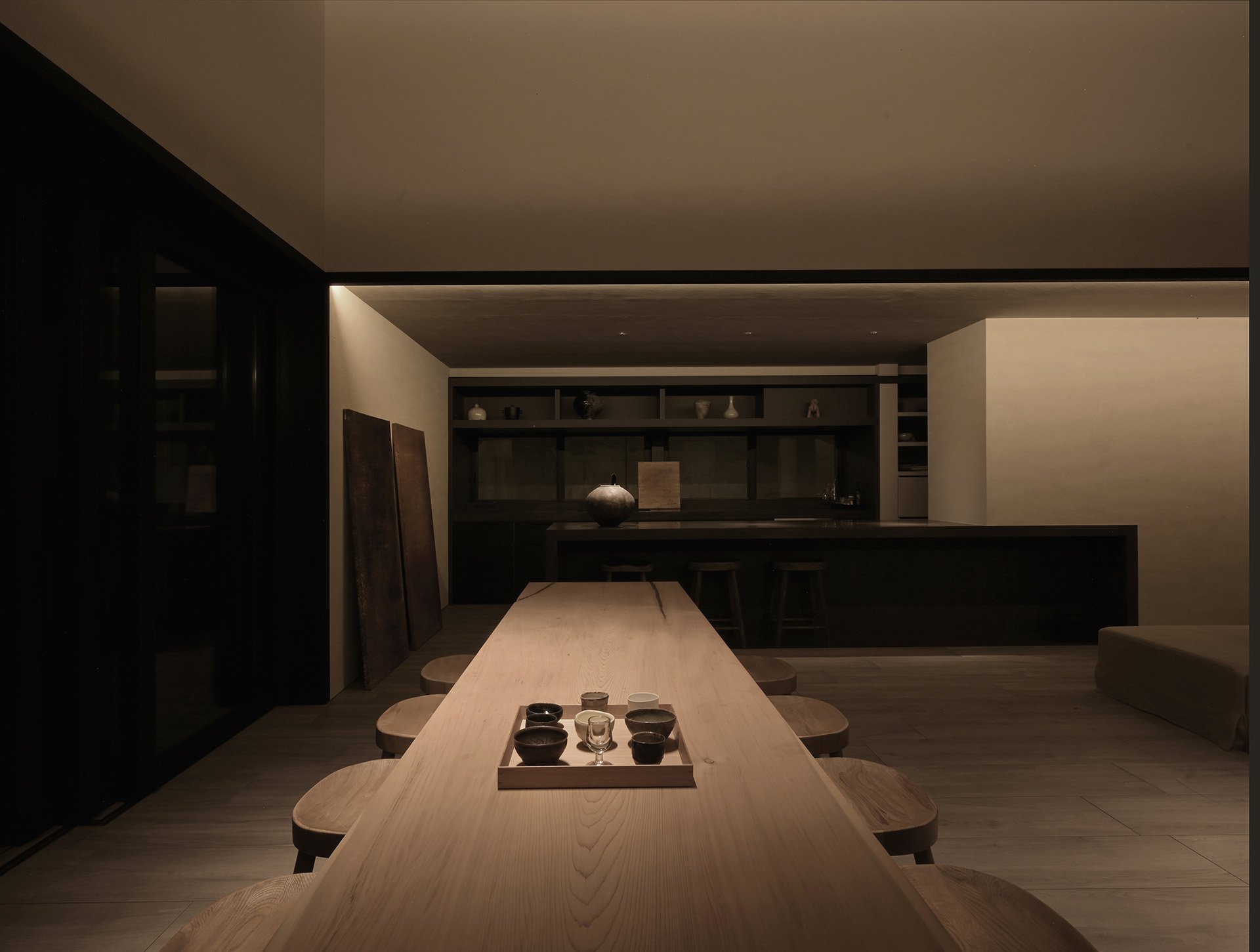
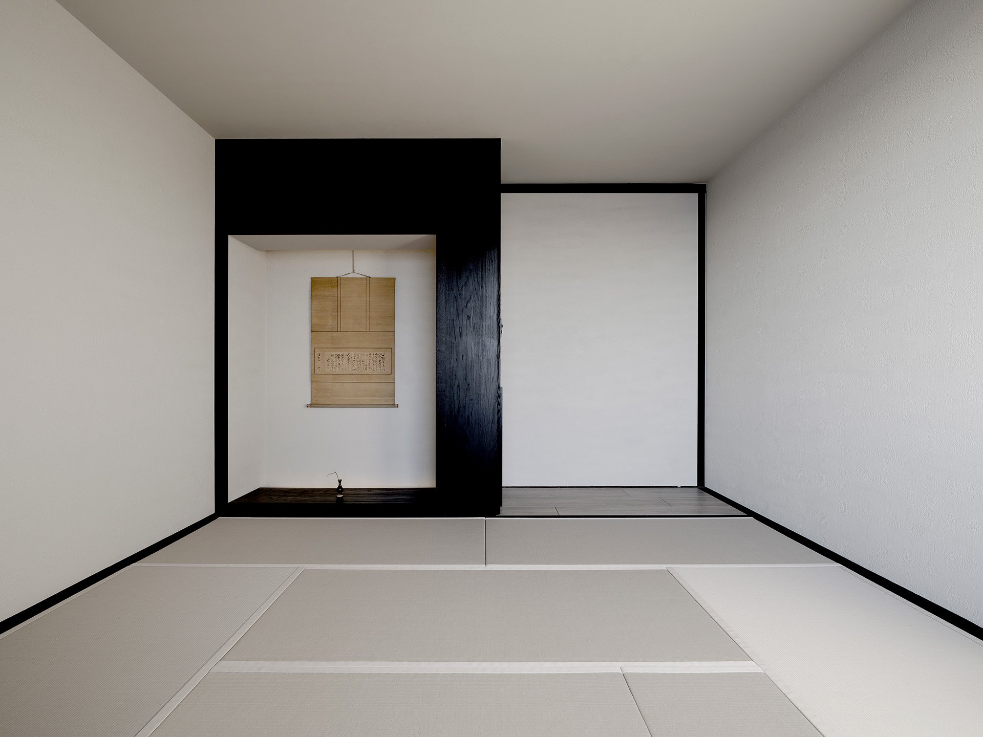
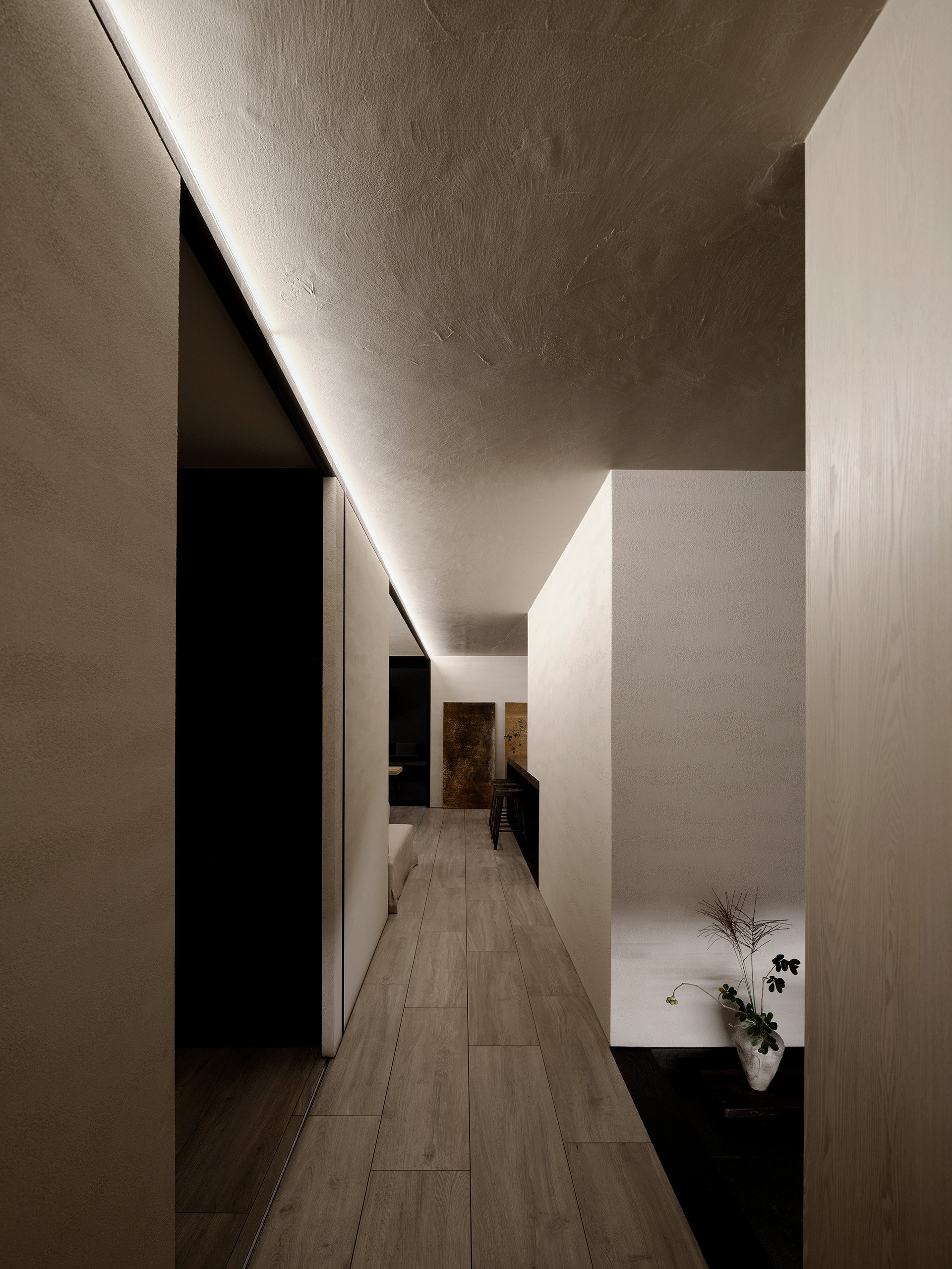
Throughout the house, surprising objects and artworks, reminiscent of marine treasures, punctuate the spaces. Genta Ishizuka's lacquer art above the sofa adds an exquisite touch, drawing on the beauty of the sea. The open kitchen, a monolithic centerpiece in the living room, invites residents to immerse themselves in the outside scenery while entertaining and cooking. Artistic rusty panels, created by nature itself, adorn the space, adding an organic element to the interior. With only two Japanese-style rooms, an atelier, and a spacious living room that opens generously to the ocean, the house's design ensures flexible use, be it for entertaining, tea ceremonies, or simply unwinding.
With a color palette and materials inspired by the natural environment, the house exudes warmth and continuity. From the rough-textured walls to the ceramic tiles and tatami floors, the warm gray tones evoke a sense of spaciousness and harmony. Large sliding doors seamlessly merge with the walls, dissolving the boundaries and inviting the outside in.
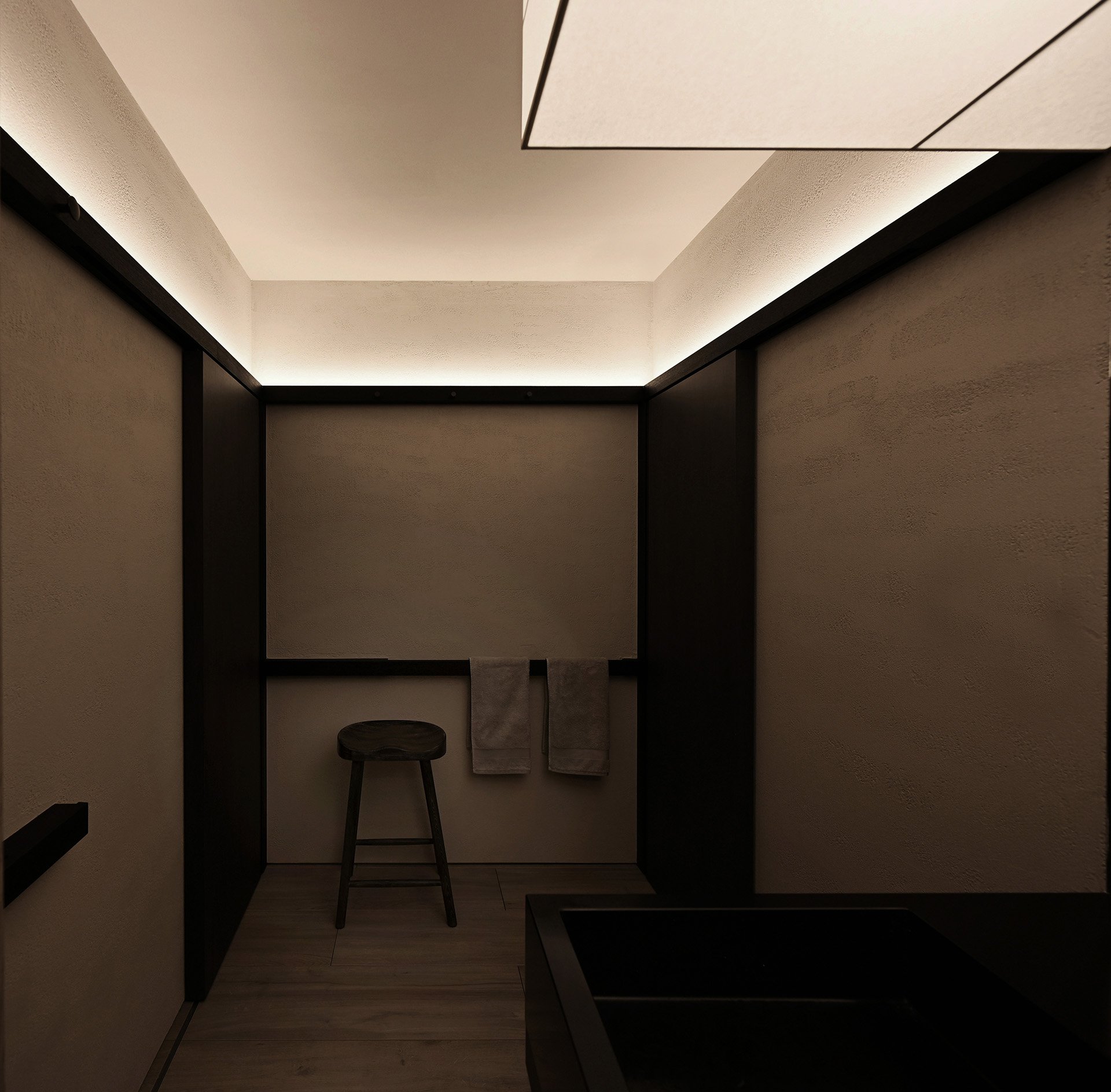
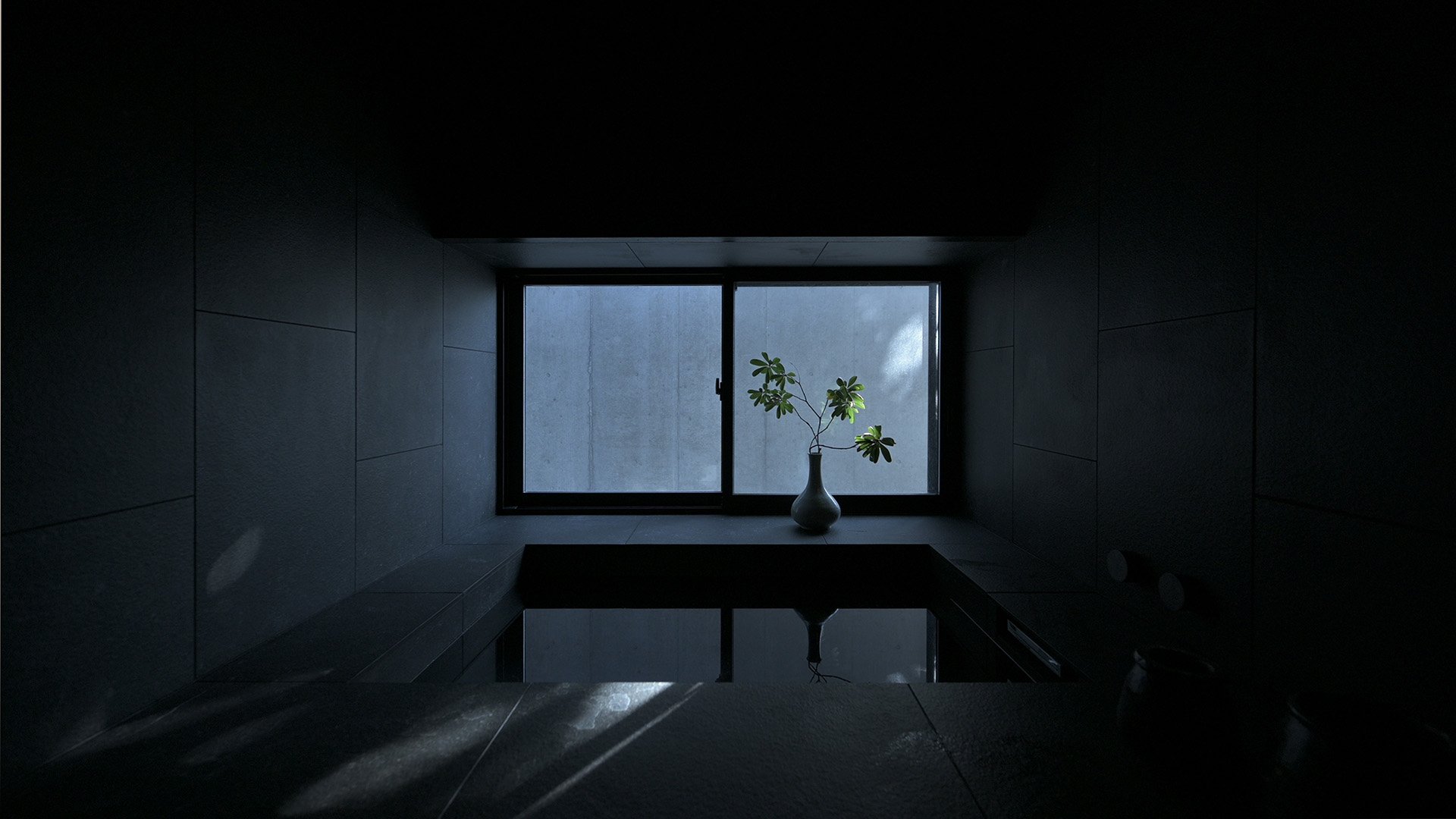
The bathroom, designed as a tranquil retreat within the house, immerses residents in an atmosphere of serene intimacy. An oversized suspended shade bathes the vanity area in a gentle and luminous light, offering a sense of comfort and relaxation. The lower bathtub, seemingly carved into the black stone floor, connects inhabitants with the raw sensations of nature, enhancing the house's primitive allure.
Honoring the tradition of old Japanese houses, Wa House can be completely enclosed with Yakisugi shutters, safeguarding the interior from inclement weather. Through its fusion of vernacular architecture and modern abstract archetypes, the house sparks a captivating dialogue that transcends time and culture.
PHOTO:
YASUTAKA KOJIMA / IKUNORI YAMAMOTO
GWENAEL NICOLAS
Photo courtesy of: CURIOSITY INC. & Atelier HARETOKE
Pritzker Laureate Ryue Nishizawa's Latest Masterpiece: A Meditative Timber Retreat in Karuizawa, Shishi-Iwa House
Discover the Tranquility of Hinoki House No.3, Ryue Nishizawa's Latest Architectural Masterpiece, a Meditative Timber Retreat in Karuizawa that Pays Homage to Traditional Japanese Residential Architecture and Celebrates Sustainability
Discover the Tranquility of Hinoki House No.3, Ryue Nishizawa's Latest Architectural Masterpiece, a Meditative Timber Retreat in Karuizawa that Pays Homage to Traditional Japanese Residential Architecture and Celebrates Sustainability
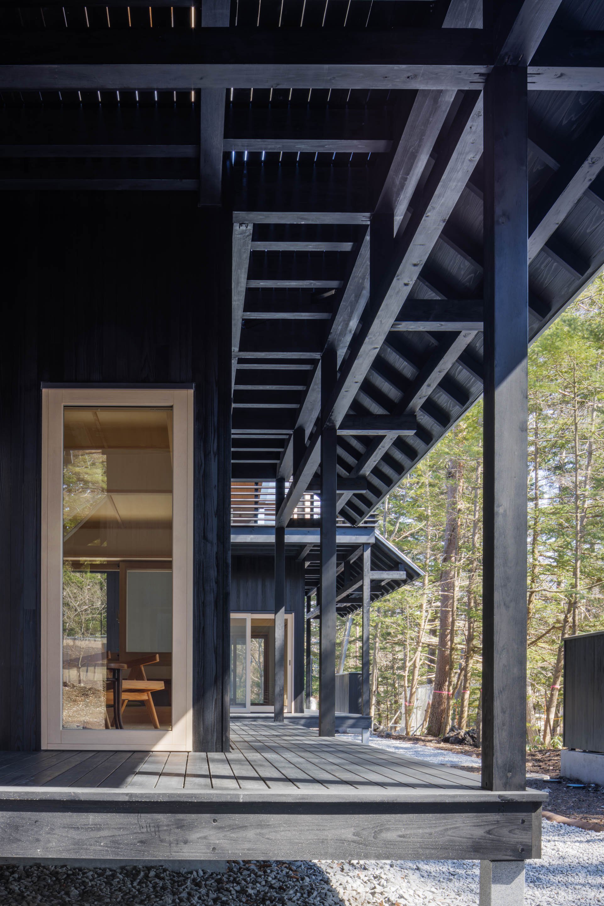
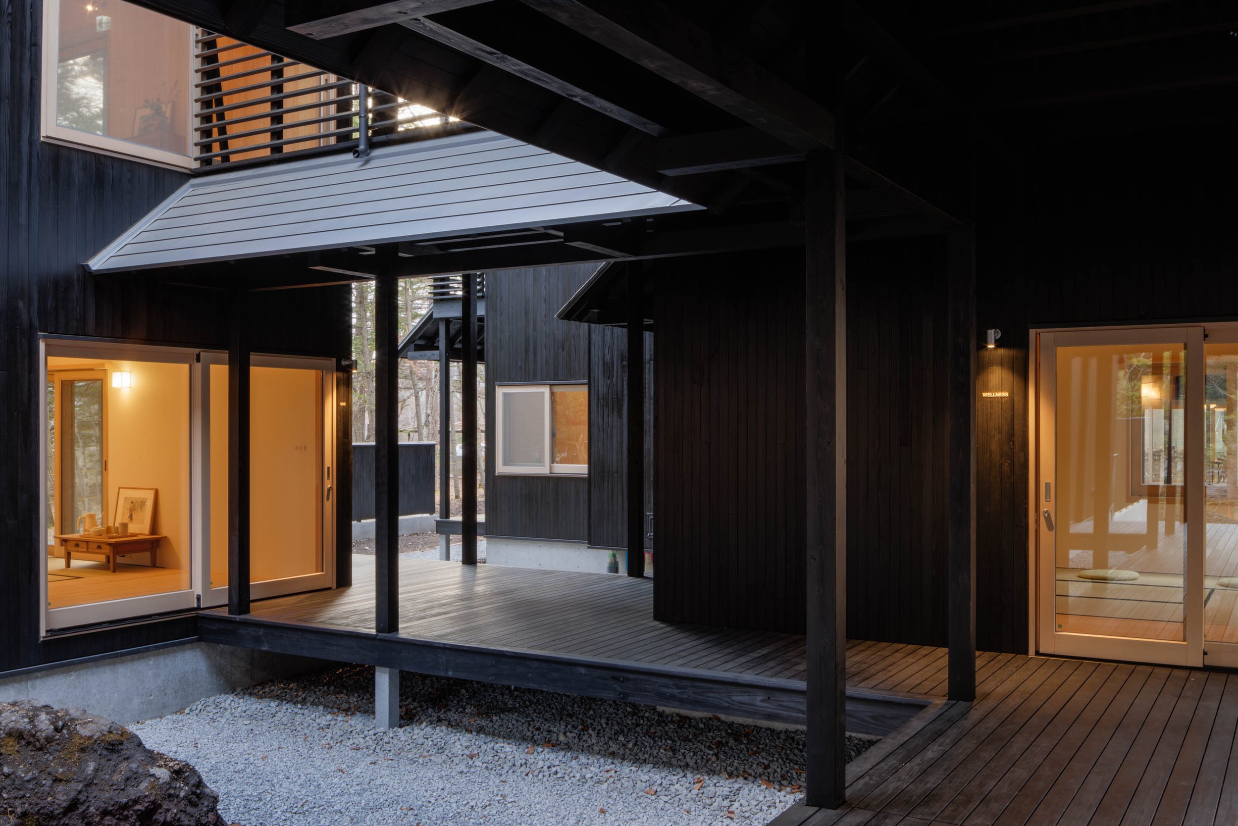
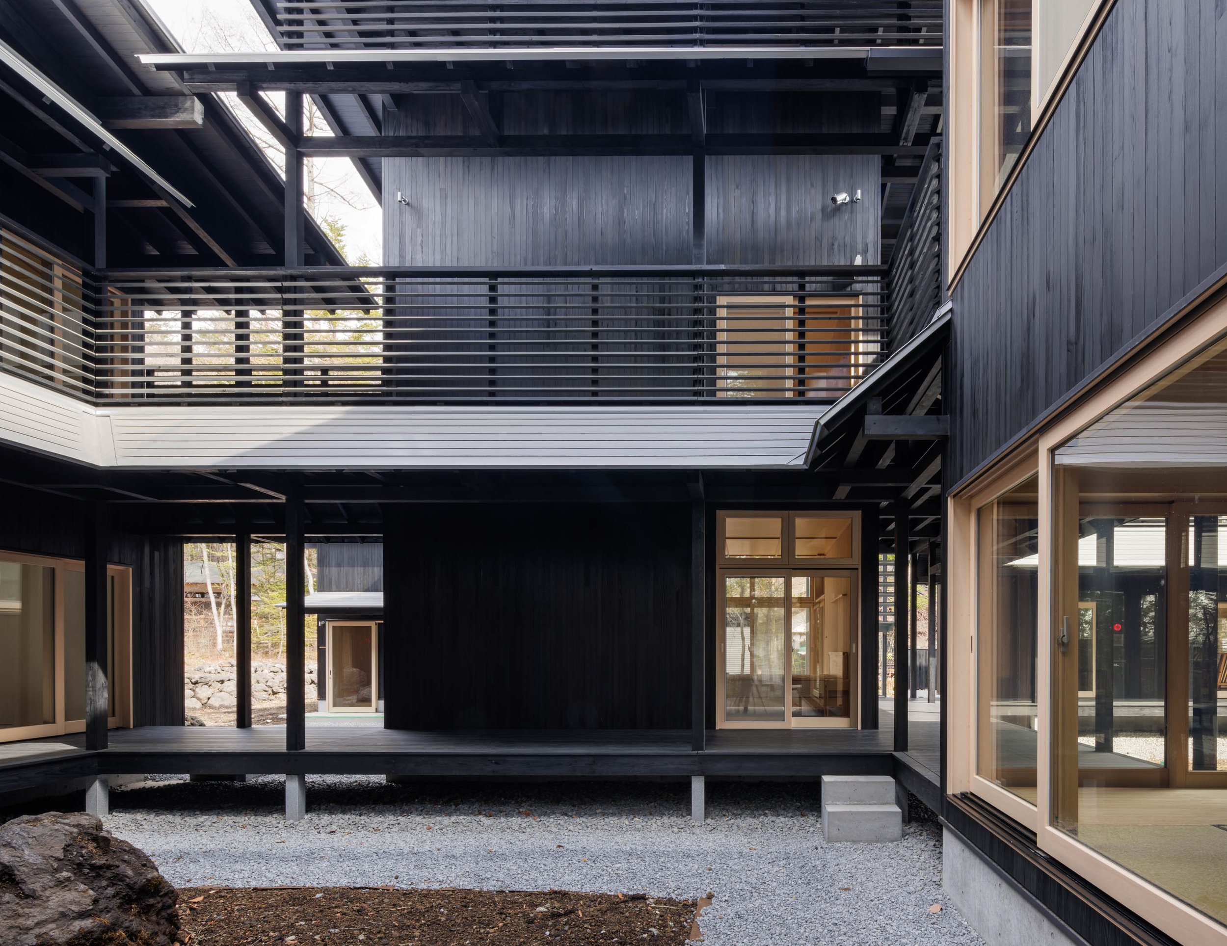
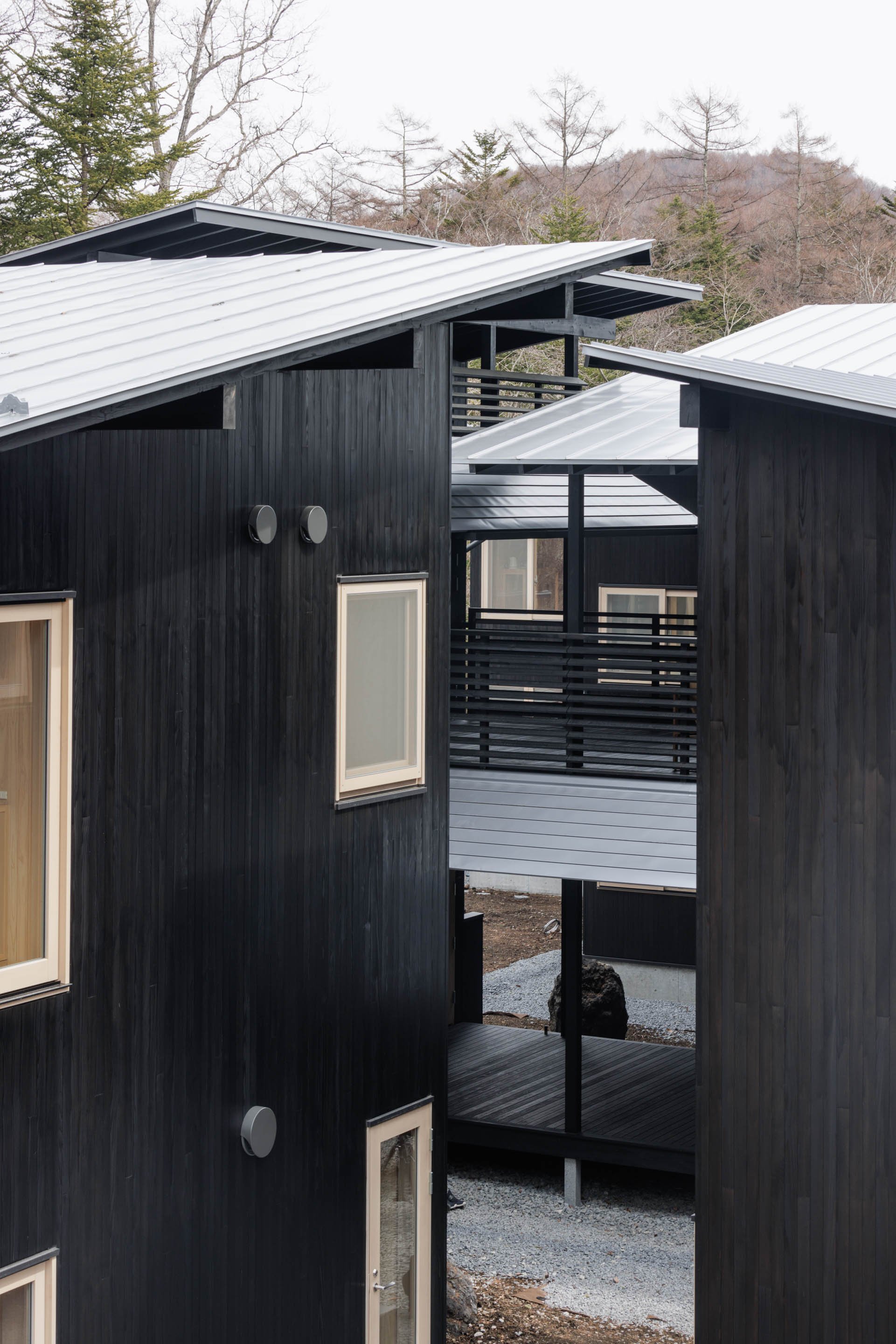
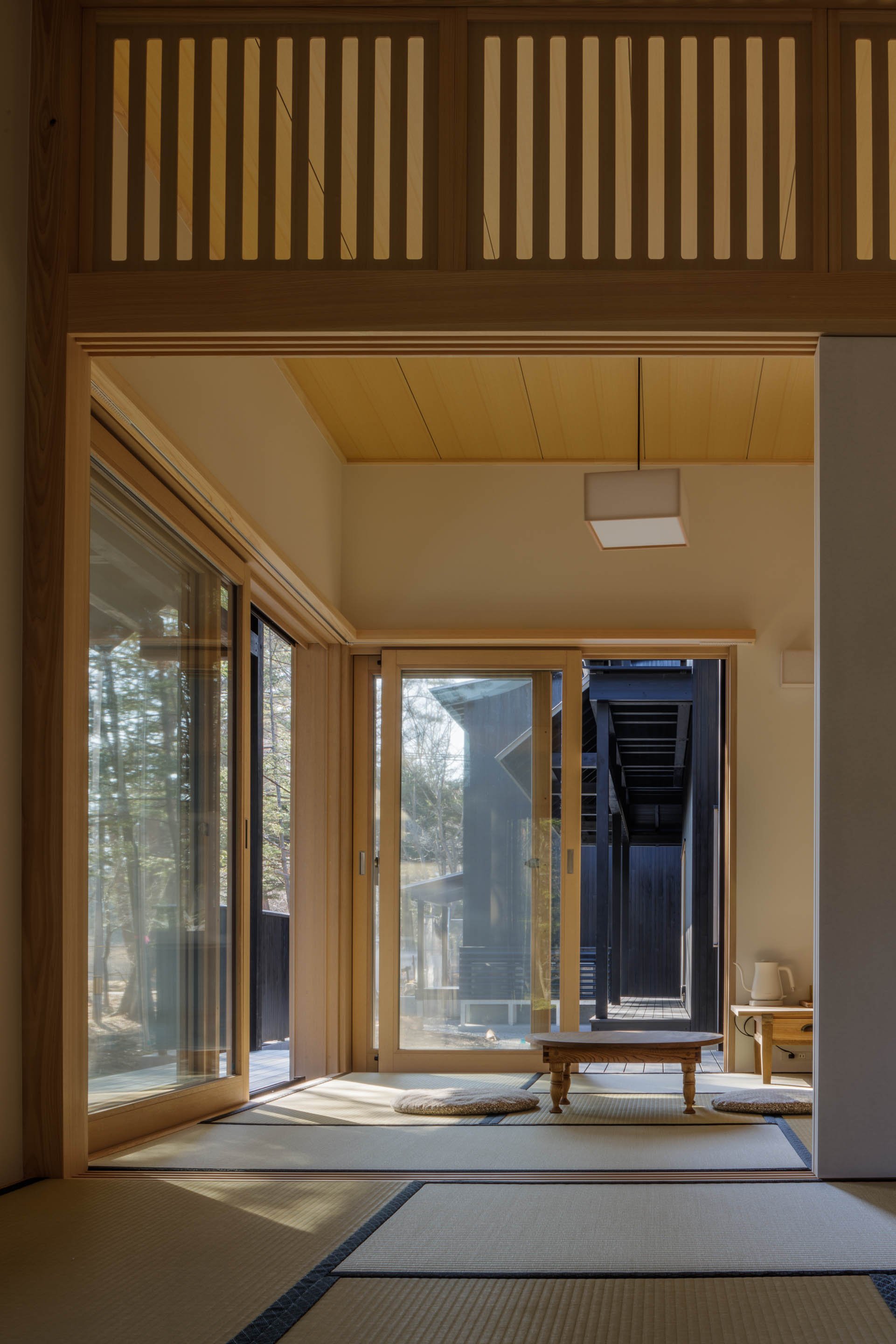
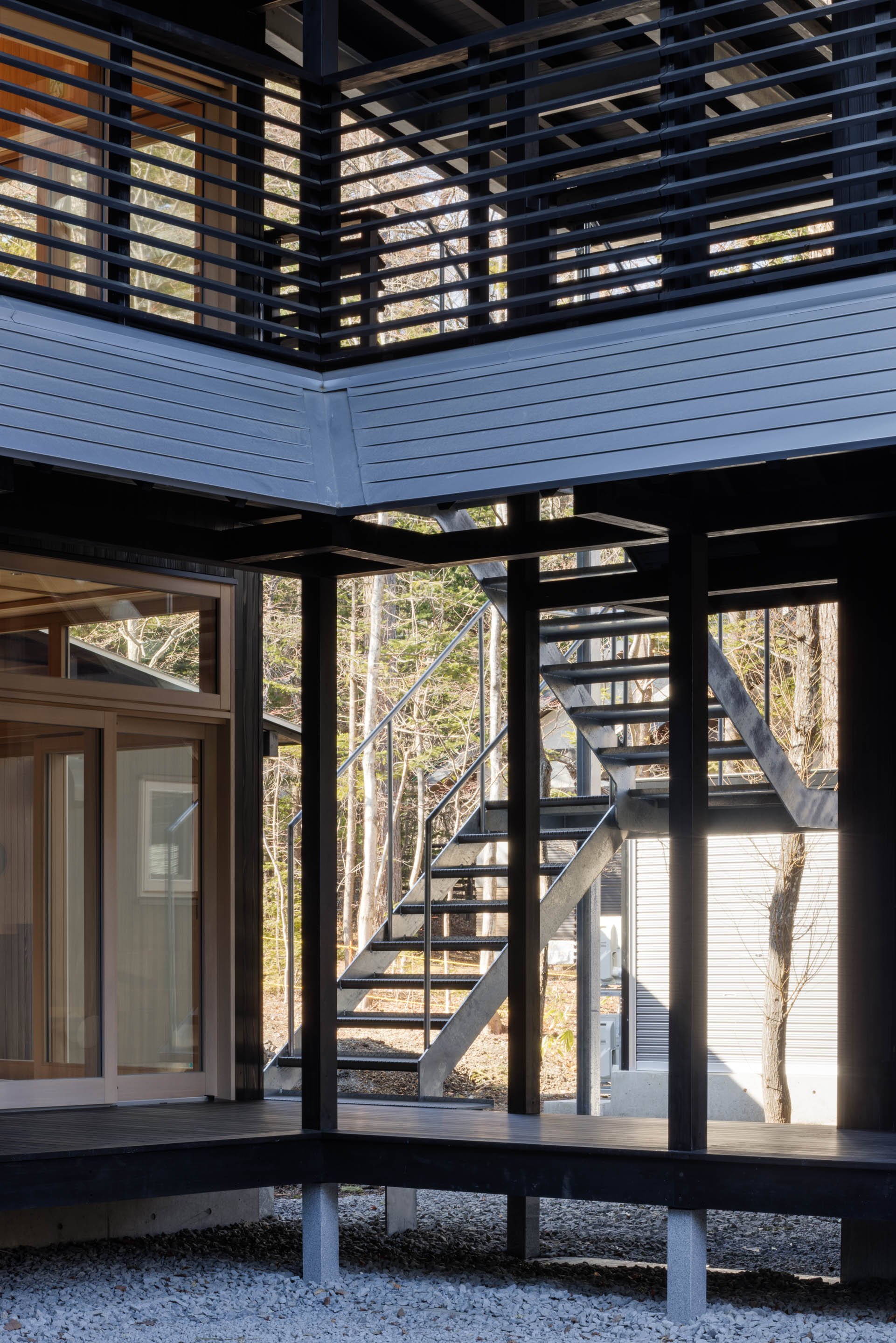
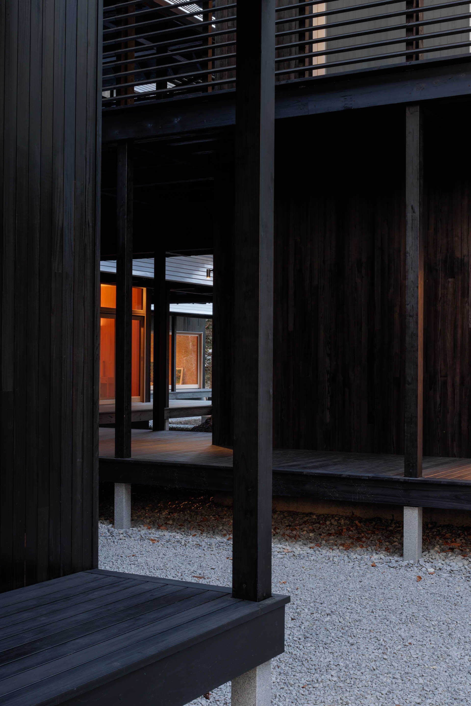
Shishi-Iwa House, the collection of architectural masterpieces situated in Karuizawa, Japan, has announced the opening of SSH No.03. Designed by Pritzker Prize laureate and co-founder of SANAA, Ryue Nishizawa, the mountain nature retreat is an homage to traditional Japanese residential architecture and is Nishizawa's first hotel project. SSH No.03 joins the two other Houses in the collection, SSH No.01 and SSH No.02, designed by Pritzker Prize laureate Shigeru Ban. All three Houses are situated mere minutes from each other and form SHISHI-IWA HOUSE KARUIZAWA, with guests sharing all common facilities.
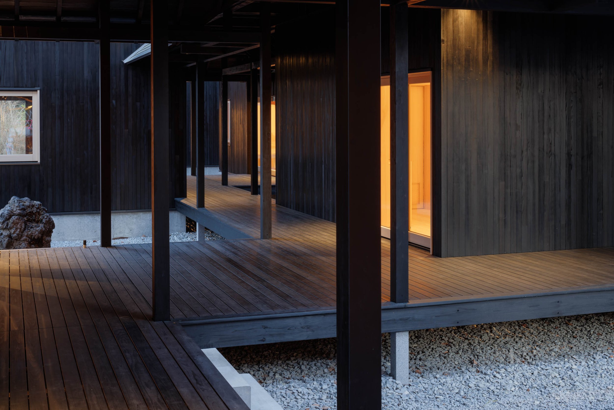
SSH No.03 is comprised of 10 pavilions interconnected by a series of engawa and garden courtyards. With only 10 guest rooms and 1 cabin villa, the retreat is exclusive and offers both Superior Rooms and Tatami Suites. Inspired by spacial transparency and the Japanese concept of negative space, Nishizawa has deliberately created empty areas through minimal furnishings and embellishments, allowing natural light to stream continuously through the rooms' windows.
Hinoki cypress wood is prominently featured throughout SSH No.03, sourced from Gifu Prefecture, Japan. Considered a sacred wood in Japan, it has been used for centuries to build shrines, temples, and palaces due to its durability and aromatic scent. Sustainability is also a top priority, with a small building footprint and the use of carbon-friendly timber sourced primarily in Japan.
The winding engawa walkway that intersects the pavilions offers in-between spaces for discovery and contemplation, with the landscape carefully constructed with over hundreds of cherry, maple, and evergreen trees. Four Japanese courtyards provide moments of stillness, completing a spiritual journey in which guests become one with nature and with themselves.
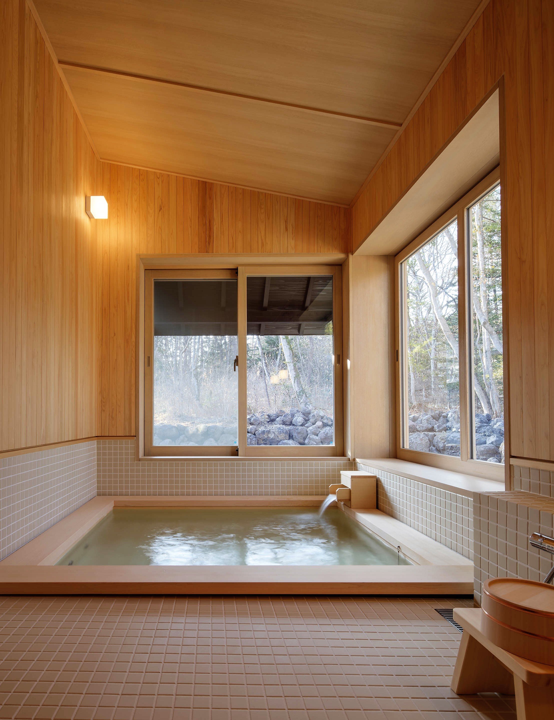
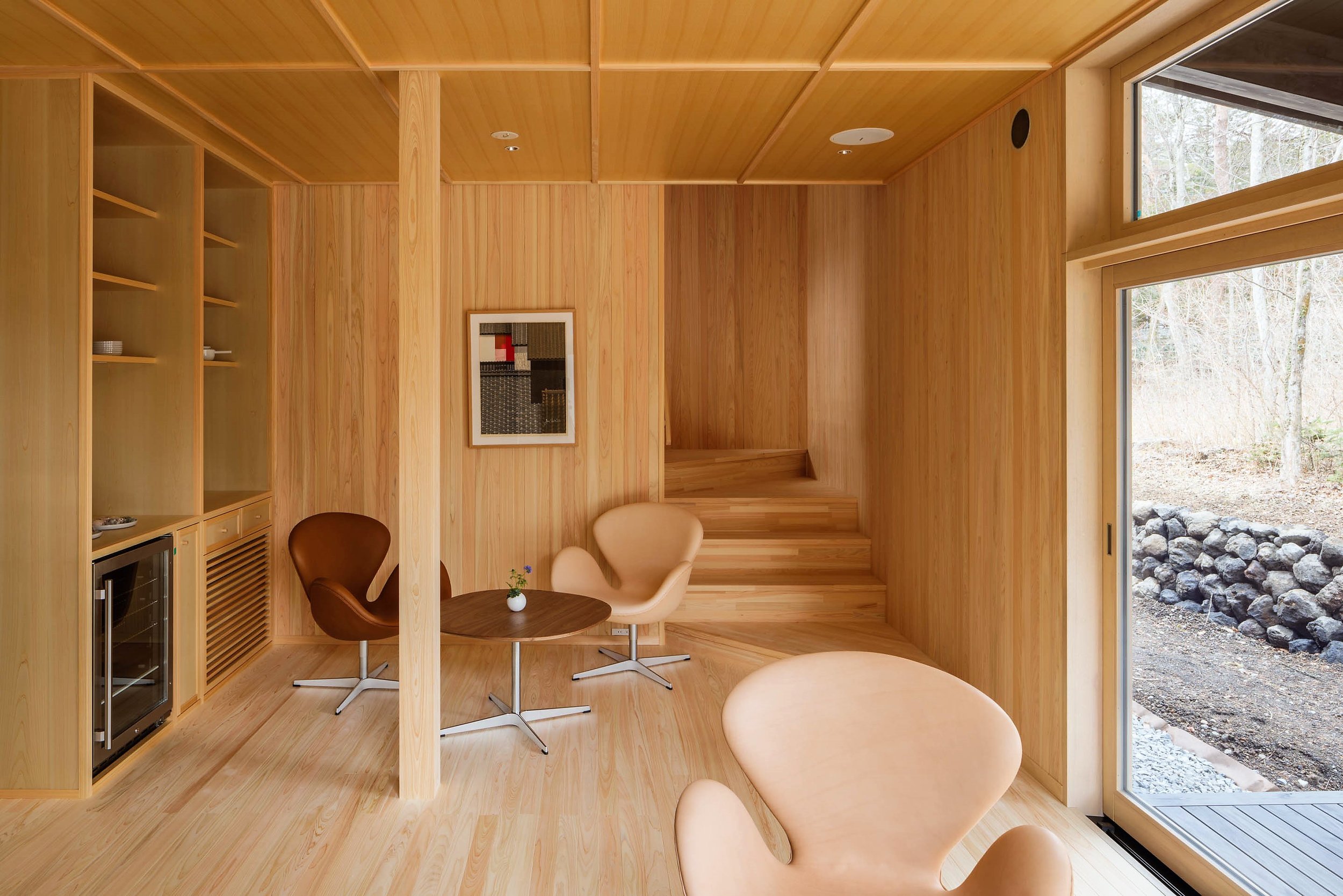
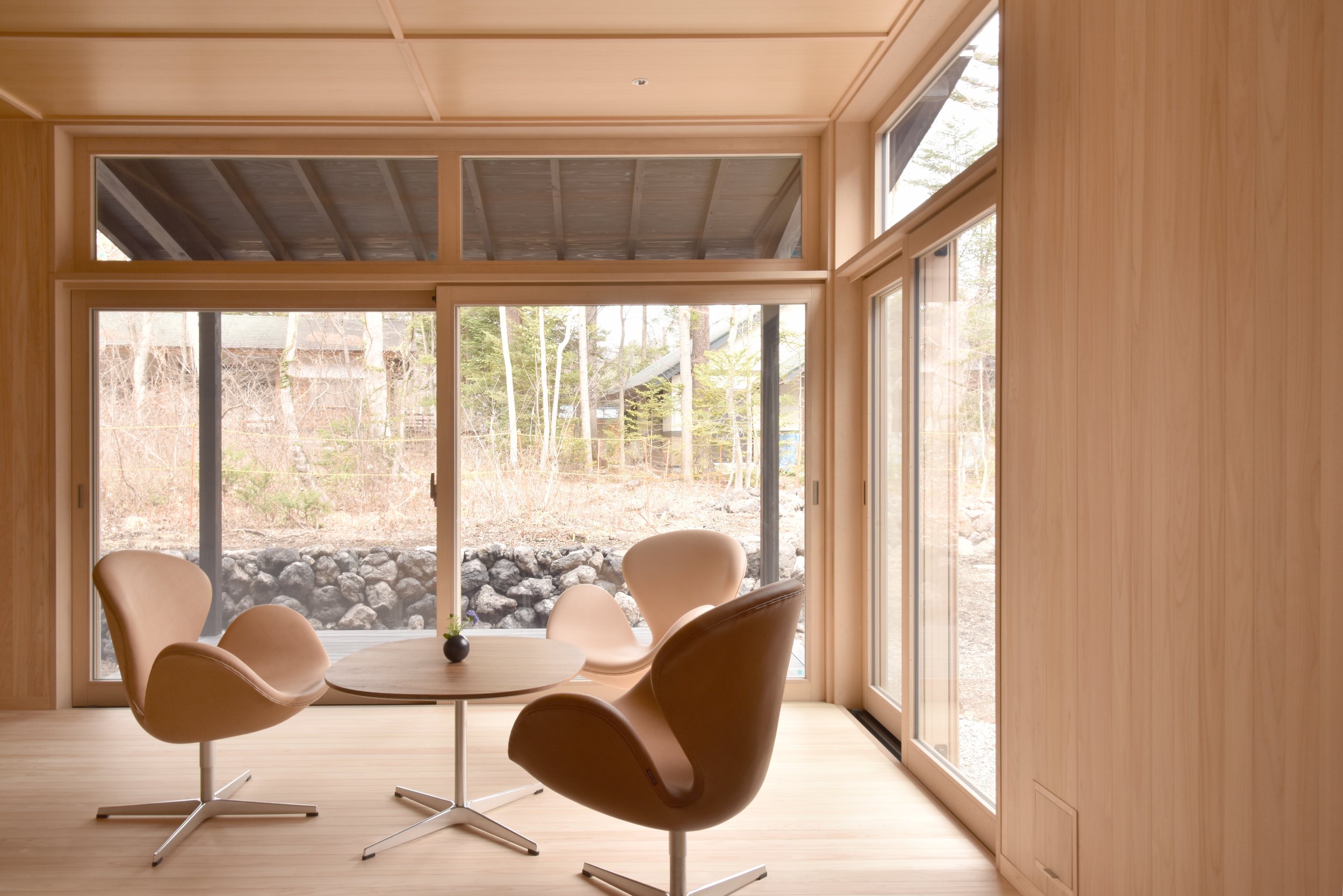
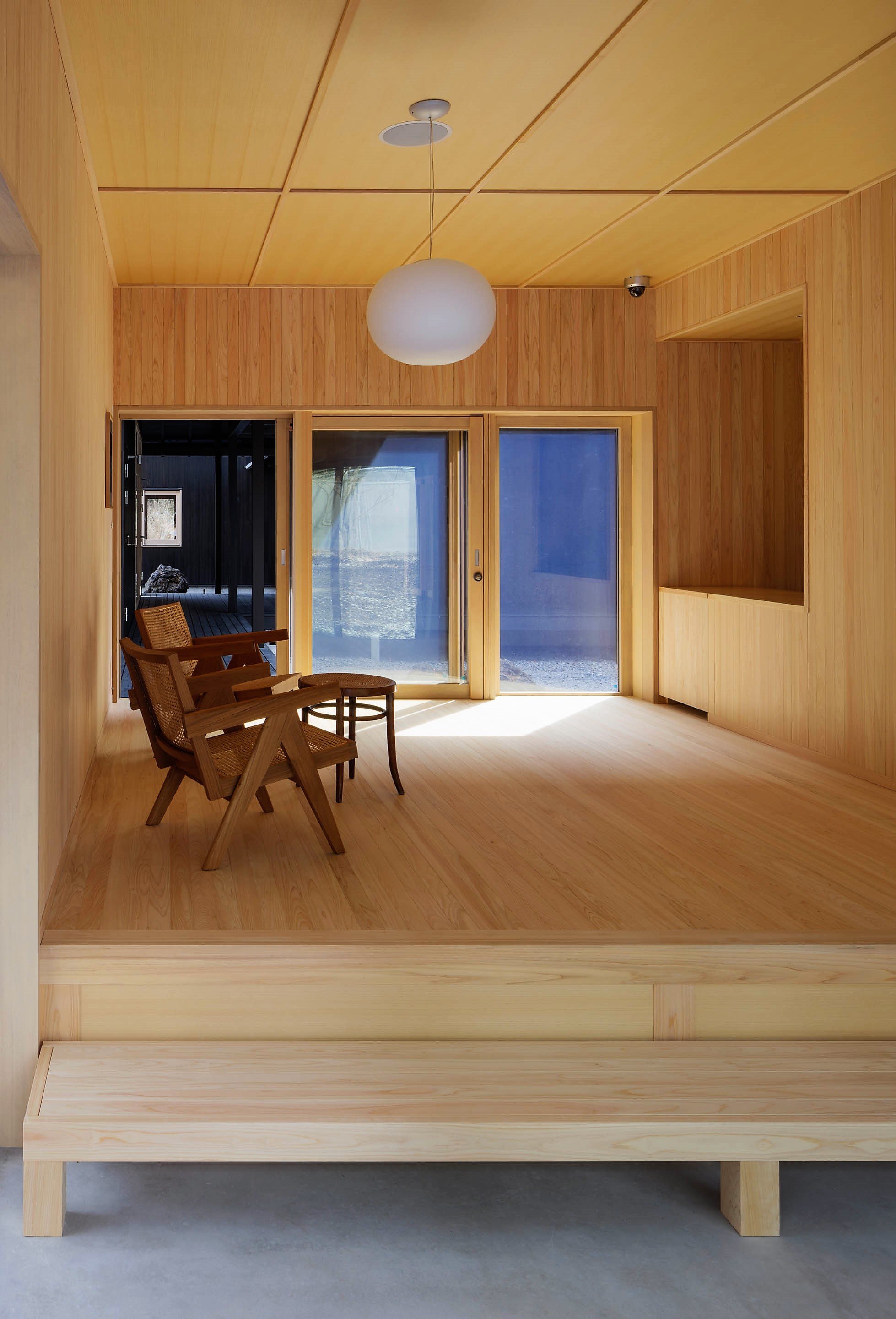
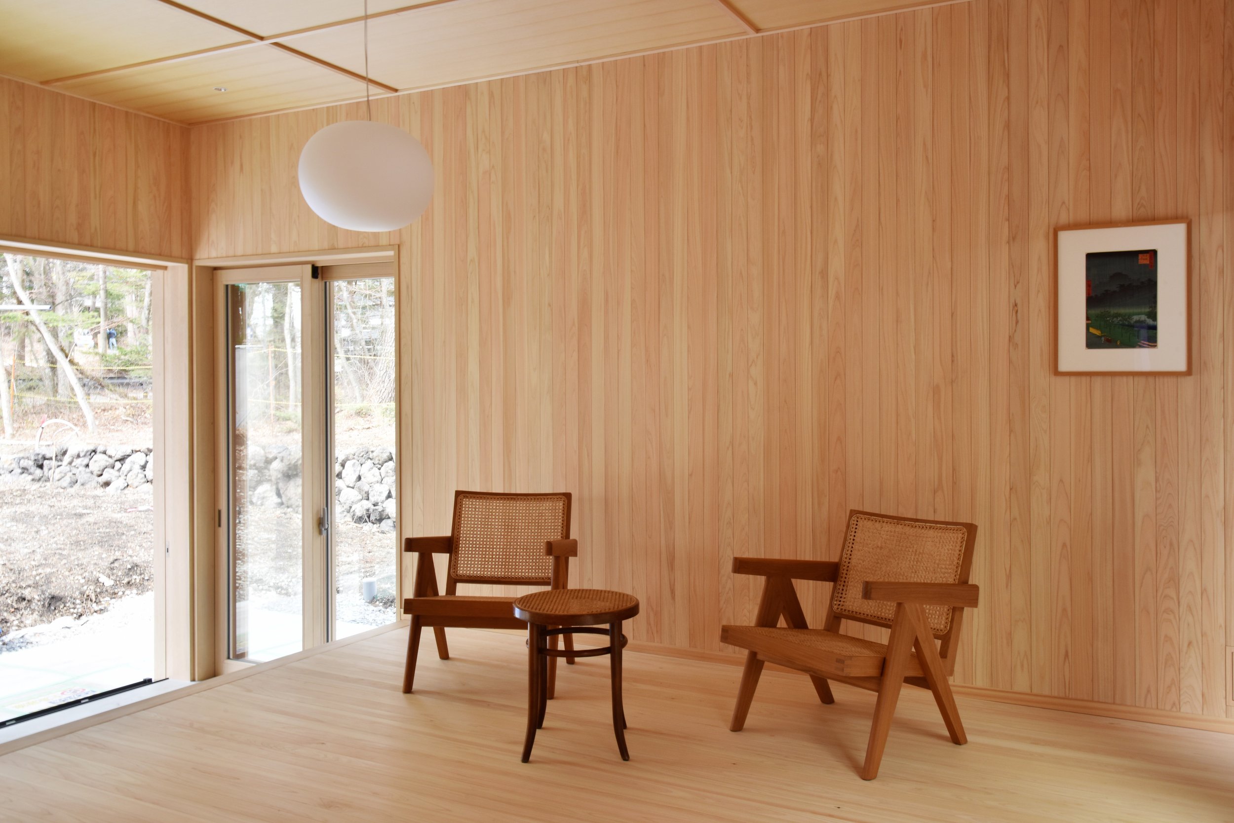
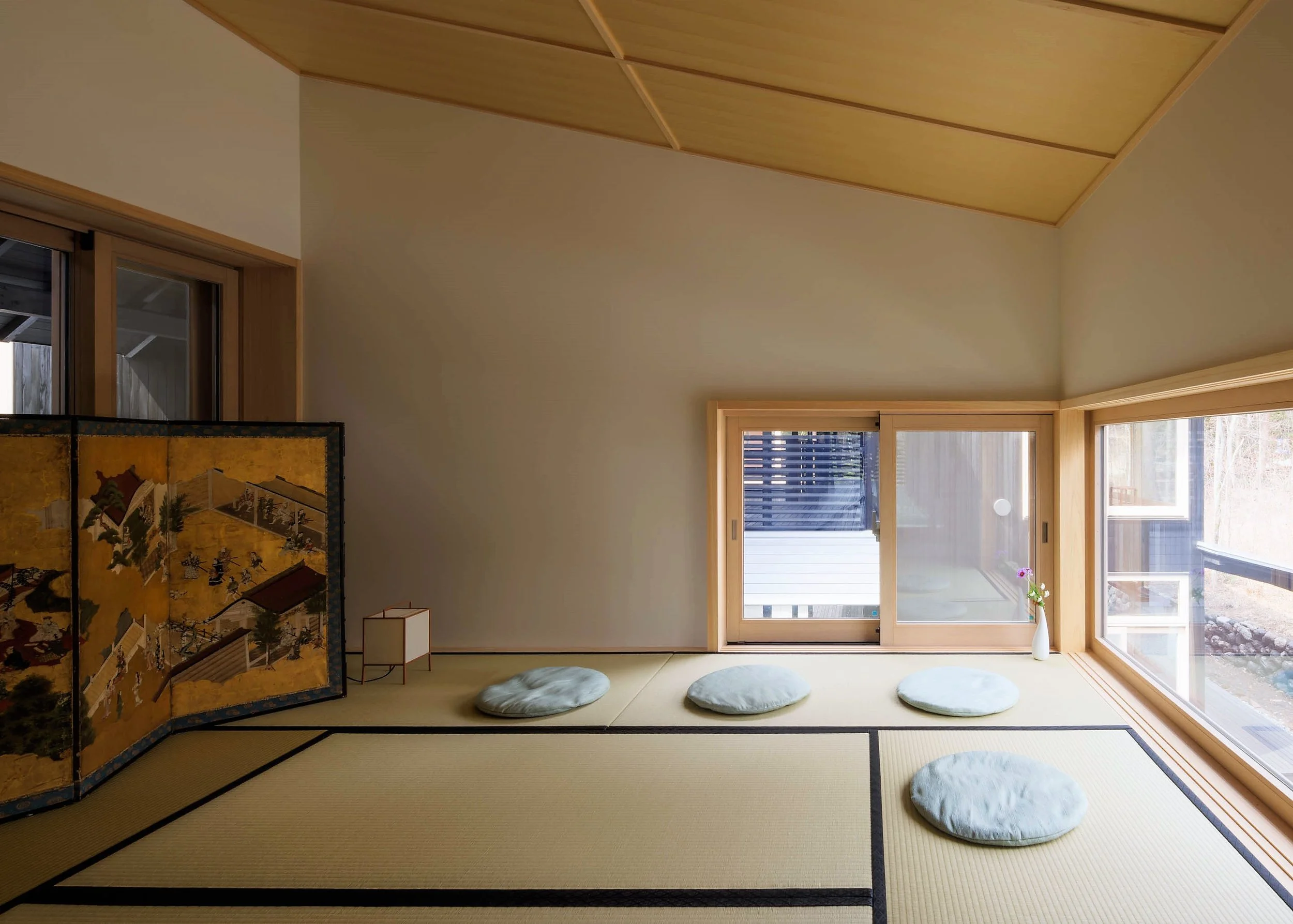
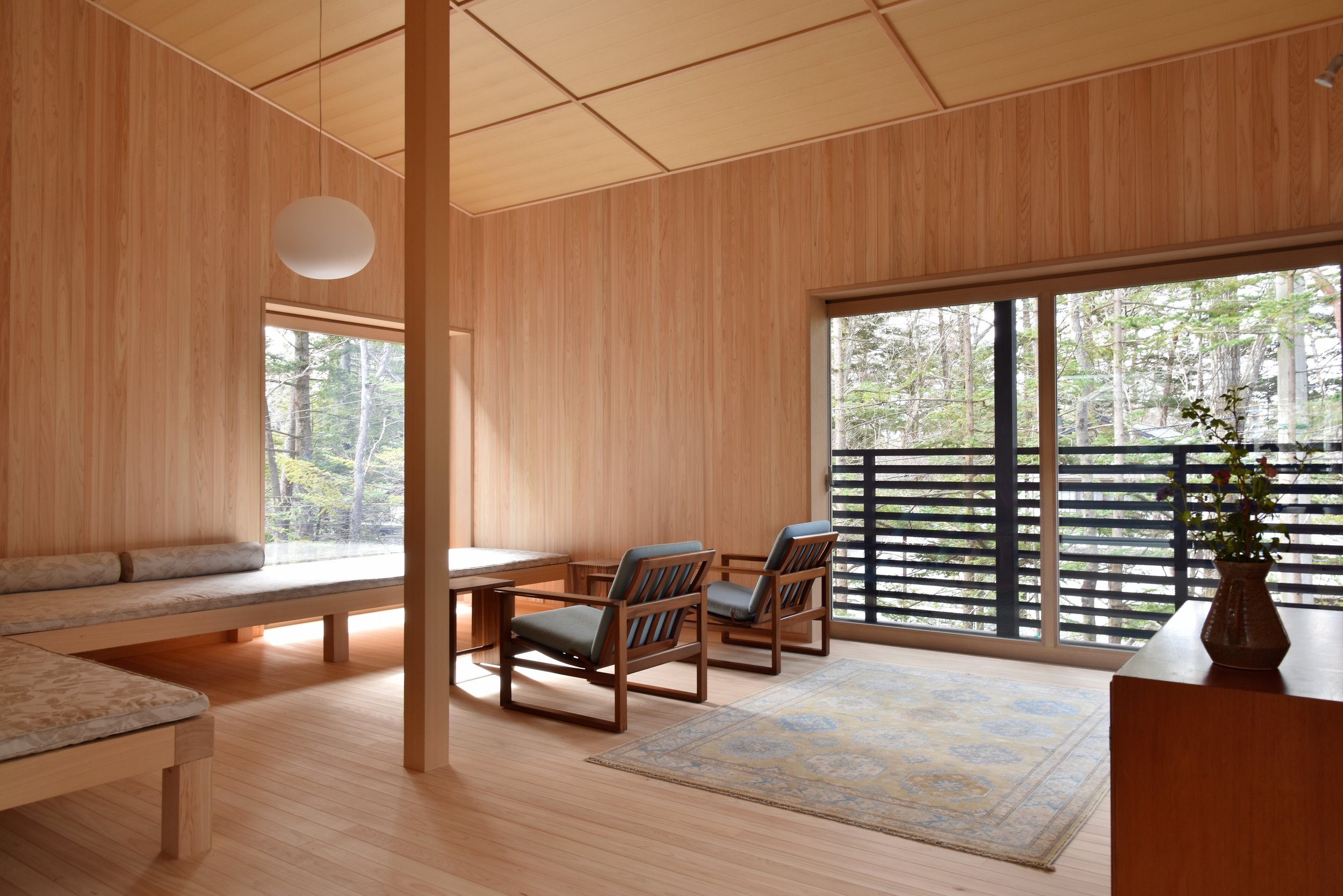
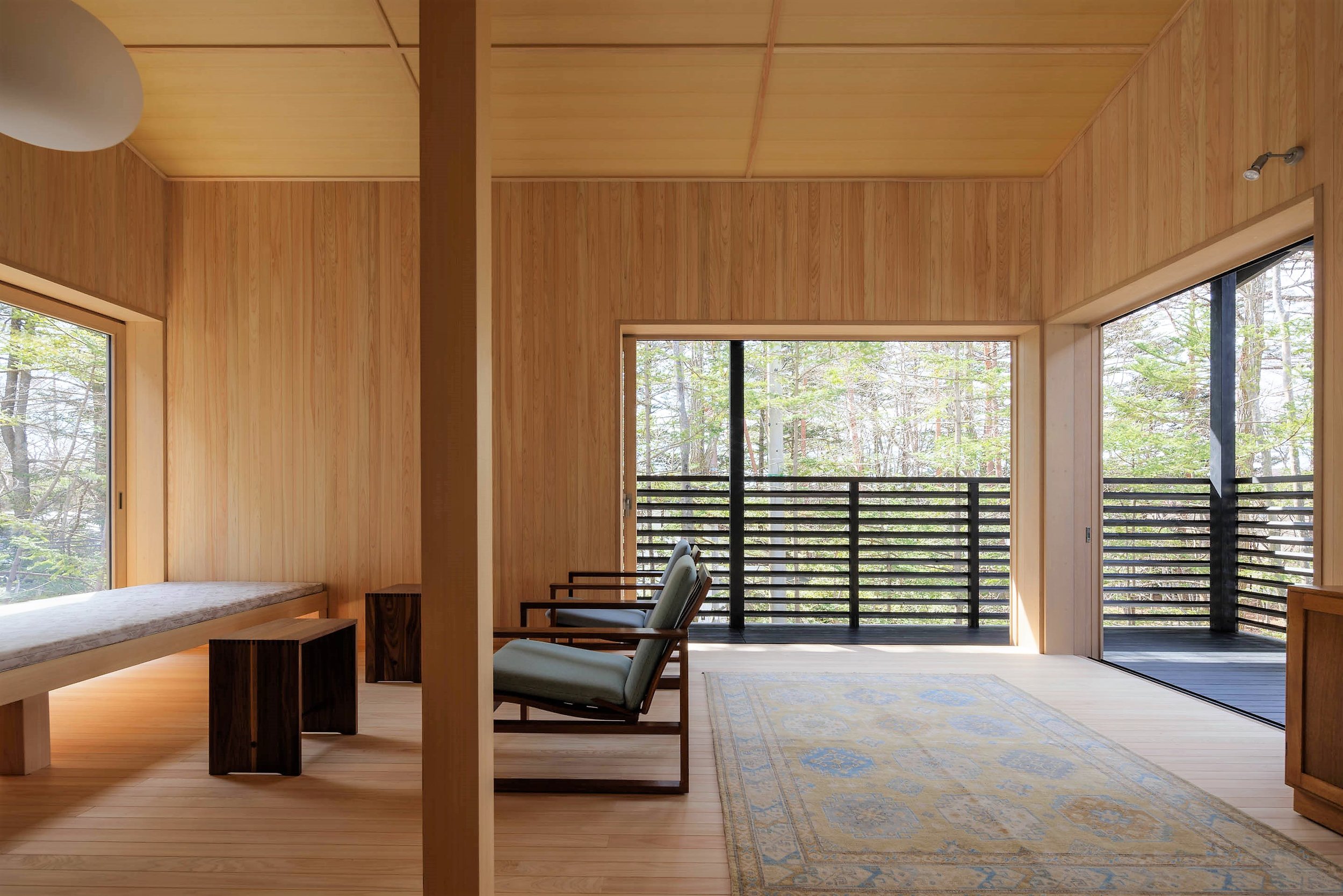
A bathhouse and tea house complement the Ma experience envisioned by the architect, with plans to offer massage, yoga, and meditation sessions. The location within the serene Karuizawa Yacho no Mori, the National Wild Bird Sanctuary, in the embrace of almost 100 hectares of lush forest, expands moments of rejuvenation, with forest bathing and special walking tours.
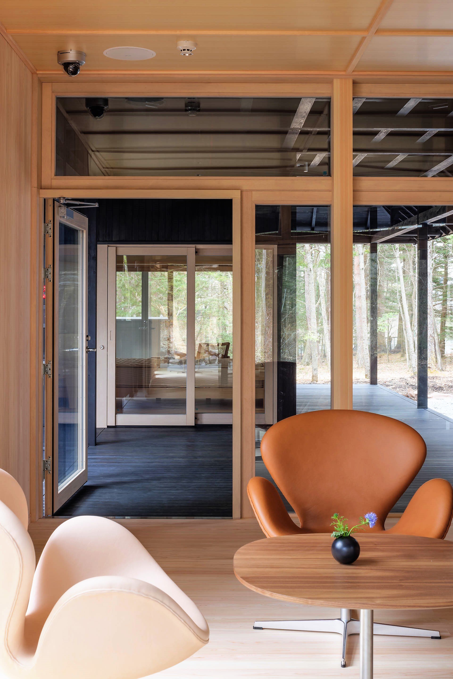
Guests also have direct access to all facilities at SSH No.01 and SSH No.02, including the restaurant and bar, offering fine dining options, sake, wine, and whisky tastings, and tea rituals. A collection of antique Japanese furniture and vintage mid-century modern furniture, including historically significant pieces by Charles and Ray Eames, Pierre Jeanneret, Arne Jacobsen, Borge Mogensen, Bill Max, Michael Thonet, and Bodil Kjaer, complement the House's traditional architecture.
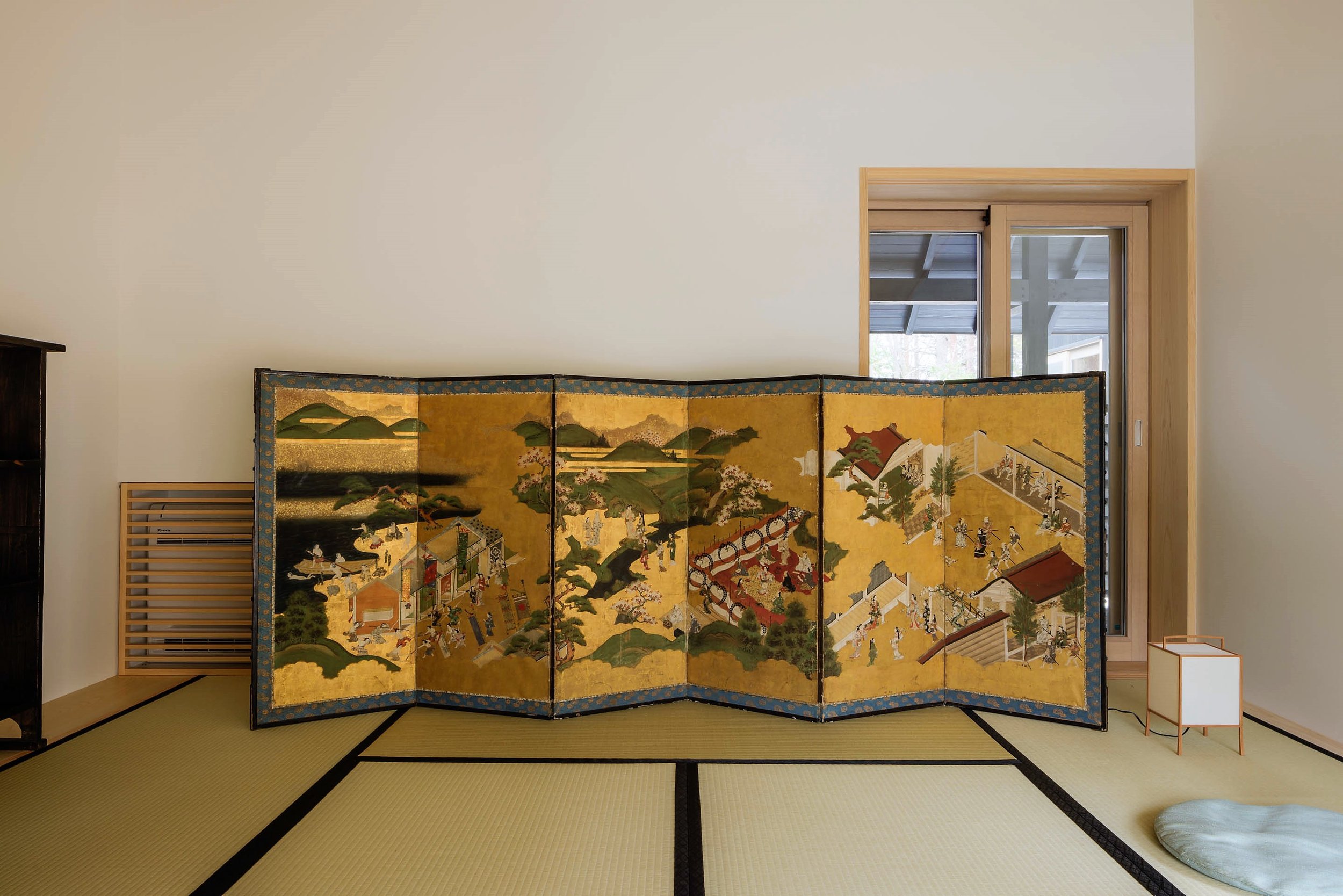
A significant cultural heritage collection of approximately 50 original ukiyo-e woodblock prints from a dozen major artists, including Utagawa Hiroshige and Shibata Zeshin in the 1840s, and Azechi Umetaro and Sekino Junichiro in the 1960s, is on display throughout SSH No.03.
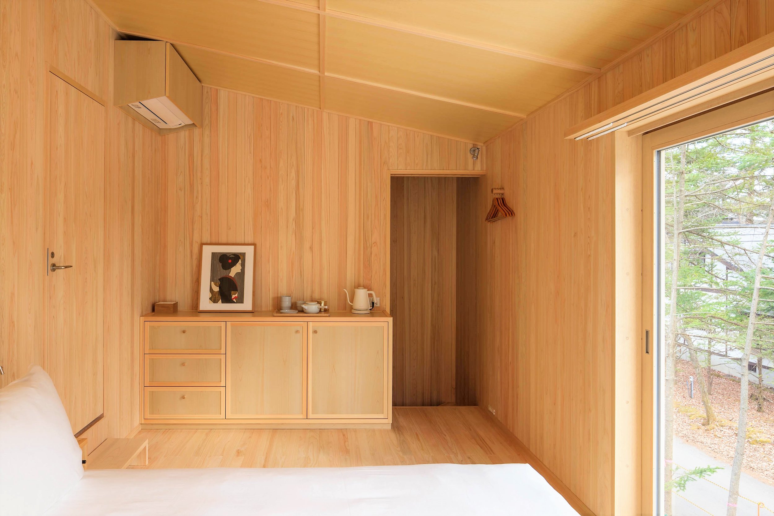
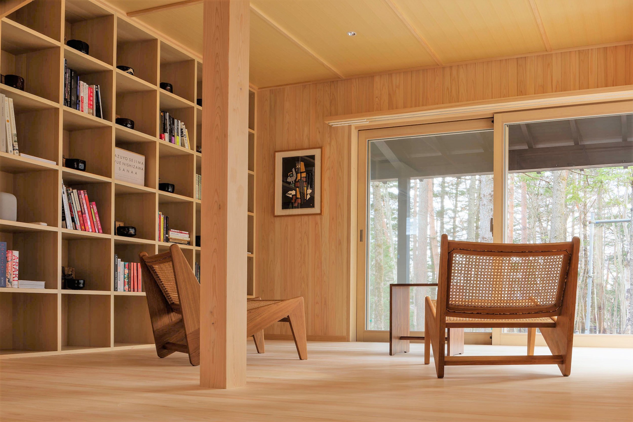
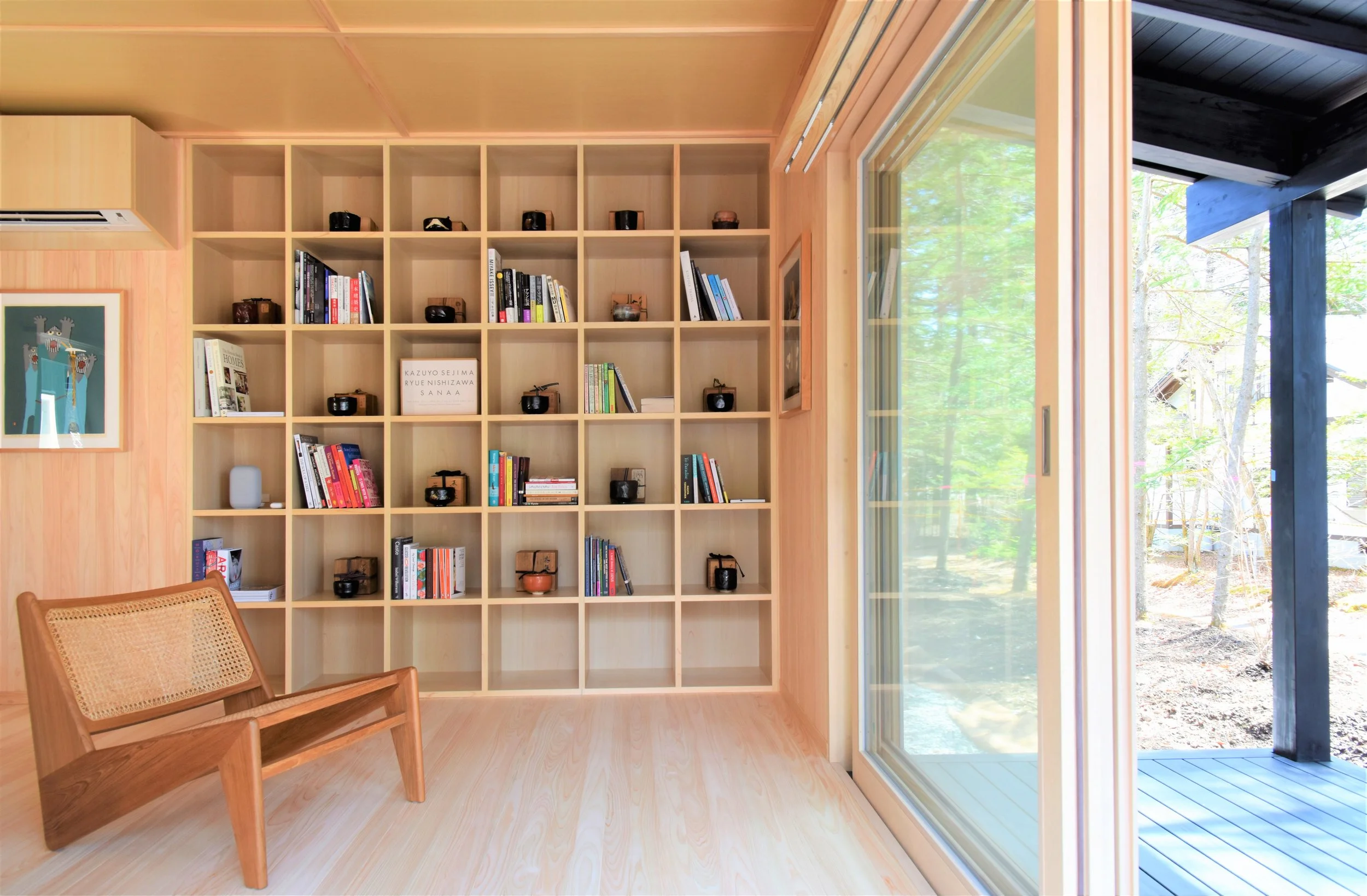
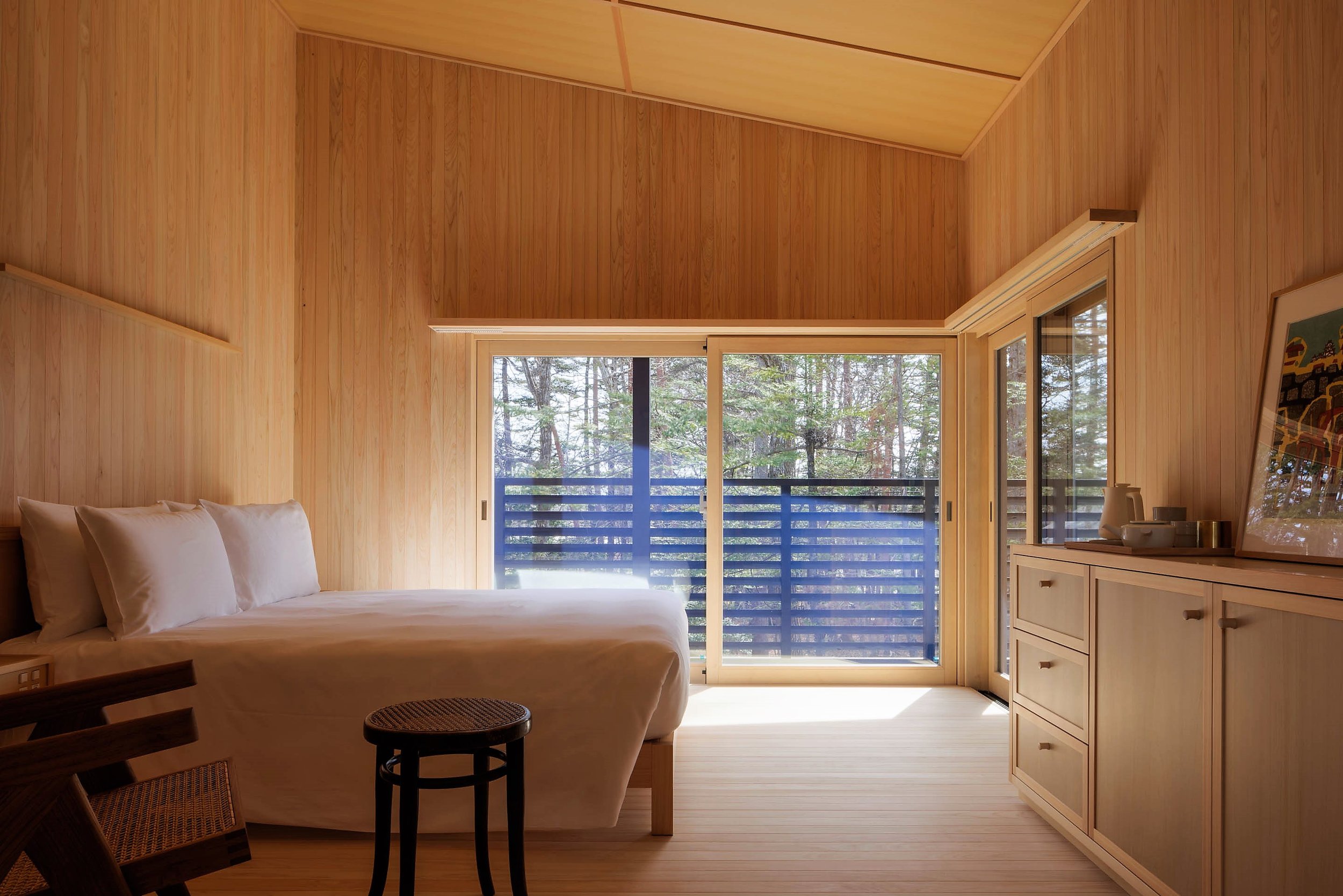
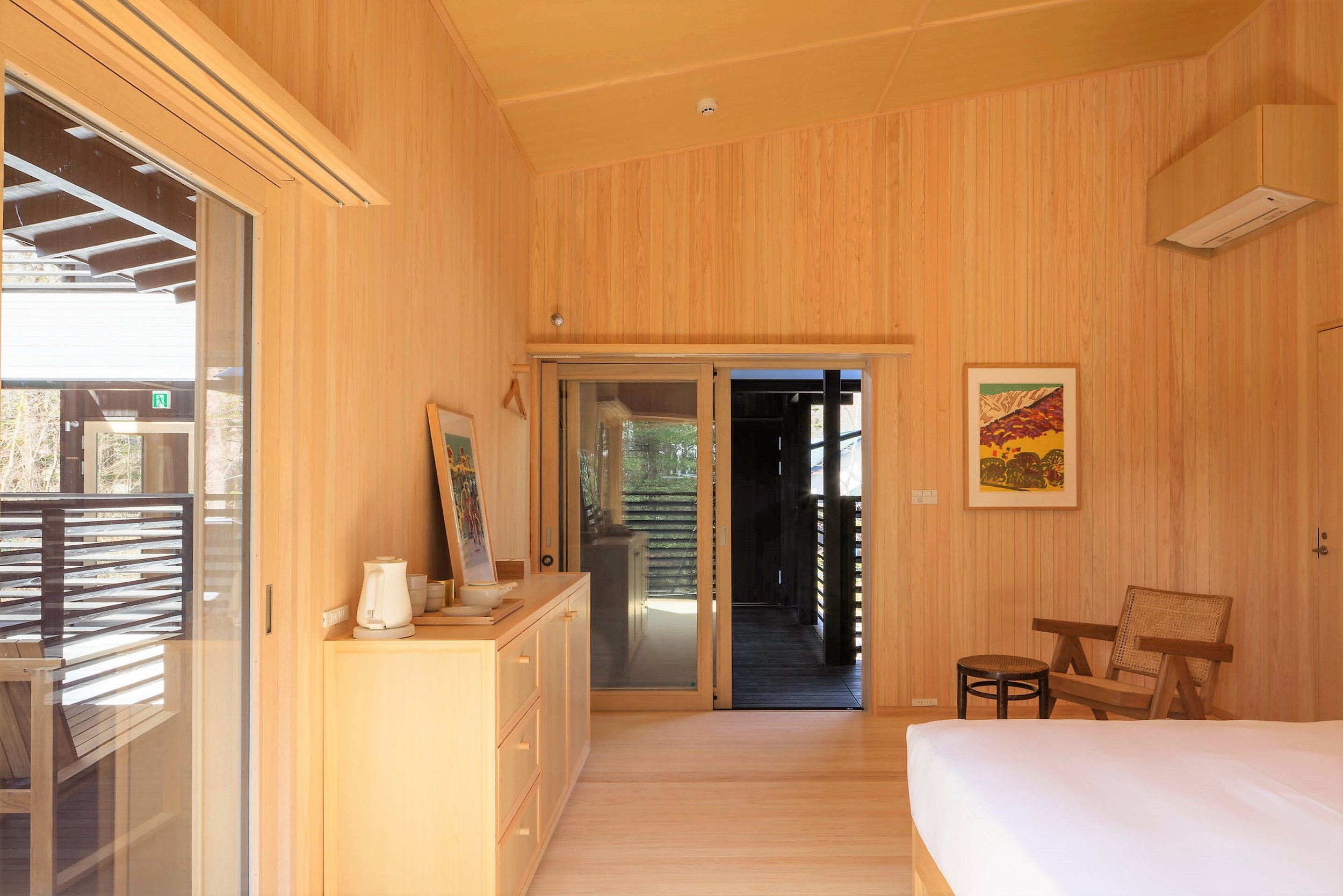
Complementing the House's traditional architecture is a collection of antique Japanese furniture and vintage mid-century modern furniture, including historically significant pieces by renowned designers. The interiors are beautifully curated with minimalist decor that creates a tranquil atmosphere, allowing guests to fully unwind and relax in luxury.
SSH No.03 offers an immersive and unique experience that combines traditional Japanese architecture, natural beauty, and modern luxury living. It is an ideal destination for families and friends to spend quality time together in a peaceful and serene environment, away from the hustle and bustle of urban life.
Complementing the House’s traditional architecture is a collection of antique Japanese furniture as well as vintage mid-century modern furniture, including historically significant pieces by Charles and Ray Eames, Pierre Jeanneret, Arne Jacobsen, Borge Mogensen, Bill Max, Michael Thonet, andBodil Kjaer.
On display throughout SSH No.03 is a significant cultural heritage collection of approximately 50 original ukiyo-e woodblock prints from a dozen major artists including Utagawa Hiroshige and Shibata Zeshin in the 1840s, and Azechi Umetaro and Sekino Junichiro in the 1960s.
You can visit: https://www.shishiiwahouse.jp
GOOD CYCLE BUILDING 001 Asanuma Corporation Nagoya Branch Office Renovation by Nori Architects and Asanuma Corporation
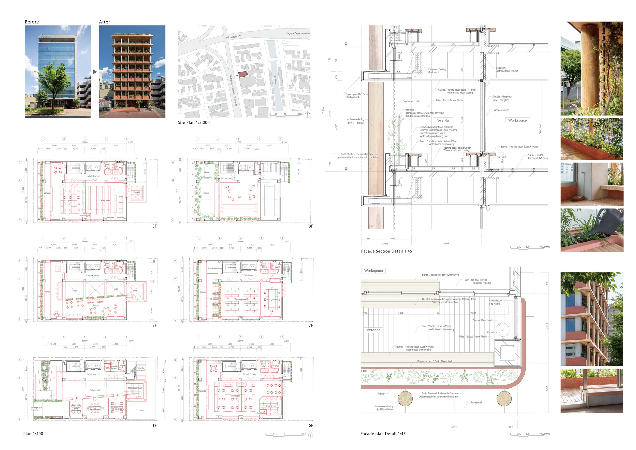
The Asanuma Corporation is promoting its first flagship project, the GOOD CYCLE BUILDING, a project to renovate a 30-year-old building into an environmentally friendly building. The existing building frame was utilized and modified to increase accessibility to natural light and wind, and new materials were added as much as possible using natural materials such as earth and wood, enabling the building users to participate in the construction and maintenance process.
The Asanuma Corporation is promoting its first flagship project, the GOOD CYCLE BUILDING, a project to renovate a 30-year-old building into an environmentally friendly building. The existing building frame was utilized and modified to increase accessibility to natural light and wind, and new materials were added as much as possible using natural materials such as earth and wood, enabling the building users to participate in the construction and maintenance process.
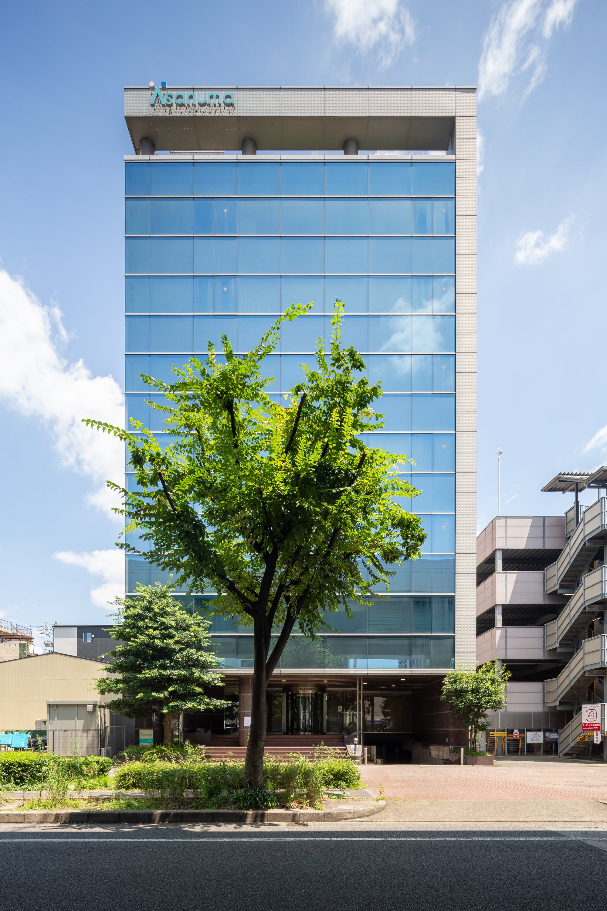
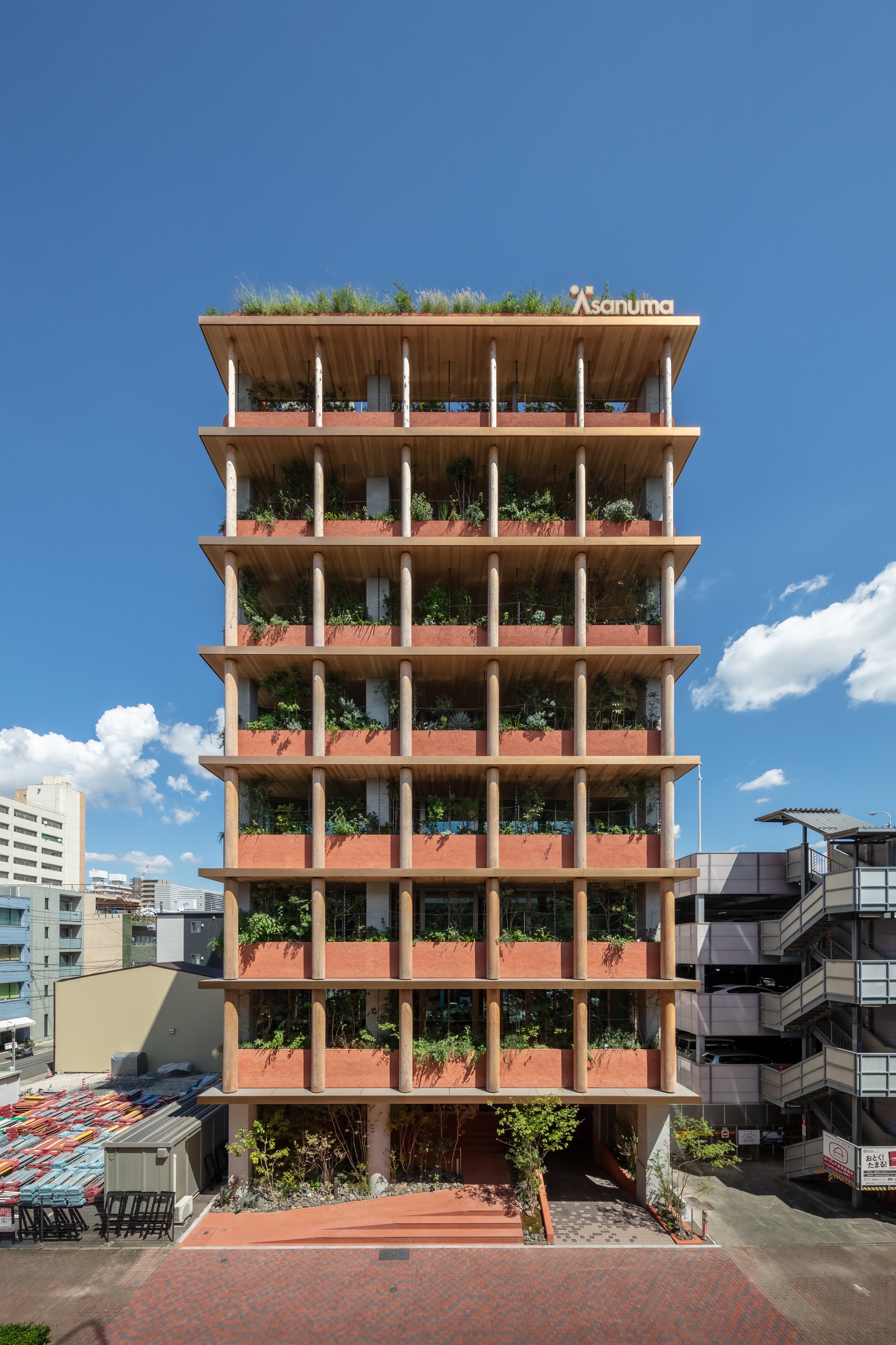
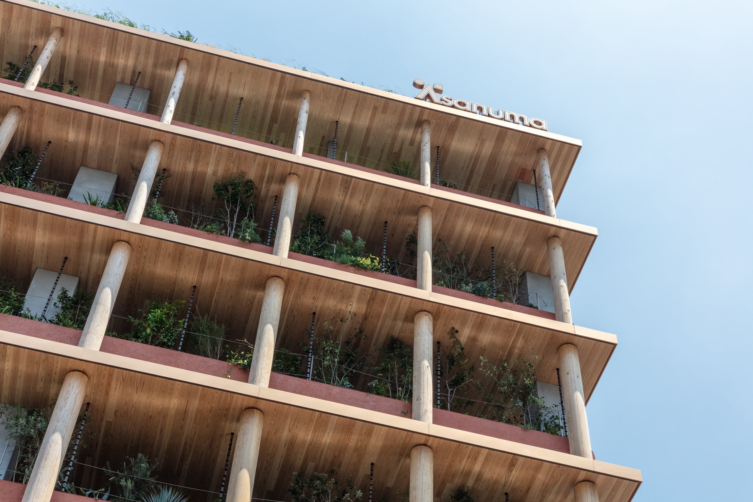
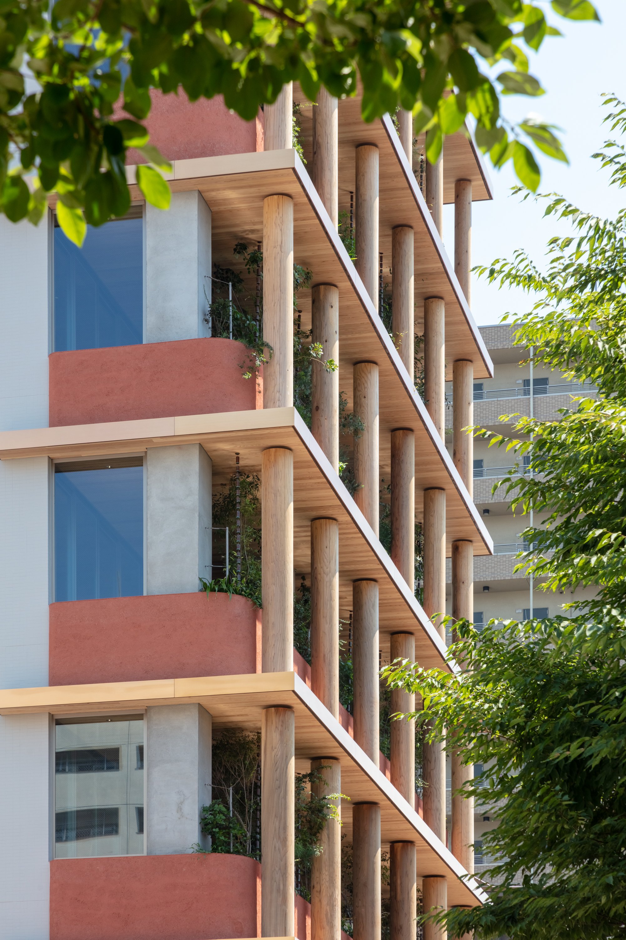
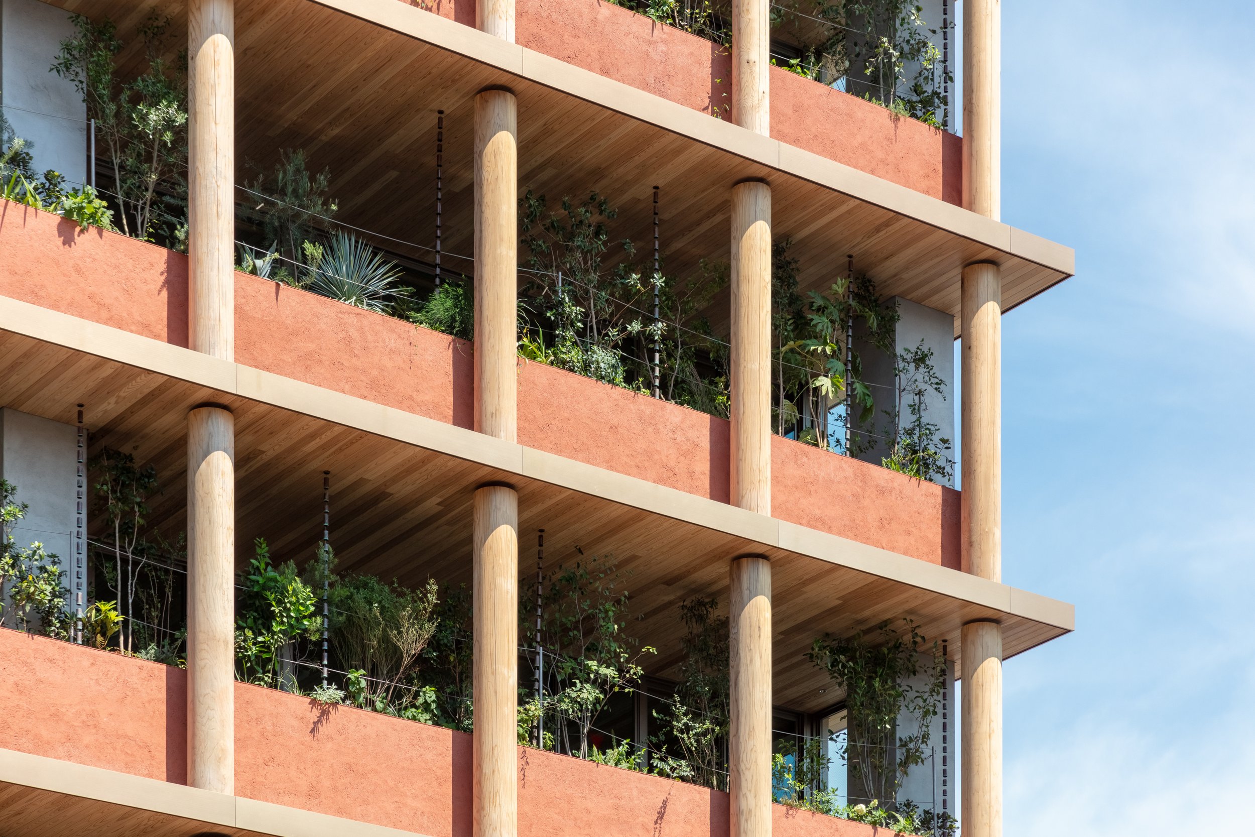
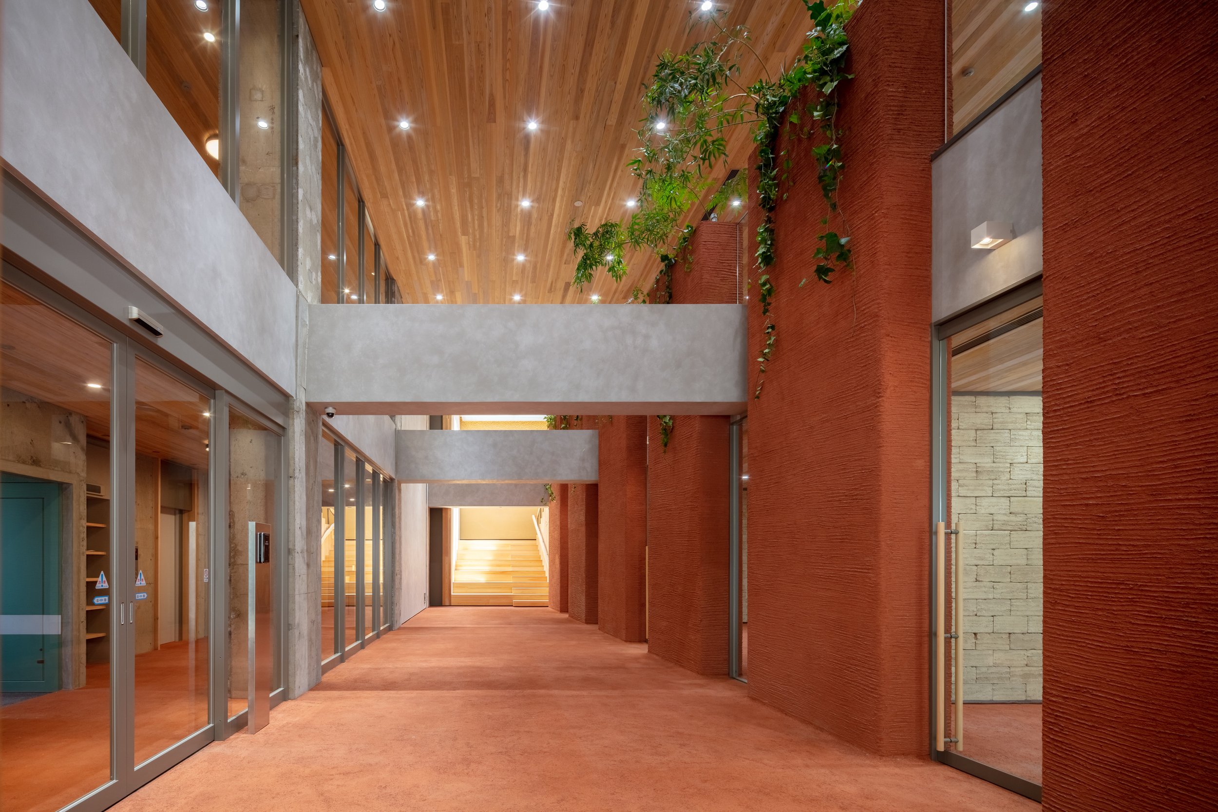
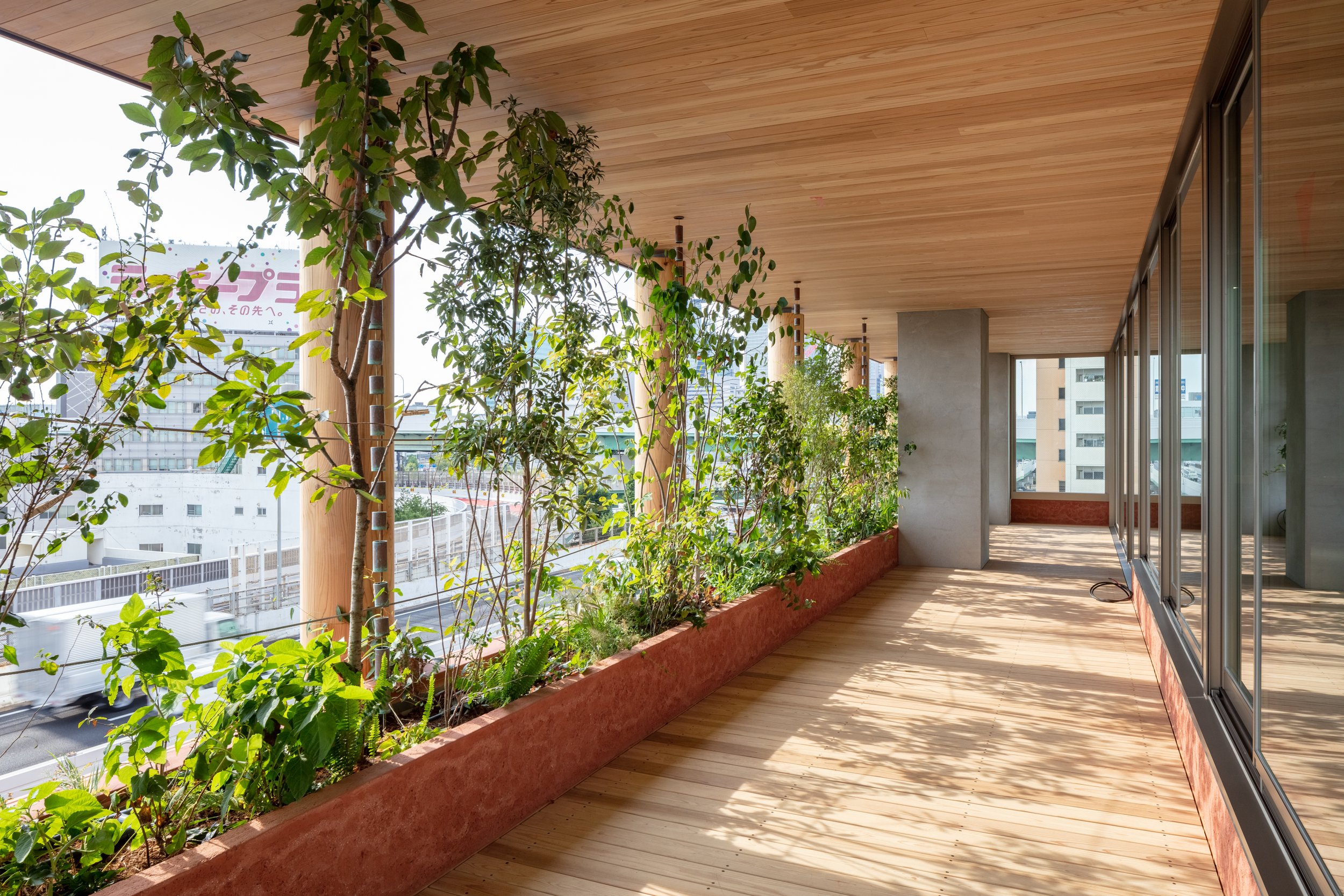
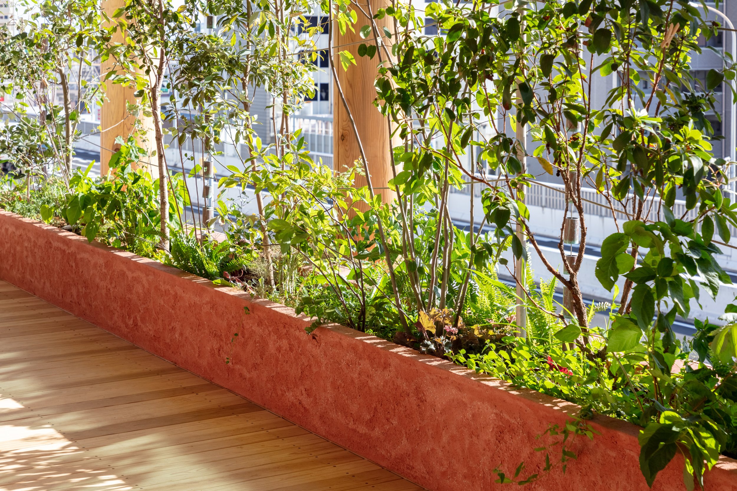
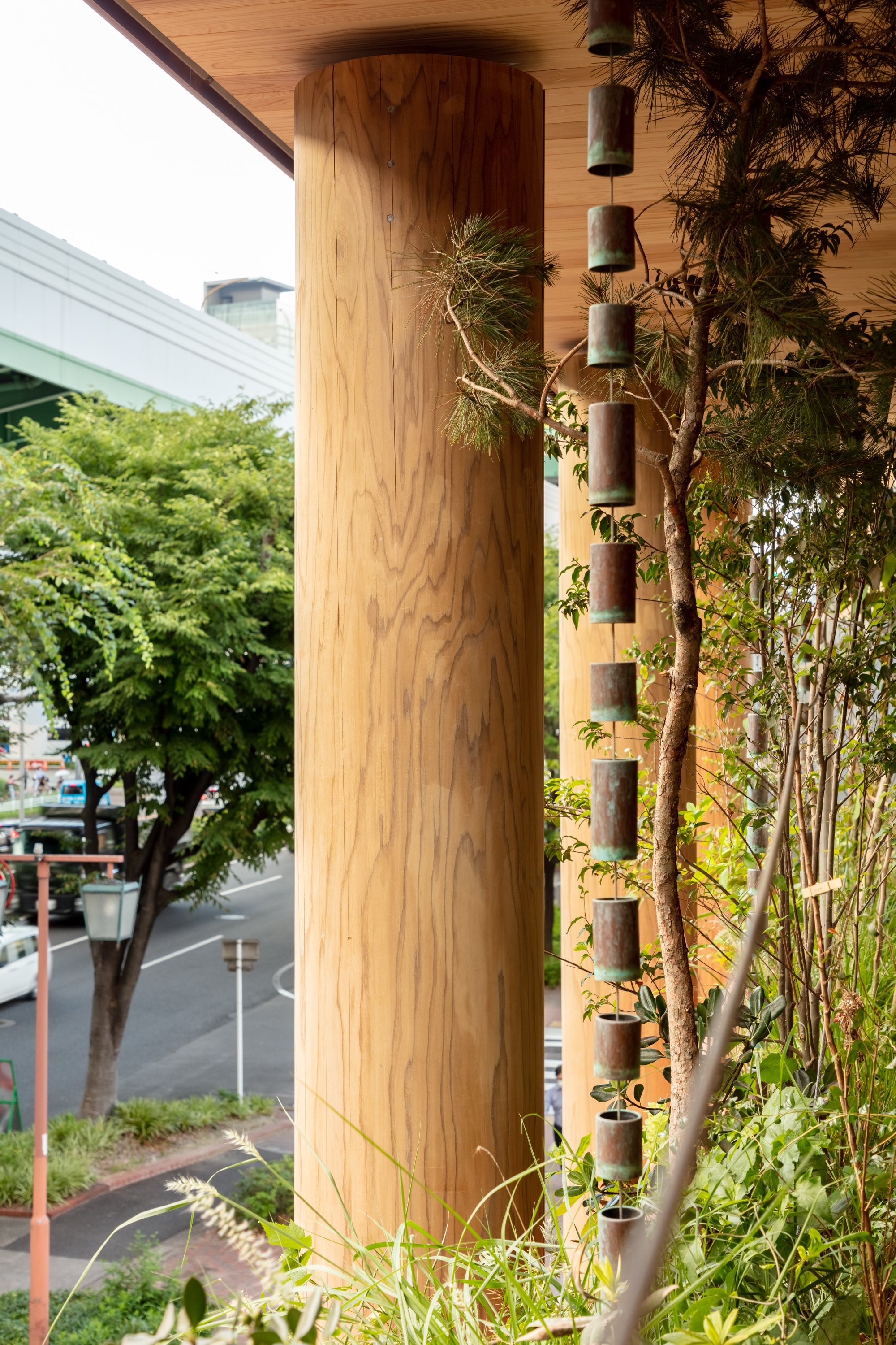
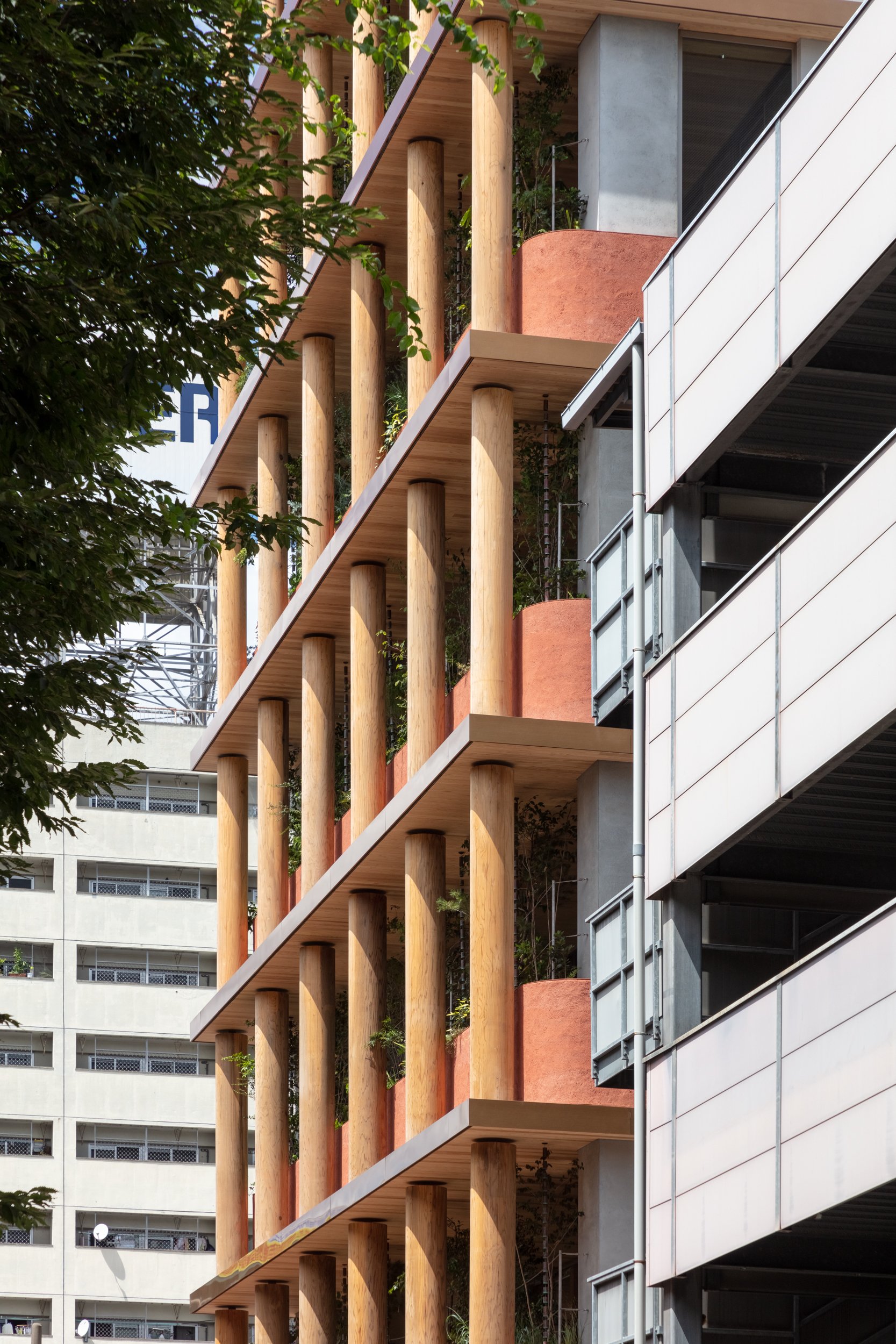
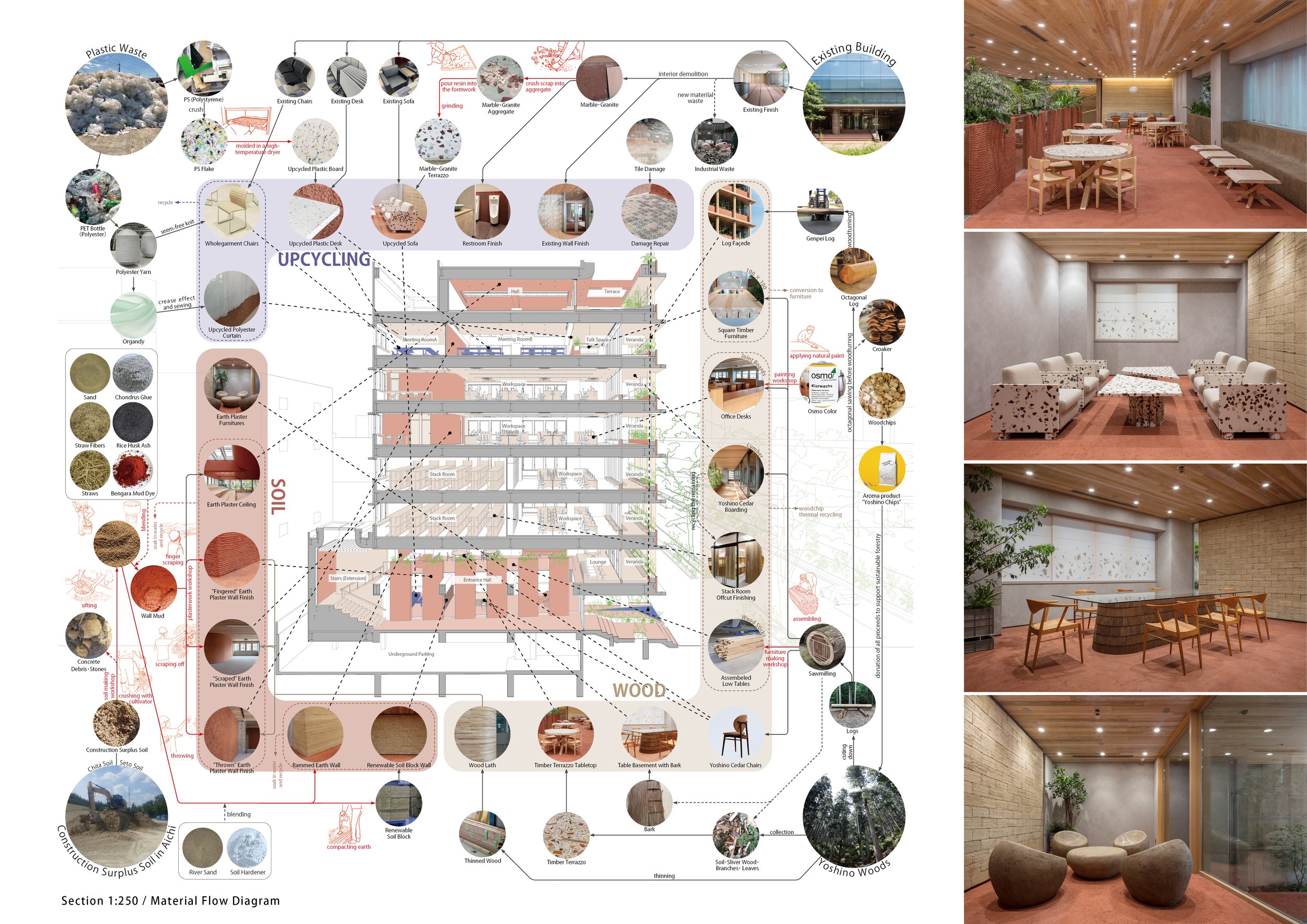
Inside and outside the building, soil materials were used for floors, walls, ceilings, and furniture. Raw materials were obtained from leftover soil in Aichi Prefecture. As long as amateurs participate in the finishing process, such as making marks with their fingers or throwing soil, the wall will be expressed "naturally" through human movement. Aside from the fact that earthen walls are not impure (petroleum-derived materials and cement are sometimes added to improve durability), they can also be applied for painting in the future and eventually returned to nature. In addition to the interior and exterior of the building as well as for furniture, fittings, and products, Japanese cedar from the Yoshino forest in Nara, which Asanuma Corporation manages sustainably, wharvested.ed. To minimize the amount of scrap wood generated, the front façade is built from Yoshino cedar logs with the largest diameter from a single tree. Existing stones and other materials used in existing buildings were repurposed as interior surfaces. Others were crushed into small pieces and hardened with plaster to be used as furniture surfaces. Urban waste was also used as a resource. A surface material made of waste plastic flakes that have been crushed and hardened by heating has been used to cover existing furniture, and a knitted fabric made of recycled polyester yarn has been used to wrap existing furniture.
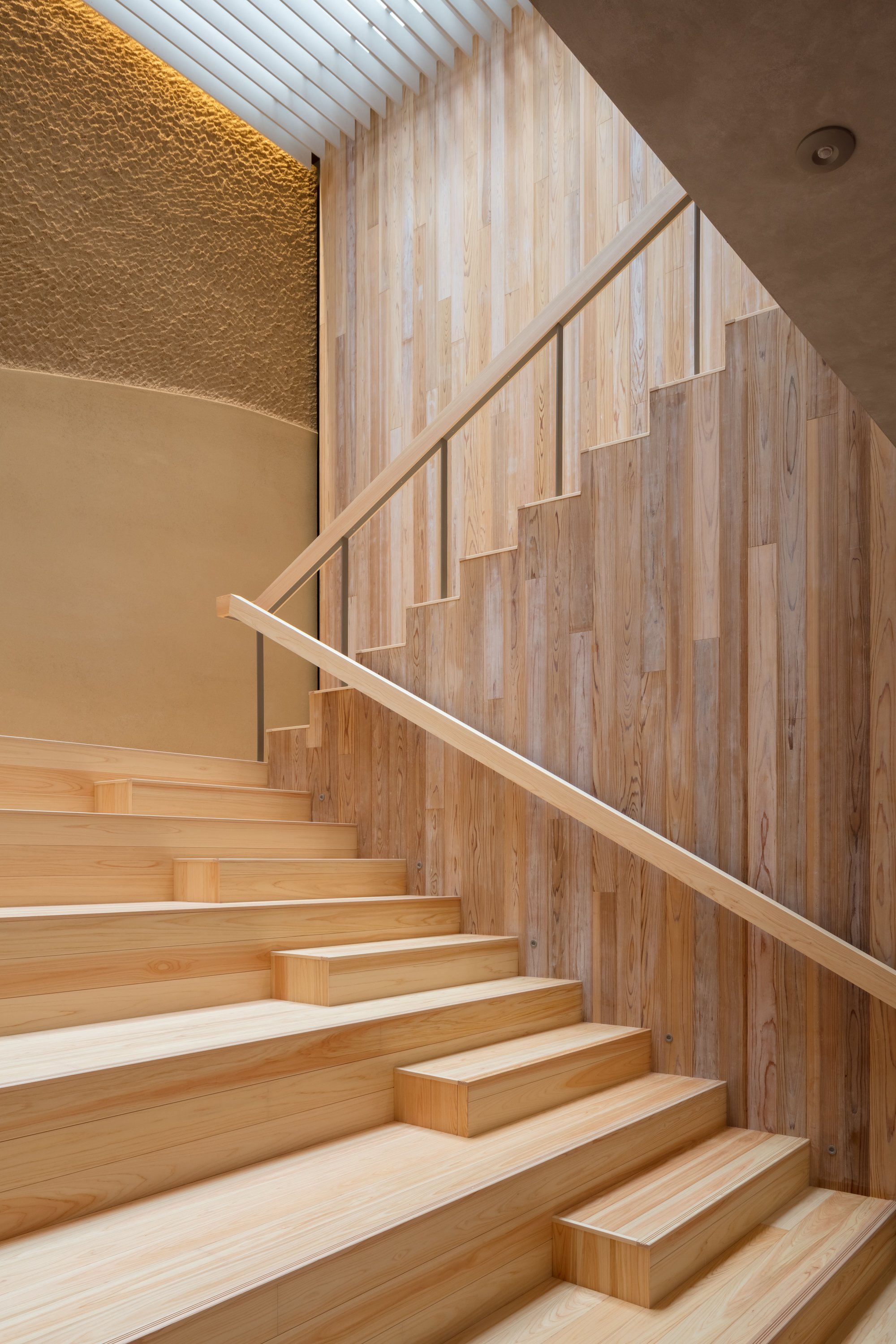
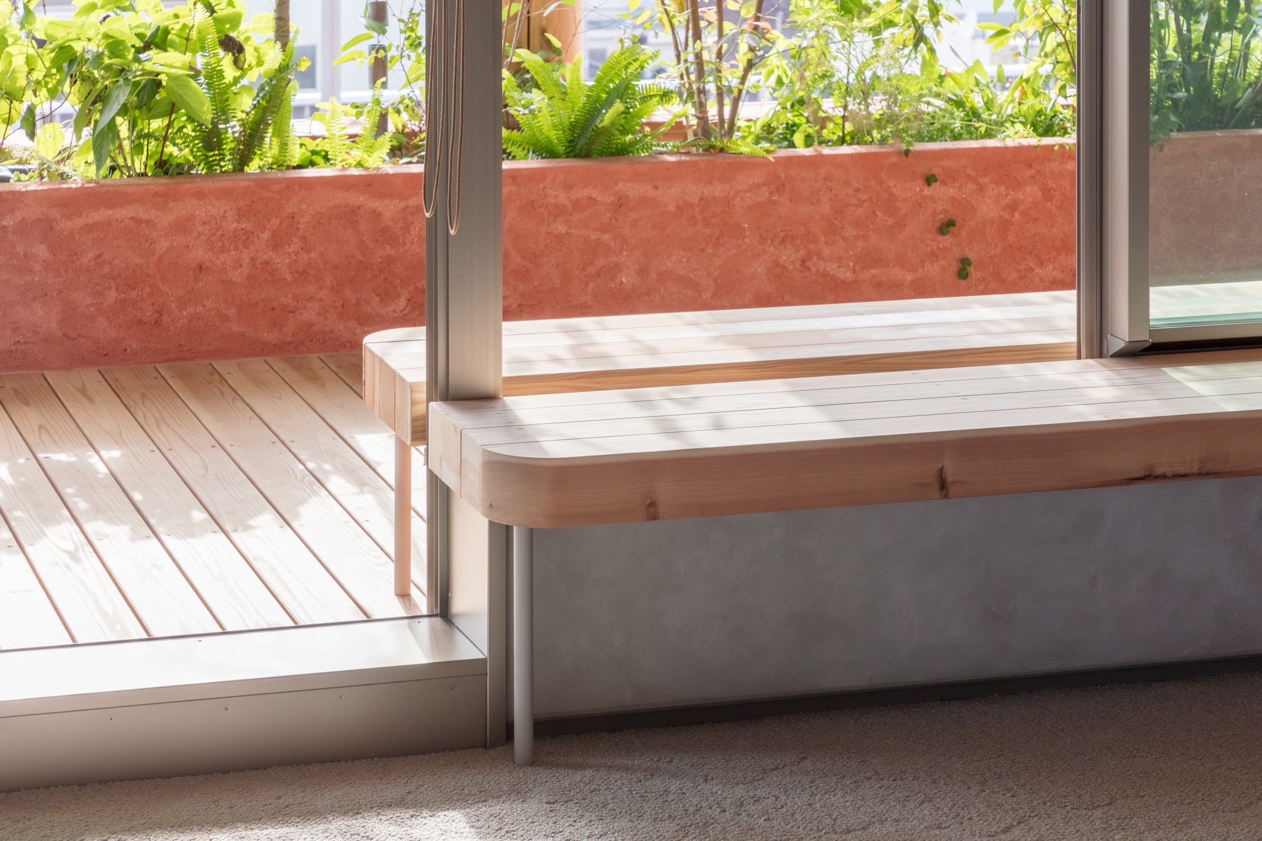
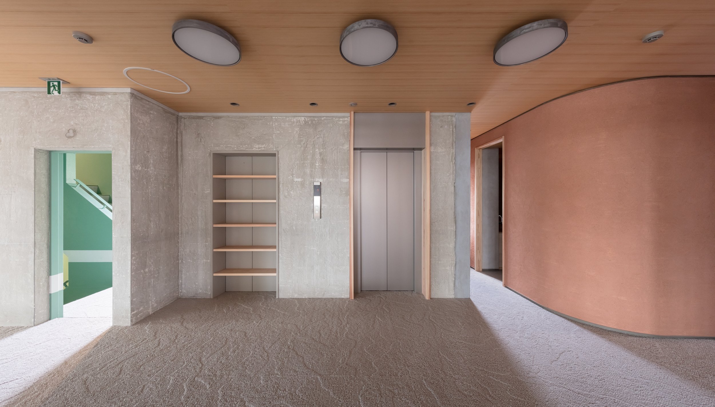
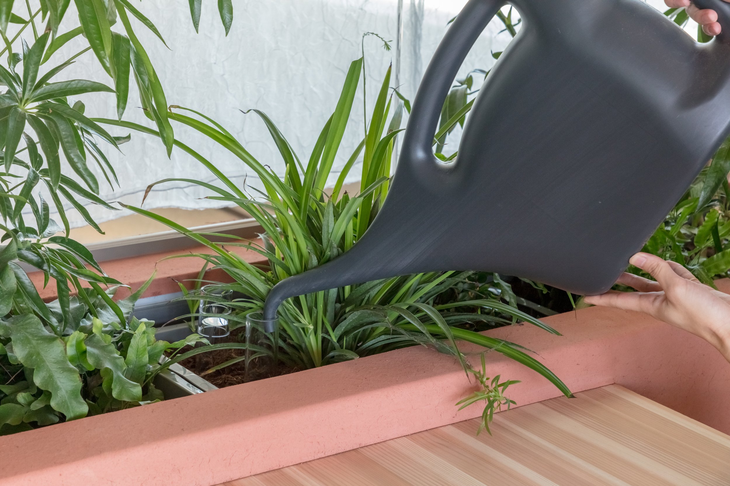
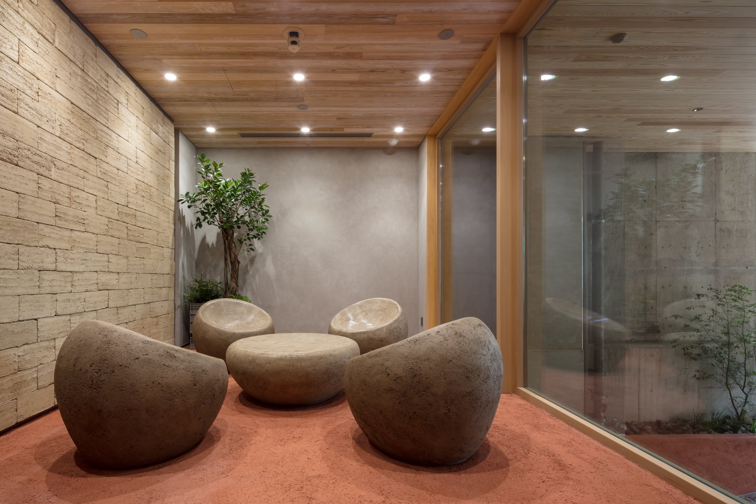
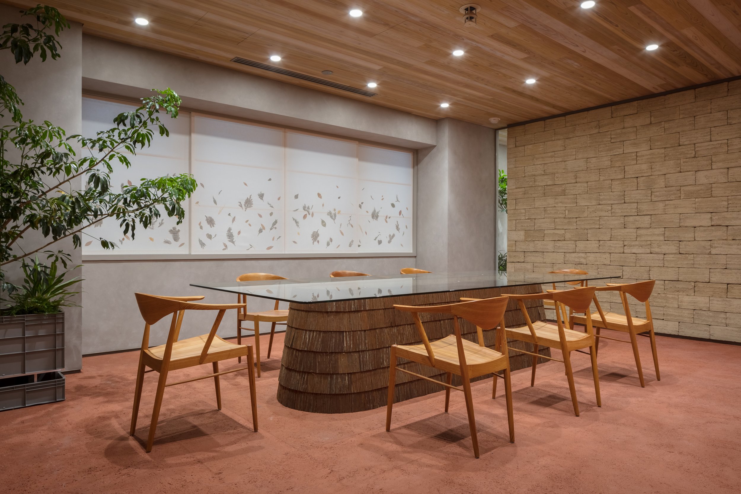
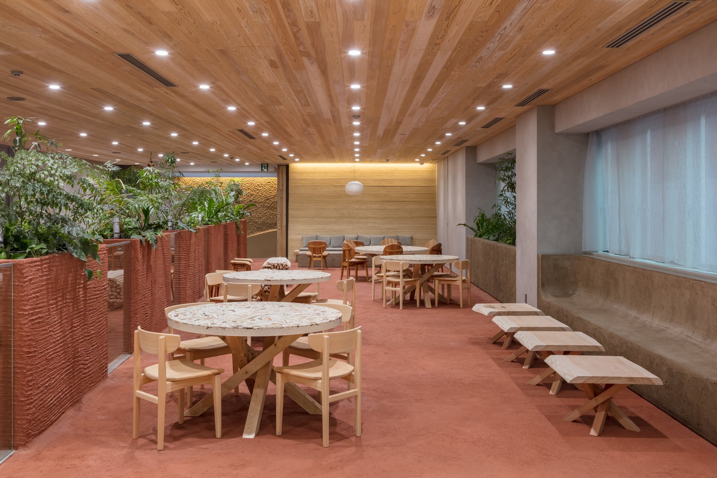
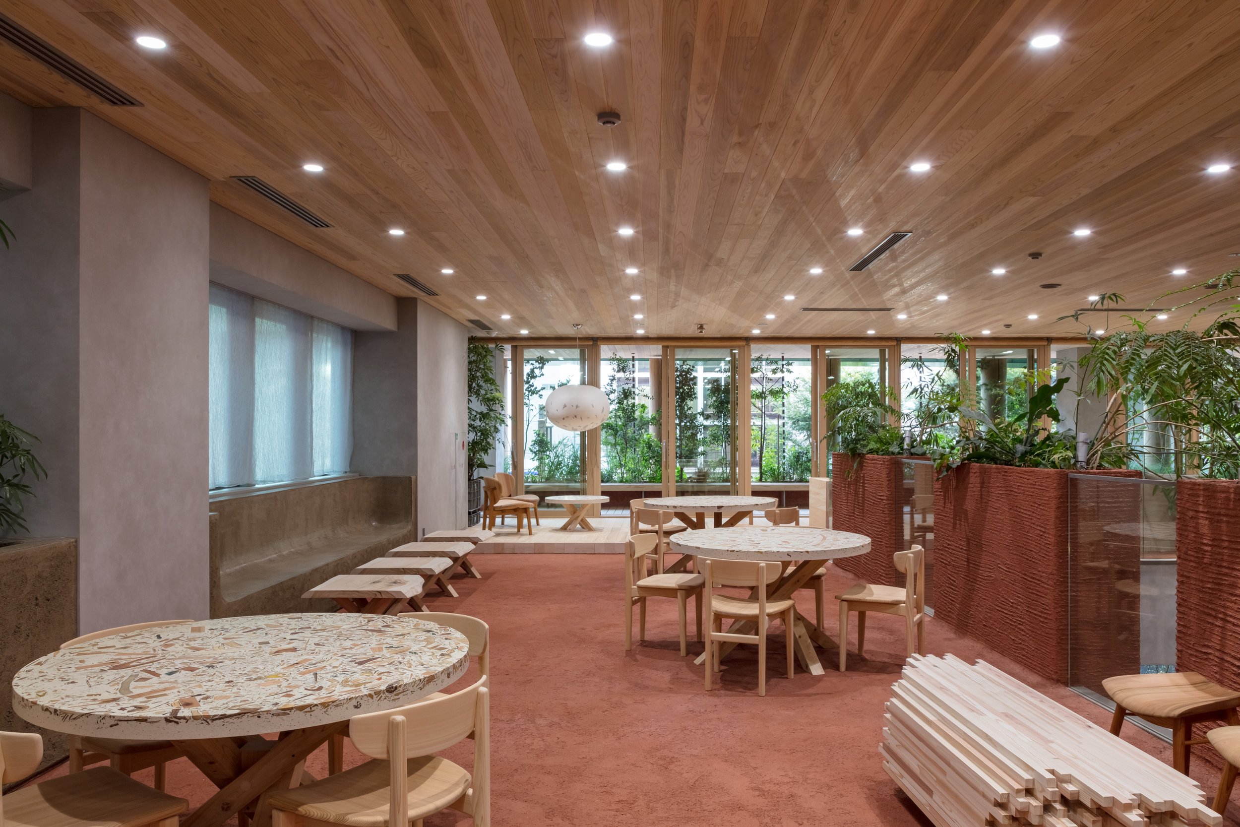
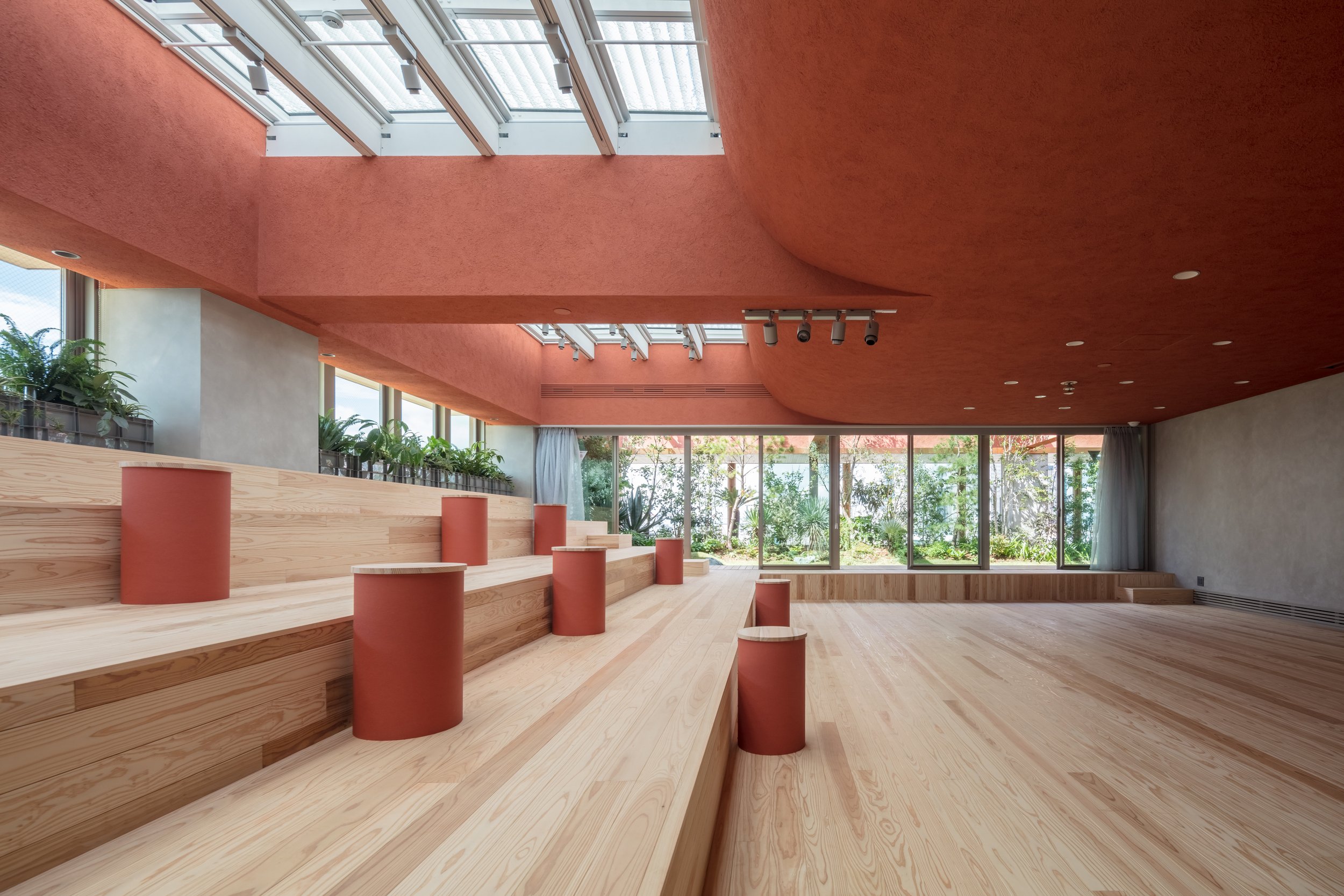
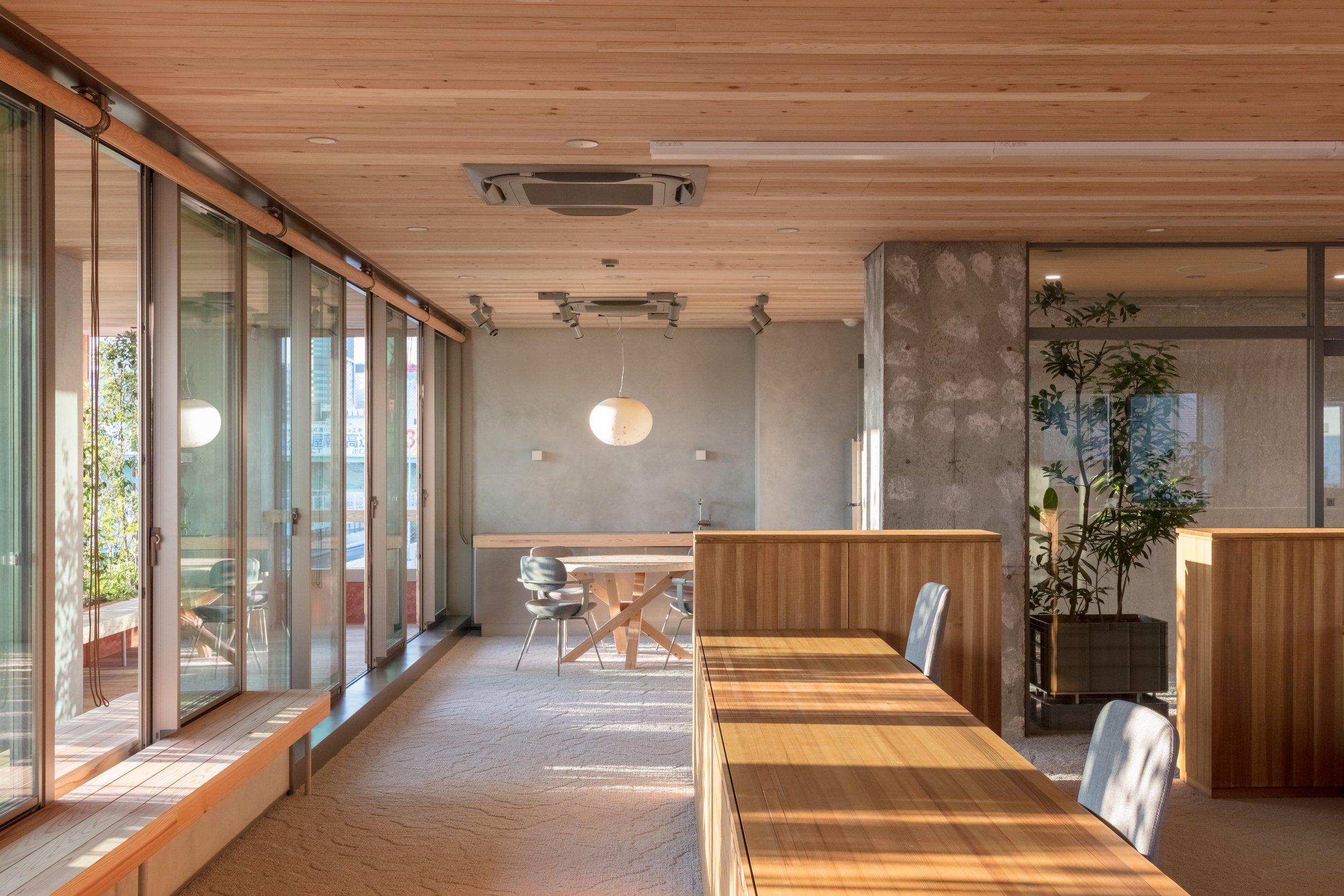
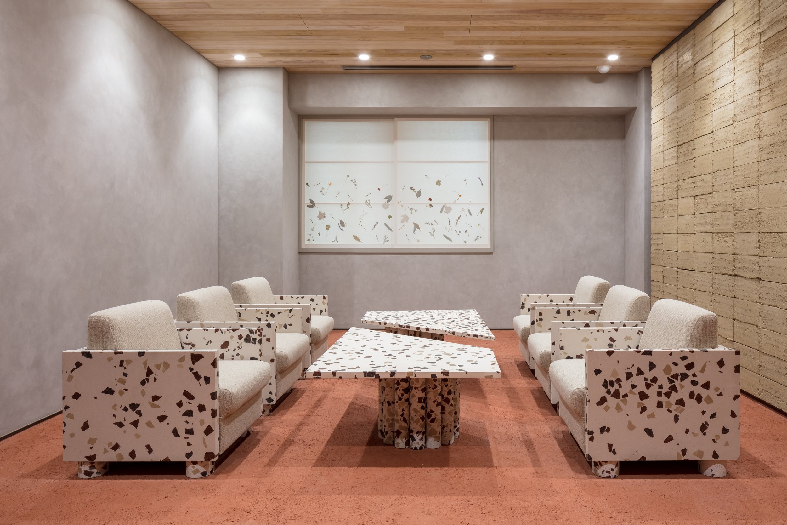
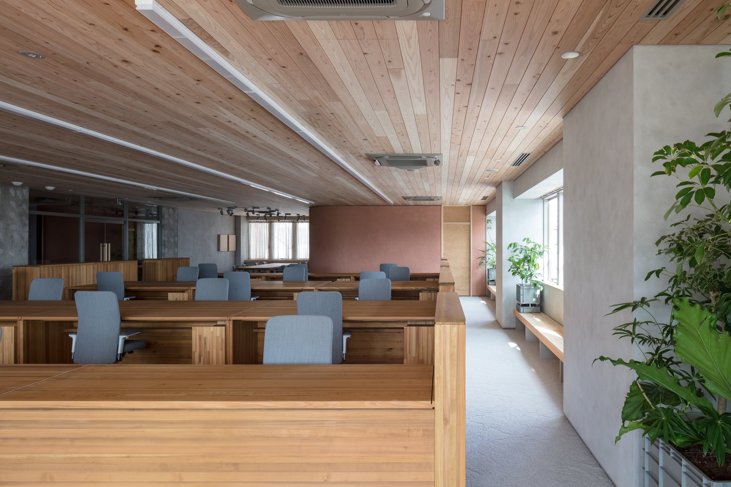
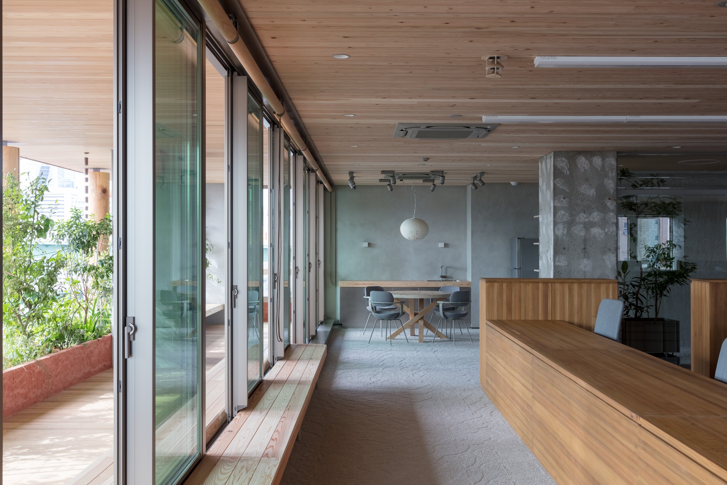
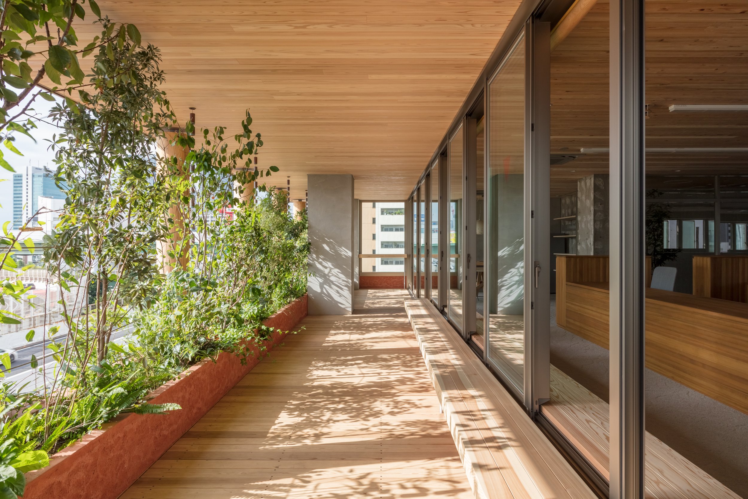
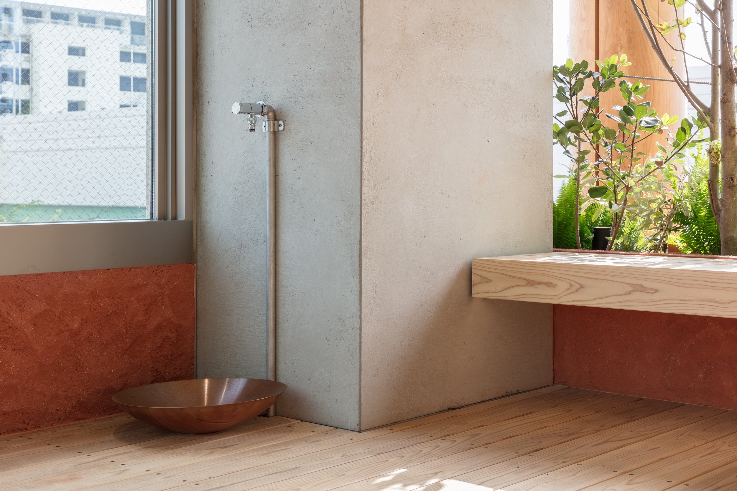
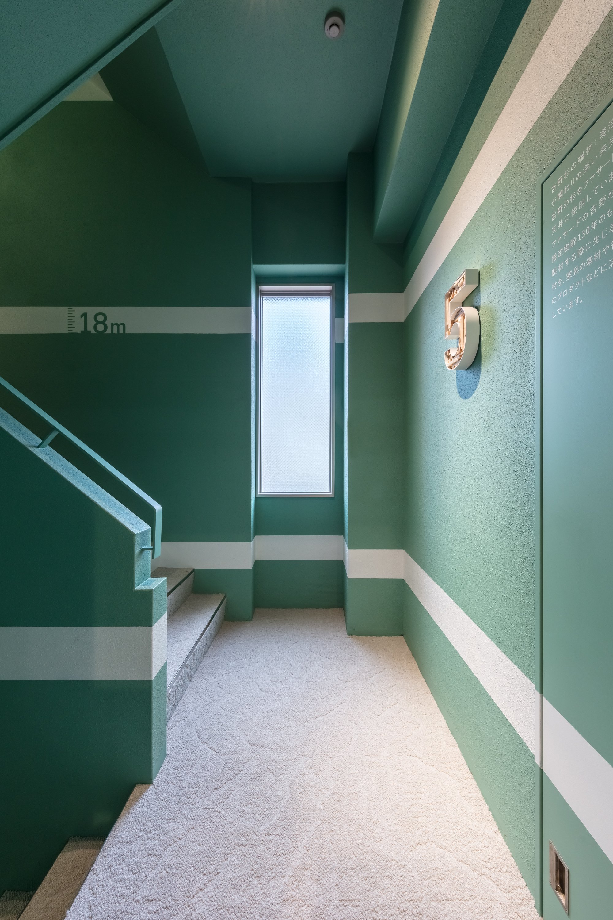
A building functions as a "material bank" and is a transit point in the flow of materials. To maximize the possibility of re-using materials, it is imperative to use natural materials in a way that allows them to be separated from artificial materials, in order to maximize their effectiveness, and eventually return them to the earth. It is necessary to process existing man-made materials so that new materials can be created, making the most of their characteristics. By creating a delightful environment connected to the changing nature of light, wind, soil, trees, and plants, this project attempts to reconstruct buildings as part of the new material flow in the city, and to reposition architecture in a cycle that is good for people and the earth.
Planning & Drawing
Designer Profile
Norihisa KAWASHIMA
Principal at Nori Architects, Senior Assistant Professor at Meiji University
Registered Architect, JAPAN, Dr. Eng.
Born in Kanagawa prefecture in 1982, Kawashima graduated from the University of Tokyo in 2005, earned his master’ s degree from the University of Tokyo Graduate School in 2007, after which he was hired by Nikken Sekkei. Kawashima became a visiting scholar at University of California, Berkeley and worked with Prof. Dana Buntrock and LOISOS + UBBELOHDE in 2012. In 2014, Kawashima became an assistant professor at the Department of Architecture of Tokyo Institute of Technology. In 2016, Kawashima earned a doctor’s degree from the University of Tokyo Graduate School. In 2017, Kawashima established Nori Architects. In 2020, Kawashima became a senior assistant professor at Meiji University. Now Kawashima is a principal of Nori Architects and a principal of Regional Design Laboratory at Meiji University.
Representative works:Sony City Osaki [2011] , Diagonal Boxes [2016] , Yuji Yoshida Gallery / House [2017] , Saw-tooth Roofs in Ichinomiya[2017], REVZO Toranomon [2020] ,and GOOD CYCLE BUILDING 001 Asanuma Corporation Nagoya Branch Office Renovation[2021].
Representative awards: The Prize of Architectural Institute of Japan [Architectural Design], 1st Prize in the 7th Sustainable Housing Award from IBEC, 1st Prize in JIA Sustainable Architecture Award 2020, Good Design Award 2021 Good Design Best 100, Sky Design Awards 2021 THE NEW BLACK BRONZE and many others.
Music Hall in the Sky by Takuro Yamamoto Architects
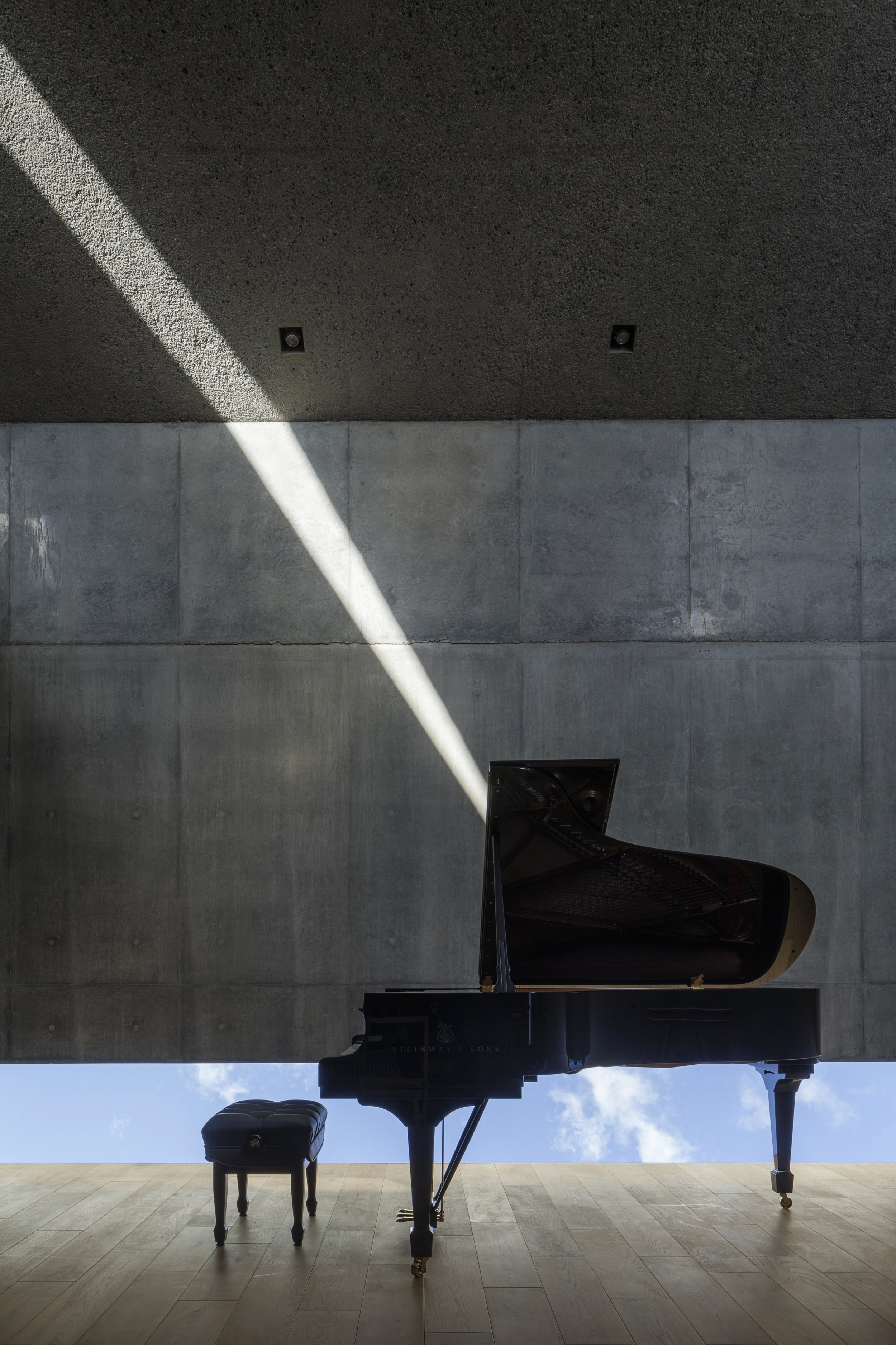
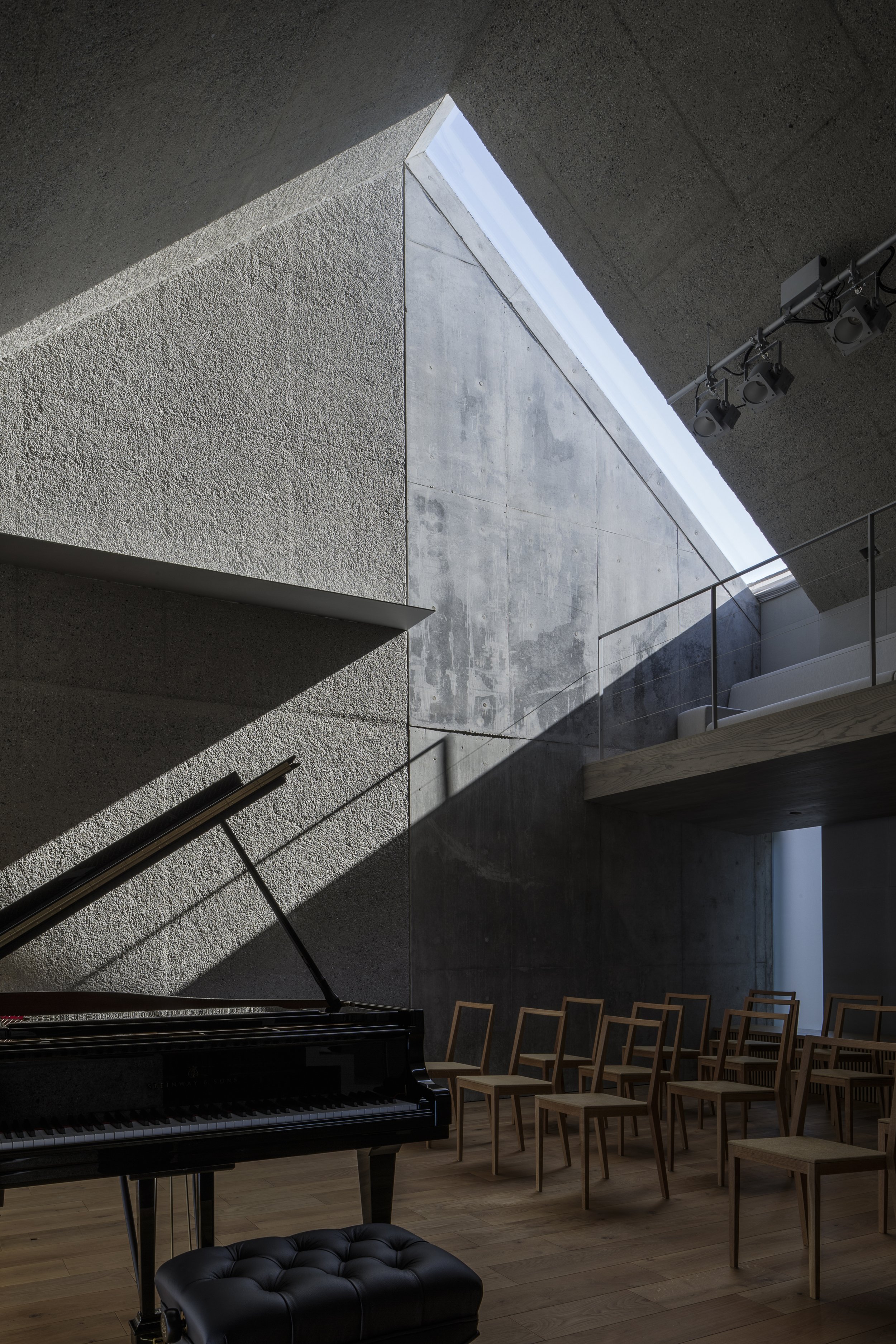
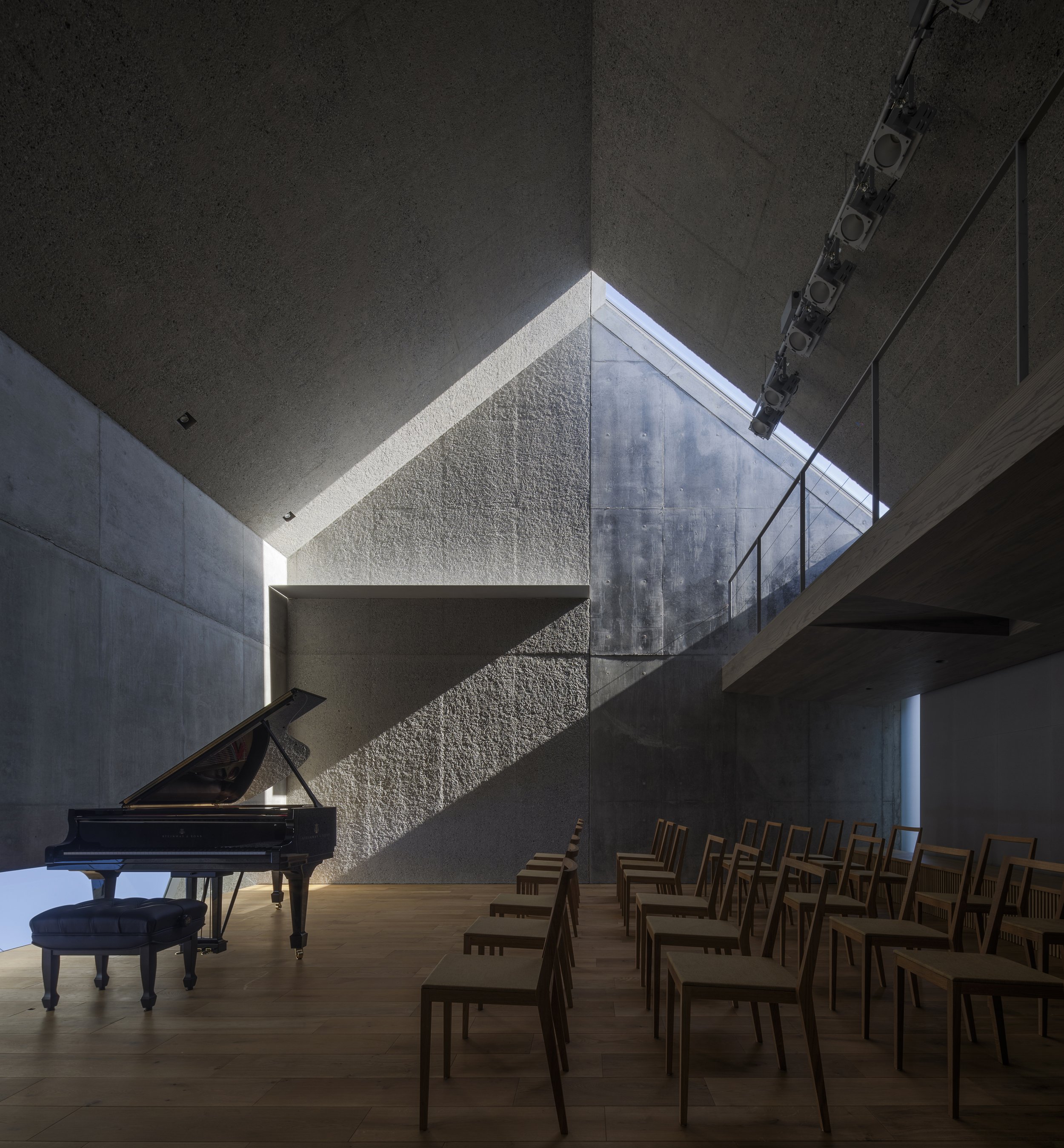
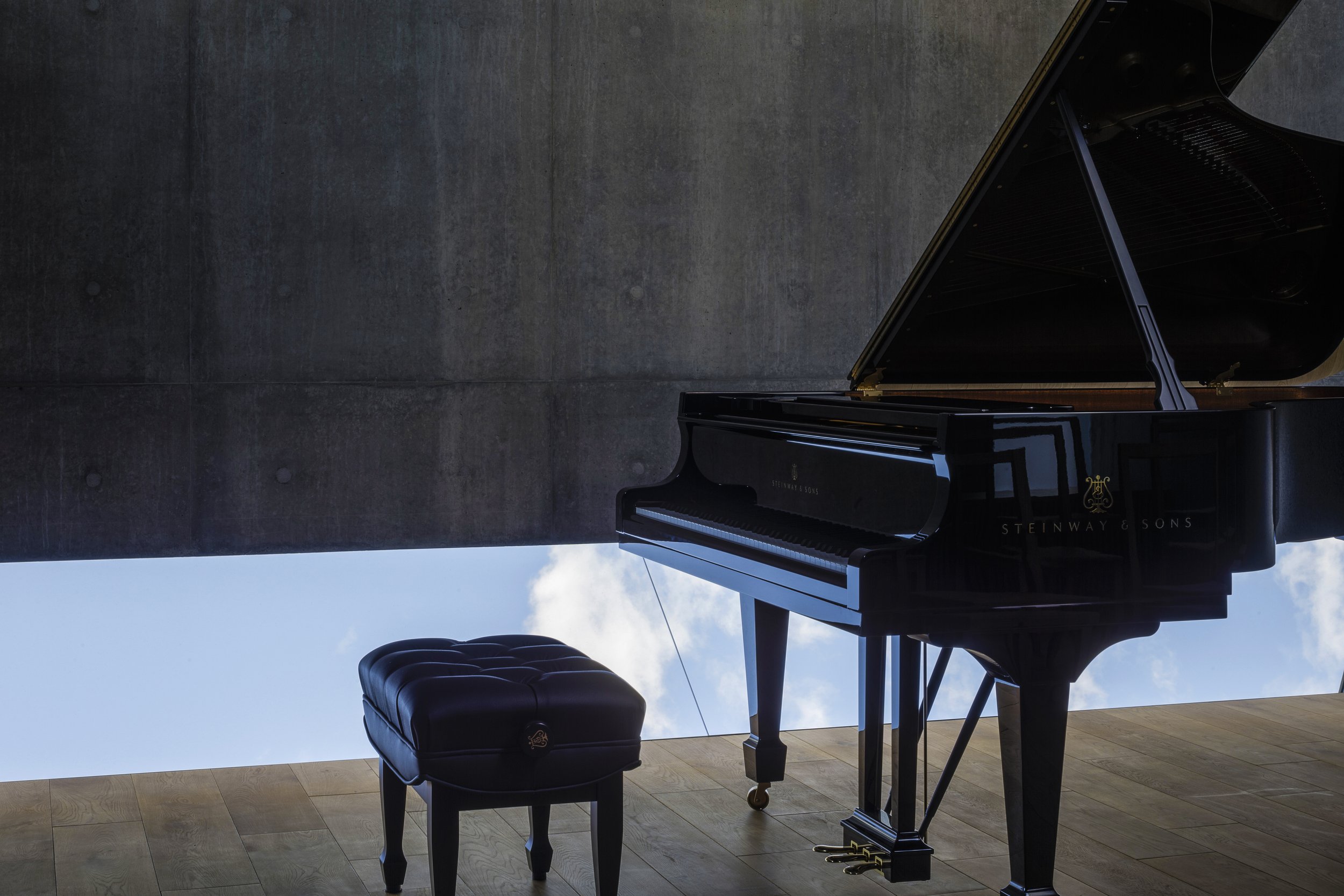
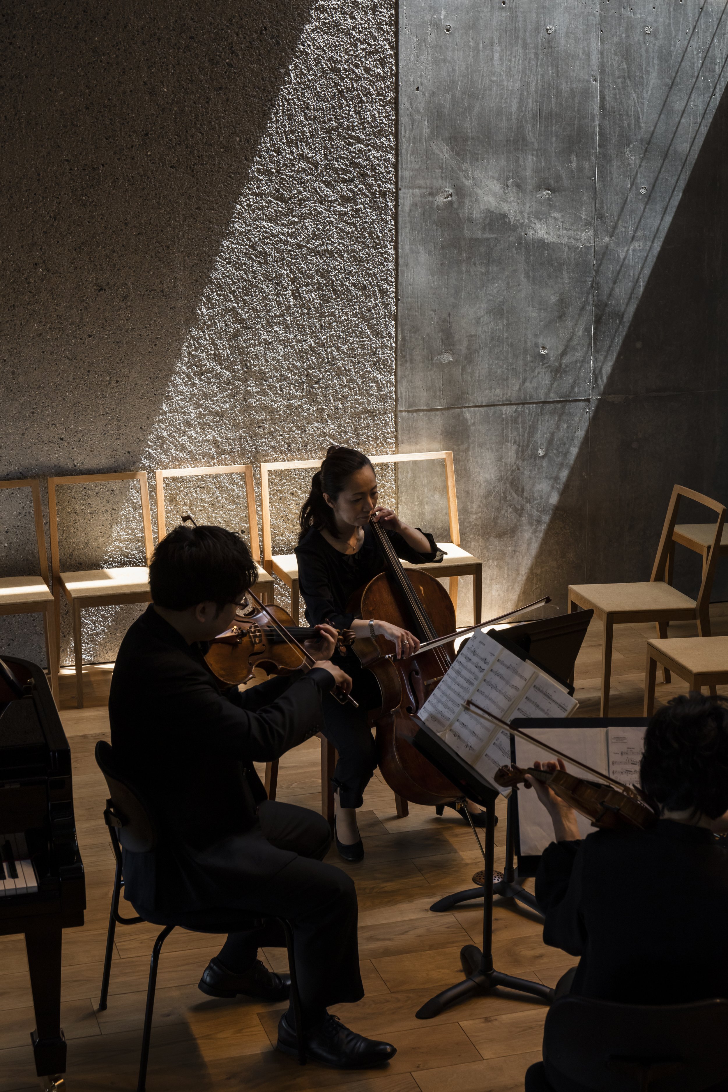
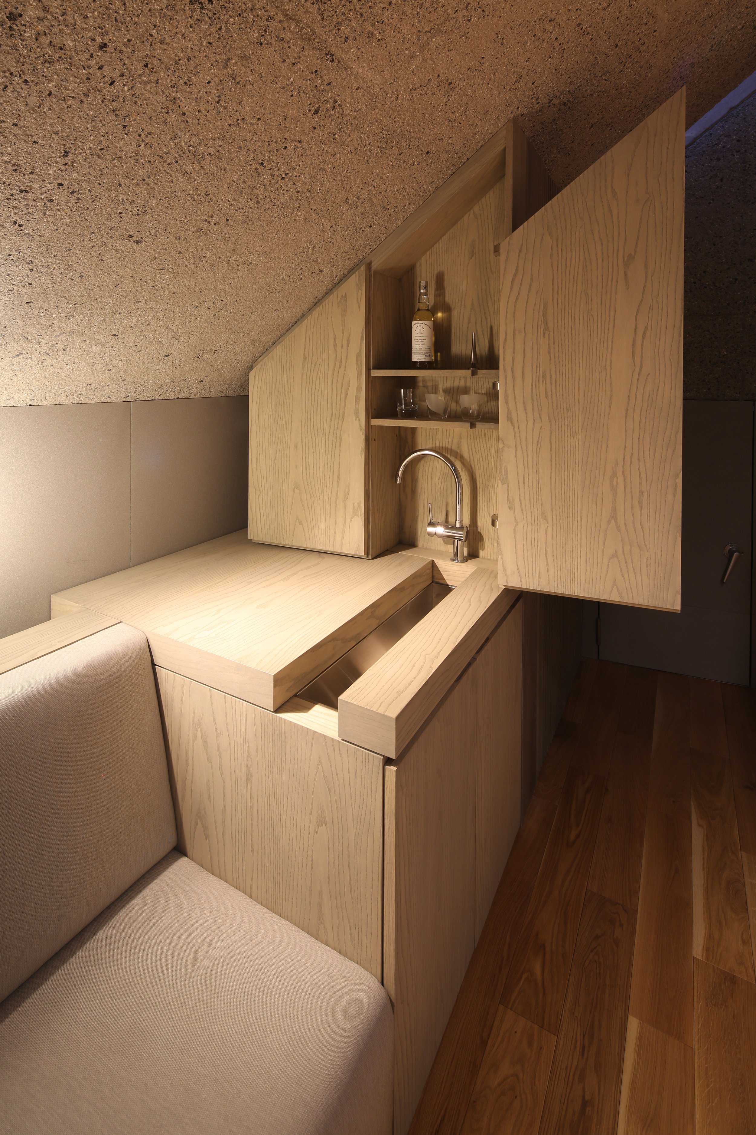
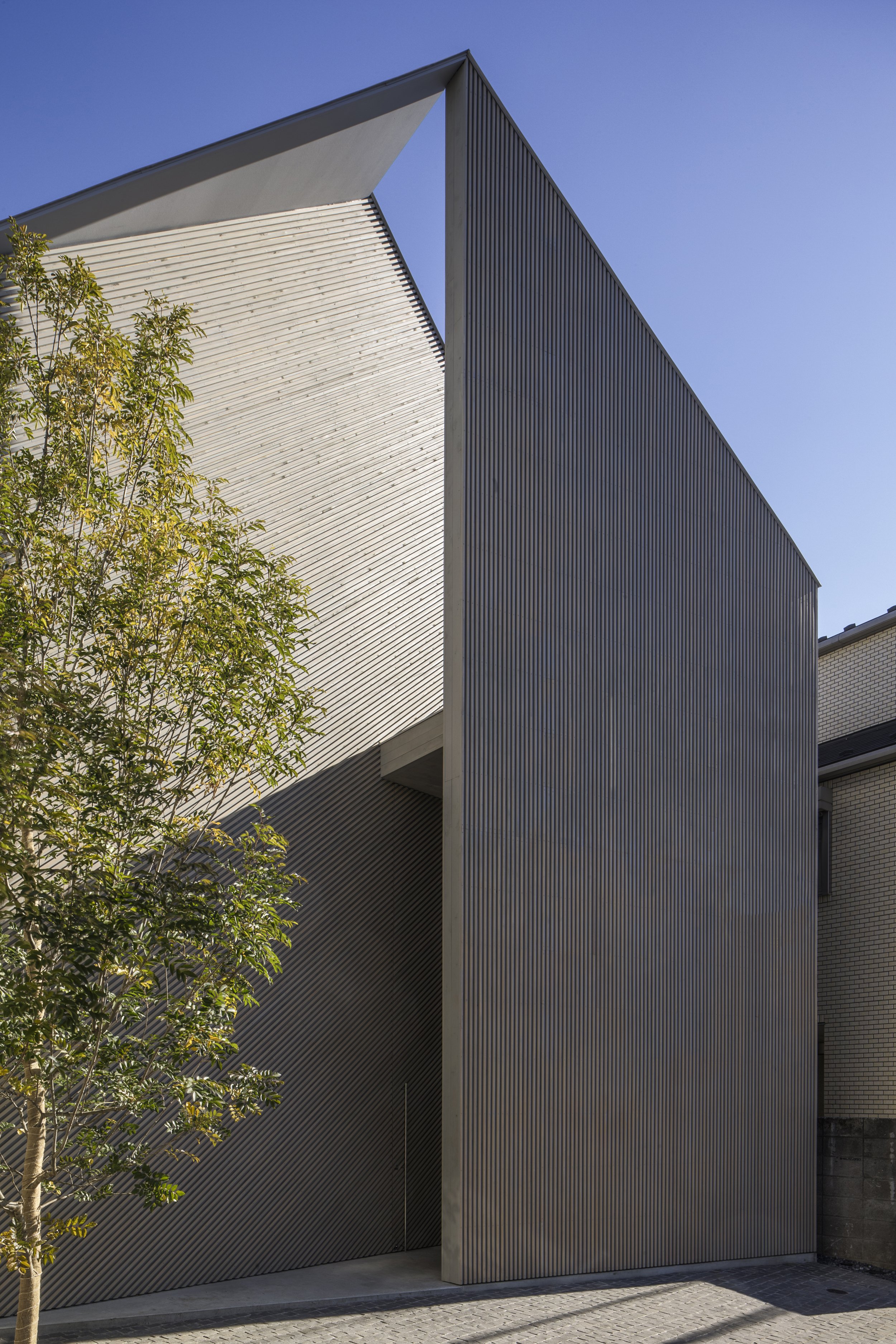
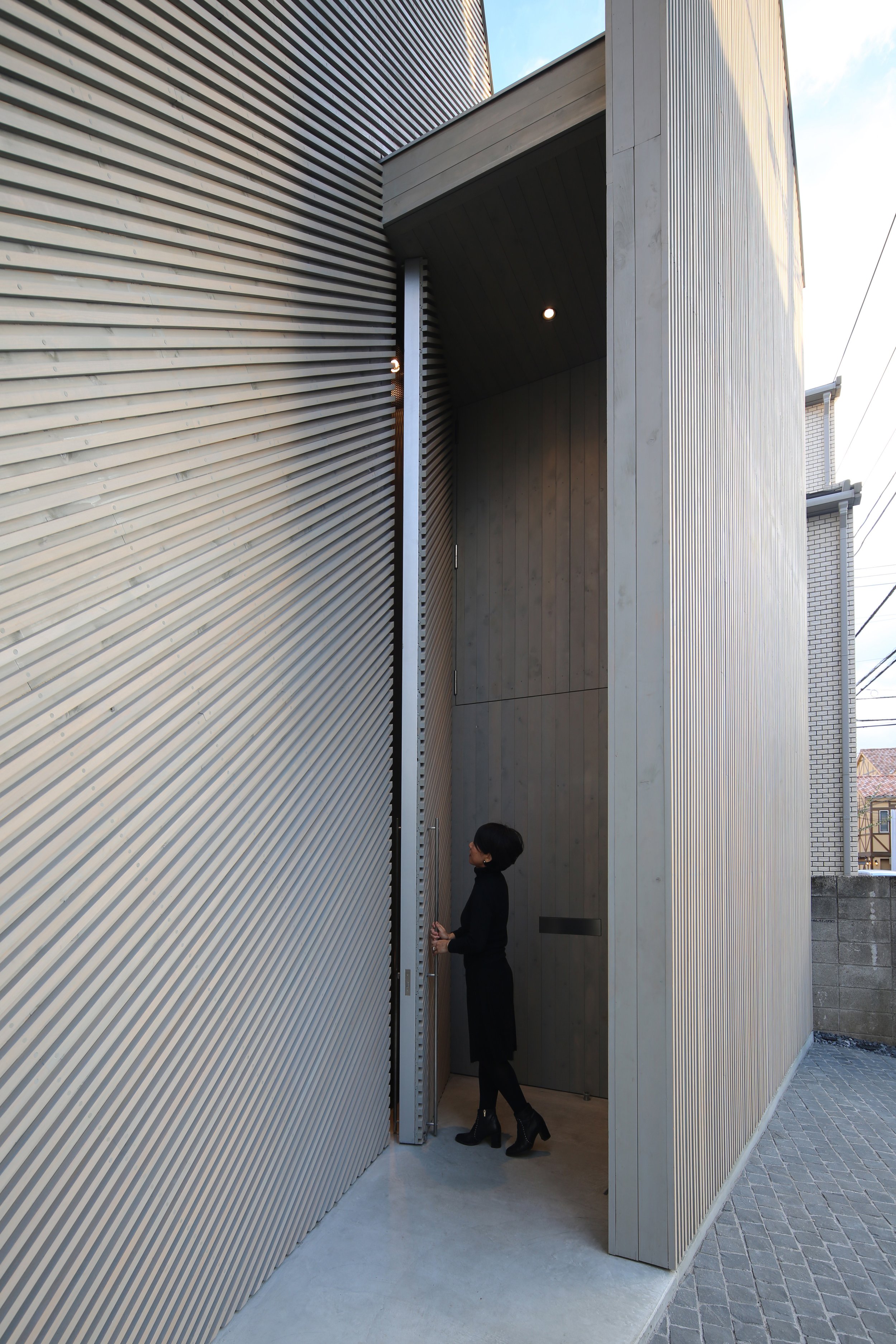
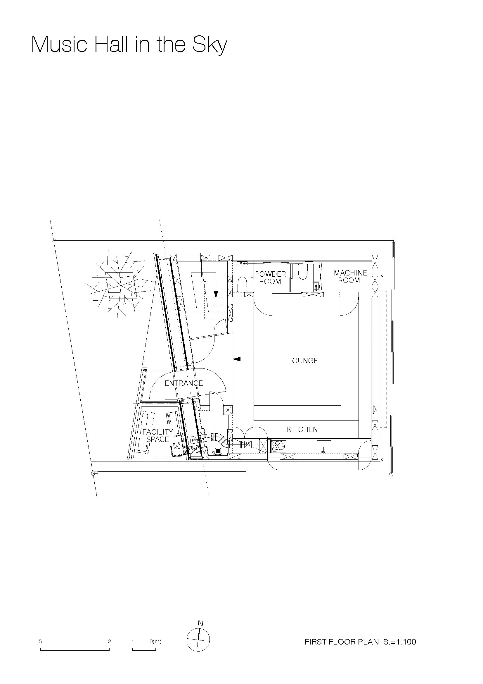
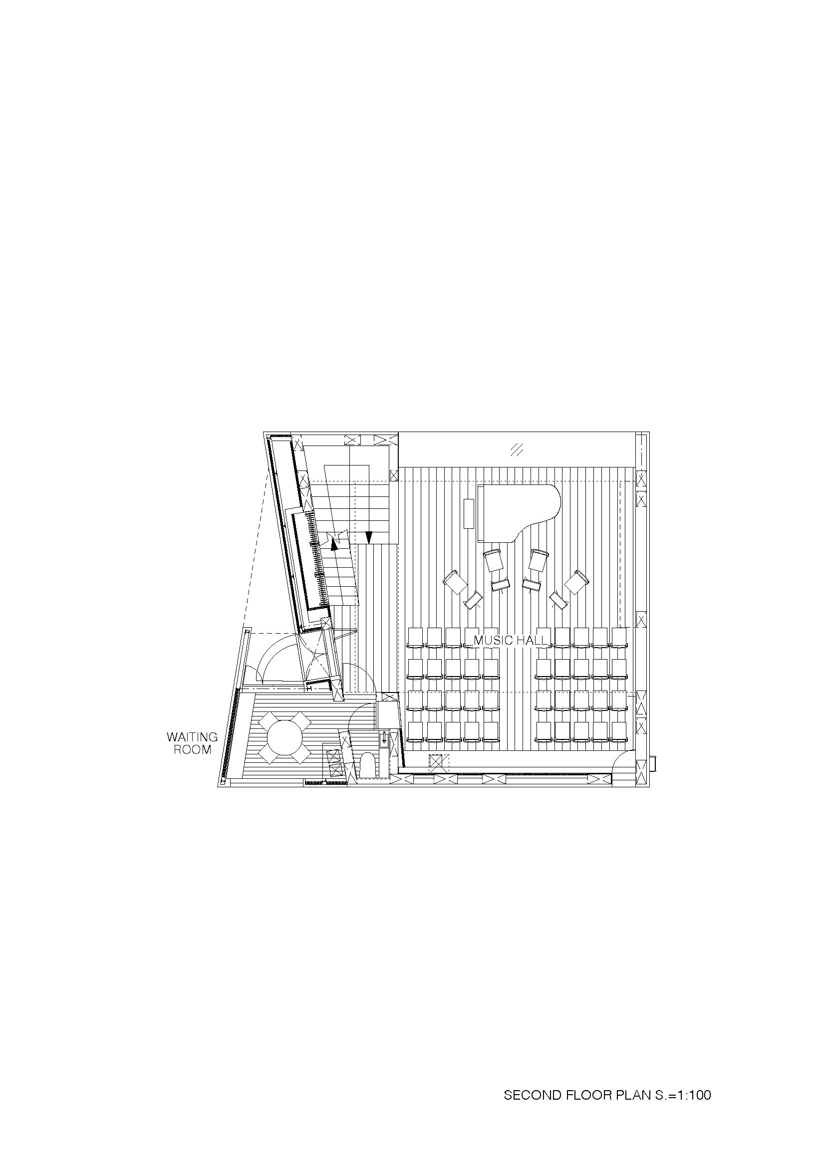
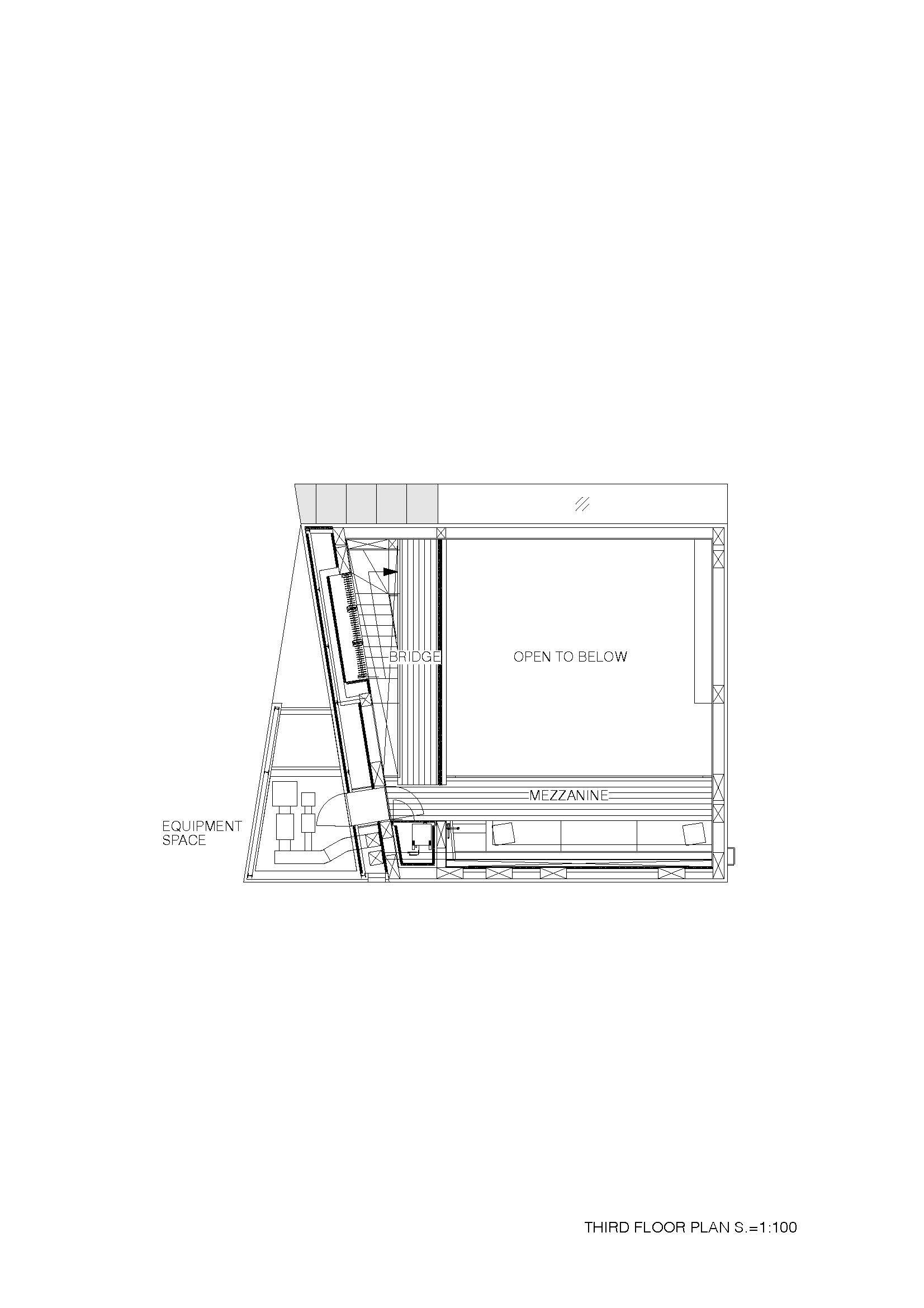
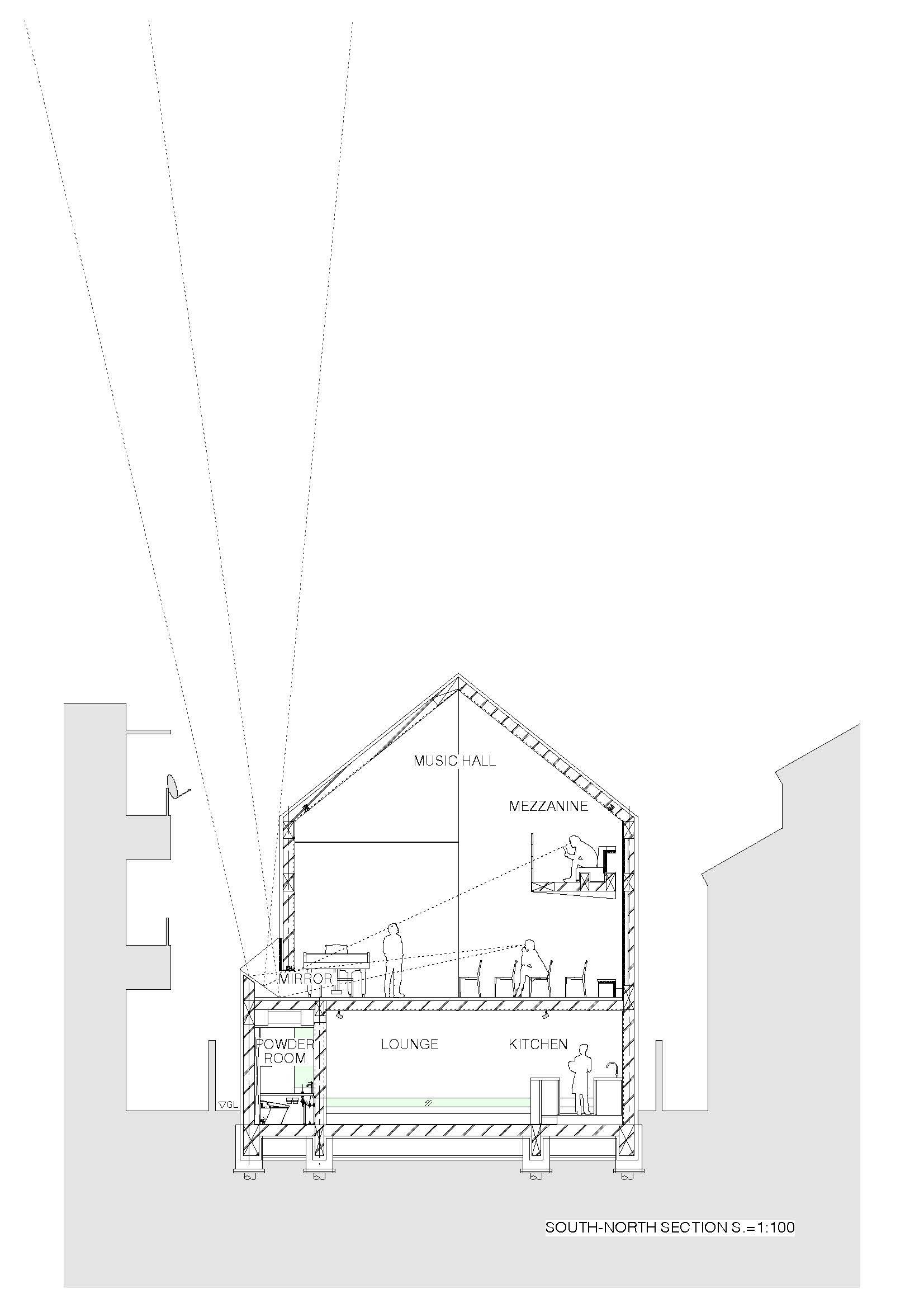
Takuro Yamamoto Architects won the Bronze Award for Music Hall in the Sky at the Sky Design Awards 2022. In a residential area of Tokyo, Music Hall in the Sky is a small classical music concert hall with about 50 seats. It is surrounded by collective housing and three-story houses, but despite this, you can listen to music in an environment where only the sky can be seen outside the window because the adjacent houses cannot be seen from the hall's windows.
Takuro Yamamoto Architects won the Bronze Award for Music Hall in the Sky at the Sky Design Awards 2022.
In a residential area of Tokyo, Music Hall in the Sky is a small classical music concert hall with about 50 seats. It is surrounded by collective housing and three-story houses, but despite this, you can listen to music in an environment where only the sky can be seen outside the window because the adjacent houses cannot be seen from the hall's windows.
It is common for concert halls to be designed without windows. For staging reasons and sound insulation, concerts are generally separated from everyday life by having no windows in the hall, especially in large halls. A windowless hall, however, is inappropriate for a space that should be relaxing, because it creates a sense of captivity in the audience.
Architect Takuro Yamamoto also believed that if you could see the sky when looking lower than eye level, it would be a very unusual experience similar to looking out the window of a plane, and this would make you feel as if the whole building were surrounded by the sky instead of buildings. The mirror and the top light were combined to create a ribbon window at the foot of the stage. Listeners may enjoy concerts in this hall on a Sunday afternoon and escape everyday life for a while by watching the blue sky and floating clouds.
Drawing & Planning
Designer Profile
Takuro Yamamoto
Takuro Yamamoto Architects
Born in Shiga Prefecture in 1973. Though admitted to the Department of Mechanical Engineering, Faculty of Engineering, Kyoto University, intending to design aircraft, he changed his track when he encountered architecture. After working with Nippon Electric Co., Ltd., he enrolled in the Department of Architecture, Faculty of Science and Engineering, Waseda University. Completing the master’s course in 2003, he joined Atelier Bow-Wow. Then, he established Takuro Yamamoto Architects in 2005. Worked as a part-time lecturer at Shibaura Institute of Technology from 2010 to 2014 and at Waseda University from 2013 to 2016.
ARCHITECTURAL SYNOPSIS:
Credits : Takuro Yamamoto Architects
Location :Tokyo
Use : Music Hall
Site Area : 140.57m2
Building Area : 84.16m2
Total Floor Area :188.91m2
Completion : November 2019
Structure : Reinforced Concrete + Steel
Client : a married couple
Architect : Takuro Yamamoto
Structure Design : Takashi Baba Structure Design Office
Acoustic Design : Nagata Acoustics
Construction : Shin Co., Ltd.
For more information: https://takuroyama.jp
VALENTINO’S PINK PP HUE ENTERS THE EVERYDAY WITH PANTONE
A single color, tested and refined, augmented and uplifted. The iconic Pink PP hue - first conceived for Valentino’s Pink PP Fall/Winter 2022-23 Collection - tells a story of exacting standards, extensive research, and undeniable energy. Now, the hue that has taken over billboards and pulsed down the runway is entering a new sphere.


A single color, tested and refined, augmented and uplifted. The iconic Pink PP hue - first conceived for Valentino’s Pink PP Fall/Winter 2022-23 Collection - tells a story of exacting standards, extensive research, and undeniable energy. Now, the hue that has taken over billboards and pulsed down the runway is entering a new sphere.
As the first European luxury fashion brand to partner with Pantone, on a signature brand color vision, the collaboration highlights the Maison’s mastery of color, forever inscribing Creative Director Pierpaolo Piccioli’s carefully studied hue into the lexicon of design. With the special-edition items, customers can bring a piece of Pink PP into their lives, living alongside an evocative color that forever represents a pioneering vision of fashion.
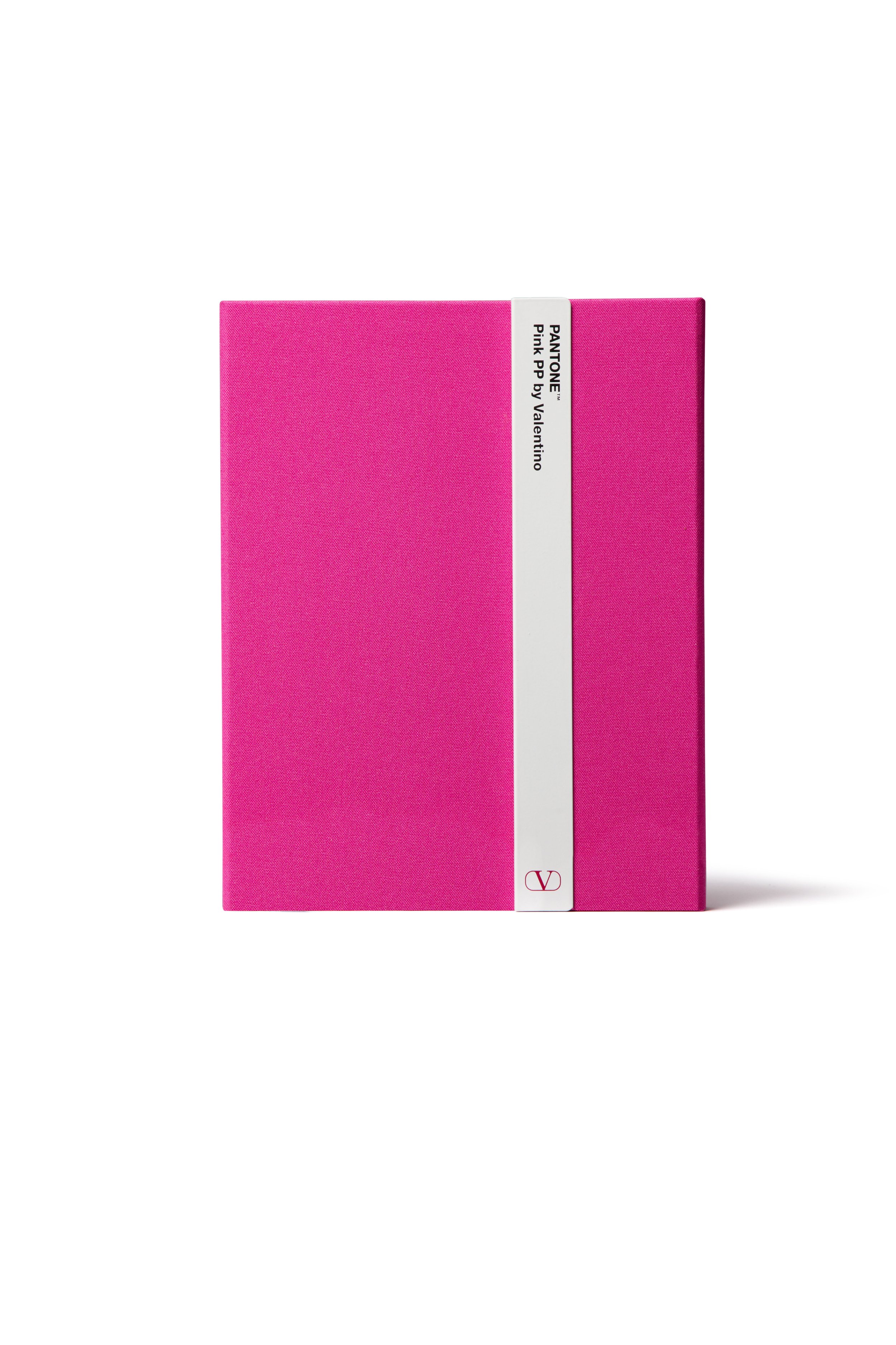
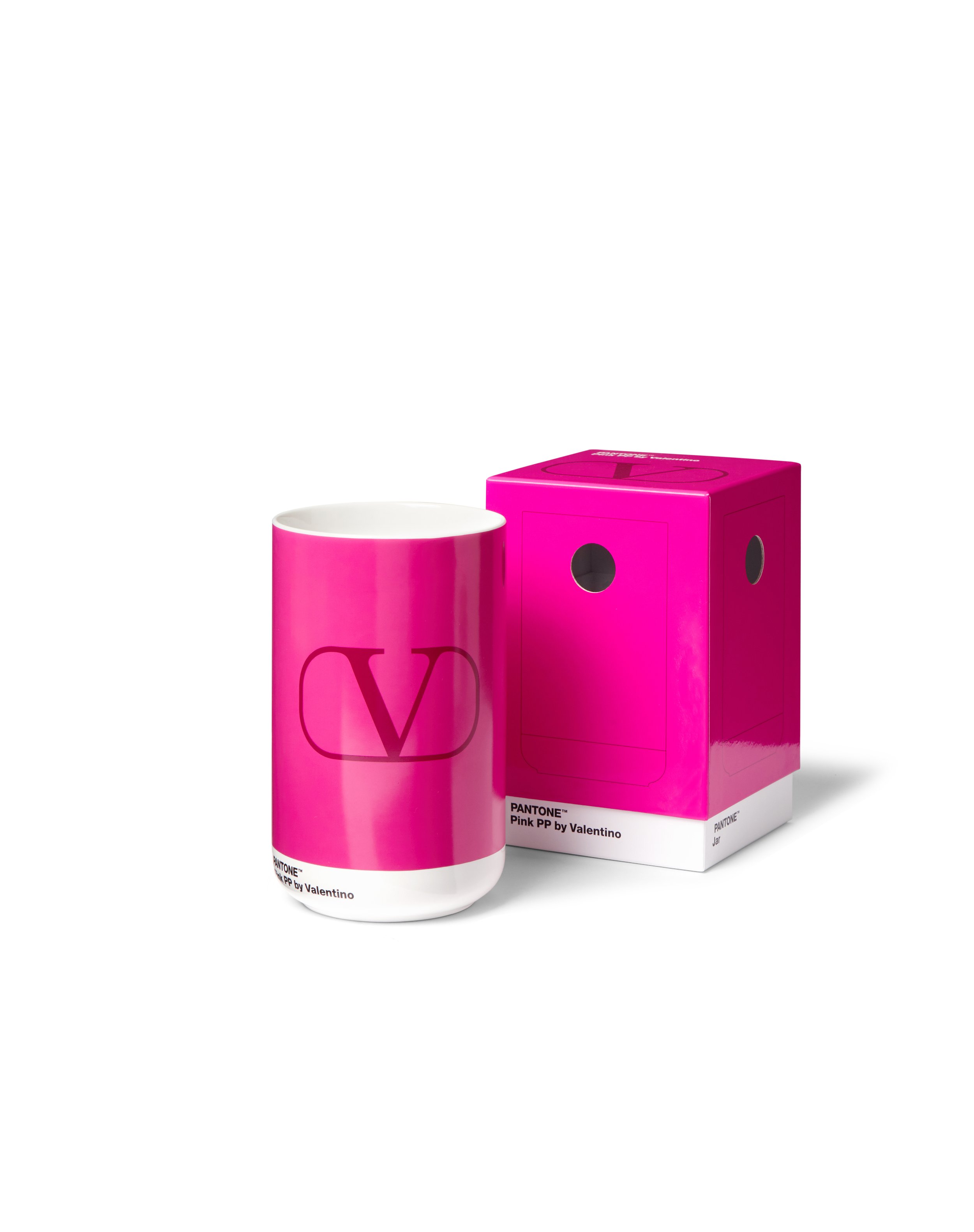
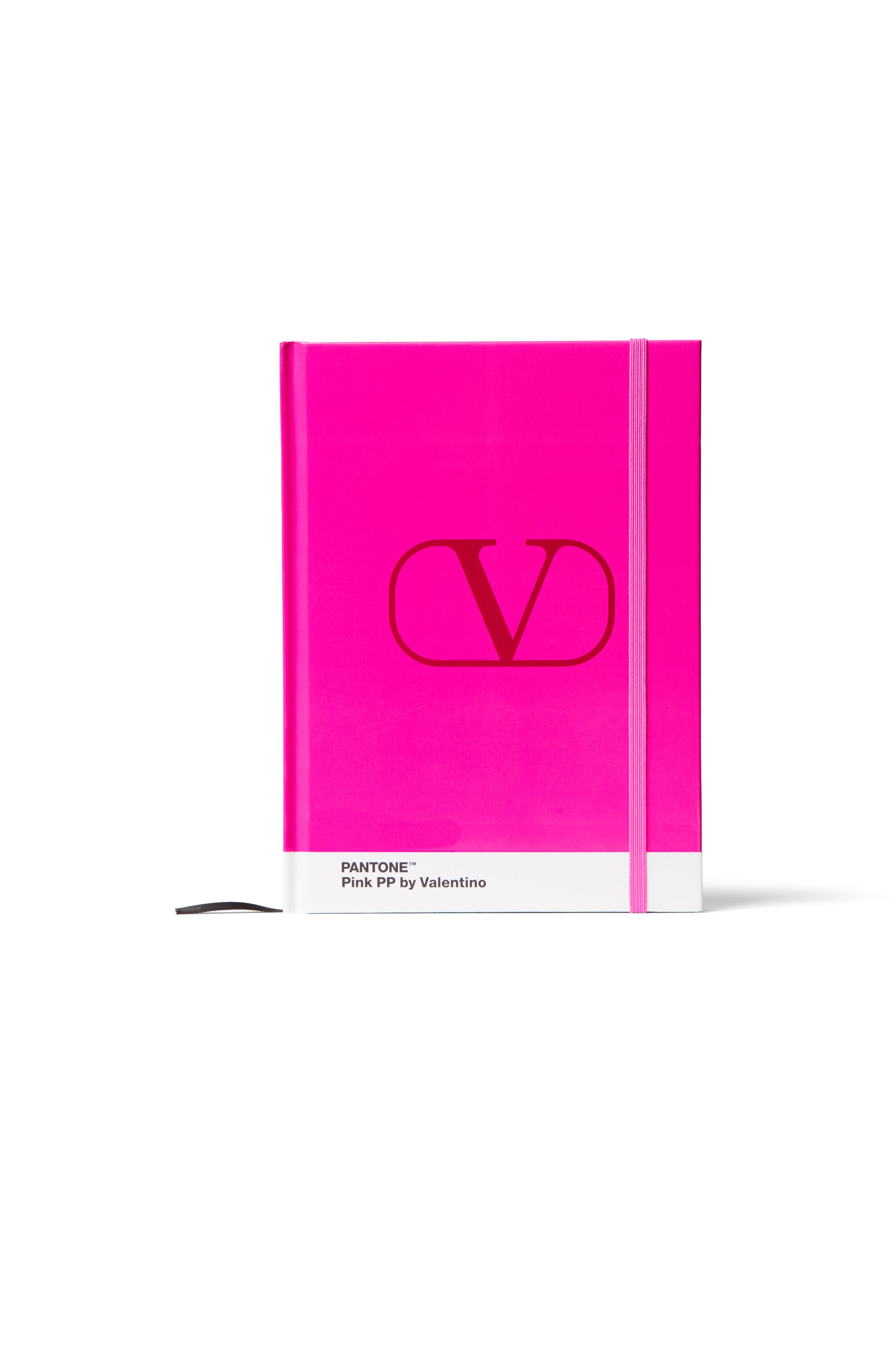
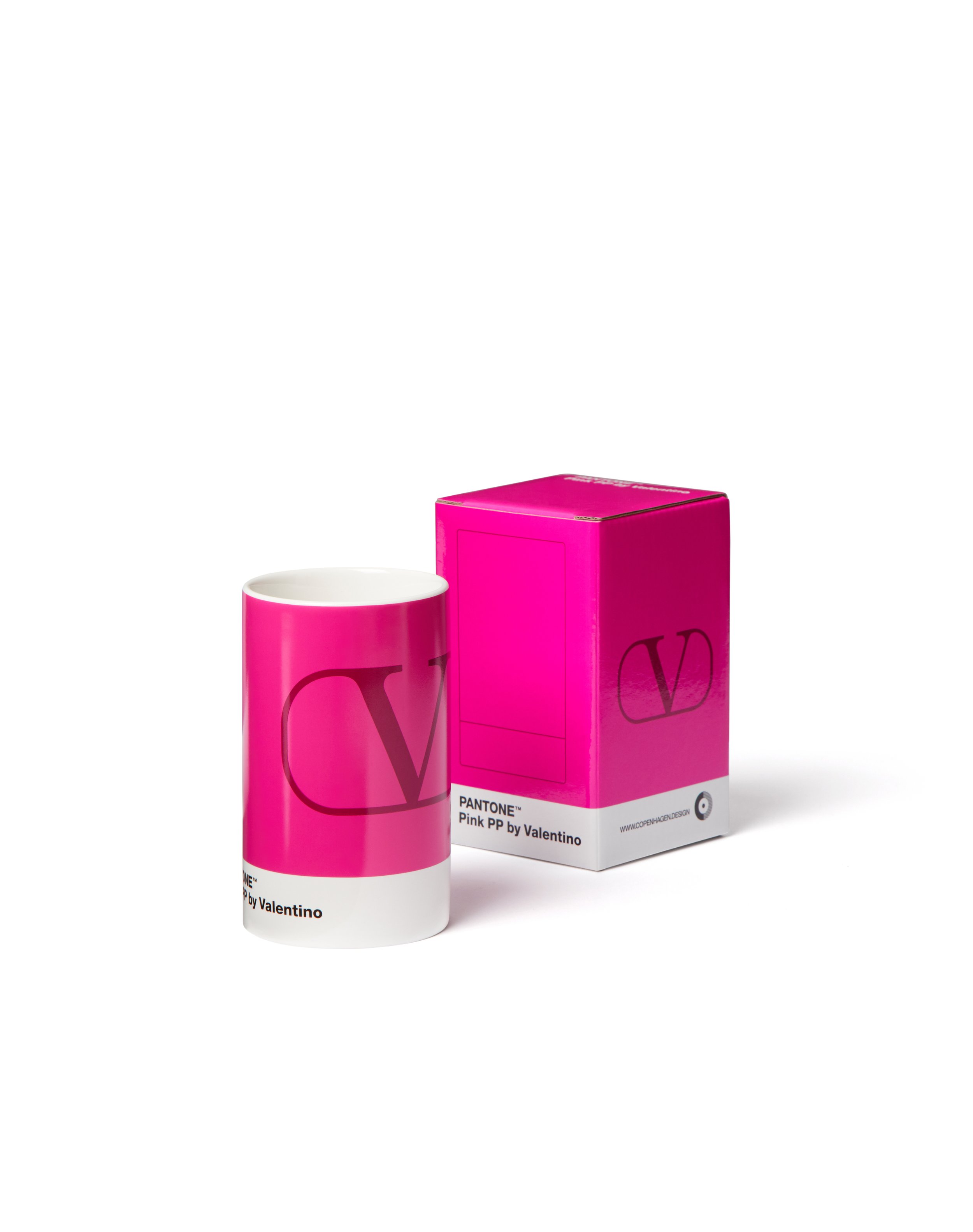
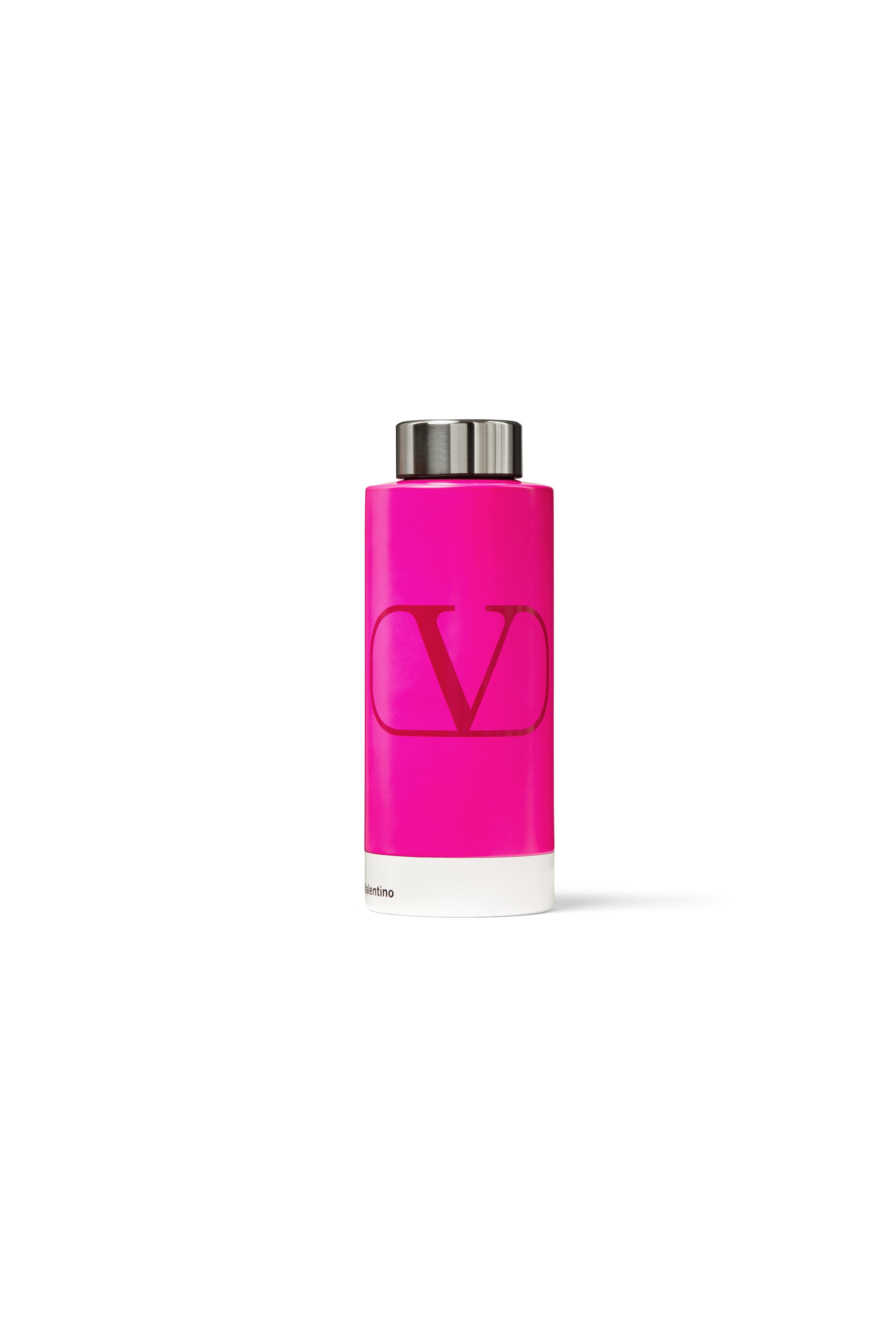
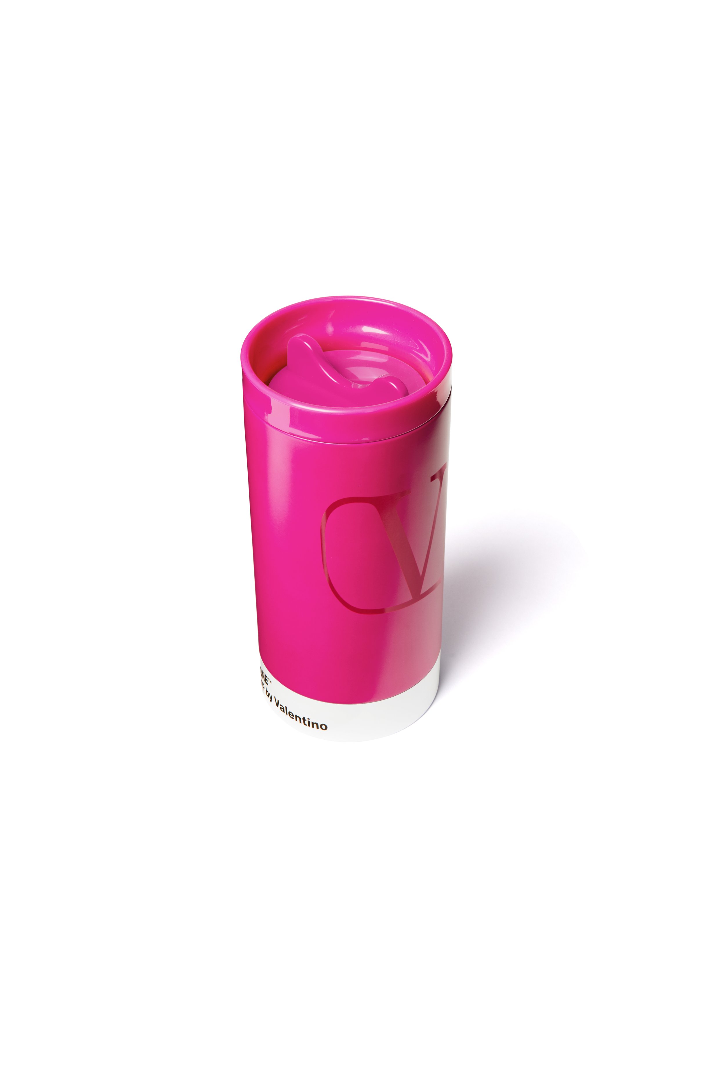
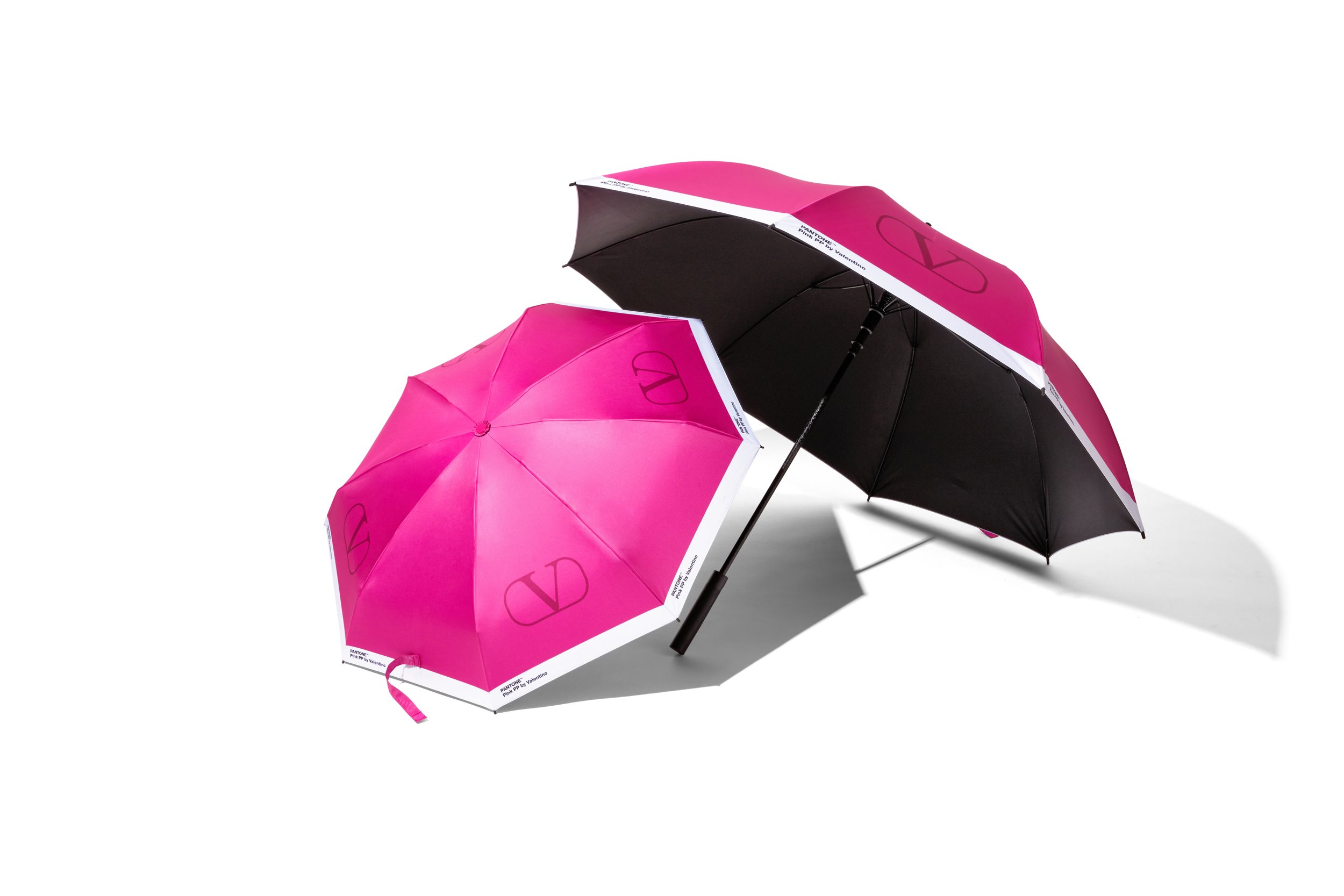
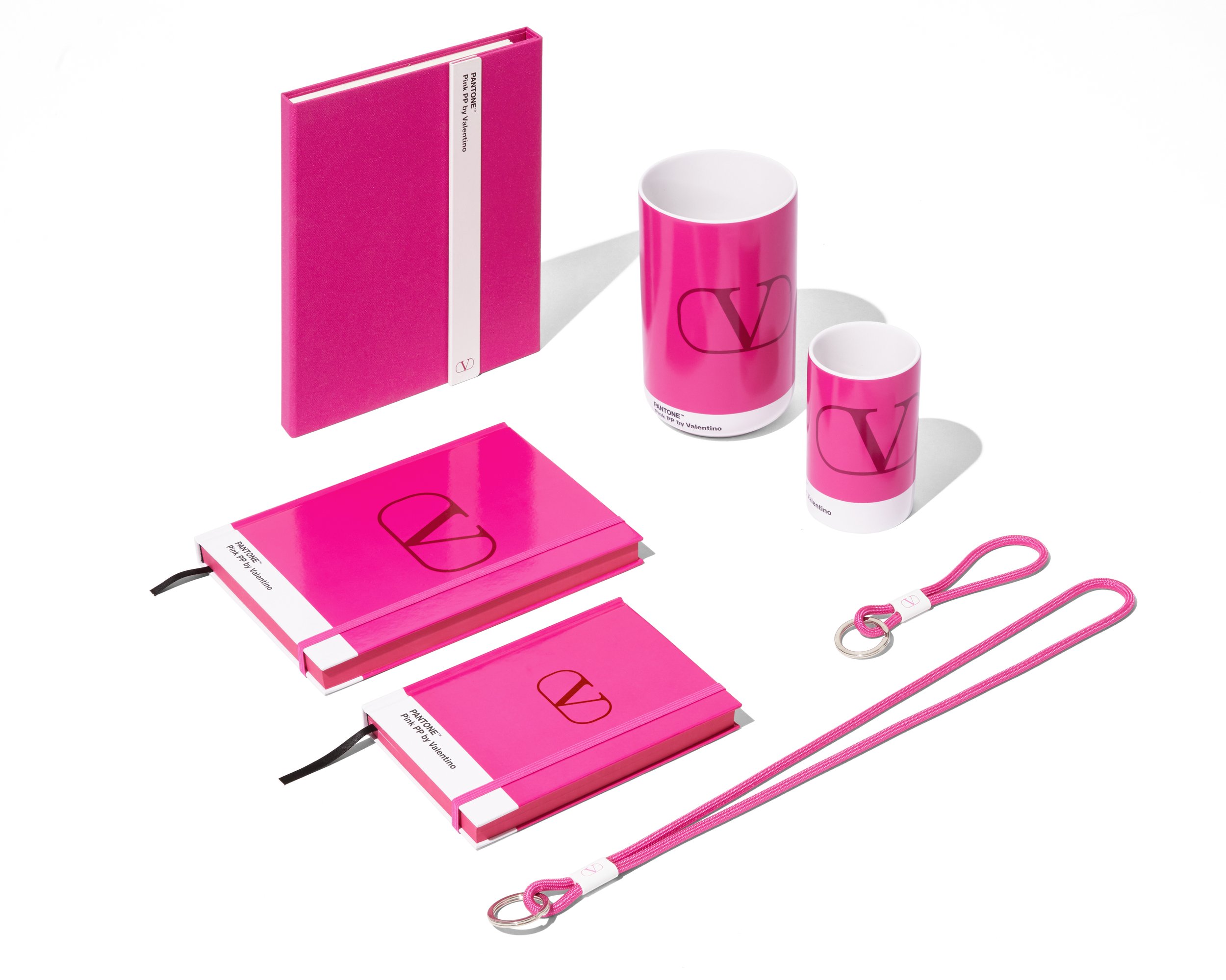
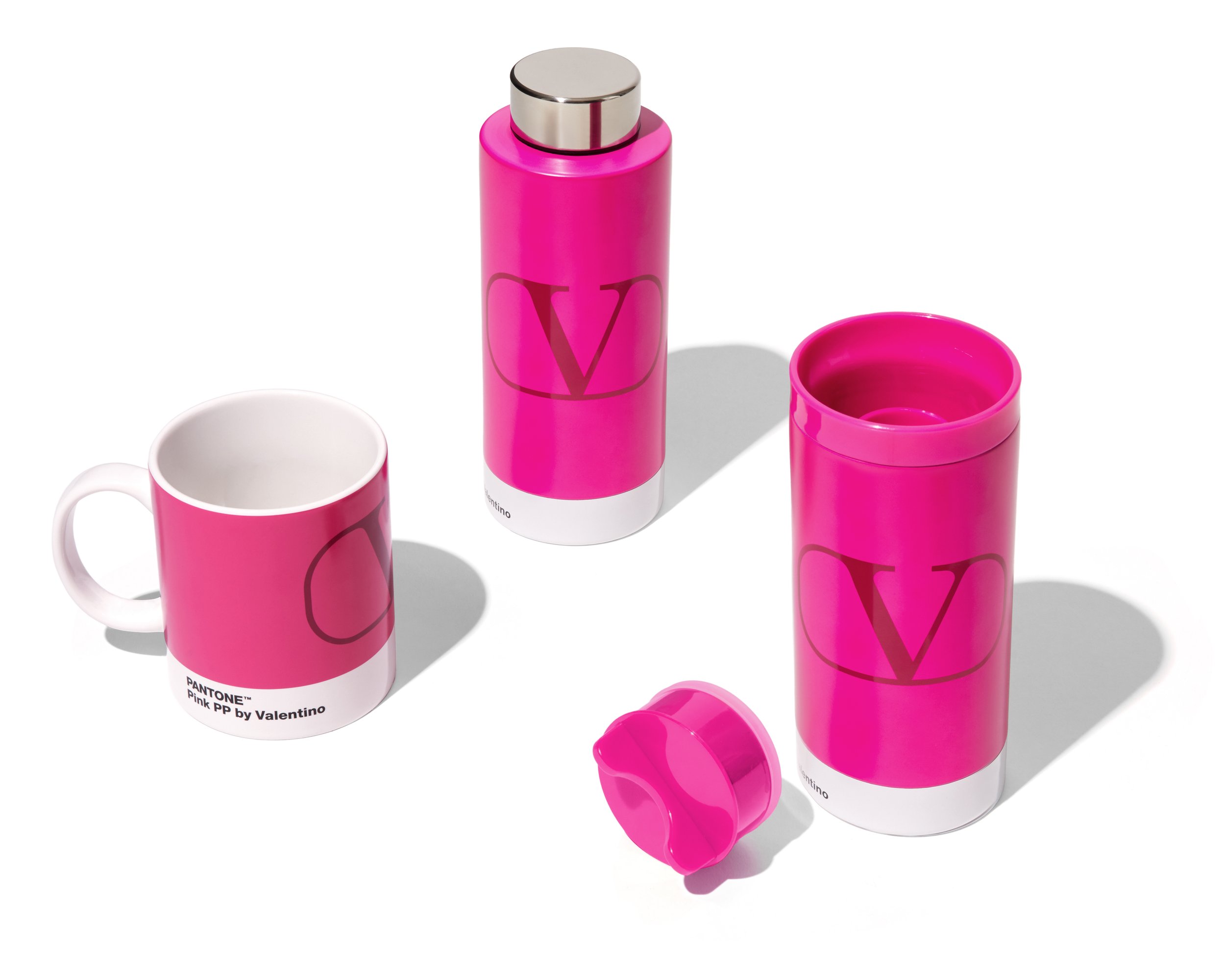
Together with the Pantone Color Institute - the definitive authority on all-things color - Valentino is releasing a selection of limited-edition objects in Pink PP, brought to life by Danish object developer Copenhagen Design ApS. Individual and unrepeatable, the color can now be seen on 11 items, ranging from to-go mugs and keychains to notebooks, jars, and even a logoed umbrella. Crafted in premium materials, each item echoes the design of the iconic Pantone chip, featuring the Pink PP by Valentino color, along with the Maison’s storied logo.
To celebrate the collaboration, special pop-ups and pop- ins will be launched throughout the world in October. Entrenched in the Pink PP world, pop-ins at Valentino boutiques in Italy, France, Middle East, Singapore, Japan and more will see boutique corners drenched in the bright pink shade and sporting the 11 items. Meanwhile, special pop-ups in Tokyo’s Ginza and Omotesando districts, and in Melbourne’s Chadstone Mall allow the Pink PP effect to find traction through inventive installations.
This month, the Pink PP shade will also find itself translated into the digital. Developed with Meta’s Spark AR, an experience will bring users face to face with the iconic color on Instagram. Through this new digital effect, the face camera will transport users into a fully pink world, while the back camera will conjure up a digital puddle onto any surface, from which collection items will arise, giving way to a mixed reality experience. This innovative AR experience will be available to users globally starting from 10th Oct 2022 through Valentino’s Instagram account.
Color holds an immense and emotive power. Through the Maison’s latest collaborations, its signature hue can enter into our daily lives, leaving a carefully crafted mark on the objects we know and love.
For more information, please visit: https://www.valentino.com/en-hk/experience/pantone-and-valentino-pink-pp
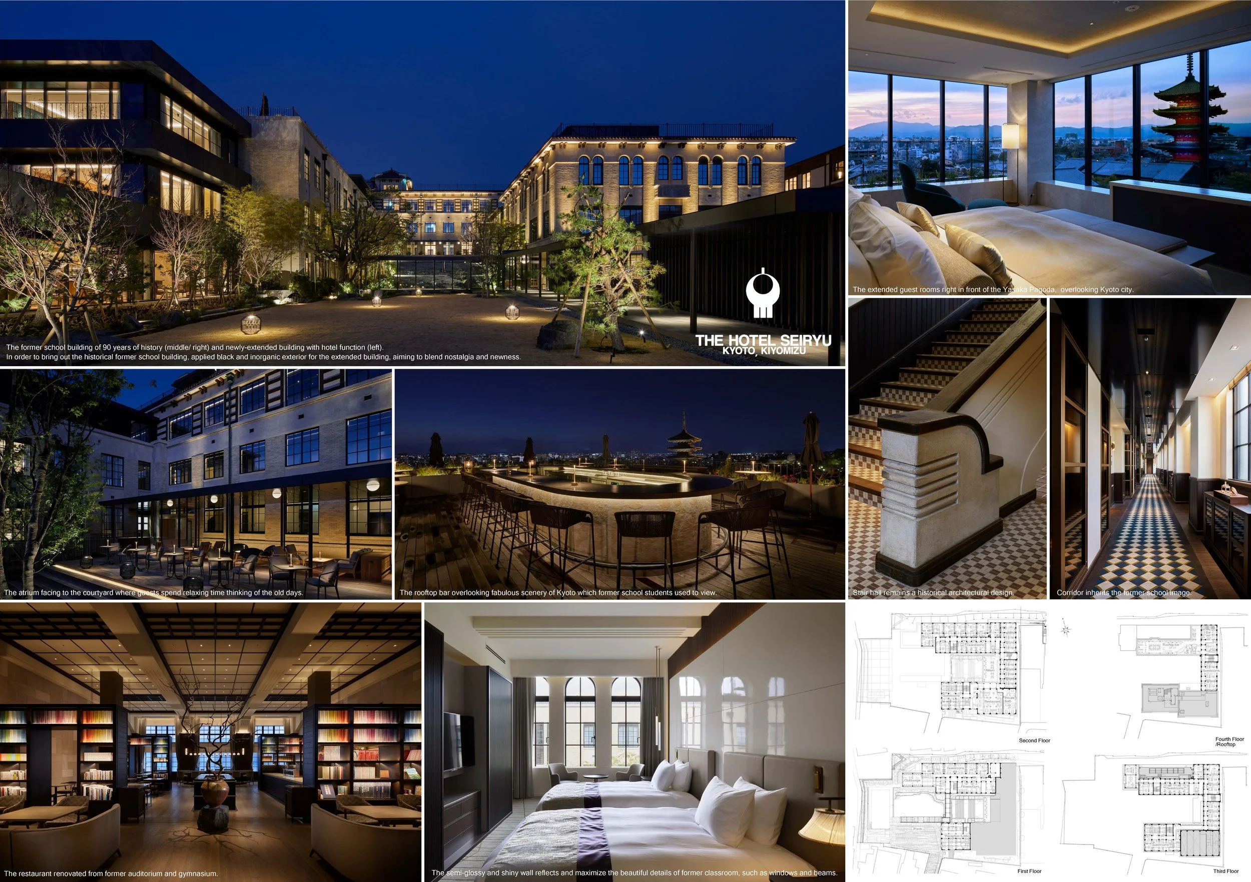
The Hotel Seiryu Kyoto Kiyomizu has conserved and re-concerned the aesthetics of Japan and design by Nomura Co., Ltd A.N.D
Hotel Seiryu Kyoto Kiyomizu is a renovation initiative that aimed to preserve and re-recognize the Japanese beauty of the former Kiyomizu Elementary School with a 90-year history in Kyoto. It will have 4 floors and 6,800 square meters in total floor area.
The Hotel is located on the mountain slope with picturesque views in a district with many historical sites including significant Kyoto cultural assets, which have been nurtured by eons of history.
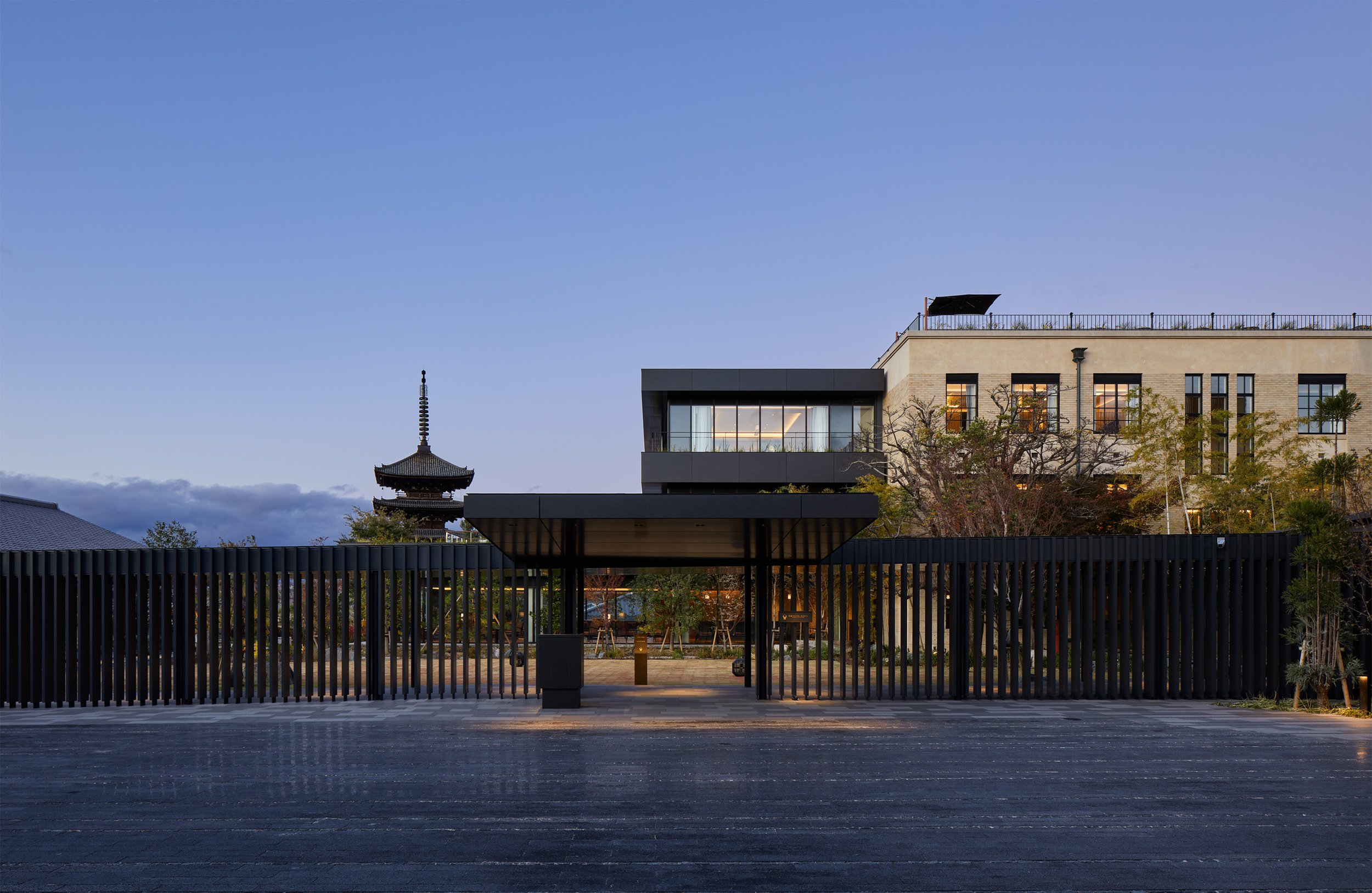
The hotel's name combines two elements: Tokyo Kiyomizu, one of the world's most popular tourist destinations, and Seiryu, a legendary guardian god of Higashiyama that embodies the spirit of this one-and-only hotel built from the remnants of an historic elementary school.
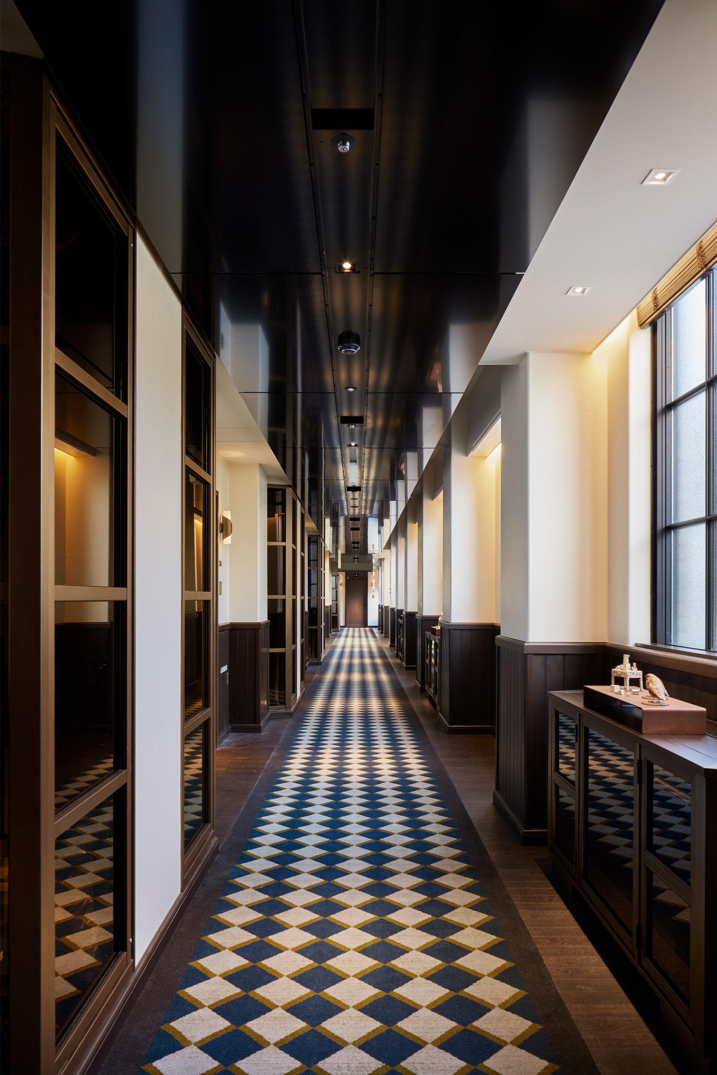
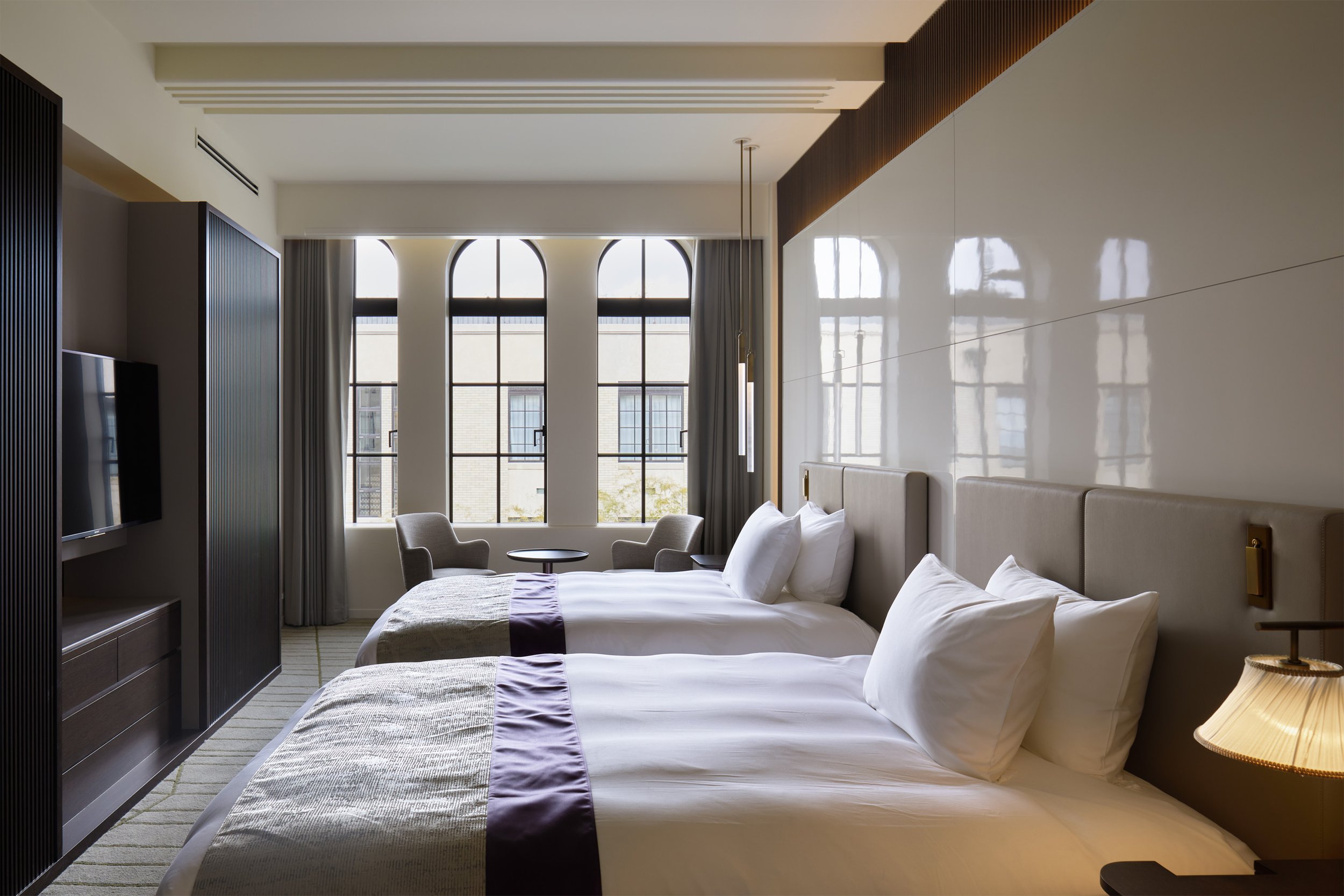
There are many delicate details in the school building. The interior of the building features not only Spanish tiles, arched windows, and double-width tiles, but also decorative haunch beams, wood spandrel walls, and mosaic tile finishing.
Design by Nomura Co., Ltd A.N.D from Japan. By combining nostalgia with newness, our team made sure to pay utmost homage to western architecture. To enhance the historic details of stairs, beams, and corridors, an inorganic, black-and-white, and semi-glossy material was selected.
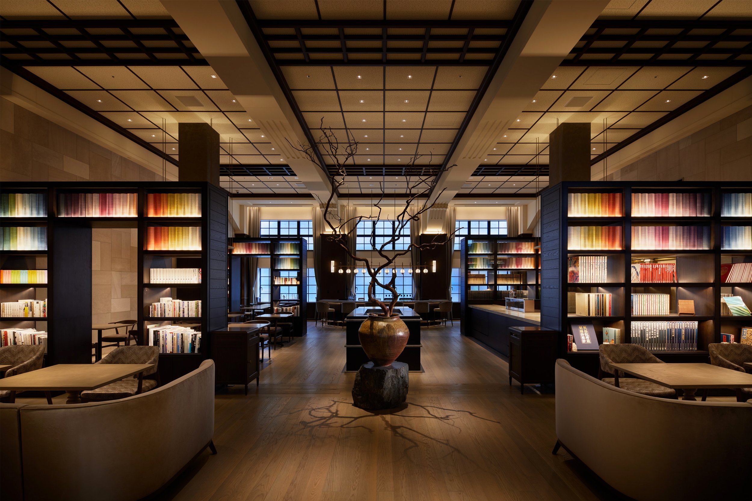
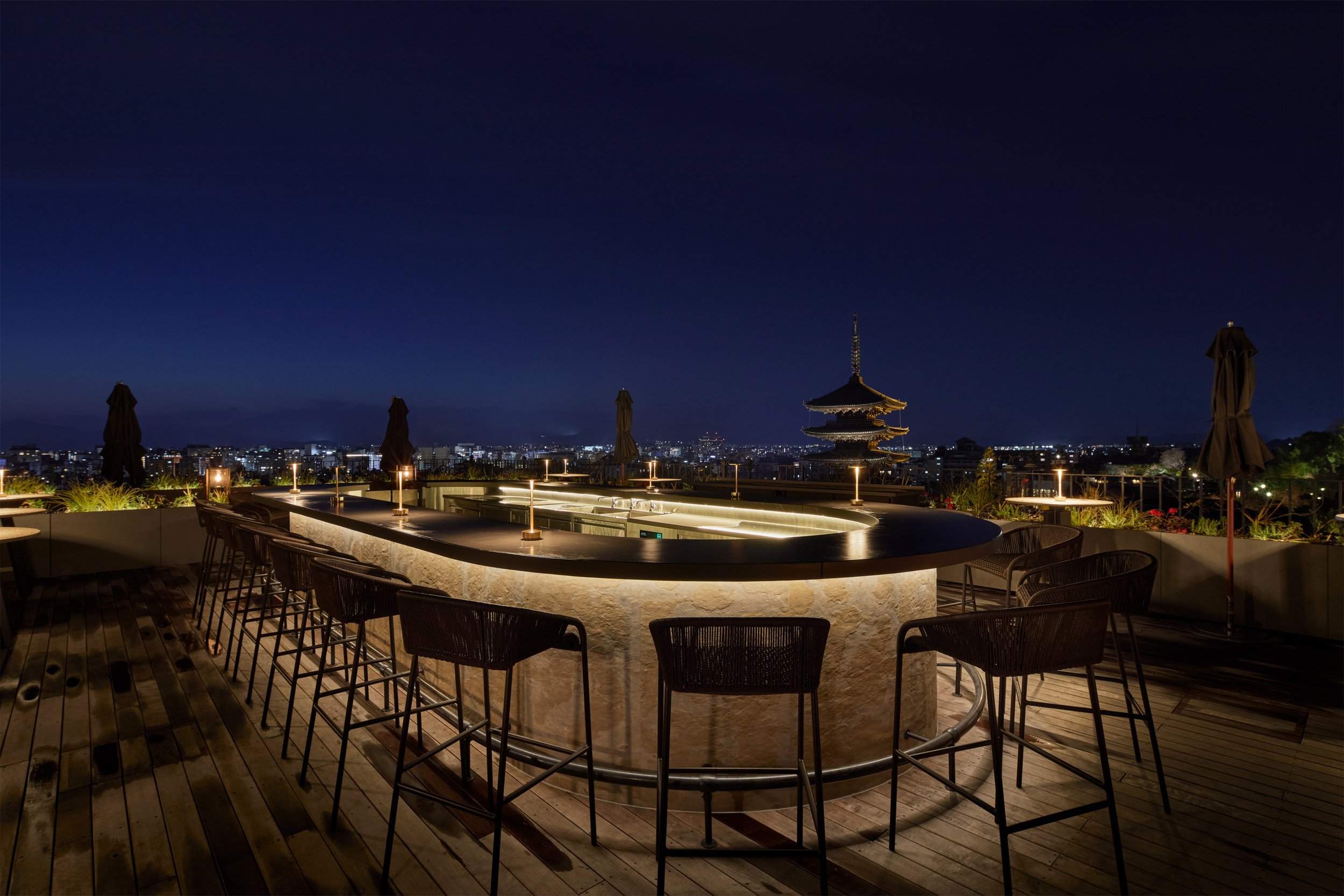
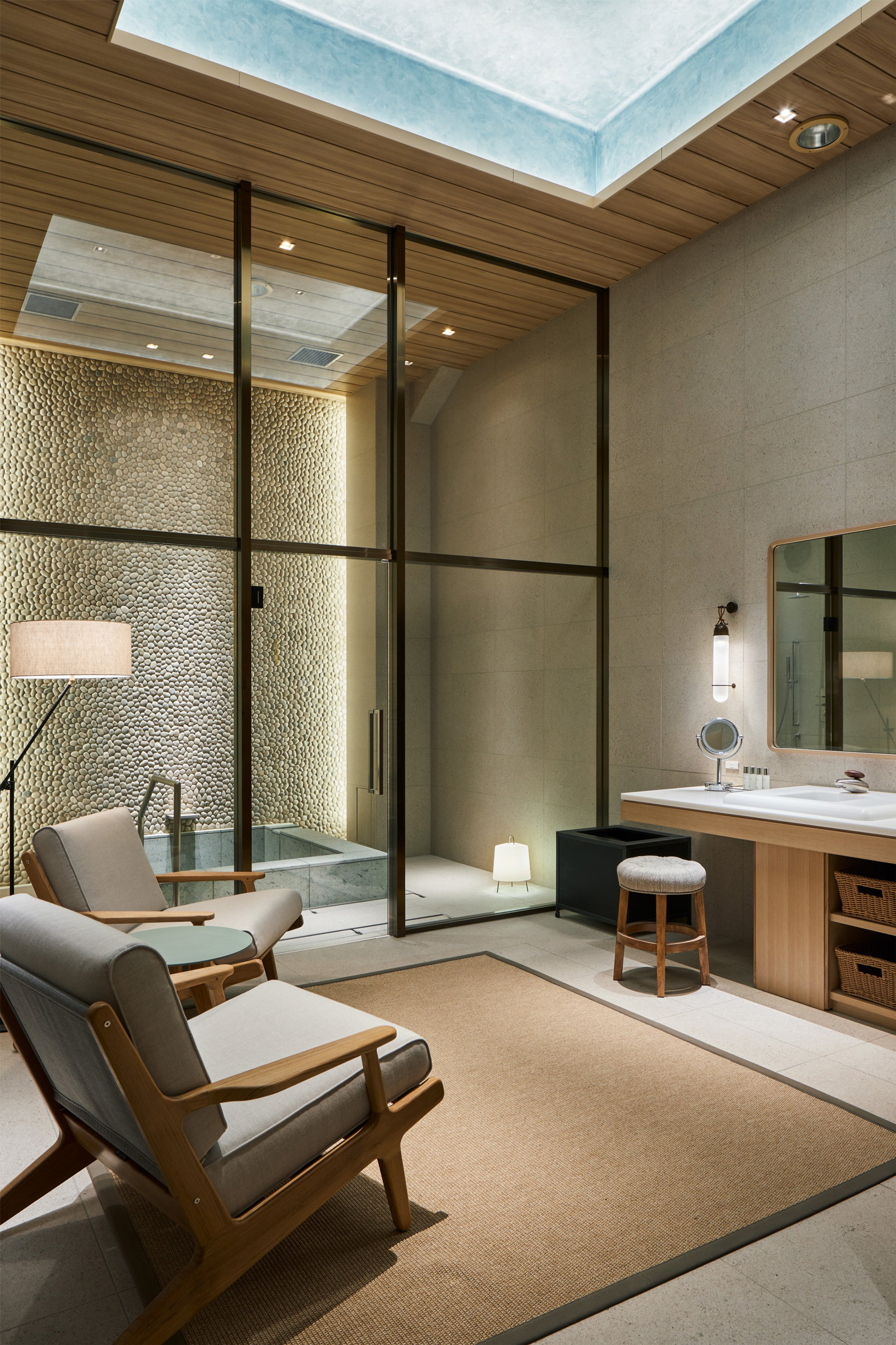
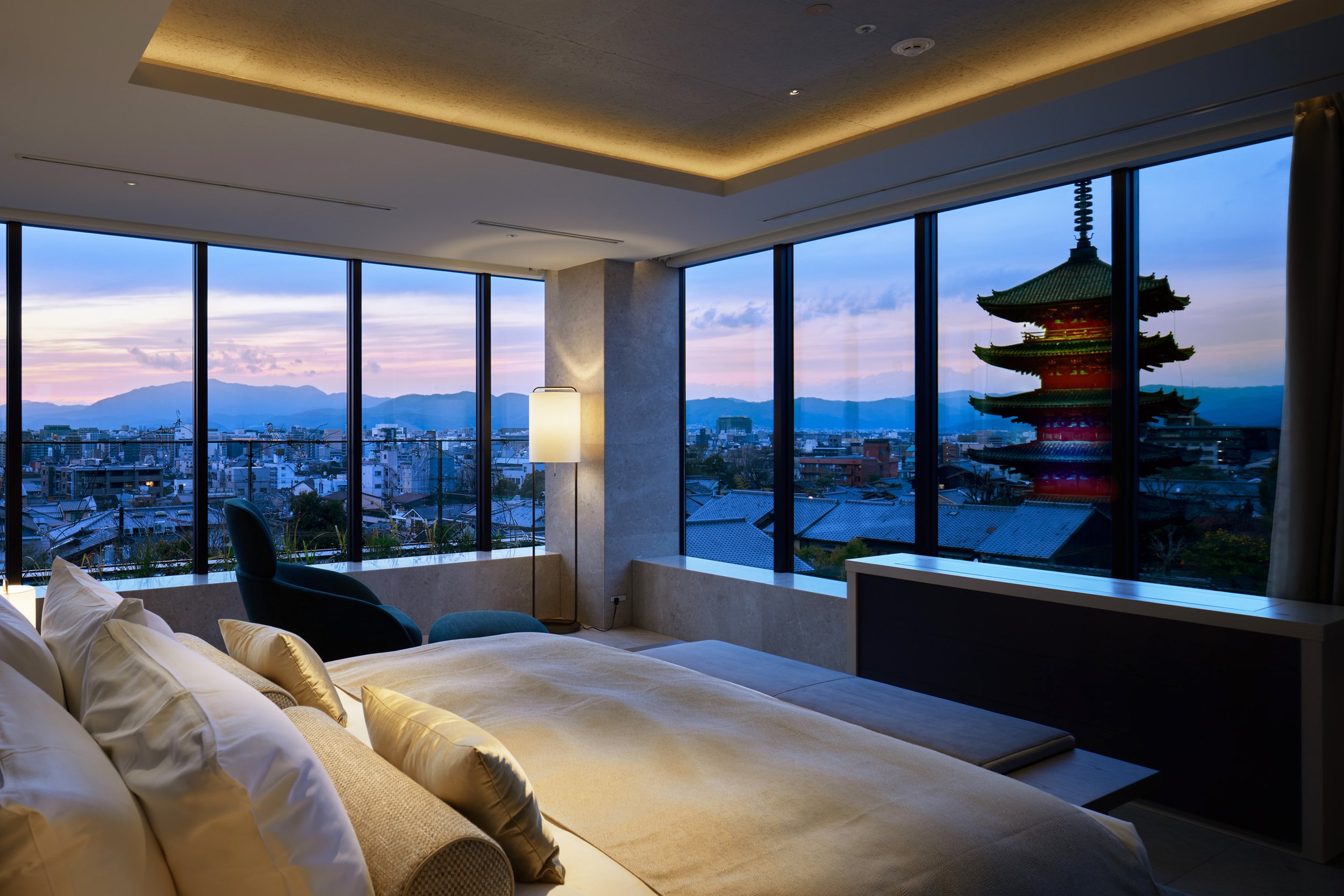
The Design Team converted gymnasiums and auditoriums formerly used by schoolchildren into restaurants and spas. A significant rooftop bar has been reborn on the former roof of the school building which overlooks Kyoto city. Guests can experience the old times by viewing the same Yasaka Pagoda, scenic mountains and city of Kyoto that former school children looked at.
The A.N.D team designed a space where guests can view photographs, documents, and records from the elementary school's history in order to realize the concept of "Imprint memories and connect to the future." The assemblance of spaces re-assigned with different stories creates a resounding "heritage hotel" where history, culture, and architecture come together.
This project plays an instrumental role in how we view the future for future generations, both according to the design team and the hotel. In this way, Japanese culture is passed on to them as well as their sense of regionality and sociality from their parents.
Designer Profiles
Left: 株式会社乃村工藝社 A.N.D. 小坂竜 A.N.D., Nomura Co., Ltd. Ryu Kosaka
Top Left: 株式会社乃村工藝社 A.N.D. 浦田 晶平 A.N.D., Nomura Co., Ltd. Shohei Urata
Top Right: 株式会社乃村工藝社 A.N.D. 安田 紘基 A.N.D., Nomura Co., Ltd. Hiroki Yasuda
Lower Left: 株式会社乃村工藝社 萠抜 徹 Nomura Co., Ltd. Toru Haenuki
Lower right: 株式会社乃村工藝社 西川 裕之 Nomura Co., Ltd. Hiroyuki Nishikawa
This project won the Bronze award in the interior design division of Sky Design Awards www.skydesignawards.com in 2021.
For more information about 株式会社乃村工藝社 A.N.D, please visit:
Kamitopen Co. Ltd. has designed the finest architecture skills throughout history - the KAMA-ASA Shop
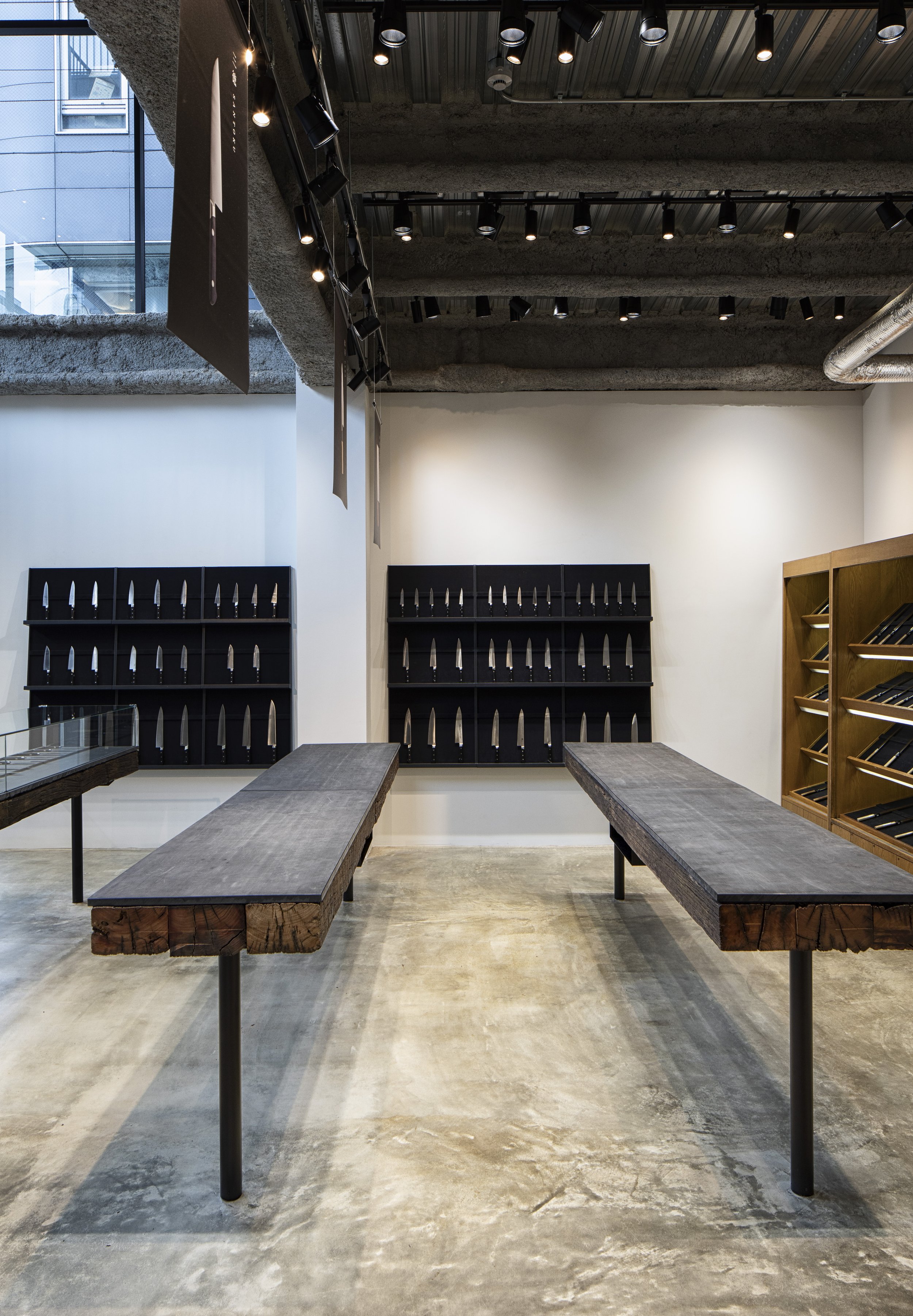
What should the shop do to stand out from its competitors and showcase its unique craftsmanship in Tokyo Japan? Kamitopen Co., Ltd Japan's head designer and architect, Mr. Masahiro Yoshida, has re-designed the shop and using a simple shape and the delicate touches of the craftsman.
The Kappabashi area of Tokyo, Japan is a well known area for chefs and for those who love to cook, it is often referred to as "Tokyo's Kitchen Town.". A day spent walking through Kappabashi, Tokyo's "kitchen town," could easily be spent. Kappabashi is about 800 meters long, with about 170 specialty stores lining an 800 meter stretch of a street called Kappabashi Dougu Street, between Asakusa and Ueno area.
"KAMA-ASA" in Asakusa Kappabashi was established in 1908 by Minosuke Kumazawa. It was initially known as Kumazawa Imono Ten, but was changed to its current name, Kama-ASA. Over a century ago, Kama-Asa began to cater to the needs of chefs. Daisuke Kumazawa, who is the fourth generation owner of the company, has inherited the business and its vision. He aims to provide customers with quality tools that are well-designed. What should the shop do to stand out from its competitors and showcase its unique craftsmanship? Using a simple shape and the delicate touches of the craftsman, Kamitopen Co., Ltd Japan's head designer and architect, Mr. Masahiro Yoshida, has re-designed the shop.
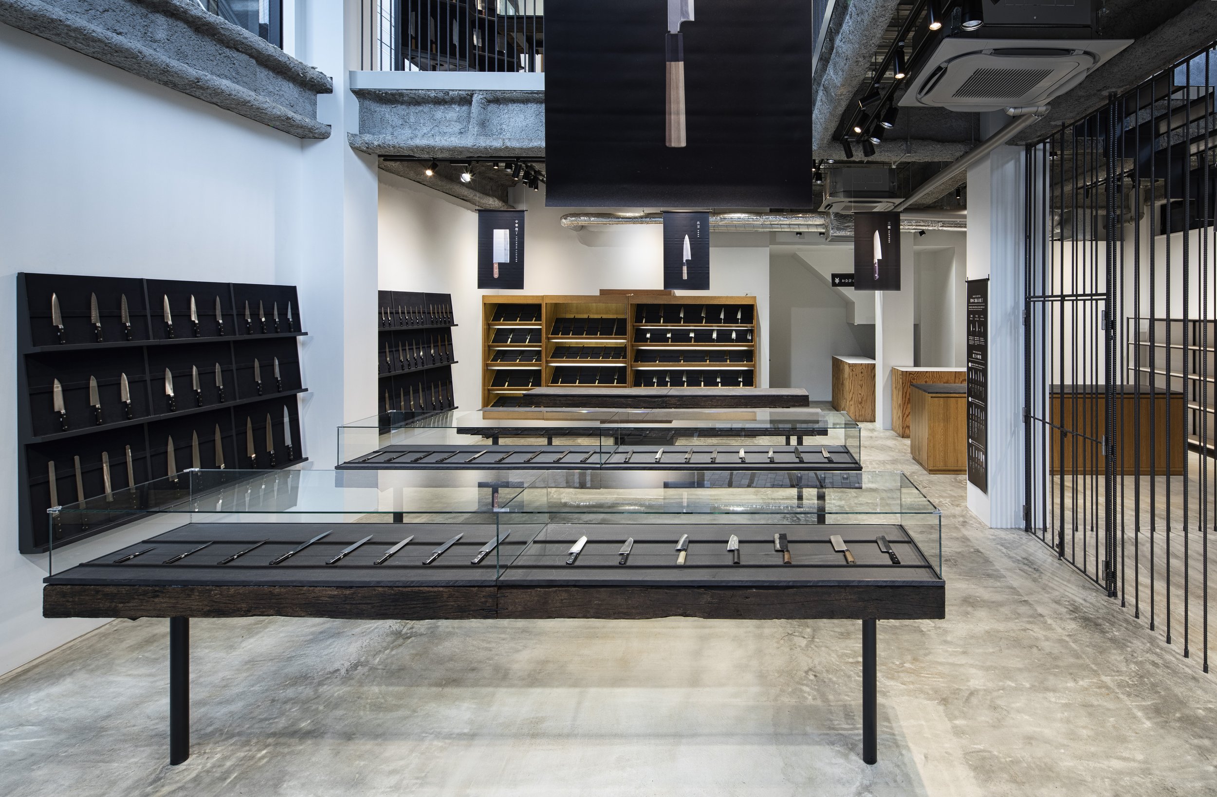

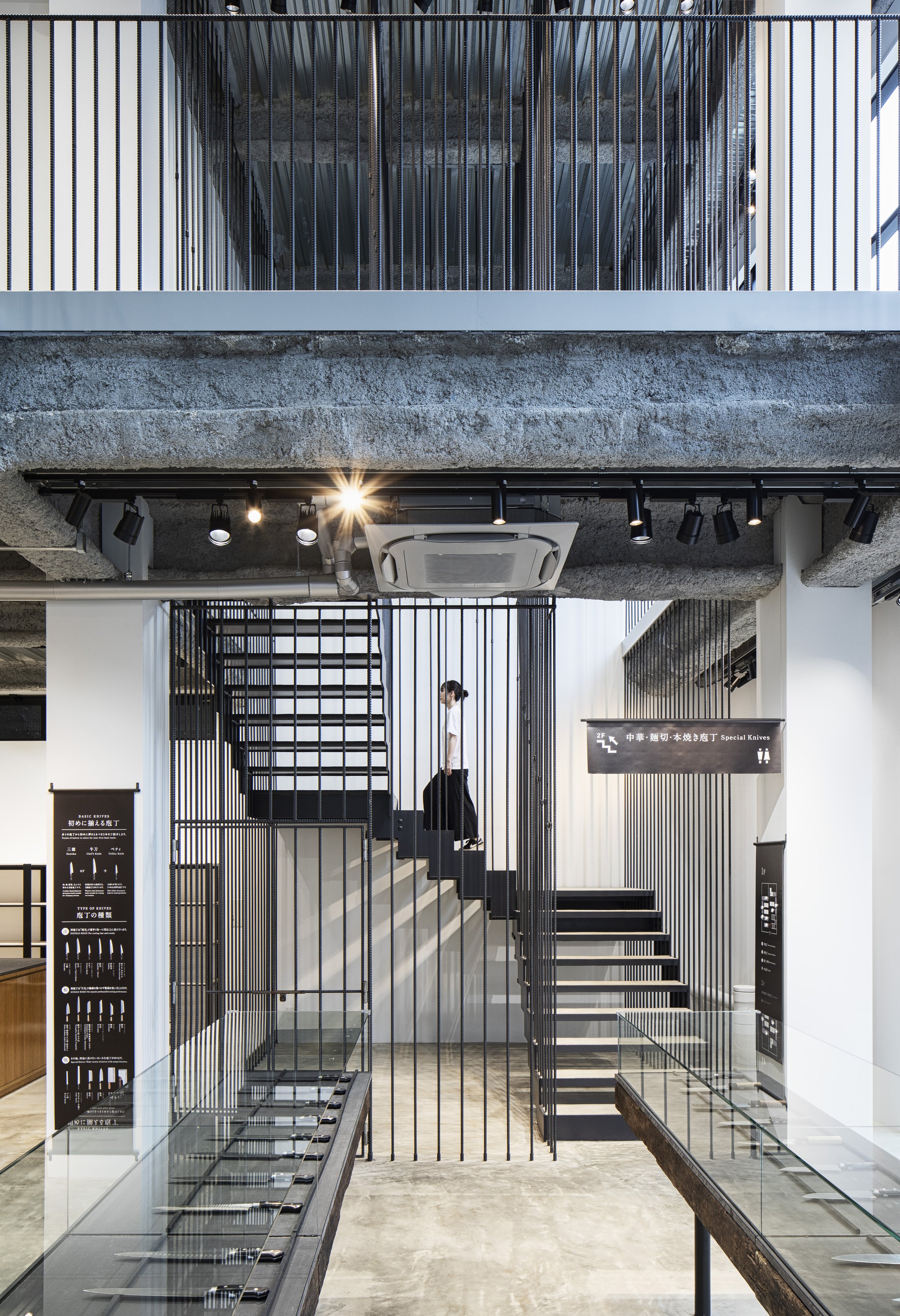
A steel rebar, which is also called ribs and joints, is a roll of steel in the form of a stick used to build homes, buildings, and other structures.
Mashairo Yoshida of the KAMA-ASA Shop understands that the philosophy of the company is based on the belief that the finest tools are made with the right intentions, thus offering the finest skills of craftsmen who make kitchen utensils to their customers.
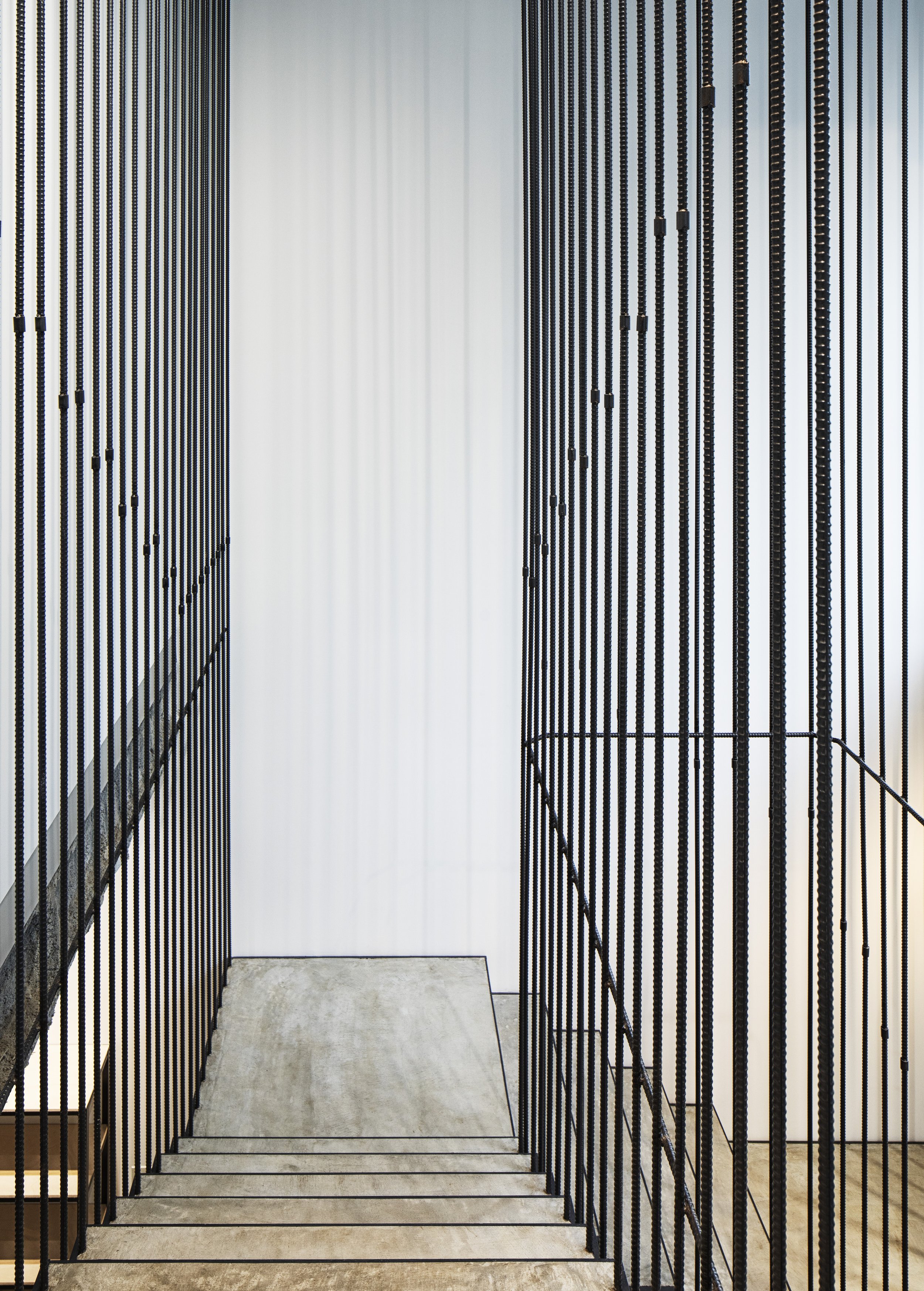
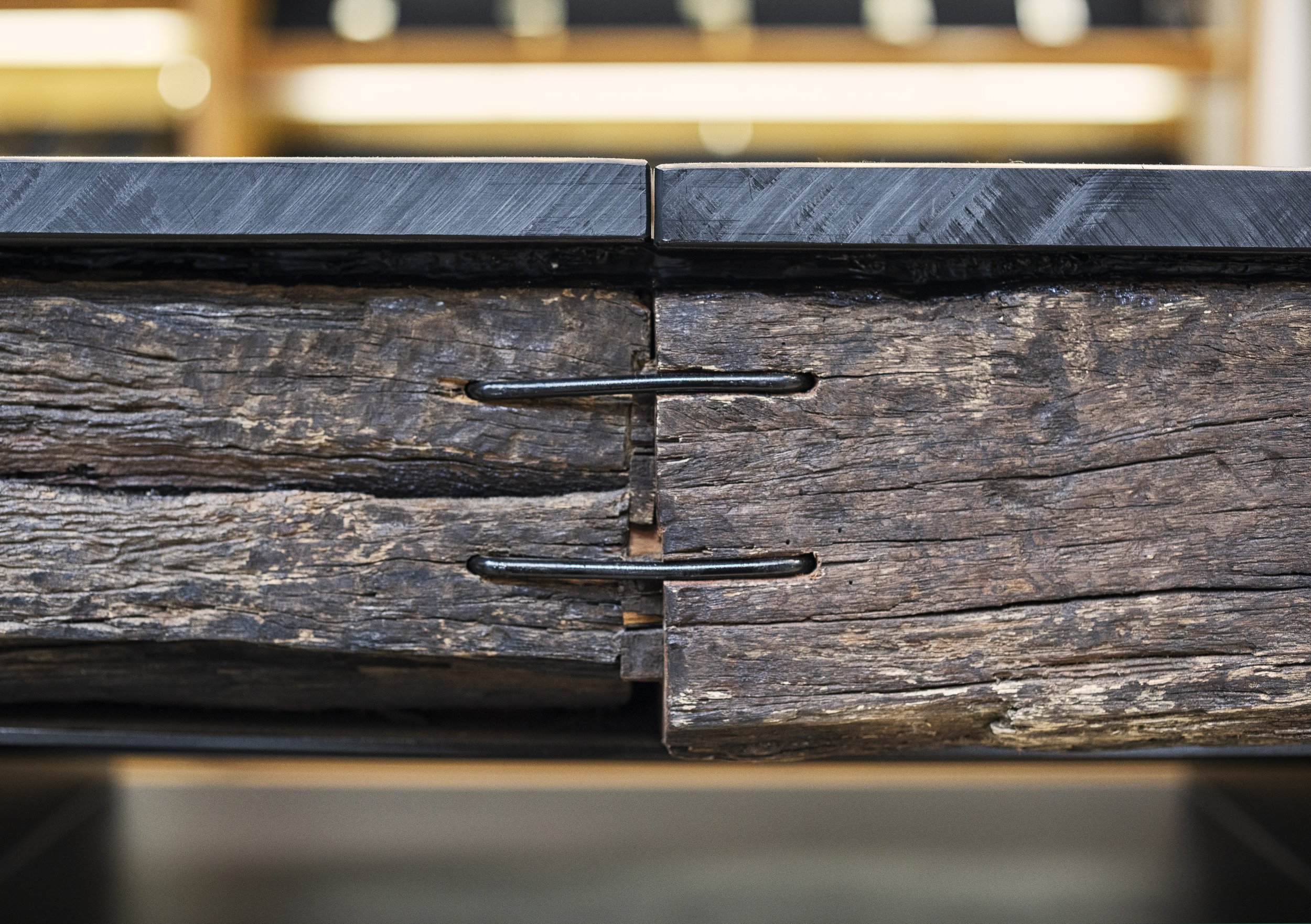
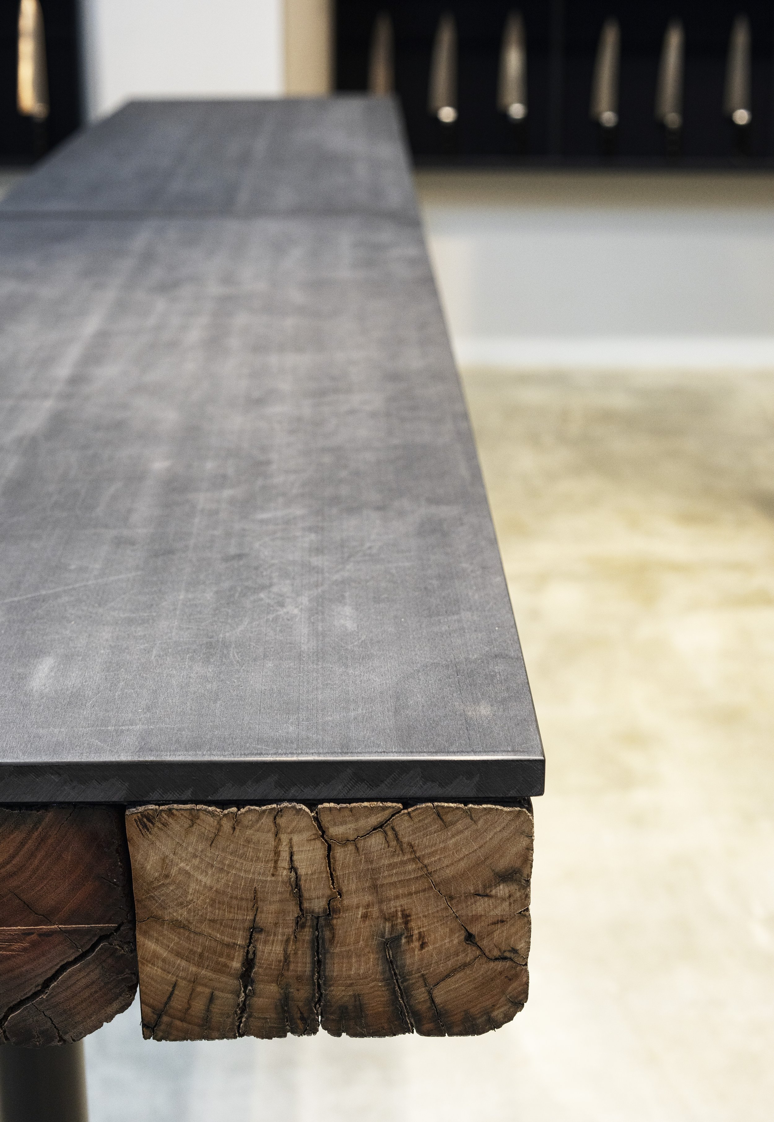

This is why in this store's space we felt it was appropriate to display an exhibition of the architecture skills that have been displayed by craftsmen throughout history. A particular design used rebar as the main design element, despite the fact that it is usually hidden in the walls since it is usually hidden in the ceiling. The use of rebar raised the level of sophistication in the shop dramatically.
The project won the silver award in the interior design division of Sky Design Awards www.skydesignawards.com in 2021.
Drawing/ Planning
Designer Profiles
Representative director / First Class Architect
1977 : Born in Osaka, Japan
2001 : Graduated from department of architecture,Kyoto Institute of Technology “Waro Kishi laboratory”
2001 : TAKARA SPACE DESIGN
2008 : Established KAMITOPEN architects
When organic meets structure with irregularities and margins - ARTIZON MUSEUM
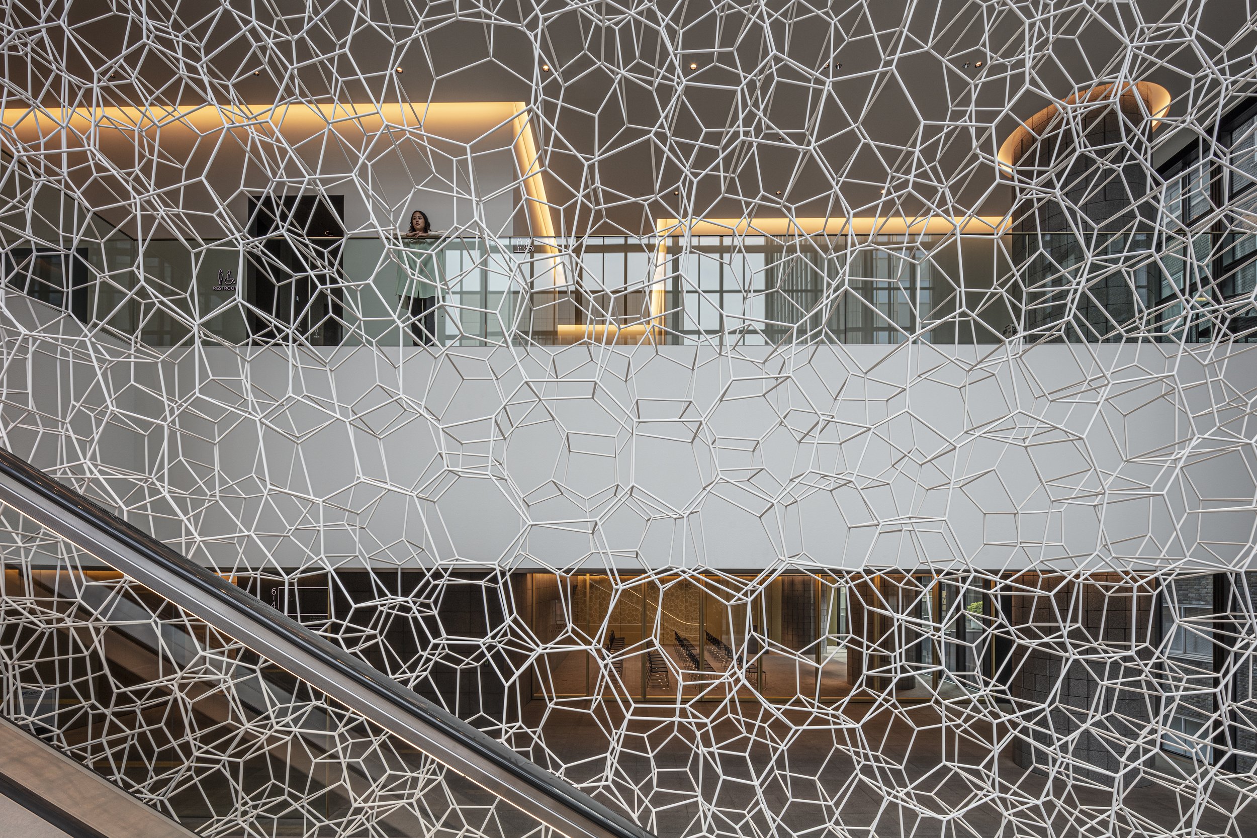
Designed by Tonerico: Inc., the Artizon Museum was a collaborative effort of Japanese designers. There is a space inside this museum that could be called a margin. It does not have the default purpose of location that visitors would expect, as well as elements that are intuitively perceived as uneven.
Tonerico Inc was established by three Tokyo-based designers. Hiroshi Yoneya, Ken Kimizuka, and Yumi Masuko came together in 2002. Among its diverse activities, which range from architecture to interior design to furniture and product design, the company specializes in a wide range of disciplines. Their approach is to present their conceptual works both abroad and in Japan both without any particular client as an expression of their design philosophy. Designed by Tonerico: Inc., the Artizon Museum was a collaborative effort of Japanese designers. There is a space inside this museum that could be called a margin. It does not have the default purpose of location that visitors would expect, as well as elements that are intuitively perceived as uneven. There are elements in certain painting styles that facilitate the power to inspire people's creativity, such as "the way one interacts with marginal spaces" and "sensory elements." In addition to the primitive method of forming space, this is an attempt to capture the wholeness that can be found beyond connecting these seemingly aimless elements, or in other words, an organic state uniquely resulting from being irregular.
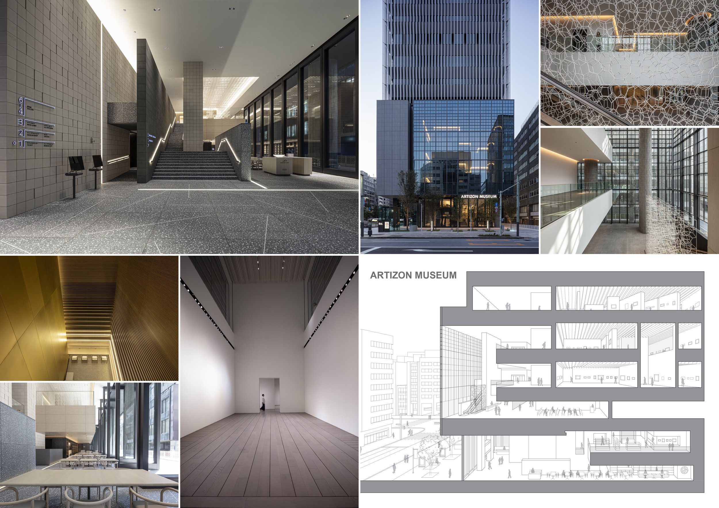
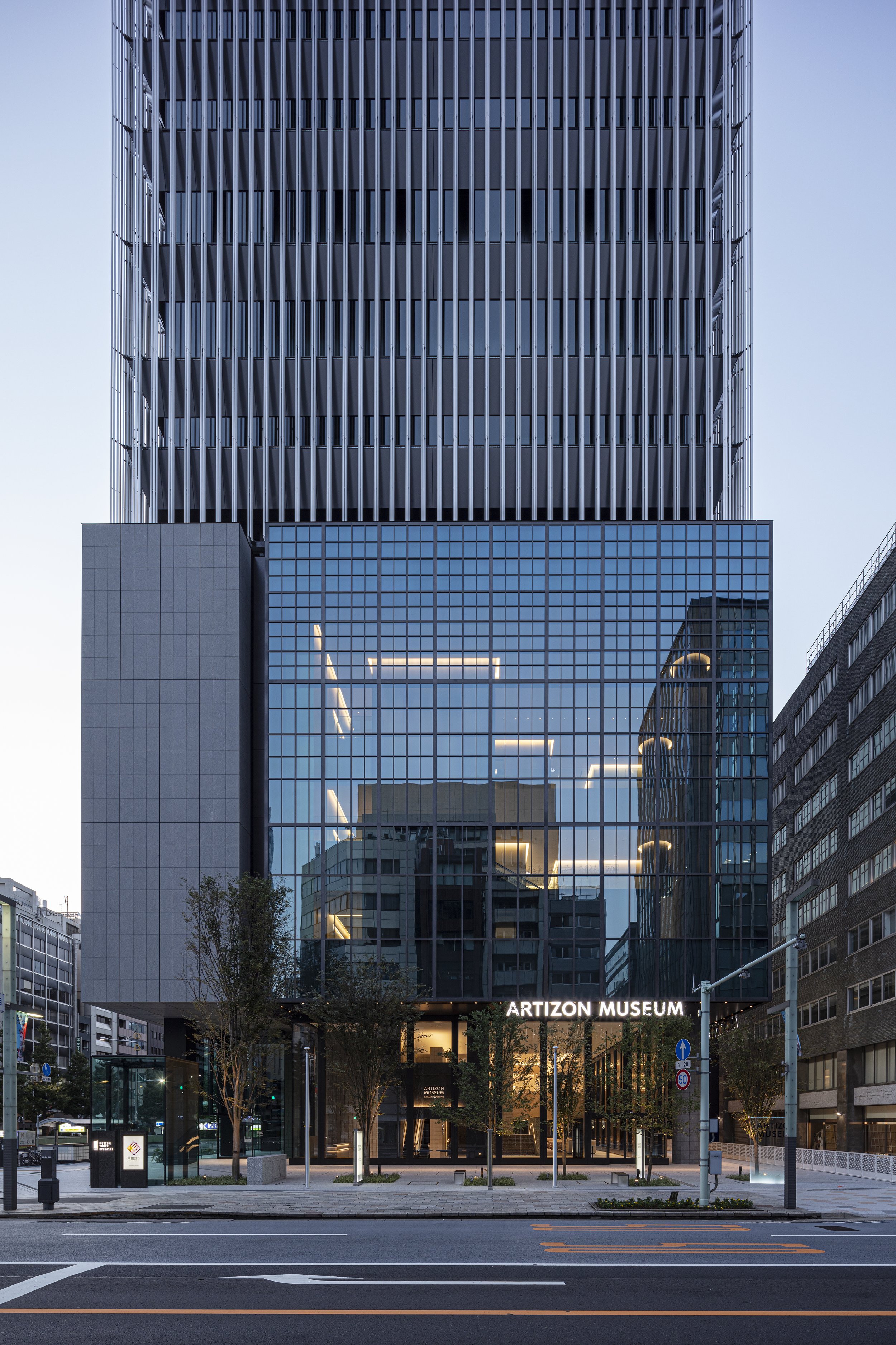
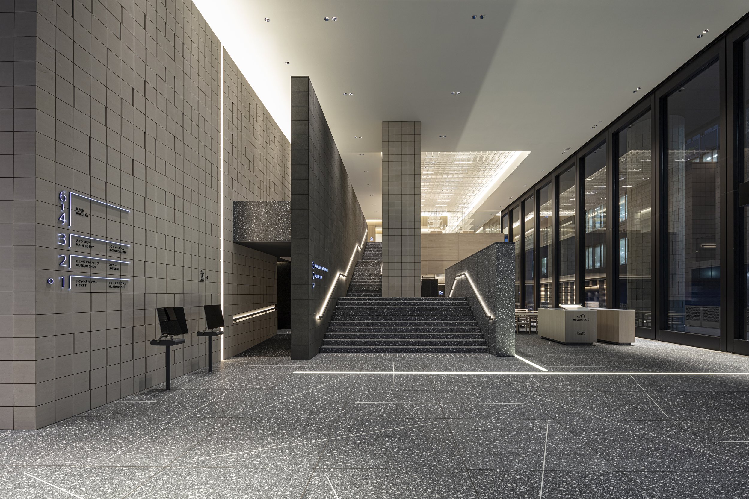
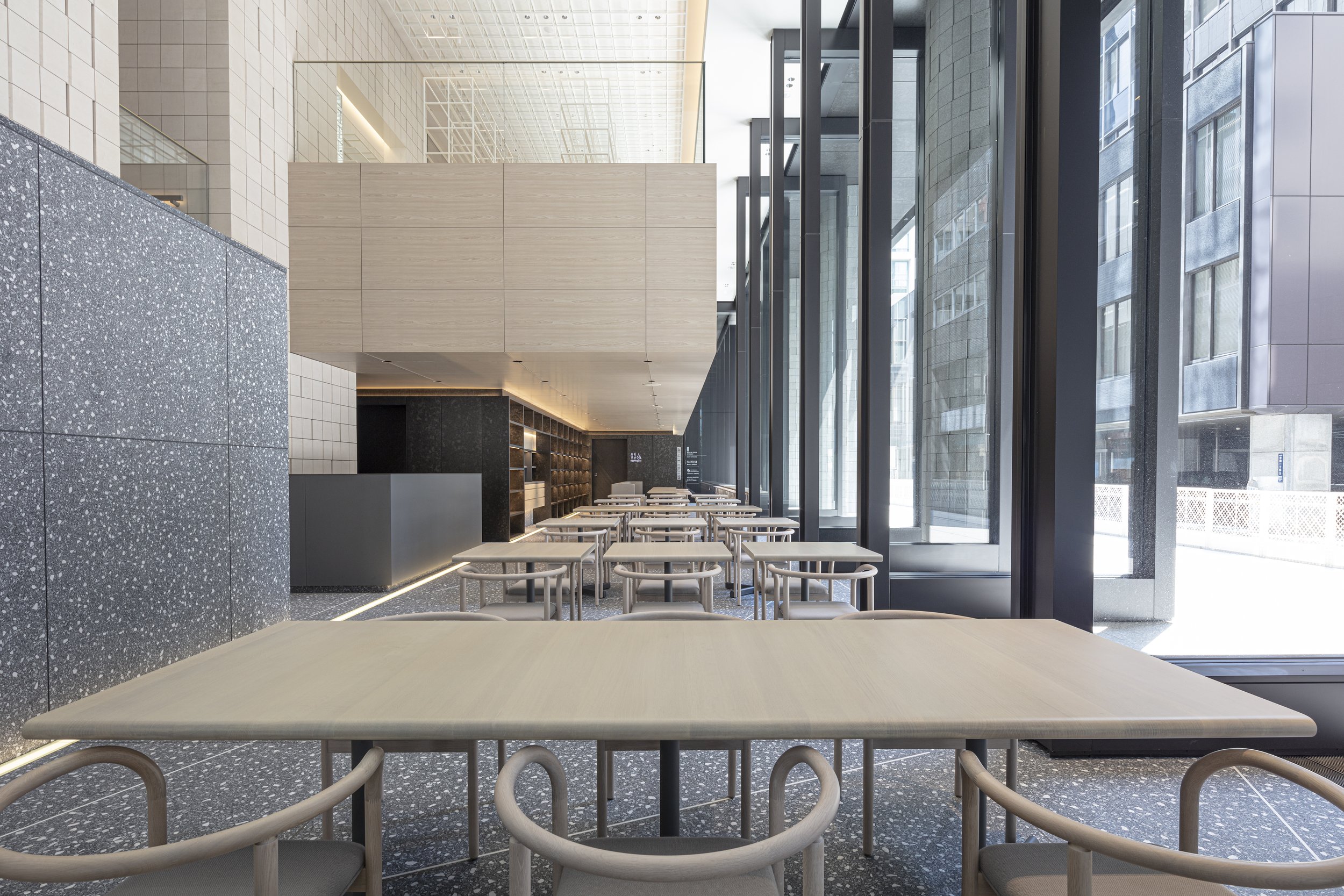
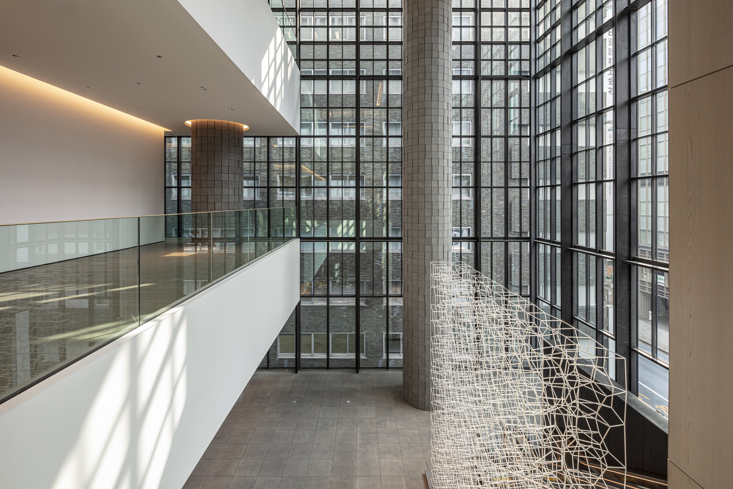
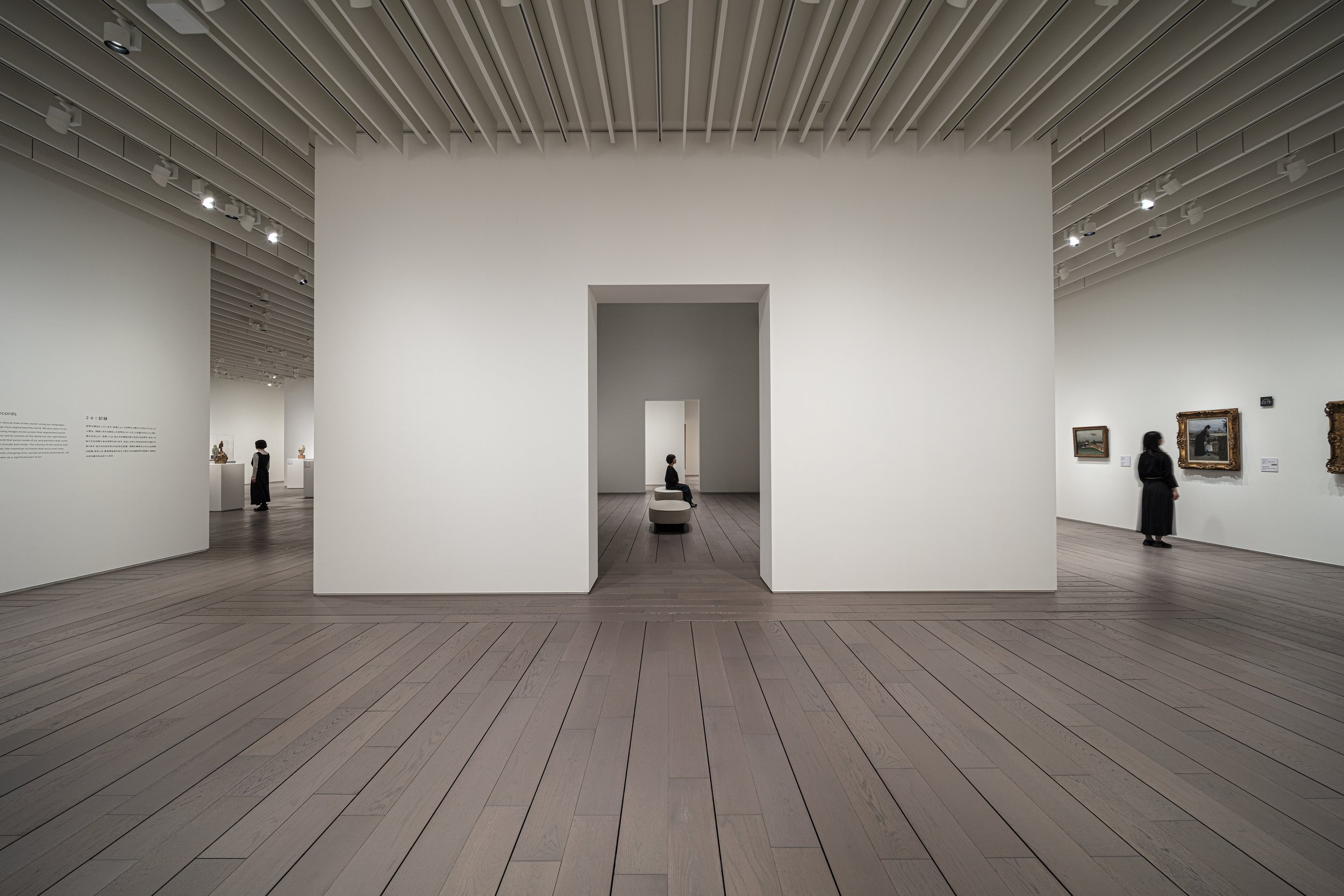
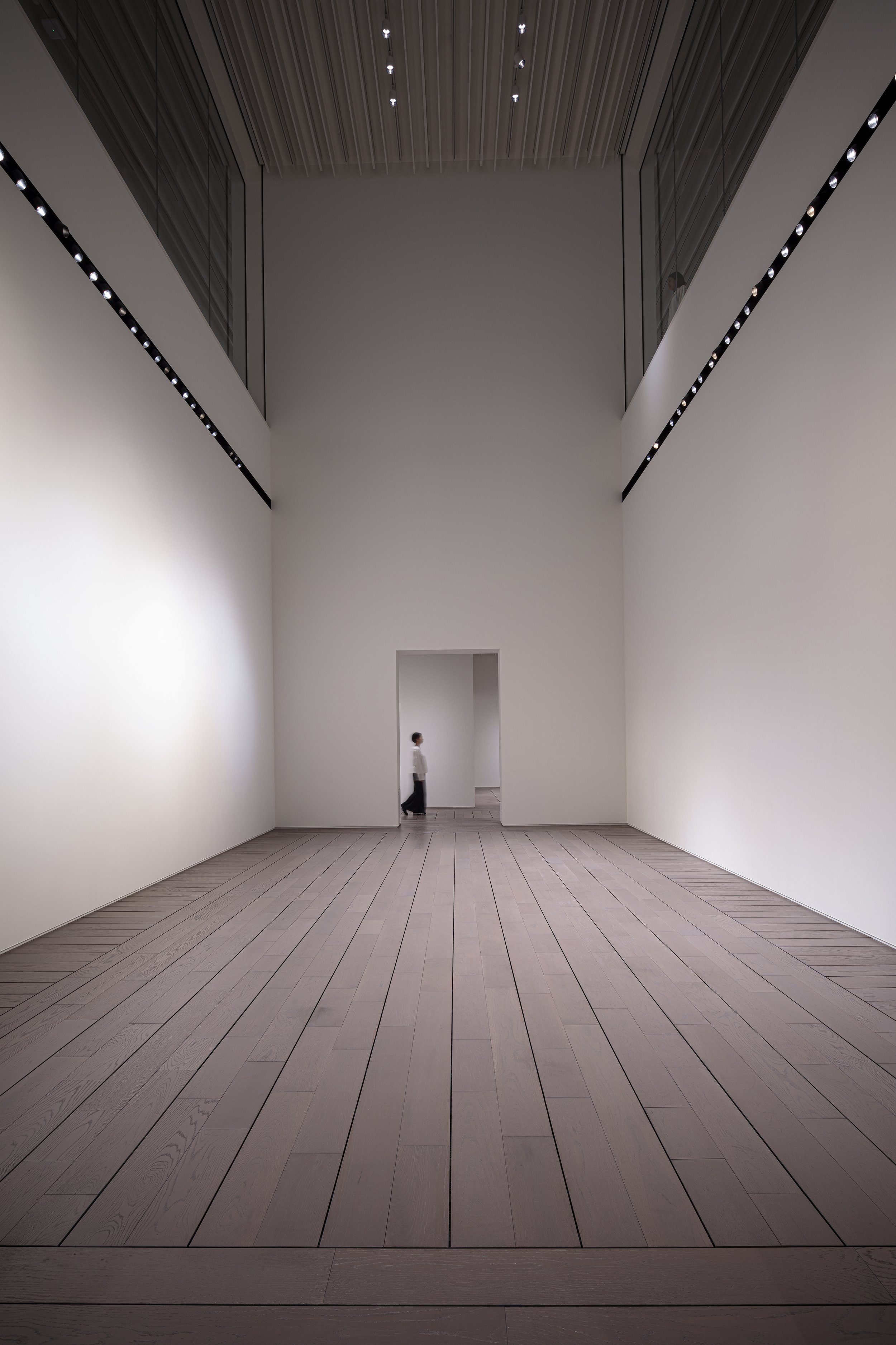
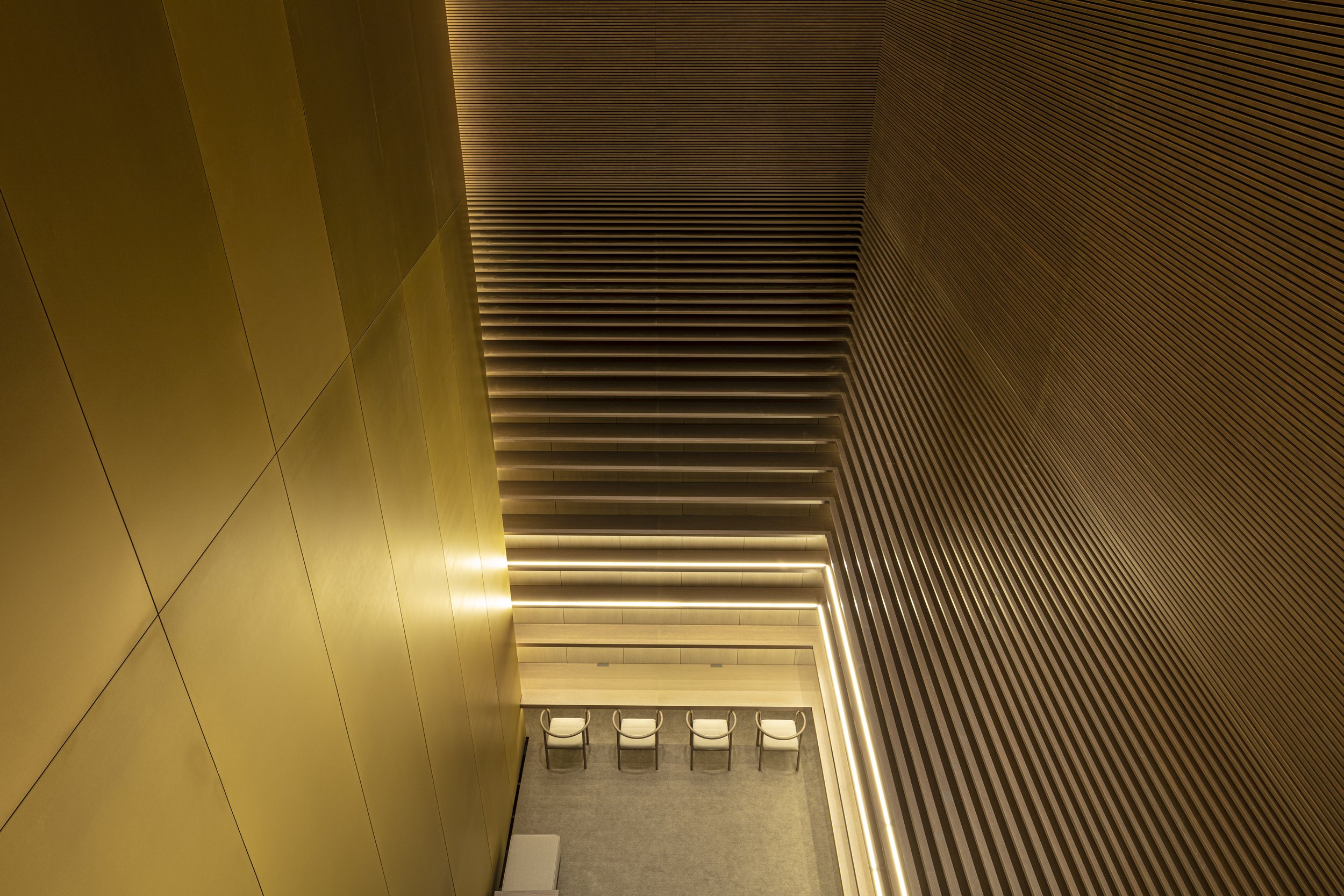
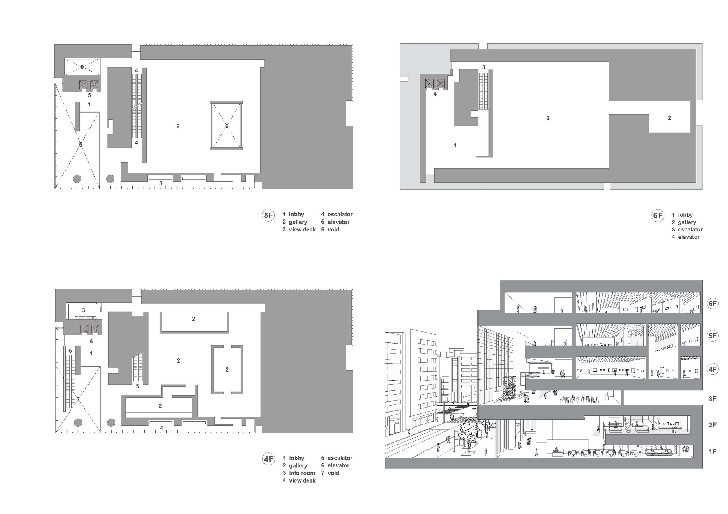
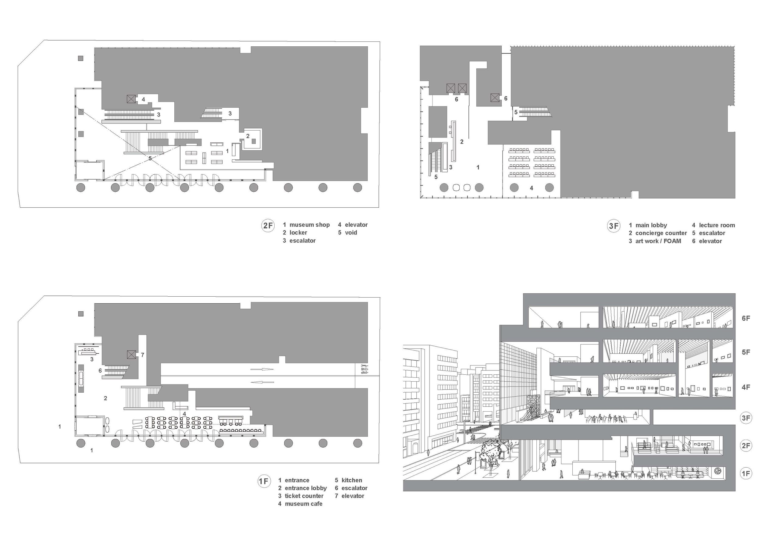
"Experiencing Creation" is the concept of the museum. Visitors can experience creativity in this space by seeing, sensing, and knowing the artworks and artists. By doing so, you can encourage them to explore various forms of creativity. It was necessary for it to embody a more intimate relationship with art that the outside of the museum would be accessible from within. Thus, the name "ARTIZON" is derived from the combination of the words "ART" and "HORIZON.". The inside of the museum must be visible from the outside to embody a more intimate relationship with art. Rather than complying with the basic principle that natural light should not be allowed inside the galleries, the idea of a visible space between the inside and outside of the enclosed space flies in the face of this fundamental principle. However, the objective was to produce a museum that would be both visually and sensually open to the city. In the Museum Tower Kyobashi, the first through sixth floors are dedicated to museums. On the three floors that make up the top floor, there will be exhibitions on display, while on the bottom floor, there will be public spaces, such as the entrance, a café, a shop, and a lecture hall.
Drawing/ Planning
Designer Profiles
TONERICO:INC.
Tokyo-based designers Hiroshi Yoneya, Ken Kimizuka, Yumi Masuko established their own studio TONERICO:INC. in 2002.
REVZO Toranomon was designed to minimize waste generation in the architecture
Sustainable architecture is often referred to as green architecture or environmental architecture. To achieve minimal negative impacts to the ecosystem and the communities, architects must produce smart designs and use available technologies. Norihisa KAWASHIMA, Principal at Nori Architects, Senior Assistant Professor at Meiji University, and his team of architects have minimized the amount of waste generated from the construction of a new mid-scale rental office series to achieve sustainability.
Sustainable architecture is often referred to as green architecture or environmental architecture. To achieve minimal negative impacts to the ecosystem and the communities, architects must produce smart designs and use available technologies. Norihisa KAWASHIMA, Principal at Nori Architects, Senior Assistant Professor at Meiji University, and his team of architects have minimized the amount of waste generated from the construction of a new mid-scale rental office series to achieve sustainability.
In June 2020, the REVZO prototype has been completed at Toranomon, Tokyo, as part of a planned series by a Japanese real estate company. Through improving the physical and mental well-being of its occupants, and fostering a creative atmosphere, this office aims to foster a delightful environment where one can connect with the ever-changing "nature" around them. The core configuration includes two wide openings, with the street-facing side allowing natural light to penetrate fully into the 17-meter deep tenant workspace. The floors have operable windows to facilitate natural ventilation. There is a balcony with a planting strip along the street-facing side of the building. The planting strips will be filled with cherry blossoms, hydrangeas, and color-changing seasonal plants, as well as edible plants such as blueberries, lemons, and herbs, creating a place where tenants can observe seasonal changes and harvest them as well. In addition to providing footholds for plants, stainless steel mesh along the side of the balcony protects residents and objects from falling. An outdoor escape staircase is located at the end of a balcony, which can serve as an extension of the balcony. On one side of the building, air conditioners are located, blowing horizontally into the room, eliminating the need for ductwork from the ceiling. This allows for a high ceiling while keeping the floor-to-ceiling height low. In addition to reducing waste generated during construction, semi-skeletonized finishes also provide for immediate occupancy and reduced environmental impact.
The entrance is covered in a variety of wild vegetation, including red pine and agave. The arrangement makes seasonal changes visible to visitors and office workers alike. Plants are arranged and displayed on earthen walls, mirrors, and displays depicting images of nature throughout the lobby area. Displays of furniture creations are also on display. Due to the natural lighting and well-ventilated stairs, and art and speakers on every floor, one would prefer to take the staircase instead of taking the elevator. A communal lounge with high ceilings, decorated with wood, earth, and vegetation, can be found on the top floor. Labels on furniture and accessories indicate where they come from, creating an environment that demonstrates the craftsmanship put into the furniture.
Designer Profile
Norihisa KAWASHIMA
Principal at Nori Architects, Senior Assistant Professor at Meiji University
Registered Architect, JAPAN, Dr. Eng.
Born in Kanagawa prefecture in 1982, Kawashima graduated from the University of Tokyo in 2005, earned his master’ s degree from the University of Tokyo Graduate School in 2007, after which he was hired by Nikken Sekkei. Kawashima became a visiting scholar at University of California, Berkeley and worked with Prof. Dana Buntrock and LOISOS + UBBELOHDE in 2012. In 2014, Kawashima became an assistant professor at the Department of Architecture of the Tokyo Institute of Technology and jointly established ARTENVARCH with Keika Sato. In 2016, Kawashima earned a doctor’s degree from the University of Tokyo Graduate School. In 2017, Kawashima established Nori Architects. In 2020, Kawashima became a senior assistant professor at Meiji University. Now Kawashima is a principal of Nori Architects and a principal of Regional Design Laboratory at Meiji University.
Representative works:Sony City Osaki [2011] , Diagonal Boxes [2016] , Yuji Yoshida Gallery / House [2017] , Saw-tooth Roofs in Ichinomiya[2017], and REVZO Toranomon[2020] .
Representative awards: The Prize of Architectural Institute of Japan [Architectural Design], 1st Prize [Prize from the Minister of Land, Infrastructure and Transport] in the 7th Sustainable Housing Award from IBEC, 1st Prize in JIA Sustainable Architecture Award 2020, and many others.
For more information, please visit: http://norihisakawashima.jp/
*The New Black is a new award from www.skydesignawards.com designed to discover and recognise young architects and designers, or small projects such as pop-up, residential, or retail shops project sizes up to 50m2 (540 ft²).
*The New Black entrants must be either under 38 years of age OR the project submitted must be less than 50m2 (with no age limitation).
Imaise House - A high earthquake resistance residential in Japan
Japan is constantly affected by seismic and volcanic activity thanks to its location in the Circum-Pacific Mobile Belt. Despite covering just 0.25 percent of the earth's land area, Japan experiences 18.5% of the world's earthquakes. Geographically and physically, how the Japanese live and how they design safe living environments. For one of his clients, Tatsuya Kawamoto + Associates designed a high earthquake resistance residential building, which won the "New Black" Award in 2021.
Japan is constantly affected by seismic and volcanic activity thanks to its location in the Circum-Pacific Mobile Belt. Despite covering just 0.25 percent of the earth's land area, Japan experiences 18.5% of the world's earthquakes. Geographically and physically, how the Japanese live and how they design safe living environments. For one of his clients, Tatsuya Kawamoto + Associates designed a high earthquake resistance residential building, which won the "New Black" Award in 2021.
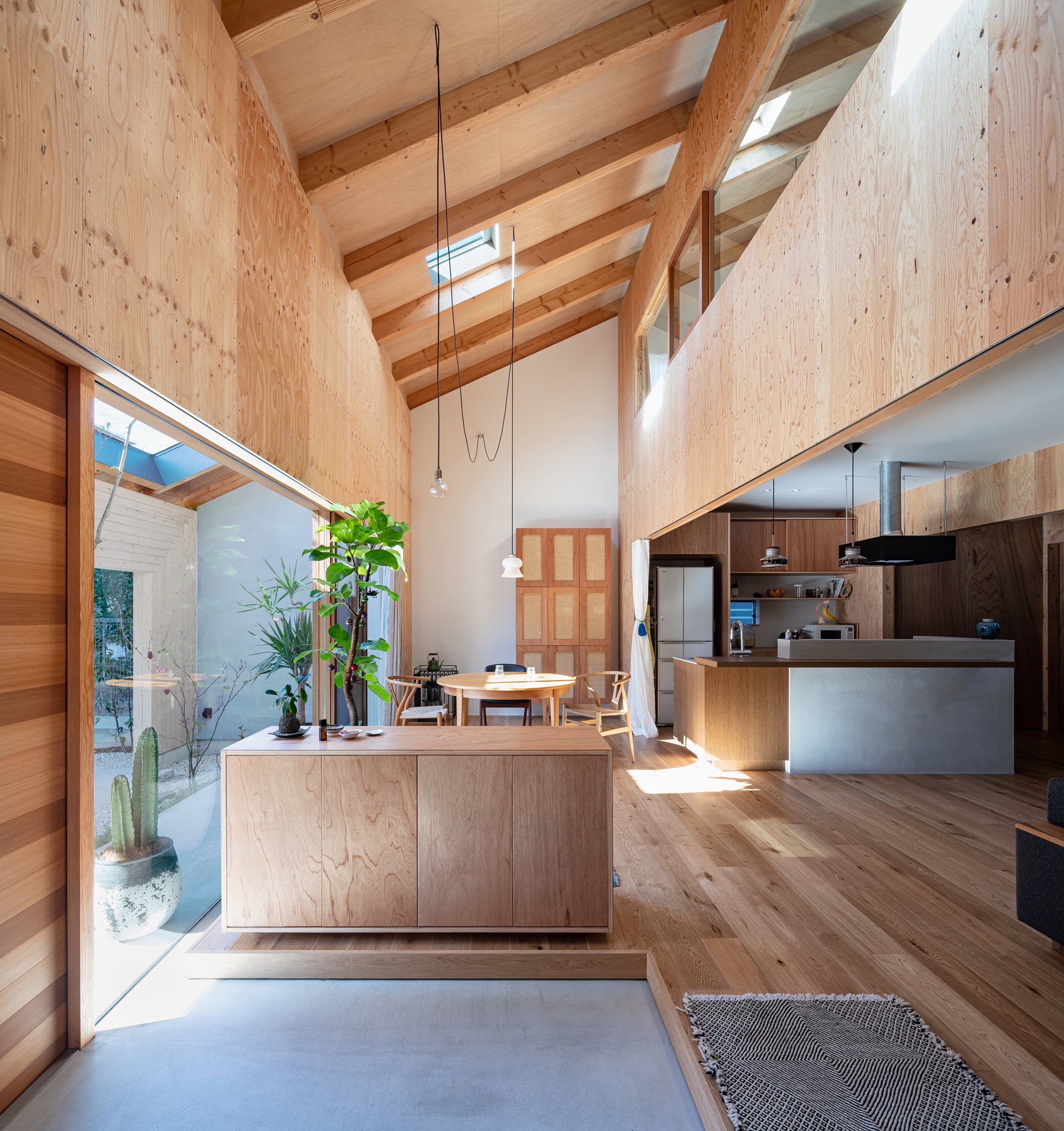
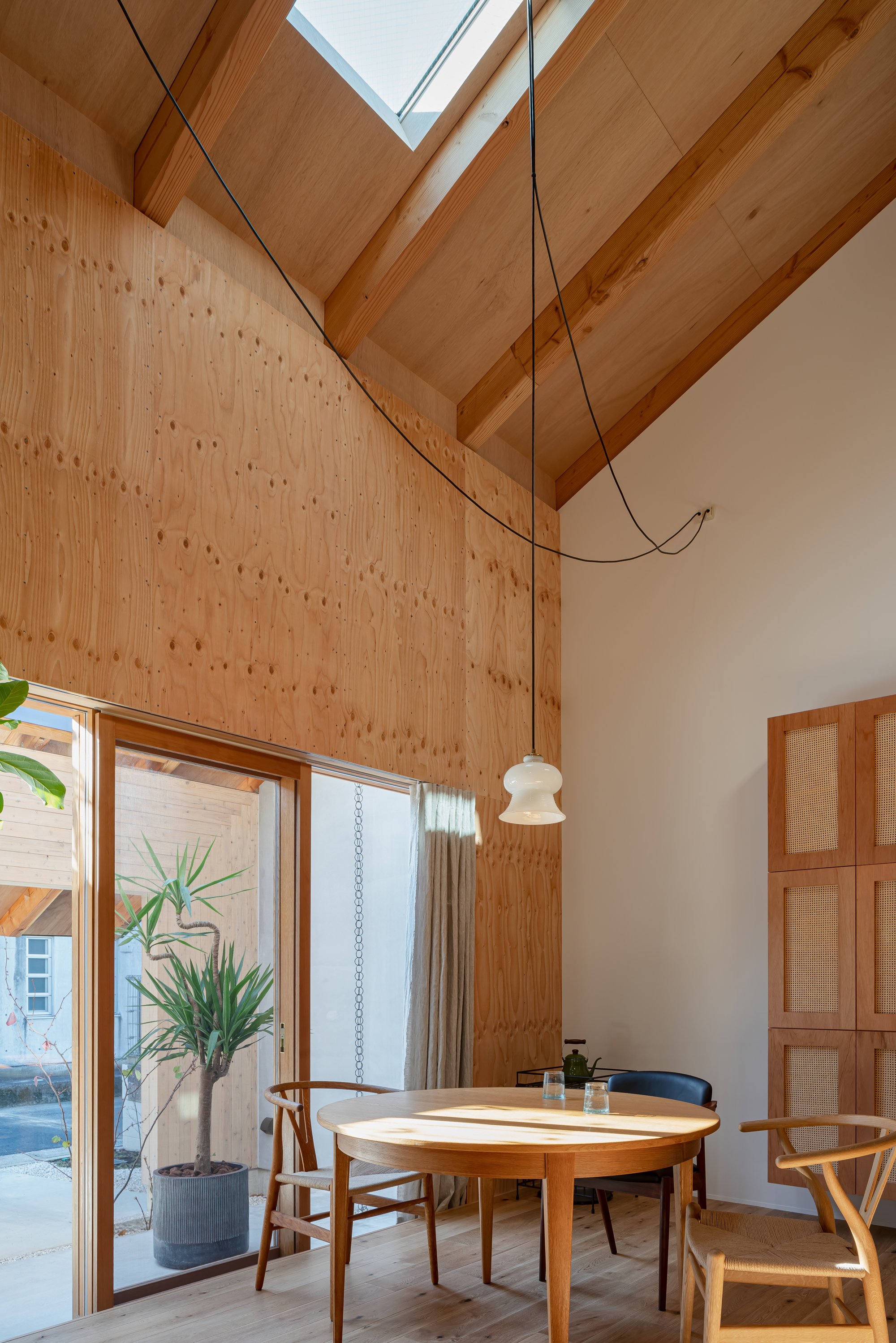
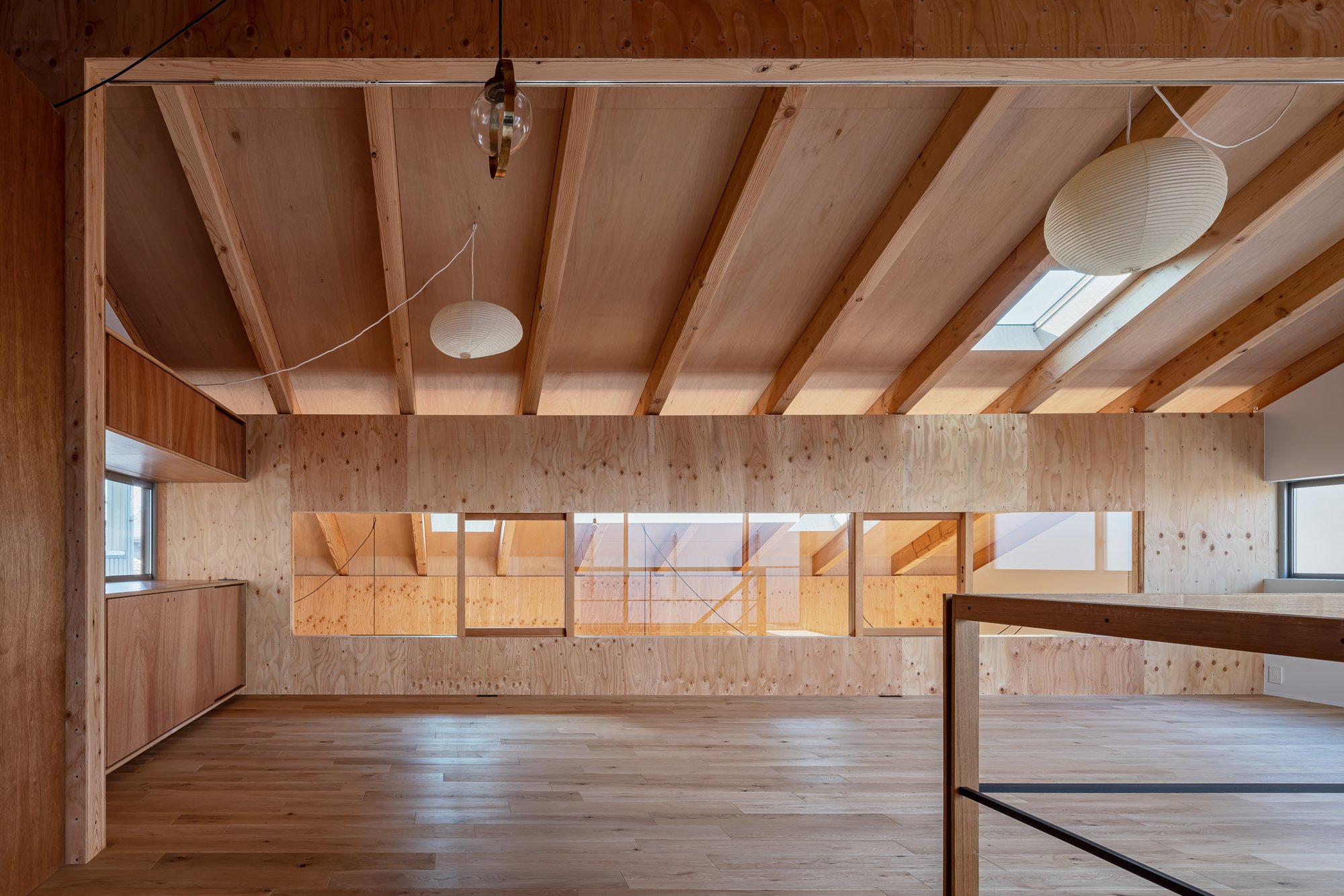
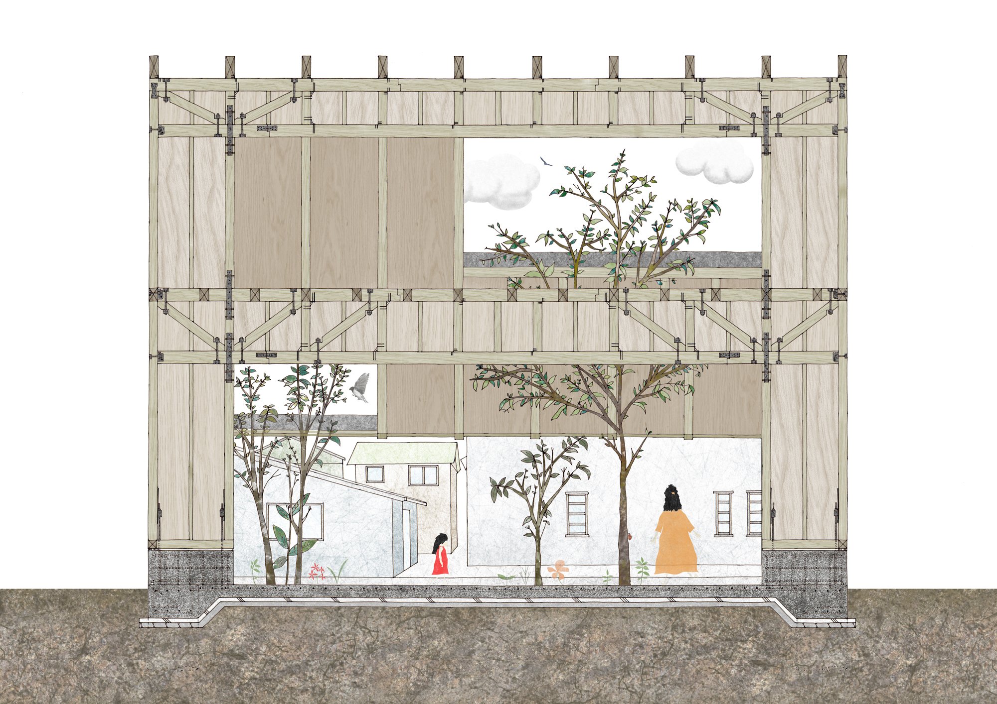
Generally, the main areas of a building need to be on the second floor since the structural walls needed on the first floor are reduced. The building should have "high earthquake resistance" as well as "open space."
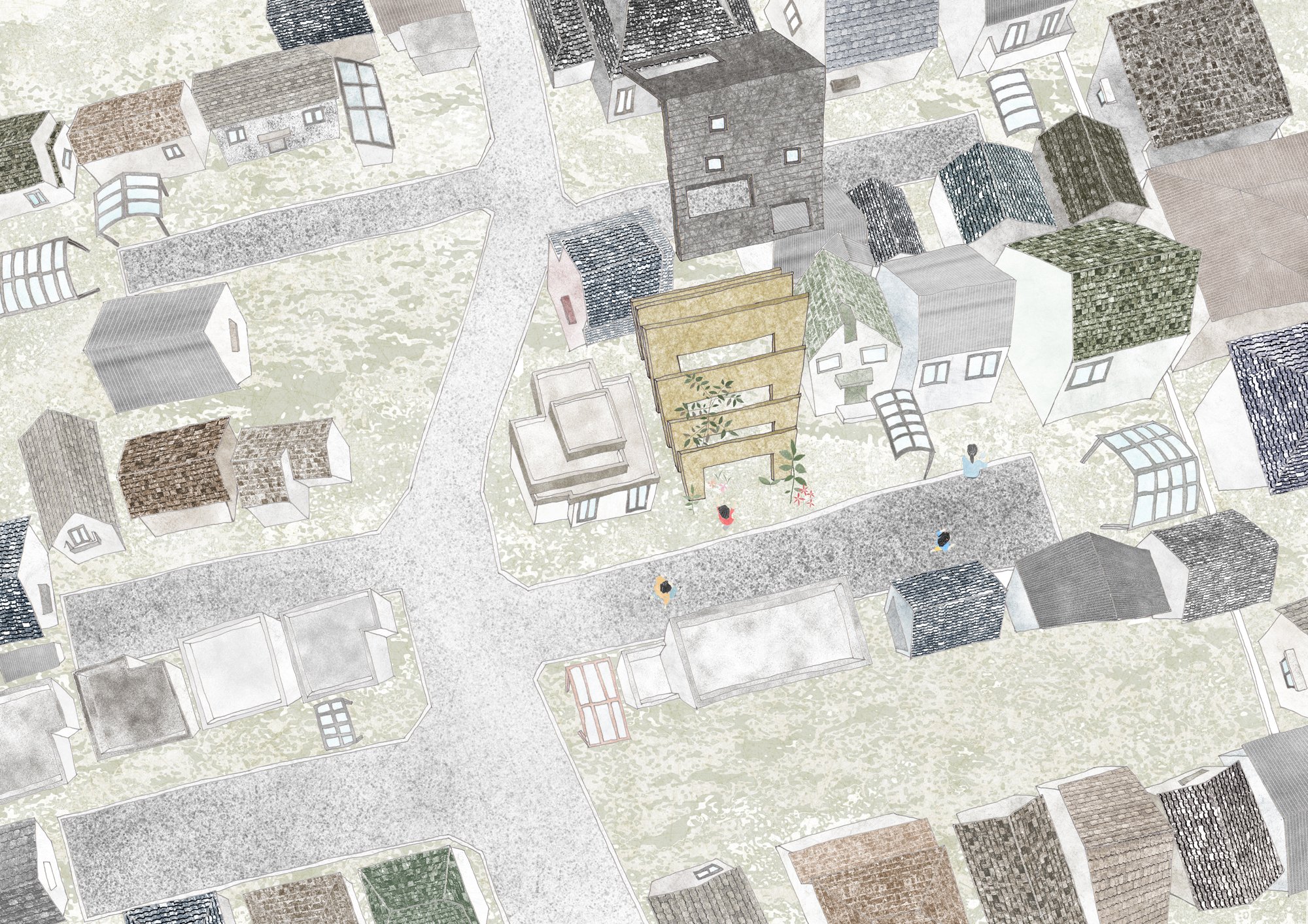
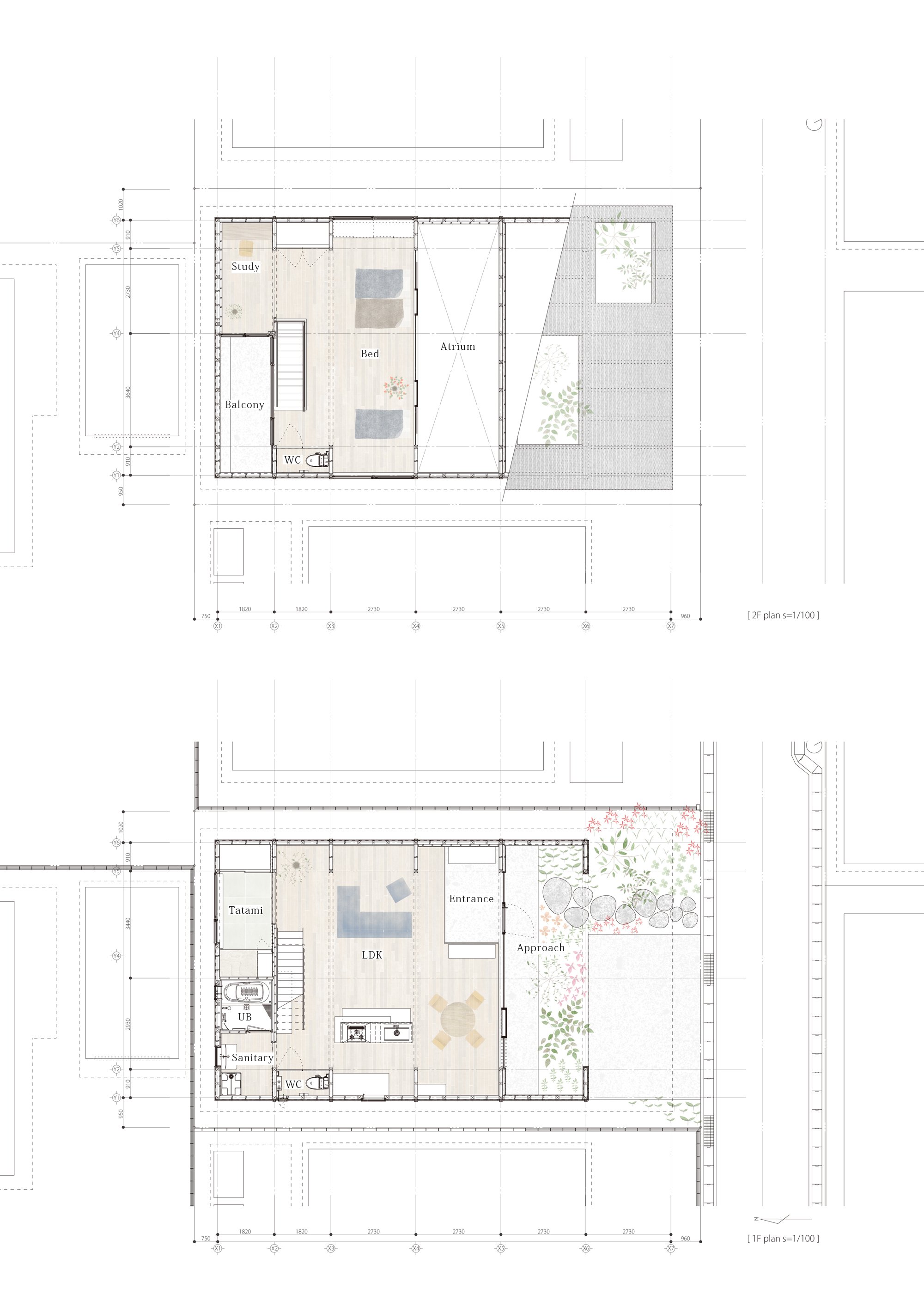
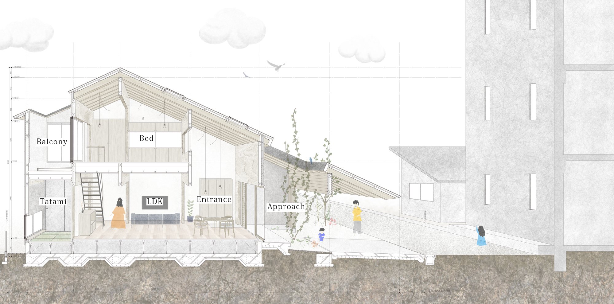
By taking into consideration the surrounding environment of a "private road," the front road is a private property, and planning a space in which the inside and the outside are seamless, the designer aims to achieve maximum spatial volume within the given constraints.
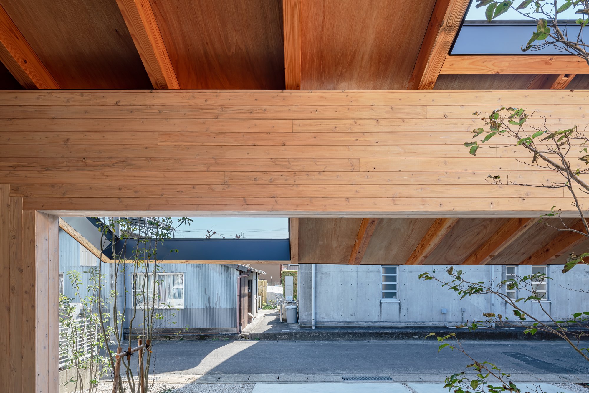
The building has a simple and clear configuration with only an 8.0m-wide "frame" that provides both earthquake resistance and a large opening.
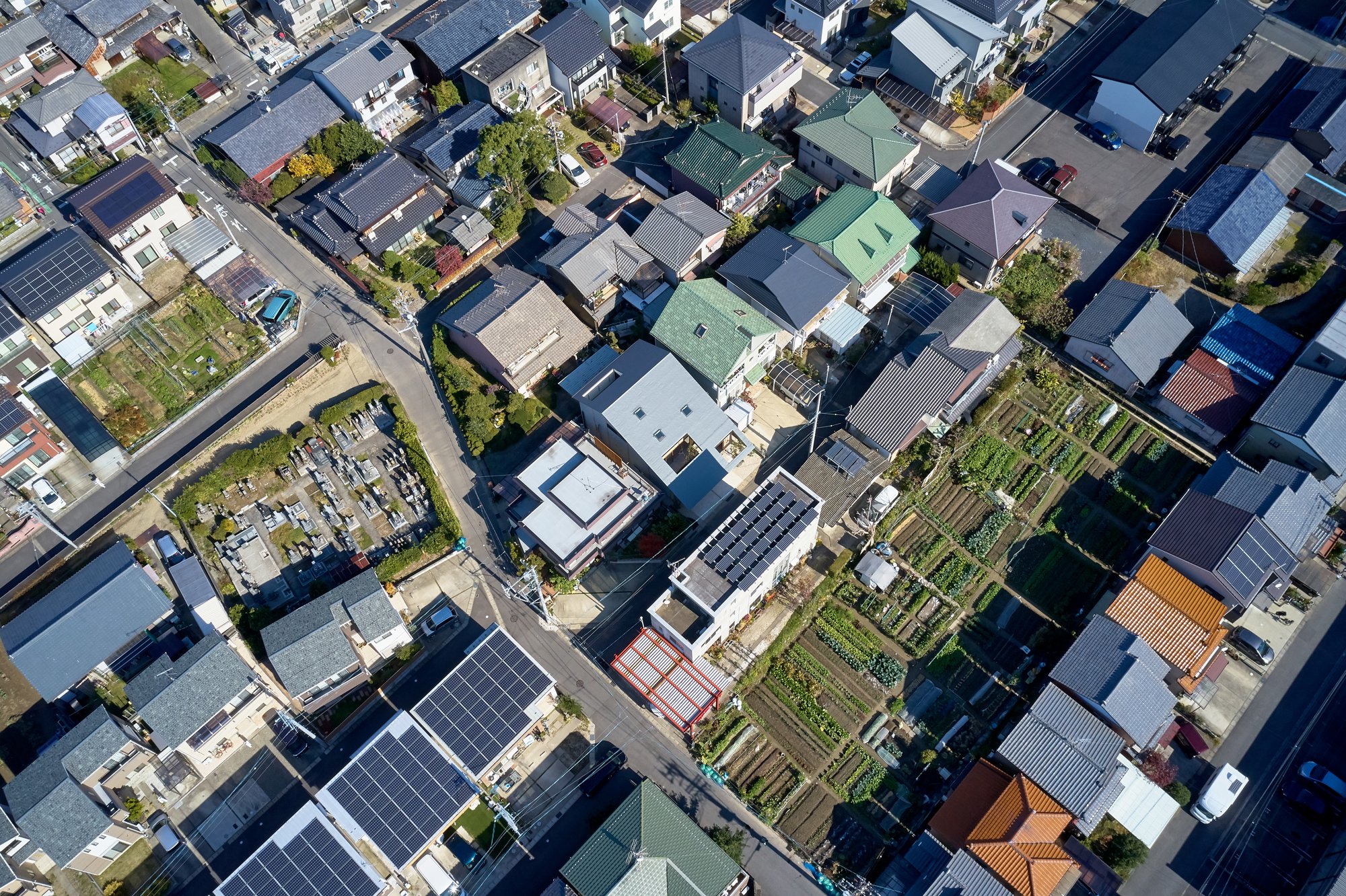
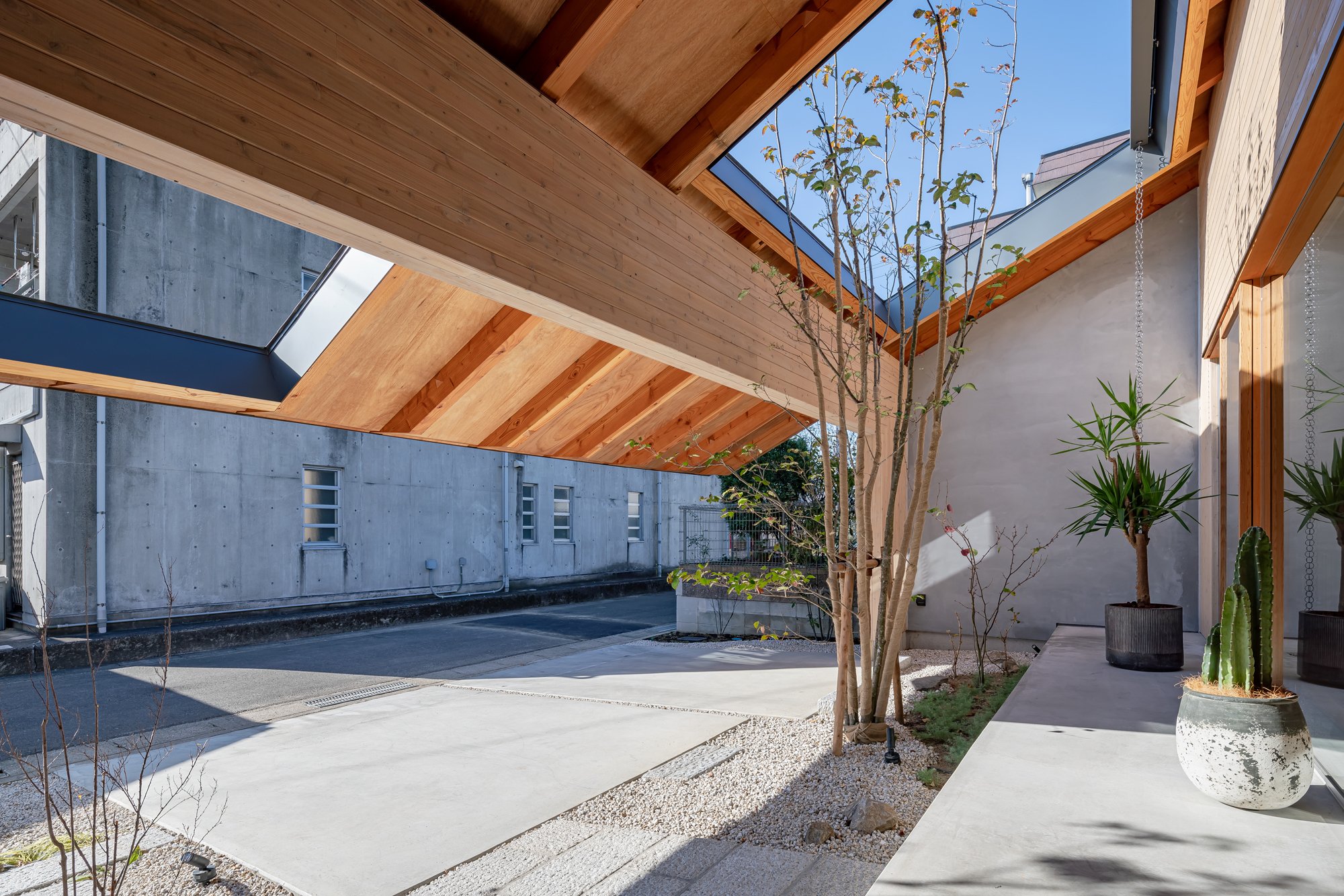
There was a unique community created around this "private road", which branched off the main road.
With the incorporation of local, unique characteristics that are different from each road into the living space, the designer thought it would be possible to contribute to regional development by establishing a favorable climate as a residential area for communities that could be made as a by-product of local industries.
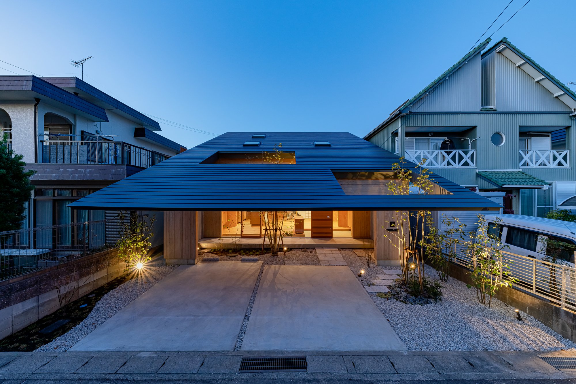
A gate frame, in addition to its function as an earthquake-resistant element, also acts as a ruler that gives rhythm to the space by arranging at regular intervals and measuring the distance from the city, and by inserting rails into each frame, it can be private as desired.
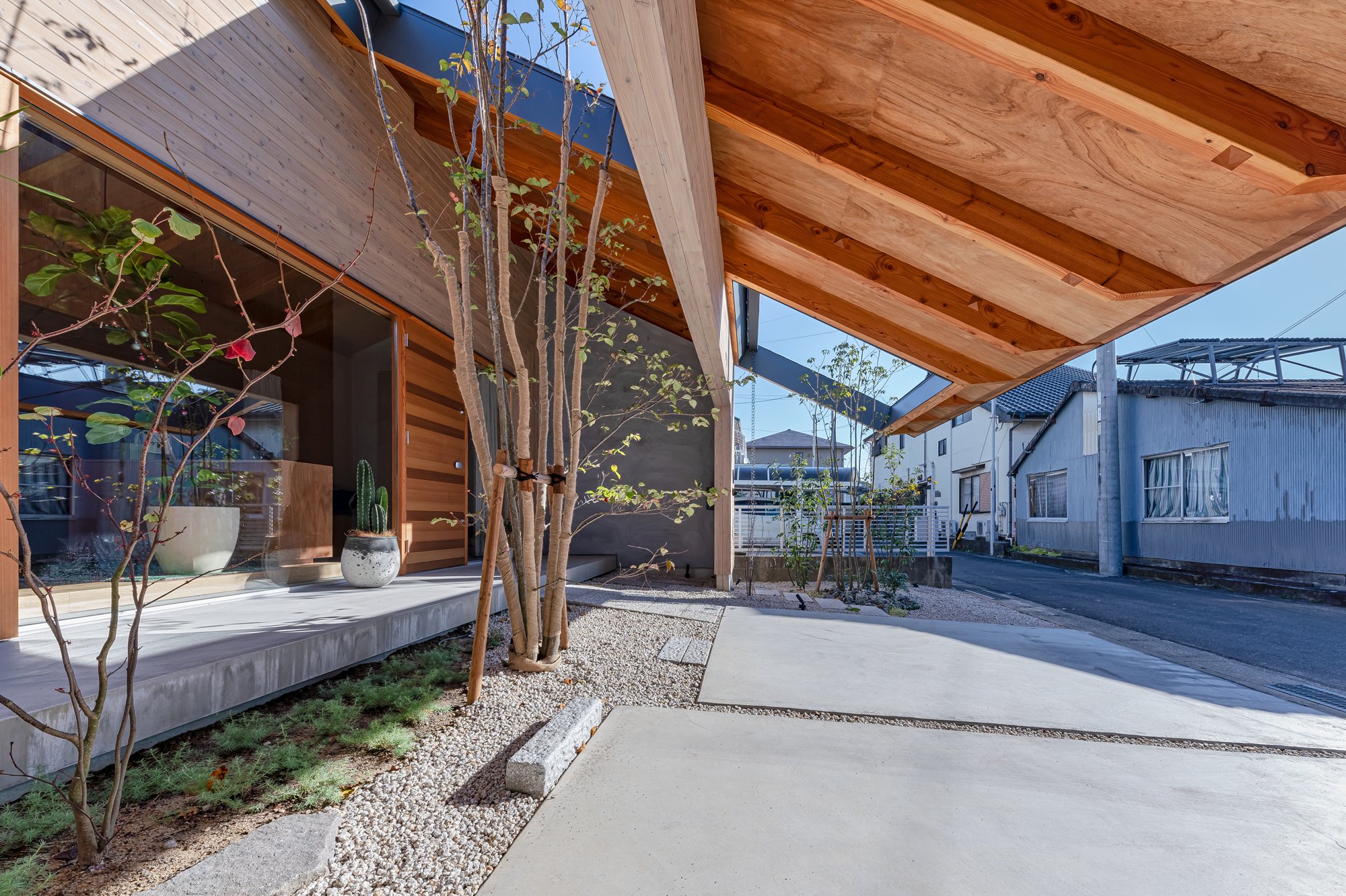
By extending the eaves across the front road side and creating a continuous external space, it is anticipated that the resident will gradually spread out under the roof while making the most of the small parcel.
Mr. Kawamoto said: "Due to the surrounding environment, which was moderately protected by chance, we were able to live in the nearby land and use the road as a living space."
Construction methods like this have taken root in this area. By mixing the resident's demand, the structure designed to solve the problem, and these, it is made.Imaise House
Architectural Overview
Location : Ichinomiya Aichi Japan
Completion : November 2020
Principal use : House
Structure : Timber structure
Site area : 168.38㎡
Building area : 99.12㎡

Designer Profile
Tatsuya Kawamoto
1990 Born in Aichi,Japan
2012 ~ worked at Takeshi Hosaka Architects
2013 ~ worked at Hiroyuki Shinozaki Architects
2018 ~ established Tatsuya Kawamoto + Associates
AWARDS
2011 2nd prize of Japan institute of architects tokai branch architectural design competition award 28th
2012 2nd prize of Graduation design review
2013 3rd prize of Japan institute of architects tokai branch architectural design competition award 30th
2015 Fine work of Nisshin kogyo architectural design competition 2015
2016 2nd prize of Circos international architecture competition 2016
2017 Honorable mentions of Shinkenchiku residential design 2017
2017 4th prize of CLT idea contest 2017 Awards
2011 2nd prize of Japan institute of architects tokai branch architectural design competition award 28th
2012 2nd prize of Graduation design review
2013 3rd prize of Japan institute of architects tokai branch architectural design competition award 30th
2015 Fine work of Nisshin kogyo architectural design competition 2015
2016 2nd prize of Circos international architecture competition
2017 Honorable mentions of Shinkenchiku residential design 2017
2017 4th prize of CLT idea contest 2017
For more information about Tatsuya Kawamoto + Associates, please visit:
*The New Black is a new award from www.skydesignawards.com designed to discover and recognise young architects and designers, or small projects such as pop-up, residential, or retail shops project sizes up to 50m2 (540 ft²).
*The New Black entrants must be either under 38 years of age OR the project submitted must be less than 50m2 (with no age limitation).
Kyushu Voice in Japan, Design by Jindesign Co., Ltd
In order to revitalize the economy and culture of Kyushu, Kyushu Voice aims to promote Kyushu products in Japan and around the world. As a home base for the project, this building fulfills three purposes, including serving as a new symbol of Kyushu's history and nature. It also serves as a shop selling a variety of products made in Kyushuin along with a workshop developed with local producers and citizens.
In order to revitalize the economy and culture of Kyushu, Kyushu Voice aims to promote Kyushu products in Japan and around the world. As a home base for the project, this building fulfills three purposes, including serving as a new symbol of Kyushu's history and nature. It also serves as a shop selling a variety of products made in Kyushuin along with a workshop developed with local producers and citizens.
Kyushu Voice's base is located in Dazaifu, the most suitable city for this project because of its history and popularity as a central city of Kyushu. From ancient times until the Heian period, Dazaifu was the imperial office in charge of Kyushu. There are around ten million tourists visiting this historical city every year, both from inside and outside the country.
At the core of this project, it is imperative to demonstrate modern Japanese architecture that incorporates tradition and innovation. As such, it was not necessary to construct a bespoke building, but rather to renovate an existing structure with a long history. Tokyotaka Aoki, principal architect of Jindesign Co., Ltd. from Japan, chose a wooden old folk house around 100 years old that was located on Kotoriishoji. It was 2 minutes away from Dazaifu Tenmangu shrine because of its condition and location.
Moreover, Mr. Aoki designed the building to display the latest Japanese architecture and function as a shop and a community center in the area.
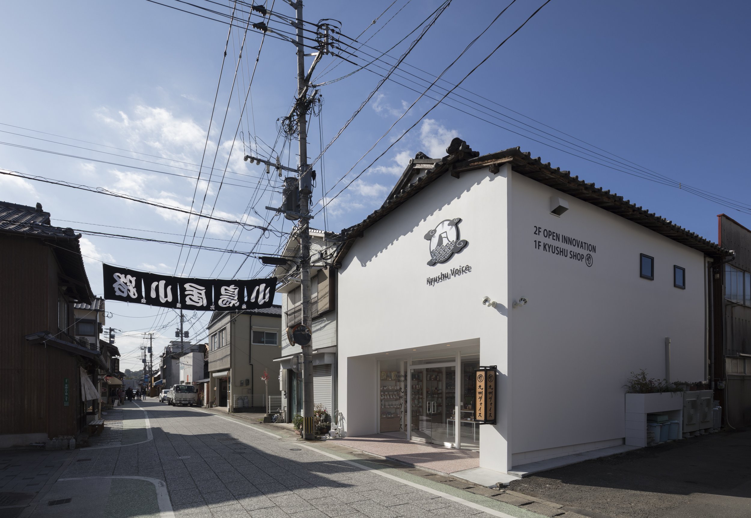
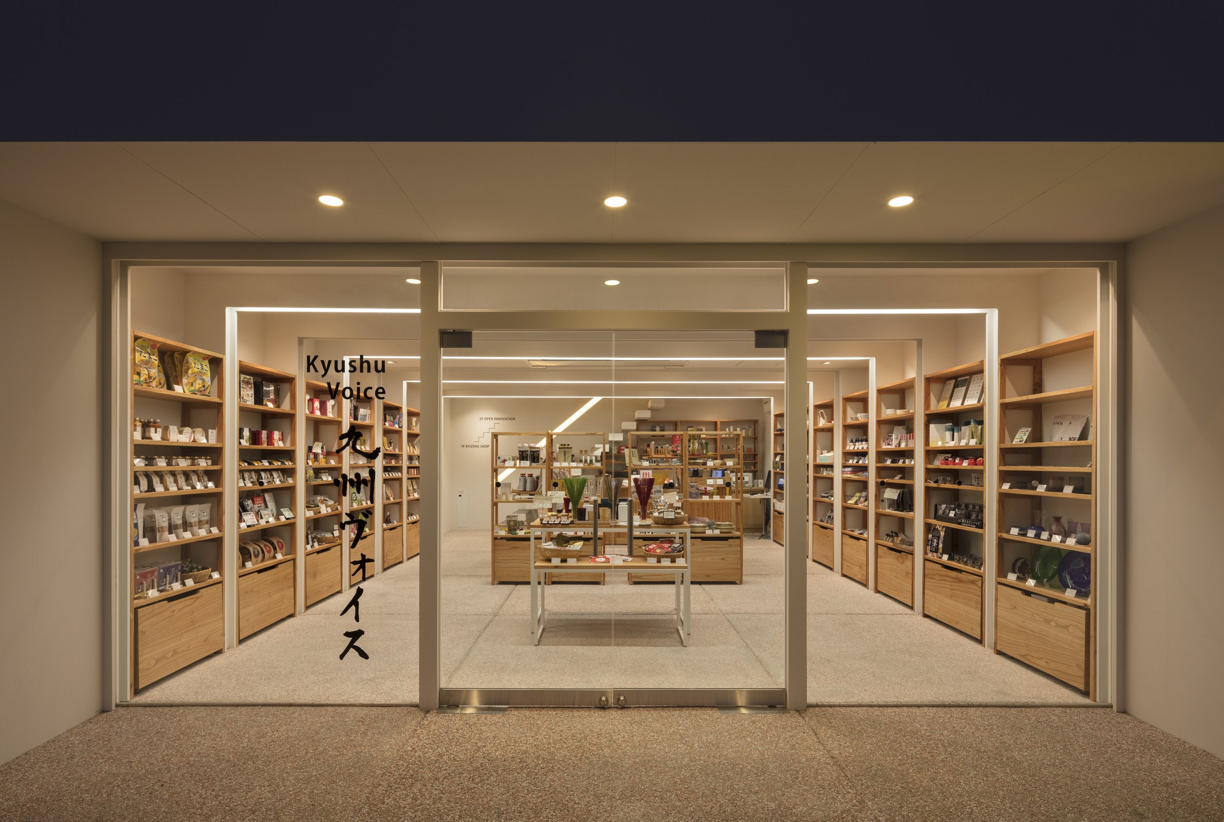
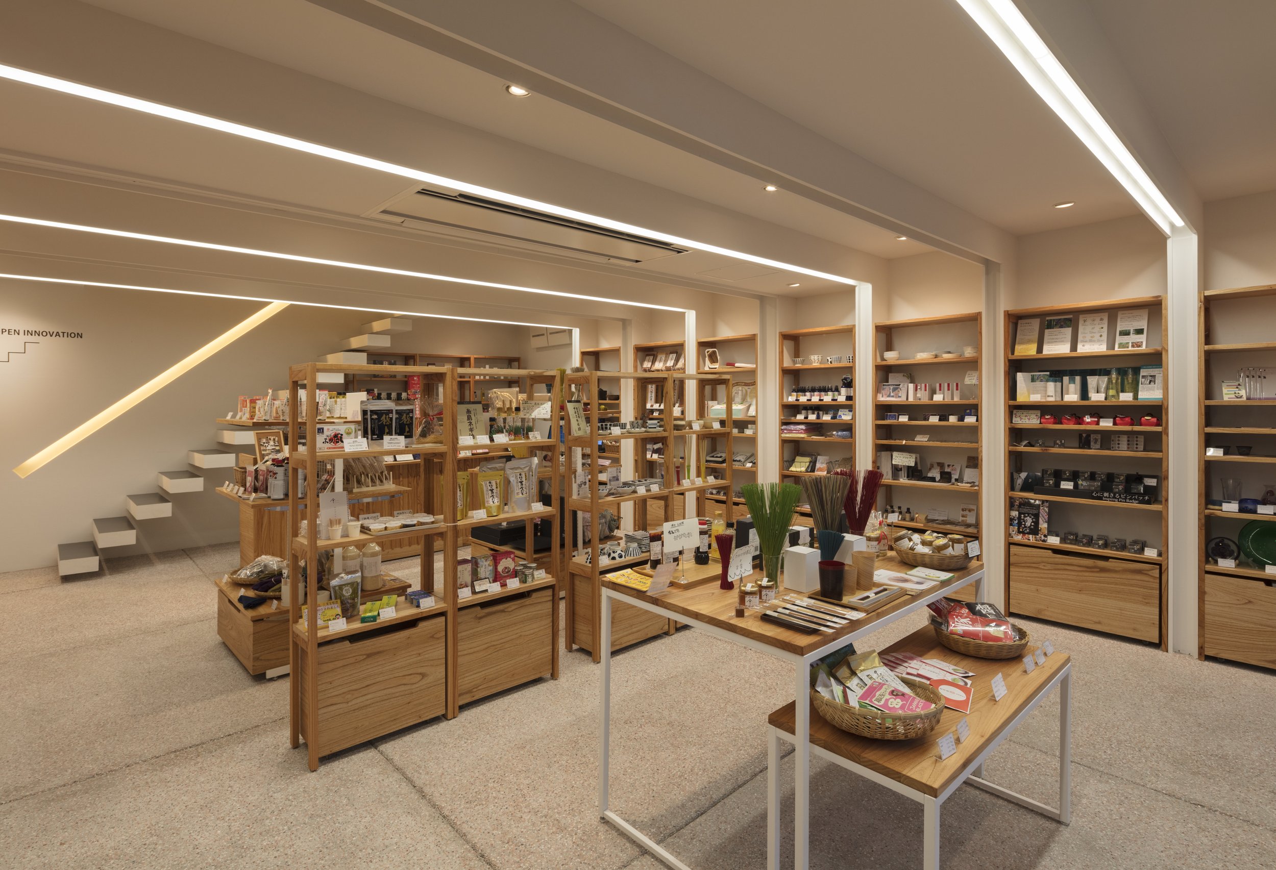
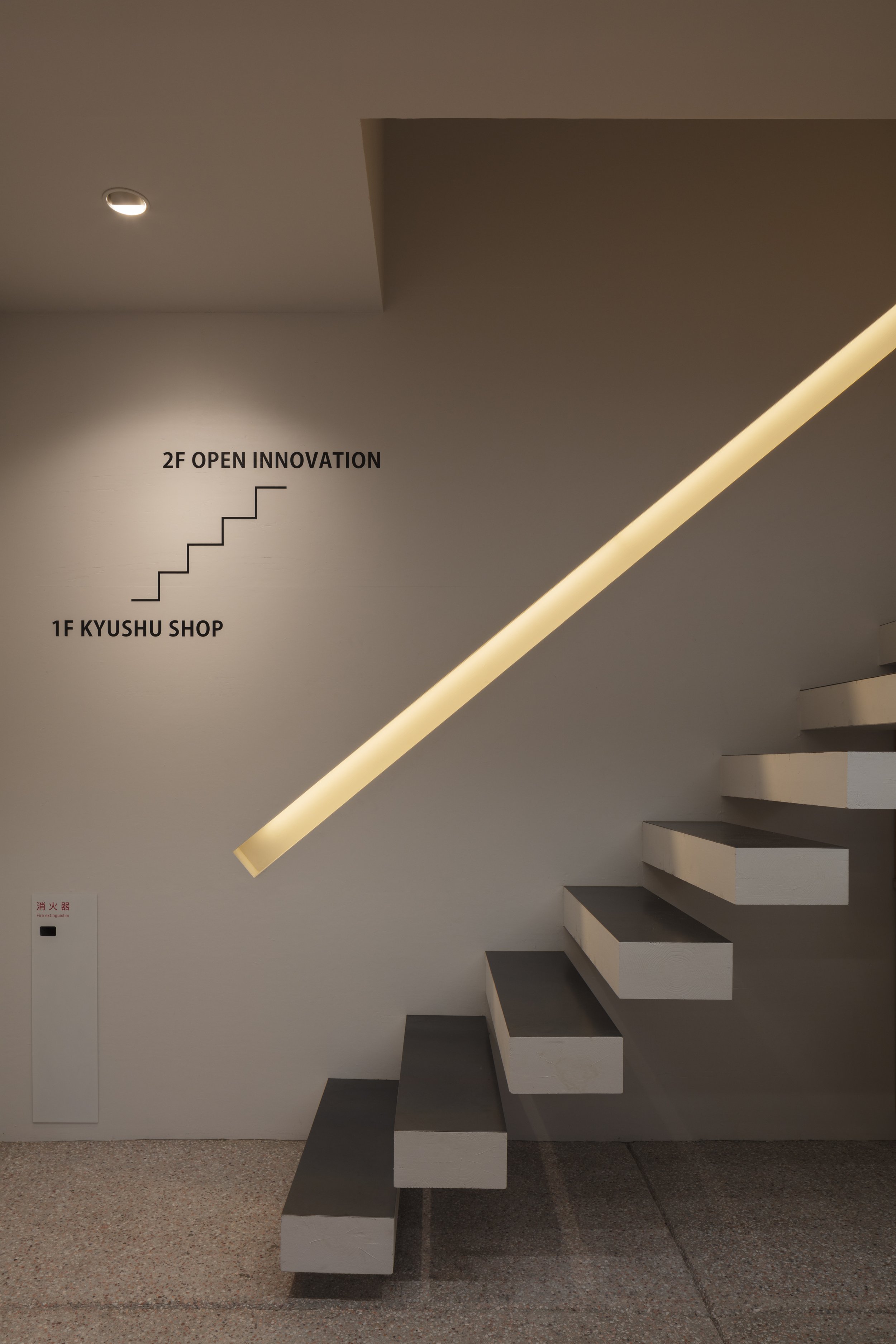
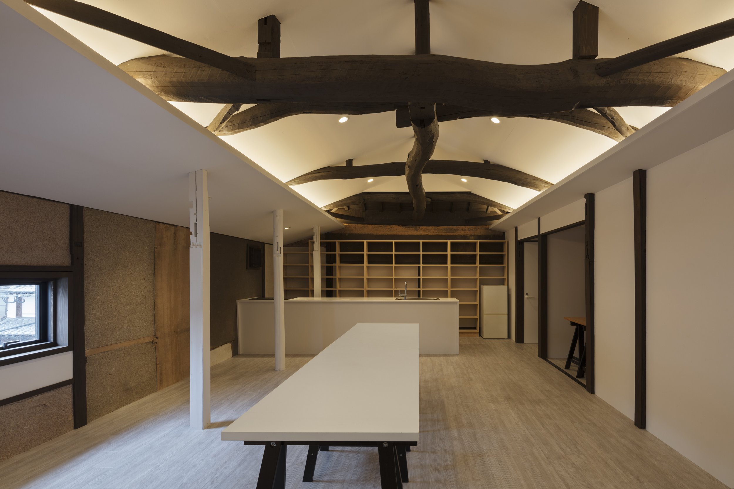
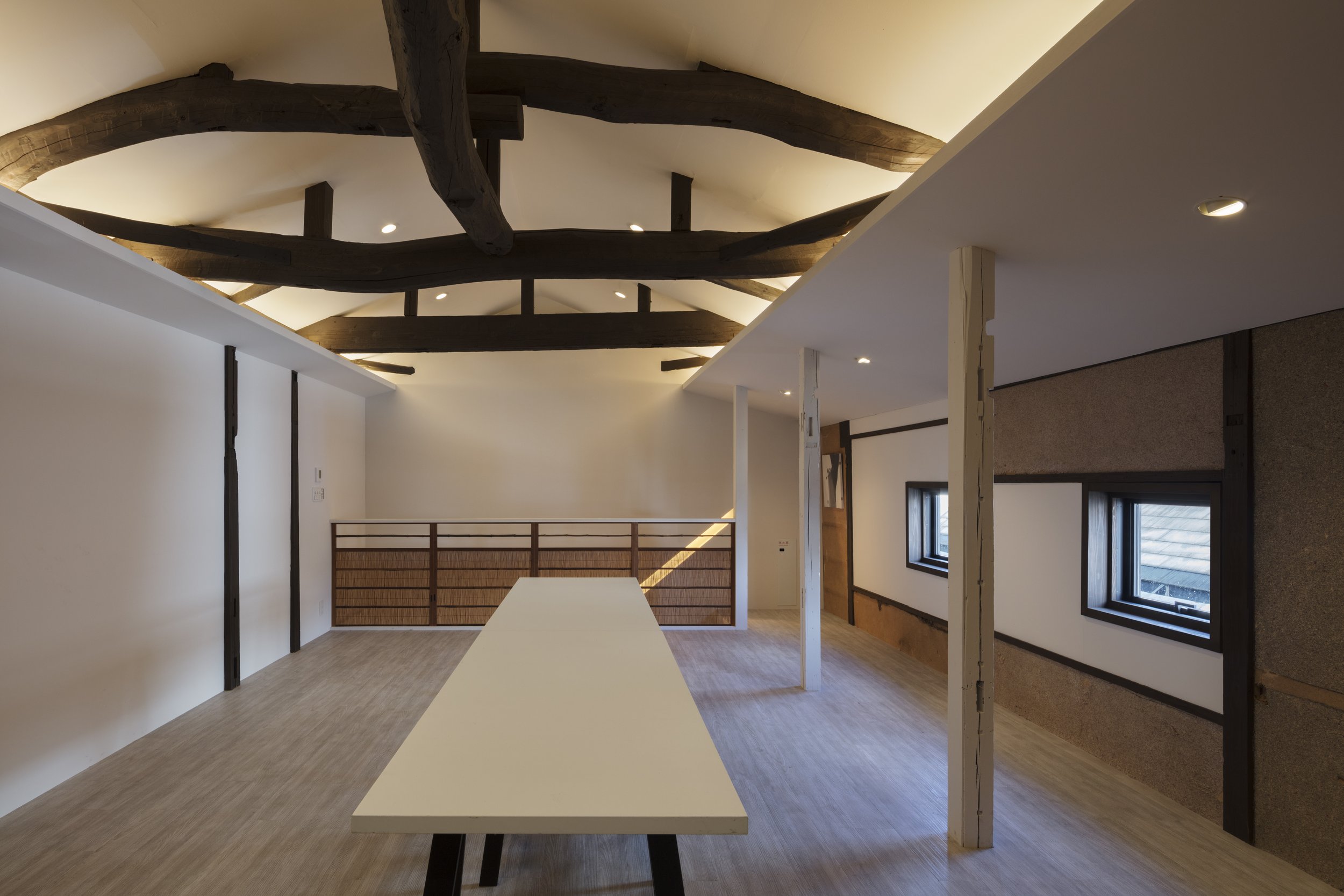
In keeping with the tradition of the building, the designer decided to conserve the tile roof. Aside from this, it is located along a tasteful street, so its façade needed to match the historic Dazaifu. To design its façade, Mr. Aoki drew inspiration from a traditional Japanese warehouse, "Kura". "Kura" has the character of a massive white wall of plaster, similar to the White Cube, an architectural element associated with Modernism. In addition, its traditional elements were applied to its façade design.
The designer further emphasized the modernist theme by inserting white volumes with a columnless open space, similar to the Kura pattern. A row of wooden frames shaped like gates was arranged in order to remind us of a shrine's main entrance. As a result of the construction and reinforcement of the 5.5m span columnless space, the lighting in the frames provided opportunities for people to enter.
"Kyushu Voice" is the silver winning project of Sky Design Awards 2022 in the "The New Black" architecture division,
*The New Black is a new award designed to discover and recognise young architects and designers, or small projects such as pop-up, residential, or retail shops with project sizes up to 50m2 (540 ft²).
*The New Black entrants must be either under 38 years of age OR the project submitted must be less than 50m2 (with no age limitation).
For more information about this project, please visit: https://www.jindesign.co.jp/ or visit the www.skydesignawards.com
R100 Tokyo promotes the cross-cultural aspects of Opus Arisugawa in Japan
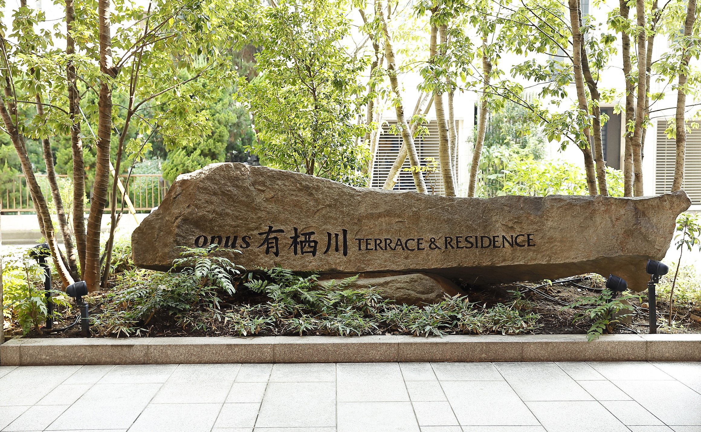
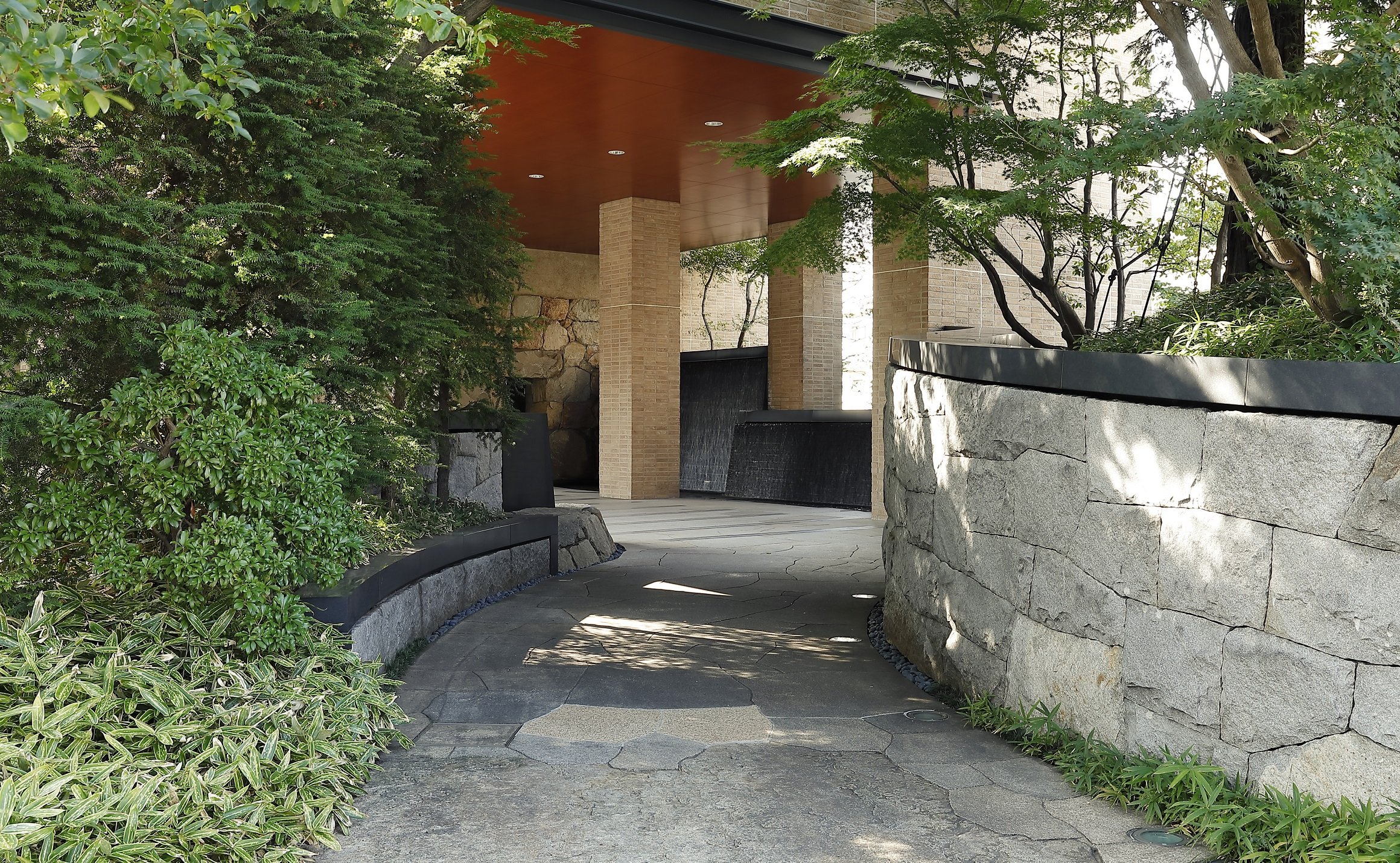
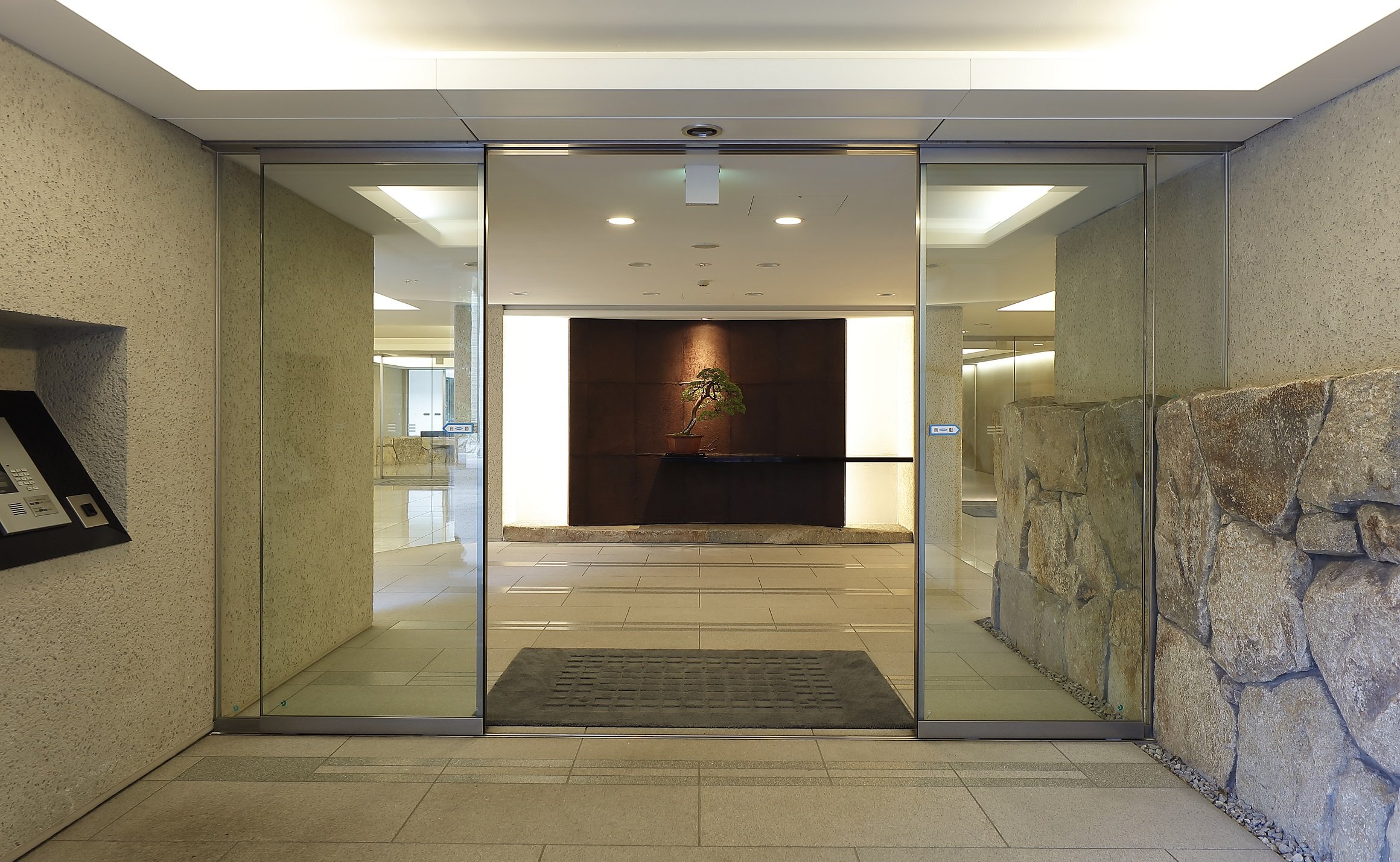
With the "R100 TOKYO" brand, Rebita offers essential living in a direct location in the heart of Tokyo with over 100 square meters of exclusive living space. This unit has been designed according to the concepts of "CROSS-CULTURAL" and "COMPELLING MINIMALISM", and OEO Studio, long inspired by Japan, has added a new proposal based on the sensibilities of Scandinavia and Japan.
Through collaboration with OEO studio, With the collaboration of OEO studios, R100 Tokyo promotes Opus Arisugawa's cross-cultural aspects in Japan
Over a 100 square-meter unit has been developed by Rebita Corporation in cooperation with NTT Urban Development Corporation (Head Office: Chiyoda-ku, Tokyo; President: Junichi Kawashima.), developed within Opus Arisugawa, a leading Tokyo condominium . The unit was designed by Copenhagen, Denmark-based OEO Studio as the first residential design available for sale.
Rebita is proud to announce that they have teamed up with the design firm, OEO studio, to create a new concept for living in Tokyo. This unit has been designed according to the concepts of "CROSS-CULTURAL" and "COMPELLING MINIMALISM", and OEO Studio, long inspired by Japan, has added a new proposal based on the sensibilities of Scandinavia and Japan.
The result is R100 TOKYO - a 100 square meter unit that provides essential living in a direct location in the heart of Tokyo through collaboration between two cultures. OEO Studio is a design company that specializes in creating products and spaces that are both compelling and minimalistic. The company's signature approach is to express a simple yet compelling narrative through the use of materials and subtle, precise details. Through this partnership, R100 hopes to promote cultural similarities between Scandinavia and Japan while observing Japan from a slightly different perspective.
About the Concept
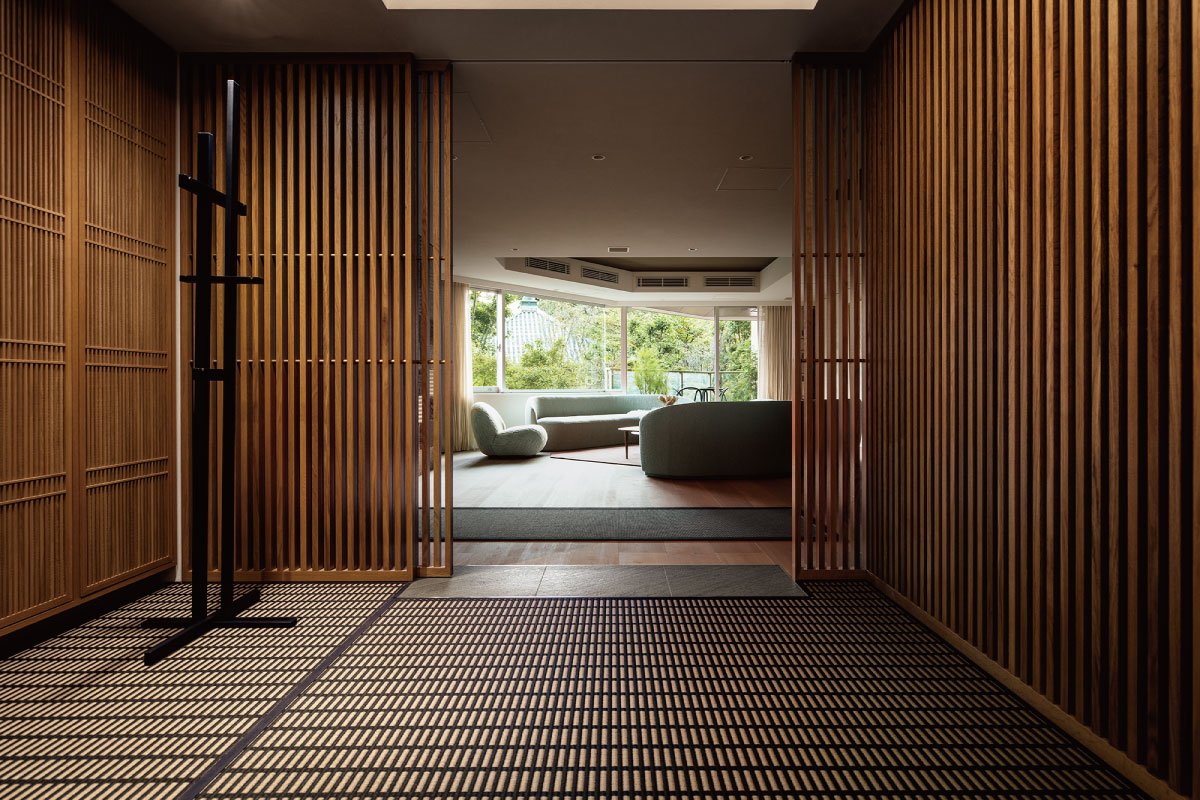
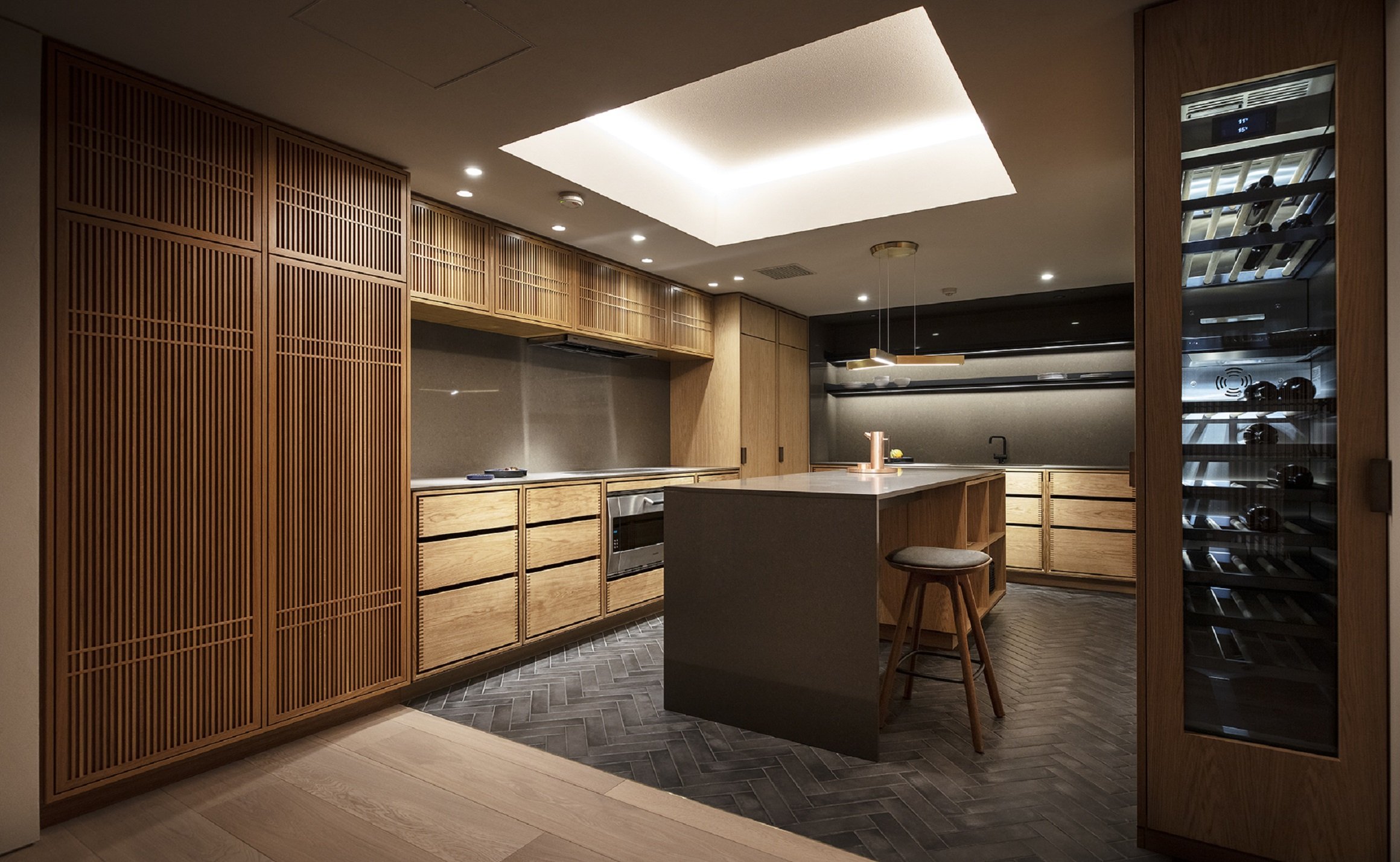
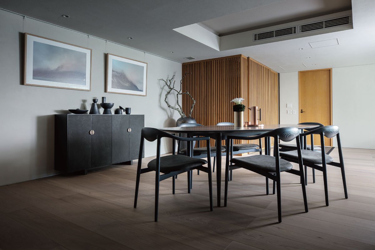
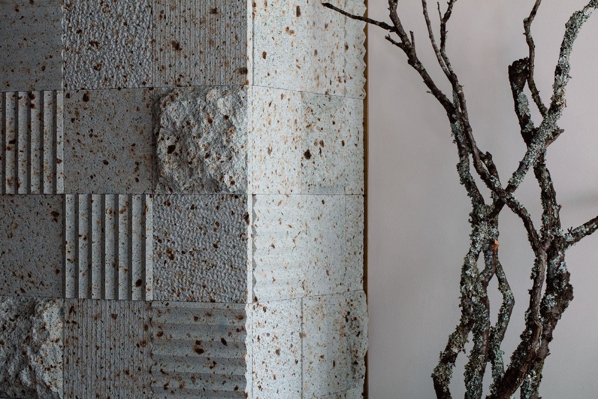
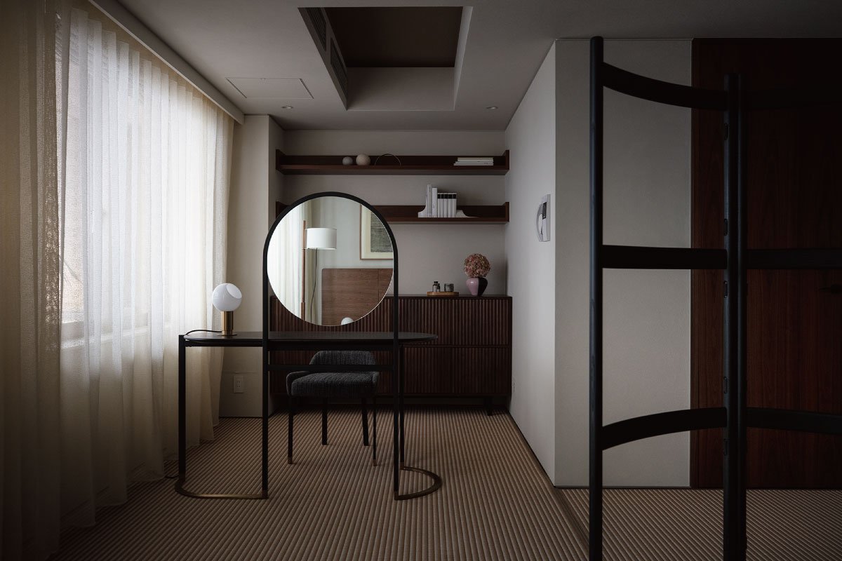
Above images: A variety of natural materials are used in the design of natural spaces
Scandinavian and Japanese cultures share a sense of natural materials, and the units draw extensively on natural elements. The oil finish is given to solid wood as much as possible so that it can change even more beautifully over time. Garde Hvalsøe (also written as Garde Vels), a Danish kitchen workshop, designed and constructed the large wooden kitchen, which is the first of its kind ever to be shown to the public. As it is used more and more, the solid wood will become a symbol of the residence because it is reminiscent of Danish cabinetry from the 1950s. With this property, you will be able to experience Scandinavian and Japanese cultures at the same time, and as you live there longer, the more blessings you will reap.
Background of Planning Recent growth in the urban luxury condominium market has occurred along with the emergence of a new group of buyers, including young entrepreneurs and executives, and there is a growing demand for homes that exceed traditional values such as real estate market prices and features of homes. Located in the heart of Tokyo's city center, R100 TOKYO from Rebita International offers one-of-a-kind residences designed by numerous architects and designers in order to provide "homes that look forward 100 years".
With the acquisition of Opus Arisugawa, a superior urban residence in terms of both location and specifications, we aim to offer a one-of-a-kind residence that will maximally express what R100 TOKYO wishes to offer, which led us to design this residence.
Japanese people have respected nature for thousands of years, taking in the surrounding scenery and sunlight, blending it with materials that make up their homes, and experiencing the changes and beauty of the four seasons each day. With their fusion, Japanese culture and Scandinavian values would enhance and sublimate each other. The design of this unit is a collaboration between R100 Tokyo and OEO Studio, a Danish architectural firm with deep cultural knowledge of Japanese design and culture, with the goal of creating a "cross-cultural" design based on Japanese culture.
Please visit: https://r100tokyo.com/sales/akasaka-aoyama-azabu/opus3rdflooroeostudio/ for more information
Or stay tuned with our Upcoming new publication of “One Story” for the story of R100 Tokyo.
OEO Studio has designed interiors, furniture, and products around the world, in addition to a number of projects in Japan, including the Kaikado Cafe, a collaboration with a Kyoto craftsman, as well as the interior design for the INUA restaurant in Tokyo.
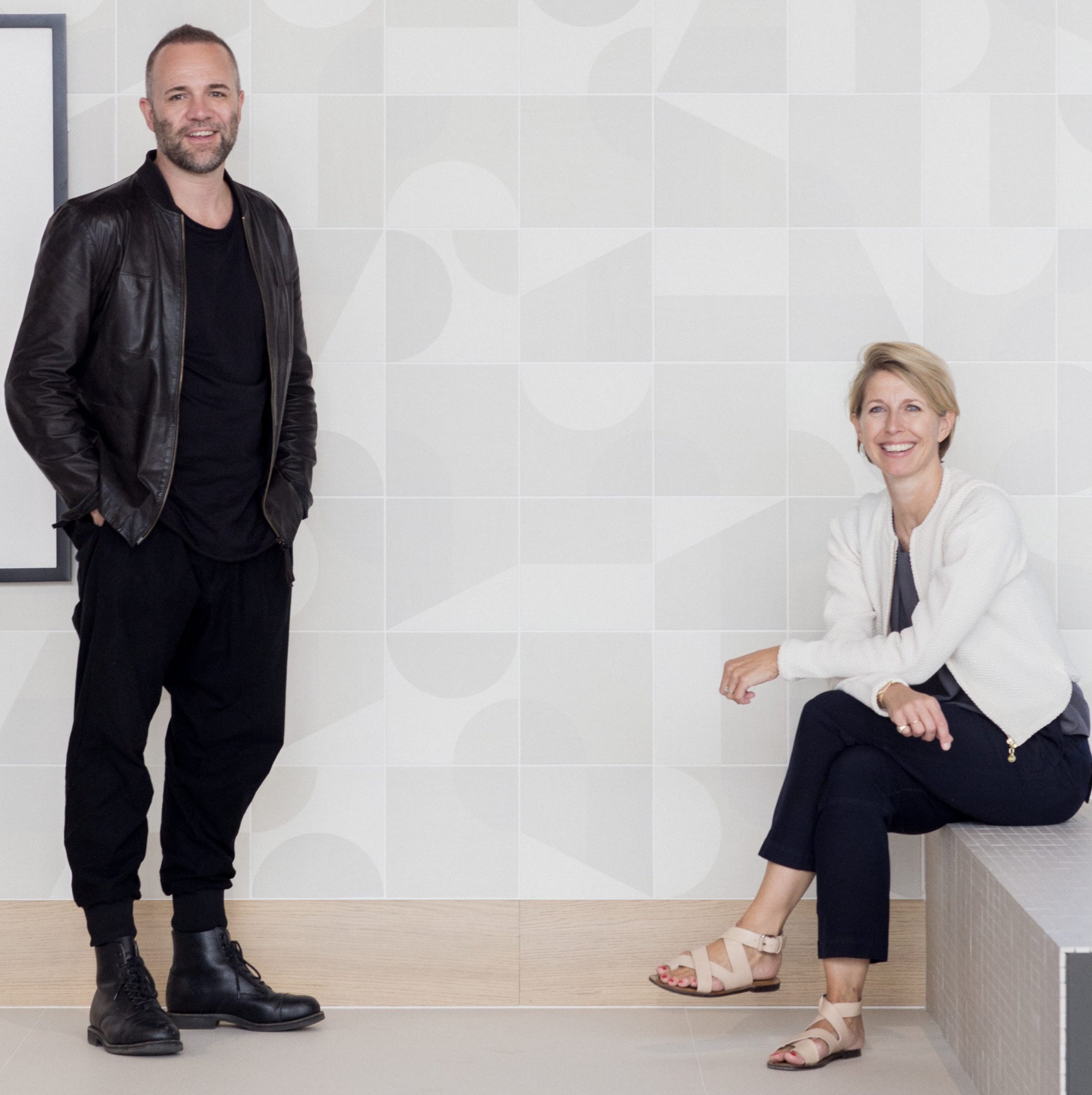
Left: Thomas Lykke, Head of Design & Founding Partner at OEO Studio
Right: Anne-Marie Buemann, Managing Partner at OEO Studio
Apartment with Six Void in Fudomae, Japan
A city with a dense population in Japan has many small houses and apartments. Fudomaw's apartment with six voids was designed by Akira Koyama from Key Operations Inc. This project won the bronze award in the architecture category in the 2021 Sky Design Awards.
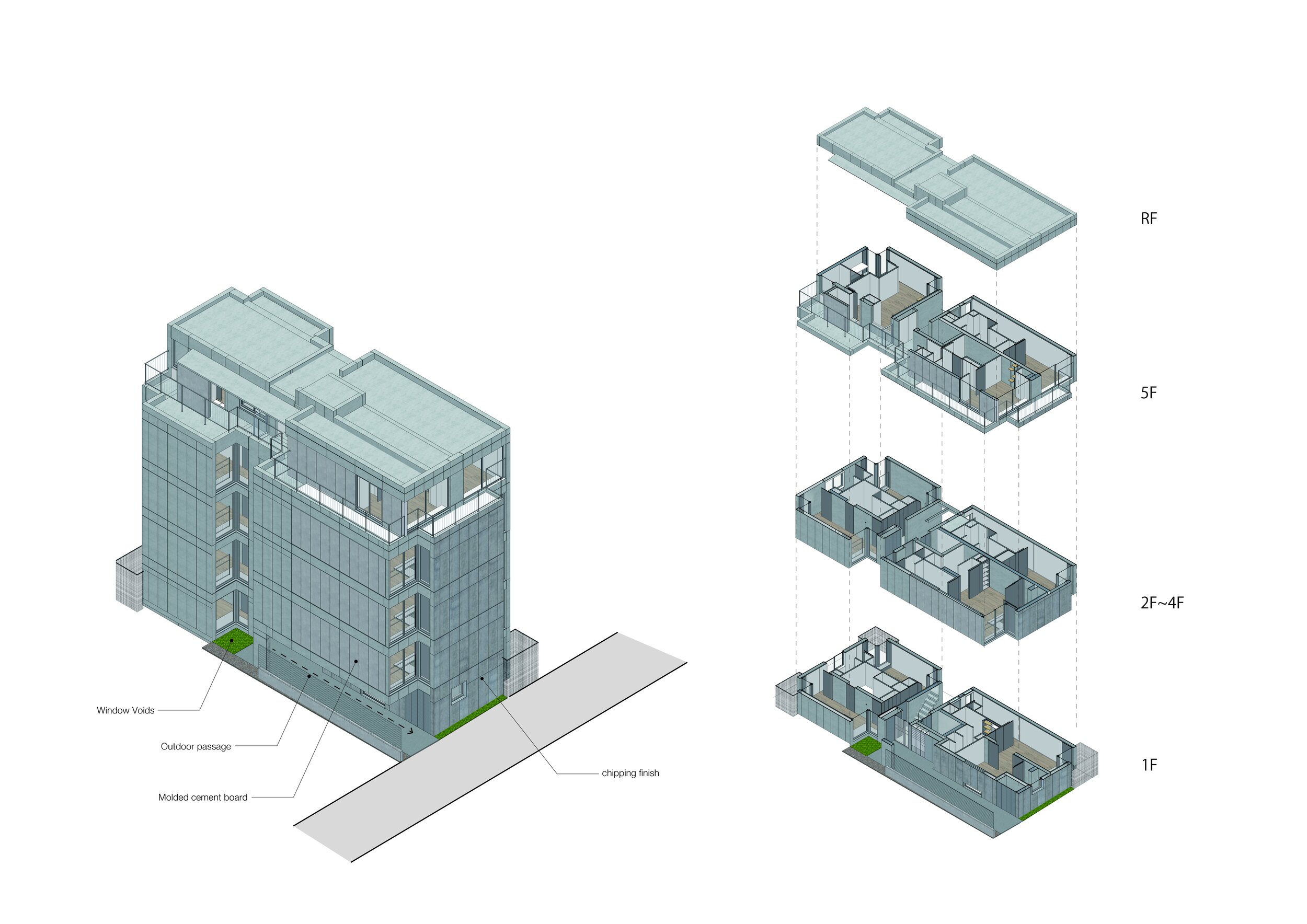
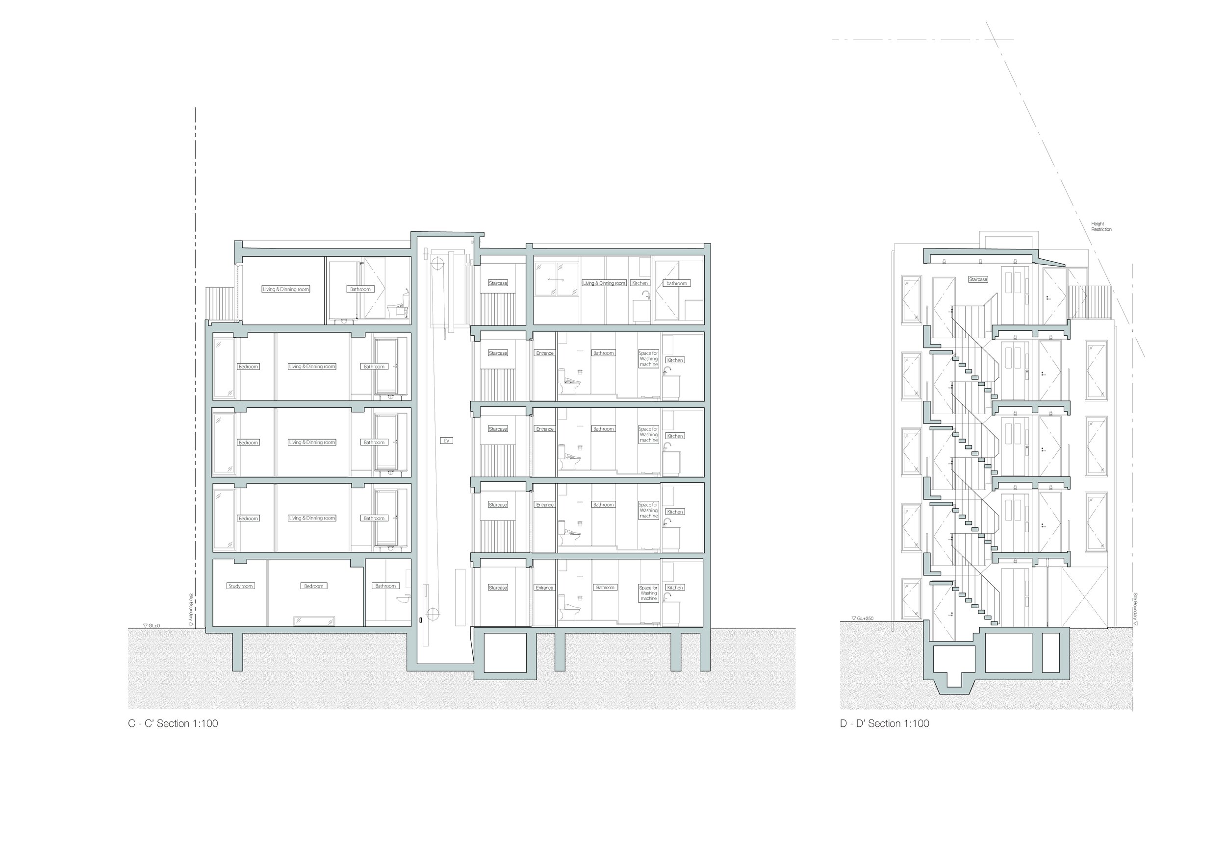
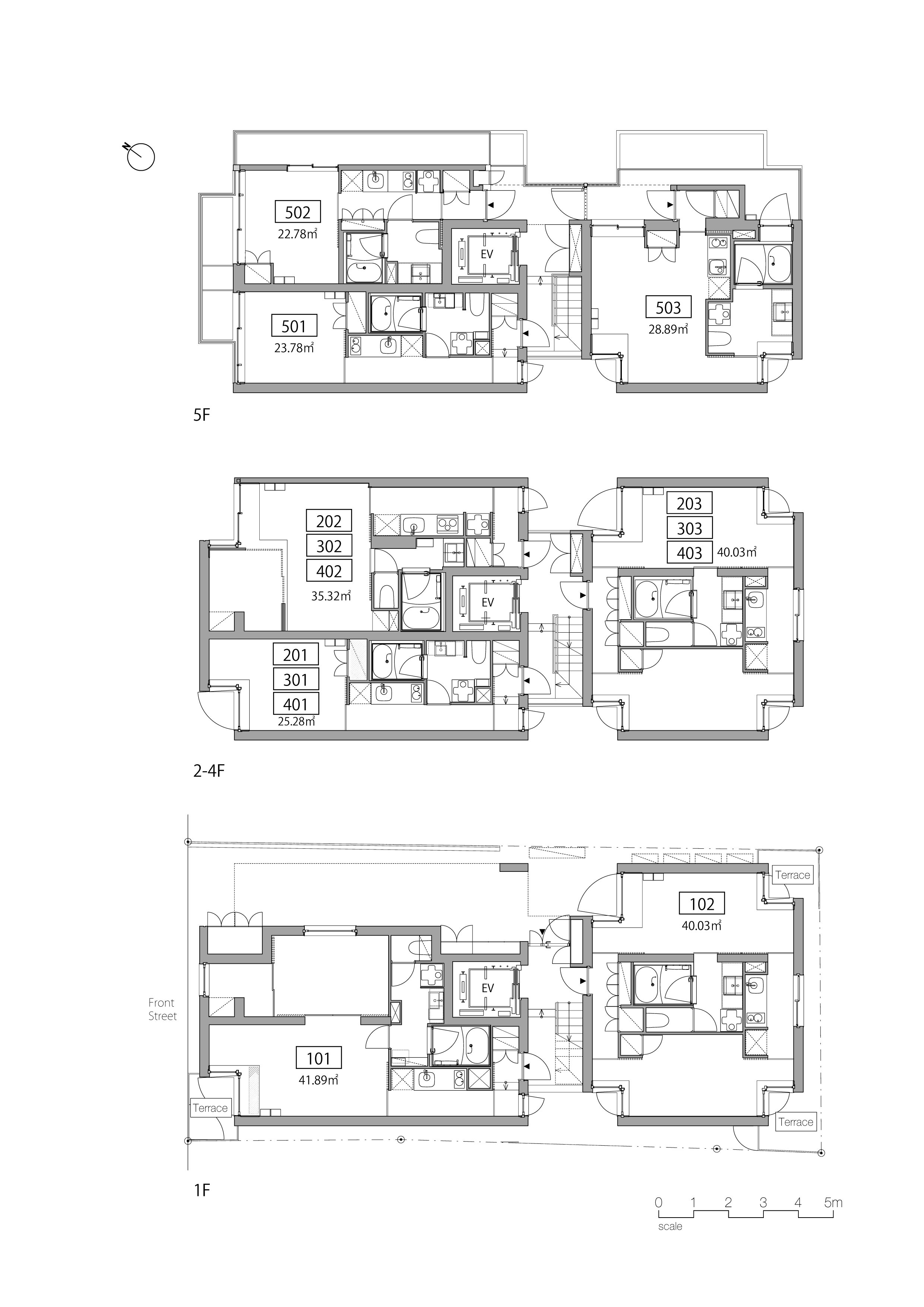
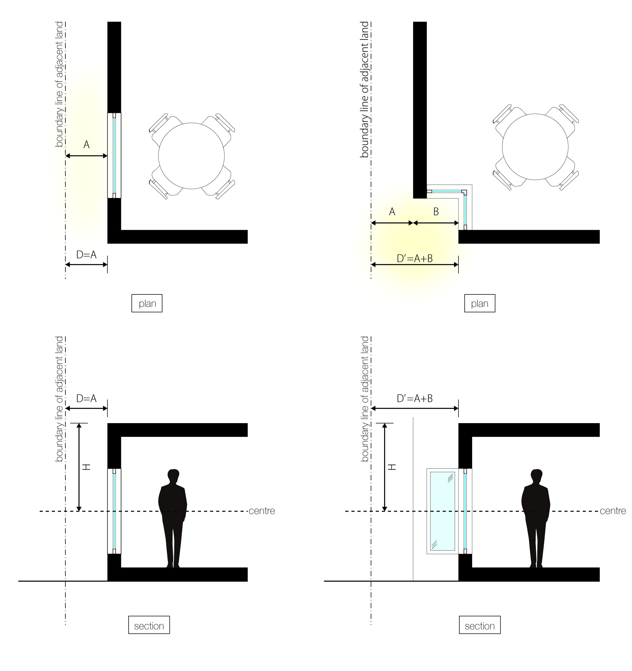
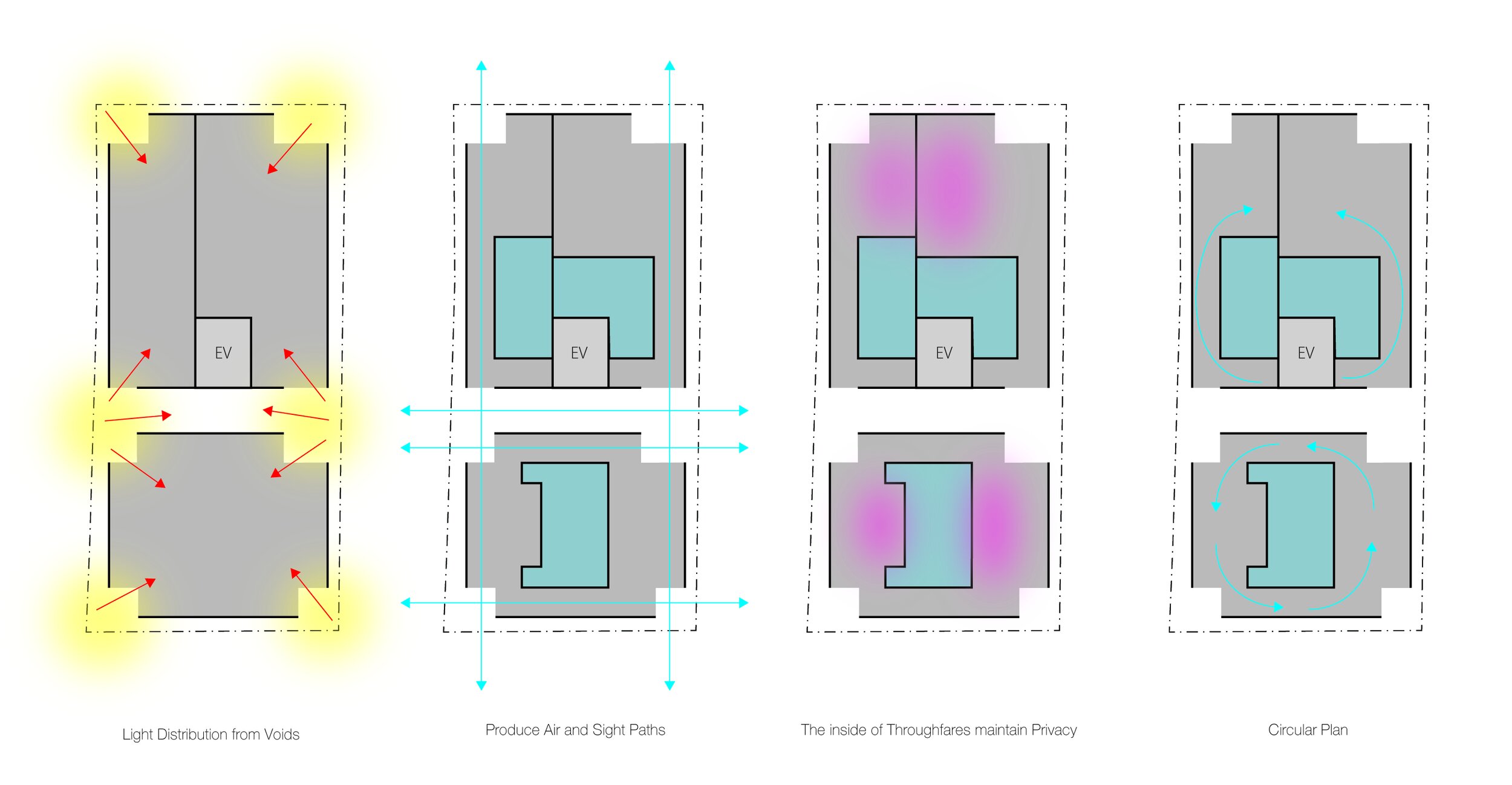
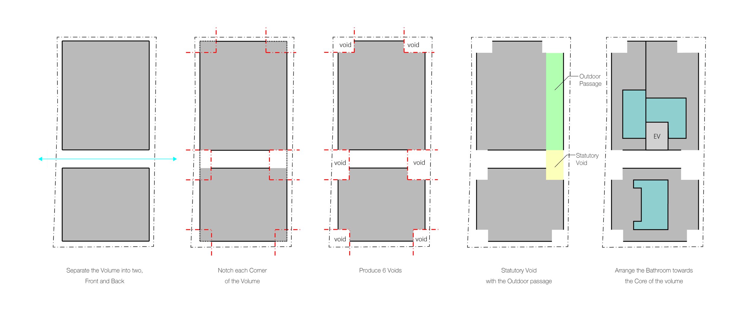
In an area near the entrance to Meguro Fudoson, a Buddhist temple, a five-storey apartment complex with 14 units was built. In order to develop a parcel relatively deep with an extremely tight frontage in central Tokyo, the main theme for the design was to provide daylight and airflow wherever possible. The design also maintained density, thereby optimizing rental rates. Additionally, voids were established to meet the local ordinance requirement of an evacuation route.
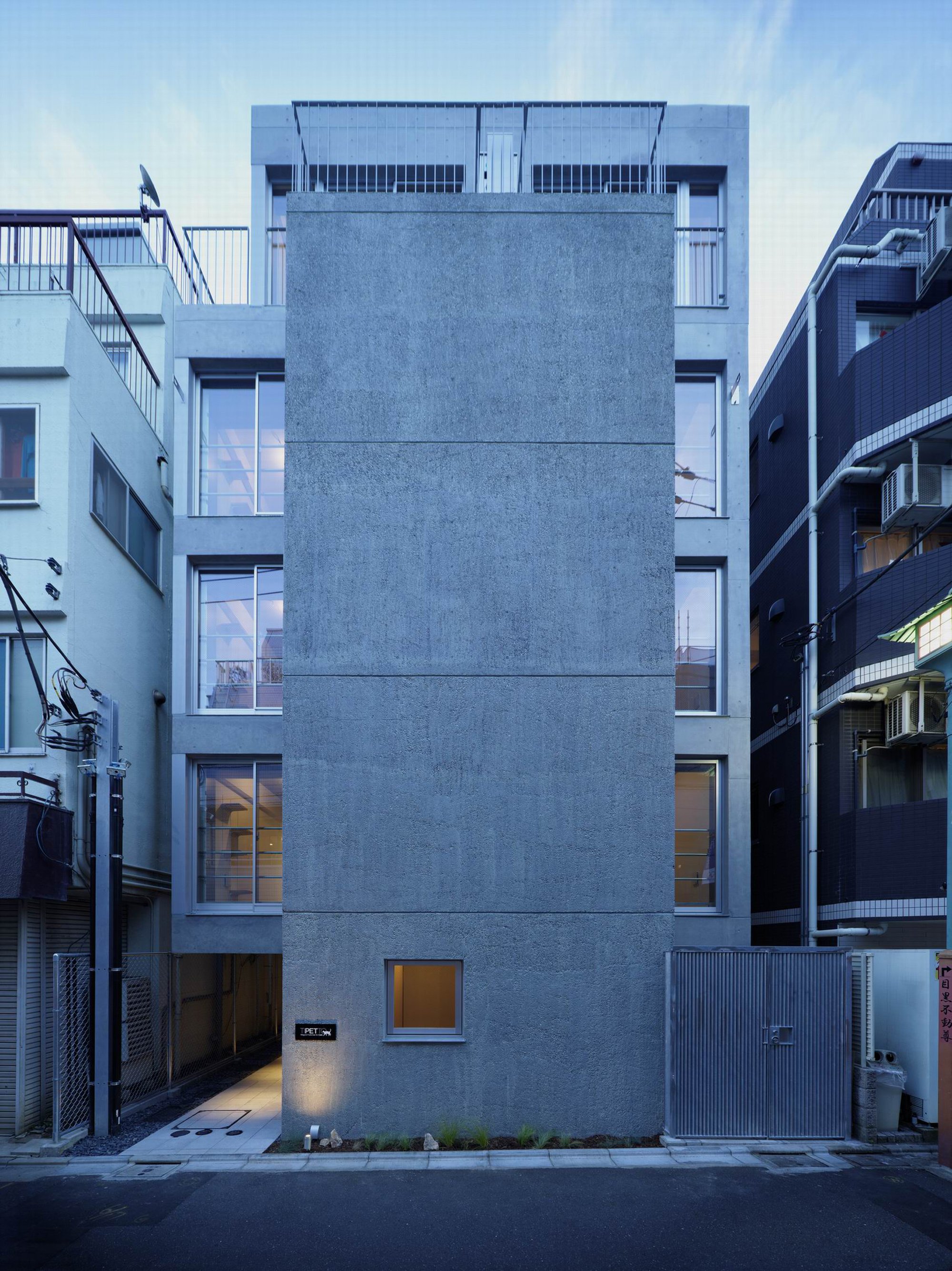
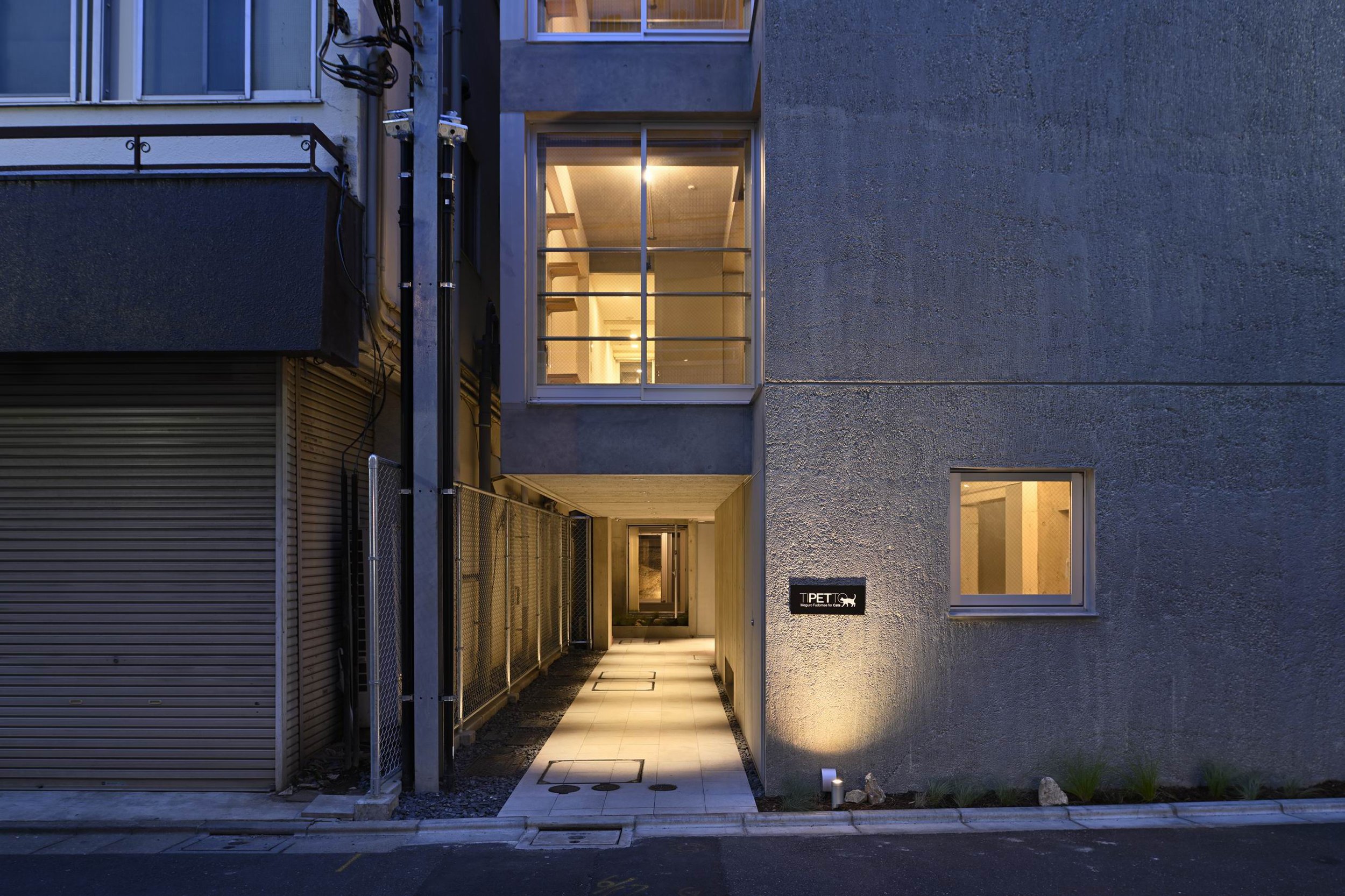
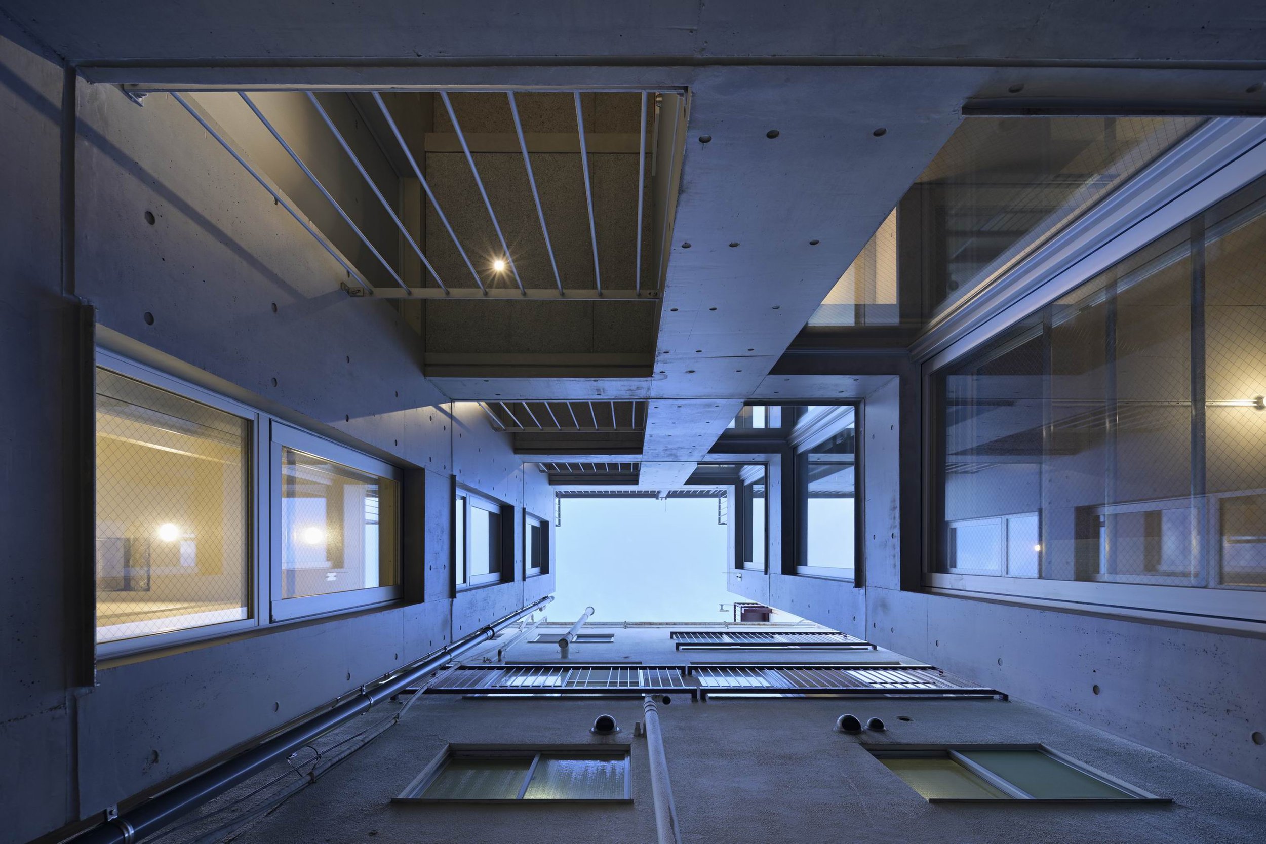
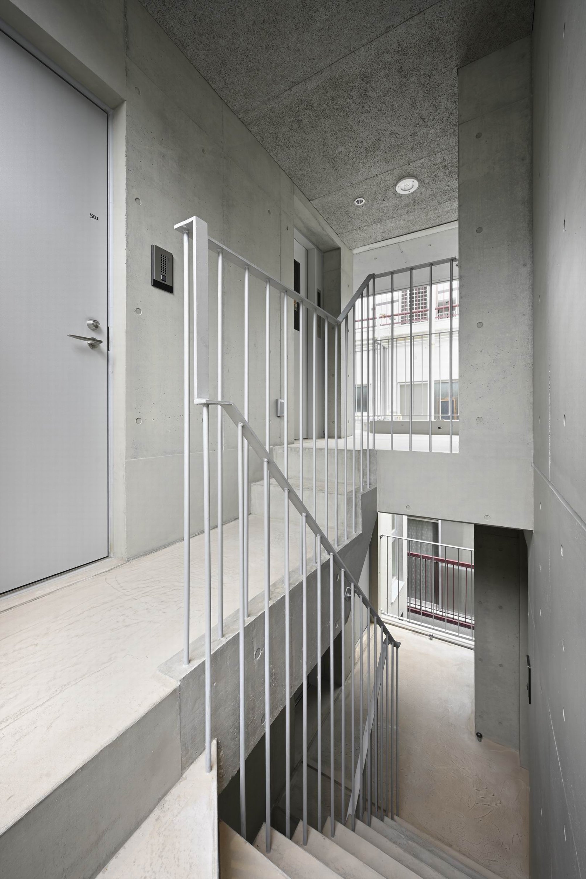
The completed building consists of two volumes, front and rear, separated by open corridors and stairs ascending to all floors. There are six vertical voids in each volume that focus light downward for a comfortable indoor environment. Each volume is notch-notched to reveal six vertical voids. In this complex, studio flats are arranged so that the bathrooms are at the center of the volume and the corridor runs along the exterior wall. Internally, the corridors serve to provide natural ventilation through the six voids from the front to the back. Similarly, the one-bedroom flats of the rear volume have bath areas at the core and can also be traversed past the entry and kitchen to the living room or bedroom, so a circular path can be followed around the entire perimeter of the apartment. Within the vicinity of windows facing the voids, there is a loft and stairs for cats. While humans relax in the same area, cats can bask in the sun and explore outside. On the whole, the indoor environment is conducive for humans and cats.
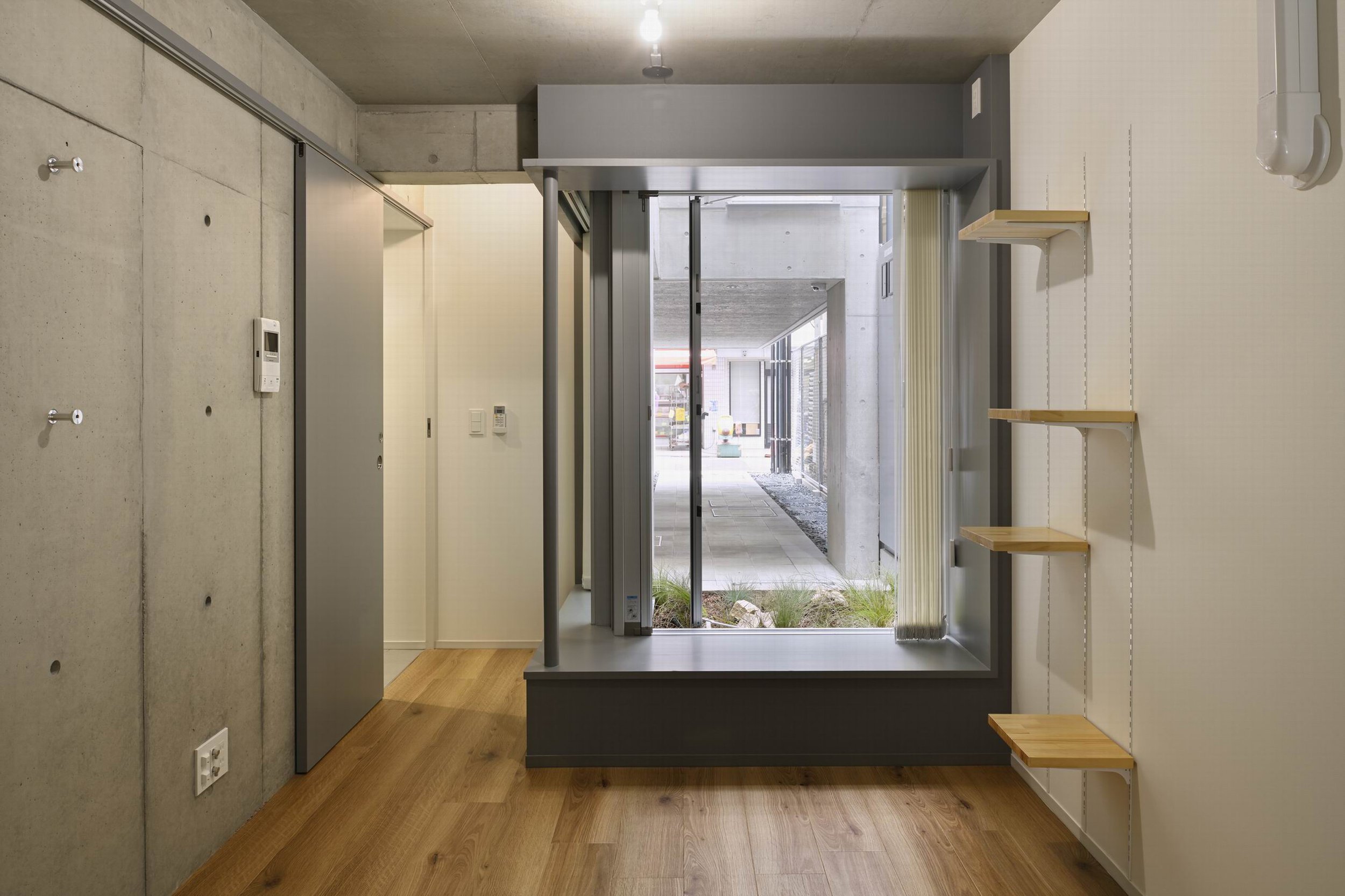
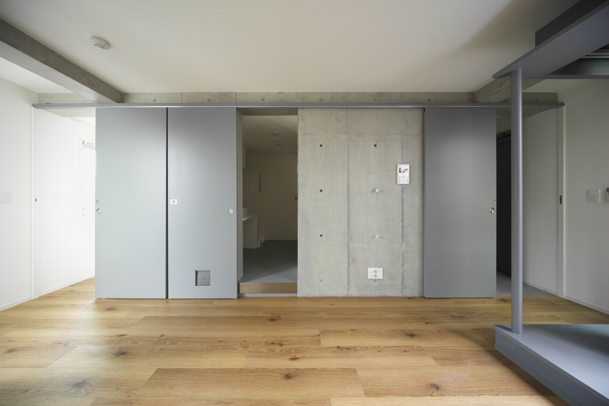
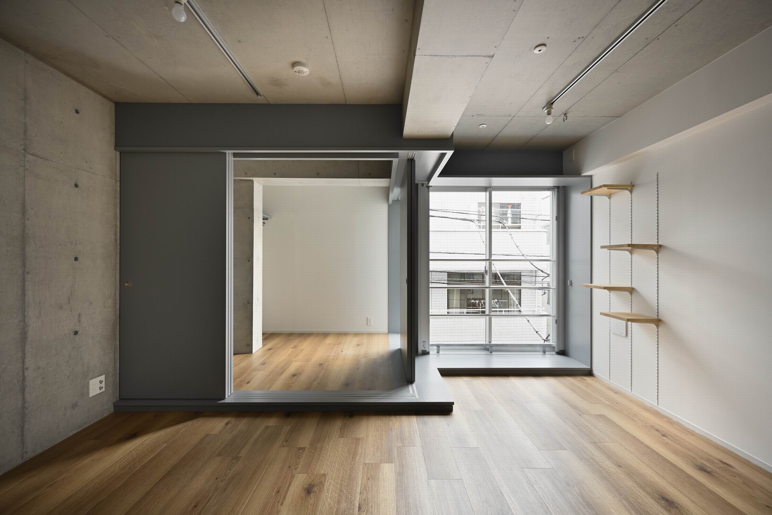
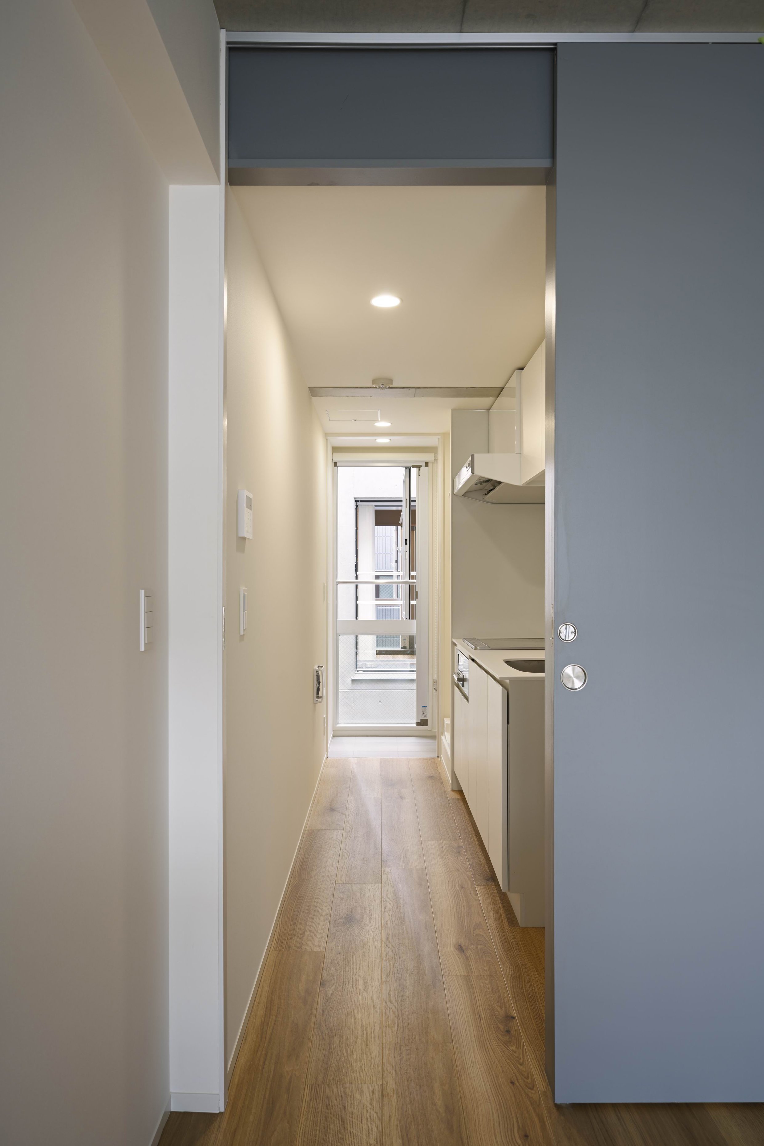
The COVID-19 experience highlights the importance of including outdoor spaces in the design, like windows, balconies, rooftops, and courtyards, as well as plazas, parks, and other open spaces. Within this flat complex, there are voids which create poor airflow to the back to ensure natural ventilation.
Although a studio layout was initially requested for the larger flats designed for two occupants, the final plan establishes two mutually separate, comfortable living spaces connected by corridors along the full perimeter of the building. Separate "meeting" rooms are available to both residents if they are both working at home and provide quiet work environments without having to worry about noise from the other. Furthermore, accommodations provide comfort through pets to the "post Coronavirus" generation.
Drawing/ Planning
