Blue Bottle Zhang Yuan Cafe design by Neri&Hu
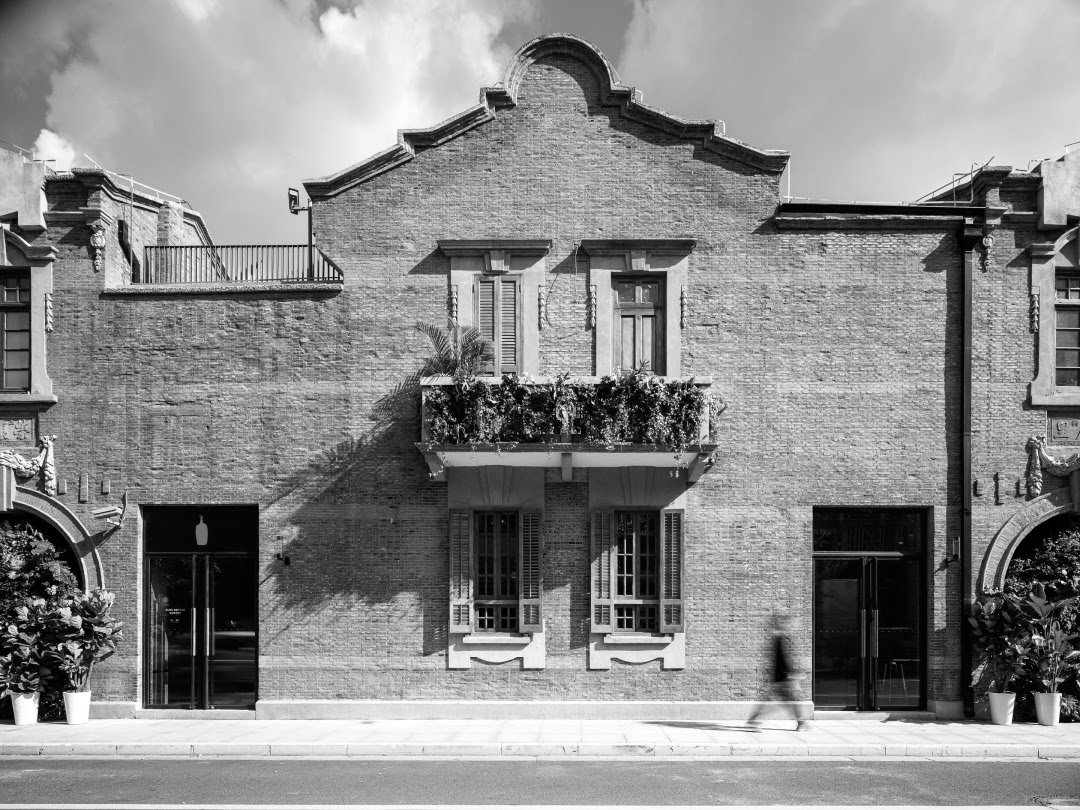
The most famous garden in Shanghai, Zhang Yuan, developed into one of the earliest public and commercial spaces in modern China, exemplifying and leading the emergence of a new Chinese urban lifestyle at the end of the 19th century. After a complete rehabilitation of Zhang Yuan's historic buildings, Blue Bottle commissioned Neri&Hu to create a retail space within one of the old Shikumen typology residences in 2022. In Shanghai, coffee initiates a dialogue between the city's rich history and its contemporary social landscape.
The most famous garden in Shanghai, Zhang Yuan, developed into one of the earliest public and commercial spaces in modern China, exemplifying and leading the emergence of a new Chinese urban lifestyle at the end of the 19th century. After a complete rehabilitation of Zhang Yuan's historic buildings, Blue Bottle commissioned Neri&Hu to create a retail space within one of the old Shikumen typology residences in 2022. In Shanghai, coffee initiates a dialogue between the city's rich history and its contemporary social landscape.
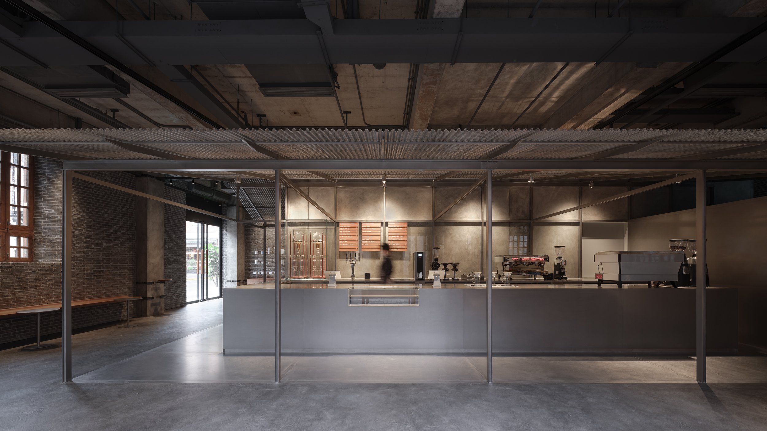
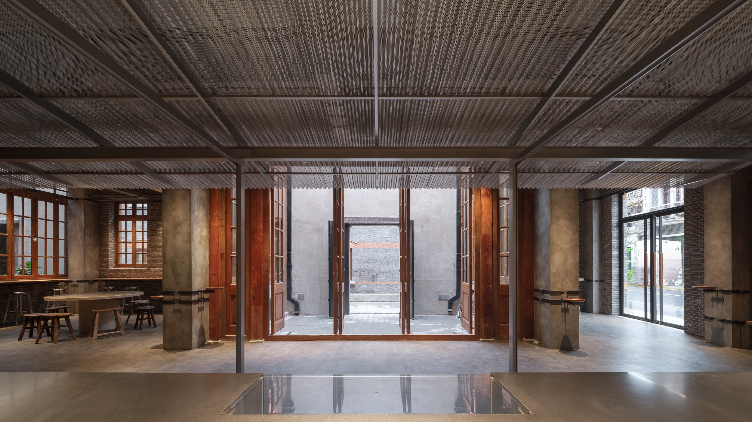
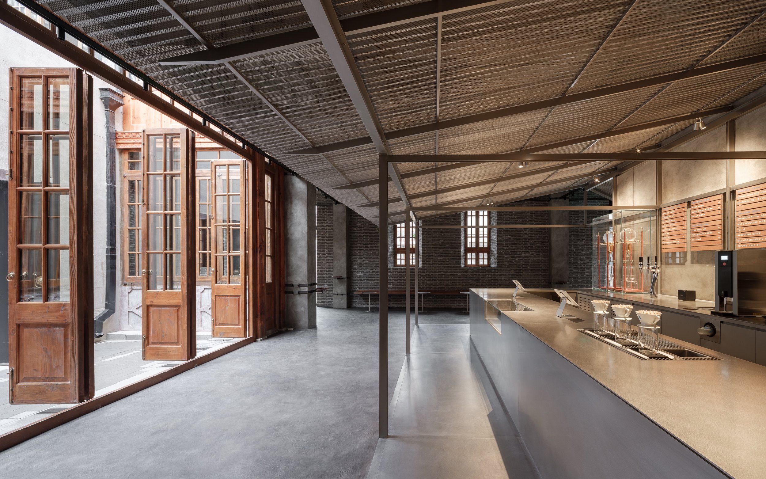
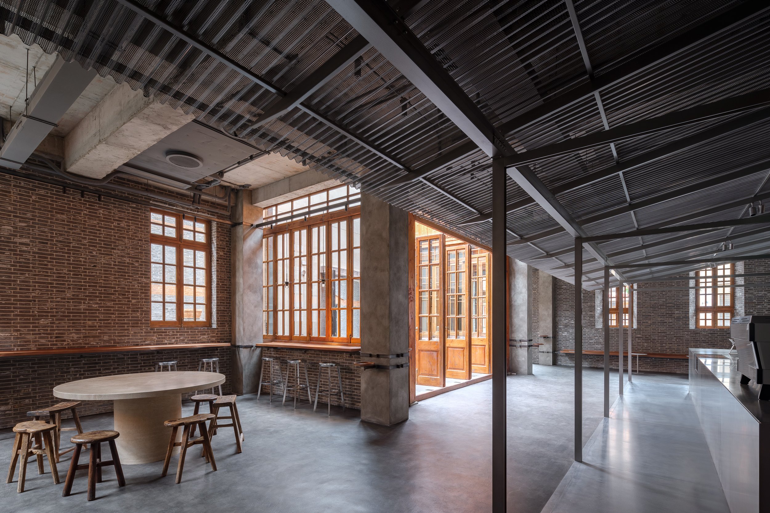
Amidst the architectural relics of Zhang Yuan, where the city’s collective memory resides, one can imagine this scene described by Chinese writer Mu Xin - people scattered about in the shadowy lanes of Shanghai at sunset like tiny crabs scurrying in and out of their sandy shelters. In this vast network of alleys, people carried on about their daily lives, but there was always time for leisure for the Shanghainese. Both locals and visitors can enjoy Neri&Hu's narrative journey by capturing the spirit of the local urban fabric.
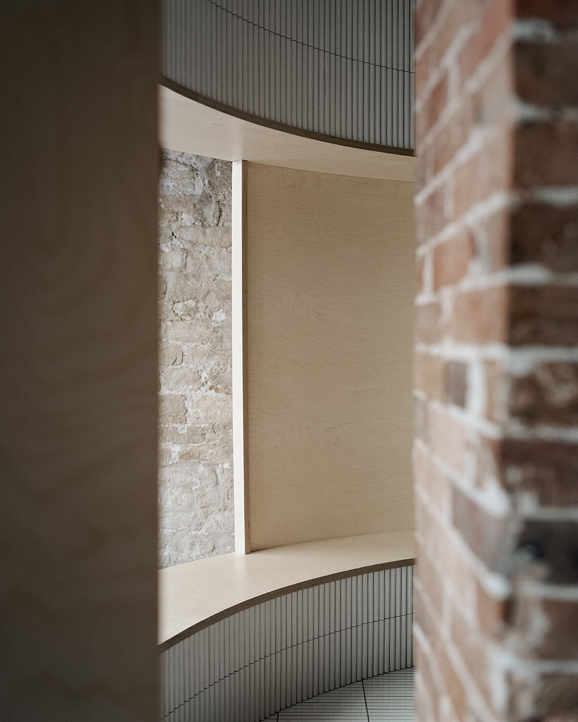
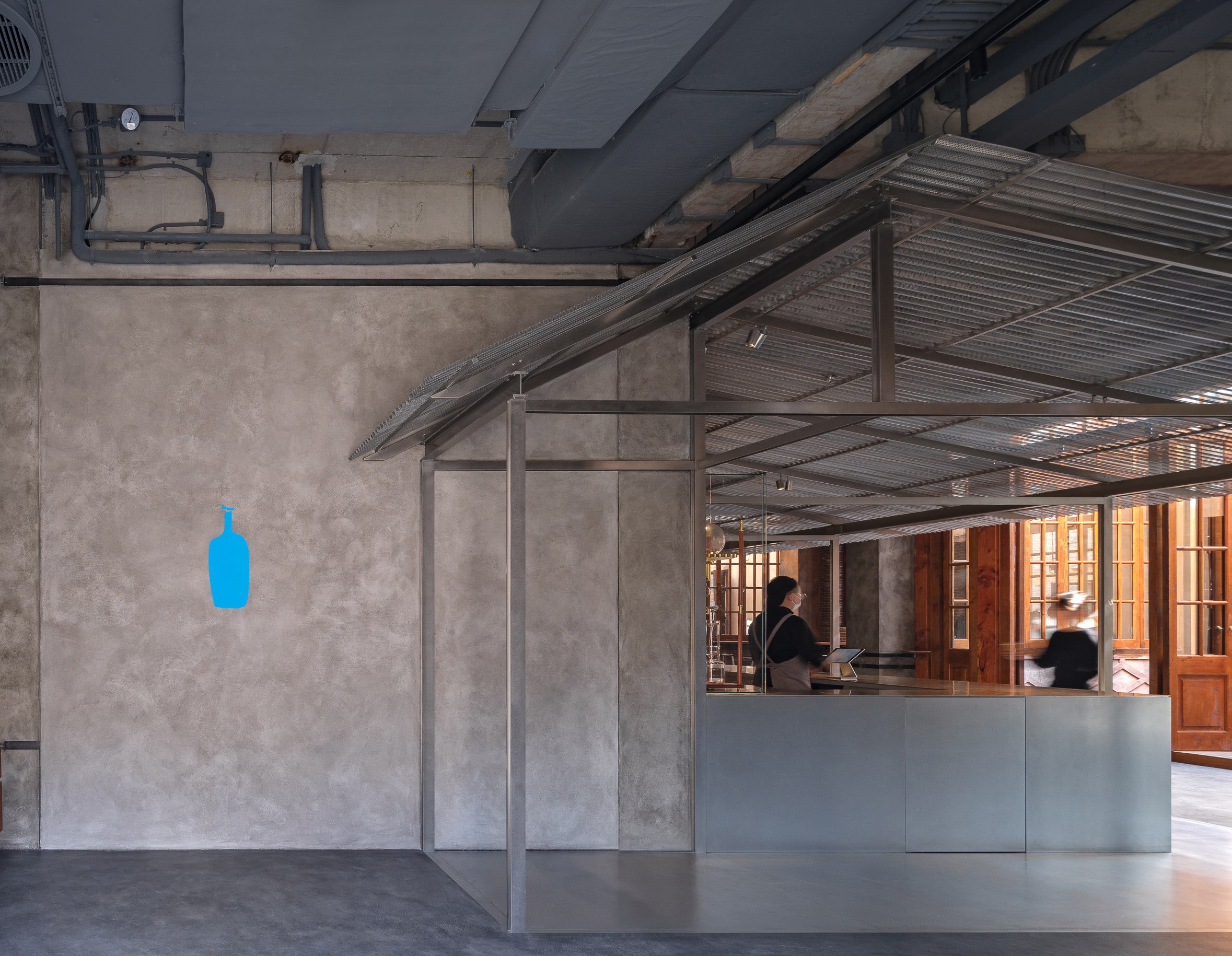
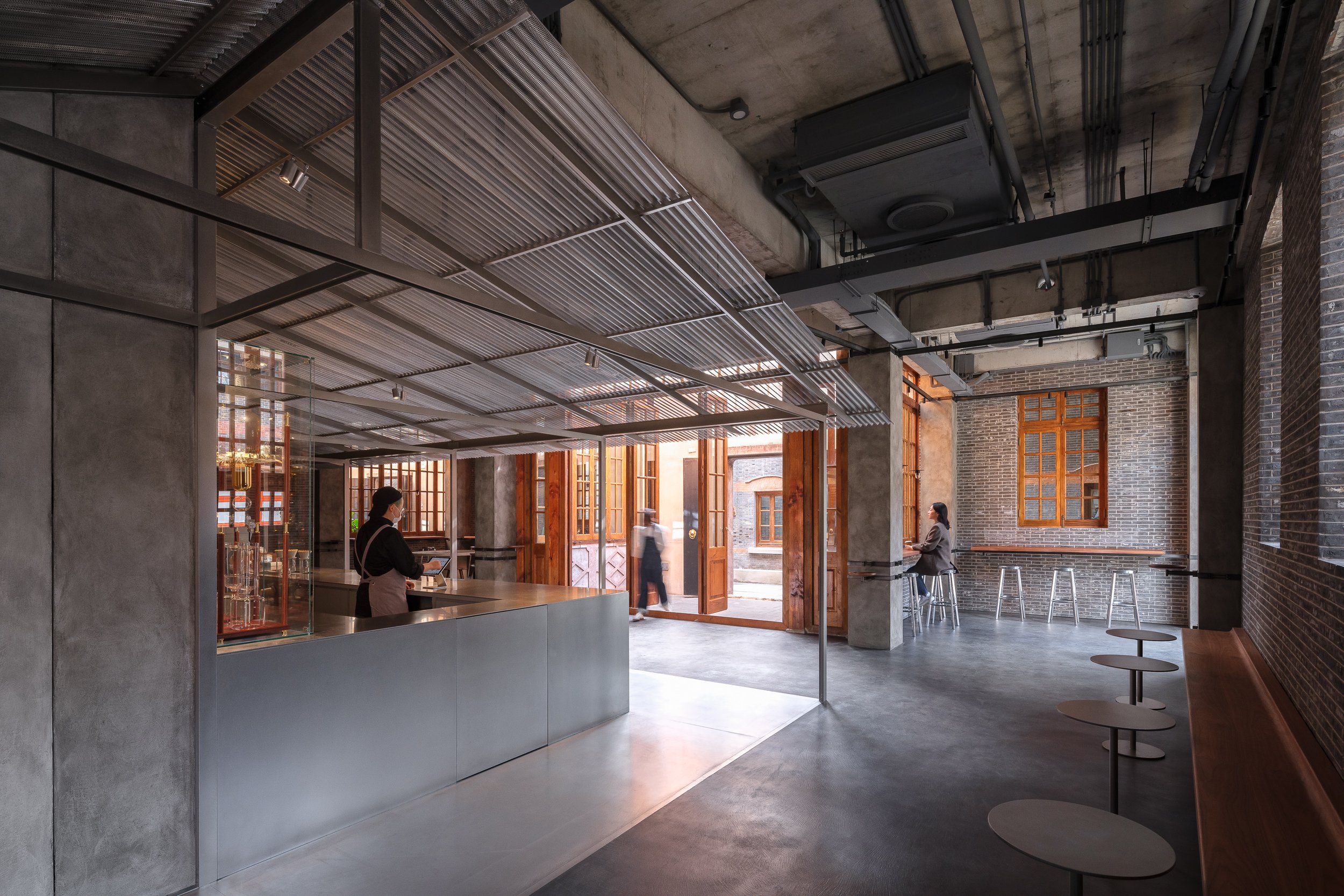
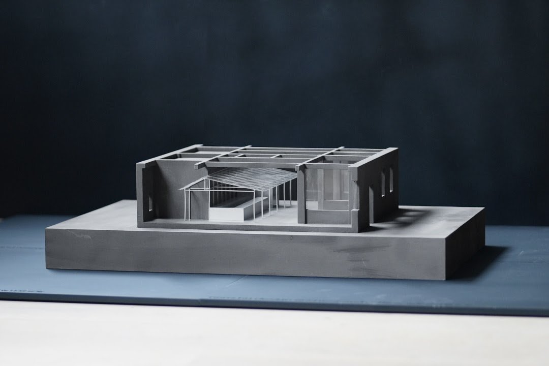
The existing brick walls, doors, and windows of the original architectural façades and atriums are preserved according to historic preservation guidelines. This leaves them as a continuous backdrop for the addition of new design elements. A primitive shelter forms the visual and circulatory focal point of the project; it is where coffee is prepared and served, and represents a return to the origins of architecture. An elongated space connects the main street to the atrium along the old building's exterior wall. As a nod to the leisurely social moments of life in Shikumen, this alley-like building space includes benches and small tables against the windows and walls.
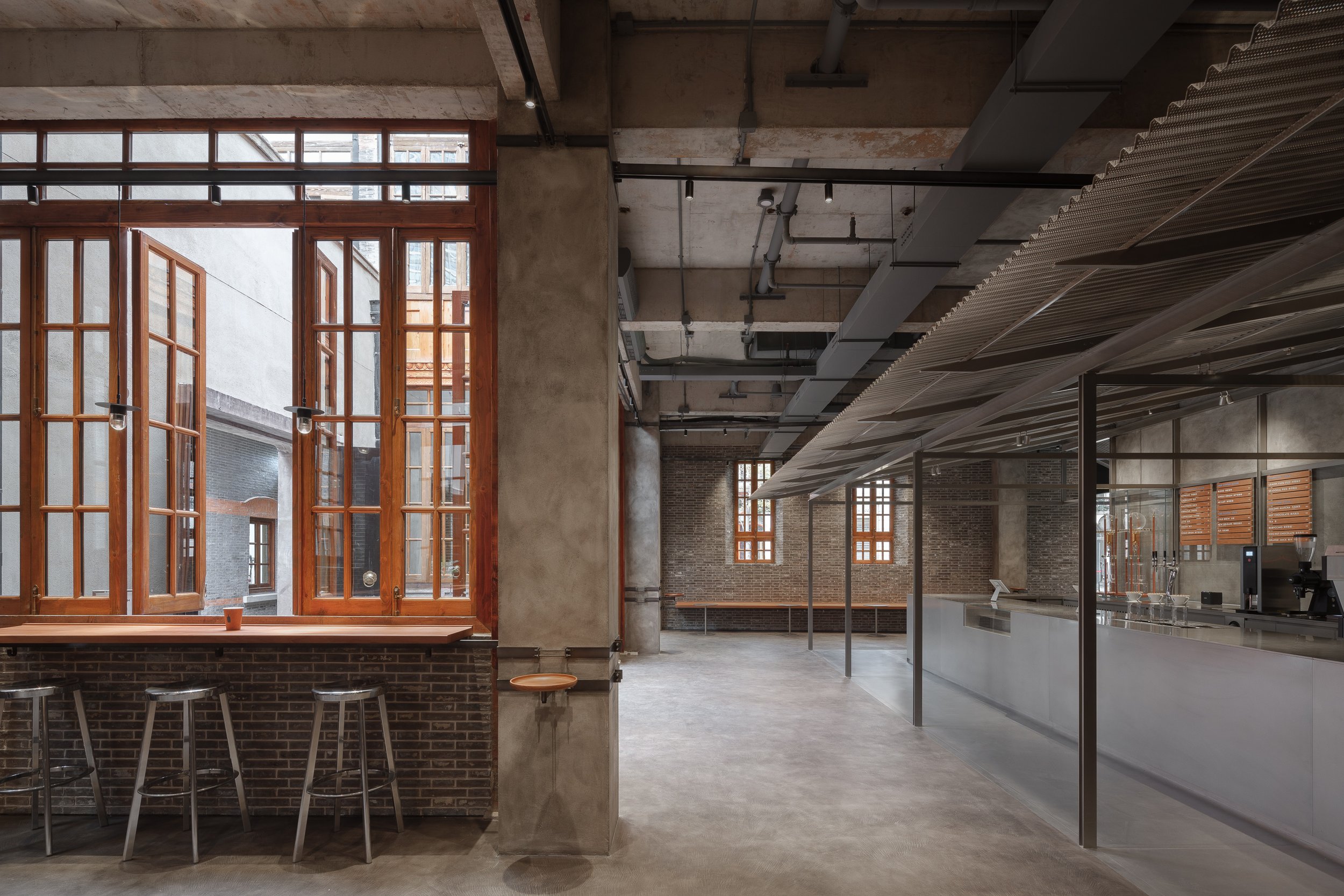
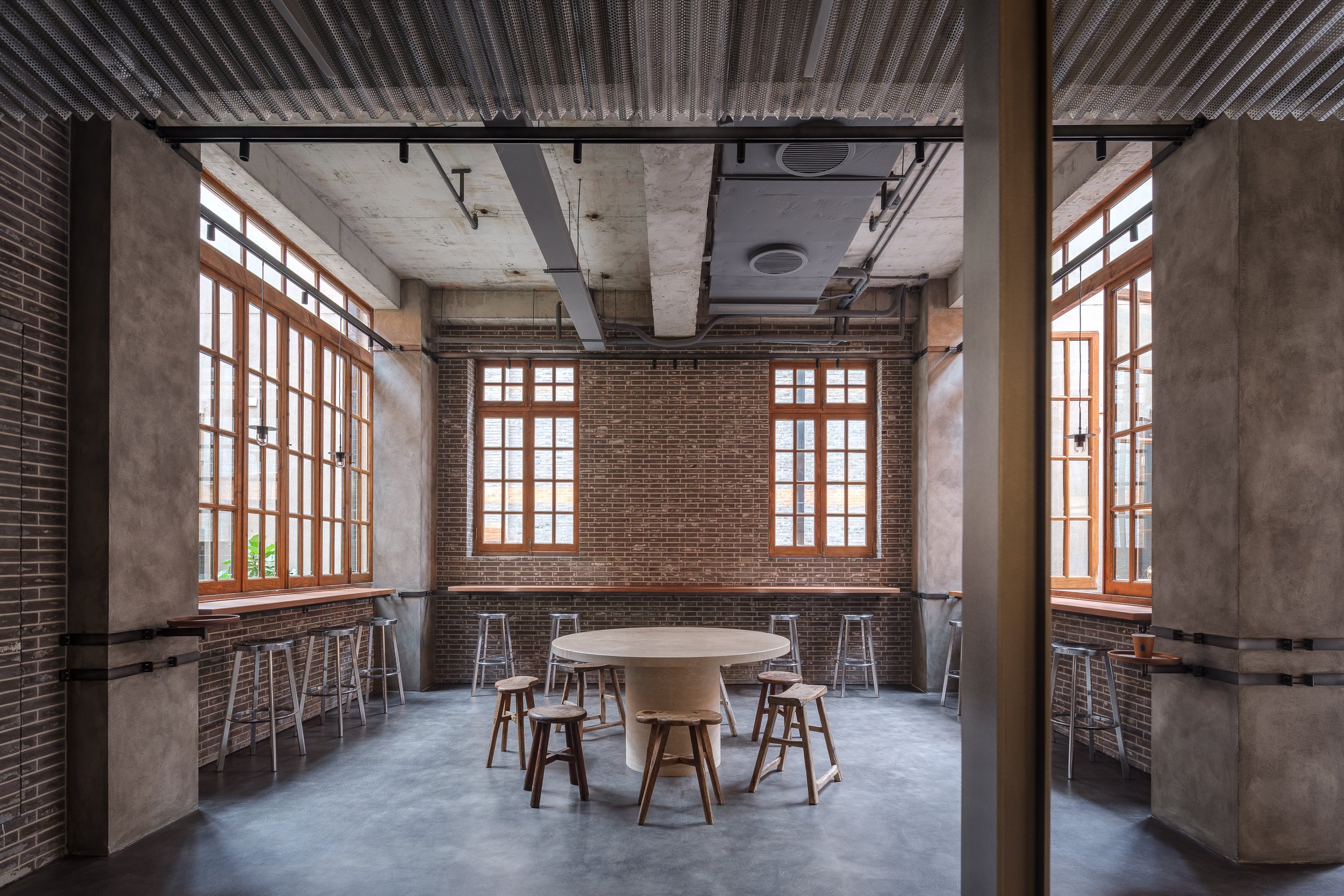
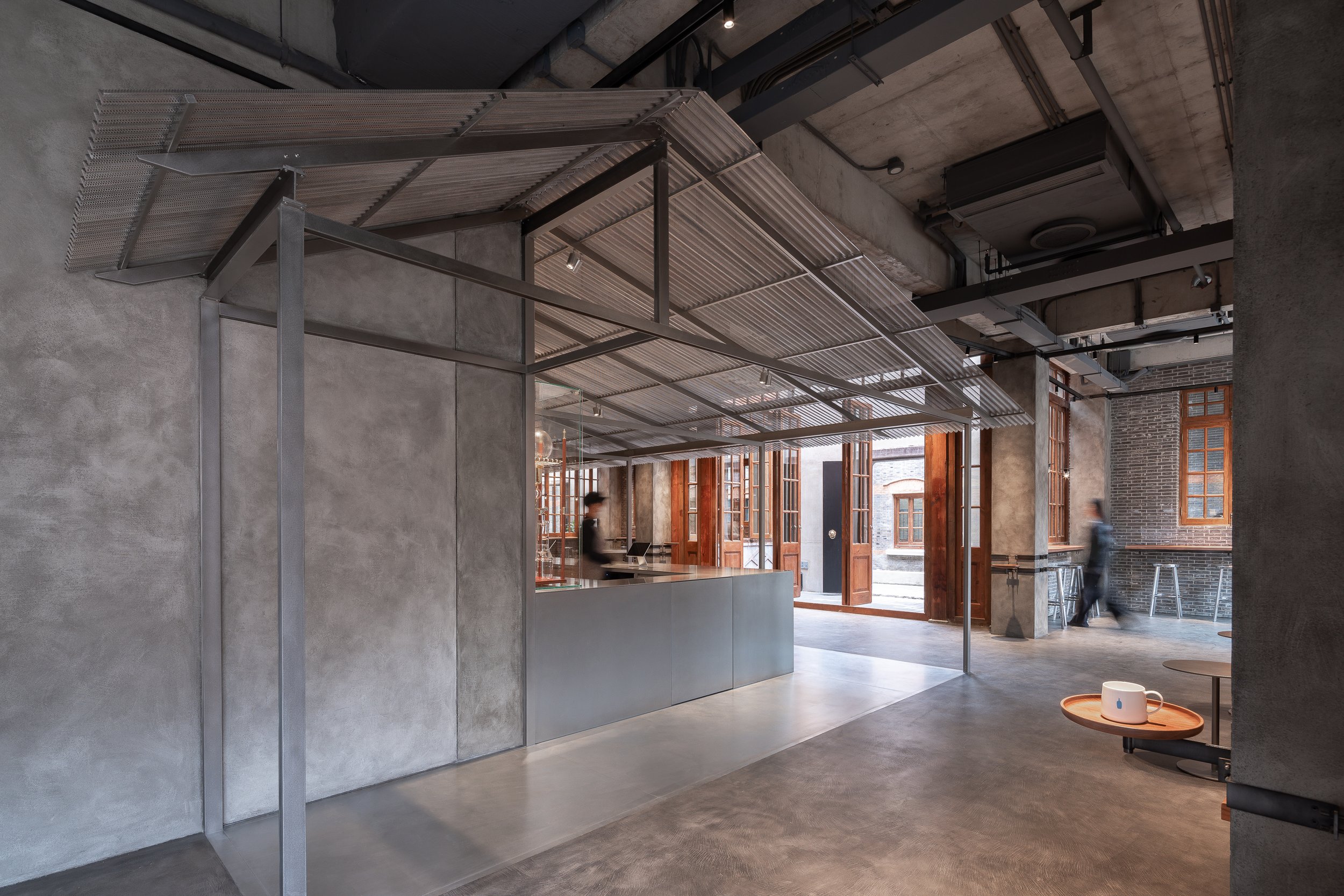
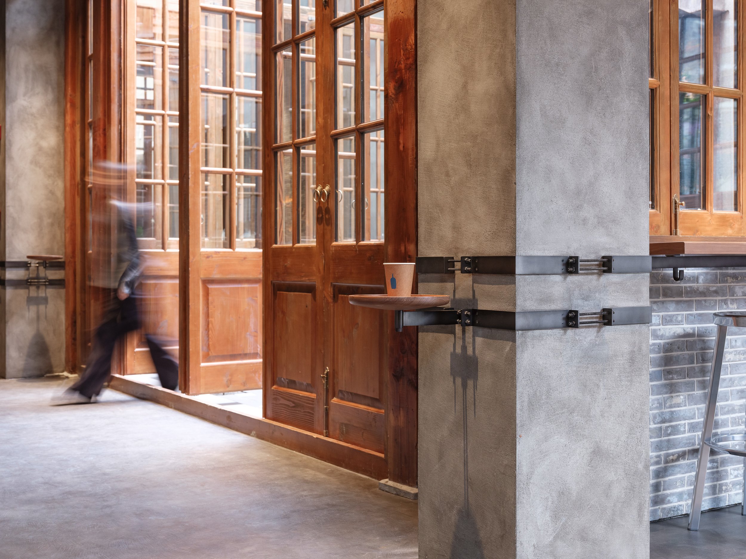
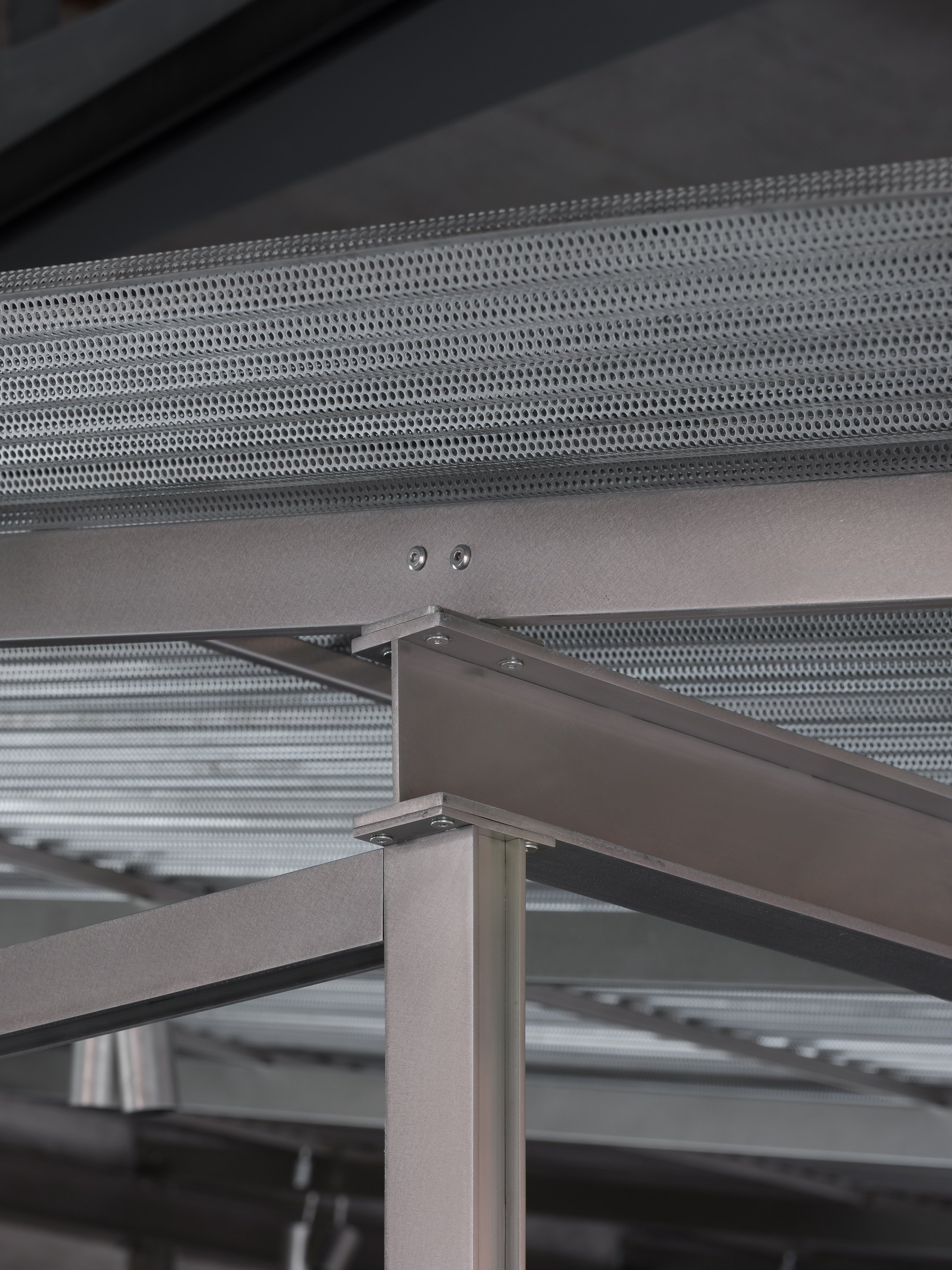
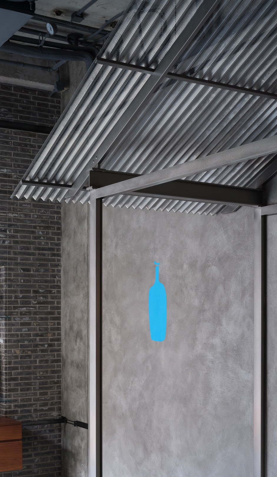
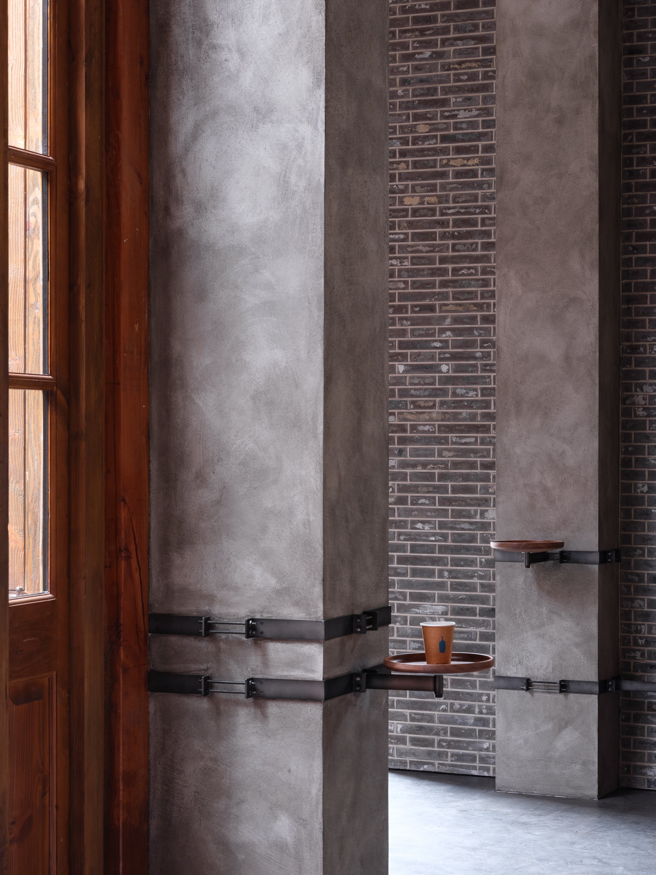
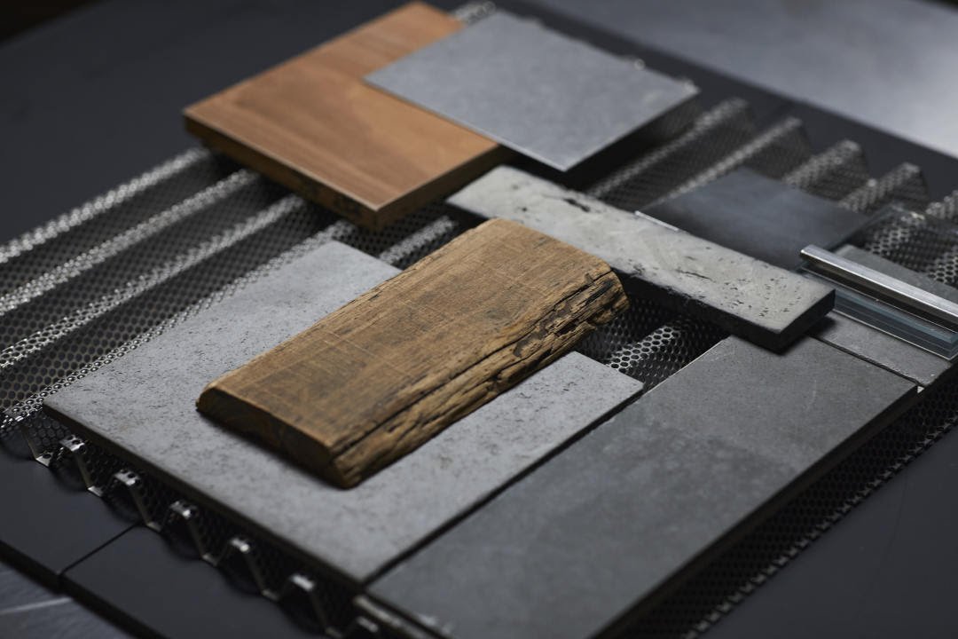
Neri&Hu studied the structure and its tectonic joinery meticulously to make it as light as possible, in contrast to the heavy palette of the existing architecture. Stainless steel is used for the roof structure while perforated and bent steel is used for the roof surface, reflecting the surroundings subtly and fuzzy. Neri&Hu also were inspired by the informal construction and simple attachments that people once used to extend their private spaces into the alley, so the existing structural columns are commandeered with metal rods and small platforms that serve as light rails, benches, side tables, and objects. This project incorporates repurposed traditional old furniture, whose traces of time impart a sense of warmth and familiarity, merging the old and the new, Blue Bottle and Shanghai.
Primitive Shelter
Blue Bottle Zhang Yuan Cafe
Site Address: W5-1A, 240 North Maoming Road, Jing'an District, Shanghai, China
Completion: November 2022
Client: Blue Bottle Coffee
Project Type: Interior
Program: Cafe
Gross area: 175 sqm
Partners-in-charge: Lyndon Neri, Rossana Hu
Associate-in-charge: Qiucheng Li
Design team: Jiaxin Zhang, Xi Chen, Peizheng Zou, Shangyun Zhou, Greg Wu, Luna Hong
Interior design: Neri&Hu Design and Research Office
FF&E design and procurement: Design Republic
General contractor: Blue Peak Image Producing Co., Ltd
Photos: Zhu Runzi
Neri&Hu created Foreverhouse at Home Sweet Home Exhibition at KORA
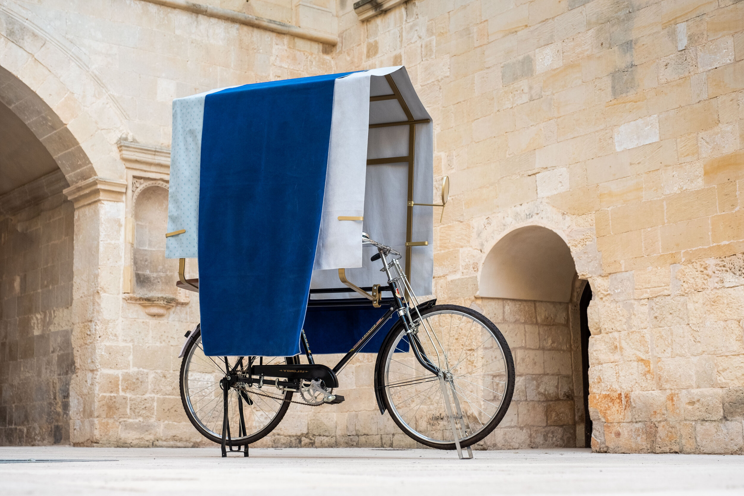
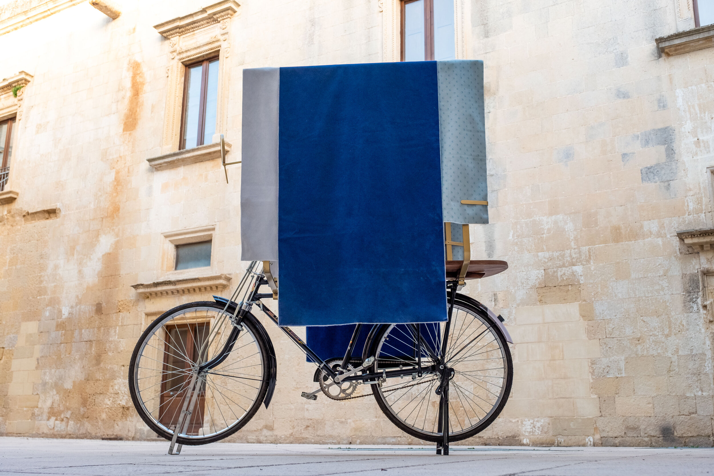
Drawing inspiration from the image of a bicycle, Neri&Hu has created Foreverhouse for the exhibition. As with many of Neri&Hu's works, Foreverhouse hints at maintaining tradition as a form of resistance to cultural erasure.
Home Sweet Home, curated by Paolo Mele, Alessandra Pioselli, Davide Quadrio, and Claudio Zecchi, recently opened at the KORA Contemporary Center, Palazzo de Gualtieris in Lecce, Italy, showcasing more than 40 artists and designers from around the world. The exhibition explores the theme of “home,” a place to live in and a witness of everyday life, where relationships are born and unfold over time.
The ideas of home and being “at home” are psychological constructs shaped by subjective perceptions of shelter, privacy and security. Our dwelling bears the marks of our daily rituals of inhabitation, and over time they serve as vessels for the accumulation of the artifacts of everyday life.
Drawing inspiration from the image of a bicycle, Neri&Hu has created Foreverhouse for the exhibition. As with many of Neri&Hu's works, Foreverhouse hints at maintaining tradition as a form of resistance to cultural erasure. Since the early 1990s, the bicycle has played a pivotal role in China. Whether in urban centers or the countryside, the bicycle remains one of the most critical and ubiquitous modes of transport. For many people, the bicycle's significance goes beyond its function of transporting us from one place to another; it is an object inextricably tied to modes of life and livelihoods. The bicycle can carry a load of recycled items three times its own weight; it can also tow a cart full of goods for sale. Literally or metaphorically, the bicycle can support an entire family on its two wheels.
The concept of Foreverhouse is to stretch the familiar image of a bicycle to become a travelling home. With the addition of a simple metal structure and draped fabrics, Neri&Hu has turned an ordinary bicycle into a shelter with a table and storage pockets. The fabric pouch uses a pleated fold, containing itself and any precious items within a perfect little pocket. The pattern of the fabric is inspired by the traditional delight from Shanghai: xiaolongbao. The thin but elastic dough of xiaolongbao is a flawless container to hold the aromatic juices while allowing the steam to escape. Rather than focusing on the physical construction of a house, Foreverhouse directs attention to the social realities of our times: with the rising tides of mass migration, what happens to our sense of belonging?
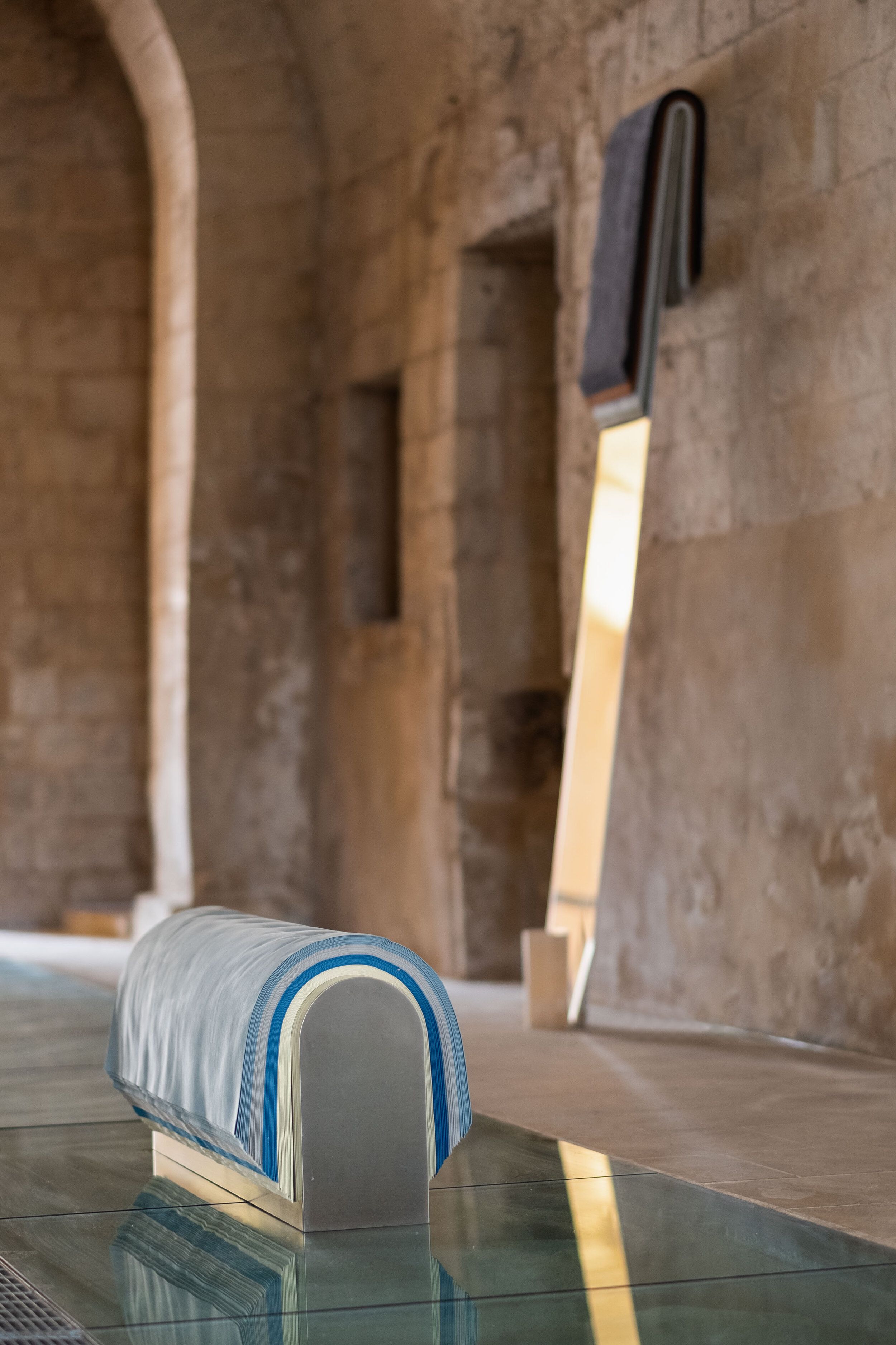
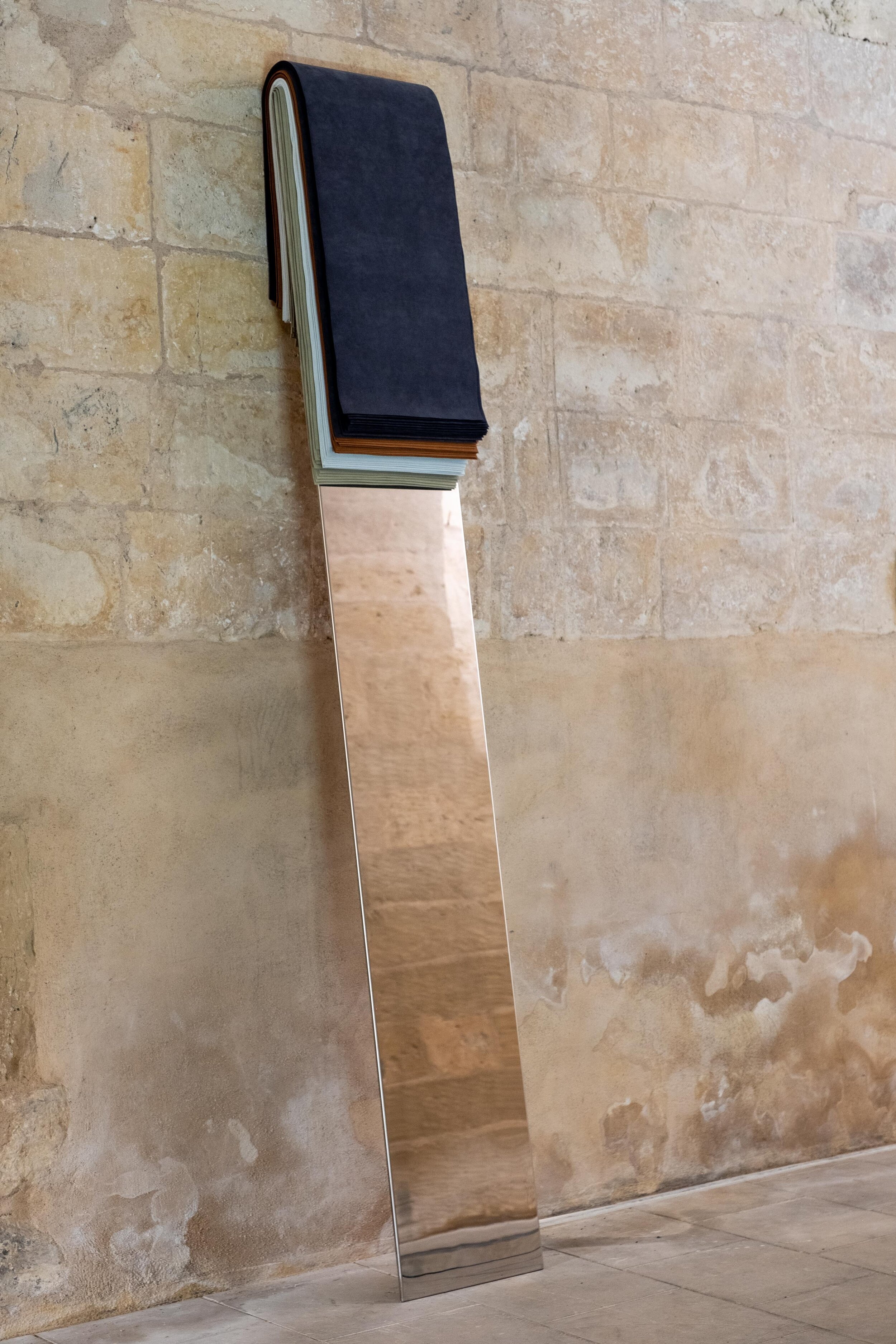
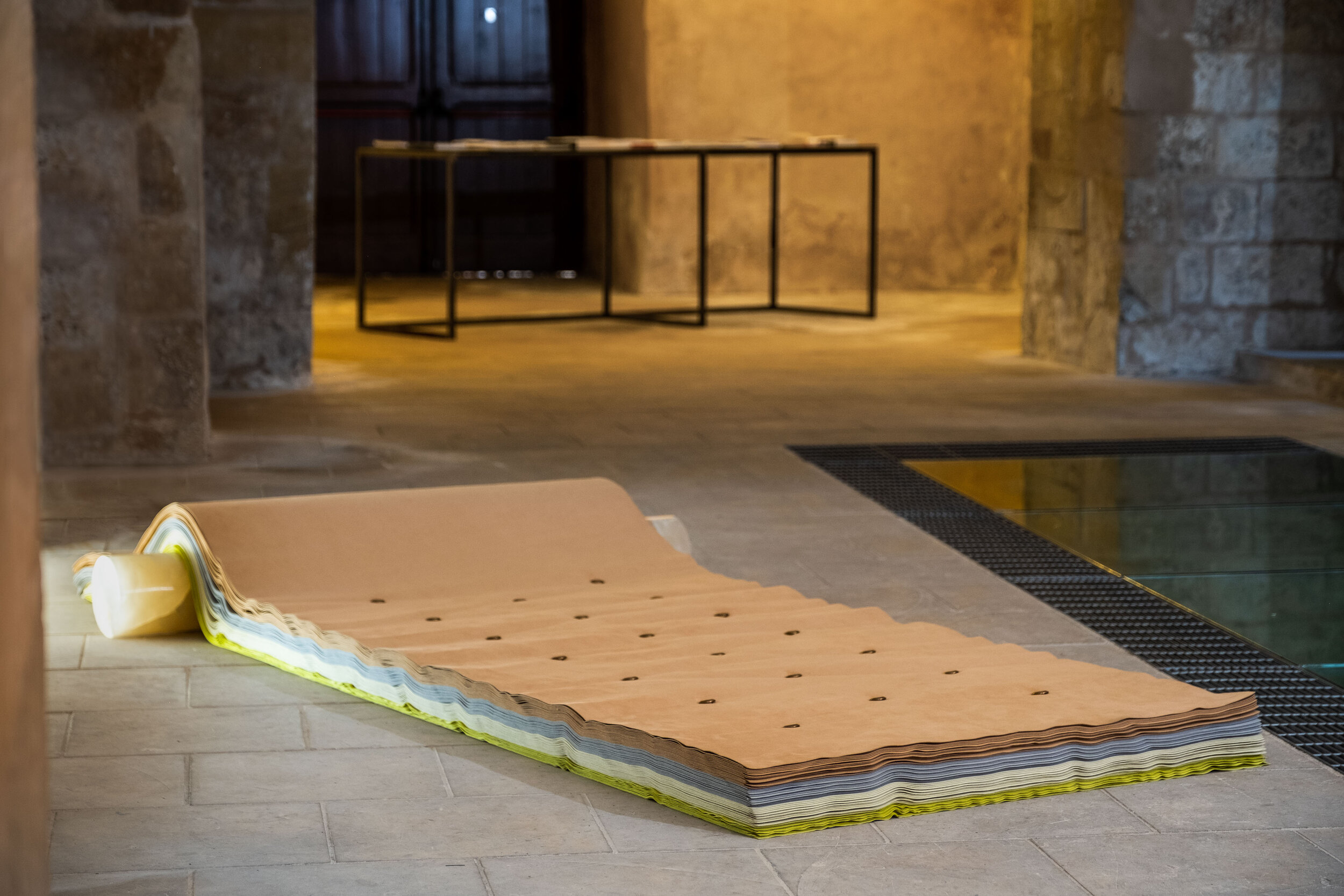
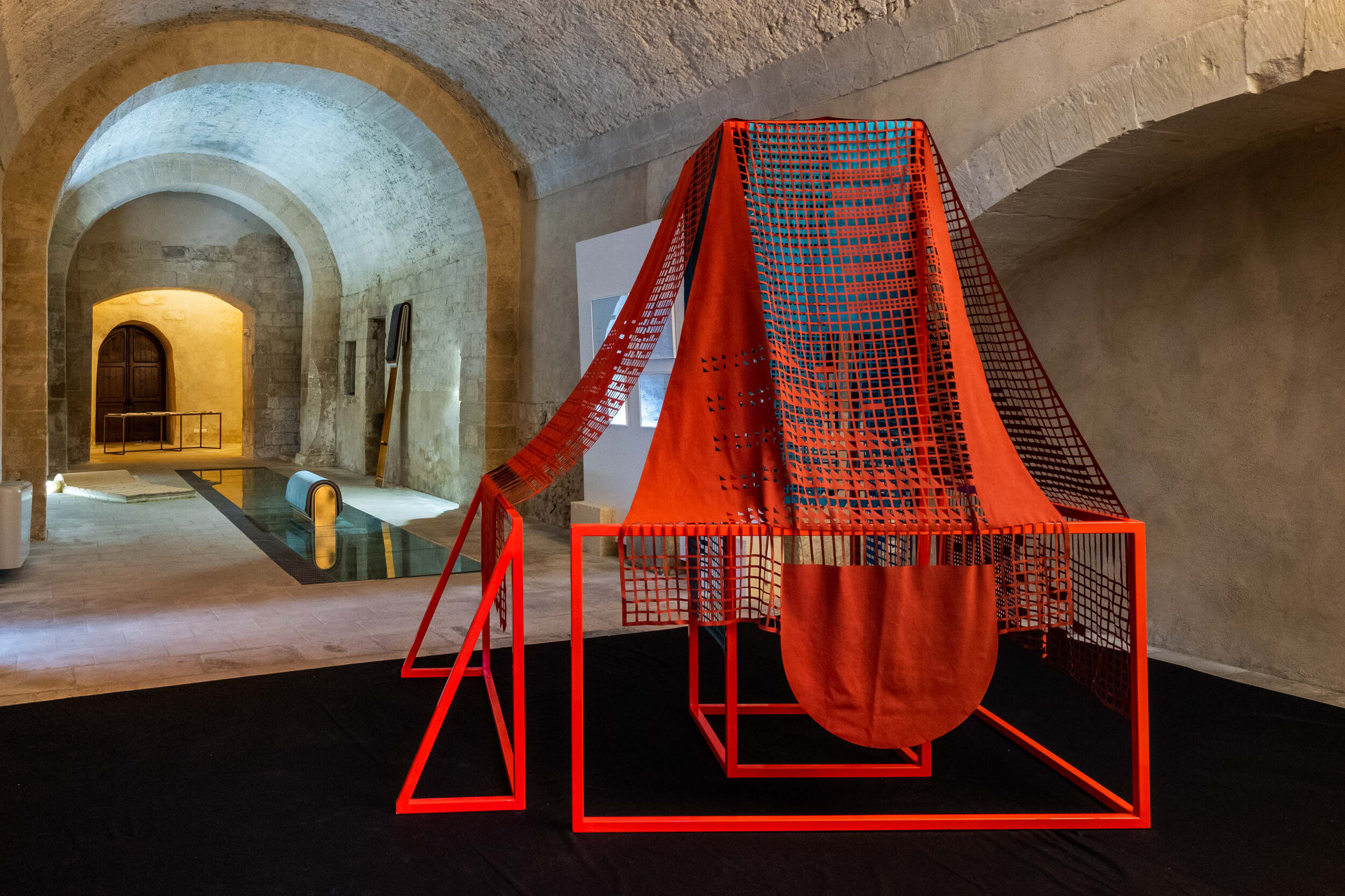
KORA Contemporary Arts Center is a 1600-sqm space dedicated to creating and researching contemporary art, recently opened in Lecce, Italy. KORA Contemporary Arts Center hosts temporary and permanent exhibitions, workshops and public education programs. In addition, the complex contains a library, a bookshop, a bar, an area for children's activities, conference spaces, and an area for events and performances.
For more information about KORA and Home Sweet Home Exhibition, please visit:
http://www.k-ora.it/
About Nuri&Hu
The Celebration of the heritage that narrates Parisian history by Neri & Hu, the Papi Restaurant
Nestled in the Grands Boulevards district of Paris' 9th arrondissement, Papi is the latest brainchild of up-and-coming restaurateur Etienne Ryckeboer his debut seafood bar Bulot Bulot. This time, he teams up with Neri&Hu to rehaul the façade and interior space, and with talented Japanese chef Akira Sugiura to serve a seasonal menu of modern Italian dishes.
Located on the ground floor of a typical late 19th century Haussmann building, Neri&Hu's design concept celebrates the layered material heritage that narrates Parisian history.
Nestled in the Grands Boulevards district of Paris' 9th arrondissement, Papi is the latest brainchild of up-and-coming restaurateur Etienne Ryckeboer his debut seafood bar Bulot Bulot. This time, he teams up with Neri&Hu to rehaul the façade and interior space, and with talented Japanese chef Akira Sugiura to serve a seasonal menu of modern Italian dishes.
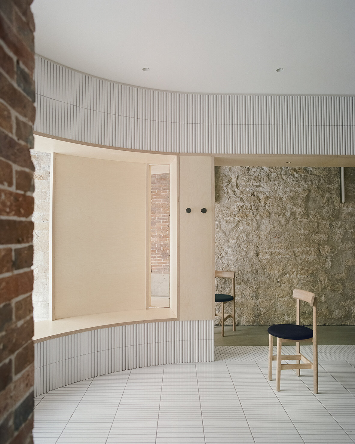
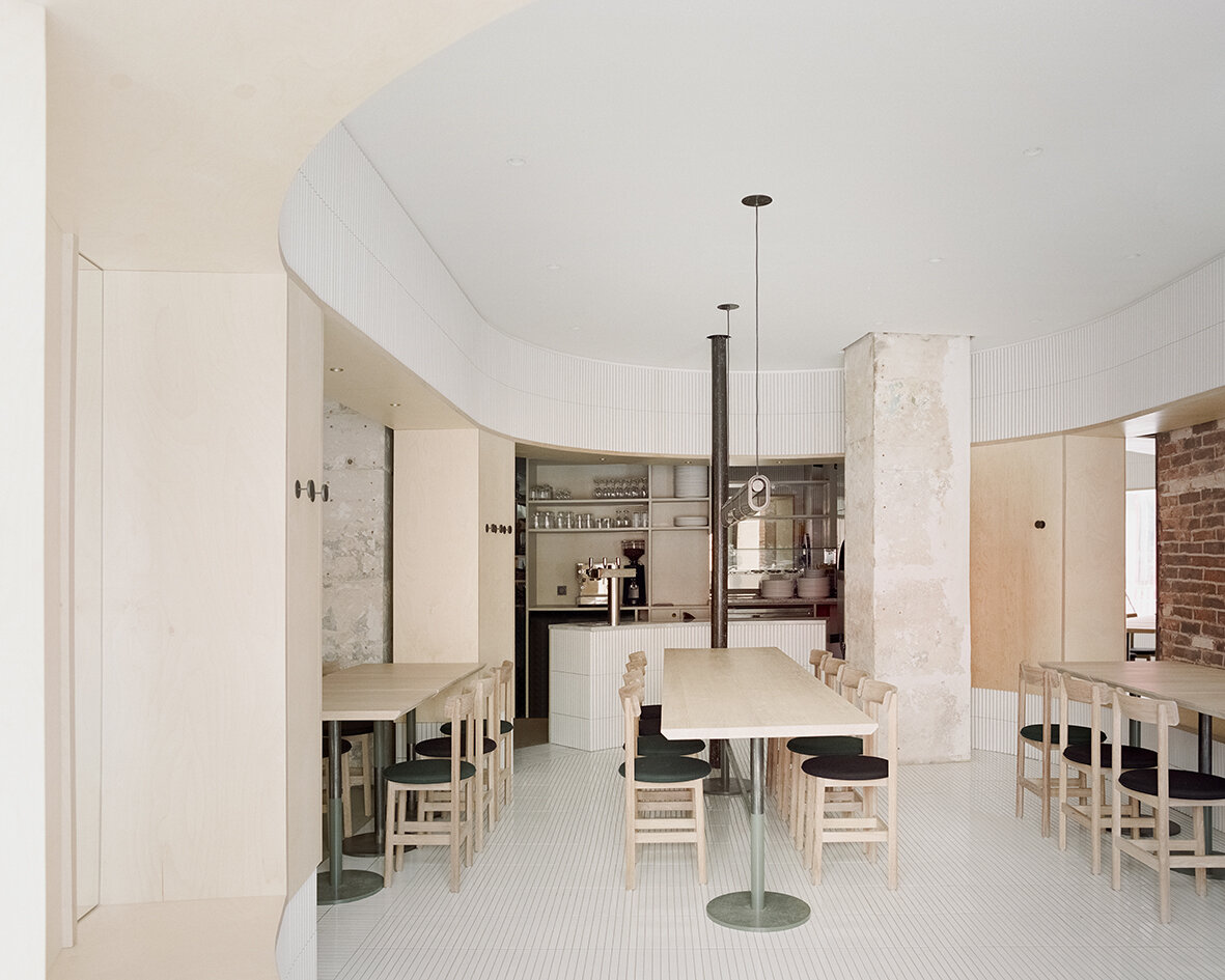
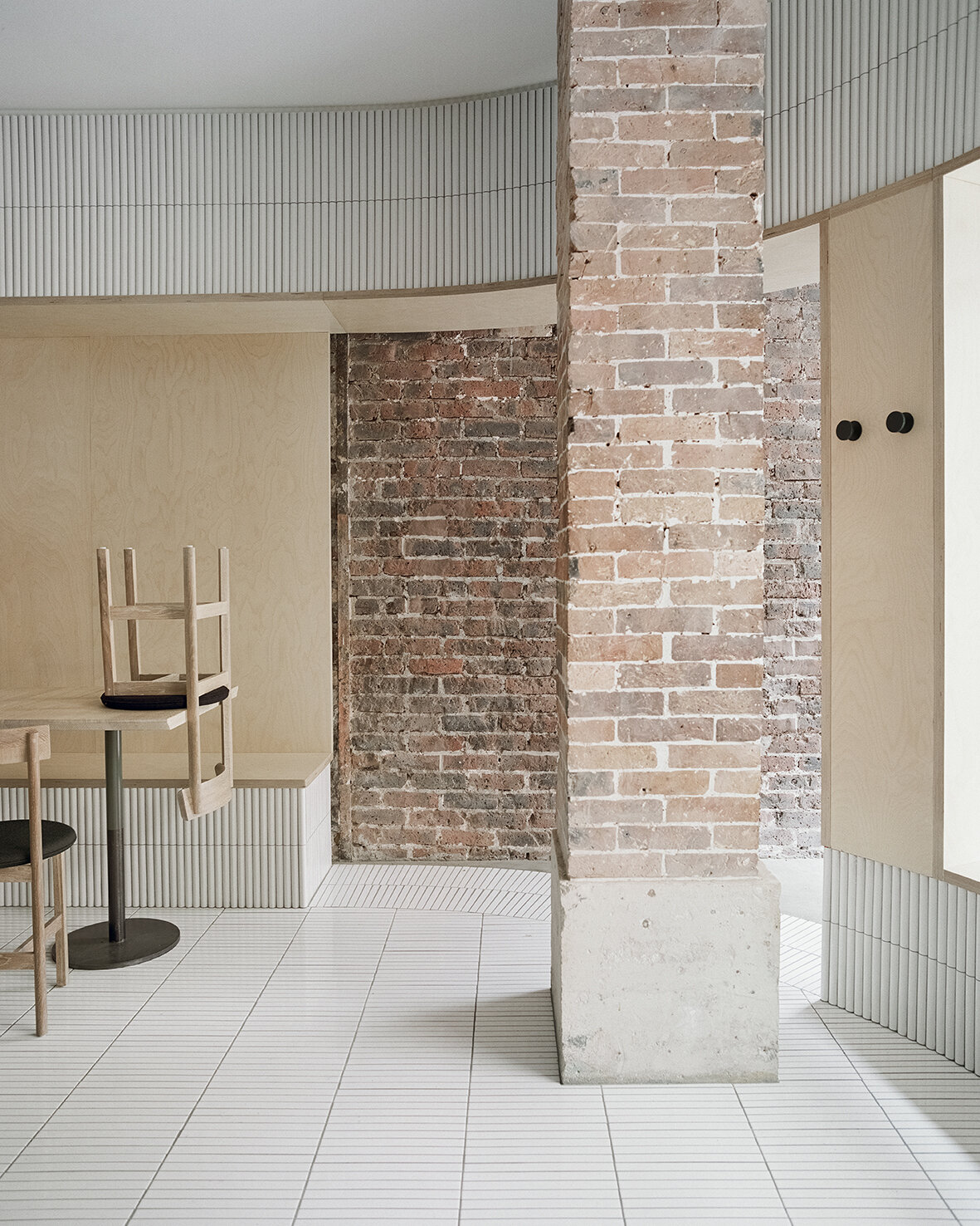
Located on the ground floor of a typical late 19th century Haussmann building, Neri&Hu's design concept celebrates the layered material heritage that narrates Parisian history. During the dismantling phase, the existing site was treated carefully; by stripping back the strata of finishes built up through the decades, the raw materials' beauty is revealed. Every single element was meticulously examined, and the challenge was to resist the urge to fix every imperfection, instead, honour the imprint oft of time upon each surface. Within the interior, portions of the old limestone and brick walls, a raw steel column, and a brick column are preserved and integrated into the design. On the façade, an existing steel I-beam lintel is featured, while a segment of the old stone moulding by the entry is left exposed, stitching the façade seamlessly to the neighboring building. Each fragment neighbouring ants a different period in Paris' history, forming a beautiful yet imposing canvas for the architects to add their new strokes.
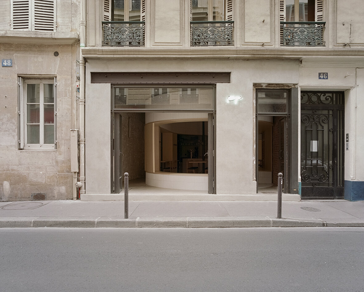

The new raw-steel-framed fully-operable glass façade maintains a visual continuity between the street and the venue and effectively extends the public realm into the interior. As guests enter the space through the main door, they see the clash of juxtaposing old and new materials, telling a story of sophistication with fresh textures of tile, glass and wood. Mirrors are placed strategically to create dynamic perspectives and voyeuristic moments between interior and exterior while inviting guests into cross gazes. The spatial and material strategies deployed to create a layered reading against the historical backdrop, offering guests a variety of experiences to explore within the space - moments of both public introversion and private extroversion.
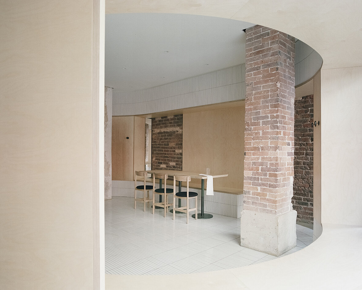
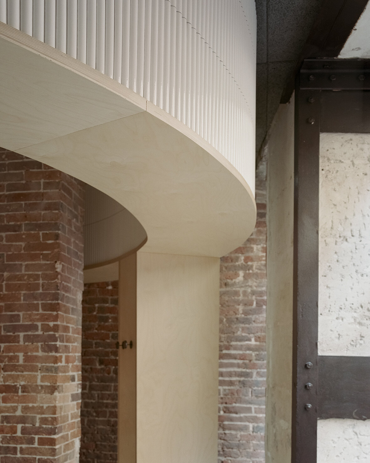
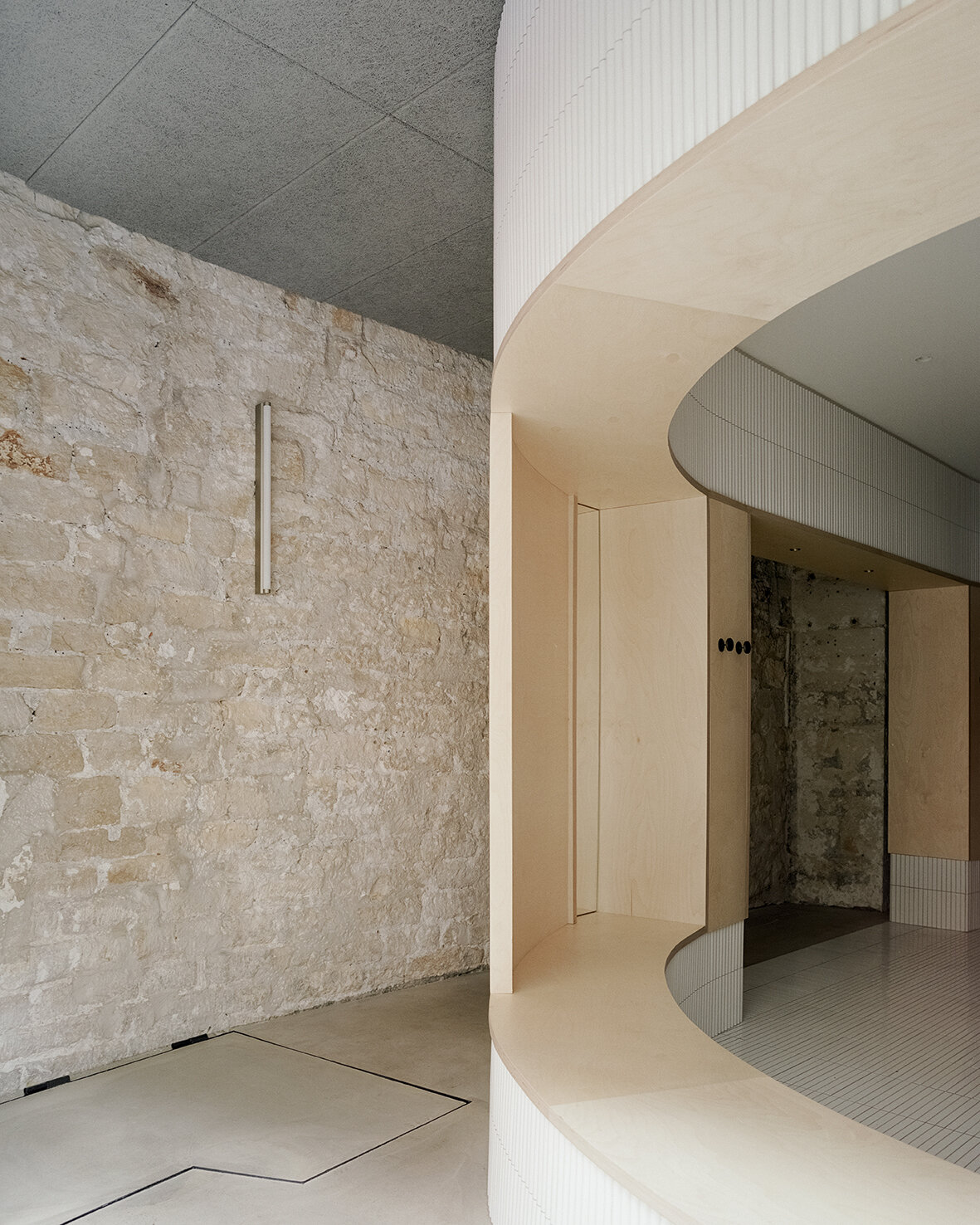
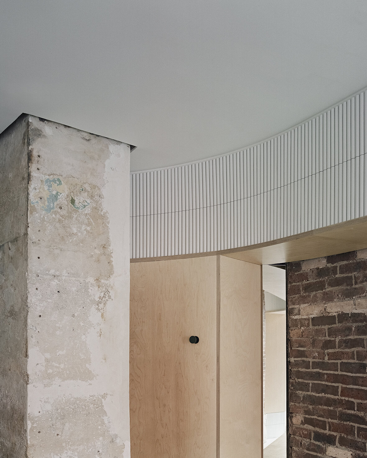
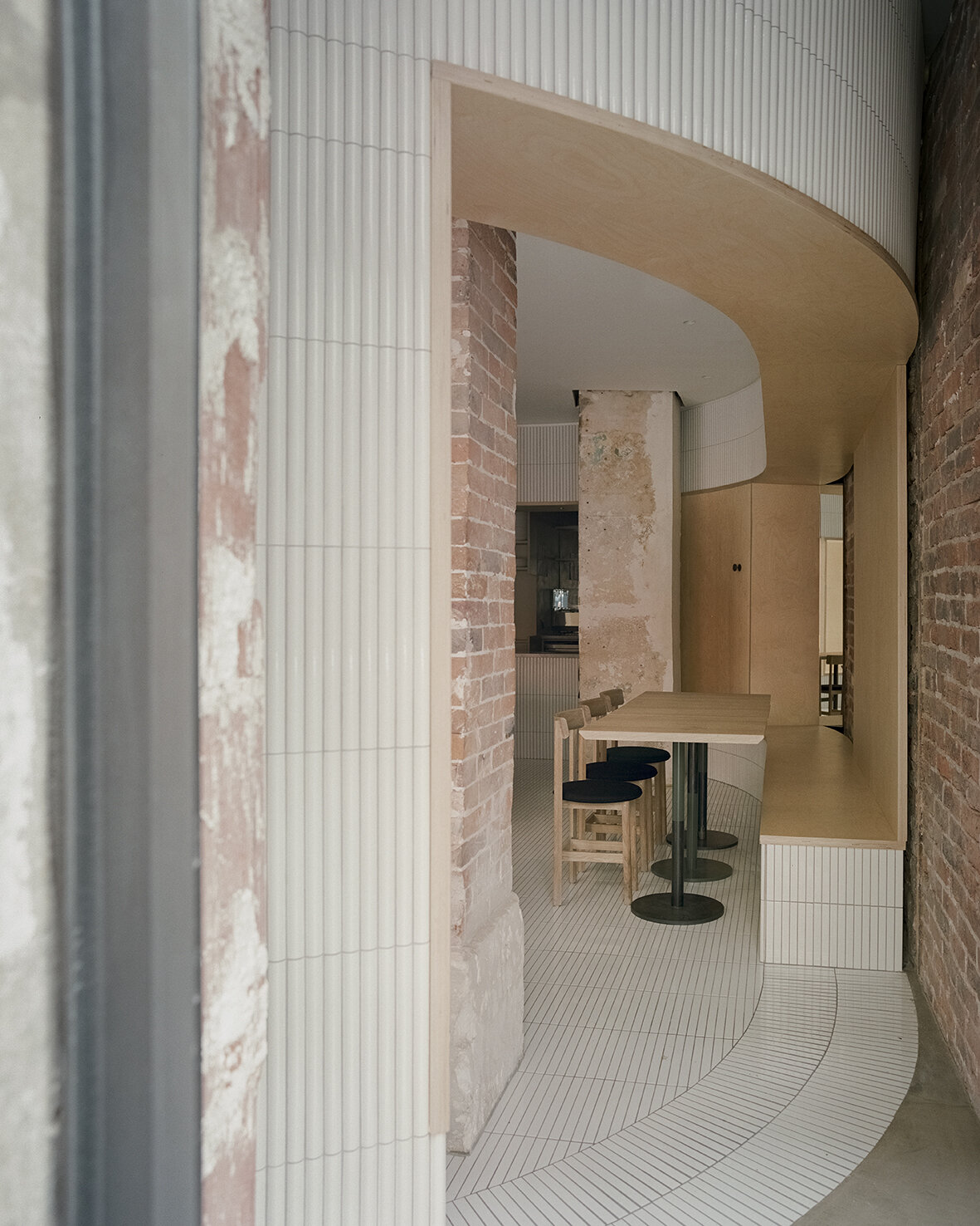
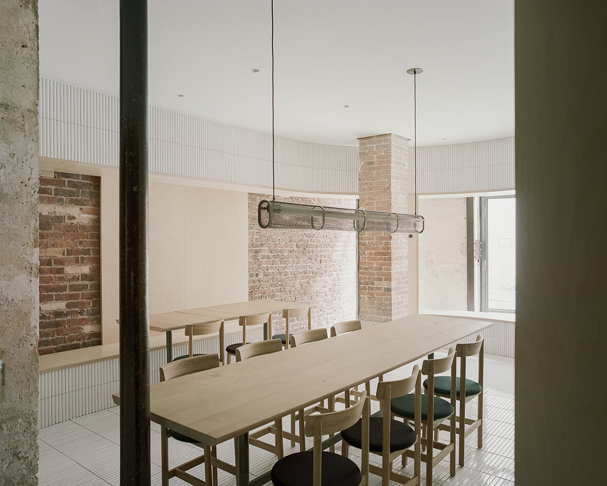
Despite the compact 52 square meters of usable area, Neri&Hu’s asserts two figures into space: an oblong volume forming an arena-like enclosure that integrates all the functional needs of seating, display, chef’s preparation counter, privacy screen, as well as a round shape containing the wood-burning oven. Clad in handmade convex-curved white ceramic tiles, the enclosure features large openings framed with thick birch plywood that become seating benches for guests. Entering the arena, where the floor is adorned with narrow white ceramic tiles, guests are instantly transformed from spectators to performers on stage. The central communal table features a long custom pendant light above, while a series of lights by Viabizzuno create a stark modern contrast on the old limestone wall. Custom wood and fabric chairs, manufactured by De La Espada, are designed by Neri&Hu specifically for Papi Restaurant to fit within the limited footprint.
