TIFFANY & CO. Unveils Plans For A Contemporary Glass Addition Atop Its Classic Fifth Avenue Flagship Store
A holistic transformation of this magnitude has not taken place in the building’s 80-year history. Tiffany is embarking on the project in partnership with the renowned architectural firm, The Office for Metropolitan Architecture (OMA). Led by Partner Shohei Shigematsu, OMA New York is engaged in specific aspects of the transformation–including a reimagined upper addition.
For the first time, Tiffany & Co. is revealing exterior renderings of the transformation underway at its Fifth Avenue flagship store. The upper addition (floors 8, 9 and 10) of the 10-story architectural icon located at 727 Fifth Avenue will be completely reimagined from office space originally constructed in 1980, into a new exhibition, event and clienteling space. Surrounded by a curtain of undulating glass complementing the classic limestone façade below, the contemporary structure above this historic building echoes the height and grandeur of the flagship’s timeless main floor. Construction began on Tiffany’s flagship transformation in spring 2019 and is estimated to be complete in spring 2022.
“The Tiffany & Co. Fifth Avenue flagship is arguably one of the most beloved and well-known luxury retail spaces in the world. It's a place where so many have memories of important moments in their lives, filled with emotion and anticipation of the extraordinary,” said Reed Krakoff, Chief Artistic Officer, Tiffany & Co. “Tiffany’s newly transformed flagship will reflect the future of our brand while honouring our 183-year legacy.”
A holistic transformation of this magnitude has not taken place in the building’s 80-year history. Tiffany is embarking on the project in partnership with a renowned architectural firm, The Office for Metropolitan Architecture (OMA). Led by Partner Shohei Shigematsu, OMA New York is engaged in specific aspects of the transformation–including a reimagined upper addition.
The ambition for the design of the new upper volume is to create a vertical continuity with the existing structure, while also setting it apart as a bold and innovative addition to the building. The corniced parapet of the original building will be mirrored by a slumped glass façade above. The eye is drawn upward creating a gentle transition between the two structures. This ribbon-like design detail brings a sensuality to the building, instilling a softness among the curtain walls of the building’s neighbours.
The recessed glass exhibition and event space will echo the feeling of the main floor with its column-free, double-height ceilings. The expansive glass facade brings an openness to both sides of the building and opens up to an outdoor terrace that will offer guests a view from the world’s most famous intersection for luxury retail, and up Fifth Avenue to Central Park.
The expansive Tiffany flagship was a symbol of modern architecture when it was built in 1940. The grandeur and essence of that majestic space will remain and continue to awe guests as they enter the renovated store in 2022. An evolved luxury retail experience will draw consumers inside once again and inspire them to journey from the main floor up through the entirety of the building.
In the interim, the Tiffany Flagship Next Door located at the adjacent 6 East 57th Street will continue to serve as Tiffany & Co.’s home, showcasing the entire breadth of the Brand’s extraordinary collections, until the original flagship’s completion in spring 2022.
For more information, please visit: https://www.tiffany.com
The modern expression Cadillac House, designed by Gensler, Shanghai, China
In Shanghai, China, Cadillac China and Gensler’s Shanghai Office sound a clear note of great latitude in expressing Cadillac House’s individuality, thus giving it the leeway to embrace deconstructivism and digital technologies.
Gensler redefines Cadillac House in Shanghai
with a sleek silhouette and defines it with a magnetic personality.

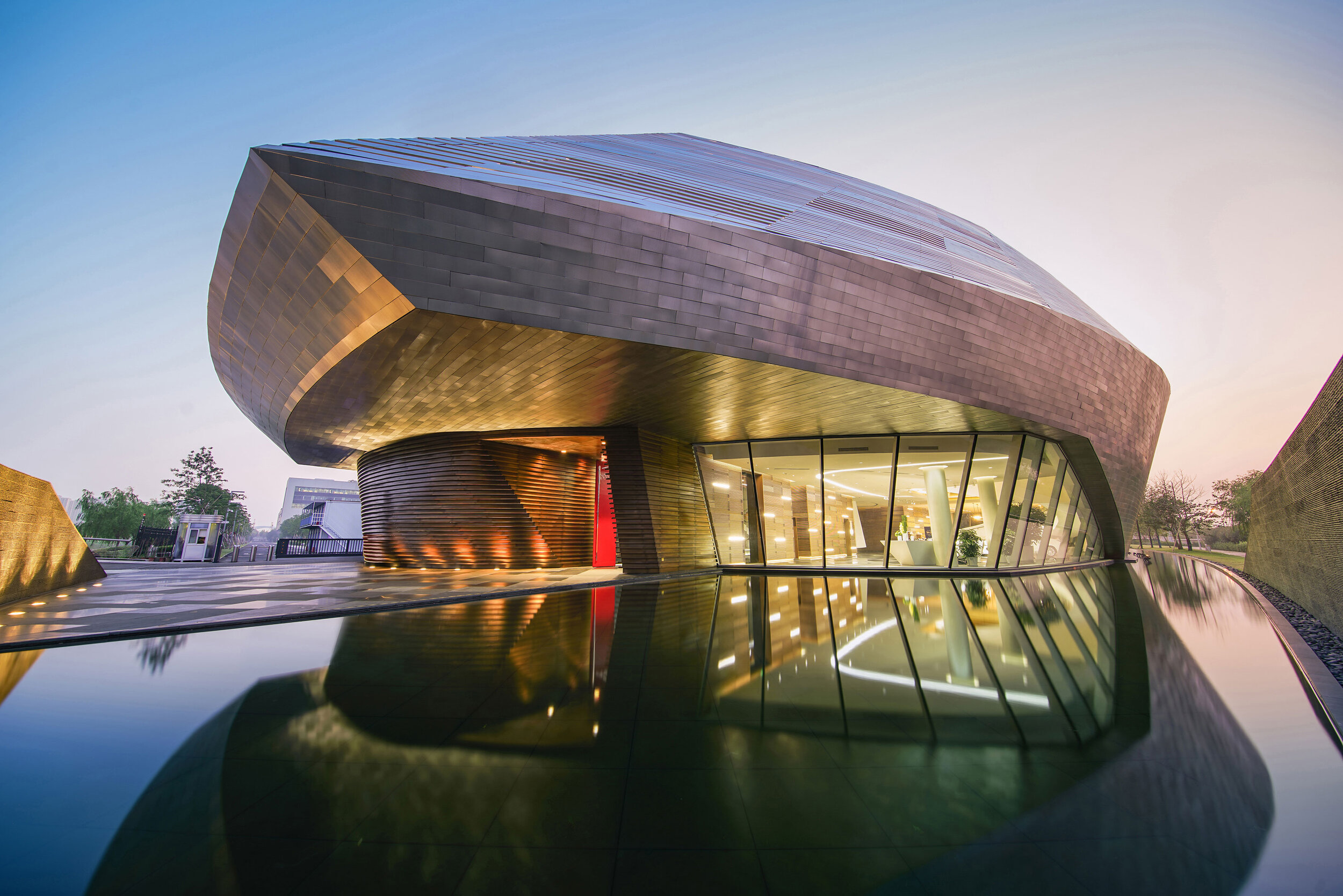
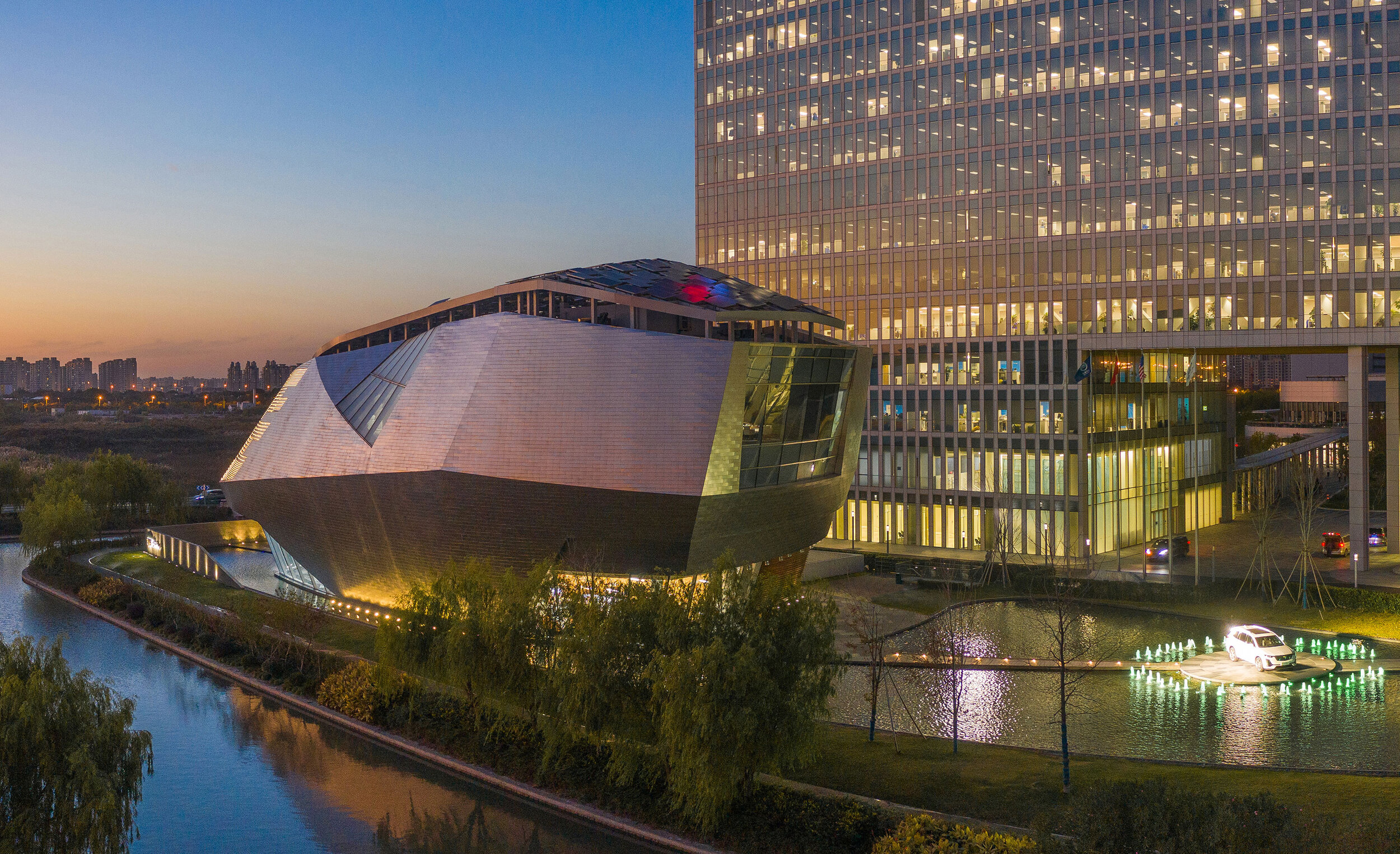
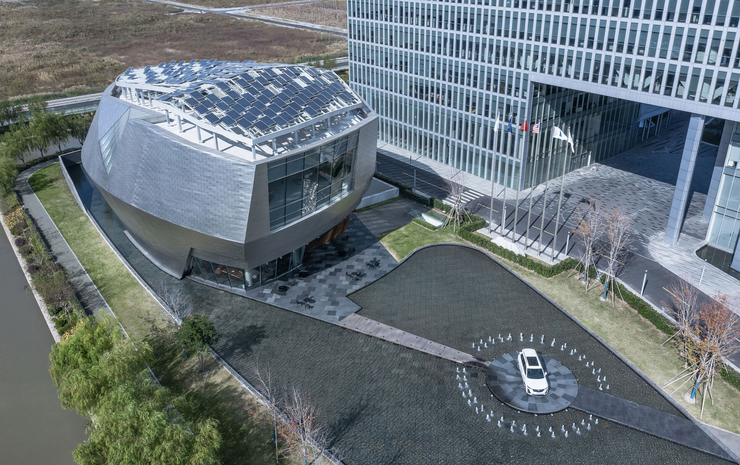
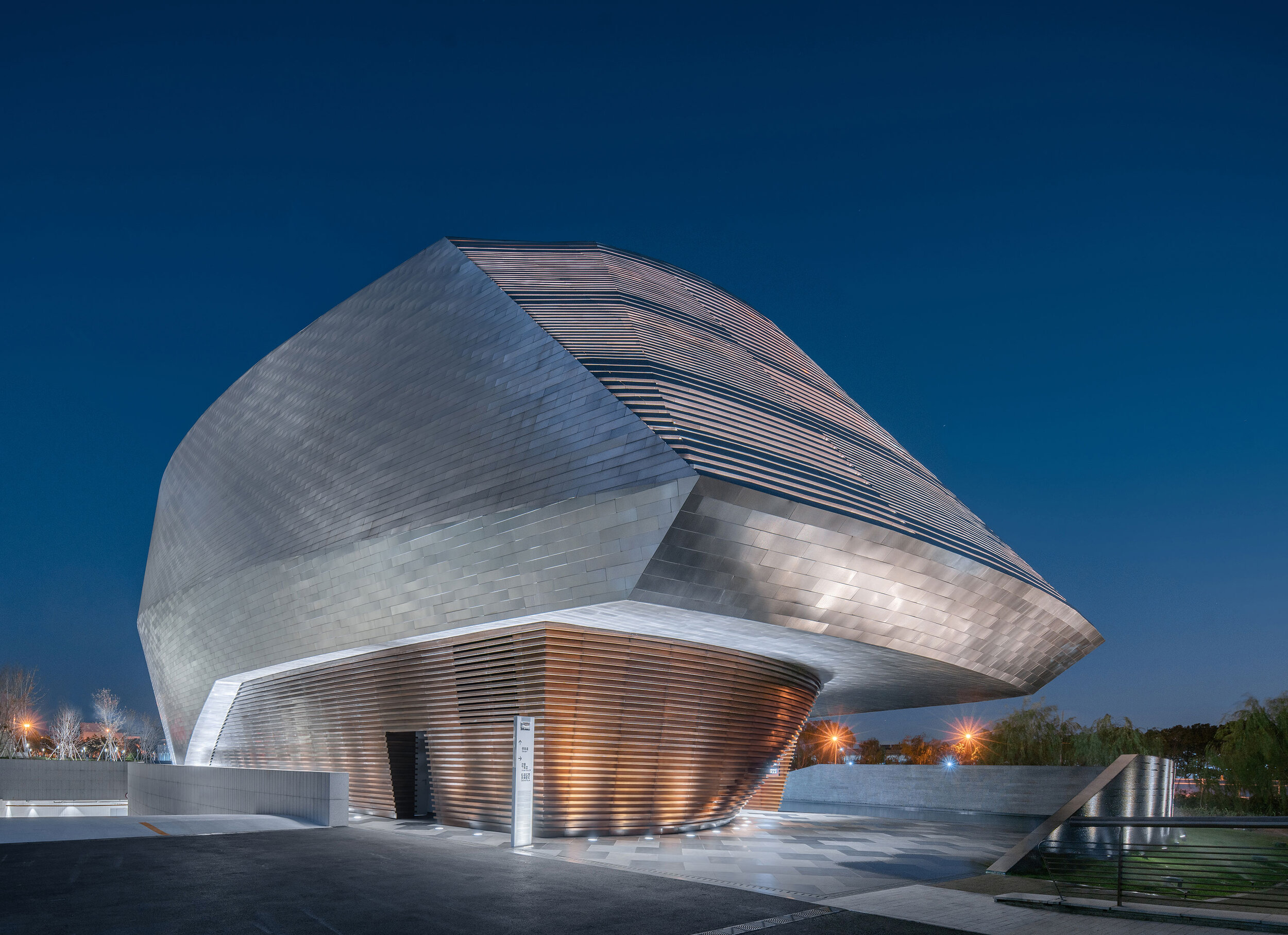
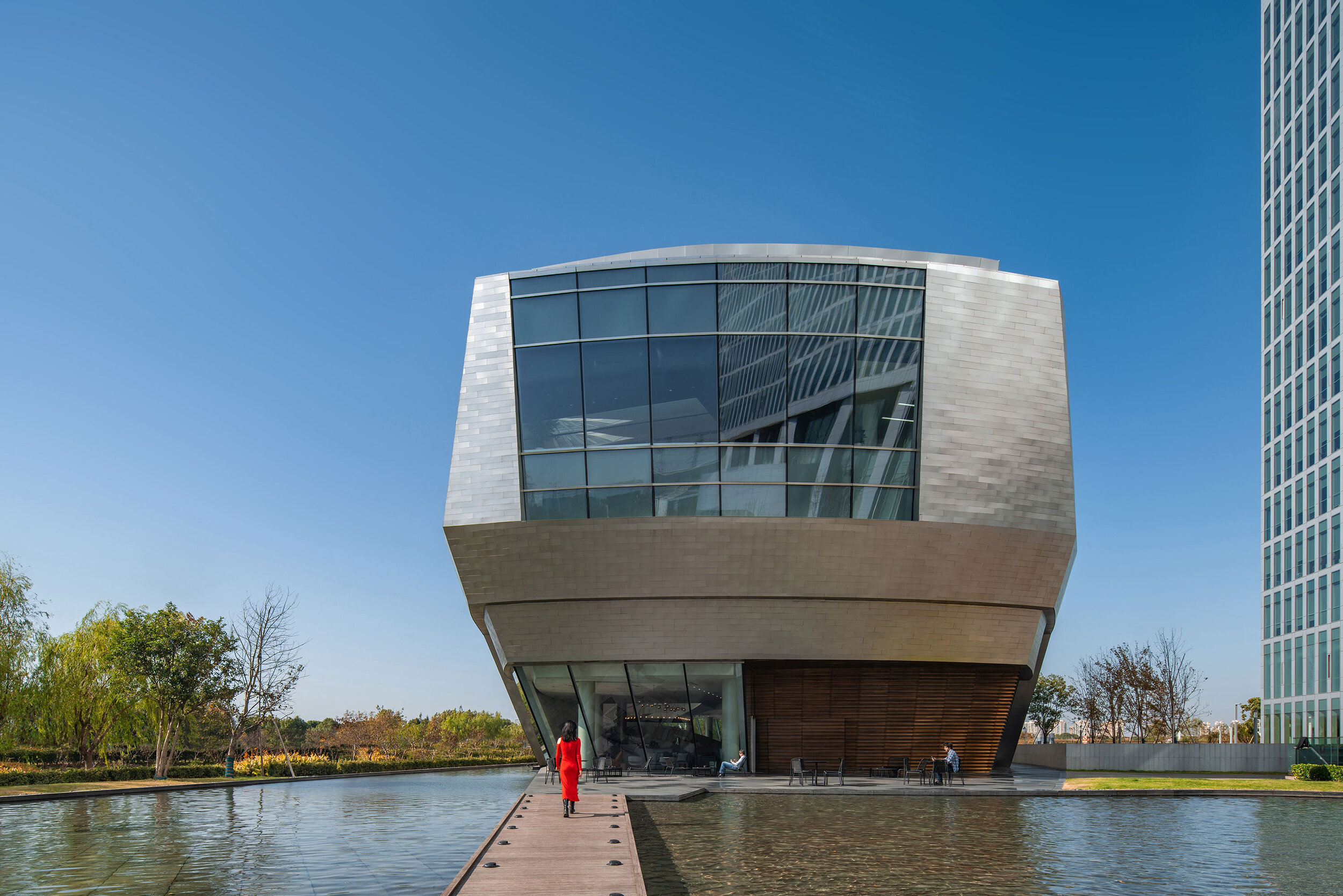
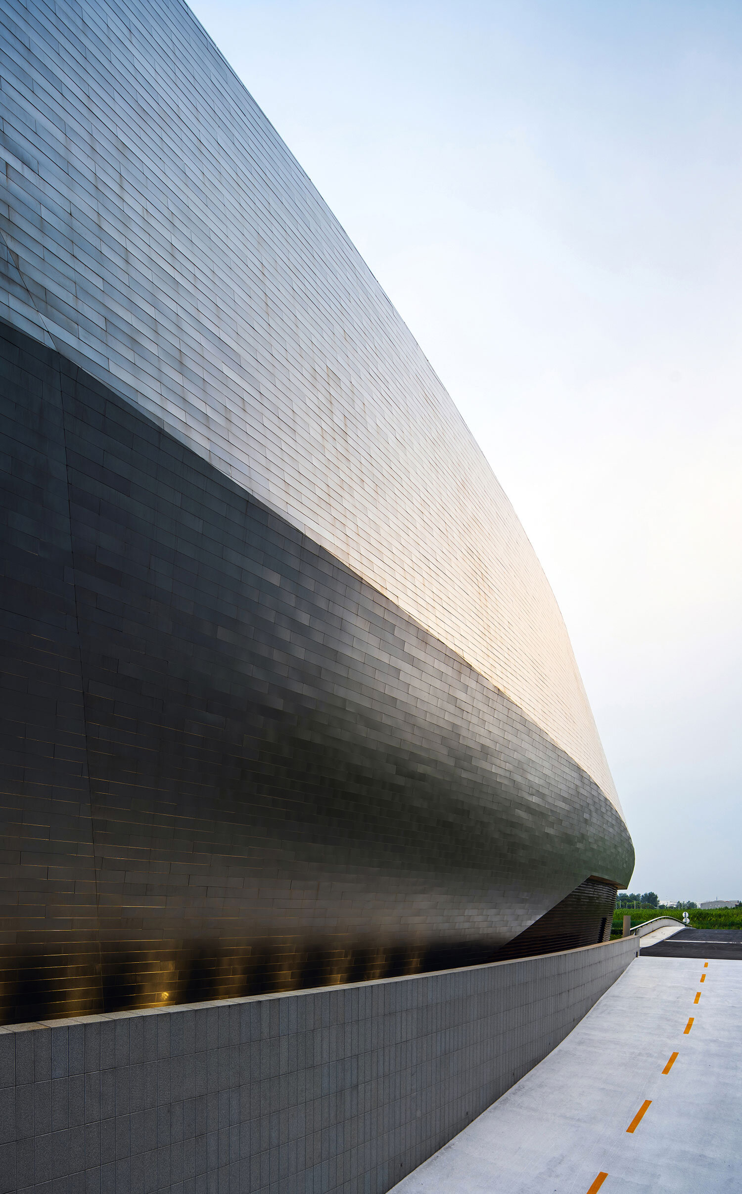
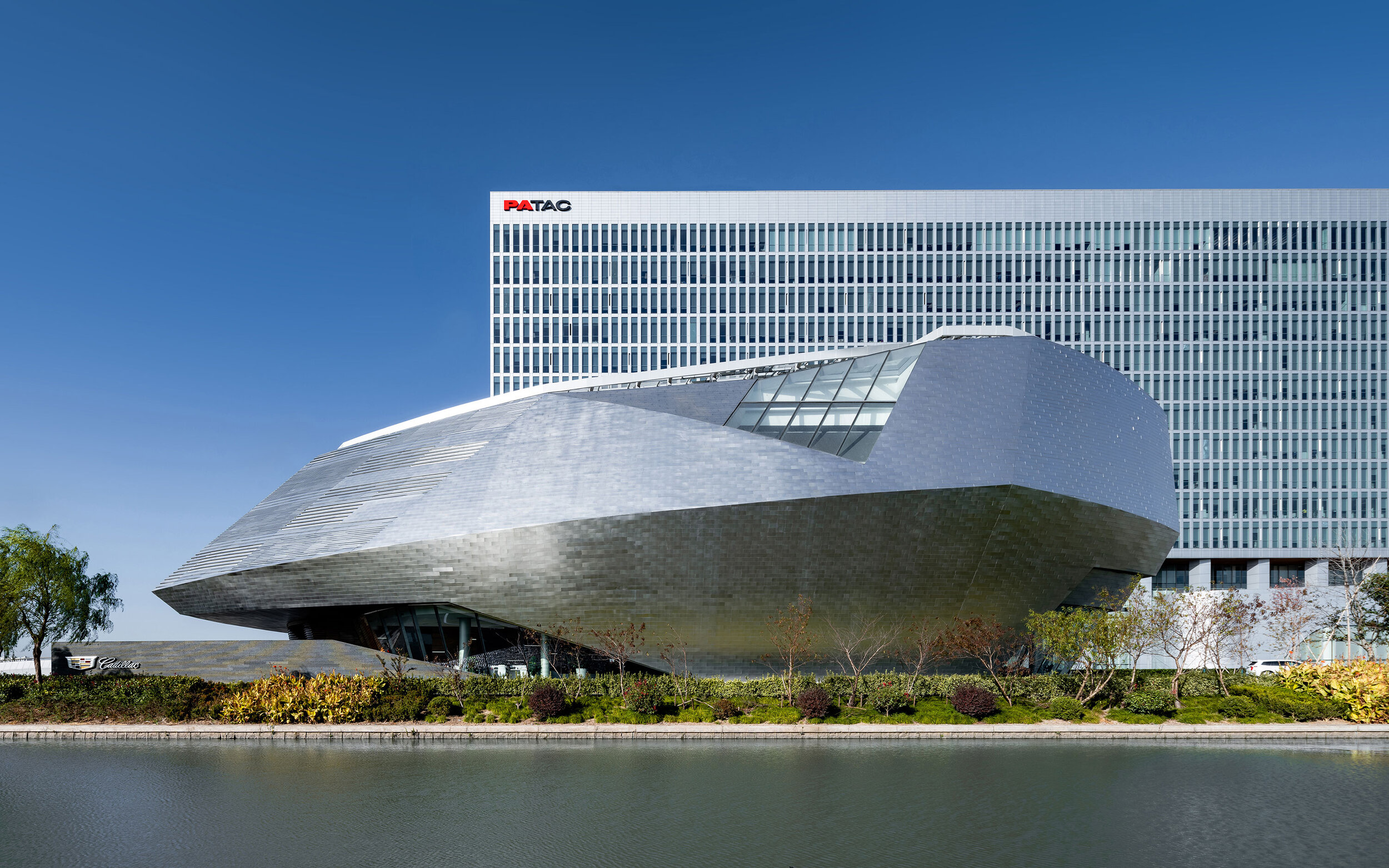
In Shanghai, China, Cadillac China and Gensler’s Shanghai Office sound a clear note of great latitude in expressing Cadillac House’s individuality, thus giving it the leeway to embrace deconstructivism and digital technologies.
Cadillac has a longstanding history now and Cadillac House is at its tender age, who is born in the ‘Me’ Generation wherein its birth is intended for exploring the stronger relation between new-technology trends and aestheticism and Self-expressing.
And Gensler, in modern expression, would care to render any visit to the House into a journey of exploration of modernism and futurism. Xiaomei Lee and Peter Weingarten, Co-Regional Managing Principals at Gensler Greater China, said that The Cadillac House project exemplifies Gensler’s One-Firm-Firm culture through combining the expertise of a global network and cross-practice collaboration from retail design, digital experience design to interior design and architecture disciplines, to leverage the power of design to create a better world.’
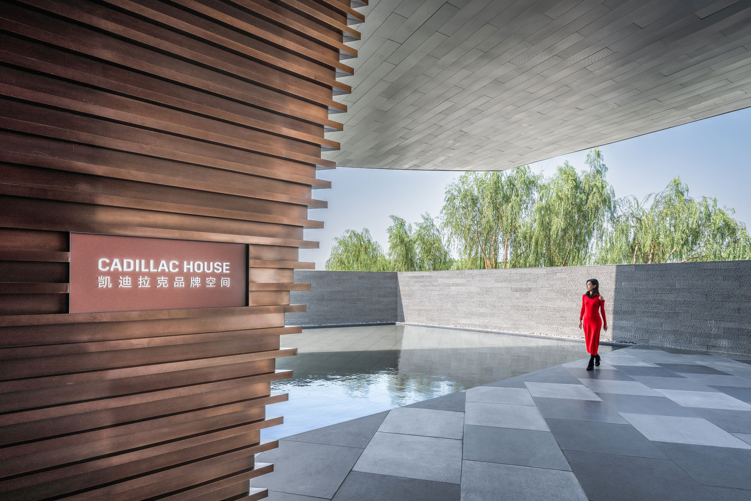
Nestled on a small peninsula with a lovely pool encompassing around, the House could be perceived as a vehicle-like gemstone mined out of a lake. Installed in 7,000 rectangular stainless steel plates, the façade unveils its true charm as the dusk falls — ribbons of LED underneath the metallic husk twinkle bright and Cadillac, the sign, emits beautiful light — and it dawns on you ‘what a glittering site!’.
The House is equipped with durable solar panels, with the sustainable conversion from sunlight to electricity.
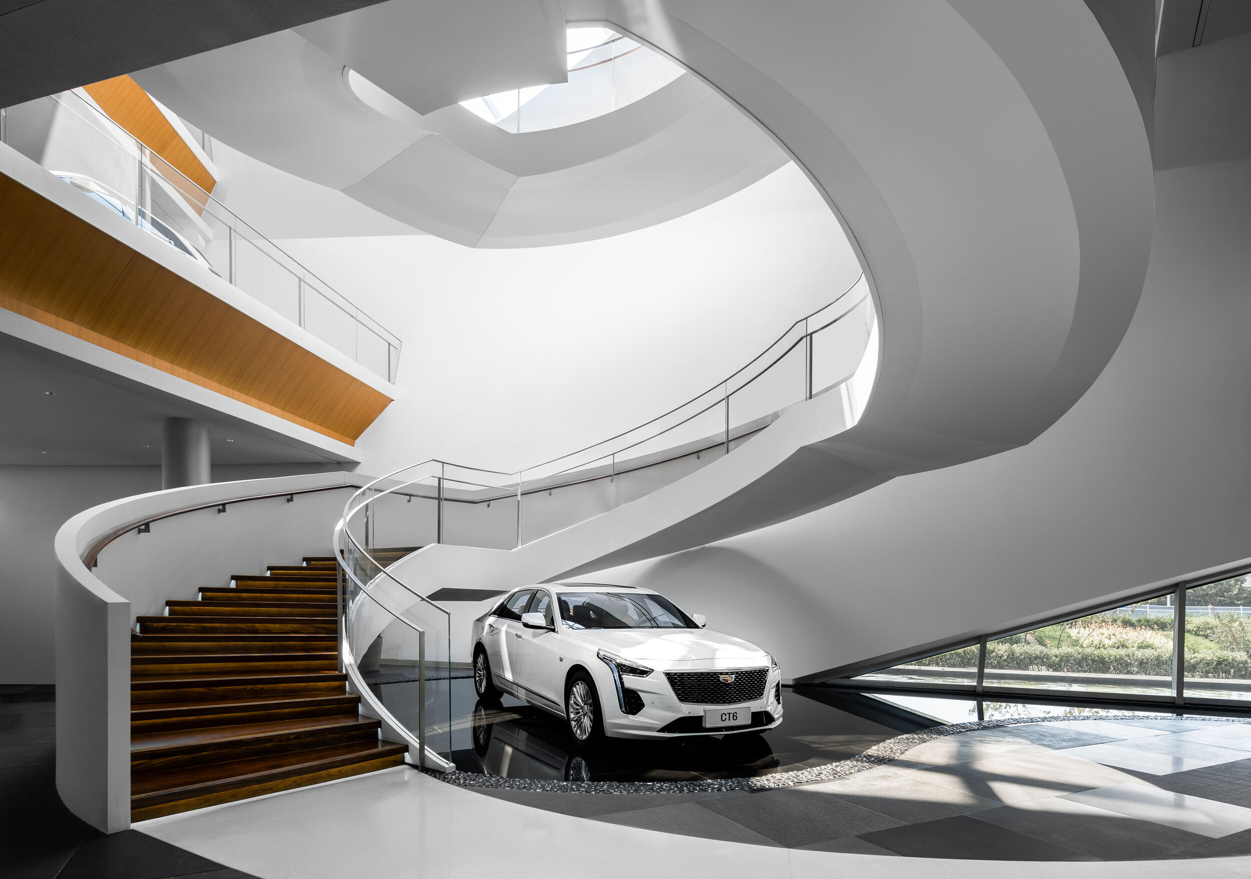

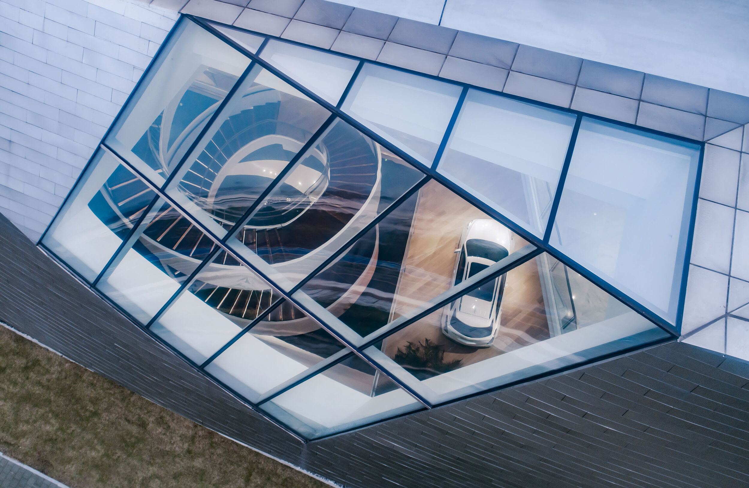
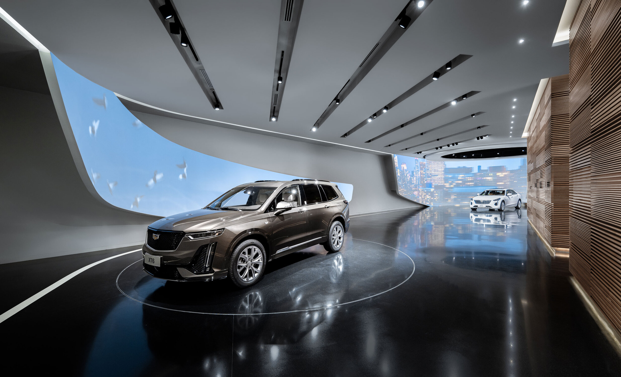
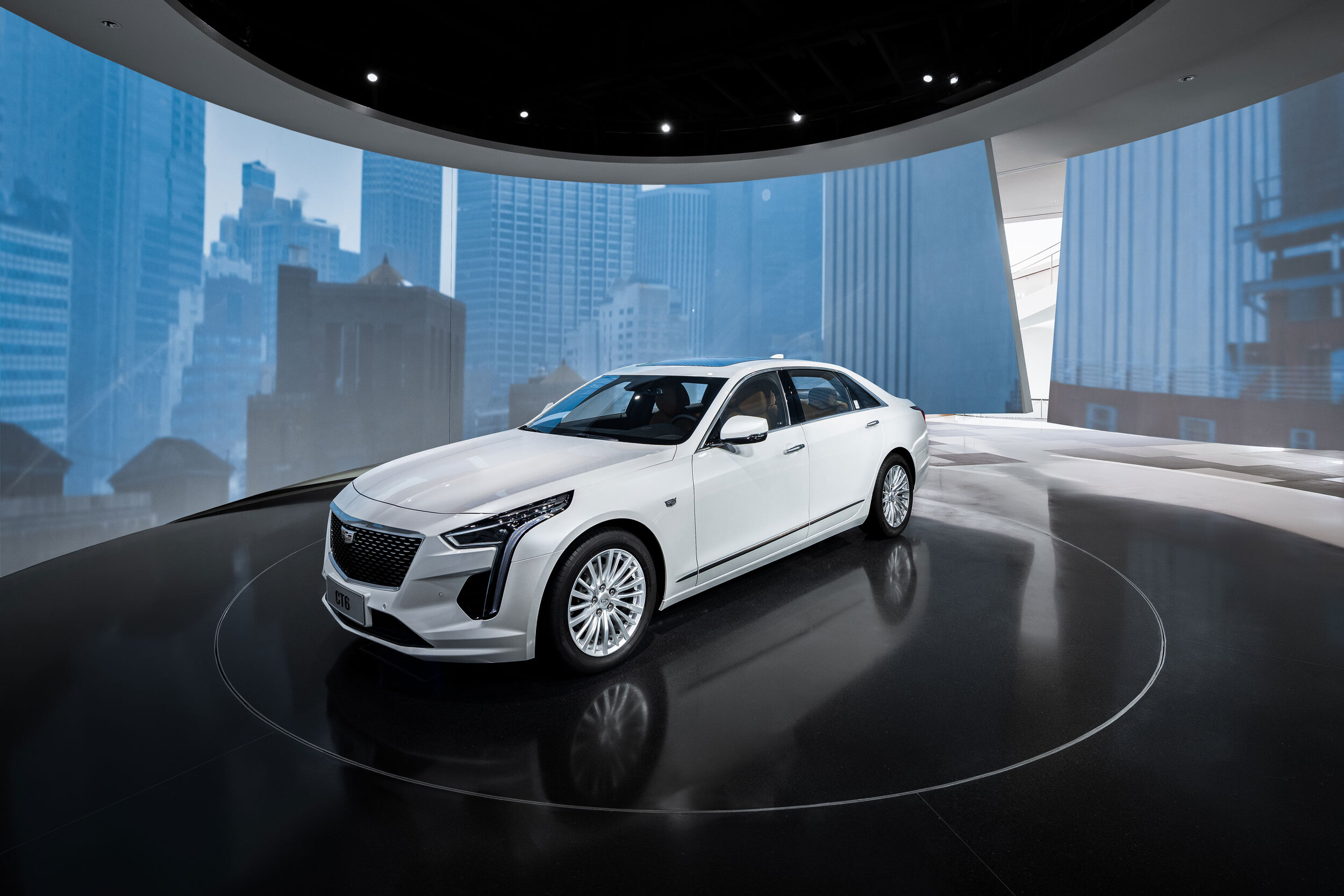
There could not be mere one single merit that natural light could engender. The House features skylights purposefully for the use of optimising light penetration into the inside.
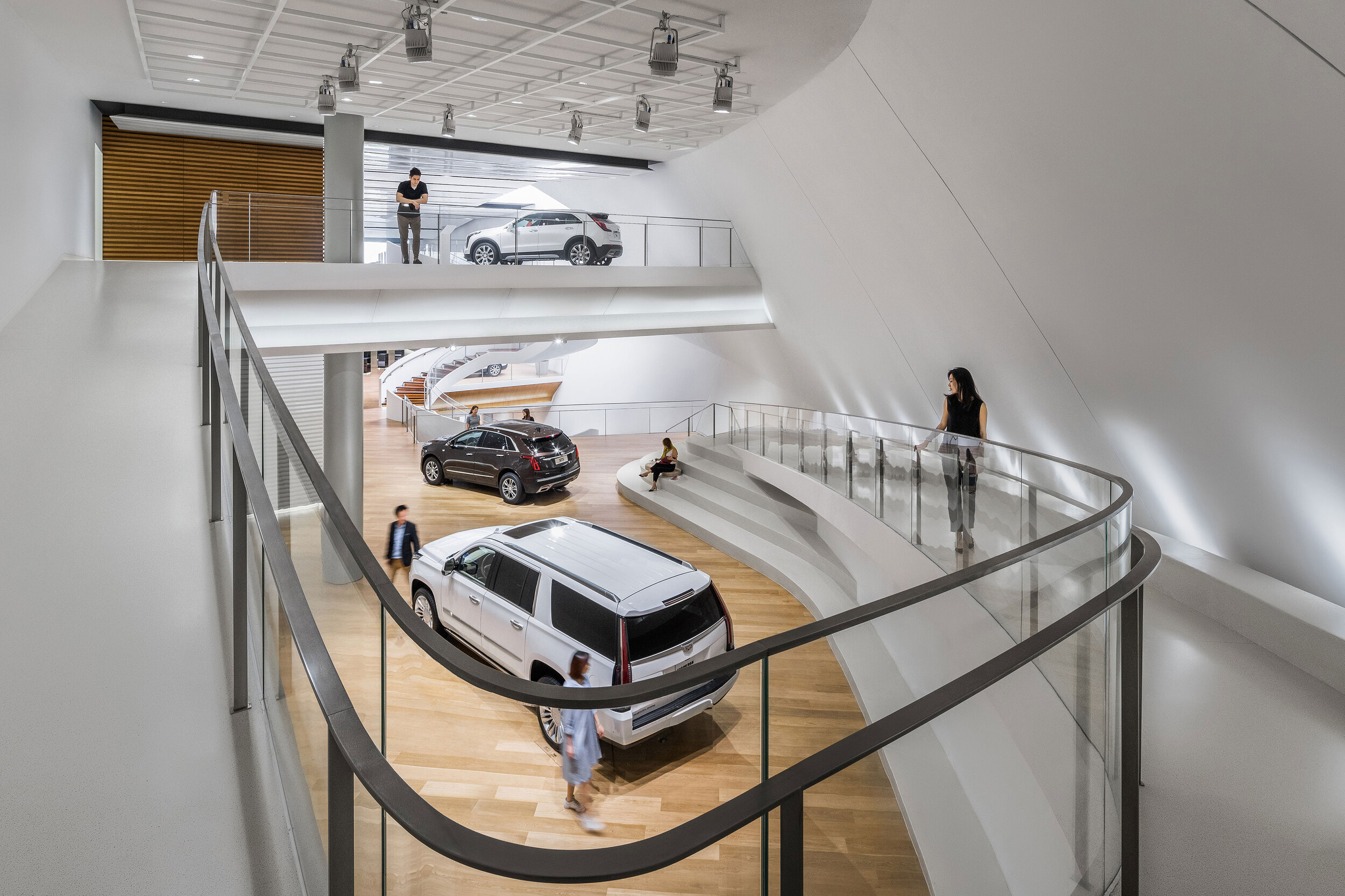
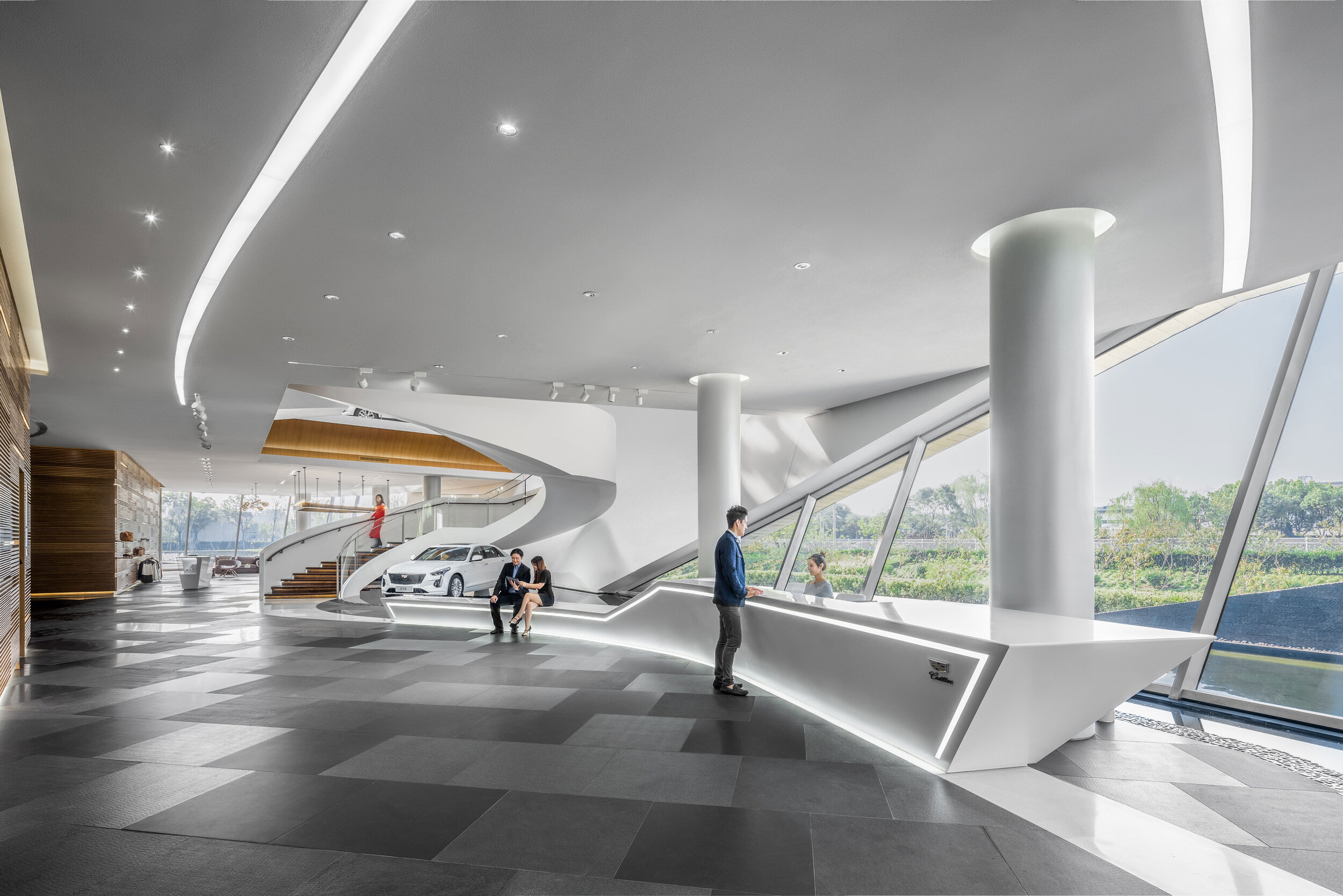
Inside, the consistency of refinement and luxury will hardly astound you to see the discontinuity of an air of nobleness. Moving through a wondrous entrance, you will be greeted with an open-plan foyer emerging before you.
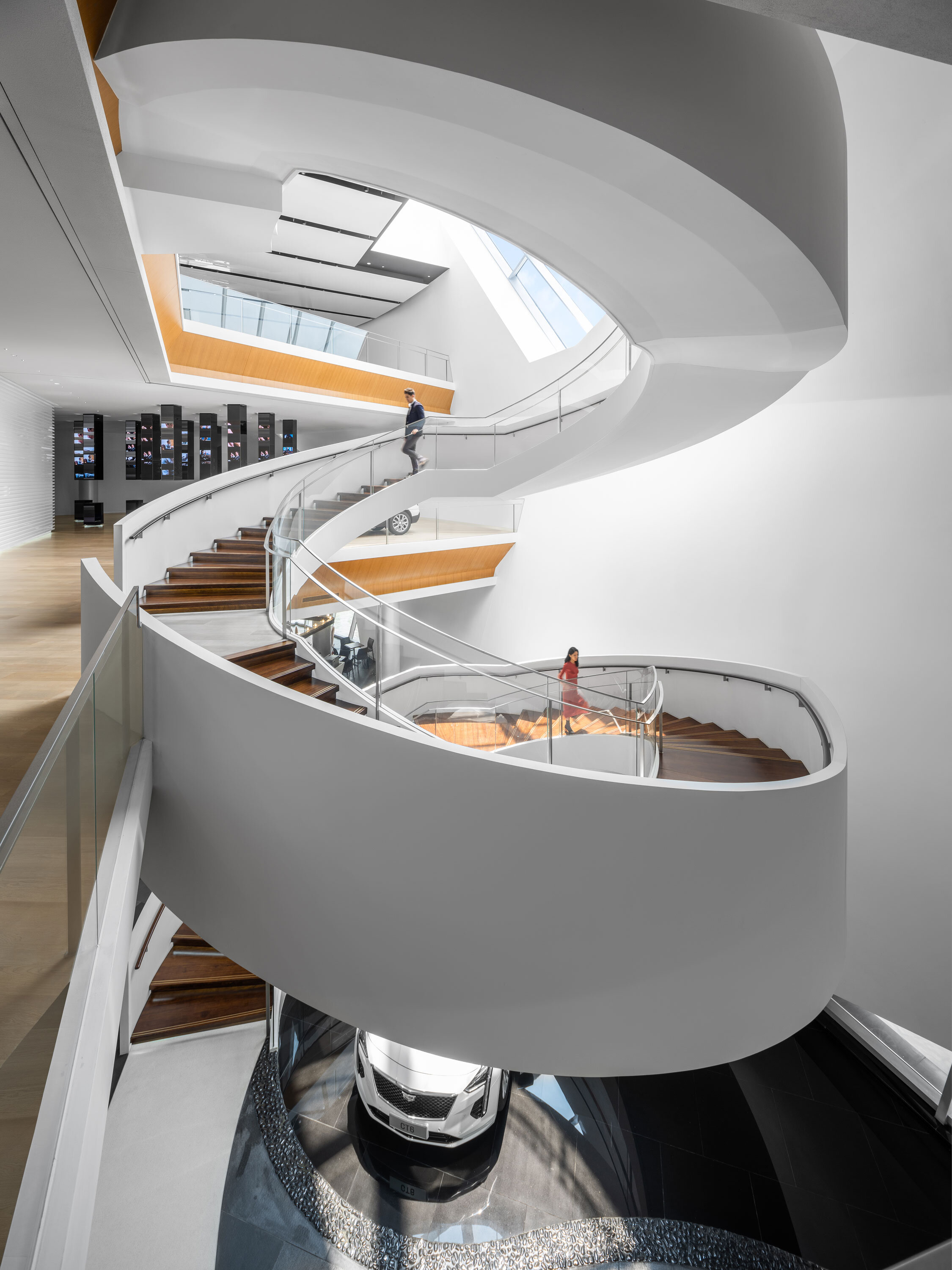
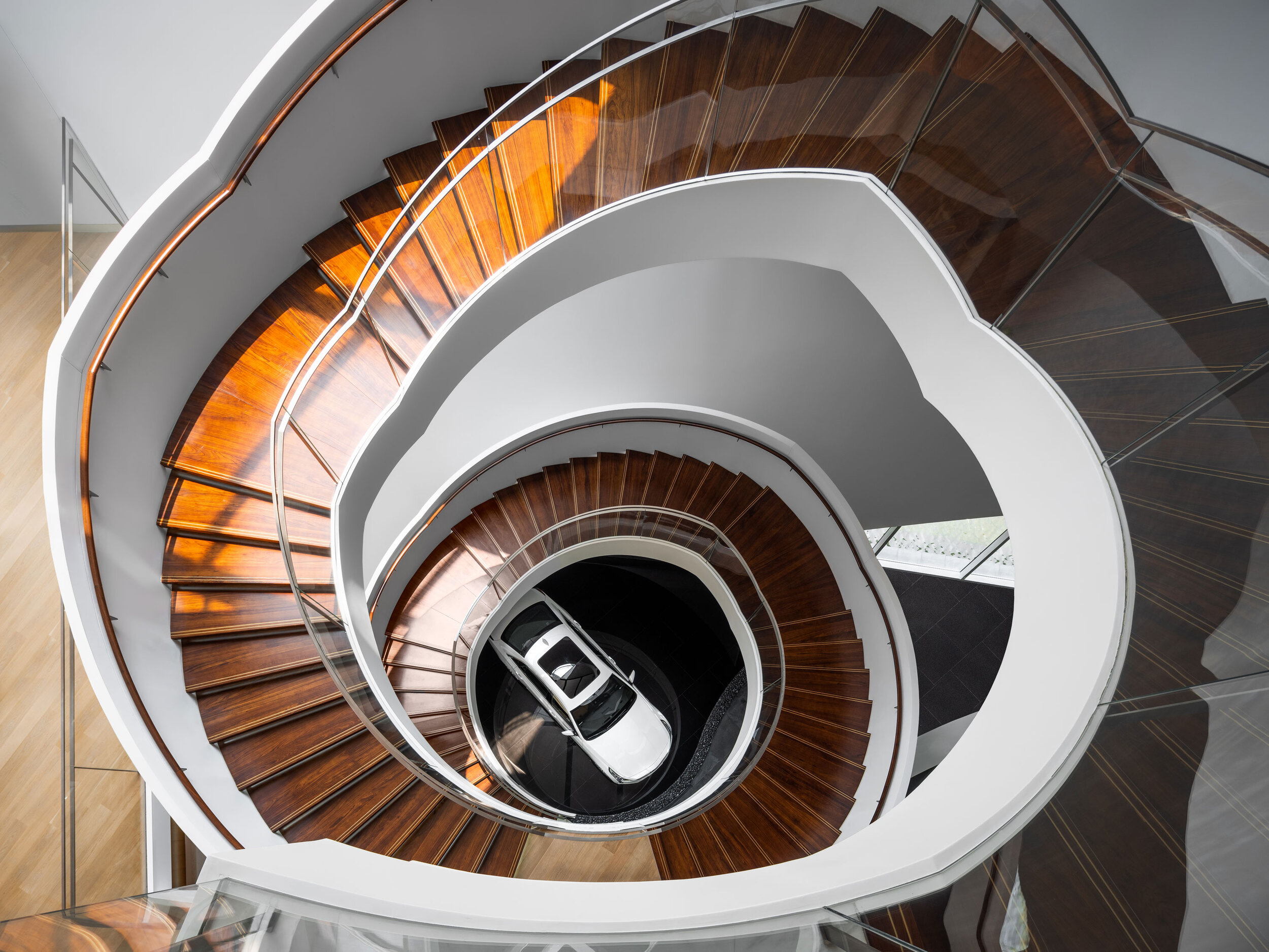
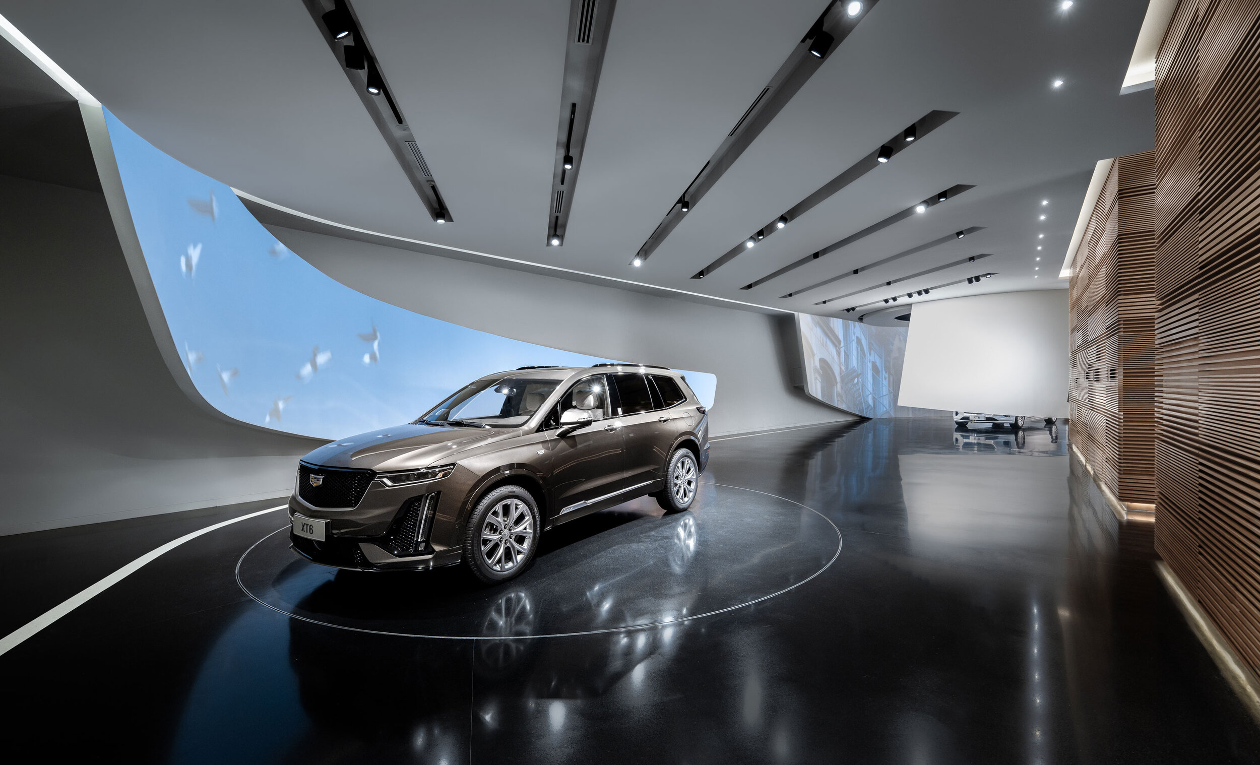
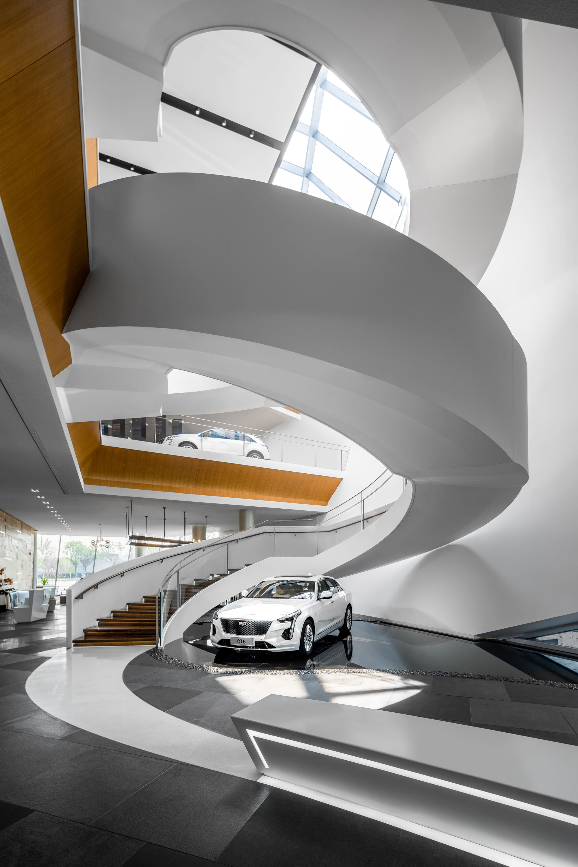
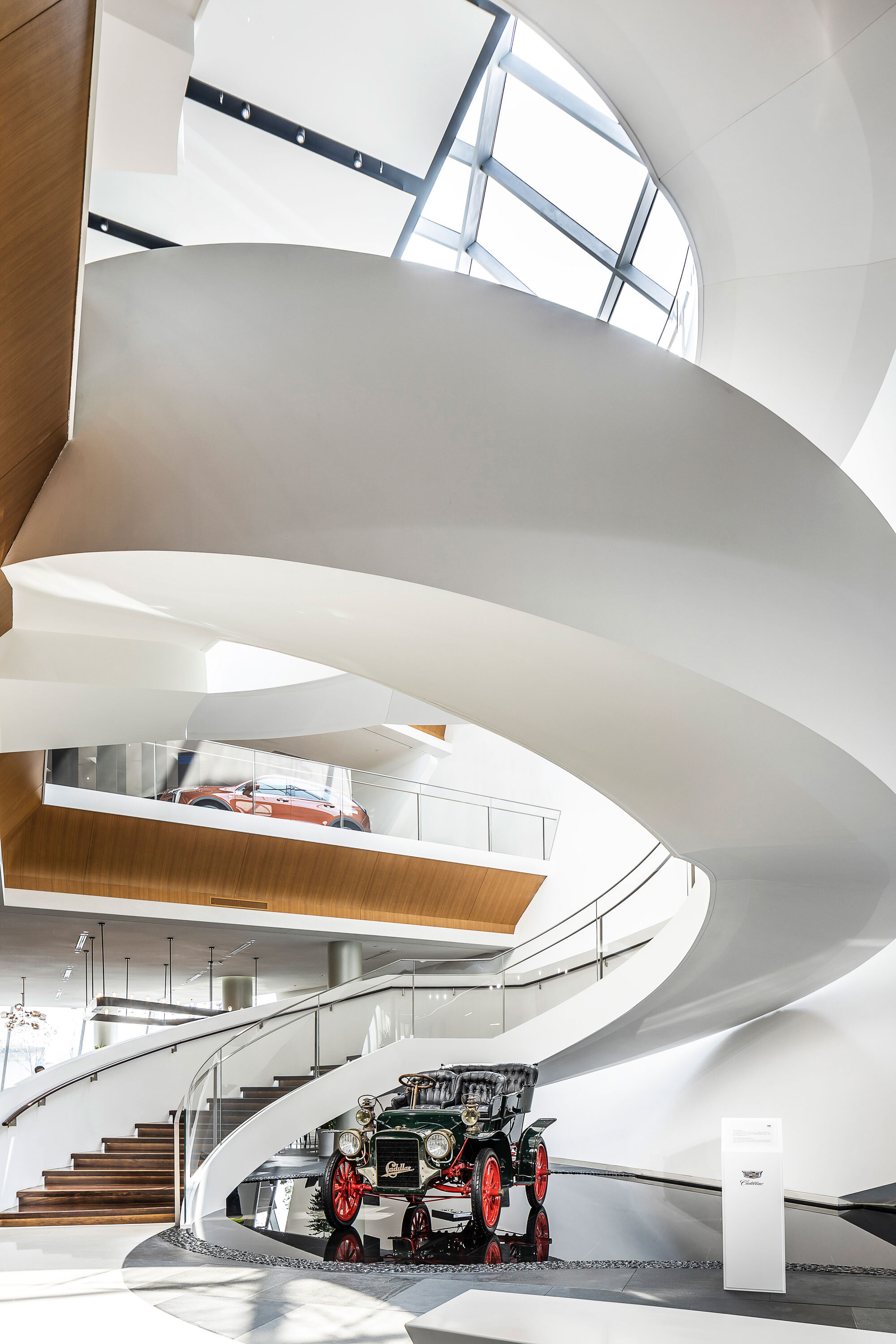
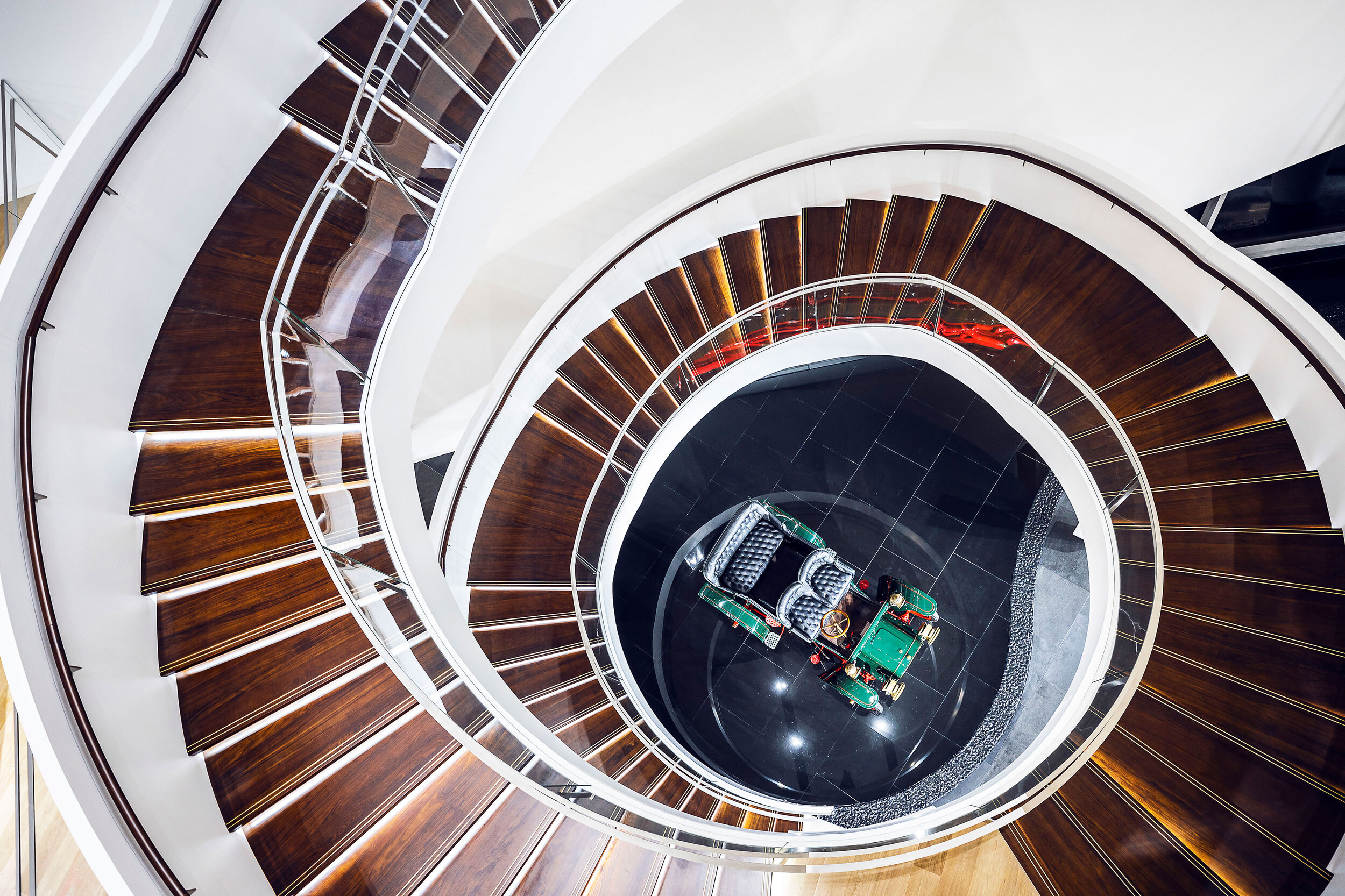
Awaiting are the Cadillacs. They are waiting for customers who take an avid interest in carrying a sign of luxury home. Gensler realises the idea of establishing a platform for Cadillacs to showcase their specialties, and, underneath a massive spiral staircase or in the centre of a lobby will you set your eyes on a different individual.
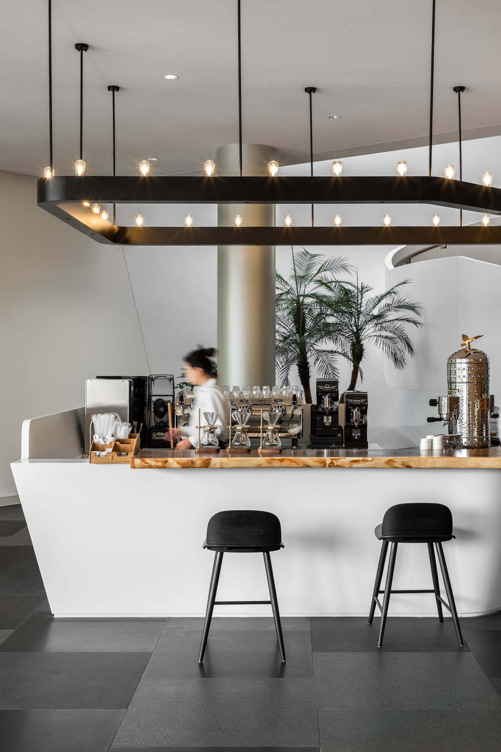
Standing still for a moment with eyes riveted on the Cadillacs, you will smell of classic aroma of dark roast coffee, which is tantalizing in the space, and that aroma is a high-profile fixture in a luxurious locality. A timber-and-concrete spiral staircase leads from the open-plan foyer to the second level and the third, dispensing with columns offering the verticality to offset the smoothness of the ribbon-like spiral.Three floors in total, Cadillac House rings the change with a linear arrangement of ‘past-present-future’, having a theme fixed on every floor but in a way that the ‘future’ is in the middle and the ‘past’ in the top floor.
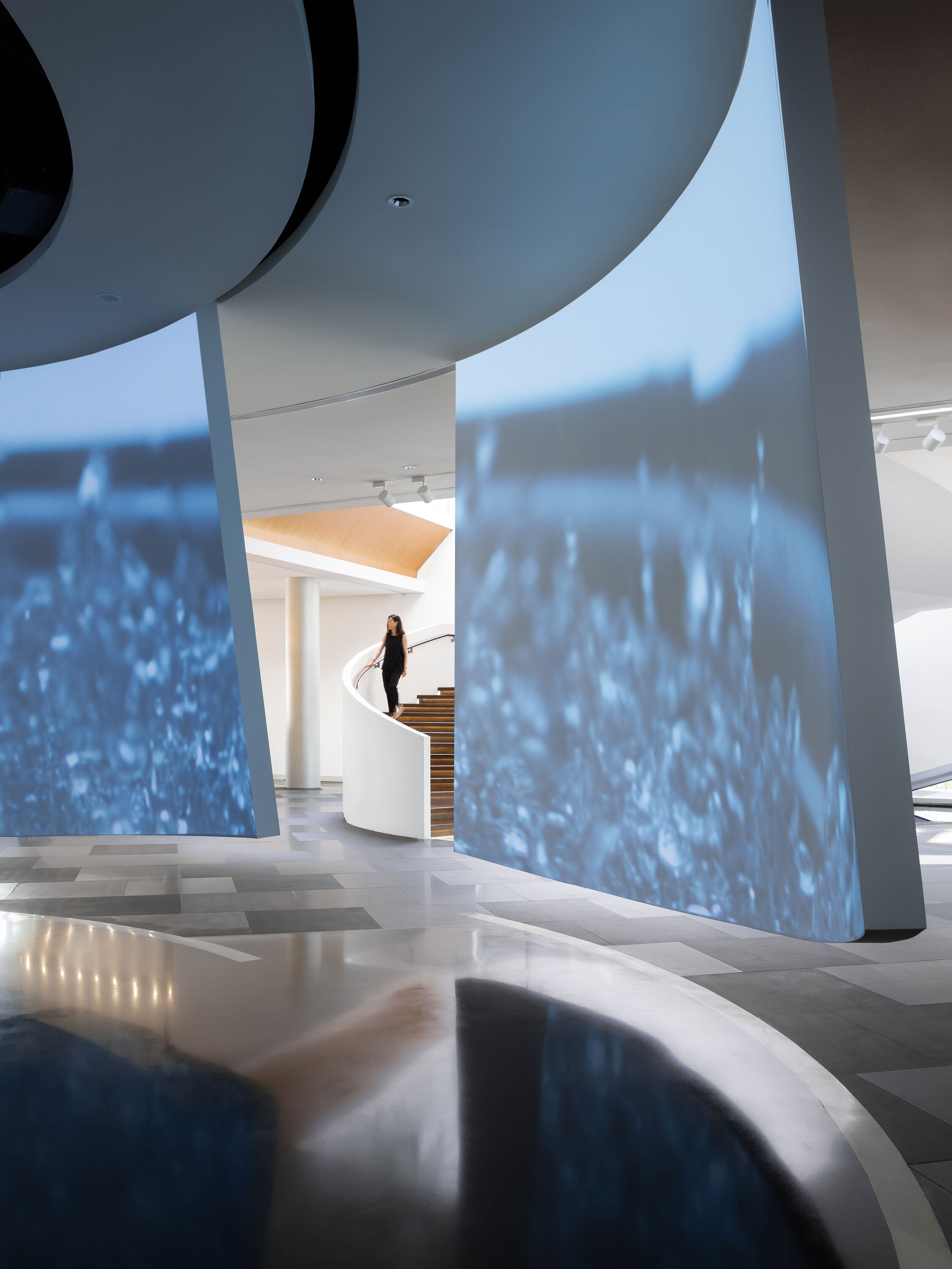
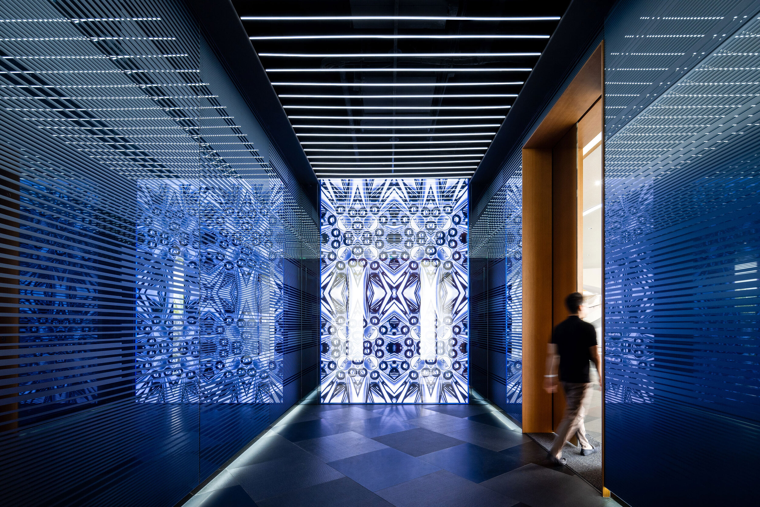

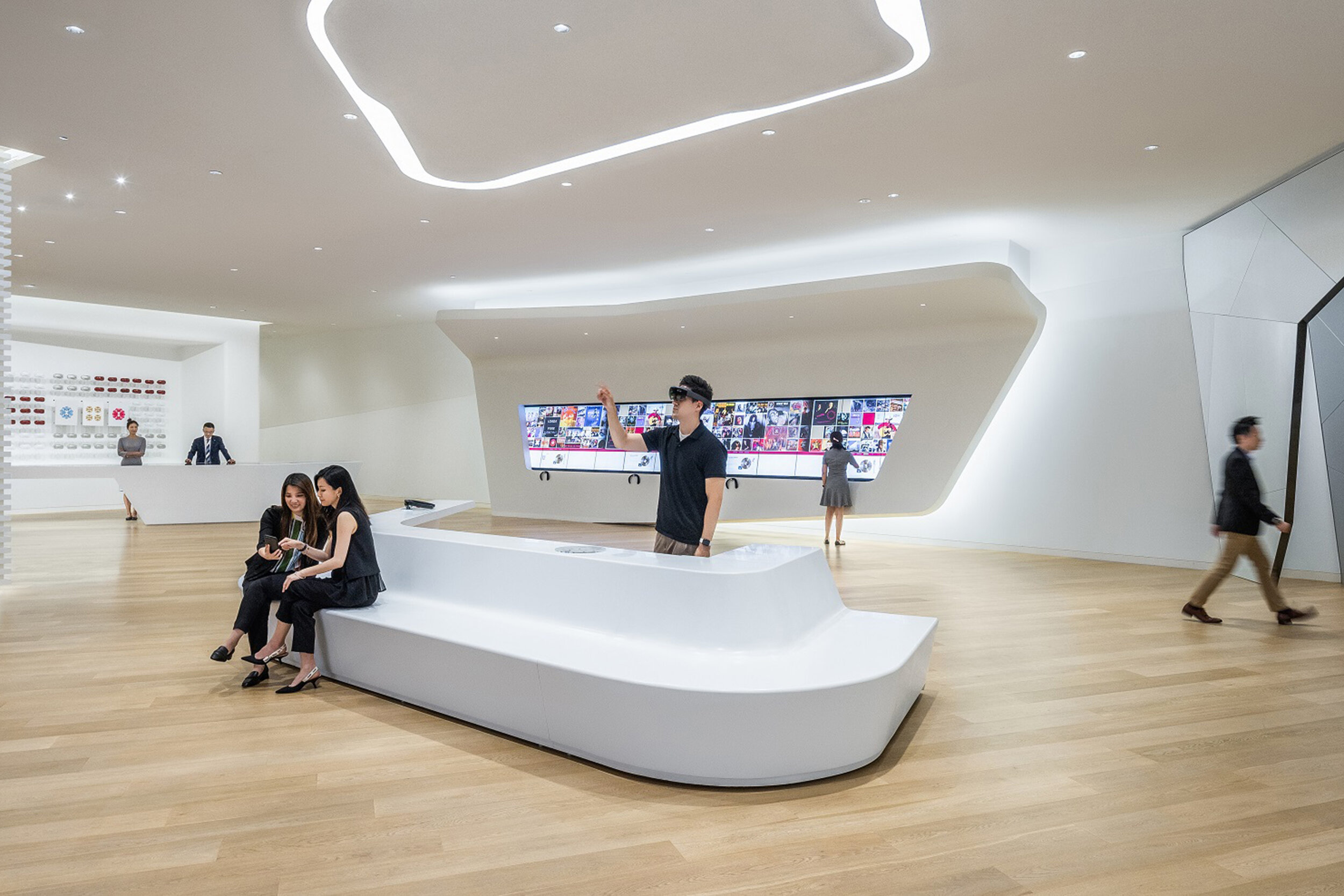
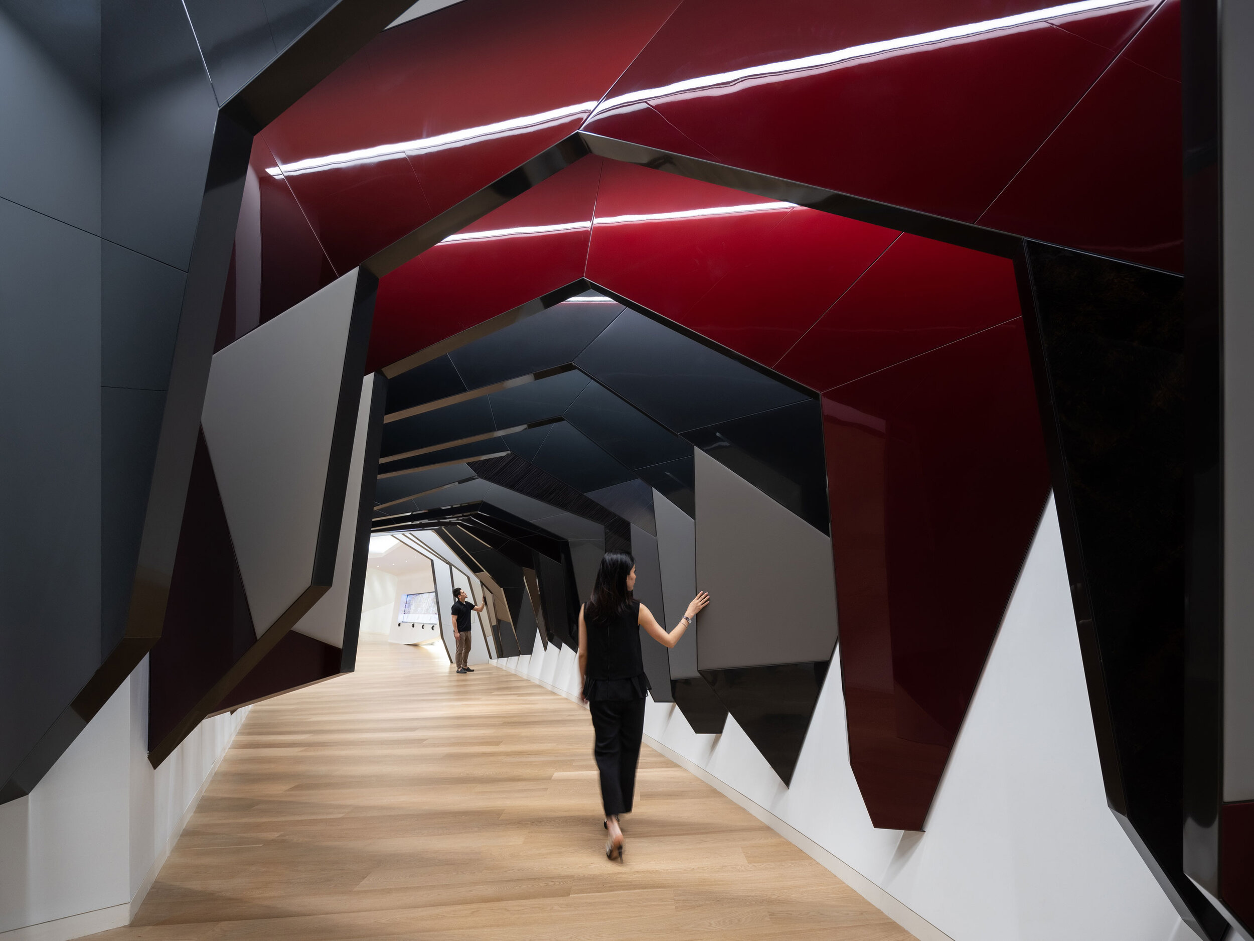
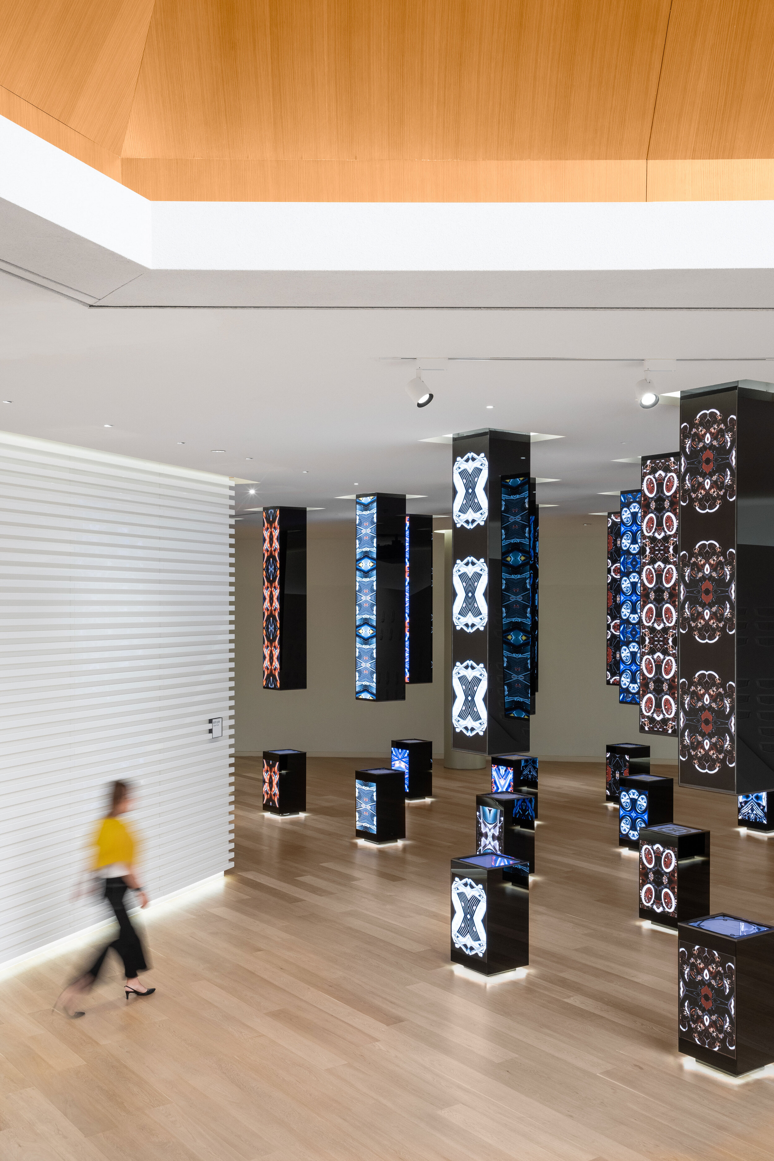
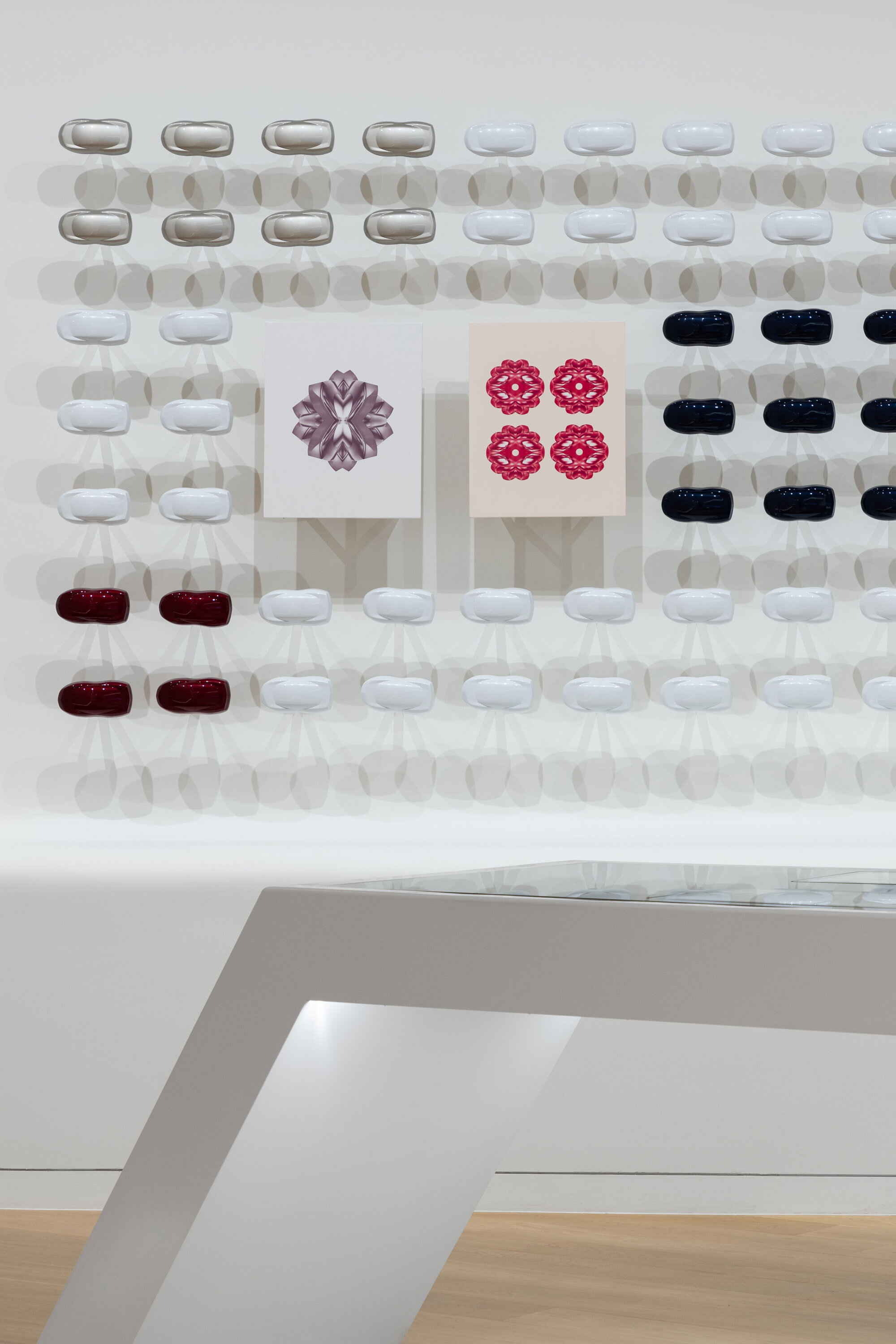
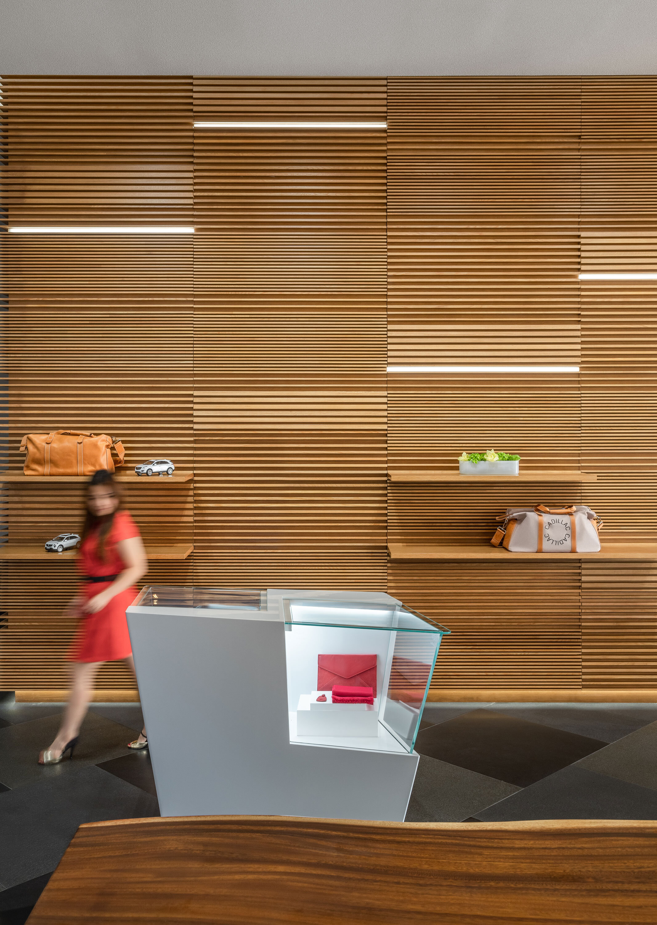
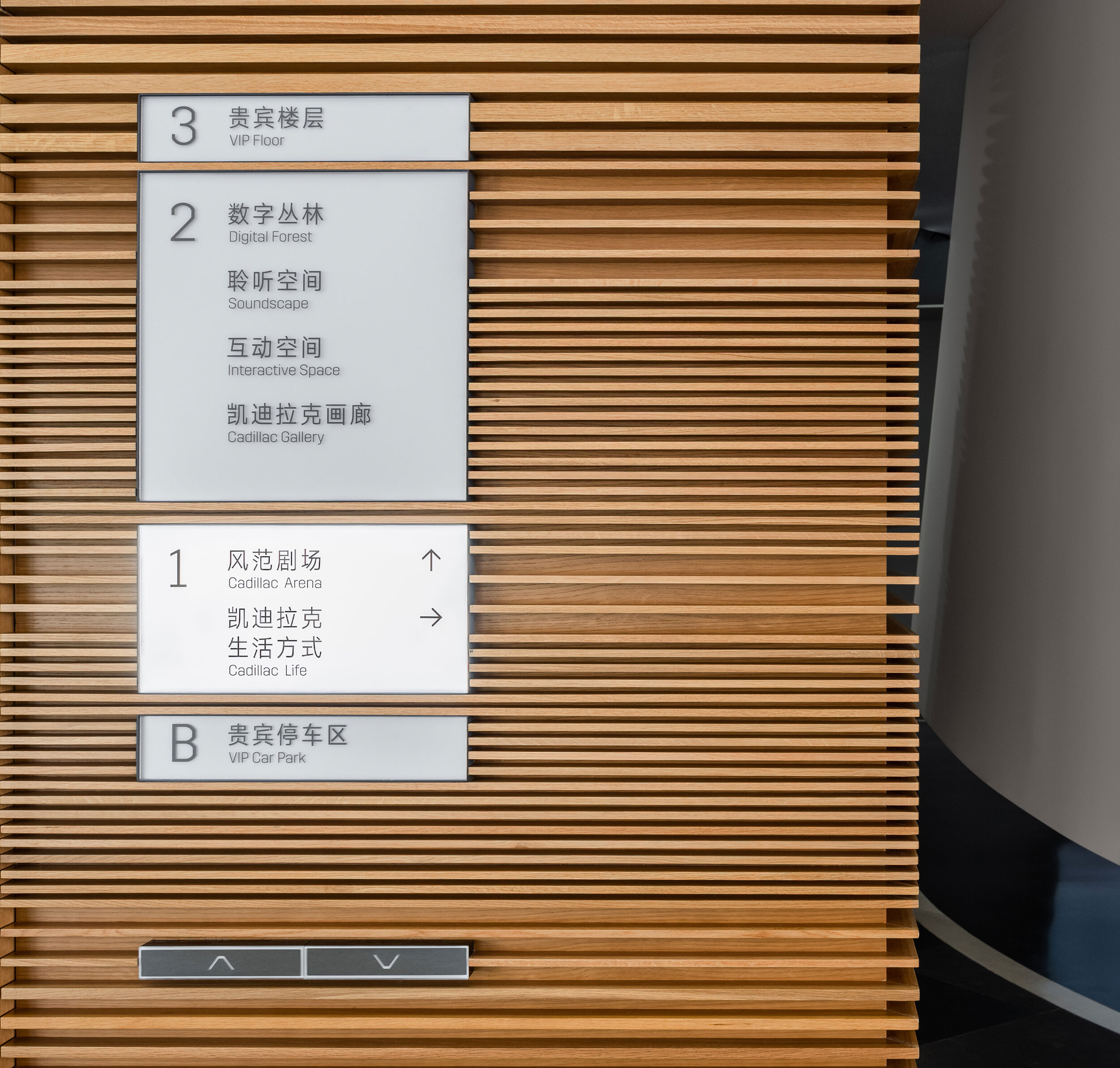
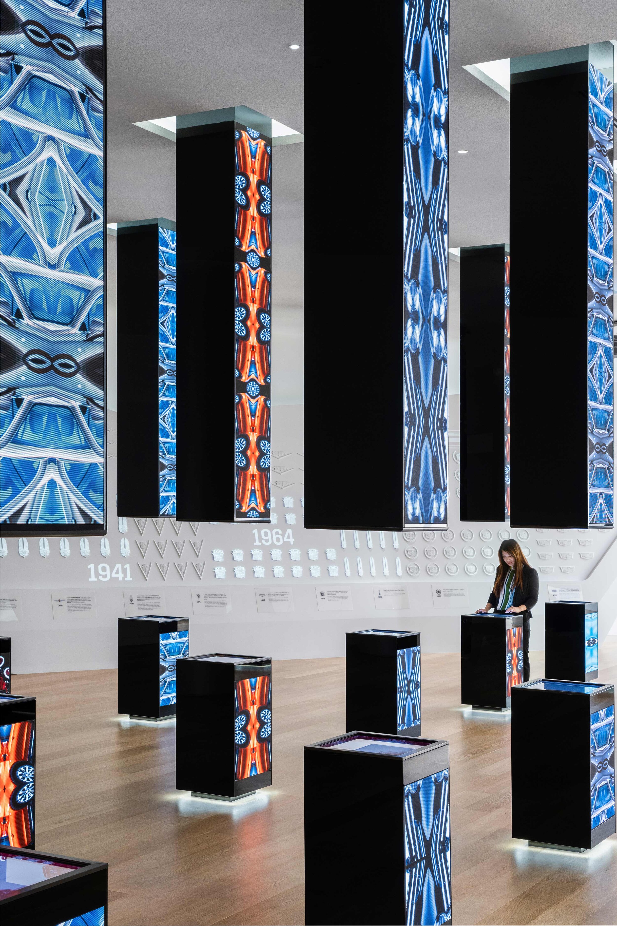
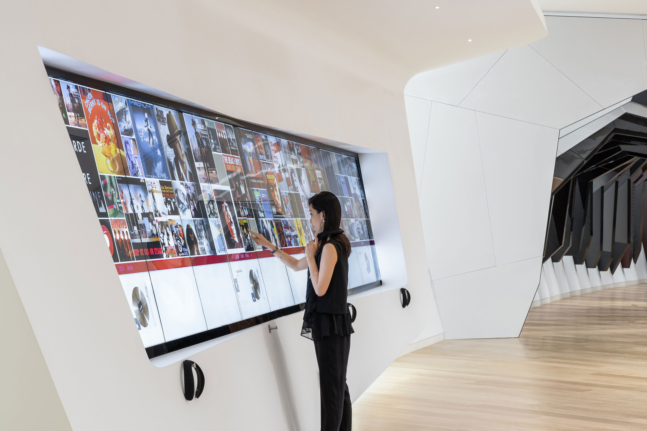
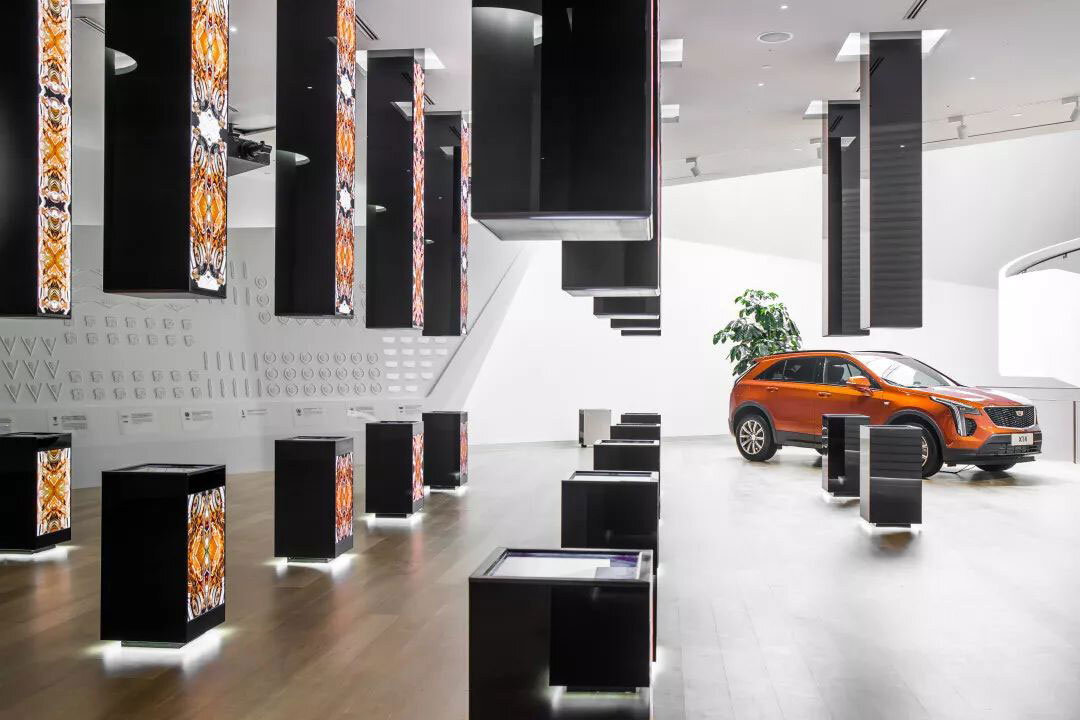
Level 2 focuses on the theoretical possibility of multi-sensory interactive technologies. Adopting multiple ways to open up a novel opportunity for customers to a body-syntonic end, is actually, grounded on the basis of VR and 3D printing.
Technologies are an invariably trend-propelled force. There is a patch of the area which is characterized by a cluster of slender cuboids with digital screens embedded, which is named ‘Digital Forest’. The name could be conceived as a variation of ‘Concrete Jungle’ because these columns have a bearing on their architectural counterparts.
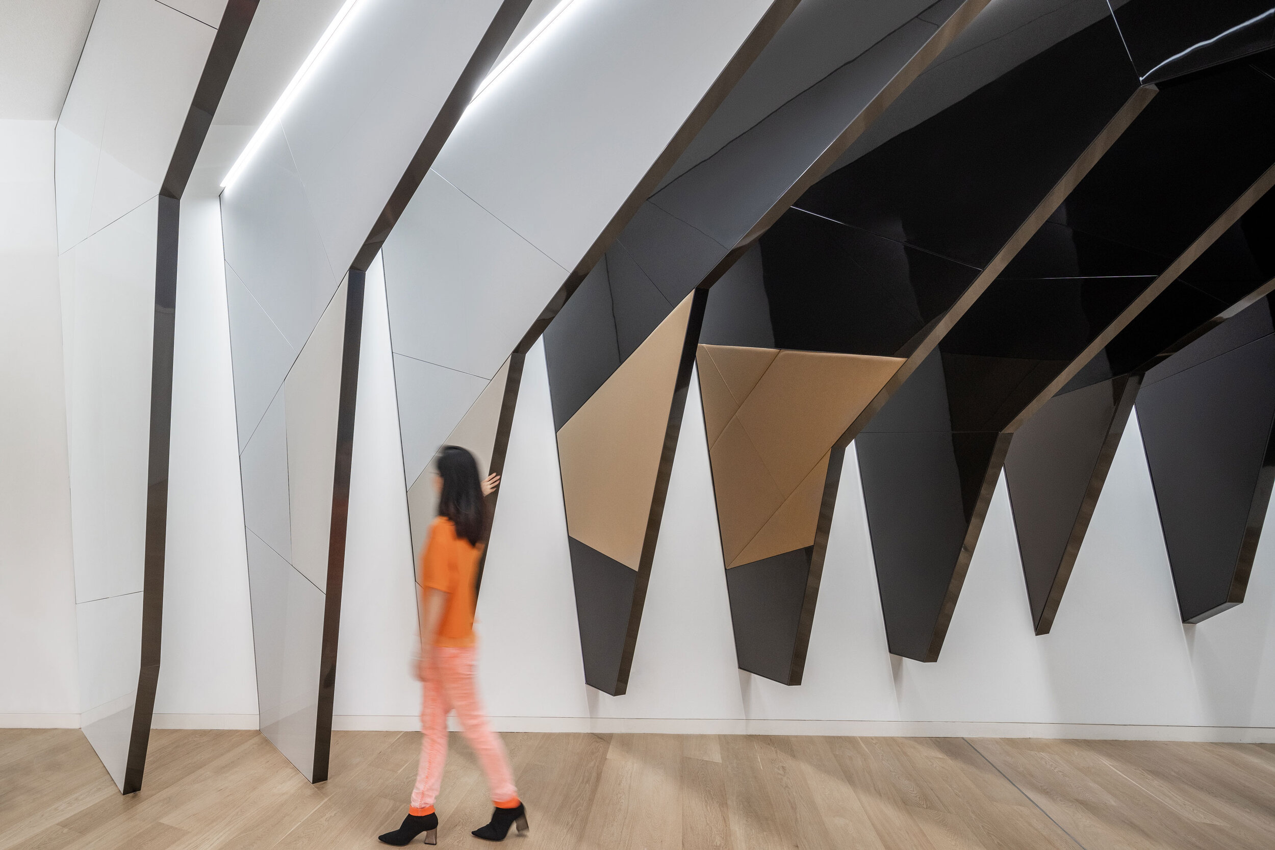
A hallway is imbued with a notion of the time tunnel, through which you are capable of having a panoramic view of the growth of Cadillac.
Cadillac sets the bar high and it is estimated that over 3000 songs have included its namesakes on purpose to indicate that Cadillac is synonymous with automobile sleekness and a sign of wealth. Richard Chang, Greater China Retail Practice Area Leader at Gensler said, ‘‘We are proud to be working with Cadillac on designing such an important project. And the AIA award is great recognition for all the hard work to bring the project into completion.’
Project credits:
Project Name: Cadillac House
Location: No. 2199, Jufeng Road, Jin Qiao, Pu Dong, Shanghai, China
Architectural and Interior design: Gensler (Gensler’s Shanghai Office)
Date of Open: 27/3/ 2019
Site area: 6493㎡
Photographer: Blackstation & CreatAR
Design Pier capture the preciousness of time and the fragility of a moment
Design Pier returns for Designart Tokyo 2020, compiling a selection of high-end design objects that capture the preciousness of time and the fragility of a moment and compels them to experience life to its fullest. The selection includes unique and precious pieces that challenge commercially made objects' homogeneity and brings a refreshing perspective, creating an emotional attachment between products and users.
Design Pier returns for Designart Tokyo 2020, compiling a selection of high-end design objects that capture the preciousness of time and the fragility of a moment and compels them to experience life to its fullest. The selection includes unique and precious pieces that challenge commercially made objects' homogeneity and brings a refreshing perspective, creating an emotional attachment between products and users.

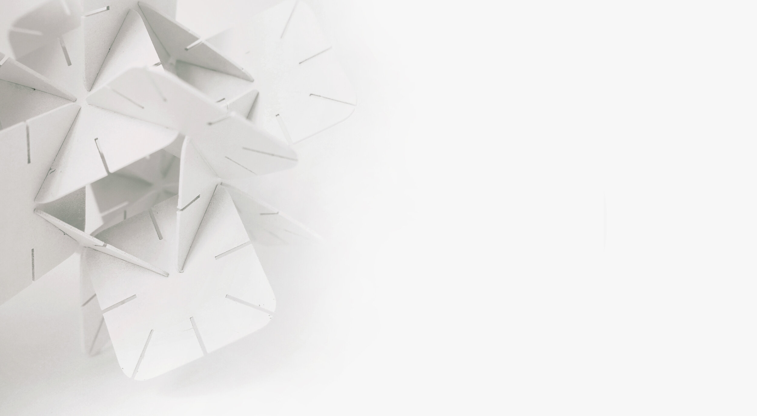
DAZINGFEELSGOOD (DFG) is a Singapore based design practice founded by Kiat Ng and Karen Chiam in 2015. Guided by design fundamentals, the practice reflects on rational and reduction approaches to explore, design, collaborate and create works that span across furniture, graphic and spatial design disciplines.
The practice has led DFG to produce works that are represented at international art and design platforms including Art Stage (Singapore), Maison&Objet (Paris), SaloneSatellite (Milan), and received recognition from A’ Design Award (Italy), Asia Design Prize (Korea) and Bolia Design Award (Denmark).
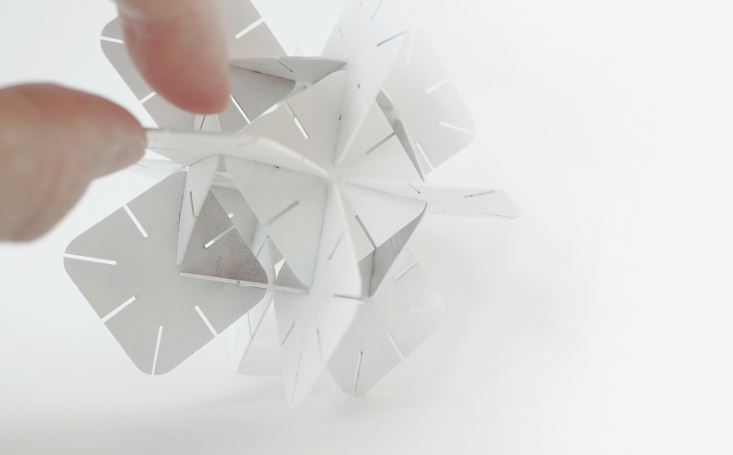
Objet is a series of modular planes in the expressions of geometric shapes connected in a methodical arrangement to create assemblages that function as lighting.
Title: Objet
Year: 2020
Dimensions: 500 x 500 x 500mm each (A series of 3 artworks)
Material: Acrylic with dichroic film
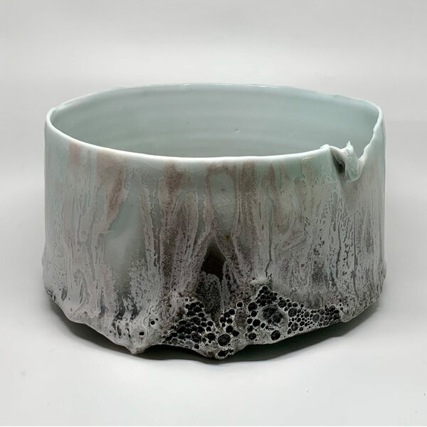
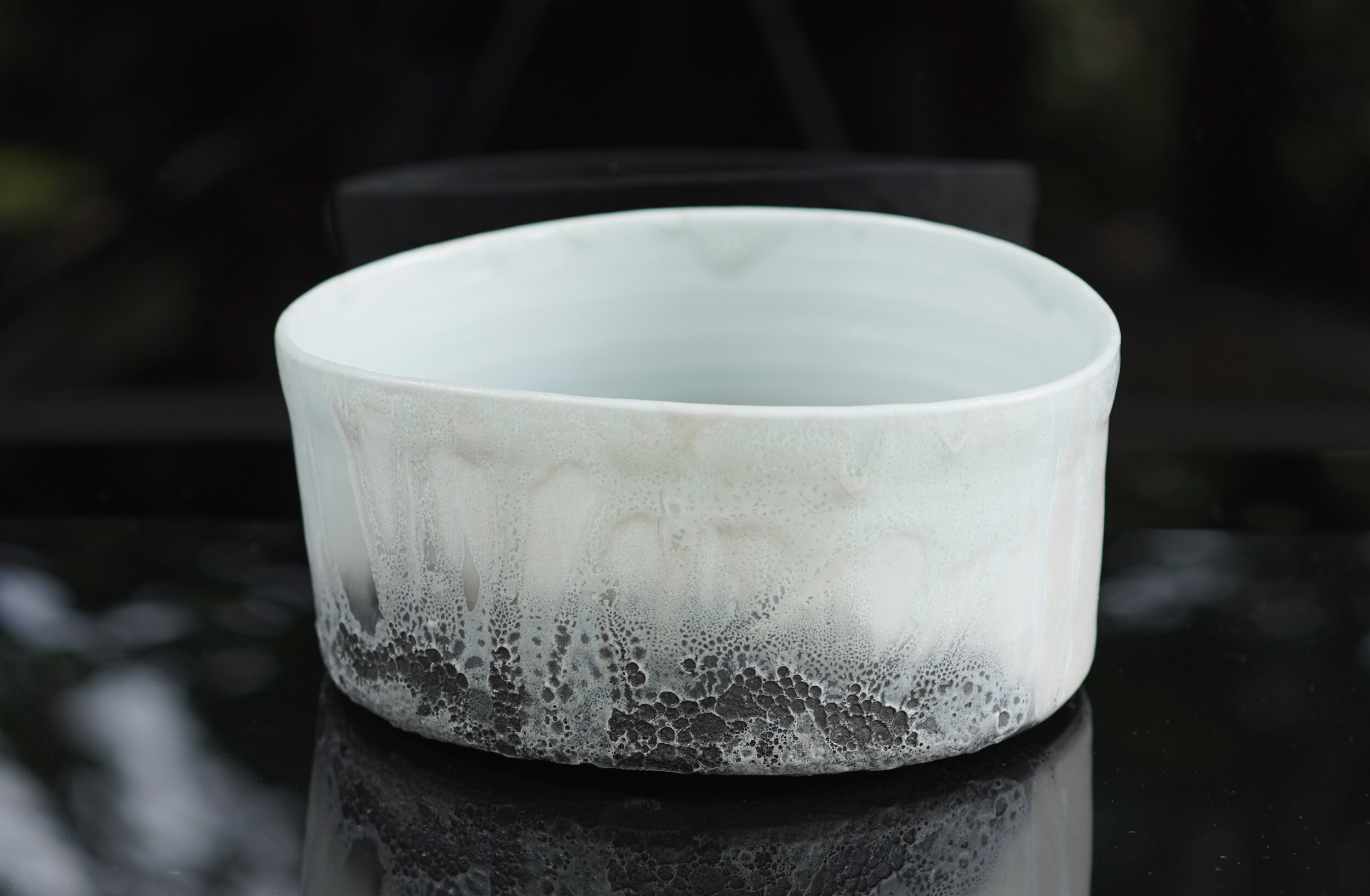
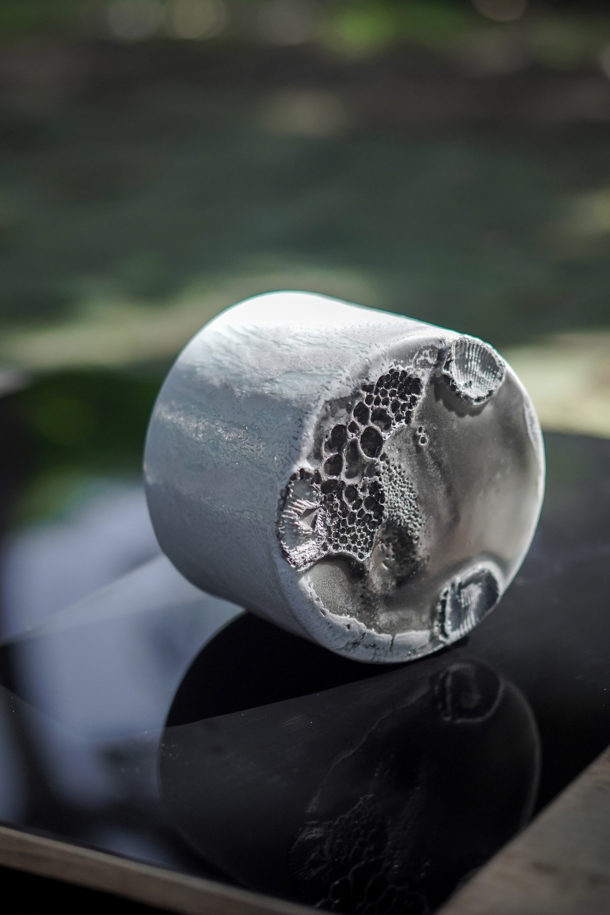
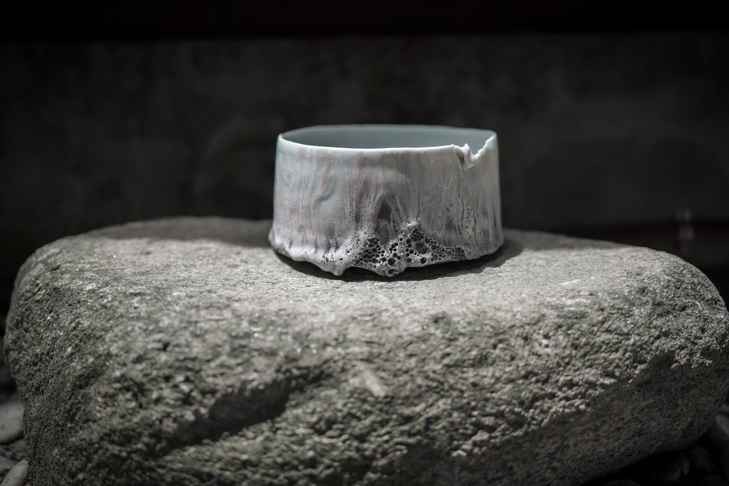
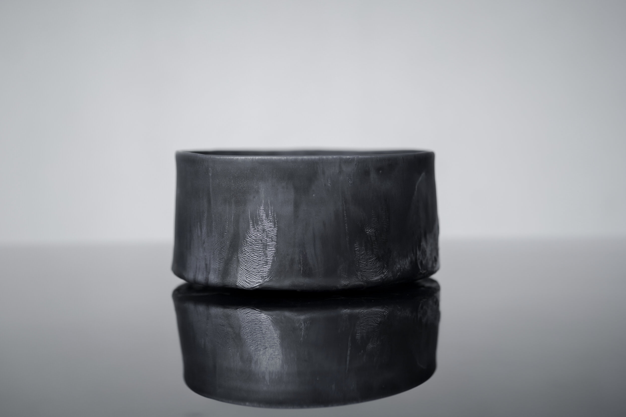
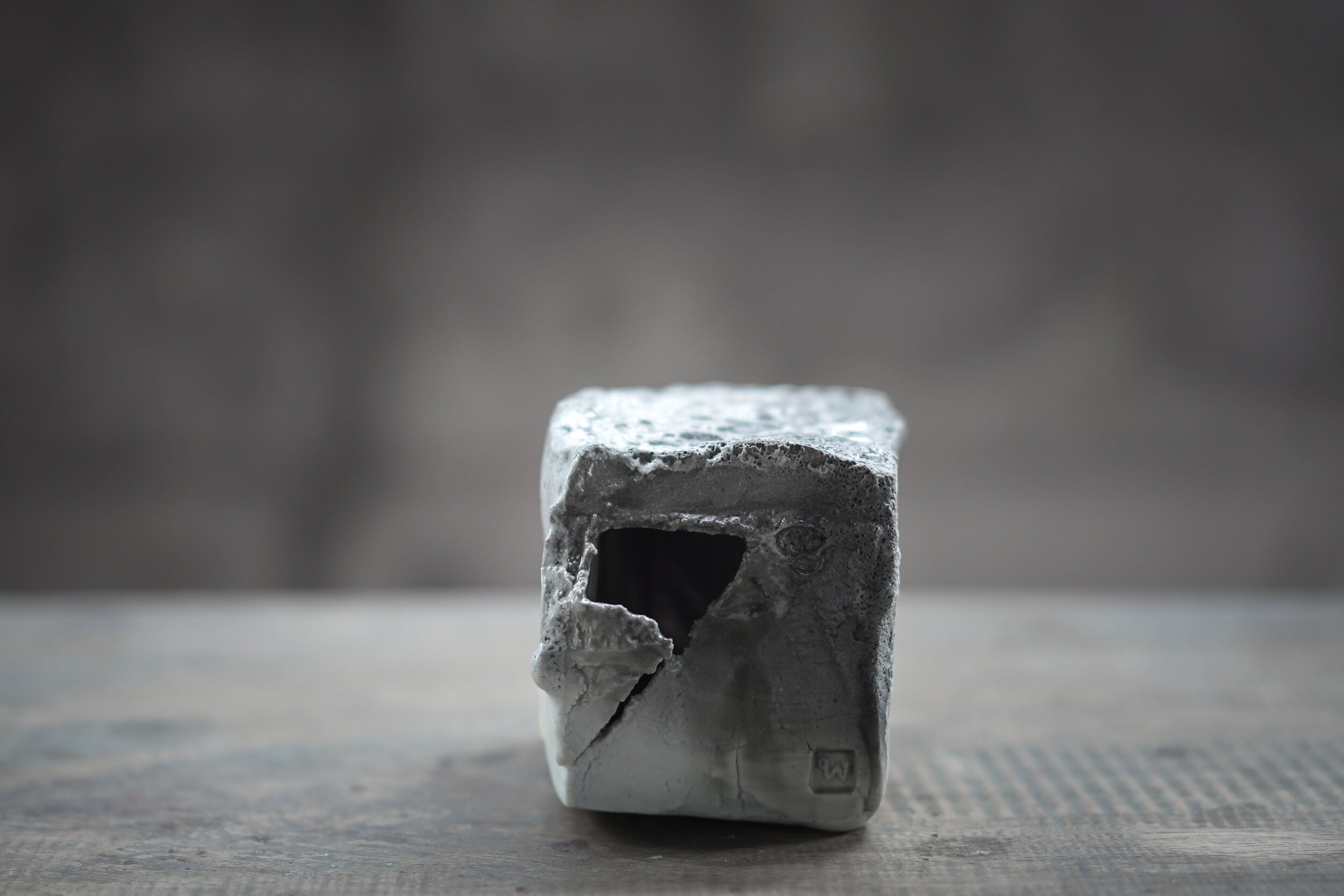
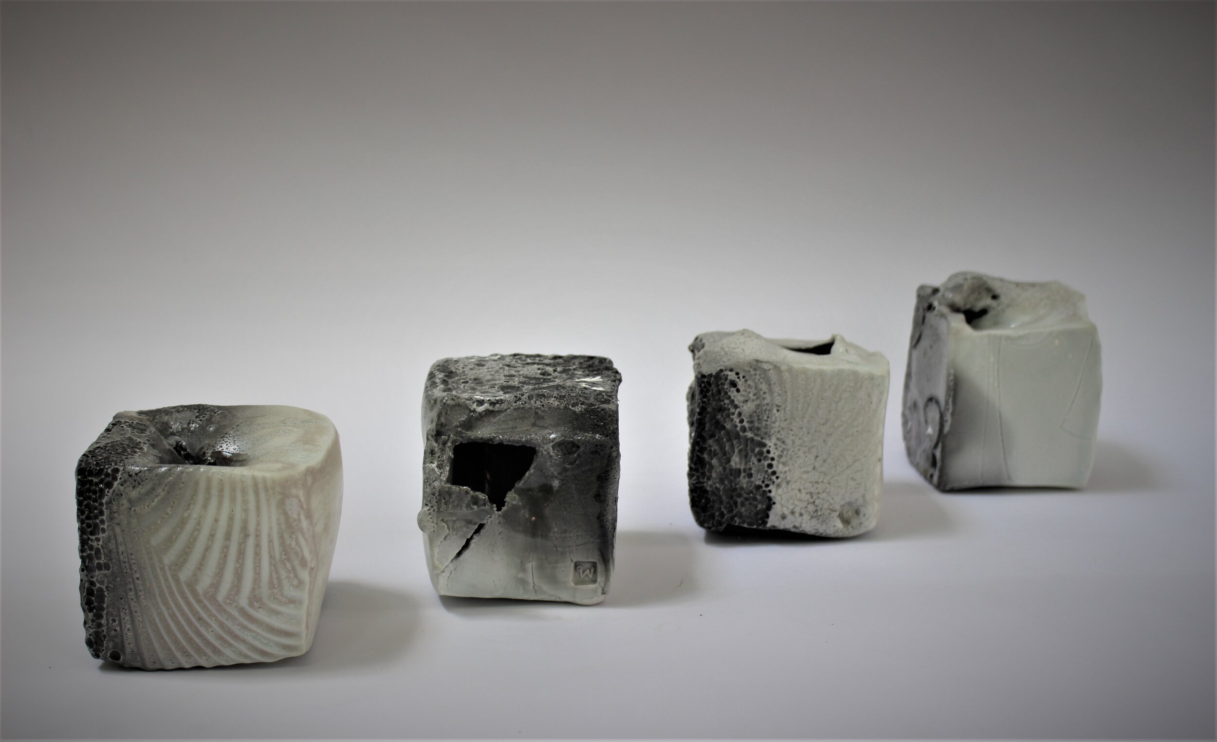
In my work I try to find a good balance between what is made and what is found. I want to submit to the nature of fired-clay, and keep certain evidence of my existence. That is my pride as a maker. I like boundaries and rules. Craftsmanship is very important to me.
I make vessels sometimes. Sometimes, I create an object with the intention of creating a vessel. When I take various kinds of minerals, clay, and different parts of Earth, arrange them in a specific way then heat them in my kiln and I feel like I am making a new type of rock in a very short time. The actual rock cycle in nature goes on for millions of years. In my lifetime I hope I can illustrate the process through my practice and bring it into the domestic settings and environments for people to experience.
Pim Sudhikam (1973/ Thailand): Pim holds a Bachelor of Industrial Design from Chulalongkorn University, Bangkok, and a Master of Fine Arts from HDK Gothenburg University, Sweden. Since 1998 Pim has been working with clay as her primary medium, investigating pottery as material, process and content. Her works include collections of objects, sculptures, and large-scale, site-specific installations. The works explore a balance between what happened and what being made while she tries to bring natural phenomena into the domestic context in the form of vessels. Pim has taken part in exhibitions, symposia, and residencies in Thailand and abroad. She has received “Awards of Excellence in Arts and Crafts” from the Ministry of Culture, “National Invention Award” from the National Research Council of Thailand, and an Honourable Mention from the 39th Ceramic Competition Gualdo Tadino, Italy. Pim is a board member of the Thai Ceramic Society and elected Council Member of The International Academy of Ceramics (IAC). Her studio is built among trees and gardens in the middle of Bangkok.
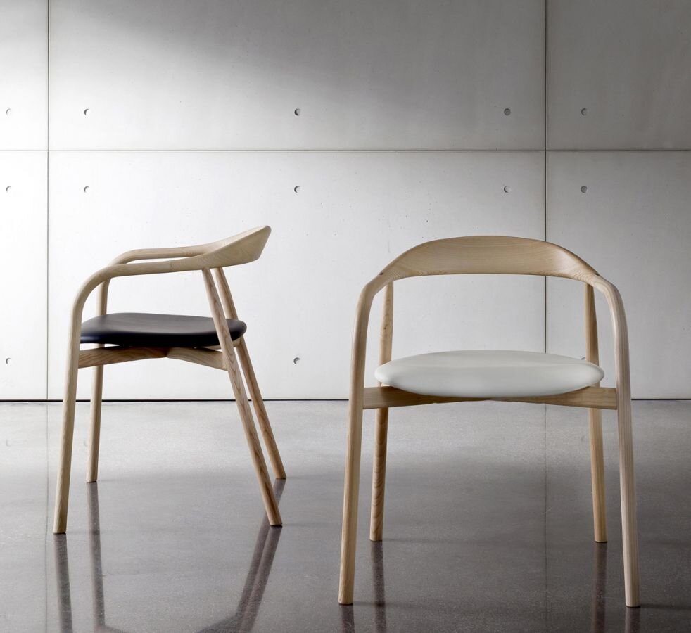
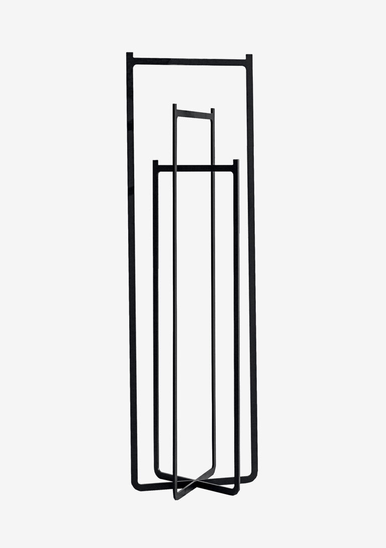
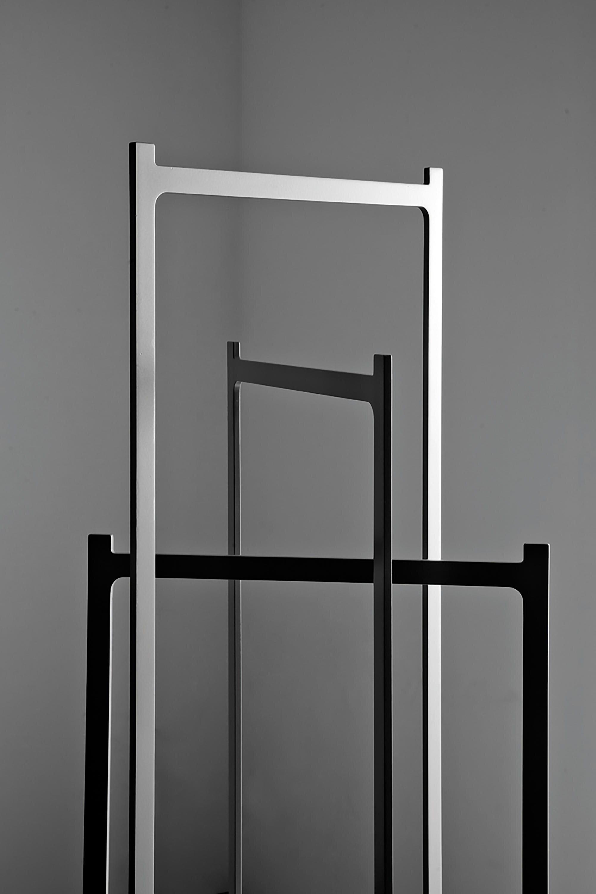
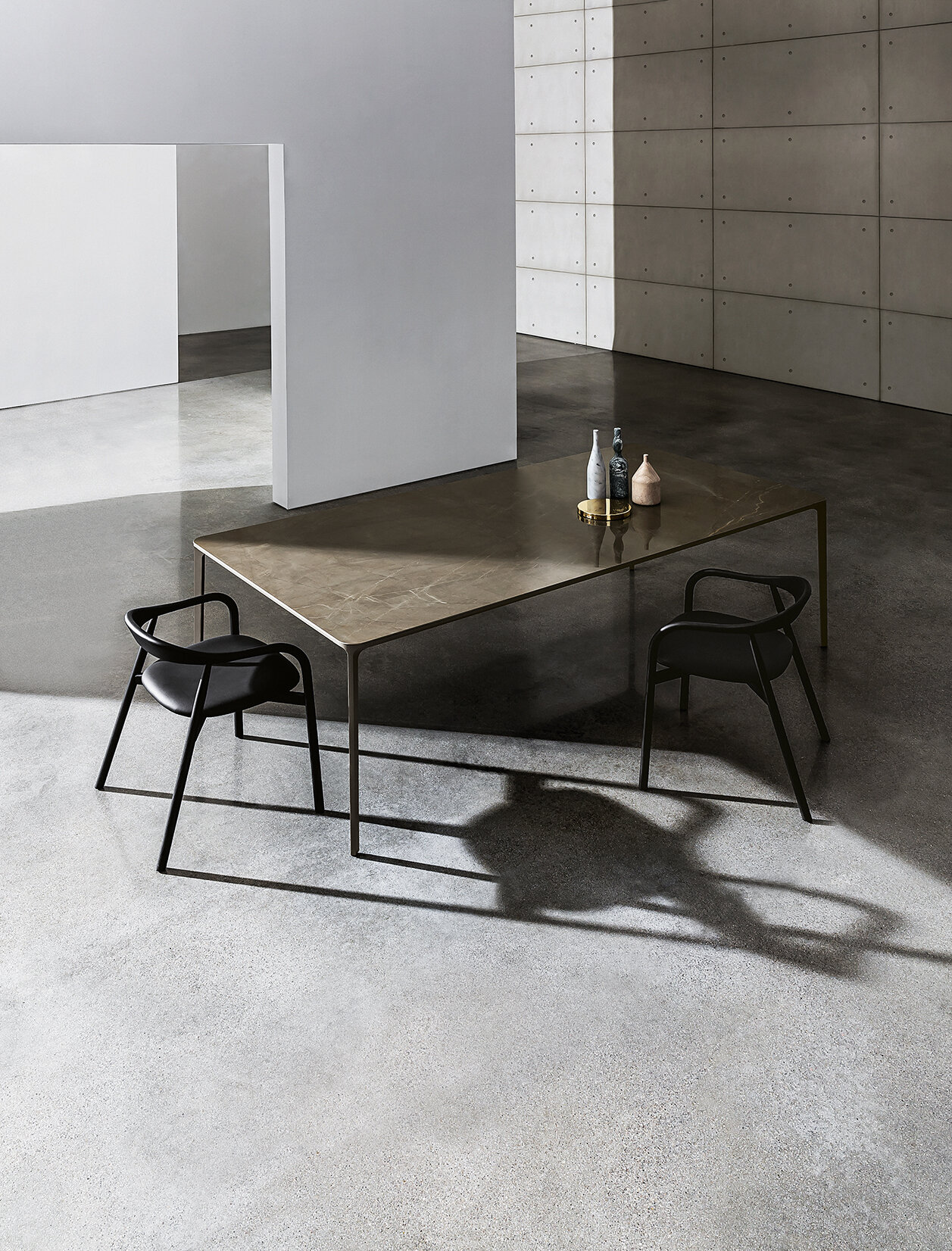
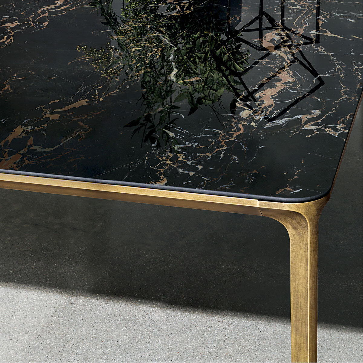
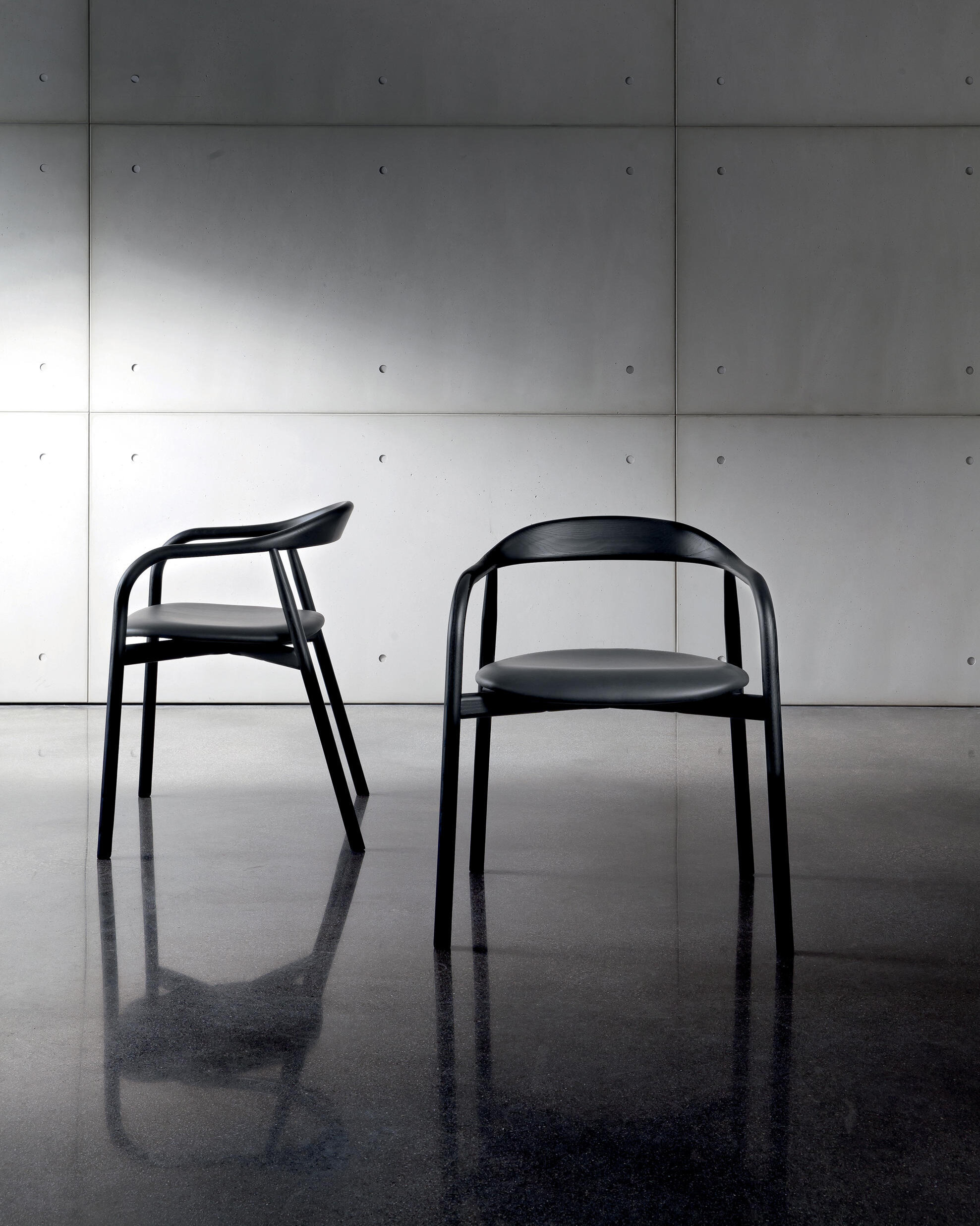
The Slim table, available in different sizes and heights, was designed by Matthias Demacker for Sovet. The designer sought the perfect balance between elegance and minimalism to create a model that can surprise the lines' lightness. Offering a selection of finishes that can fit any environment, Sovet's expertise in using materials added value to the model.
About Sovet: Sovet blends the Italian glass art tradition and the contemporary design inspiration to create furniture that speaks an original, elegant and versatile language. The company provides innovative material inspirations, combining elegance, sustainability and minimal design, focusing on the quality of the materials and the craftsmanship, the versatility of the project and the sustainability of the production process. Sovet is a new culture of living for home & contract spaces.
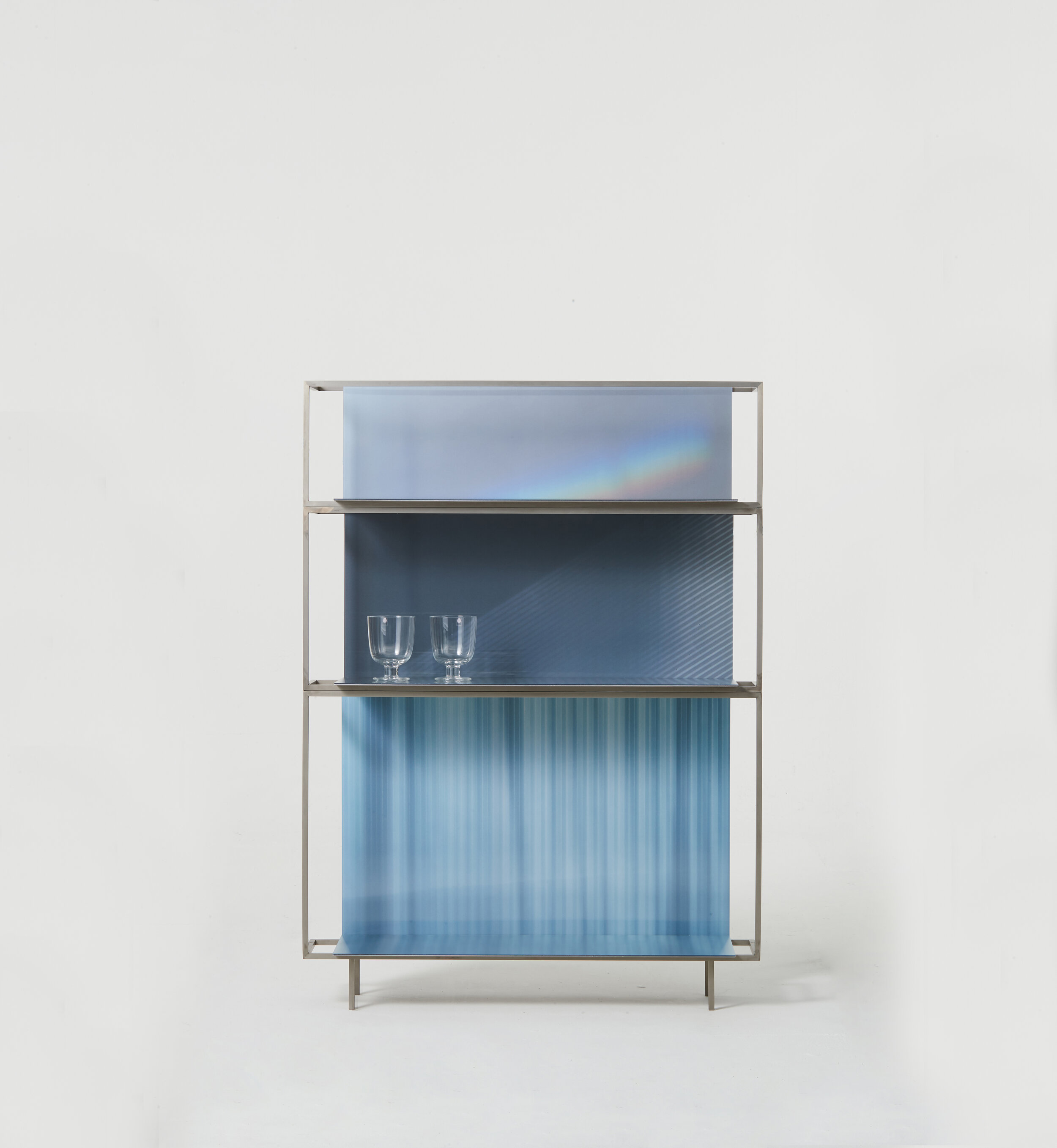
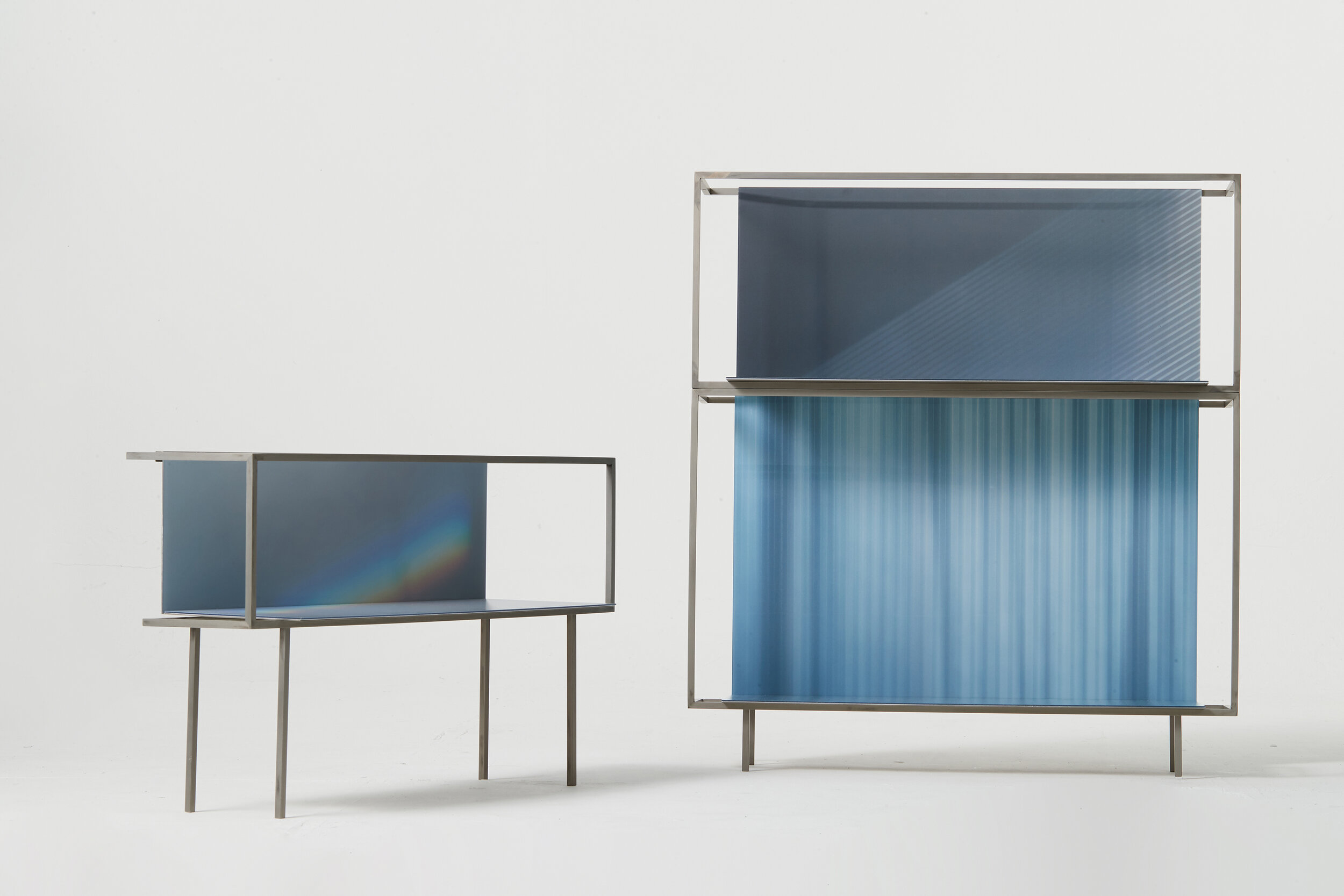
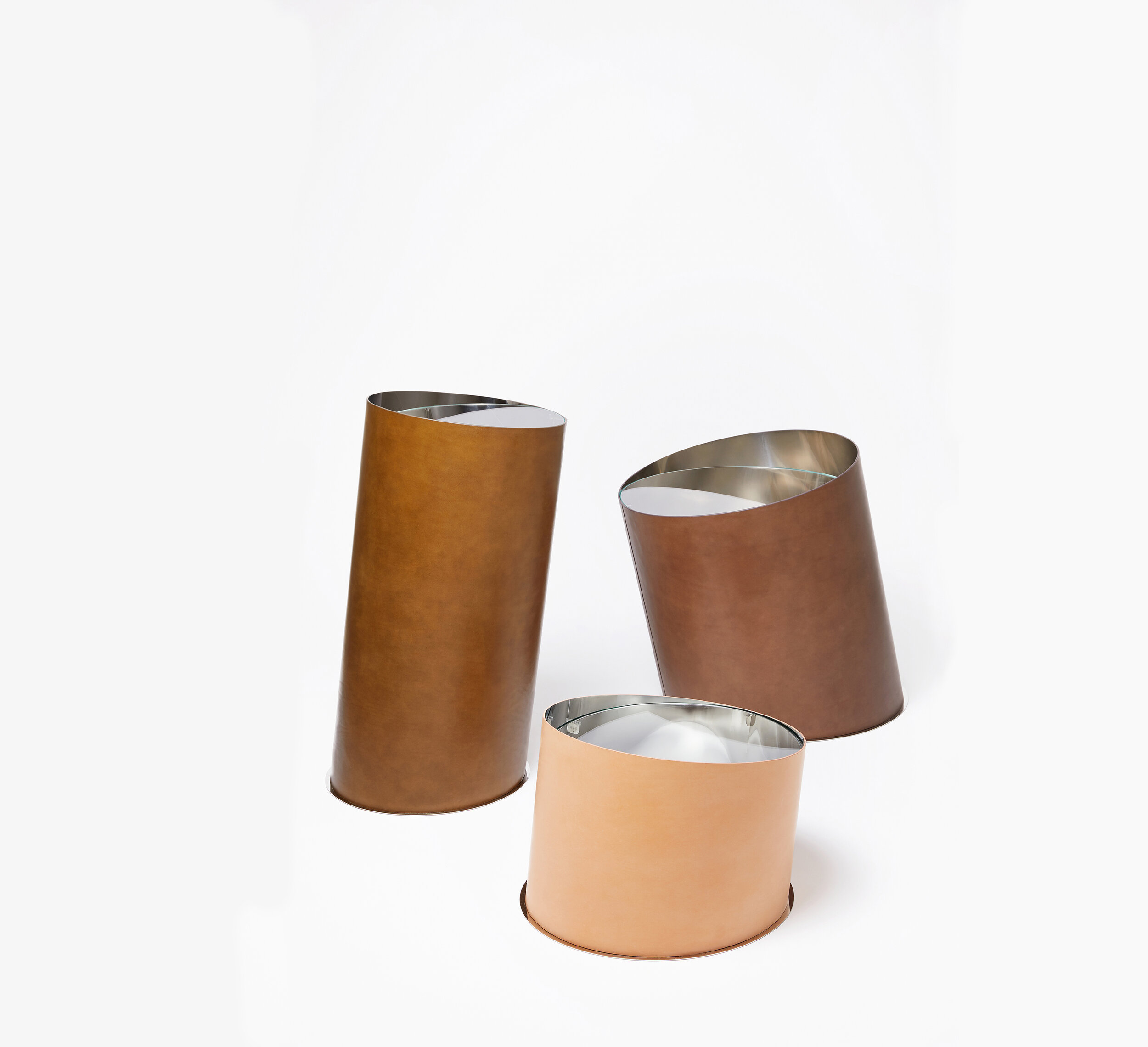
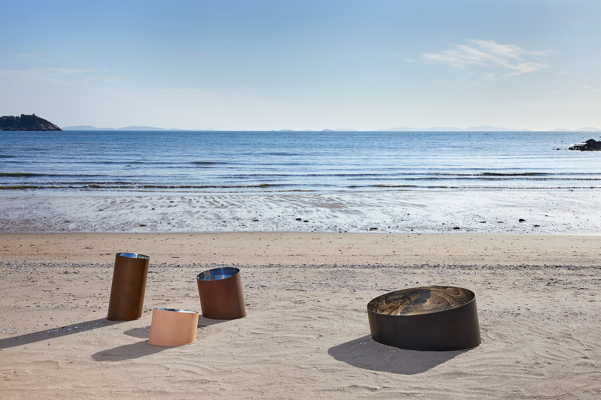
StudioEJ is a Seoul based design studio focusing on furniture and interior design.
“We try to make scenes of space that are created through unique relationships among objects and space.”
Printed Light 2020 is a shelf containing poetic moments drawn with natural light found in interior spaces. The light which is common in everyday life-light coming through the curtains in the morning, red light coming through the blind in the late afternoon and always nice rainbow (prism effect) on the wall-are applied to the spaces of different sizes to induce a warm light experience.
Happy Pixel intends more active and dramatic conversations with objects, which is interaction by applying a mirror to the lenticular as a pixel. If you apply a mirror to the naturalized pixelated image and reflect it on the mirror which is a part of the pixel, you will find a moment assimilated with the natural image.
With several years of working experience for architectural firms, she started her practice focusing on experimental and conceptual projects in a wide range of fields from small objects to space design. Her approach to design is to create a special and unique experience taking a fresh perspective on the mundane.
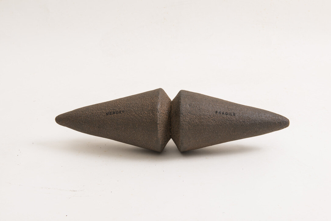
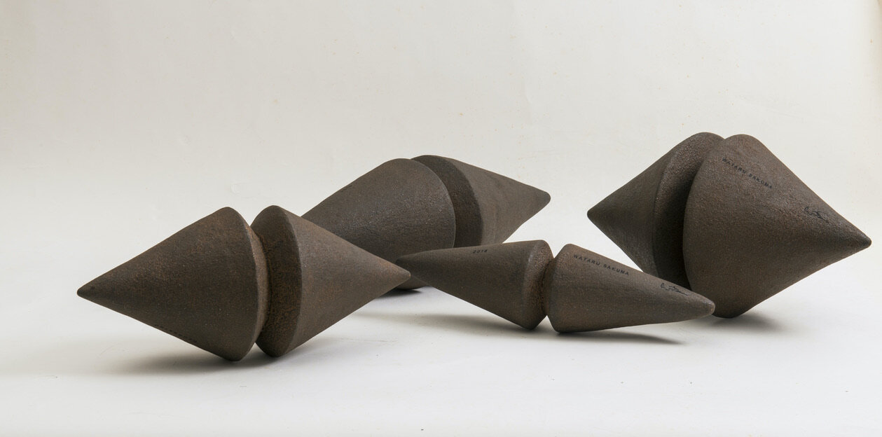
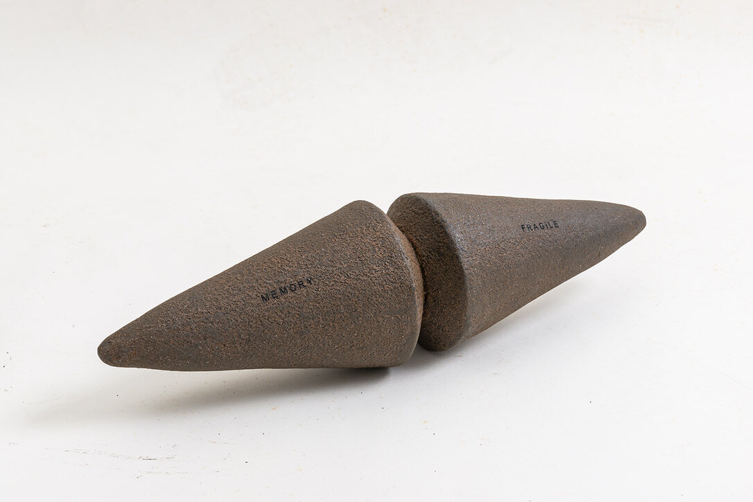
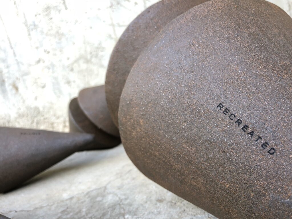
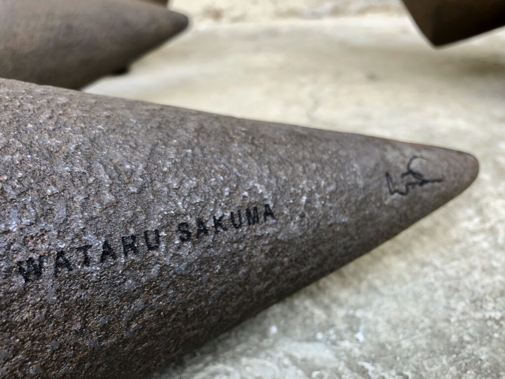
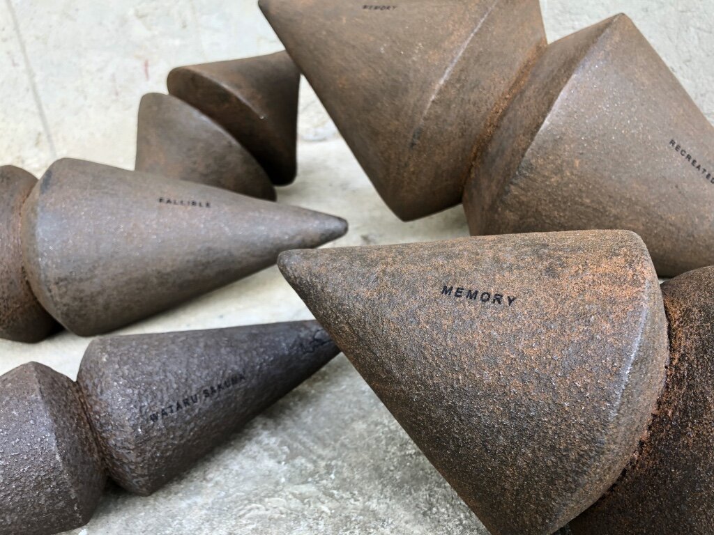
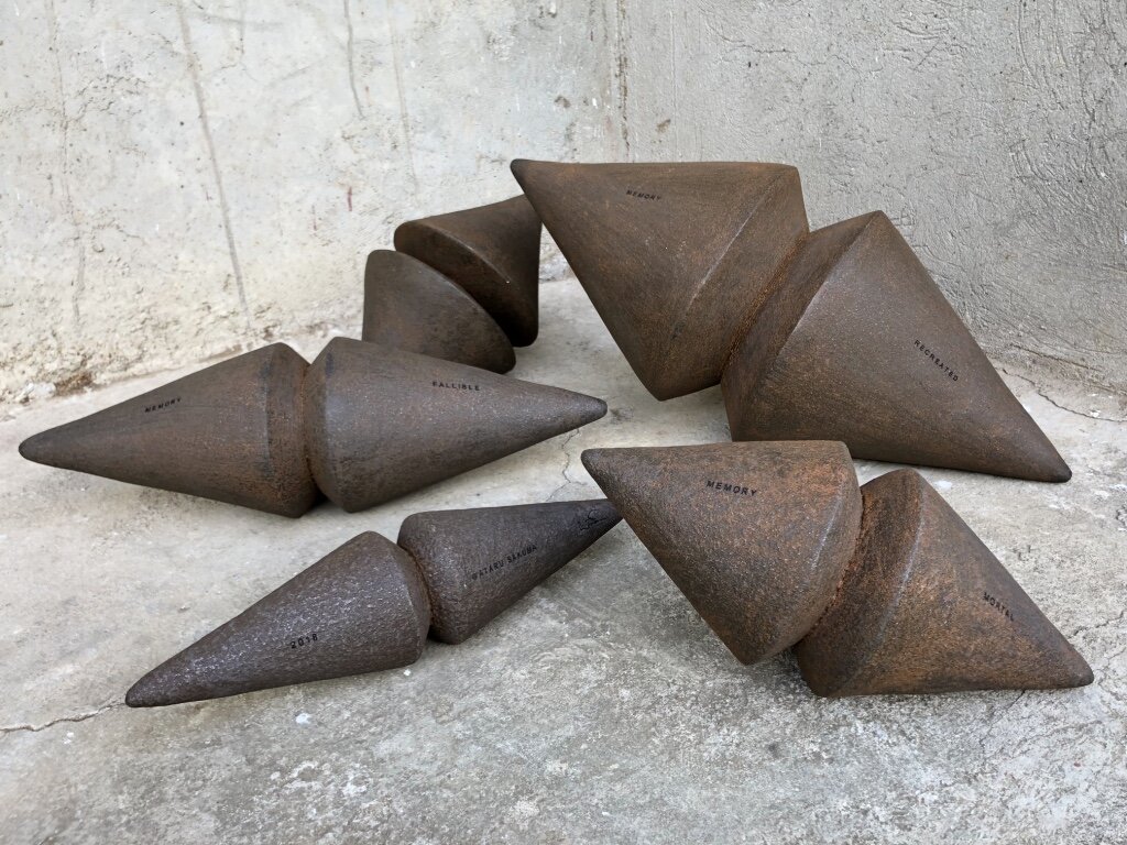
“Not what it seems to be”
Our memory is molded by daily social interaction with environment. We store the experience in our memory and we shape our own belief and faith.
We tend to judge and make decisions based on what we know. But more often things are “Not what it seems to be”.
“Not what it seems to be”, the massive and masculine objects lead us to believe that they are made out of Heavy Black Iron, yet in contrary all the objects are made of light weight Recycled Carton. Once interacting with the objects, you would find out that they are not merely objects, but an instrumental pair of Maracas filled with natural seeds creating sound inside. Deceiving our expectations, they challenge our sense of perspective and question our own memory and faith while planting a New Memory through interacting with the pieces. Reminding us that Memory is Re-Created every day yet it is a Fragile, Mortal, and Fallible “Object” veiled by a thin layer of Rusting Faith.
THE DESIGNER
Wataru Sakuma is a Philippine-based Japanese designer with a strong background in fine arts. Famous for his creativity and ingenuity, Wataru uses even the most basic of materials, like paper, to create functional yet artistic pieces for urban living. His respect for nature and his ability to see something beautiful in discarded or overlooked materials gives his work conscience.
For more information, please visit: www.designpier.co or http://designart.jp/designarttokyo2020/en/exhibitor/design-pier/
Exhibition dates:Oct 27th – Nov 3rd, 2020
Hours:11:00 AM – 8:00 PM
Omotesando Hills Main Building B3F, Space O
Address:4-12-10 Jingumae, Shibuya-ku, Tokyo
About Omotesando Hills
Omotesando Hills is a unique cultural/commercial complex, emerging as the new face of Omotesando, which has transmitted various trends as the hub of Japanese fashion and culture.
The six-level atrium (three stories above ground and three underground stories) at the heart of the main building is complemented by the 700m “Spiral Slope” ramp (“the second Omotesando”) spiraling around the atrium space in an incline roughly equal to that of Omotesando. At the center of the atrium space is a grand stairway (from the first basement to the third basement), leading to a 548㎡ multi-purpose space, called “Space O”, in the third basement which serves as a base for imparting information.
The exterior wall holds a 250m long LED display called “Bright-Up Wall”, illuminating the nightscape of Omotesando.
These creative spaces are combined with “selective” stores mainly positioned along the Spiral Slope, “MEDIA SHIP.”, involved corporations, participating artists, and trend-conscious people who gather at Omotesando Hills combine together in order to evolve the complex into a new facility with unparalleled expressive ability. It is the venue for various events related to fashion and art and continues to generate the latest news.
British Art Installation “Please Be Seated” in Chinese Mainland
Swire Properties kicked off the highly anticipated tour of “Please Be Seated” in the Chinese mainland in collaboration with British design firm Paul Cocksedge Studio. From now till 1 November 2020, the large-scale installation will be open to the public at the Temple Plaza of Sino-Ocean Taikoo Li Chengdu, engaging the community through an interactive art experience.
Crossover collaboration with Paul Cocksedge Studio will present the studio’s first-ever touring public art installation across the Chinese mainland
Swire Properties kicked off the highly anticipated tour of “Please Be Seated” in the Chinese mainland in collaboration with British design firm Paul Cocksedge Studio. From now till 1 November 2020, the large-scale installation will be open to the public at the Temple Plaza of Sino-Ocean Taikoo Li Chengdu, engaging the community through an interactive art experience.
The debut of this significant art piece across its retail projects in the Chinese mainland resonates with Swire Properties’ commitment to offering world-class art and cultural experiences for local communities to enjoy. This is the first international showcase of the giant public art piece since its critically acclaimed debut at the London Design Festival in 2019. Following the Chengdu stop, “Please Be Seated” will travel across the country to Taikoo Hui in Guangzhou, Taikoo Li Qiantan in Shanghai, and Taikoo Li Sanlitun in Beijing, where it will become a permanent installation in the capital city.
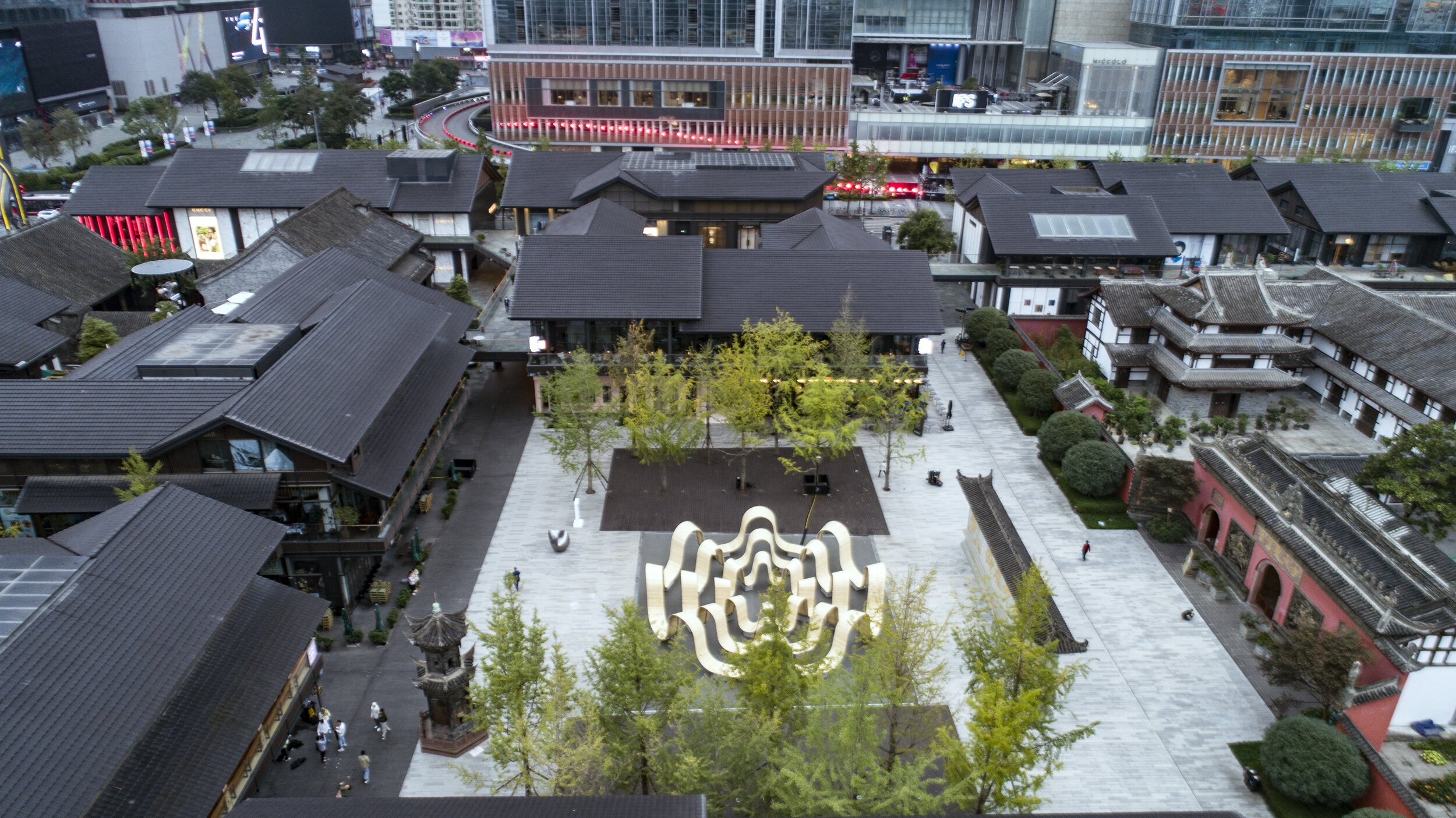
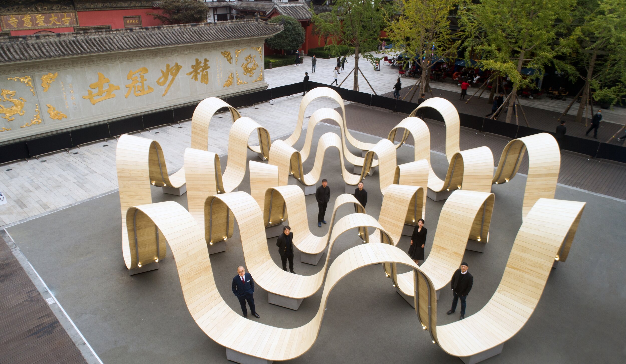
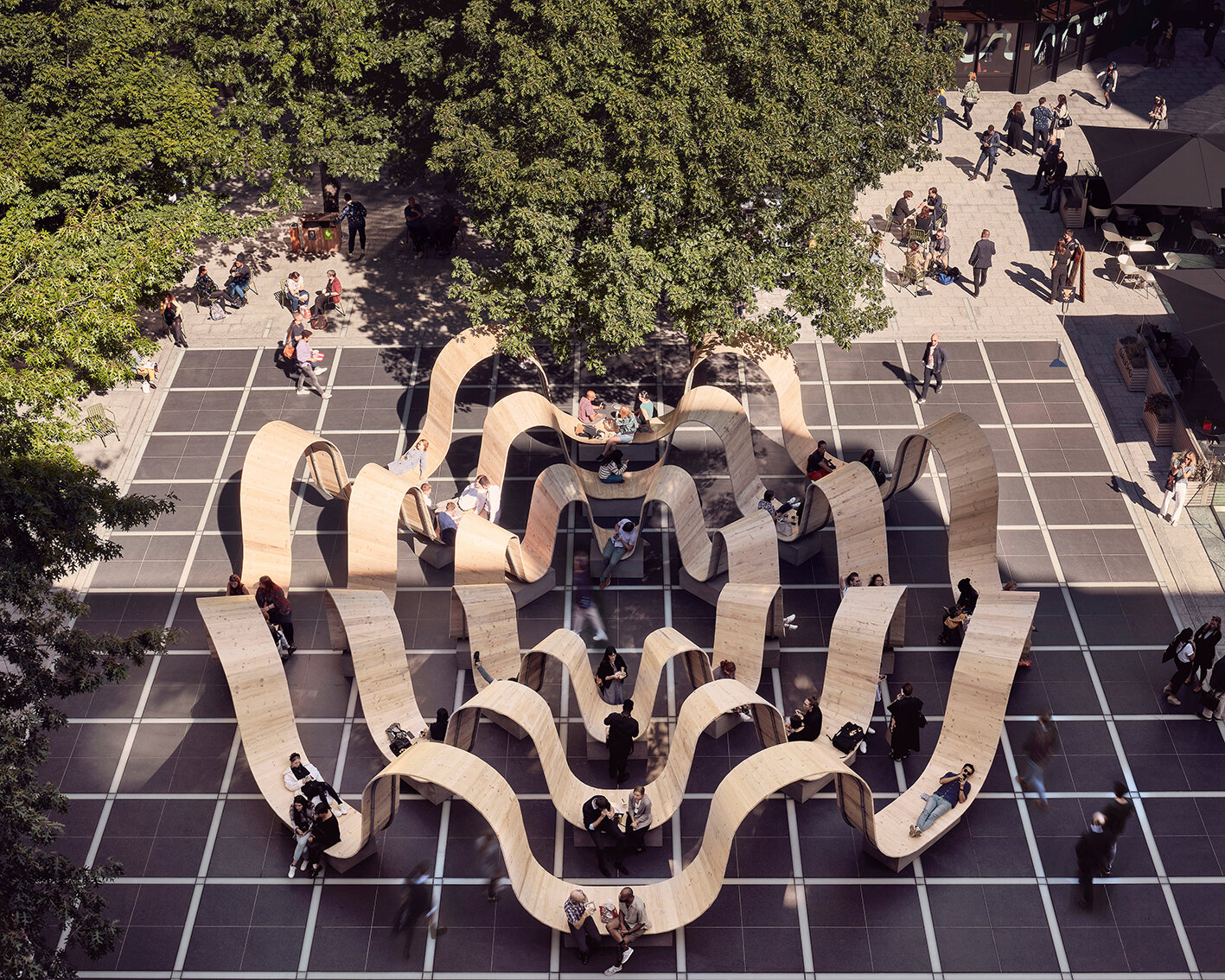
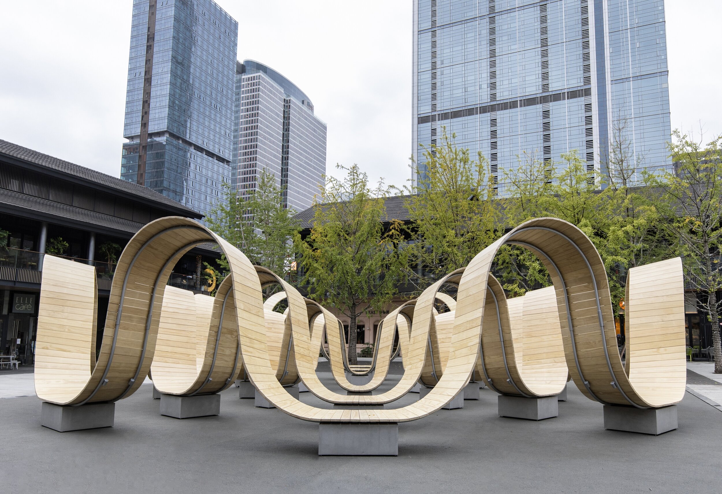
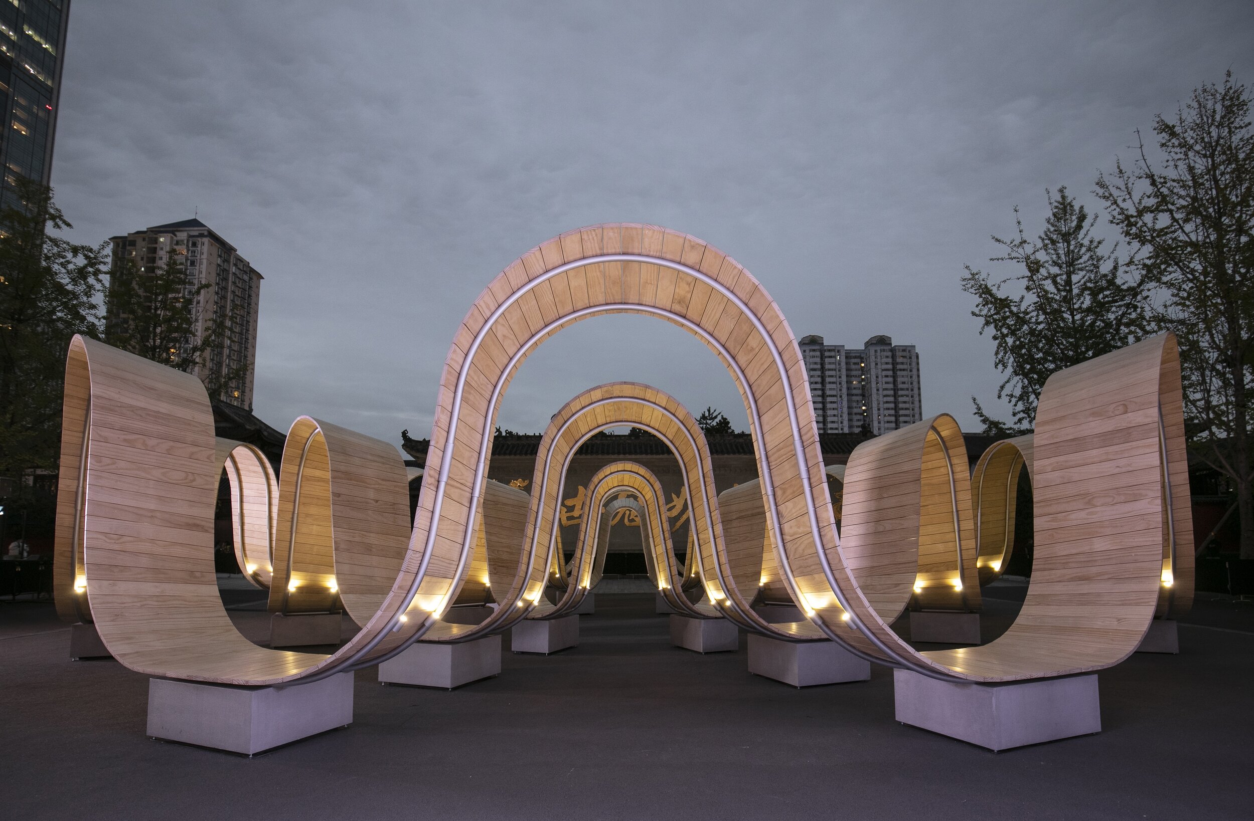
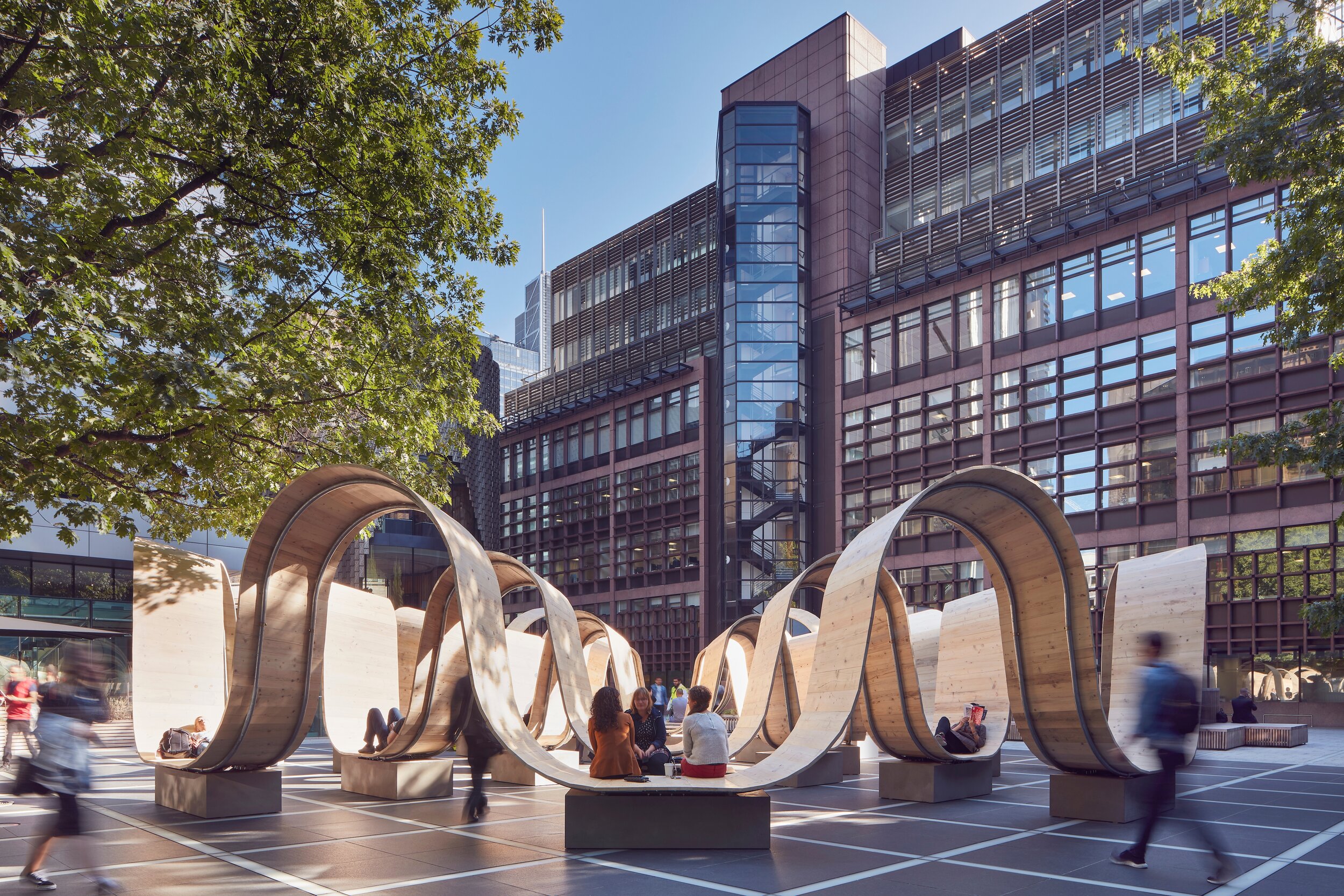
"Please Be Seated" was designed by Paul Cocksedge Studio to respond to urban life's dynamic nature, reinvigorating how local audiences interact with space and the community. The 15.2 meter-long installation features' waves' of wood rising up to form arches for people to walk through and curves under to create space for people to sit, lie and relax. Echoing Swire Properties' intense focus on sustainable development, the piece is fabricated from 1,440 planks of sustainably sourced timber.
Please Be Seated is designed by acclaimed British designer Paul Cocksedge. ©MarkCocksedge
“We’re delighted to partner with Paul Cocksedge Studio to bring this ambitious art piece to four of our retail centers in the Chinese mainland,” said Tim Blackburn, Chief Executive Officer, Chinese mainland, Swire Properties. “This installation, which merges innovation, sustainability, and art, is a wonderful showcase of our commitment to creative placemaking in our communities. With this piece, we invite the public to explore and engage with the artwork on their own terms, interacting with it so that they become an integral part of the piece themselves. We feel this sends a powerful message of the personal relationships we form with art and speaks to our vision of curating exceptional art and cultural experiences within our developments.”
“Please Be Seated” was an instinctive response to public space and the rhythm of people moving through it. We are excited to work with Swire Properties again to create a piece of work that engages with the public and puts them at the center of the design,” said Cocksedge. Paul Cocksedge Studio has a longstanding creative partnership with Swire Properties and has created ambitious pieces of work, including “Gust of Wind” at HKRI Taikoo Hui in Shanghai and “Spectrum” the Swire Properties VIP lounge at Art Basel Hong Kong 2019.
About Paul Cocksedge Studio
Paul Cocksedge is an internationally acclaimed British designer, who has spent the last decade building a reputation for innovative design, underpinned by research into the limits of technology and materials. His catalog of work spans design products, architectural projects, installations, and sculptures, all infused with the sense of simplicity, joy, and wonder that has come to characterize his work. In 2018, Cocksedge designed a light installation for COS’s Coal Drops Yard retail space, and in 2019 created a VIP Lounge for Swire Properties at Art Basel Hong Kong. Current projects include the studio’s first bridge, and first project in South Africa, as well as Slump, an exhibition with Carpenters Workshop Gallery. Cocksedge's Here Comes The Sun – a socially distanced picnic blanket - is also featured in V&A Dundee's Now Accepting Contactless show.
Visit the studio's website at www.paulcocksedgestudio.com
About Sino-Ocean Taikoo Li Chengdu
Located in the city center of Chengdu, Sino-Ocean Taikoo Li Chengdu is a mixed-use development jointly developed by Swire Properties and Sino-Ocean Group. Opened in 2015, the development comprises an open-plan, low-rise and lane-driven shopping mall, and The Temple House - an understated luxury urban hotel with 100 Rooms and 42 Residences.
About Swire Properties
Swire Properties develops and manages commercial, retail, hotel, and residential properties, with a particular focus on mixed-use developments in prime locations at major mass transportation intersections. Swire Properties is listed on the Main Board of the Stock Exchange of Hong Kong and its investment portfolio in Hong Kong comprises Taikoo Place, Cityplaza, and Pacific Place. In addition to Hong Kong, the Company has investments in the Chinese mainland, the United States, Singapore, Indonesia, and Vietnam.


