A feeling called Home - City Home Collective
BRABBU is a design brand that reflects an intense way of living, bringing fierceness, strength and power into an urban lifestyle. With a diverse range of furniture, casegoods, upholstery, lighting and rugs, and through sensory design, they pass on a unique experience in every product that they design and produce. Assuming that home is a lot more than a space, City Home Collective, the company responsible for this Park City House, wanted to do something exceptional with this project, creating a meaningful feeling to the client: a place where he belongs.
BRABBU is a design brand that reflects an intense way of living, bringing fierceness, strength and power into an urban lifestyle. With a diverse range of furniture, casegoods, upholstery, lighting and rugs, and through sensory design, they pass on a unique experience in every product that they design and produce. Assuming that home is a lot more than a space, City Home Collective, the company responsible for this Park City House, wanted to do something exceptional with this project, creating a meaningful feeling to the client: a place where he belongs.
The prime objective of this design firm is to match people with unique spaces, working with high-skilled designers, such as Helena Morozoff, the senior designer responsible for this Park City project, who prospects smart design with no boundaries.
As a result, the strategy here was to let the material drive the design, always opting for the most comfortable furnishing, choosing and combining materials that speak to each other, which made this warm, tactile and visual feeling of a retreat possible.
This perfect combination of neutral tones and patterns, contributed to the arising of this cosy and monochromatic space, filled with elegance and uniqueness, allowing the space to evolve over the time.
In a nutshell, City Home Collective believes that “life is better when you love where you live”, so they designed this house as the perfect place to relax, reconnect and recharge. And that is why home is so much more than a space, it is definitely a feeling.
For more information, please visit: www.brabbu.com
The Celebration of the heritage that narrates Parisian history by Neri & Hu, the Papi Restaurant
Nestled in the Grands Boulevards district of Paris' 9th arrondissement, Papi is the latest brainchild of up-and-coming restaurateur Etienne Ryckeboer his debut seafood bar Bulot Bulot. This time, he teams up with Neri&Hu to rehaul the façade and interior space, and with talented Japanese chef Akira Sugiura to serve a seasonal menu of modern Italian dishes.
Located on the ground floor of a typical late 19th century Haussmann building, Neri&Hu's design concept celebrates the layered material heritage that narrates Parisian history.
Nestled in the Grands Boulevards district of Paris' 9th arrondissement, Papi is the latest brainchild of up-and-coming restaurateur Etienne Ryckeboer his debut seafood bar Bulot Bulot. This time, he teams up with Neri&Hu to rehaul the façade and interior space, and with talented Japanese chef Akira Sugiura to serve a seasonal menu of modern Italian dishes.
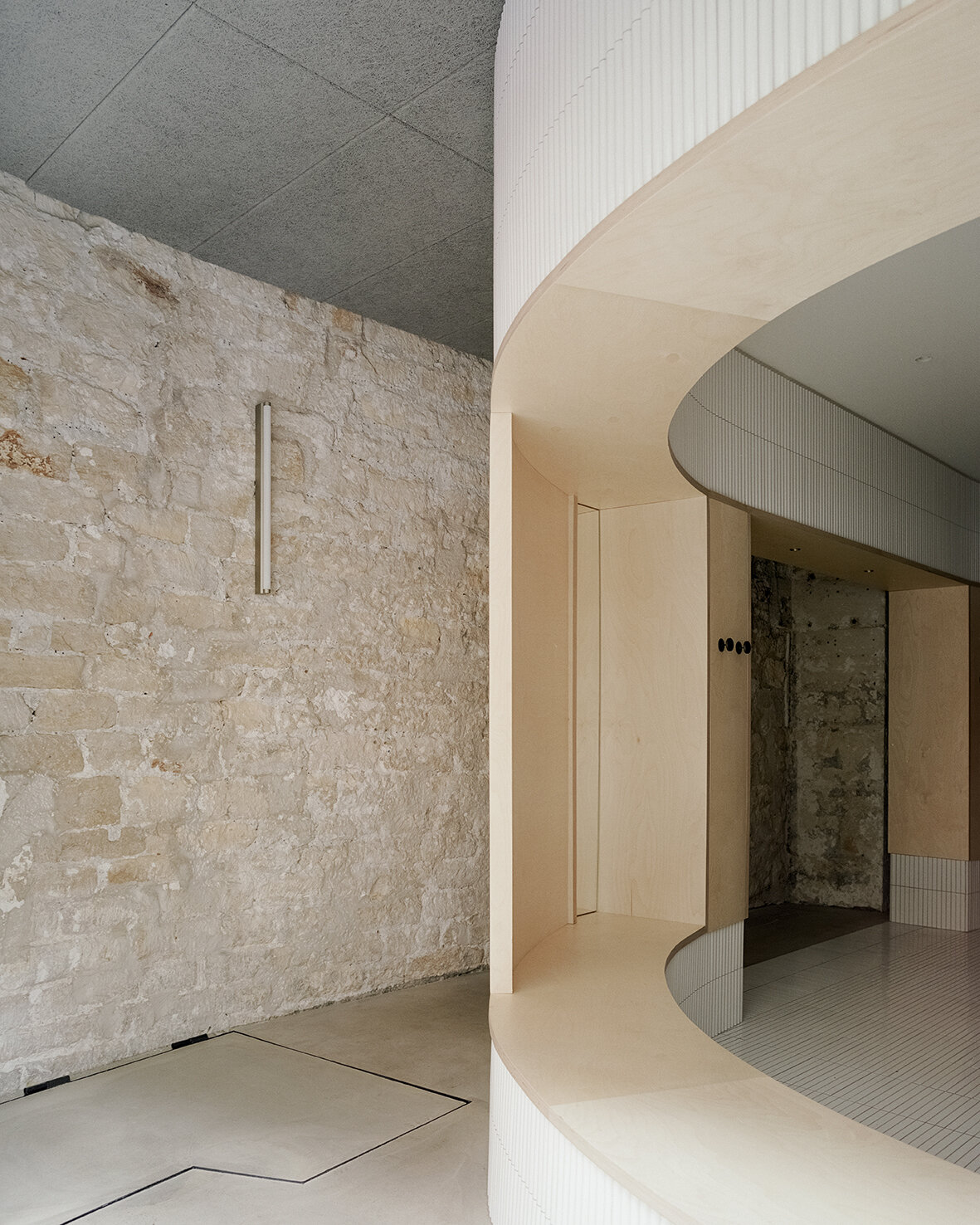
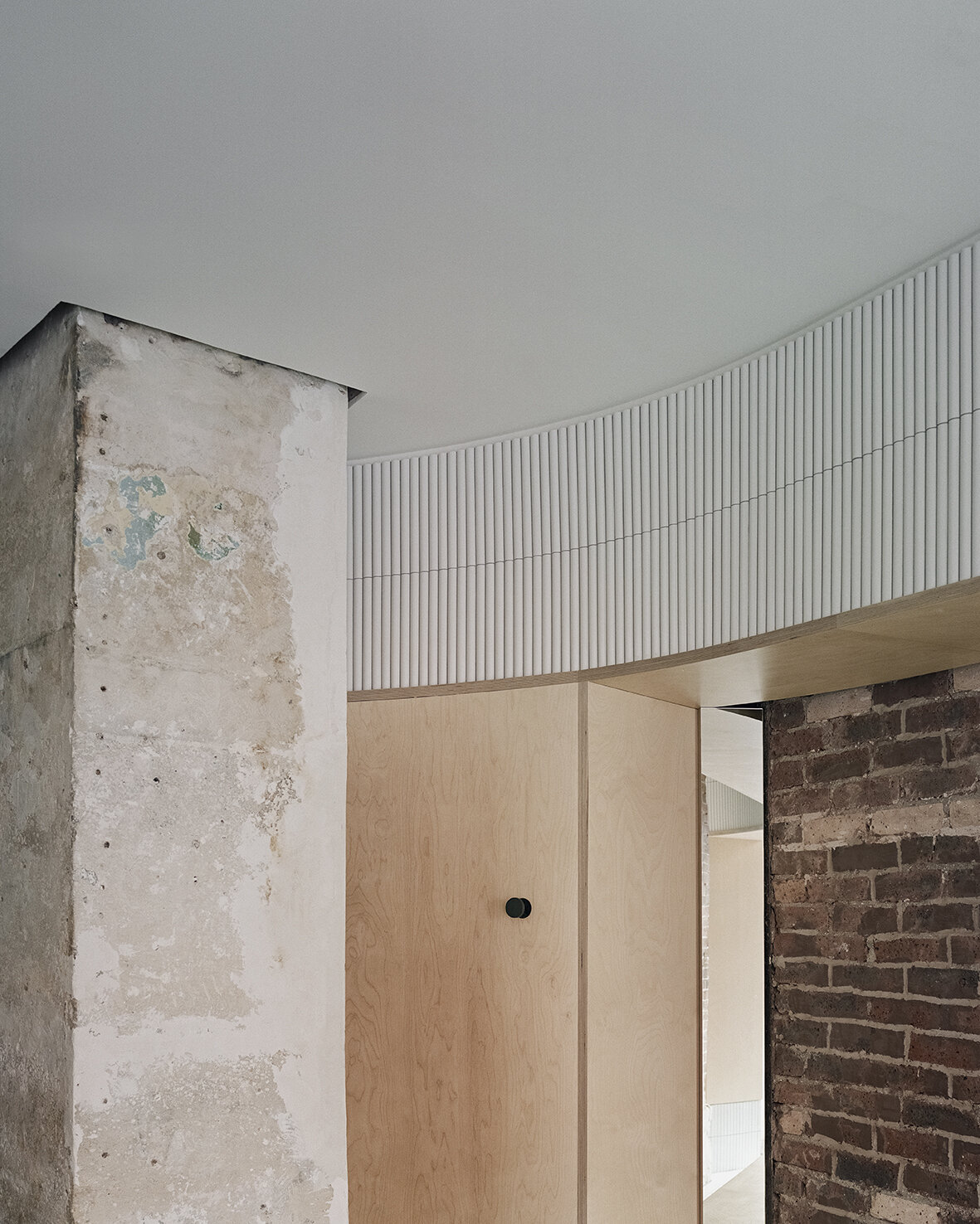
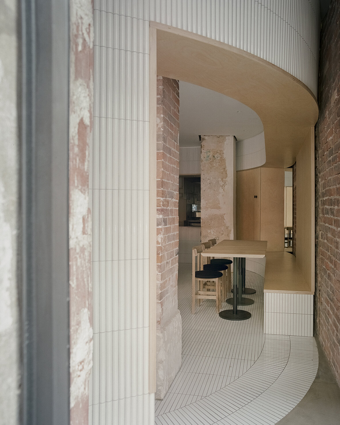
Located on the ground floor of a typical late 19th century Haussmann building, Neri&Hu's design concept celebrates the layered material heritage that narrates Parisian history. During the dismantling phase, the existing site was treated carefully; by stripping back the strata of finishes built up through the decades, the raw materials' beauty is revealed. Every single element was meticulously examined, and the challenge was to resist the urge to fix every imperfection, instead, honour the imprint oft of time upon each surface. Within the interior, portions of the old limestone and brick walls, a raw steel column, and a brick column are preserved and integrated into the design. On the façade, an existing steel I-beam lintel is featured, while a segment of the old stone moulding by the entry is left exposed, stitching the façade seamlessly to the neighboring building. Each fragment neighbouring ants a different period in Paris' history, forming a beautiful yet imposing canvas for the architects to add their new strokes.
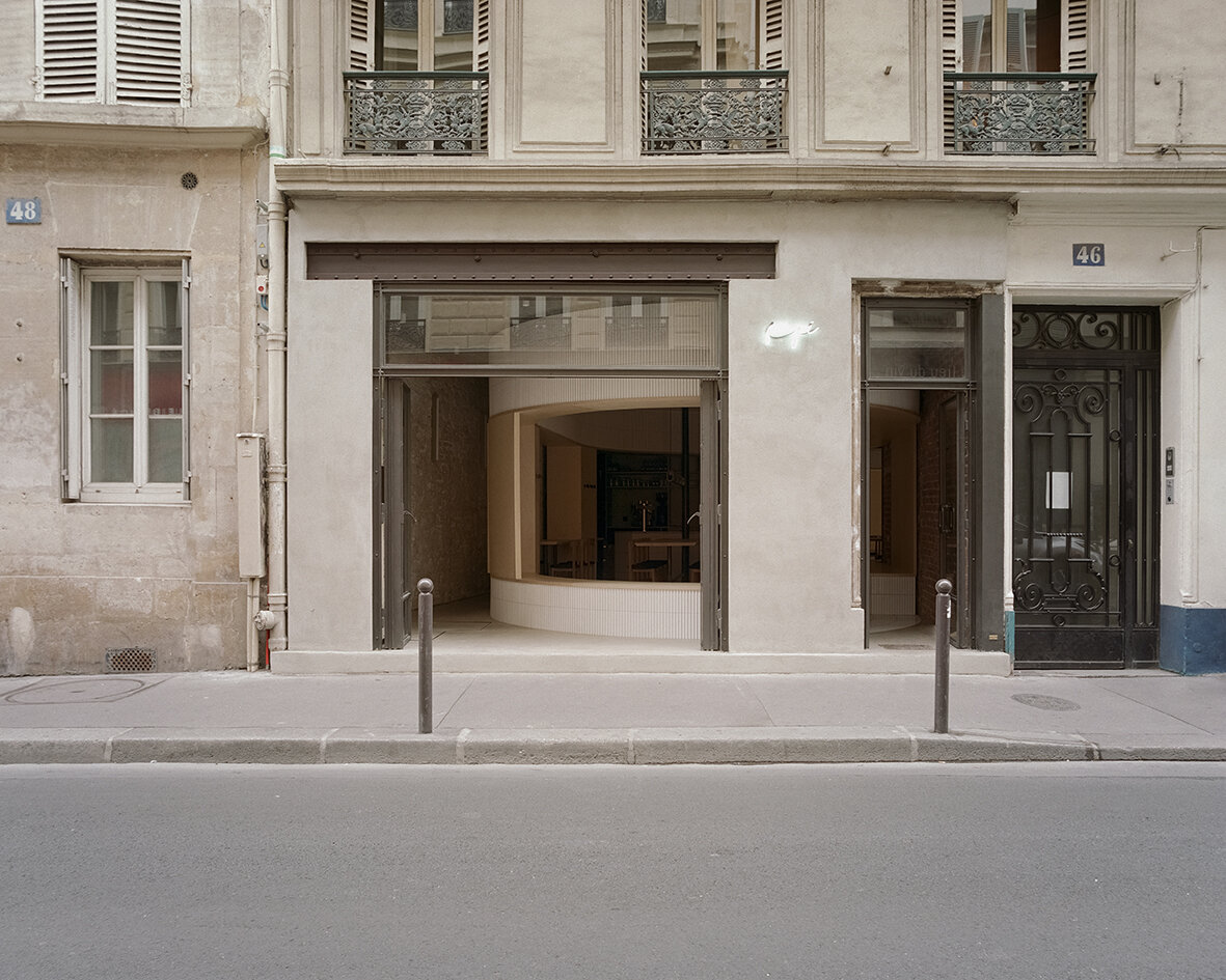
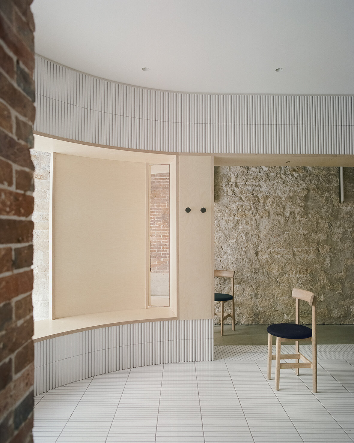
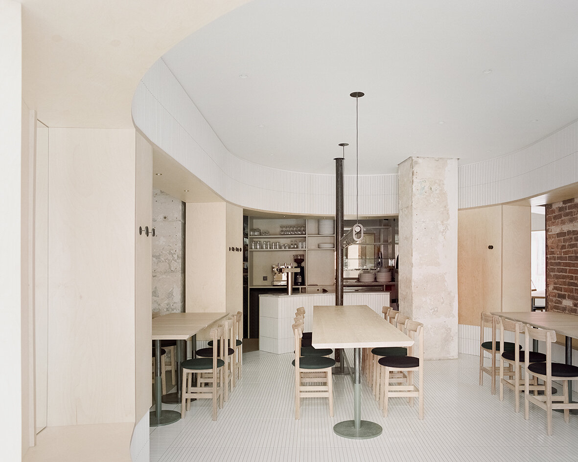
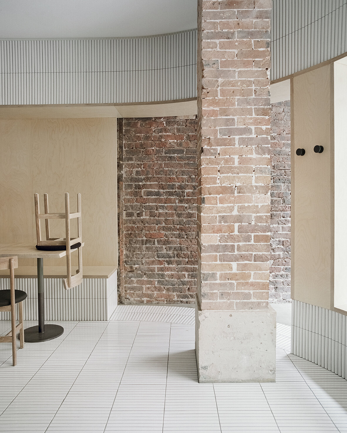
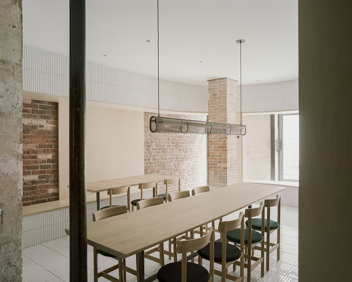

The new raw-steel-framed fully-operable glass façade maintains a visual continuity between the street and the venue and effectively extends the public realm into the interior. As guests enter the space through the main door, they see the clash of juxtaposing old and new materials, telling a story of sophistication with fresh textures of tile, glass and wood. Mirrors are placed strategically to create dynamic perspectives and voyeuristic moments between interior and exterior while inviting guests into cross gazes. The spatial and material strategies deployed to create a layered reading against the historical backdrop, offering guests a variety of experiences to explore within the space - moments of both public introversion and private extroversion.
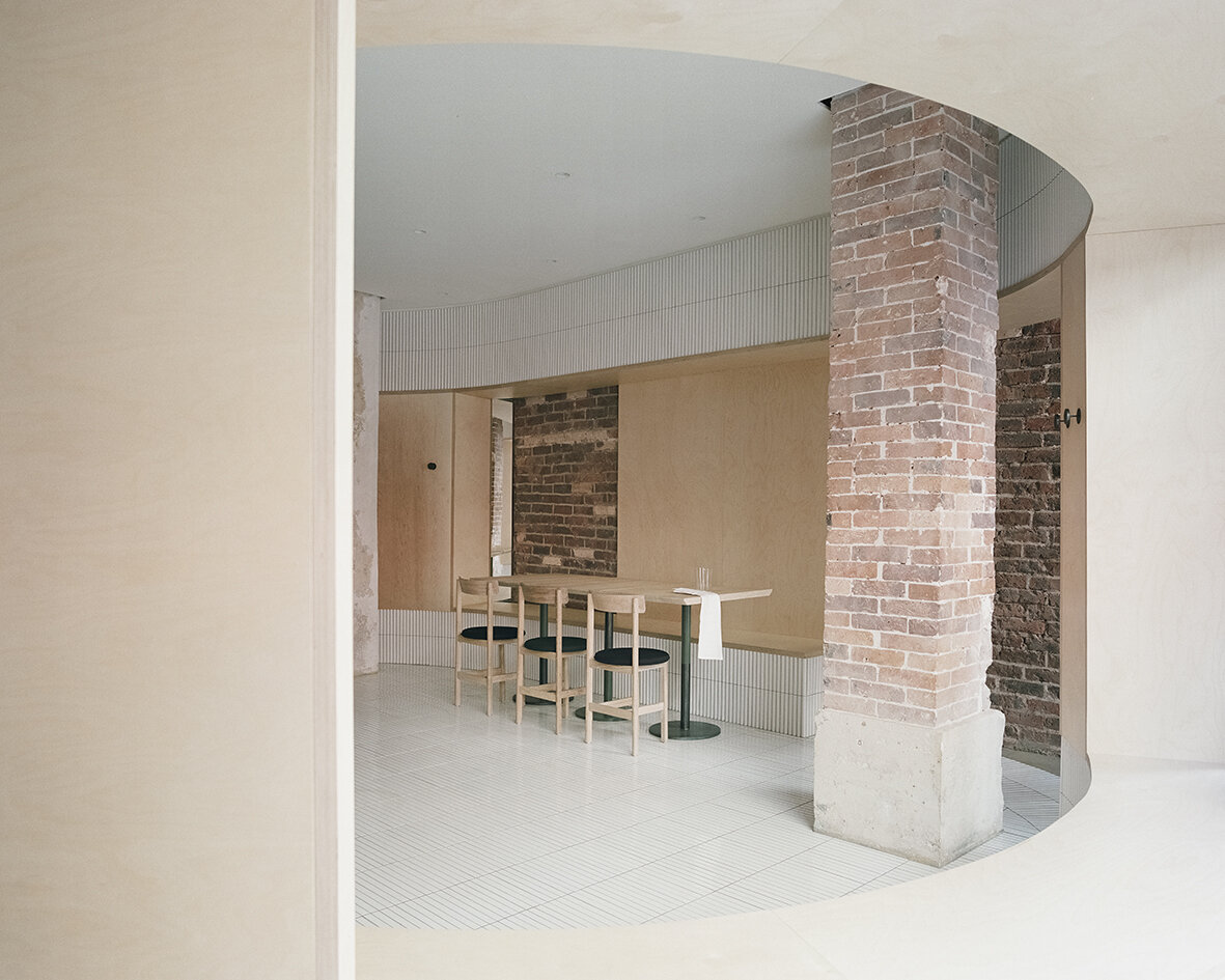
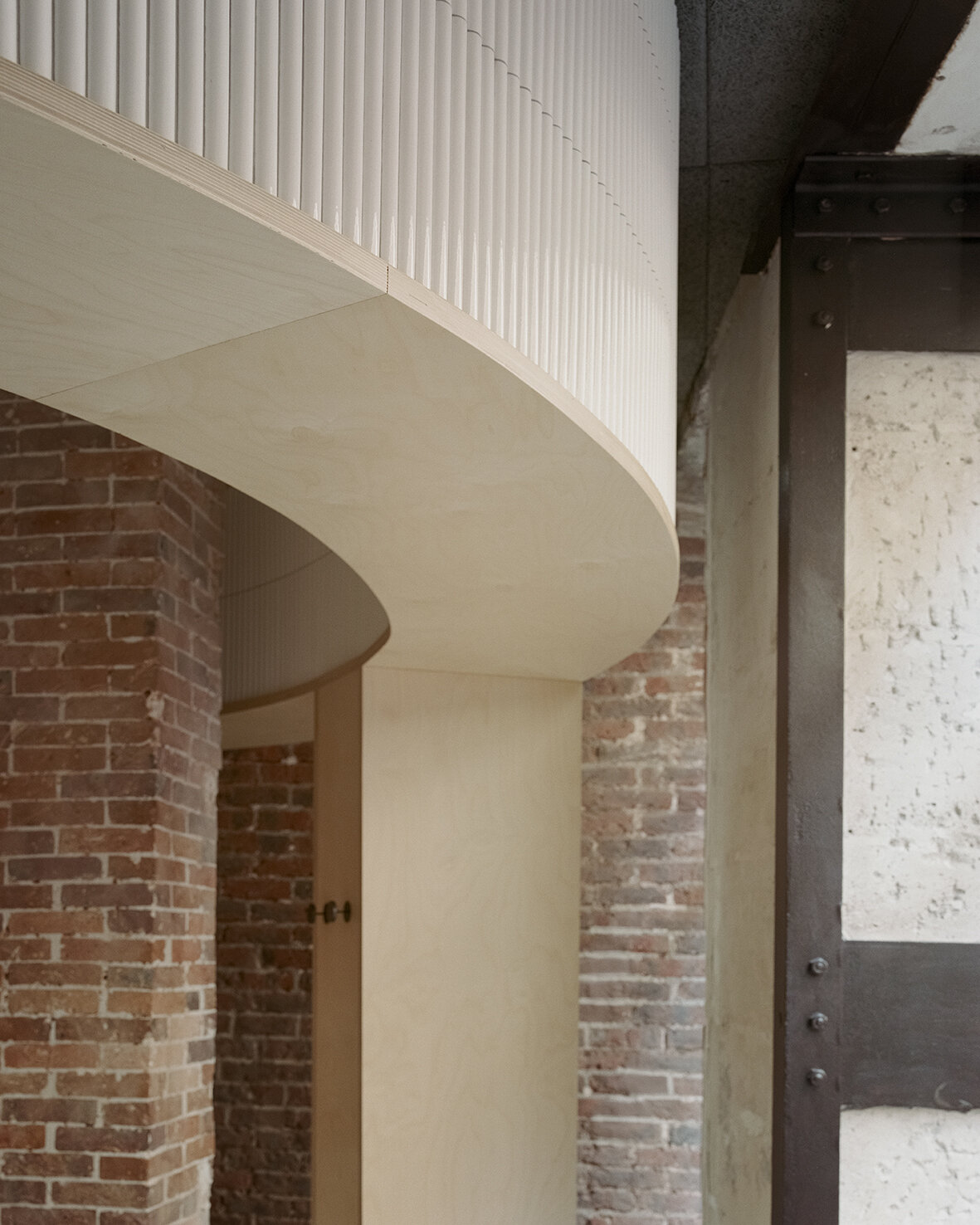
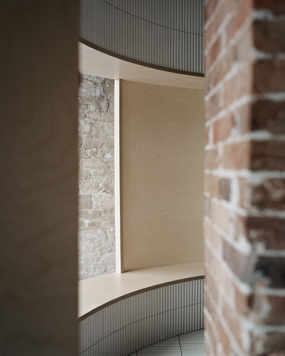
Despite the compact 52 square meters of usable area, Neri&Hu’s asserts two figures into space: an oblong volume forming an arena-like enclosure that integrates all the functional needs of seating, display, chef’s preparation counter, privacy screen, as well as a round shape containing the wood-burning oven. Clad in handmade convex-curved white ceramic tiles, the enclosure features large openings framed with thick birch plywood that become seating benches for guests. Entering the arena, where the floor is adorned with narrow white ceramic tiles, guests are instantly transformed from spectators to performers on stage. The central communal table features a long custom pendant light above, while a series of lights by Viabizzuno create a stark modern contrast on the old limestone wall. Custom wood and fabric chairs, manufactured by De La Espada, are designed by Neri&Hu specifically for Papi Restaurant to fit within the limited footprint.
Minimalism in an environment of expressionism
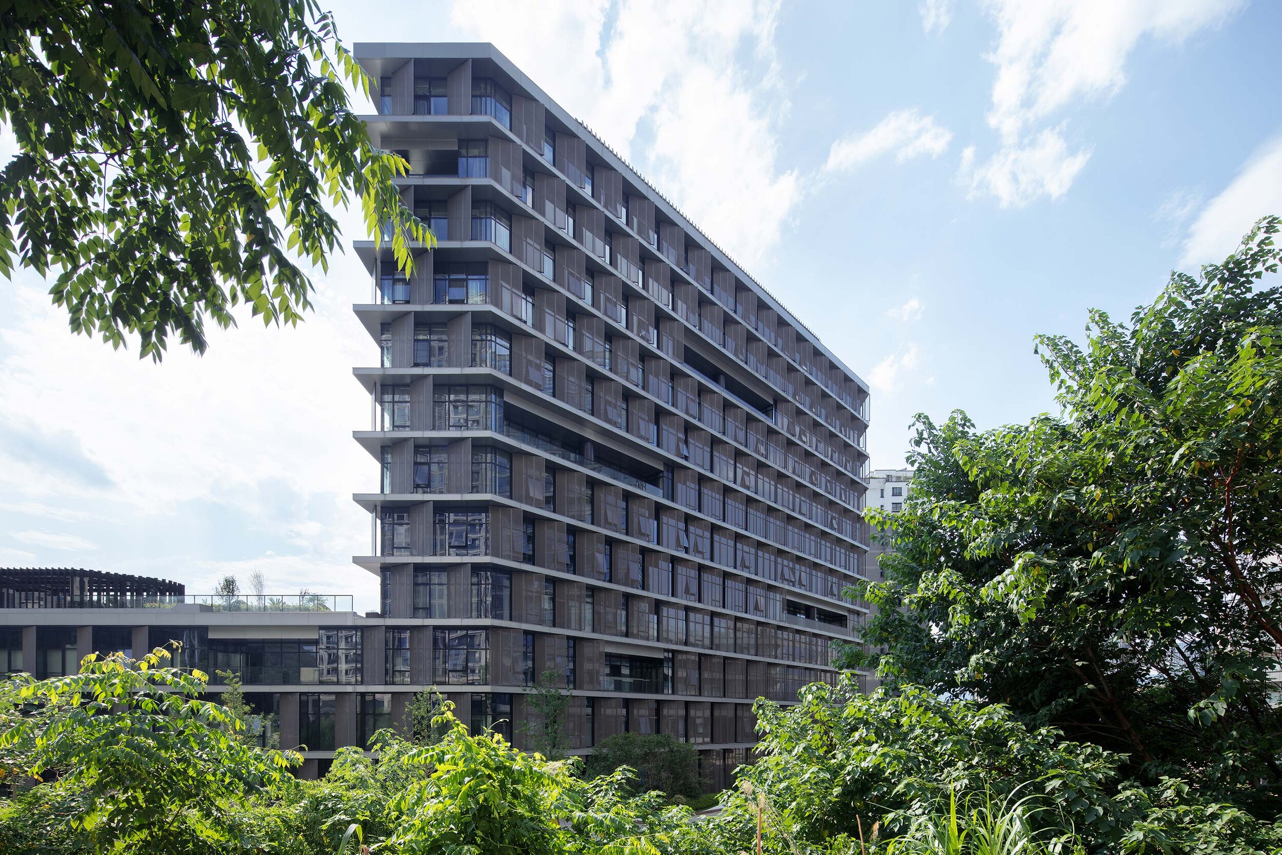
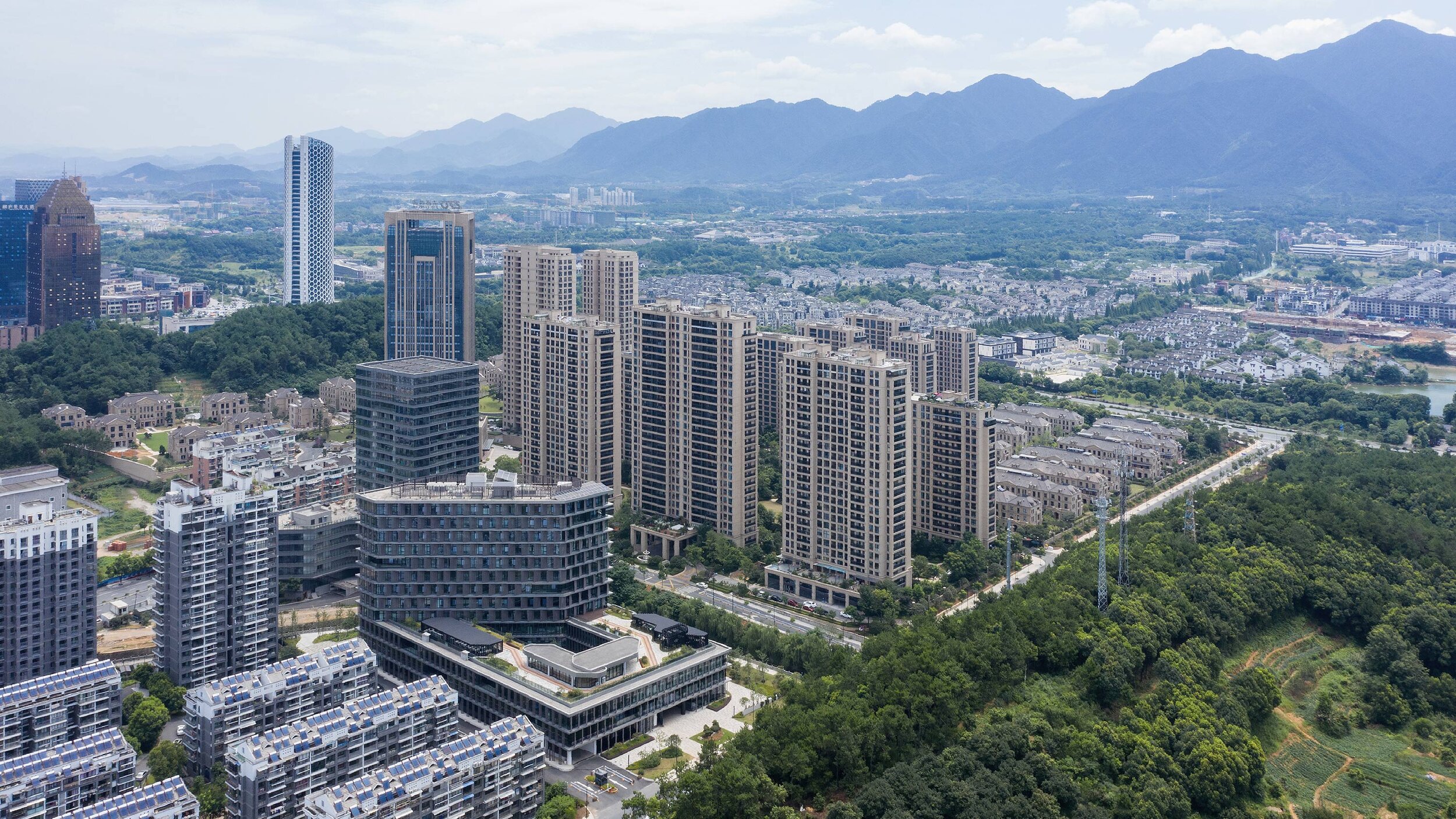
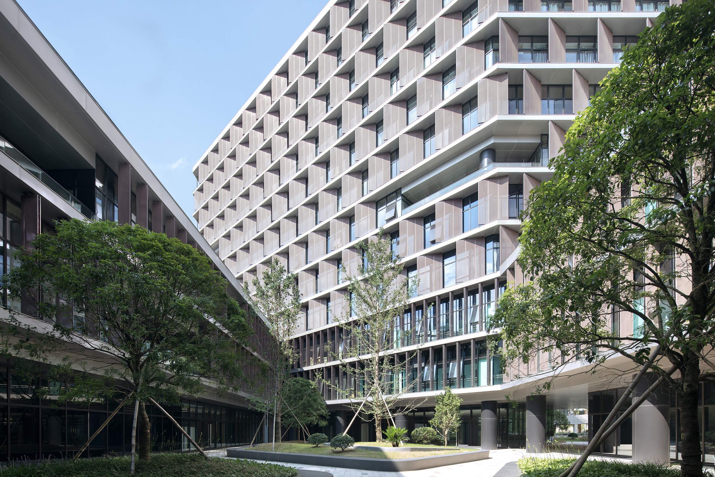
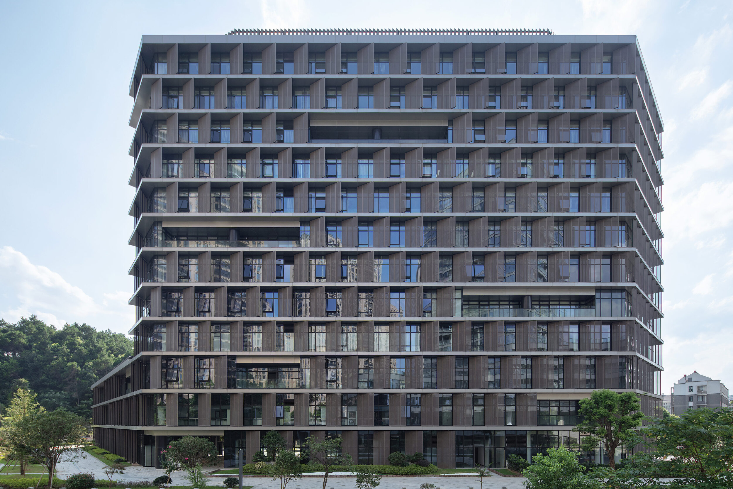
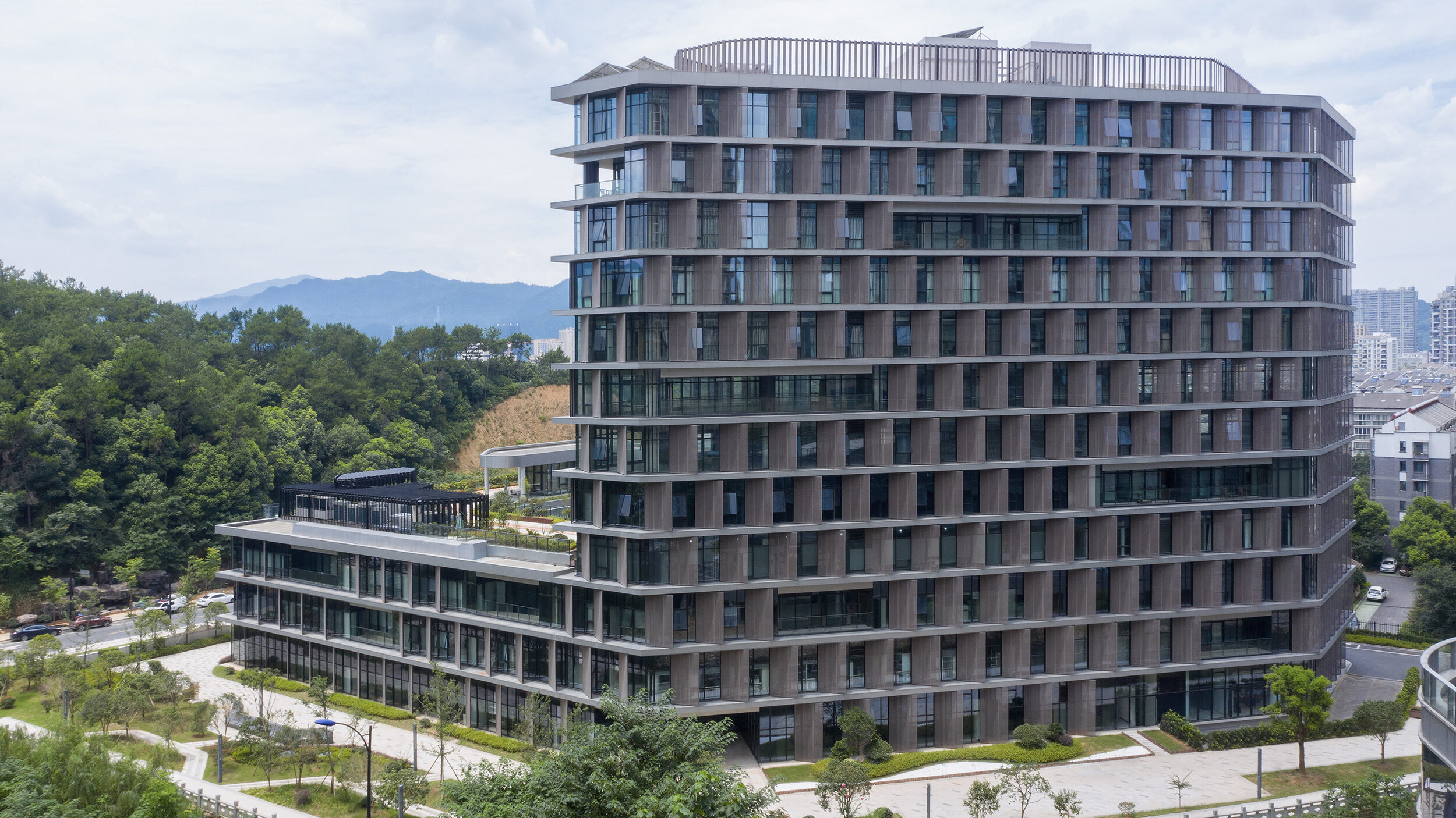
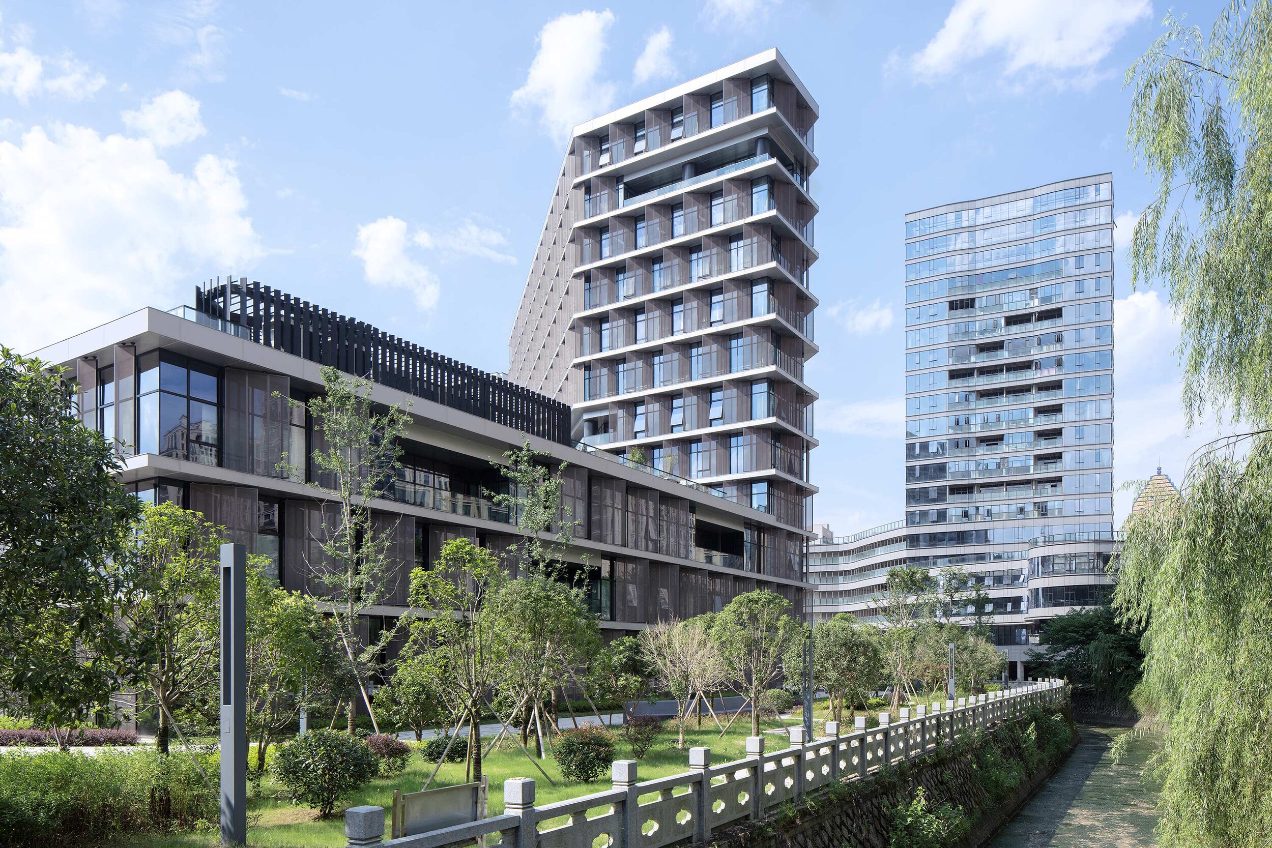
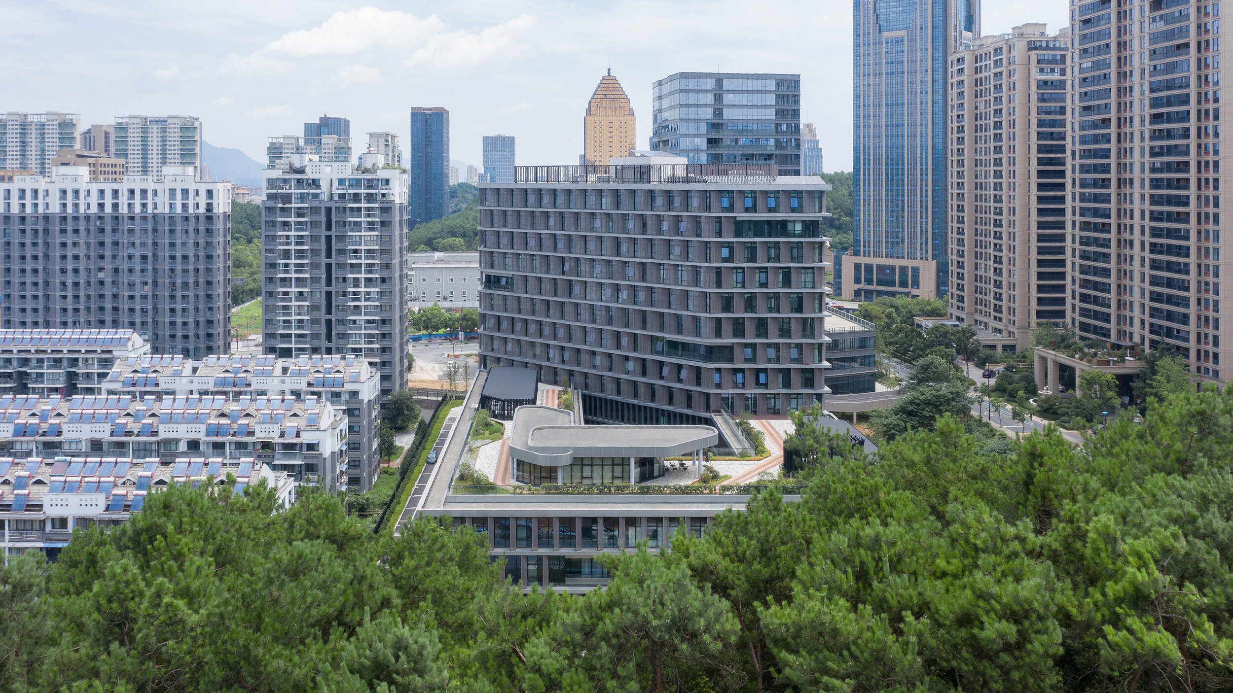
Designed by BAU (Brearley Architects + Urbanists), Tonglu Archives Building is located in Hangzhou, China. In China, the perimeter block typology doesn't usually return the Floor Area Ratio (FAR) necessary to satisfy inner-urban densities. This leads to an over-reliance on detached towers to meet FAR requirements. The perimeter block with a tower extrusion, however, presents a useful hybrid.
'it is the least we could do: minimalism in an environment of expressionism.' - Steve Whitford (Partner)
Hybrid typology
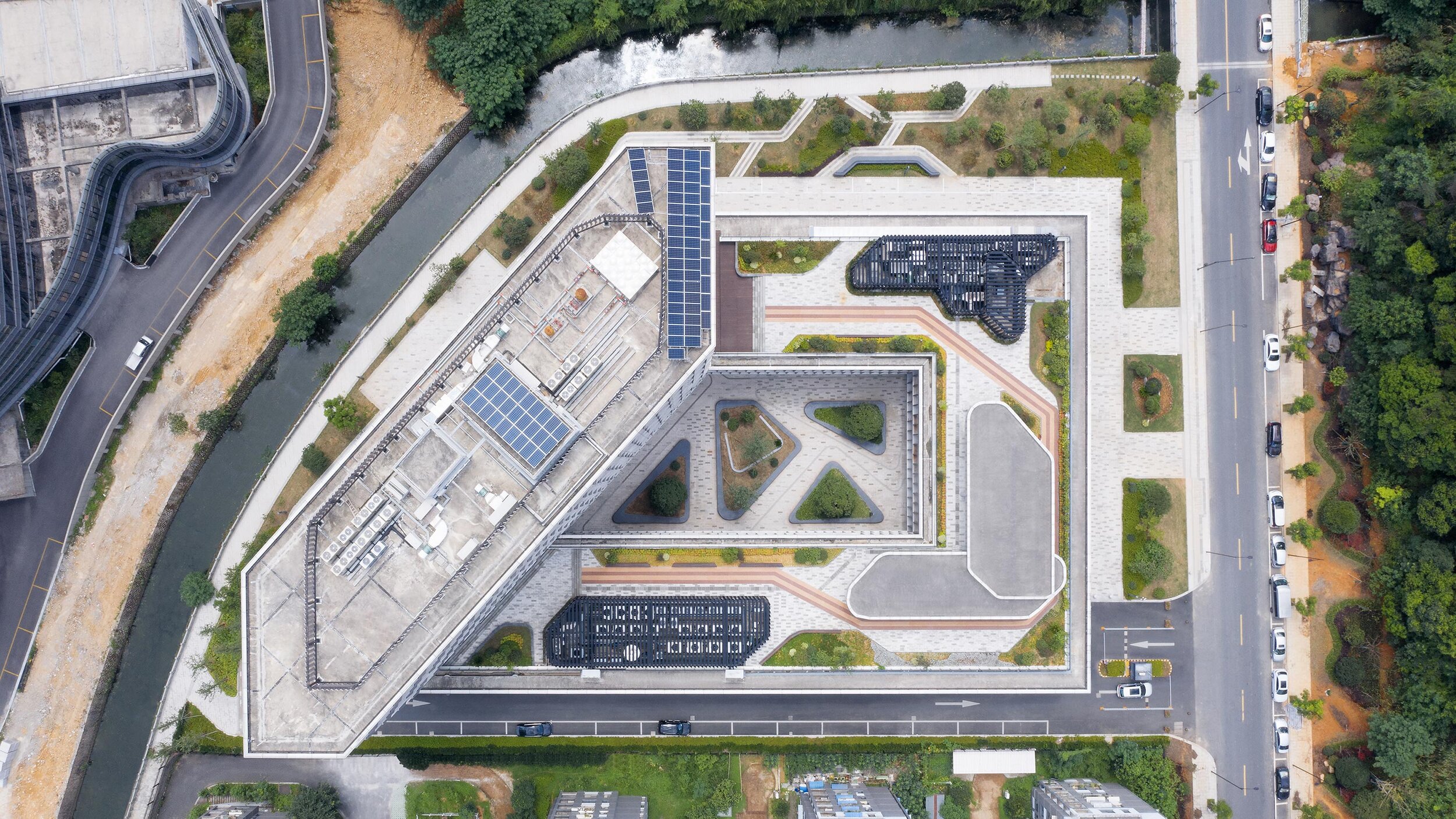
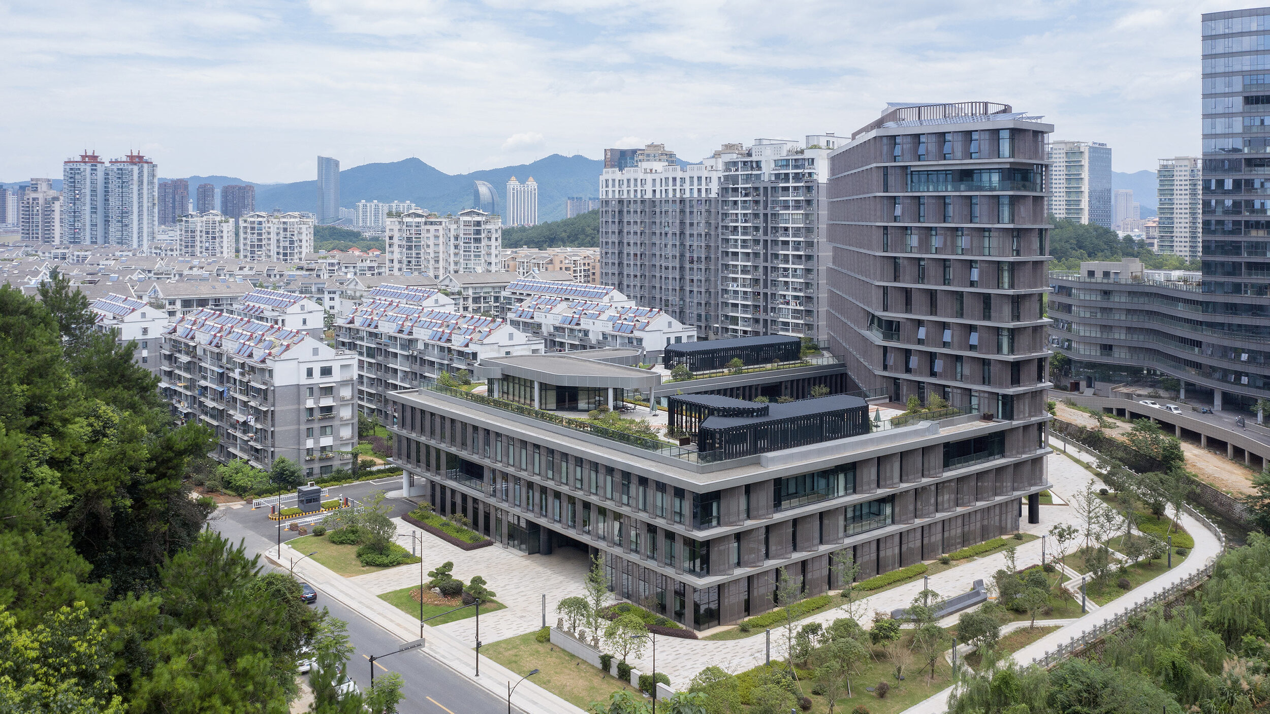
Designed by BAU (Brearley Architects + Urbanists), Tonglu Archives Building is located in Hangzhou, China. In China, the perimeter block typology doesn't usually return the Floor Area Ratio (FAR) necessary to satisfy inner-urban densities. This leads to an over-reliance on detached towers to meet FAR requirements. The perimeter block with a tower extrusion, however, presents a useful hybrid.
The advantages of the perimeter block are combined with the capacity of the tower to maximize floor area. (Positive reinforcement of active urban street edges; well ventilated and naturally lit building interiors; and an internal courtyard that has the options of being private, semi-private-semi-public, or public space)
Metal petals
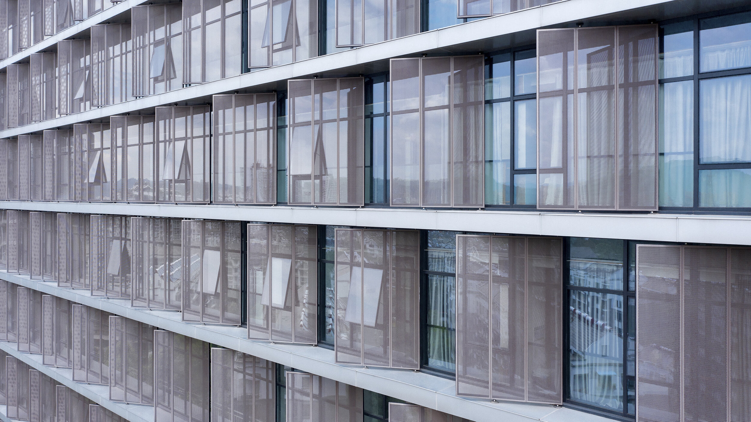
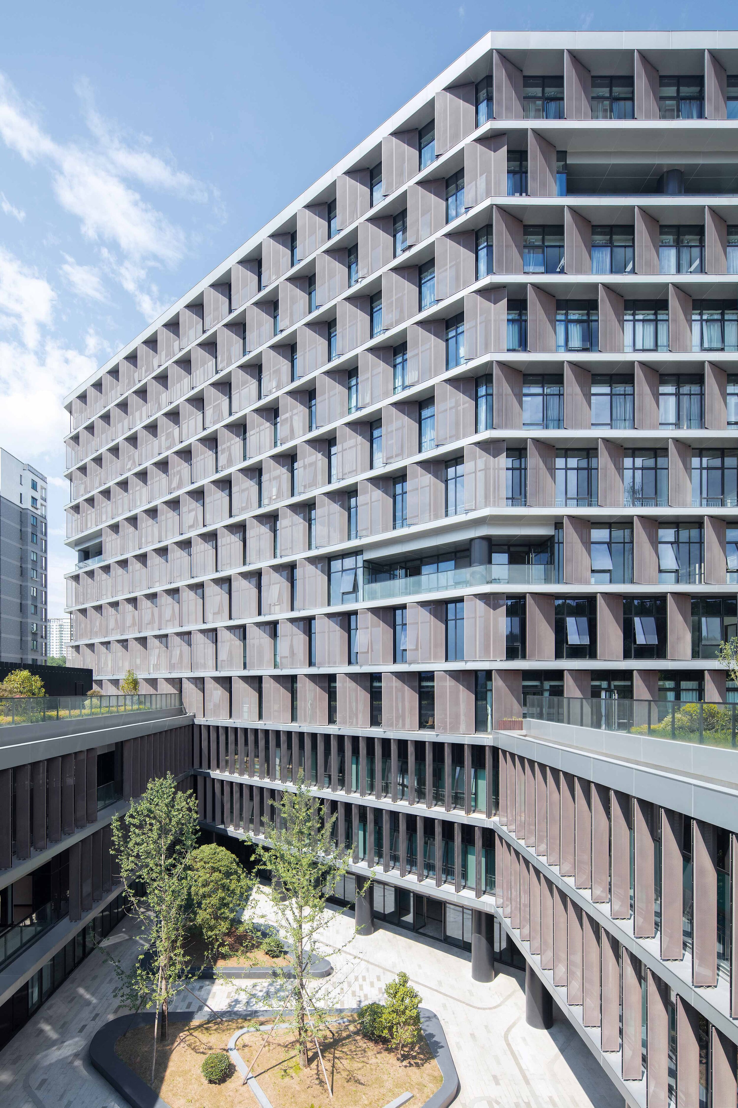
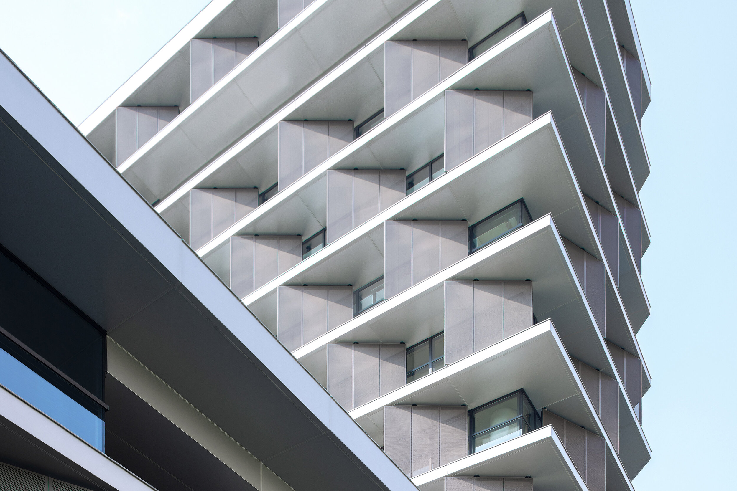
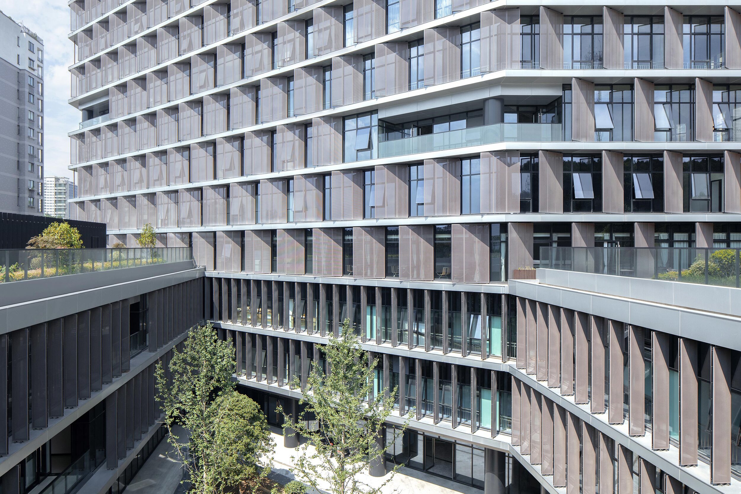
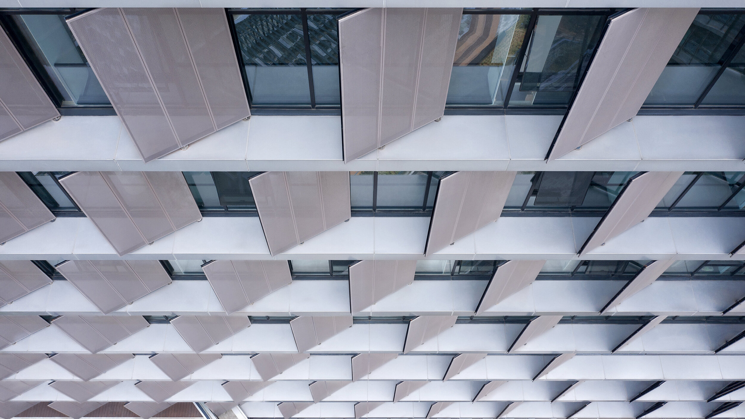
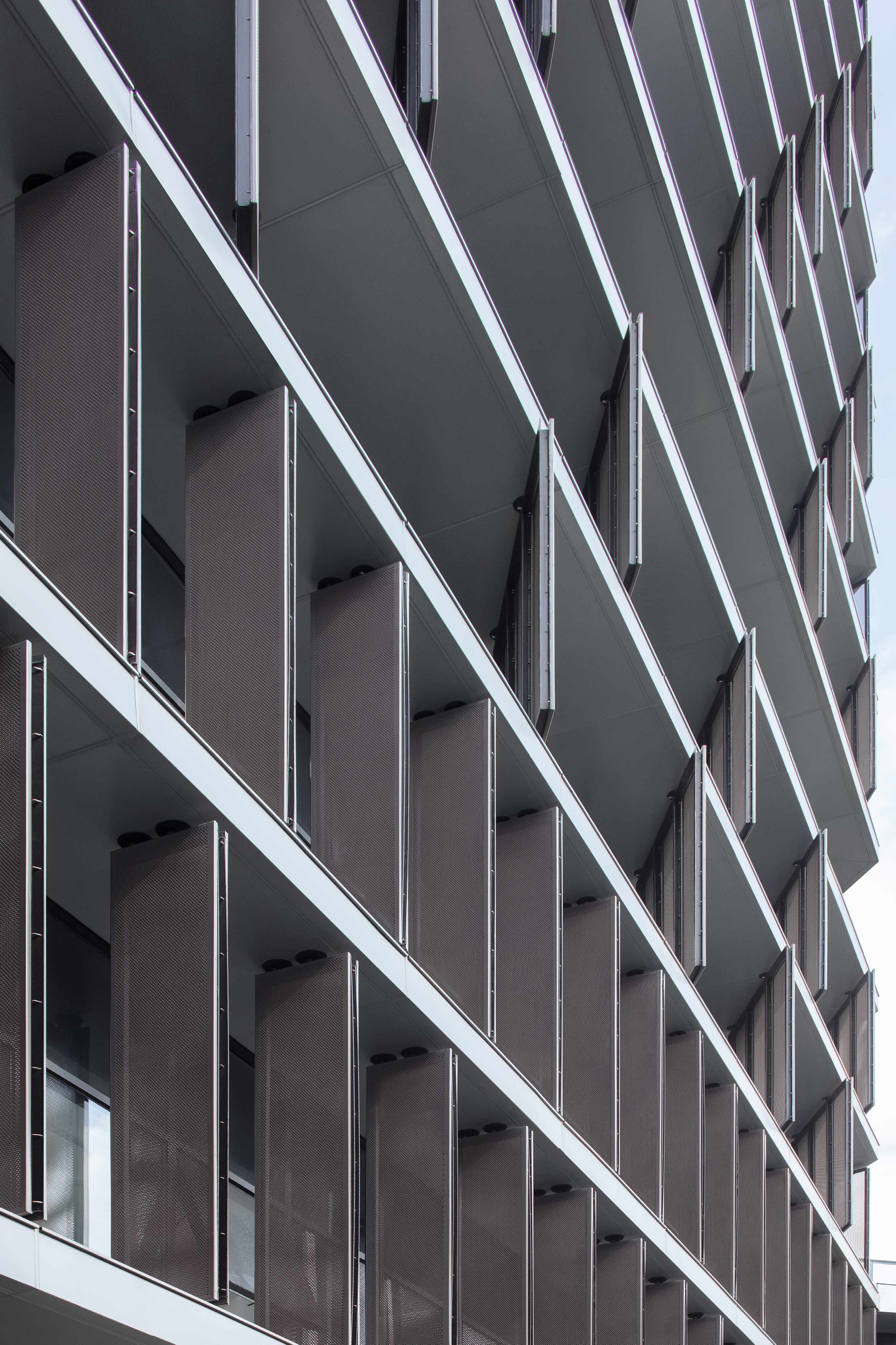
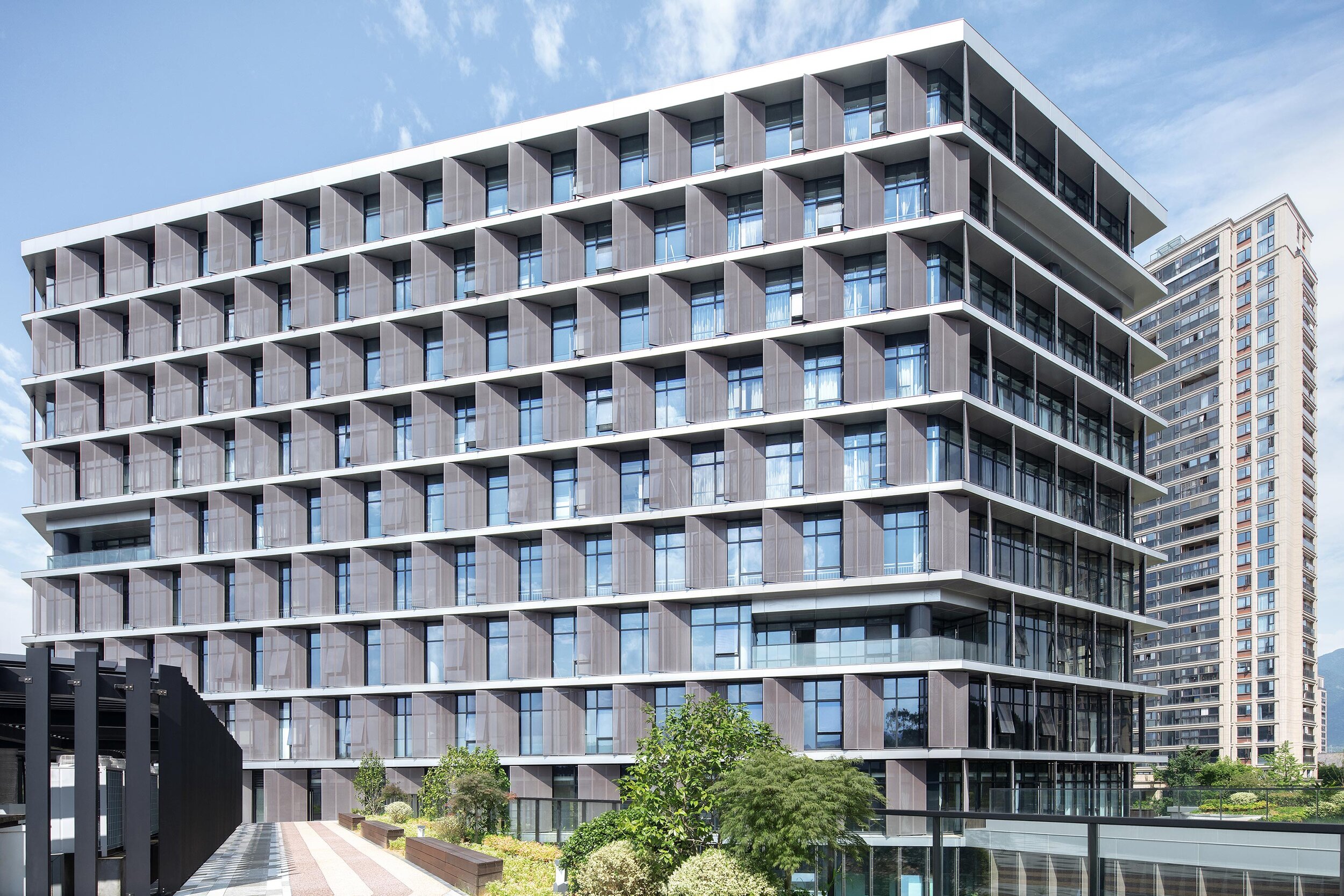
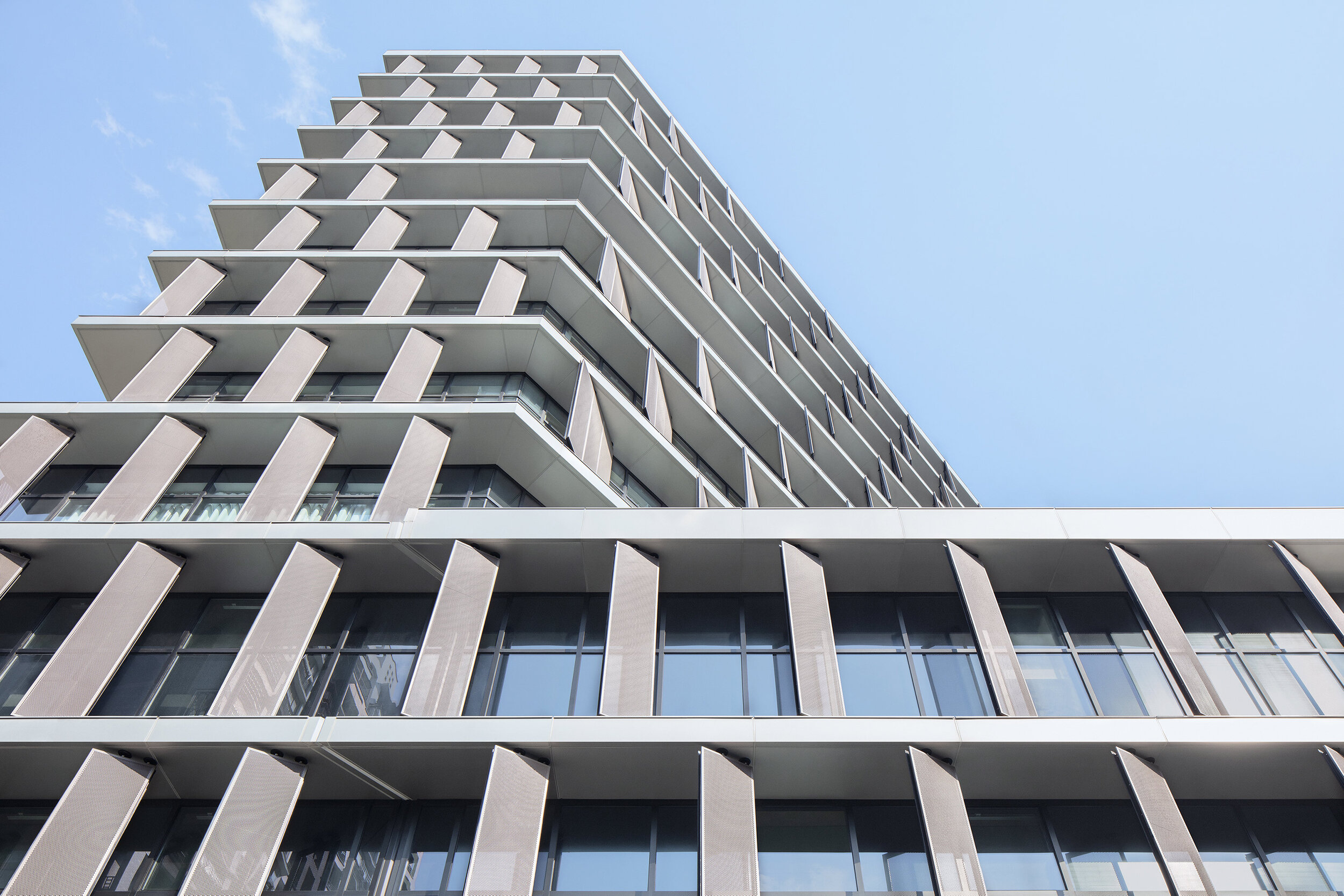
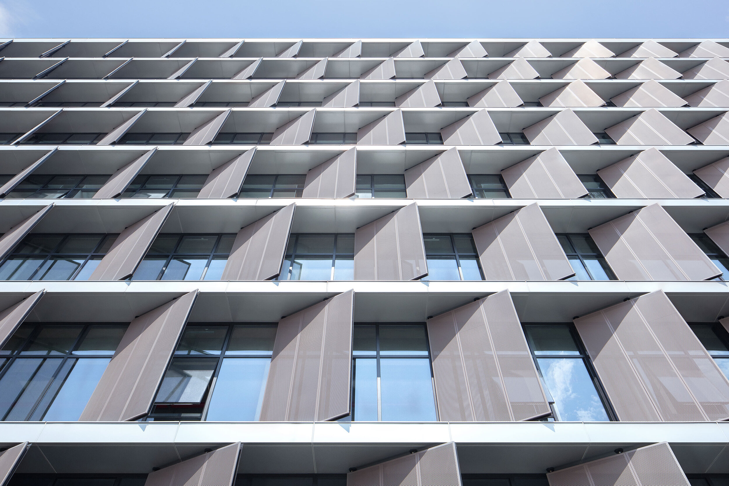
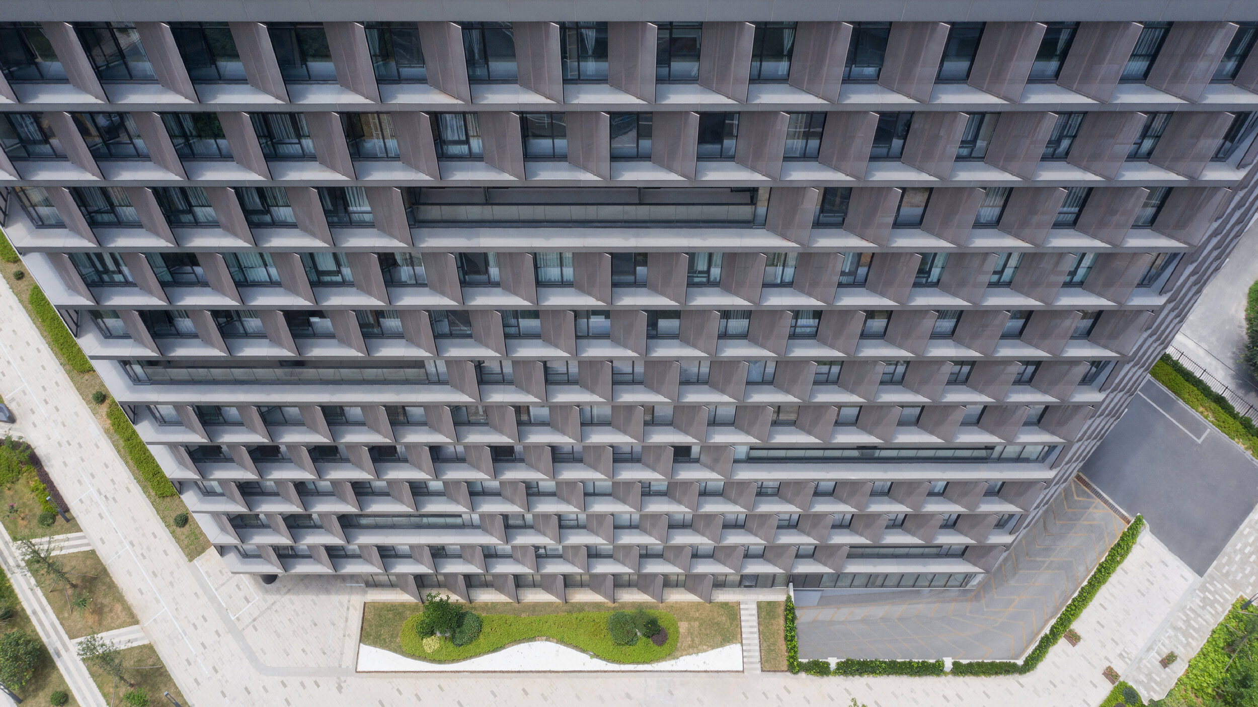
Surprisingly, all facades required vertical screens to prevent unwanted heat gain. Elegantly thin slab edges are projected past the window line and form horizontal ledges to sit vertical perforated metal sunscreens. These screens are closed enough to block the sun, yet open enough to not impede views out. Decks are then cut into the petals to provide outdoor space for each floor level and subtle visual relief to the petals' wall.
Minimalism 1. – Expressionism 0.
The program for this local government building is different: document archives, testing laboratories, staff canteen, a commercial street-front cafe, and a variety of closed and open office spaces. This suggests an architectural articulation of these programs. Besides, the typological hybrid offers an indication of the perimeter building and the tower.
However, rather than exploring these apparent solutions, the questions posed were: What are the program's differences? What are the differences generated by combining the perimeter block and tower typologies? And finally, what is the least we need to do to engage with these differences?
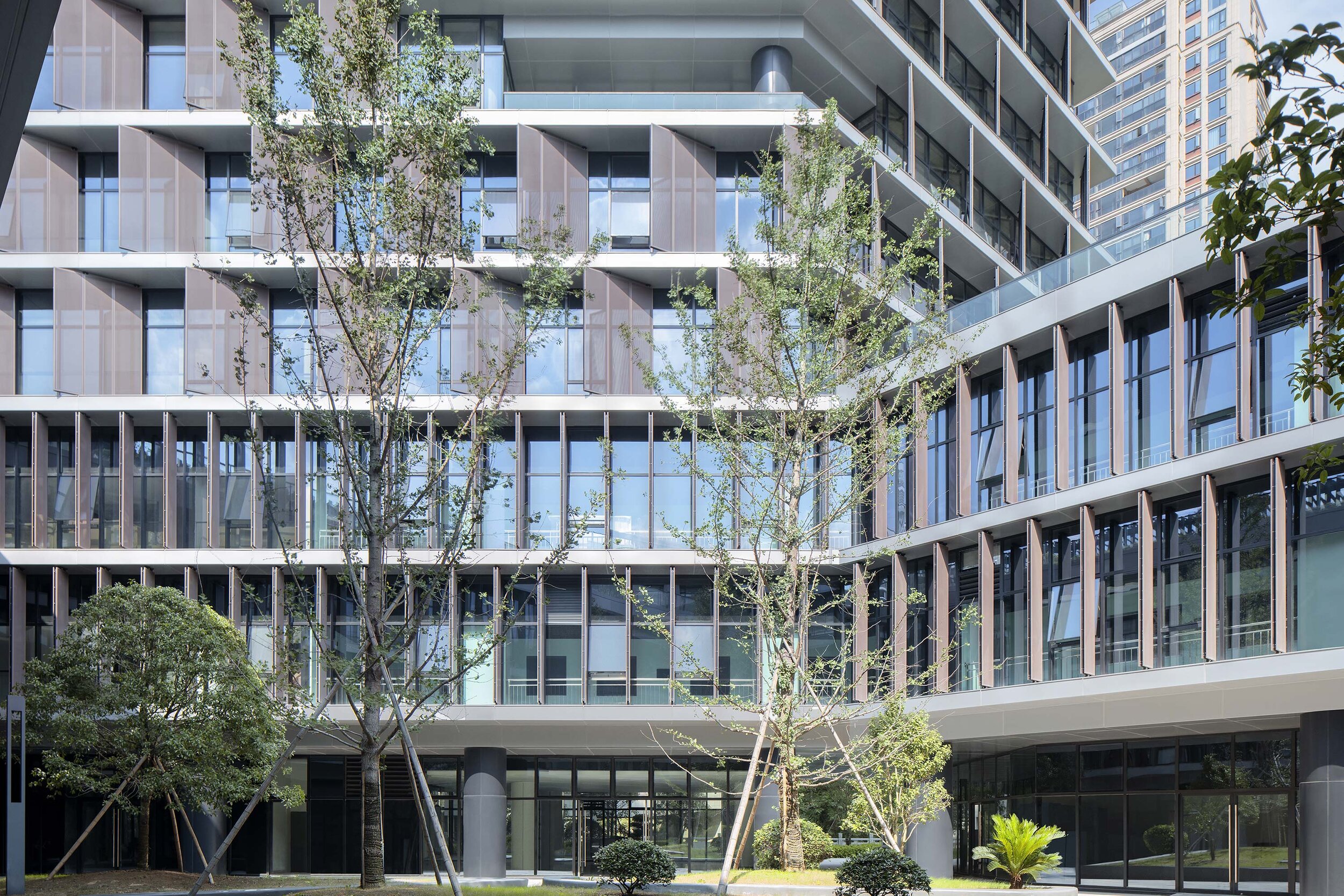
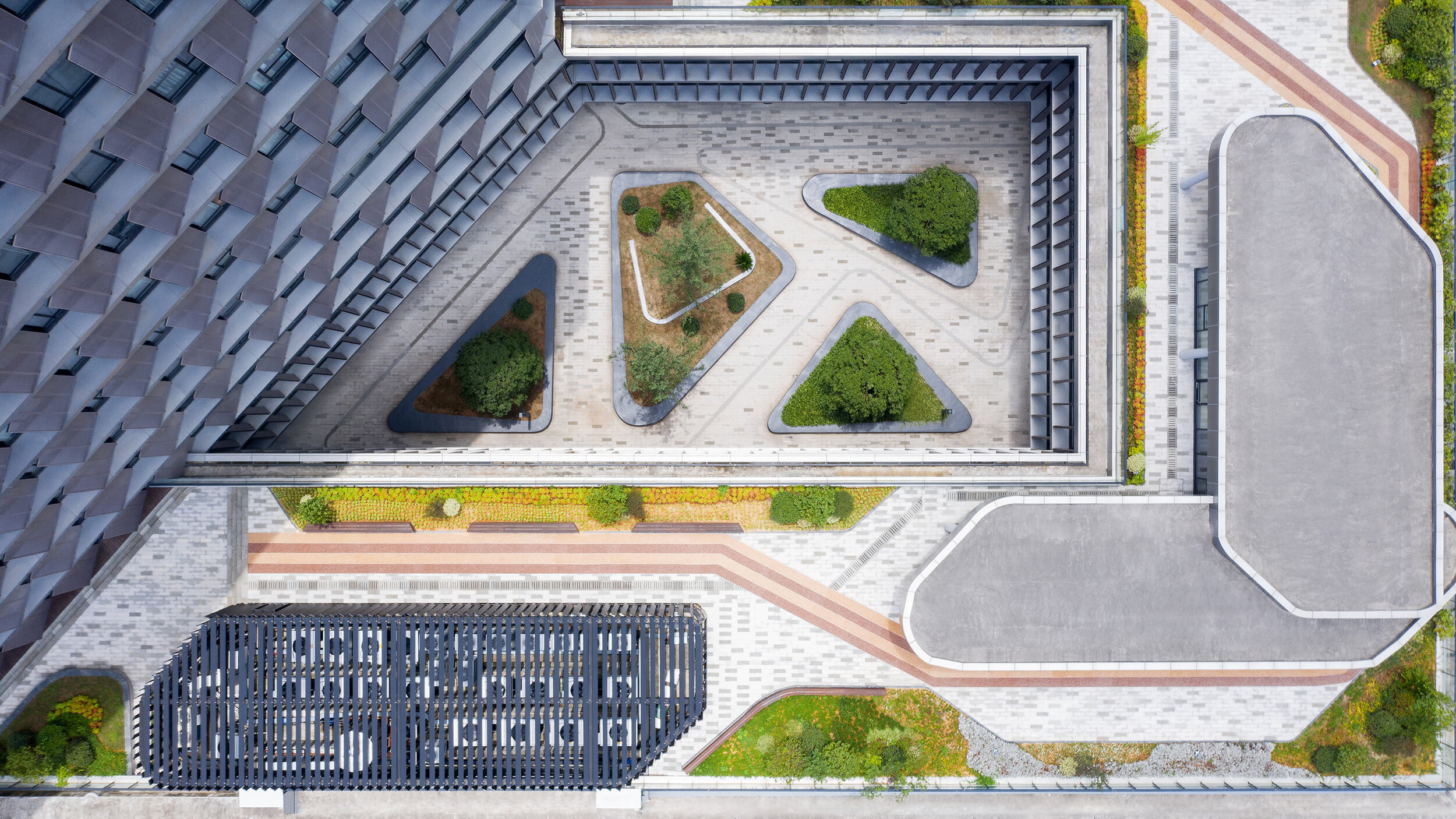
Semi-public courtyard
This centralized circulation strategy creates a semi-public outdoor space and provides opportunities for encounter and exchange among different public departments. It also provides an active area for lunch in a protected courtyard landscape.
The courtyard directly links the public footpath off the main southern entrance to a proposed pedestrian bridge to the northeast of the site. This diagonal shortcut further reinforces the semi-public nature of the courtyard.
Roofscape as displaced landscape
To encourage the staff to get out of the building and enjoy the river frontage or the courtyard, the paving from the ground floor interiors flows directly into the yard and out to the river's edge – a robust strategy for the future, when the ground floor develops more pubic and/or commercial programs.
The tower overlooks the perimeter block roof, and this space provides an opportunity for a significant private outdoor space for the building tenants. A garden pavilion for staff lunches or informal meetings sits within a roofscape that presents as a displaced landscape. The staff canteen opens on to this roofscape. Plant rooms have been disguised as additional garden pavilions.
More visible than we think
In a commercial and retail environment where every building is trying hard to be seen as different from its neighbours, advertising and signage dominate streetscapes. Buildings are becoming extensions of corporate logos and marketing campaigns – a minimal, elegant and calm public building may be more visible than we think.
Project Data
Project Name: Hangzhou Tonglu Archives Building
Project Status: Completed 2019
Location: Tonglu, Hangzhou, Zhejiang Province
Client: Tonglu Urban Development and Management Co., Ltd.
Typology: Office
Program: Document archives; testing laboratories; office.
Year: 2016—2019
GFA: 26,700 m²
Construction Cost: RMB 136 million
BAU Project Team: James Brearley, Jens Eberhardt, Chen Zhiyong, Luo Huaili, Steve Whitford, Gao Weiguo, Chen Jian
Builder: Hangzhou Harbour Construction Co., Ltd.
Engineer+Documenting LDI: China United Engineering Company
Photographer:Xia Zhi
Light of hope - Tokyo Michiterasu 2020 winter illumination
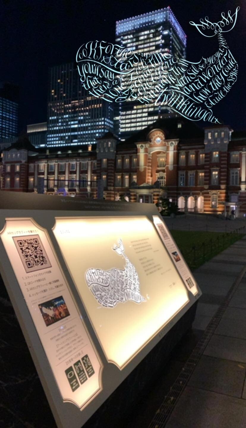
This unique light and illumination event has become the area's winter tradition since Tokyo Millenario was first held in 1999. This year, Tokyo Michiterasu 2020 is still hosting during the global pandemic, hoping to light the way of all of us to the future: Michi (unknown) and terasu (light). This event hopes to deliver a message of support and thanks to the people working towards the new era (the "new normal") from Japan's heart. *fRAum®︎ is the main visual for art calligraphy.
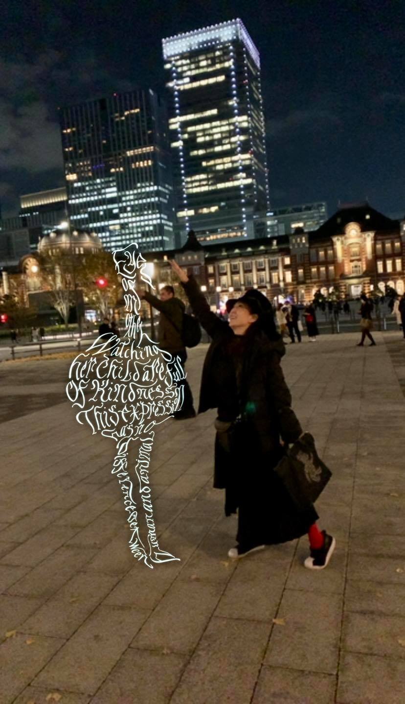
Light of hope, one of the latest projects created by KAZUKI KUMONO & YOKO FRAKTUR This light and illumination event has become the area’s winter tradition. This year, Tokyo Michiterasu 2020, with the wish of lighting the way to the future: Since we may not be able to visit in life but you may also visit online during the pandemic. They hope to deliver a message of support and thanks to the people working towards the new era (the “new normal”) from the heart of Japan. This is one of the winter illuminations that you can enjoy both on-site and remotely.
fRAum®︎ is the main visual for art calligraphy.
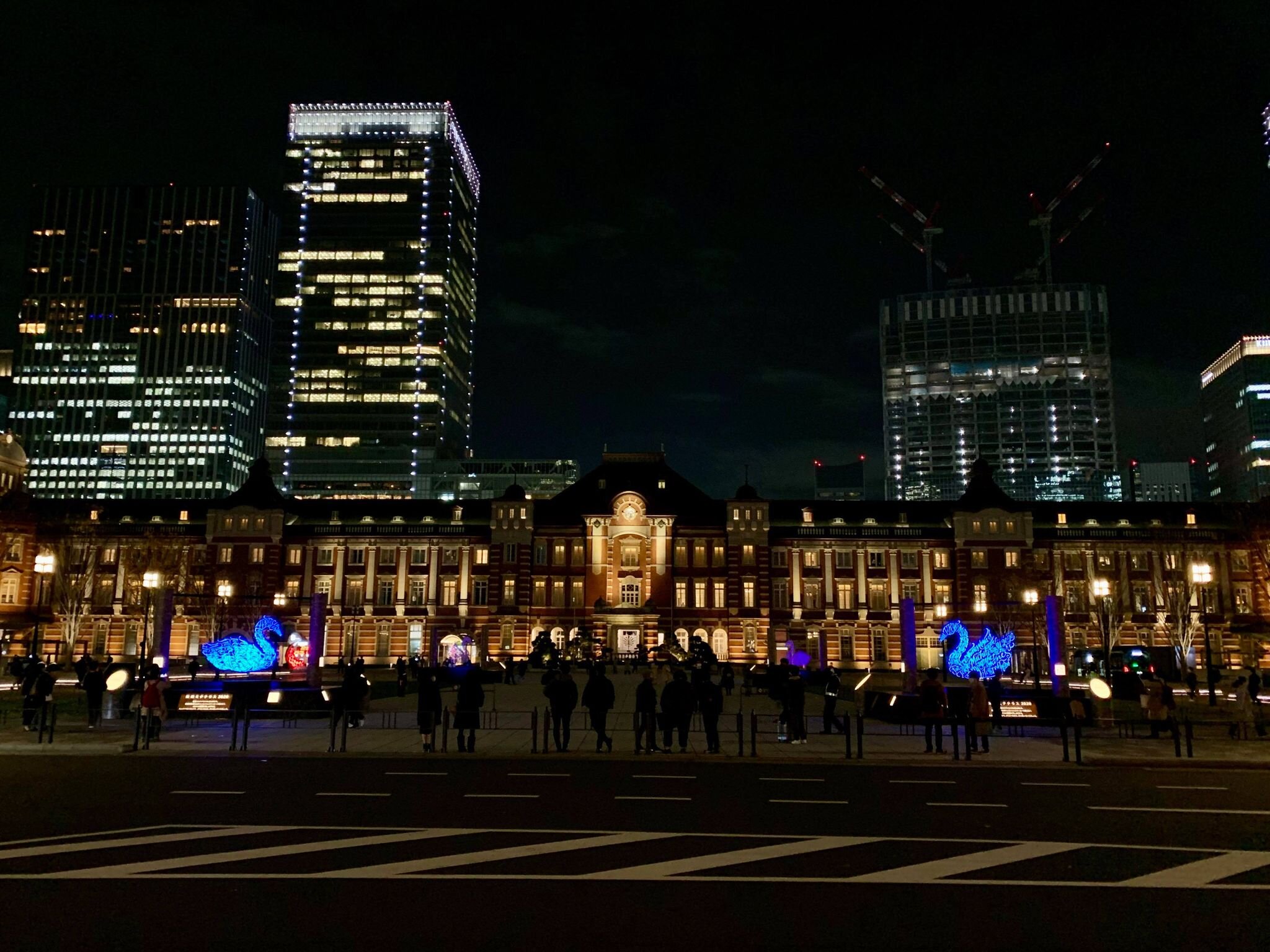
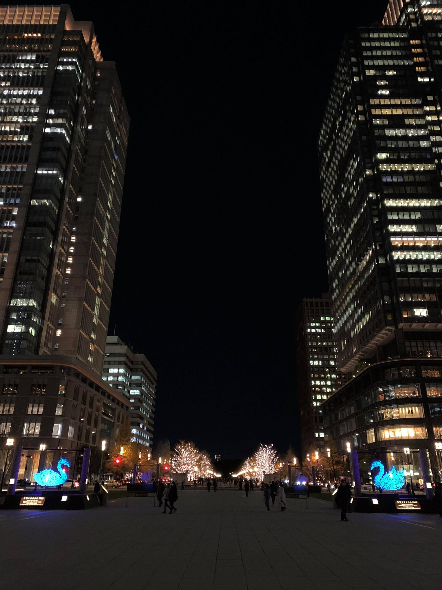
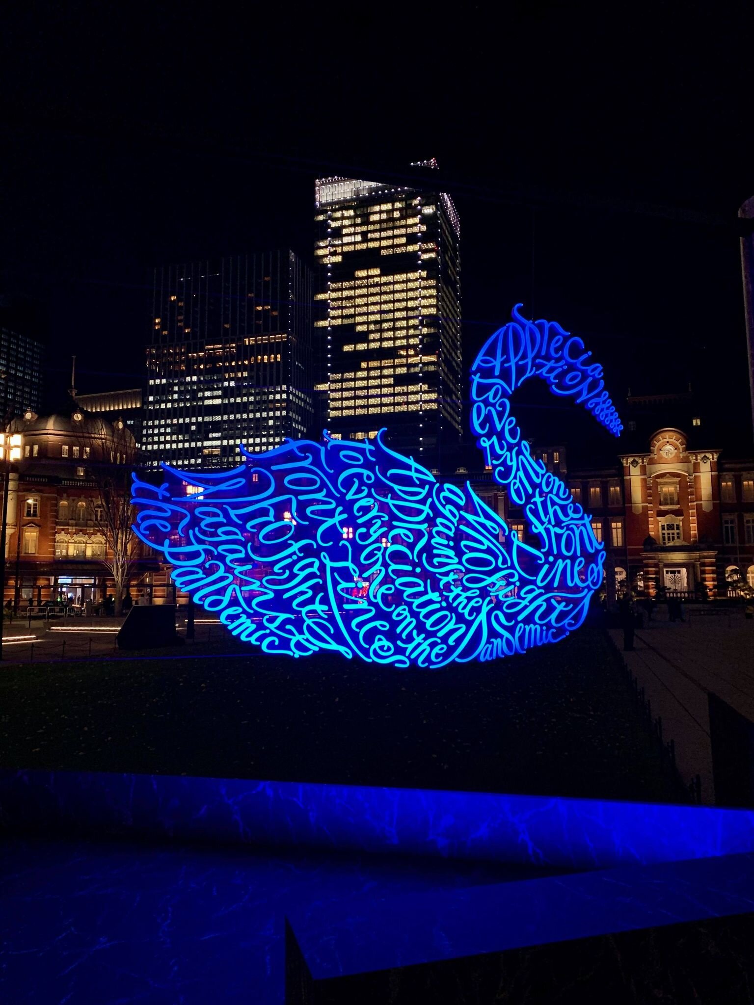
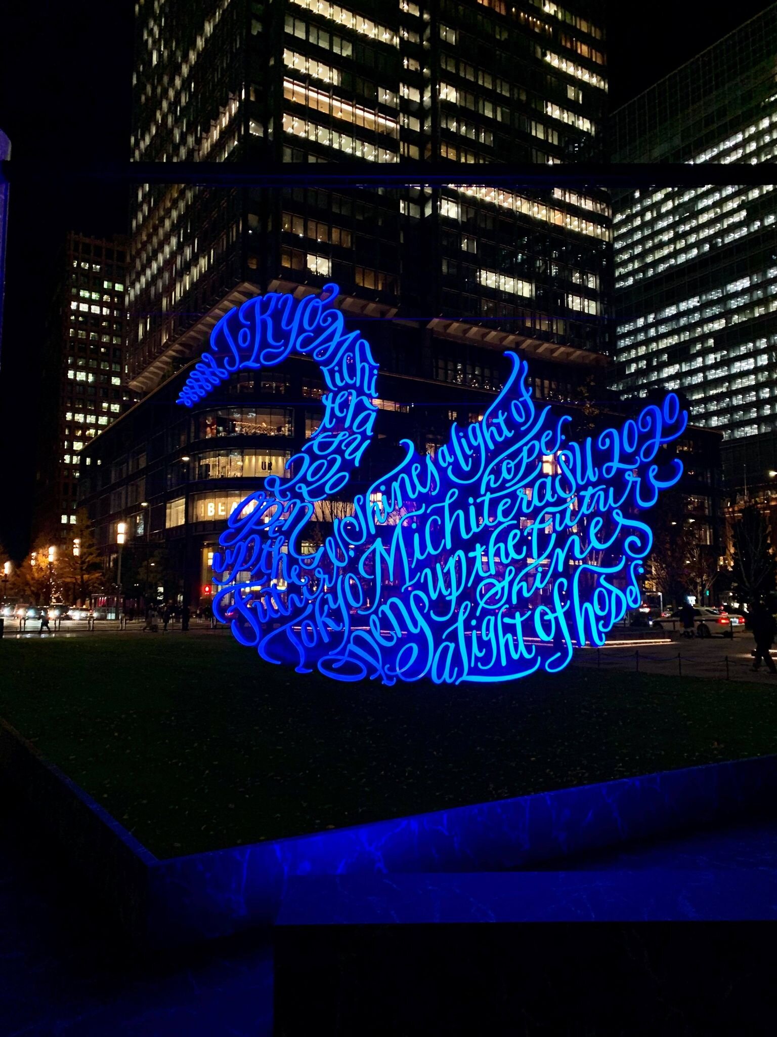
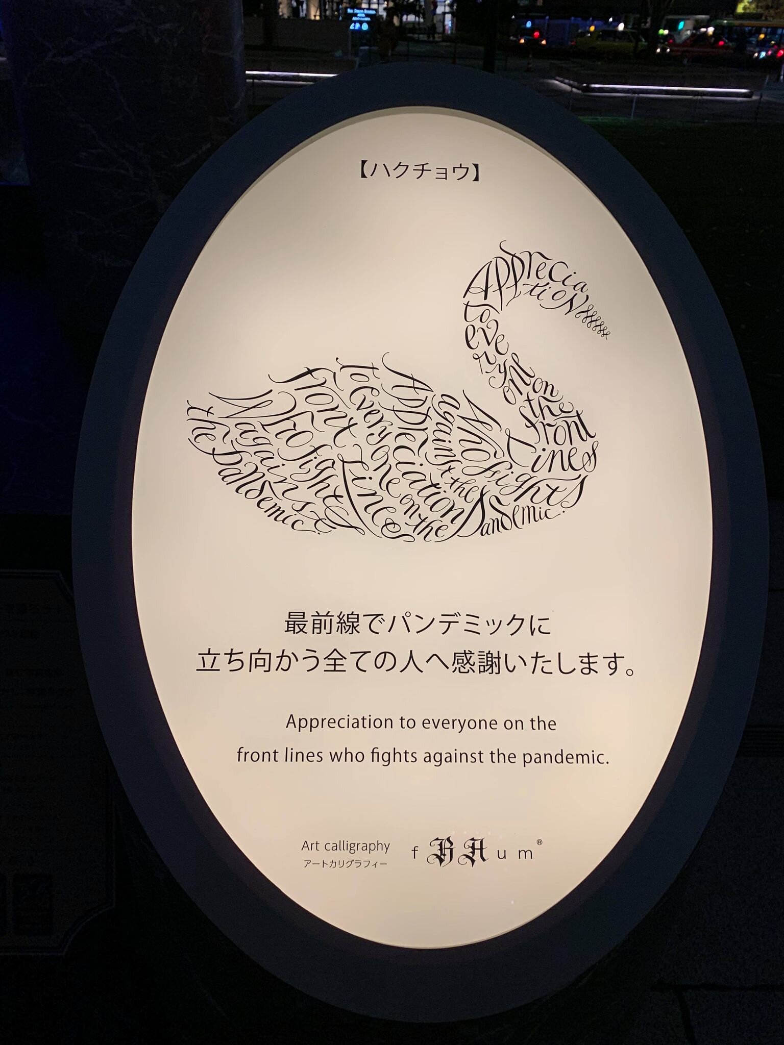
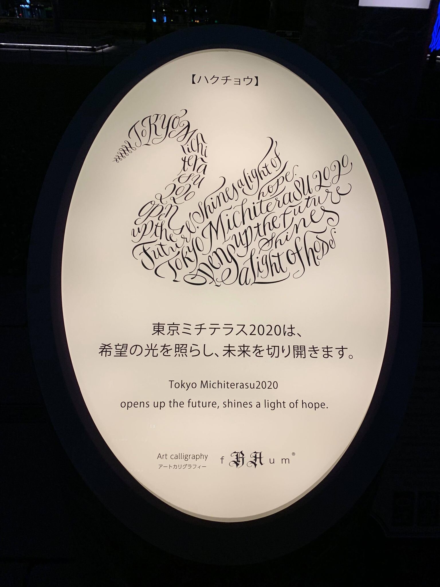
You may find there are many different characteristics in the city of Tokyo. Where history, the future and culture meet. Surrounding Tokyo Station, this area continues to emerge as a unique city where history, tradition, culture, science, business, and innovation blend together dynamically and form a hub that connects Tokyo, Japan and the world.
This unique light and illumination event has become the area's winter tradition since Tokyo Millenario was first held in 1999. This year, Tokyo Michiterasu 2020 is still hosting during the global pandemic, hoping to light the way of all of us to the future: Michi (unknown) and terasu (light). This event hopes to deliver a message of support and thanks to the people working towards the new era (the "new normal") from Japan's heart.
For those who can’t visit in person, Tokyo Michiterasu 2020’s official website offers a particular movie. It features five short stories told by art calligraphy animals in Tokyo Station Marunouchi Station Square and on Gyoko-Dori Street. Please enjoy whereby the dark world grows with the light of hope.
Episode 1:
Living is not breathing but doing - Jean-Jacques Rousseau
Episode 2
Because love is, that forgives the conflict of opinion with mistakes and their own that person. - Florence nightingale
Episode 3
The best way to cheer yourself up is to try to cheer somebody else up - Mark Twain
Episode 4
If you fantasize anyway, it’s best to have a wonderful imagination. - Lucy Maud Montgomery
Episode 5
True courage and kindness go on with people together. - Samuel Smiles
The video will be released on December 24, 2020
Event Details
The name of the event: Tokyo Michiterasu 2020
Opening period: Thursday, December 10 - Friday, December 25, 2020, from 3:00 pm ~ 9:00pm
*Some of the online content is scheduled to be available until Thursday, December 31. AR is available both daytime and nighttime at the venue.
The venue: Tokyo Station Marunouchi Station Square, Gyoko-Dori Street
The hosts (in no particular order) East Japan Railway Company Tokyo Branch and Mitsubishi Estate Co., Ltd.
Other sponsors (in no particular order)Ministry of Land, Infrastructure, Transport and Tourism; Chiyoda Ward; The Chiyoda City Tourism Association; The Tokyo Chamber of Commerce and Industry; Tokyo International Forum Co., Ltd.; The Council for Area Development and Management of Otemachi, Marunouchi, and Yurakucho.
For more information, please visit: https://www.tokyo-michiterasu.jp/en/
The Green Soul of Zegna - the Dream of Zero Waste Possible
At Zegna, they have taken care of the world we live in from the beginning, following in the footsteps of their founder Ermenegildo Zegna. This is their company mission, based on a constantly-evolving thought: looking at the future with the belief that our actions today will shape our tomorrow.
“At Zegna, we have taken care of the world we live in from the beginning, following in the footsteps of our founder Ermenegildo Zegna. This is our company mission, based on a constantly-evolving thought: looking at the future with the belief that our actions today will shape our tomorrow.”
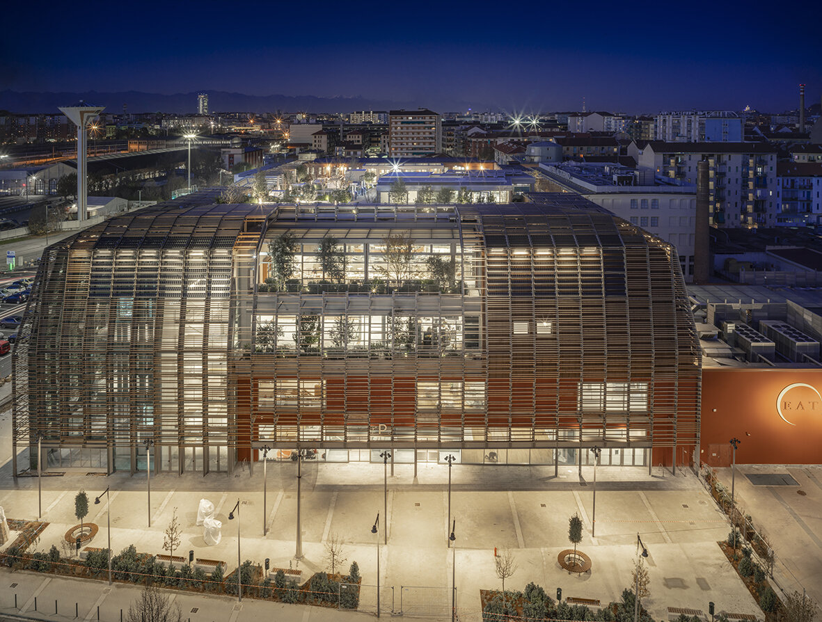
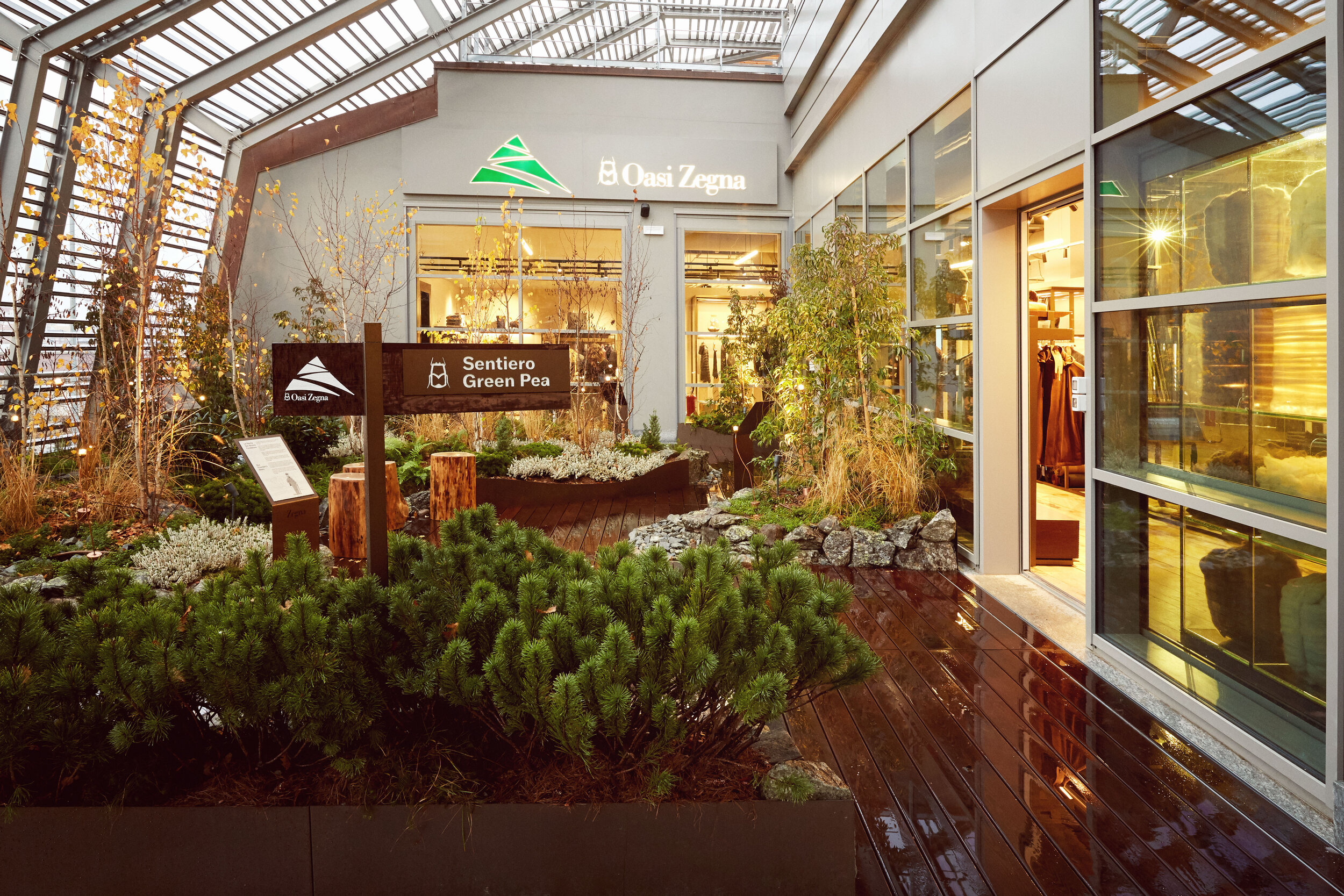
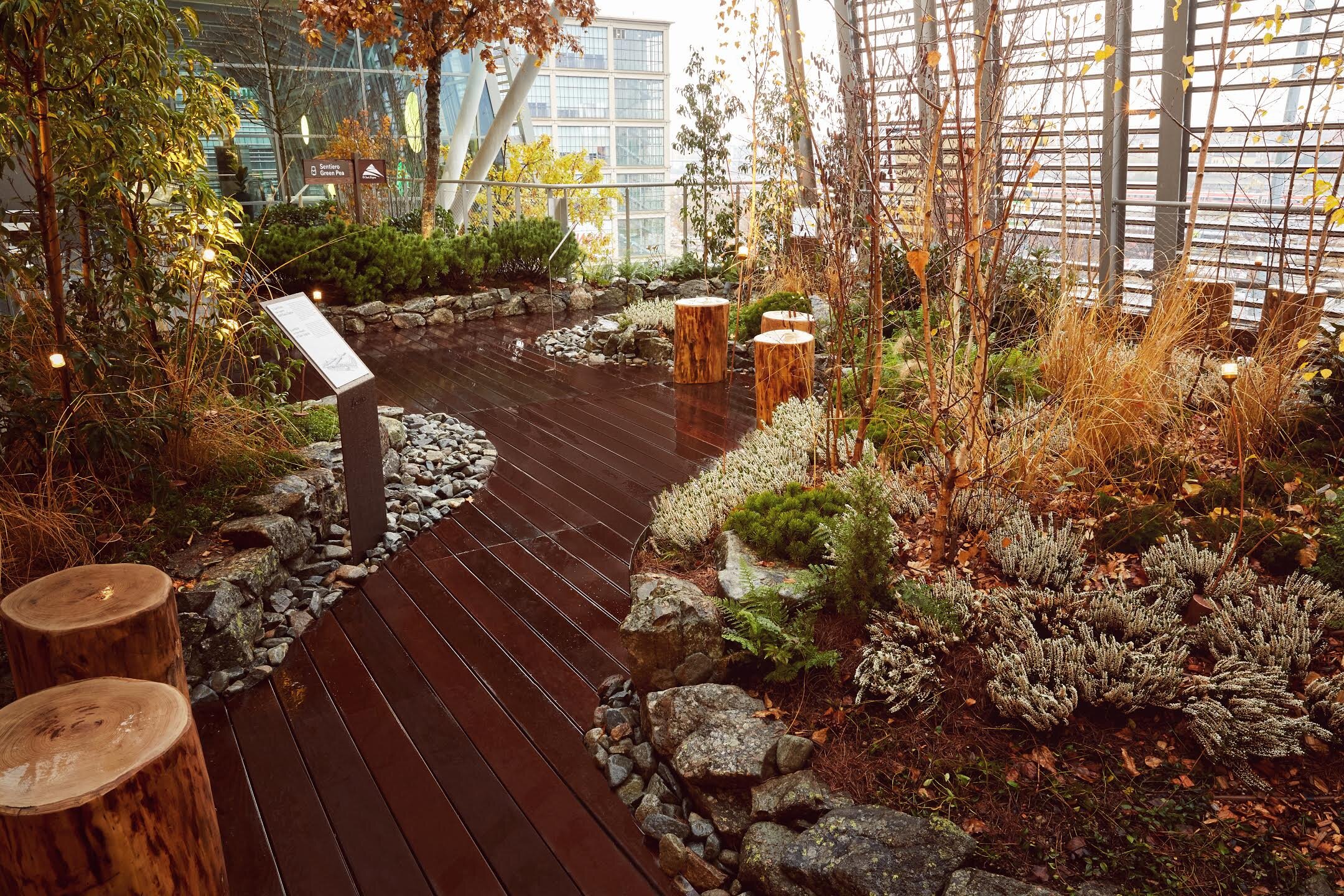
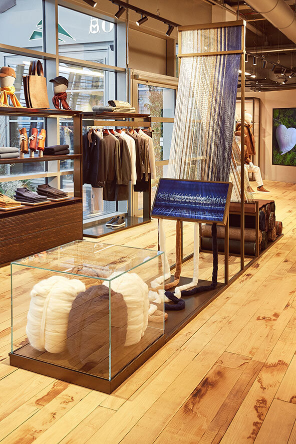
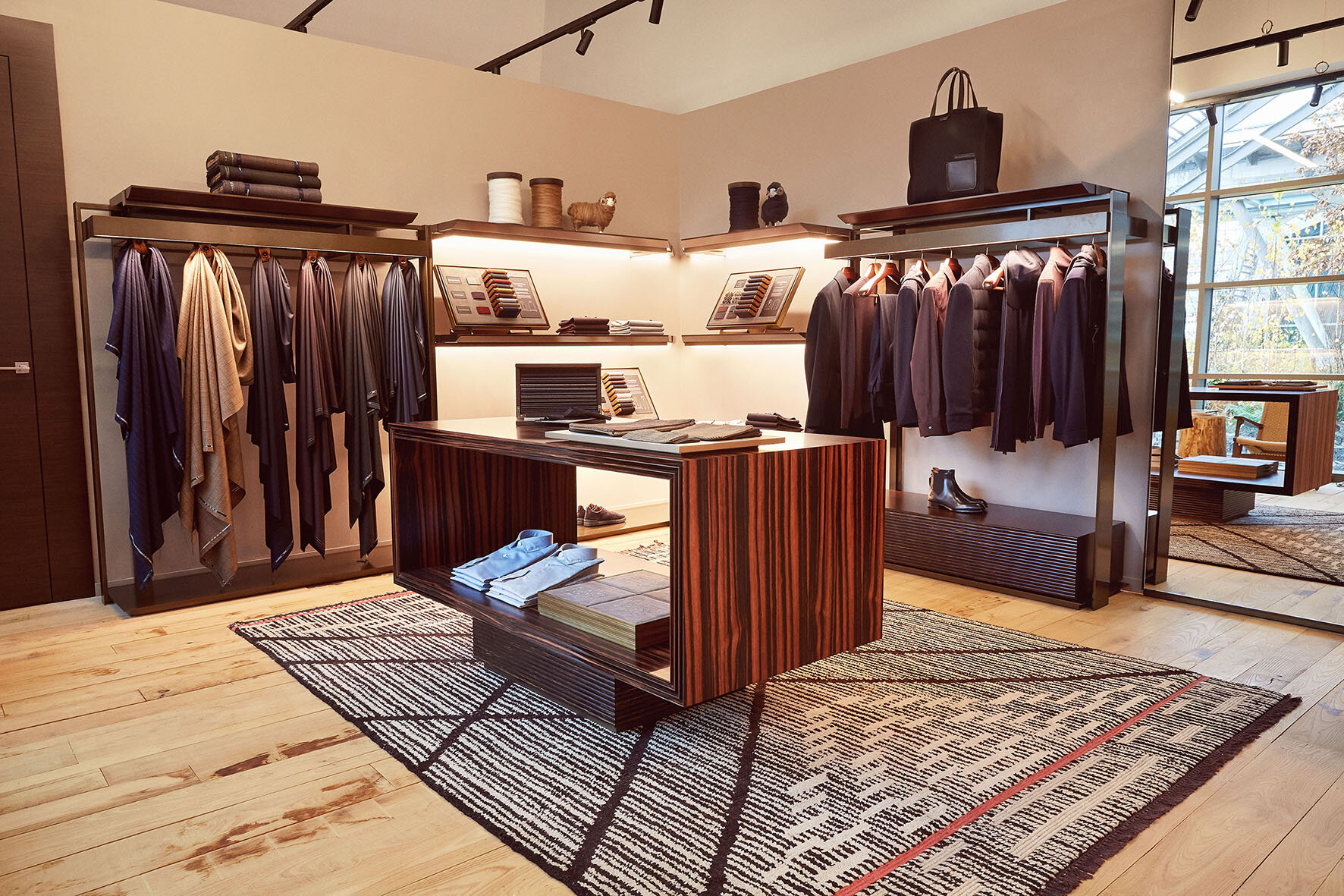
At Zegna, social and environmental responsibility have been our roots for 110 years. When they were founded in 1910, Ermenegildo Zegna’s dream was not just to create the world’s finest textiles but to make his hometown and the world around it a better place, ensuring the highest-quality products without compromising the quality of life for future generations. His vision is still the heart of everything we do. The environment is at the core of our efforts: we believe the very best garments can only come from the best natural resources, and that these resources need to be cared for. The advanced vertical integration of our business model facilitates our journey towards a sustainable product and holds us accountable for responsible practices and processes.
2020 marks our 110th anniversary. On this landmark year, we are proud to renew our sustainability pledge, exemplified by OASI Zegna, where our Lanificio Zegna was established and our green philosophy was ignited. OASI Zegna is a unique model of our environmental consciousness, a territory that now covers 100km2 from Trivero to Valle Cervo in the Alpi Biellesi, which would not have been possible without the visionary approach of our founder.
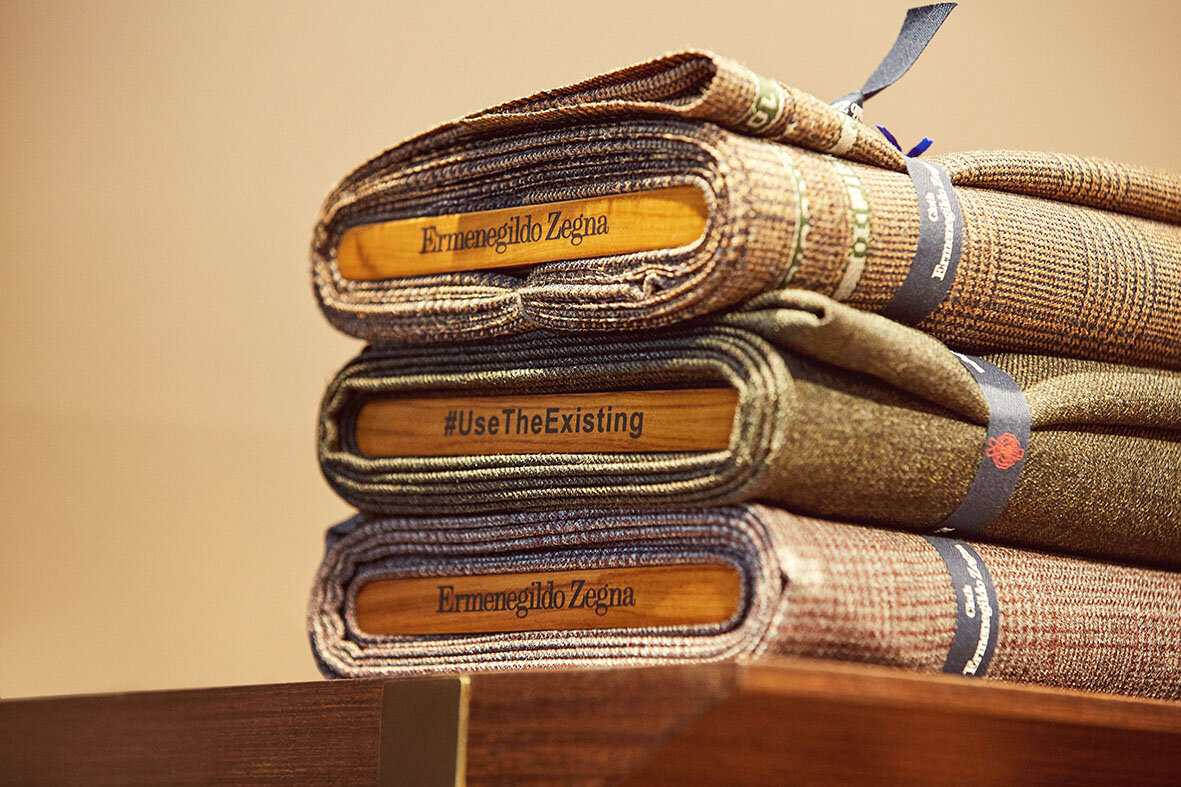
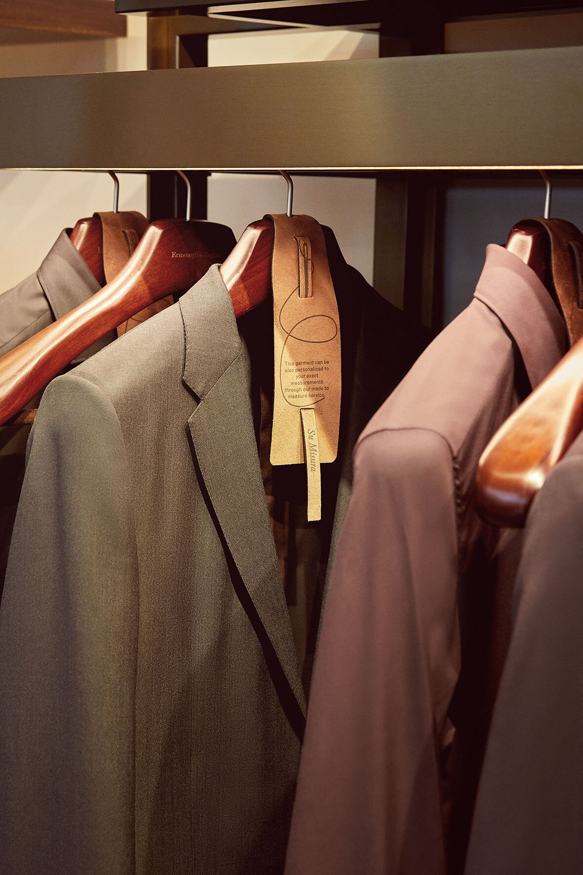
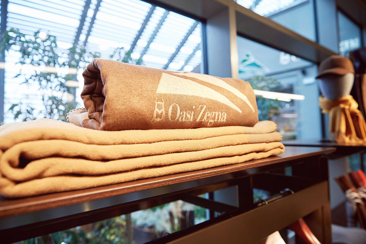
“In an ever-changing world, luxury companies can simply adapt to changes or choose to be a positive force in driving these changes. Our responsibility is to leverage our past to build a better present and future. This carries over into everything we do, following our founder’s legacy. I’m very pleased that Zegna is part of the Green Pea project, partnering with Oscar Farinetti who shares the same sustainability ethos with us”, says Gildo Zegna, CEO of Ermenegildo Zegna.”
Meanwhile at Z ZEGNA, we continue to push the boundaries to explore sustainable fashion solutions, and use recyclablematerials to create the Z ZEGNA FW20 #Usetheexisting Nylon Padded Jacket and Vest. The extra-light recycled nylon stuffing creates feather-like comfort, whilst outstanding weaving and craftsmanship ensurewaterproofing and warmth. The streamlined design is ideal for outdoor adventures and city life alike, with functional details such as a patch pocket on the chest, zipper side pockets covered by a sleek, peach-skin technofabric shell, and a drawstring at the bottom. A carefree choice for contemporary gentlemen to mix and match, the Z ZEGNA FW20 #Usetheexisting Nylon Padded Jacket and Vest come in four colour options: black, red, bright yellow and dark green.
“Morethan a simple project, #UseTheExisting is a state of mind,” says Artistic Director, Alessandro Sartori. “The main goal is to rework the fashion system in order to reduce our ecological footprint. At Zegna, we are trying to reuse resources in order to not waste any materials in the production chain. It is a mission and a vision in which we are investing a lot. This is the principle behind the latest and future collections.”
Together, wecan build a better tomorrow.
For more information, please visit: www.zega.com
ZEGNA AND LEICA JOIN FORCES IN A COLLABORATION TO BE LAUNCHED GLOBALLY
Fashion meets Photography: the exclusive collaboration between Zegna and Leica Camera, the legendary German camera manufacturer, yields a capsule collection of high-end camera accessories, possibly the most refined to date.
Fashion meets Photography: the exclusive collaboration between Zegna and Leica Camera, the legendary German camera manufacturer, yields a capsule collection of high-end camera accessories, possibly the most refined to date.
Debuted in January 2020 on the runway of the Ermenegildo Zegna XXX Winter 2020 Fashion Show, this highly expected capsule collection finally comes to life.
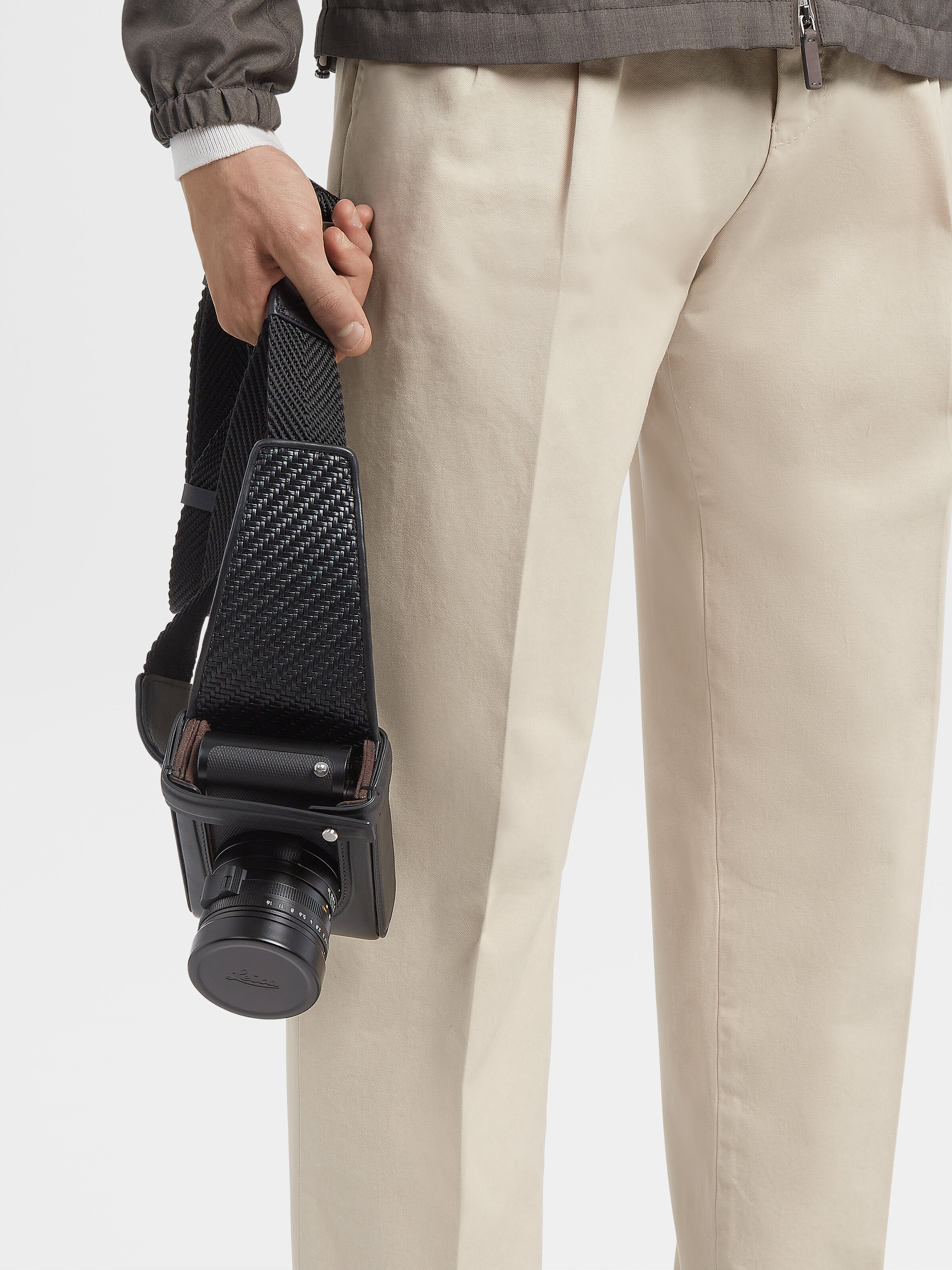
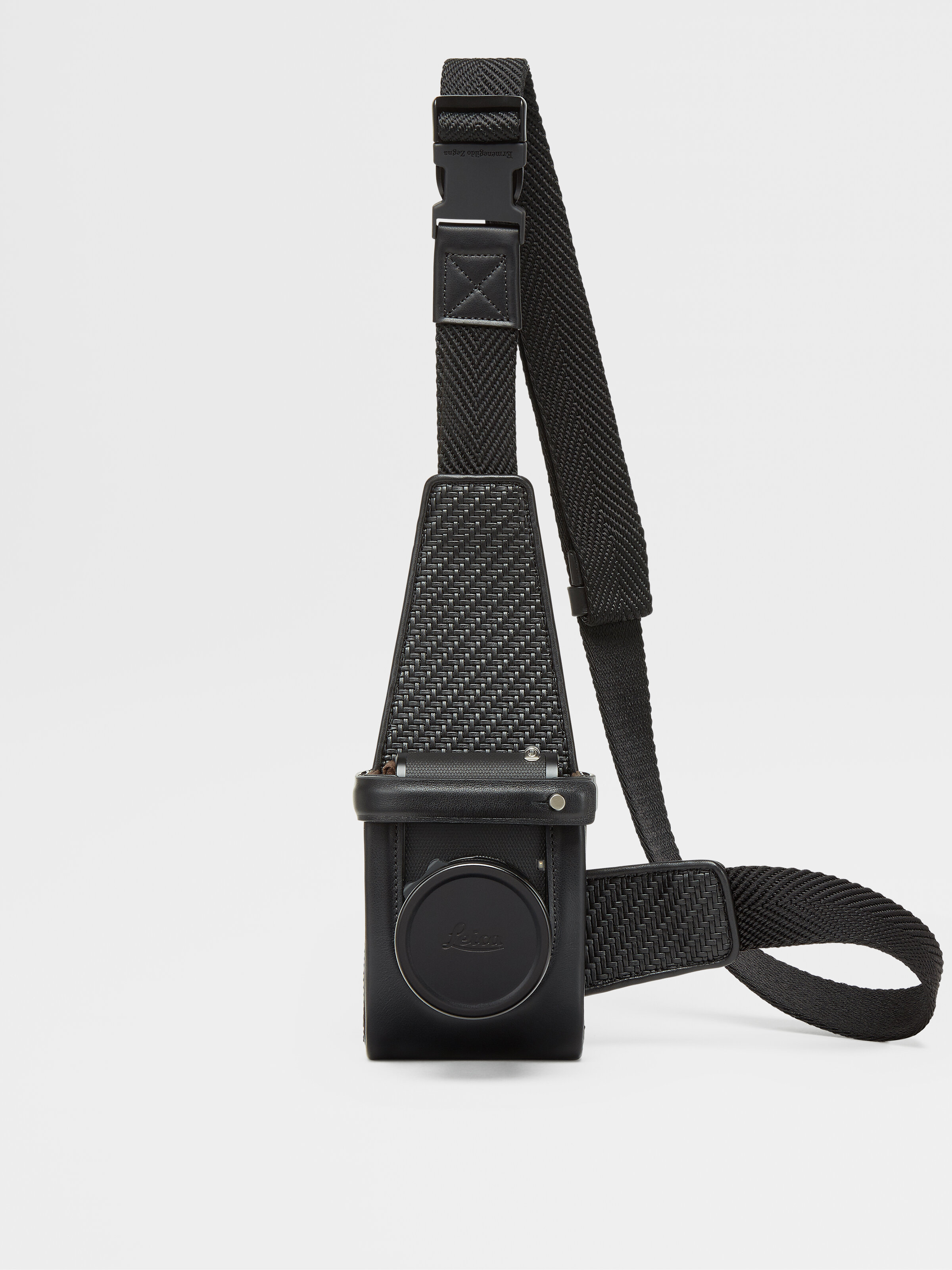
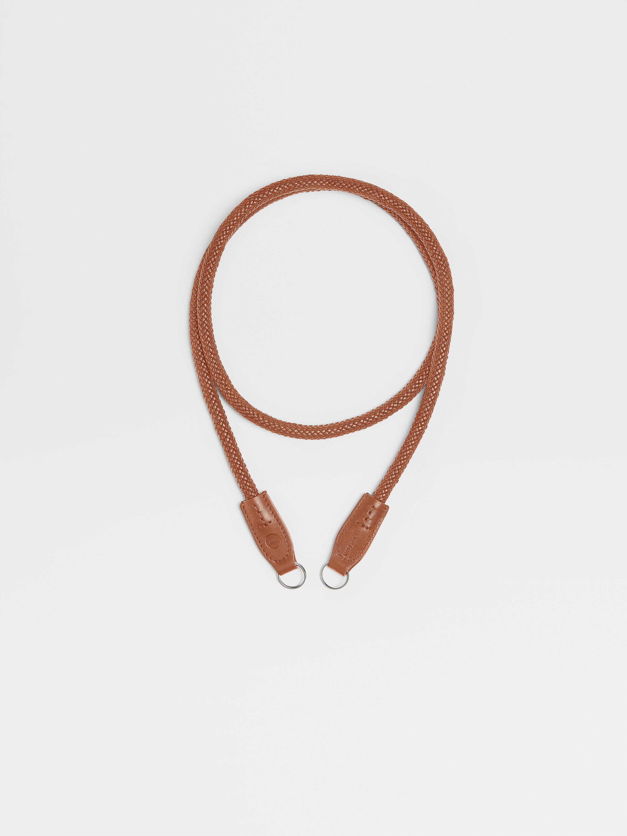

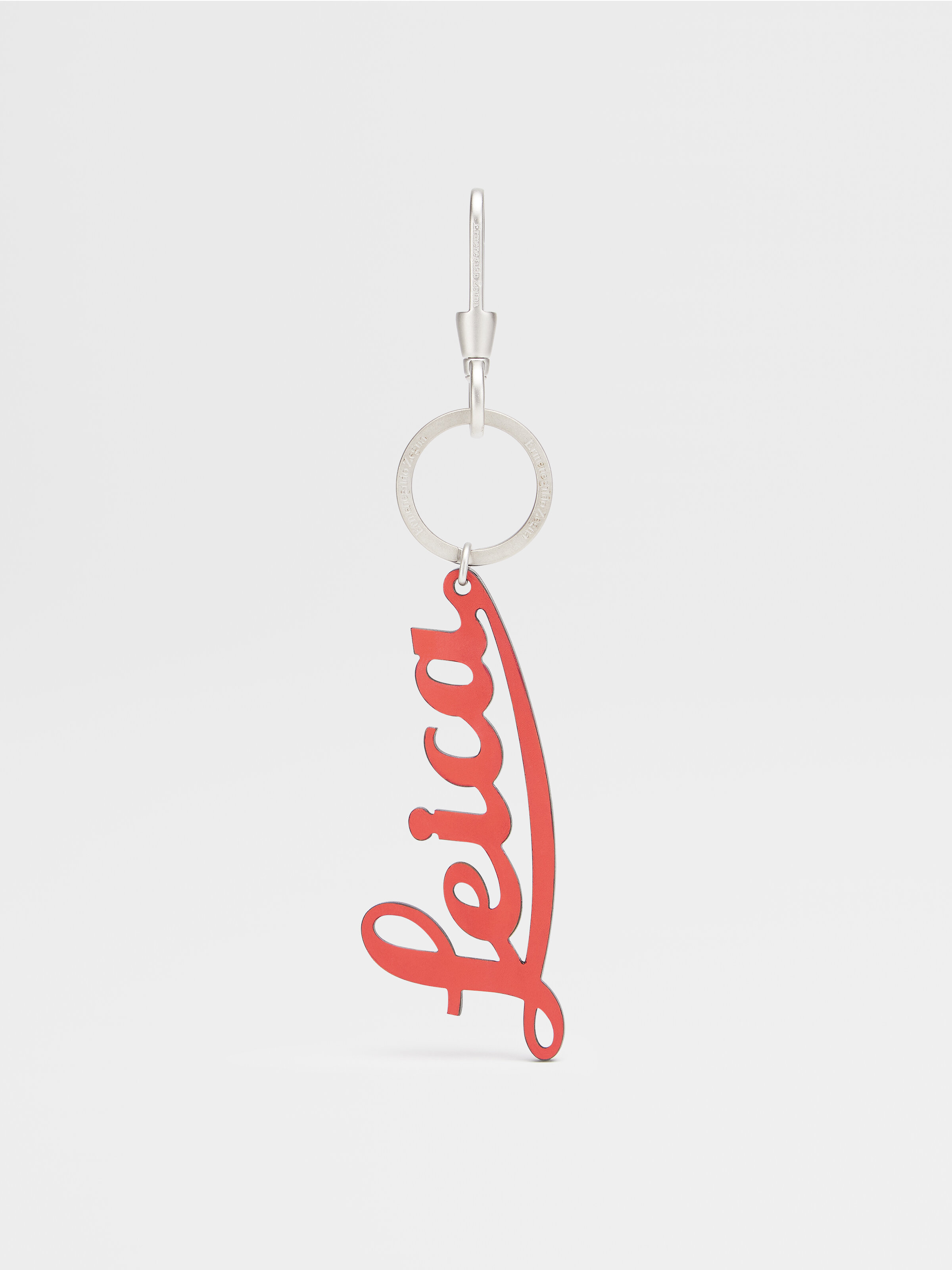
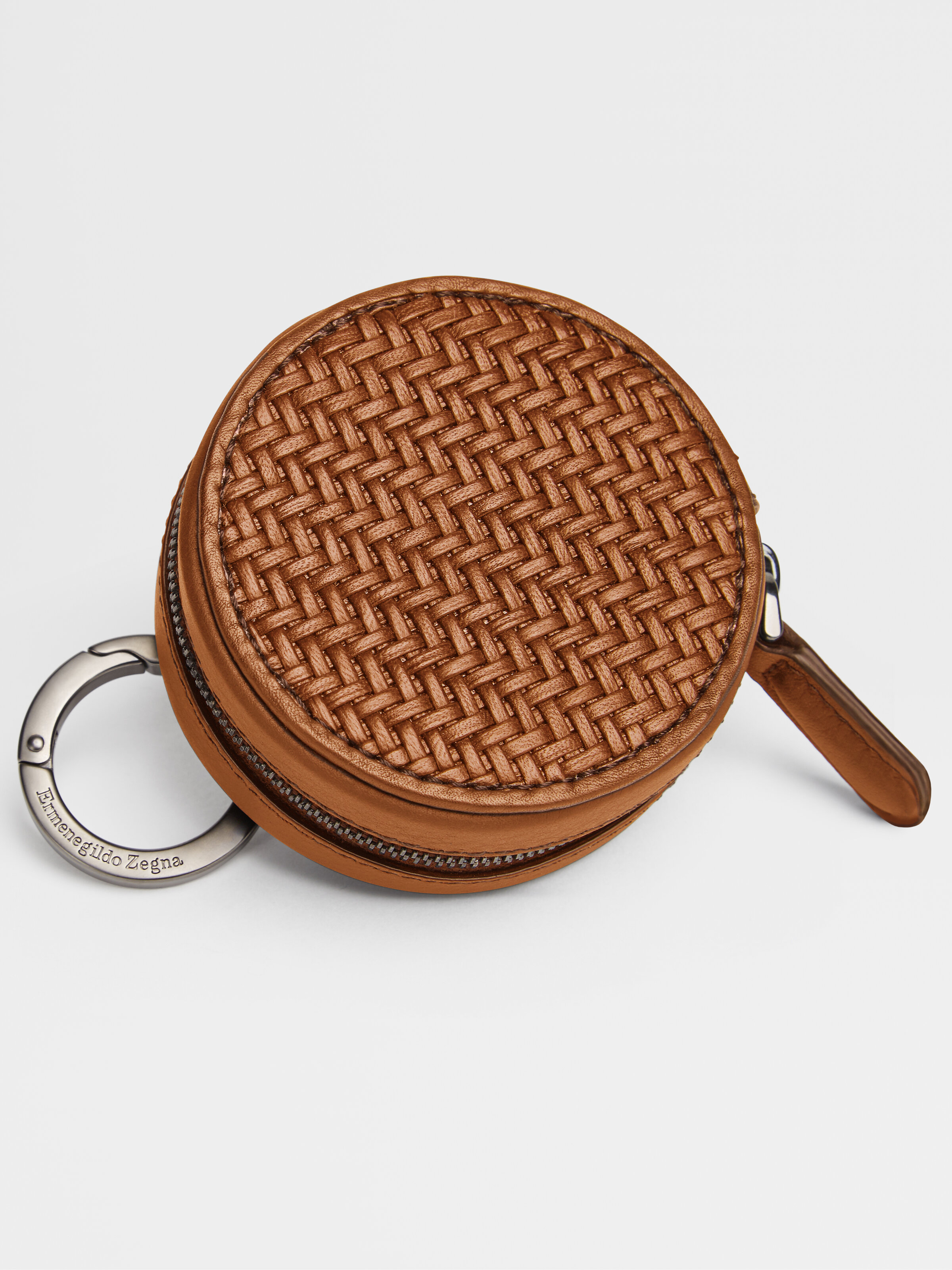
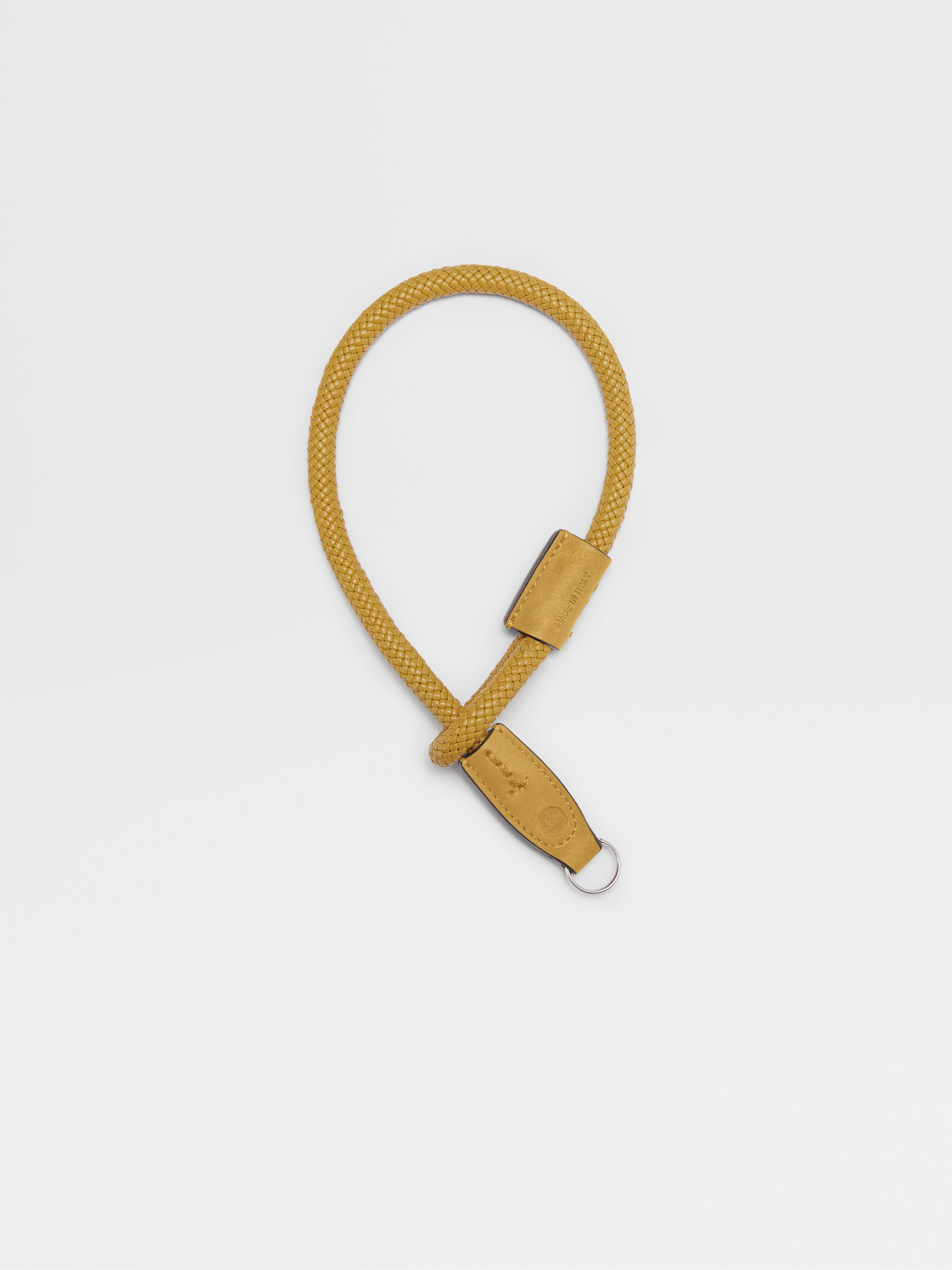
Designed for the modern photographer, in search of the most beautiful image but equally attentive to the subtle details of handmade craftsmanship, the collaboration strengthens the link between two expressions of art and creativity, reflecting a broader dialogue between the two brands.
Zegna Artistic Director Alessandro Sartori, a photography enthusiast and authentic Leica lover, has always been inspired by photography as a creative language that he often visually uses as a reference for his collections. His own passion led Zegna to a collaboration built upon the mutual expression of creativity and innovation, craftsmanship and technicality which further cements Zegna’s reputation as a global luxury lifestyle brand.
The collaboration collection consists in PELLETESSUTATM camera holsters for Leica Q2 and Leica M cameras; PELLETESSUTATM protectors for Leica Q2 and Leica M cameras; functional crossbody bags called Insta-Pack, inspired by photographers’ attitude that fit almost all Compact Leica cameras (Leica V-Lux excluded) and the Leica CL with the 18mm ‘pancake’ Leica lens; carrying and wrist straps; Leica keyrings and round wallets (both for coins or the Leica Q2 lens cap) that feature luxury details and precious touch of the PELLETESSUTATM collection, an iconic Zegna special woven nappa, result of an innovative Ermenegildo Zegna research aimed to recreate precious fabric using extremely thin strips of selected nappa leather in place of fabric yarns.“
“Zegna and Leica share the same values and very deep integrity and quality towards the excellence of their own products; my wish is to build up a long chapter together. The vision and the DNA of Leica have always been genuine, an obsessive quest for quality, extremely refined research, a very unique approach towards not only the world of camera and photography but mostly towards the craftsmanship and a distinctive syntax” says Alessandro Sartori, Zegna Artistic Director.
“What a wonderful addition: The creation of a Leica camera, moving images and a Zegna garment is unique and outstanding. Both brands share the same humanistic approach for values, design, sustainability, and quality” says Karin Rehn-Kaufmann, Leica Global Director Art and Leica Galleries.

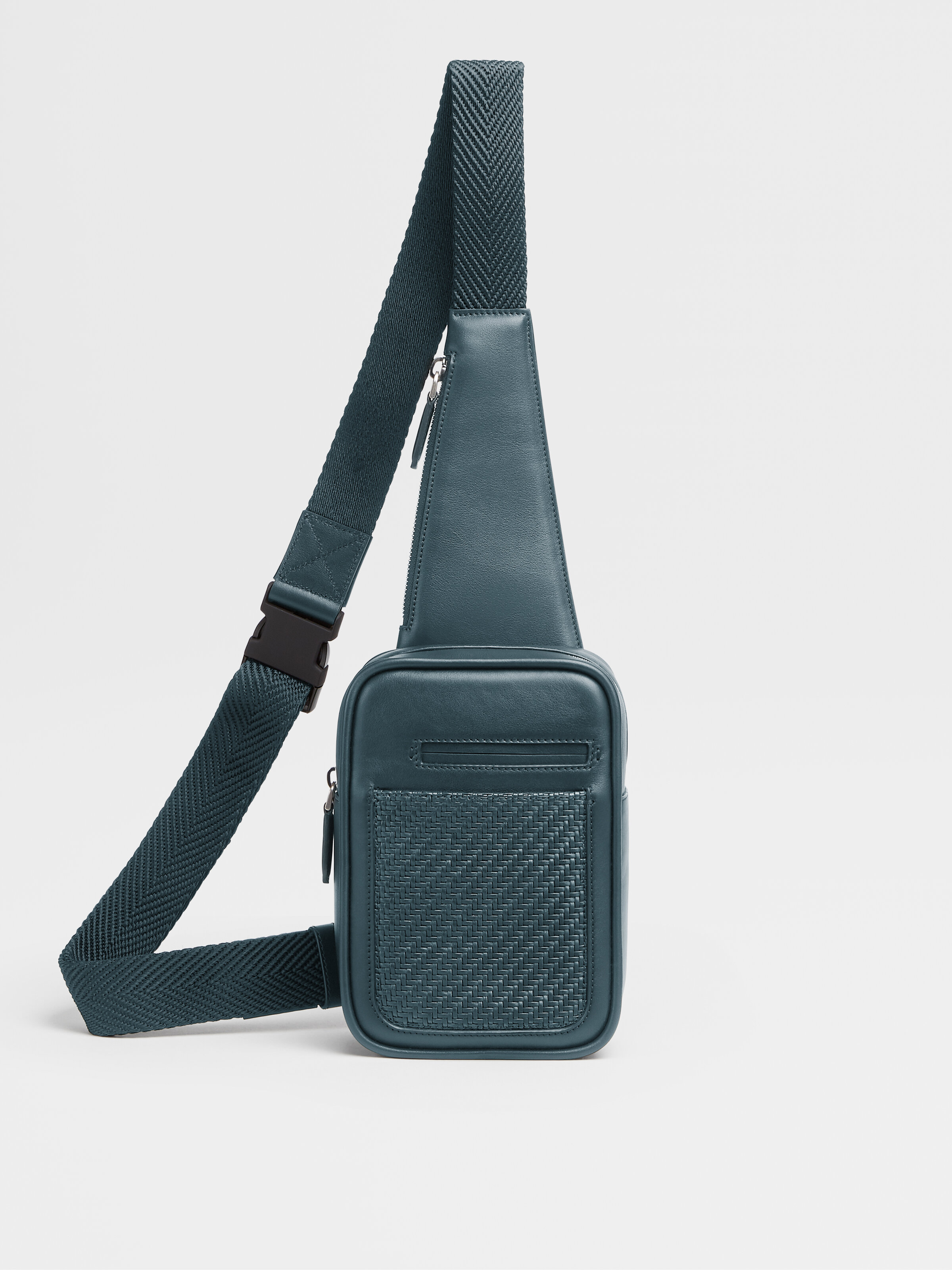


The Zegna and Leica collaboration collection are distributed globally in an exclusive selection of Zegna Flagship Stores (such as New York City, Paris, London, Milan, Dubai, Shanghai, Beijing, Ginza, Isetan) as well as in 60 select Leica stores worldwide.
The collection is also available on-line, on zegna.com and leica-camera.com.




![[FOR DIGITAL ONLY] FW20 Leica - 03 9x16.jpg](https://images.squarespace-cdn.com/content/v1/5260d046e4b0c0ba62540470/1607322652279-JAV9WNOVU431207KO4JK/%5BFOR+DIGITAL+ONLY%5D+FW20+Leica+-+03+9x16.jpg)