The whimsical curves on the Loïe suspension
To celebrate their 10th anniversary, the leading Parisian design studio MYDRIAZ unveils a capsule collection that combines oneiric elegance with a contemporary twist.
To celebrate their 10th anniversary, the leading Parisian design studio MYDRIAZ unveils a capsule collection that combines oneiric elegance with a contemporary twist. With the introduction of the first new indulgence product range, MYDRIAZ is broadening its audience. The Loïe suspension is the first piece of this coveted collection made exclusively in MYDRIAZ’s workshop in Paris.
Striving to combine artistic and artisanal disciplines, this new series celebrates MYDRIAZ’s co-founders and designers, Jennifer Midoz and Malo du Bouëtiez.
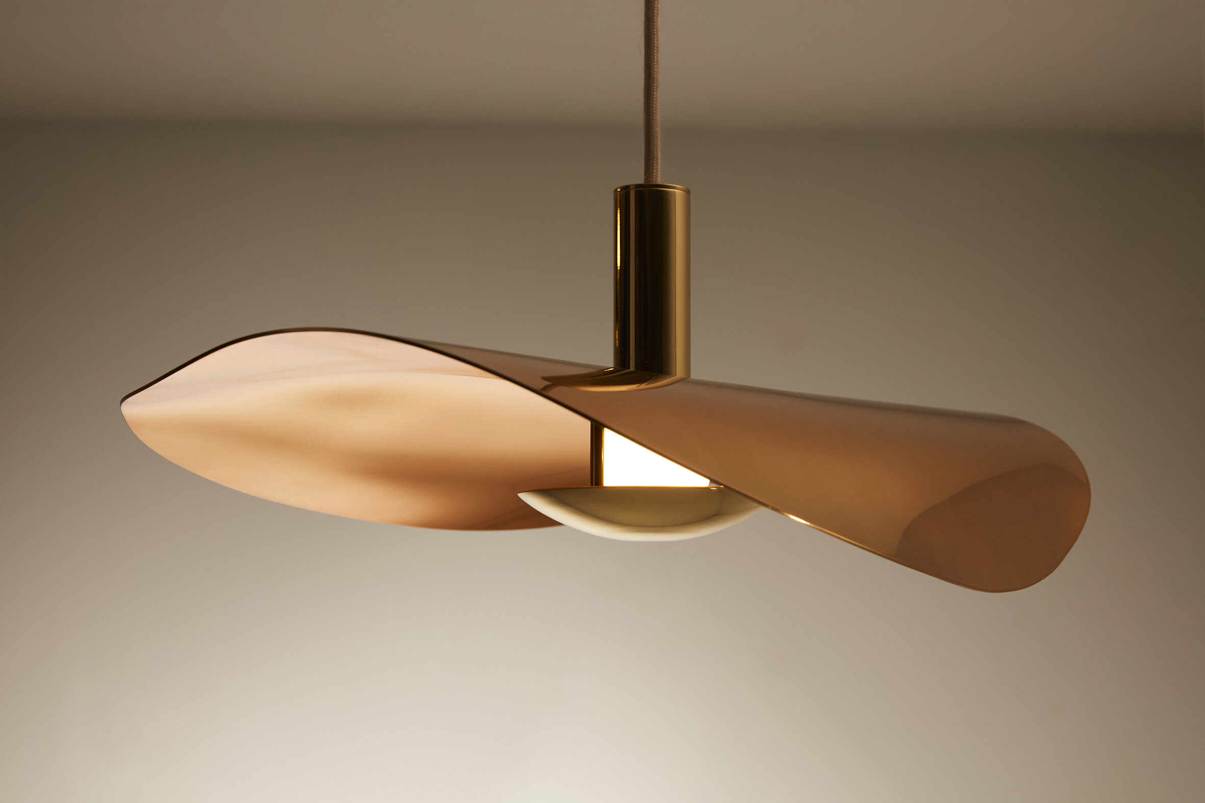
The new Loïe suspension encompasses traditional metalwork with contemporary techniques. Its shape was inspired by the light and airy Serpentine dance movements pioneered by American artist Loïe Fuller. The shimmering of the delicate fabric and the floaty allure of the moving material on the dancer’s costumes is reimagined onto the brass structure of the light.
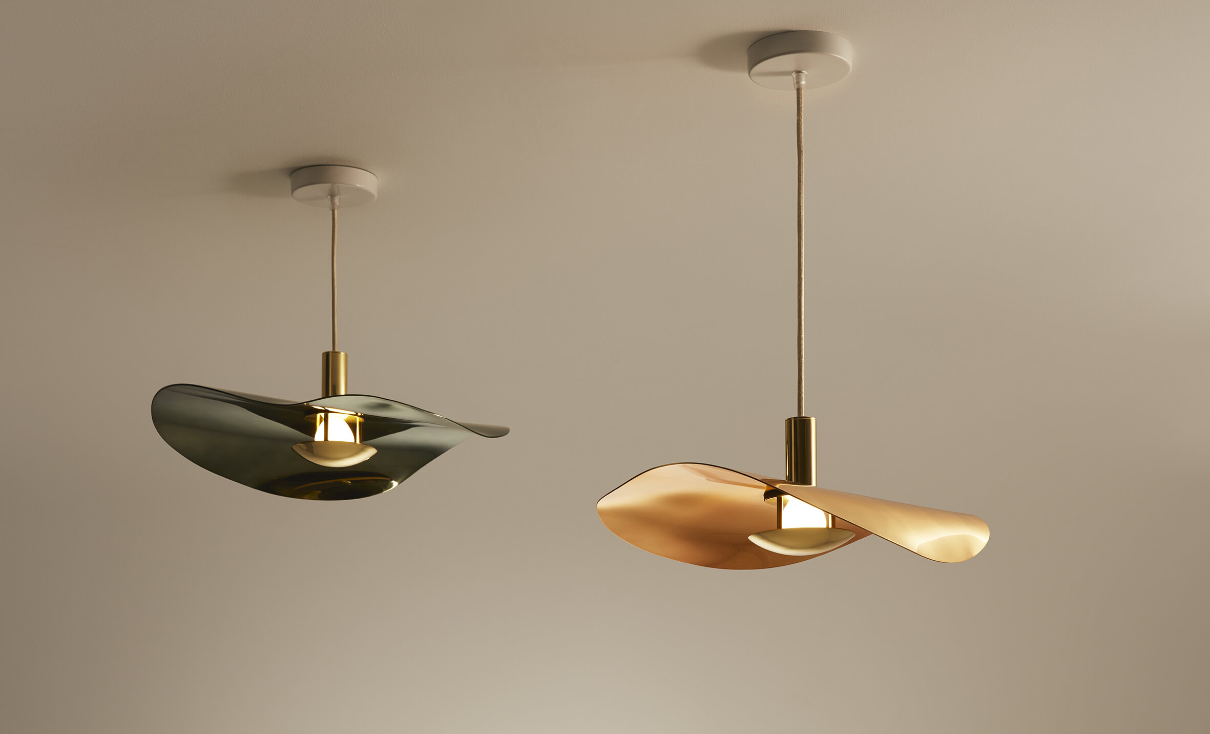
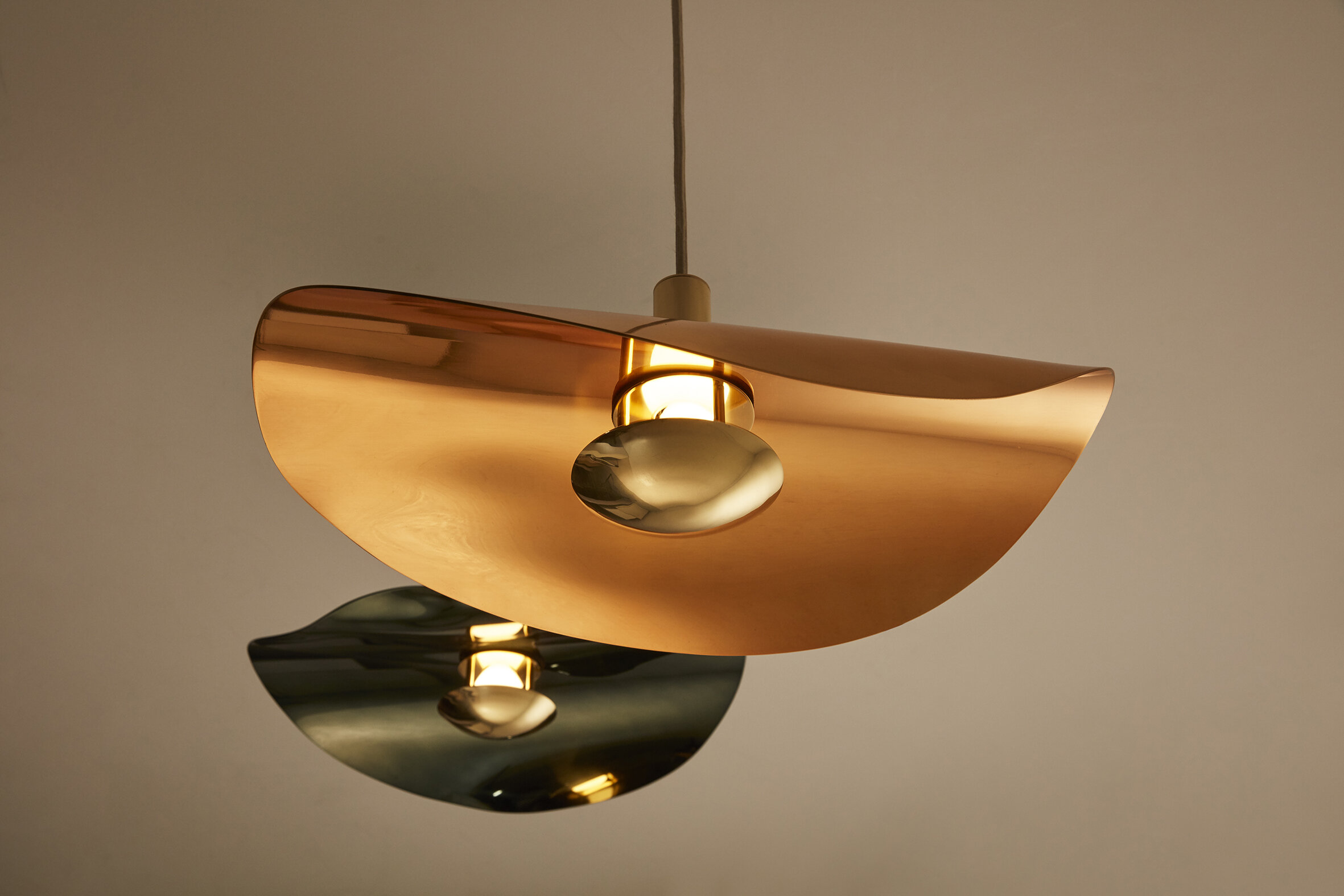
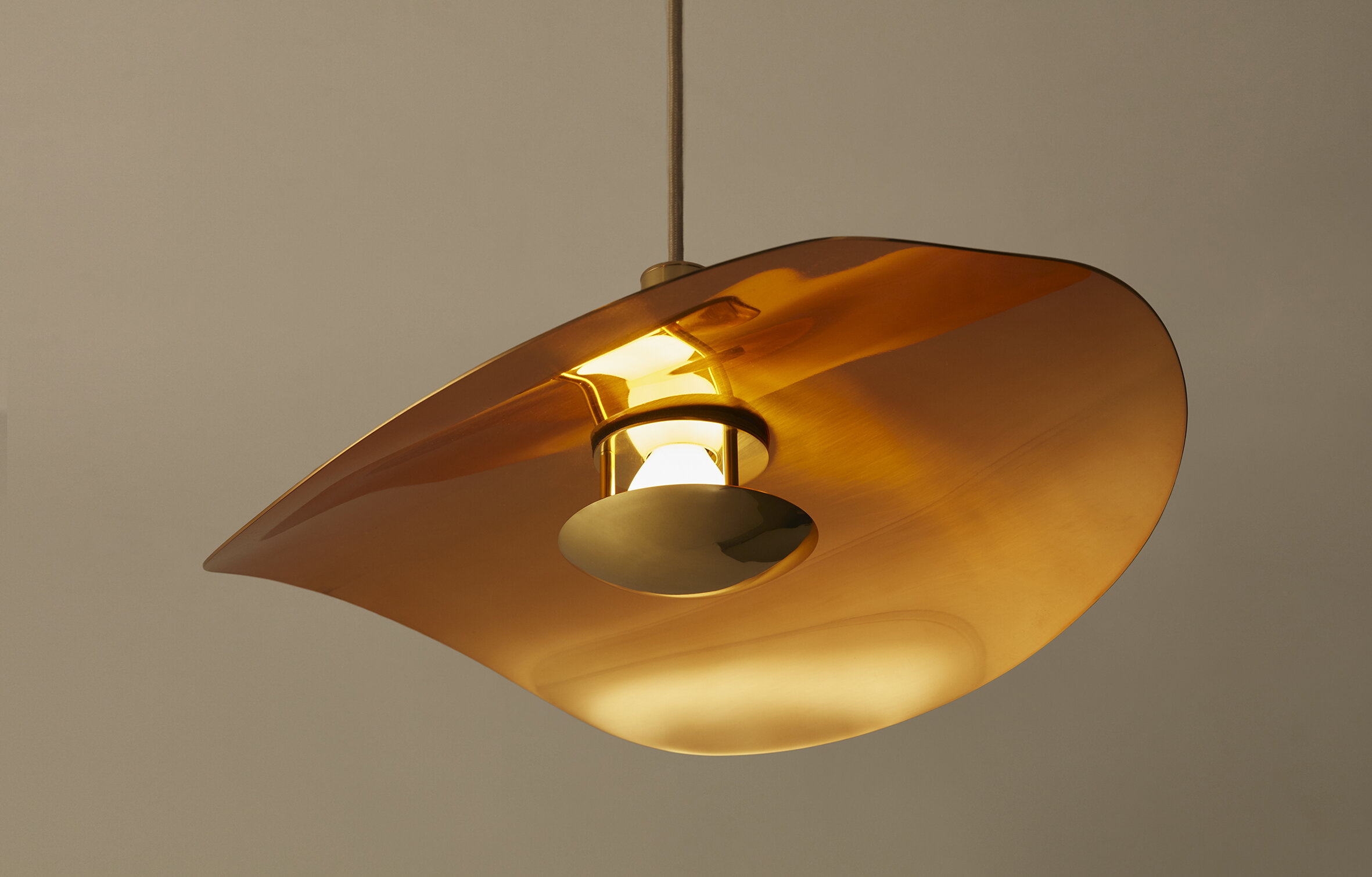
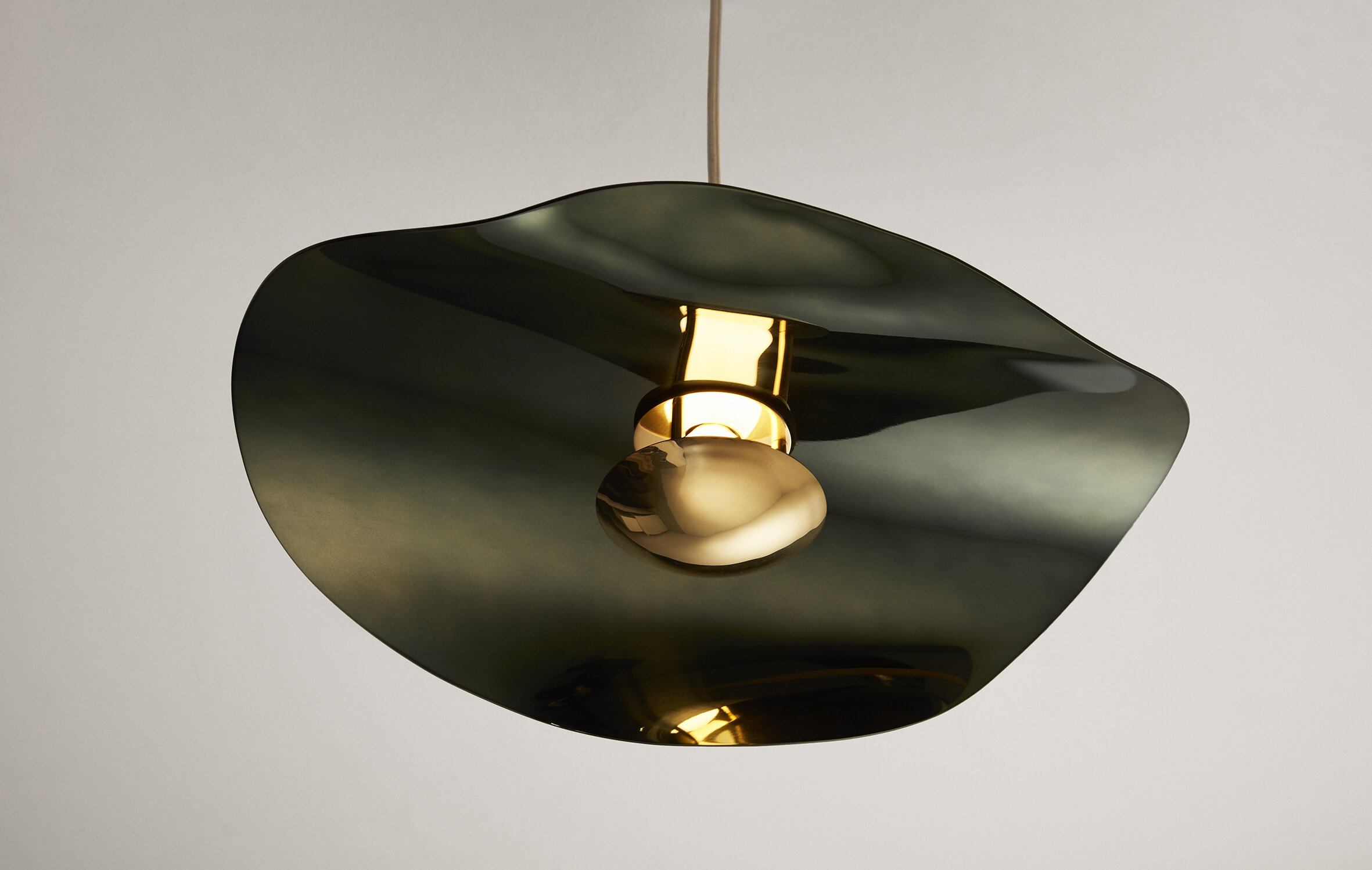
To create the whimsical curves on the Loïe suspension, the metal is continuously heated with a bright flame to allow it to be randomly sculpted until a perfect and unique supernova shape is achieved.
This technique has become typical of the studio’s collections. It was a process first used for the Mercure light, and after thorough research and development, it was extended and adapted to several other creations, allowing greater freedom in the design and conception phase.
Available in green and copper, the colour varnish has been chosen to harmonize and enhance the natural property of the underlying brass.
The Loïe suspension combines the design ethos and creative methods of MYDRIAZ, giving birth to an exceptional piece that radiates and brings warmth to a room.
The high-street collection will soon welcome new pieces, competing in innovation and ingenuity in the work and association of materials. They will be distributed across emblematic stores worldwide.
Specifications :
Made in small quantities by hand
in Mydriaz’s Parisian workshop
42 x 32 x 15 cm
Brass and coloured varnish
1350,00€ (excl. Tax)
For more information, please visit: www.mydriaz-paris.com
Unlock your Imagination, Open your Mind to a Brilliant Prospect
The Existence of a City Depends on Memory
By naming the project in Chinese after the “Nanjing Brocade” –a traditional article famous for its cloud-like colours and intricate patterns, China Overseas Land & Investment pays homage to the heritage of a city, the place where the best fabrics in the country are produced: the “Fifth Cotton Mill.”
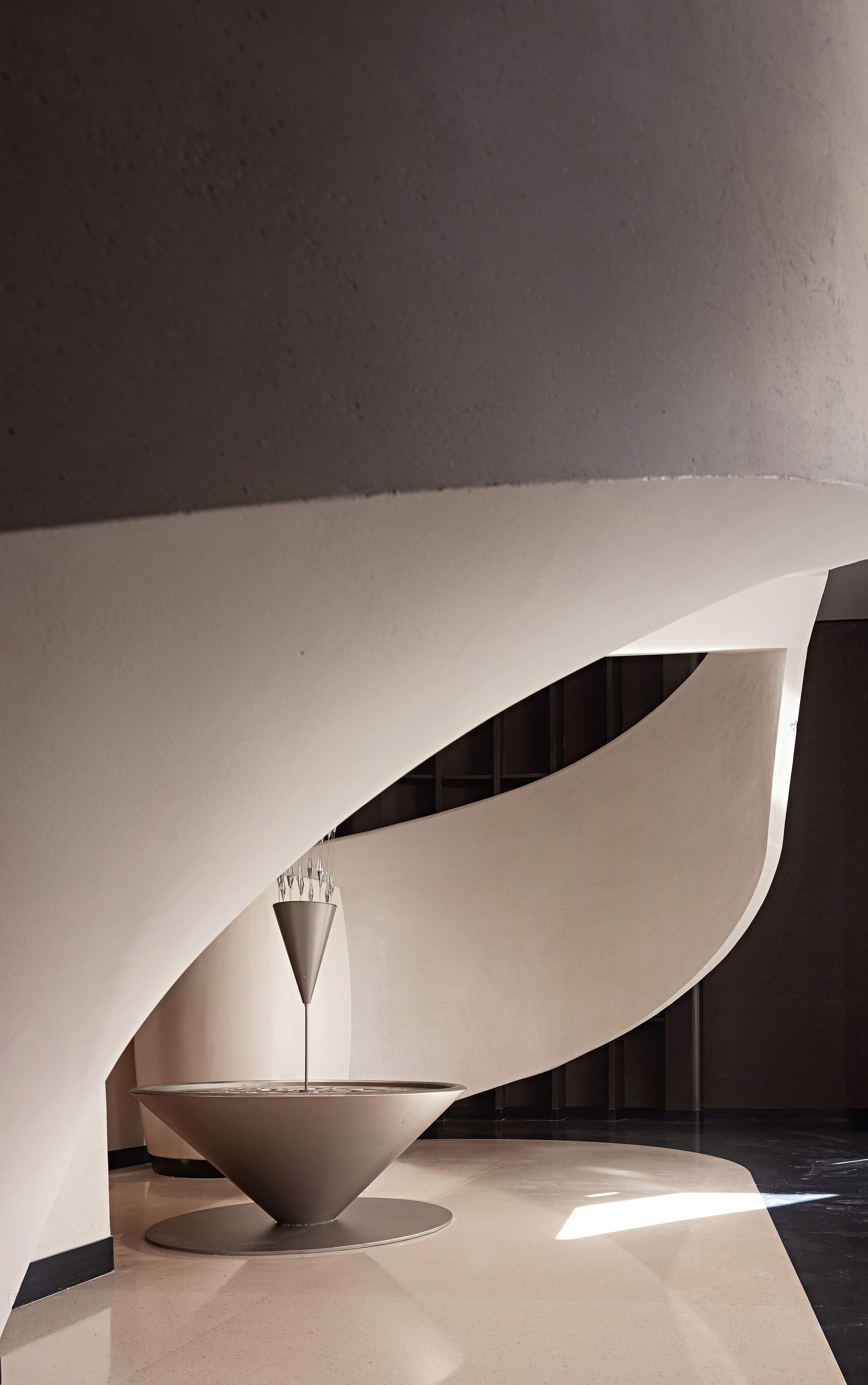
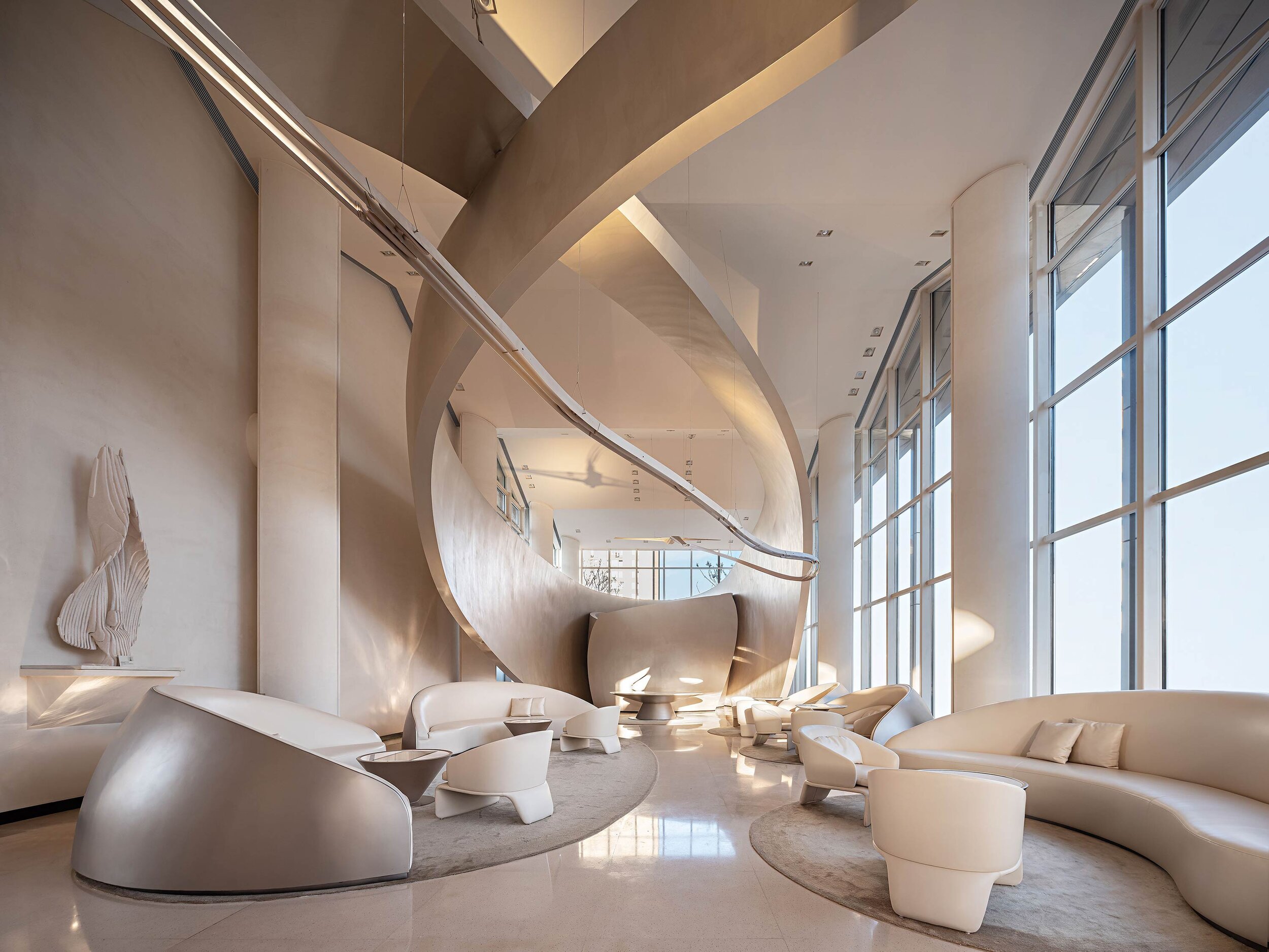
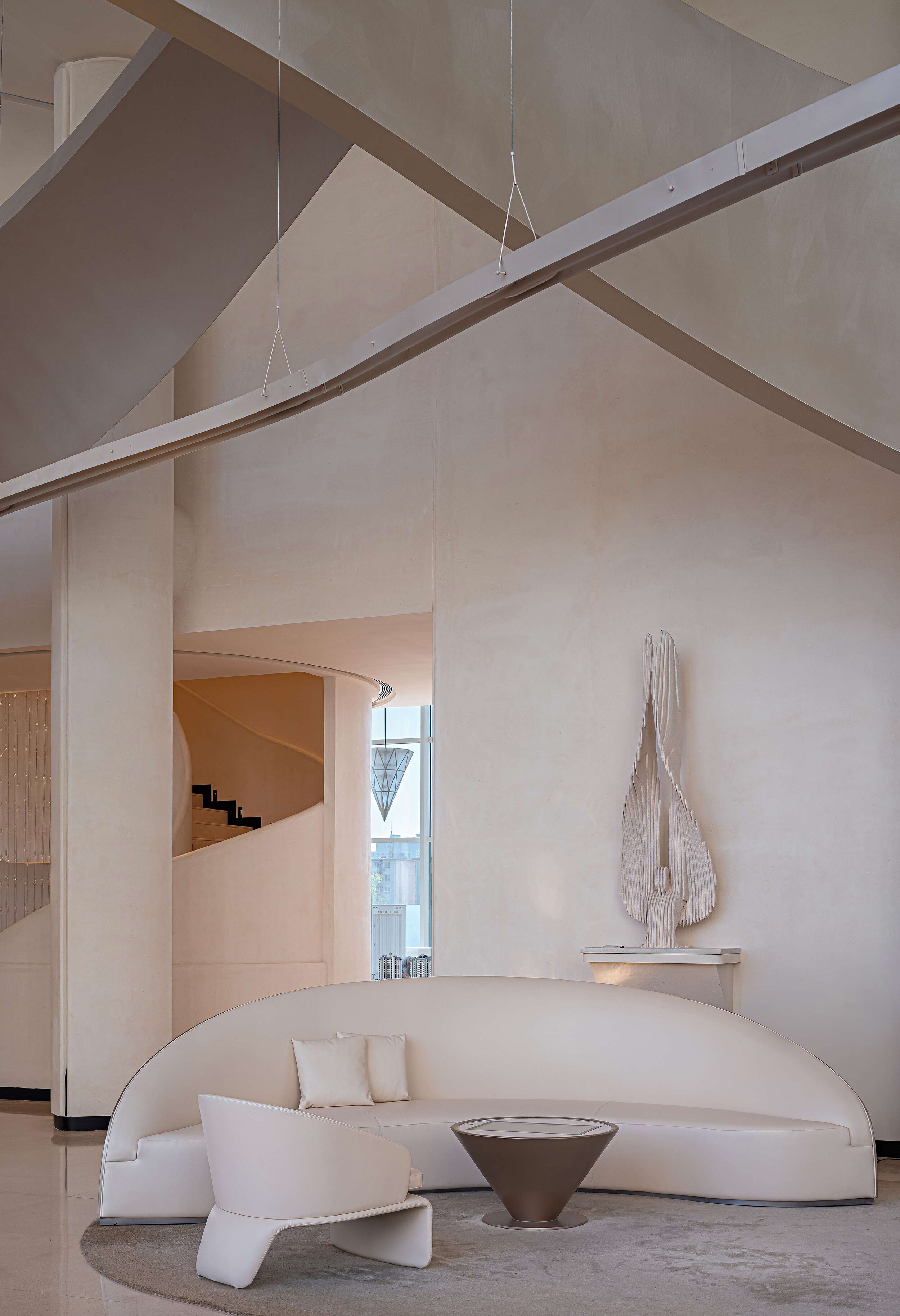
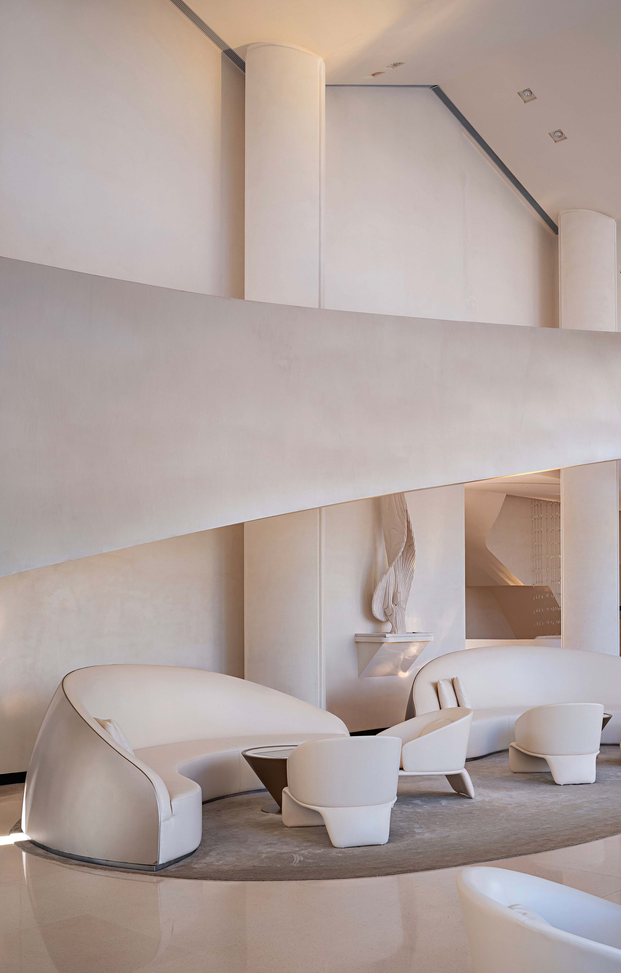
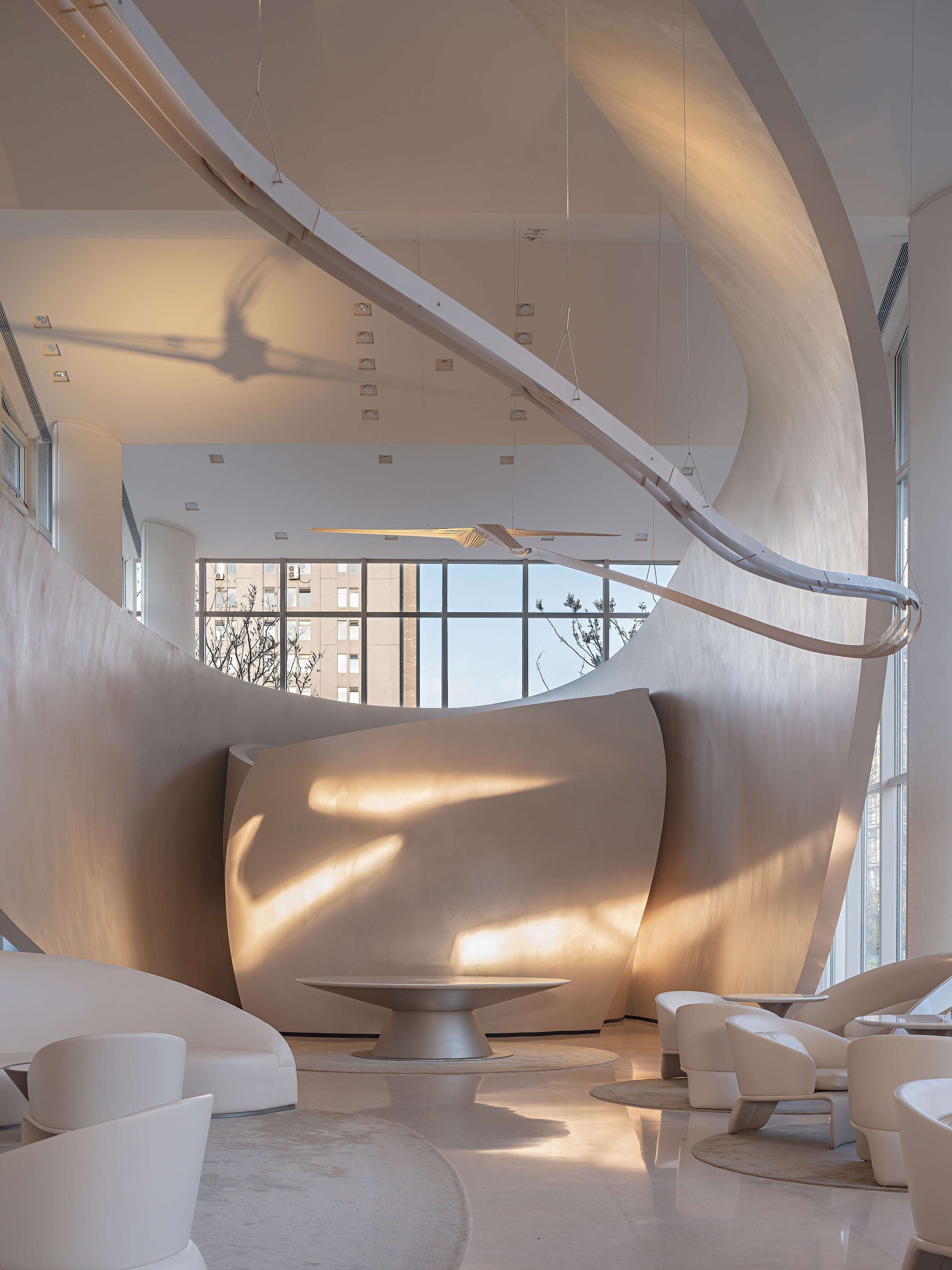
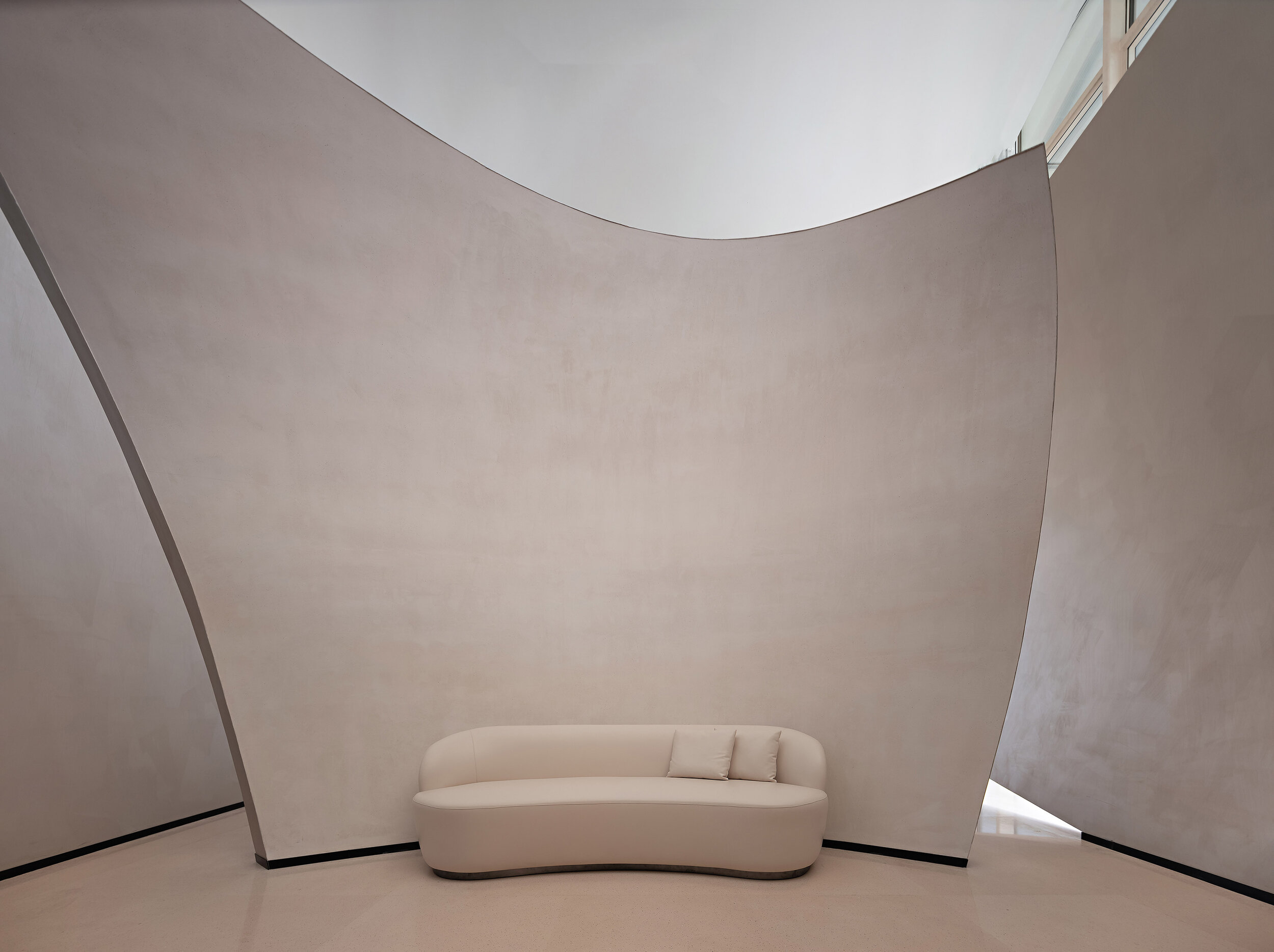
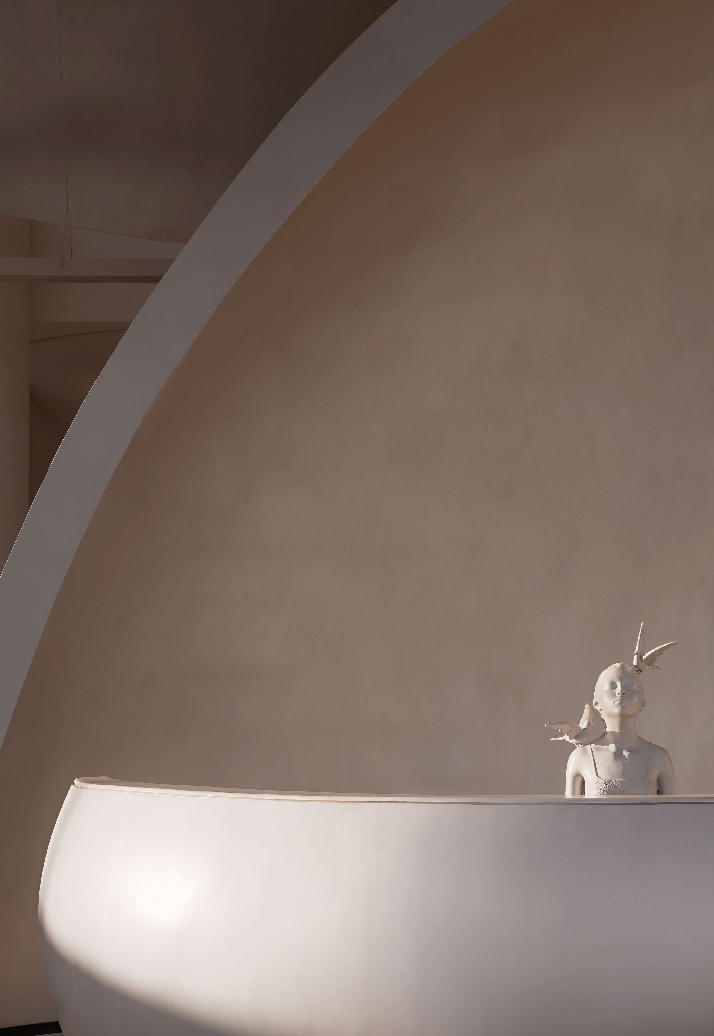
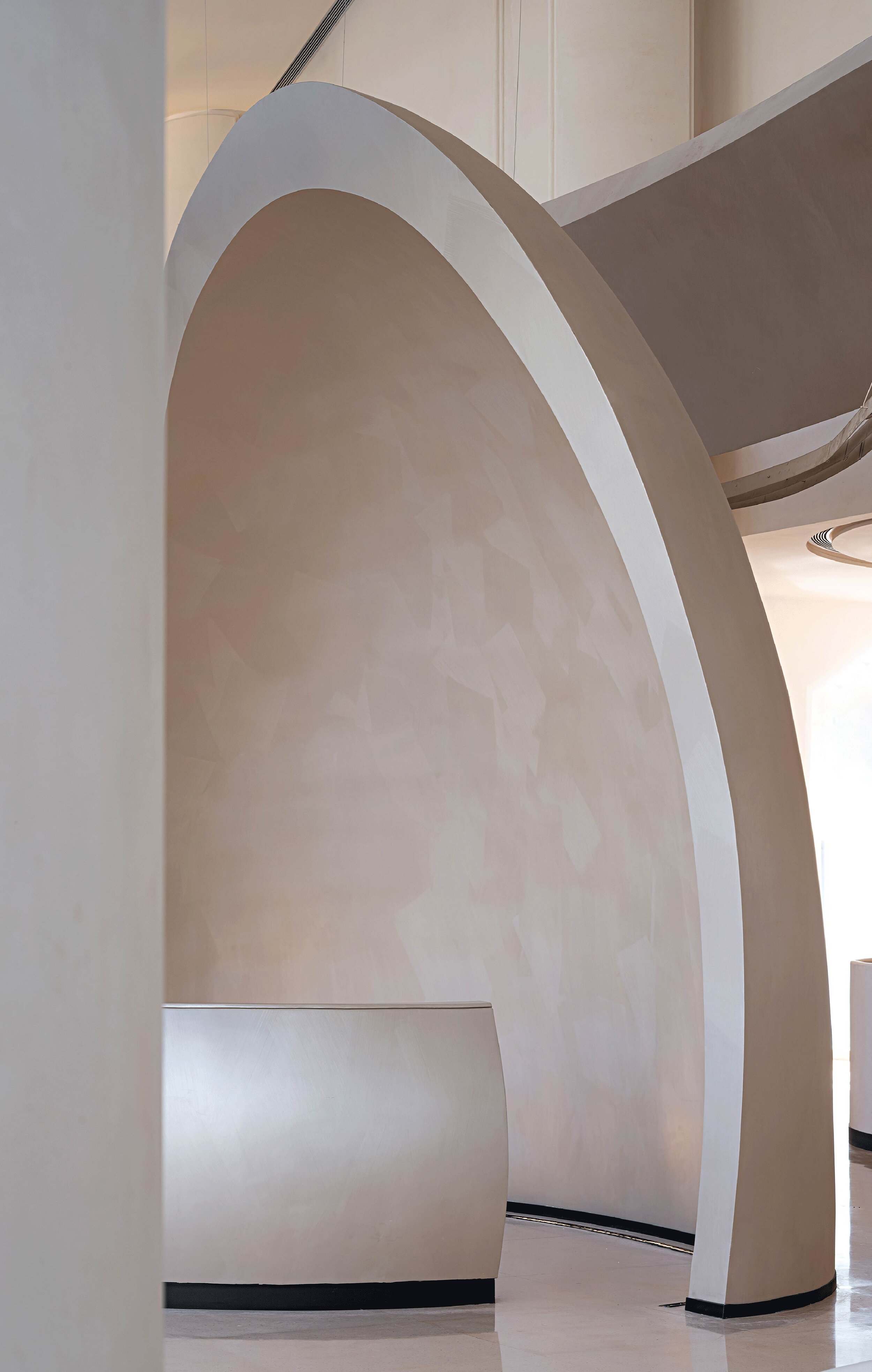
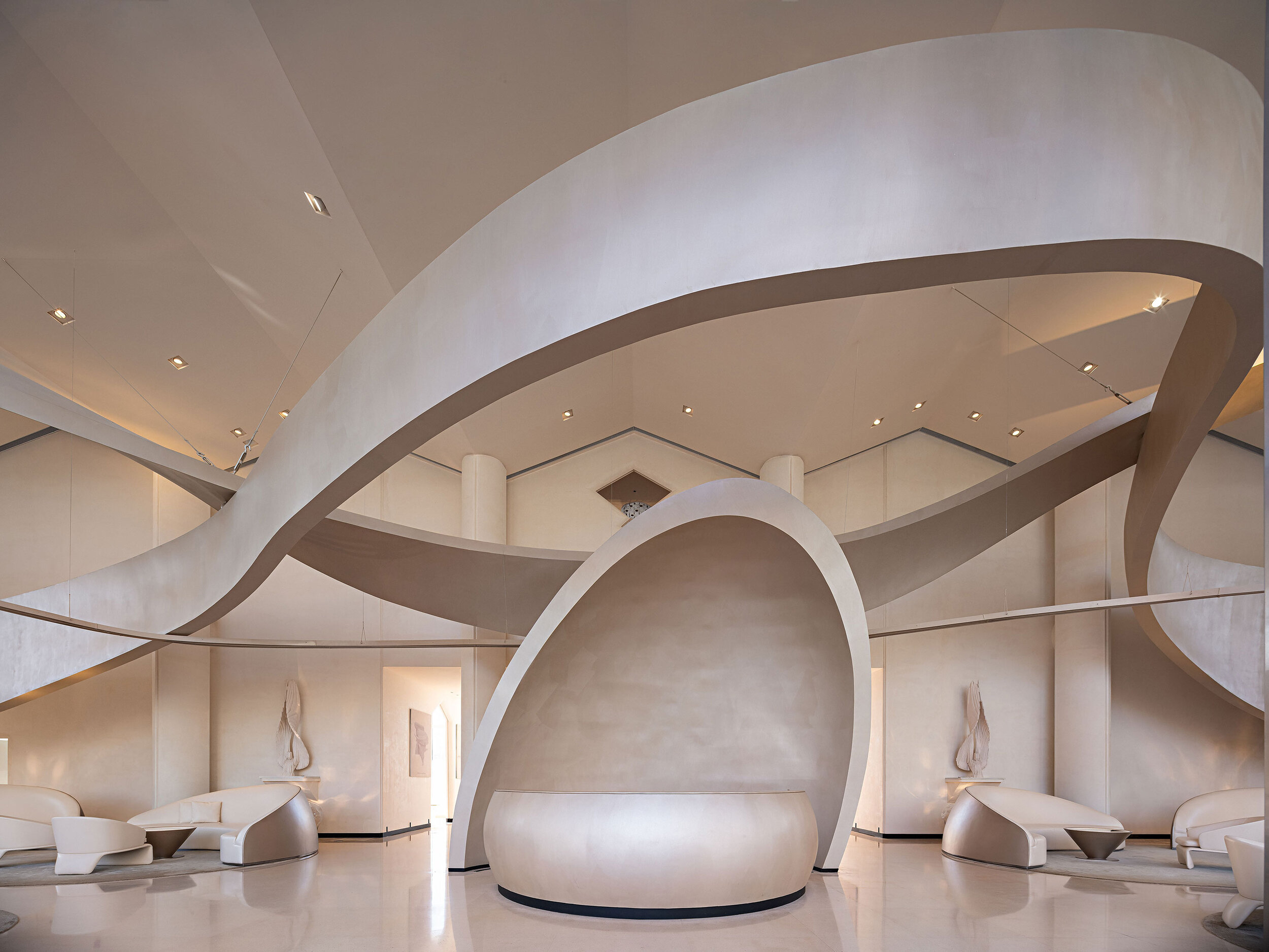
The mill has been a part of Chinese culture for different generations. It is the prime model of how space can become a symbolic memory. The connection between the mill, the city, and society creates a dialogue between architecture, space, and people.
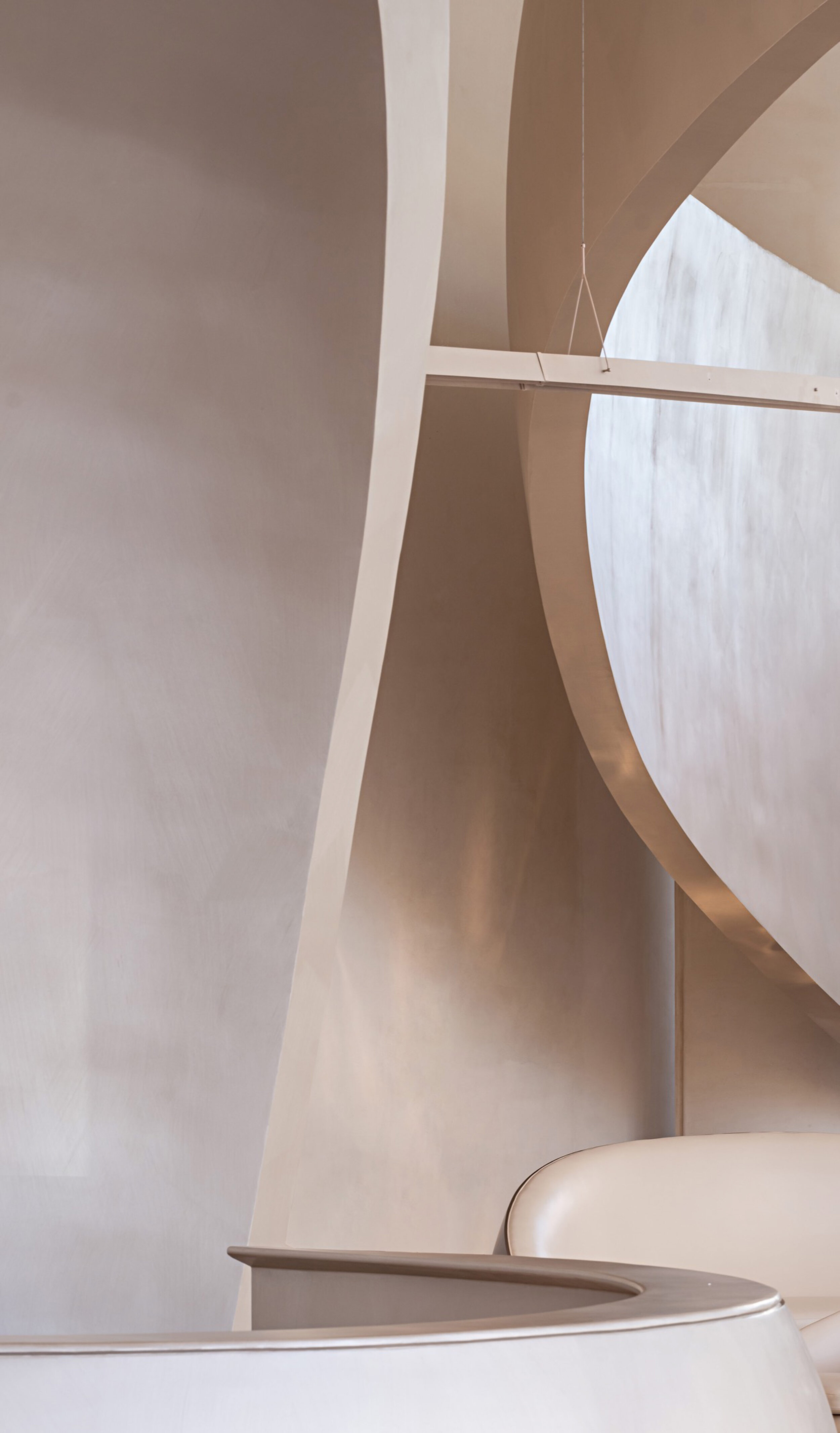
The designer had arranged the space created similar to a carrier inside a glass box to generate fluid forms and dynamic sculptures resembling the sinuous shapes of the Nanjing brocade, extensive sand dunes that transform time into organic musical patterns.
In Art, Past and Present Overlap while the Old and the New Establish a Unique Dialogue.
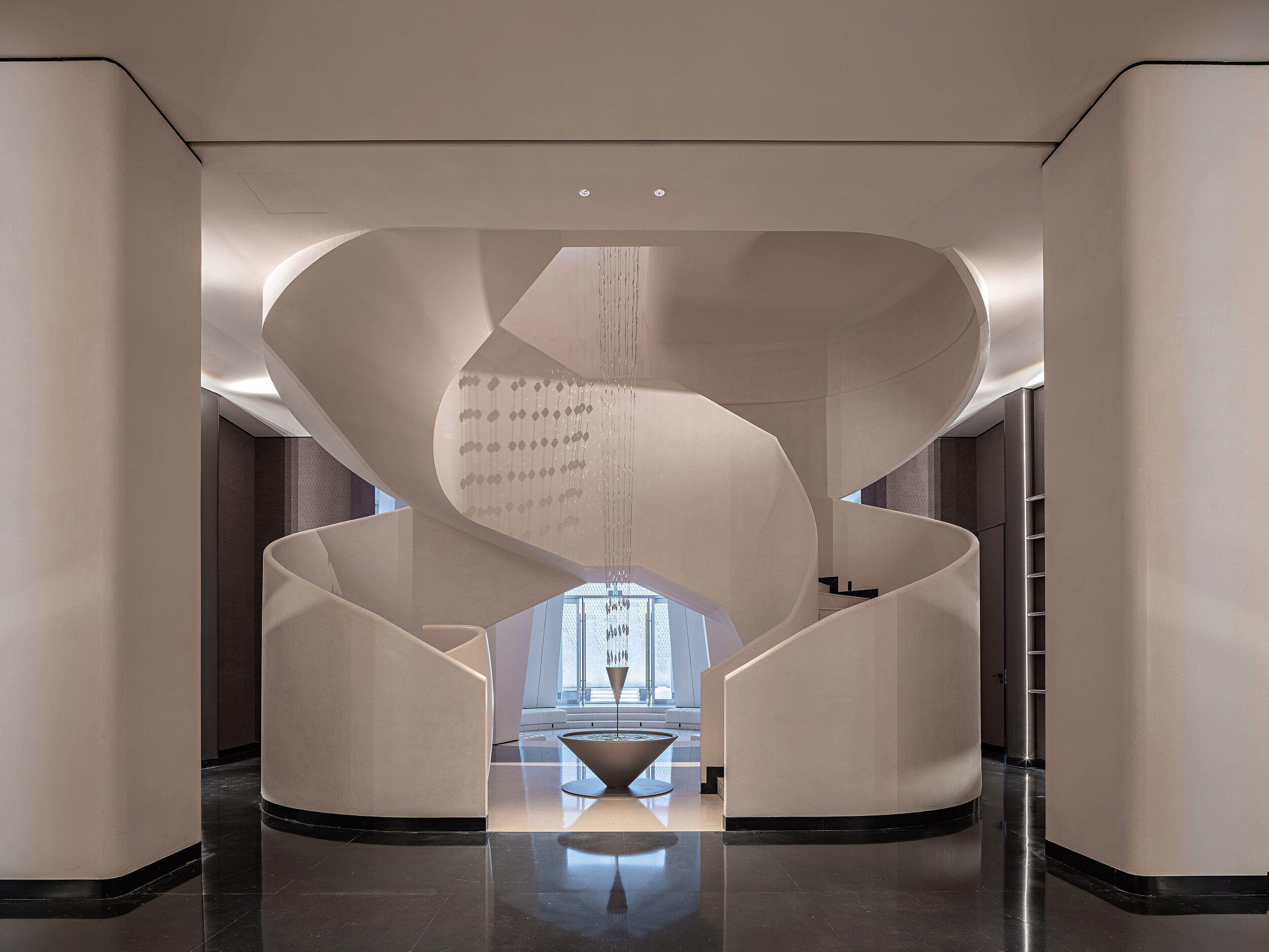
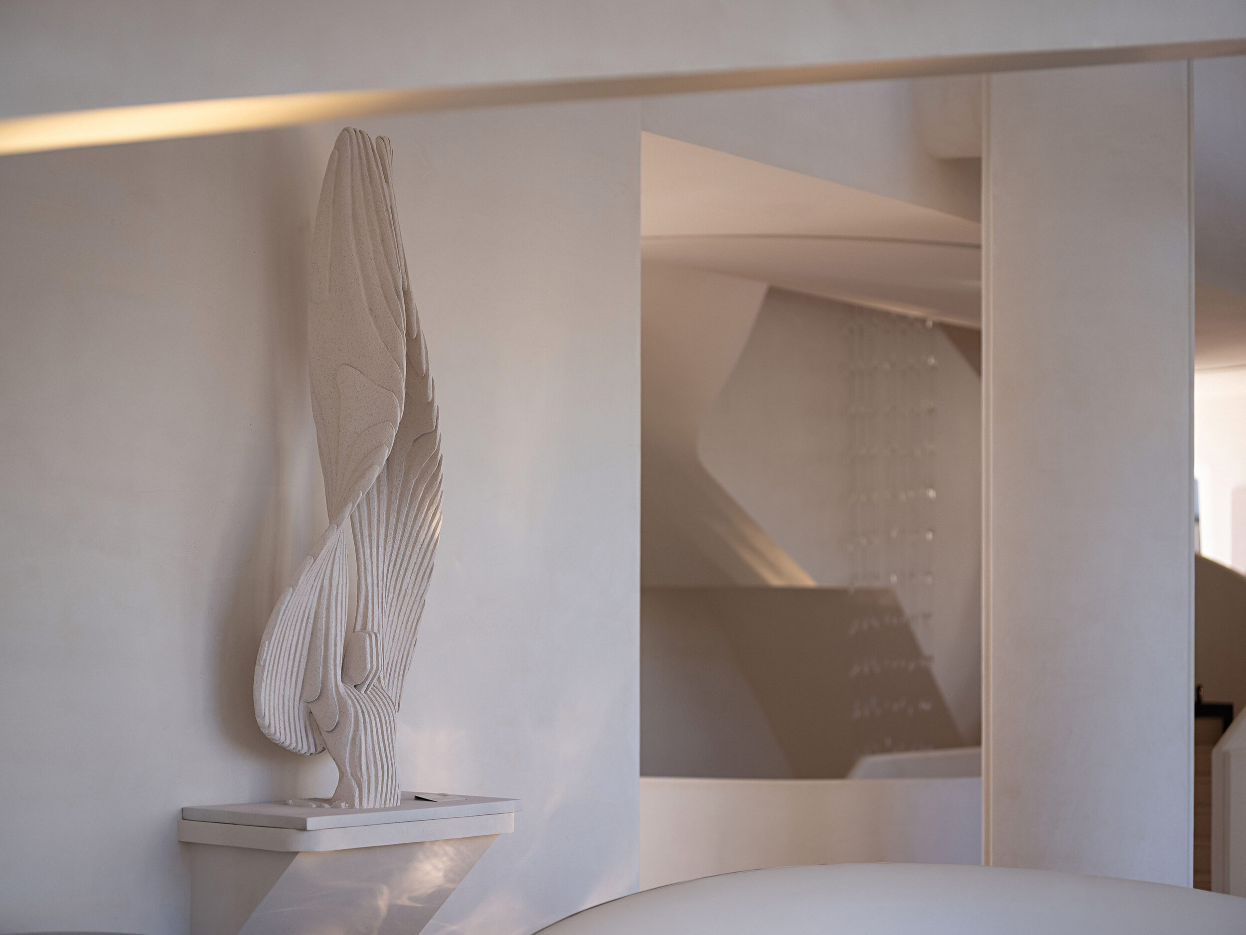
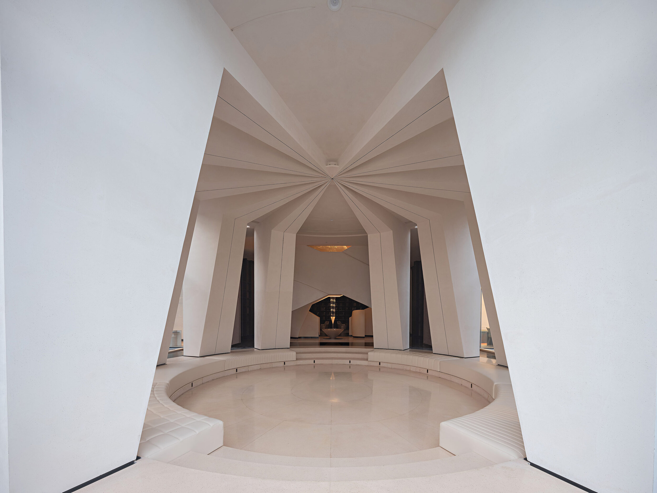
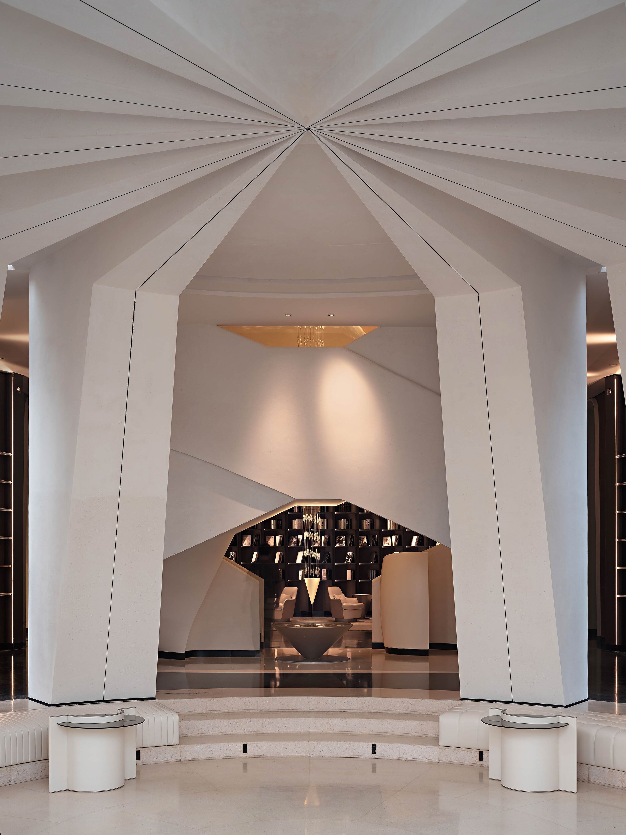
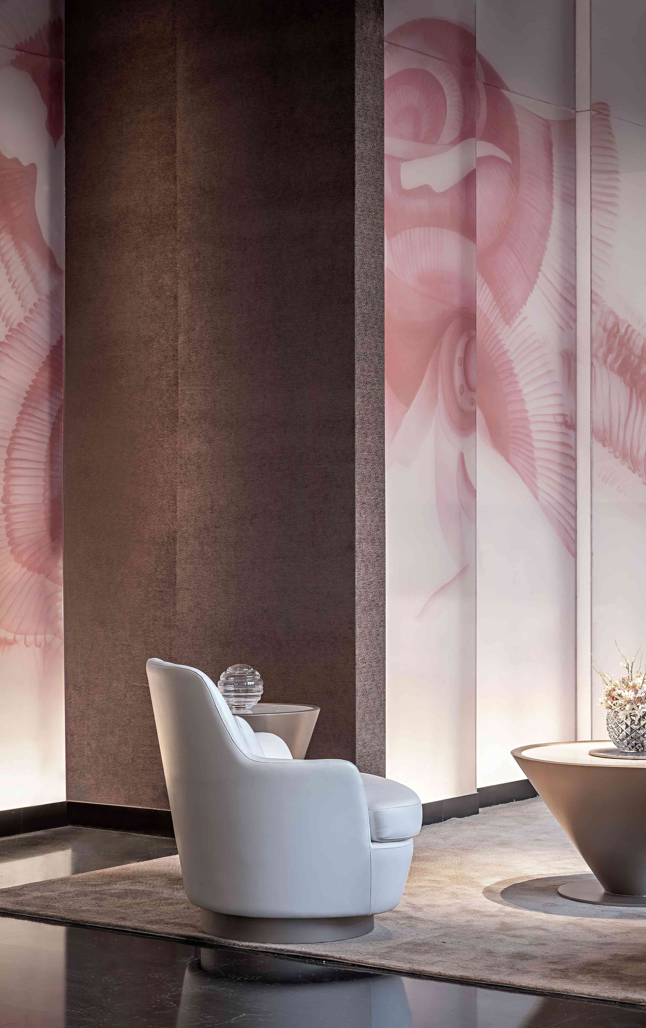
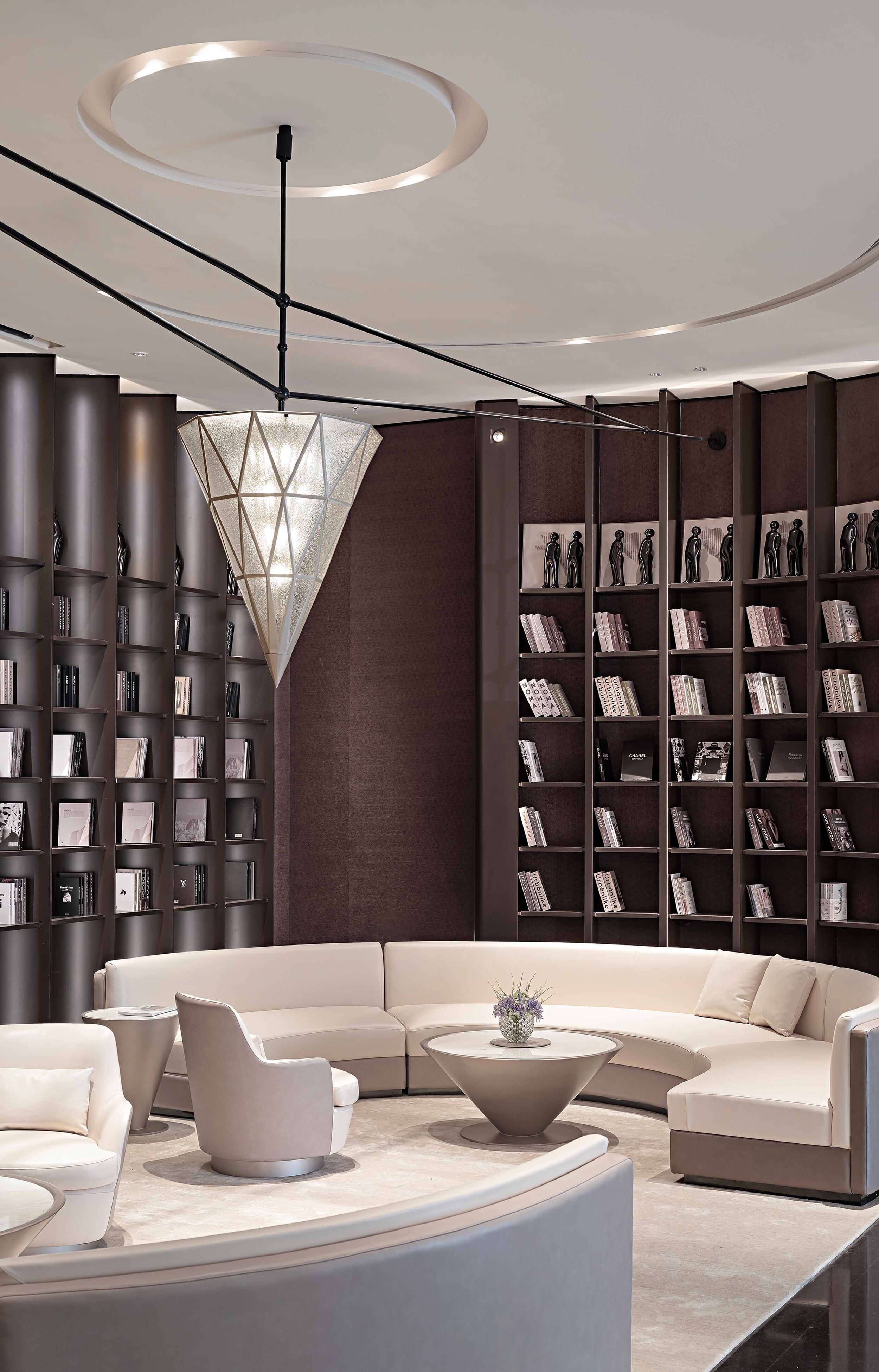
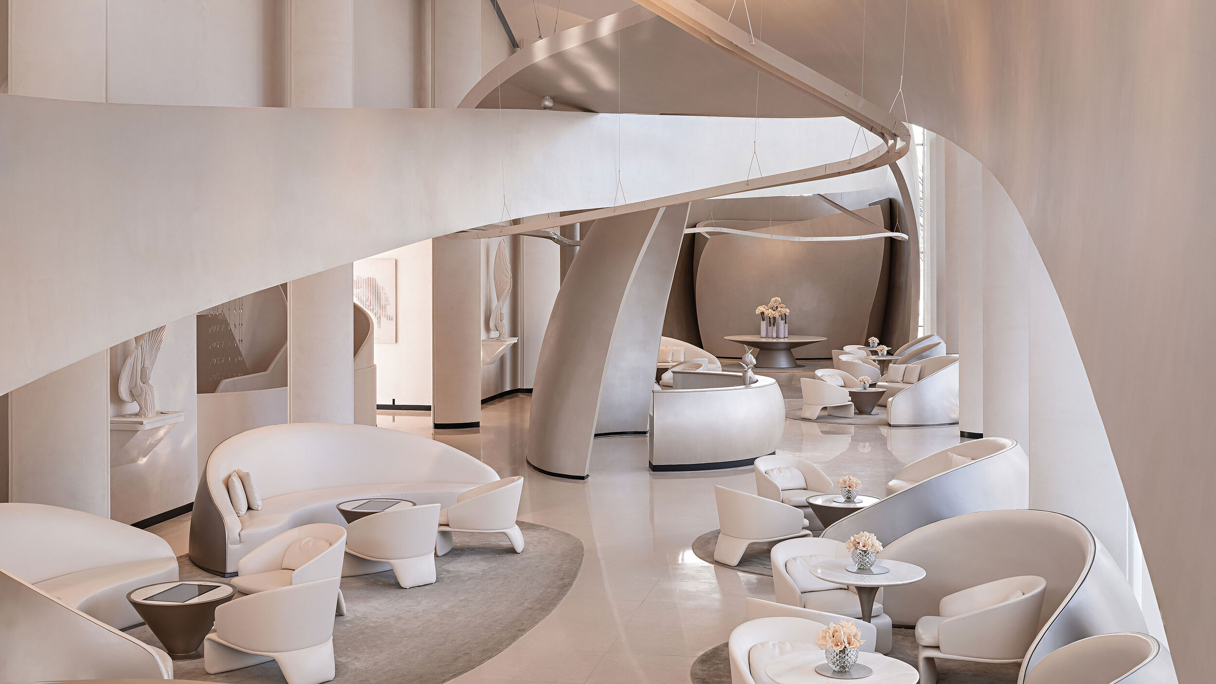
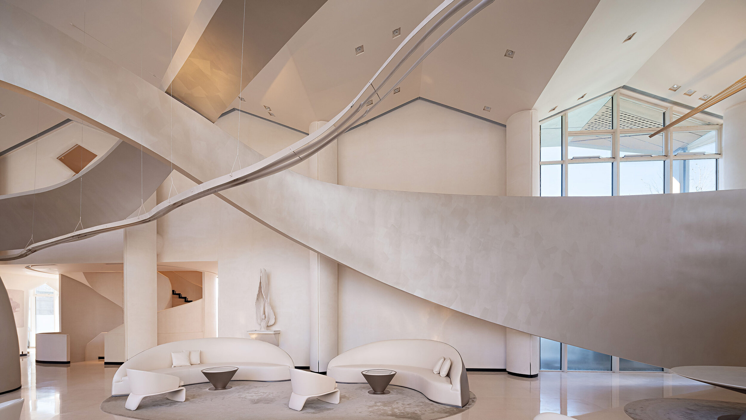
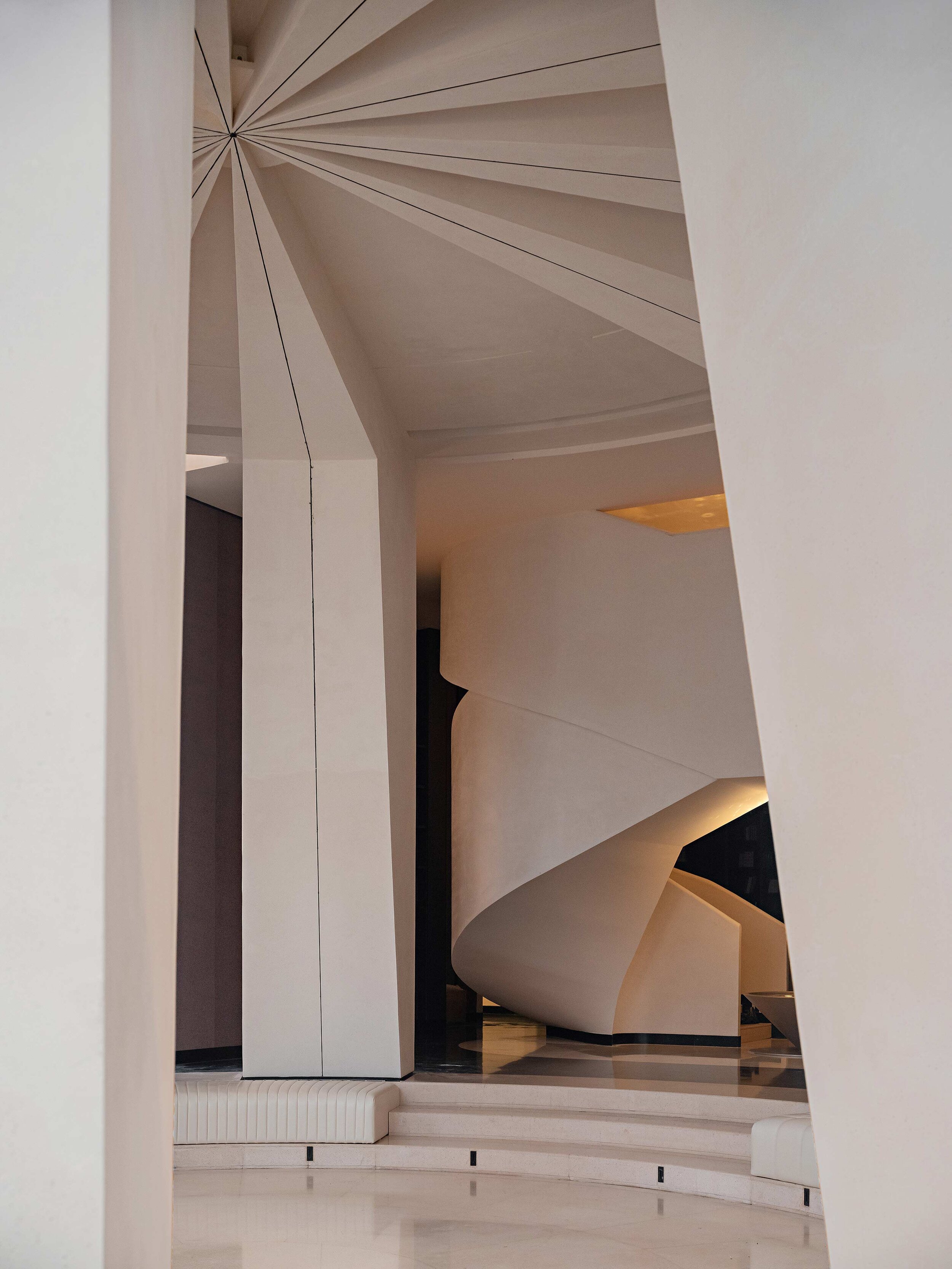
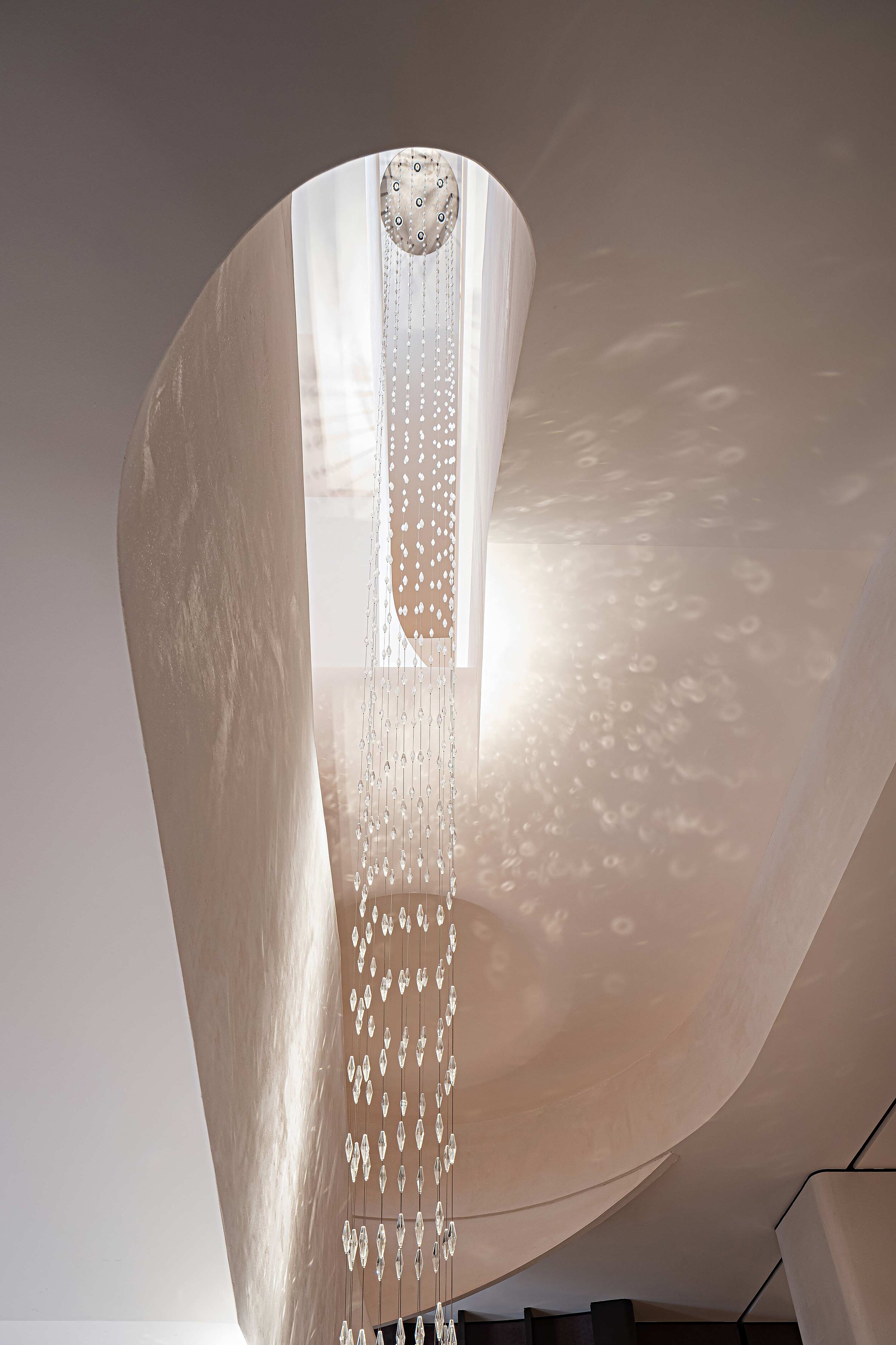
The designer takes elements from nature and memory and twists them into threads that weave an architectural brocade, using flexible curves to provide artistic tension to the surrounding environment, combining memories with physical space.
Memories evolve before our eyes as if weaved with fine silk threads. Countless flying yarns condense day and night into a winged sculpture, a threader moving swiftly between giant ribbons in space.
A fifty-two-meter-long and nine-meter-wide sculpture rises toward the sky and extends through the whole interior space of the property. Inspiration for the piece comes from Chinese brocade, revolving and dancing around, both intertwined and scattered simultaneously, outlining the shape of an infinite loop, aiming toward the future.
“We highlight the cultural features of the cotton industry in China. Using space to connects the past with the future. Through a dynamic momentum to create outlines, the beauty of life in bloom with unique elements from the past and formidable sights into future”. – said the designer.
“Time” is the Essence behind Brilliant Prospect
The designer adopted a unique artistic language to define Brilliant Prospect –the project’s name in English. Such a creative approach represents a distinctive landmark composed of artistic and cultural elements.
And thus, sinuous curves grow around the space, weaving segments of time into particular groups, orchestrating multiple ideas into one. Like an epic opera, its magnificent forms fascinate people with a distinctive charm.
Unlock your Imagination, Open your Mind to a Brilliant Prospect
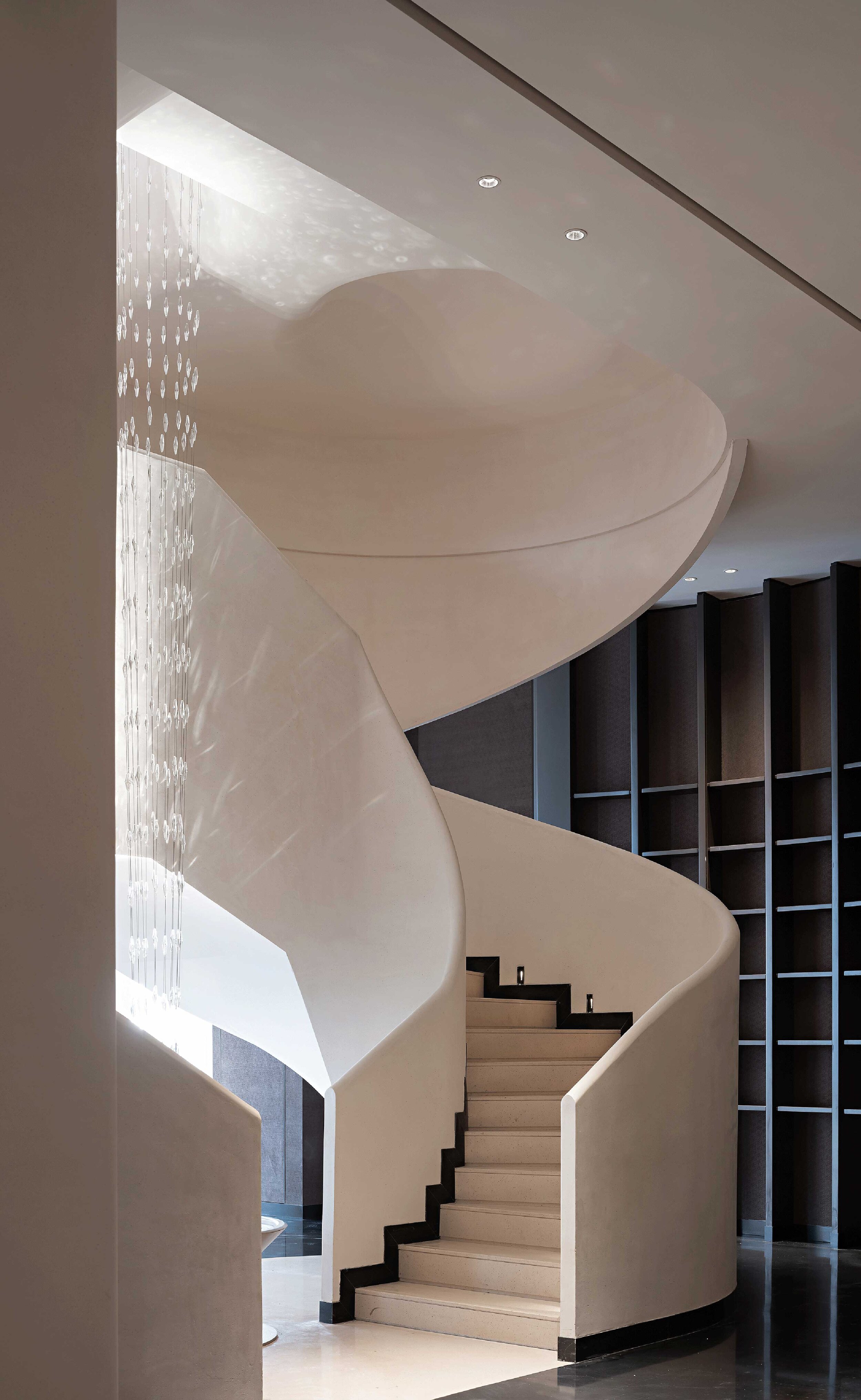
Complementing the central sculpture, an artistic staircase becomes the symbolic entrance to a time tunnel that distributes imaginative elements above and below ground. At the center of two sculptural curved stairs lies an installation called the “Time Shuttle.”
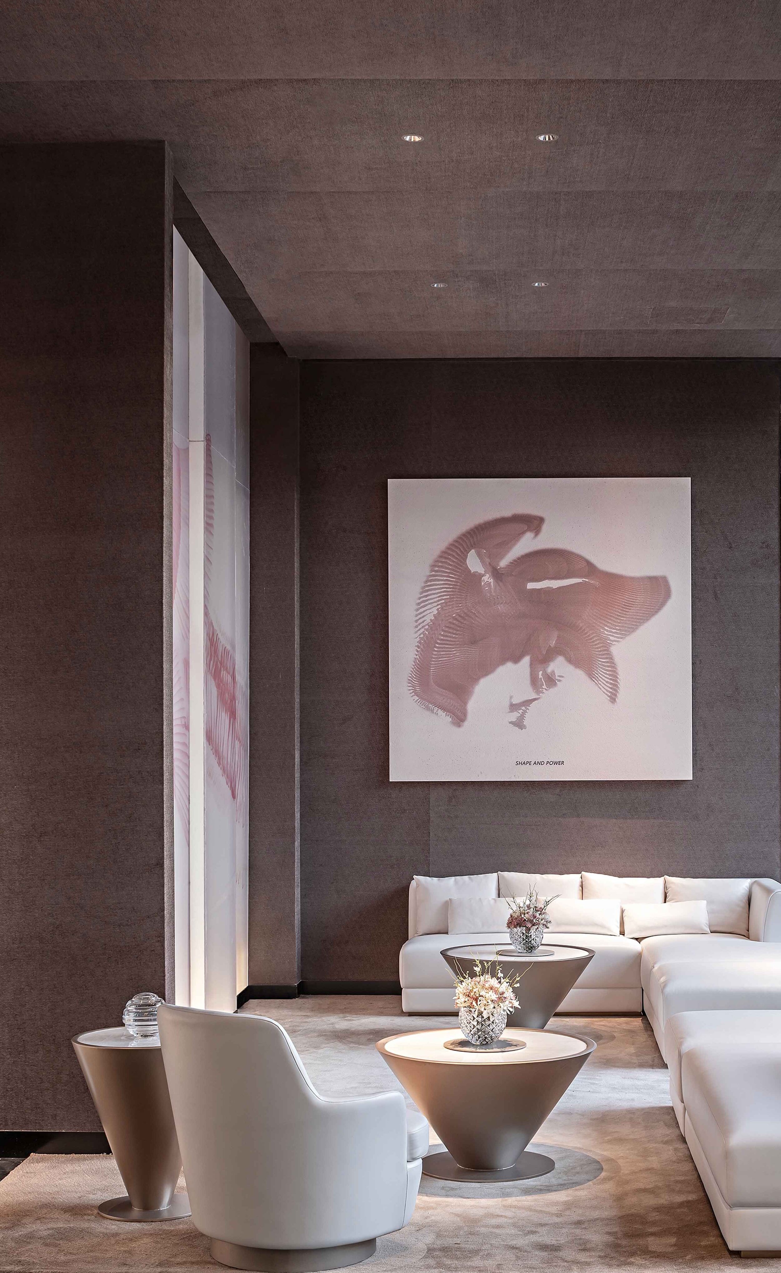
The designer sets the central functional zone of the property in a sunken courtyard where mirrored are as vast as the skies, and lakes provide a deep depth of field, separating everything inside the property from the complexities of the external world. The salon area opposite the book bar interprets the convergence of time with geometric shapes.
The whole space is bestowed with church-like sacredness and tranquillity. It cultivates a life of elegance with poetry, wine, flowers and tea, gathering the essence of life through elements such as rhythm, softness and comfortable surroundings to enjoy the company of old and new friends.
The clubhouse is an extension of the household, a unique kind of companionship that further refines and integrates social circles. Once again, the “spindle” becomes the main artistic symbol of the space. This time, the shape hangs down from the ceiling, concentrating the light coming from a surrounding “ocean of knowledge.”
Thus, the designer transforms space into a petri dish of curiosity and creativity, awaking memories and shaping them. The area feels like a “dance frozen in time” about to begin again, prompting a breathtaking melody that transforms objects into lively and meaningful beings.
The designer hopes to create an artistic “choreography” between real and imaginary times, providing guests with endless possibilities from the future, a banquet, meeting or party in modern times.
Project info
Project name: Brilliant Prospect Project status: Completed in September, 2020
Location: Shijiazhuang, Hebei Province, China
Developer: China Overseas Land and Investment Contractor: Beijing Mingyang Hanhai Decoration LLC. Design team: GBD Lead designer: Du Wenbiao (Bill Do)
Interior design: Guangzhou GBD Design Project area: approximately 2000m2
Main Materials: Terrazzo, Faux paint, Metal paint Photographer: BenMo Studio
Kukan Design Award is now partnering with the IF Design Award
Kukan Design Award / 日本空間デザイン賞is now calling for entries. The Japan Spatial Design Award is now partnering with the iF Design Award, managed by the German iF International Forum Design GmbH. As a result of this partnership agreement, the Shortlisted winners of the Japan Kukan Design Award 2021 will be exempted from the registration fee and pre-selection process for the iF Design Award 2022 to become a finalist in iF Design Awards.
The Japan Kukan (Spatial) Design Award was created in 2019 and is the only and most significant spatial design award in Japan. The aim is to discover, recognize and evaluate outstanding and best designers in Japan and abroad. Kukan Design Awards hope to communicate to as many people as possible worldwide to deliver the 'power of spatial design' through great design.
Besides, following the "Sustainable Development Goals," Kukan Design Award has established a new "Sustainable Space Award" for works that contribute to realizing a better and more sustainable future for all people.
*All entries must be submitted via the dedicated entry website.
For more details, please visit the following website:https://kukan.design/
Application period: Thursday 1 April 2021, 10:00 - Wednesday 16 June 2021, 23:00 (Japan time)
Eligible entries: 11 categories, including exhibition, commercial, office and residential
Sponsored by: General Incorporated Association Japan Commercial Environment Design Association, General incorporate and sponsored by Ministry of land infrastructure, transport and tourism, Japan Trade promotion Organization (Jetro), Nihon Keizai Shimbun (Planned)
For the application inquiry, please contact Kukan@japandesign.ne.jp.
A feeling called Home - City Home Collective
BRABBU is a design brand that reflects an intense way of living, bringing fierceness, strength and power into an urban lifestyle. With a diverse range of furniture, casegoods, upholstery, lighting and rugs, and through sensory design, they pass on a unique experience in every product that they design and produce. Assuming that home is a lot more than a space, City Home Collective, the company responsible for this Park City House, wanted to do something exceptional with this project, creating a meaningful feeling to the client: a place where he belongs.
BRABBU is a design brand that reflects an intense way of living, bringing fierceness, strength and power into an urban lifestyle. With a diverse range of furniture, casegoods, upholstery, lighting and rugs, and through sensory design, they pass on a unique experience in every product that they design and produce. Assuming that home is a lot more than a space, City Home Collective, the company responsible for this Park City House, wanted to do something exceptional with this project, creating a meaningful feeling to the client: a place where he belongs.
The prime objective of this design firm is to match people with unique spaces, working with high-skilled designers, such as Helena Morozoff, the senior designer responsible for this Park City project, who prospects smart design with no boundaries.
As a result, the strategy here was to let the material drive the design, always opting for the most comfortable furnishing, choosing and combining materials that speak to each other, which made this warm, tactile and visual feeling of a retreat possible.
This perfect combination of neutral tones and patterns, contributed to the arising of this cosy and monochromatic space, filled with elegance and uniqueness, allowing the space to evolve over the time.
In a nutshell, City Home Collective believes that “life is better when you love where you live”, so they designed this house as the perfect place to relax, reconnect and recharge. And that is why home is so much more than a space, it is definitely a feeling.
For more information, please visit: www.brabbu.com
The Celebration of the heritage that narrates Parisian history by Neri & Hu, the Papi Restaurant
Nestled in the Grands Boulevards district of Paris' 9th arrondissement, Papi is the latest brainchild of up-and-coming restaurateur Etienne Ryckeboer his debut seafood bar Bulot Bulot. This time, he teams up with Neri&Hu to rehaul the façade and interior space, and with talented Japanese chef Akira Sugiura to serve a seasonal menu of modern Italian dishes.
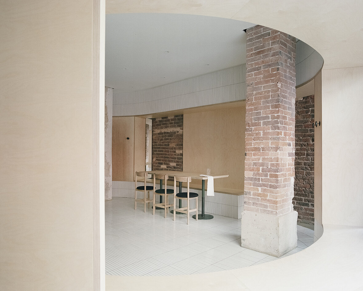
Located on the ground floor of a typical late 19th century Haussmann building, Neri&Hu's design concept celebrates the layered material heritage that narrates Parisian history.
Nestled in the Grands Boulevards district of Paris' 9th arrondissement, Papi is the latest brainchild of up-and-coming restaurateur Etienne Ryckeboer his debut seafood bar Bulot Bulot. This time, he teams up with Neri&Hu to rehaul the façade and interior space, and with talented Japanese chef Akira Sugiura to serve a seasonal menu of modern Italian dishes.
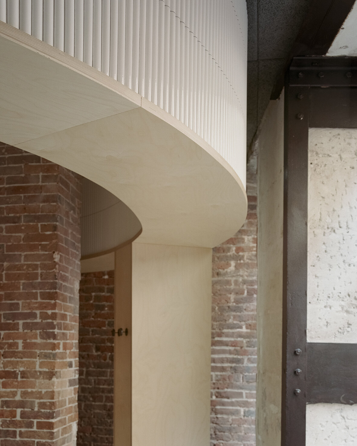
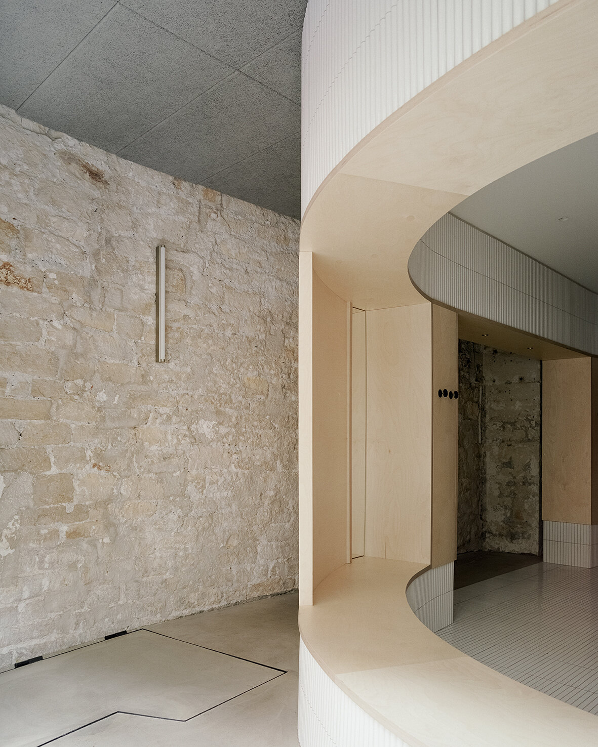
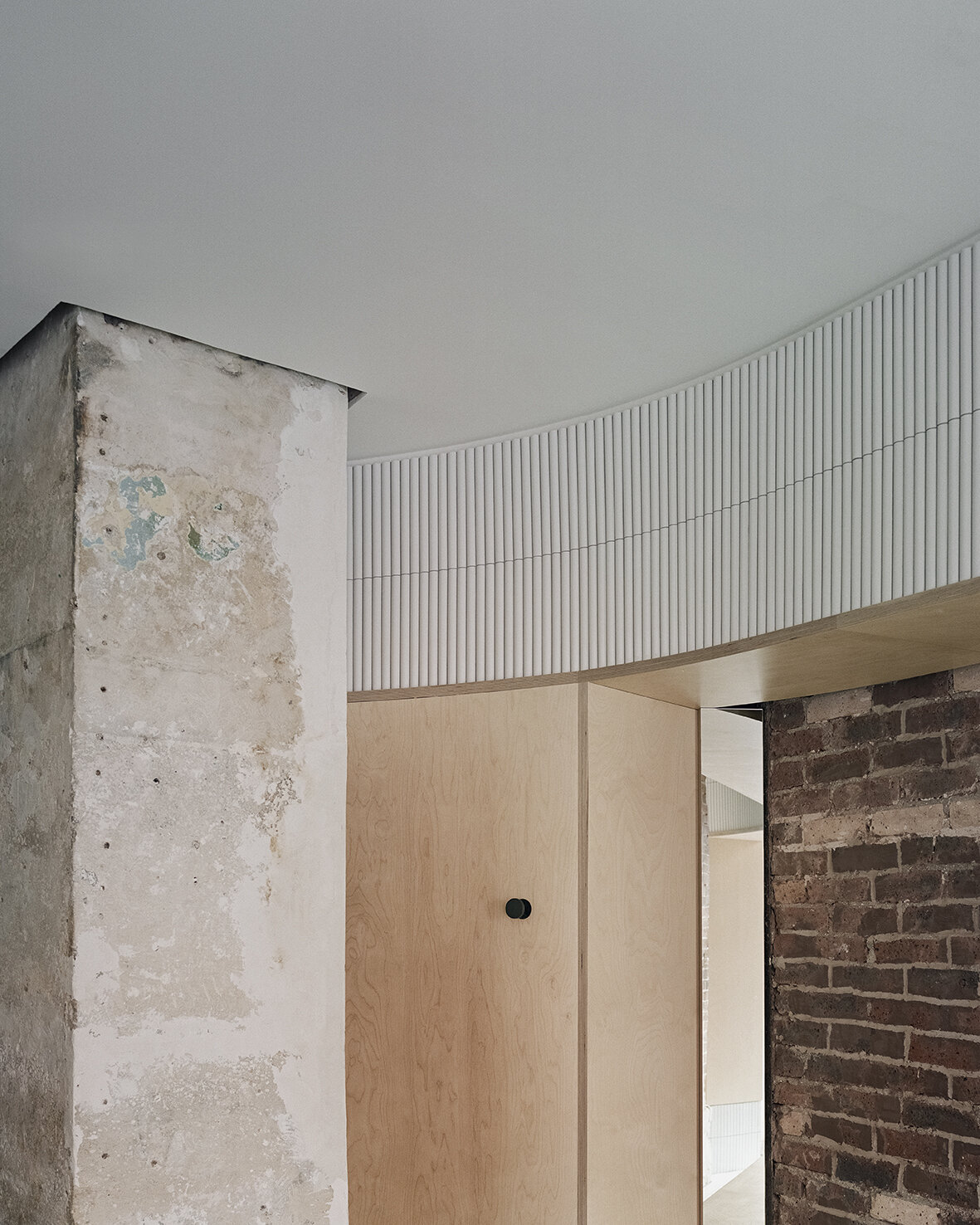
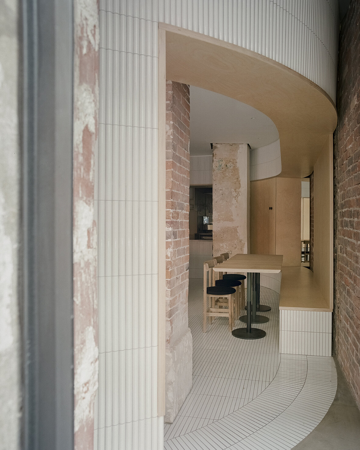
Located on the ground floor of a typical late 19th century Haussmann building, Neri&Hu's design concept celebrates the layered material heritage that narrates Parisian history. During the dismantling phase, the existing site was treated carefully; by stripping back the strata of finishes built up through the decades, the raw materials' beauty is revealed. Every single element was meticulously examined, and the challenge was to resist the urge to fix every imperfection, instead, honour the imprint oft of time upon each surface. Within the interior, portions of the old limestone and brick walls, a raw steel column, and a brick column are preserved and integrated into the design. On the façade, an existing steel I-beam lintel is featured, while a segment of the old stone moulding by the entry is left exposed, stitching the façade seamlessly to the neighboring building. Each fragment neighbouring ants a different period in Paris' history, forming a beautiful yet imposing canvas for the architects to add their new strokes.
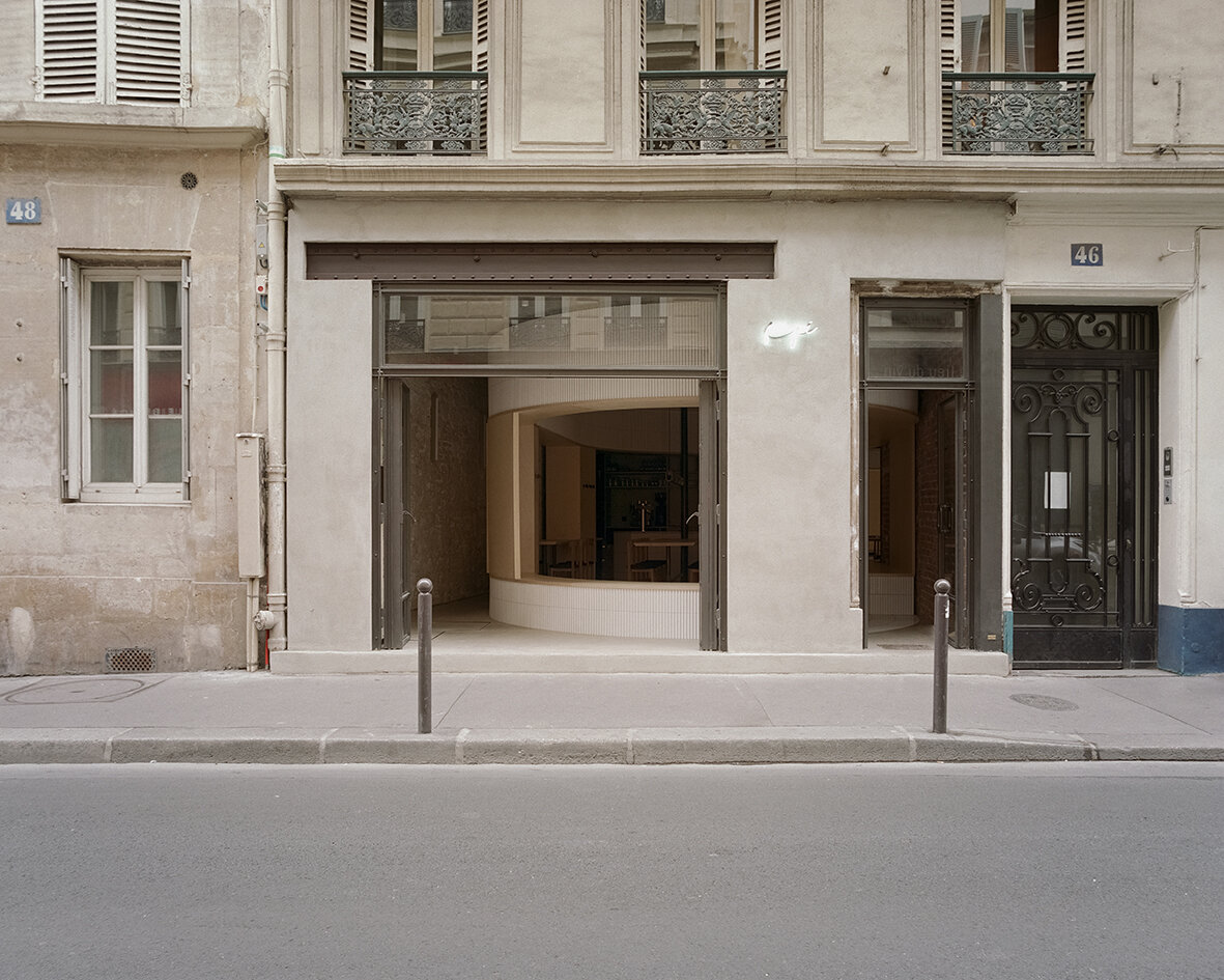
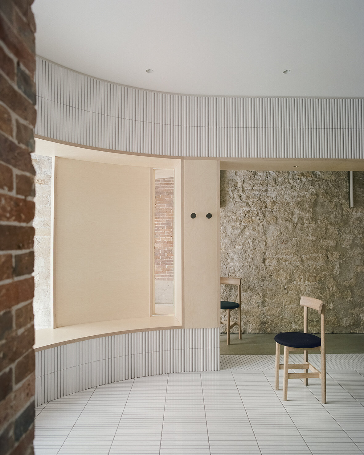
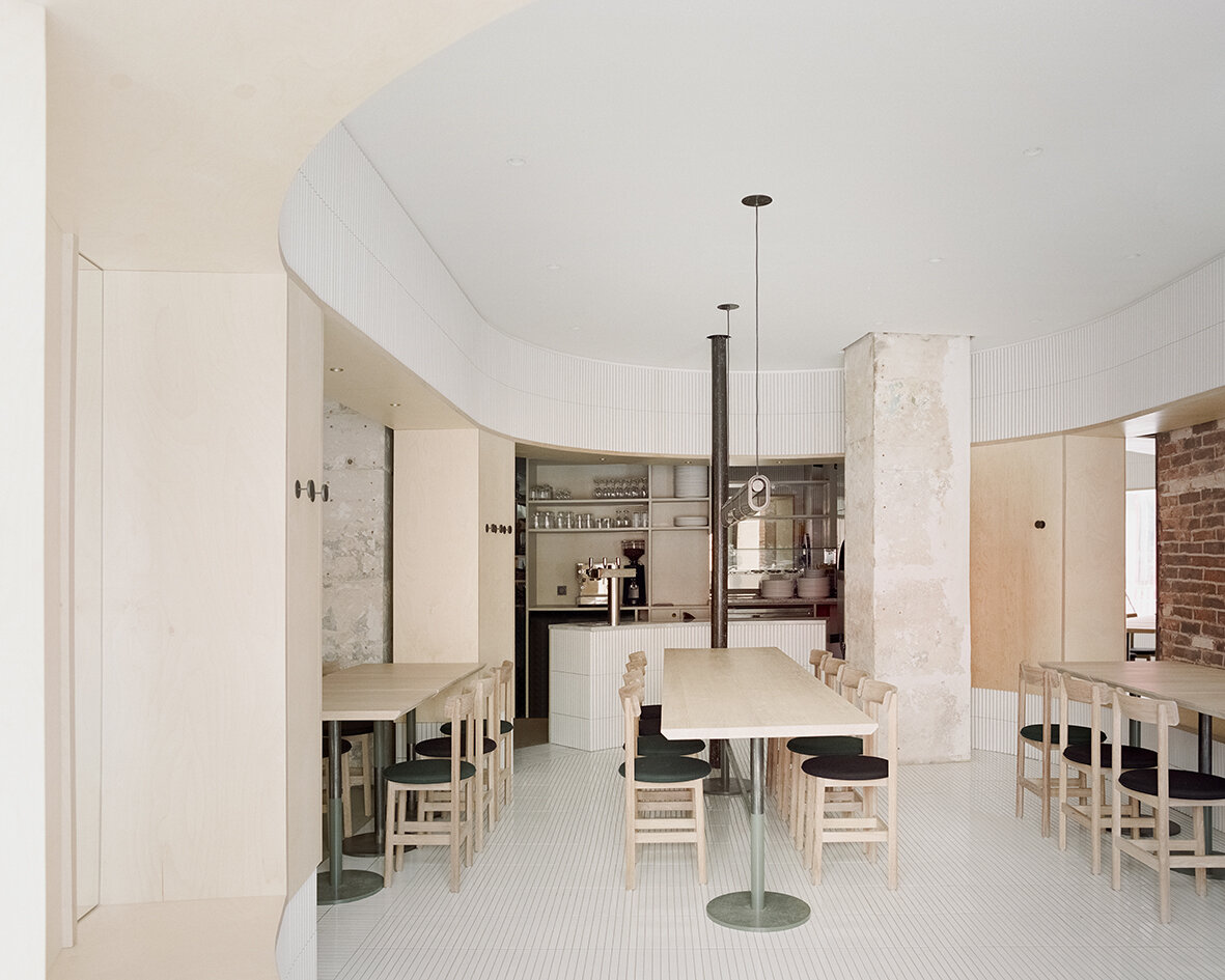
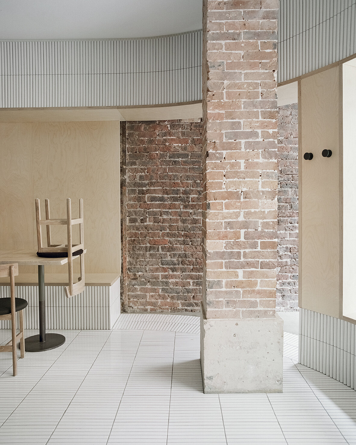
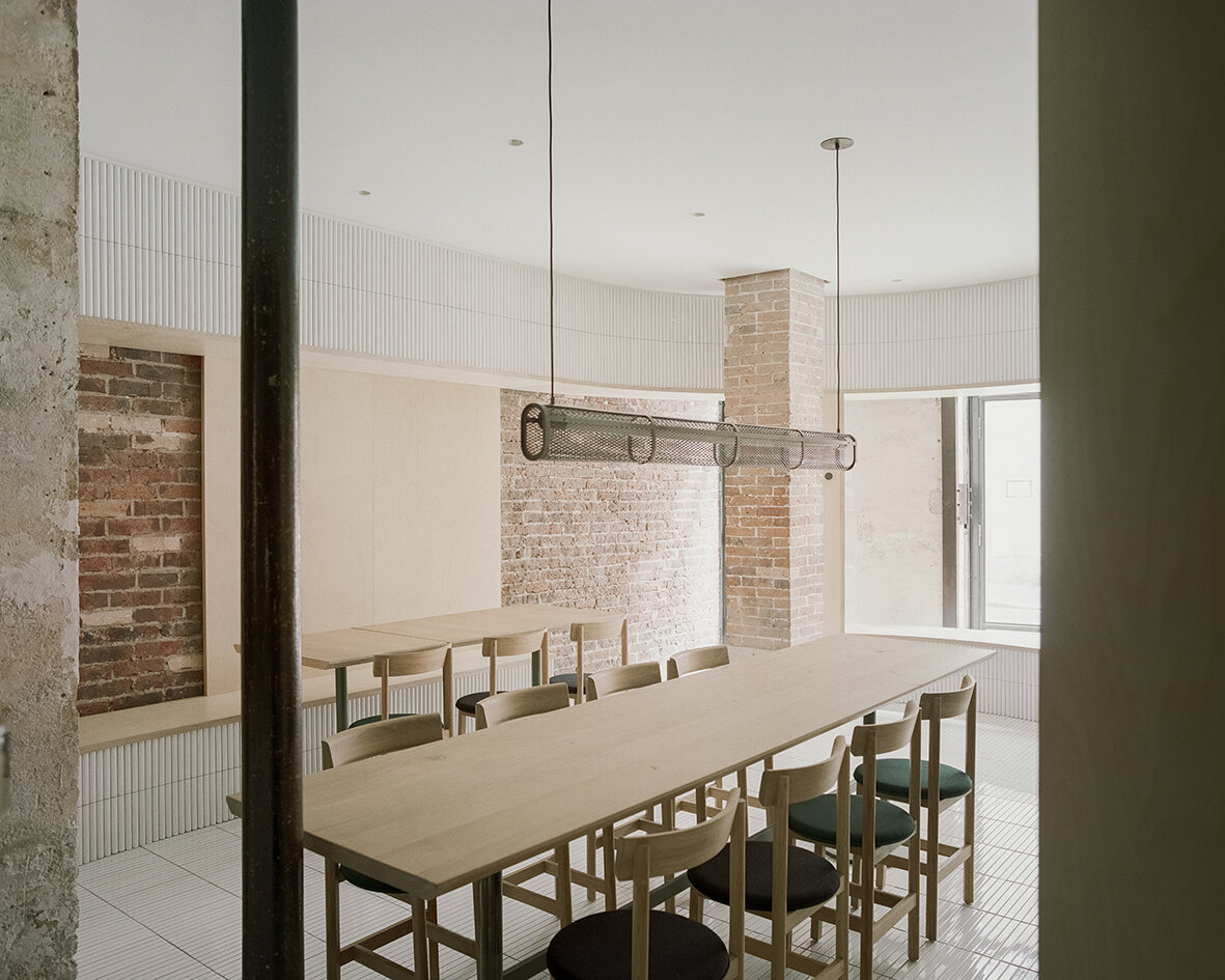

The new raw-steel-framed fully-operable glass façade maintains a visual continuity between the street and the venue and effectively extends the public realm into the interior. As guests enter the space through the main door, they see the clash of juxtaposing old and new materials, telling a story of sophistication with fresh textures of tile, glass and wood. Mirrors are placed strategically to create dynamic perspectives and voyeuristic moments between interior and exterior while inviting guests into cross gazes. The spatial and material strategies deployed to create a layered reading against the historical backdrop, offering guests a variety of experiences to explore within the space - moments of both public introversion and private extroversion.
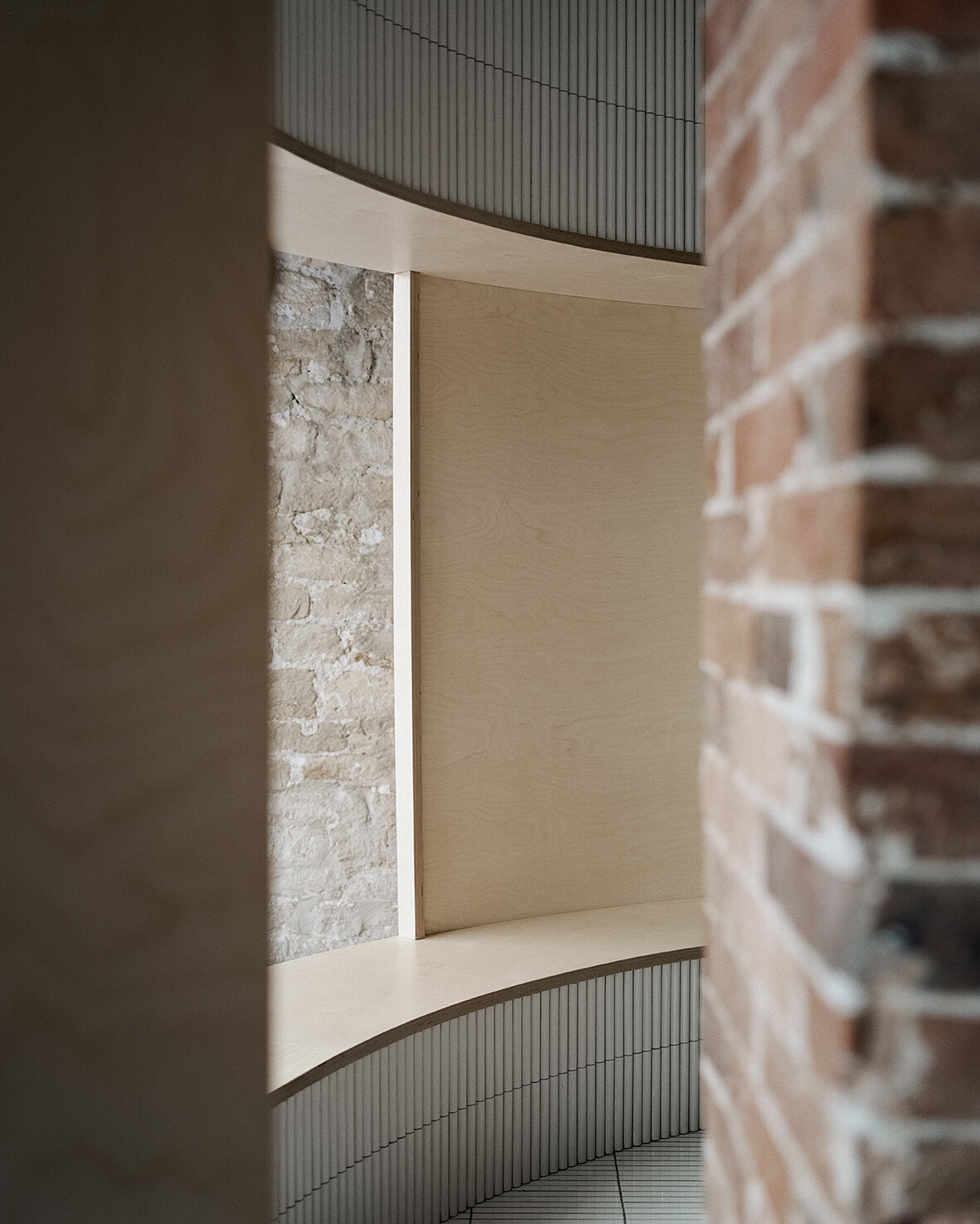
Despite the compact 52 square meters of usable area, Neri&Hu’s asserts two figures into space: an oblong volume forming an arena-like enclosure that integrates all the functional needs of seating, display, chef’s preparation counter, privacy screen, as well as a round shape containing the wood-burning oven. Clad in handmade convex-curved white ceramic tiles, the enclosure features large openings framed with thick birch plywood that become seating benches for guests. Entering the arena, where the floor is adorned with narrow white ceramic tiles, guests are instantly transformed from spectators to performers on stage. The central communal table features a long custom pendant light above, while a series of lights by Viabizzuno create a stark modern contrast on the old limestone wall. Custom wood and fabric chairs, manufactured by De La Espada, are designed by Neri&Hu specifically for Papi Restaurant to fit within the limited footprint.
Minimalism in an environment of expressionism
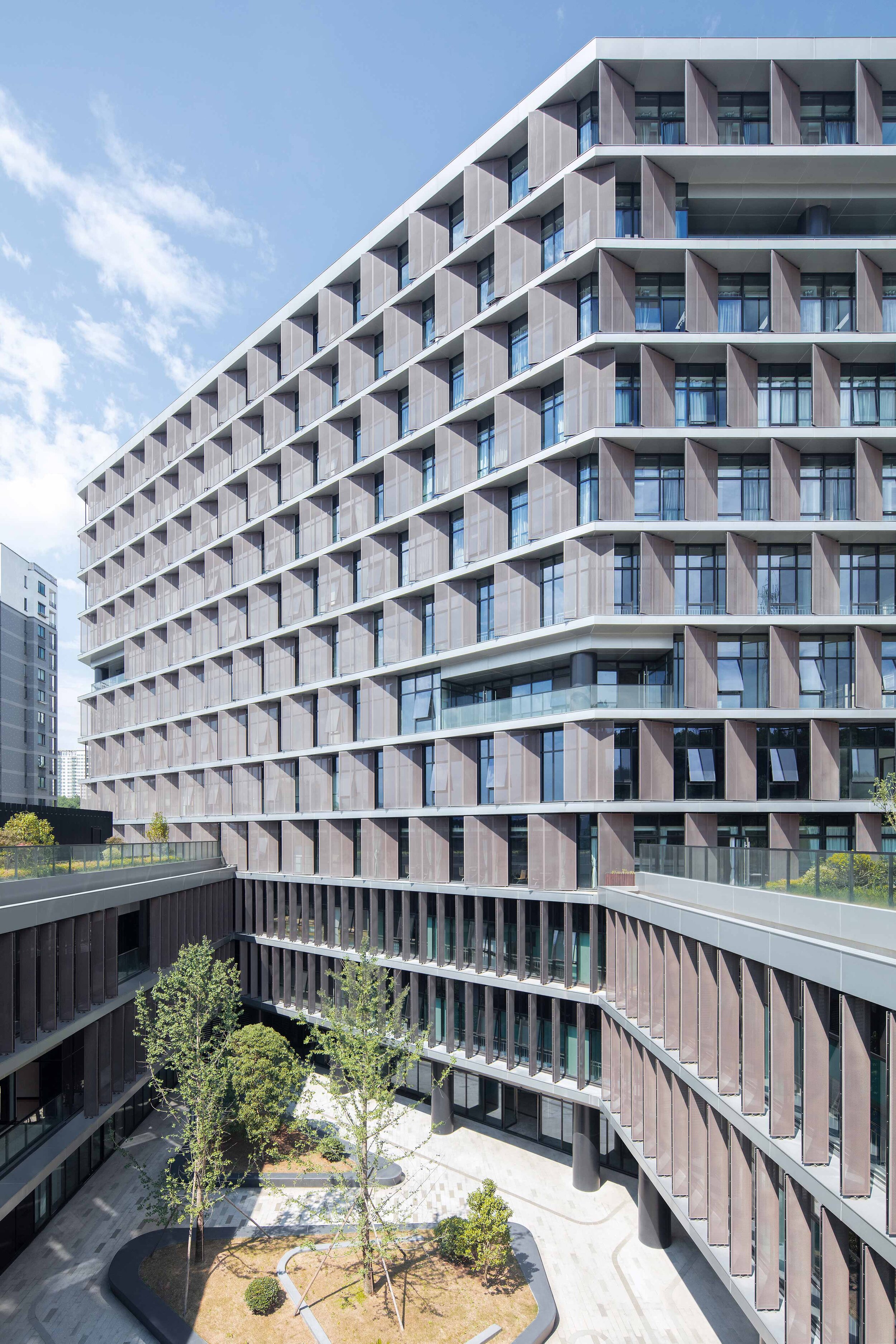
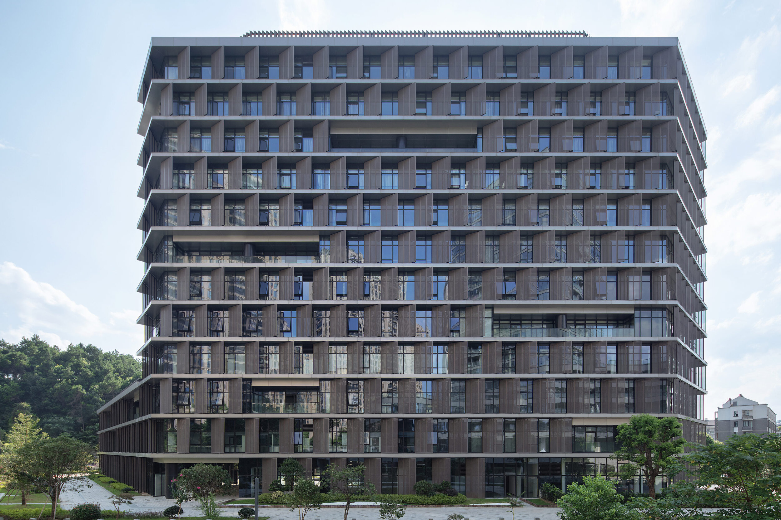
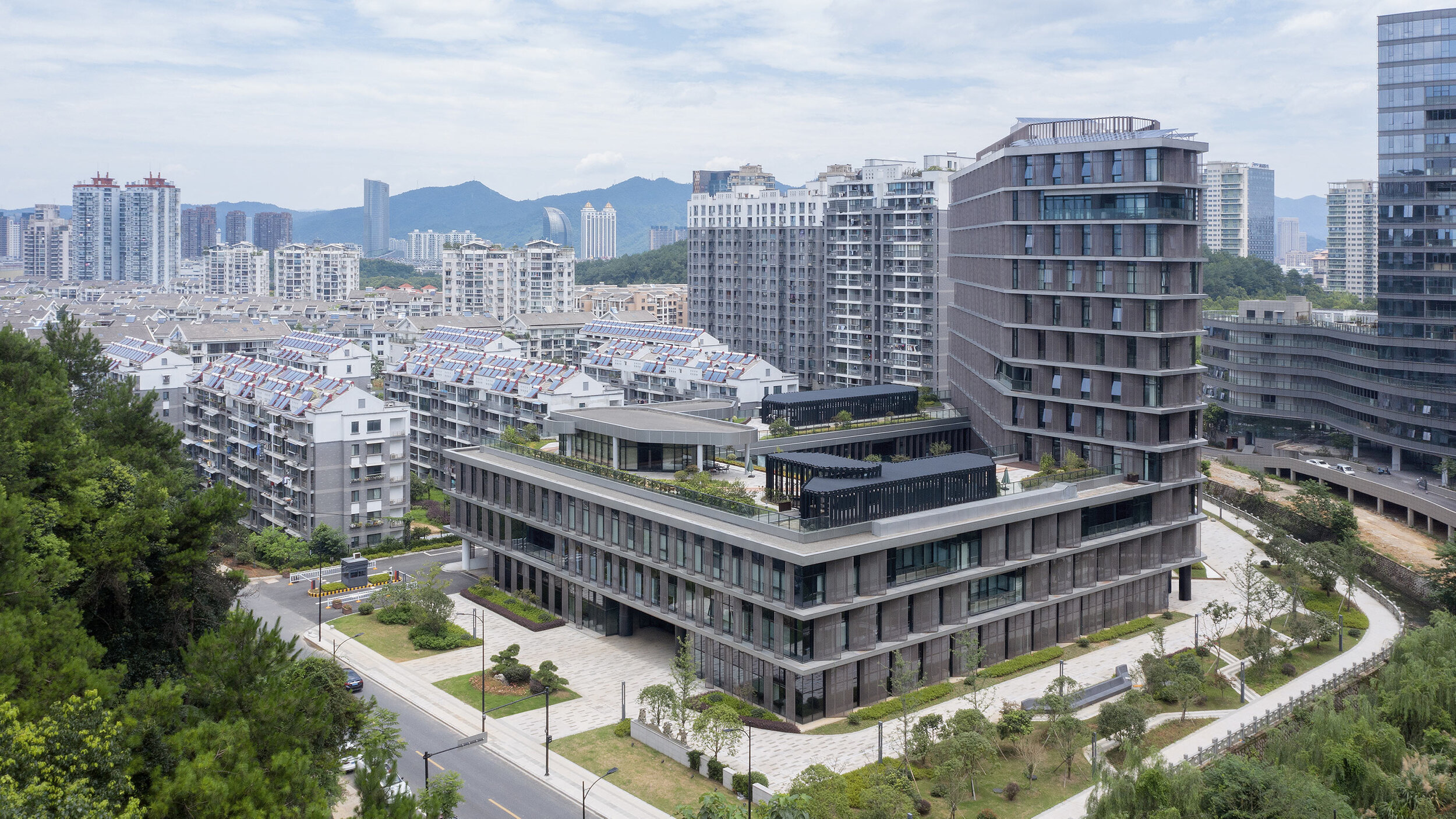
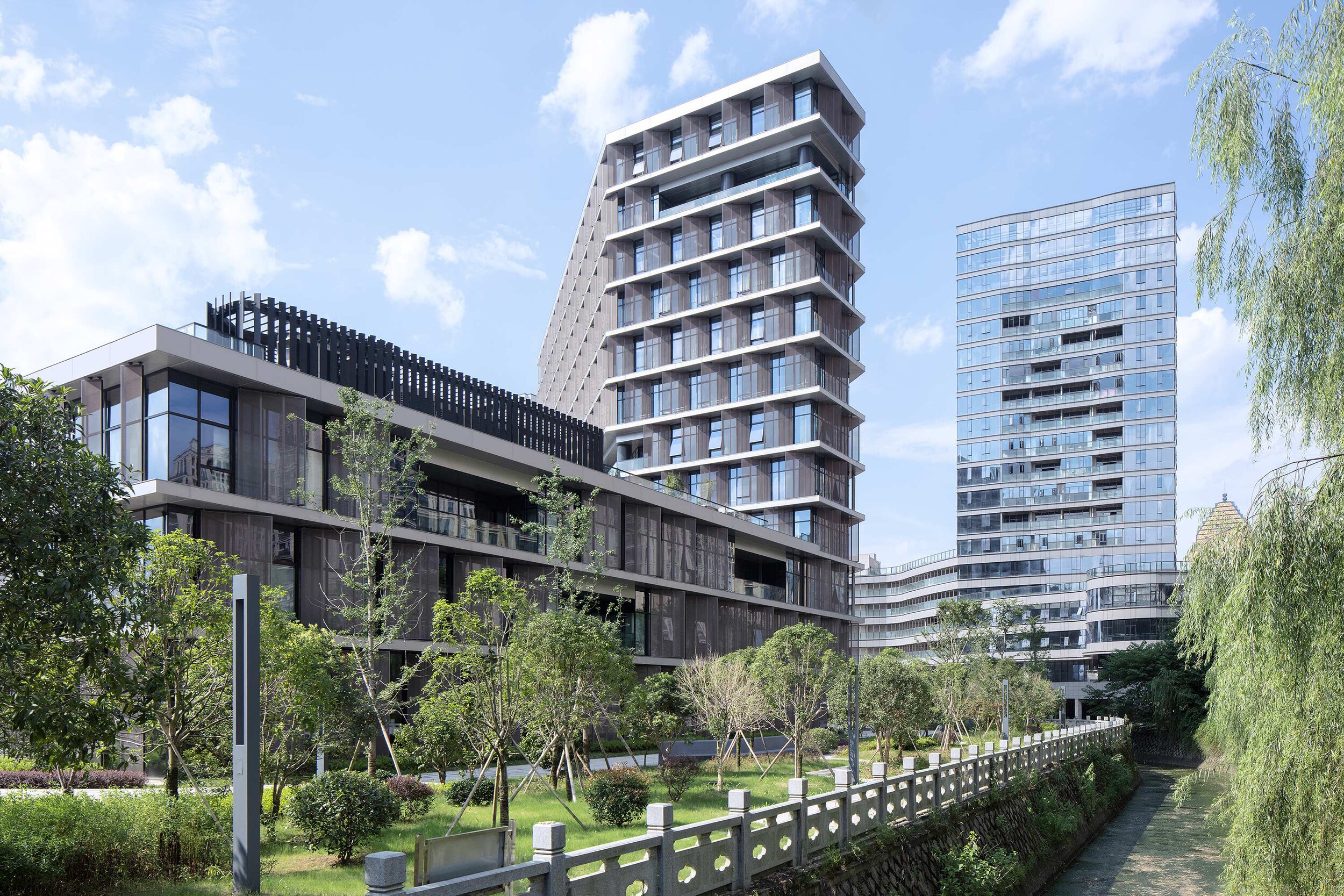
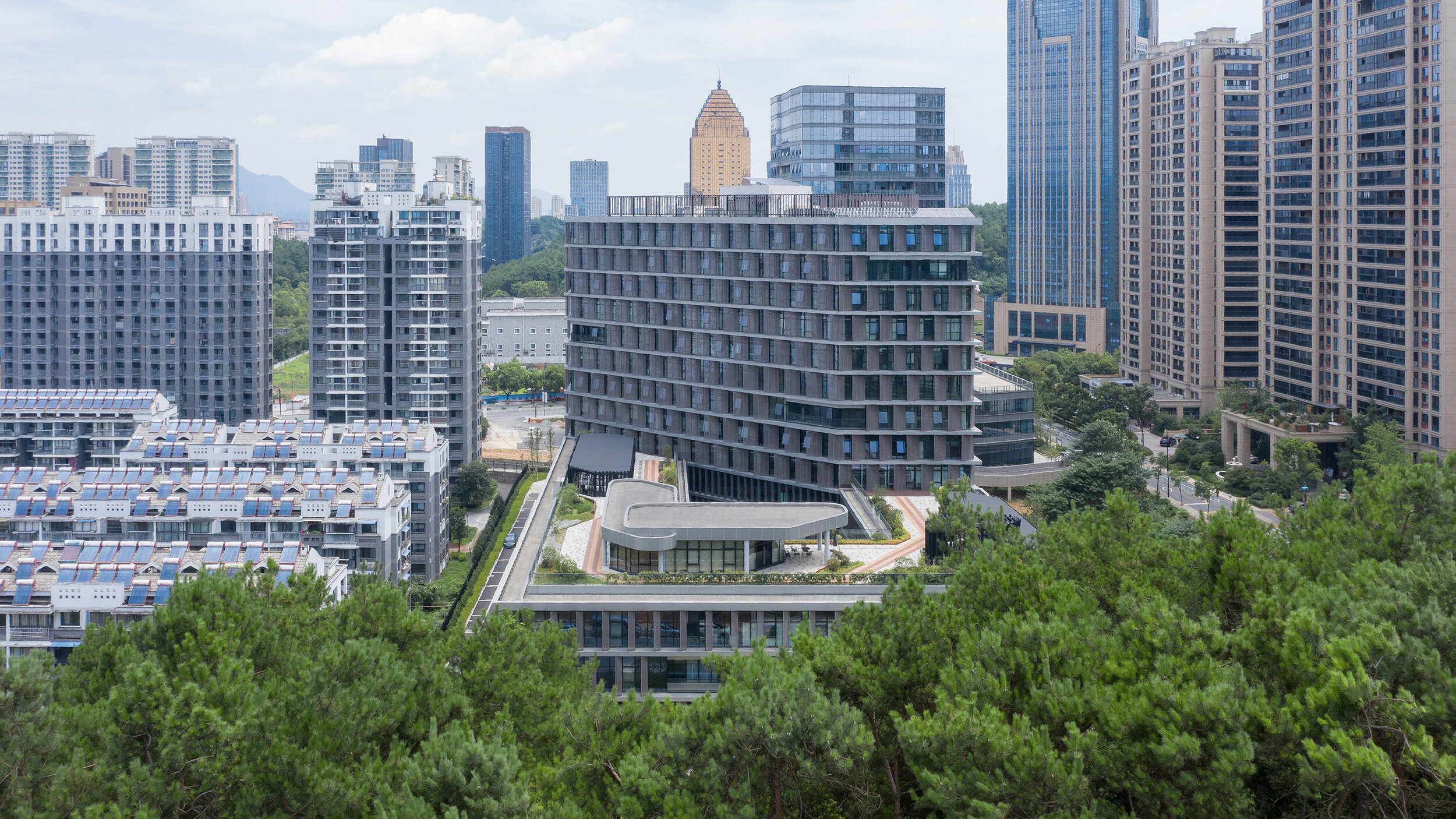
Designed by BAU (Brearley Architects + Urbanists), Tonglu Archives Building is located in Hangzhou, China. In China, the perimeter block typology doesn't usually return the Floor Area Ratio (FAR) necessary to satisfy inner-urban densities. This leads to an over-reliance on detached towers to meet FAR requirements. The perimeter block with a tower extrusion, however, presents a useful hybrid.
'it is the least we could do: minimalism in an environment of expressionism.' - Steve Whitford (Partner)
Hybrid typology
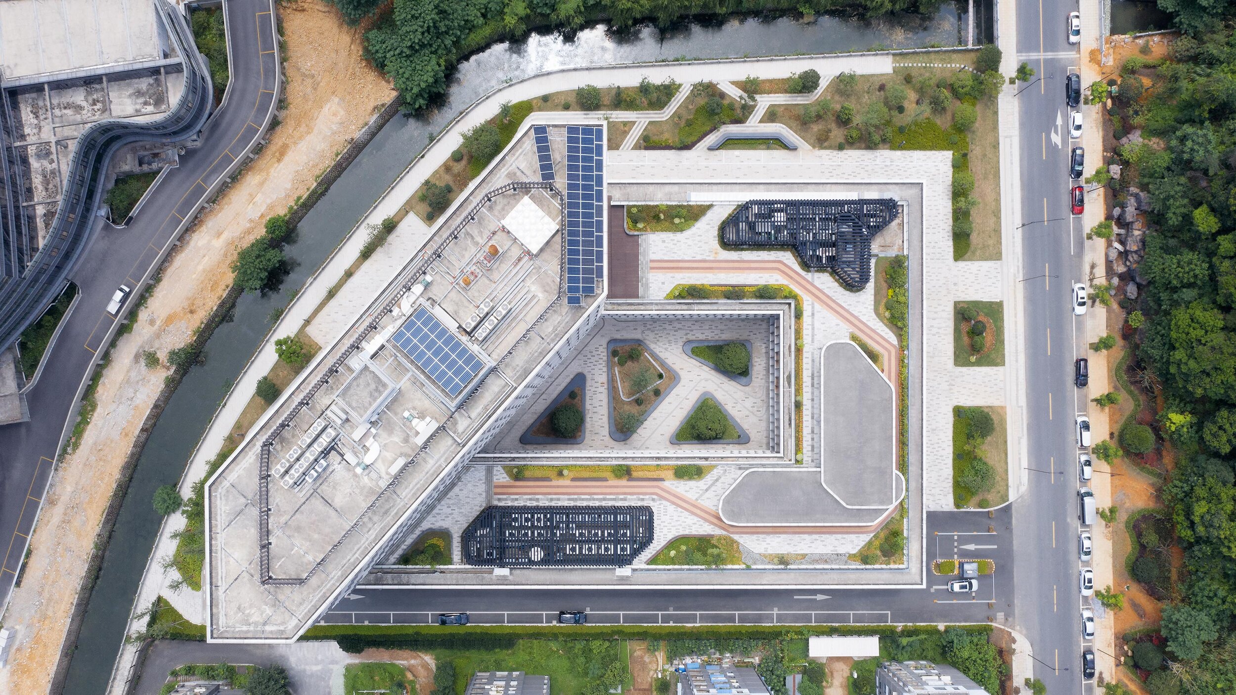
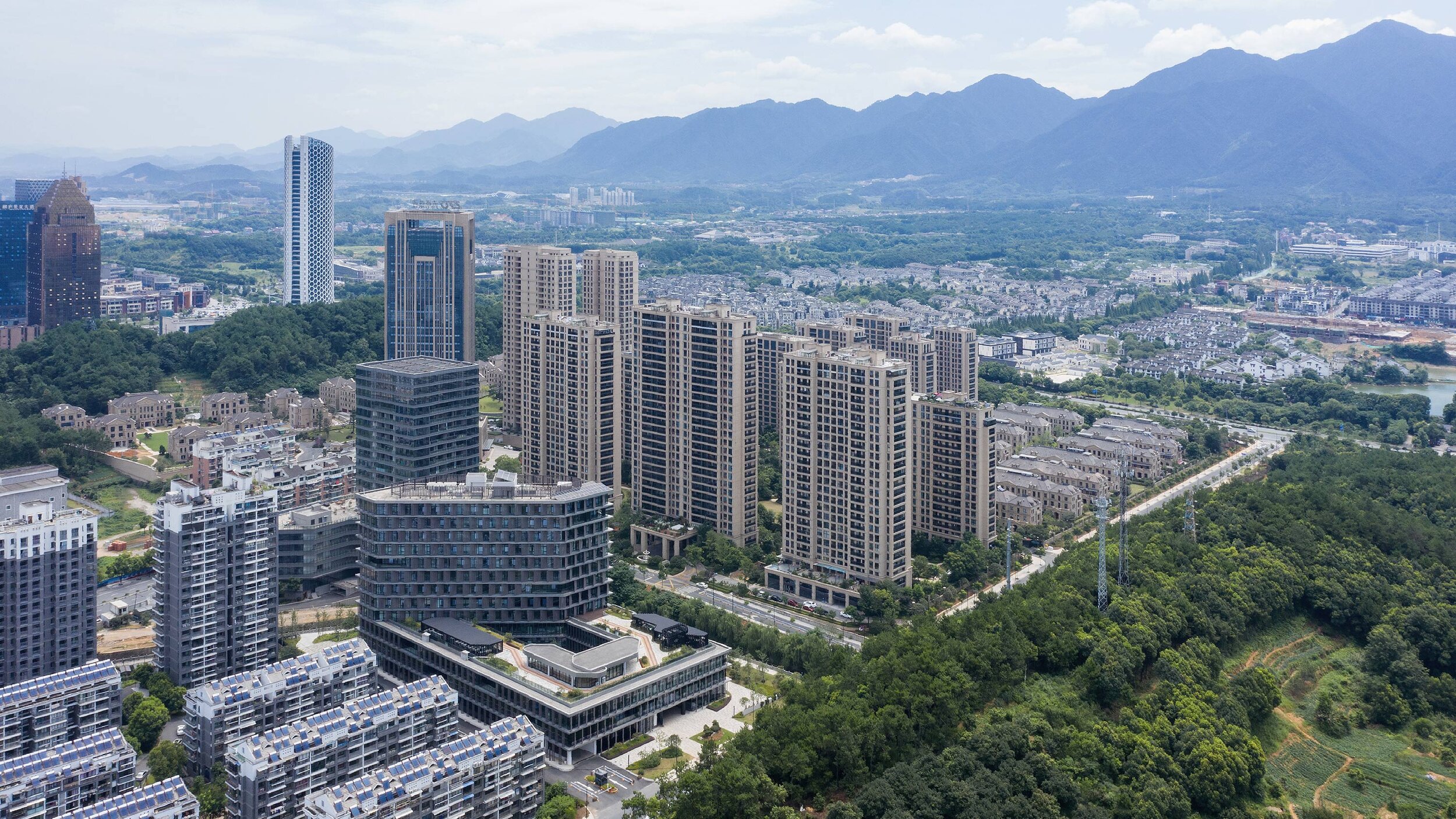
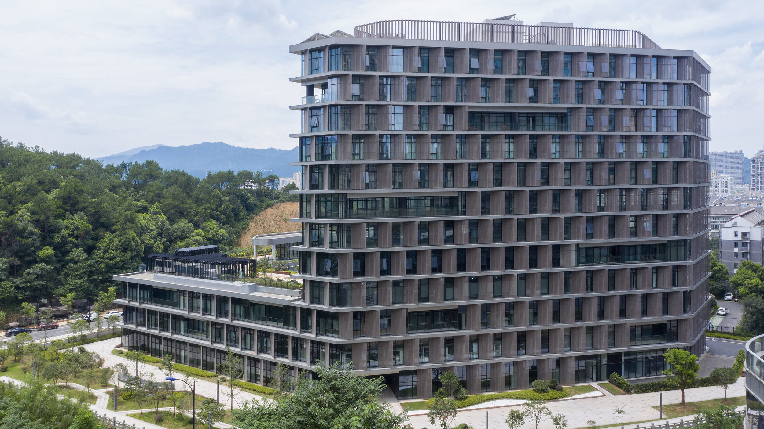
Designed by BAU (Brearley Architects + Urbanists), Tonglu Archives Building is located in Hangzhou, China. In China, the perimeter block typology doesn't usually return the Floor Area Ratio (FAR) necessary to satisfy inner-urban densities. This leads to an over-reliance on detached towers to meet FAR requirements. The perimeter block with a tower extrusion, however, presents a useful hybrid.
The advantages of the perimeter block are combined with the capacity of the tower to maximize floor area. (Positive reinforcement of active urban street edges; well ventilated and naturally lit building interiors; and an internal courtyard that has the options of being private, semi-private-semi-public, or public space)
Metal petals
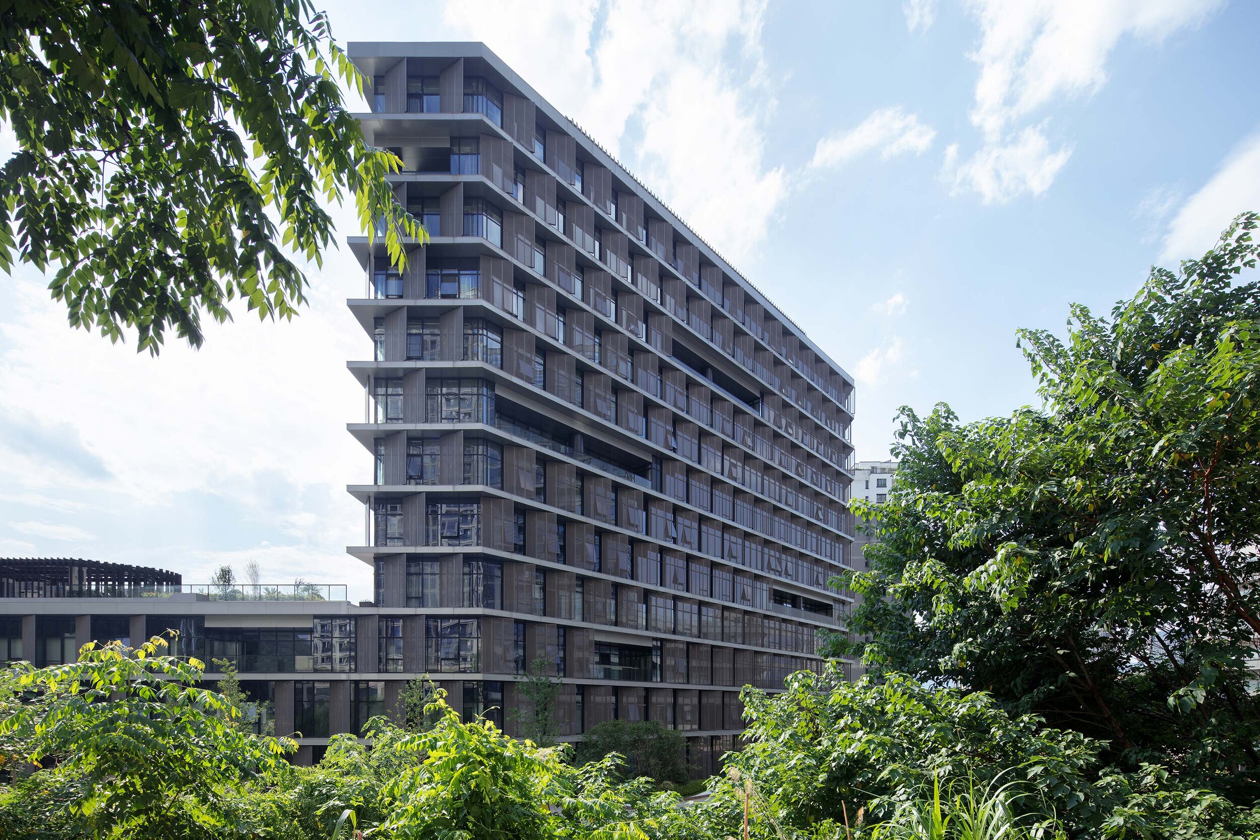
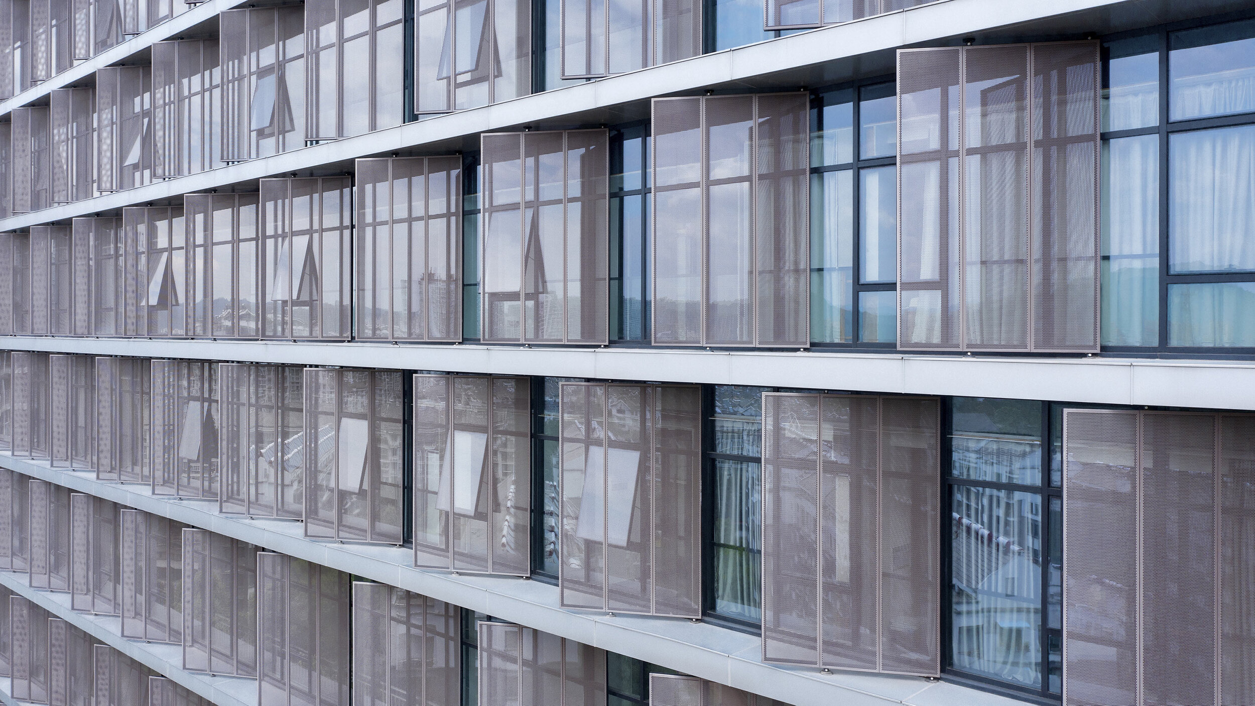
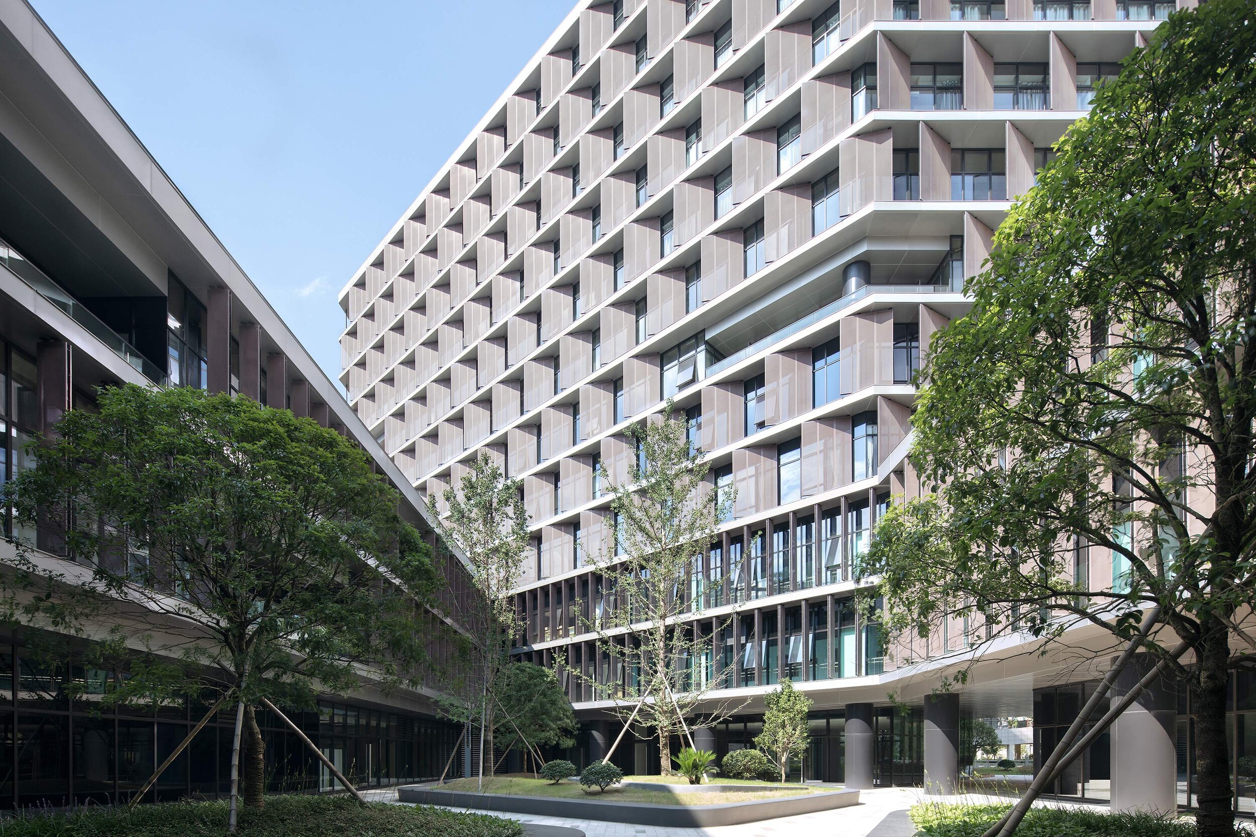
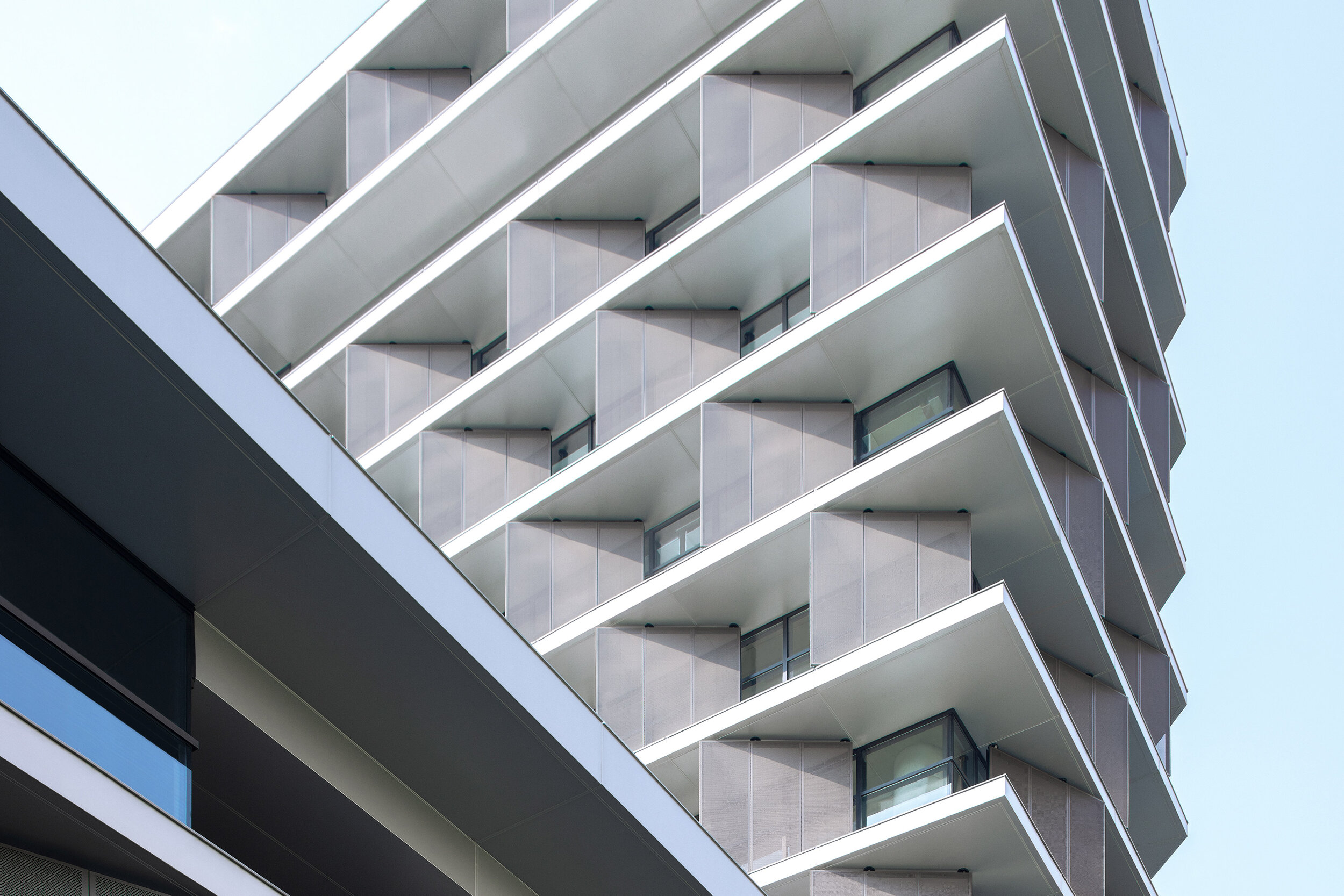
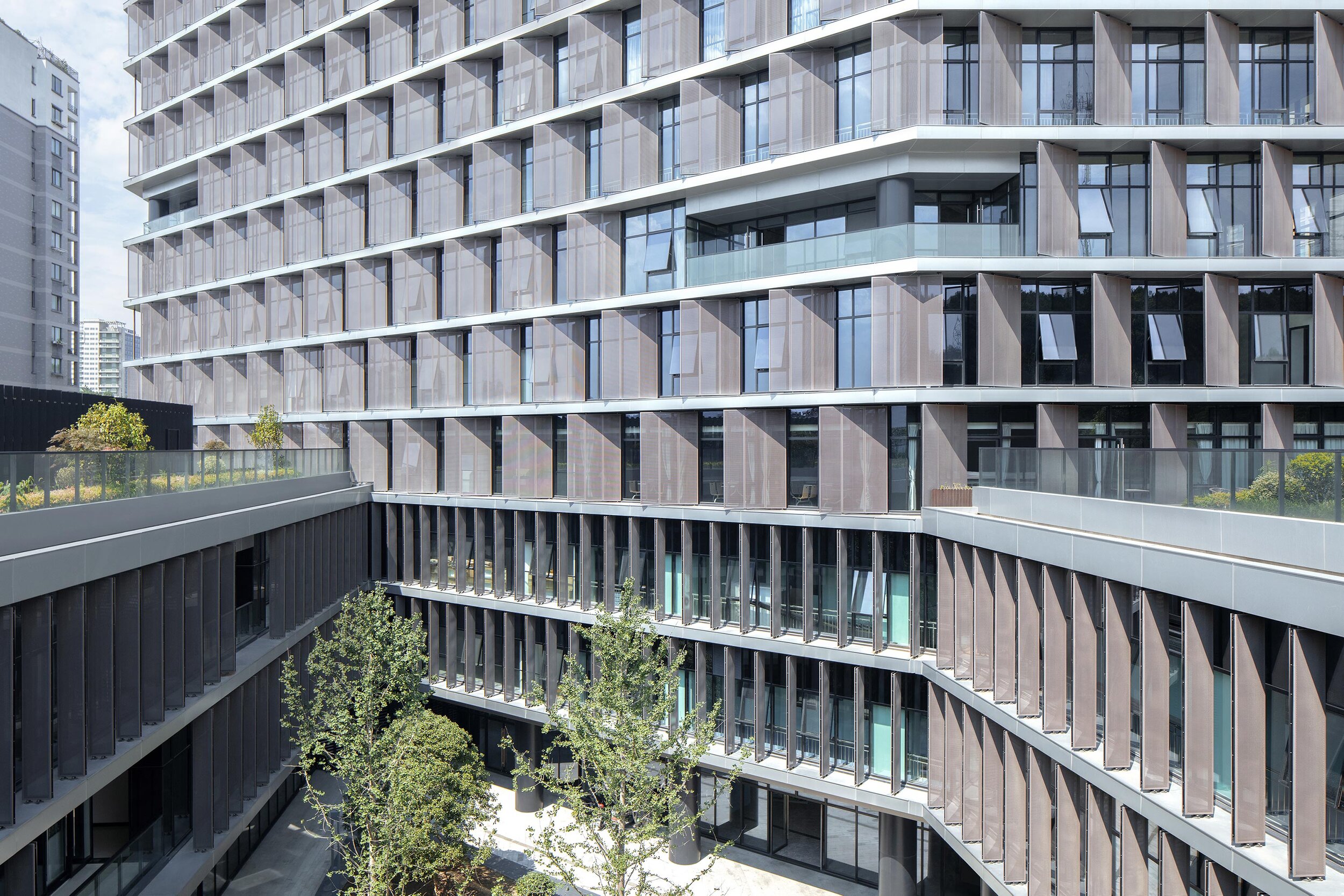
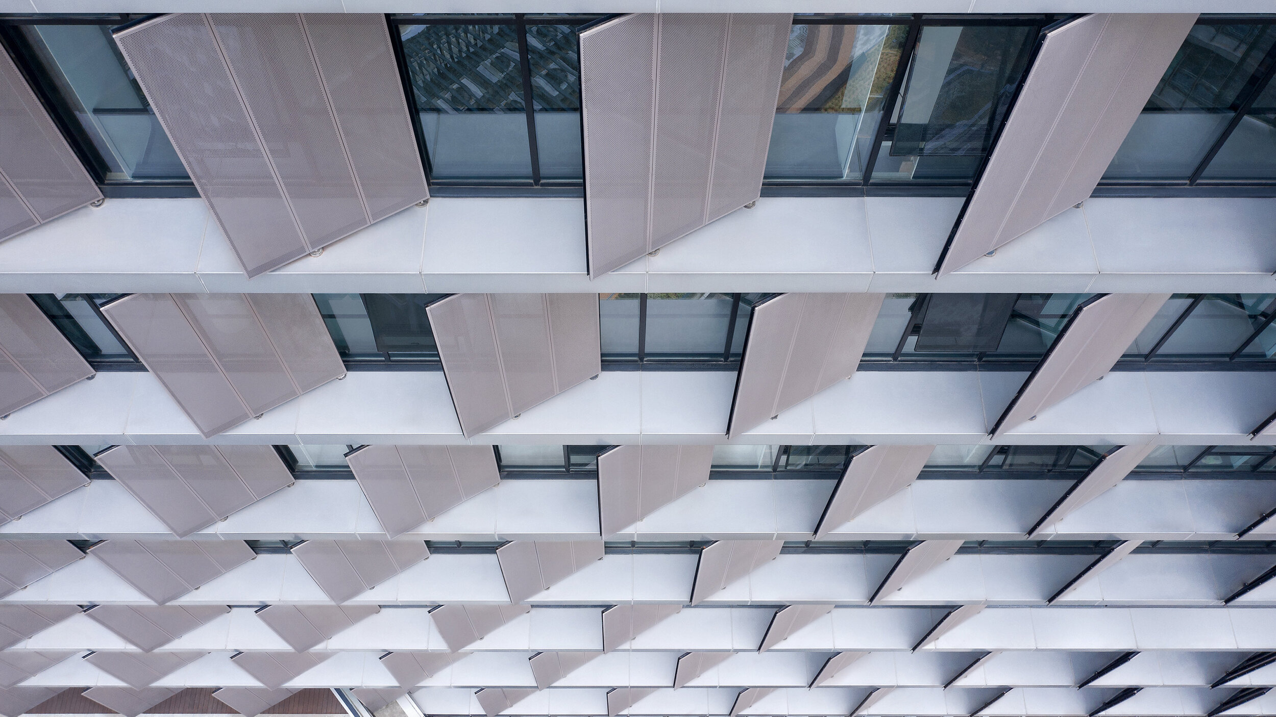
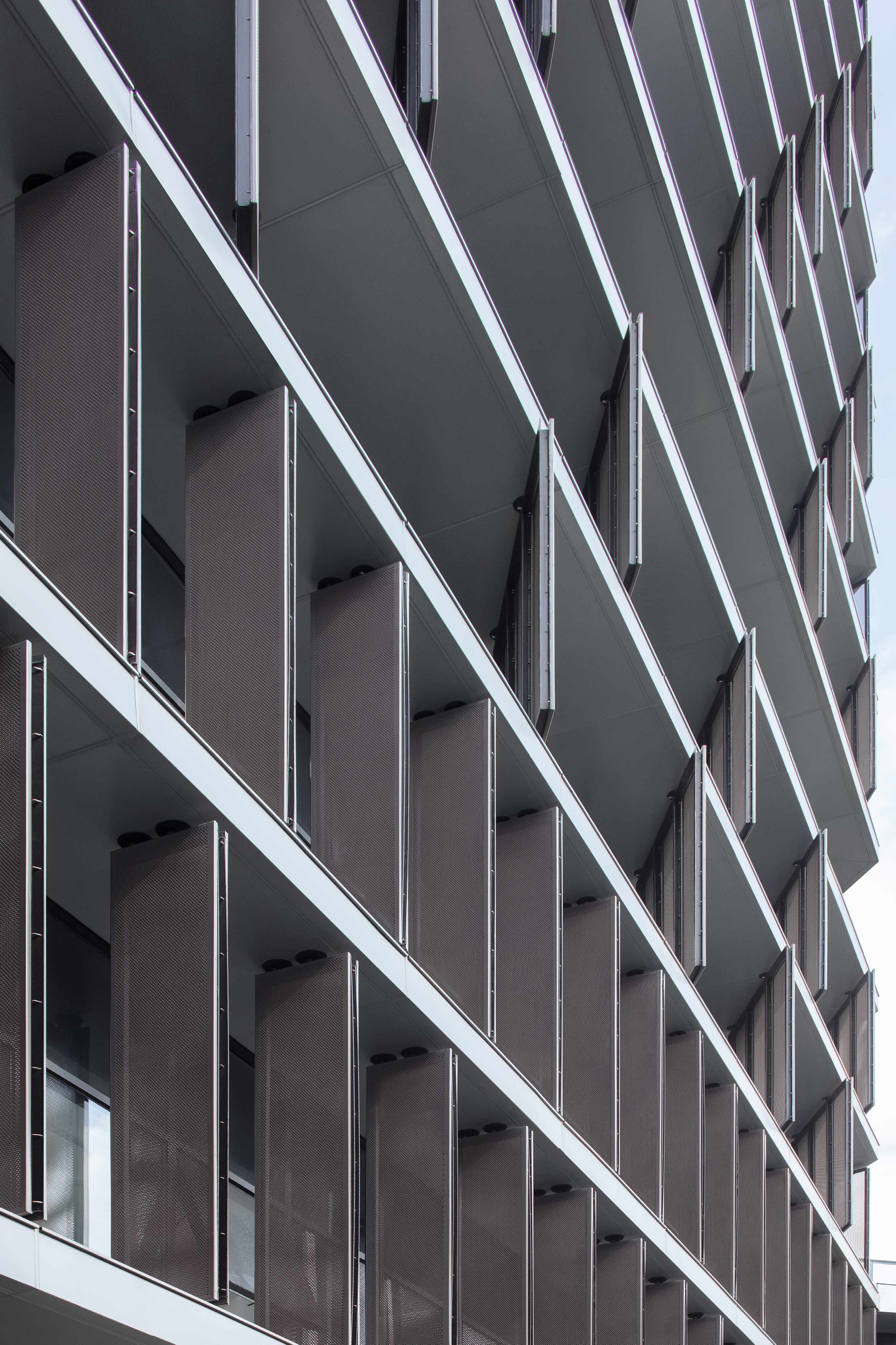
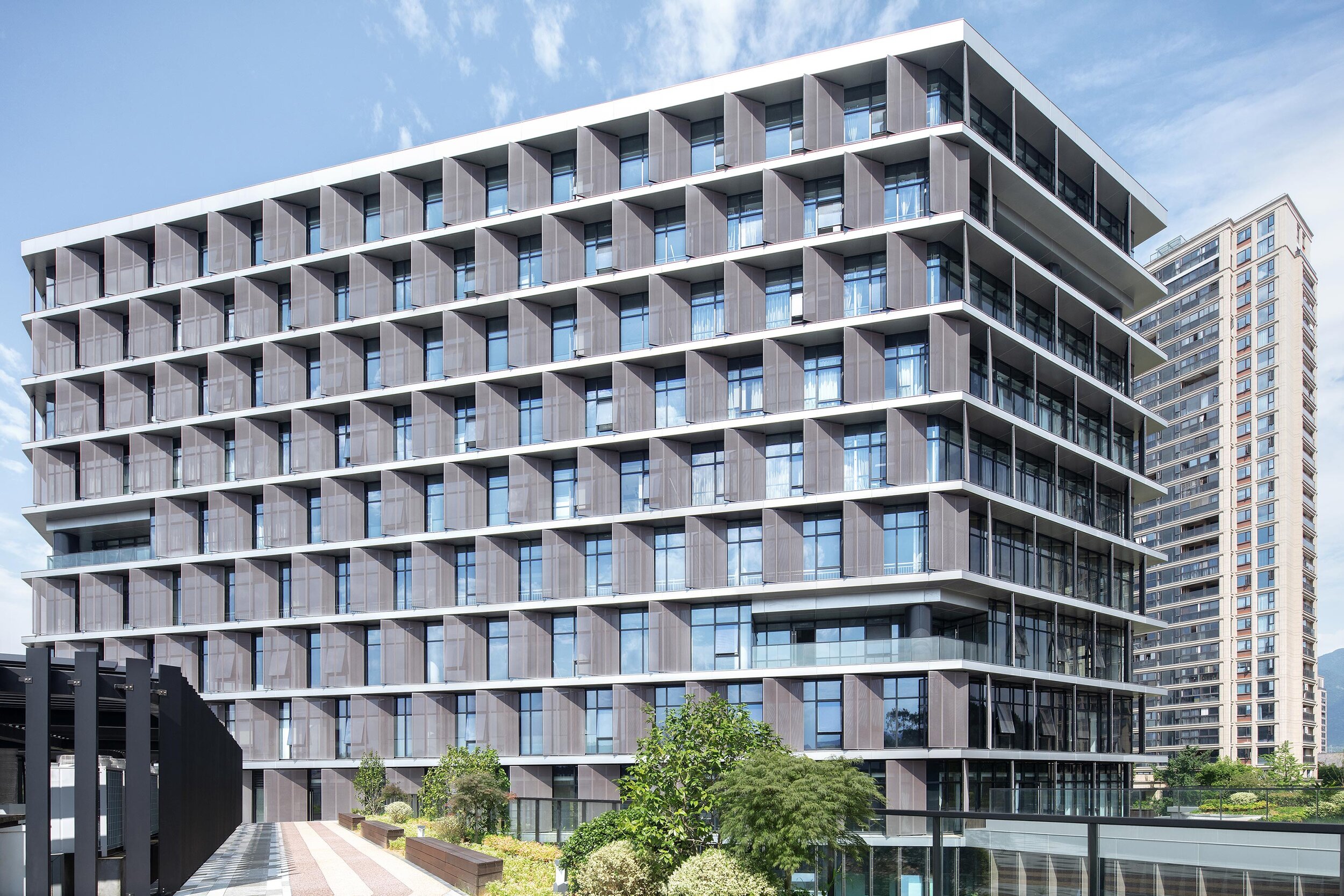
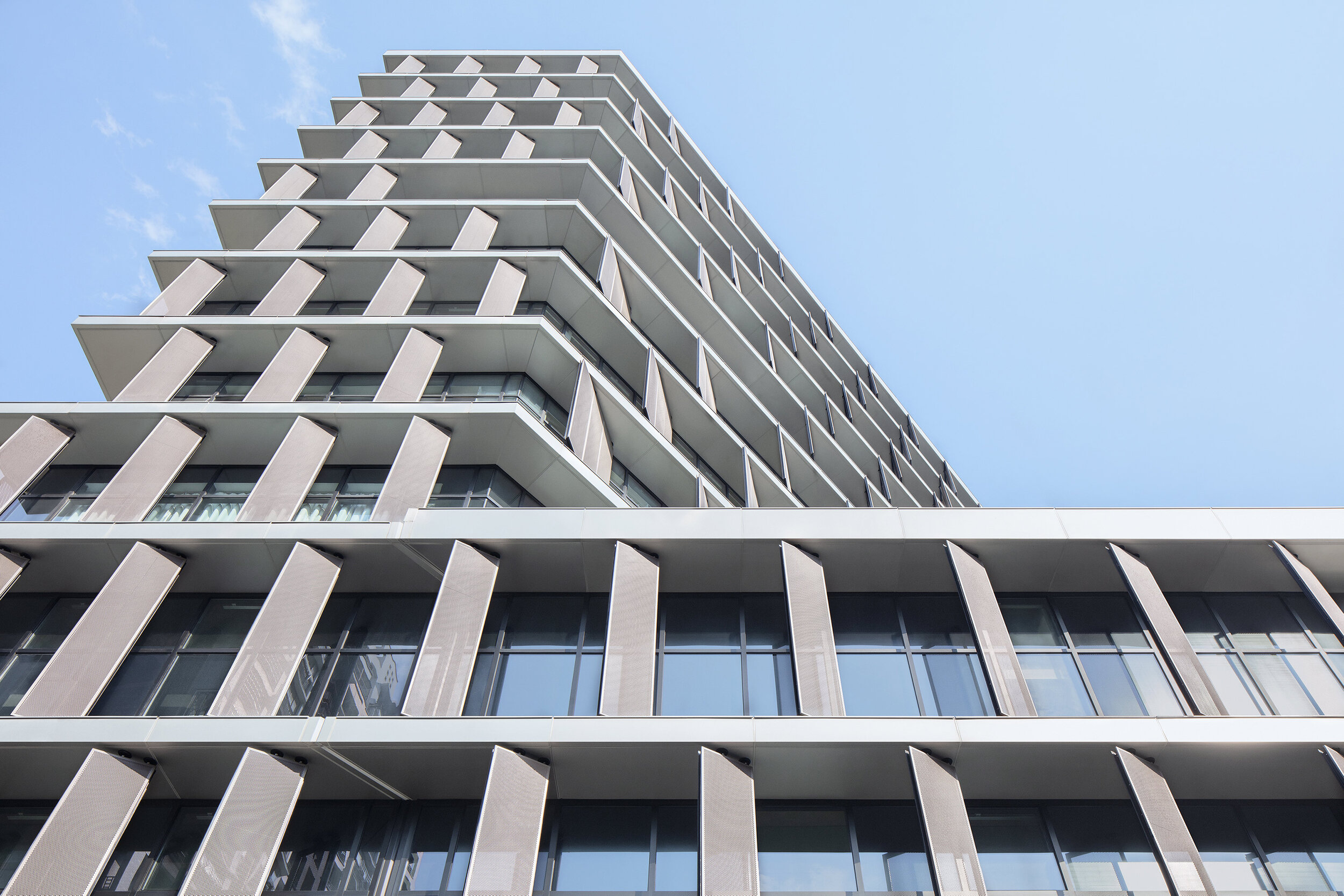
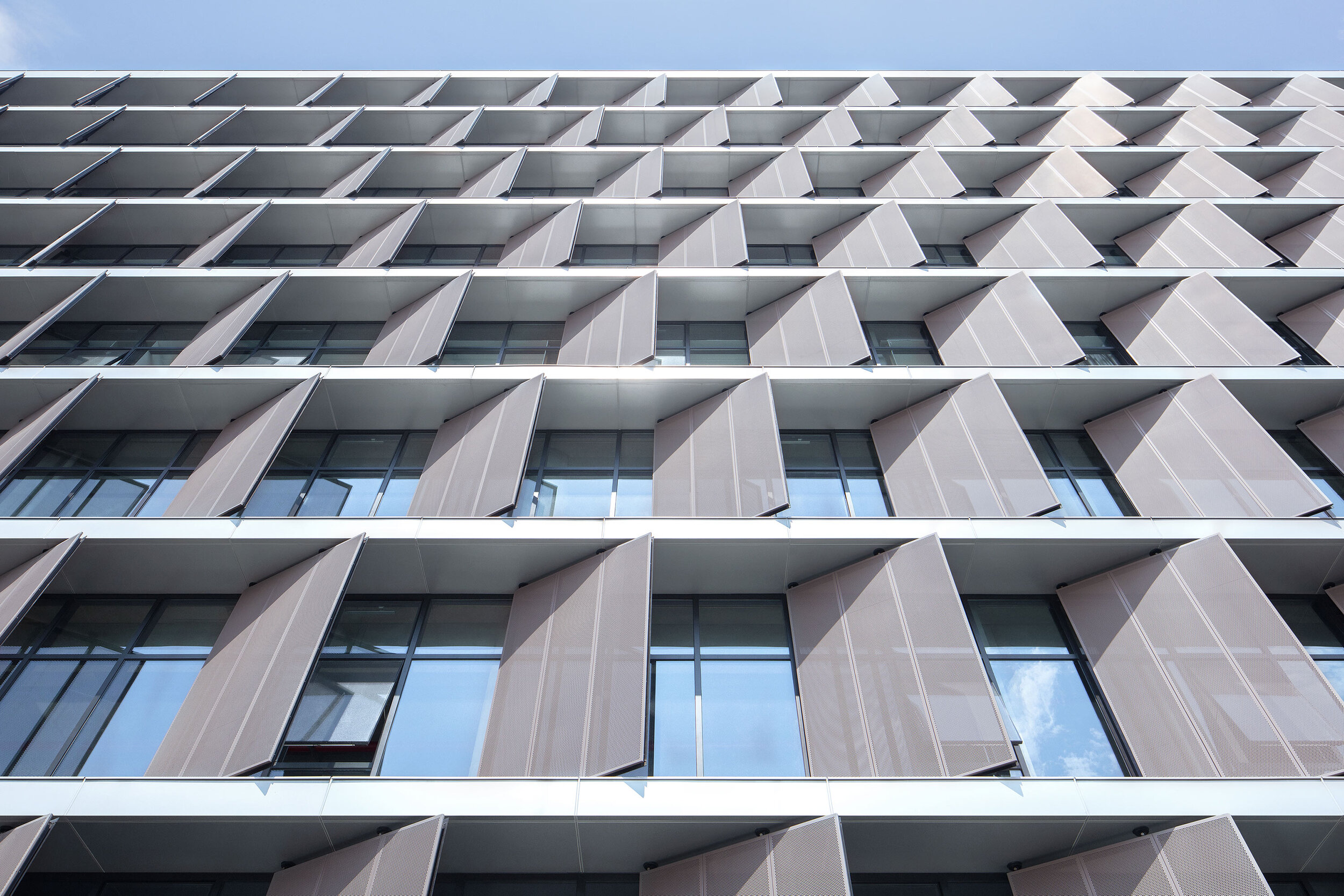
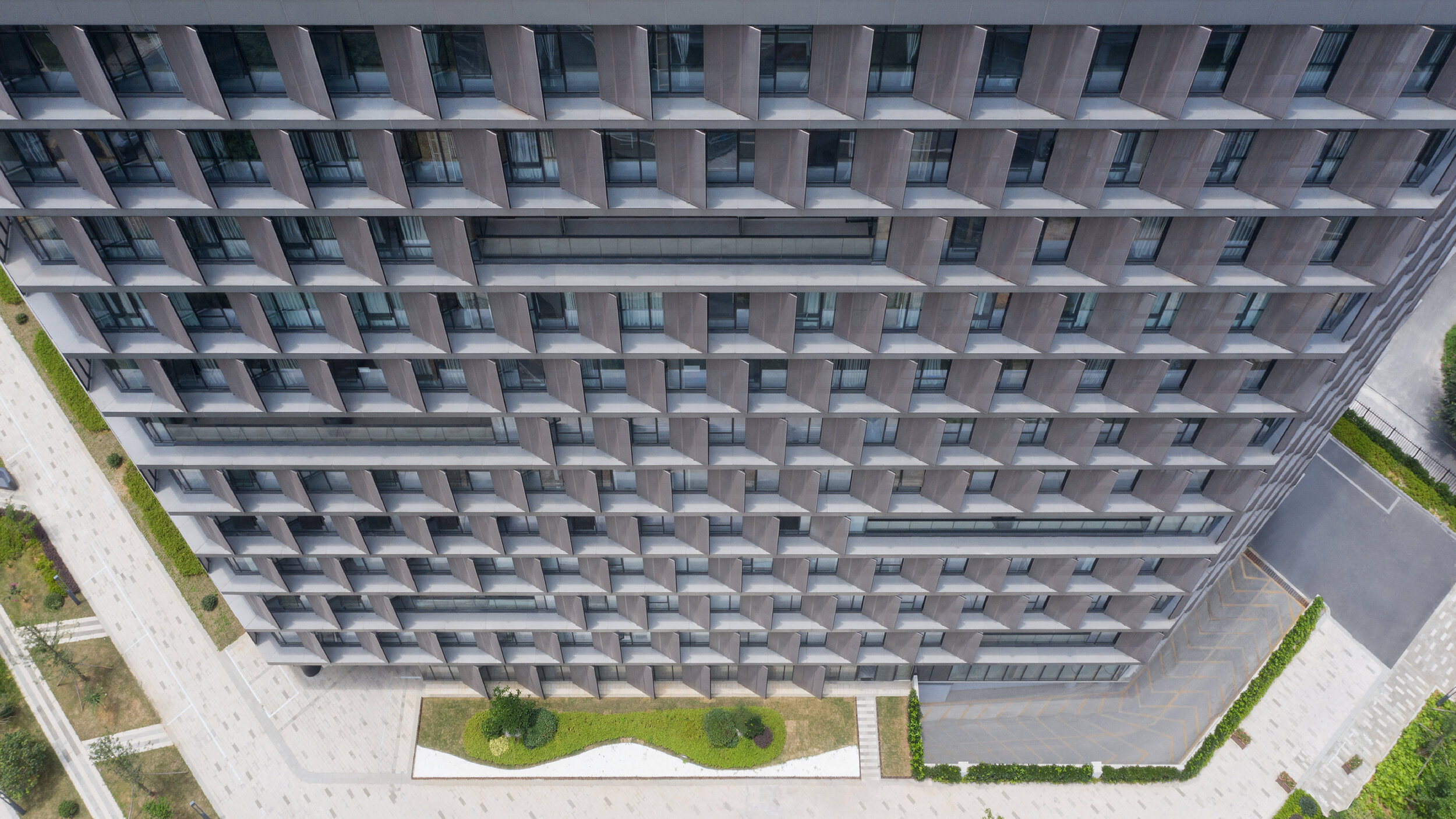
Surprisingly, all facades required vertical screens to prevent unwanted heat gain. Elegantly thin slab edges are projected past the window line and form horizontal ledges to sit vertical perforated metal sunscreens. These screens are closed enough to block the sun, yet open enough to not impede views out. Decks are then cut into the petals to provide outdoor space for each floor level and subtle visual relief to the petals' wall.
Minimalism 1. – Expressionism 0.
The program for this local government building is different: document archives, testing laboratories, staff canteen, a commercial street-front cafe, and a variety of closed and open office spaces. This suggests an architectural articulation of these programs. Besides, the typological hybrid offers an indication of the perimeter building and the tower.
However, rather than exploring these apparent solutions, the questions posed were: What are the program's differences? What are the differences generated by combining the perimeter block and tower typologies? And finally, what is the least we need to do to engage with these differences?
Semi-public courtyard
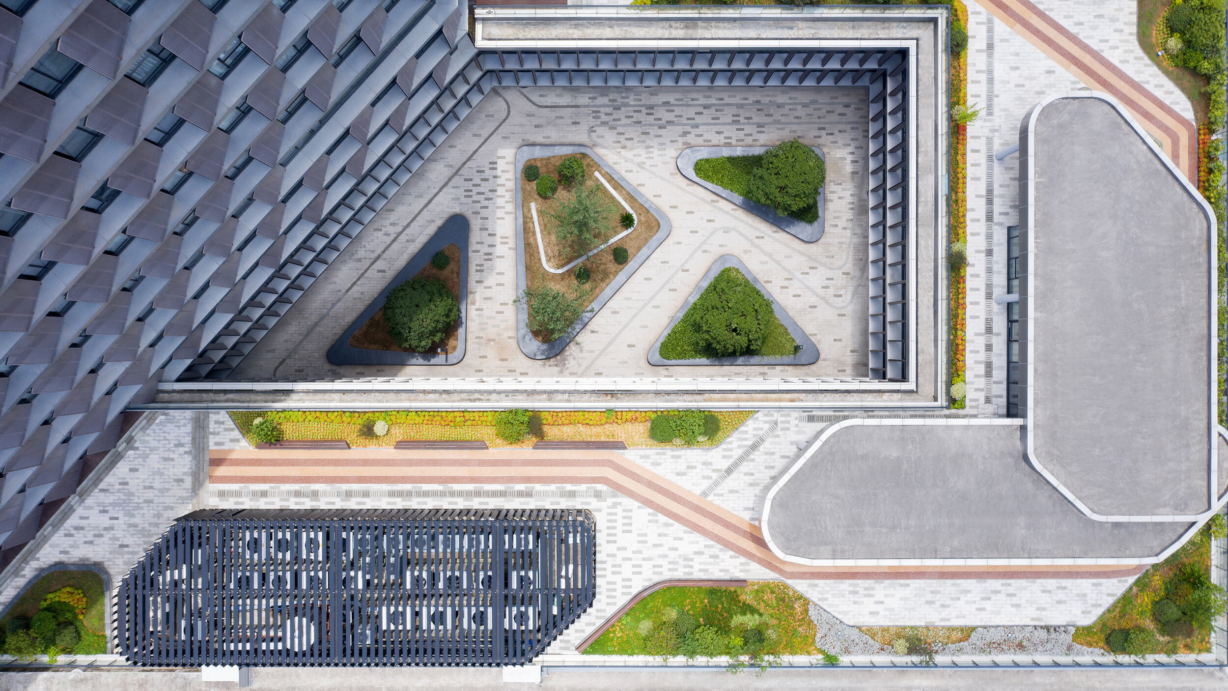
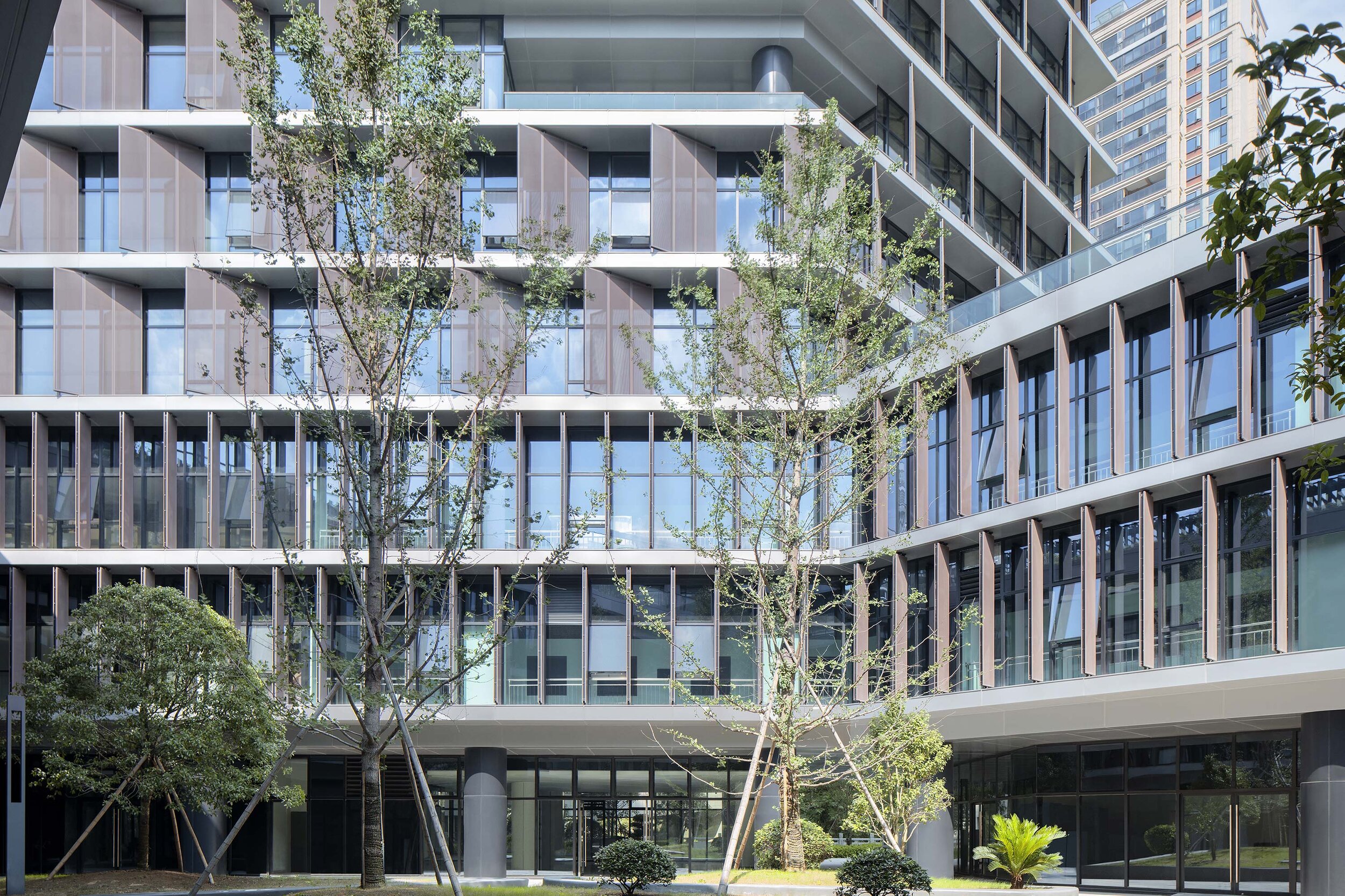
This centralized circulation strategy creates a semi-public outdoor space and provides opportunities for encounter and exchange among different public departments. It also provides an active area for lunch in a protected courtyard landscape.
The courtyard directly links the public footpath off the main southern entrance to a proposed pedestrian bridge to the northeast of the site. This diagonal shortcut further reinforces the semi-public nature of the courtyard.
Roofscape as displaced landscape
To encourage the staff to get out of the building and enjoy the river frontage or the courtyard, the paving from the ground floor interiors flows directly into the yard and out to the river's edge – a robust strategy for the future, when the ground floor develops more pubic and/or commercial programs.
The tower overlooks the perimeter block roof, and this space provides an opportunity for a significant private outdoor space for the building tenants. A garden pavilion for staff lunches or informal meetings sits within a roofscape that presents as a displaced landscape. The staff canteen opens on to this roofscape. Plant rooms have been disguised as additional garden pavilions.
More visible than we think
In a commercial and retail environment where every building is trying hard to be seen as different from its neighbours, advertising and signage dominate streetscapes. Buildings are becoming extensions of corporate logos and marketing campaigns – a minimal, elegant and calm public building may be more visible than we think.
Project Data
Project Name: Hangzhou Tonglu Archives Building
Project Status: Completed 2019
Location: Tonglu, Hangzhou, Zhejiang Province
Client: Tonglu Urban Development and Management Co., Ltd.
Typology: Office
Program: Document archives; testing laboratories; office.
Year: 2016—2019
GFA: 26,700 m²
Construction Cost: RMB 136 million
BAU Project Team: James Brearley, Jens Eberhardt, Chen Zhiyong, Luo Huaili, Steve Whitford, Gao Weiguo, Chen Jian
Builder: Hangzhou Harbour Construction Co., Ltd.
Engineer+Documenting LDI: China United Engineering Company
Photographer:Xia Zhi


