The Ultimate Nostalgia Tai’an’s Ceremony Hall - The Hometown Moon
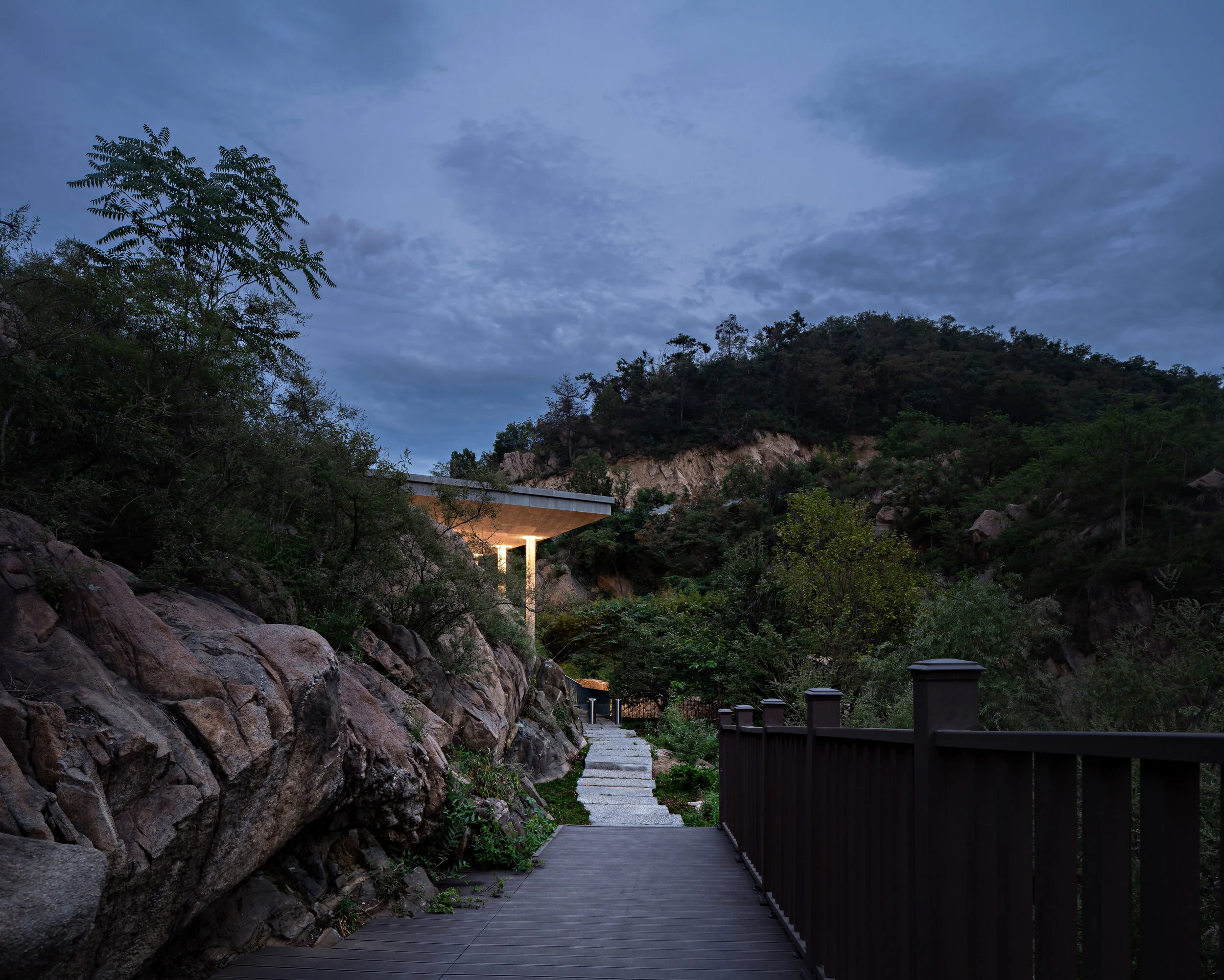
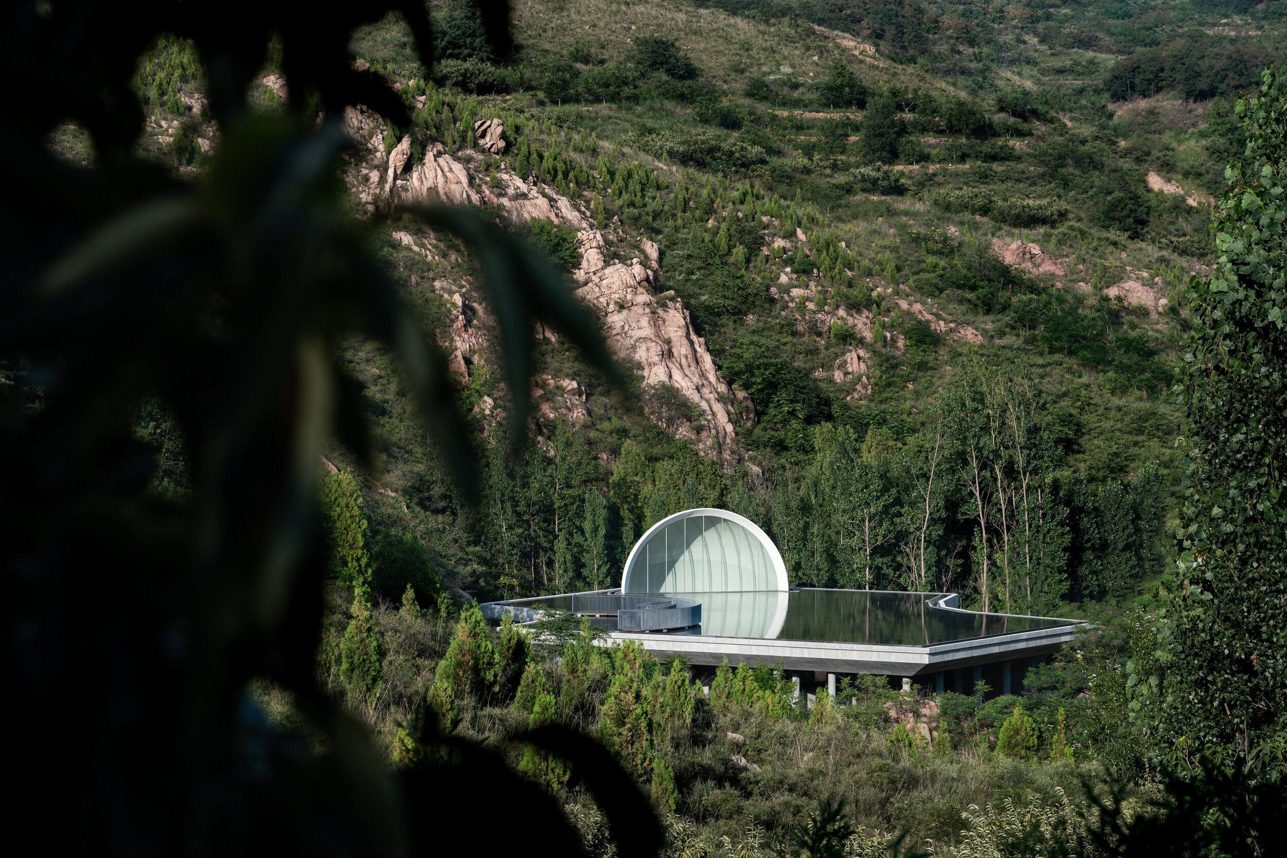
The parking lot is the last reminder of modern civilization. To access the Hometown Moon, visitors must go through a purifying road. It takes about five to ten minutes to walk along the path between mountains and streams. The entrance lies behind a boulder.
The Possibilities of a New Hometown
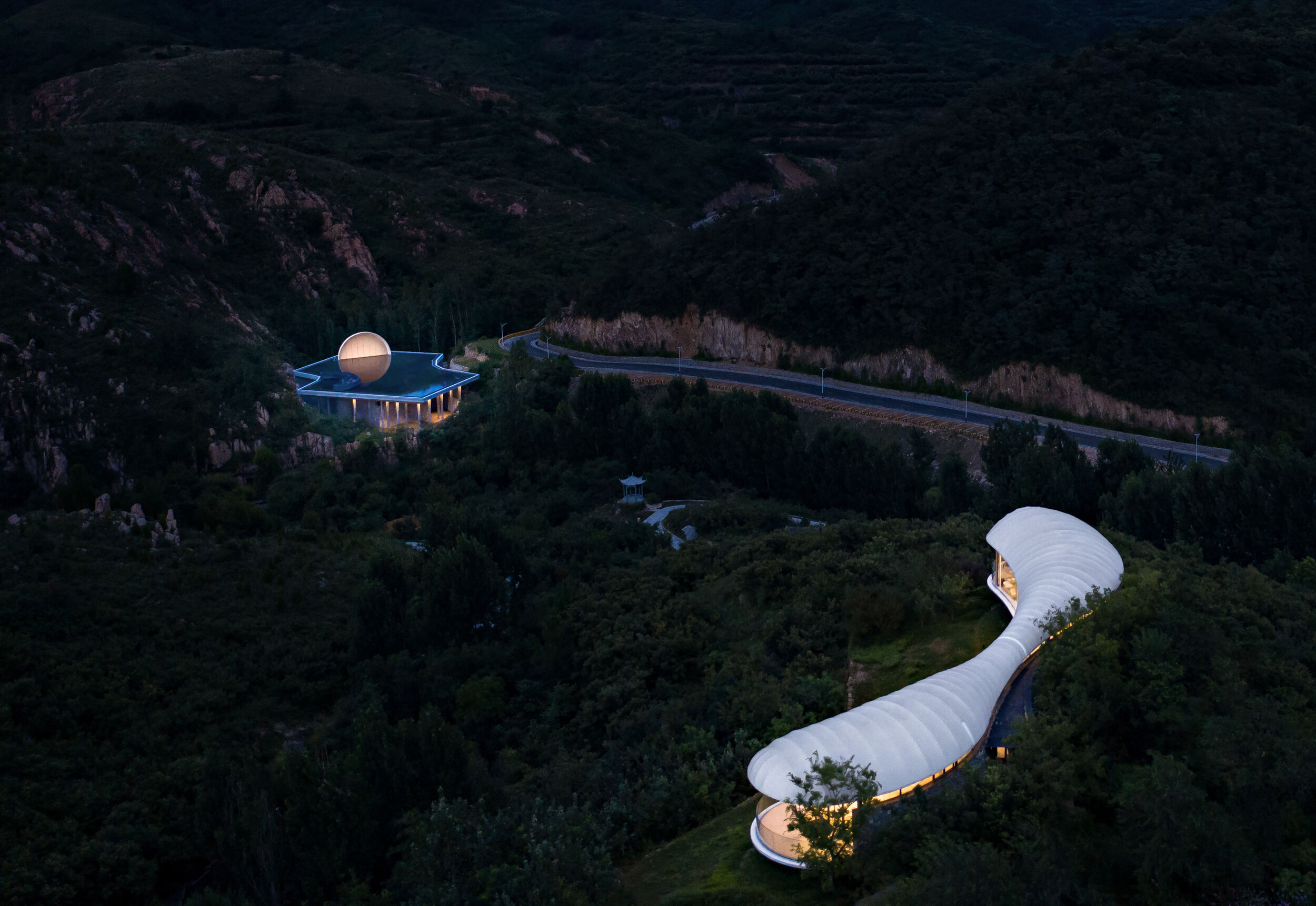
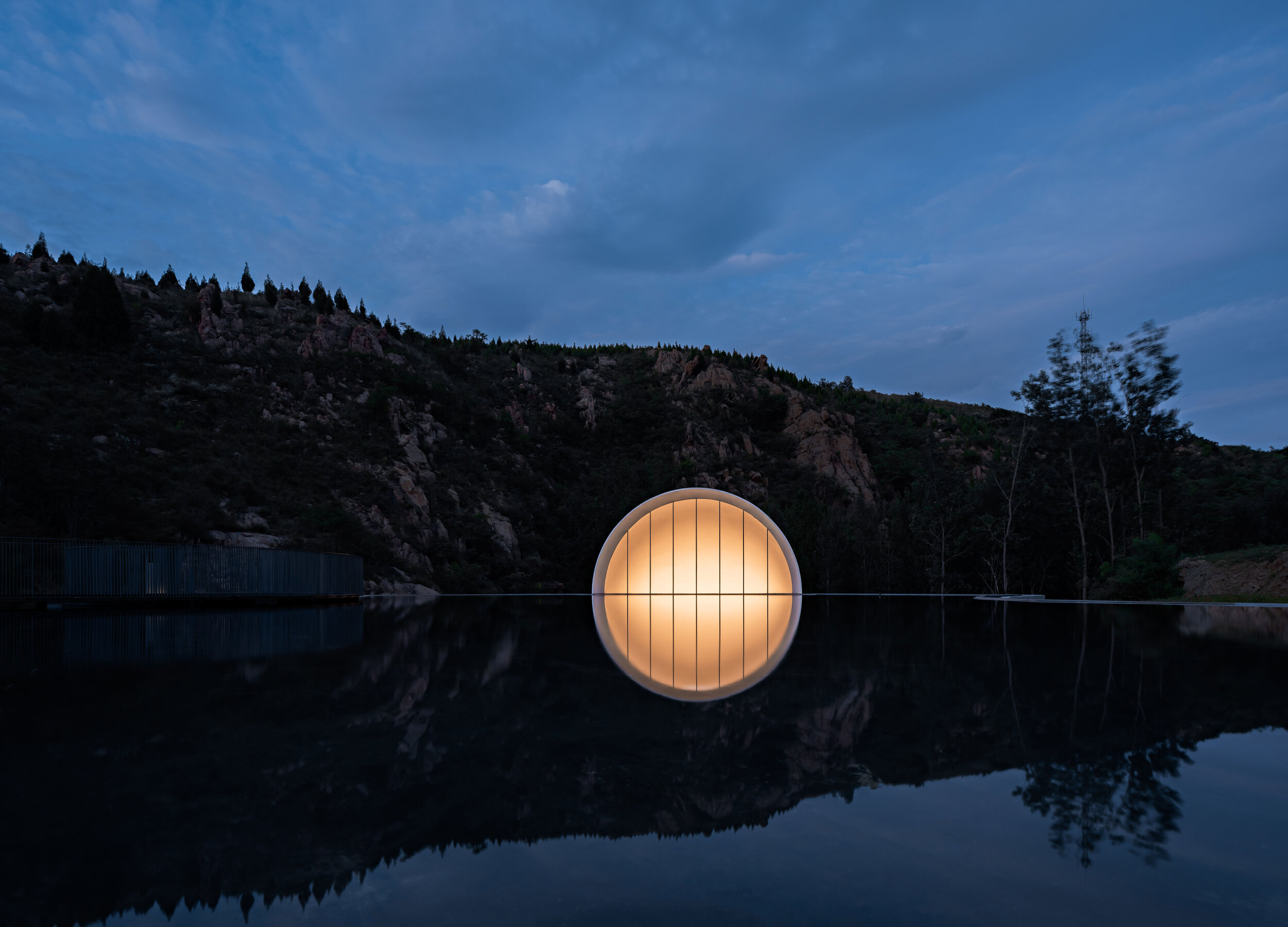
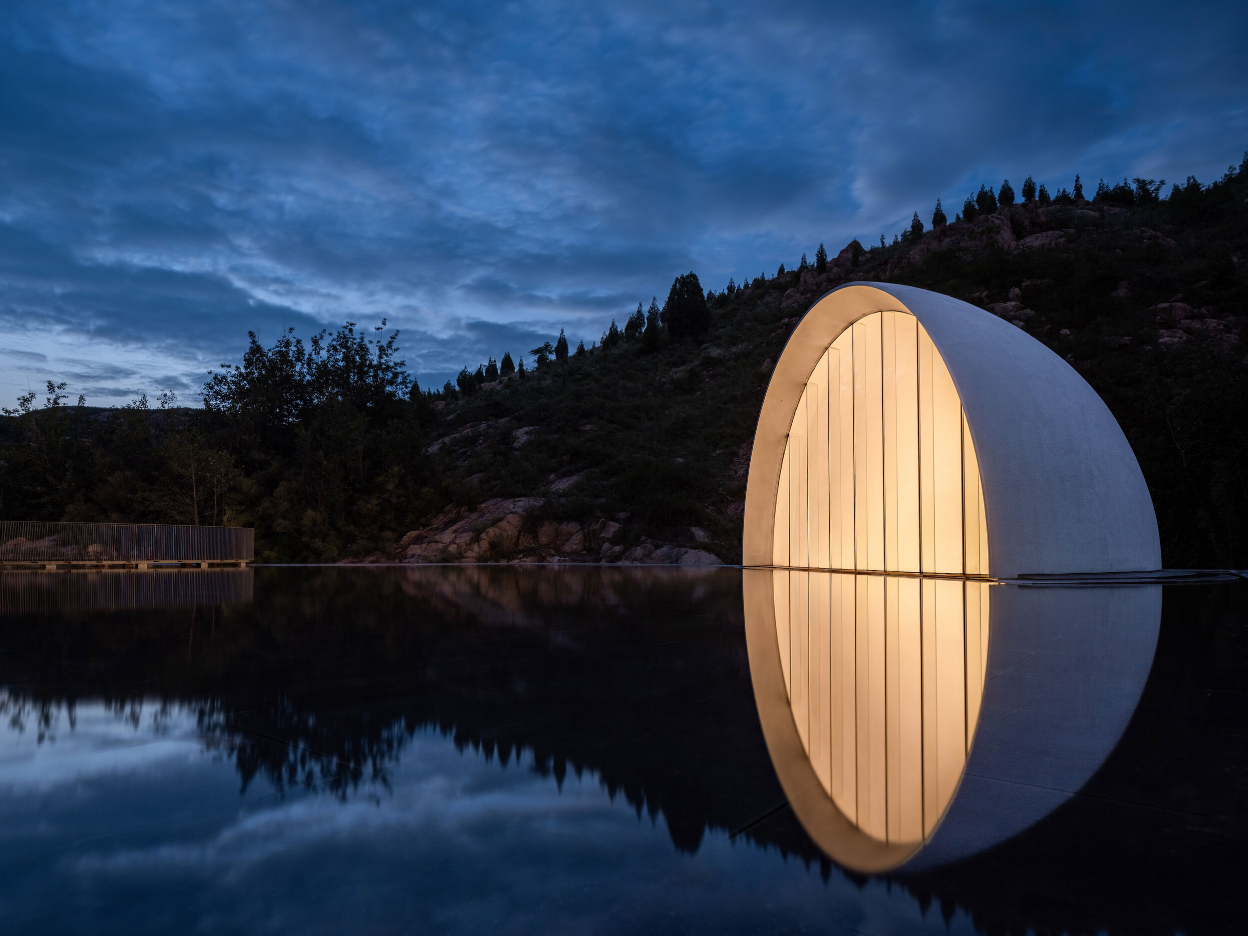
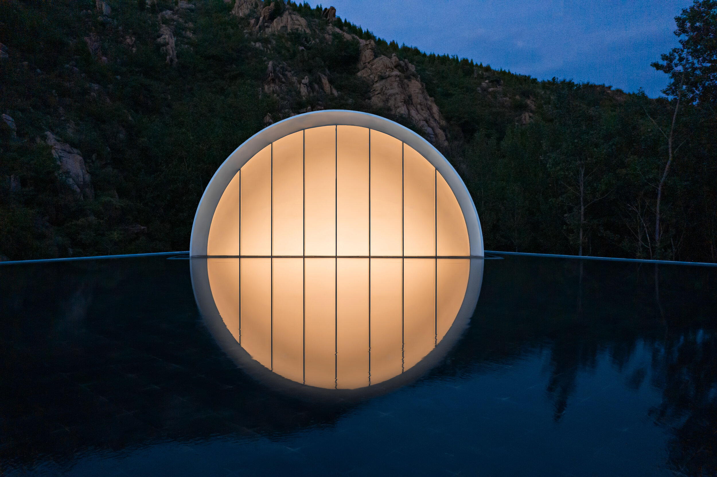
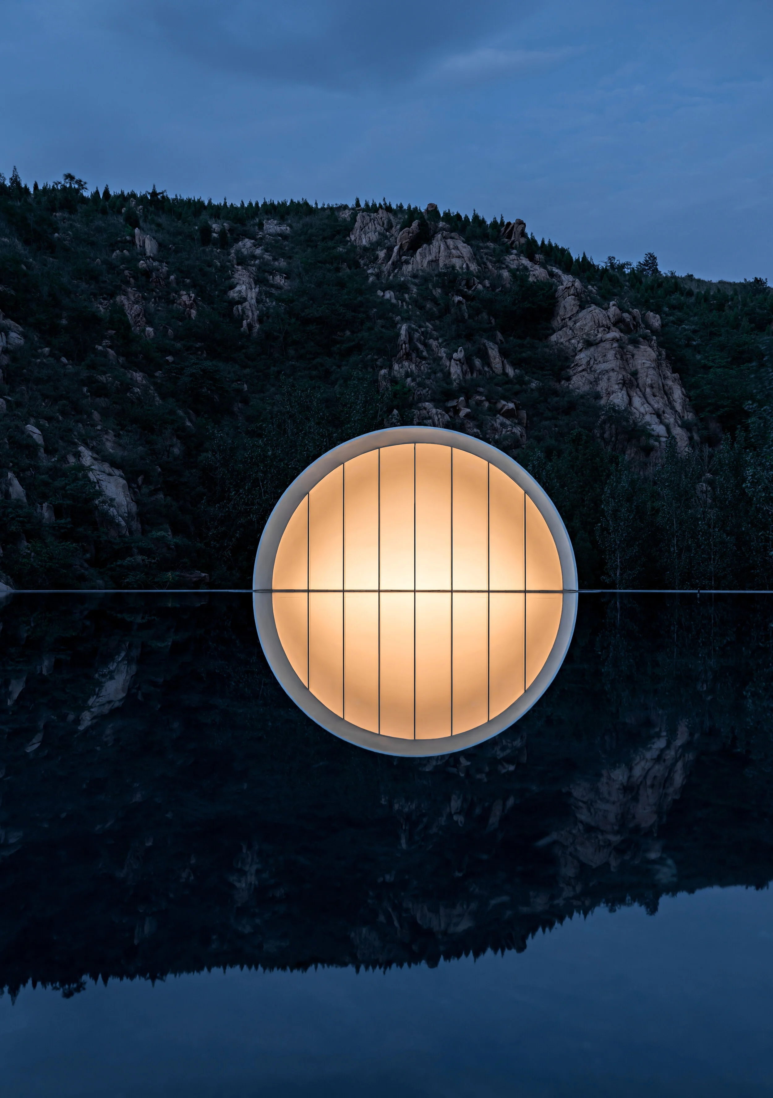
An assortment of colourful banners welcomes passengers at the high-speed train station in Tai’an, China. The headlines perched above the Jiunv Crest (Nine Women’s Peak) showcase a Hometown Moon or a Hometown Cloud, inviting people to walk on the moon or wander around the cloud. The intriguing wording is part of a creative campaign inviting travellers to visit attractions lying beyond the main scenic area of Mount Tai. The strategy looks to breathe new life into Nine Women’s Peak, a branch of the famous mount that gives its name to the city of Tai’an.
At the beginning of 2019, Shandong Lushang Group commissioned Syn Architects to develop the overall planning and design of the mountainous area, its villages, and the Hometown Moon, the representative structure of the project. In no time at all, a Hometown Cloud state of mind began to spread out. Fei Xiang’s theme, Hometown Cloud, was played repeatedly in the building. The romantic song from the ’80s swayed people’s emotions, creating a nostalgic atmosphere. Nine Women’s Peak drew attention on social media, bringing new people, new faces, new industries, and new possibilities to the area around Dongximen Village. The region of humble villages became an online phenomenon that attracted thousands of tourists. During the project, Lushang Group effectively used the image of “a cloud” to demonstrate the enormous value of architecture as a communication medium.
However, a series of scattered constructions is not enough to stimulate the growth of a region. Thus, the online popularity of the Hometown Cloud slowed down in less than a year. Today, Lushang Group demands a long-term holistic approach that can connect the string of mountain villages in the 55 square kilometres area. The definition of industrial and spatial structures and the introduction of new wonders that satisfy visitors looking for fresh experiences is needed too. In this regard, Syn Architects integrates daily life, industrial development, and environmental science in every project. Taking advantage of its years of practical experience in rural areas, the firm developed client markets in Jinan, Shandong province’s capital city. Additionally, attractions such as the Balou Theater and the Hometown Moon, and their supporting facilities, were unveiled one after the other. In this way, Syn Architects returns to the birthplace of Confucianism, rebuilding the relationship between dualities such as the city and the countryside, modern society, and homesickness, searching for forgotten values and neglected possibilities.
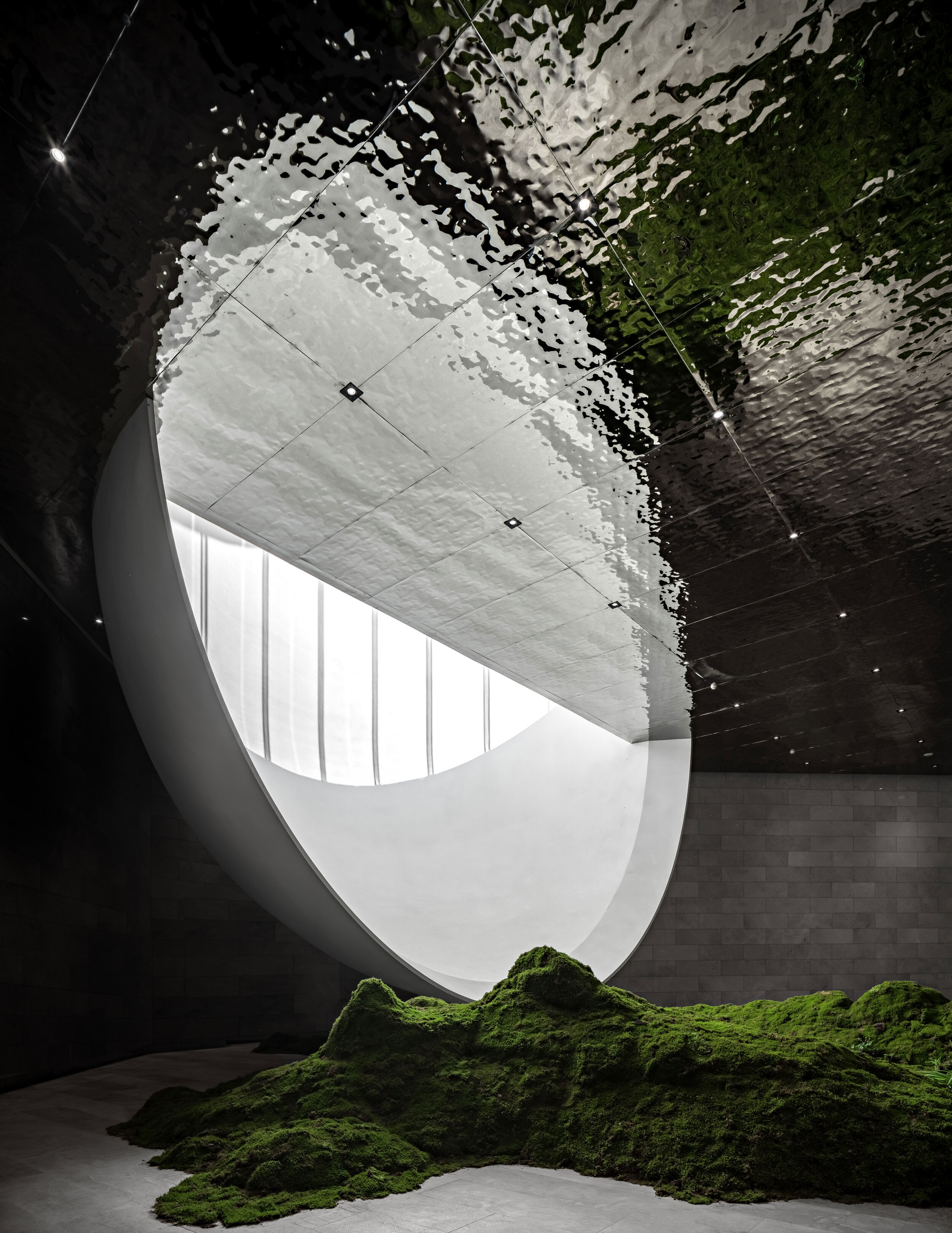
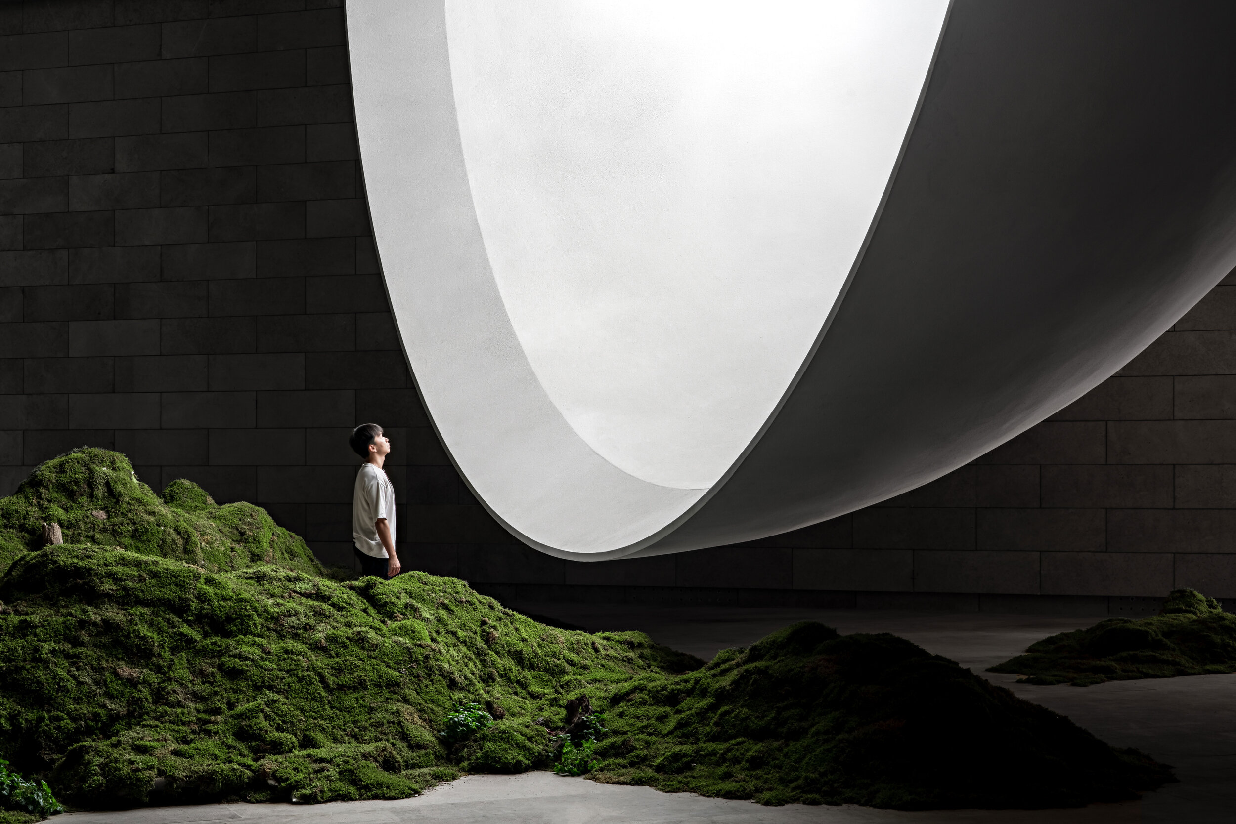
The Moon is the Light of Our Hometown
The original concept for the Hometown Moon comes from the developer. During the Mid-Autumn Festival of 2019, a moon-shaped balloon with a diameter of 10 meters was lit up in Nianhua Bay, spreading magical colours and lights all around. Inspired by the scene, the Lushang Group hopes to light up a full moon at the Nine Women’s Peak and write the next chapter in intellectual property for designed hometowns.
Mr. Zou Yingxi, the lead architect and planner of the project, hopes to infuse a deep meaning into the artificial moon. He longs for a moon that never sets. According to this rhetoric, the building functions as a ceremony hall designed to escape conventionalisms. Among its main features, the structure attracts locals and tourists from other provinces, can host ceremonies and events, and provide spiritual and operational values that strengthen the village’s resources.
An ancient poem from the Song Dynasty ponders the nature of perspective and emotion: “the clouds and the moon remain the same, but mountains and rivers evolve throughout time.” Modern-day catalysts are also capable of evoking nostalgia, regardless of location. As such, an architectural poem about the moon does not need to relate to the classical symbol. Under this philosophy, Syn Architects combines abstract geometrical shapes and simple materials to create a pure space with complex visuals that stimulate the soul, leaving traditional figurative expressions behind.
The Route Guidance
The parking lot is the last reminder of modern civilization. To access the Hometown Moon, visitors must go through a purifying road. It takes about five to ten minutes to walk along the path between mountains and streams. The entrance lies behind a boulder. From here on, visitors begin to enjoy communion with nature. Birds singing, insects chirping, rustling leaves, gurgling streams, and hearts beating with joy and anticipation; the sounds of nature make visitors feel at ease. After crossing a mountain, a river, and exploring a few curved pathways, visitors finally arrive at the building. Here, they ponder about the intriguing nature of the architecture. And on the emotional side, their senses of hearing and smell are stimulated by their natural surroundings.
The long and winding paths increase the curiosity of visitors. Attracted by a building in the middle of nature, they suddenly find themselves inside the structure, wondering about the charms of an inverted moon. Like Buddhist meditation, the experience develops insight by feeling the background of mountains and forests to complete a mental reorganization, soothing the souls of urban residents. Along the plank road, there are playgrounds, cabin camps, bonfire areas, and anti-fog devices. These and other similar spaces enrich the experience and the dimension of the project.
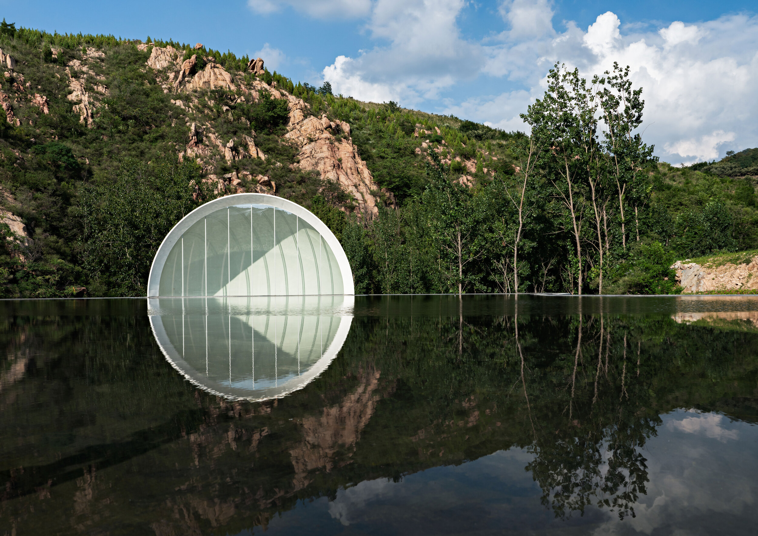
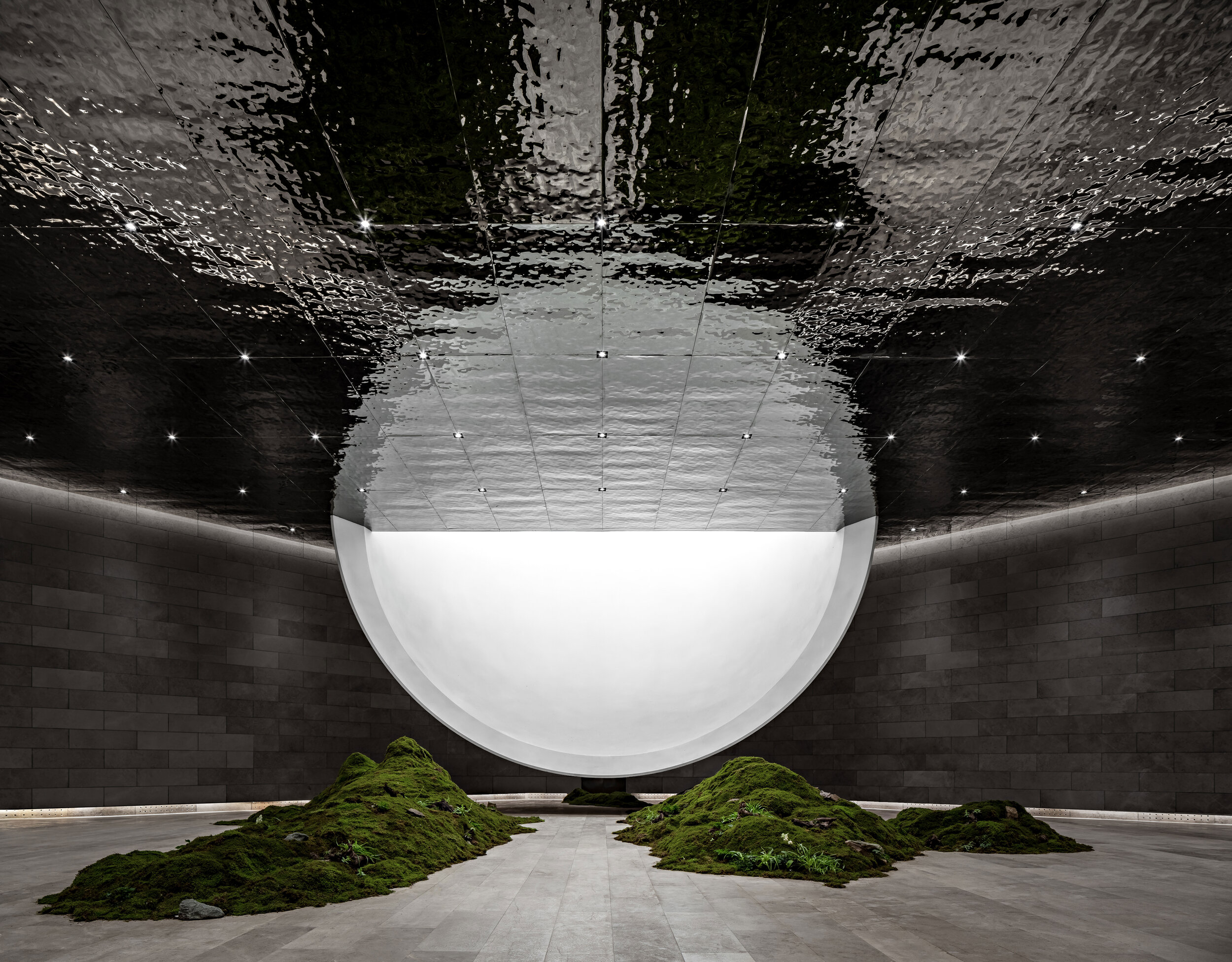
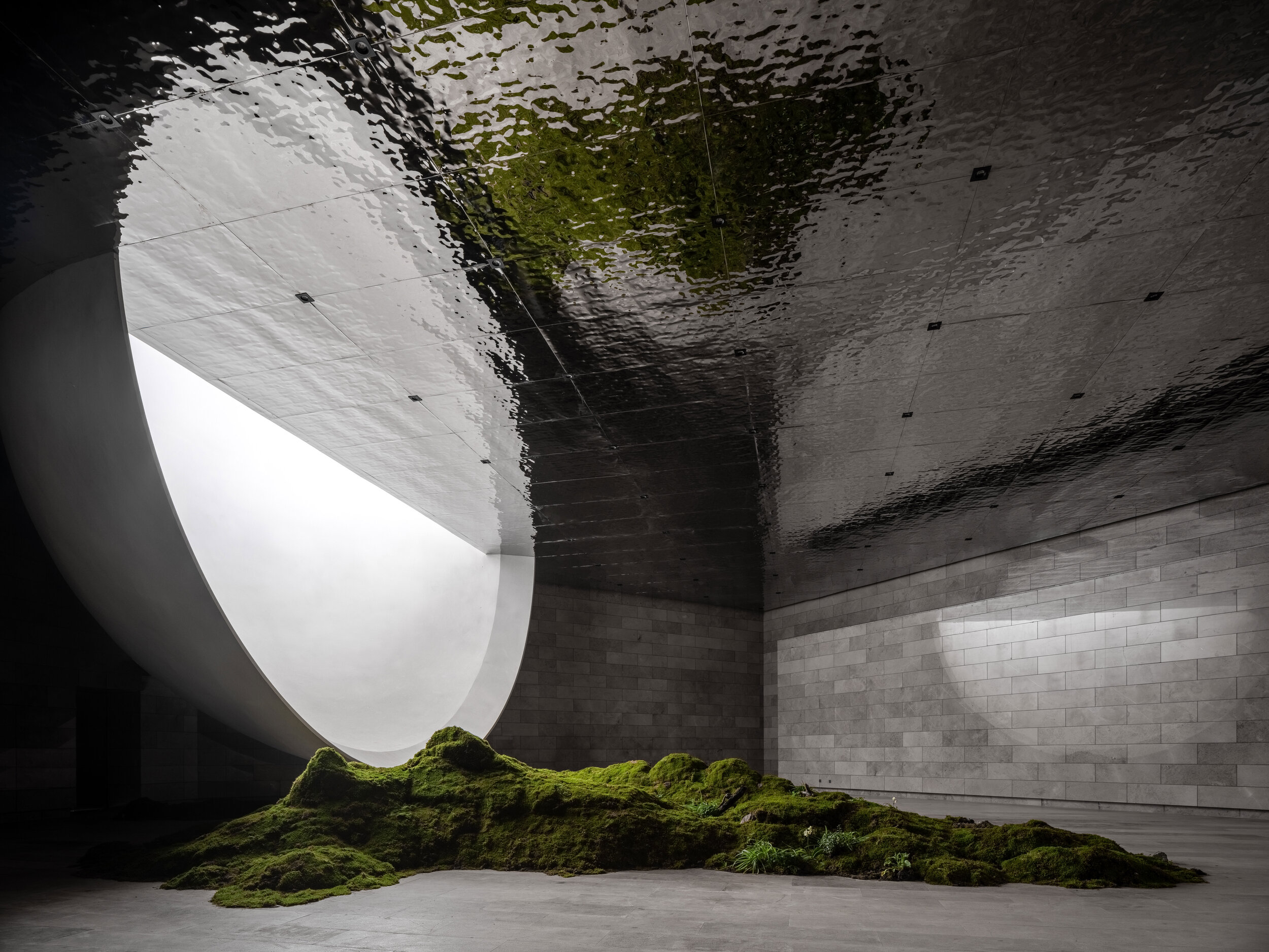
Bridges on top of the structure allow visitors to contemplate the moon by the reflecting pond without entering the building. There is a plank road connection between the group of bridges and the mountain that grants access for this purpose. If there is an ongoing ceremony in the room, the door on the roof can be closed to avoid interference. If there is no activity in the room, visitors touched by the moon on the ceiling can enter the building and contemplate the lower half of the moon.
The parking lot is the last reminder of modern civilization. To access the Hometown Moon, visitors must go through a purifying road. It takes about five to ten minutes to walk along the path between mountains and streams. The entrance lies behind a boulder. From here on, visitors begin to enjoy communion with nature. Birds singing, insects chirping, rustling leaves, gurgling streams, and hearts beating with joy and anticipation; the sounds of nature make visitors feel at ease. After crossing a mountain, a river, and exploring a few curved pathways, visitors finally arrive at the building. Here, they ponder about the intriguing nature of the architecture. And on the emotional side, their senses of hearing and smell are stimulated by their natural surroundings.
The long and winding paths increase the curiosity of visitors. Attracted by a building in the middle of nature, they suddenly find themselves inside the structure, wondering about the charms of an inverted moon. Like Buddhist meditation, the experience develops insight by feeling the background of mountains and forests to complete a mental reorganization, soothing the souls of urban residents. Along the plank road, there are playgrounds, cabin camps, bonfire areas, and anti-fog devices. These and other similar spaces enrich the experience and the dimension of the project.
Interventions
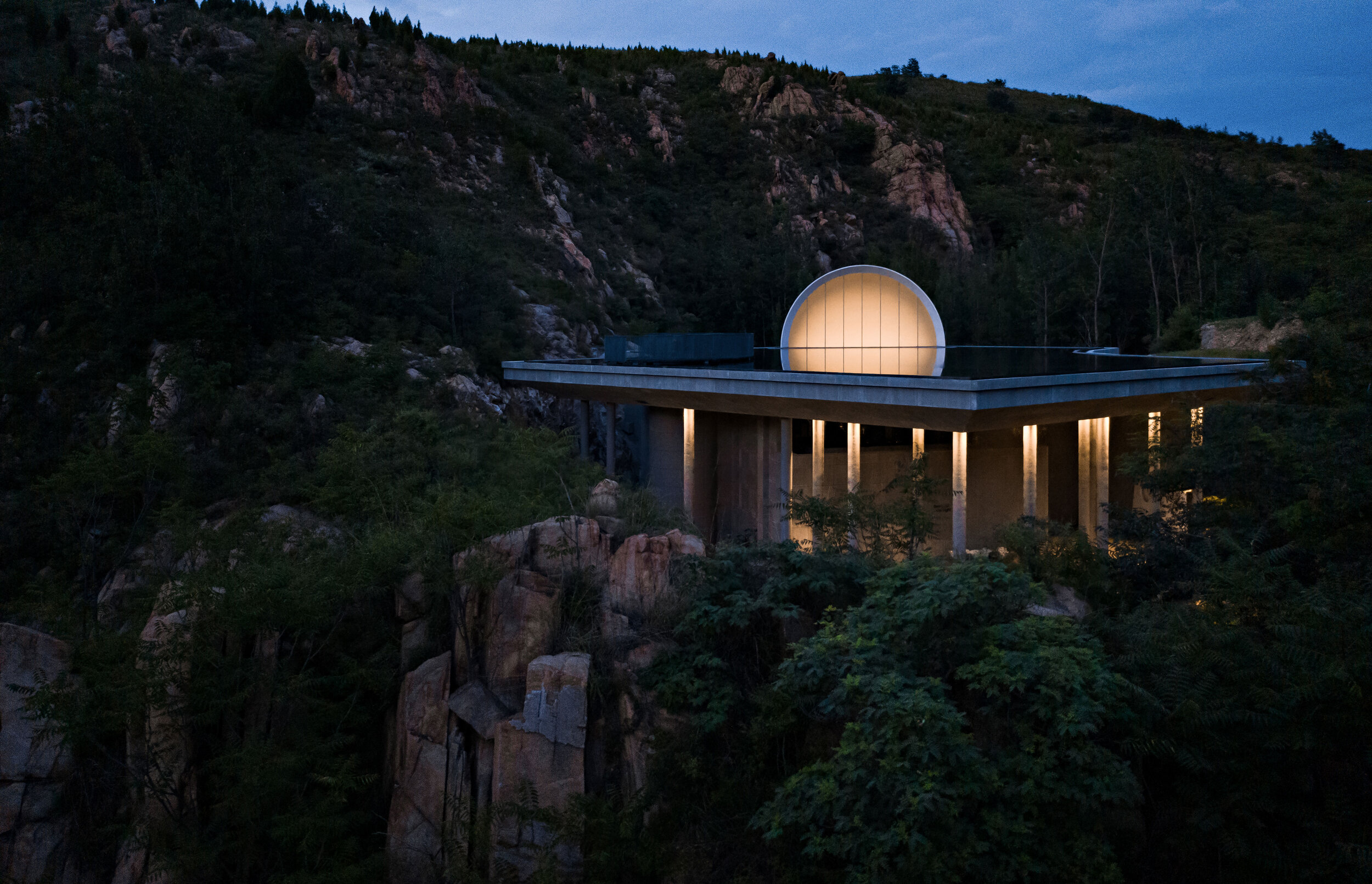
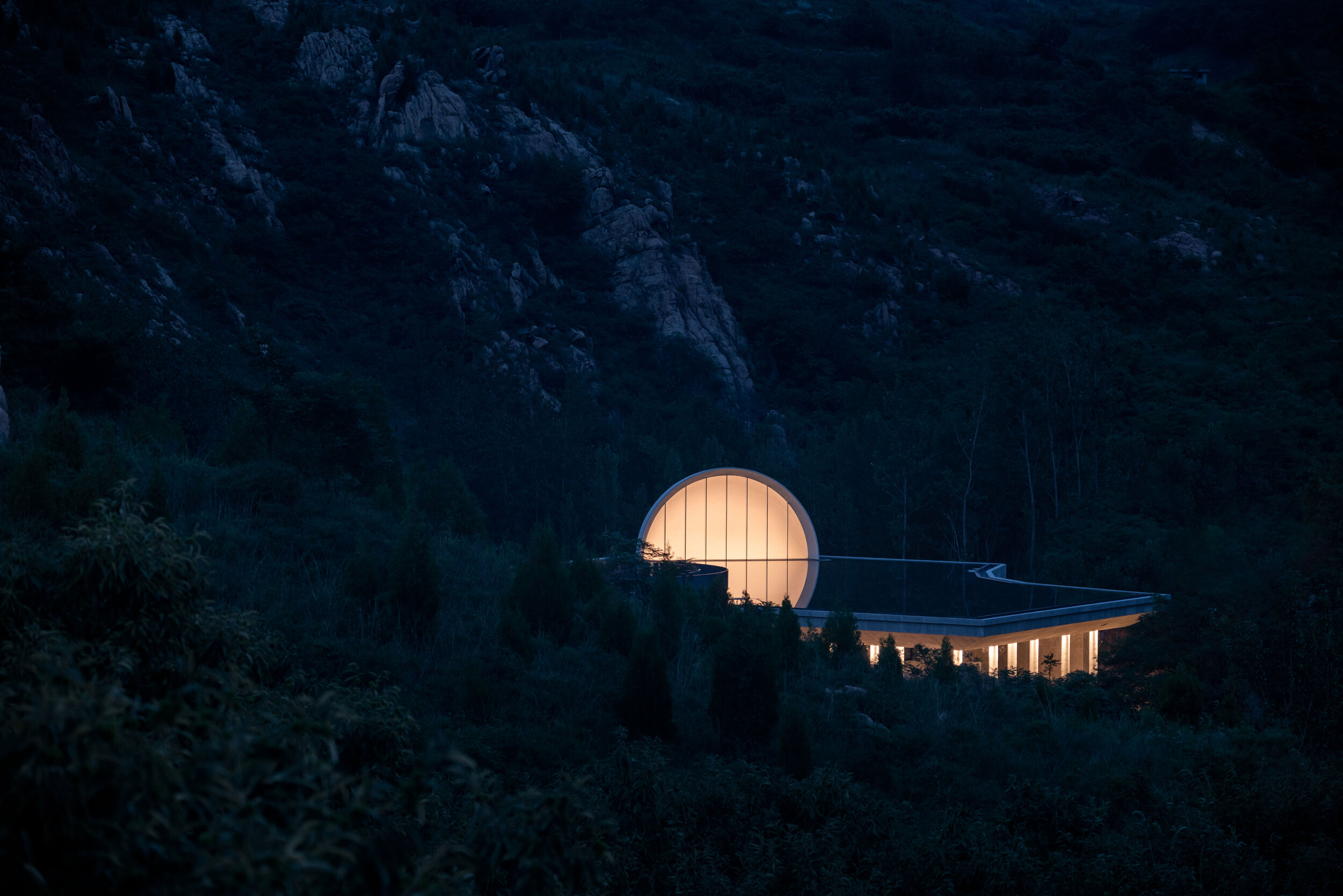
When the surroundings become gray, the visitors are officially inside the territory of the moon. The building occupies more than 1,000 square meters consisting of the moon, the cavity, and the grey space. Inspired by the mountain stream by the base of the building, the designer uses architecture as a medium to reproduce the romantic idea of a moon born on the sea.
The placement of the Hometown Moon was designated considering several factors: the altitude needs to remain moderate, and the building must not block the mountains behind it. It should not be blocked by the hill in front of it either. Proportion-wise, the diameter of the moon and the area of the water surface must match to ensure that the architectural piece and its reflection on the water form a full moon together. Furthermore, the cavity in the building needs to contain half of the moon with a diameter of 12 meters. The space also needs to allow the appropriate height required to host ceremonies.
The depth of the roof pond needs to consider the water evaporation rate. In this regard, a water reservoir 0.5 meters deep and a central interlayer device work together to reduce the hydration frequency. The ceremonial space needs to remain column-free, and the form and shape of the full moon need to limit the thickness of the beams. A ribbed and beamless concrete floor meets the load-bearing requirements of the structure at a reasonable price too.
Syn Architects takes advantage of the materials available in the area to adopt a limited intervention approach. The strategy consists of widening the base of the valley before erecting the building. Such a method also preserves the original spillway to help prevent natural disasters. The foundations are dug according to the calculated diameter of the moon and the space desired. Furthermore, the rocky and mossy walls of the mountain remain untouched as a natural limit to the project. In this way, the walls showcase the struggle between man and nature while further participating in the aesthetic concept.
The natural scenery is the starting point of the Hometown Moon. Indeed, nature is the catalyst that feeds the imagination of architects. They ensure that the solution is reasonable, achieving goals and fulfilling spatial and functional requirements by maximizing the integration with nature.
Project Information
Project Name: The Hometown Moon
Location: Daolang Town, Tai’an City, Shandong Province
Client: Taian Lushang Jiunvfeng Rural Revitalization Co., Ltd.
Project type: Architecture Design, Landscape Design, Interior Design
Design Period: 2019.10-2020.7
Construction Period: 2020.7 -2021.6
Site Area: 1866 sqm | Architecture Area: 1469 sqm | Interior Area: 856 sqm | FAR: 0.78 | Green Rate: 30% | Function: Chapel
Project Team:
Chief Architect:Zou Yingxi
Project Architect: Liu Yuan, Jin Nan
Interior Design Team: Xia Fuqiang, Qian Guoxing, Cao Zhenzhen, Liu Tingting, Li Qianxi
Interior Rendering Team: Feng Yan, Guo Mengjia, Li Hui
Landscape Design Team: Jin Nan, Xu Lu, Liu Shuang, Li Beibei, Liang Jingqi
Architecture Rendering Team: Zhu Feng, Chen Lan, Liang Xiaoting, Ruan Jianjun, Shi Lina, Tang Tang, Zheng Lihua, Liu Shuang (Sketch)
Contractor: Shandong Tai Shan Puhui Construction Ltd,.
Structural Engineer:Wang Qiang, Yang Jian, Yan Dongqiang
MEP Consultant:Huang Yuanzheng, Mei Yantao, Ji Pengcheng
Lighting Design:Create stars studio lighting design
Other consultants:Feng Yasong, Liao Shijie, Chen Lu, Xu Yan, Zheng Shuai
Main Contractor: Shandong Tai Shan Puhui Construction Ltd,.
Materials:
Slab, Glass, Wood Panels, Stainless Steel Panels / Photographer: Zheng Yan/ Video: Huasheng
“Since the completion of the building, it has started a dialogue with users and nature. I look forward to seeing it being modified over time, further blending with the environment as the trees grow.
Each architecture has two destinies: being destroyed or being protected. I look forward to creating an architecture that is reluctant to be destroyed. It will be the highest achievement of my career. For this reason, I will bestow deeper meaning to my architecture and create more emotional bonds for its users. I hope that the moon can become this kind of architecture. Even if it disappears in time, it will still exist in our spiritual world.”.
Zou Yingxi
Lead Architect
of SYN Architects
“Since the completion of the building, it has started a dialogue with users and nature. I look forward to seeing it being modified over time, further blending with the environment as the trees grow.
Each architecture has two destinies: being destroyed or being protected. I look forward to creating an architecture that is reluctant to be destroyed. It will be the highest achievement of my career. For this reason, I will bestow deeper meaning to my architecture and create more emotional bonds for its users. I hope that the moon can become this kind of architecture. Even if it disappears in time, it will still exist in our spiritual world.”.
Unlock your Imagination, Open your Mind to a Brilliant Prospect
The Existence of a City Depends on Memory
By naming the project in Chinese after the “Nanjing Brocade” –a traditional article famous for its cloud-like colours and intricate patterns, China Overseas Land & Investment pays homage to the heritage of a city, the place where the best fabrics in the country are produced: the “Fifth Cotton Mill.”
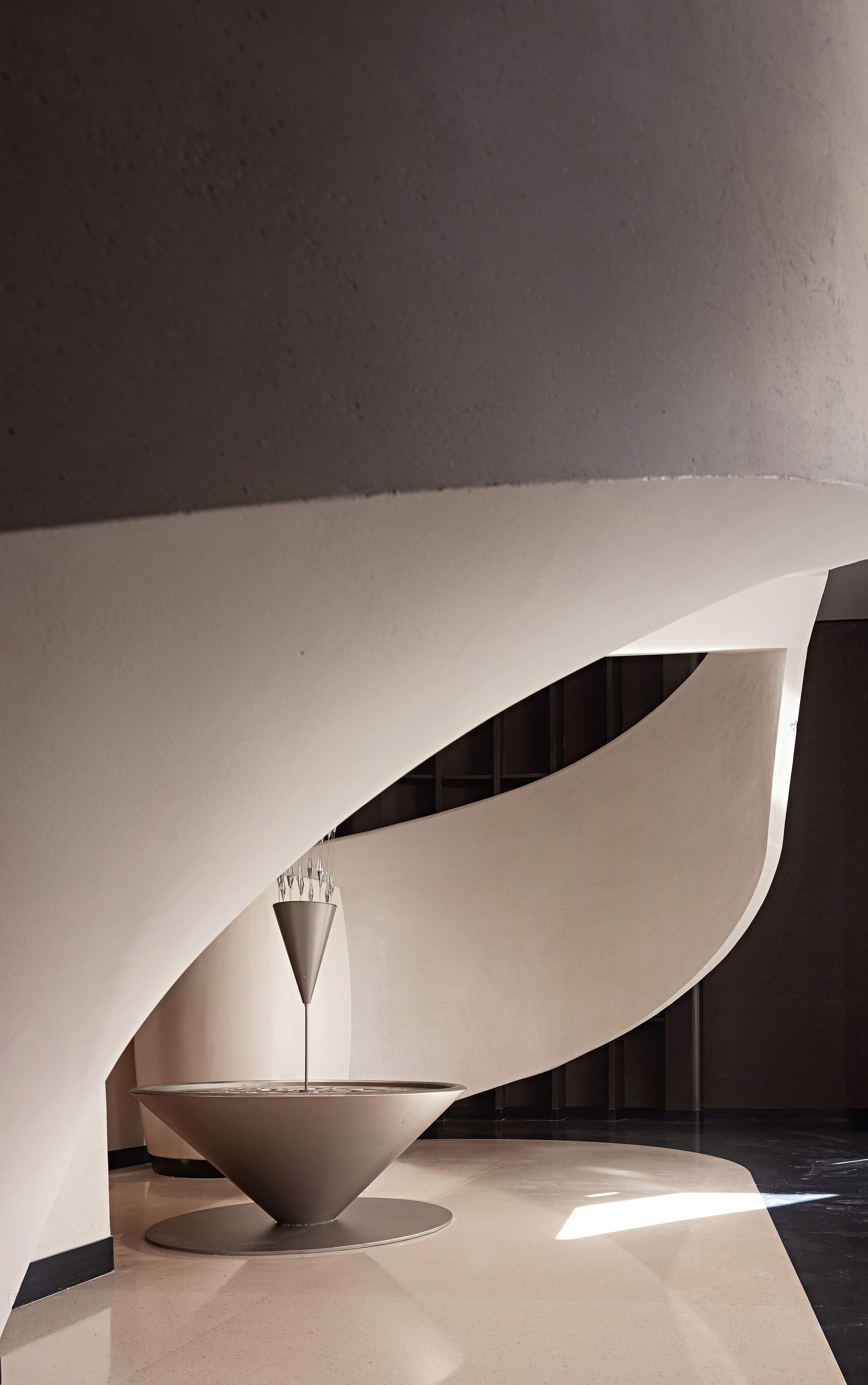
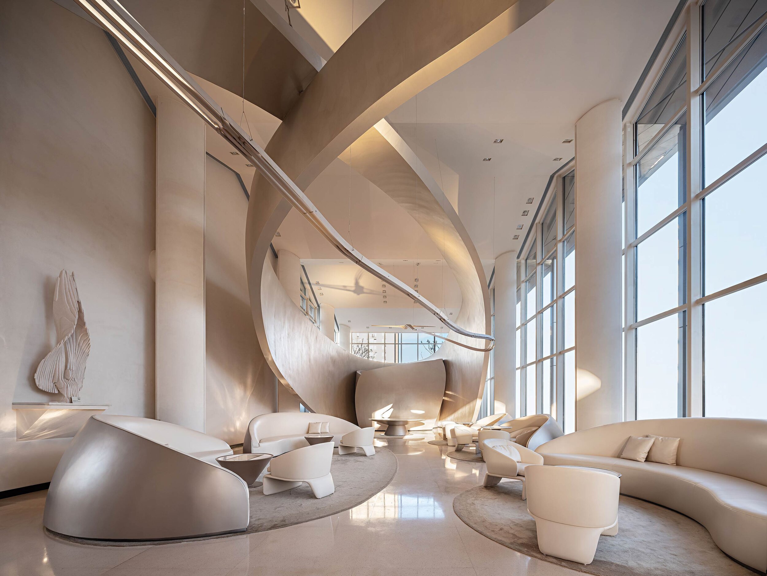
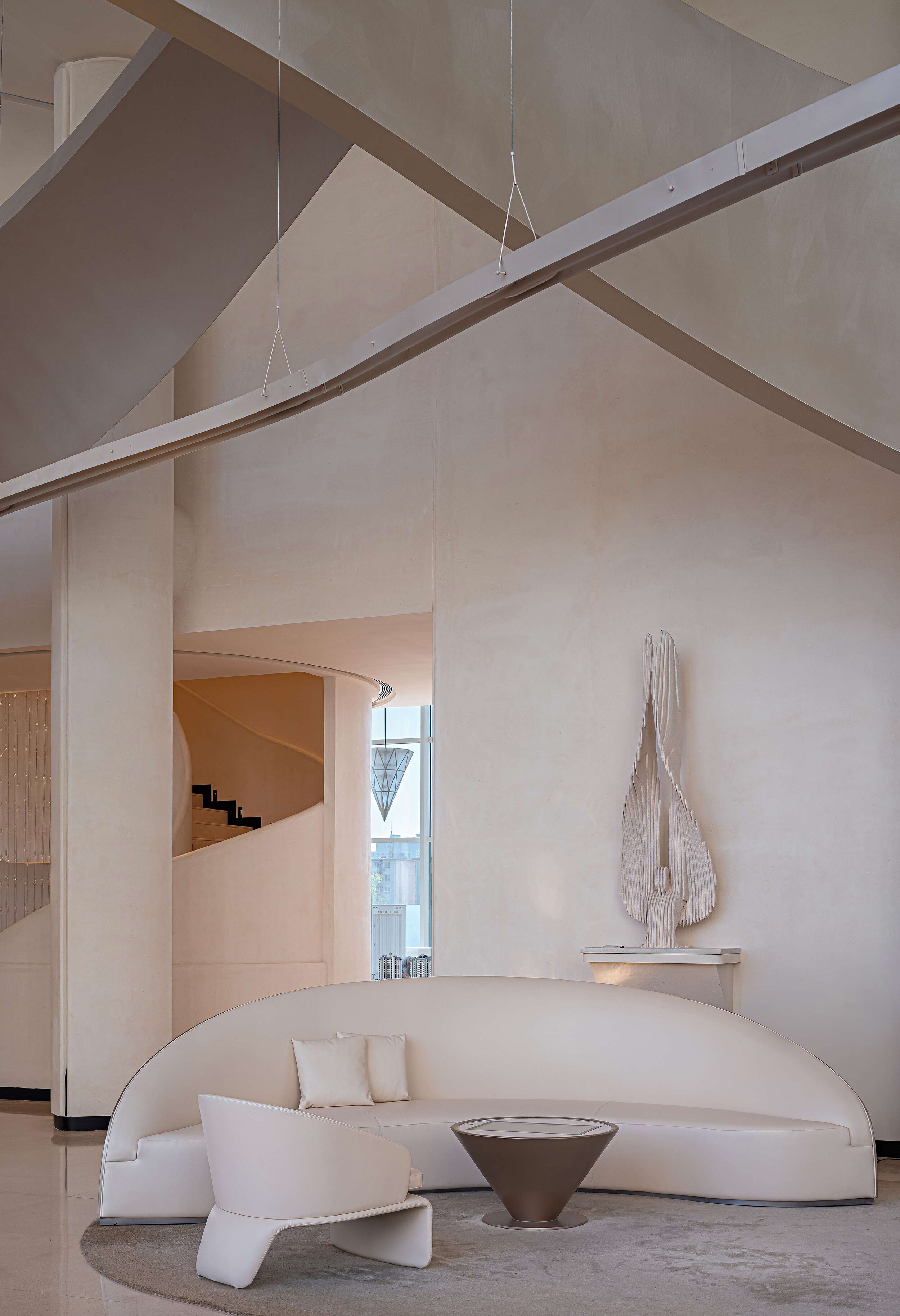
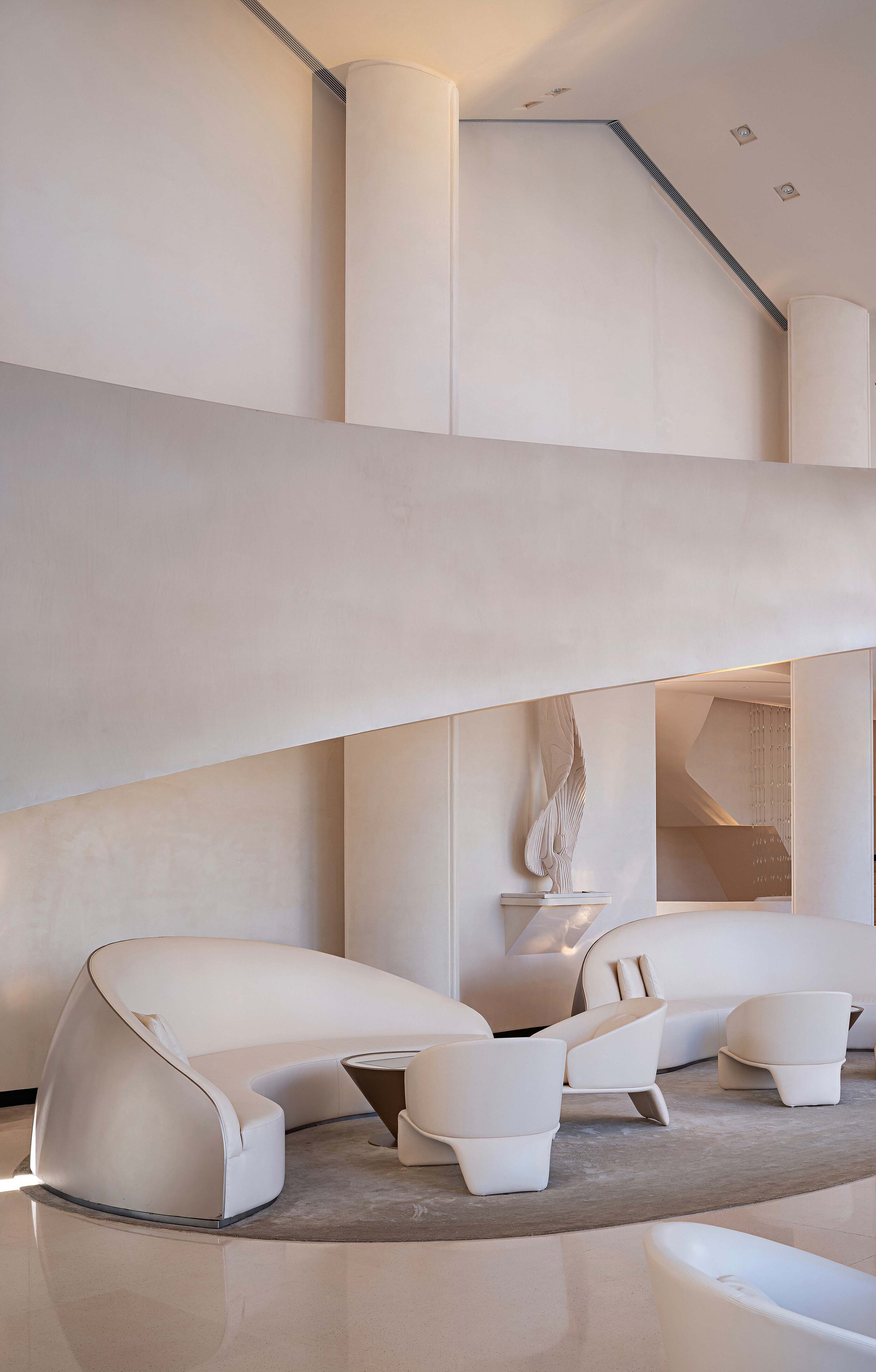
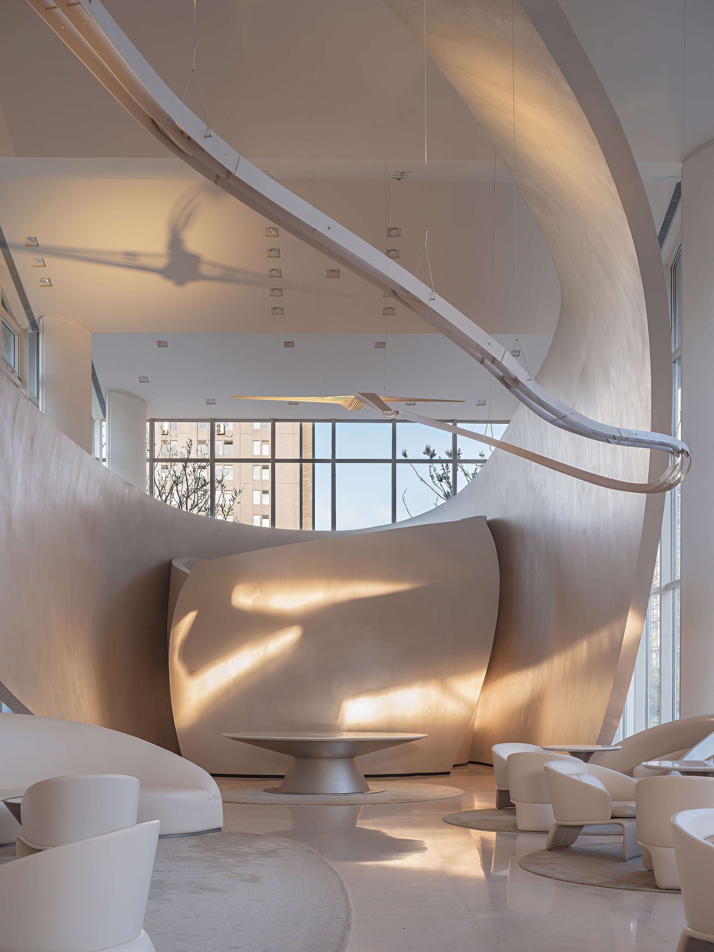
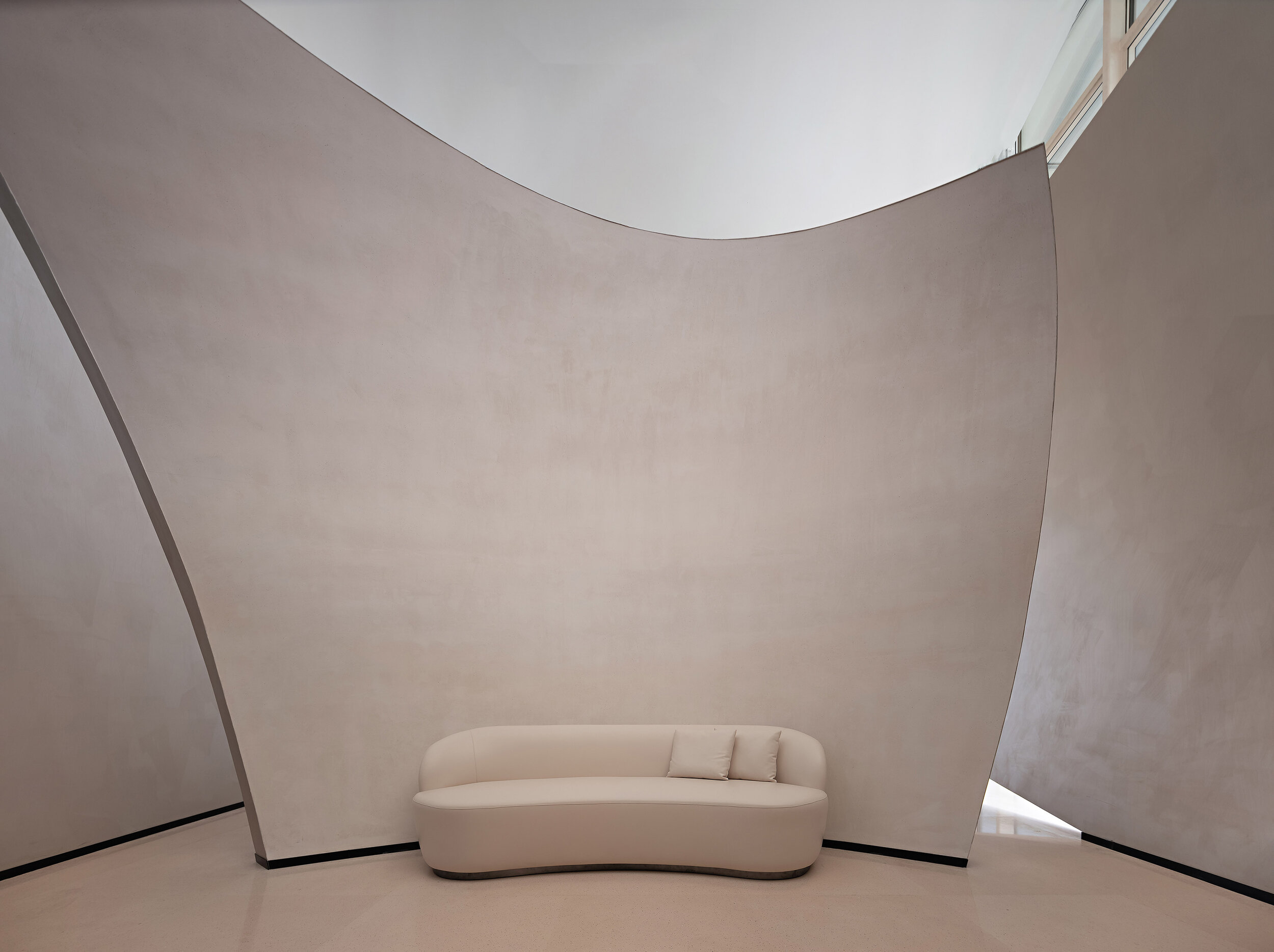
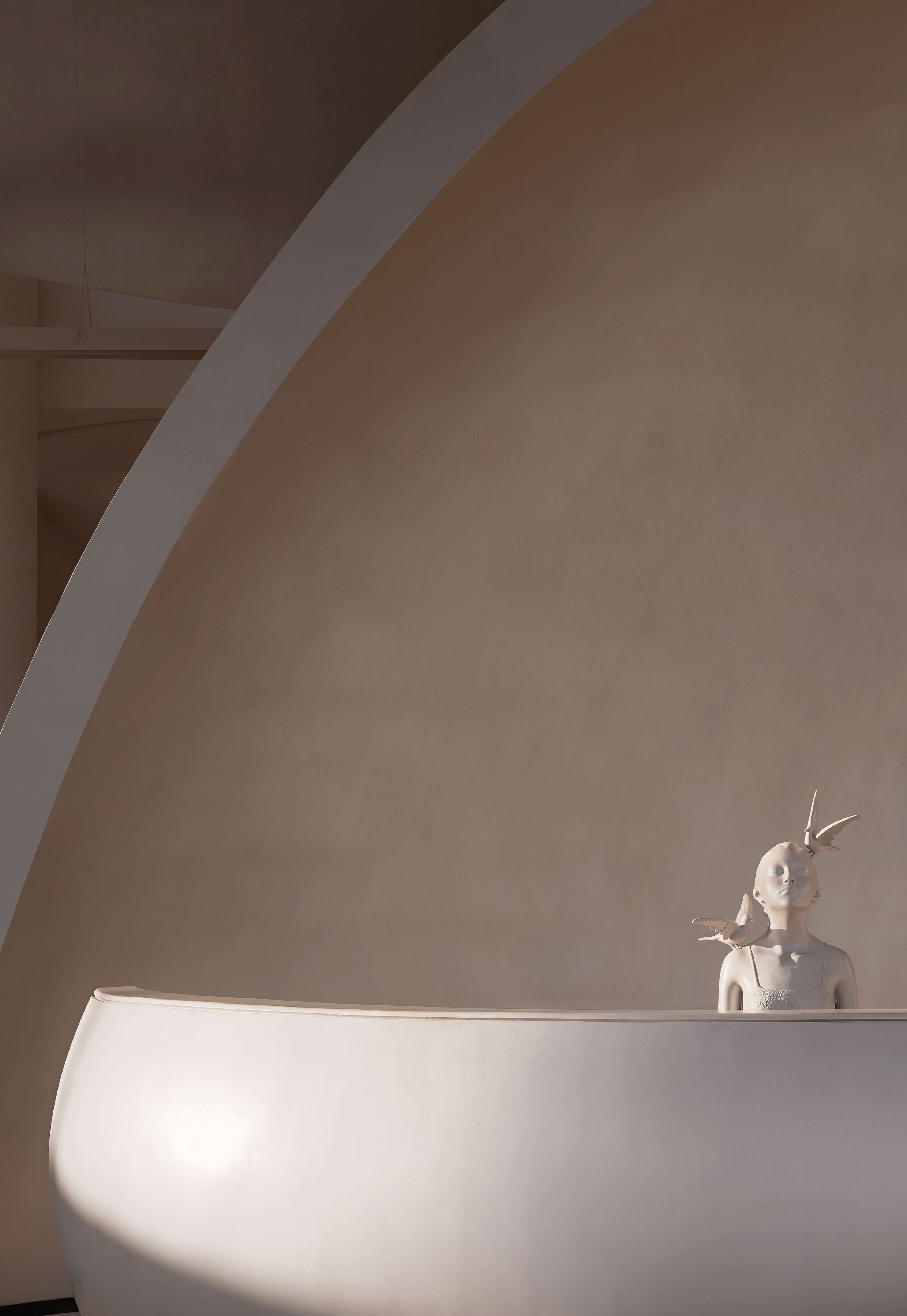
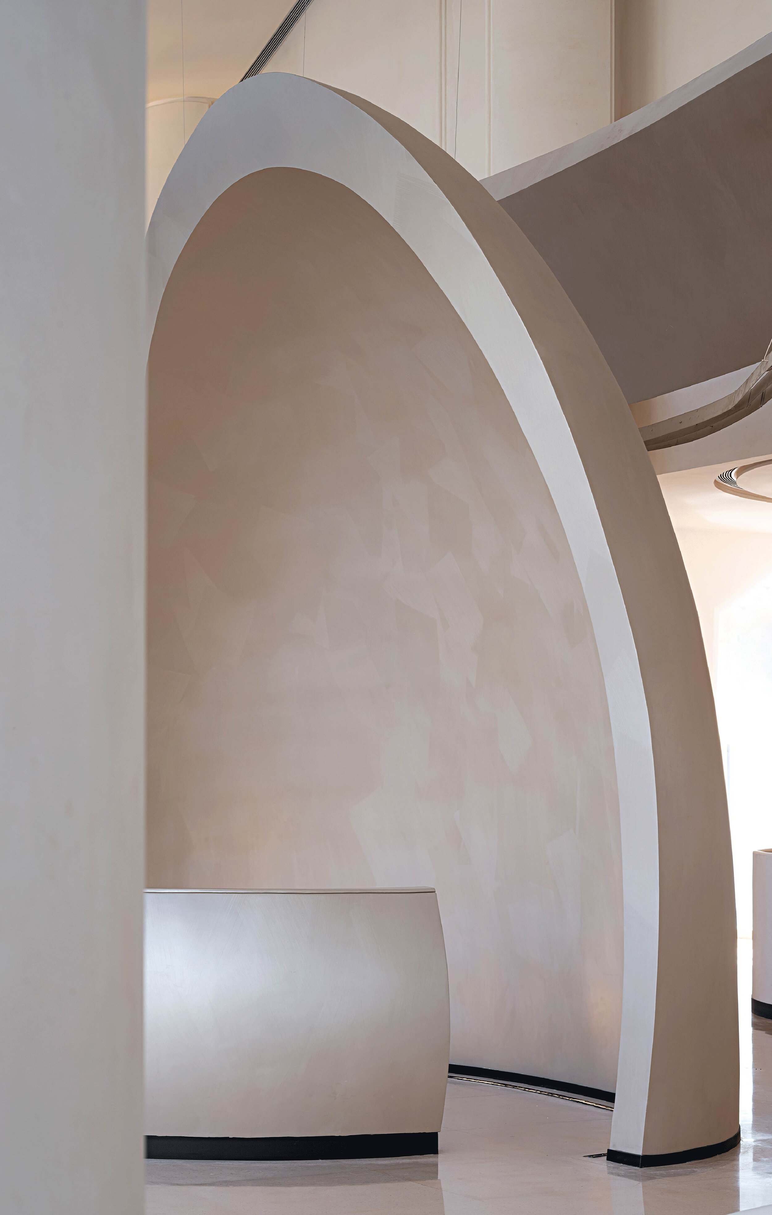
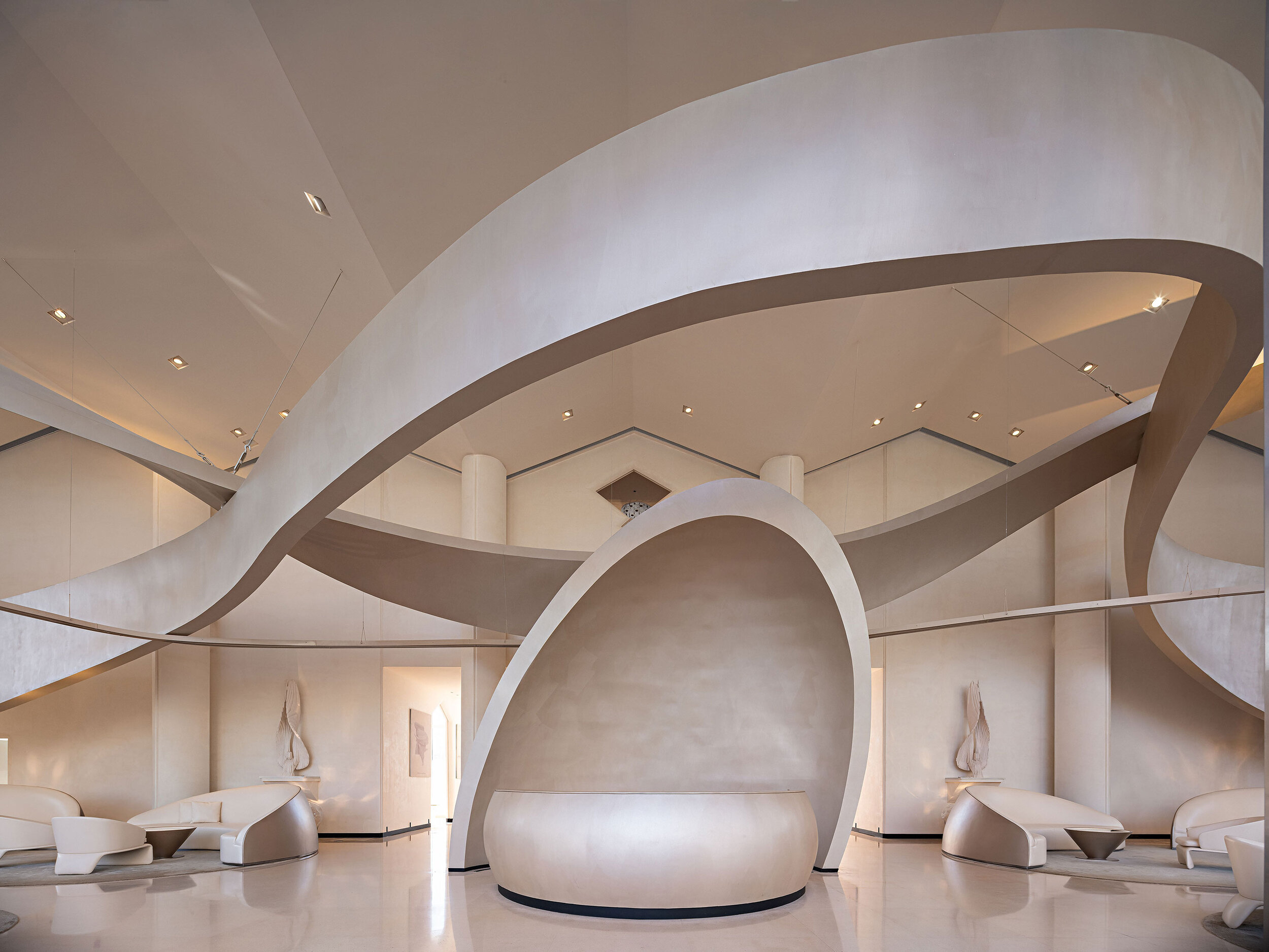
The mill has been a part of Chinese culture for different generations. It is the prime model of how space can become a symbolic memory. The connection between the mill, the city, and society creates a dialogue between architecture, space, and people.
The designer had arranged the space created similar to a carrier inside a glass box to generate fluid forms and dynamic sculptures resembling the sinuous shapes of the Nanjing brocade, extensive sand dunes that transform time into organic musical patterns.
In Art, Past and Present Overlap while the Old and the New Establish a Unique Dialogue.
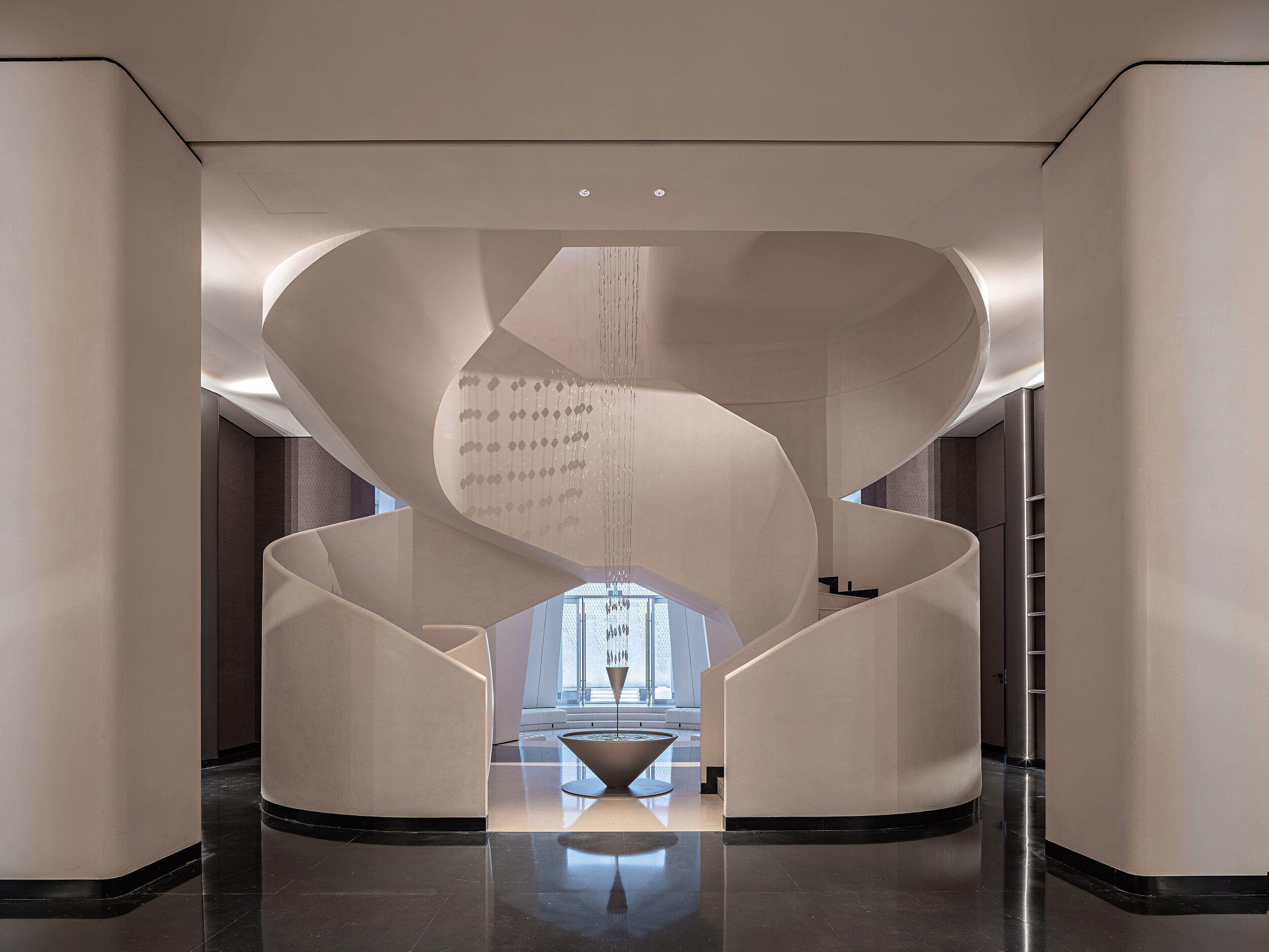
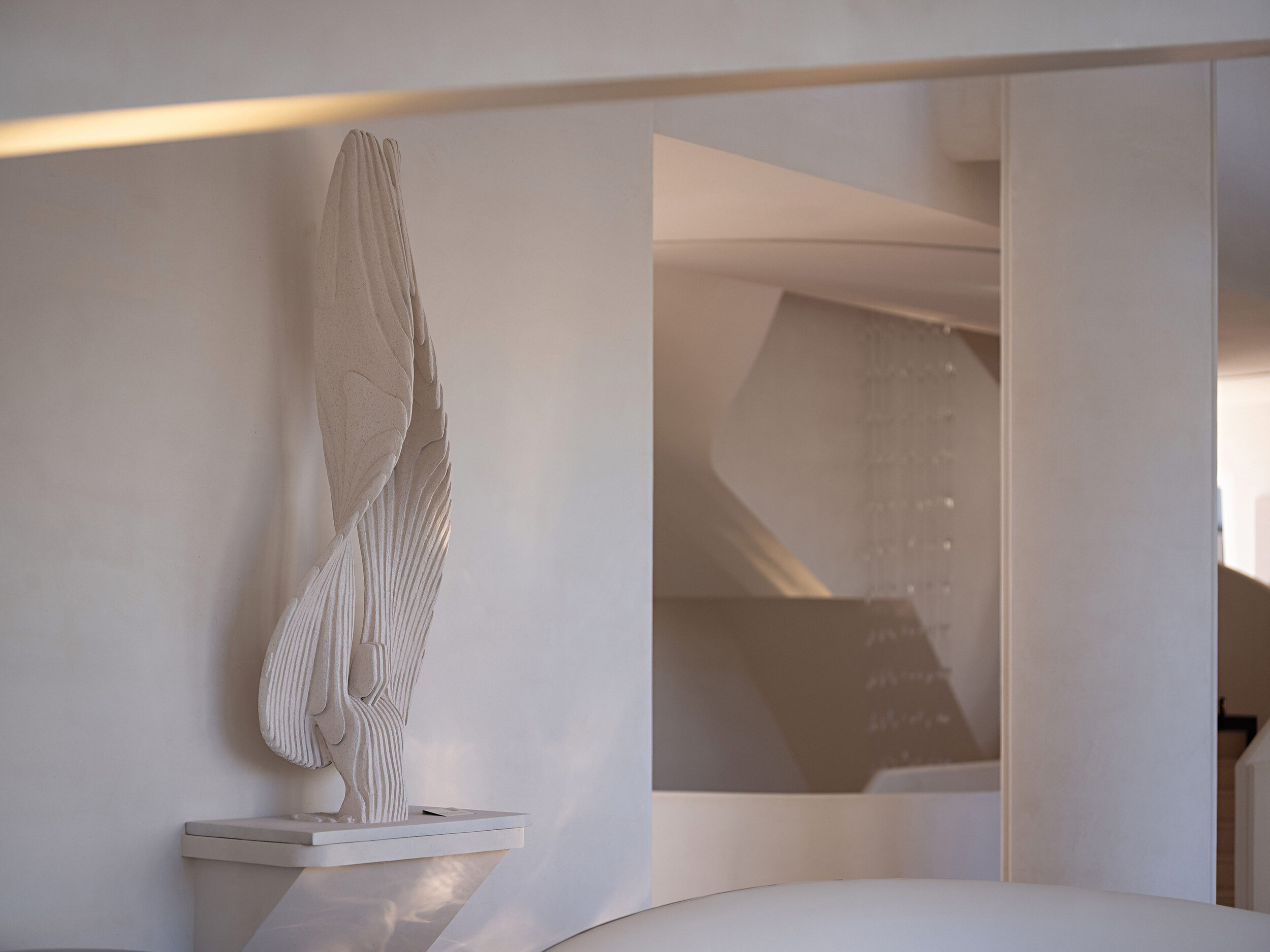
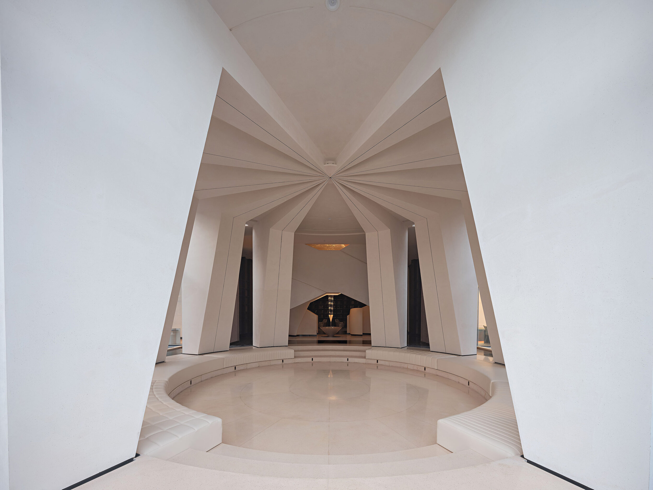
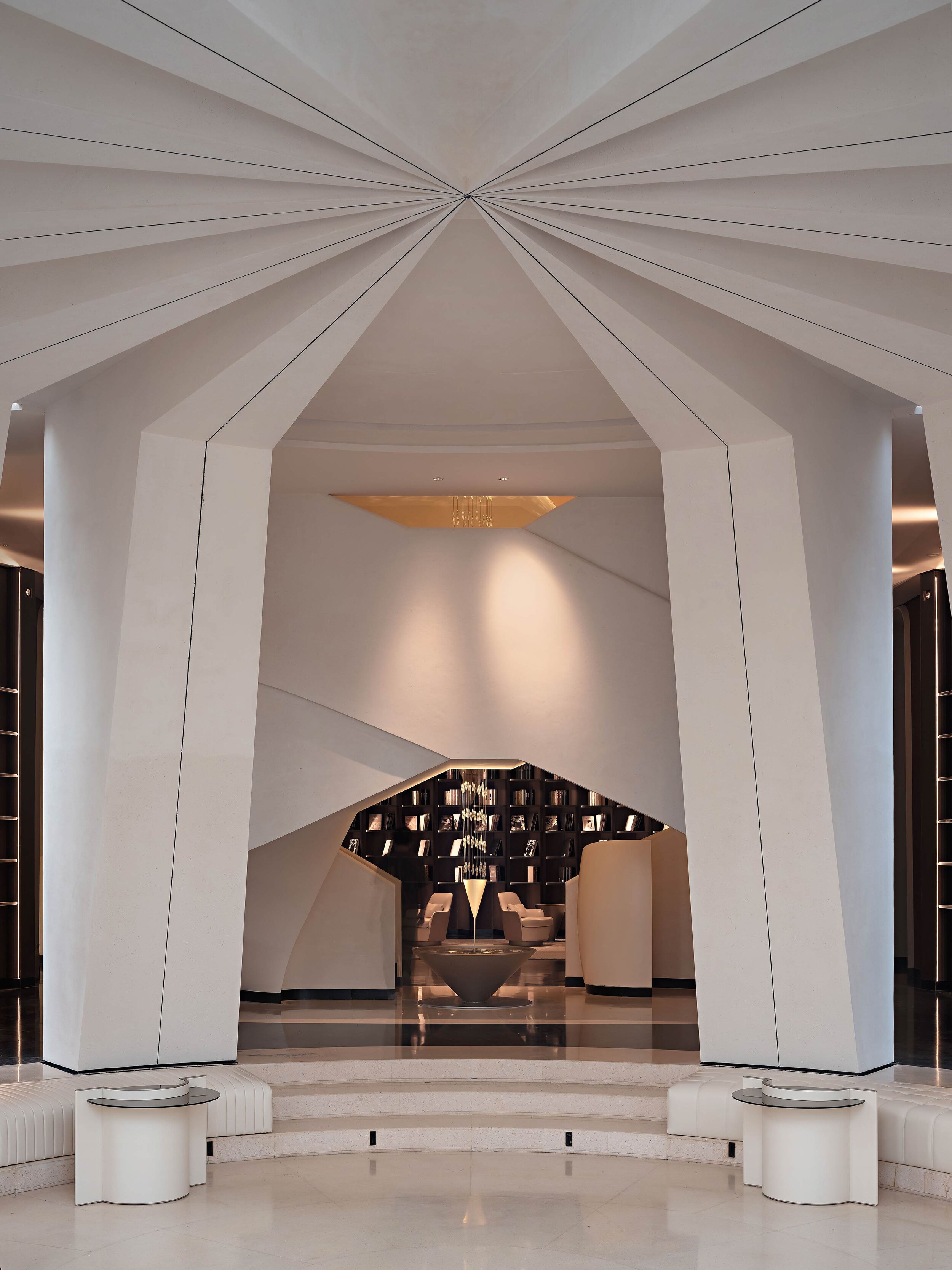
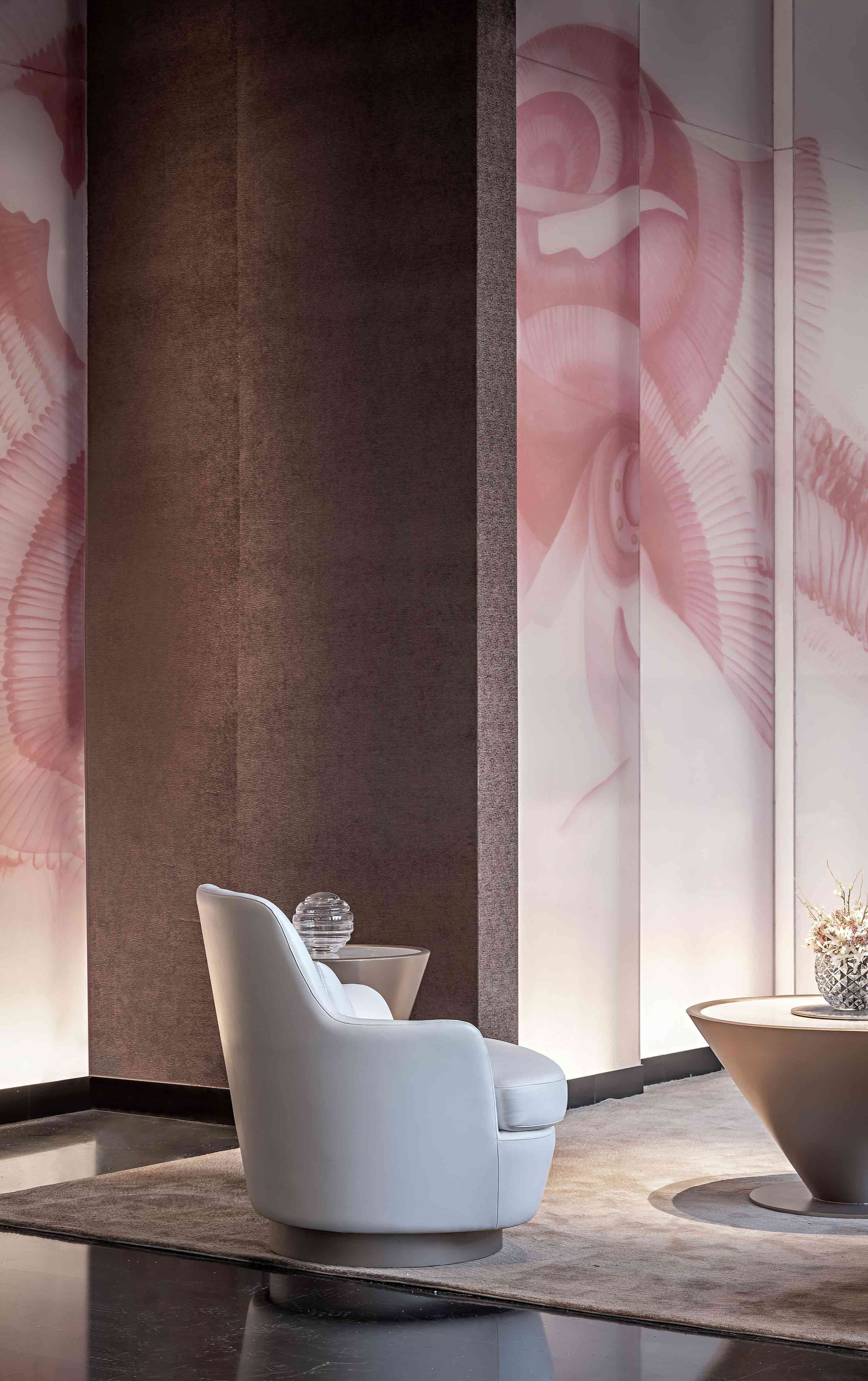
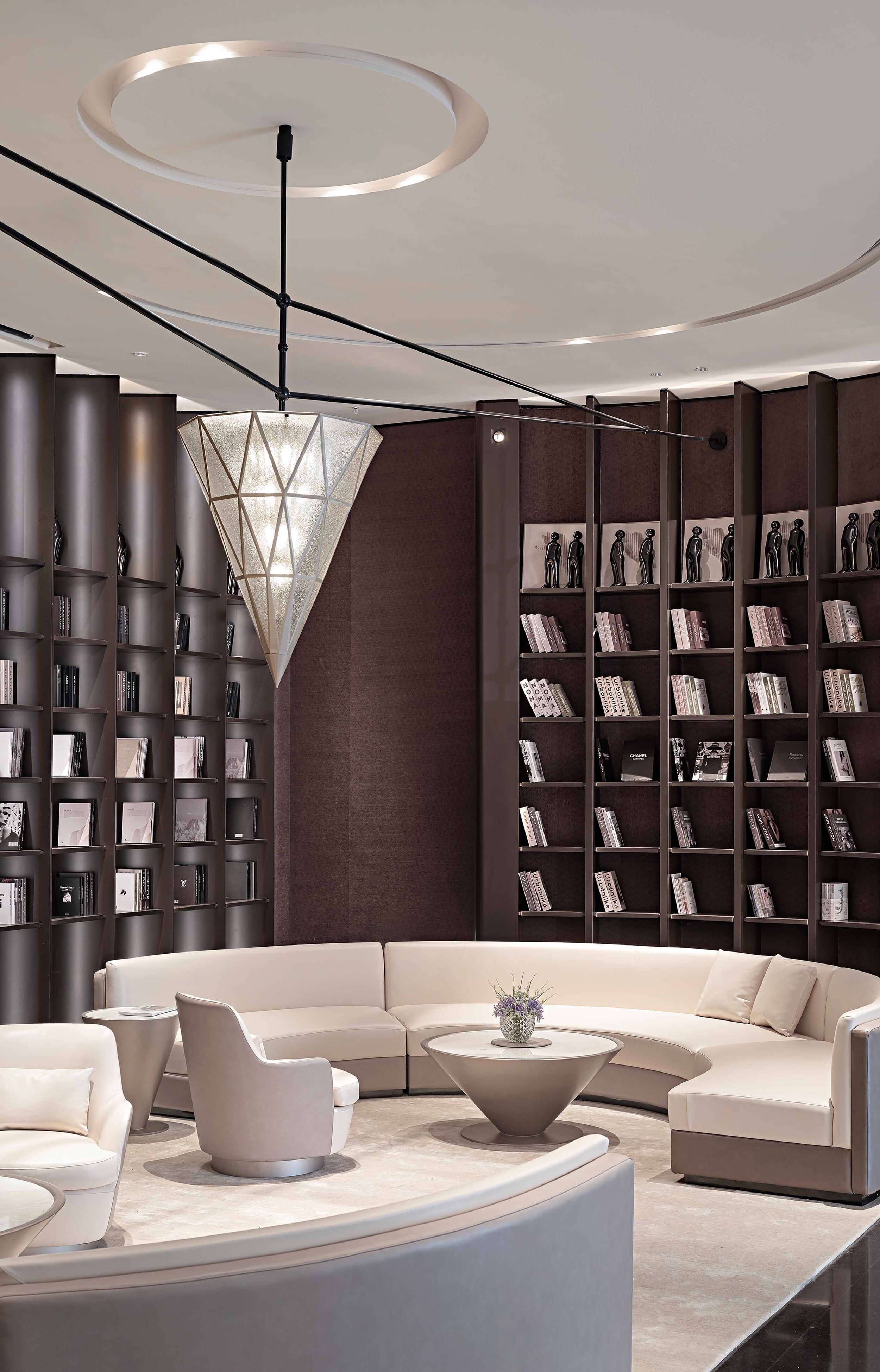
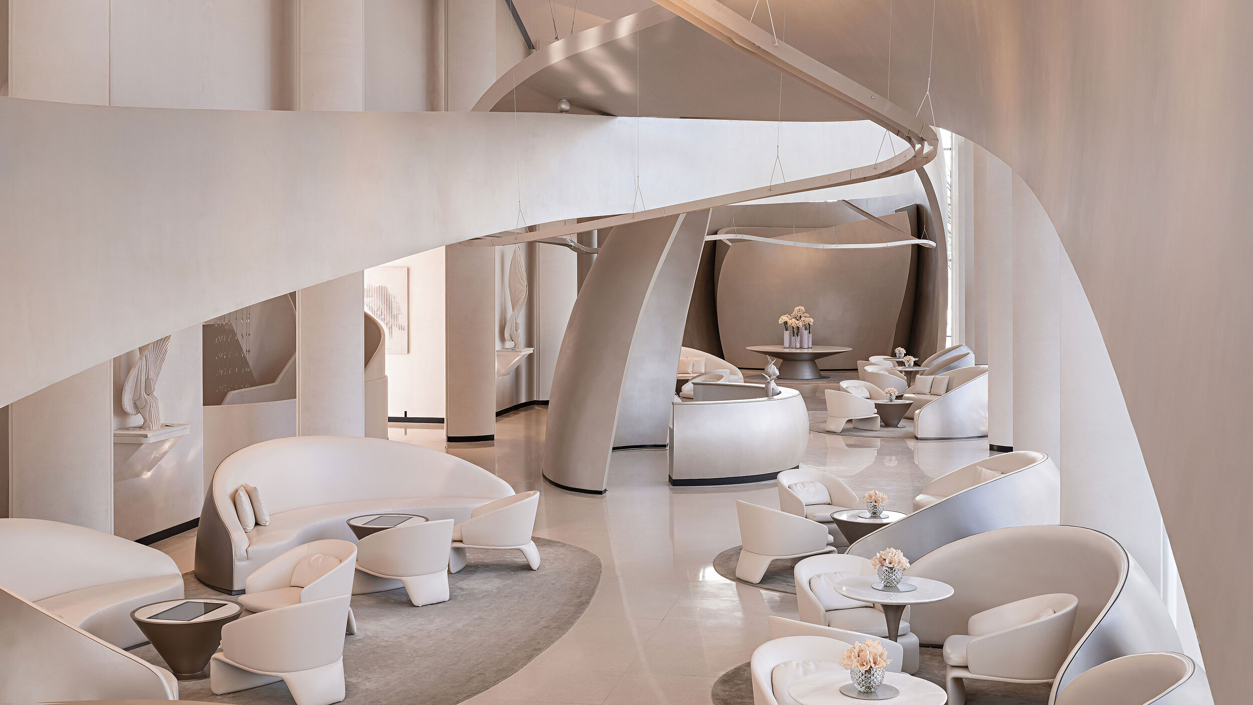
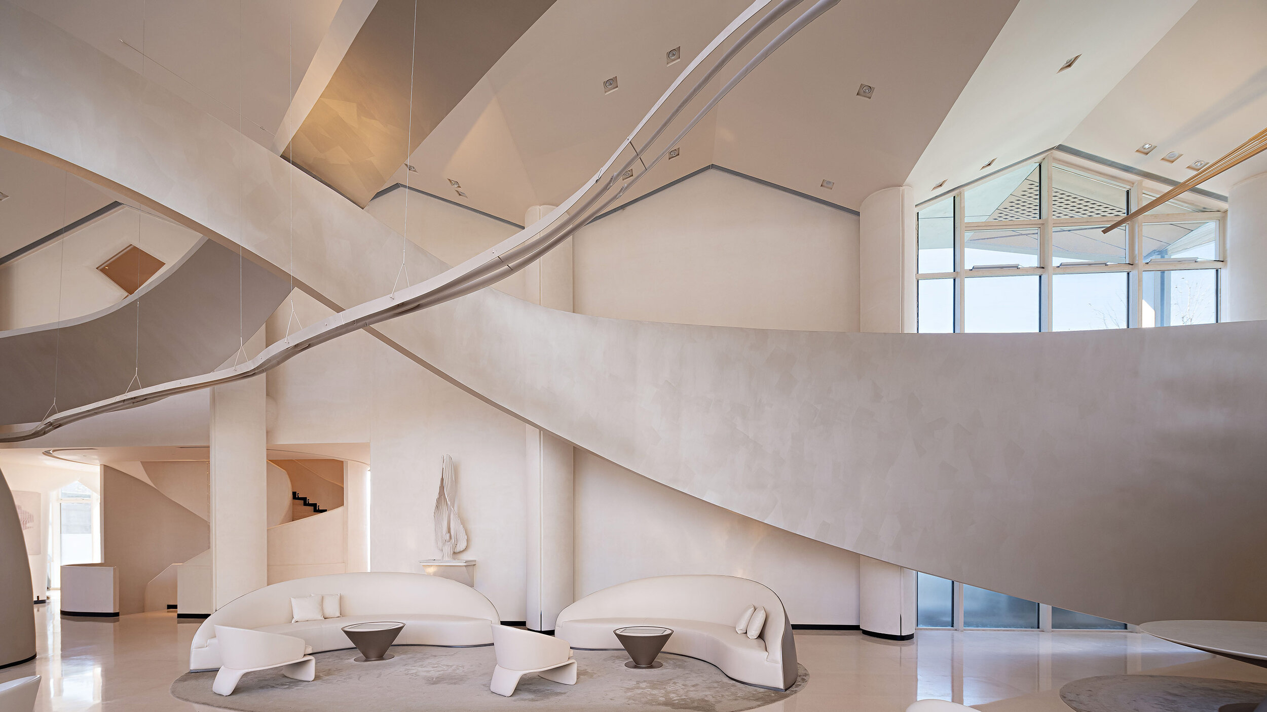
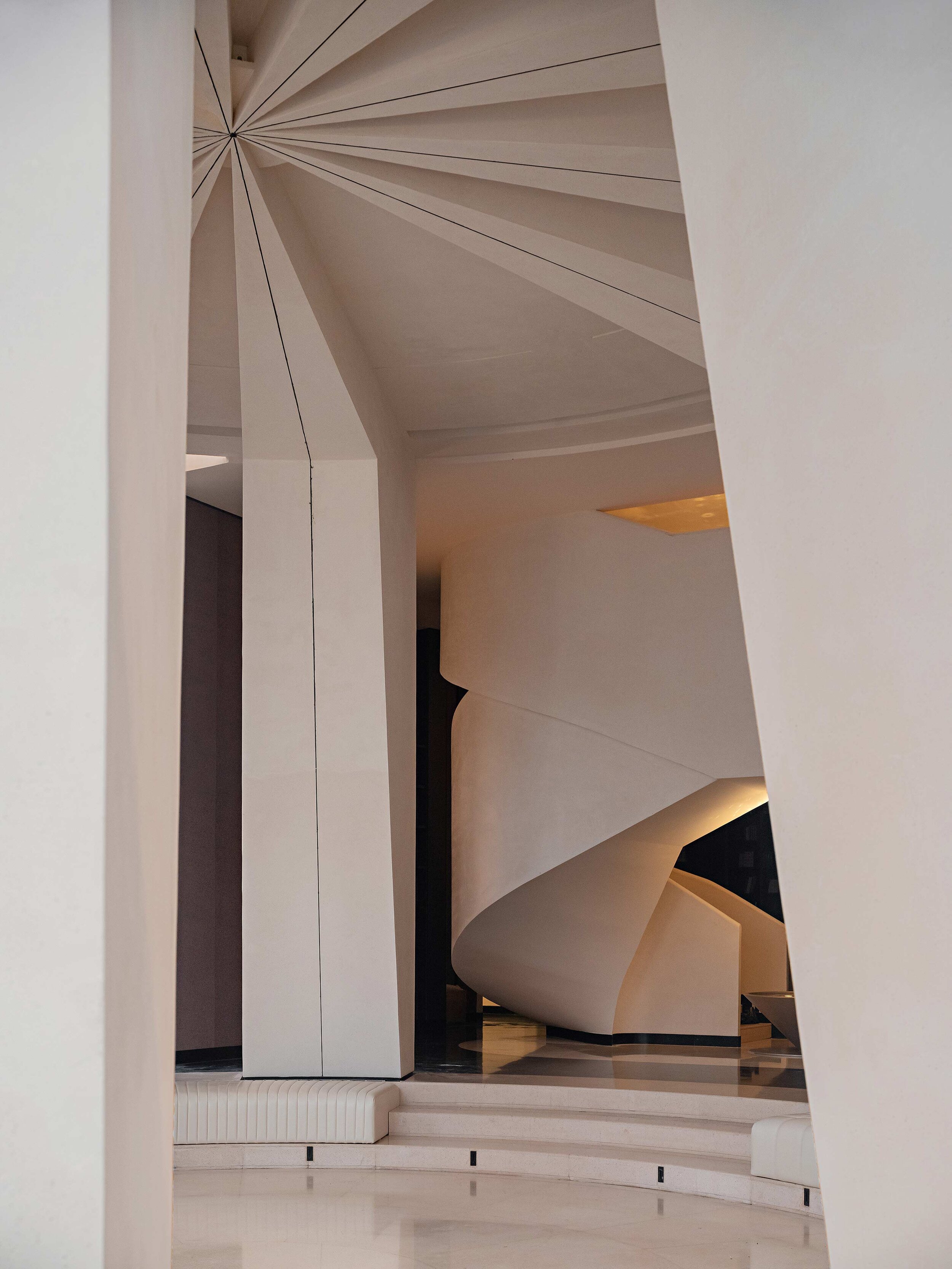
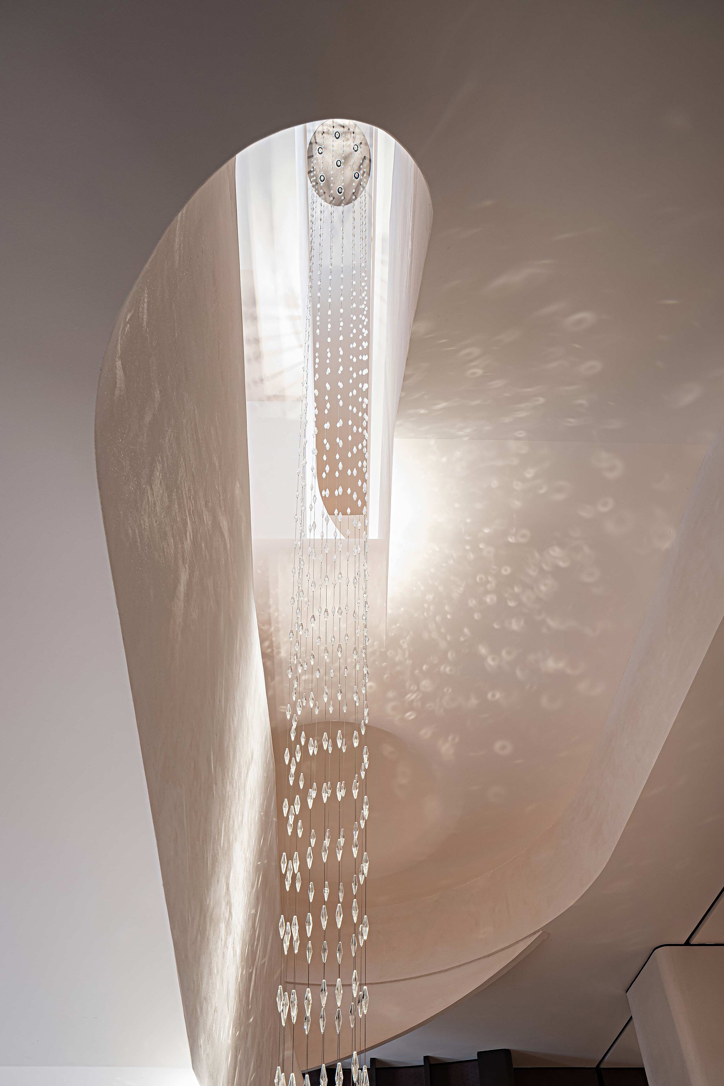
The designer takes elements from nature and memory and twists them into threads that weave an architectural brocade, using flexible curves to provide artistic tension to the surrounding environment, combining memories with physical space.
Memories evolve before our eyes as if weaved with fine silk threads. Countless flying yarns condense day and night into a winged sculpture, a threader moving swiftly between giant ribbons in space.
A fifty-two-meter-long and nine-meter-wide sculpture rises toward the sky and extends through the whole interior space of the property. Inspiration for the piece comes from Chinese brocade, revolving and dancing around, both intertwined and scattered simultaneously, outlining the shape of an infinite loop, aiming toward the future.
“We highlight the cultural features of the cotton industry in China. Using space to connects the past with the future. Through a dynamic momentum to create outlines, the beauty of life in bloom with unique elements from the past and formidable sights into future”. – said the designer.
“Time” is the Essence behind Brilliant Prospect
The designer adopted a unique artistic language to define Brilliant Prospect –the project’s name in English. Such a creative approach represents a distinctive landmark composed of artistic and cultural elements.
And thus, sinuous curves grow around the space, weaving segments of time into particular groups, orchestrating multiple ideas into one. Like an epic opera, its magnificent forms fascinate people with a distinctive charm.
Unlock your Imagination, Open your Mind to a Brilliant Prospect
Complementing the central sculpture, an artistic staircase becomes the symbolic entrance to a time tunnel that distributes imaginative elements above and below ground. At the center of two sculptural curved stairs lies an installation called the “Time Shuttle.”
The designer sets the central functional zone of the property in a sunken courtyard where mirrored are as vast as the skies, and lakes provide a deep depth of field, separating everything inside the property from the complexities of the external world. The salon area opposite the book bar interprets the convergence of time with geometric shapes.
The whole space is bestowed with church-like sacredness and tranquillity. It cultivates a life of elegance with poetry, wine, flowers and tea, gathering the essence of life through elements such as rhythm, softness and comfortable surroundings to enjoy the company of old and new friends.
The clubhouse is an extension of the household, a unique kind of companionship that further refines and integrates social circles. Once again, the “spindle” becomes the main artistic symbol of the space. This time, the shape hangs down from the ceiling, concentrating the light coming from a surrounding “ocean of knowledge.”
Thus, the designer transforms space into a petri dish of curiosity and creativity, awaking memories and shaping them. The area feels like a “dance frozen in time” about to begin again, prompting a breathtaking melody that transforms objects into lively and meaningful beings.
The designer hopes to create an artistic “choreography” between real and imaginary times, providing guests with endless possibilities from the future, a banquet, meeting or party in modern times.
Project info
Project name: Brilliant Prospect Project status: Completed in September, 2020
Location: Shijiazhuang, Hebei Province, China
Developer: China Overseas Land and Investment Contractor: Beijing Mingyang Hanhai Decoration LLC. Design team: GBD Lead designer: Du Wenbiao (Bill Do)
Interior design: Guangzhou GBD Design Project area: approximately 2000m2
Main Materials: Terrazzo, Faux paint, Metal paint Photographer: BenMo Studio
The Celebration of the heritage that narrates Parisian history by Neri & Hu, the Papi Restaurant
Nestled in the Grands Boulevards district of Paris' 9th arrondissement, Papi is the latest brainchild of up-and-coming restaurateur Etienne Ryckeboer his debut seafood bar Bulot Bulot. This time, he teams up with Neri&Hu to rehaul the façade and interior space, and with talented Japanese chef Akira Sugiura to serve a seasonal menu of modern Italian dishes.
Located on the ground floor of a typical late 19th century Haussmann building, Neri&Hu's design concept celebrates the layered material heritage that narrates Parisian history.
Nestled in the Grands Boulevards district of Paris' 9th arrondissement, Papi is the latest brainchild of up-and-coming restaurateur Etienne Ryckeboer his debut seafood bar Bulot Bulot. This time, he teams up with Neri&Hu to rehaul the façade and interior space, and with talented Japanese chef Akira Sugiura to serve a seasonal menu of modern Italian dishes.
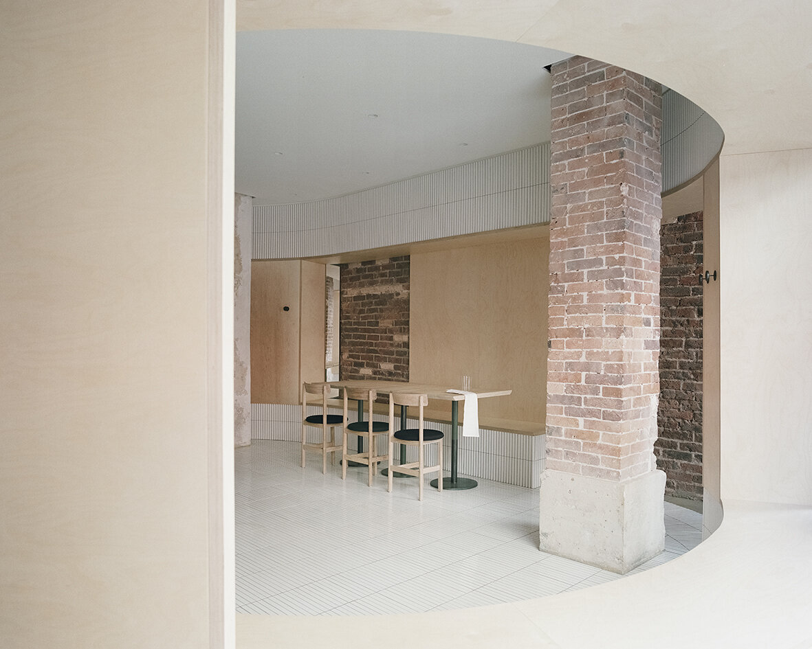
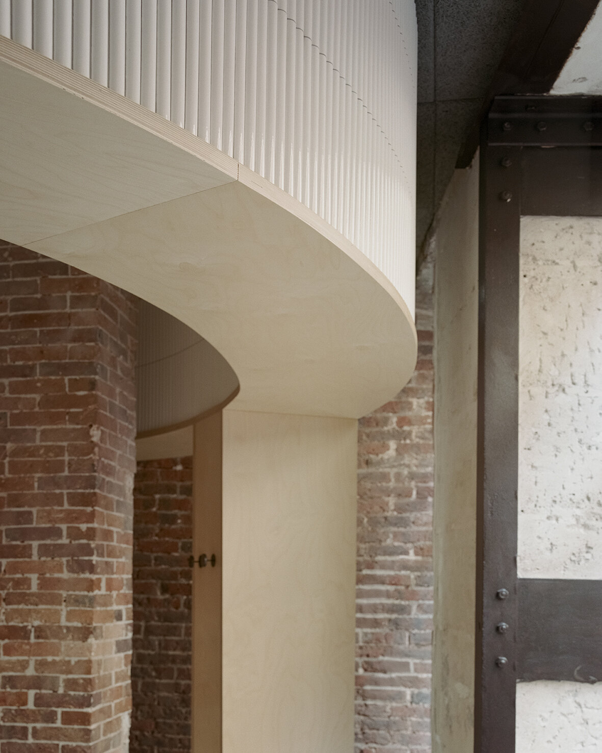
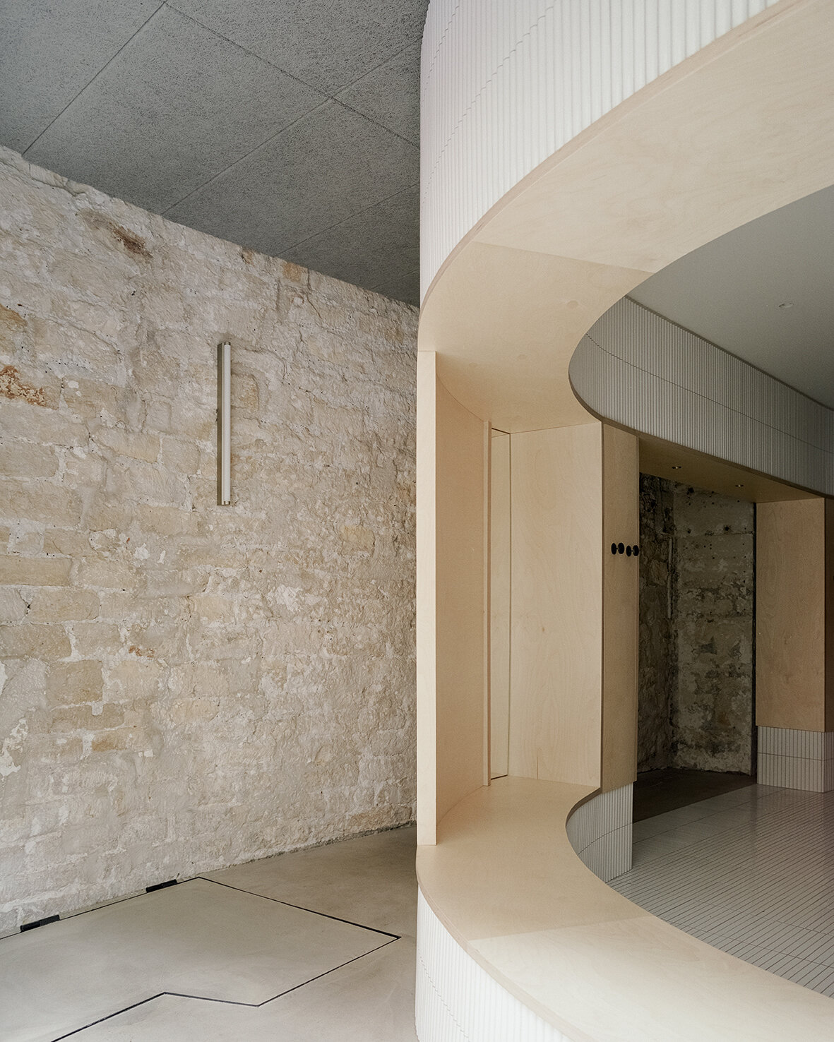
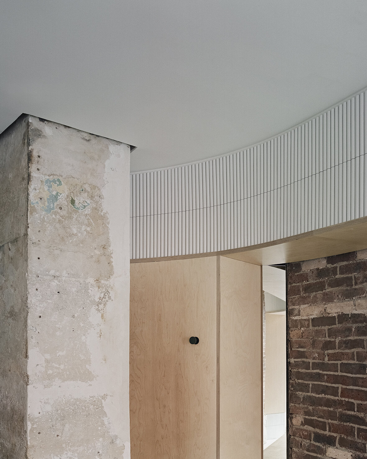
Located on the ground floor of a typical late 19th century Haussmann building, Neri&Hu's design concept celebrates the layered material heritage that narrates Parisian history. During the dismantling phase, the existing site was treated carefully; by stripping back the strata of finishes built up through the decades, the raw materials' beauty is revealed. Every single element was meticulously examined, and the challenge was to resist the urge to fix every imperfection, instead, honour the imprint oft of time upon each surface. Within the interior, portions of the old limestone and brick walls, a raw steel column, and a brick column are preserved and integrated into the design. On the façade, an existing steel I-beam lintel is featured, while a segment of the old stone moulding by the entry is left exposed, stitching the façade seamlessly to the neighboring building. Each fragment neighbouring ants a different period in Paris' history, forming a beautiful yet imposing canvas for the architects to add their new strokes.
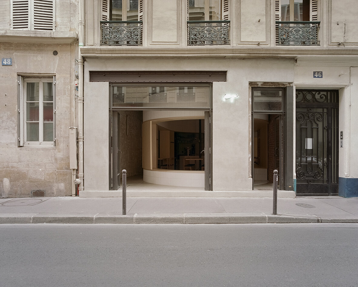
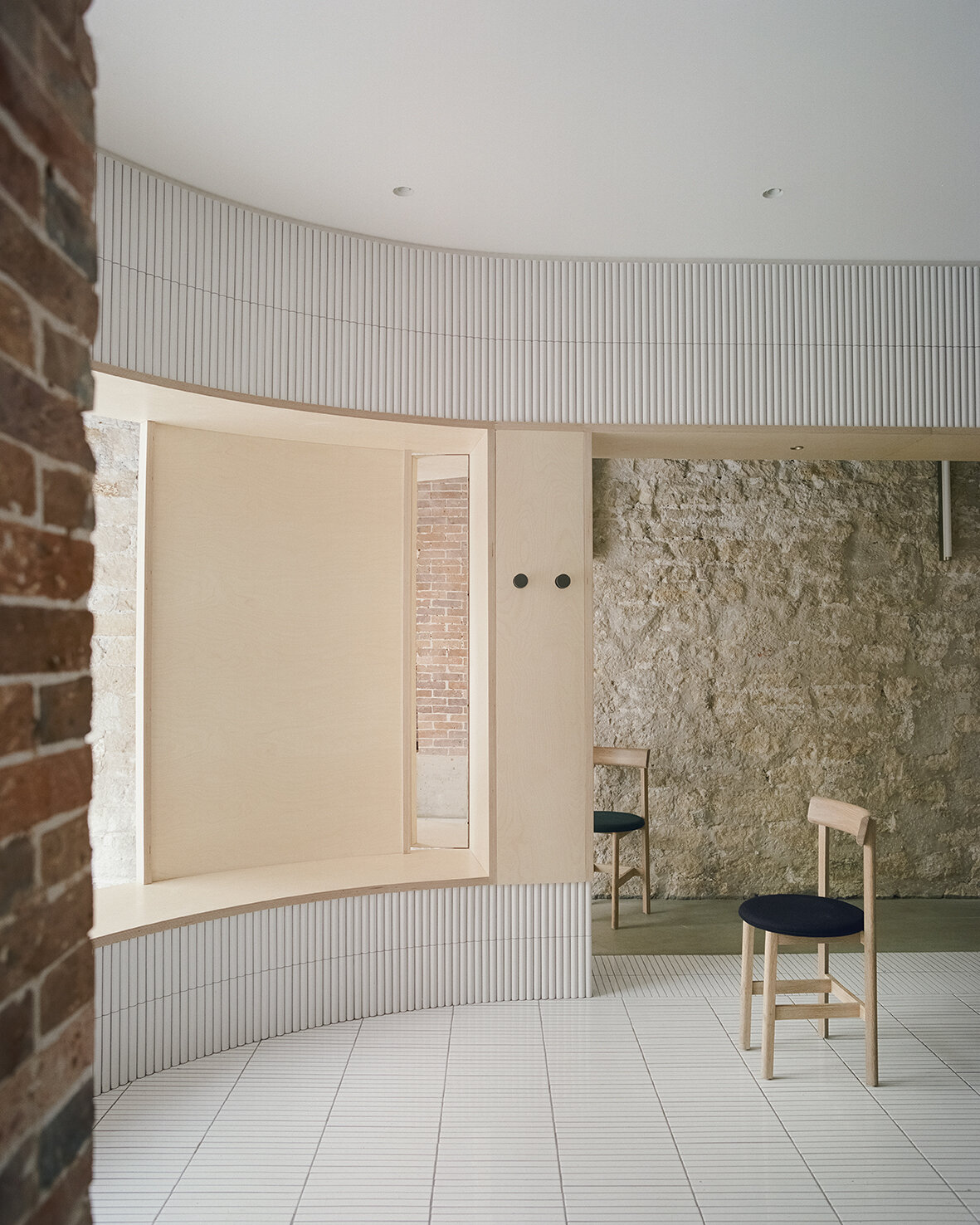
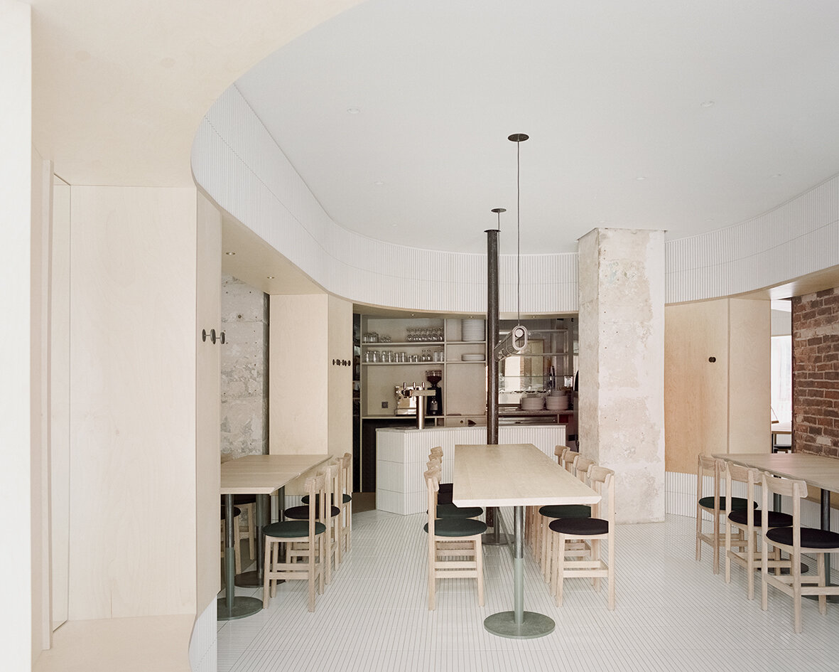
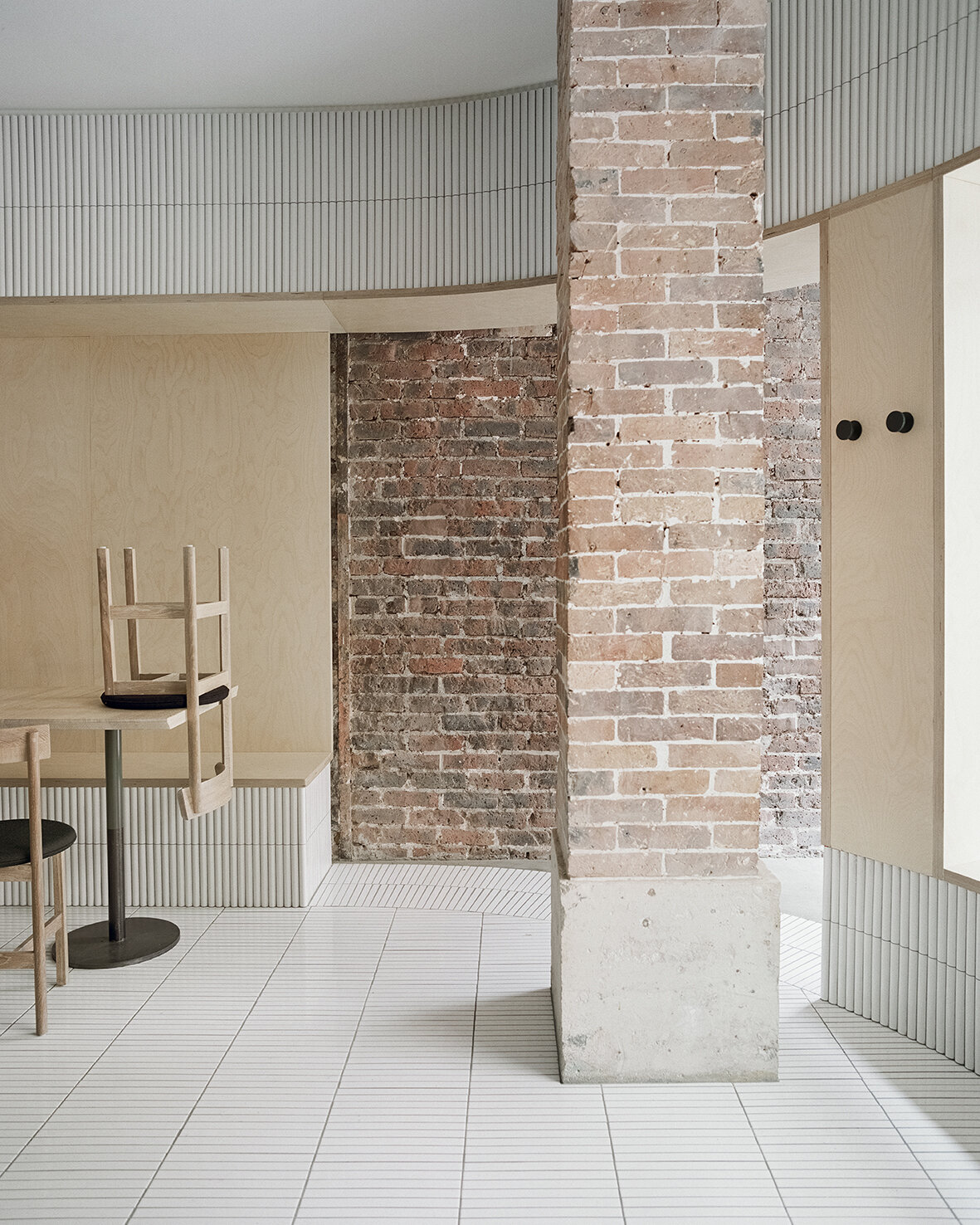
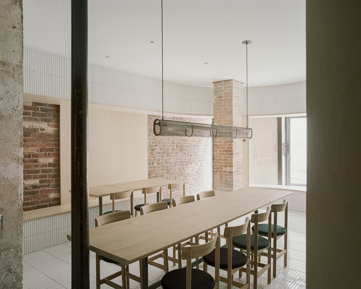

The new raw-steel-framed fully-operable glass façade maintains a visual continuity between the street and the venue and effectively extends the public realm into the interior. As guests enter the space through the main door, they see the clash of juxtaposing old and new materials, telling a story of sophistication with fresh textures of tile, glass and wood. Mirrors are placed strategically to create dynamic perspectives and voyeuristic moments between interior and exterior while inviting guests into cross gazes. The spatial and material strategies deployed to create a layered reading against the historical backdrop, offering guests a variety of experiences to explore within the space - moments of both public introversion and private extroversion.
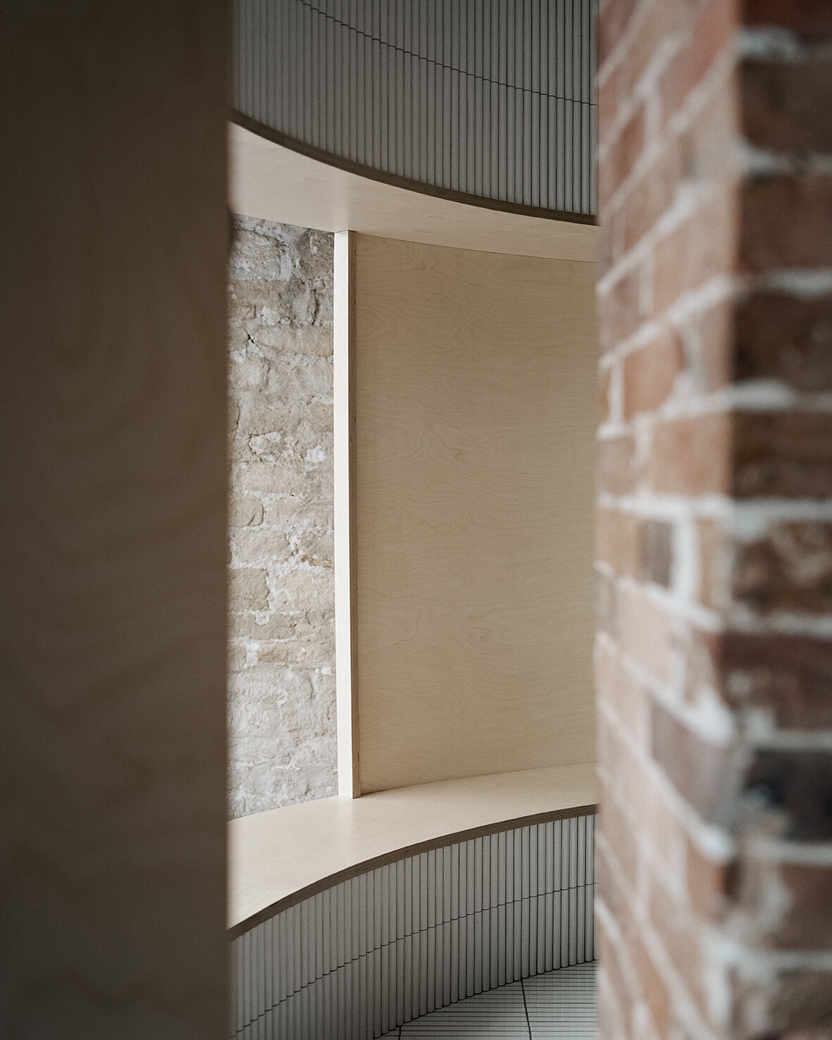
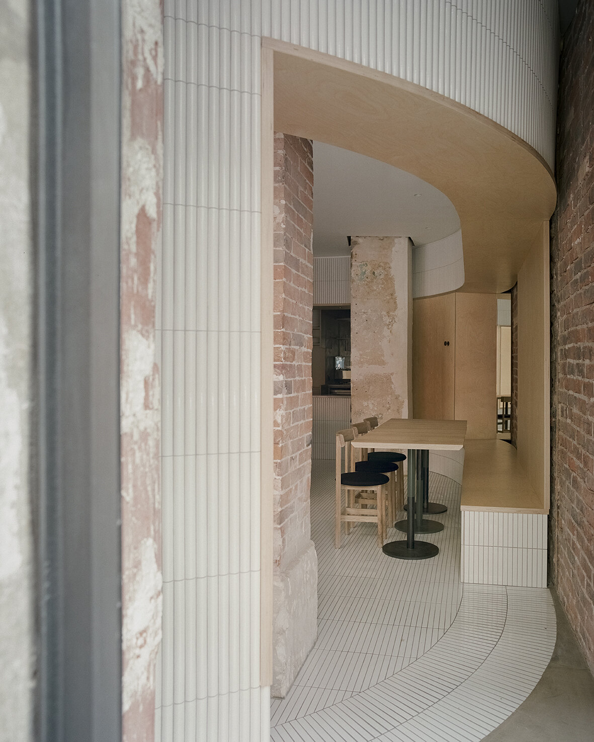
Despite the compact 52 square meters of usable area, Neri&Hu’s asserts two figures into space: an oblong volume forming an arena-like enclosure that integrates all the functional needs of seating, display, chef’s preparation counter, privacy screen, as well as a round shape containing the wood-burning oven. Clad in handmade convex-curved white ceramic tiles, the enclosure features large openings framed with thick birch plywood that become seating benches for guests. Entering the arena, where the floor is adorned with narrow white ceramic tiles, guests are instantly transformed from spectators to performers on stage. The central communal table features a long custom pendant light above, while a series of lights by Viabizzuno create a stark modern contrast on the old limestone wall. Custom wood and fabric chairs, manufactured by De La Espada, are designed by Neri&Hu specifically for Papi Restaurant to fit within the limited footprint.
Minimalism in an environment of expressionism
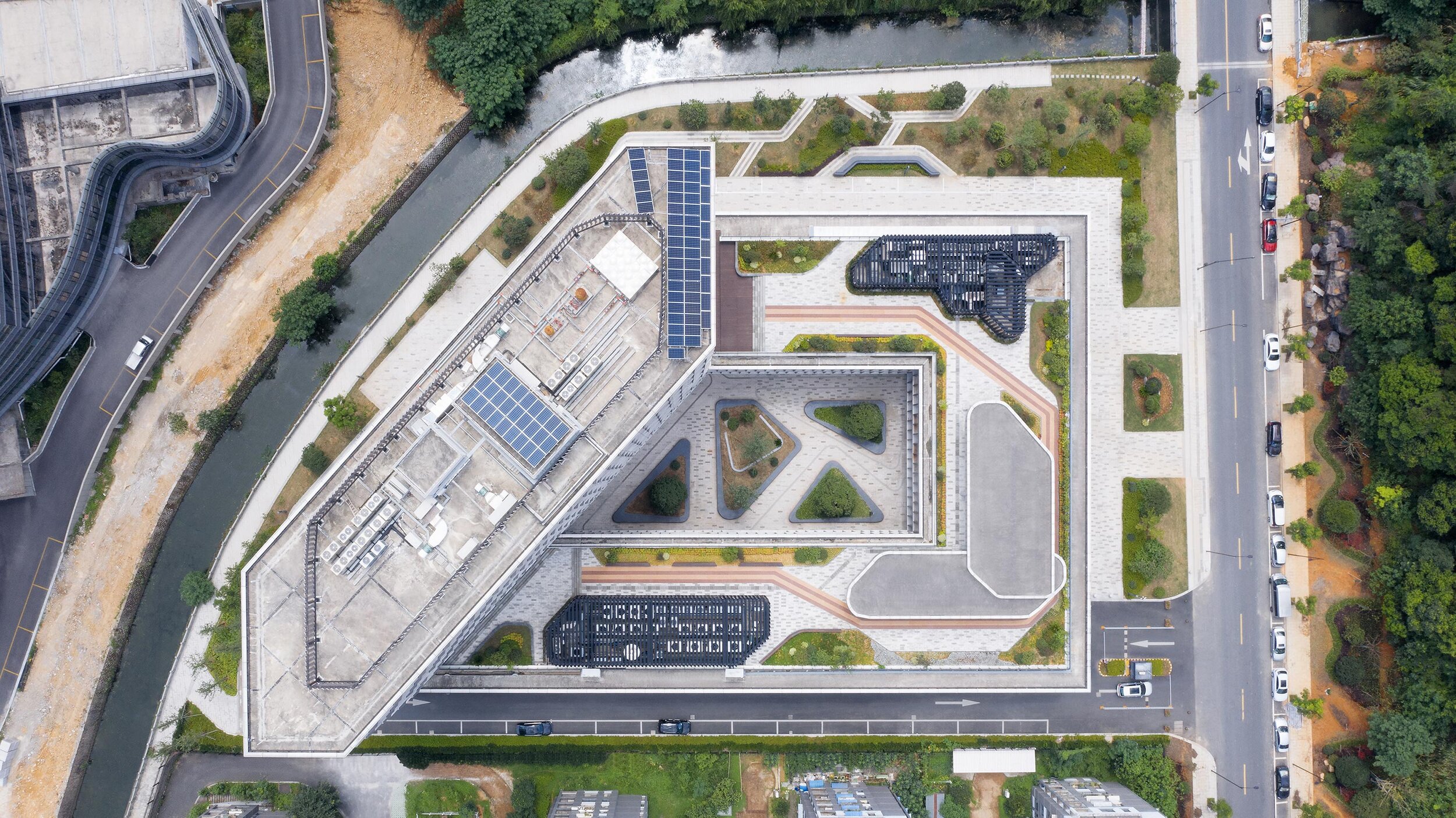
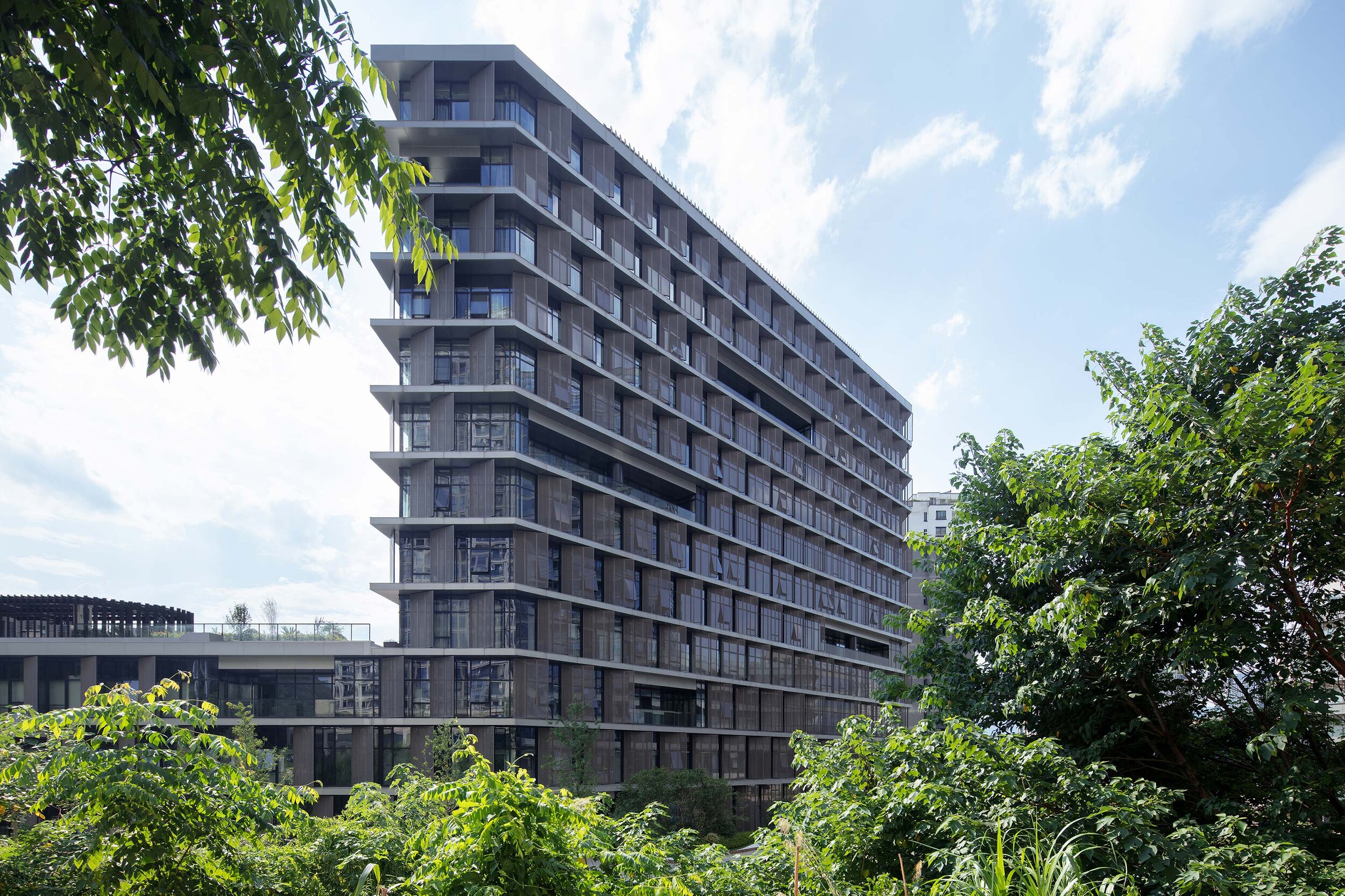
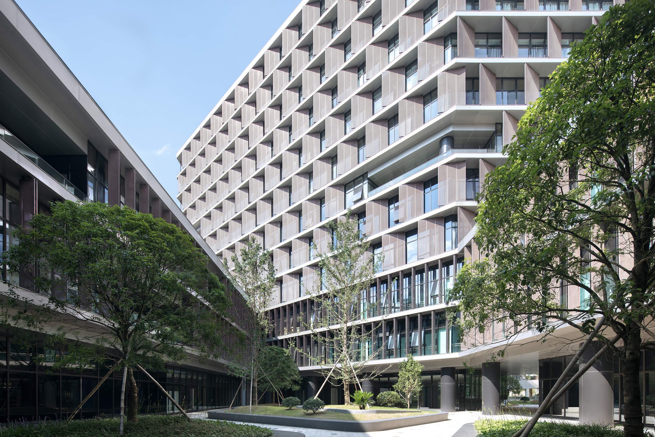
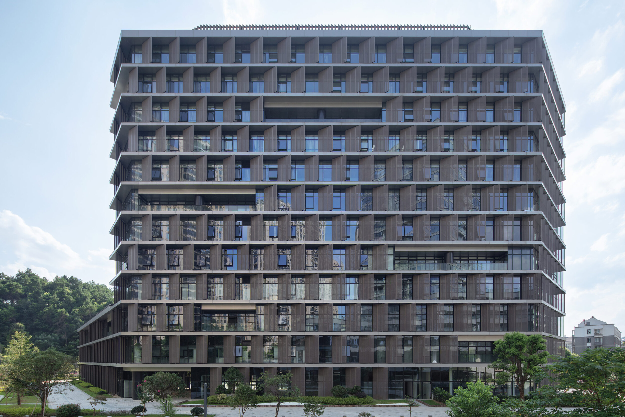
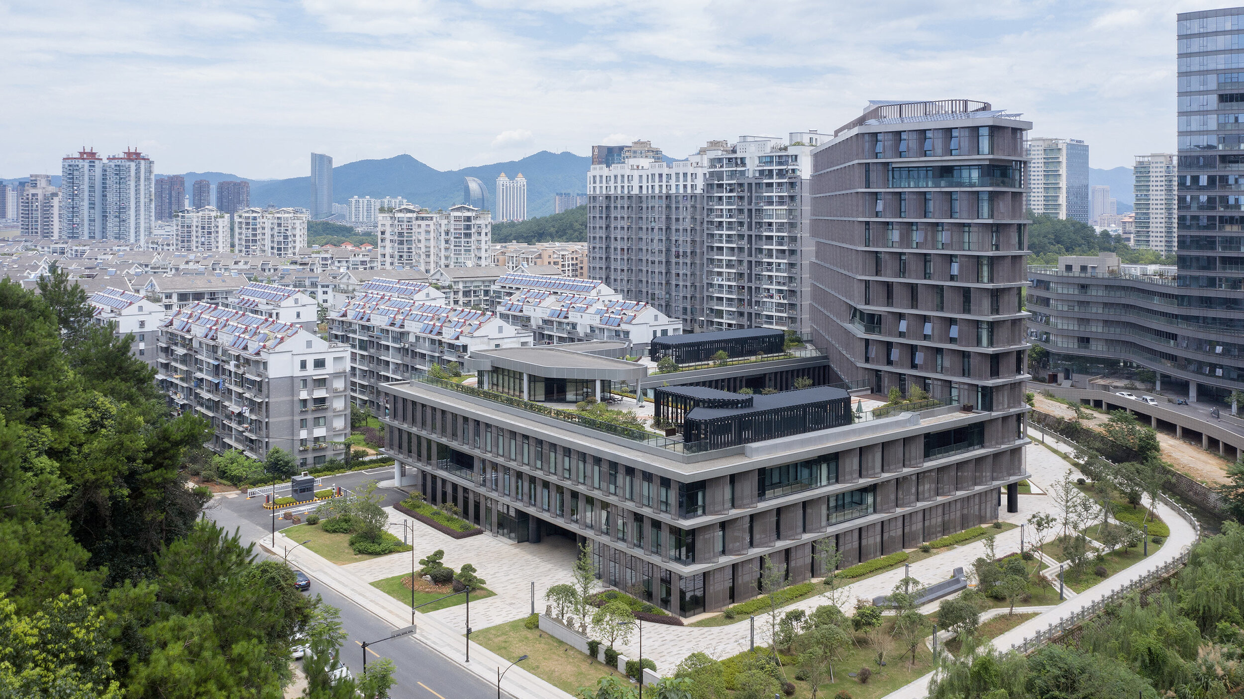
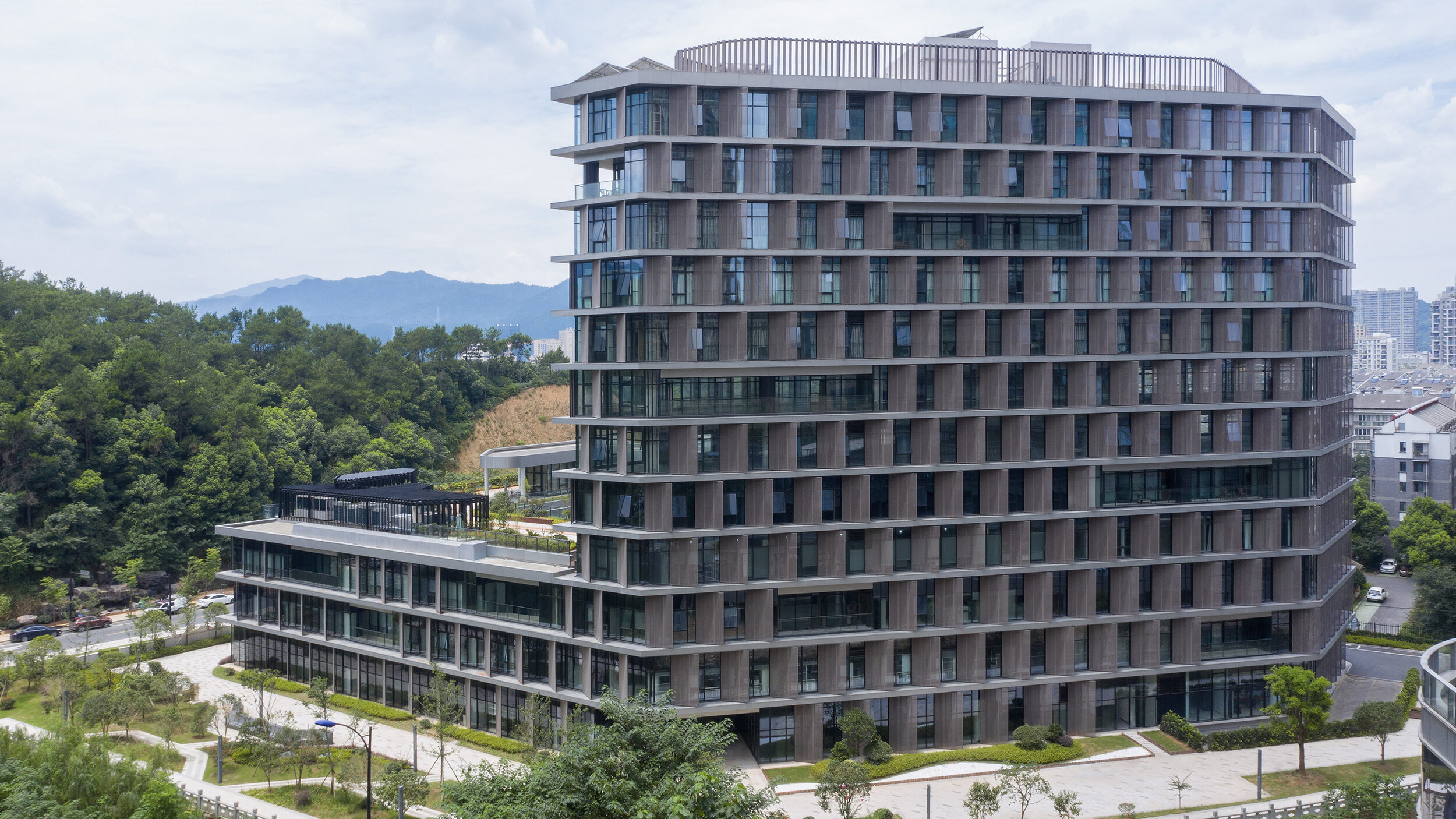
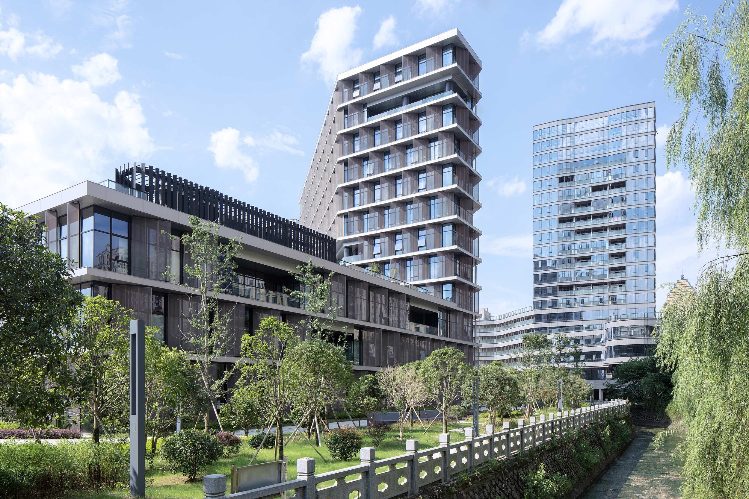
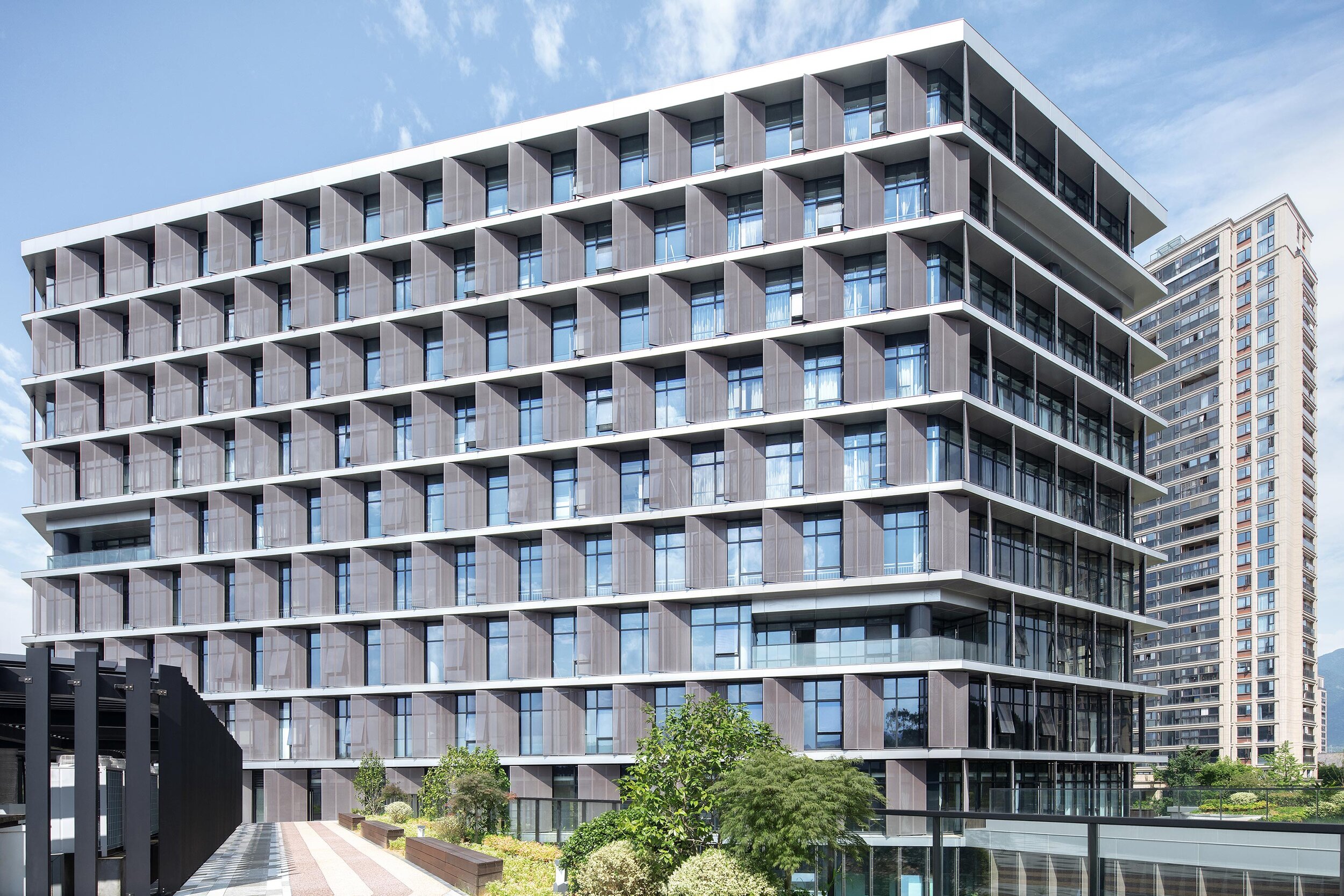
Designed by BAU (Brearley Architects + Urbanists), Tonglu Archives Building is located in Hangzhou, China. In China, the perimeter block typology doesn't usually return the Floor Area Ratio (FAR) necessary to satisfy inner-urban densities. This leads to an over-reliance on detached towers to meet FAR requirements. The perimeter block with a tower extrusion, however, presents a useful hybrid.
'it is the least we could do: minimalism in an environment of expressionism.' - Steve Whitford (Partner)
Hybrid typology
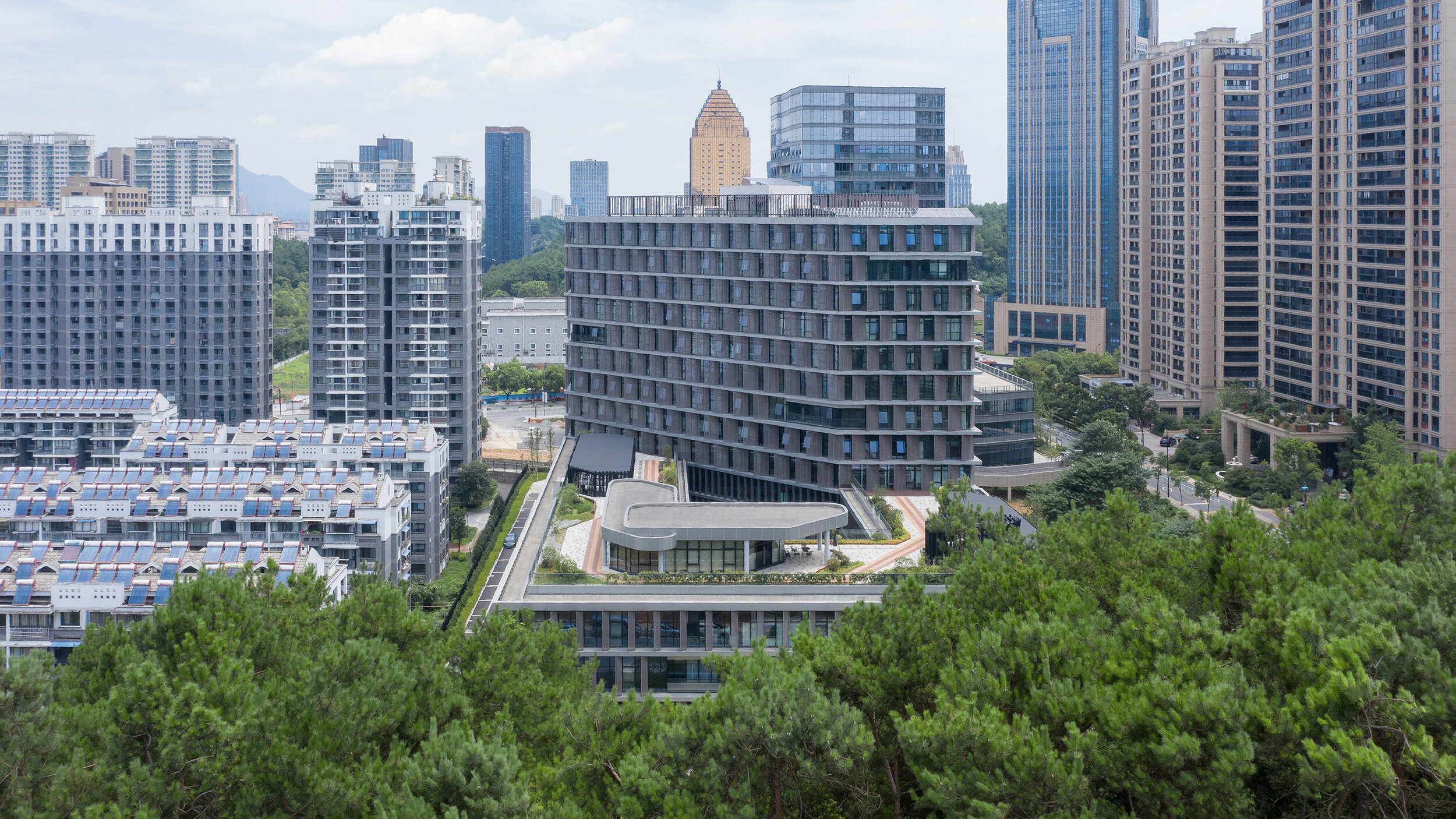
Designed by BAU (Brearley Architects + Urbanists), Tonglu Archives Building is located in Hangzhou, China. In China, the perimeter block typology doesn't usually return the Floor Area Ratio (FAR) necessary to satisfy inner-urban densities. This leads to an over-reliance on detached towers to meet FAR requirements. The perimeter block with a tower extrusion, however, presents a useful hybrid.
The advantages of the perimeter block are combined with the capacity of the tower to maximize floor area. (Positive reinforcement of active urban street edges; well ventilated and naturally lit building interiors; and an internal courtyard that has the options of being private, semi-private-semi-public, or public space)
Metal petals
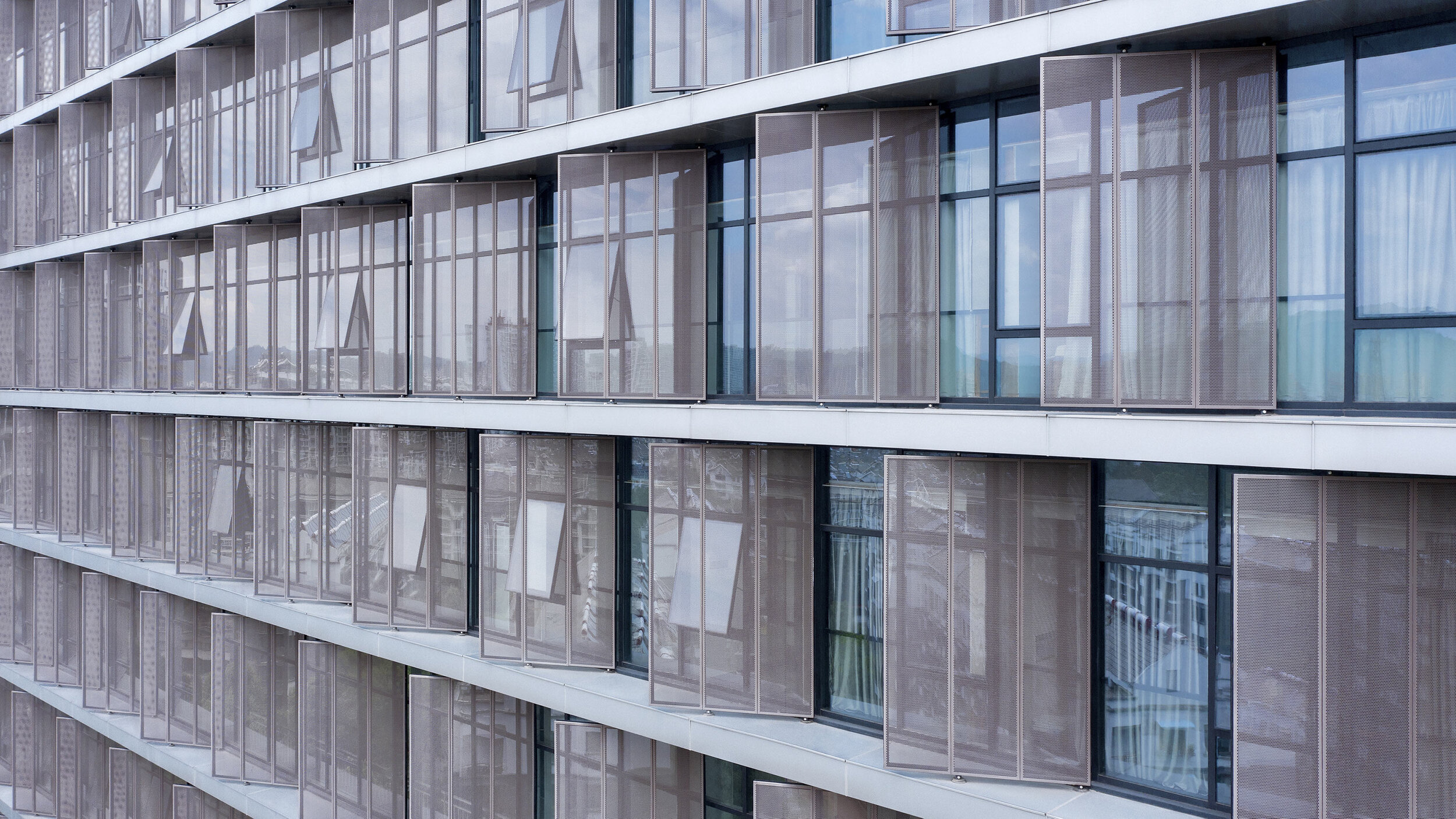
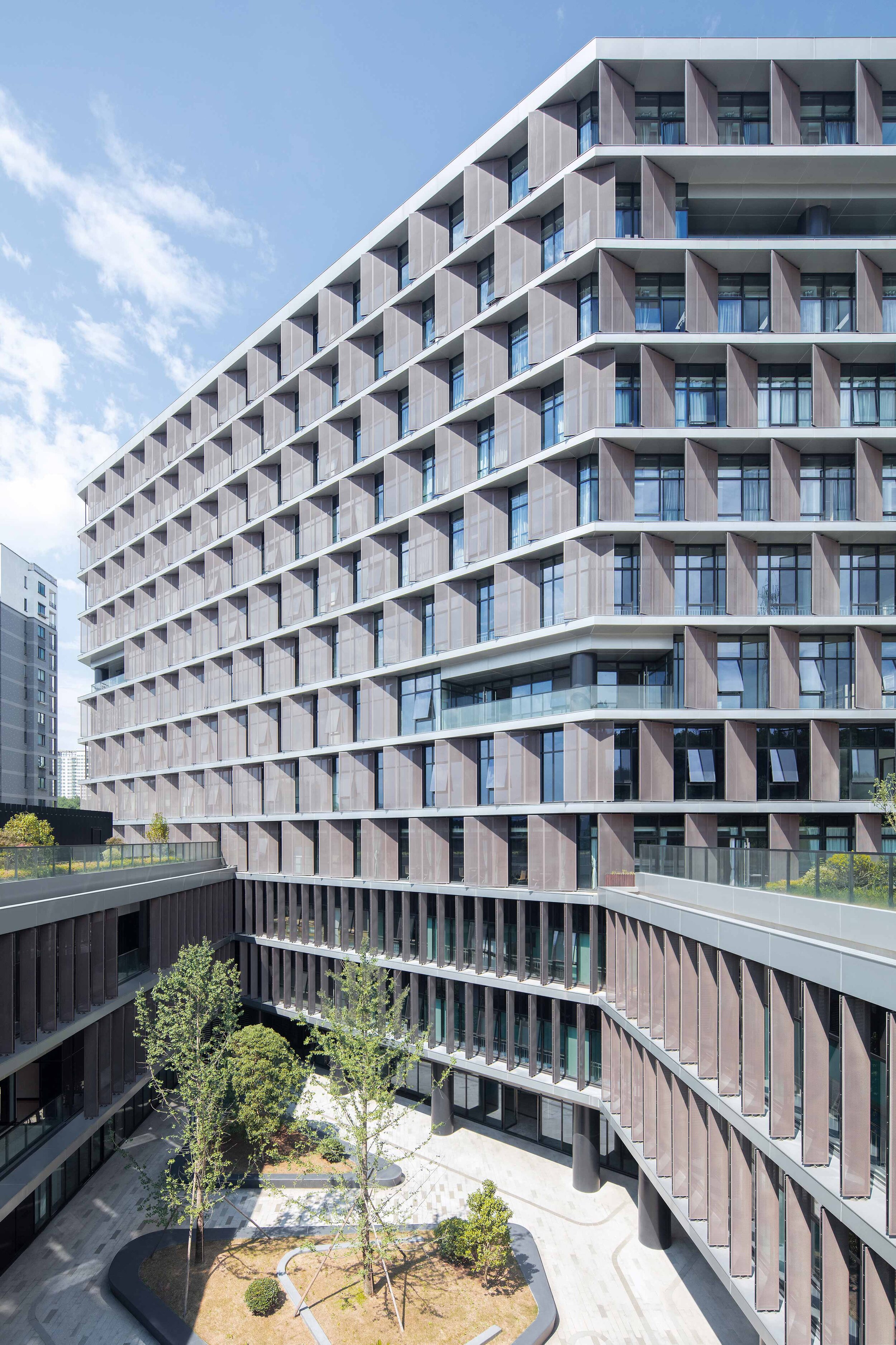
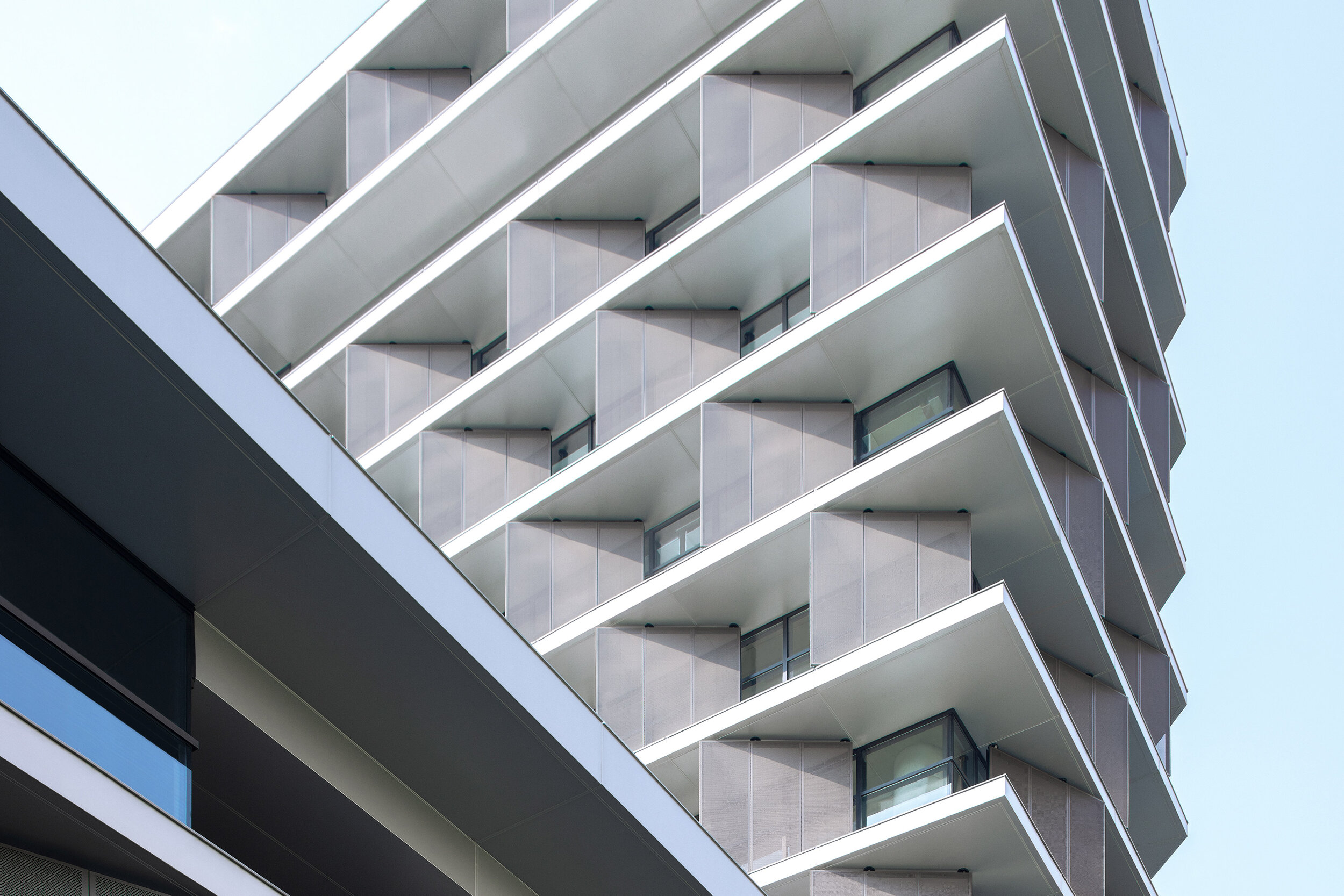
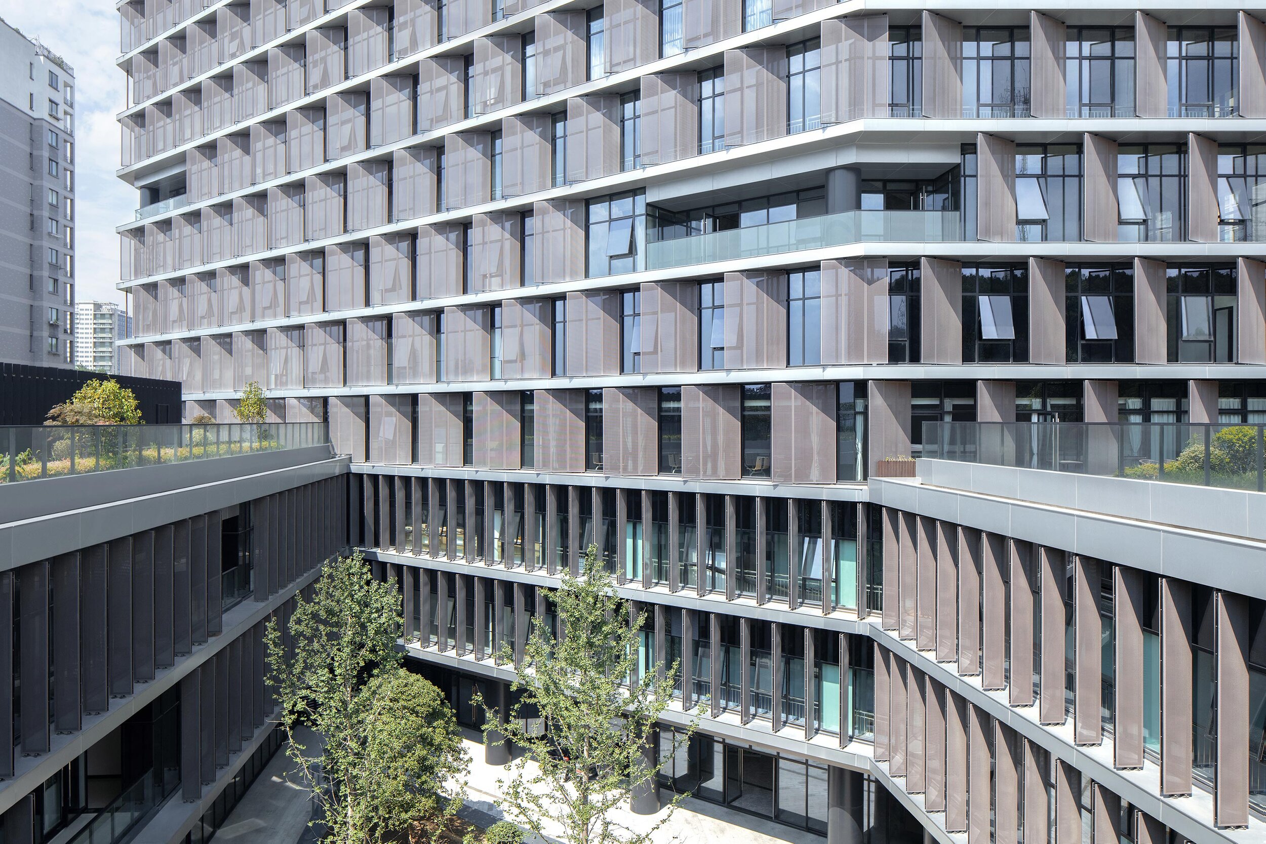
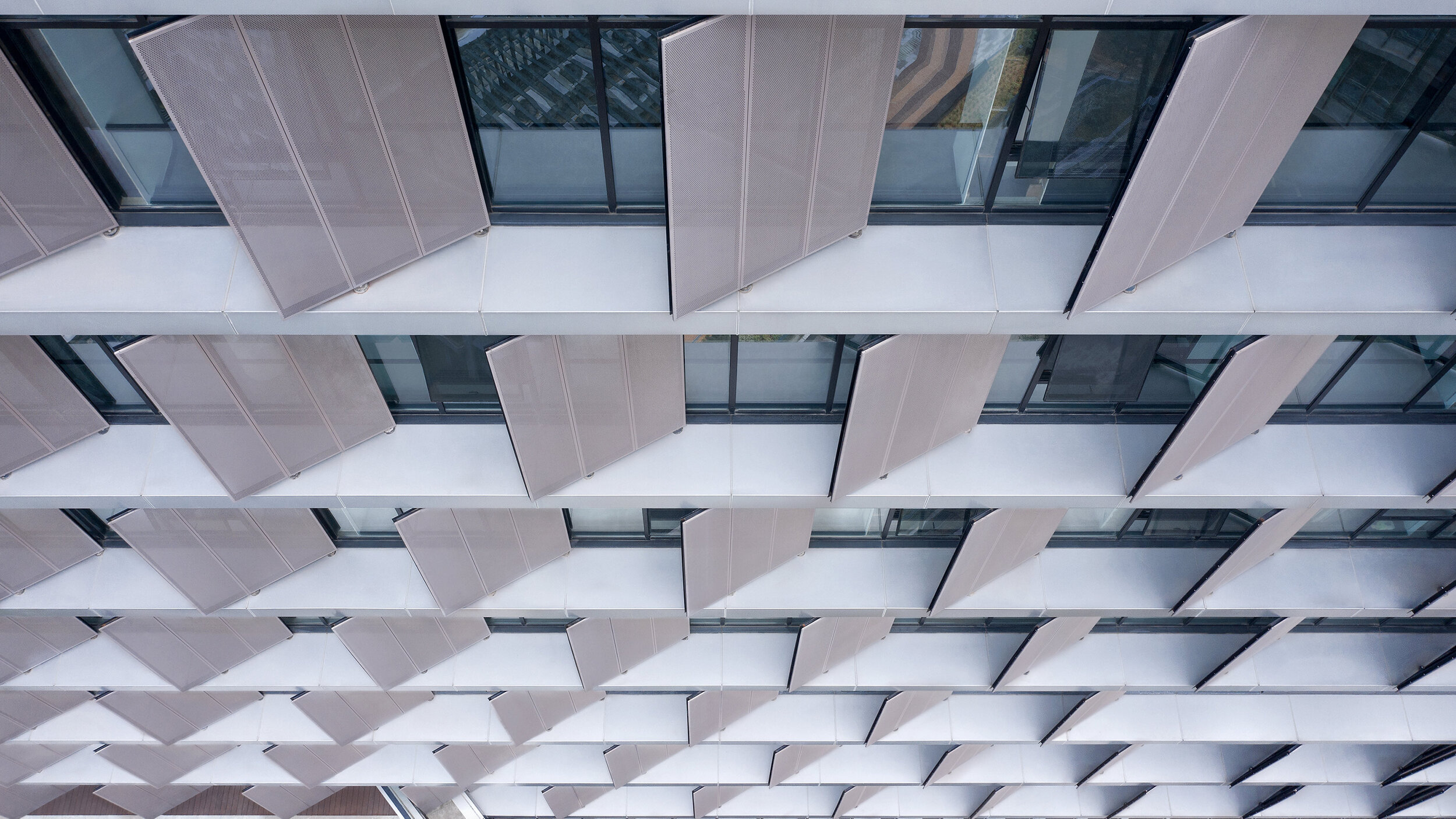
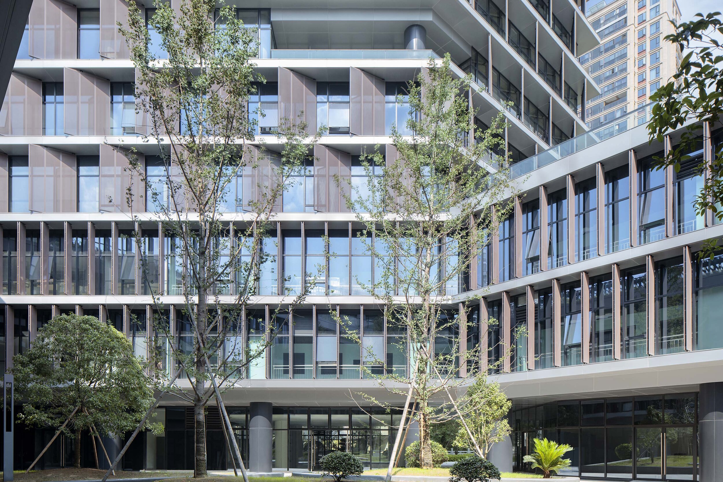
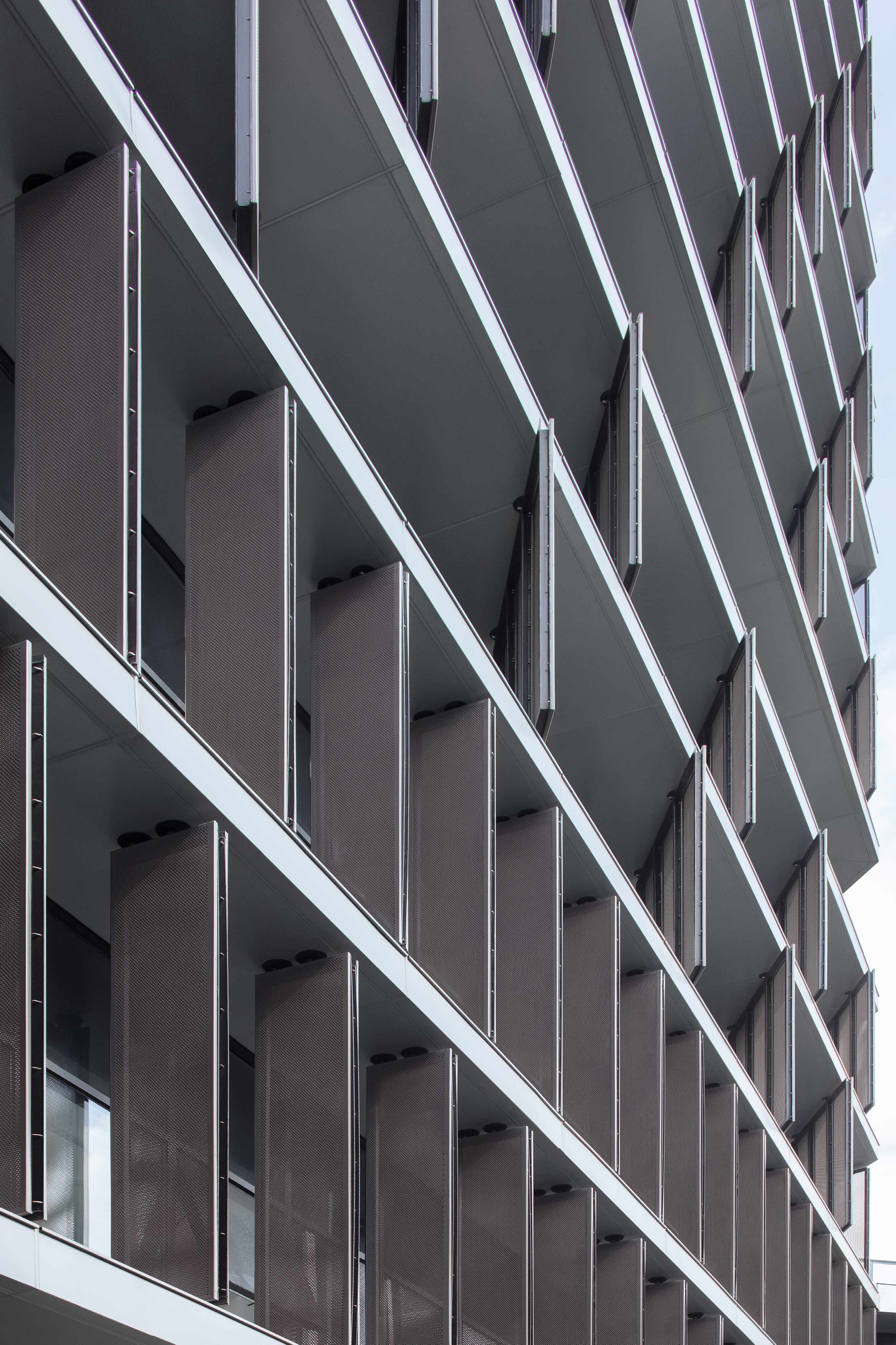
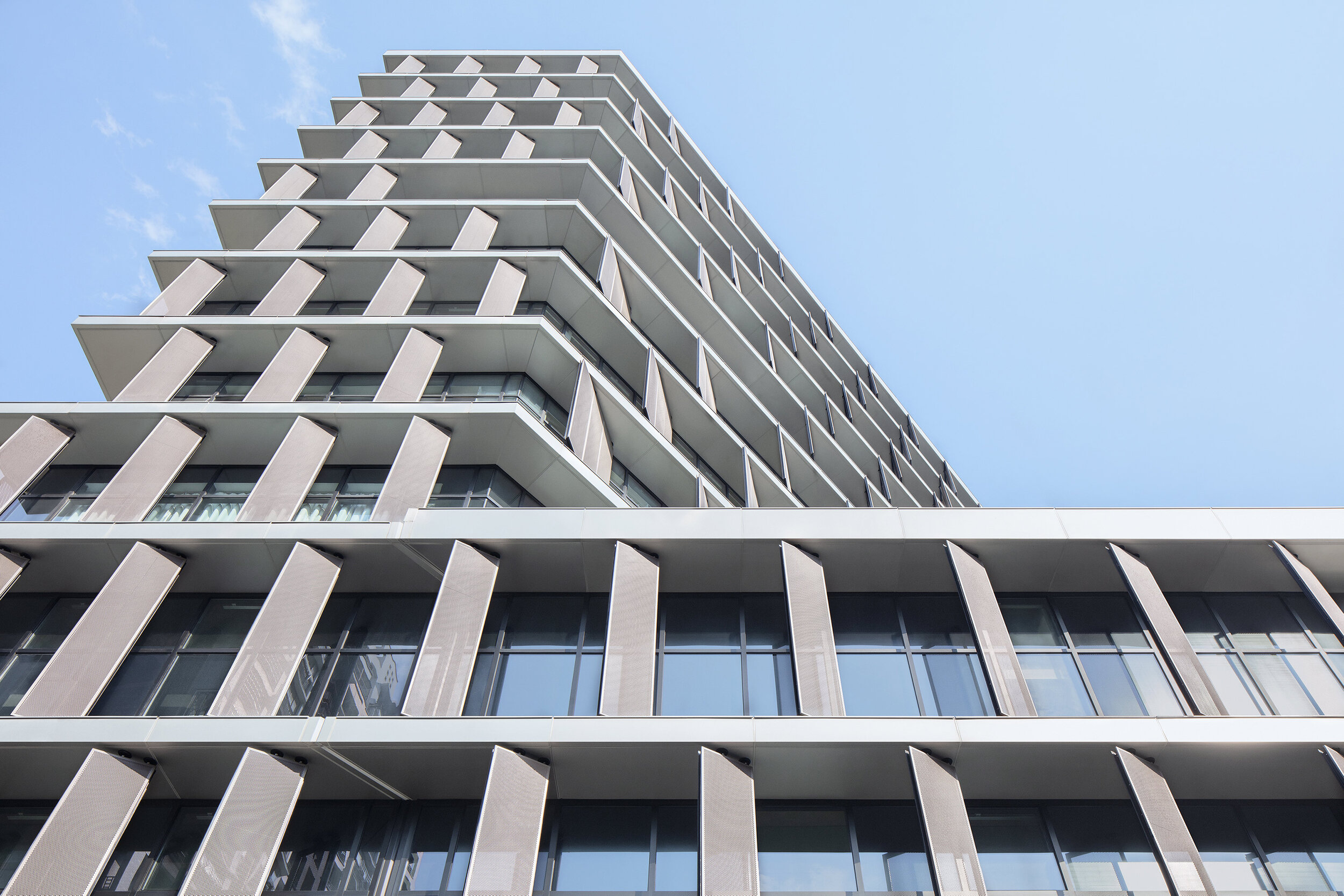
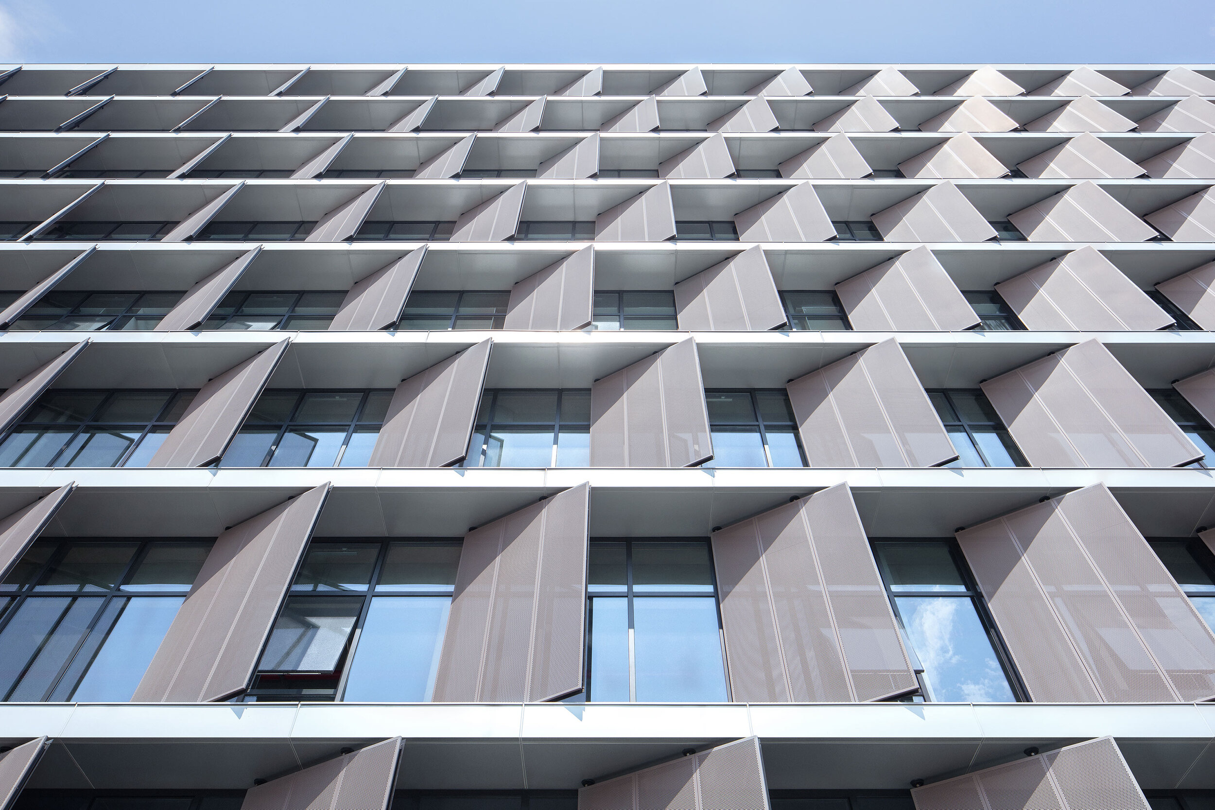
Surprisingly, all facades required vertical screens to prevent unwanted heat gain. Elegantly thin slab edges are projected past the window line and form horizontal ledges to sit vertical perforated metal sunscreens. These screens are closed enough to block the sun, yet open enough to not impede views out. Decks are then cut into the petals to provide outdoor space for each floor level and subtle visual relief to the petals' wall.
Minimalism 1. – Expressionism 0.
The program for this local government building is different: document archives, testing laboratories, staff canteen, a commercial street-front cafe, and a variety of closed and open office spaces. This suggests an architectural articulation of these programs. Besides, the typological hybrid offers an indication of the perimeter building and the tower.
However, rather than exploring these apparent solutions, the questions posed were: What are the program's differences? What are the differences generated by combining the perimeter block and tower typologies? And finally, what is the least we need to do to engage with these differences?
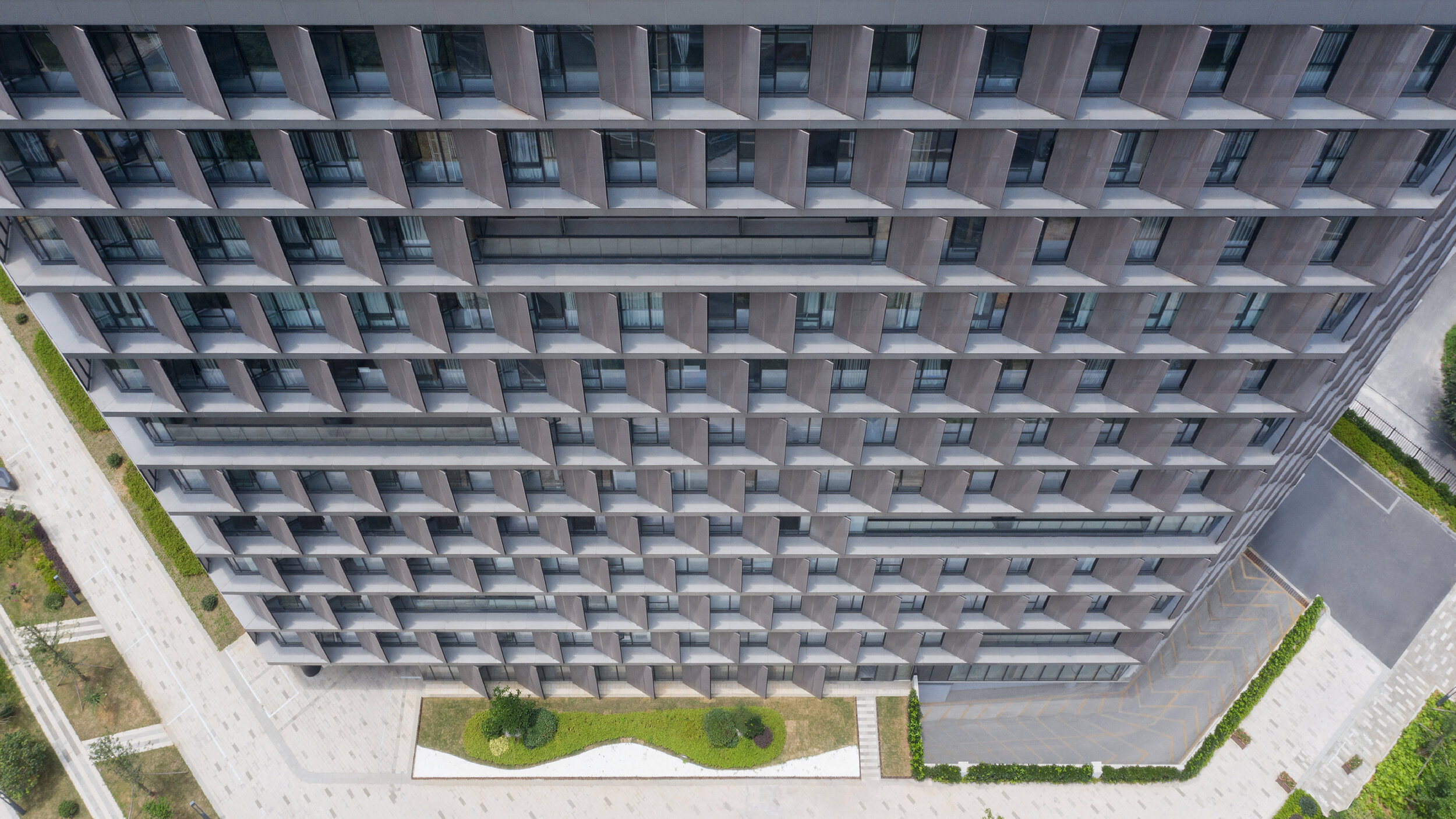
Semi-public courtyard
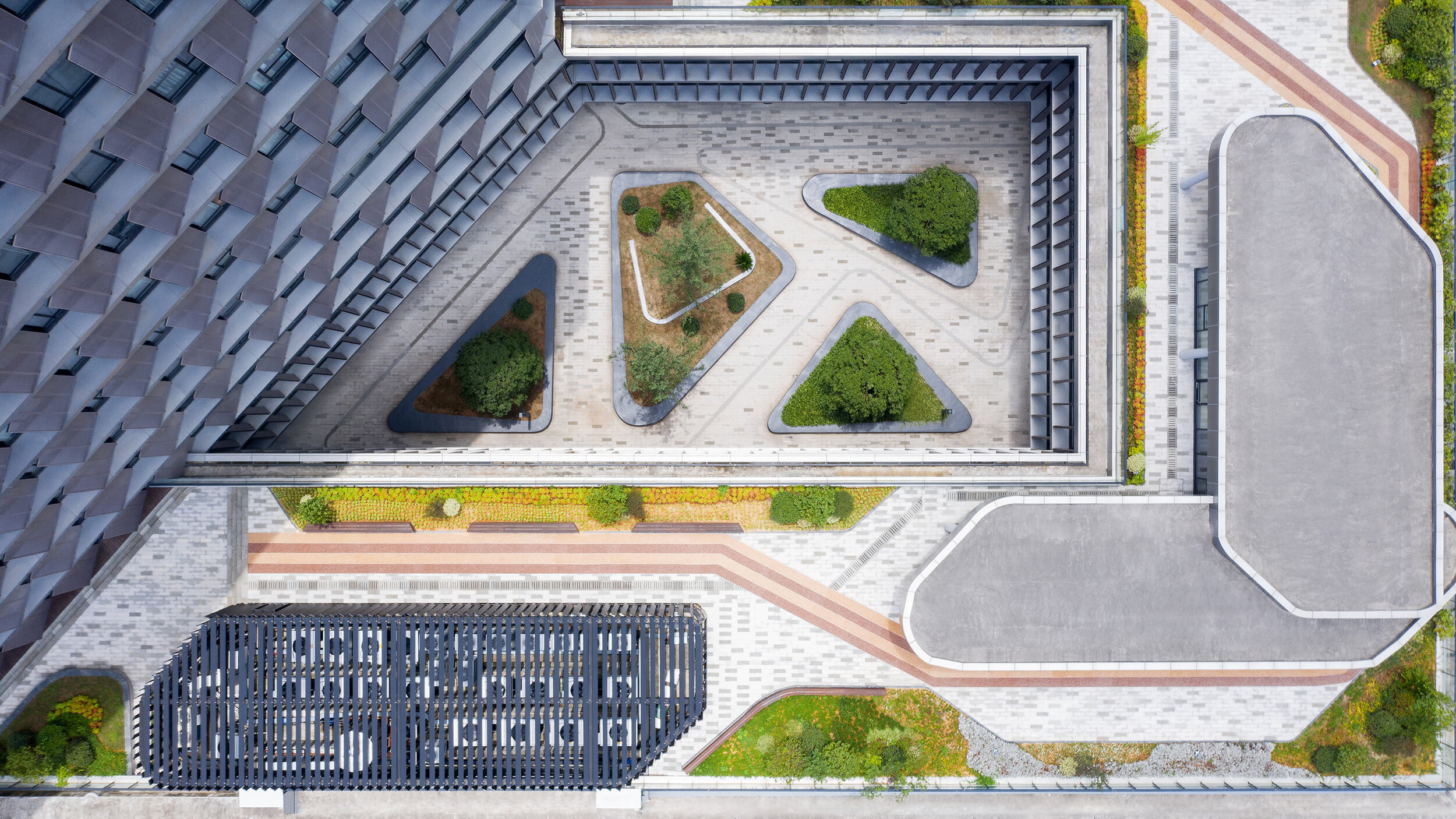
This centralized circulation strategy creates a semi-public outdoor space and provides opportunities for encounter and exchange among different public departments. It also provides an active area for lunch in a protected courtyard landscape.
The courtyard directly links the public footpath off the main southern entrance to a proposed pedestrian bridge to the northeast of the site. This diagonal shortcut further reinforces the semi-public nature of the courtyard.
Roofscape as displaced landscape
To encourage the staff to get out of the building and enjoy the river frontage or the courtyard, the paving from the ground floor interiors flows directly into the yard and out to the river's edge – a robust strategy for the future, when the ground floor develops more pubic and/or commercial programs.
The tower overlooks the perimeter block roof, and this space provides an opportunity for a significant private outdoor space for the building tenants. A garden pavilion for staff lunches or informal meetings sits within a roofscape that presents as a displaced landscape. The staff canteen opens on to this roofscape. Plant rooms have been disguised as additional garden pavilions.
More visible than we think
In a commercial and retail environment where every building is trying hard to be seen as different from its neighbours, advertising and signage dominate streetscapes. Buildings are becoming extensions of corporate logos and marketing campaigns – a minimal, elegant and calm public building may be more visible than we think.
Project Data
Project Name: Hangzhou Tonglu Archives Building
Project Status: Completed 2019
Location: Tonglu, Hangzhou, Zhejiang Province
Client: Tonglu Urban Development and Management Co., Ltd.
Typology: Office
Program: Document archives; testing laboratories; office.
Year: 2016—2019
GFA: 26,700 m²
Construction Cost: RMB 136 million
BAU Project Team: James Brearley, Jens Eberhardt, Chen Zhiyong, Luo Huaili, Steve Whitford, Gao Weiguo, Chen Jian
Builder: Hangzhou Harbour Construction Co., Ltd.
Engineer+Documenting LDI: China United Engineering Company
Photographer:Xia Zhi
KUKAN DESIGN AWARD 2020
Established to connect the value of spatial design to the future, the KUKAN DESIGN AWARD is the most esteemed of such awards in Japan. Our society grows increasingly complex, our values are changing, from valuing a wealth of things to respecting wealth in our hearts, and meanwhile, we face many challenges. The mission behind the KUKAN DESIGN AWARD is to excavate the solution to our society’s multi-faceted challenges and breakthrough to a hopeful future.
On November 13, 2020, the Kukan Design Awards ceremony was successfully held at the Tokyo Design Center (Gotanda, Tokyo). Due to the global pandemic, only winners and invited parties were invited to celebrate in the ceremony.
Kukan Design Awards were established to connect with the value of spatial design toward the future. Co-organized by DSA (Japan Design Space Association) and JCD (Japan Commercial Environmental Design Association), it is recognized as the most prestigious spatial design award in Japan.
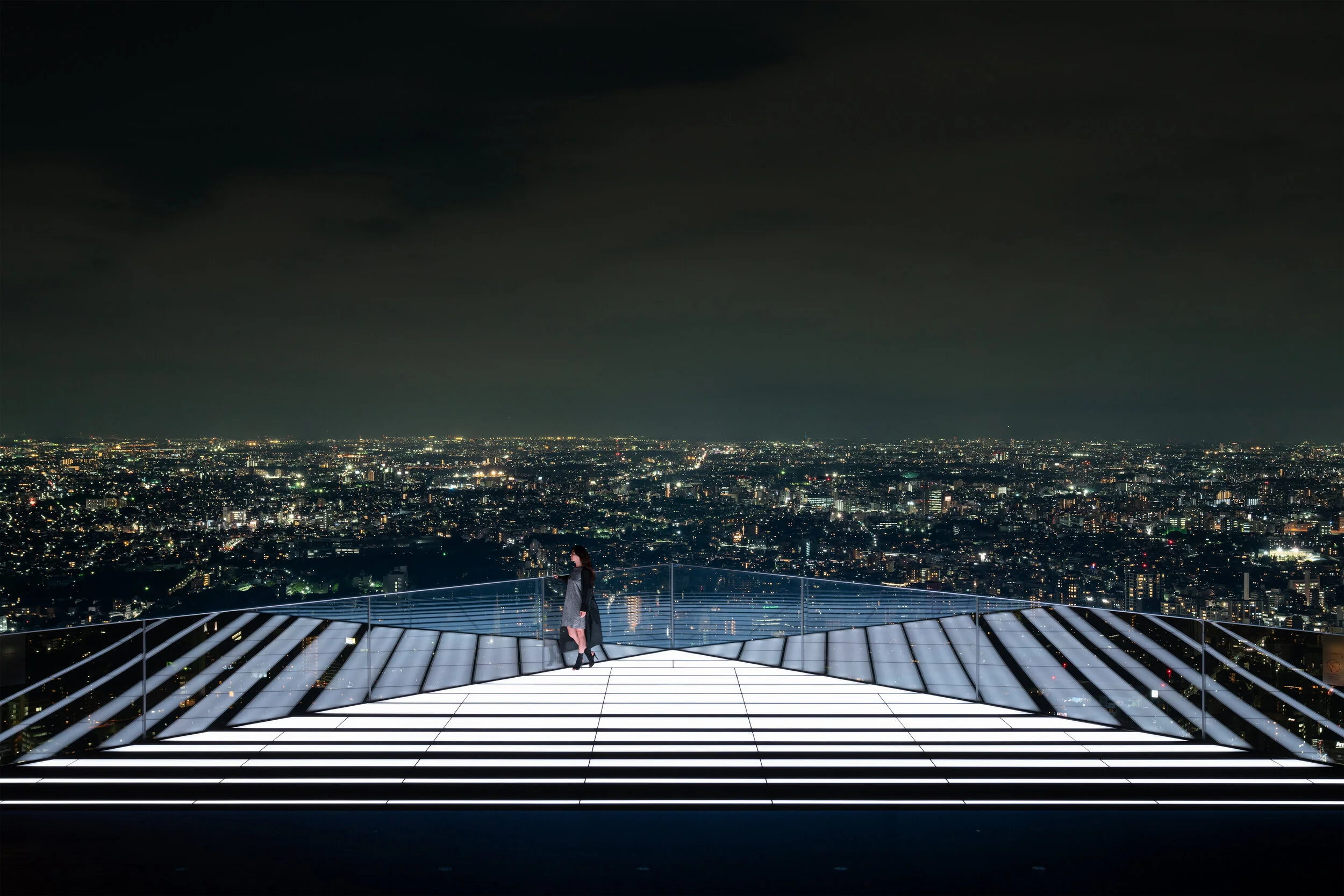
The winning project "Shibuya Sky" and "Fukadaiji Garden Restaurant Maruta" and "Kumamoto Castle Special Tour Passage" have been awarded as "KUKAN OF THE YEAR 2020", the grand prize of this year.
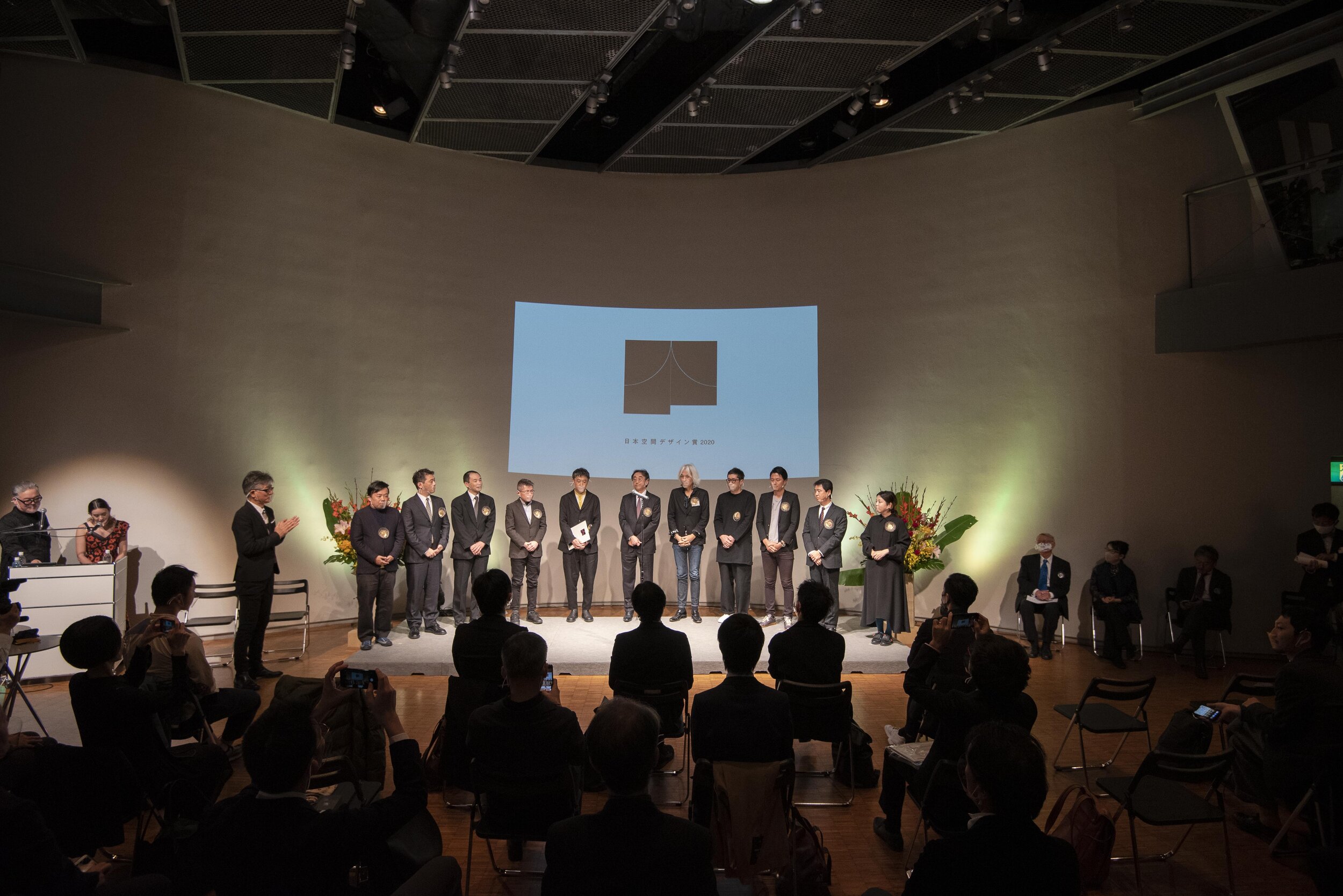
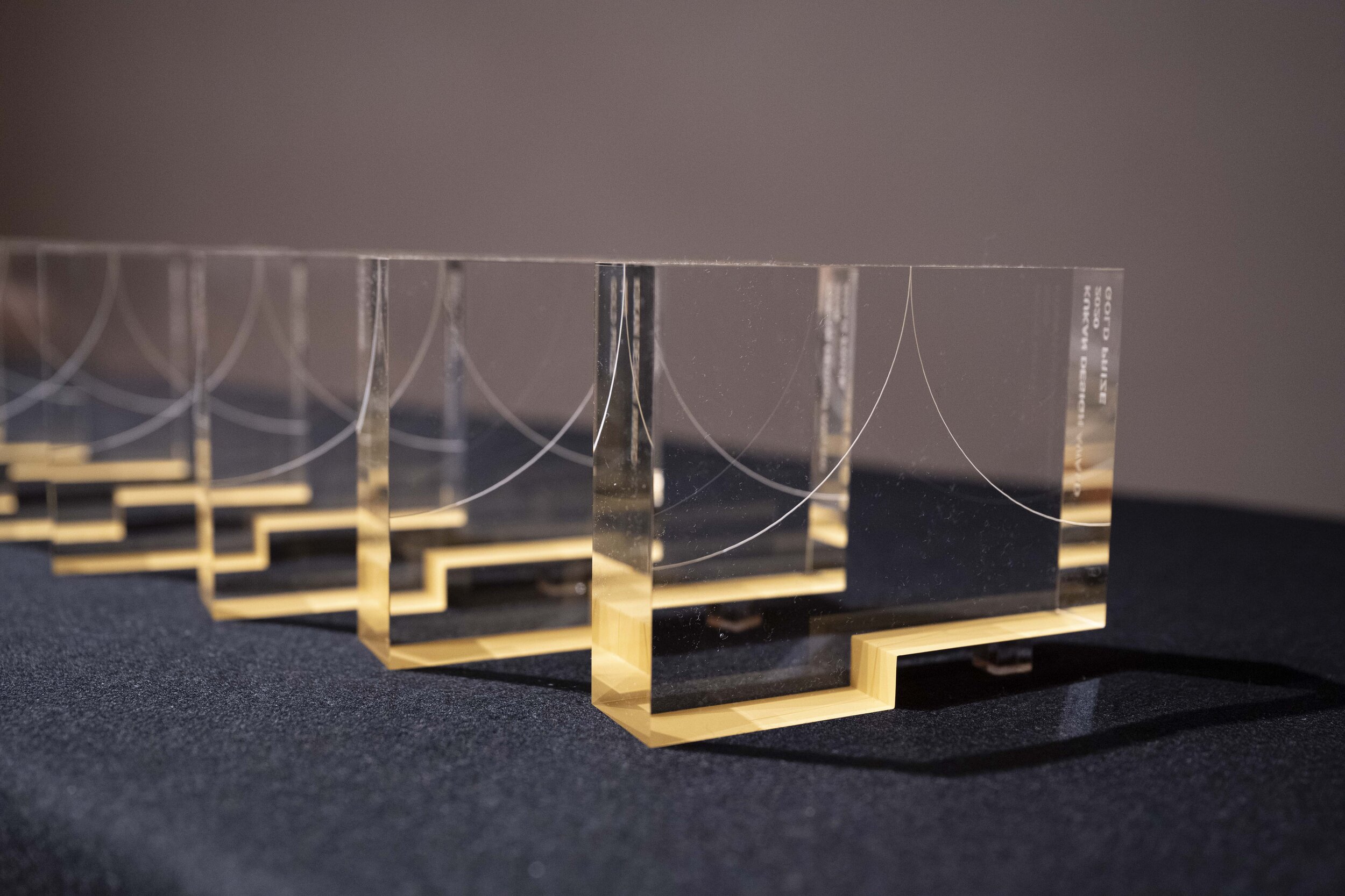
KUKAN OF THE YEAR 2020
Winning Project: Shibuya Sky
Design by: Tadao Kamei / Takeyuki Katsuya / Shibuya Station Area Development Planning Joint Venture (Nikken Sekkei), Keisuke Arikuni / RHIZOMATIKS
Photographer: SS Tokyo, Kenichi Suzuki, Keita Sinya (ROLLUPstudio.)
Winning Project: JINDAIJI GARDEN Restaurant Maruta
Design by: Shunichi Furuya/ FURUYA DESIGN ARCHITECT OFFICE
Photography: Shinkenchiku-sha
Winning Project: Kumamoto Castle Reconstruction Observation Path
Design by: Yuzuru Tsukagawa + Shun Hori / NIHONSEKKEI
photography: Kenji Masunaga
KUKAN DESIGN TALK
The moderator, Mr. Naoki Iijima (JCD Director), held a discussion session with three champions of KUKAN OF THE YEAR 2020.
GOLD PRIZE / 2020
KATACHI TO KURASHI
Hokuto Fujii / hokkyok Inc.
Wako Main Bldg. / Multiple
Jun Musashi / Wako, Hokuto Ando / we+, Toshiya Hayashi / we+
mother's+
Junichi Yokoo / TAKENAKA CORPORATION
Shibuya PARCO - HULIC building
Yuuji Hamano, Yoshiharu Kabe, Nobuhiko Kakitani / TAKENAKA CORPORATION
The Hotel Seiryu Kyoto Kiyomizu
Ryu Kosaka / A.N.D., Nomura Co., Ltd
Hiroshi Yoneya, Ken Kimizuka / TONERICO:INC.
“HANEDA SKY CAMPUS” Headquarter of Azusa Sekkei
Kazuyuki Watanabe / Azusa Sekkei
International Dorm-City
Expert Member, Kanagawa University Campus Development Planning CommitteeKukan Design Awards
For more information about KUKAN DESIGN Award, please visit: https://kukan.design/
TIFFANY & CO. Unveils Plans For A Contemporary Glass Addition Atop Its Classic Fifth Avenue Flagship Store
A holistic transformation of this magnitude has not taken place in the building’s 80-year history. Tiffany is embarking on the project in partnership with the renowned architectural firm, The Office for Metropolitan Architecture (OMA). Led by Partner Shohei Shigematsu, OMA New York is engaged in specific aspects of the transformation–including a reimagined upper addition.
For the first time, Tiffany & Co. is revealing exterior renderings of the transformation underway at its Fifth Avenue flagship store. The upper addition (floors 8, 9 and 10) of the 10-story architectural icon located at 727 Fifth Avenue will be completely reimagined from office space originally constructed in 1980, into a new exhibition, event and clienteling space. Surrounded by a curtain of undulating glass complementing the classic limestone façade below, the contemporary structure above this historic building echoes the height and grandeur of the flagship’s timeless main floor. Construction began on Tiffany’s flagship transformation in spring 2019 and is estimated to be complete in spring 2022.
“The Tiffany & Co. Fifth Avenue flagship is arguably one of the most beloved and well-known luxury retail spaces in the world. It's a place where so many have memories of important moments in their lives, filled with emotion and anticipation of the extraordinary,” said Reed Krakoff, Chief Artistic Officer, Tiffany & Co. “Tiffany’s newly transformed flagship will reflect the future of our brand while honouring our 183-year legacy.”
A holistic transformation of this magnitude has not taken place in the building’s 80-year history. Tiffany is embarking on the project in partnership with a renowned architectural firm, The Office for Metropolitan Architecture (OMA). Led by Partner Shohei Shigematsu, OMA New York is engaged in specific aspects of the transformation–including a reimagined upper addition.
The ambition for the design of the new upper volume is to create a vertical continuity with the existing structure, while also setting it apart as a bold and innovative addition to the building. The corniced parapet of the original building will be mirrored by a slumped glass façade above. The eye is drawn upward creating a gentle transition between the two structures. This ribbon-like design detail brings a sensuality to the building, instilling a softness among the curtain walls of the building’s neighbours.
The recessed glass exhibition and event space will echo the feeling of the main floor with its column-free, double-height ceilings. The expansive glass facade brings an openness to both sides of the building and opens up to an outdoor terrace that will offer guests a view from the world’s most famous intersection for luxury retail, and up Fifth Avenue to Central Park.
The expansive Tiffany flagship was a symbol of modern architecture when it was built in 1940. The grandeur and essence of that majestic space will remain and continue to awe guests as they enter the renovated store in 2022. An evolved luxury retail experience will draw consumers inside once again and inspire them to journey from the main floor up through the entirety of the building.
In the interim, the Tiffany Flagship Next Door located at the adjacent 6 East 57th Street will continue to serve as Tiffany & Co.’s home, showcasing the entire breadth of the Brand’s extraordinary collections, until the original flagship’s completion in spring 2022.
For more information, please visit: https://www.tiffany.com
