The Ultimate Nostalgia Tai’an’s Ceremony Hall - The Hometown Moon
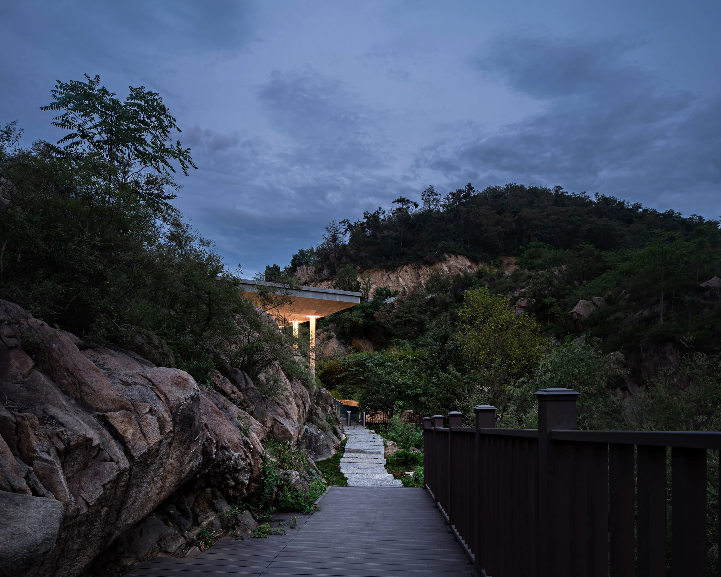
The parking lot is the last reminder of modern civilization. To access the Hometown Moon, visitors must go through a purifying road. It takes about five to ten minutes to walk along the path between mountains and streams. The entrance lies behind a boulder.
The Possibilities of a New Hometown
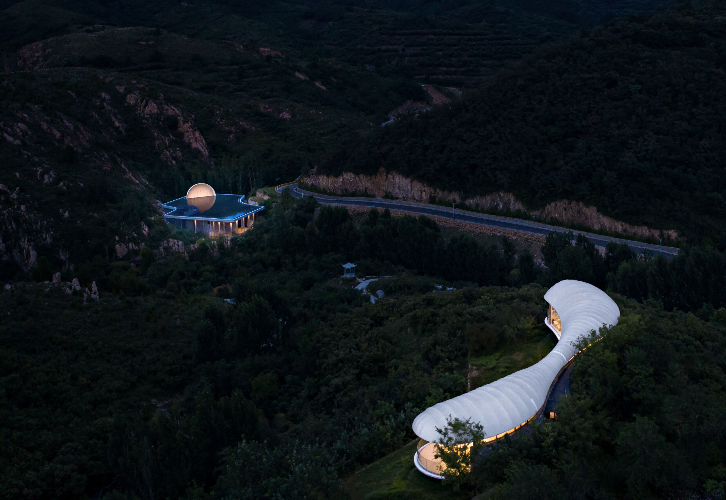
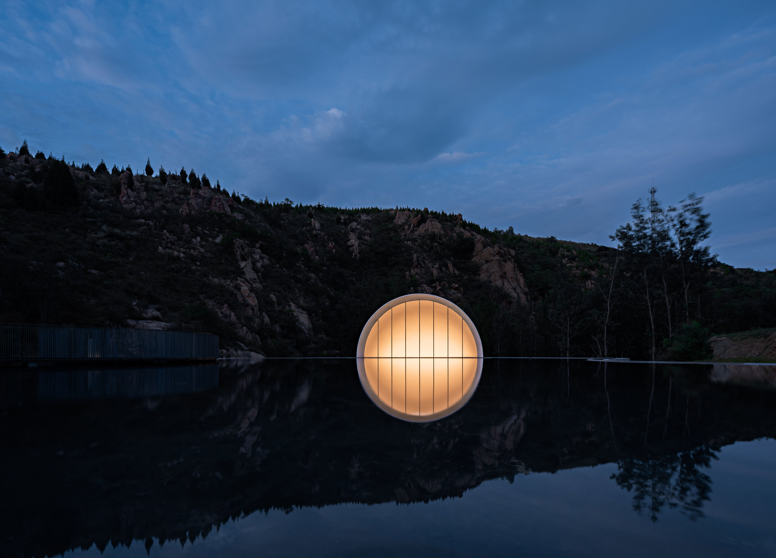
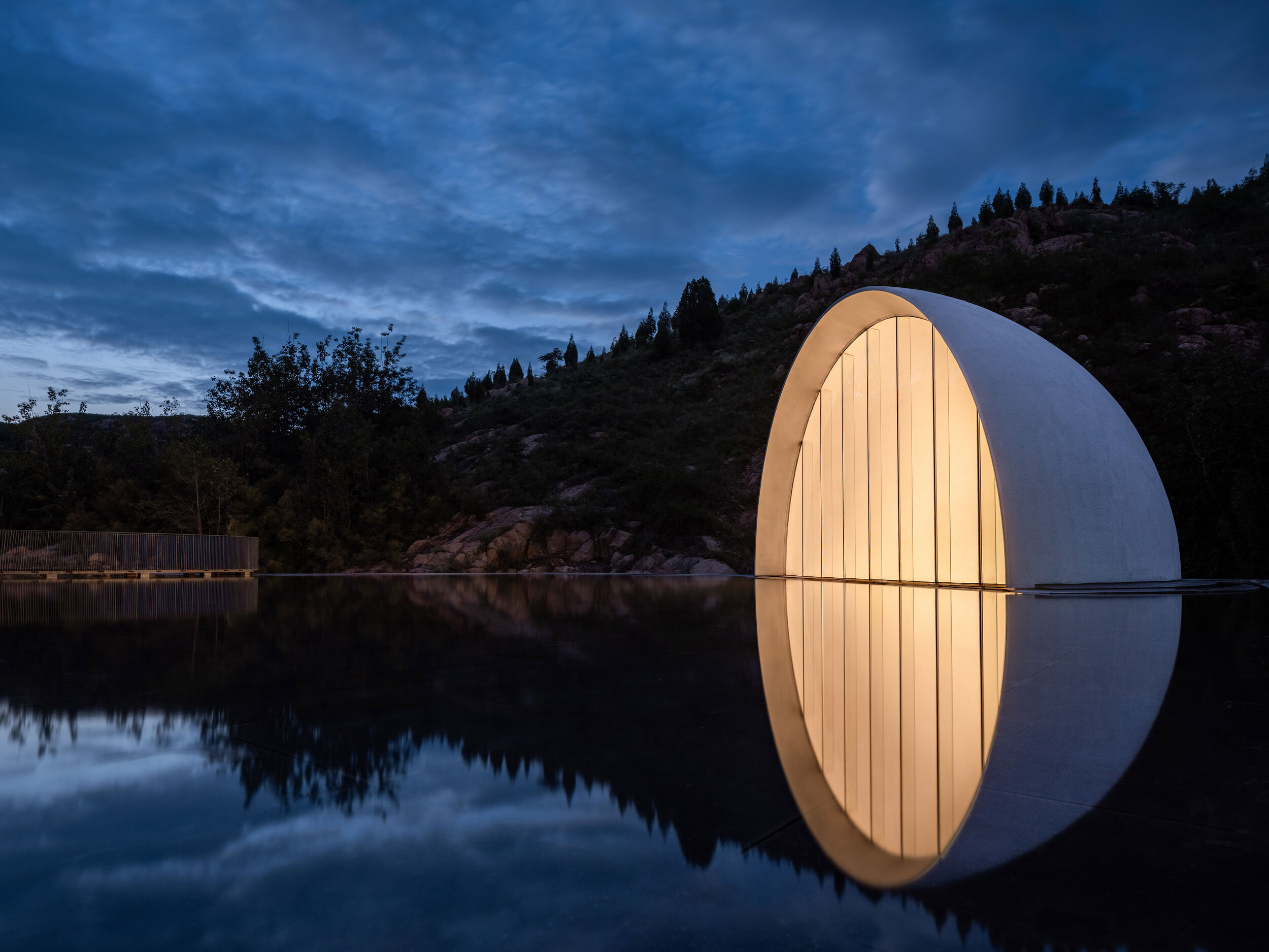
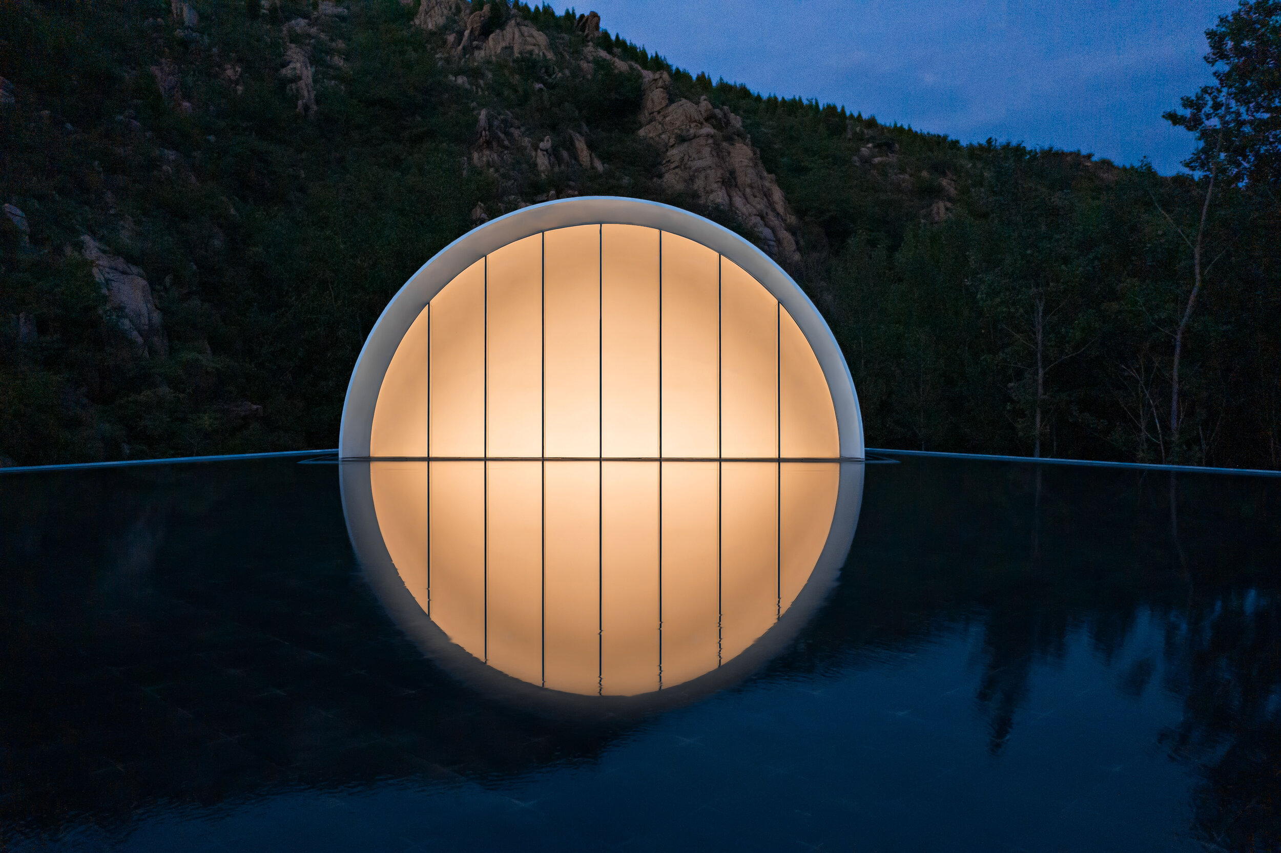
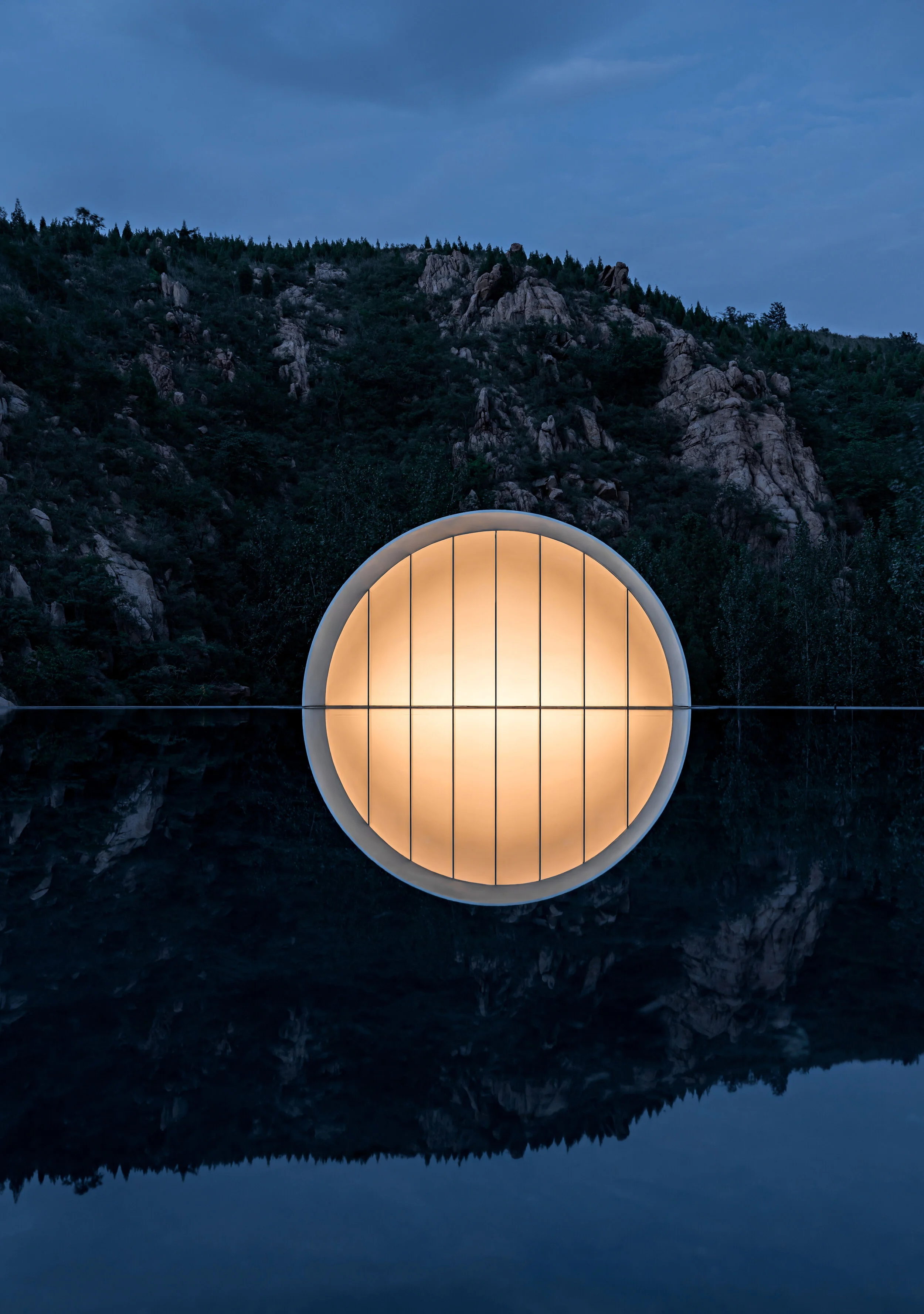
An assortment of colourful banners welcomes passengers at the high-speed train station in Tai’an, China. The headlines perched above the Jiunv Crest (Nine Women’s Peak) showcase a Hometown Moon or a Hometown Cloud, inviting people to walk on the moon or wander around the cloud. The intriguing wording is part of a creative campaign inviting travellers to visit attractions lying beyond the main scenic area of Mount Tai. The strategy looks to breathe new life into Nine Women’s Peak, a branch of the famous mount that gives its name to the city of Tai’an.
At the beginning of 2019, Shandong Lushang Group commissioned Syn Architects to develop the overall planning and design of the mountainous area, its villages, and the Hometown Moon, the representative structure of the project. In no time at all, a Hometown Cloud state of mind began to spread out. Fei Xiang’s theme, Hometown Cloud, was played repeatedly in the building. The romantic song from the ’80s swayed people’s emotions, creating a nostalgic atmosphere. Nine Women’s Peak drew attention on social media, bringing new people, new faces, new industries, and new possibilities to the area around Dongximen Village. The region of humble villages became an online phenomenon that attracted thousands of tourists. During the project, Lushang Group effectively used the image of “a cloud” to demonstrate the enormous value of architecture as a communication medium.
However, a series of scattered constructions is not enough to stimulate the growth of a region. Thus, the online popularity of the Hometown Cloud slowed down in less than a year. Today, Lushang Group demands a long-term holistic approach that can connect the string of mountain villages in the 55 square kilometres area. The definition of industrial and spatial structures and the introduction of new wonders that satisfy visitors looking for fresh experiences is needed too. In this regard, Syn Architects integrates daily life, industrial development, and environmental science in every project. Taking advantage of its years of practical experience in rural areas, the firm developed client markets in Jinan, Shandong province’s capital city. Additionally, attractions such as the Balou Theater and the Hometown Moon, and their supporting facilities, were unveiled one after the other. In this way, Syn Architects returns to the birthplace of Confucianism, rebuilding the relationship between dualities such as the city and the countryside, modern society, and homesickness, searching for forgotten values and neglected possibilities.
The Moon is the Light of Our Hometown
The original concept for the Hometown Moon comes from the developer. During the Mid-Autumn Festival of 2019, a moon-shaped balloon with a diameter of 10 meters was lit up in Nianhua Bay, spreading magical colours and lights all around. Inspired by the scene, the Lushang Group hopes to light up a full moon at the Nine Women’s Peak and write the next chapter in intellectual property for designed hometowns.
Mr. Zou Yingxi, the lead architect and planner of the project, hopes to infuse a deep meaning into the artificial moon. He longs for a moon that never sets. According to this rhetoric, the building functions as a ceremony hall designed to escape conventionalisms. Among its main features, the structure attracts locals and tourists from other provinces, can host ceremonies and events, and provide spiritual and operational values that strengthen the village’s resources.
An ancient poem from the Song Dynasty ponders the nature of perspective and emotion: “the clouds and the moon remain the same, but mountains and rivers evolve throughout time.” Modern-day catalysts are also capable of evoking nostalgia, regardless of location. As such, an architectural poem about the moon does not need to relate to the classical symbol. Under this philosophy, Syn Architects combines abstract geometrical shapes and simple materials to create a pure space with complex visuals that stimulate the soul, leaving traditional figurative expressions behind.
The Route Guidance
The parking lot is the last reminder of modern civilization. To access the Hometown Moon, visitors must go through a purifying road. It takes about five to ten minutes to walk along the path between mountains and streams. The entrance lies behind a boulder. From here on, visitors begin to enjoy communion with nature. Birds singing, insects chirping, rustling leaves, gurgling streams, and hearts beating with joy and anticipation; the sounds of nature make visitors feel at ease. After crossing a mountain, a river, and exploring a few curved pathways, visitors finally arrive at the building. Here, they ponder about the intriguing nature of the architecture. And on the emotional side, their senses of hearing and smell are stimulated by their natural surroundings.
The long and winding paths increase the curiosity of visitors. Attracted by a building in the middle of nature, they suddenly find themselves inside the structure, wondering about the charms of an inverted moon. Like Buddhist meditation, the experience develops insight by feeling the background of mountains and forests to complete a mental reorganization, soothing the souls of urban residents. Along the plank road, there are playgrounds, cabin camps, bonfire areas, and anti-fog devices. These and other similar spaces enrich the experience and the dimension of the project.
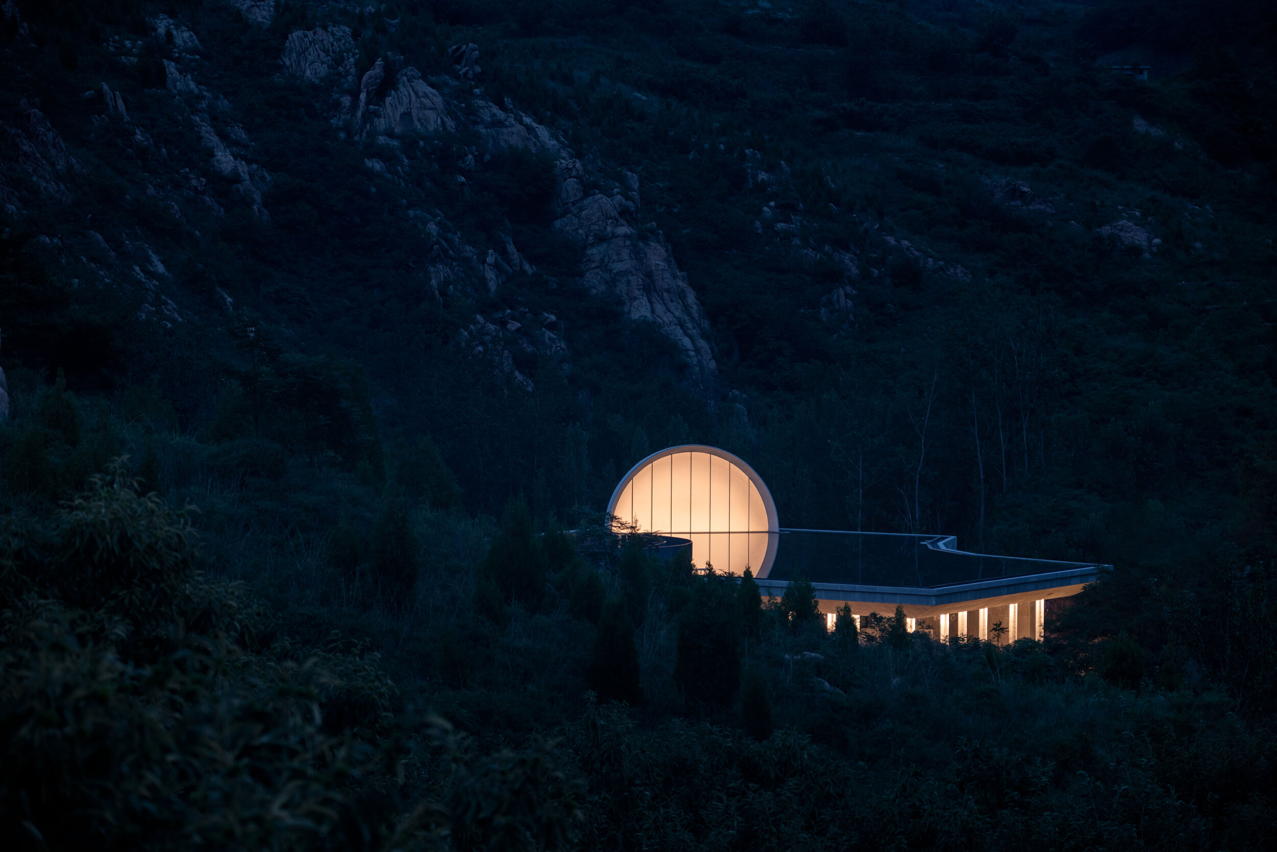
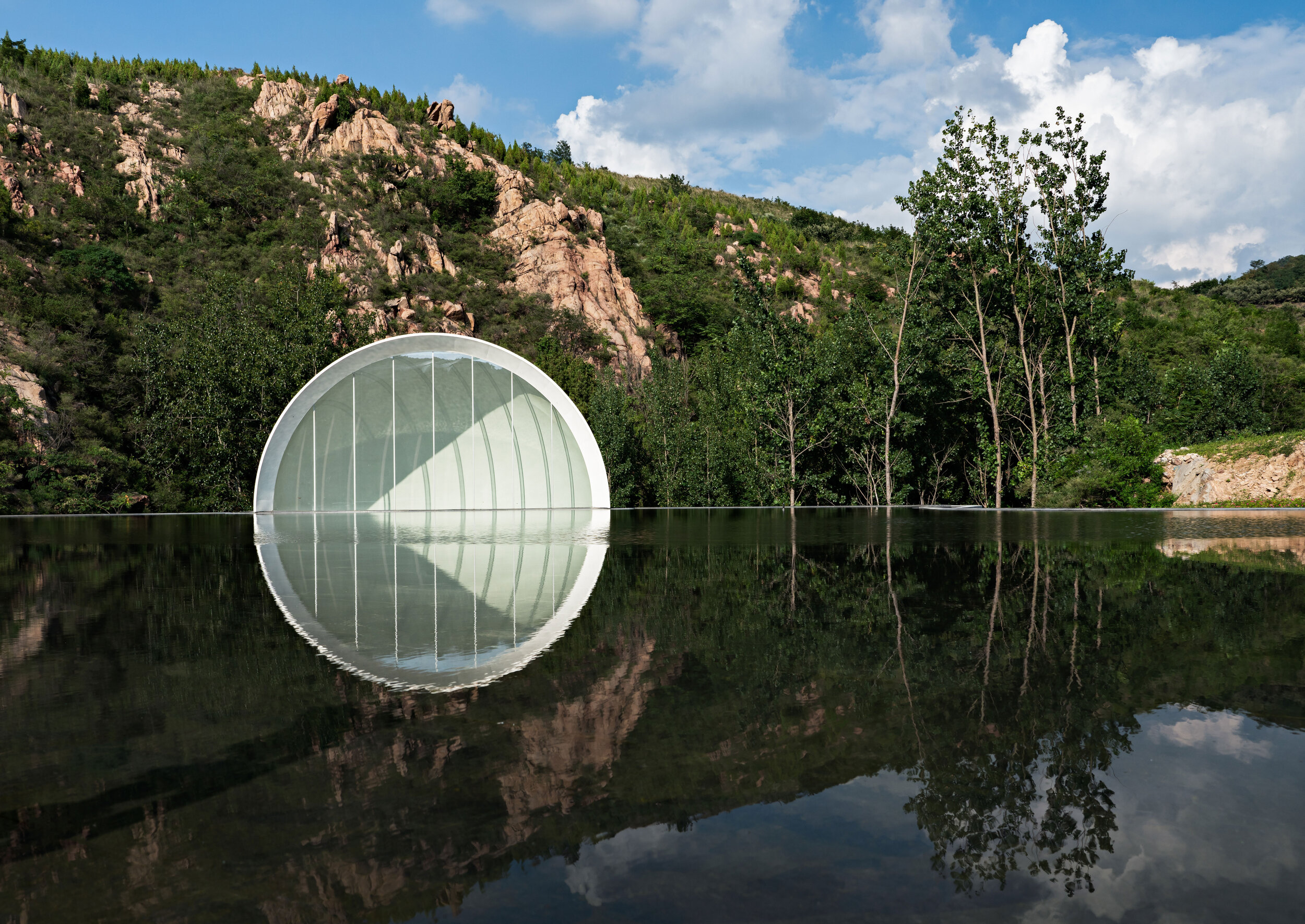
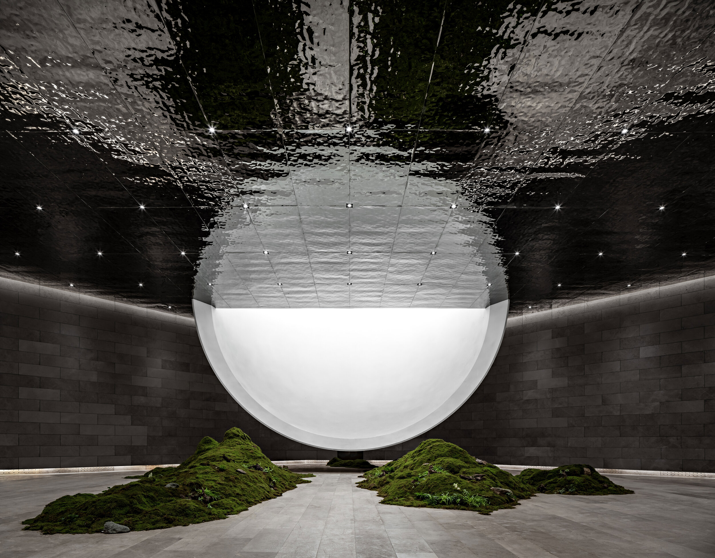
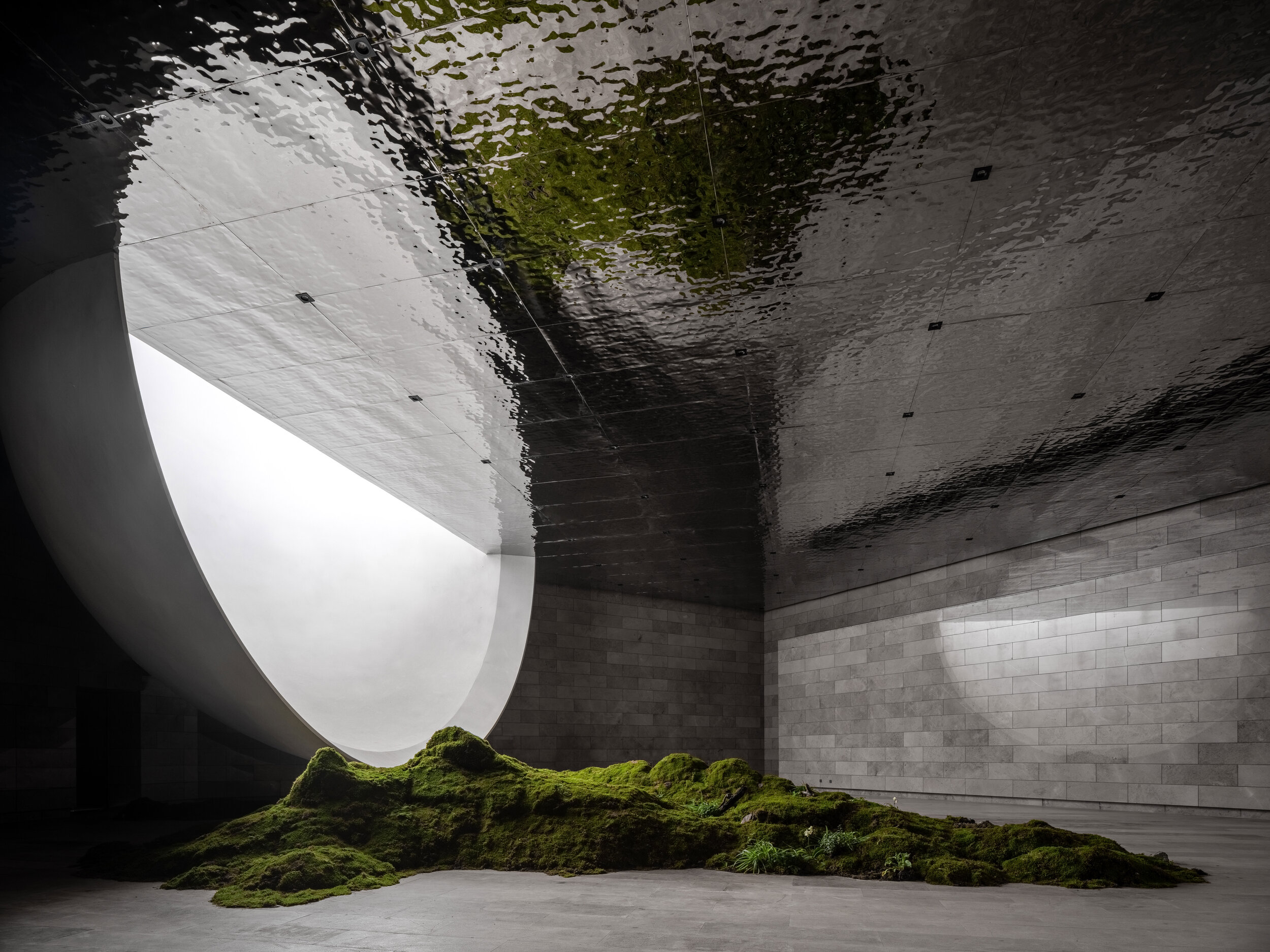
Bridges on top of the structure allow visitors to contemplate the moon by the reflecting pond without entering the building. There is a plank road connection between the group of bridges and the mountain that grants access for this purpose. If there is an ongoing ceremony in the room, the door on the roof can be closed to avoid interference. If there is no activity in the room, visitors touched by the moon on the ceiling can enter the building and contemplate the lower half of the moon.
The parking lot is the last reminder of modern civilization. To access the Hometown Moon, visitors must go through a purifying road. It takes about five to ten minutes to walk along the path between mountains and streams. The entrance lies behind a boulder. From here on, visitors begin to enjoy communion with nature. Birds singing, insects chirping, rustling leaves, gurgling streams, and hearts beating with joy and anticipation; the sounds of nature make visitors feel at ease. After crossing a mountain, a river, and exploring a few curved pathways, visitors finally arrive at the building. Here, they ponder about the intriguing nature of the architecture. And on the emotional side, their senses of hearing and smell are stimulated by their natural surroundings.
The long and winding paths increase the curiosity of visitors. Attracted by a building in the middle of nature, they suddenly find themselves inside the structure, wondering about the charms of an inverted moon. Like Buddhist meditation, the experience develops insight by feeling the background of mountains and forests to complete a mental reorganization, soothing the souls of urban residents. Along the plank road, there are playgrounds, cabin camps, bonfire areas, and anti-fog devices. These and other similar spaces enrich the experience and the dimension of the project.
Interventions
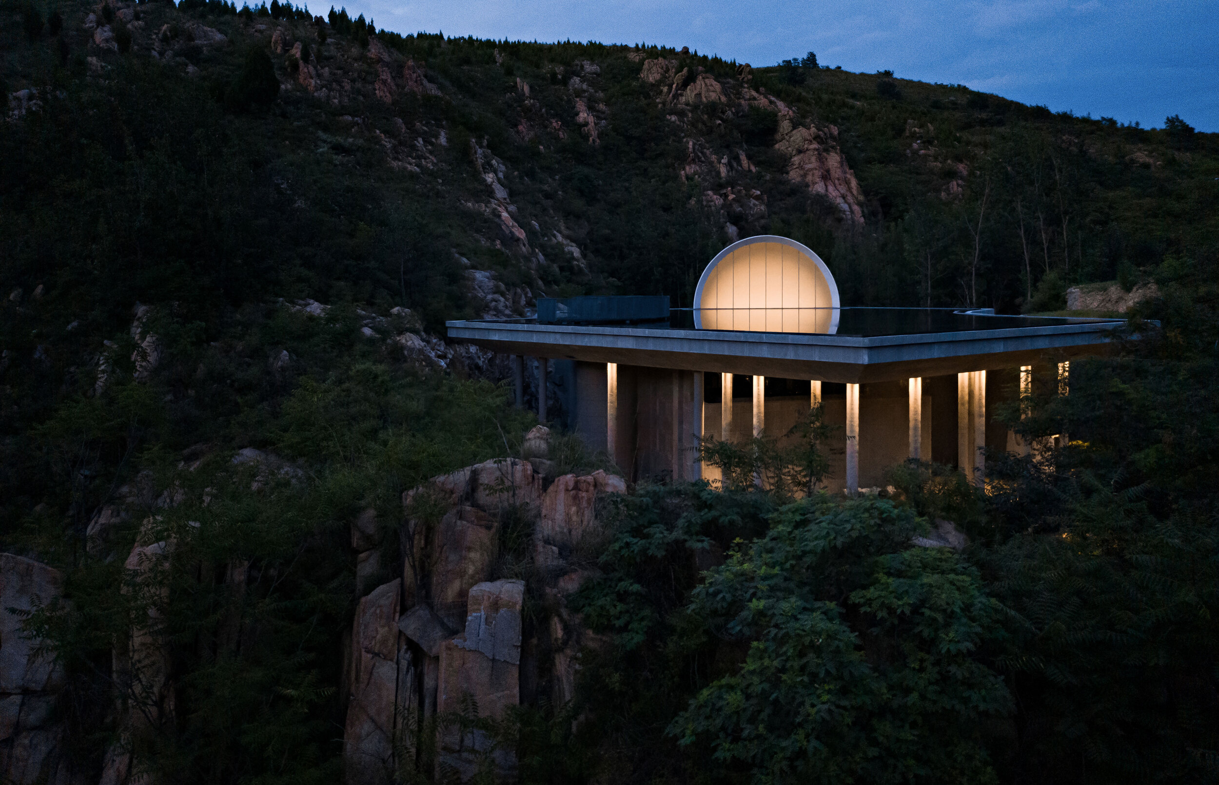
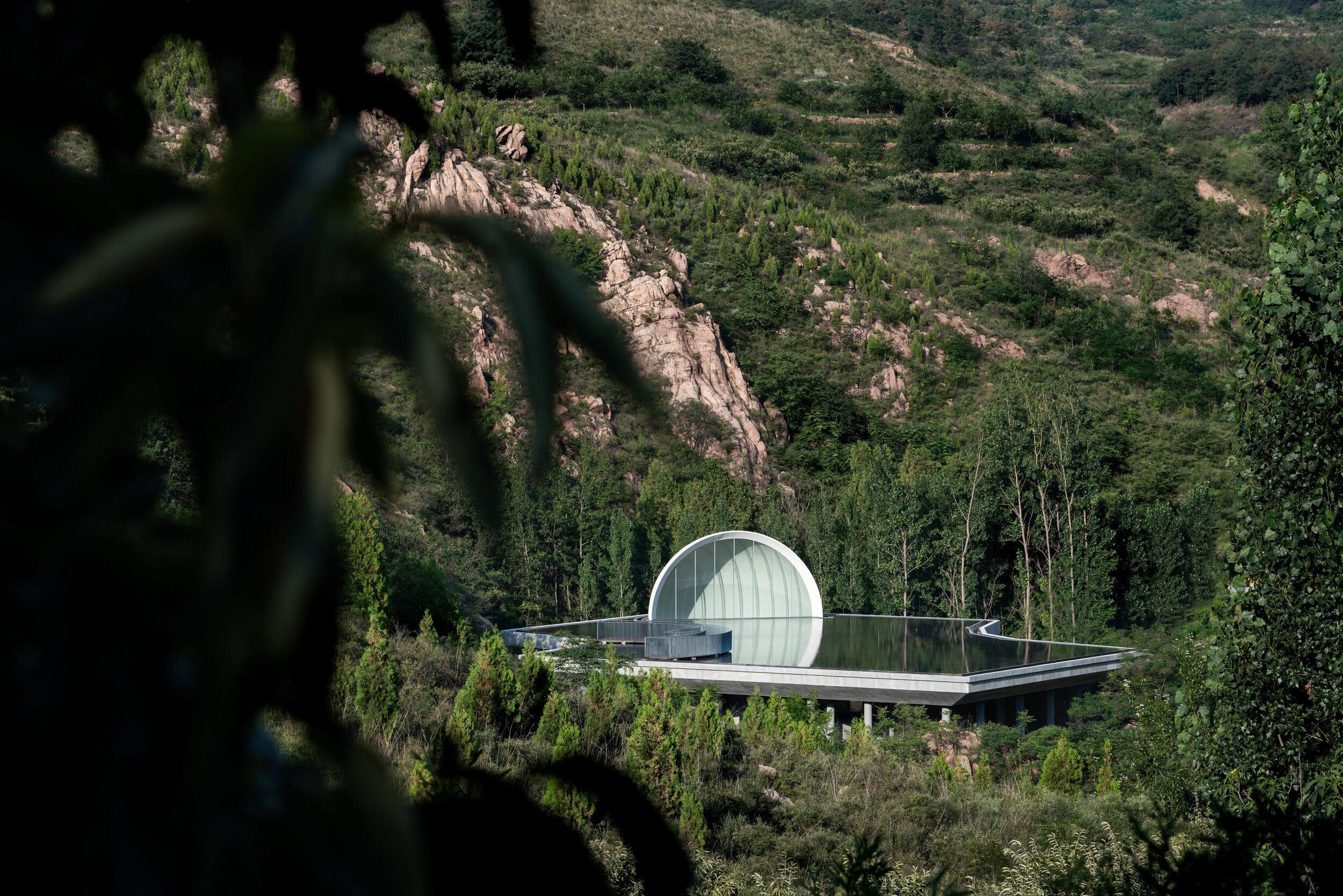
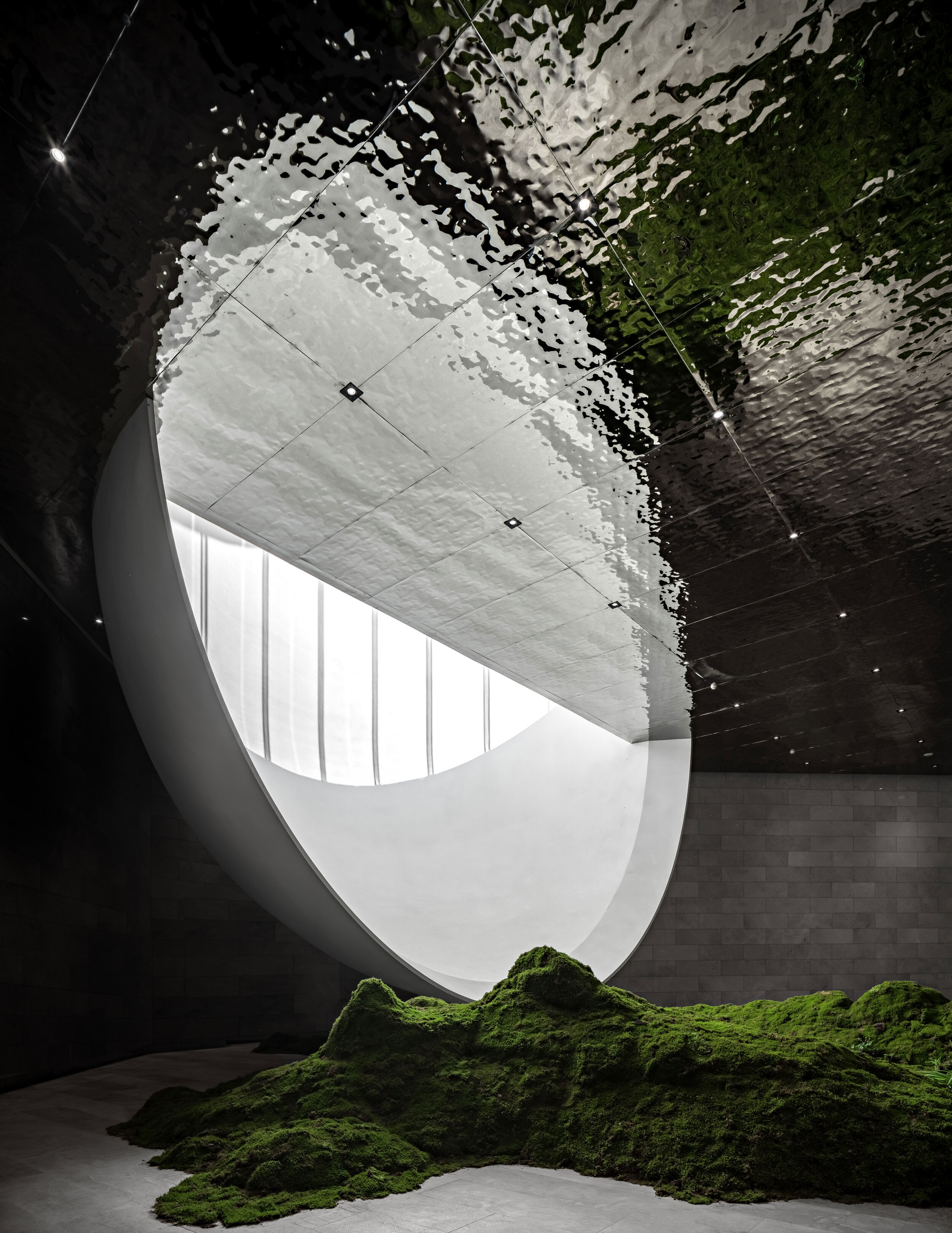
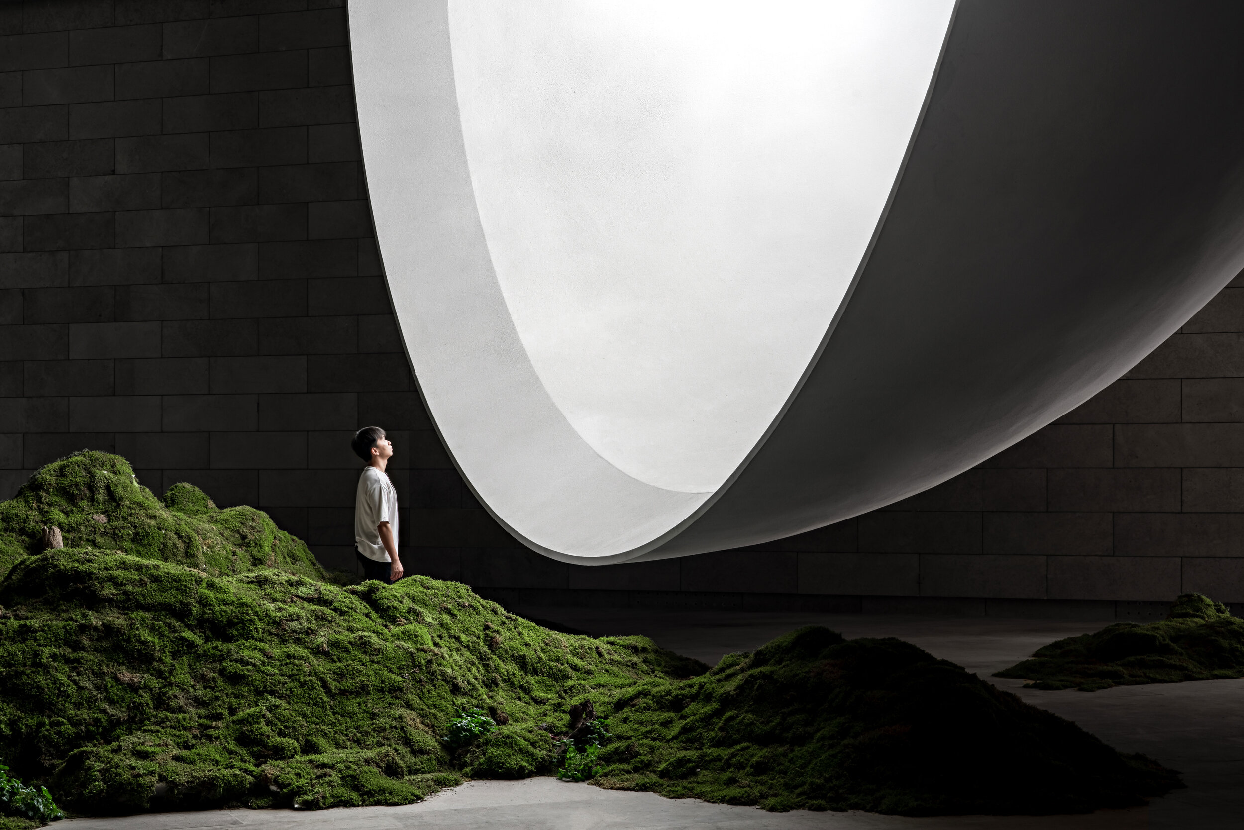
When the surroundings become gray, the visitors are officially inside the territory of the moon. The building occupies more than 1,000 square meters consisting of the moon, the cavity, and the grey space. Inspired by the mountain stream by the base of the building, the designer uses architecture as a medium to reproduce the romantic idea of a moon born on the sea.
The placement of the Hometown Moon was designated considering several factors: the altitude needs to remain moderate, and the building must not block the mountains behind it. It should not be blocked by the hill in front of it either. Proportion-wise, the diameter of the moon and the area of the water surface must match to ensure that the architectural piece and its reflection on the water form a full moon together. Furthermore, the cavity in the building needs to contain half of the moon with a diameter of 12 meters. The space also needs to allow the appropriate height required to host ceremonies.
The depth of the roof pond needs to consider the water evaporation rate. In this regard, a water reservoir 0.5 meters deep and a central interlayer device work together to reduce the hydration frequency. The ceremonial space needs to remain column-free, and the form and shape of the full moon need to limit the thickness of the beams. A ribbed and beamless concrete floor meets the load-bearing requirements of the structure at a reasonable price too.
Syn Architects takes advantage of the materials available in the area to adopt a limited intervention approach. The strategy consists of widening the base of the valley before erecting the building. Such a method also preserves the original spillway to help prevent natural disasters. The foundations are dug according to the calculated diameter of the moon and the space desired. Furthermore, the rocky and mossy walls of the mountain remain untouched as a natural limit to the project. In this way, the walls showcase the struggle between man and nature while further participating in the aesthetic concept.
The natural scenery is the starting point of the Hometown Moon. Indeed, nature is the catalyst that feeds the imagination of architects. They ensure that the solution is reasonable, achieving goals and fulfilling spatial and functional requirements by maximizing the integration with nature.
Project Information
Project Name: The Hometown Moon
Location: Daolang Town, Tai’an City, Shandong Province
Client: Taian Lushang Jiunvfeng Rural Revitalization Co., Ltd.
Project type: Architecture Design, Landscape Design, Interior Design
Design Period: 2019.10-2020.7
Construction Period: 2020.7 -2021.6
Site Area: 1866 sqm | Architecture Area: 1469 sqm | Interior Area: 856 sqm | FAR: 0.78 | Green Rate: 30% | Function: Chapel
Project Team:
Chief Architect:Zou Yingxi
Project Architect: Liu Yuan, Jin Nan
Interior Design Team: Xia Fuqiang, Qian Guoxing, Cao Zhenzhen, Liu Tingting, Li Qianxi
Interior Rendering Team: Feng Yan, Guo Mengjia, Li Hui
Landscape Design Team: Jin Nan, Xu Lu, Liu Shuang, Li Beibei, Liang Jingqi
Architecture Rendering Team: Zhu Feng, Chen Lan, Liang Xiaoting, Ruan Jianjun, Shi Lina, Tang Tang, Zheng Lihua, Liu Shuang (Sketch)
Contractor: Shandong Tai Shan Puhui Construction Ltd,.
Structural Engineer:Wang Qiang, Yang Jian, Yan Dongqiang
MEP Consultant:Huang Yuanzheng, Mei Yantao, Ji Pengcheng
Lighting Design:Create stars studio lighting design
Other consultants:Feng Yasong, Liao Shijie, Chen Lu, Xu Yan, Zheng Shuai
Main Contractor: Shandong Tai Shan Puhui Construction Ltd,.
Materials:
Slab, Glass, Wood Panels, Stainless Steel Panels / Photographer: Zheng Yan/ Video: Huasheng
“Since the completion of the building, it has started a dialogue with users and nature. I look forward to seeing it being modified over time, further blending with the environment as the trees grow.
Each architecture has two destinies: being destroyed or being protected. I look forward to creating an architecture that is reluctant to be destroyed. It will be the highest achievement of my career. For this reason, I will bestow deeper meaning to my architecture and create more emotional bonds for its users. I hope that the moon can become this kind of architecture. Even if it disappears in time, it will still exist in our spiritual world.”.
Zou Yingxi
Lead Architect
of SYN Architects
“Since the completion of the building, it has started a dialogue with users and nature. I look forward to seeing it being modified over time, further blending with the environment as the trees grow.
Each architecture has two destinies: being destroyed or being protected. I look forward to creating an architecture that is reluctant to be destroyed. It will be the highest achievement of my career. For this reason, I will bestow deeper meaning to my architecture and create more emotional bonds for its users. I hope that the moon can become this kind of architecture. Even if it disappears in time, it will still exist in our spiritual world.”.
Minimalism in an environment of expressionism
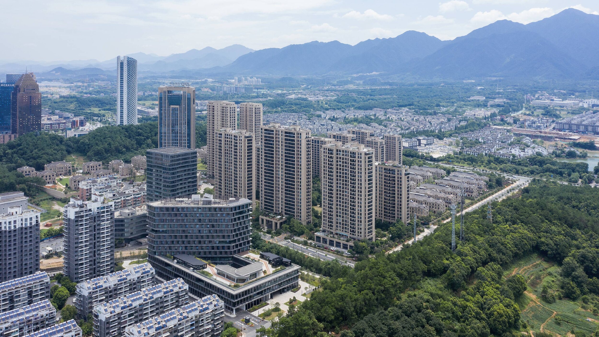
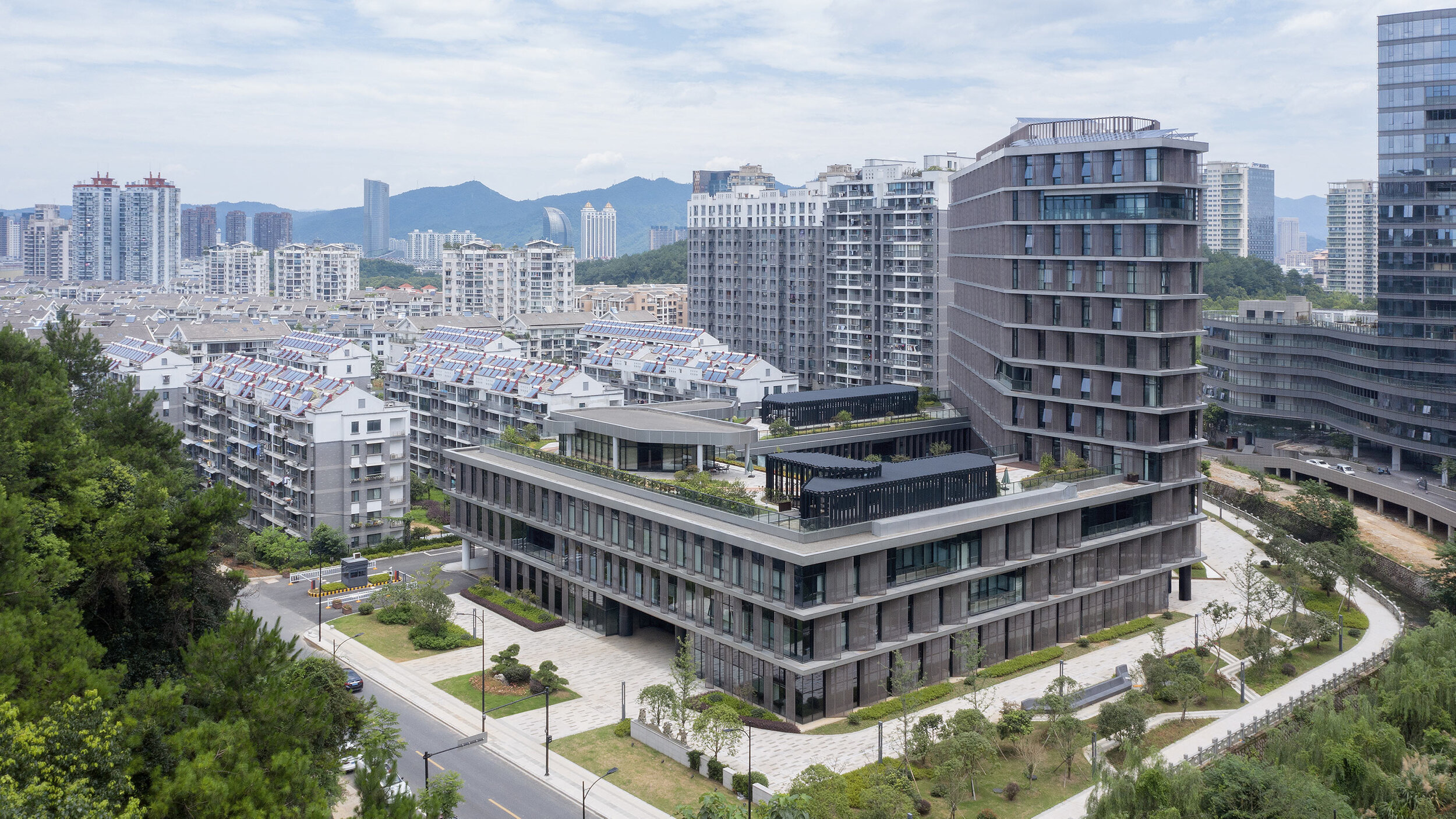
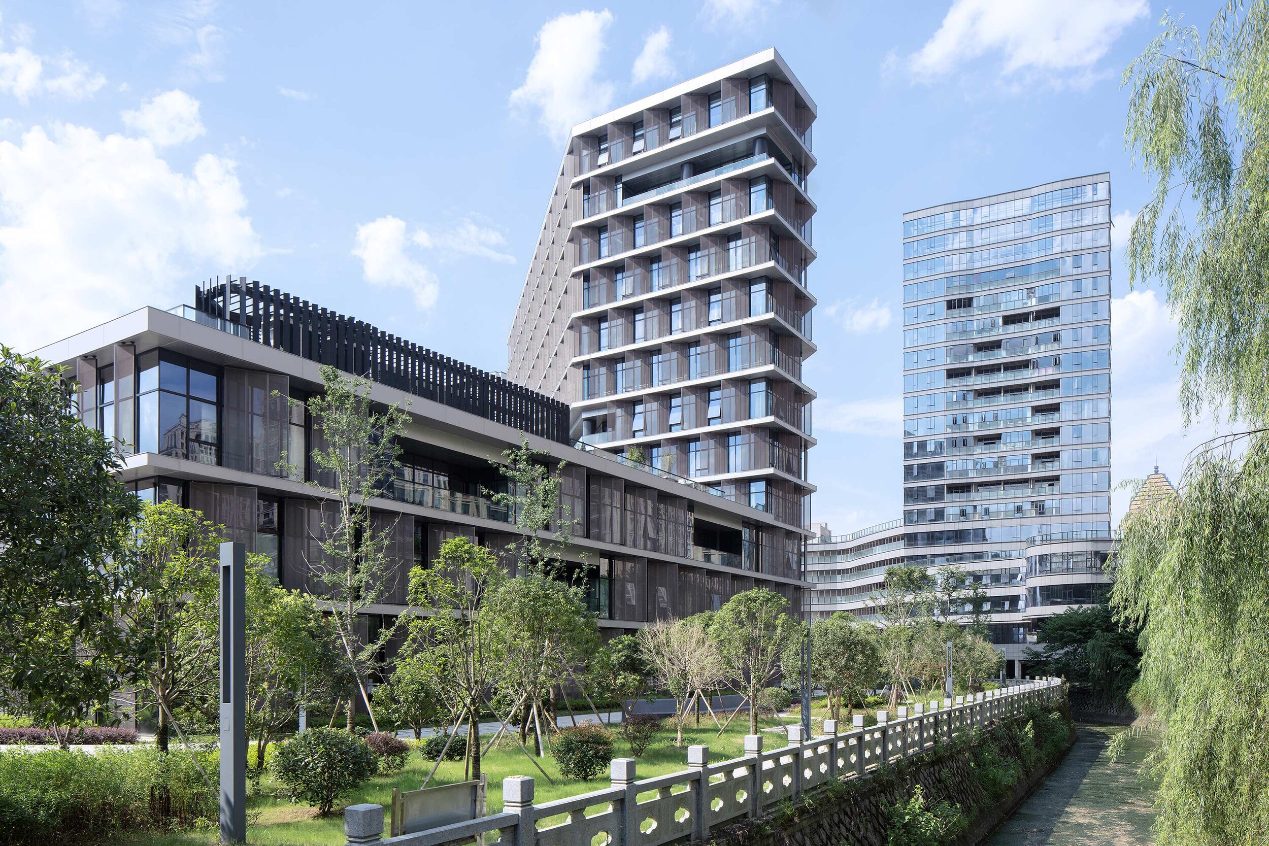
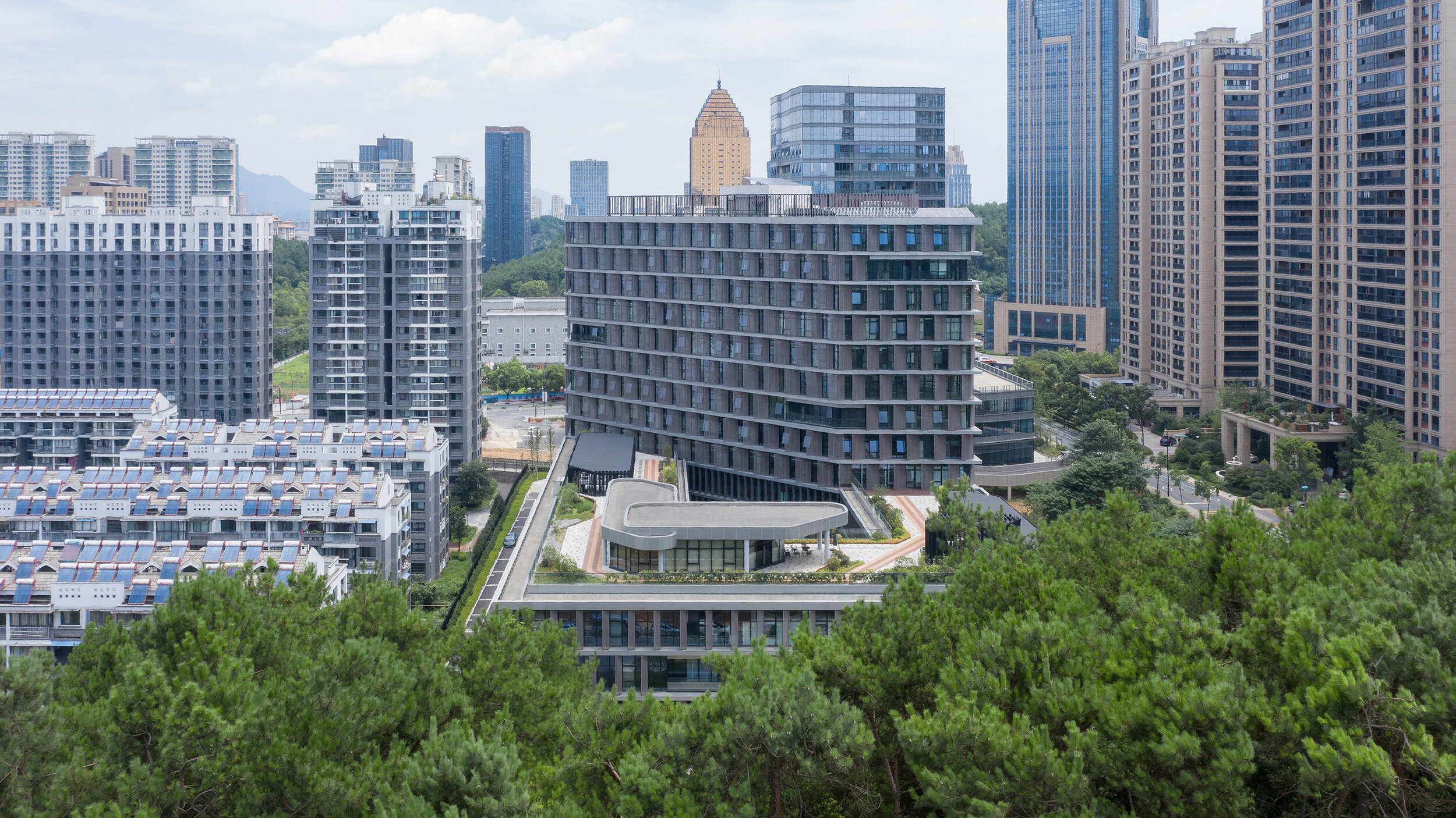
Designed by BAU (Brearley Architects + Urbanists), Tonglu Archives Building is located in Hangzhou, China. In China, the perimeter block typology doesn't usually return the Floor Area Ratio (FAR) necessary to satisfy inner-urban densities. This leads to an over-reliance on detached towers to meet FAR requirements. The perimeter block with a tower extrusion, however, presents a useful hybrid.
'it is the least we could do: minimalism in an environment of expressionism.' - Steve Whitford (Partner)
Hybrid typology
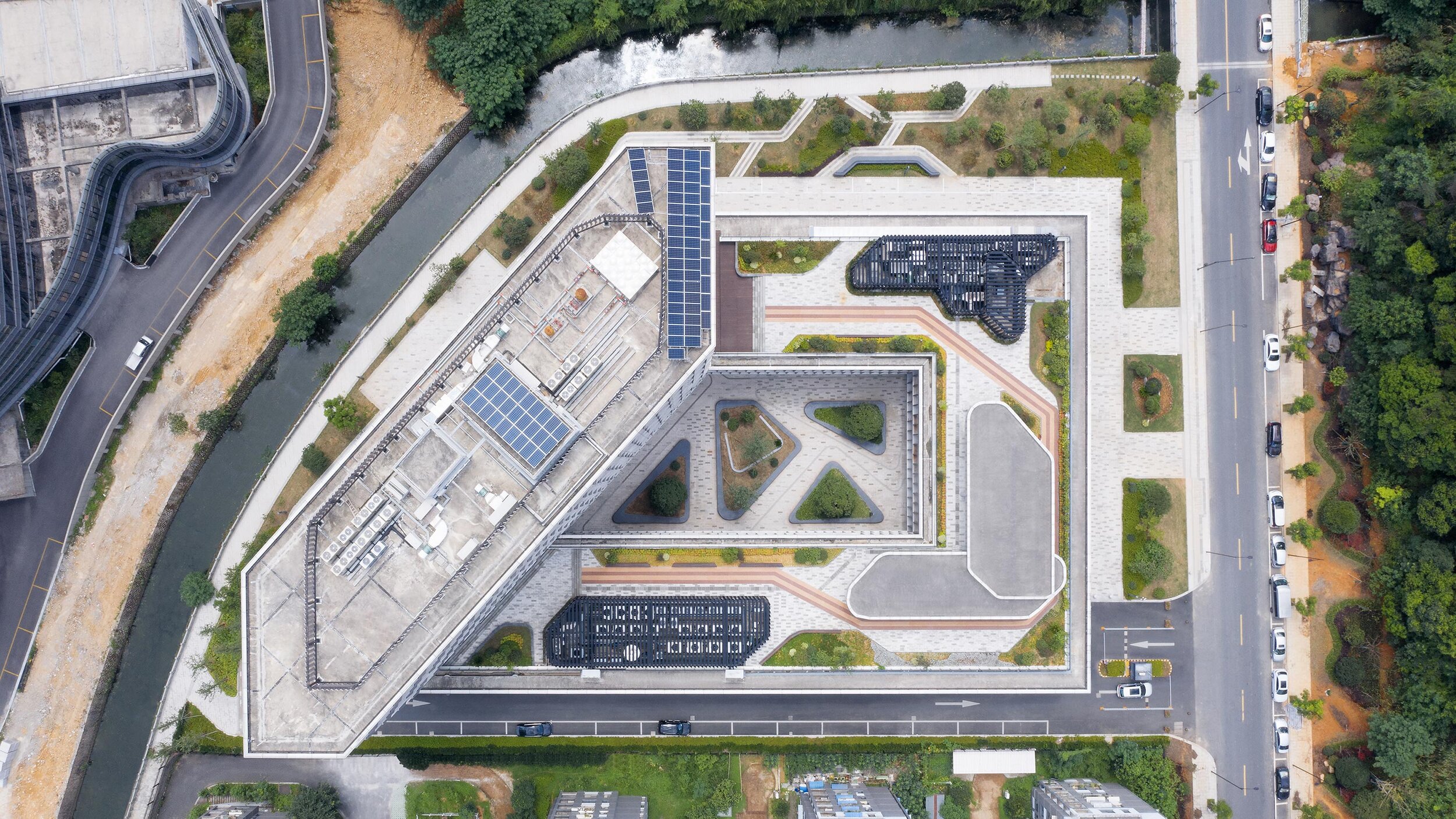
Designed by BAU (Brearley Architects + Urbanists), Tonglu Archives Building is located in Hangzhou, China. In China, the perimeter block typology doesn't usually return the Floor Area Ratio (FAR) necessary to satisfy inner-urban densities. This leads to an over-reliance on detached towers to meet FAR requirements. The perimeter block with a tower extrusion, however, presents a useful hybrid.
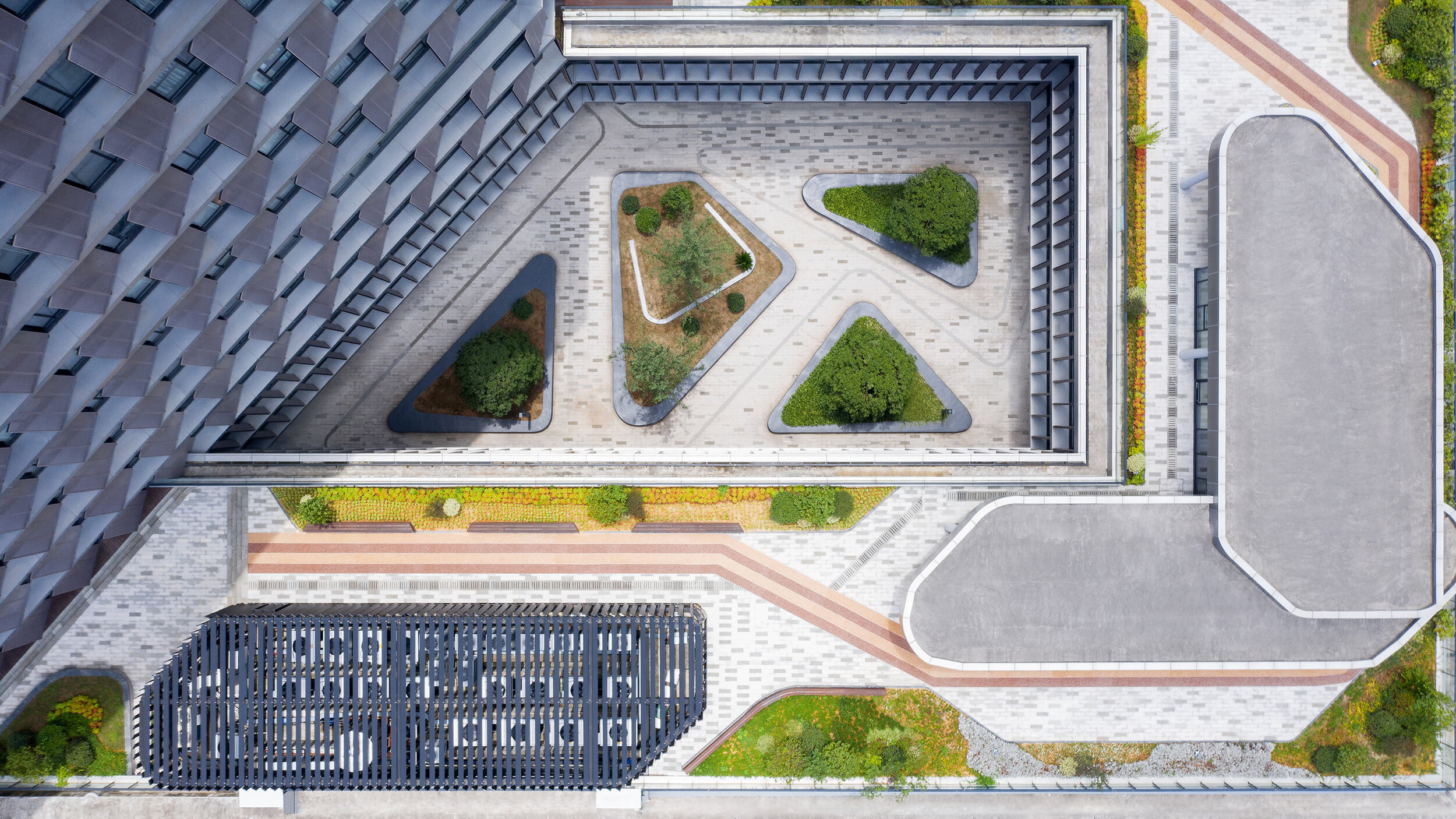
The advantages of the perimeter block are combined with the capacity of the tower to maximize floor area. (Positive reinforcement of active urban street edges; well ventilated and naturally lit building interiors; and an internal courtyard that has the options of being private, semi-private-semi-public, or public space)
Metal petals
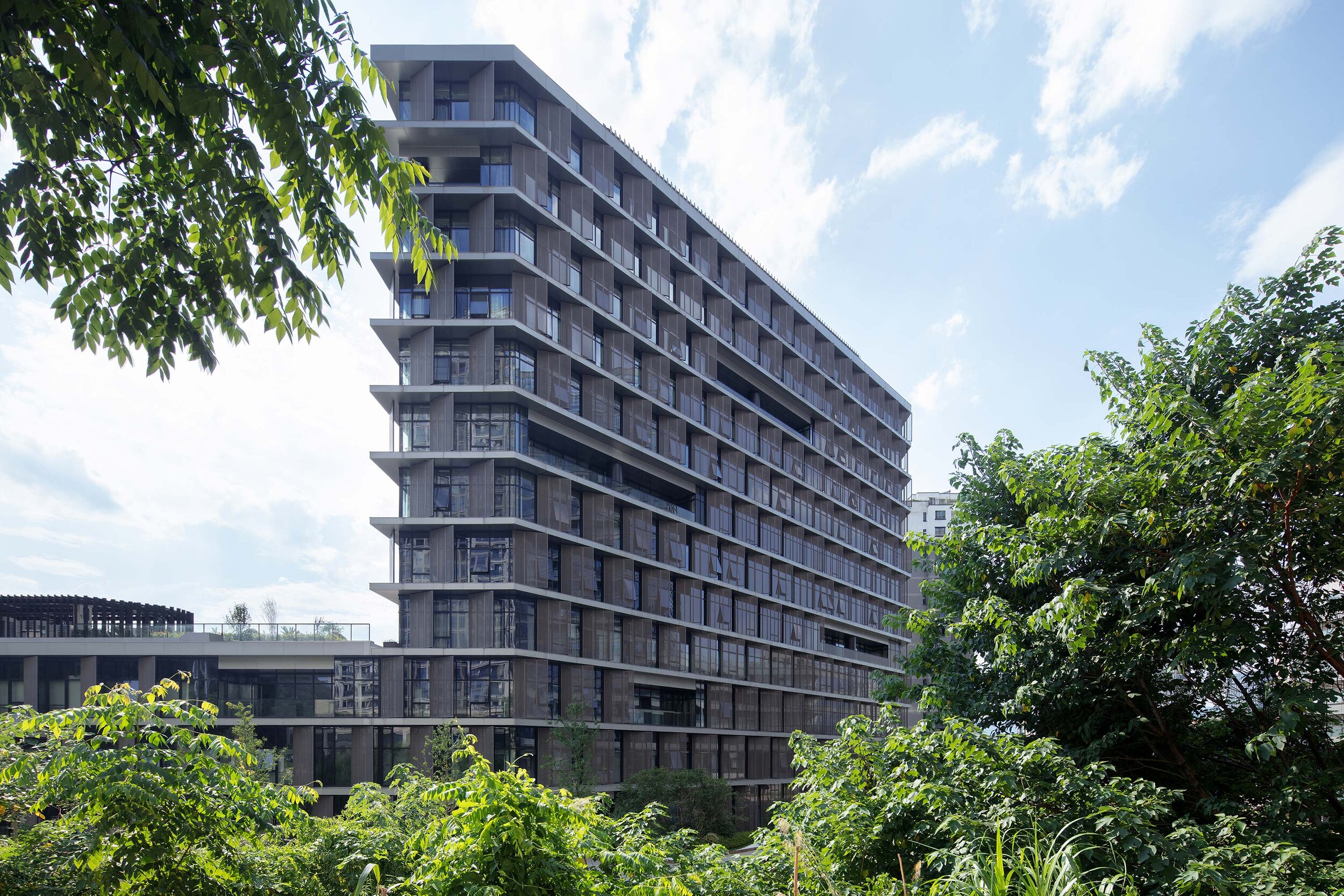
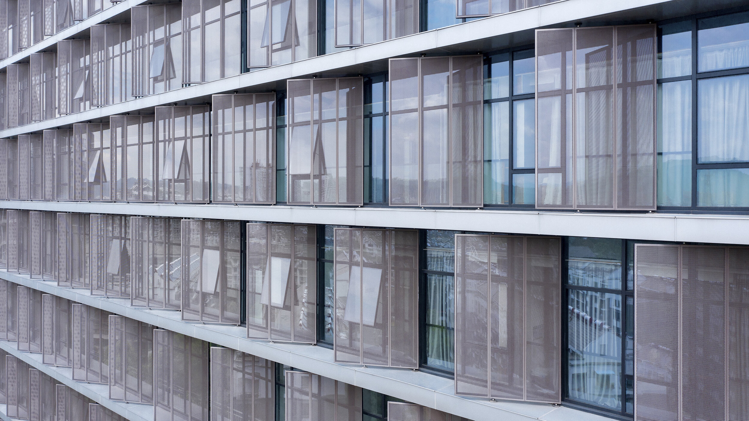
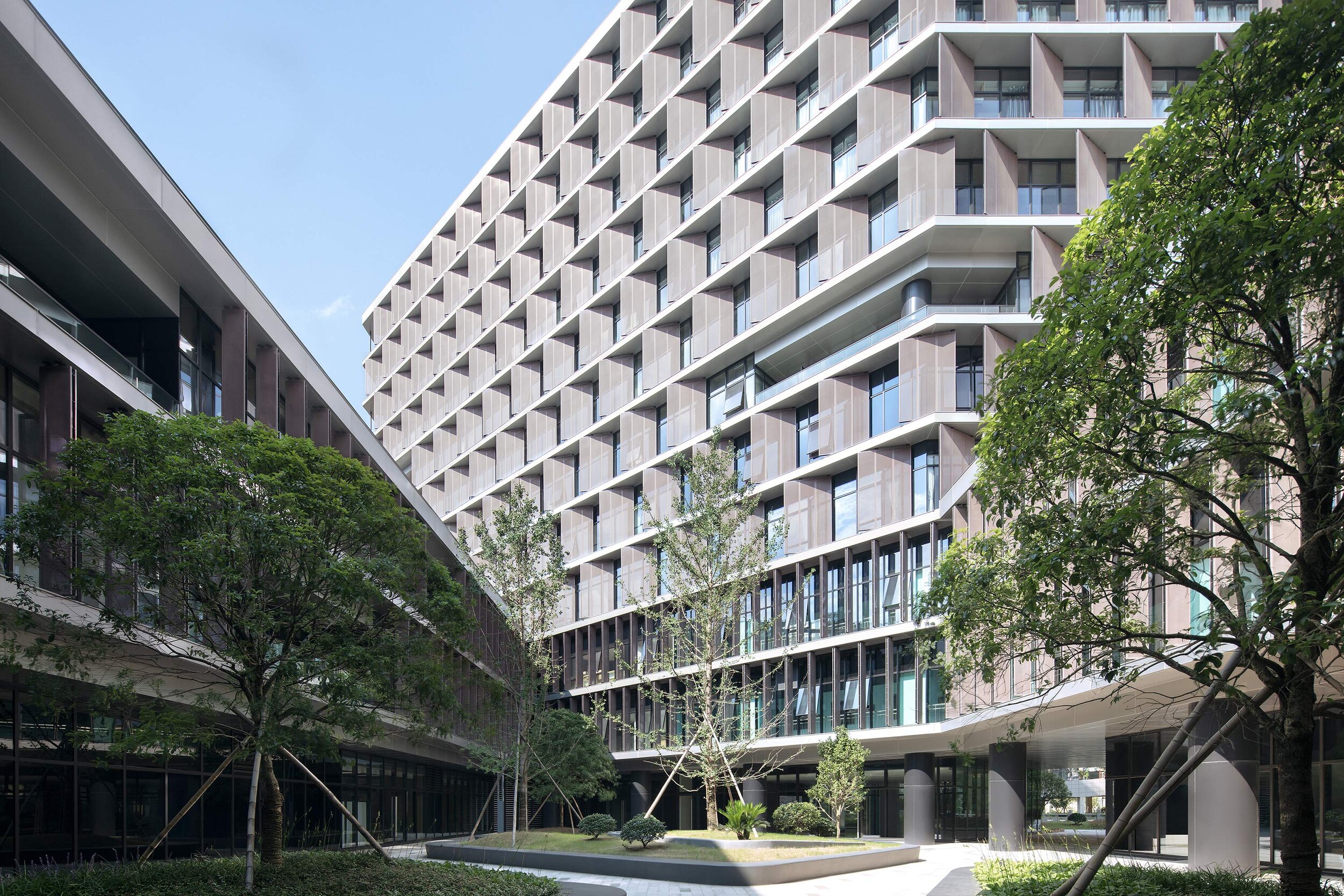
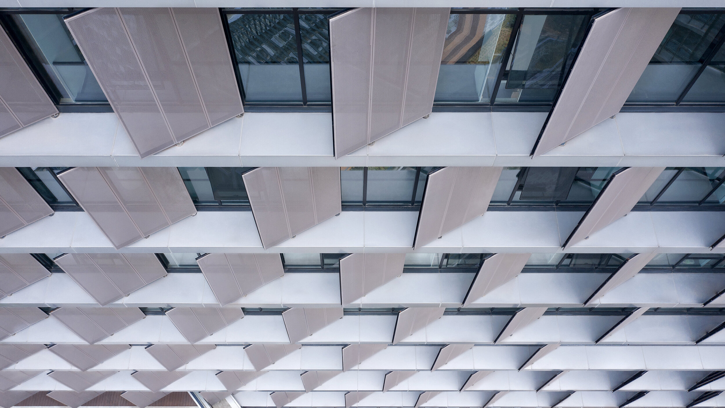
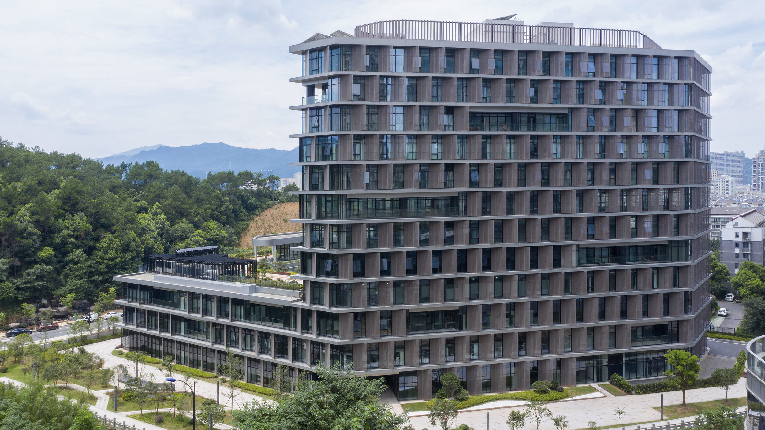
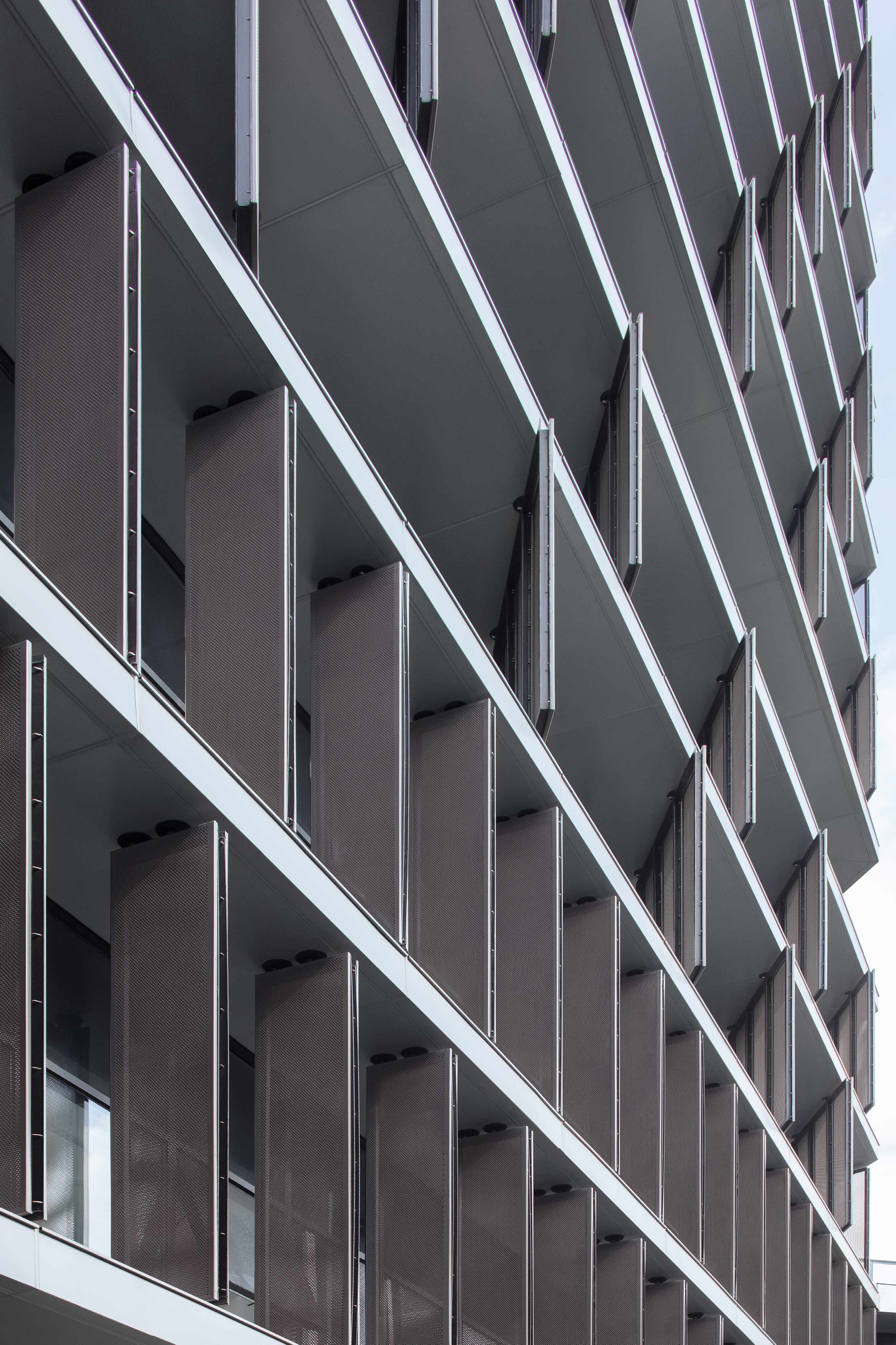
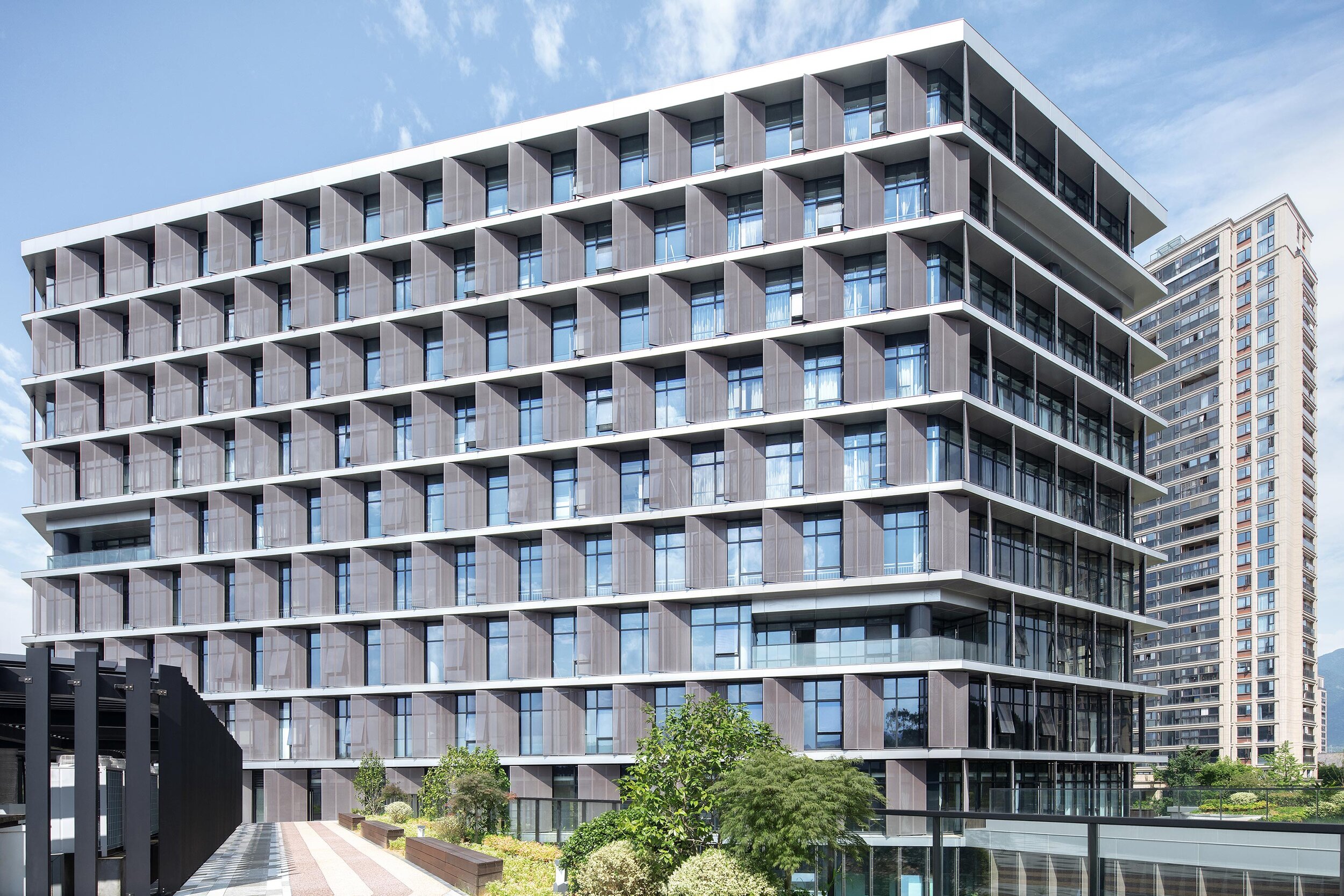
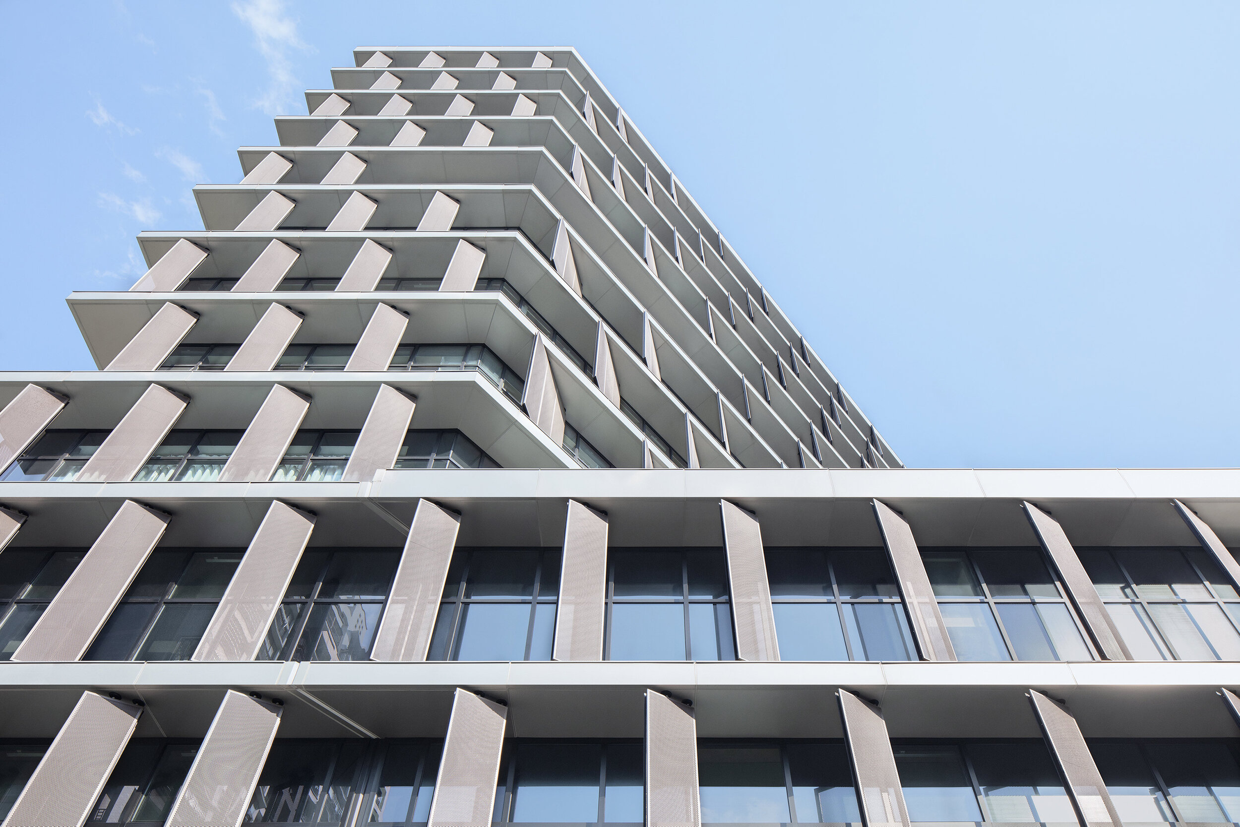
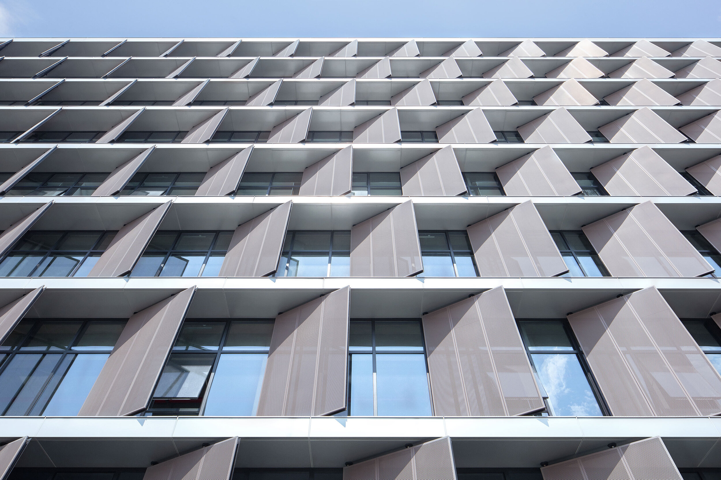
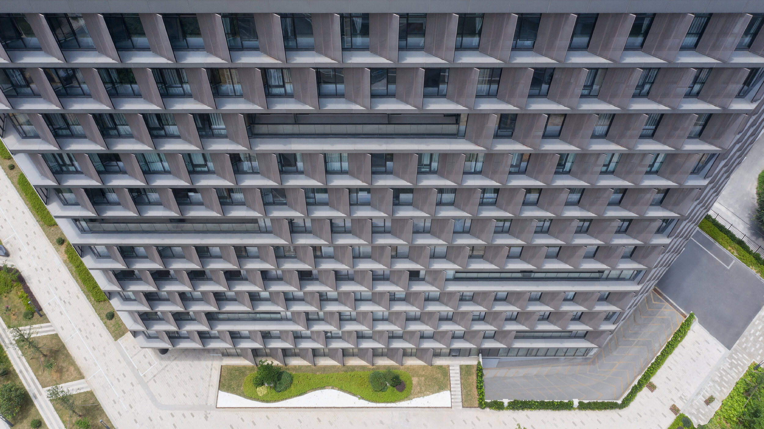
Surprisingly, all facades required vertical screens to prevent unwanted heat gain. Elegantly thin slab edges are projected past the window line and form horizontal ledges to sit vertical perforated metal sunscreens. These screens are closed enough to block the sun, yet open enough to not impede views out. Decks are then cut into the petals to provide outdoor space for each floor level and subtle visual relief to the petals' wall.
Minimalism 1. – Expressionism 0.
The program for this local government building is different: document archives, testing laboratories, staff canteen, a commercial street-front cafe, and a variety of closed and open office spaces. This suggests an architectural articulation of these programs. Besides, the typological hybrid offers an indication of the perimeter building and the tower.
However, rather than exploring these apparent solutions, the questions posed were: What are the program's differences? What are the differences generated by combining the perimeter block and tower typologies? And finally, what is the least we need to do to engage with these differences?
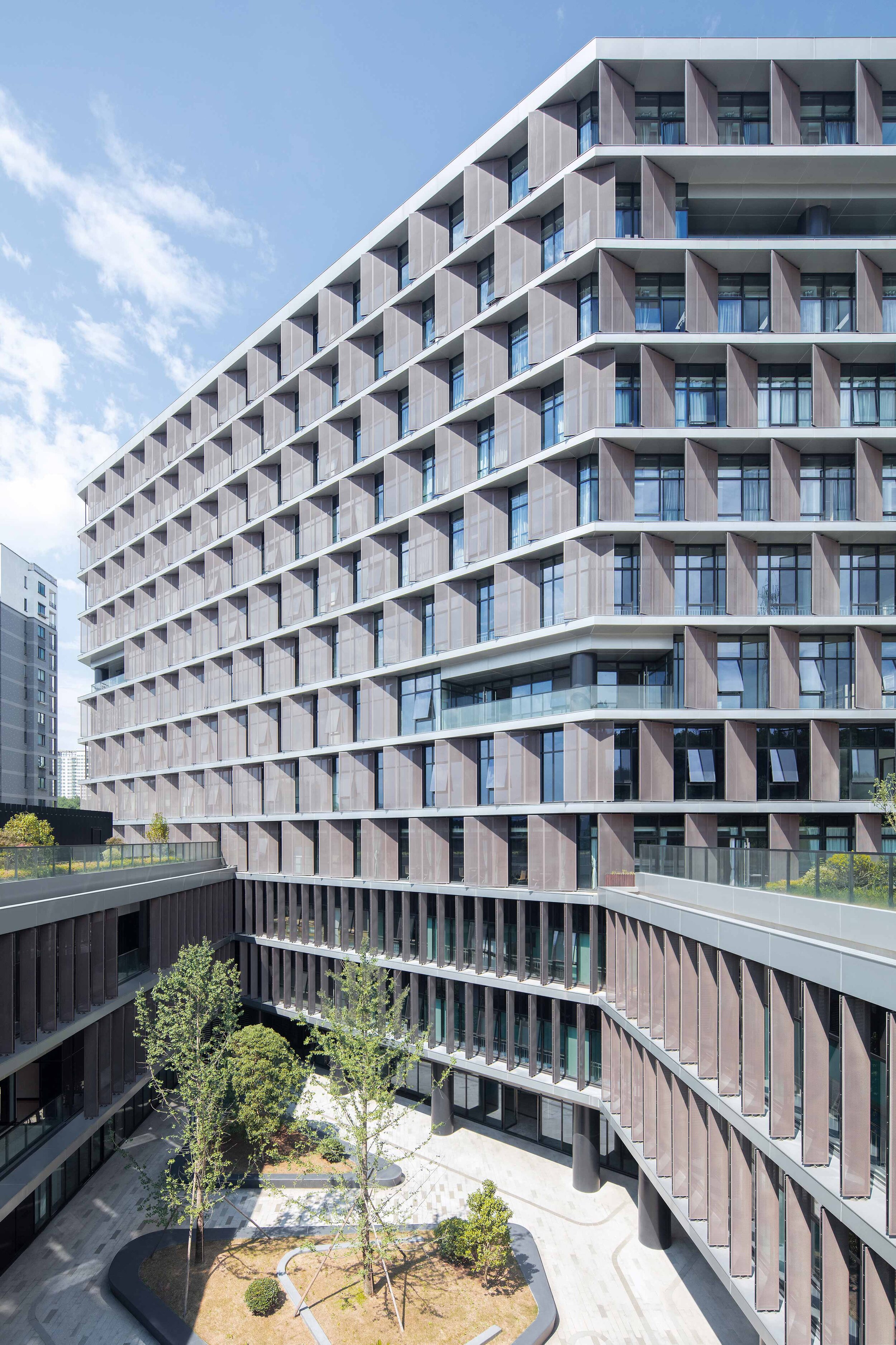
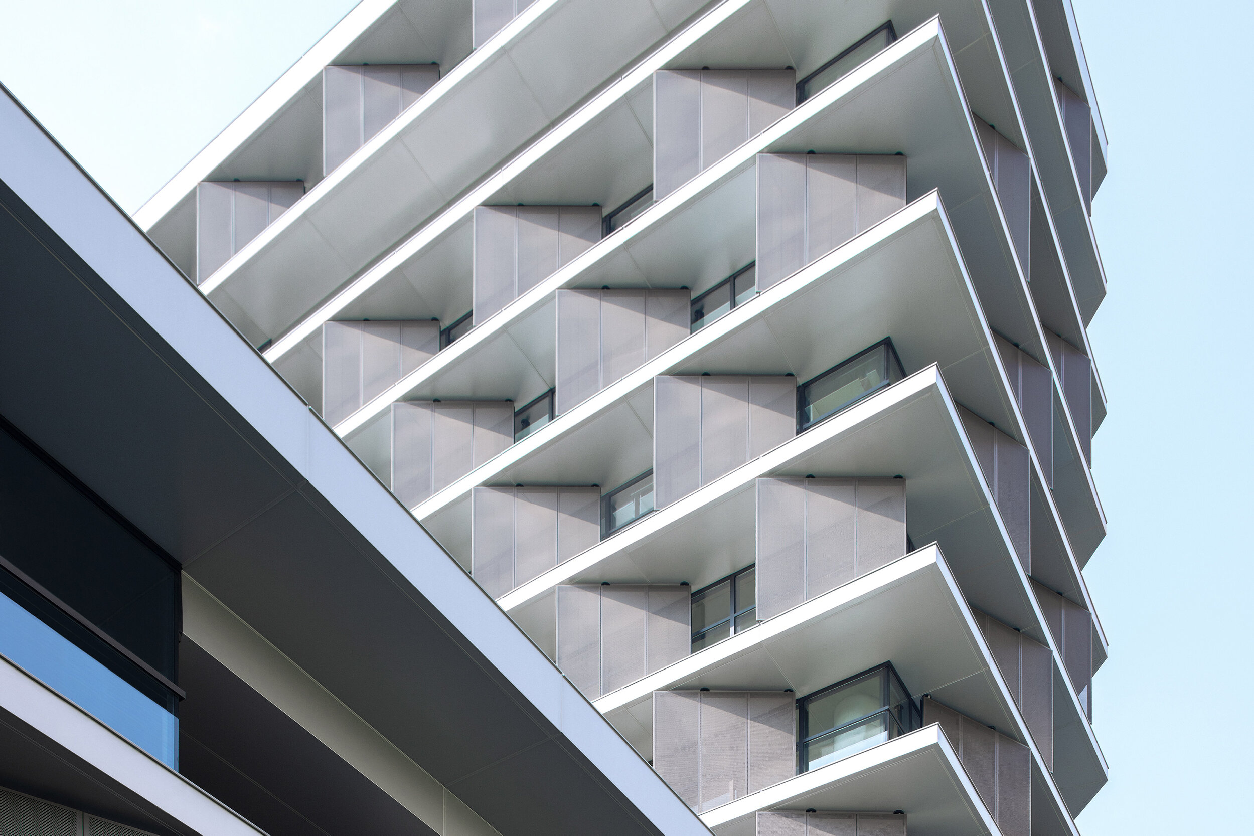
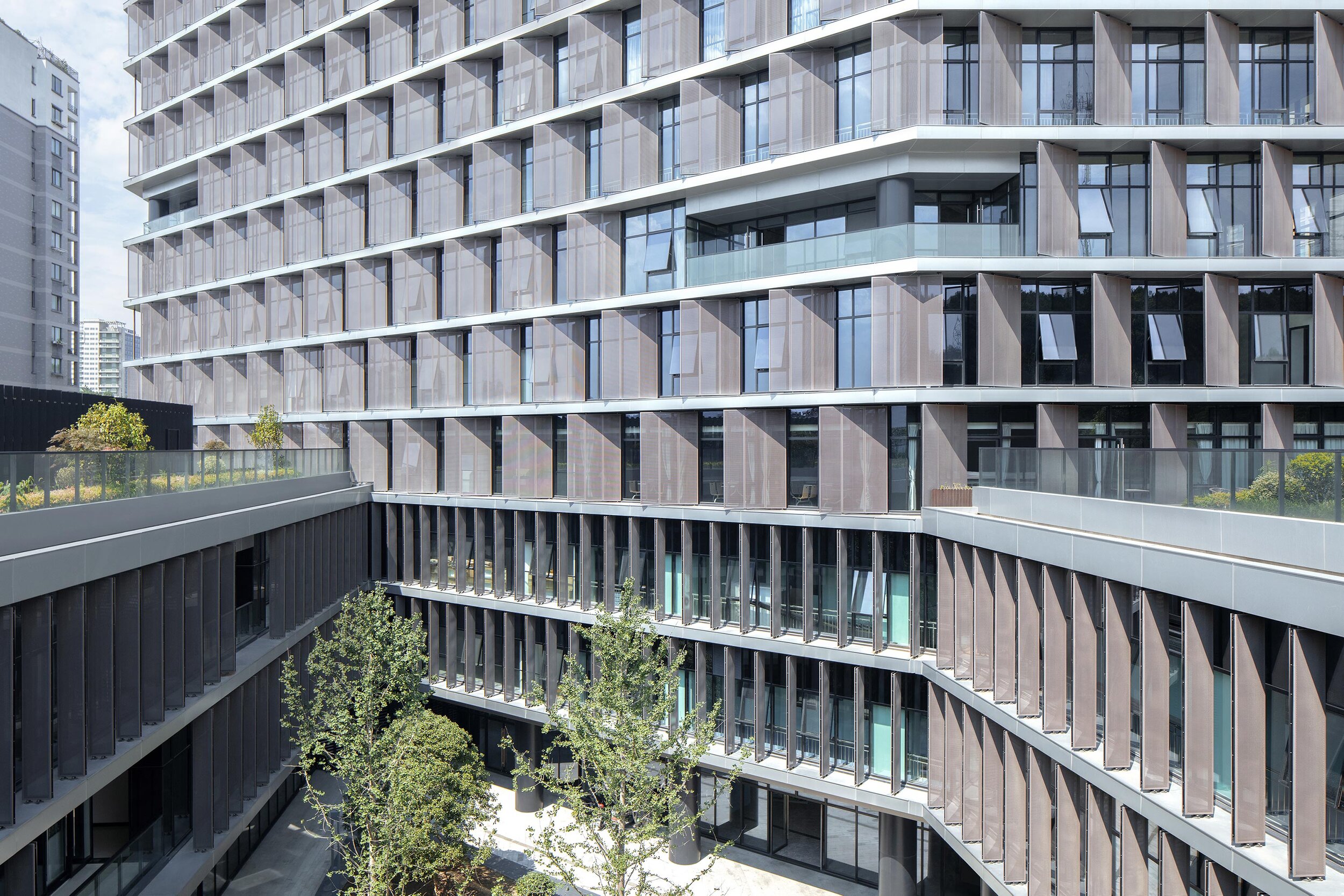
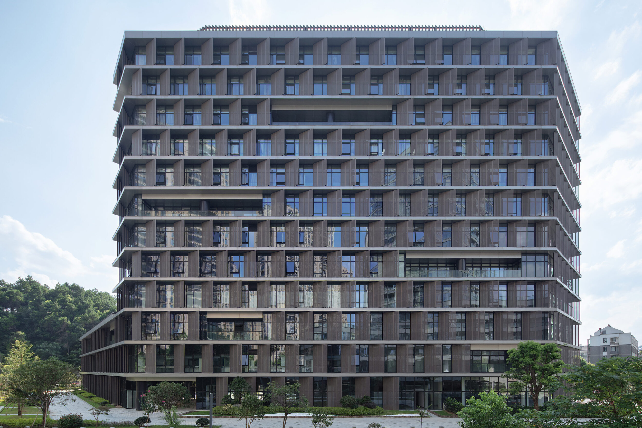
Semi-public courtyard
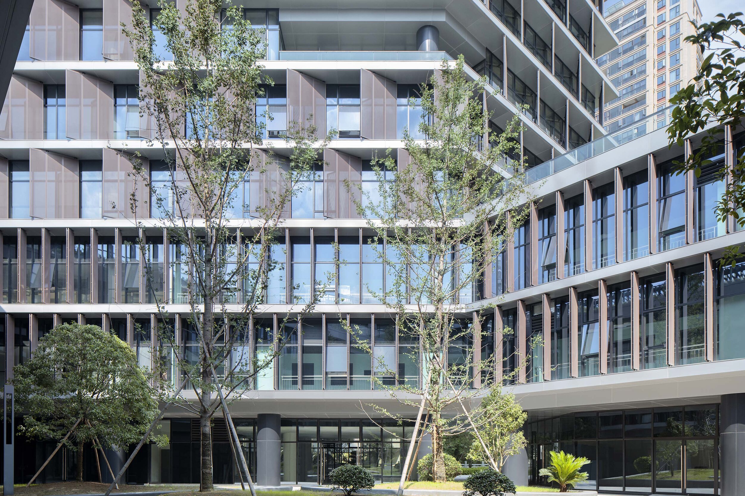
This centralized circulation strategy creates a semi-public outdoor space and provides opportunities for encounter and exchange among different public departments. It also provides an active area for lunch in a protected courtyard landscape.
The courtyard directly links the public footpath off the main southern entrance to a proposed pedestrian bridge to the northeast of the site. This diagonal shortcut further reinforces the semi-public nature of the courtyard.
Roofscape as displaced landscape
To encourage the staff to get out of the building and enjoy the river frontage or the courtyard, the paving from the ground floor interiors flows directly into the yard and out to the river's edge – a robust strategy for the future, when the ground floor develops more pubic and/or commercial programs.
The tower overlooks the perimeter block roof, and this space provides an opportunity for a significant private outdoor space for the building tenants. A garden pavilion for staff lunches or informal meetings sits within a roofscape that presents as a displaced landscape. The staff canteen opens on to this roofscape. Plant rooms have been disguised as additional garden pavilions.
More visible than we think
In a commercial and retail environment where every building is trying hard to be seen as different from its neighbours, advertising and signage dominate streetscapes. Buildings are becoming extensions of corporate logos and marketing campaigns – a minimal, elegant and calm public building may be more visible than we think.
Project Data
Project Name: Hangzhou Tonglu Archives Building
Project Status: Completed 2019
Location: Tonglu, Hangzhou, Zhejiang Province
Client: Tonglu Urban Development and Management Co., Ltd.
Typology: Office
Program: Document archives; testing laboratories; office.
Year: 2016—2019
GFA: 26,700 m²
Construction Cost: RMB 136 million
BAU Project Team: James Brearley, Jens Eberhardt, Chen Zhiyong, Luo Huaili, Steve Whitford, Gao Weiguo, Chen Jian
Builder: Hangzhou Harbour Construction Co., Ltd.
Engineer+Documenting LDI: China United Engineering Company
Photographer:Xia Zhi
TIFFANY & CO. Unveils Plans For A Contemporary Glass Addition Atop Its Classic Fifth Avenue Flagship Store
A holistic transformation of this magnitude has not taken place in the building’s 80-year history. Tiffany is embarking on the project in partnership with the renowned architectural firm, The Office for Metropolitan Architecture (OMA). Led by Partner Shohei Shigematsu, OMA New York is engaged in specific aspects of the transformation–including a reimagined upper addition.
For the first time, Tiffany & Co. is revealing exterior renderings of the transformation underway at its Fifth Avenue flagship store. The upper addition (floors 8, 9 and 10) of the 10-story architectural icon located at 727 Fifth Avenue will be completely reimagined from office space originally constructed in 1980, into a new exhibition, event and clienteling space. Surrounded by a curtain of undulating glass complementing the classic limestone façade below, the contemporary structure above this historic building echoes the height and grandeur of the flagship’s timeless main floor. Construction began on Tiffany’s flagship transformation in spring 2019 and is estimated to be complete in spring 2022.
“The Tiffany & Co. Fifth Avenue flagship is arguably one of the most beloved and well-known luxury retail spaces in the world. It's a place where so many have memories of important moments in their lives, filled with emotion and anticipation of the extraordinary,” said Reed Krakoff, Chief Artistic Officer, Tiffany & Co. “Tiffany’s newly transformed flagship will reflect the future of our brand while honouring our 183-year legacy.”
A holistic transformation of this magnitude has not taken place in the building’s 80-year history. Tiffany is embarking on the project in partnership with a renowned architectural firm, The Office for Metropolitan Architecture (OMA). Led by Partner Shohei Shigematsu, OMA New York is engaged in specific aspects of the transformation–including a reimagined upper addition.
The ambition for the design of the new upper volume is to create a vertical continuity with the existing structure, while also setting it apart as a bold and innovative addition to the building. The corniced parapet of the original building will be mirrored by a slumped glass façade above. The eye is drawn upward creating a gentle transition between the two structures. This ribbon-like design detail brings a sensuality to the building, instilling a softness among the curtain walls of the building’s neighbours.
The recessed glass exhibition and event space will echo the feeling of the main floor with its column-free, double-height ceilings. The expansive glass facade brings an openness to both sides of the building and opens up to an outdoor terrace that will offer guests a view from the world’s most famous intersection for luxury retail, and up Fifth Avenue to Central Park.
The expansive Tiffany flagship was a symbol of modern architecture when it was built in 1940. The grandeur and essence of that majestic space will remain and continue to awe guests as they enter the renovated store in 2022. An evolved luxury retail experience will draw consumers inside once again and inspire them to journey from the main floor up through the entirety of the building.
In the interim, the Tiffany Flagship Next Door located at the adjacent 6 East 57th Street will continue to serve as Tiffany & Co.’s home, showcasing the entire breadth of the Brand’s extraordinary collections, until the original flagship’s completion in spring 2022.
For more information, please visit: https://www.tiffany.com
The modern expression Cadillac House, designed by Gensler, Shanghai, China
In Shanghai, China, Cadillac China and Gensler’s Shanghai Office sound a clear note of great latitude in expressing Cadillac House’s individuality, thus giving it the leeway to embrace deconstructivism and digital technologies.
Gensler redefines Cadillac House in Shanghai
with a sleek silhouette and defines it with a magnetic personality.

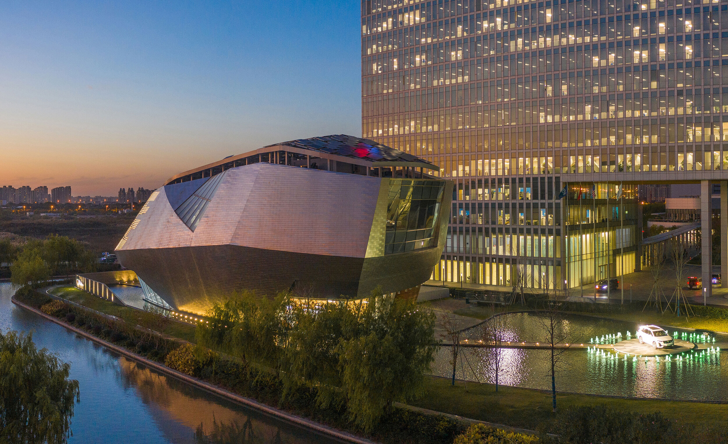
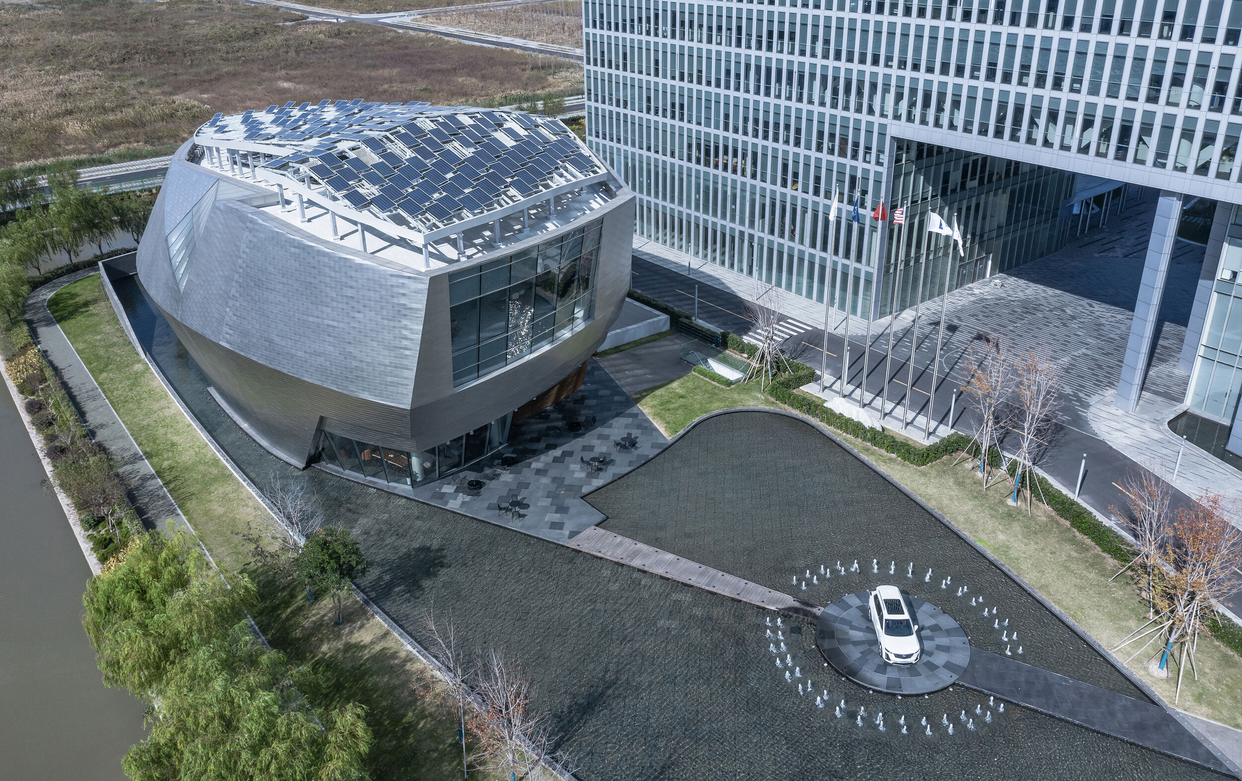
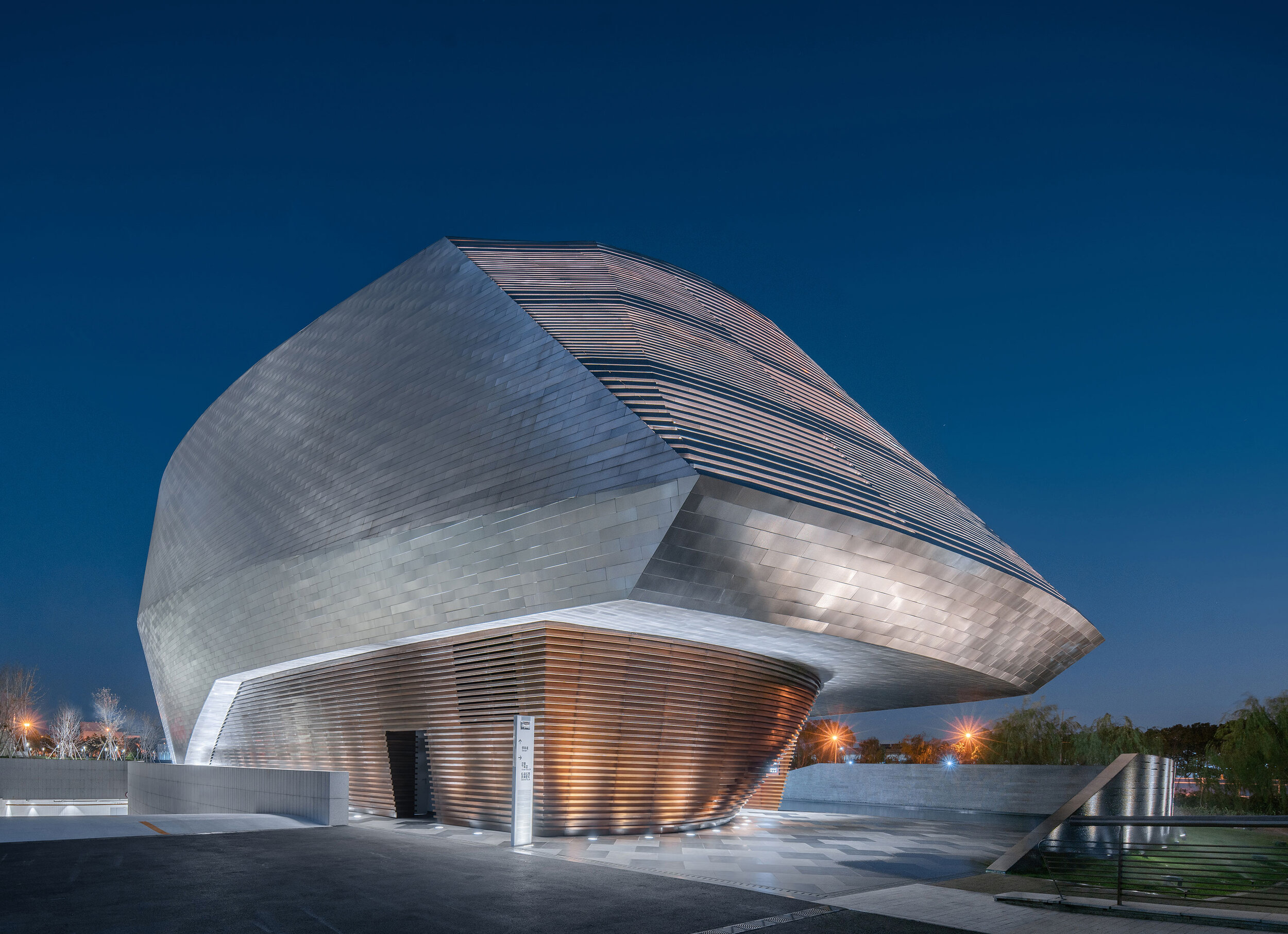
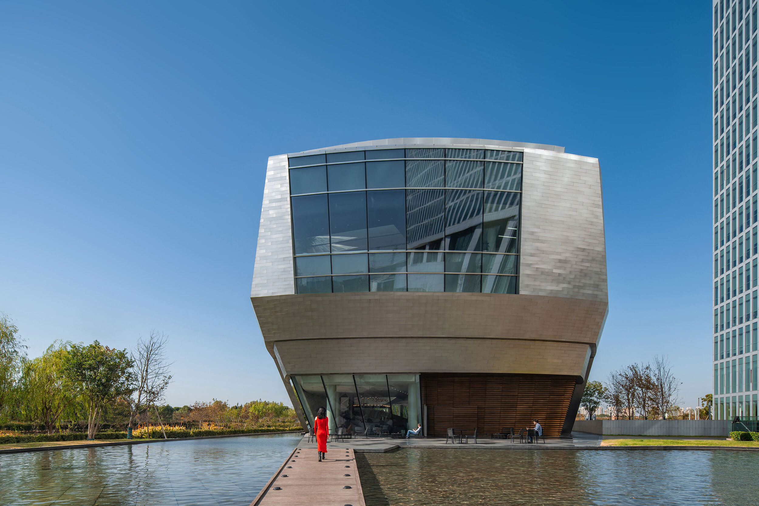
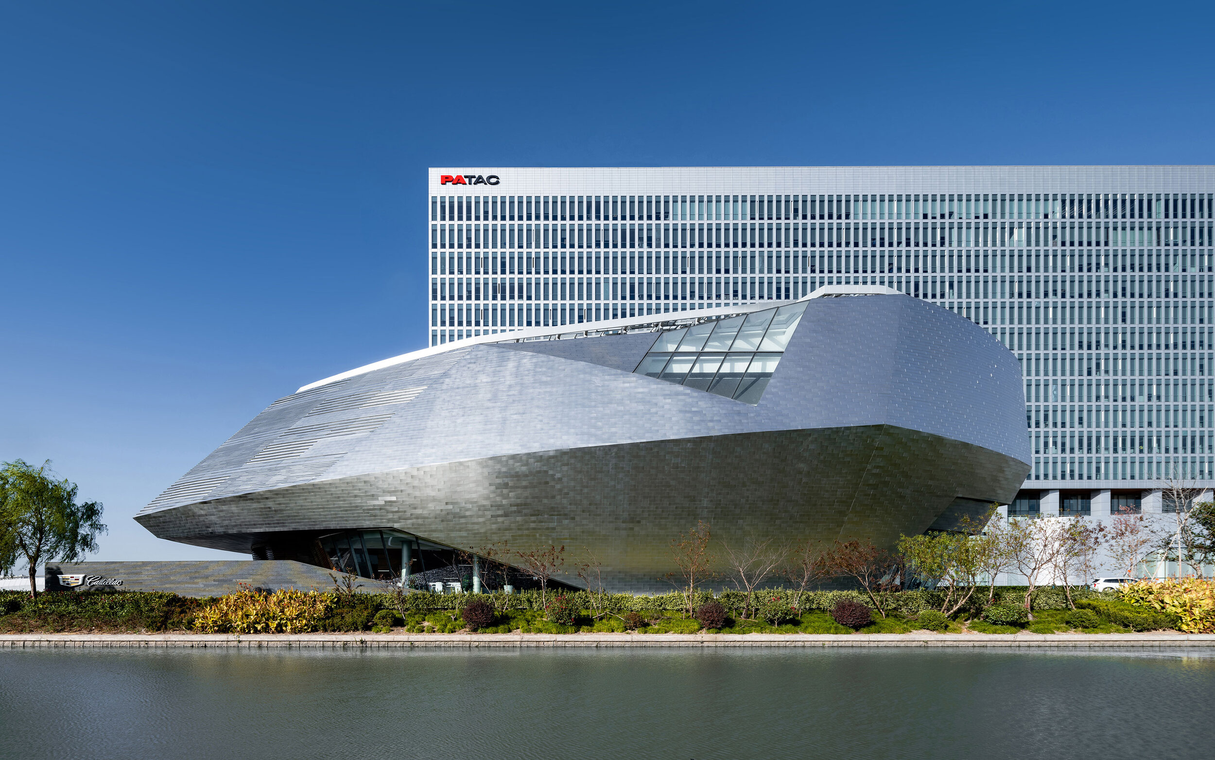
In Shanghai, China, Cadillac China and Gensler’s Shanghai Office sound a clear note of great latitude in expressing Cadillac House’s individuality, thus giving it the leeway to embrace deconstructivism and digital technologies.
Cadillac has a longstanding history now and Cadillac House is at its tender age, who is born in the ‘Me’ Generation wherein its birth is intended for exploring the stronger relation between new-technology trends and aestheticism and Self-expressing.
And Gensler, in modern expression, would care to render any visit to the House into a journey of exploration of modernism and futurism. Xiaomei Lee and Peter Weingarten, Co-Regional Managing Principals at Gensler Greater China, said that The Cadillac House project exemplifies Gensler’s One-Firm-Firm culture through combining the expertise of a global network and cross-practice collaboration from retail design, digital experience design to interior design and architecture disciplines, to leverage the power of design to create a better world.’
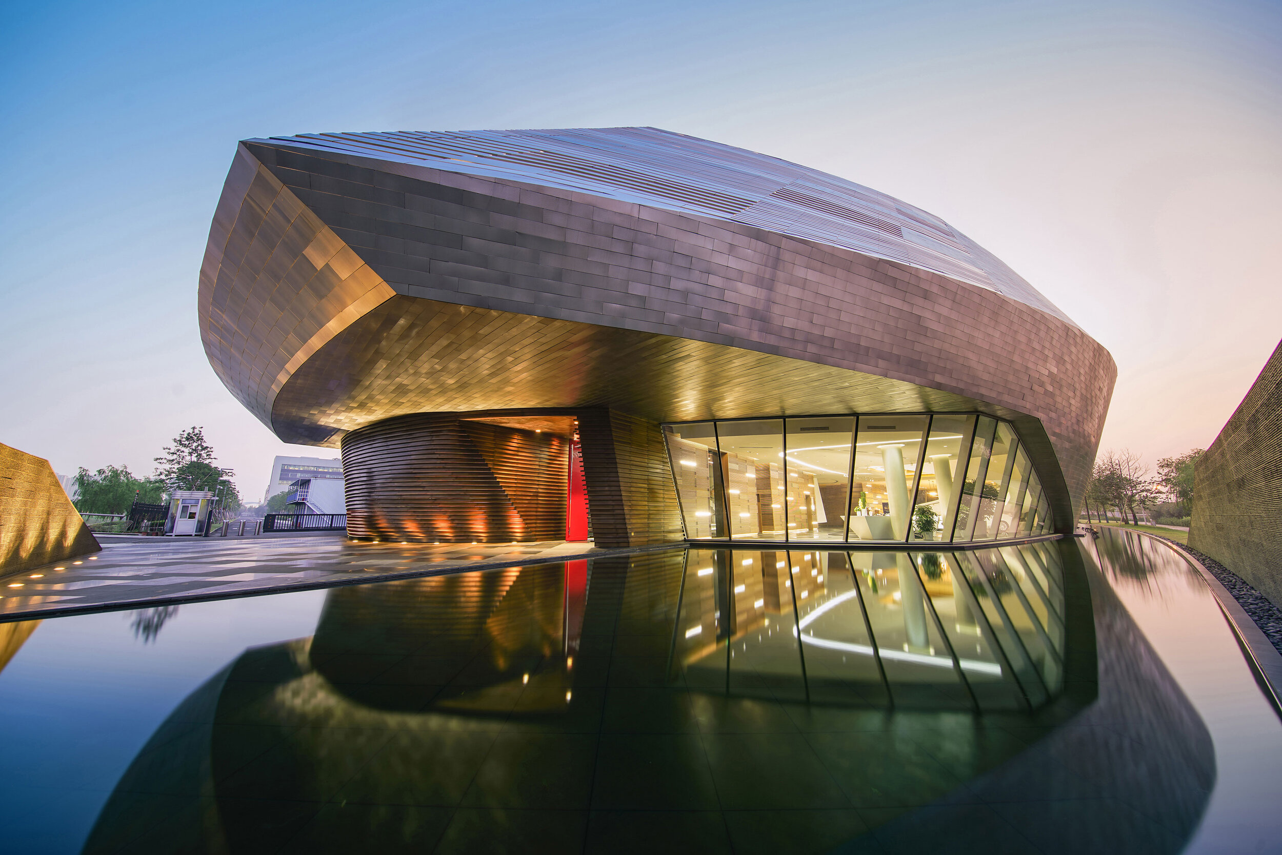
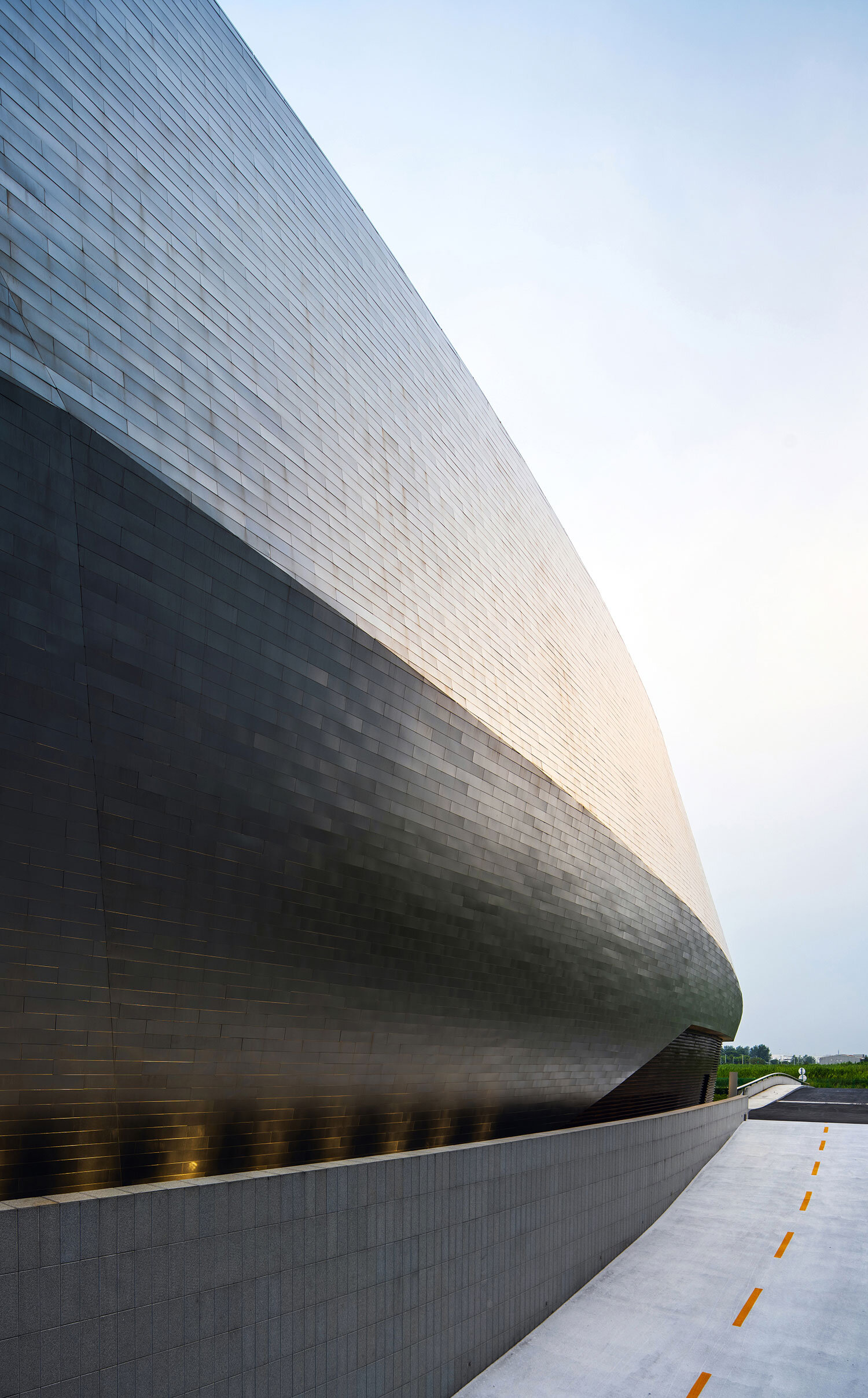
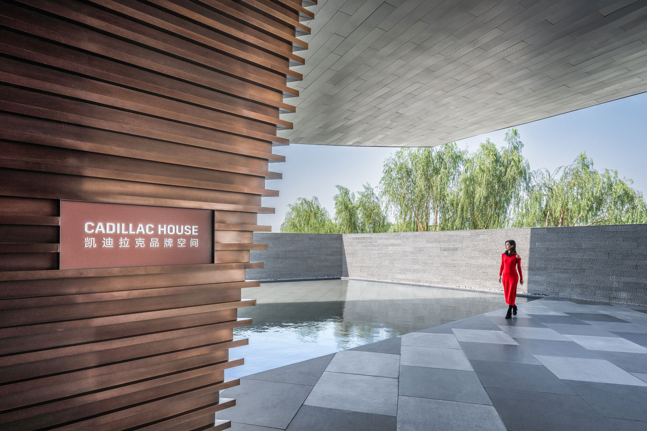
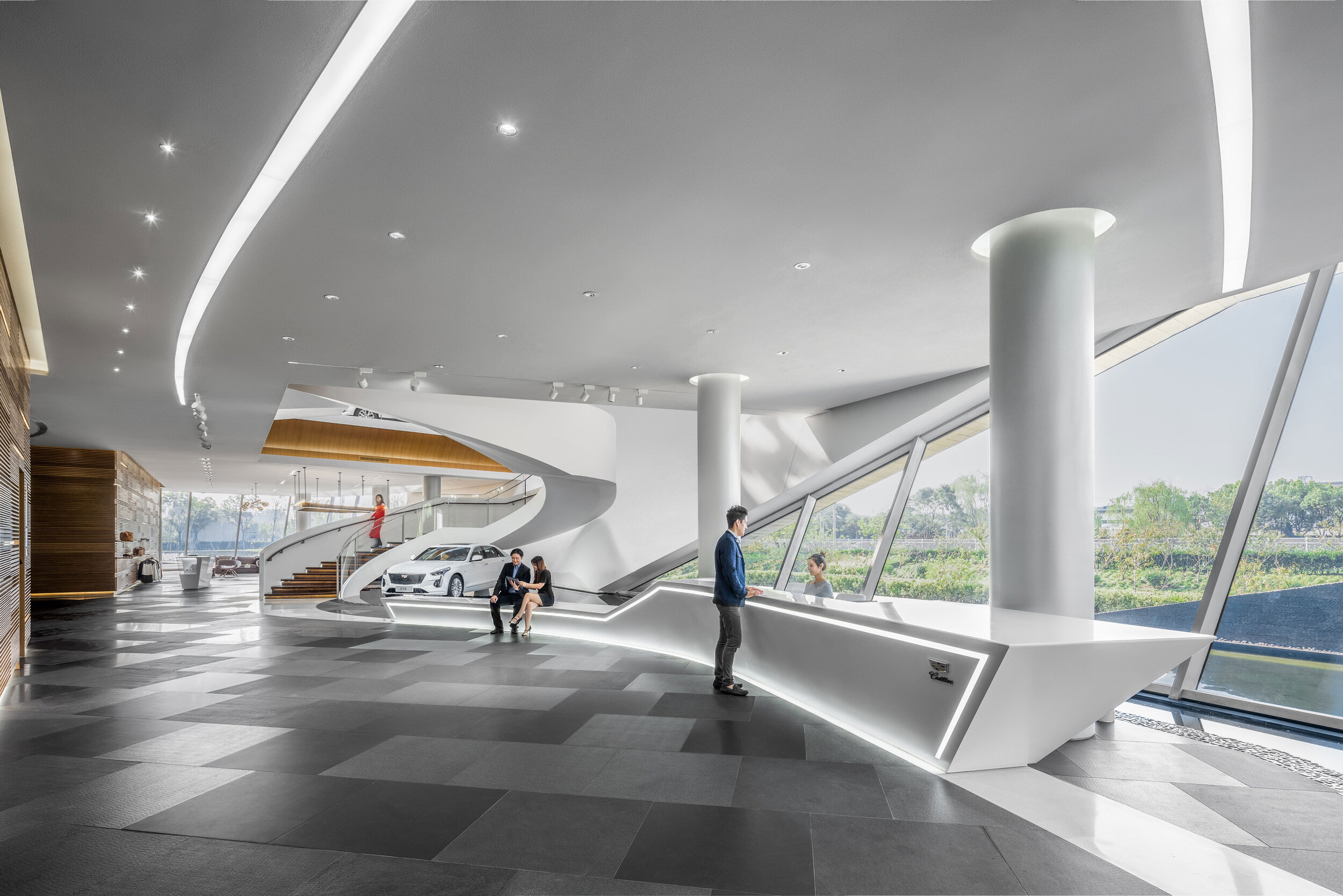
Nestled on a small peninsula with a lovely pool encompassing around, the House could be perceived as a vehicle-like gemstone mined out of a lake. Installed in 7,000 rectangular stainless steel plates, the façade unveils its true charm as the dusk falls — ribbons of LED underneath the metallic husk twinkle bright and Cadillac, the sign, emits beautiful light — and it dawns on you ‘what a glittering site!’.
The House is equipped with durable solar panels, with the sustainable conversion from sunlight to electricity.
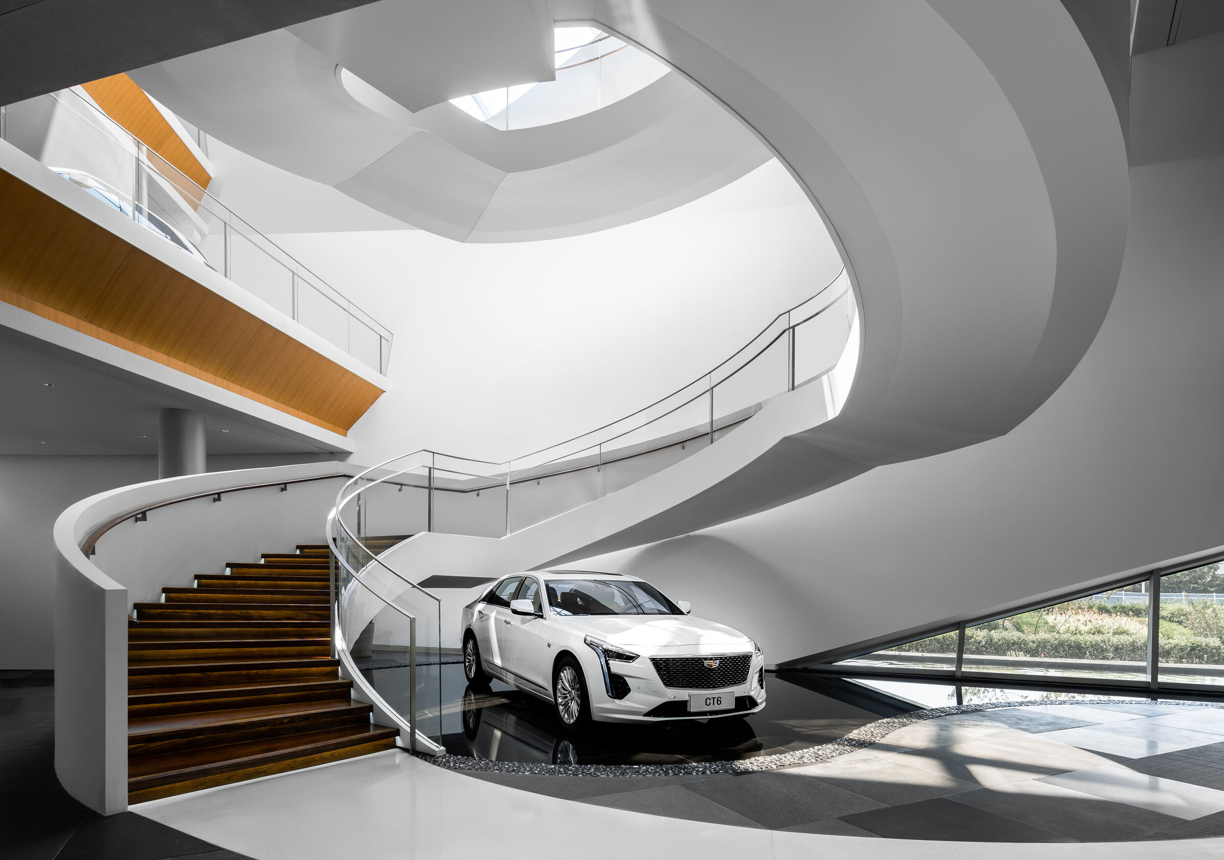
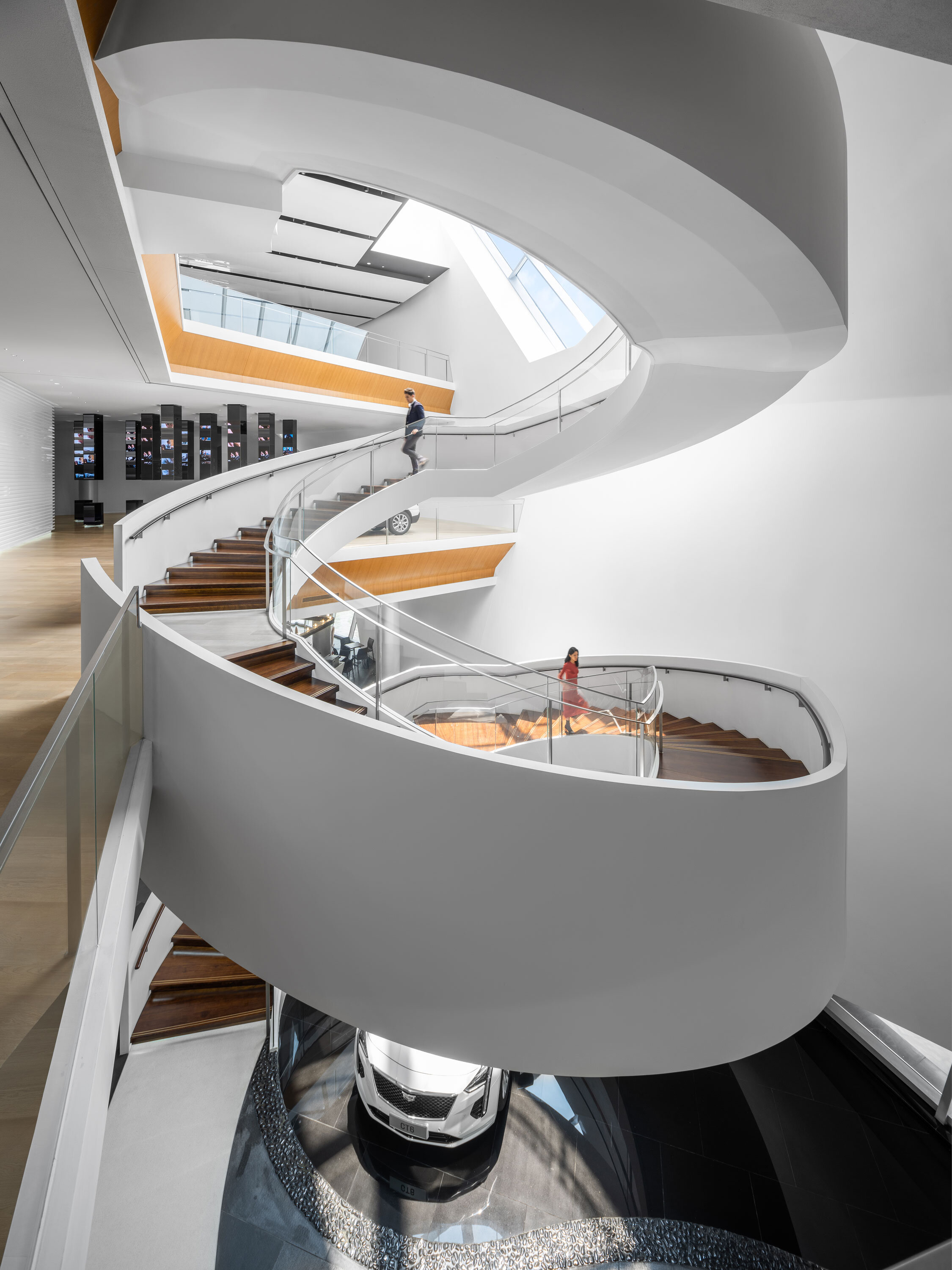
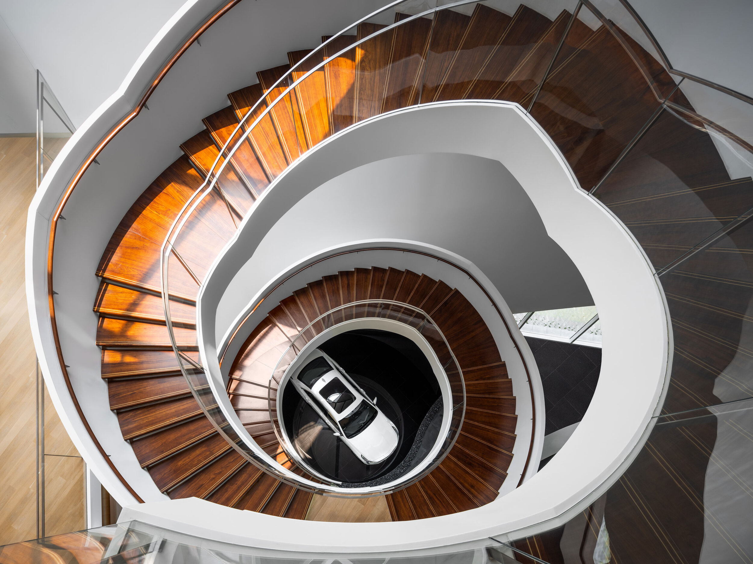

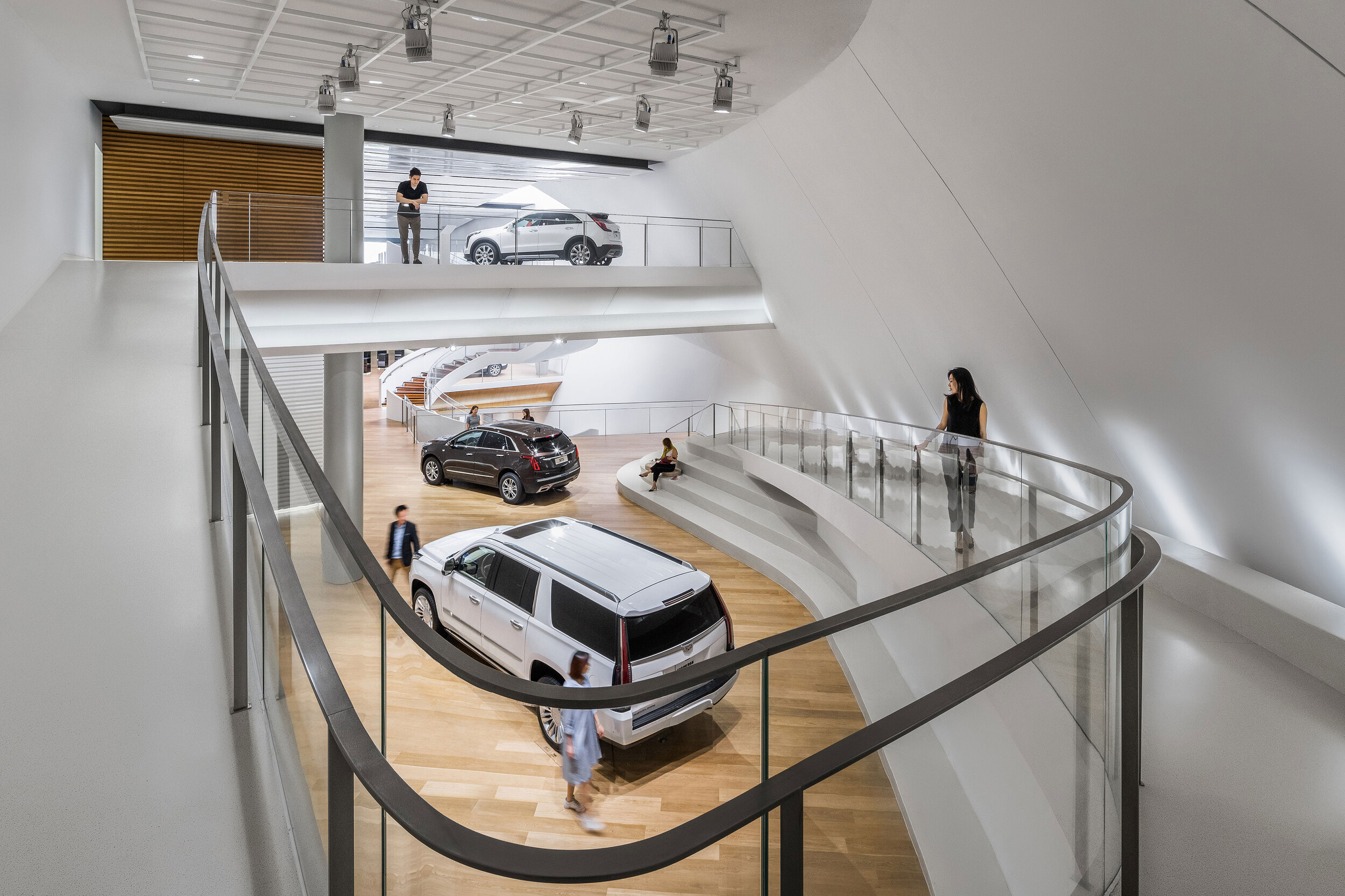
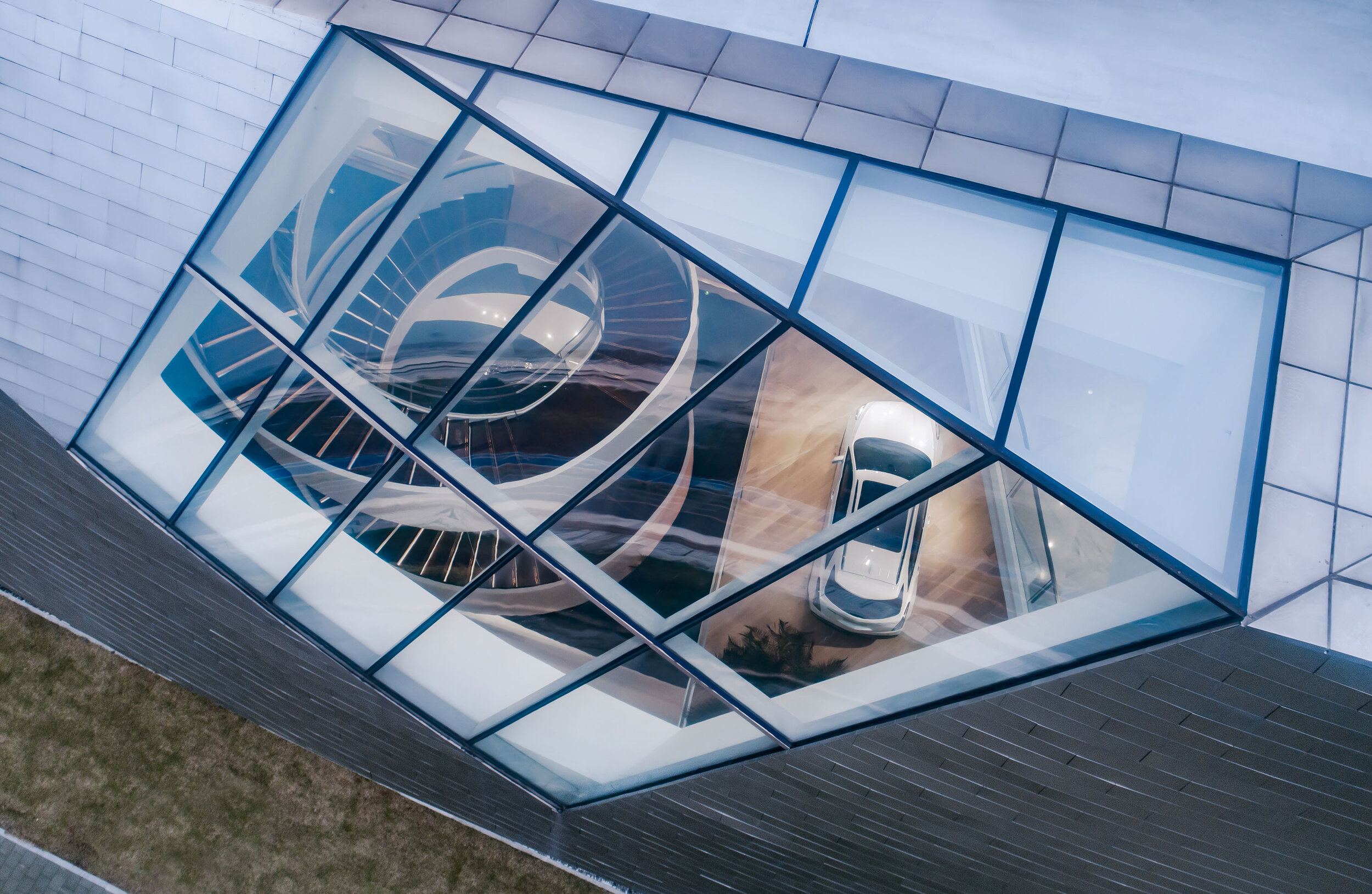
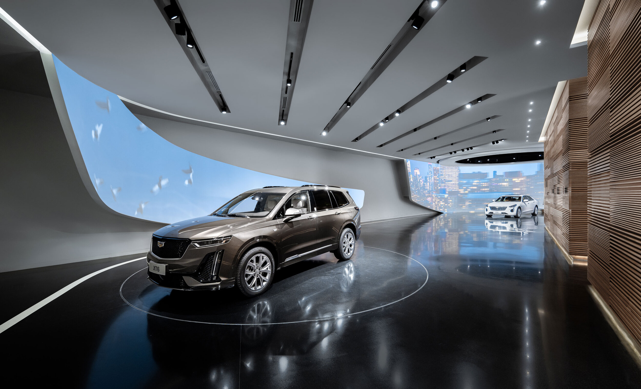
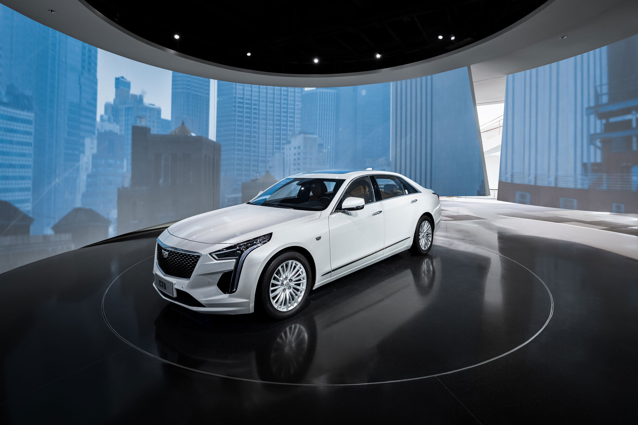
There could not be mere one single merit that natural light could engender. The House features skylights purposefully for the use of optimising light penetration into the inside.
Inside, the consistency of refinement and luxury will hardly astound you to see the discontinuity of an air of nobleness. Moving through a wondrous entrance, you will be greeted with an open-plan foyer emerging before you.
Awaiting are the Cadillacs. They are waiting for customers who take an avid interest in carrying a sign of luxury home. Gensler realises the idea of establishing a platform for Cadillacs to showcase their specialties, and, underneath a massive spiral staircase or in the centre of a lobby will you set your eyes on a different individual.
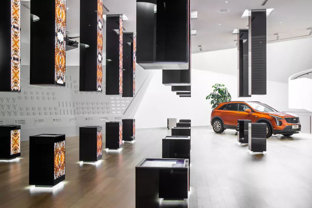
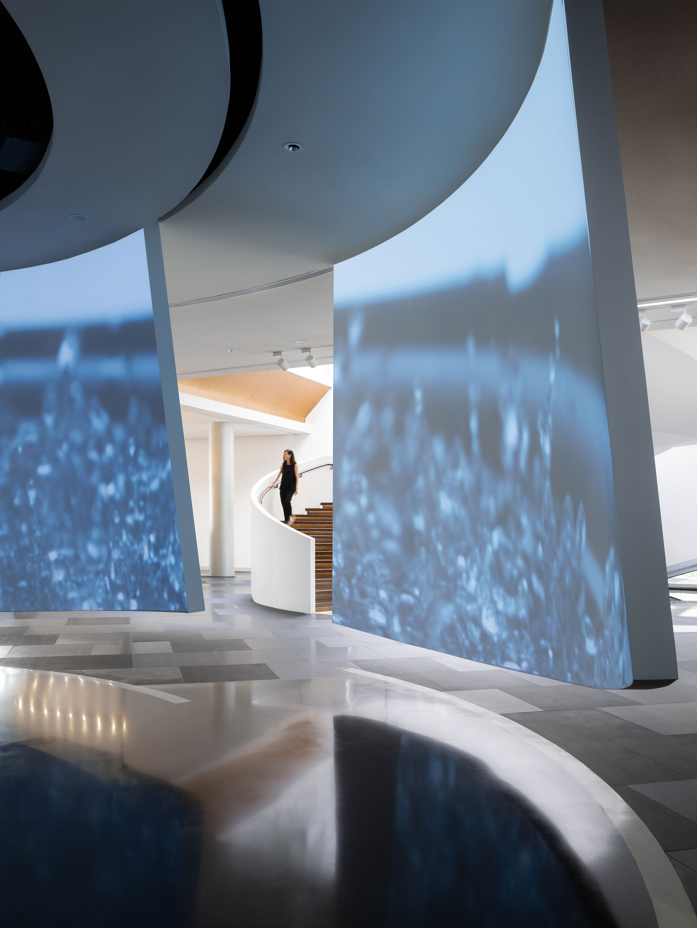
Standing still for a moment with eyes riveted on the Cadillacs, you will smell of classic aroma of dark roast coffee, which is tantalizing in the space, and that aroma is a high-profile fixture in a luxurious locality. A timber-and-concrete spiral staircase leads from the open-plan foyer to the second level and the third, dispensing with columns offering the verticality to offset the smoothness of the ribbon-like spiral.Three floors in total, Cadillac House rings the change with a linear arrangement of ‘past-present-future’, having a theme fixed on every floor but in a way that the ‘future’ is in the middle and the ‘past’ in the top floor.
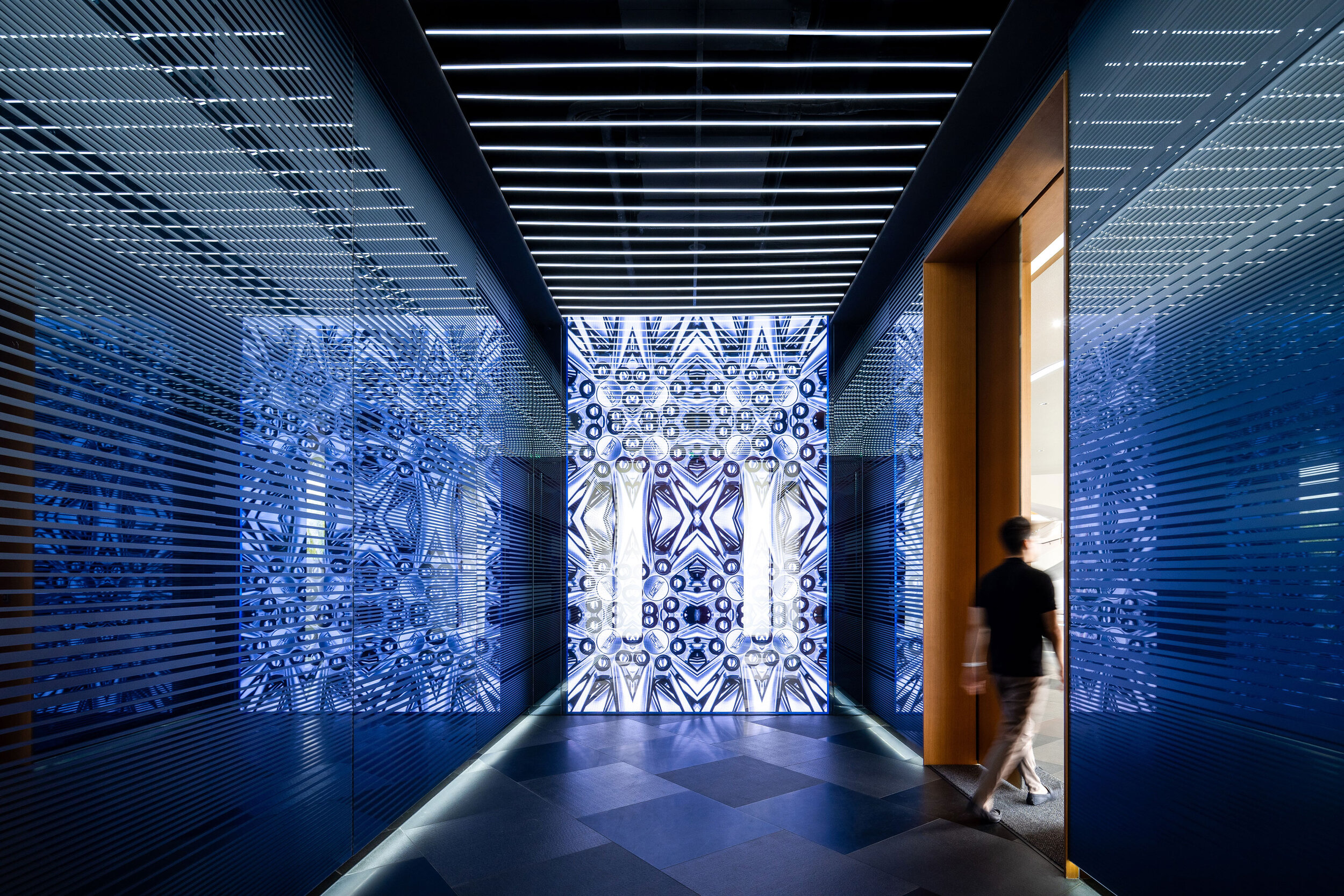

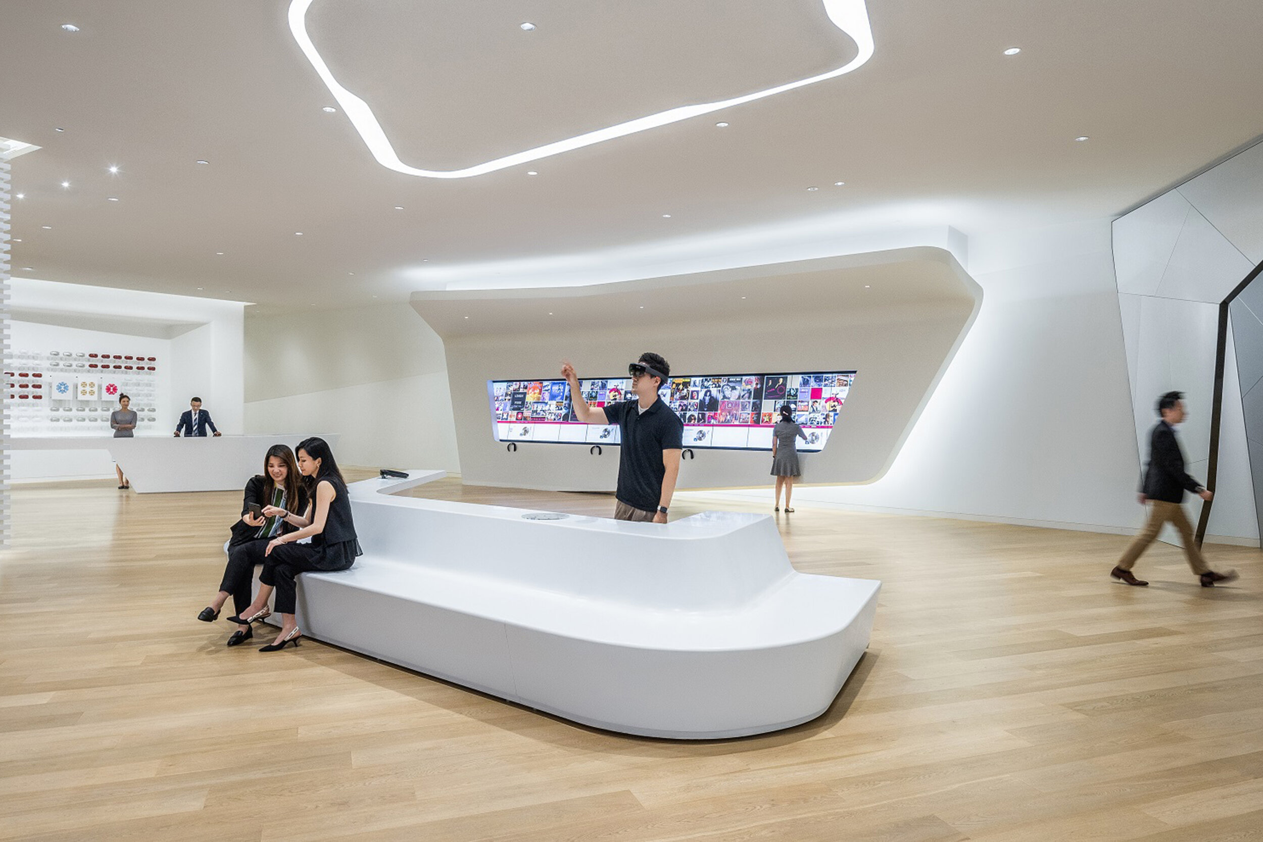
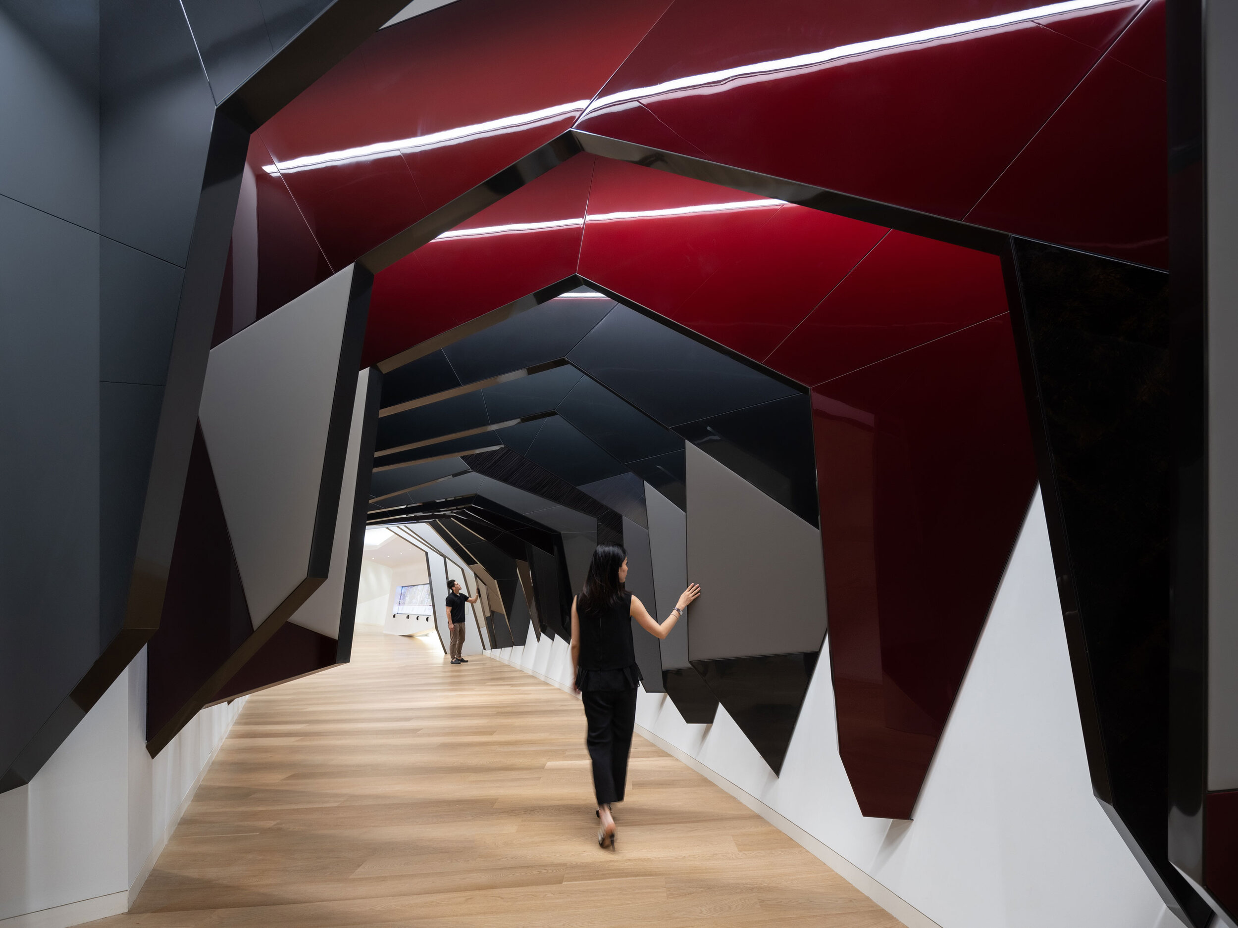
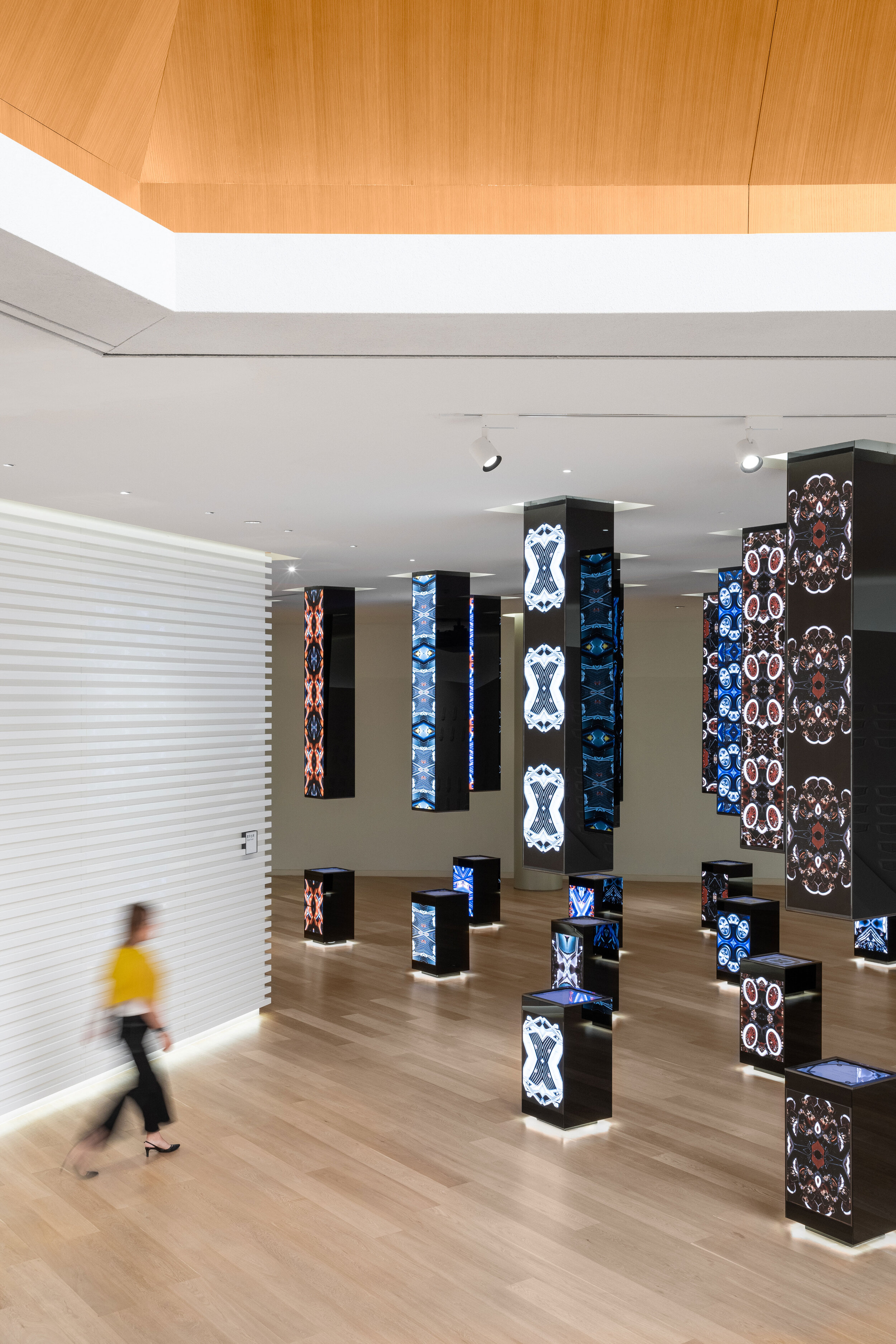
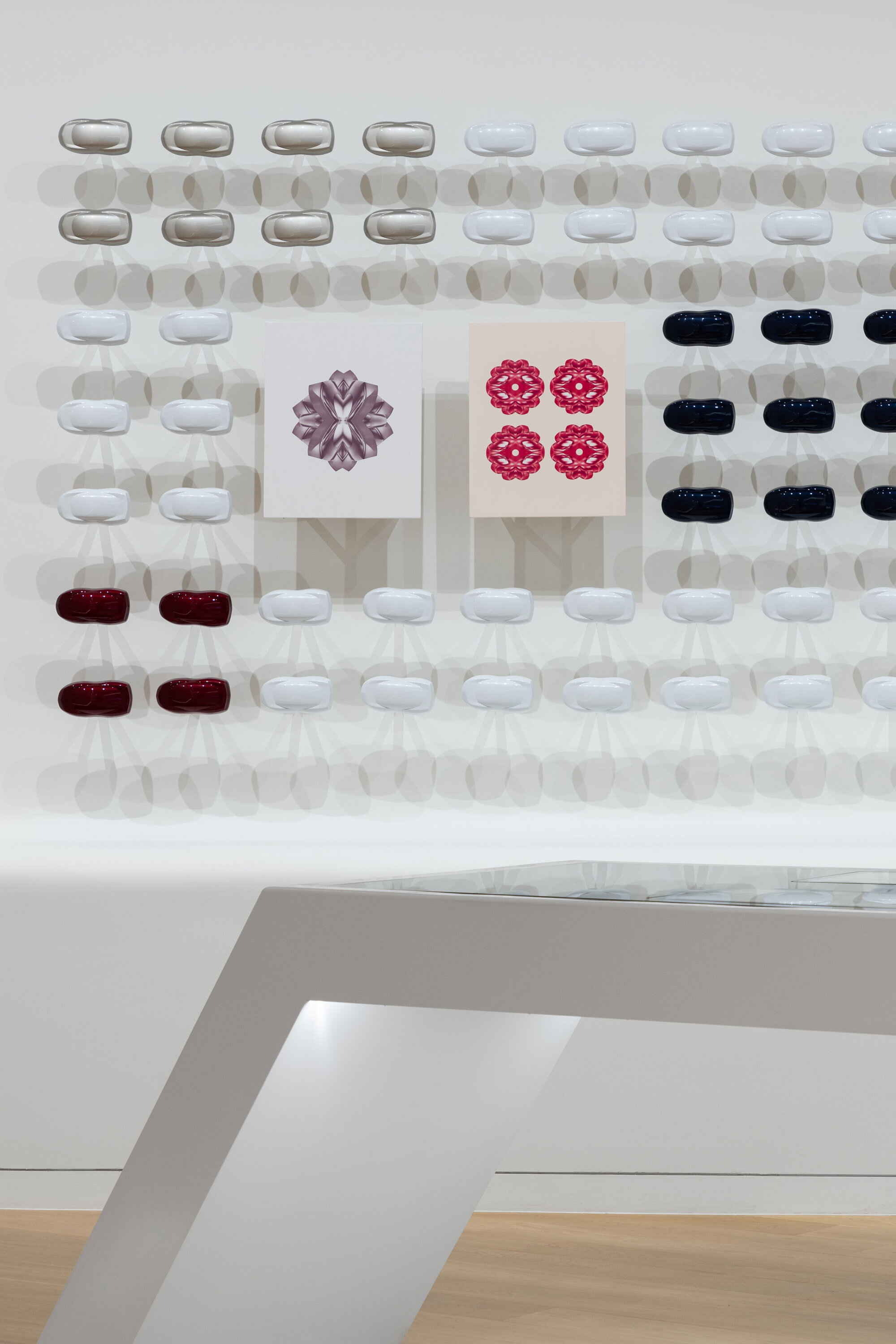
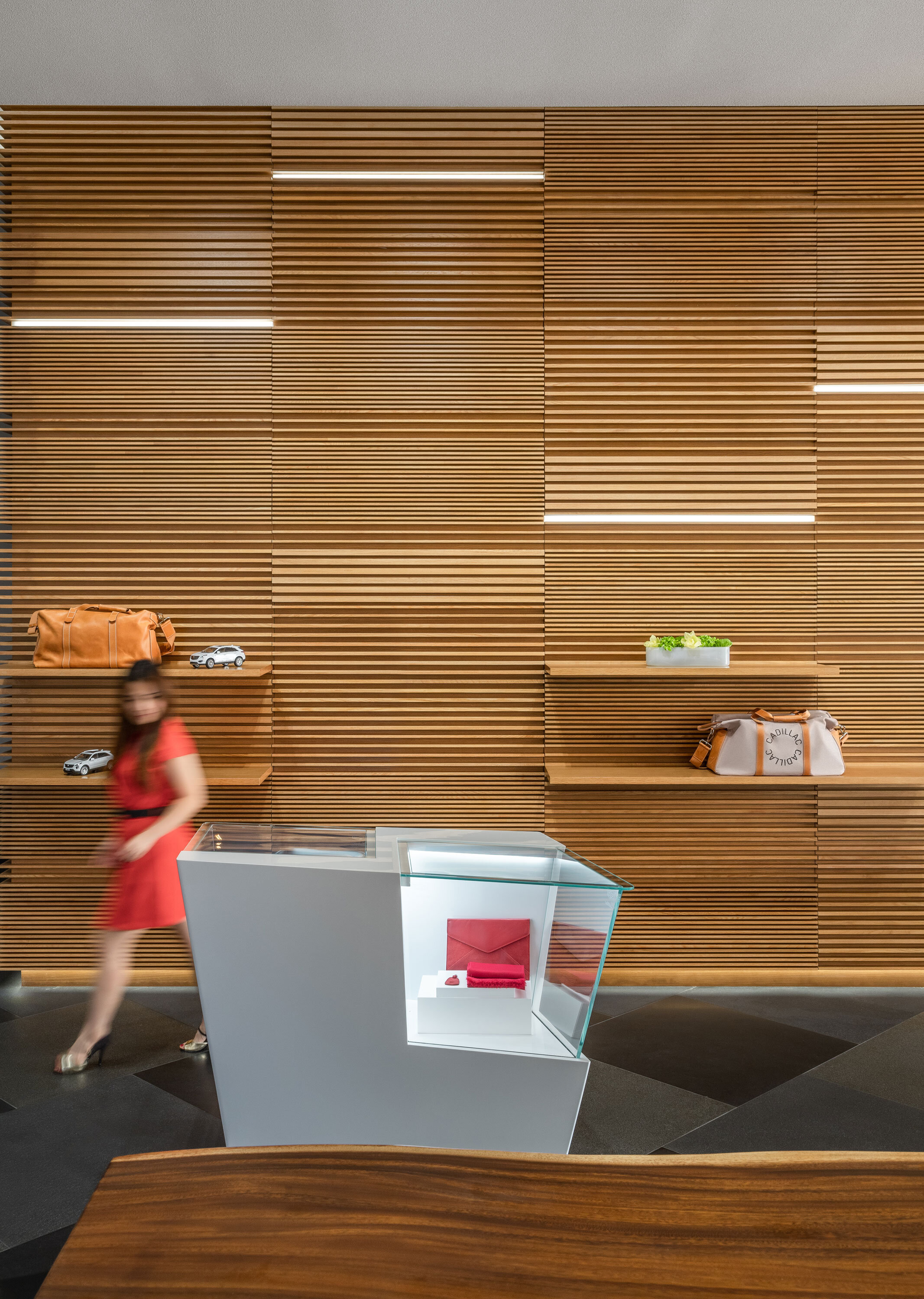
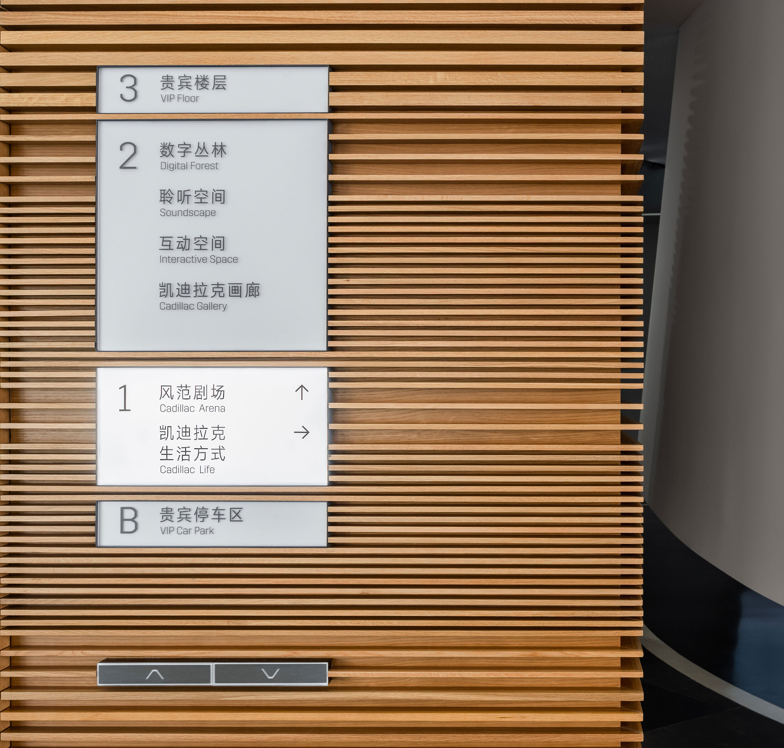
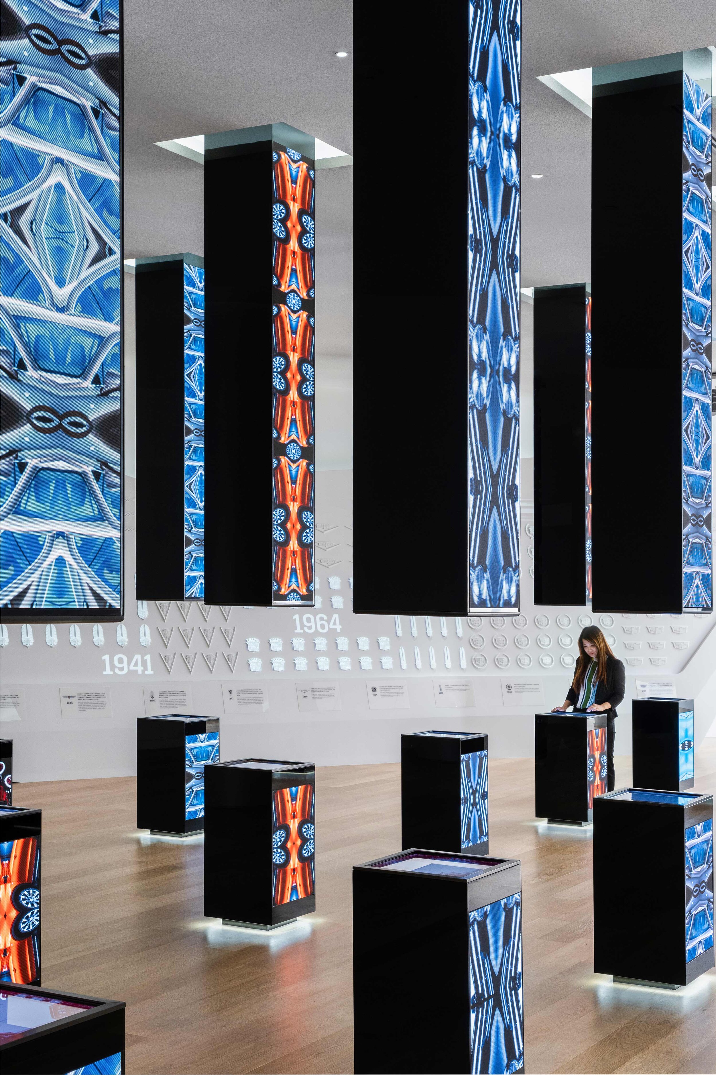
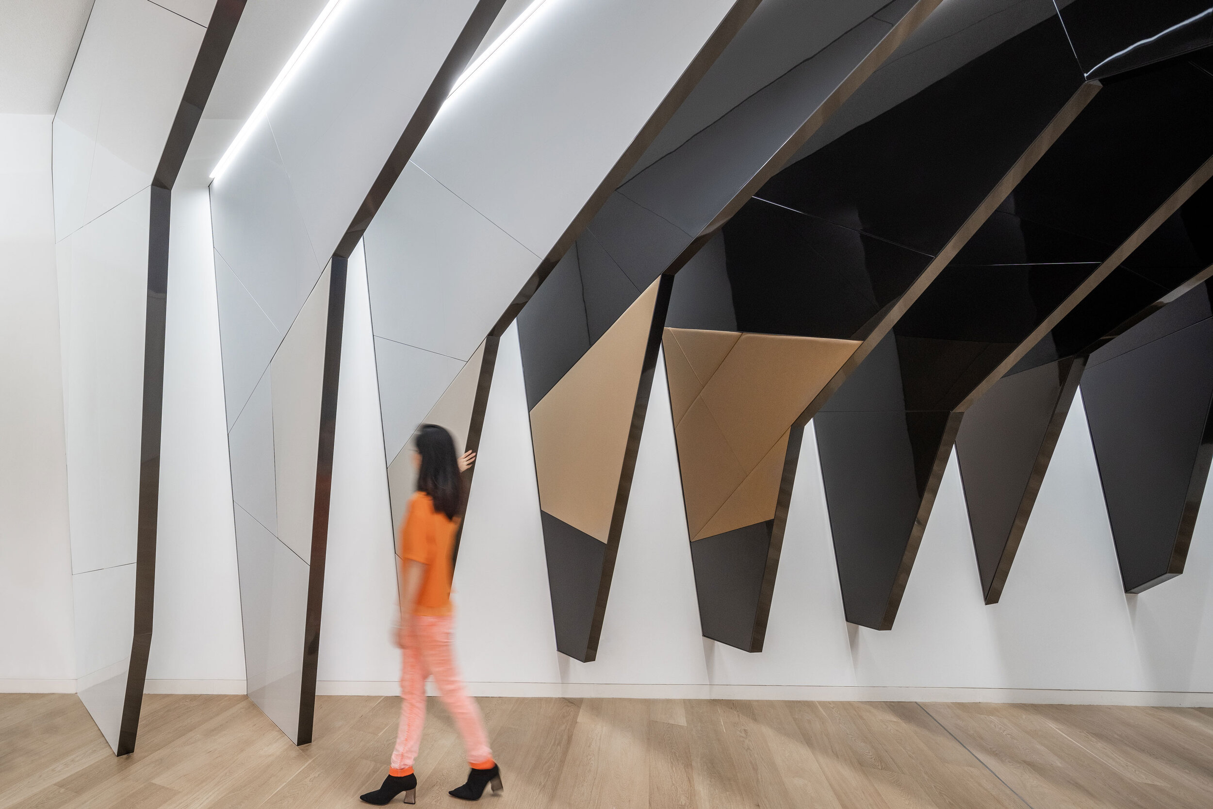
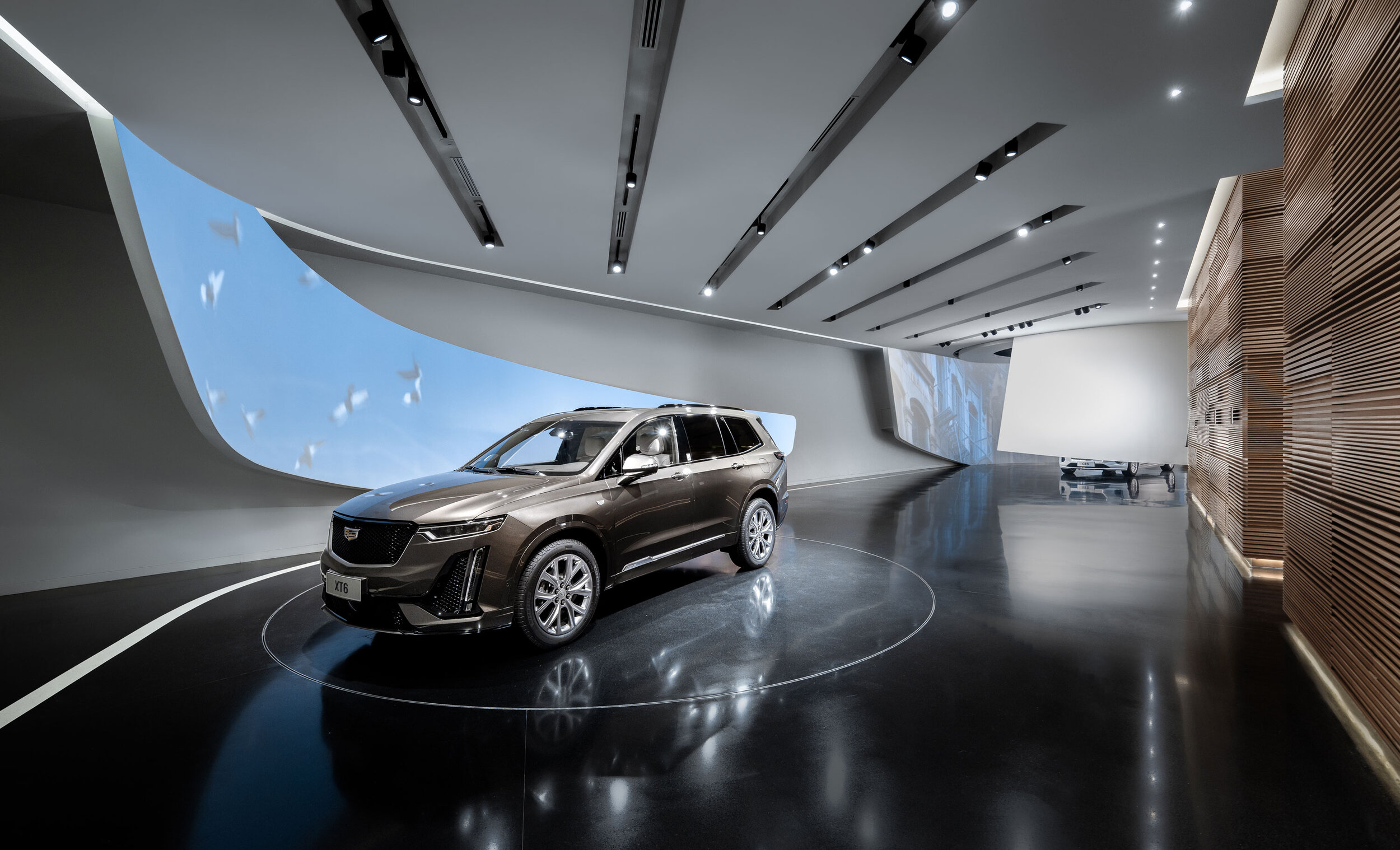
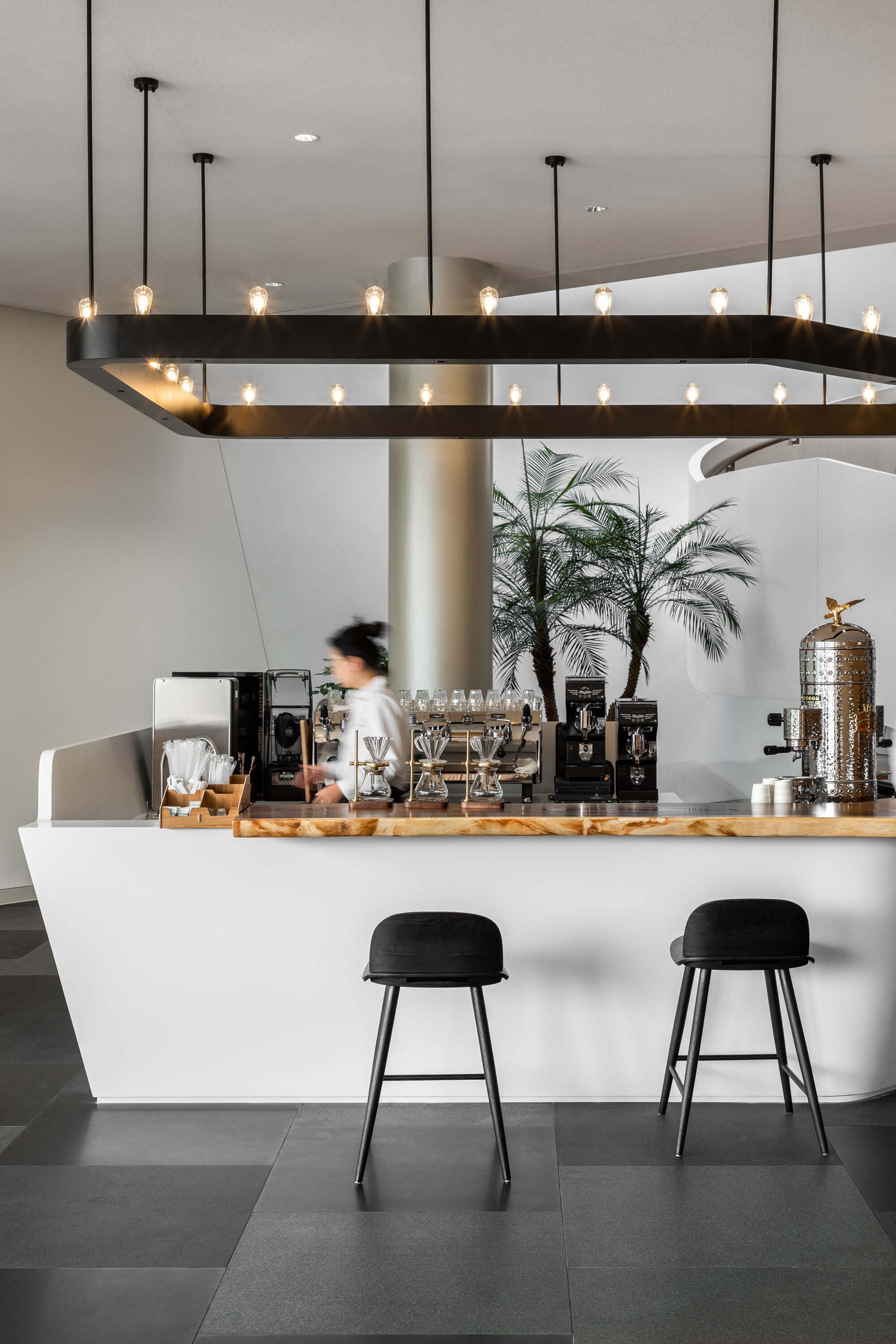
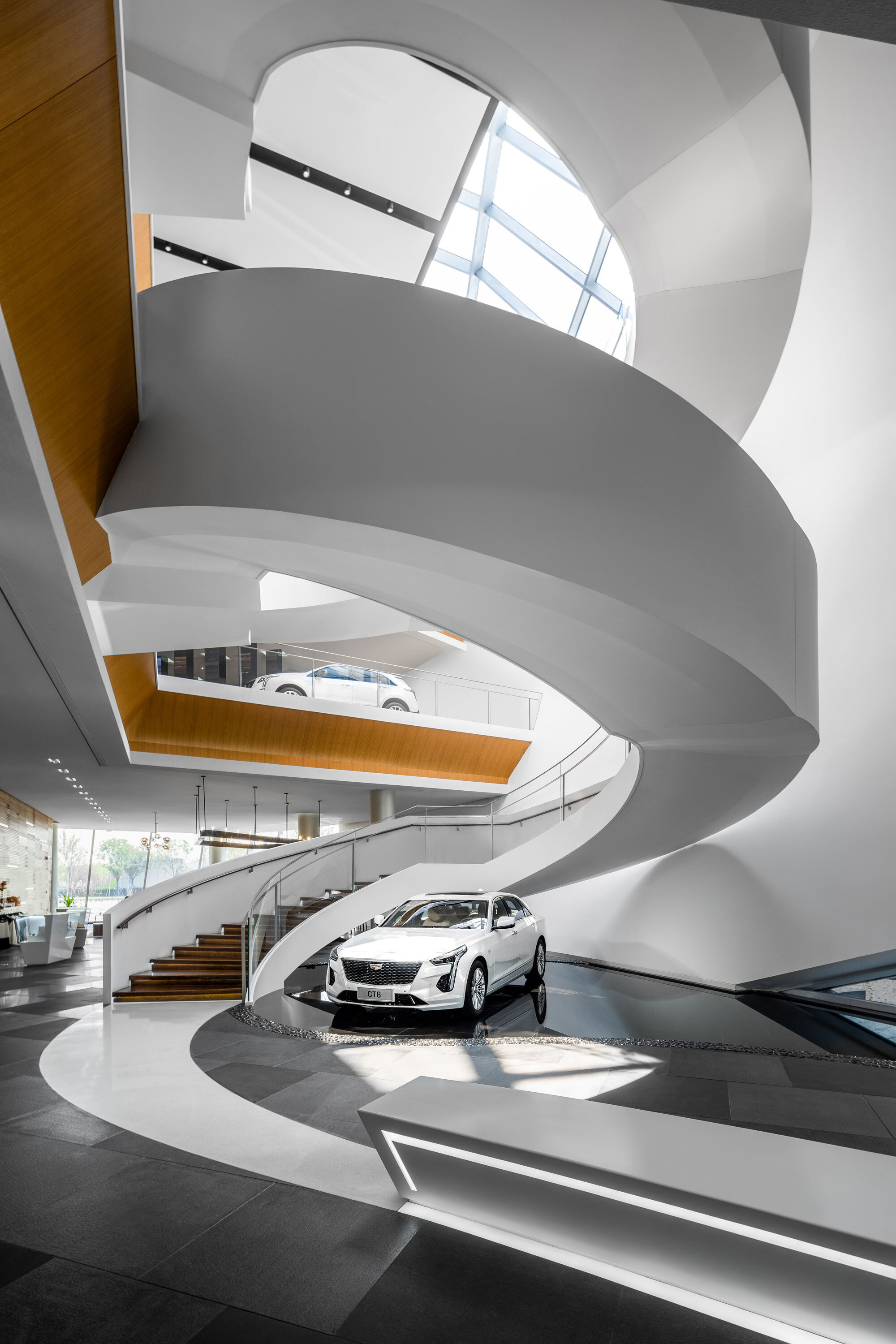
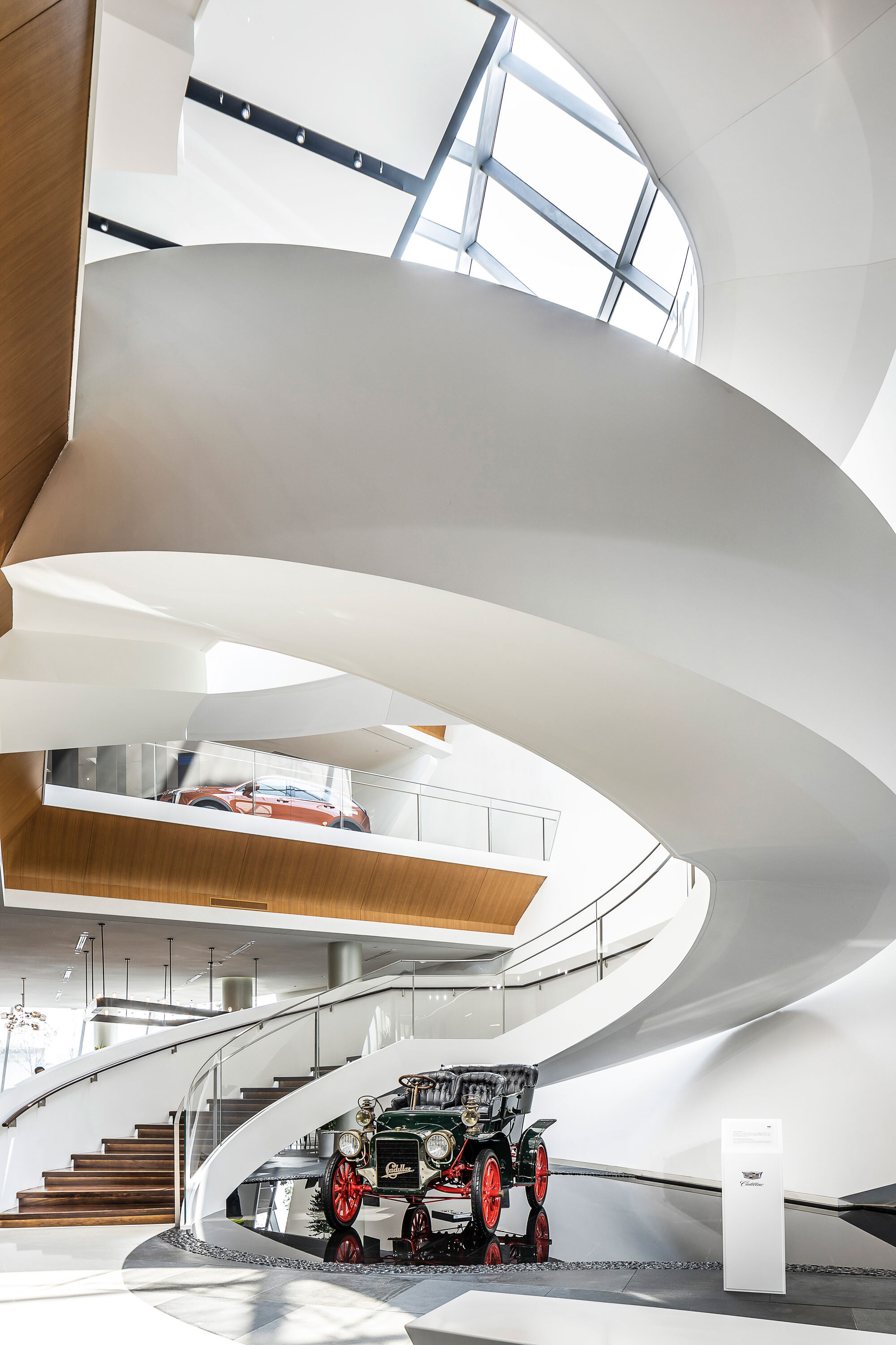
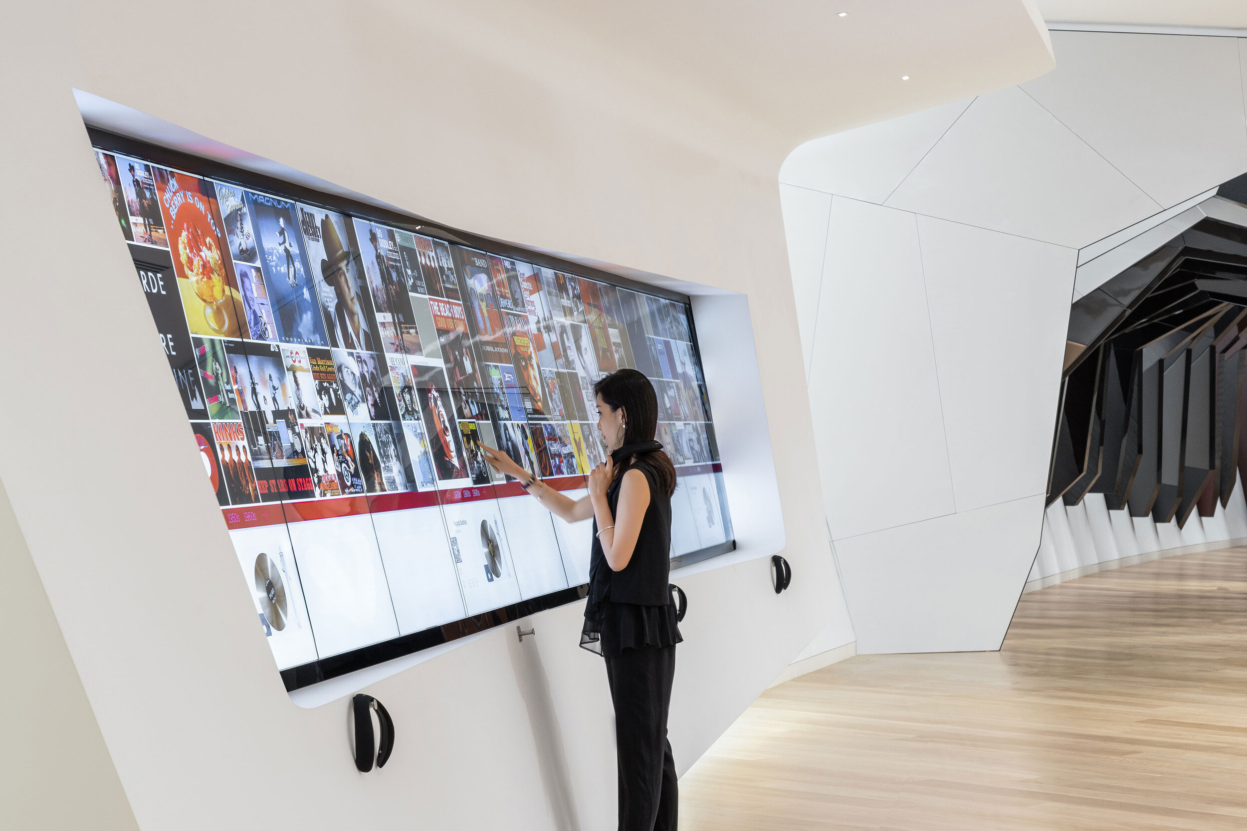
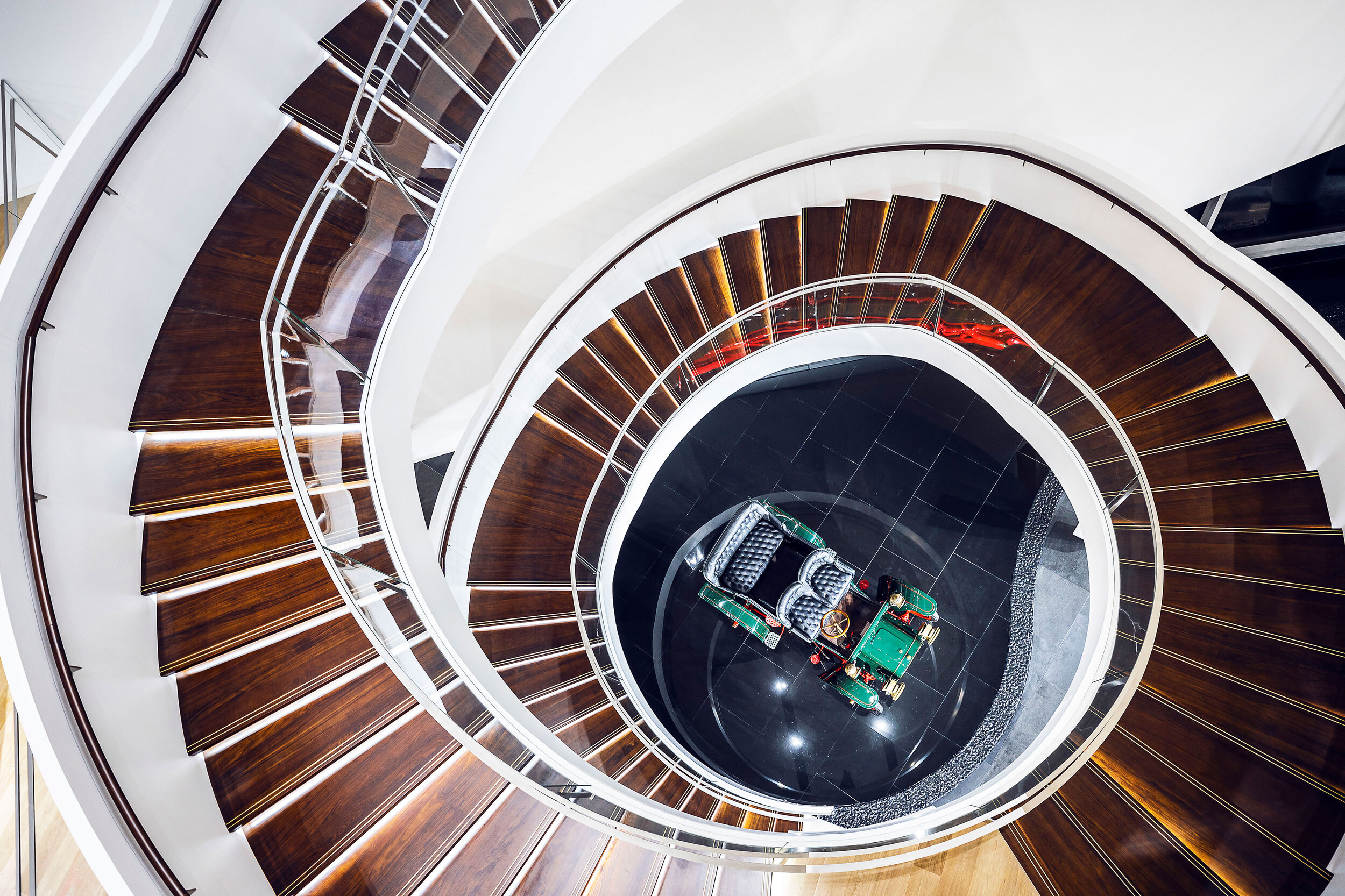
Level 2 focuses on the theoretical possibility of multi-sensory interactive technologies. Adopting multiple ways to open up a novel opportunity for customers to a body-syntonic end, is actually, grounded on the basis of VR and 3D printing.
Technologies are an invariably trend-propelled force. There is a patch of the area which is characterized by a cluster of slender cuboids with digital screens embedded, which is named ‘Digital Forest’. The name could be conceived as a variation of ‘Concrete Jungle’ because these columns have a bearing on their architectural counterparts.
A hallway is imbued with a notion of the time tunnel, through which you are capable of having a panoramic view of the growth of Cadillac.
Cadillac sets the bar high and it is estimated that over 3000 songs have included its namesakes on purpose to indicate that Cadillac is synonymous with automobile sleekness and a sign of wealth. Richard Chang, Greater China Retail Practice Area Leader at Gensler said, ‘‘We are proud to be working with Cadillac on designing such an important project. And the AIA award is great recognition for all the hard work to bring the project into completion.’
Project credits:
Project Name: Cadillac House
Location: No. 2199, Jufeng Road, Jin Qiao, Pu Dong, Shanghai, China
Architectural and Interior design: Gensler (Gensler’s Shanghai Office)
Date of Open: 27/3/ 2019
Site area: 6493㎡
Photographer: Blackstation & CreatAR
Beijing Residence in Dongzhimen 8 designed by André Fu
André Fu embarks upon his first foray into the ultra-luxe market of Mainland China, and his first station to alight upon is Dongzhimen 8 in Beijing.
André Fu embarks upon his first foray into the ultra-luxe market of Mainland China, and his first station to alight upon is Dongzhimen 8 in Beijing.
LED-ridden high-rises, neon signs, or a riot of sparkling colours, all the semblance of modernity are supposed to be entailed in the popular criteria used for assessing how developed a mega-city is. However, these iridescent delights could thin down a metropolis's genuine attractiveness, which boasts a duality of 'Modern vs. Historical,' and this city is Beijing.
Its historic heritages arguably weigh much more in attractiveness than modernity does. They could be either regal or folkloric - The Forbidden City, Hutong valleys, the residues of ramparts and fortifications dating back three millennia - if you would feel like seeking more approachableness from this city, then these locales will not be missed.
Crossing Cultures with Design indicates that André Fu has an inclination towards interlacing his designs with quality of locality. Investing the regional and cultural peculiarities with the design, for him, is a process of refinement, and redefinition as well. The city is alive, so designs.
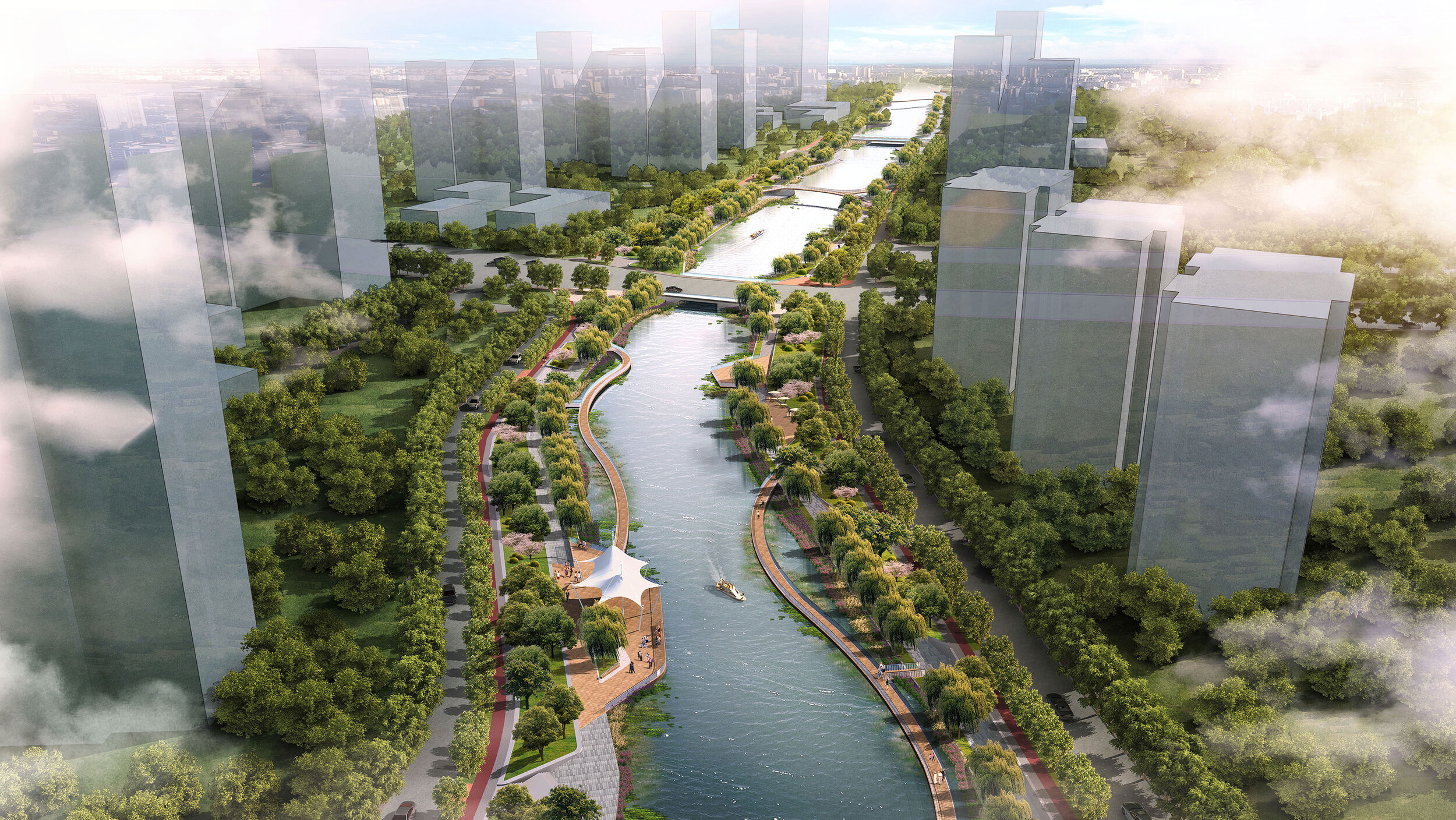
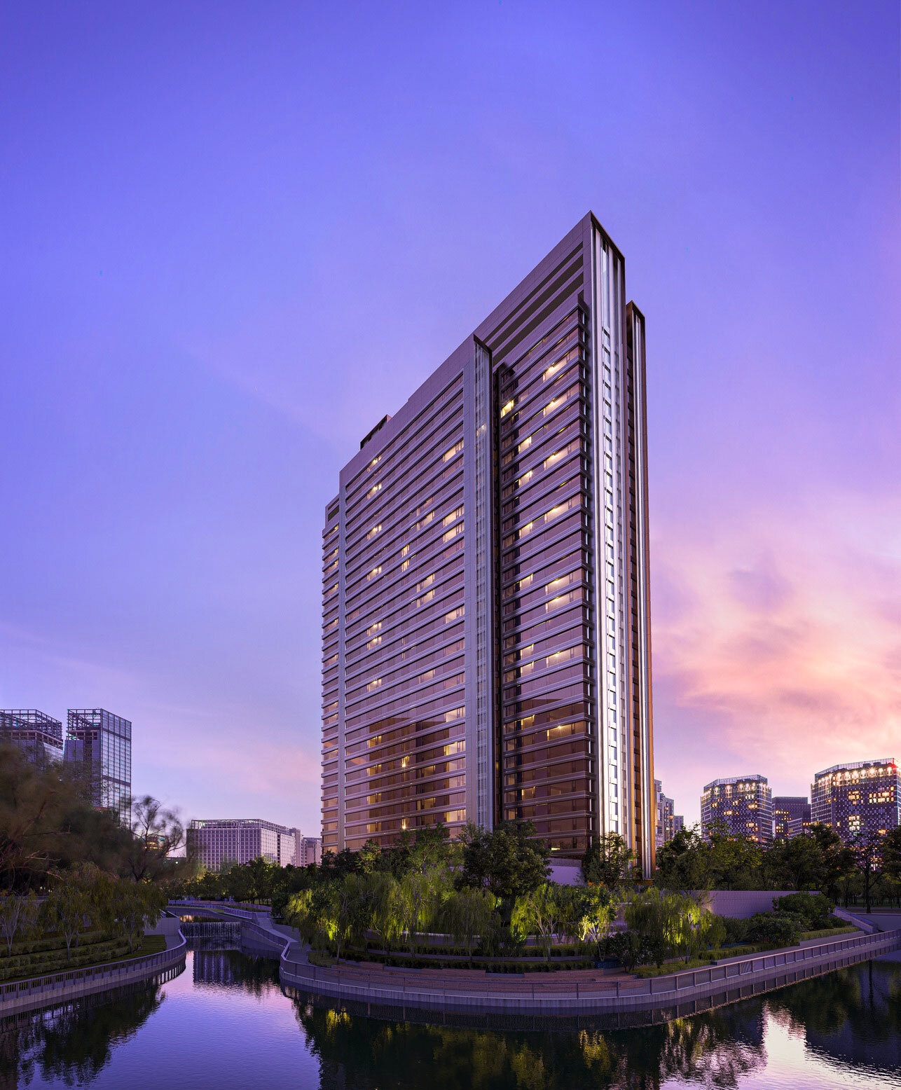
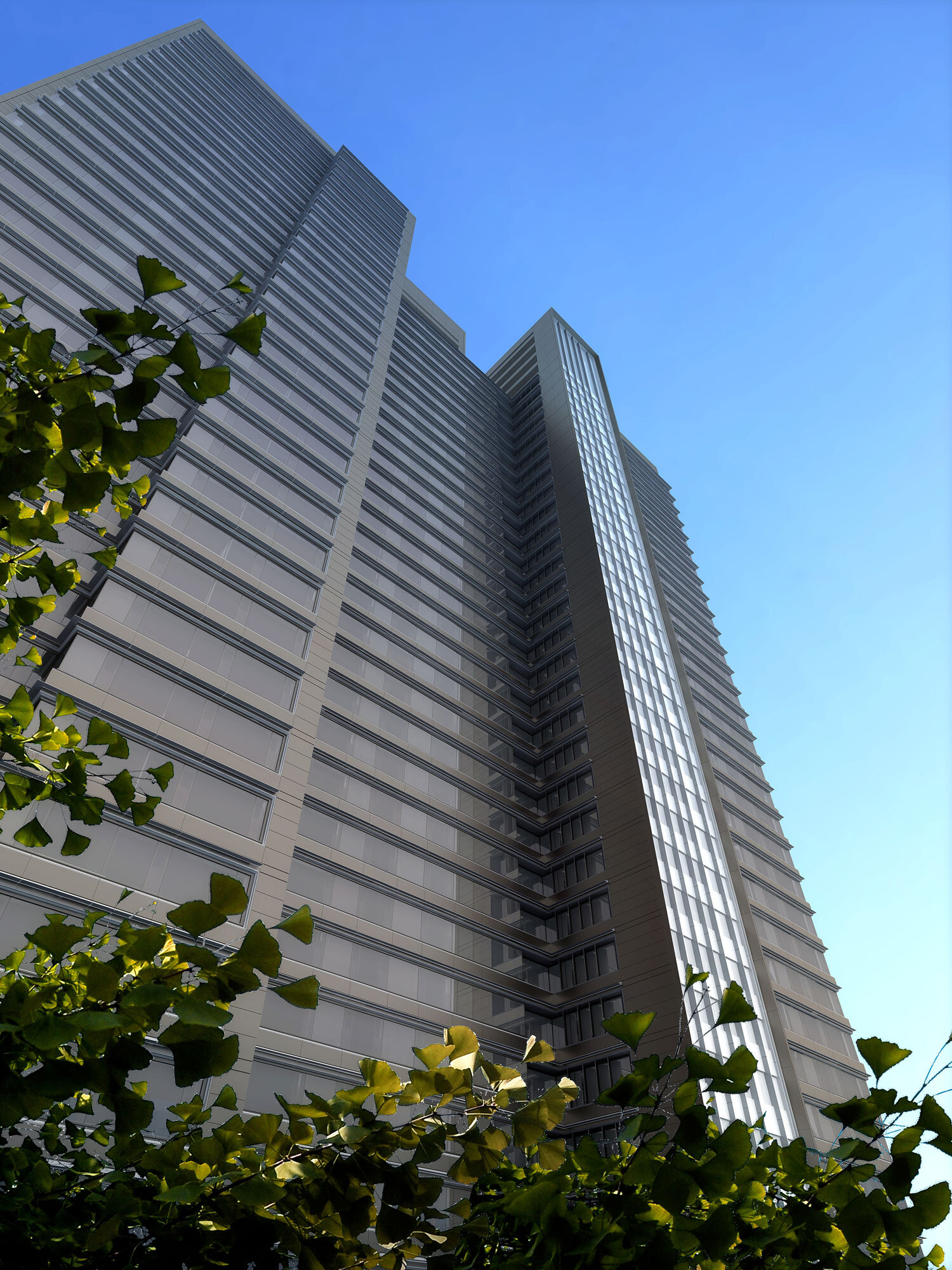
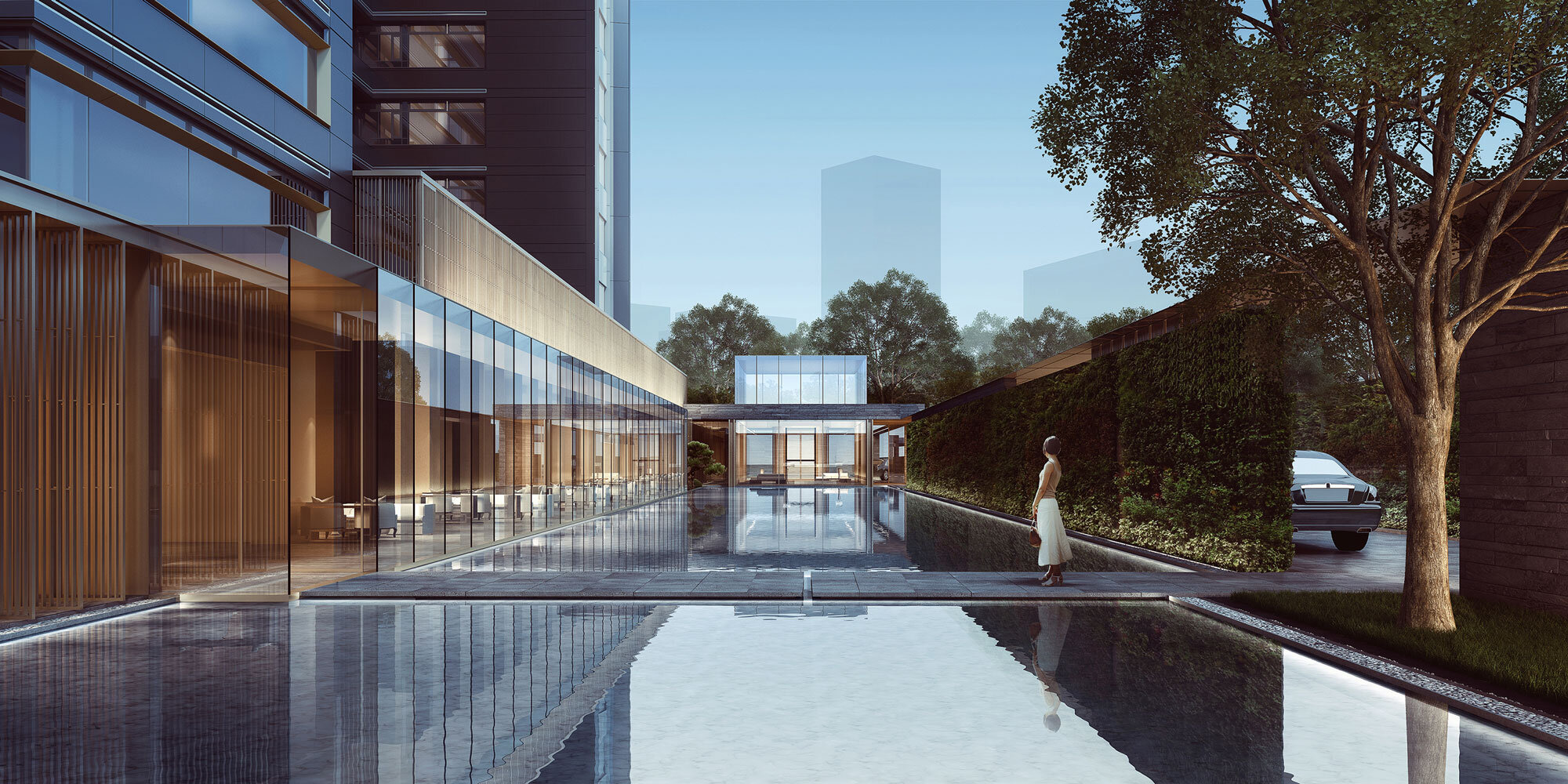
Dongzhimen 8 is wrapped in a history envelope. Dongzhimen was the East Gate of the Beijing city fortifications which was a transportation node since the Yuan Dynasty (1271–1368) and now is a prosperous commercial hub in Beijing. Because of its 800-year history and notably 8 being auspicious in Chinese numerology, 8 becomes an integral part of Dongzhimen 8. In particular, Liangma River (1368 – now), sending off an aroma of ancient history, encompasses it, serving as an aquatic vista for the residence. Dongzhimen 8 can undo the rigid dichotomy between urbanity and hermitage. It cannot be uprooted itself from the urbanity though, so one side is the hectic street, and it can be a Peach Blossom Shangri-la in a peninsula, the verdant and tree Moors in a suave manner, then the other side, you could imagine, it is an ecosystem friendly zone.
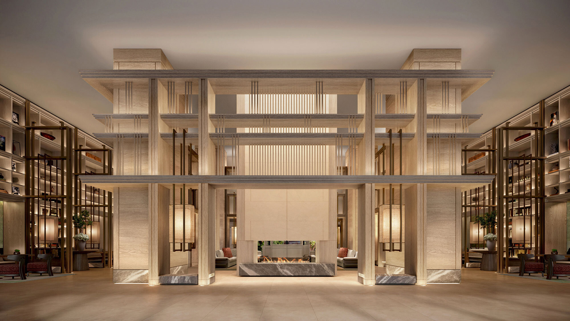
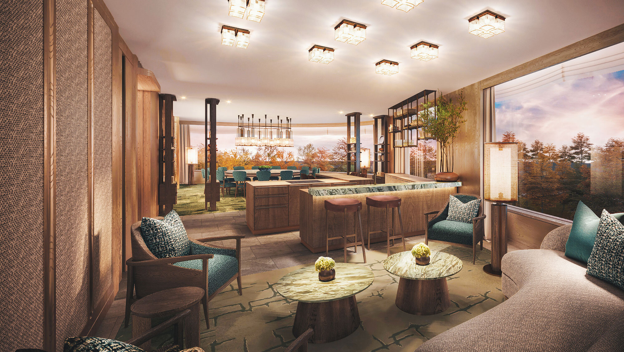
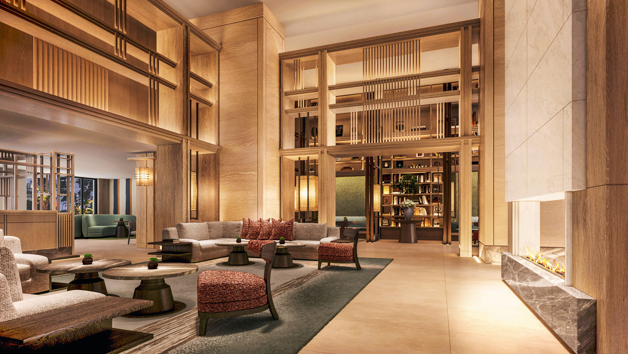
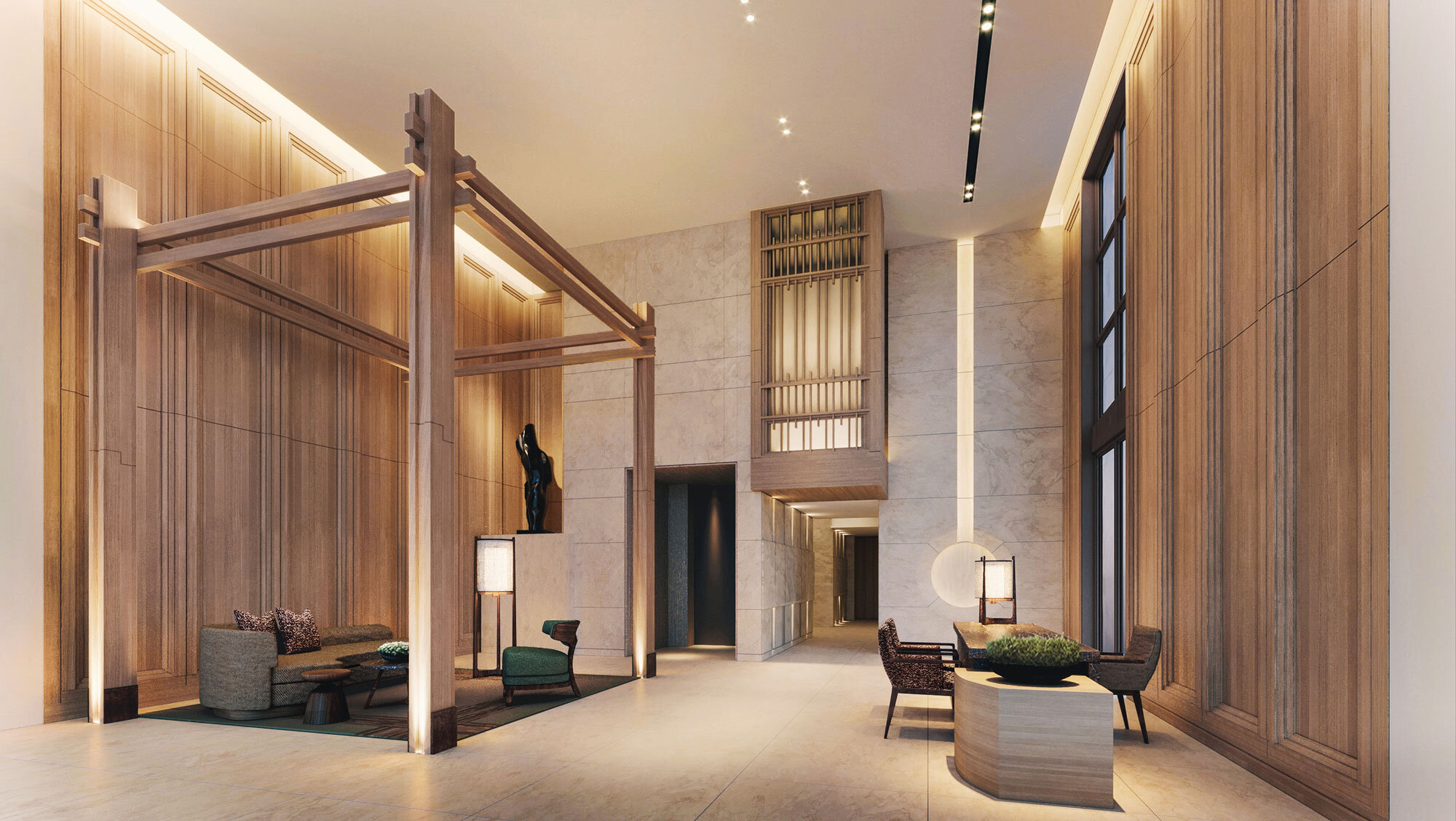
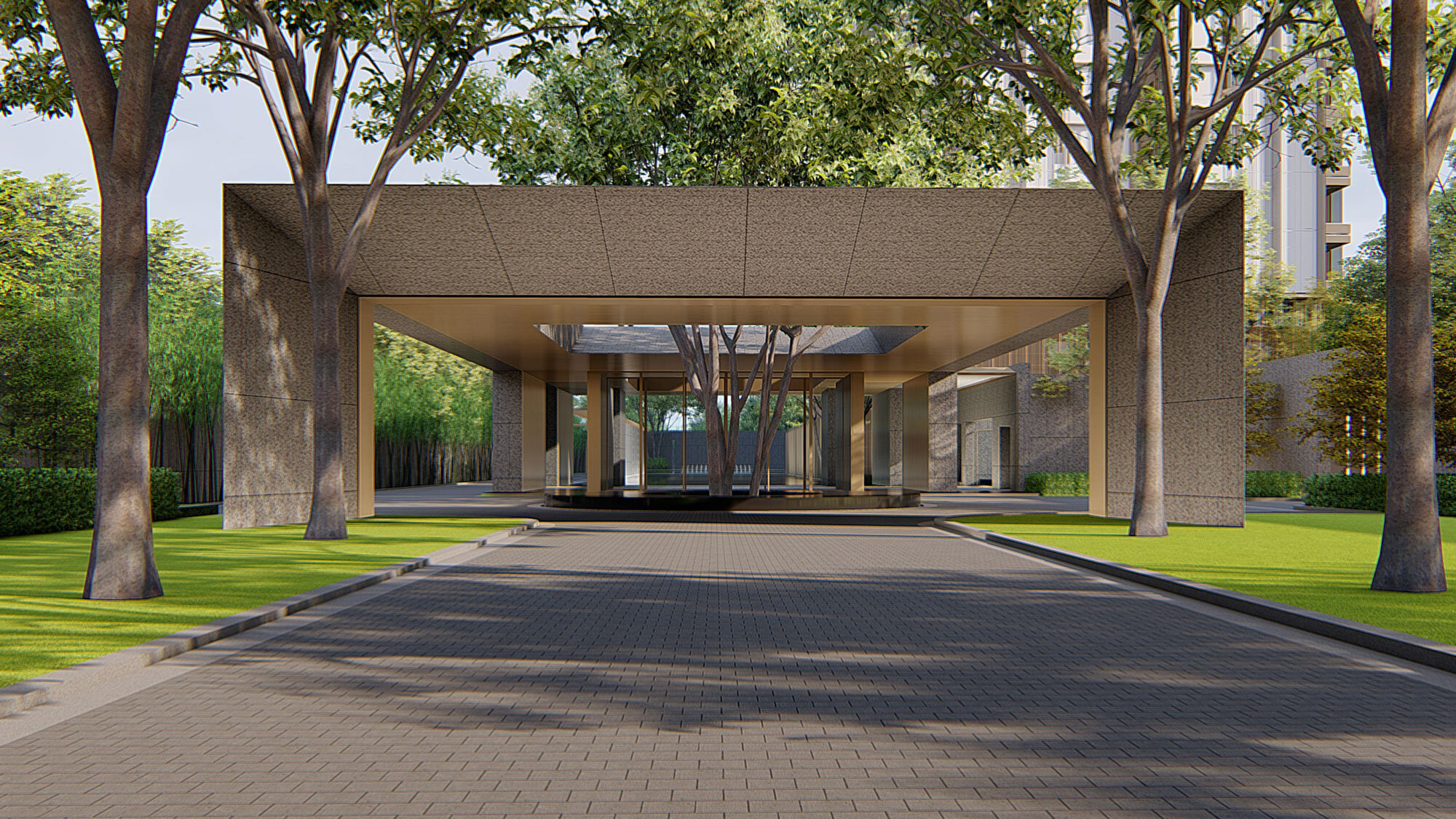
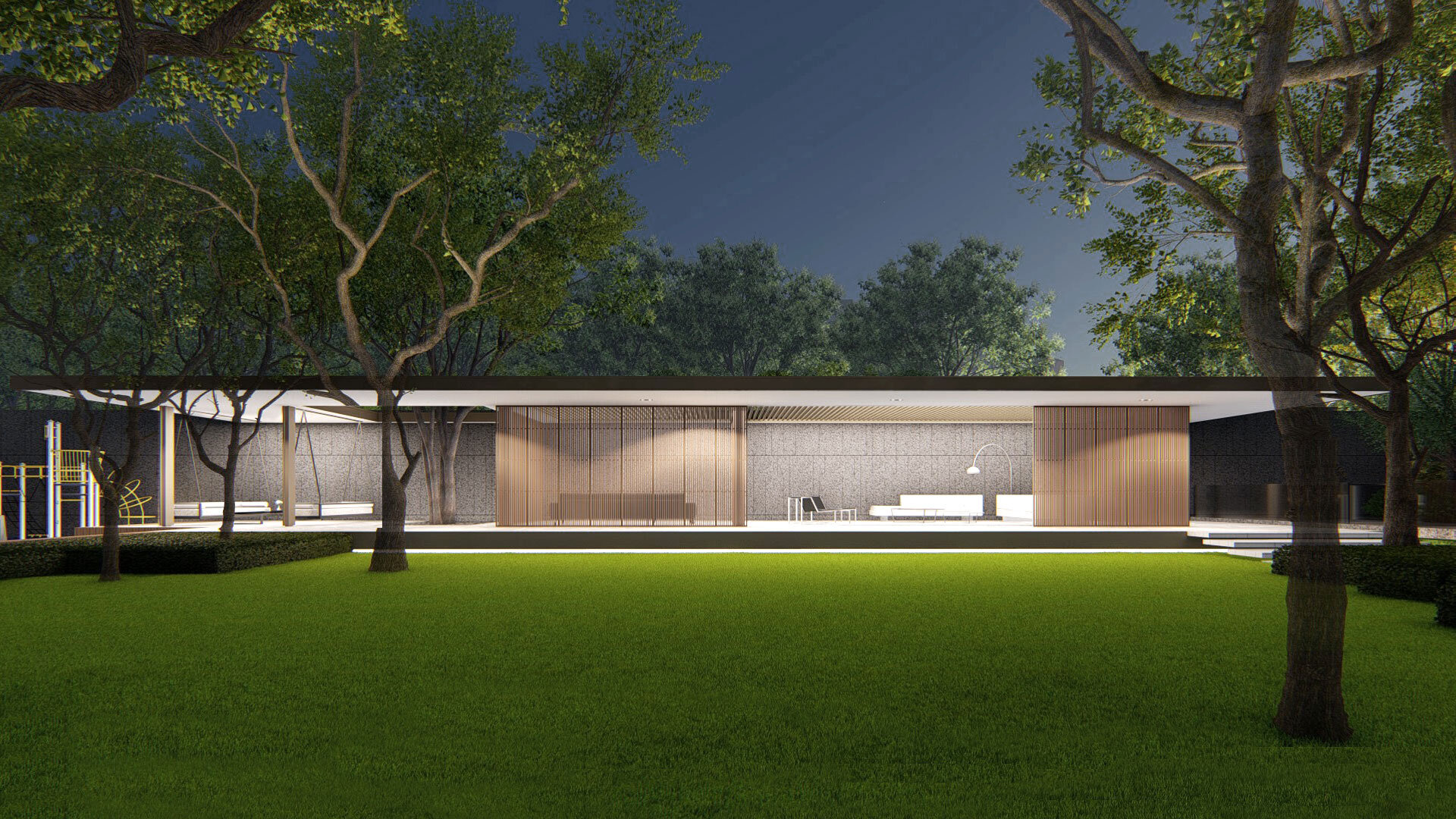
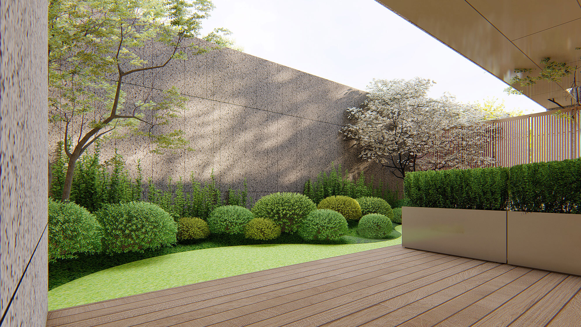
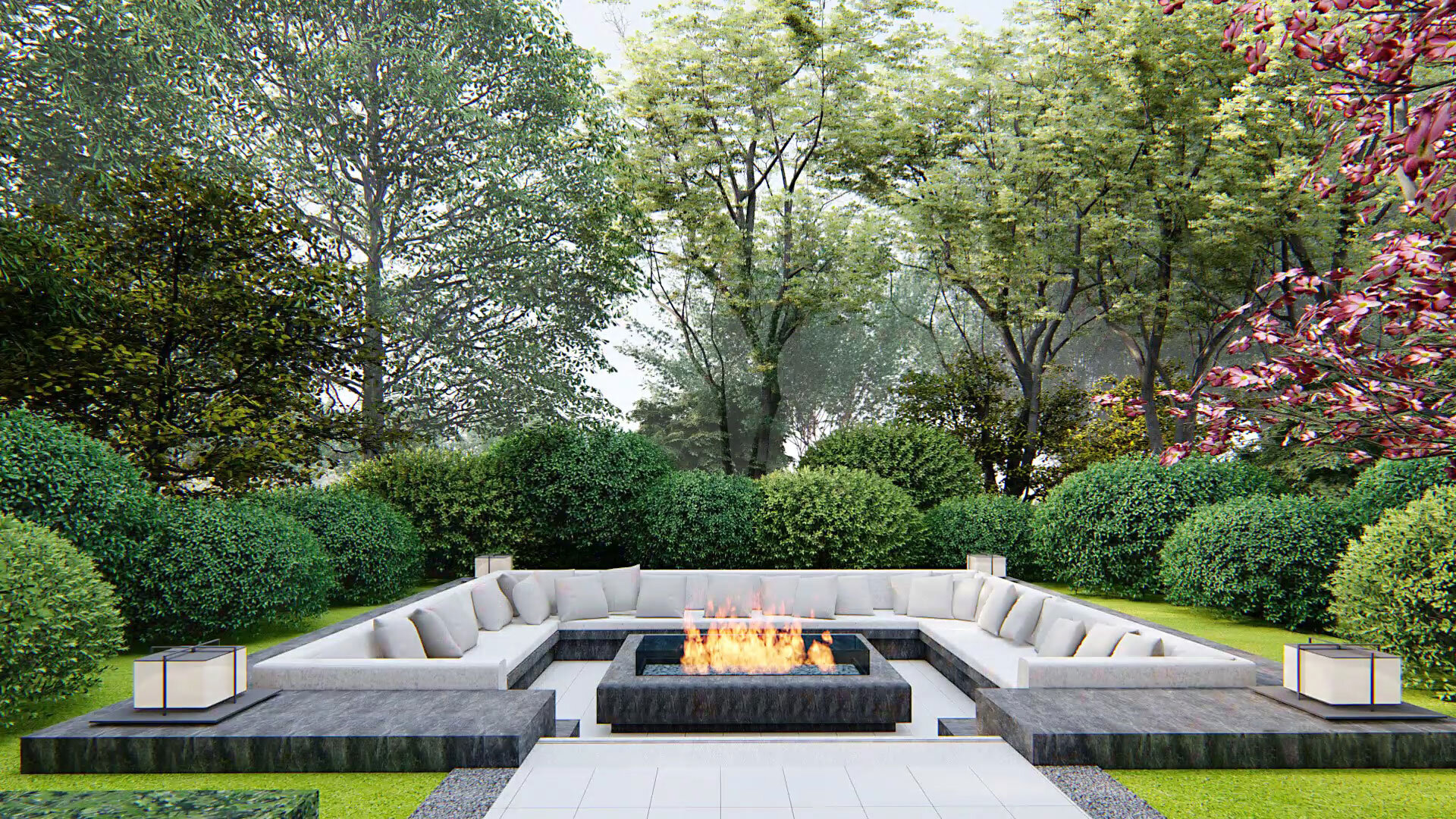
Suffice it to say that consumerism was outdated and uncalled-for enough to be decoupled from the modern definition of luxury. André believes that extravagant luxury needs to be pared down. Furthermore, at the thought of Beijing's stunning history, he wants luxury to set in motion resonance with the account. In partnership with the developers, they endeavour to create a space that makes an ‘elbow room’ to renew luxury and enliven the history.
André includes mortise-and-tenon joints in the entire design. It is an oriental story to unfold. In stark comparison to brick-and-stone structures, wood texture is an enabler to lighten up the atmosphere redolent of the Chinese tradition. Colours are the key. By utilizing balanced shades and brightness, André made various palettes release a sense of elegance and reservedness. Design is, practically speaking, not something of montage. It is more like interwoven stuff wherein cultural expressions, through a particular symbol of colours, more often than not, are enacting a crucial role to fortify the texture.
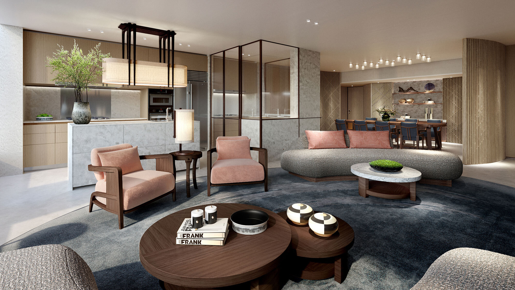
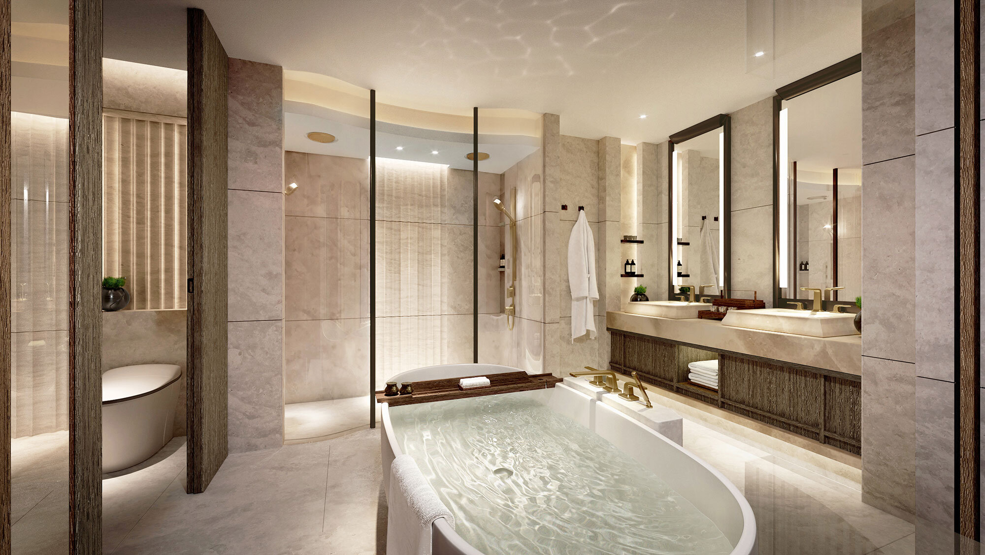
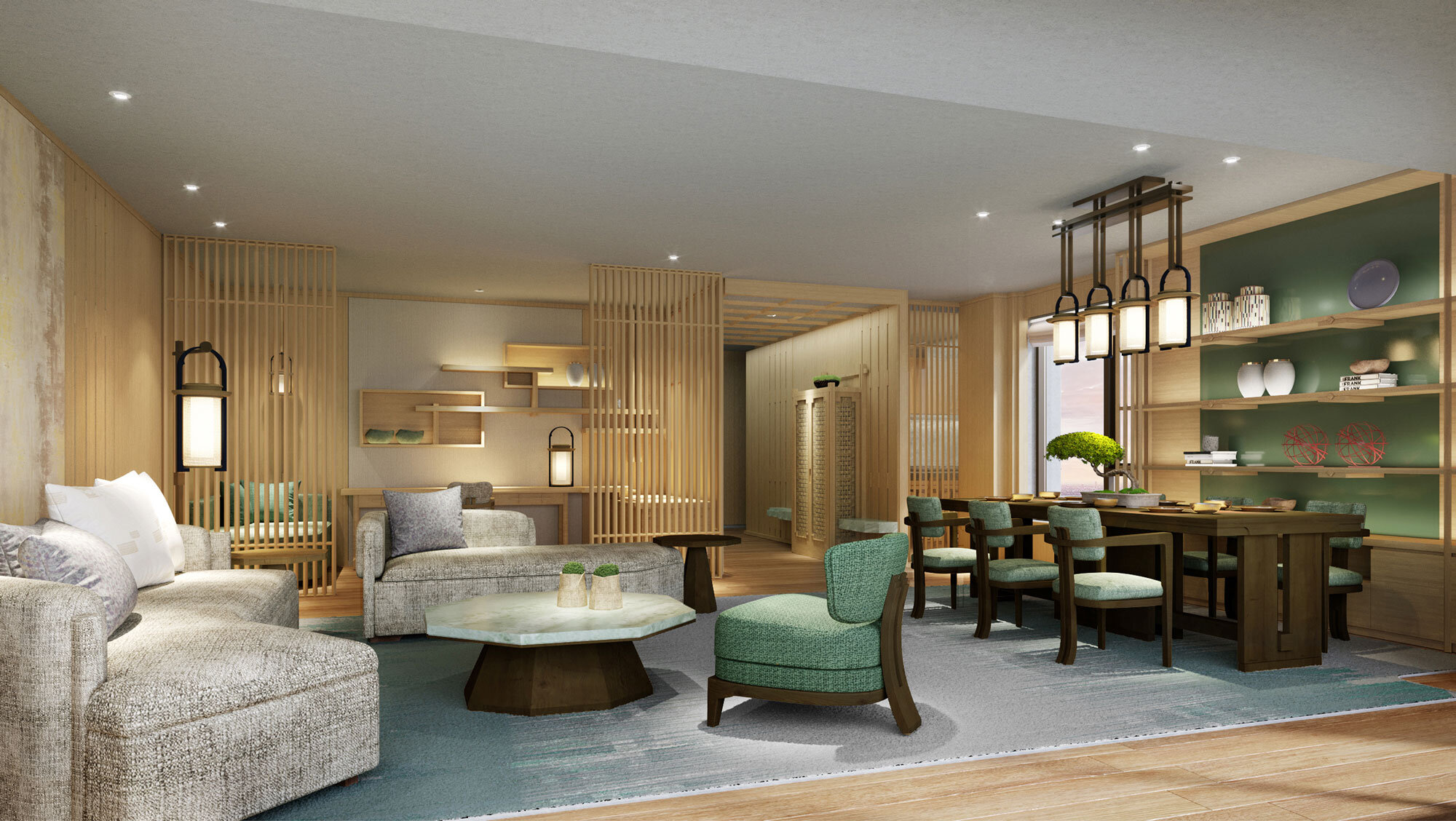
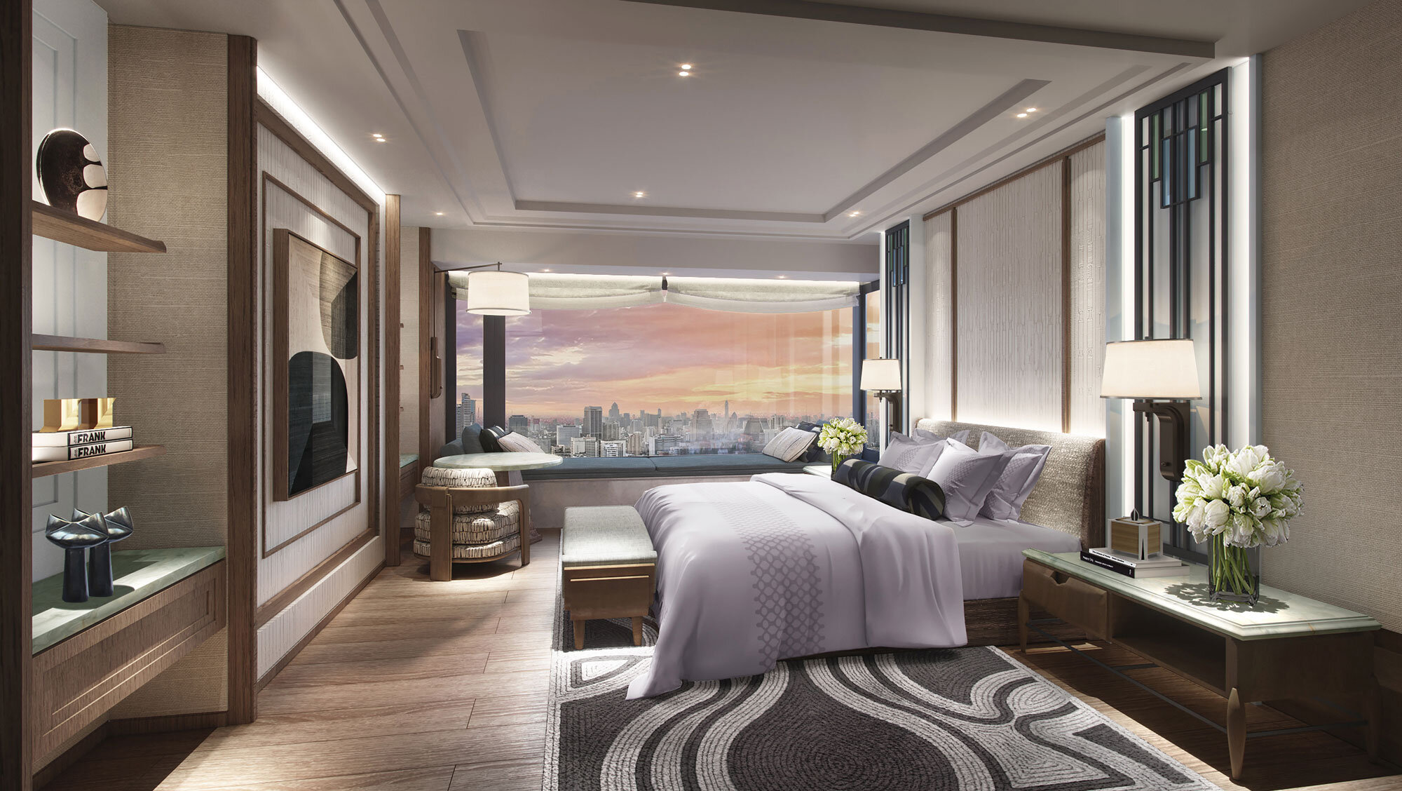
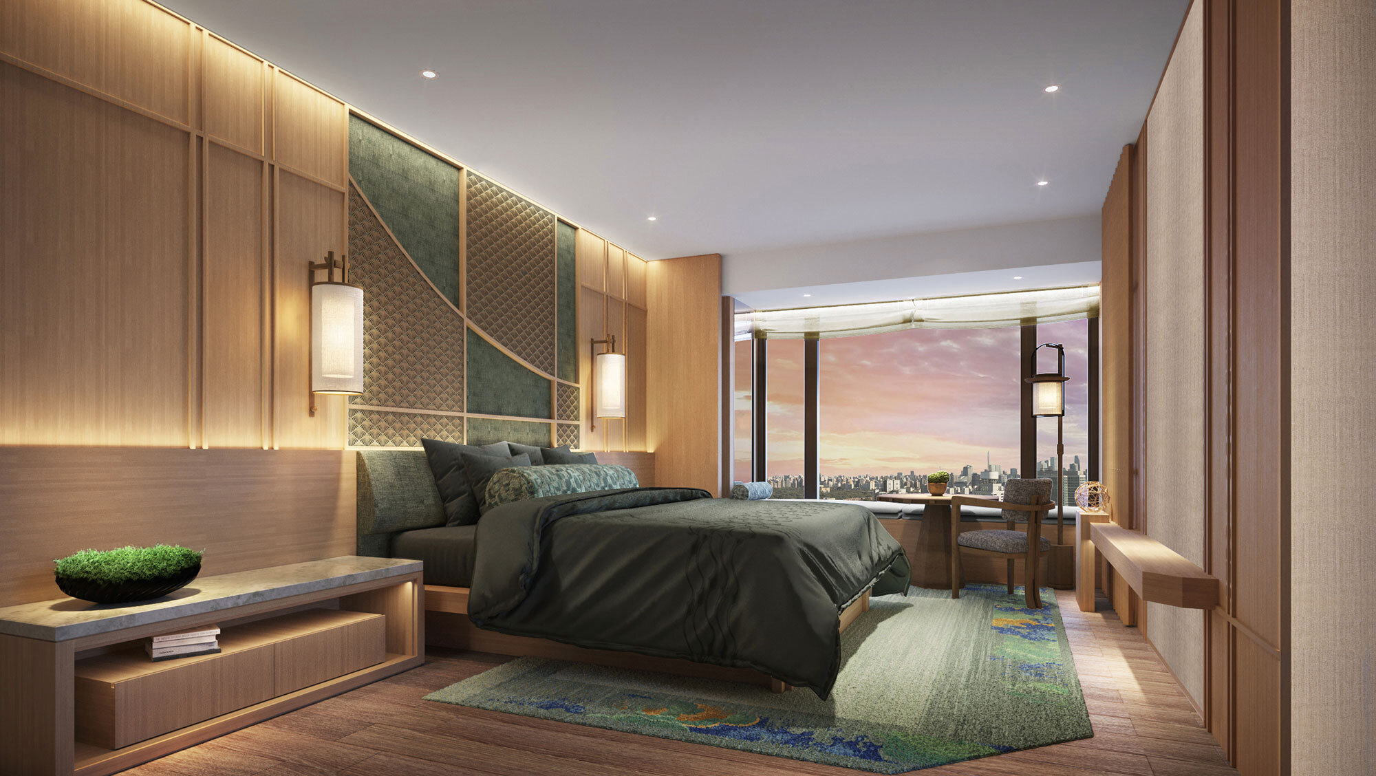
André does not implement an avant-garde design in Dongzhimen 8. He focuses much more on making coordination between elements. The residence is as genuinely individualistic as a person. Its personality basks in the reflected glory of the occupants and culture signs.
Born in Hong Kong and educated in England from the age of 14, André Fu holds a Bachelor of Arts at Cambridge University and a Masters in Architecture from the University of Cambridge. Fu credits his distinctive design style – a quietly thoughtful, carefully considered yet analytical approach marked by a highly refined aesthetic – to his peripatetic cultural upbringing.
He first redefined hospitality notions with his design of the world-renowned Upper House hotel in Hong Kong. His creations extend from a unique furniture collaboration with Louis Vuitton's Objets Nomades collection to contemporary art galleries in Hong Kong, Tokyo and Shanghai. With major hotels and restaurants around the world. Leading brands including Villa La Coste in Provence, The Berkeley London, Hong Kong's Upper House Hotel and St Regis, as well as Waldorf Astoria Bangkok.
Name: Dongzhimen 8
Exterior design: gad
Interior design: André Fu
Design team: DIA & AFSO
Landscape design: Zheng Shanfeng
Location: Dongzhimen, Beijing, China
Copyright: Life Group
Design year: 2020
Helsinki Design Week celebrates design in September 2020
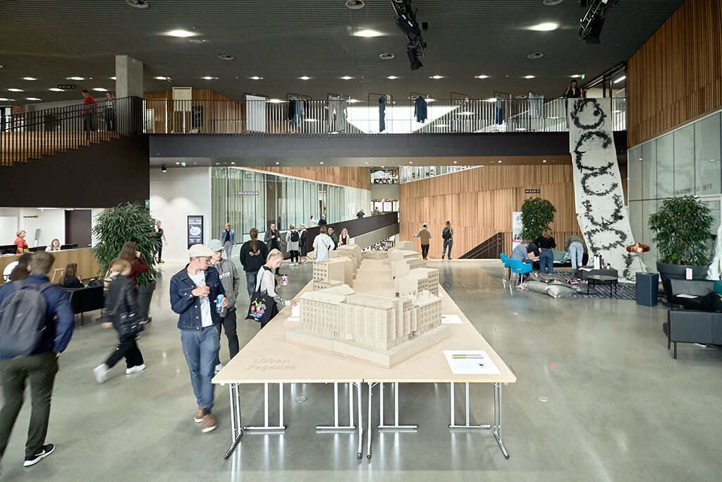
One of the largest design festivals in the Nordic countries with children and families, The 16th annual Helsinki Design Week is held from now until 13 September 2020. The festival events will again spread throughout the city: from museums to markets, from seminar halls to secret shops, from studios to showrooms and from offline to online events and encounters.
One of the largest design festival in the Nordic countries with children and families
The 16th annual Helsinki Design Week is held from now until 13 September 2020. The festival events will again spread throughout the city: from museums to markets, from seminar halls to secret shops, from studios to showrooms and from offline to online events and encounters.
Helsinki Design Week is a series of responsibly organized events of varying sizes. It is not a festival at one single venue holding thousands of visitors. With regards to possible restrictions on venues or visitors due to the international health crisis, the festival has the means and opportunity to multiply into smaller events or use new digital methods of exhibiting content.
Helsinki Design Week’s statement for 2020 is Commitment Matters – a theme that raises questions regarding the meaning and value of designing. The phrase is a stimulus for thought, and the theme is meant to be used as a tool for everyone taking part in the festival: the event organizers, the exhibitors, the seminar speakers and the visitors. The leading partner of the festival, the City of Helsinki, is supporting the safe and responsible organization of the festival.
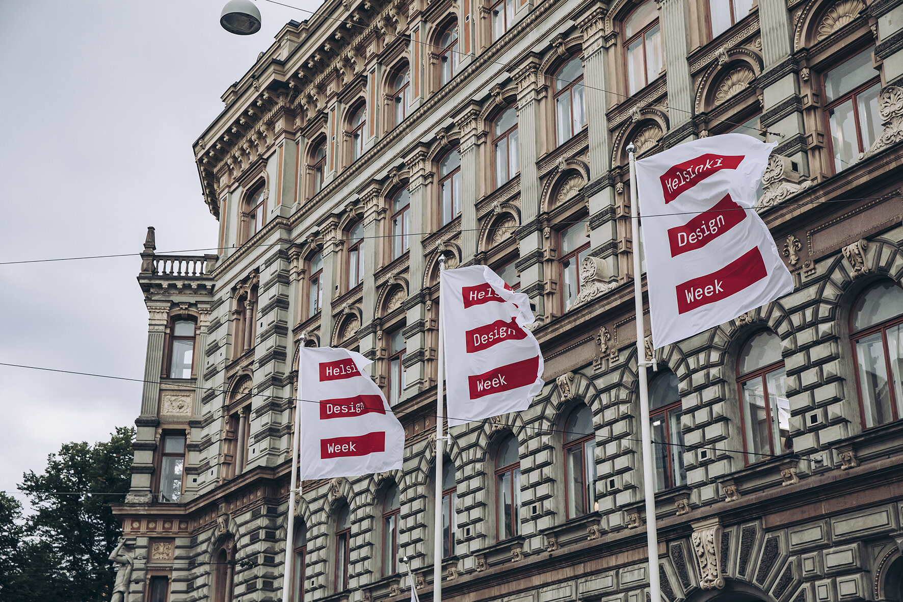
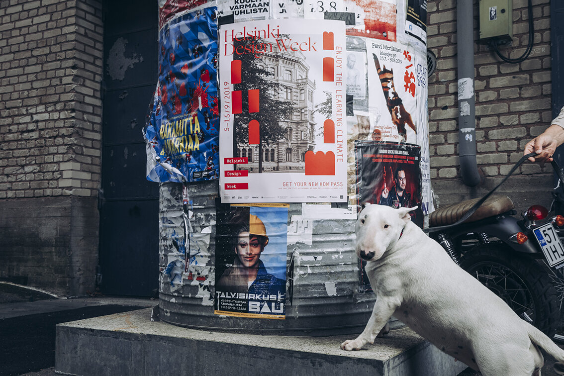
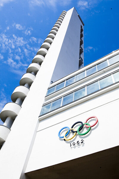
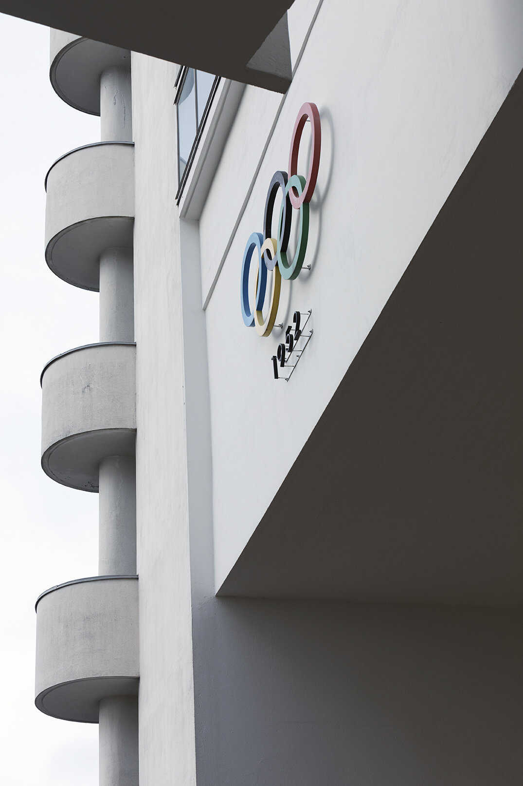
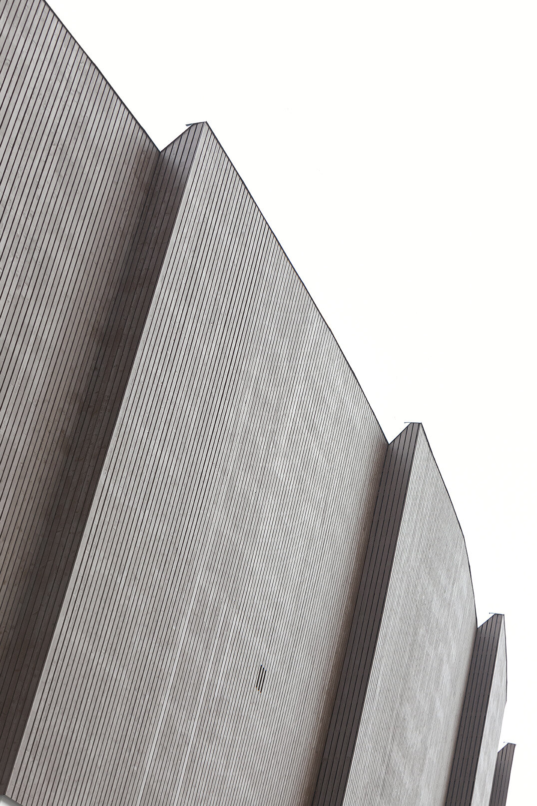
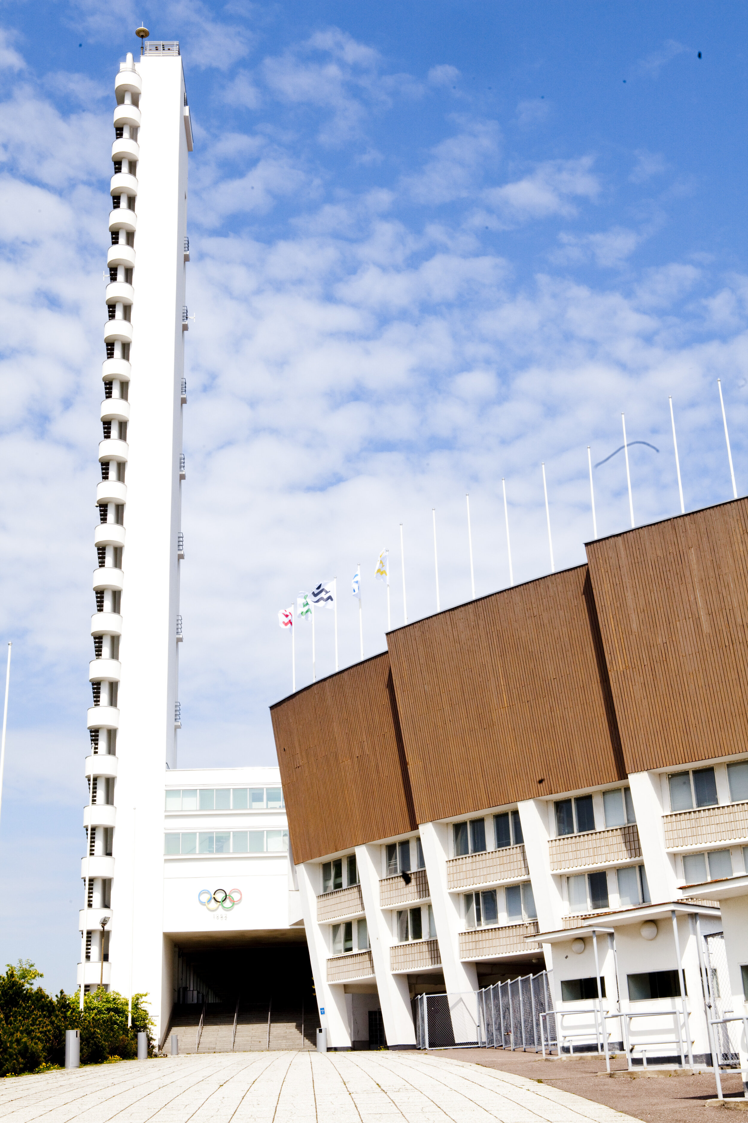
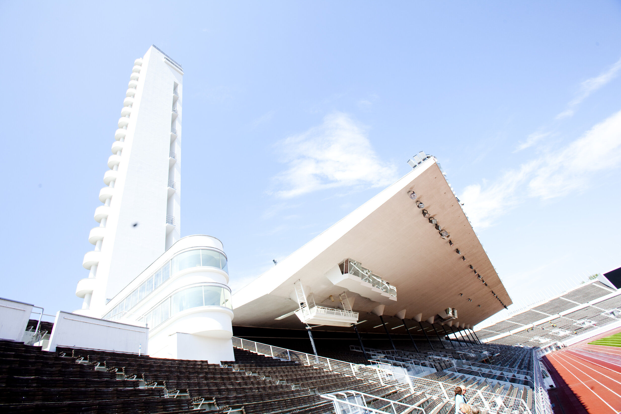
The festival visuals celebrate the legendary Helsinki Olympic Stadium, combining its functionalistic architecture with vivid and energetic colours from the athletic world. Historic photos from the 1940s will highlight the design and history of the restored monument.
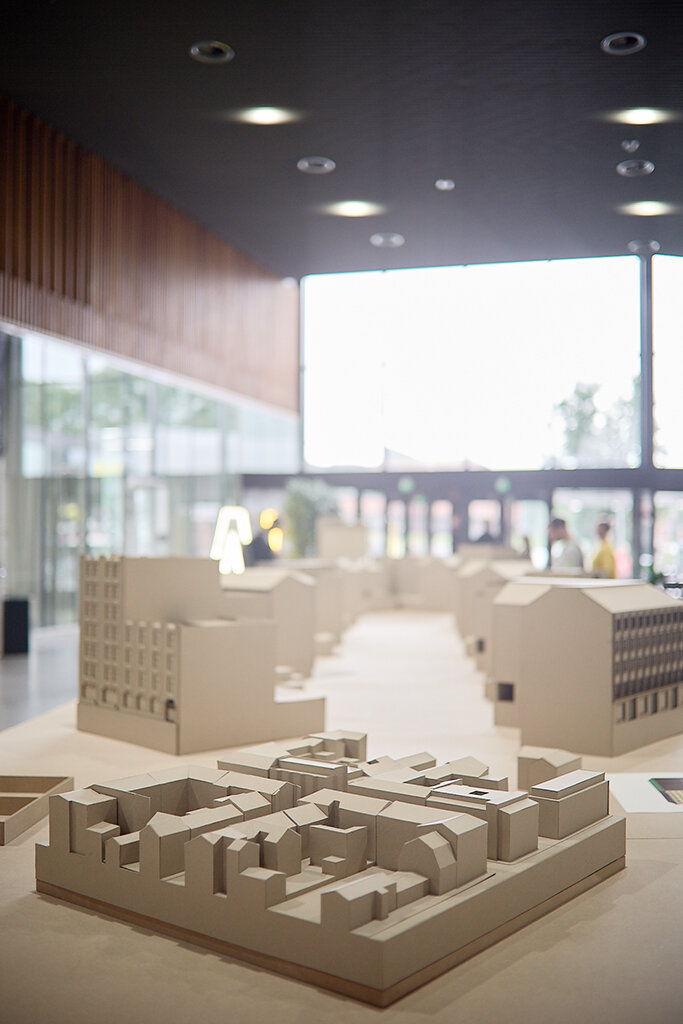
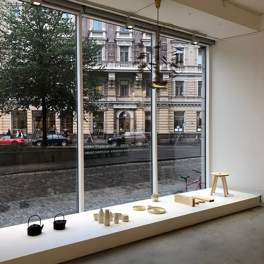
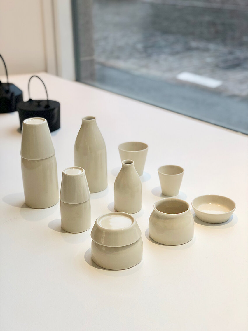
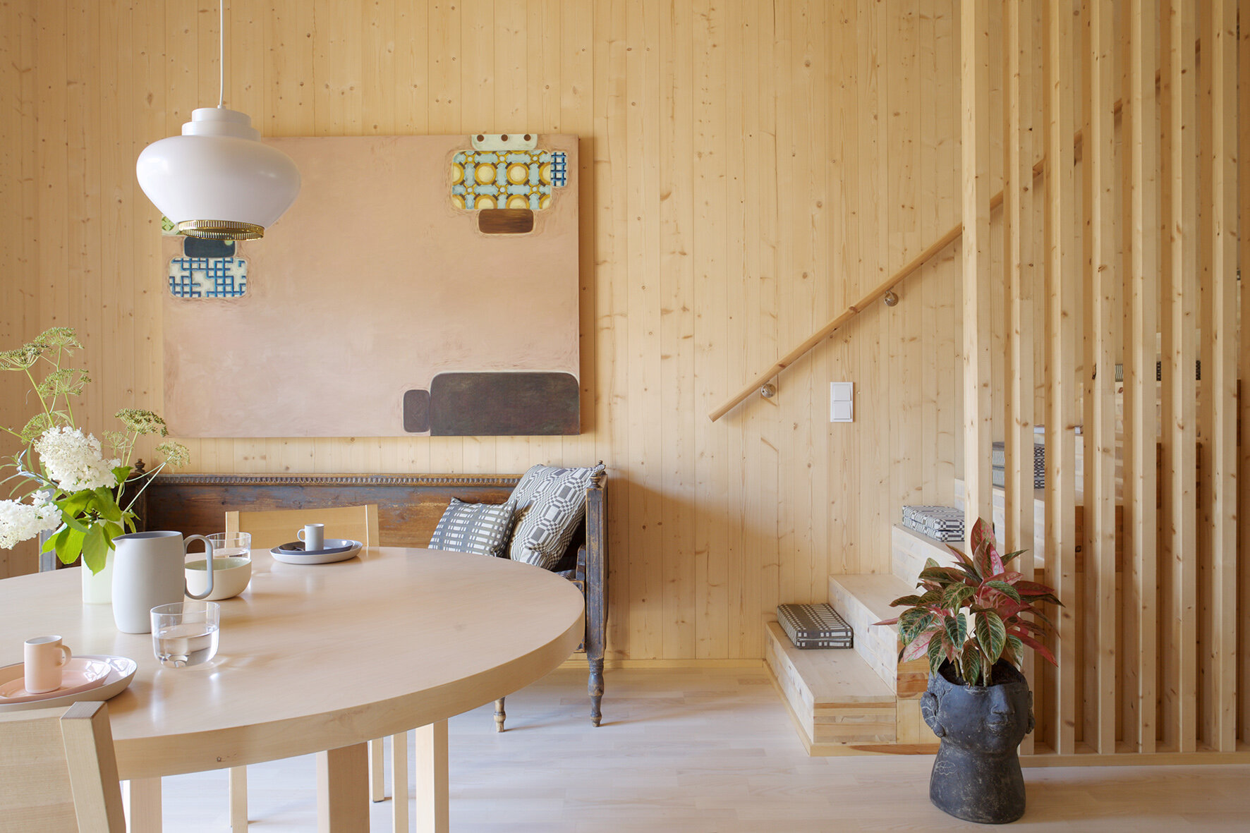
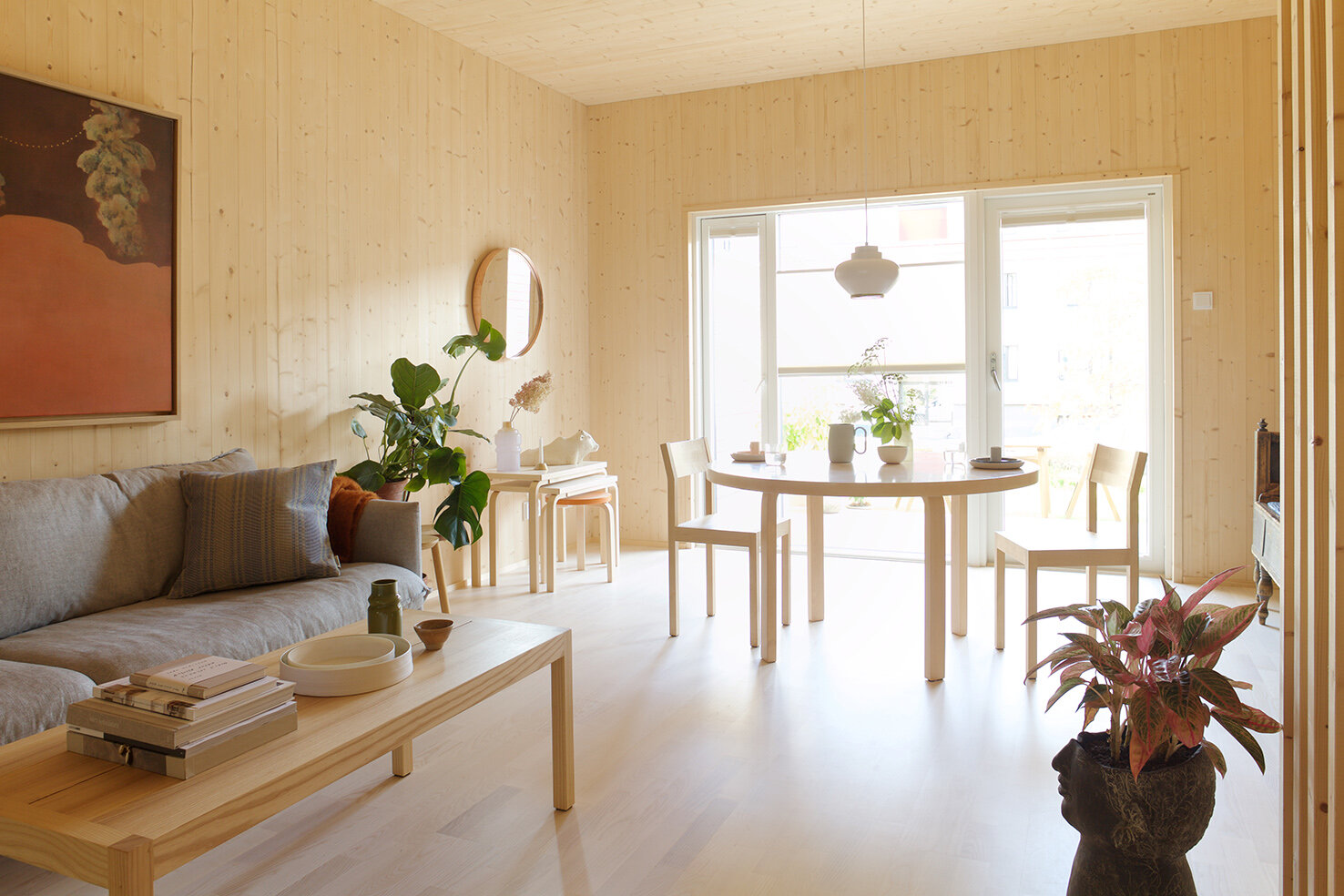
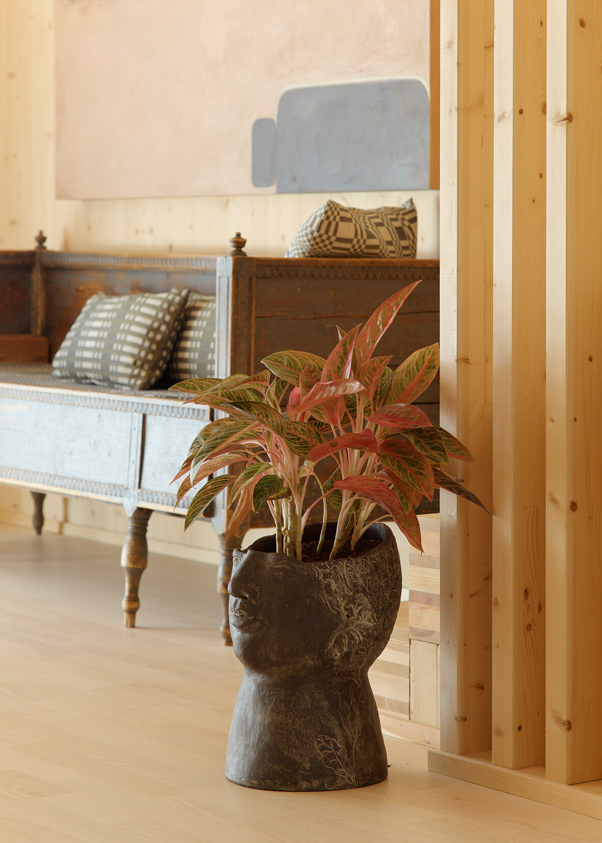
The main venue: the Olympic Stadium
The main venue of Helsinki Design Week will be the Olympic Stadium. With its large and airy spaces, it is a perfect spot for safe encounters. The stadium is open on 11–13 September for guided tours and for Children’s Design Weekend.
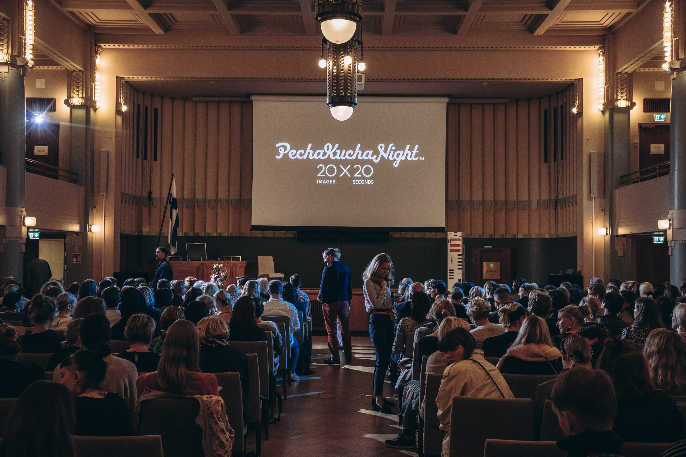
The Stadium is also home to the main exhibition, a series of installations on design, architecture and fashion, presenting interesting design from unique pieces to large scale setups. A review of top young designers is not to be missed. The Olympic Stadium will also host an event that may well become the biggest PechaKucha Night ever held. The evening of September 12 is reserved for 10 presentations, each less than 7 minutes long. The idea of PechaKucha, Japanese for “chit chat”, is simple: 20 slides and 20 seconds of commentary on a theme chosen by the presenter.
Helsinki Design Week’s programme for children develops an understanding of architecture and design.
Helsinki Design Week continues the festival tradition of a dedicated programme for children and families for the seventh consecutive year. A sports-themed Children’s Design Weekend 12–13 September takes place at the renovated and modernized Helsinki Olympic Stadium. Children’s Design Week at Annantalo 7–13 September focuses on design workshops. Schools familiarize learners with design through PechaKucha presentations with a toolkit produced by Helsinki Design Week.
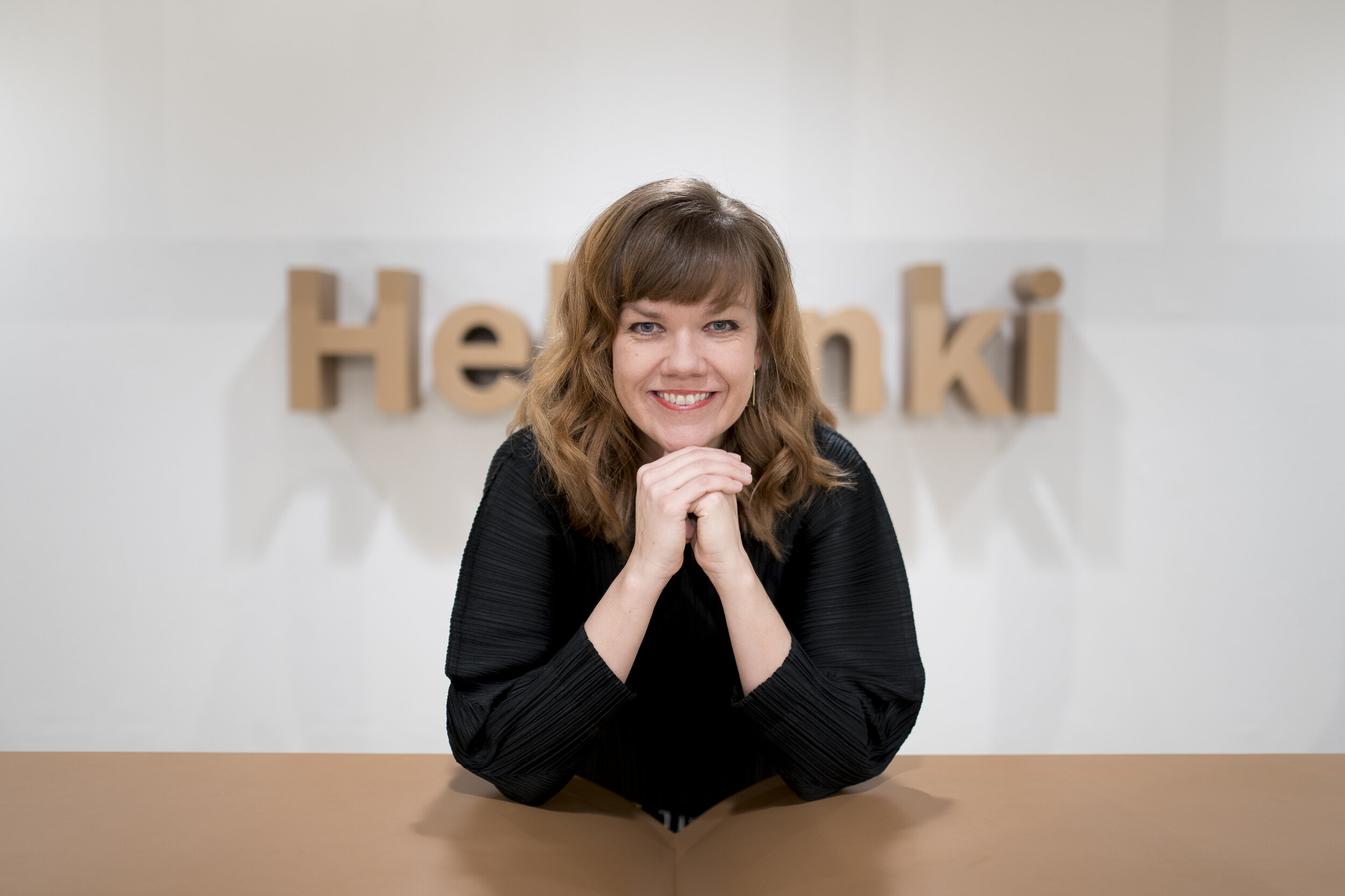
“Our programme for children offers such activities for the whole family that makes architecture and design familiar to citizens from childhood onwards. Thus we guide them to observe their built environment with a critical eye,” says Helsinki Design Week Programme Director Anni Korkman.
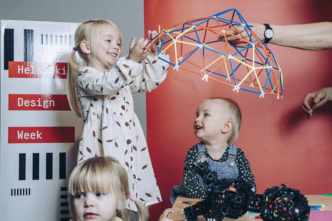
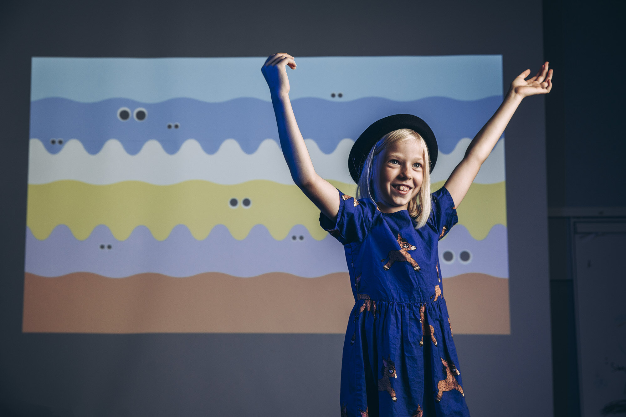
Helsinki Design Week (HDW) produces the children’s programme, as well as all other programme content, in partnership with external event organizers. All children’s events are free of charge.
Children are guests of honour at Olympic Stadium.
A part of Helsinki Design Week’s in-house production, HDW Children’s Design Weekend is held at the Helsinki Olympic Stadium on 12–13 September. The weekend features a route designed for children and built on the famous green of the Olympic Stadium. The route’s five playful sports sites combine sports and art, making design visible at the same time. Parents can join their children’s sports performances with instructions stored in QR codes. At the end of the route, children make their trophies and pose with them on the podium. The trophy materials are available on the Helsinki Design Week website so that the programme can be duplicated at home.
As a part of Helsinki Design Week’s COVID-19 safety guidelines, registration is required to attend this free event.
Workshops at Annantalo
Annantalo, the City of Helsinki arts centre for children, young people and families, celebrates Children’s Design Week 7–13 September with nature- and future-themed programme.
Workshops on the themes are held at Annantalo for groups from schools and daycare centres. For example, 5th graders can create art with soil materials at the Annantalo yard in a workshop that combines mythology, architecture, art and biosciences.
A forest installation has been erected at the Annantalo yard: trunks of trees from thinning forest operations have been used to create a playful space resembling a forest. Three exhibitions on display inside the arts centre focus on ecology, the environment and the bond between a mother and her baby.
Most of the workshops are held outdoors. Safety is ensured indoors with sufficient distances maintained between occupants. Some of the workshops require registration.
Children’s Design Week at Annantalo
PechaKucha at schools
Learners at Helsinki comprehensive schools follow a Culture Path from one grade to the next. The path includes suggestions for cultural contents for each grade, and every learner should make at least one cultural visit in a year.
“Culture Path ensures that every learner has an opportunity to be familiarized with various cultural contents and cultural operators during their basic education,” says Pedagogical Specialist Panu Hatanpää of the City of Helsinki Education Division.
“Familiarizing learners with culture through Culture Path visits is part of new creative learning at Helsinki schools, and it is closely linked to familiarizing learners with design and design thinking,” Hatanpää emphasizes and points out that design is included in Culture Path contents.
There are no visits by school groups to Helsinki Design Week events this year. Visits are replaced by a toolkit produced by Helsinki Design Week for organizing PechaKucha presentations, one of the Design Week’s essential programme items. PechaKucha is a form of storytelling, in which the presenter talks about a topic with 20 images, 20 seconds about each.
“PechaKucha is a good method for learners to practice making a presentation in front of an audience and to talk about topics of importance to them. For the audience, PechaKucha is a good method to practice listening,” Hatanpää says.
Helsinki Design Week’s PechaKucha toolkit is freely available to all. (Please note that the toolkit content is in Finnish only).
Design education in Helsinki
Design education is also in focus at Design Museum: A&DO Learning Centre for Architecture and Design organizes DesignLab: Mini Jam at the museum and online on 11 September. Talks by specialists and design-themed jamming shed light on future architecture and design learning and on the tone that public participation brings to urban design. The City of Helsinki supports the event.
“Helsinki has been a pioneer in architecture and design education for many years,” says Chief Design Officer Hanna Harris of the City of Helsinki. “We have several teachers and schools in Helsinki dedicated to the theme.”
For example, the Arabia Comprehensive School teaches design as part of creative problem solving that crosses subject boundaries, and the methods of design education are used in all subjects on grades 1–9. The Kruununhaka Comprehensive School for grades 7–9 offers a design track for local students.
“The City of Helsinki has joined forces with design organizations and projects to develop contents for architecture and design education for use by teachers, and we have participated in varied design collaborations. Our next step is to develop long-ranging activities within the City organization,” Harris asserts.“ I consider the following to be of very high importance: architecture and design education provides children and young people with means for creative problem solving and for the development of their identity. They learn to comprehend their neighbourhoods, to understand planning and various materials, and they obtain tools to participate in building our joint future.”
For more information, please visit: https://www.helsinkidesignweek.com/festival/
